Single Timeframe Multi-EMA Trend Table### Overview
The **Single Timeframe Multi-EMA Trend Table** displays the directional bias of 7 customizable Exponential Moving Averages (EMAs) calculated from a single, higher timeframe of your choice.
This allows traders working on lower execution timeframes (e.g., 1-minute or 5-minute charts) to effortlessly monitor macro trend alignment and EMA support/resistance zones from higher timeframes (e.g., 15m, 1h, or 4h) without switching charts.
---
### Key Features
* **Selectable Target Timeframe:** Choose any timeframe (1m, 5m, 15m, 1h, 4h, 1D, etc.) to fetch EMA data from.
* **7 Customizable EMAs:** Define 7 individual EMA lengths (e.g., EMA 9, 20, 50, 100, 150, 200, 800) to monitor full trend structure.
* **Consolidation Detection:** Identifies when price is compressing or trading close to a specific EMA line, marking it as a **RANGE 🟡** state.
* **Clean UI:** Displays chosen timeframe in the table header alongside active EMA lengths and clear color-coded statuses.
---
### How to Use
1. **Set Target Timeframe:** In the settings, choose the macro timeframe you want to base your analysis on (e.g., 15m).
2. **Configure EMAs:** Input your preferred EMA lengths.
3. **Gauge Trend Strength:**
* **Full Bullish Alignment:** All or most EMAs show `BULLISH 🟢`.
* **Compression/Ranging:** Multiple EMAs show `RANGE 🟡`, warning of choppy price action. Indicateur

Price Structure RSIOverview
Price Structure RSI is a market-structure oscillator that converts confirmed structural breaks into a cumulative directional series and then applies the Relative Strength Index calculation to that series.
Unlike a traditional RSI, which is calculated directly from price changes, this indicator measures how previously identified pivot highs and pivot lows are being broken.
The oscillator includes:
- market-structure-based RSI
- configurable RSI length
- configurable overbought and oversold levels
- Close or High/Low structure-break confirmation
- optional EMA, SMA, or WMA smoothing
- confirmed bullish and bearish signals
- dark and light colour presets
- gradient oscillator visualization
- simplified bullish and bearish historical W/L panels
- configurable target and stop distances
- configurable panel positions
- bullish and bearish alerts
The indicator is intended to help users examine whether recent market-structure breaks are producing stronger bullish or bearish pressure.
It does not predict future price movement and does not provide automatic instructions to enter or exit a trade.
Open-source reuse and credits
Price Structure RSI is a modified and expanded derivative of the open-source indicator "Market Structure RSI" by ClayeWeight.
The original pivot detection, stored structure levels, broken-structure accumulation, cumulative structure total, RSI transformation, moving-average selection, threshold-crossing signals, and alert framework were adapted from ClayeWeight's work.
This version adds:
- Pine Script v6 compatibility
- dark and light colour presets
- revised oscillator colours and gradient fills
- confirmed-bar signal processing
- configurable historical target and stop measurements
- next-bar outcome evaluation
- conservative same-bar target and stop handling
- separate bullish and bearish W/L panels
- configurable panel positioning and offsets
- additional input validation
- revised alert messages
The original source was published under the Mozilla Public License 2.0.
This modified version is also published open-source under the Mozilla Public License 2.0.
Core methodology
The indicator first identifies simple confirmed pivot highs and pivot lows.
A pivot high is identified when:
- the centre candle has a higher high than the candle before it
- the centre candle has a higher high than the candle after it
A pivot low is identified when:
- the centre candle has a lower low than the candle before it
- the centre candle has a lower low than the candle after it
Because the script evaluates historical candles, the pivot is recognized only after the necessary later candle has closed.
Confirmed pivot-high prices are stored in an array.
Confirmed pivot-low prices are stored in a separate array.
Structure breaks
The indicator checks whether stored pivot levels have been broken.
Users can select one of two Structure Break Type settings:
- Close
- High/Low
When Close is selected:
- a stored pivot high is considered broken when the previous candle closes above it
- a stored pivot low is considered broken when the previous candle closes below it
When High/Low is selected:
- a stored pivot high is considered broken when the previous candle high moves above it
- a stored pivot low is considered broken when the previous candle low moves below it
When one or more stored pivot highs are broken, positive values are added to the cumulative structure total.
When one or more stored pivot lows are broken, negative values are added to the cumulative structure total.
Broken levels are removed from their respective arrays so that the same structure level is not counted repeatedly.
Cumulative structure total
Each broken pivot high contributes:
- +1
Each broken pivot low contributes:
- -1
If several stored structure levels are broken together, several values can be added during the same calculation.
The script then calculates the cumulative sum of these positive and negative structure changes.
A rising structure total indicates that more stored pivot highs are being broken.
A falling structure total indicates that more stored pivot lows are being broken.
Structure RSI
The Relative Strength Index calculation is applied to the cumulative structure total rather than directly to price.
The default RSI Length is:
- 20
The resulting oscillator is called the Structure RSI.
Higher Structure RSI values indicate that bullish structure breaks have recently had greater influence on the cumulative series.
Lower Structure RSI values indicate that bearish structure breaks have recently had greater influence.
The Structure RSI should not be interpreted as a standard price RSI because its input is the cumulative structure-break series rather than normal closing-price changes.
Overbought and oversold levels
The default levels are:
- Overbought Level: 80
- Oversold Level: 20
The Oversold Level must remain below the Overbought Level.
The script displays an error when the oversold setting is equal to or above the overbought setting.
The levels are configurable and should be treated as analytical thresholds rather than universally optimal settings.
Bullish signal
A bullish signal occurs when the Structure RSI crosses upward through the selected Oversold Level.
The signal is confirmed only after the chart candle closes.
The bullish marker appears at the bottom of the oscillator pane.
A bullish signal indicates that the structure-based oscillator has recovered above its lower threshold.
It does not guarantee that price will continue higher.
Bearish signal
A bearish signal occurs when the Structure RSI crosses downward through the selected Overbought Level.
The signal is confirmed only after the chart candle closes.
The bearish marker appears at the top of the oscillator pane.
A bearish signal indicates that the structure-based oscillator has moved back below its upper threshold.
It does not guarantee that price will continue lower.
Moving average
An optional moving average can be applied to the Structure RSI.
Available moving-average types are:
- EMA
- SMA
- WMA
The default settings are:
- Moving Average Type: EMA
- Moving Average Length: 8
The moving average can be used to observe the smoother direction of the Structure RSI.
The moving average does not directly create the bullish or bearish threshold signals.
Hiding the moving average does not change the Structure RSI calculation.
Oscillator colours
The Structure RSI line changes colour according to its current position.
- Above the Overbought Level: bearish colour
- Below the Oversold Level: bullish colour
- Between the two levels: neutral grey
The oscillator also includes:
- a dashed overbought line
- a dashed oversold line
- a dotted 50 midline
- a neutral background fill between the main levels
- bullish and bearish gradient fills
- optional dark and light colour presets
The colour settings change presentation only.
They do not alter the structure calculation or signal logic.
Confirmed signals
Bullish and bearish signals are accepted only on confirmed chart bars.
The script does not finalize a signal solely because the Structure RSI temporarily crosses a threshold while the active candle is still open.
Values may still move while the current chart candle develops.
The final marker and alert are generated only after the candle closes with the crossing condition confirmed.
Historical W/L measurements
The indicator includes simplified historical bullish and bearish outcome measurements.
These measurements are not a complete TradingView strategy backtest.
When no measurement is currently active, a confirmed signal can begin a new historical measurement.
For a bullish signal:
- the signal candle close becomes the recorded entry price
- the target is placed above the recorded entry
- the stop is placed below the recorded entry
For a bearish signal:
- the signal candle close becomes the recorded entry price
- the target is placed below the recorded entry
- the stop is placed above the recorded entry
Only one unresolved historical measurement is tracked at a time.
Target distance
Target Distance (%) controls the percentage distance between the recorded signal close and the historical target.
The default value is:
- 1.0%
For a bullish measurement:
- Target = Entry Price × (1 + Target Percentage)
For a bearish measurement:
- Target = Entry Price × (1 - Target Percentage)
The minimum allowed target distance is 0.1%.
Stop distance
Stop Distance (%) controls the percentage distance between the recorded signal close and the historical stop.
The default value is:
- 1.0%
For a bullish measurement:
- Stop = Entry Price × (1 - Stop Percentage)
For a bearish measurement:
- Stop = Entry Price × (1 + Stop Percentage)
The minimum allowed stop distance is 0.1%.
Next-bar evaluation
Target and stop evaluation begins on the bar after the signal.
The signal candle itself is not used to determine the result.
This prevents price movement that occurred earlier during the signal candle from being counted after the entry has been recorded at that candle's close.
Wins and losses
The tables use the following labels:
- W = Win
- L = Loss
A win means that the configured target was reached before the configured stop.
A loss means that the configured stop was reached before the configured target.
The displayed percentage is:
- Wins divided by completed Wins and Losses
Bullish and bearish measurements are counted separately.
Same-bar target and stop handling
A chart candle can sometimes touch both the target and stop.
Standard OHLC chart data does not reveal which level was reached first inside that candle.
When both levels are touched during the same bar, the script records a loss.
This conservative rule avoids automatically assuming the more favourable outcome.
The script does not reconstruct lower-timeframe intrabar movement.
One active measurement at a time
Only one unresolved historical measurement can be active.
When a measurement is already active:
- later bullish or bearish signals can still appear
- later signals can still trigger alerts
- later signals do not start another W/L measurement
- the active measurement remains open until its target or stop is reached
An opposite signal does not automatically close the existing measurement.
This means that not every displayed signal is included in the W/L panels.
Bull panel
The Bull panel displays results from completed bullish measurements.
The panel contains:
- Bull
- W: number of bullish targets reached first
- L: number of bullish stops reached first
- percentage of completed bullish measurements recorded as wins
The Bull panel position can be selected from the available chart locations.
Bear panel
The Bear panel displays results from completed bearish measurements.
The panel contains:
- Bear
- W: number of bearish targets reached first
- L: number of bearish stops reached first
- percentage of completed bearish measurements recorded as wins
The Bear panel position can be selected independently from the Bull panel.
Panel positions and offsets
The Bull and Bear panels can be placed at:
- top left
- top centre
- top right
- middle left
- middle centre
- middle right
- bottom left
- bottom centre
- bottom right
Row and column offsets can be used to move each panel within the available position grid.
Negative row values move the selected panel upward.
Positive row values move it downward.
Negative column values move it to the left.
Positive column values move it to the right.
The final position is restricted to the available TradingView table locations.
The panels can overlap when both are assigned to the same effective position.
Meaning of the displayed percentage
The percentage represents the share of completed measurements where the configured target was reached before the configured stop.
It is not:
- a guaranteed win rate
- proof of future profitability
- a complete strategy result
- a recommendation to enter a trade
- a forecast of future performance
The historical measurement does not include:
- commissions
- spread
- slippage
- liquidity
- order execution
- position sizing
- account equity
- partial exits
- trailing stops
- market gaps
- order rejection
- overlapping positions
- complete intrabar sequencing
Historical results do not guarantee future results.
Alerts
The indicator includes two alert conditions:
- Bullish Signal
- Bearish Signal
The Bullish Signal alert is triggered when the Structure RSI crosses upward through the Oversold Level on a confirmed chart bar.
The Bearish Signal alert is triggered when the Structure RSI crosses downward through the Overbought Level on a confirmed chart bar.
When creating TradingView alerts, use:
- Once Per Bar Close
This matches the confirmed signal logic.
How to Use
1. Apply the indicator
Add Price Structure RSI to a standard TradingView chart.
The oscillator appears in a separate pane below the main price chart.
2. Begin with the default settings
The default configuration is:
- RSI Length: 20
- Overbought Level: 80
- Oversold Level: 20
- Structure Break Type: High/Low
- Moving Average Type: EMA
- Moving Average Length: 8
- Target Distance: 1.0%
- Stop Distance: 1.0%
Review the indicator with its default configuration before changing several settings simultaneously.
3. Select the structure-break type
Choose High/Low when a stored structure level should be considered broken as soon as the previous candle's high or low passes it.
Choose Close when the previous candle must close beyond the stored structure level.
High/Low is generally more responsive.
Close is generally more restrictive.
Neither setting is automatically more accurate.
4. Read the Structure RSI
Use the oscillator to observe the balance of recent broken pivot highs and pivot lows.
A rising oscillator indicates that bullish structure breaks are having greater recent influence.
A falling oscillator indicates that bearish structure breaks are having greater recent influence.
The oscillator can remain elevated or depressed during extended directional conditions.
5. Read the overbought area
When the Structure RSI moves above the Overbought Level, bullish structure-break pressure has pushed the oscillator into its upper region.
The bearish signal does not occur merely because the oscillator is above the level.
The bearish signal occurs only when the oscillator later crosses downward through the Overbought Level on a confirmed bar.
6. Read the oversold area
When the Structure RSI moves below the Oversold Level, bearish structure-break pressure has pushed the oscillator into its lower region.
The bullish signal does not occur merely because the oscillator is below the level.
The bullish signal occurs only when the oscillator later crosses upward through the Oversold Level on a confirmed bar.
7. Wait for the candle to close
Signals are confirmed at bar close.
Do not treat a temporary intrabar threshold crossing as a finalized signal.
Wait for the marker to remain after the chart candle closes.
8. Use the moving average
Enable the moving average to observe a smoother version of the Structure RSI.
Available types are:
- EMA
- SMA
- WMA
A shorter moving-average length reacts more quickly.
A longer moving-average length responds more slowly.
The moving average can provide visual context, but it is not part of the threshold-crossing signal condition.
9. Configure the target and stop distances
Set Target Distance (%) and Stop Distance (%) according to the historical measurement you want to study.
For example:
- Target: 1.0%
- Stop: 1.0%
This creates an equal-distance historical measurement.
Another example:
- Target: 2.0%
- Stop: 1.0%
This creates a larger target than stop.
These settings are research parameters and are not recommended trading settings.
10. Read the Bull panel
The Bull panel measures completed bullish signals.
- W means the bullish target was reached first
- L means the bullish stop was reached first
- the percentage shows bullish wins divided by completed bullish outcomes
Only signals that begin while no other measurement is active are included.
11. Read the Bear panel
The Bear panel measures completed bearish signals.
- W means the bearish target was reached first
- L means the bearish stop was reached first
- the percentage shows bearish wins divided by completed bearish outcomes
Only signals that begin while no other measurement is active are included.
12. Understand same-bar outcomes
When both the target and stop are touched during the same candle, the result is counted as a loss.
This is a conservative assumption because the chart's OHLC data cannot show which level was reached first.
13. Understand skipped measurements
A signal can appear while another historical measurement is still unresolved.
That signal can still:
- display a marker
- trigger an alert
However, it does not begin another historical measurement.
This is why the total W/L count may be lower than the total number of visible signals.
14. Position the panels
Choose separate positions for the Bull and Bear panels.
The default positions are:
- Bull panel: top left
- Bear panel: top right
Use the row and column offsets when small position adjustments are needed.
Avoid assigning both panels to the same final position unless overlapping panels are intended.
15. Select the colour preset
Use Dark Background on dark chart themes.
Use Light Background on light chart themes.
The preset changes moving-average and panel text colours.
It does not change the indicator calculations.
16. Create alerts
Create separate TradingView alerts for:
- Bullish Signal
- Bearish Signal
Use Once Per Bar Close.
Test alerts on the intended symbol and timeframe before using them operationally.
17. Review broader market context
Use Price Structure RSI together with additional analysis such as:
- trend direction
- price structure
- support and resistance
- volume
- volatility
- liquidity
- market sessions
- recent swing highs and lows
- scheduled economic or company events
- risk management
A threshold crossing alone does not guarantee a reversal or continuation.
Suggested starting process
- Apply the indicator to a standard candlestick chart
- Keep RSI Length at 20
- Keep the levels at 80 and 20
- Begin with High/Low structure breaks
- Keep the EMA smoothing line enabled
- Use a target and stop distance of 1.0%
- Wait for confirmed bar-close signals
- Compare the oscillator with visible price structure
- Review the Bull and Bear panels separately
- Remember that only one active measurement is tracked
- Test several symbols and timeframes before drawing conclusions
- Use Once Per Bar Close for alerts
Limitations
- The indicator is derived from the open-source Market Structure RSI by ClayeWeight
- The central structure-break accumulation methodology is adapted from the original work
- Pivot identification is based on a simple three-candle relationship
- Pivots are identified only after the required later candle has closed
- The oscillator measures broken stored structure levels rather than normal price momentum
- The Structure RSI can behave differently from a standard price RSI
- The indicator does not determine whether a structure break is genuine or false
- The indicator does not measure volume, volatility, liquidity, or trend strength
- Signals are confirmed at bar close and may occur later than temporary intrabar conditions
- A bullish signal does not guarantee that price will rise
- A bearish signal does not guarantee that price will fall
- Only one unresolved historical measurement is tracked at a time
- Not every visible signal is represented in the W/L panels
- Opposite signals do not close active measurements
- Target and stop evaluation begins on the bar after the signal
- Same-bar target and stop contact is recorded as a loss
- The W/L panels are simplified historical measurements
- The displayed percentages are not complete backtest results
- Commissions, spread, slippage, liquidity, position sizing, and execution are not included
- Historical outcomes do not imply future results
- The indicator should not be used as the sole basis for a trading decision
Price Structure RSI is an analytical and research tool.
It does not provide financial advice, guaranteed signals, guaranteed win rates, or guaranteed results. Indicateur

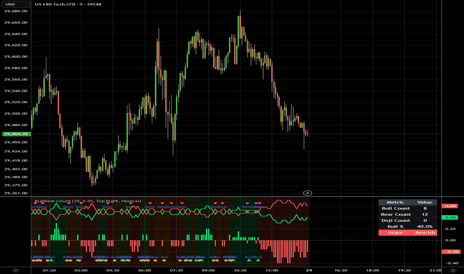
Bull vs Bear Candle CountBull vs Bear Candle Count
Bull vs Bear Candle Count is a market participation and directional bias indicator designed to measure whether buyers or sellers have been dominating recent price action.
Instead of relying on traditional moving averages or oscillators, this indicator simply analyzes the number of bullish and bearish candles over a customizable lookback period to determine whether the market environment is currently Bullish, Bearish, or Balanced. Based on the candle distribution, the indicator calculates net directional pressure and visually highlights shifts in market conditions.
Features:
• Customizable lookback period
• Bullish, Bearish, and Balanced market state detection
• Net Bias histogram for directional strength visualization
• Bull % and Bear % comparison lines
• Adjustable balanced threshold sensitivity
• Optional background highlighting based on market state
• State transition markers for environment changes
• Summary table displaying:
Bull count
Bear count
Doji count
Bull percentage
Current market state
Alerts Included:
• Bullish State Shift
• Bearish State Shift
• Balanced State Shift
Potential use cases:
• Identify directional market pressure
• Filter trades based on overall market environment
• Confirm trend continuation or weakening momentum
• Spot transitions between trending and balanced conditions
• Add confluence to existing strategies and systems
Interpretation:
Bullish
Bullish candles are dominating the selected lookback period
Bearish
Bearish candles are dominating the selected lookback period
Balanced
Bull and bear participation are relatively equal, potentially indicating consolidation or indecision
Bull vs Bear Candle Count is intended as a simple way to visualize market participation and directional behavior without introducing excessive complexity.
About TrendGenY Indicators
TrendGenY indicators are built from market experience, creative concepts, and a constant pursuit of unique perspectives. Rather than following conventional ideas, the focus is on uncovering alternative insights and viewing market behavior through different angles to bring greater clarity, deeper understanding, and help traders develop a more meaningful edge in the market. Indicateur
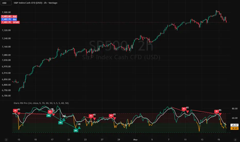
Elaris RSI Pro [Divergence]Elaris RSI Pro is a professional-grade RSI momentum and divergence indicator built for traders who want cleaner market structure signals, smarter divergence detection, and a more refined trading workflow.
The indicator combines a responsive RSI engine with advanced bullish and bearish divergence detection to help identify potential reversals, continuation setups, and momentum shifts across all market conditions.
Designed with a clean visual experience and optimized performance in mind, Elaris RSI Pro delivers clear signals without unnecessary chart clutter, making it suitable for scalpers, swing traders, and intraday traders alike.
Key Features:
• Regular Bullish & Bearish Divergence Detection
• Hidden Bullish & Bearish Divergence Detection
• Configurable Pivot Detection Engine
• Adjustable Minimum & Maximum Pivot Distance Filters
• Dynamic RSI Momentum Coloring
• Signal Smoothing with EMA Filter
• Overbought / Oversold Zone Visualization
• Optional Divergence Lines & Labels
• Optional Pivot Markers for Advanced Analysis
• Professional Alert Conditions
• Non-Repainting Confirmed Pivot Logic
• Optimized Object Management for Better Performance
Elaris RSI Pro is built using confirmed pivot logic, meaning divergence signals are generated only after pivot confirmation to reduce repainting behavior and improve signal reliability.
The indicator is highly customizable, allowing traders to adapt the sensitivity and visual behavior to different trading styles, markets, and timeframes.
Works well with:
• Market Structure Analysis
• Trend Following Systems
• Support & Resistance Trading
• Smart Money Concepts (SMC)
• Liquidity Sweep Confirmation
• Multi-Timeframe Confluence Strategies
Best used alongside proper risk management and confirmation tools.
Non-Repainting:
This indicator uses confirmed pivot-based calculations. Signals appear only after pivot confirmation and do not repaint historically after confirmation. Indicateur

Indicateur

AG Pro Displacement Quality Finder [AGPro Series]AG Pro Displacement Quality Finder
Overview / What It Does
AG Pro Displacement Quality Finder is designed to identify displacement candles that stand out for structural intent rather than simple size alone. Instead of highlighting every large bar on the chart, the script evaluates whether a candle shows the type of directional expansion that traders often associate with meaningful repricing. The goal is to help separate ordinary volatility from displacement events that may deserve closer attention.
The core logic focuses on the quality of the candle itself and the context immediately connected to it. A displacement candle can look impressive at first glance while still lacking the characteristics that make it useful in analysis. This script addresses that problem by combining body expansion measurements, marubozu-style pressure assessment, and optional volume confirmation into a single quality framework. The result is a more selective view of bullish and bearish displacement conditions.
Once a valid event is detected, the script does not stop at marking the candle. It also maps a follow-up reclaim zone derived from the displacement structure so the user can monitor whether price revisits, respects, or interacts with that area later. This creates a workflow that is not limited to signal spotting. It extends the idea into post-event tracking, which is often the more practical part of chart analysis.
The visual design is intended to keep the chart readable while still making the key information obvious. Displacement candles can be recolored, quality tags can classify stronger events, and reclaim zones can remain visible long enough to preserve market context. The panel summarizes the latest state and core ratios so the user can quickly understand why the most recent event qualified.
Unique Edge
The distinctive feature of this script is that it treats displacement as a quality problem, not just a range problem. Many tools mark large candles. This script tries to isolate higher-conviction expansion candles by checking whether the body is meaningfully large relative to ATR and average body size, whether the candle shows strong close-to-extreme behavior, and whether optional volume confirmation supports the move.
A second differentiator is the reclaim-zone workflow. Instead of placing a marker and ending the analysis there, the script projects a reclaim area from the detected displacement structure. That makes the tool useful both at the moment of expansion and in the bars that follow. Traders who study impulsive moves often care just as much about what happens after the expansion candle as they do about the candle itself.
The script also uses visual hierarchy to keep stronger and more relevant structures easier to read than older or lower-priority ones. This helps reduce the “everything matters equally” problem that often makes zone-based tools harder to use in practice.
Methodology
The script evaluates bullish and bearish displacement candidates using multiple filters that are designed to work together rather than as isolated checks. At the center of the model is body expansion. The candle body is compared against ATR and against an average-body baseline so that the script can judge whether a bar is unusually forceful for the instrument and timeframe being viewed.
A marubozu-proximity component is then used to assess directional cleanliness. In simple terms, the script looks for candles whose closing behavior suggests genuine directional pressure rather than a wide but indecisive bar. This helps reduce false positives from candles that are large in total range but weak in directional conviction.
An optional volume confirmation layer can be enabled for users who want displacement selection to include participation strength. This does not redefine the script into a volume indicator. It simply acts as an additional confirmation filter for users who prefer more selectivity.
When a displacement event qualifies, the script can recolor the candle and assign a quality tag. The quality tag reflects the combined strength of the measured conditions rather than a single-factor reading. The script then builds a reclaim zone tied to that displacement structure and extends it forward so later interaction can be monitored on the chart.
Signals & Alerts
The script is built around bullish and bearish displacement detection. When the selected conditions are met, the chart can display a quality tag and the displacement candle can be visually emphasized. Reclaim zones are then plotted so the user can follow the area after the impulse.
Bullish and bearish alerts can be used to notify the user when a qualified displacement event appears. These alerts are intended to identify the script’s filtered displacement conditions, not to predict the full future path of price. In practice, they are most useful as chart-review prompts or workflow triggers rather than as stand-alone trade instructions.
Key Inputs
Users can customize the strictness and presentation of the model through inputs such as:
- Body expansion sensitivity relative to ATR
- Body expansion sensitivity relative to average candle body
- Marubozu proximity threshold
- Optional volume confirmation
- Candle recoloring
- Quality tag visibility
- Reclaim zone visibility and extension length
- Panel font size
- Label font size
- General visual display preferences
These controls allow the script to be tuned for more aggressive discovery or more selective filtering depending on instrument behavior and timeframe.
Limitations & Transparency
This script does not claim to identify every important move, nor does it assume that every qualified displacement event will lead to continuation. Some valid expansion candles can fail quickly, while some useful moves may be excluded if the filters are set too strictly. That trade-off is part of any selective model.
Reclaim zones are analytical reference areas, not guarantees of support or resistance. Price may react, ignore the zone, briefly interact with it, or invalidate it entirely. The script is designed to visualize these areas in a structured way, but interpretation remains with the user.
Results can vary materially across assets, sessions, volatility regimes, and timeframes. Thresholds that work well on one instrument may be too loose or too strict on another. Users should expect to calibrate settings rather than assume one configuration is universally optimal.
As with most chart tools, visual density can increase if many qualifying events occur in the same region. The script includes hierarchy-oriented visual handling, but it is still best used with sensible chart context and reasonable parameter choices.
Risk Disclosure
This script is an analytical charting tool. It is not financial advice, not a promise of performance, and not a guarantee of future results. It does not know the user’s objectives, risk tolerance, execution quality, or portfolio constraints.
Displacement, momentum expansion, and reclaim behavior can all be useful concepts in market analysis, but none of them remove uncertainty. Users should apply their own process, risk controls, and independent judgment before acting on any chart observation generated by this script.
Indicateur

AG Pro Engulfing Candle Quality [AGPro Series]AG Pro Engulfing Candle Quality
Overview / What it does
AG Pro Engulfing Candle Quality is a price action overlay designed to detect bullish and bearish engulfing candles and then grade them through a structured quality framework instead of treating every engulfing event as equally important.
Rather than marking all engulfing candles with the same visual weight, this script evaluates whether the candle shows characteristics that may make the event more meaningful in context. The goal is to reduce low-value pattern noise and help the user focus on engulfing candles that display stronger internal structure and better surrounding conditions.
The script can color qualifying candles, display score labels directly on the chart, add optional background emphasis, and summarize recent signal state through an information panel. This makes it suitable for traders who want a cleaner way to review engulfing behavior without turning the chart into a generic pattern map.
In practical use, the script is not intended to predict direction on its own. It is designed as a filtering and chart-reading aid for users who already work with structure, liquidity, support/resistance, trend context, or discretionary execution rules.
Unique Edge
Many engulfing tools stop at pattern detection. This script takes a different approach by treating engulfing candles as a quality event rather than a binary event.
Its core difference is the scoring model. Each qualifying candle is evaluated through a multi-factor framework that can include relative volume behavior, body-to-range efficiency, prior directional context, engulf strength, and optional support/resistance proximity. This creates a 1-10 quality score that helps separate weaker engulfing events from stronger ones.
The result is a more selective workflow:
- detect the pattern,
- evaluate the candle quality,
- display only the events that meet the user’s threshold,
- and keep the chart focused on higher-interest formations.
This makes the script different from simple engulfing markers, basic candlestick libraries, or broad pattern collections. Its purpose is not to label everything. Its purpose is to rank and filter.
Methodology
The script identifies bullish and bearish engulfing conditions using configurable detection logic. Users can choose a stricter close-based interpretation or a broader wick-based interpretation depending on how selective they want the pattern engine to be.
Once an engulfing candle is detected, the script evaluates the event with a weighted quality framework. The conceptual components include:
1. Relative volume
The candle is compared against a moving average of volume. A candle that forms with stronger-than-normal participation can receive a higher quality contribution than one forming on ordinary or weak activity.
2. Body efficiency
The candle body is evaluated relative to the full range. A larger, more decisive body may indicate stronger commitment than a candle with excessive wick noise and a relatively small real body.
3. Prior directional context
The script reviews recent directional pressure over a user-defined lookback window. This helps distinguish engulfing candles that appear after a more meaningful opposing move from those that form in flatter or less informative conditions.
4. Engulf strength
The script can incorporate how convincingly the current candle overtakes the prior candle structure, adding another layer beyond simple pattern recognition.
5. Optional support/resistance proximity
Users can enable an additional contextual bonus when the engulfing event forms near pivot-derived support or resistance areas.
These components are normalized into a score from 1 to 10. The score is then used for chart display, filtering, and alerts. This means the script is not simply asking whether an engulfing candle exists. It is asking whether the engulfing candle appears to have enough internal and contextual quality to deserve attention.
Signals & Alerts
The script can display:
- bullish engulfing events,
- bearish engulfing events,
- candle coloring for qualified signals,
- optional score labels,
- optional background highlights,
- and a chart panel summarizing recent signal state.
Alerts are deterministic and based on confirmed rule conditions inside the script. Users can create alerts for:
- bullish engulfing events,
- bearish engulfing events,
- high-quality bullish engulfing events,
- high-quality bearish engulfing events,
- or any engulfing event that meets the selected minimum score threshold.
As with any chart tool, users should understand that alerts reflect the script’s rules, not an outcome guarantee. An alert means the selected condition has been satisfied according to the methodology. It does not imply that the next market move will be favorable.
Key Inputs
The script includes several controls so users can adapt the tool to different symbols and timeframes.
Important inputs include:
- minimum score required for display,
- label cooldown to reduce visual clustering,
- trend-strength lookback,
- strict close-based or broader wick-based engulf logic,
- bullish and bearish visibility toggles,
- optional support/resistance bonus,
- support/resistance pivot length,
- ATR-based proximity setting,
- scoring weights for volume, body efficiency, trend context, and engulf strength,
- volume average threshold,
- body/range threshold,
- color controls for bullish, bearish, and score states,
- label size,
- background highlight toggle,
- candle-coloring toggle,
- score label visibility,
- panel visibility, position, font size, and theme,
- and minimum score required for alerts.
These inputs allow the user to keep the script conservative and selective, or make it more permissive when reviewing more active charts.
Limitations & Transparency
This script is a rule-based visual analysis tool. It does not know future price action, and it does not confirm trade quality on its own.
Several points are important:
- An engulfing candle is still a local pattern. It can fail, especially in noisy or low-liquidity environments.
- Strong scores do not guarantee continuation or reversal.
- The support/resistance context is approximate and derived from pivot logic, not from a universal market map.
- Volume behavior can vary across markets and data feeds.
- Different timeframes can produce very different signal density and quality distribution.
- The script is designed for confirmation and filtering, not for fully automated decision-making.
Users should treat the score as a structured quality estimate, not as a promise. In many workflows, the script is most useful when combined with broader context such as market structure, trend bias, higher-timeframe levels, session behavior, or risk management rules.
Risk Disclosure
This script is provided for chart analysis and educational use. It is not financial advice, not an execution system, and not a guarantee of performance.
All trading and investing involve risk. Market conditions can change quickly, and any pattern, score, or alert can fail. Users are responsible for their own analysis, entries, exits, and risk controls.
Use the script as a decision-support tool, not as a substitute for judgment.
Indicateur

AG Pro Relative Volume Pressure Map [AGPro Series]AG Pro Relative Volume Pressure Map
Overview / What it does
AG Pro Relative Volume Pressure Map is designed to evaluate whether relative volume is translating into efficient bullish pressure, efficient bearish pressure, inefficient two-way absorption, or possible climax behavior.
Instead of treating relative volume as a standalone “high volume” condition, this script maps how that volume is interacting with candle structure, close location, wick behavior, and short-term pressure efficiency. The result is a rules-based pressure framework built to help organize active price-volume interaction directly on the chart.
This script is not built as a basic RVOL meter, a generic volume spike detector, or a standalone entry engine. Its purpose is to classify whether elevated relative volume is being accepted as directional pressure, being absorbed into unstable churn, or appearing late enough to justify caution.
The visual design is intentionally chart-facing. Pressure events, backdrop zones, memory trails, and the summary panel are meant to help traders read whether volume is supporting directional intent or fading into friction. It is a decision-support map, not a prediction model.
Unique Edge
The main difference of this script is simple:
It does not ask only whether volume is above average.
It asks whether above-average volume is producing usable directional pressure.
That distinction matters.
Many relative volume tools stop at “volume is elevated.” This script goes further and evaluates whether that elevated participation is accompanied by efficient body structure, strong close positioning, limited opposing wick pressure, and acceptable short-horizon follow-through context. In other words, it attempts to separate meaningful pressure from noisy activity.
This also makes the script materially different from several other AG Pro tools:
- It is not a Volume Profile framework. It does not map acceptance, rejection, POC interaction, or value-area structure.
- It is not a VWMA extension tool. It does not measure dislocation from a volume-weighted moving anchor.
- It is not a money-flow proxy. It does not attempt to infer broader accumulation or distribution from flow-style formulas.
- It is not a breakout-quality map. It does not judge level breaks, retests, or structural invalidation around support/resistance rails.
- It is not a trend regime meter. It focuses on active pressure quality around current bars rather than broad market-state classification.
Its niche inside the AG Pro lineup is more specific:
AG Pro Relative Volume Pressure Map focuses on whether current relative volume is being converted into directional pressure efficiently, inefficiently, or excessively.
Methodology
The script starts with relative volume. Current volume is compared against its recent average so the tool can determine whether participation is dry, normal, elevated, or extreme.
From there, the script evaluates how price is behaving inside the same bar:
- Body efficiency: how much of the total range is being expressed through the real body.
- Close location: whether the bar is closing with directional conviction or fading into the middle of its range.
- Opposing wick pressure: whether the active side is being challenged by rejection.
- Stretch versus ATR: whether the move is becoming extended relative to recent volatility.
- Optional one-bar follow-through filter: whether short-horizon continuation is present when pressure is classified.
These components are combined into a pressure logic model that classifies price-volume behavior into five chart states:
1. Bull Pressure
Elevated relative volume is aligned with an efficient bullish body, strong close placement, limited upper-wick resistance, and acceptable follow-through context.
2. Bear Pressure
Elevated relative volume is aligned with an efficient bearish body, strong close placement, limited lower-wick resistance, and acceptable follow-through context.
3. Absorption
Relative volume is elevated, but directional efficiency is weak, conflicted, or unstable. This often reflects churn, friction, or two-way participation where raw activity does not cleanly convert into directional pressure.
4. Climax Risk
Relative volume is extreme and the bar is stretched enough to justify caution. The script uses this state to identify situations where pressure may be arriving in a late or inefficient form rather than in a fresh, clean expansion phase.
5. Passive
No major pressure condition is active. Participation is comparatively dry, mixed, or below the threshold required for the more expressive states above.
States / Alerts
This script is organized around states rather than trade commands.
Available state logic includes:
- Bull Pressure
- Bear Pressure
- Absorption
- Climax Risk
- Pressure State Change
These alerts are intended to reflect changes in price-volume character, not guaranteed opportunity. They can be used as workflow events, review prompts, or contextual filters inside a broader chart process.
The panel summarizes the active environment through fields such as:
- RVOL state
- Current pressure state
- Pressure side
- Quality
- Strength
- Efficiency
- Absorption risk and short-horizon bias
The chart layer complements this with event labels, backdrop zones, and pressure memory trails so the user can see not only what state is active now, but how recent pressure has evolved across the visible structure.
Why this is different from the other AG Pro scripts
AG Pro Relative Volume Pressure Map was intentionally designed to avoid overlap with the existing AG Pro publication line.
Where some AG Pro tools are built around breakout structure, moving-average displacement, equilibrium logic, profile interaction, or directional survival around a specific technical framework, this script stays centered on one narrower question:
Is current relative volume producing efficient pressure, inefficient absorption, or late-stage risk?
That makes it different in both concept and use case.
For example:
- A breakout-quality tool is asking whether a level event is structurally convincing.
- A profile-based tool is asking whether price is accepting or rejecting volume-defined areas.
- A reclaim/dislocation tool is asking whether price is stretching away from or reclaiming a known reference.
- This script is asking whether participation itself is translating into directional pressure cleanly enough to matter.
So even when the chart user applies multiple AG Pro tools together, this one is not meant to duplicate them. It fills a different layer of analysis: active pressure efficiency around relative volume.
Key Inputs
Relative Volume Length
Controls the lookback used to normalize current volume versus its recent baseline.
ATR Length
Used for stretch evaluation and several visual placement rules.
Pressure Smoothing
Smooths the relative volume component to reduce one-bar noise.
Use 1-Bar Follow-Through Filter
Adds a simple continuation requirement so pressure states can be made more selective.
Elevated RVOL Threshold
Defines the point at which participation becomes meaningfully above normal.
Extreme RVOL Threshold
Defines the threshold used for more exceptional activity and climax-style conditions.
Minimum Body Efficiency
Controls how much real-body participation is required before a pressure bar is considered efficient.
Strong Close Location
Controls how strongly price must close toward the active side of the range.
Opposing Wick Ceiling
Limits how much opposing rejection can be present before directional pressure quality degrades.
Climax Stretch vs ATR
Controls how extended a bar must be, relative to ATR, before the script considers late-stage risk more seriously.
Visual controls are also included for panel visibility, panel theme, panel font size, label density, candle coloring, backdrop display, and pressure-trail presentation.
Limitations & Transparency
This script does not predict future direction.
It does not identify hidden order flow.
It does not classify fundamental volume intent.
It does not replace execution rules, risk management, or higher-timeframe context.
Relative volume can expand for many reasons, and elevated participation does not guarantee continuation. In the same way, absorption or climax-style behavior can persist longer than expected before price resolves clearly.
All state classifications in this tool are rules-based interpretations of chart behavior. They are useful as structured context, but they are still abstractions built from price and volume features. Users should expect false positives, missed events, and market-specific variation depending on volatility regime, instrument behavior, and timeframe selection.
This script should be treated as an analytical overlay. It is designed to improve chart organization and pressure reading, not to promise outcomes.
Risk Disclosure
This script is provided for educational and informational purposes only.
It is not financial advice, not investment advice, and not a solicitation to buy or sell any instrument.
Trading and investing involve risk. Losses can exceed expectations, especially in volatile markets. Any decision made using this script should be confirmed with independent analysis, sound risk controls, and a workflow appropriate to the user’s own objectives and experience.
This tool is best used as one layer inside a broader decision process, not as a standalone reason to enter, exit, or size a position.
Indicateur

Bullish-Bearish Candle PowerBullish Bearish Candle Power
What Does This Code Do For You?
Saves you from the hassle of constantly scanning for candlestick patterns on the screen.
Measures whether price action is supported by volume.
Provides an emotion-free, mathematical momentum report.
Part 1: Measuring the Candle Anatomy
The code breaks down every new candlestick into precise components:
Candle Range: The difference between the highest and lowest price.
Body Size: The net difference between the open and close price.
Wicks (Upper and Lower): Shows how much the price was rejected at the top and bottom.
Part 2: Pattern Recognition Engine
This is the smartest part of the code. It automatically scans for popular technical analysis candlestick patterns. If a candle meets the rules, it awards Bonus Points to that direction's strength.
Bullish (Uptrend) Patterns and Criteria:
Hammer: Long lower wick, short upper wick (Buyers bought the dip). +25 points.
Bullish Engulfing: The green candle's body is larger than the previous red candle's body. +30 points.
Bullish Marubozu: A solid green candle with almost no wicks. +35 points.
Morning Star, Tweezer Bottom, Harami: Other classic reversal patterns.
Bearish (Downtrend) Patterns and Criteria:
Shooting Star: Long upper wick, short lower wick (Sellers hit from the top). +25 points.
Bearish Engulfing: The red body engulfs the previous green body. +30 points.
Bearish Marubozu: A solid, full red candle. +35 points.
Evening Star, Tweezer Top, Hanging Man: Classic bearish reversal patterns.
Part 3: Volume Confirmation
Low-volume rallies are usually traps. To solve this, the code divides the current candle's volume by the volume average of the last 20 candles (SMA). If the volume is above the average, the power is multiplied; if it is below, it reduces the score.
Part 4: Final Strength Calculation
The code aggregates all this data (Position in the candle + Volume + Bonus Points) and creates two pools: Raw Bullish Power and Raw Bearish Power. It then converts them into percentages:
Bullish Percentage = (Bullish Score / Total Score) * 100
For example, at the end of the calculation, the system tells you: "There is 80% Buying and 20% Selling pressure on this candle."
Part 5: Visualization, Tables, and Alerts
It displays the results on your screen for easy reading:
Sub-chart Lines: Draws dynamic Green and Red lines to show instantly who is in control.
Top-Right Table: Shows the real-time percentage status of the candle and the detected pattern name (e.g., Hammer).
Background Colors and Alerts: If either side exceeds a threshold you set in the settings (for example 75%), it paints the background of the screen and sends an automatic alert to your phone or computer.
GOOD LUCK!
Author:Rmzn4406 Indicateur

AG Pro OBV Pressure Divergence [AGPro Series]AG Pro OBV Pressure Divergence
Overview
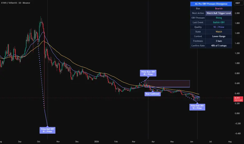
AG Pro OBV Pressure Divergence is a context-aware divergence quality map built around the relationship between price structure and On-Balance Volume pressure.
The script is designed to identify bullish and bearish divergence events, then rank those events by participation quality, structural context, and follow-through behavior. Instead of treating every divergence as equally important, it separates weaker pressure disagreements from more meaningful setups and organizes them into a cleaner decision framework.
This is not a generic divergence marker that prints every local mismatch between price and an underlying series. Its purpose is to classify divergence events through a layered process that includes pivot structure, price displacement, OBV behavior, trend context, confirmation timing, and visual emphasis.
The result is a tool that can be used to study when price and participation begin to disagree, while still preserving a practical chart view that remains readable during live market conditions.
What this script does
- Detects bullish divergence when price forms a lower low while OBV forms a higher low
- Detects bearish divergence when price forms a higher high while OBV forms a lower high
- Filters divergence candidates using pivot separation and ATR-based price swing requirements
- Scores events by quality instead of treating all signals the same
- Highlights the strongest events with more prominent chart objects
- Tracks confirmation and invalidation behavior after the initial event
- Displays a compact summary panel for state, pressure, context, and freshness
Unique Edge
Many divergence tools stop at basic detection. They show a disagreement between price and an oscillator or cumulative volume series and leave the rest to the user.
This script takes a different approach.
Its goal is not to maximize the number of divergence labels on the chart. Its goal is to classify divergence quality.
That difference matters. A simple divergence can appear in noisy conditions, in weak structural locations, or without any meaningful follow-through. In those cases, the event may still be technically valid, but not equally useful from an analytical point of view.
AG Pro OBV Pressure Divergence attempts to address that by combining several layers:
1. Structural divergence detection
2. ATR-normalized price displacement filtering
3. OBV pressure comparison between pivots
4. Local trend context using fast and slow EMA structure
5. Setup monitoring through confirmation and invalidation logic
6. Visual hierarchy that distinguishes lower-quality from higher-quality events
Because of this design, the script is better understood as a divergence classification framework rather than a simple divergence marker.
It is also distinct from breakout, reclaim, or trend continuation tools. It does not evaluate break-retest mechanics, VWAP reclaim logic, or general trend strength as its primary objective. Its focus is the quality of price-versus-participation disagreement.
Methodology
The script begins by identifying swing pivots through a configurable pivot length. These pivots form the structural anchor points used to compare price and OBV behavior.
For bullish divergence:
- price must form a lower low
- OBV must form a higher low
For bearish divergence:
- price must form a higher high
- OBV must form a lower high
After a raw divergence is found, the script applies additional requirements before the event is accepted:
Pivot Separation
A minimum bar gap is enforced between pivots so that tightly packed micro-swings do not dominate the output.
Minimum Price Swing
The distance between the two relevant pivots is measured relative to ATR. This prevents very small structural changes from being treated like full-quality events.
Pressure Evaluation
The OBV relationship between the two pivots is examined to determine whether participation is actually improving or weakening in a meaningful way.
Trend Context
Fast and slow EMA structure is used to frame whether the event is appearing against or within the prevailing price environment.
Contextual Location
The script also evaluates where the event is occurring in its local range structure. This helps separate mid-range noise from more interesting reversal or exhaustion locations.
Scoring
All of the above components contribute to a quality score. That score is then used to separate lower-priority events from stronger ones.
Confirmation
After the initial event, the script tracks a confirmation window. During that window, the setup may confirm, remain pending, expire, or become invalidated.
This layered structure is intentional. The script does not assume that a divergence label alone is enough.
Signal Structure
The script organizes events into a sequence instead of a single binary output.
Event Detected
A new bullish or bearish divergence is found and scored.
Pending State
The event remains active while the script monitors whether follow-through appears within the confirmation window.
Confirmed
If the confirmation condition is met within the allowed window, the event is marked as confirmed.
Invalidated
If price fails the setup before confirmation, the event is marked as invalidated.
Expired
If no confirmation occurs within the defined number of bars, the setup is no longer treated as active.
This state-based behavior is useful because it prevents the chart from presenting all divergence events as finalized conclusions the moment they appear.
Quality Model
The script uses a quality threshold and a premium threshold to distinguish event strength.
Lower-quality events can still be displayed when the user wants a fuller map of all structure, but the script can also be configured to focus only on stronger setups.
This creates three practical layers of interpretation:
Building
A divergence exists, but the score is lower and the event should be treated with more caution.
High
The event passes the main quality threshold and receives stronger visual treatment.
Premium
The event exceeds the premium threshold and receives the strongest category treatment in the script.
This does not mean that premium events are guarantees, and it does not imply that lower-quality events are unusable. It simply reflects that not every divergence deserves the same level of attention.
Panel Summary
The summary panel is intended to give quick context without forcing the user to inspect every label one by one.
The panel includes:
- Bias
A simple view of the current directional background based on the fast and slow EMA relationship.
- Pressure
A quick summary of whether OBV pressure is rising, falling, or mixed.
- Last Event
Shows the most recent detected divergence direction.
- Quality
Displays the score and current classification of the most recent event.
- State
Shows whether the most recent tracked setup is in watch, confirmed, invalidated, or idle state.
- Context
Provides a compact view of the local environment, such as trend-up, trend-down, or range-related placement.
- Freshness
Indicates how many bars have passed since the latest tracked event.
Visual Design
The chart output is intentionally organized with hierarchy.
Qualified events are easier to spot than weaker ones.
Confirmation labels are visually distinct from initial event labels.
Link lines help explain which two pivots created the divergence.
Optional background pulse and active setup zone provide temporary emphasis without permanently dominating the chart.
EMA context remains available but is visually secondary to the divergence structure.
Tooltips are included for key settings so that the logic behind the inputs remains understandable directly from the settings panel.
Signals and Alerts
The script includes alert conditions for the main state transitions:
- New Bullish Pressure Divergence
- New Bearish Pressure Divergence
- Premium Bullish Pressure Divergence
- Premium Bearish Pressure Divergence
- Bullish Pressure Divergence Confirmed
- Bearish Pressure Divergence Confirmed
- Pressure Divergence Invalidated
These alerts are designed to reflect internal script states rather than making claims about future price outcomes.
Key Inputs
Pivot Length
Controls how swings are defined. Higher values reduce noise but may delay detection.
OBV Smoothing
Smooths the OBV series before divergence analysis. Higher values create a cleaner but slower pressure curve.
Minimum Pivot Separation
Prevents overly compressed pivots from producing excessive clustering.
Minimum Price Swing (ATR)
Requires meaningful structural movement before a divergence is accepted.
Quality Threshold
Defines the minimum score required for a divergence to be treated as a qualified event.
Premium Threshold
Defines the score level required for premium classification.
Confirmation Window (Bars)
Controls how long a pending event is monitored before it expires.
Use Close-Based Confirmation
Switches confirmation logic between close-based behavior and intrabar high/low behavior.
Main Label Size
Scales event, confirmation, and invalidation labels.
Panel Text Size
Controls panel readability independently from chart labels.
Drawing Emphasis
Adjusts how visually prominent lines, EMA context, and active zone objects appear on the chart.
How to use it
This script is best approached as a context tool, not as a stand-alone decision engine.
A practical workflow may look like this:
1. Identify whether the panel context is aligned with a broad directional background or whether the market is behaving more like a range.
2. Observe whether a new divergence appears in a meaningful local location rather than in the middle of random price noise.
3. Compare the quality score and classification.
4. Watch whether the event confirms or invalidates within the chosen time window.
5. Combine the information with your own structure, risk, and execution framework.
The script is often more informative when used to reduce attention on weaker disagreements and concentrate on better-formed pressure divergences.
Who it may be useful for
This script may be useful for users who want:
- a more structured way to study price and OBV disagreement
- a cleaner divergence map with stronger visual hierarchy
- a chart that distinguishes raw detection from confirmed follow-through
- a volume-pressure oriented lens that is different from standard oscillator-only divergence tools
It may be less suitable for users who want a high-frequency signal stream, a one-click entry engine, or a tool that treats every local divergence as equally relevant.
Limitations and Transparency
This script has important limitations.
First, divergence is an analytical concept, not a guaranteed turning-point mechanism. A divergence can appear and still fail, extend, or resolve slowly.
Second, the scoring model is a ranking method, not a prediction formula. A higher score does not mean certainty. It only means that the event better satisfies the script's internal conditions.
Third, pivot-based logic requires structure to form. This means the script necessarily depends on completed swing information and will not behave like a forward-only projection model.
Fourth, confirmation and invalidation logic are simplifications intended to organize event follow-through. They do not replace full trade management, execution rules, or independent risk control.
Fifth, any indicator that uses volume-derived inputs depends on the characteristics of the underlying market data. Users should be aware that data quality and market structure can differ across symbols and venues.
This script is therefore best used as a contextual classification tool rather than a complete standalone methodology.
What this script is not
- It is not a guarantee of reversals.
- It is not a promise engine.
- It is not a fully automated trading system.
- It is not a substitute for independent structure analysis or risk management.
- It is not designed to predict every local top or bottom.
- It is not intended to imply that premium signals are always superior in every market condition.
Its purpose is narrower and more practical:
to organize OBV-based divergence events into a more useful analytical framework.
Risk Disclosure
This script is for chart analysis and research purposes only.
It does not provide financial advice, investment advice, portfolio advice, or a guarantee of future market behavior. Market conditions can change quickly, and any signal or classification generated by the script can fail or become invalid.
Users should make independent decisions and apply their own risk controls before acting on any chart output.
In summary
AG Pro OBV Pressure Divergence is a public, chart-based tool for analyzing divergence quality through the interaction of price structure and OBV pressure.
Its main contribution is not that it detects divergence, but that it attempts to rank divergence events by structural relevance, pressure context, and follow-through state.
For users who want a cleaner way to study whether price and participation are beginning to disagree, this script aims to provide a more selective and better-organized framework than a raw all-events divergence marker.
Indicateur

AG Pro RSI Pressure Map [AGPro Series]AG Pro RSI Pressure Map
OVERVIEW
AG Pro RSI Pressure Map is an overlay indicator that interprets RSI behavior as directional pressure on price rather than presenting RSI as a standalone oscillator panel. The script maps bullish and bearish pressure conditions directly on the chart, highlights confirmed pressure builds, and separates those states from release conditions and internal weakening.
The goal is not to repeat standard RSI threshold usage such as simple overbought/oversold signals. Instead, this script translates RSI persistence, slope, trend alignment, and price response efficiency into a chart-based pressure model. The result is a structure-aware visual framework that helps users evaluate whether momentum is building, fading, or attempting to reassert itself.
This tool is designed for traders who prefer price-chart context over isolated oscillator readings. By keeping the logic on the main chart, it becomes easier to observe how directional pressure develops around swings, pullbacks, transitions, and continuation attempts.
UNIQUE EDGE
The distinctive idea behind this script is that RSI is not treated here as a one-line trigger engine. Instead, RSI is used as a pressure input inside a multi-step state model. A bullish or bearish condition is not activated by a single threshold alone. It requires a combination of persistence, slope, trend-side alignment, and minimum response quality.
That makes this script structurally different from conventional RSI overlays or threshold markers. It does not simply mark every move above or below a level. It attempts to identify whether price is actually behaving like a pressure phase, whether that phase lasts long enough to matter, and whether the move later transitions into a release or a weakening sequence.
Another important distinction is the use of zone persistence and signal spacing. Short-lived fluctuations are filtered by minimum zone duration, paint delay, cooldown spacing, and failure-lock logic. This helps reduce repetitive chart clutter and keeps the output more focused on pressure phases that remain contextually relevant for more than a single bar.
WHAT THE SCRIPT DOES
This indicator classifies chart behavior into a small number of practical states:
- Bullish Pressure
- Bearish Pressure
- Bullish Release
- Bearish Release
- Pressure Failure
- No Active Zone
Pressure zones are displayed as soft background states once a valid zone remains active long enough to pass the paint delay requirement. Signal markers and optional labels identify important transitions, including new pressure builds and release conditions. A panel summarizes the current state so users can quickly read the broader condition without scanning every marker.
The script is intended to help with context and organization. It is not limited to trend continuation use only. It can also help identify when an apparent move is weakening internally or when a previous stretch phase may be transitioning into a more constructive re-engagement.
METHODOLOGY
The script combines several components into a single state engine:
1. RSI baseline calculation
RSI is calculated from user-defined length and can optionally be smoothed. This creates the base momentum input for the pressure model.
2. RSI slope and persistence
The script evaluates whether RSI is rising or falling, and whether that direction persists across a configurable lookback window. This helps distinguish stable directional pressure from one-bar fluctuation.
3. Trend alignment
Price is compared against a trend EMA so the script can evaluate whether a pressure condition is aligned with the prevailing side of the market. This reduces cases where RSI alone may look strong while price structure remains inconsistent.
4. Price response efficiency
The model checks whether recent price movement is meaningful relative to ATR. This is used to filter low-quality pressure states where RSI movement exists but price response is weak.
5. Zone state logic
A bullish or bearish pressure state is only activated when the required conditions are present and remains active until exit logic invalidates it. Minimum zone duration and flat cooldown logic are used to reduce rapid state flipping.
6. Release logic
Release conditions are derived from pressure transitions that also satisfy contextual requirements such as recent stretch history and price-side confirmation. This is meant to make release signals more selective than ordinary threshold crosses.
7. Failure logic
The script can detect internal weakening inside an active zone when slope deteriorates and response quality drops. Failure-lock behavior is used to avoid excessive repetition inside the same pressure phase.
Because the model works through a state engine rather than isolated threshold events, the output is better understood as a pressure map than as a classical oscillator trigger set.
SIGNALS AND ALERTS
The script provides the following event types:
- Bullish Pressure Build
- Bearish Pressure Build
- Bullish Release Confirmed
- Bearish Release Confirmed
- Pressure Failure
These alerts are meant to notify users about state transitions, not to replace trade planning or execution rules. A pressure build does not automatically imply continuation. A release does not guarantee reversal or acceleration. A failure does not guarantee collapse. Each event is best interpreted in the context of structure, liquidity, volatility, and timeframe.
KEY INPUTS
RSI Length
Controls the base RSI period.
RSI Smoothing
Applies optional smoothing to RSI before state evaluation.
Trend EMA Length
Defines the trend alignment reference.
Persistence Lookback / Minimum Persistence Count
Control how stable RSI direction must be before a pressure state becomes valid.
Bull Entry RSI / Bear Entry RSI
Set the activation thresholds for bullish and bearish pressure.
Bull Exit RSI / Bear Exit RSI
Define when active pressure zones can terminate.
Minimum Push Efficiency
Filters low-quality states where RSI movement is not supported by sufficient price response.
Release Lookback
Controls how far back the script checks for recent stretch context before validating release behavior.
Minimum Zone Bars / Flat Cooldown Bars
Reduce rapid flip behavior and help pressure zones remain more stable.
Zone Paint Delay
Prevents immediate background painting on very early bars of a new zone.
Build Label Offset / Release Label Offset / Failure Label Offset
Allow spacing between labels and candles for cleaner presentation.
Build Label Minimum Gap Bars / Release Label Minimum Gap Bars
Reduce repeated labels on the same side and improve chart readability.
HOW TO READ IT
A bullish pressure zone means the script currently sees persistent bullish-side momentum that remains aligned with trend-side conditions and minimum response requirements. A bearish pressure zone means the same on the downside.
A bullish release is not simply “bullish RSI.” It represents a more selective re-engagement condition built on prior context. The bearish release follows the same idea in reverse.
A pressure failure suggests that the active zone may be weakening internally. This is not a standalone reversal call. It is a cautionary state that says the current pressure phase is losing quality.
The panel should be read as a summary layer:
- RSI State shows the active state classification
- Pressure Bias shows the normalized directional bias
- Stretch Status shows whether RSI is in an extreme region
- Structure Align shows whether price and RSI are aligned
- Signal State shows the latest meaningful state event
LIMITATIONS AND TRANSPARENCY
This script is not a prediction engine and should not be interpreted as one. It is a state-classification tool built from RSI behavior, EMA alignment, ATR-normalized response, and rule-based persistence logic.
Like all chart tools, it is sensitive to timeframe selection, volatility regime, and market structure. A setting combination that feels appropriate on one symbol or timeframe may be too loose or too strict on another.
The script also does not solve broader market context. It does not evaluate macro conditions, volume profile, order flow, news, or execution quality. Users should treat it as a chart-organization tool, not as a complete trading framework.
The output is intentionally selective, but any filter system involves trade-offs. More filtering may reduce noise while also delaying some transitions. Less filtering may make the script more responsive while increasing signal density.
This indicator should be used as a supporting layer for chart reading, not as a substitute for risk management, independent analysis, or confirmation from the user’s own process.
WHAT THIS SCRIPT IS NOT
- Not a basic RSI overbought/oversold marker set
- Not a simple RSI 50-line crossover script
- Not a buy/sell guarantee system
- Not a replacement for execution rules
- Not a full strategy with entries, exits, and sizing logic
It is a rule-based pressure mapping tool designed to help visualize directional momentum states on price.
RISK DISCLOSURE
This indicator is for analysis and chart interpretation only. It does not provide financial advice, investment advice, or guaranteed outcomes. All trading involves risk, including the risk of loss. Users should test settings, validate behavior on their own markets and timeframes, and make independent decisions based on their own methodology and risk tolerance. Indicateur

Indicateur
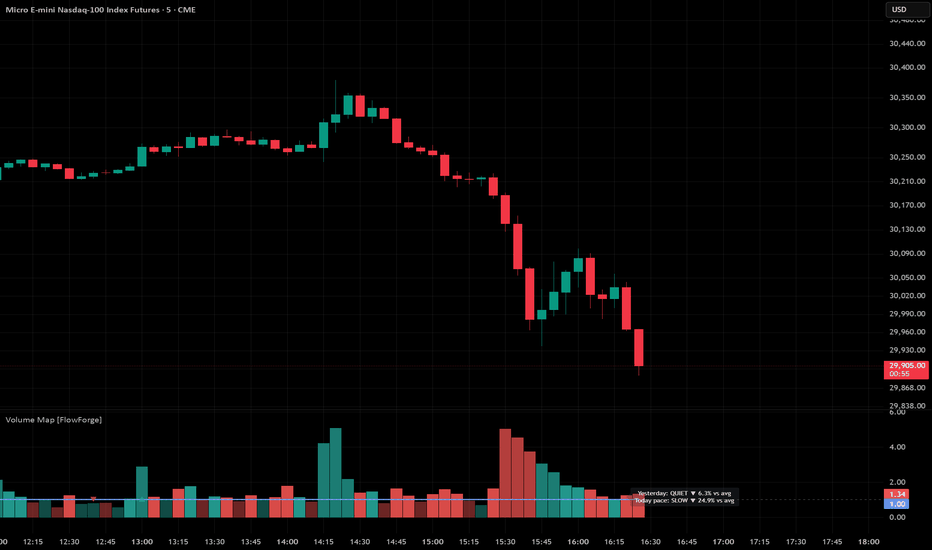
MTF CISD Trade System + Alerts🔹 Introduction
This indicator, MTF CISD Trade System + Alerts, identifies high-probability trade entries by detecting Change in State of Delivery (CISD) events across up to six user-defined timeframes simultaneously, and only triggering an entry signal when every enabled timeframe agrees on directional bias — confirmed by a matching CISD on the chart's own timeframe.
The core idea is this: when the market's delivery mechanism — the way price is being distributed or accumulated by institutional participants — shifts in the same direction across multiple timeframes at once, that convergence is meaningful. A single timeframe CISD is noise. Six timeframes aligning and then confirming on your entry timeframe is a structurally significant event.
No model of institutional order flow or delivery state is perfect. CISD is a proxy — a price-action-based inference about intent, not direct visibility into the order book. I'll address this limitation honestly throughout.
🔹 The Premise
🔸 What is "Delivery"?
Markets don't move randomly. Price is delivered from one level to another by participants with directional intent. When a large participant — a bank, fund, or algorithm with size — wants to accumulate a long position, they need sellers. When they want to distribute, they need buyers. The process of filling that intent leaves observable footprints in price structure.
Delivery state refers to the current directional intent baked into recent price action. Is the market delivering price upward — making higher closes, respecting higher opens, absorbing sell-side resistance? Or is it delivering downward — closing below opens, treating prior bullish structure as supply?
The key insight is that delivery doesn't change instantaneously. It tends to persist. A market that has been delivering bullishly for the past several candles is more likely to continue doing so than to suddenly reverse — until it shows you structural evidence of a state change.
That evidence is what CISD captures.
🔸 The Mechanics of a CISD
Consider a concrete example. Assume price has been in a bearish delivery phase. The most recent non-inside bearish candle closed at $99 with an open of $101. That open — $101 — becomes a bull target: a structural level that, if reclaimed on a close, suggests the market is no longer delivering bearishly.
Now assume price trades sideways for a few candles and then a candle closes at $102. The prior close was at $100, meaning price was below $101 going into this candle and has now closed above it. That crossover — price transitioning through the open of a prior bearish candle — is a Bullish CISD.
Why does the open matter and not, say, the high or the body midpoint? Because the open of a directional candle represents where price started before commitment was expressed. Reclaiming it suggests that commitment is being challenged at the source. It's the most structurally defensible level to use without access to actual order book data.
The inverse applies for Bearish CISD: the open of the last non-inside bullish candle becomes a bear target, and a close below it — crossing from above — signals a shift toward bearish delivery.
Inside candles are excluded. A candle whose high is lower than the prior high and whose low is higher than the prior low is an inside candle — it expresses no directional commitment of its own. Using it to set a target would contaminate the signal with indecision. The indicator skips inside candles entirely when updating targets.
🔸 Why Multiple Timeframes?
A single CISD on a 5-minute chart happens dozens of times per session. Most are meaningless. They represent micro-fluctuations in a market that is, at higher timeframes, still clearly trending in the opposite direction.
The core challenge in intraday trading is timeframe alignment: you want to be trading with the higher timeframe bias, not against it. A bullish 5-minute CISD during a bearish hourly, daily, and weekly structure is a counter-trend scalp at best, a trap at worst.
Lo and MacKinlay (1988) documented that returns at different frequencies are not independent — price structure at higher timeframes significantly conditions the distribution of outcomes at lower timeframes. This is the academic underpinning of what traders know empirically: trade with the higher timeframe, not against it.
When the Weekly, Daily, H4, H1, M15, and M5 have all individually confirmed a bullish CISD — meaning delivery has demonstrably shifted to bullish on every relevant timeframe — the probability that a long entry will find follow-through is structurally higher than any single-timeframe setup could provide.
Six-timeframe alignment is rare. That rarity is the filter.
🔸 The Confirmation Gate — Why Not Enter Immediately on Alignment?
This is a subtle but critical design decision, and one that separates this system from a naive multi-timeframe crossover.
When a higher timeframe — say, the hourly — registers its CISD and becomes the final piece needed for full bearish alignment, the current 5-minute candle might already have a bullish CISD baked into it. That candle existed before the alignment completed. It's not a response to bearish alignment — it's a relic of the prior bullish structure.
Entering short on that candle would be entering against the very confirmation you're requiring. You'd be using a bullish local signal as a short entry trigger simply because the timing happened to coincide with a higher timeframe shift.
The indicator solves this with a pending state. The moment full alignment is achieved, the system arms a directional pending flag and waits. It does not enter. It listens. The entry only fires when the next local CISD — the one that occurs after alignment is confirmed — appears in the correct direction. A bearish pending state requires a new bearish CISD on the chart timeframe. A bullish pending state requires a new bullish CISD.
The entry is always a fresh confirmation, never a recycled one.
🔹 How It Works
🔸 CISD Detection Engine
The indicator runs an identical CISD detection function on every timeframe, including the local chart timeframe and all six user-selected higher timeframes via request.security. For each timeframe, it maintains two levels:
Bull target — the open of the most recent non-inside bearish candle
Bear target — the open of the most recent non-inside bullish candle
A Bullish CISD fires when the prior close was at or below the bull target and the current close is above it. A Bearish CISD fires when the prior close was at or above the bear target and the current close is below it.
State updates — the "Last CISD" label in the table — only occur on confirmed (closed) bars. This prevents the state from flickering during the formation of a live candle. What you see in the table reflects the last completed directional shift, not a mid-bar reading.
Small green triangles below bars mark Bullish CISD events on the chart timeframe. Small red triangles above bars mark Bearish CISD events. These are visual anchors showing you where delivery shifts are occurring locally — independently of whether alignment is achieved.
🔸 Multi-Timeframe Alignment Table
In the top-right corner, a compact table displays the current CISD state for each of the six configured timeframes.
Green (Bullish) — that timeframe's last confirmed CISD was bullish
Red (Bearish) — that timeframe's last confirmed CISD was bearish
Gray (Neutral) — insufficient history or no CISD has fired yet
Full alignment — all enabled timeframes showing the same state — triggers a green or red background on the chart. This background is persistent: it stays active for the entire duration that alignment holds, giving you a continuous visual context for the trade environment.
Individual timeframes can be enabled or disabled. Disabling a timeframe removes it from the alignment calculation entirely — it doesn't count for or against alignment. This lets you configure the system for your specific trading style, whether that's a 3-timeframe approach for faster setups or all 6 for maximum confluence.
🔸 Entry Signals
Larger triangles — green below the bar for longs, red above the bar for shorts — mark actual entry signals. These only appear when:
All enabled timeframes are aligned in the same direction
The CISD confirmation gate is armed (alignment was freshly achieved or is ongoing)
A new local CISD fires in the matching direction
The entry falls within the configured time window and day-of-week filter
Entries are taken at the close of the confirmation candle. This is an important assumption: in practice, you would place a limit order at the close price or enter at the open of the next candle. Bar-close entries are the most common convention for CISD-based strategies because the CISD itself is only confirmed on the close.
🔸 Trade Lines and Risk Management
When an entry fires, the indicator automatically draws three horizontal lines extending forward in time:
Blue (Entry) — the close price at the moment of entry
Red dashed (Stop Loss) — the open of the entry candle by default, or the low of the prior candle for longs / high of the prior candle for shorts if the "Use Previous Candle for SL" option is enabled
Green dashed (Take Profit) — calculated as Entry + (Risk × RR Ratio) for longs, Entry − (Risk × RR Ratio) for shorts
The Risk-Reward Ratio is fully adjustable. The default is 2.0, meaning TP is twice the distance of SL from entry. Increasing this improves the reward per trade but will reduce win rate as price needs to travel further to close the trade as a winner. Decreasing it improves win rate at the cost of expected value per trade — there is a direct tradeoff.
The stop loss placement assumption matters significantly. Using the entry candle's open assumes you're targeting the candle where delivery shifted as your invalidation point — if price returns to that open, the CISD failed. Using the prior candle's extreme gives the trade slightly more room but widens risk. Neither is universally superior — it depends on the volatility of the instrument and the timeframe you're trading.
Lines extend bar-by-bar until alignment breaks, at which point the trade is considered closed.
🔸 Session and Day-of-Week Filters
The entry filter uses America/New_York timezone with automatic DST adjustment. You set a start and end hour/minute in Eastern time, and the indicator computes whether each potential entry candle's close time falls within that window.
This matters because CISD setups during illiquid hours — Asian session for US equities, overnight for forex majors during off-hours — tend to produce false alignment from low-volume price drift rather than genuine institutional delivery shifts. Restricting entries to the primary session for your instrument significantly reduces noise.
Days of the week are individually toggleable. Sunday and Saturday are off by default. Mondays and Fridays around major economic events are worth monitoring carefully — many traders prefer to disable Friday entries to avoid holding through weekend gaps.
🔸 Performance Statistics Table
In the bottom-left, a live stats table tracks:
Total Trades — all entry signals that fired within the allowed session
Wins — trades where price reached the TP level before alignment broke
Losses — trades where price hit the SL level, or alignment broke before either level was reached
Win Rate — wins as a percentage of total trades
There are limitations here worth stating clearly. The stats count a trade as a loss if alignment breaks before either TP or SL is hit — which is the conservative assumption. In live trading, you might hold the trade past alignment if your personal rules allow it. The stats reflect the mechanical rules of the system as coded, not all possible discretionary interpretations.
🔹 Closing Remarks
CISD is one of the more structurally sound price-action concepts available to retail traders because it is anchored to a specific, objectively defined level — the open of a prior directional candle — rather than a subjective pattern or a lagging average. It doesn't predict the future. It identifies where delivery has demonstrably shifted and asks whether the market is confirming that shift across the timeframes that matter to you.
This system is not a black box that prints money. Full six-timeframe alignment is rare by design. When it occurs, you are looking at a market that has, at every relevant structural level, shifted its delivery state in the same direction. That's meaningful context — not a guarantee.
The most important thing this system can do for your trading is force discipline: you cannot enter unless structure agrees. You cannot enter on a stale signal. You cannot override the session filter in the code. The rules are the rules.
Use it as a confluence tool. Study the setups it finds. Understand why some hit TP and others break alignment early. The patterns in that data will teach you more about your instrument than any indicator description can.
🔹 References
Market Microstructure & Timeframe Dependency
Lo, A. W., & MacKinlay, A. C. (1988). Stock market prices do not follow random walks: Evidence from a simple specification test. Review of Financial Studies, 1(1), 41–66.
Easley, D., & O'Hara, M. (1992). Time and the process of security price adjustment. Journal of Finance, 47(2), 577–605.
Order Flow and Directional Delivery
Hasbrouck, J. (1991). Measuring the information content of stock trades. Journal of Finance, 46(1), 179–207.
Glosten, L. R., & Milgrom, P. R. (1985). Bid, ask and transaction prices in a specialist market with heterogeneously informed traders. Journal of Financial Economics, 14(1), 71–100.
Multi-Timeframe Analysis
Müller, U. A., Dacorogna, M. M., Davé, R. D., Pictet, O. V., Olsen, R. B., & Ward, J. R. (1993). Fractals and intrinsic time — a challenge to econometricians. Olsen & Associates Research Group, Zurich. Indicateur

FVG Rejection Trade SystemHere's the publication description:
FVG Rejection Trade System
🔹 Introduction
This indicator — FVG Rejection Trade System — identifies Fair Value Gaps (FVGs) on your chart, detects when price returns to reject from those gaps, and automatically manages hypothetical trade entries, stop-losses, and take-profits — tracking all results in a live stats table.
The core idea is rooted in one of the more durable observations in price action: gaps created by three-candle imbalances act as unfinished business. When price returns to fill that imbalance and rejects, the gap has functioned as support or resistance. That rejection is the signal.
No indicator can guarantee the gap will hold. This model is a systematic framework for identifying and logging these events — not a prediction engine. A FVG that rejects on Tuesday may fill on Thursday. The stats table exists precisely to let you measure this empirically on your specific instrument and timeframe over time.
I'll cover the detection logic, entry rules, filtering options, and how to read the table output throughout.
🔹 The Premise
🔸 What is a Fair Value Gap?
A Fair Value Gap forms when price moves so aggressively in one direction that a three-candle sequence leaves an unfilled range. Specifically:
For a bullish FVG — the high of candle two bars ago is below the low of the current bar. That untouched range between them is the gap. Price gapped upward, leaving a pocket of inefficiency below.
For a bearish FVG — the low of candle two bars ago is above the high of the current bar. Price gapped downward.
To understand why these levels matter, consider what's happening mechanically. Assume price is trading at 5,000 on an S&P futures chart. A large aggressive buy order runs through the tape — three consecutive candles close higher with almost no overlap. The high of the first setup candle sits at 4,980. The low of the third candle is 5,010. Everything between 4,980 and 5,010 was skipped.
That range never saw two-sided trading. No sellers provided liquidity there because price moved through before they could respond. No buyers filled bids there because the move was already past them.
When price returns to that range, it is returning to the scene of unfinished business. Buyers who missed the initial move may be waiting. Sellers who were run over may defend. The gap acts as a potential inflection zone.
🔸 Why Rejection — Not Just Touch — Is the Signal
A gap retest alone isn't enough. Price entering a FVG is ambiguous — it could be reclaiming the zone cleanly, or it could be reversing hard through it. The distinction matters enormously for trade quality.
This indicator requires rejection confirmation: the candle that enters the zone must close back outside the zone on the opposite side from which it entered. For a bullish FVG, the candle's low must reach down into the zone and its close must be at or above the zone top. The candle wick penetrated — the body confirmed recovery.
This is the structural equivalent of a failed breakdown. Price tested the support area, couldn't sustain below it, and committed back above. That candle body is the market's real-time vote.
A close that confirms rejection is meaningfully different from a wick that merely touches.
🔸 Invalidation Logic — When the Gap No Longer Matters
Not all gaps deserve to be traded. This indicator implements a two-sided invalidation rule:
A bullish FVG is deleted if price closes below the gap's bottom boundary. Support is gone. There's no basis for a long setup in a zone that price has already violated on a closing basis.
A bullish FVG is also deleted if price closes above the gap's top boundary without a rejection. This means price blew through cleanly — the gap was consumed, not defended. The "retest and hold" scenario is no longer available.
The same logic applies symmetrically to bearish FVGs.
A gap that price has already escaped is no longer a valid reference level. Removing it keeps the chart clean and the trade logic honest.
🔹 How It Works
🔸 Detection and Box Rendering
FVGs are rendered as colored rectangles — green for bullish, red for bearish — extending a user-defined number of bars to the right. The minimum gap size filter (default: ATR-based) prevents the indicator from tagging every micro-gap on every bar. When Auto Min Gap Size is enabled, the gap must exceed one ATR(14) to be considered meaningful relative to current volatility. You can disable this and set a manual threshold if you prefer a fixed tick/point minimum.
Enabling Only Show Latest Gap keeps the chart uncluttered by removing previous boxes when a new one forms. Useful on lower timeframes where gaps stack quickly.
🔸 Entry Logic
When a rejection candle closes, the trade is queued — it does not enter on that candle's close. Entry fires at the open of the next bar. This is a deliberate choice: entering at the current bar's close introduces lookahead risk in backtesting. Entering at the next bar's open is what you would actually execute in practice by placing a market order after the signal candle closes.
Entry is long for bullish FVG rejections. Entry is short for bearish FVG rejections.
🔸 Stop-Loss Placement
Two stop modes are available:
FVG Zone — the stop is placed below the gap's lower boundary (for longs) or above the upper boundary (for shorts). A configurable buffer (default 10% of gap size) is added beyond the level to avoid being stopped by noise that slightly violates the zone.
Rejection Candle High/Low — the stop is placed at the extreme wick of the rejection candle itself (the low for longs, the high for shorts), again with the buffer. This produces a tighter stop and larger R:R in raw price terms, but is more susceptible to being stopped out on follow-through wicks.
The choice between these modes meaningfully changes your win rate and average risk. Neither is universally superior — the stats table exists to help you measure this on your instrument.
🔸 Take-Profit
TP is calculated as a fixed Risk:Reward multiple from entry. At the default 2:1, every dollar risked targets two dollars of reward. The R:R is displayed in the stats table and updates in real time when you change the setting.
🔸 Entry / SL / TP Lines
Three dashed lines are drawn from each entry bar: white for entry price, red for stop, green for take-profit. All three extend to the right until the trade resolves.
When a trade closes, the lines are capped at the exit bar. The line representing the level not reached is faded — red fades on wins, green fades on losses — giving you an immediate visual read on what happened without needing to inspect every trade manually.
Every element of these lines — color, width, style (solid, dashed, dotted) — is fully customizable from the Line Styles settings group.
🔸 TP ✓ / SL ✗ Labels
At the bar where each trade resolves, a label is placed at the exact exit price. TP ✓ in your chosen green confirms a winning trade. SL ✗ in your chosen red marks a stop-out. Labels are positioned above or below the bar based on direction and outcome so they don't stack on top of each other. Label size is independently configurable.
🔸 VWAP Filter
When enabled, the indicator will only enter long trades on rejection candles that closed above VWAP, and only enter short trades on candles that closed below VWAP. The VWAP line is rendered on the chart in yellow when this filter is active.
The rationale: VWAP is the volume-weighted average price for the session. A bullish FVG rejection occurring while price is below the day's average traded price is swimming against the volume-weighted current. Filtering to your directional VWAP bias is one of the simplest regime filters available on intraday charts.
Note that VWAP resets each session. On daily or higher timeframes this filter has less conceptual meaning and should likely be disabled.
🔸 Time Window Filter
The indicator includes a session time filter defaulting to 8:00 AM – 11:00 AM EST — the first three hours of the US equity session, generally considered the highest-liquidity and most directional window of the trading day. Only rejections occurring inside this window will trigger entries.
Time is calculated from the raw bar timestamp converted to UTC-5, so the filter functions correctly regardless of your chart's timezone setting. Start and end times are entered in 24-hour HHMM format (e.g., 800 for 8:00 AM, 1300 for 1:00 PM).
Toggling this filter off opens the system to all hours, which is useful for evaluating overnight sessions or non-US instruments.
🔸 Stats Table
A real-time performance table is rendered in the corner of your choice, showing:
Wins / Losses / Total — broken out for bullish trades, bearish trades, and combined
Win Rate — percentage of closed trades that hit TP before SL
R:R — the current risk-reward setting, so the context behind the win rate is always visible
Open — count of currently active trades by direction
Win rate without R:R is meaningless data. A 30% win rate at 3:1 R:R is profitable. A 60% win rate at 0.5:1 is not. The table shows both together intentionally.
🔹 Settings Reference
Fair Value Gap
Gap Length — how many bars the FVG box extends to the right
Auto Min Gap Size — uses ATR(14) as the minimum gap threshold; disable to set manually
Only Show Latest Gap — removes older boxes when a new gap forms
Delete Filled Gaps — removes boxes when price closes outside both boundaries
Trade System
Risk:Reward Ratio — TP distance as a multiple of risk
Stop Loss Placement — FVG Zone or Rejection Candle High/Low
Stop Buffer % — percentage of zone/candle range added beyond the SL level
VWAP Filter — restrict entries to VWAP-side direction
Time Window Filter — restrict entries to a configurable EST time range
Line Styles
Fully independent color, width (1–4), and style (Solid/Dashed/Dotted) for Entry, SL, and TP lines
Separate color and size controls for TP ✓ / SL ✗ hit labels
🔹 Closing Remarks
Fair Value Gaps are one of the more conceptually grounded tools in modern price action analysis. They represent real structural events — moments where directional aggression created an asymmetric footprint in the price record. Whether they consistently act as support or resistance depends heavily on the instrument, timeframe, and market regime.
This indicator is a measurement tool, not a prediction engine. The stats table is its most important feature. Load it on your preferred chart, let it run across several weeks of data, and examine whether bullish rejections, bearish rejections, or both are producing positive expectancy at your chosen settings. Change the time filter. Test different R:R ratios. Compare the VWAP-filtered results against unfiltered.
The system gives you the infrastructure to do that work empirically. What you do with the data is the actual edge. Indicateur

GEX Dealer HeatmapHere's the full publication description:
This indicator, "Dealer Heatmap", attempts to model gamma exposure (GEX) at each options strike level and visualize where market maker hedging activity is most likely to create gravitational pulls, support floors, and volatility amplification zones.
The idea is: if market makers are net long gamma at a given price level, they mechanically buy dips and sell rallies to stay delta-neutral — creating a pinning force. If they are net short gamma, they do the opposite, amplifying directional moves away from that level.
True GEX data requires live options chain open interest and per-strike gamma values, which TradingView does not expose to Pine Script. This indicator models the GEX structure using gamma's well-documented bell-curve decay from the at-the-money strike, VWAP-anchored flip zone estimation, and put-skew adjustments for downside levels. It is a structural proxy, not a precise measurement. I'll cover the assumptions and their justifications throughout.
🔹 The Premise — How Market Makers Create Price Structure
To understand why this indicator is useful, you need to understand what market makers actually do when they sell you an options contract.
When you buy a call option on a stock, someone has to take the other side of that trade. In most cases, that counterparty is a market maker — a firm whose job is to provide liquidity, not to take directional bets. They sell you the call, and they are now short that call.
A short call position has negative delta. If the stock moves up, the market maker loses money on that short call. To remain delta-neutral — their fundamental goal — they must buy shares of the underlying. They hedge.
This hedging behavior is not random. It is mechanical, predictable, and happens continuously as price moves. The size of the hedge they must put on per unit of price movement is governed by a greek called gamma.
🔸 What Gamma Actually Means in Practice
Assume a market maker has sold a call option with a strike of $500 on a stock currently trading at $498. The option's delta is 0.45 — meaning for every $1 the stock moves up, the option gains $0.45 in value. The market maker, short that option, loses $0.45 per share for every $1 move up.
To hedge this, they buy 45 shares per 100-contract position. This keeps them delta-neutral at $498.
Now price moves to $499. The option's delta has shifted — say it's now 0.52. The market maker needs to be long 52 shares, not 45. So they buy 7 more shares. Price moves to $500 — now the delta is 0.60. They buy 8 more shares.
Every time price moves up toward a strike where market makers are short calls, they buy more of the underlying. This buying pressure acts as a gravitational pull toward the strike — and it accelerates as price gets closer.
This is positive gamma exposure. The market maker's hedging activity is stabilizing — they buy when price falls, sell when price rises. The strike becomes a magnet.
🔸 Negative Gamma — When Market Makers Amplify Moves
The opposite condition arises when market makers are net long the options they've sold. This happens primarily in high-put-volume environments or when dealers have taken on unusual positioning.
In negative gamma, the dealer's hedging goes the other way. Price falls — they sell more underlying to stay delta-neutral. Price rises — they buy more. Their hedging amplifies the move rather than dampening it.
This is why markets in negative GEX environments tend to exhibit large, fast, trending moves. The dealer community is no longer acting as a shock absorber. They are adding fuel.
Jarrow and Protter (2012) formally documented the feedback loops that arise when large options hedgers must dynamically hedge in the underlying market, finding that such hedging creates self-reinforcing price dynamics that persist until the gamma exposure unwinds.
Ni, Pearson, and Poteshman (2005) found statistically significant evidence that options market maker hedging causes stock prices to cluster around option strike prices on expiration dates — direct empirical confirmation of the gamma pinning effect.
The core insight is this: strikes where dealers are long gamma become support and resistance levels — not because of order flow memory or technical analysis, but because of mandatory, mechanical hedging activity that occurs with every tick of price.
🔸 The GEX Flip Point — The Most Important Level on the Chart
At any given time, the market transitions somewhere between positive and negative net dealer gamma. The price level where this transition occurs is called the GEX flip point.
Above the flip point, dealers may be in negative gamma — amplifying moves higher.
Below the flip point, dealers may be in positive gamma — dampening moves lower.
This single level often explains why a market behaves in a trending, high-volatility way above a certain price but becomes sticky and range-bound below it. The flip point is not always the ATM strike. In a market with heavy put buying, it can be significantly below spot price — meaning even with price elevated, the dealer community is still net long gamma and suppressing volatility.
Kavajecz and Odders-White (2004) documented how options market activity significantly shapes the distribution of liquidity in the underlying equity market, with the most pronounced clustering occurring at the strikes with the highest open interest — consistent with the GEX framework's emphasis on high-OI strikes as structural levels.
🔹 How It Works — The Dealer Heatmap Model
🔸 Strike Level Construction
The indicator begins by identifying the at-the-money (ATM) strike — the options strike nearest to the current close price, rounded to the user-defined strike spacing. This is the single most important input in the model. Real options chains use standardized strike intervals: $1 for low-priced stocks, $5 for mid-cap equities, $25 for ETFs like SPY and QQQ, and $50–$100 for indices like SPX or ES futures.
Setting the strike spacing correctly for your instrument is the most important configuration step. If you set $5 spacing on a $50 stock where real strikes are $1 apart, the model will misplace every level significantly.
From the ATM strike, the indicator projects equally-spaced levels upward (negative GEX / resistance zones) and downward (positive GEX / support zones) based on your selected number of levels.
🔸 Gamma Strength Decay — The Bell Curve Model
True gamma is not uniformly distributed across all strikes. It concentrates heavily at the ATM strike and decays rapidly as you move further away. This is a mathematical property of the options pricing model — the Black-Scholes gamma function peaks at the money and falls off in a bell-curve shape.
The Dealer Heatmap models this with an exponential decay function:
Strength = e^(−decay × normalizedDistance²)
Where normalizedDistance is the distance from ATM expressed as a percentage of the current price. This produces a score of 1.0 at the ATM strike decaying toward 0.0 at far-out-of-the-money levels — matching the real-world distribution of gamma across strikes.
The Gamma Decay setting controls how steep this curve is. A decay factor of 1.5 (the default) produces a moderately wide distribution — reasonable for normal-volatility environments where OI is spread across several strikes. Increasing it to 3.0 or higher concentrates nearly all the modeled GEX into the 1–2 strikes nearest to the ATM, which better represents low-volatility, expiration-day, or high-IV-crush environments where gamma is extremely concentrated.
There are limitations here. The real distribution of gamma across strikes depends on where traders have actually bought and sold options — which varies by symbol, expiration cycle, and market conditions. This model assumes the distribution follows the theoretical Black-Scholes shape. In reality, skew and the volatility surface cause gamma to be distributed unevenly. The model cannot account for this without live OI data.
🔸 The Heatmap Visualization
Each zone between consecutive strike levels is drawn as a filled box. The fill intensity — how bright and opaque the zone appears — is a direct visual encoding of the modeled GEX strength at that level.
Zones glowing brightest are nearest the ATM strike. They represent the strongest modeled gamma pull. Price, when it approaches these zones, is most likely to encounter mechanical hedging pressure from the dealer community.
Zones that are faded and dim represent weak, far-OTM gamma exposure. These are areas where hedging flows are minimal and directional momentum is more likely to carry through without resistance.
Red zones above the ATM strike represent negative GEX levels — dealer hedging in these zones is pro-cyclical and amplifying. A breakout into a bright red zone suggests the move may accelerate as dealers must hedge in the direction of the move.
Teal zones below the ATM strike represent positive GEX levels — dealer hedging is counter-cyclical and dampening. Price approaching a bright teal zone is entering an area of natural mechanical support.
The yellow ATM band is the pinning zone — the strike where gamma is strongest and the dealer hedging creates the tightest gravitational pull. On options expiration days, price frequently closes near this level.
🔸 The GEX Flip Zone
The flip zone is modeled as a band around the VWAP-anchored strike — the strike nearest to the session's volume-weighted average price. This is the indicator's best estimate of where dealer gamma transitions from net positive to net negative.
When price is trading inside the flip zone, the yellow background highlight activates on the chart bars. This signals a transitional environment — dealer hedging behavior is ambiguous, and price may exhibit choppy, unpredictable behavior before committing to a direction.
Exiting the flip zone with conviction — either breaking above into negative GEX territory or dropping below into positive GEX — often precedes a regime change in volatility behavior.
🔸 Put Skew Adjustment
In most equity markets, there is chronic excess demand for put options relative to calls. Retail investors and institutions buy puts for portfolio protection. This structural imbalance means that in practice, downside strikes tend to carry more open interest and gamma than a symmetric bell-curve model would suggest.
The Put Skew setting adjusts for this by boosting the strength scores on below-ATM (positive GEX / support) levels proportionally. A skew factor of 0.25 (the default) adds a modest boost to downside strikes, with the boost scaling with distance from ATM — the further below, the more of a skew adjustment is applied.
For indices like SPX, SPY, and QQQ where put-buying is especially pronounced, increasing this to 0.4–0.6 produces a more realistic representation of the actual gamma distribution. For individual equities with balanced call/put OI, setting it closer to 0.0 is more appropriate.
🔸 VWAP Overlay
The VWAP is plotted as a reference line in orange. It serves as the anchor for the flip zone calculation and provides session context. In GEX frameworks, VWAP carries additional significance — it represents the average price at which the most volume has transacted, and market makers frequently reference it as a benchmark for their own positioning throughout the session.
🔸 Right-Side Labels and Score Bars
Each level is labeled on the right edge of the heatmap with the strike price, a normalized strength score from 0–100%, and a visual dot-bar indicator (▰▰▰▱▱▱▱▱) for at-a-glance magnitude reading. The label colors match the zone fill intensity — brighter label, stronger level.
🔹 Settings Reference
Strike Spacing — Match to the real options chain for your instrument. This is the highest-impact setting.
Levels Above/Below — How many strike levels to display on each side. More levels gives a fuller picture of the gamma landscape but increases visual density.
Heatmap Width (bars) — Controls how far back the filled boxes extend on the chart. Shorter values focus the visualization on recent price action. Longer values help when zoomed out.
Gamma Decay — Controls how steeply strength falls off away from ATM. Higher values = tighter concentration at the money.
Put Skew — Boosts downside level strengths to reflect structural put-buying demand. Higher for indices, lower for individual stocks.
Flip Zone Width — Widens or narrows the transitional zone around the flip strike. Wider values are useful in high-volatility sessions where the exact flip level is uncertain.
Max Fill Opacity — The transparency of the strongest zones. Lower values (more opaque) make the heatmap more visually dominant. Higher values keep it subtle in the background.
🔹 Closing Remarks
Gamma exposure is one of the most structurally robust sources of mechanical price pressure in modern equity markets. Unlike support and resistance drawn from price memory or subjective chart patterns, GEX-derived levels exist because they are actively maintained by the dealer community's mandatory hedging obligations. They do not require a trader to "respect" them — they are reinforced by institutional-scale buying and selling that occurs automatically.
That said, this indicator is a model. It approximates the GEX landscape using theoretical gamma distribution and structural assumptions — it does not read actual options chain data. Strike levels with genuine unusually high open interest concentrations, which would appear as anomalously strong GEX in real data, will not be captured here unless they happen to align with the modeled bell curve.
The heatmap is best used as a structural context tool — understanding which zones represent natural gravitational levels, where amplification is likely on a breakout, and where the market maker community's hedging is most active. Strong zones do not guarantee reversals. What they provide is a probabilistic edge: the awareness that entering a bright teal zone puts mechanical buying pressure on your side, and that breaking into bright red territory may be accompanied by dealer-driven acceleration.
Use it in combination with your existing analysis. The heatmap tells you where the structure is. You still need to determine when and how to act on it.
🔹 References
Gamma Exposure and Market Maker Hedging
Jarrow, R., & Protter, P. (2012). A dysfunctional role of high frequency trading in electronic markets. International Journal of Theoretical and Applied Finance, 15(3).
Ni, S. X., Pearson, N. D., & Poteshman, A. M. (2005). Stock price clustering on option expiration dates. Journal of Financial Economics, 78(1), 49–87.
Liquidity and Options Market Impact on Underlying
Kavajecz, K. A., & Odders-White, E. R. (2004). Technical analysis and liquidity provision. Review of Financial Studies, 17(4), 1043–1071.
Volatility and Dealer Positioning
Gârleanu, N., Pedersen, L. H., & Poteshman, A. M. (2009). Demand-based option pricing. Review of Financial Studies, 22(10), 4259–4299.
Bollen, N. P. B., & Whaley, R. E. (2004). Does net buying pressure affect the shape of implied volatility functions? Journal of Finance, 59(2), 711–753 Indicateur

Indicateur

JESUS SAVES Bull-Bear Split CandlesJESUS SAVES Directional Split Candles transforms traditional price bars into a structured two-segment visualization that separates each candle into a bullish and a bearish price component.
Instead of displaying classic bodies and wicks, every bar is divided into two clean, wick-free sections to highlight directional price movement within the same candle.
When open < close, the bullish section spans from low to close, while the bearish section covers close to high.
When open > close, the bearish section spans from high to close, and the bullish section covers close to low.
Importantly, no price information is lost in this transformation. All original OHLC values (Open, High, Low, Close) remain fully represented — they are simply reorganized into two directional segments instead of a traditional candle structure.
This structured view emphasizes internal price distribution and offers a refined perspective on momentum and imbalance inside each bar.
⚠️ Important Chart Setup
TradingView does not allow scripts to modify or hide the native chart candles (they cannot be programmatically set to white or transparent).
To display only the custom candles, simply open Chart Settings → Symbol and uncheck the checkboxes for Body, Wick, and Border to hide the native candles. Indicateur

Indicateur

Indicateur

Harmonic Liquidity Waves [JOAT]Harmonic Liquidity Waves
Overview
Harmonic Liquidity Waves is an open-source oscillator indicator that combines multiple volume-based analysis techniques into a unified liquidity flow framework. It integrates VWAP calculations, Chaikin Money Flow (CMF), Money Flow Index (MFI), and Klinger Volume Oscillator (KVO) with custom harmonic wave calculations to provide a comprehensive view of volume dynamics and money flow.
What This Indicator Does
The indicator calculates and displays:
Liquidity Flow - Volume-weighted price movement accumulated over a lookback period
Harmonic Wave - Multi-depth smoothed oscillator derived from liquidity flow
Chaikin Money Flow (CMF) - Classic accumulation/distribution indicator
Money Flow Index (MFI) - Volume-weighted RSI showing buying/selling pressure
Klinger Volume Oscillator (KVO) - Trend-volume relationship indicator
Wave Interference - Combined constructive/destructive wave patterns
Volume Profile POC - Point of Control from simplified volume distribution
How It Works
The core liquidity flow calculation tracks volume-weighted price changes:
calculateLiquidityFlow(series float vol, series float price, simple int period) =>
float priceChange = ta.change(price)
float volumeFlow = vol * math.sign(priceChange)
// Accumulated over period using buffer array
float avgFlow = flowSum / period
avgFlow
The harmonic oscillator applies multi-depth smoothing:
harmonicOscillator(series float flow, simple int depth, simple int period) =>
float harmonic = 0.0
for i = 1 to depth
float wave = ta.ema(flow, period * i) / i
harmonic += wave
harmonic / depth
CMF measures accumulation/distribution using the Money Flow Multiplier:
float mfm = ((close - low) - (high - close)) / (high - low)
float mfv = mfm * vol
float cmf = ta.sum(mfv, period) / ta.sum(vol, period) * 100
Signal Generation
Liquidity shift signals occur when:
Bullish Shift: Smoothed wave crosses above signal line
Bearish Shift: Smoothed wave crosses below signal line
Strong signals require volume indicator confirmation:
Strong Bull: Bullish shift + CMF > 0 + MFI > 50 + KVO > 0
Strong Bear: Bearish shift + CMF < 0 + MFI < 50 + KVO < 0
Divergence detection compares price pivots with liquidity wave pivots to identify potential reversals.
Dashboard Panel (Bottom-Right)
Wave Strength - Normalized wave magnitude
Volume Pressure - Current volume vs average percentage
Flow Direction - BUYING or SELLING based on wave sign
Histogram - Wave minus signal line value
CMF - Chaikin Money Flow reading
MFI - Money Flow Index value (0-100)
KVO - Klinger oscillator value
Vol Confluence - Combined volume indicator score
Signal - Current actionable status
Visual Elements
Liquidity Wave - Main oscillator line
Wave Signal - Smoothed signal line for crossover detection
Wave Histogram - Difference between wave and signal
Wave Interference - Area plot showing combined wave patterns
CMF/KVO/MFI Lines - Individual volume indicator plots
Divergence Labels - BULL DIV / BEAR DIV markers
Shift Markers - Triangles for basic shifts, labels for strong shifts
Input Parameters
Wave Period (default: 21) - Base period for liquidity calculations
Volume Weight (default: 1.5) - Multiplier for volume emphasis
Harmonic Depth (default: 3) - Number of smoothing layers
Smoothing (default: 3) - Final wave smoothing period
Suggested Use Cases
Identify accumulation/distribution phases using CMF and wave direction
Confirm momentum with MFI overbought/oversold readings
Watch for divergences between price and liquidity flow
Use strong signals when multiple volume indicators align
Timeframe Recommendations
Best on 15m to Daily charts. Volume-based indicators require sufficient trading activity for meaningful readings.
Limitations
Volume data quality varies by exchange and instrument
Divergence detection uses pivot-based lookback and may lag
Volume Profile POC is simplified and not a full profile analysis
Open-Source and Disclaimer
This script is published as open-source under the Mozilla Public License 2.0 for educational purposes. It does not constitute financial advice. Past performance does not guarantee future results. Always use proper risk management.
- Made with passion by officialjackofalltrades Indicateur

Indicateur

SCOTTGO - RVOL Bull/Bear Painter (Real-Time) SCOTTGO - RVOL Bull/Bear Painter (Real-Time Momentum Detection)
📌Overview
The RVOL Bull/Bear Painter is a Pine Script indicator designed to instantly highlight high-momentum candles driven by significant Relative Volume (RVOL).
It provides a clear visual signal (bar color, shape, and label) when a candle's volume exceeds its average by a user-defined threshold, confirming strong bullish or bearish interest in real-time. This helps traders quickly identify potential institutional accumulation/distribution or breakout/breakdown attempts.
✨ Key Features
Relative Volume (RVOL) Calculation: Automatically calculates the ratio of the current bar's volume to its moving average (SMA or EMA) over a customizable lookback period.
Momentum Confirmation: Paints the candle green (bullish) or red (bearish) only when both price direction and high RVOL criteria are met.
Real-Time Detection: Uses a plotshape method to display the signal triangle as soon as the RVOL and direction conditions are met on the currently forming candle, aiming for faster alerts than bar-close coloring.
Customizable Threshold: Easily adjust the RVOL multiplier (e.g., 1.5x, 2.0x, 3.0x) to filter out noise and only focus on truly significant volume events.
Labels and Alerts: Displays a volume multiplier label (e.g., BULL 2.55x) and includes pre-configured alert conditions for automated notifications.
🛠️ How to Use It
1. Identify High-Conviction Moves
Look for the painted candles and the corresponding labels. A candle painted green with a BULL label (e.g., BULL 2.5x) indicates that buyers stepped in with 2.5 times the typical volume to drive the price higher.
2. Configure Your Sensitivity
The power of the script lies in customizing the inputs:
RVOL Lookback Period: Determines the length of the volume moving average.
Shorter periods (e.g., 9-20) make the indicator more reactive to recent volume changes.
Longer periods (e.g., 50-200) require a much larger volume spike to trigger a signal.
RVOL Threshold: This is the multiplier.
Lower values (e.g., 1.5) will generate more signals.
Higher values (e.g., 3.0) will generate fewer, but generally higher-conviction, signals.
3. Set Up Alerts
Use the pre-configured alert conditions (Bullish RVOL Signal and Bearish RVOL Signal) in TradingView's alert menu. Crucially, set the alert frequency to "Once per bar" or "Once per minute" to receive notifications as soon as the high RVOL event occurs, without waiting for the bar to close. Indicateur

Indicateur