Momentum Shift Detector [DYNA]Momentum Shift Detector pinpoints the exact bar where short-term momentum changes direction. Instead of showing every EMA crossover, it applies four independent filters to surface only the shifts that matter -- giving you clean, actionable turning-point signals directly on your price chart.
Most EMA crossover tools flood the chart with signals, many of which occur in the middle of a move when the easy money has already been made. Momentum Shift Detector solves this by requiring four conditions to align simultaneously: the cross itself, a minimum EMA spread threshold to eliminate weak whipsaw crosses, a volume surge confirming real participation, and proximity to a recent swing extreme proving that price actually reversed at a meaningful level.
Key Features
Quad-Filter Signal Engine -- Combines EMA crossover, EMA spread threshold, volume confirmation, and pivot proximity into a single high-conviction signal
Anti-Whipsaw EMA Spread Filter -- Requires the fast and slow EMAs to separate by a minimum fraction of ATR before a cross counts, eliminating weak crosses that immediately reverse
Swing Pivot Awareness -- Only fires when the momentum shift occurs near an actual swing high or swing low, filtering out mid-trend noise
Volume Confirmation -- Requires above-average volume on the crossover bar, ensuring real market participation backs the shift
Confirmed-Bar Logic -- Signals are calculated on closed bars so they never repaint or disappear after appearing
Trend-Colored EMA Cloud -- Fast and slow EMAs with a shaded fill that switches between green and red as the trend changes, giving instant directional context
Multi-Layer Visual Feedback -- Labeled triangle markers, bar coloring that fades over 3 bars, and a background flash on the shift bar so you never miss a signal
How It Works
The indicator runs a fast EMA (default period 3) and a slow EMA (default period 8) on every bar. When the fast EMA crosses above the slow EMA, a potential bullish shift is detected. When it crosses below, a potential bearish shift is detected. But the signal does not fire yet.
Next, the EMA spread filter checks whether the gap between the fast and slow EMAs exceeds a minimum fraction of ATR(14). This prevents whipsaw signals where the EMAs barely cross before reversing -- a common problem on lower timeframes with choppy price action.
Then, the volume filter checks whether the crossover bar had trading volume above the user-defined multiplier (default 1.3x) times the 20-bar average volume. This ensures the shift is backed by genuine market activity, not just thin, random price movement.
Finally, the pivot proximity filter checks whether a recent swing low (for bullish shifts) or swing high (for bearish shifts) was detected within a defined number of bars. This is the key differentiator -- it means the momentum flip is happening at a place where price actually turned around, not somewhere in the middle of an existing trend.
When all four conditions align, a green triangle labeled "SHIFT" appears below the bar for a bullish flip, or a red triangle above the bar for a bearish flip. The bars around the signal are tinted to match and a subtle background flash highlights the exact moment of the shift. Meanwhile, the fast and slow EMAs are plotted with a color-coded cloud fill that shows the prevailing trend direction at a glance -- green when momentum is bullish, red when bearish.
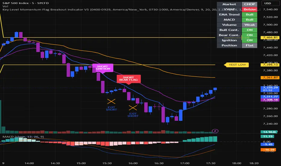
Bullish (green) and bearish (red) momentum shift signals on a 1-minute chart. The EMA cloud provides continuous trend context while triangle markers and bar coloring highlight confirmed shifts.
Settings
The core settings control the sensitivity of each filter. The Fast EMA Length (default 3) and Slow EMA Length (default 8) define the crossover speed -- shorter values react faster but may produce more signals. The Min EMA Spread (default 0.1) sets the minimum fast/slow EMA gap as a fraction of ATR(14) -- raise it to 0.2-0.3 on higher timeframes or set to 0 to disable. The Volume Multiplier (default 1.3) sets the minimum volume threshold as a multiple of the 20-bar average; raising it to 1.5 will require even stronger volume confirmation. The Pivot Proximity setting (default 5 bars) controls how close the signal must be to a detected swing pivot. The Volume Average Length (default 20) determines the lookback window for calculating average volume.
Visual toggles let you independently show or hide bullish and bearish shift markers, the EMA lines and cloud fill, bar coloring around shift events, and the background flash highlight. Alert toggles let you enable notifications for each shift type separately.
Alerts
Bullish Momentum Shift -- Fires when a confirmed bullish crossover occurs with volume above threshold near a recent swing low. "Momentum Shift Detector : Bullish momentum shift detected."
Bearish Momentum Shift -- Fires when a confirmed bearish crossover occurs with volume above threshold near a recent swing high. "Momentum Shift Detector : Bearish momentum shift detected."
To set up alerts: click the TradingView Alerts button, select "Momentum Shift Detector " from the indicator dropdown, choose "Any alert() function call" as the condition, and set your preferred notification method.
Best Practices
Use the dots as confirmation alongside your existing support/resistance levels, trendlines, or other indicators rather than as a standalone entry trigger
On higher timeframes (4H, Daily), consider widening the EMAs to 5/13 for smoother signals suited to swing trading
If signals are too frequent for your style, raise the Volume Multiplier above 1.3 or increase the Min EMA Spread to 0.2-0.3 to require stronger confirmation
Pay attention to signals that cluster at the same price zone across multiple timeframes -- these tend to mark the strongest reversals
The pivot proximity filter is the main quality gate; lowering it to 3 allows faster signals while raising it to 7-10 requires more established swing points
Part of the DYNA Ecosystem
Momentum Shift Detector is a free indicator built with the same design standards as the DYNA premium suite. For complete trade management with automatic stop loss, break-even, trailing stops, and multi-target systems, explore the full DYNA indicator collection.
Disclaimer
This indicator is a technical analysis and educational tool only -- it is not financial advice and makes no guarantee of any outcome. Past performance does not predict future results. Always do your own research and use proper position sizing and risk management.
Created by Varun Nidhi · varunnidhi.com
A free DYNA indicator — self-contained, no repainting.
Indicateur

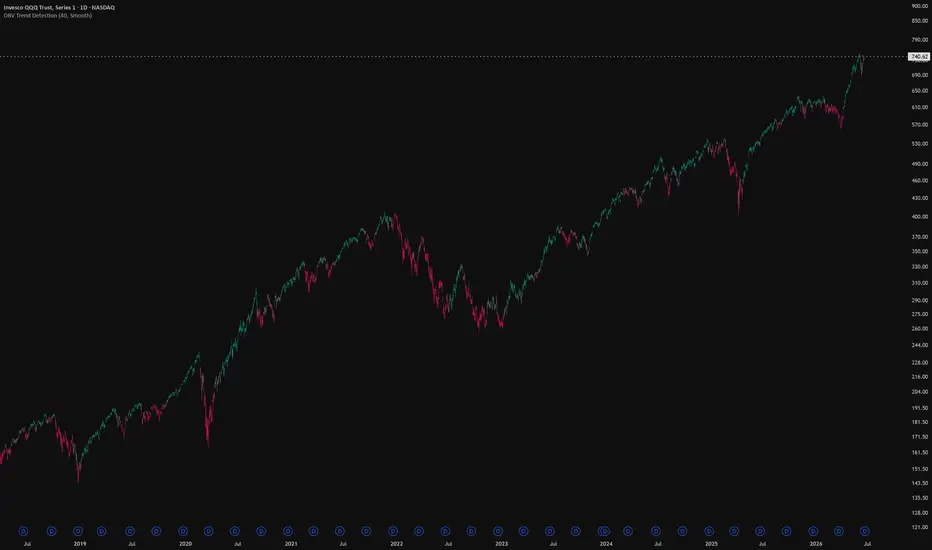
OBV Trend CandlesOBV Trend Candles
This indicator colors your candles based on the relationship between On-Balance Volume (OBV) and a moving average of OBV. It's a simple way to keep volume-based trend context visible directly on the price chart, without having to watch a separate OBV pane.
How it works
OBV accumulates volume on up-closes and subtracts it on down-closes, so a rising OBV means volume is flowing into the asset and a falling OBV means it's flowing out. This script takes that OBV line and compares it to a simple moving average of itself:
When OBV is above its SMA, volume momentum is building → candles are painted green.
When OBV is below its SMA, volume momentum is fading → candles are painted red.
The idea is that volume often shifts before or alongside price, so the color flips can give you a read on whether the current move is backed by participation.
The Sensitivity input
The single setting that matters is Sensitivity, which is the length of the SMA applied to OBV. Lower values make the indicator react faster to changes in volume flow (more color flips, more noise), while higher values smooth things out and only flip on more established shifts. Tune it to your timeframe and trading style — there's no universally "correct" value.
Notes
It works on any timeframe and any asset, as long as that asset reports volume data. On symbols without volume (some forex pairs and certain indices), OBV can't be calculated and the script will let you know. Colors are fully customizable in the settings.
This is a context/confirmation tool, not a standalone signal — it tells you about volume flow, not where to enter or exit. Use it alongside your own analysis. Indicateur

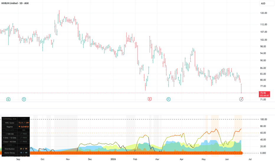
Waterfall Risk CompositeWaterfall Risk Composite (WRC)
The Waterfall Risk Composite is a quantitative short-side risk scoring system that detects the structural conditions that precede cascading selloff events — what traders call a "waterfall." Rather than identifying entry points, it measures how dangerous a stock's current environment is across three independent dimensions, combining them into a single 0–100 score.
What is a Waterfall Event?
A waterfall is a rapid, cascading price decline where selling pressure overwhelms buyers across multiple sessions. These events don't appear randomly — they are typically preceded by months of distribution, deteriorating relative strength, a collapsing MA structure, and expanding downside volatility. The WRC is designed to quantify exactly those preconditions.
How the Score is Built
The composite draws from three sub-scores, each capturing a different dimension of bearish risk:
1. Distribution Phase (max 35 pts)
Measures how aggressively a stock is being distributed relative to its benchmark. Inputs include the slope and persistence of relative strength (RS) vs XJO or SPY, the rolling up/down volume ratio over 20 sessions, and how far price has corrected from its 52-week high. A stock that has been underperforming its index for months, with more volume on down days than up days, and sitting 30–40% off its highs, will score near the maximum here.
2. Momentum Decay (max 40 pts)
Scores the structural deterioration of price momentum. This block carries the highest weighting because entrenched bear trends are the most reliable precondition for waterfall events. It measures the fast/slow EMA ratio slope (MOMO), the full bearish ordering of the 10/21/50/200 EMA stack (death cross zone scores maximum), how far and for how long price has been below the 200 EMA, and the number of consecutive days price has spent below the 40 EMA. A stock with a full bear MA stack, 150+ days below its 40 EMA, and deeply extended below its 200 EMA can score 40/40 on this block alone.
3. Volatility Stress (max 25 pts)
Detects volatility regime shifts and directional pressure. Scores the ratio of fast to slow ATR (expanding vol = stress), the proportion of ATR occurring on red candles vs green (asymmetric downside vol), and large red candles relative to the 20-day average body size — particularly when they break below a recent swing low, signalling acceleration.
Trend Gates — Soft Multiplier System
Three structural conditions act as gates that scale the final score:
Close below the 10-period Monthly MA
5 EMA below 10 EMA (daily)
Close below 40 EMA (daily)
Unlike a hard on/off switch, gates apply a proportional multiplier: all three passing = full score, two passing = 75%, one passing = 40%, none passing = score blocked entirely. This means a deeply bearish stock with a brief EMA cross-back won't suddenly drop to zero — the underlying deterioration is still reflected.
Settings
All key parameters are adjustable — RS lookback, volume window, ATR periods, gate EMA lengths, monthly MA length, alert thresholds, and table position. The indicator works on daily timeframes and above.
Alerts
Three alert conditions are included: Waterfall threshold crossed, Elevated threshold crossed, and risk declining back below Elevated.
Any ideas let me know. It's good but can be better. Indicateur
Quantum Entropy Oscillator [QEO]🚀 QUANTUM ENTROPY OSCILLATOR
The Quantum Entropy Oscillator (QEO), engineered by gunebak4n, is a high-resolution market dynamics oscillator designed to quantify directional pressure through entropy-normalized energy dispersion and momentum coherence.
QEO is built on the principle that price action is not random movement but a structured imbalance between energy accumulation and directional displacement. By measuring the relationship between volatility-derived energy and directional momentum, the oscillator isolates statistically meaningful wave behavior from market noise.
Unlike conventional oscillators that rely solely on price smoothing or fixed-period momentum, QEO introduces an entropy-aware normalization layer that dynamically adjusts signal sensitivity based on market turbulence and structural compression.
💡 CORE DESIGN PRINCIPLE
🧭 Entropy-Normalized Market Flow
QEO interprets price movement as a probabilistic energy field. High entropy represents disordered, low-conviction movement, while low entropy indicates structured directional flow.
🧬 Energy–Momentum Duality Model
The system models price behavior using two interacting forces:
• Energy: magnitude of displacement (volatility intensity)
• Momentum: directional bias of price change
The interaction between these components defines the wave structure of the market.
💡 KEY FEATURES
🎯 Entropy-Weighted Oscillator Core
The main QEO line is derived from a normalized wave function that adjusts momentum strength relative to volatility energy, producing a cleaner directional signal under varying market regimes.
📊 Signal Line Structural Filter
A secondary smoothed signal line acts as a structural baseline, allowing crossovers to represent regime shifts rather than simple momentum fluctuations.
📉 Histogram Pressure Mapping
The histogram visualizes the divergence between QEO and its signal line, representing acceleration or deceleration of directional force in real time.
🧠 Regime-Sensitive Cross Detection
Cross signals are filtered using positional constraints relative to zero-line equilibrium, distinguishing early reversals from continuation structures.
🏹 Directional Trigger System
Bullish and bearish triggers are generated only when momentum crosses structural equilibrium zones, reducing noise-driven false signals.
🔬 MATHEMATICAL STRUCTURE
Price displacement:
ΔP(t) = Close(t) − Close(t−1)
Energy field (volatility intensity):
E(t) = SMA(ΔP², n)
Momentum field (directional bias):
M(t) = SMA(ΔP, n)
Entropy-normalized wave function:
Q(t) = M(t) / √E(t)
Smoothed oscillator:
QEO = SMA(Q(t), smoothing)
Signal line:
Signal = SMA(QEO, signalLength)
Histogram:
H = QEO − Signal
This structure ensures that directional strength is always evaluated relative to current volatility conditions rather than static thresholds.
🛠️ USAGE FRAMEWORK
1. Trend Regime Detection
Sustained positive or negative QEO deviation indicates directional regime expansion.
2. Reversal Identification
Crossovers near equilibrium (zero line) signal potential structural transitions between trend states.
3. Momentum Exhaustion Zones
Histogram divergence weakening while QEO remains extended suggests diminishing directional energy.
4. Confirmation Layer Usage
QEO should be used in conjunction with structural price levels for higher-probability decision zones.
⚙️ SYSTEM CHARACTERISTICS
• Non-repainting structural oscillator logic
• Volatility-adaptive normalization layer
• Noise-filtered momentum extraction
• Regime-sensitive signal interpretation
• Multi-layer smoothing architecture
📌 CREDIT
Quantum Entropy Oscillator (QEO) is developed by gunebak4n as a volatility-normalized momentum framework for structured market interpretation on TradingView.
The system is designed for traders requiring statistically consistent signal behavior across varying volatility regimes without relying on rigid overfitted thresholds.
⚠️ DISCLAIMER
QEO is a probabilistic analytical tool. It does not predict future price movement or guarantee trading outcomes. Market behavior is stochastic, and all signals must be evaluated within a disciplined risk management framework. Indicateur

Market Weariness Spectrum Indicator [MarkitTick]💡 This advanced technical tool is engineered to evaluate the exhaustion of price trends by synthesizing volume, volatility, and price action into a single, comprehensive oscillator. By tracking how much effort the market is expending relative to the actual ground gained by price, this framework helps analysts identify periods of trend fatigue and potential reversals. Rather than relying solely on traditional price-based overbought or oversold levels, it looks deeper into market friction, signaling when a trend is mathematically likely to run out of steam and when a structural recovery is probable.
✨ Originality and Utility
Traditional momentum oscillators and standard volume metrics often operate in isolated silos, which can lead to false signals during strong, prolonged trends. This script bridges that gap by creating a multi-dimensional composite weariness score.
It detects structural exhaustion where high trading volume results in minimal price movement, indicating heavy absorption.
It measures the frequency of directional hesitation within recent price action.
It tracks effort density to provide a dynamic view of trend fatigue that single-metric indicators cannot achieve.
This multifaceted approach reduces false positives and provides a highly nuanced understanding of market mechanics during extreme conditions.
🔬 Methodology and Concepts
The core logic relies on the continuous calculation of three distinct dimensions, which are dynamically weighted and smoothed into the final composite oscillator.
● Dimension 1: Phantom Volume
This component measures the volume expended per unit of price movement.
It calculates the average volume divided by the average absolute price move over a specified lookback window.
Elevated values indicate that massive trading volume is generating very little forward progress, a classic sign of market friction.
The result is strictly normalized on a scale from 0 to 100 based on historical highest and lowest bounds over a derived lookback.
● Dimension 2: Directional Hesitation
This metric tracks the frequency of indecision in the market structure.
It evaluates the size of each candle's real body relative to the underlying Average True Range (ATR).
If a candle's body is less than a specific threshold of the ATR, it is flagged mathematically as a hesitation period.
The algorithm scores the percentage of these hesitation candles over the lookback window, normalizing the output from 0 to 100.
● Dimension 3: Effort Density
Effort Density compares the raw trading volume directly against the prevailing volatility range.
It identifies periods where the market is churning heavily without expanding its dynamic range.
Like the other dimensions, this value is smoothed, tracked against its historical extremes, and normalized to a 100-point scale for seamless integration.
● Composite Calculation and Signal Logic
The three dimensions are blended using precise, user-defined weights to form the raw weariness score.
A Simple Moving Average is applied to smooth the raw data, creating the primary indicator trajectory.
The script continuously evaluates the mathematical velocity and acceleration of this smoothed line to detect structural deceleration in weariness.
This logic triggers specific reversal signals only when extreme exhaustion mathematically begins to wane, rather than at the absolute peak.
🎨 Visual Guide
The system provides a rich, multi-layered visual experience to ensure all data is instantly readable directly on the chart.
● Chart Elements and Overlays
Candle Coloring: The main chart candles are dynamically colored based on the current weariness level, transitioning through a gradient of green, yellow, orange, and red.
Reversal Labels: Explicit downward-pointing labels appear on the chart when the weariness metric peaks above the critical threshold and structural deceleration is confirmed.
Recovery Labels: Upward-pointing labels signify that the market has recovered from a state of severe exhaustion, crossing back into baseline operational zones.
● Oscillator Panel
Oscillator Line: The thick main oscillator line representing the composite weariness score, dynamically colored.
Dimension Lines: Three distinct lines representing the individual calculations for Phantom Volume, Directional Hesitation, and Effort Density.
Threshold Fills: A semi-transparent visual fill highlights the specific zone between the critical alert level and the recovery baseline.
Critical Backgrounds: The oscillator panel background shifts color dynamically when weariness exceeds absolute critical limits.
● On-Chart Dashboard
Data Table: An intuitive, heavily formatted table tracks the exact percentage and text status of the current calculation.
Progress Bars: Text-based visual progress bars represent the isolated weight of each dimension in real-time.
Acceleration Trackers: Directional arrows track the direct acceleration vector of the current trend state.
📖 How to Use
The primary application of this system is identifying when a market move has exhausted its underlying momentum, regardless of the immediate price action.
● Identifying Exhaustion
Monitor the primary oscillator as it climbs toward the upper boundary.
When the line enters this critical zone, the current trend is expending maximum effort for minimal reward. Caution is advised for trend-continuation setups.
● Evaluating Reversals
Wait for the structural acceleration to turn negative.
When a reversal label manifests, it suggests that the exhaustion has structurally peaked and the market may be susceptible to a shift in directional momentum.
● Confirming Recoveries
After a period of extreme weariness, wait for the oscillator to fall back below the defined recovery threshold.
The appearance of a recovery label indicates the market has absorbed the previous friction, signaling a return to baseline conditions.
⚙️ Inputs and Settings
The script provides granular control over all internal weighting and lookback mechanisms.
● Core Parameters
Lookback: Defines the primary window for all moving averages and historical normalization extremes.
Smooth: Adjusts the sensitivity of the final composite score to reduce standard market noise.
ATR Len: The specific period used for calculating the volatility benchmarks essential to the Hesitation and Density formulas.
● Dimension Weights
W1 Phantom Vol: The proportional weight assigned to the volume-per-move calculation.
W2 Dir Hesit: The proportional weight assigned to the structural hesitation calculation.
W3 Effort Den: The proportional weight assigned to the volume-to-volatility calculation.
● Signal and Visual Thresholds
Crit Exh %: The strict upper boundary that defines extreme structural weariness.
Recovery %: The lower boundary that defines a complete return to standard market flow.
Confirm Bars: The sustained duration required for the indicator to remain in exhaustion before any subsequent reversal signals can be mathematically validated.
🔍 Deconstruction of the Underlying Scientific and Academic Framework
The theoretical foundation of this logic rests heavily on established volume spread principles and statistical volatility analysis.
● Effort vs. Result Mechanics
In objective terms, when a system applies maximum input volume but achieves minimal price displacement, the energy is being absorbed by opposing liquidity.
The script quantifies this exact friction mathematically through specialized density formulas, filtering out traditional momentum illusions.
● Volatility Clustering
The hesitation frameworks rely on the statistical observation of volatility clustering.
By measuring continuous body size constraints relative to an evolving volatility band, the formulas isolate periods where directional conviction fundamentally collapses.
● Derivative Logic
The internal signal engine evaluates the specific velocity and acceleration vectors of the underlying weariness curve.
By requiring structural acceleration to turn decisively negative after a local maximum, the mathematical algorithm ensures the statistical apex of the exhaustion phase has cleanly passed before printing confirmation markers.
⚠️ Disclaimer
All provided scripts and indicators are strictly for educational exploration and must not be interpreted as financial advice or a recommendation to execute trades. We expressly disclaim all liability for any financial losses or damages that may result, directly or indirectly, from the reliance on or application of these tools. Market participation carries inherent risk where past performance never guarantees future returns, leaving all investment decisions and due diligence solely at your own discretion. Indicateur

SCMF Structural Candle Momentum## Reading the SCMF Dashboard — Complete Reference
---
## The Main Panel (Chart Area)
Before the table — what you're looking at on screen:
**The histogram bars** are the core output. Each daily bar produces one histogram column. Color tells you the classification tier immediately without reading the table. Width tells you nothing — only the height (value) and color matter.
**The faint white line** running through the histogram is CMS Raw — the unpenalised score before quality gates apply. When it sits significantly higher than the histogram bar, the gates are cutting into your score. When they track closely, all gates are passing cleanly.
**The light blue filled band** around the zero line is the SQC band. Its width equals `±SQC × 0.5`. A wide band means high confidence. A narrow band means the indicator is uncertain. When a bar's histogram column sits well outside the band, the signal is strong relative to its own uncertainty.
**The thin coloured lines** are the five dimensions plotting simultaneously. You read them the same way as the histogram — above zero is bullish, below is bearish, and magnitude matters.
---
## Row 1 — CMS Adjusted
This is the single number that summarises everything. Range is ` `.
It is the weighted sum of all five dimensions, suppressed to `na` (no display) if SQC falls below 0.25 or if the liquidity gate fires.
**What the number means in practice:**
| Value | What the crowd actually did |
|---|---|
| `+0.80` to `+1.00` | Every dimension is bullish and aligned. Rare. Act with conviction |
| `+0.50` to `+0.79` | Strong multi-dimensional bull signal. Most reliable entry zone |
| `+0.20` to `+0.49` | Moderate bullish. One or two dimensions are pulling back |
| `+0.05` to `+0.19` | Marginal. Don't act on CMS alone at this level |
| `-0.05` to `+0.05` | Genuine standoff. No edge in either direction |
| `-0.05` to `-0.19` | Marginal bearish. Same — don't act alone |
| `-0.20` to `-0.49` | Moderate bearish. Check what dimension is driving it |
| `-0.50` to `-0.79` | Strong bear signal |
| `-0.80` to `-1.00` | Full multi-dimensional bearish alignment |
The distance from zero matters more than crossing a threshold. `+0.66` and `+0.64` are not meaningfully different despite sitting on opposite sides of the strong-bull line.
---
## Row 2 — Signal
The text classification of CMS Adjusted. Seven tiers:
```
▲ STRONG BULL CMS > 0.65
▲ MOD BULL CMS > 0.35
△ WEAK BULL CMS > 0.10
◆ NEUTRAL CMS between -0.10 and +0.10
▽ WEAK BEAR CMS < -0.10
▼ MOD BEAR CMS < -0.35
▼ STRONG BEAR CMS < -0.65
⚠ NO SIGNAL CMS is na (suppressed by SQC or liquidity gate)
```
The arrow shapes are intentional — filled triangles (▲▼) for strong/moderate, hollow (△▽) for weak, diamond (◆) for neutral. At a glance you know whether you're in a conviction zone or a noise zone.
`⚠ NO SIGNAL` is not a neutral reading. It means the quality gates have decided the data for this bar is unreliable — treat it as if the bar doesn't exist for signal purposes.
---
## Row 3 — CMS Raw
The composite score **before SQC suppression**, but after all five dimensions are computed and weighted. Range ` `.
**How to use it alongside CMS Adjusted:**
The gap between Raw and Adjusted tells you how much the quality gates are penalising the bar. In v1.2, CMS Adjusted = CMS Raw when SQC ≥ 0.25 (they're the same number — the only suppression now is the hard cutoff at 0.25). So the main reason these two diverge is when SQC is very close to 0.25 and the histogram shows a different shade.
More practically: if CMS Raw is `+0.71` but CMS Adjusted shows `⚠ NO SIGNAL`, it means a strong theoretical signal was killed by one of the gates — most likely liquidity (HHI abort) or a doji. Check SQC to know which gate caused it.
---
## Row 4 — SQC + Pip Bars
**The number** is the Signal Quality Coefficient — a multiplicative product of all five quality gates. Range ` `.
**The pip bars** `████ / ███░ / ██░░ / █░░░` give you instant visual confidence:
| Pips | SQC Range | Meaning |
|---|---|---|
| `████` | > 0.75 | All gates clean. Full confidence. Treat signal at face value |
| `███░` | 0.50–0.75 | One gate is degraded. Use signal but be aware of which gate |
| `██░░` | 0.25–0.50 | Two or more gates degraded. Signal valid but reduce position size |
| `█░░░` | < 0.25 | Output suppressed — CMS Adjusted will show `⚠ NO SIGNAL` |
**How to use SQC as a position sizing input:**
Don't use it as a binary pass/fail. Use it as a scale. If your normal position size at `▲ STRONG BULL` is 100%, then at SQC `███░` run 75%, at `██░░` run 50%. The number is literally a confidence weight you can apply directly.
**What kills SQC:**
There are six multiplicative components. Any one of them going low drags the product down hard:
| Component | What lowers it | How much |
|---|---|---|
| `sqc_v` (Validity) | Not on daily/weekly timeframe, or zero volume | Drops to 0 — kills everything |
| `sqc_bvc` (BVC accuracy) | No 5m intraday data, or high HHI | 0.55–0.88 range |
| `sqc_phase` (Event trust) | Gap > 2× ATR, or structural event day | 0.50–0.80 |
| `sqc_liq` (Liquidity) | HHI high (concentration), or high Amihud rank | 0.50–1.00, or 0 if abort |
| `sqc_d` (Doji validity) | Bar range < 10% of ATR | 0.30 |
| `sqc_regi` (Regime) | Transitional regime | 0.90 |
---
## Dimensions Block — D1 through D5
Every dimension runs on the same scale: ` `. Positive = bullish pressure, negative = bearish pressure, zero = no signal from this dimension. The colour in the cell matches the tier — green shades for positive, grey near zero, red shades for negative.
**`—` or `no 5m data` / `no 30m data`** means the dimension couldn't compute because the required intraday data wasn't available from your broker for this ticker. The weight for that dimension is dropped and the remaining weights renormalise. This is normal behaviour for some EGX names.
---
### D1 — CPI (Close Position Index)
**The number answers:** *Where did price close within today's range?*
```
+1.00 Closed exactly at session high
+0.50 Closed in the upper quarter of range
0.00 Closed exactly at session midpoint
-0.50 Closed in the lower quarter of range
-1.00 Closed exactly at session low
```
This is the only dimension derived purely from daily OHLC — no intraday data needed. It's always available.
**Reading example:** D1 = `+0.82`. The close was 91% of the way from the session low to the session high. The crowd ended the day with strong upward pressure.
**What it cannot tell you:** It doesn't know if volume supported that close, what time of day the high was made, or whether the close was driven by informed buyers or just thin late-day drift. That's why it carries the lowest weight (0.08–0.15 depending on regime).
---
### D2 — WAM (Wick Absorption Model)
**The number answers:** *Where did the crowd get rejected, and did the other side absorb it with conviction?*
```
+1.00 Long lower wick, large body closing up — heavy selling absorbed with conviction
+0.50 Lower wick present, modest body — absorption occurred, not fully confirmed
0.00 Wicks are symmetric, or body is tiny — no absorption signal
-0.50 Upper wick present, modest body — buying attempt was absorbed
-1.00 Long upper wick, large body closing down — heavy buying absorbed with conviction
```
**Reading example:** D2 = `+0.63`. There is a meaningful lower wick and a solid body. Someone sold aggressively into a level and got absorbed by buyers who then pushed price to close well above the session low. This is a structural sign of demand at a price level.
**The most important interaction:** WAM is the key dimension for confirming D1. If D1 = `+0.82` (closed high) but D2 = `-0.40` (long upper wick, closed off highs relative to wicks) — that's tension. The close was strong but the wicks tell a different story. The divergence engine watches for exactly this.
---
### D3 — NVD (Net Volume Delta)
**The number answers:** *Across all 54 five-minute candles today, who was the net aggressor — buyers lifting offers, or sellers hitting bids?*
```
+1.00 100% of weighted volume was aggressive buying
+0.50 Buyers were the aggressor on roughly 75% of volume
0.00 Equal buy and sell aggression — genuine equilibrium
-0.50 Sellers were the aggressor on roughly 75% of volume
-1.00 100% of weighted volume was aggressive selling
```
This is the highest-weight dimension (0.25–0.40 depending on regime) because it is the closest proxy to actual order flow. It does not depend on where price closed — a stock can close at the top of its range while NVD is negative (sellers were hitting bids all day but absorption held price up).
**Reading example:** D3 = `-0.44`. Despite what the candle looks like, sellers were the net aggressors across the intraday session. That number reflects who was initiating trades, not where price ended up.
**When D3 shows `no 5m data`:** The broker doesn't provide 5-minute history for this ticker. NVD is dropped from the composite. This particularly affects thin EGX names. CMS will still compute from D1, D2, D4, D5 with renormalised weights, but loses its most informative dimension — SQC will reflect this via `sqc_bvc` penalty.
---
### D4 — TVD (Temporal Volume Distribution)
**The number answers:** *Did volume concentrate in the conviction phase (13:30–14:30), and did it point in the same direction as price moved during that window?*
```
+1.00 Conviction phase dominated total volume AND conviction-phase price rose
+0.50 Moderate conviction-phase dominance with bullish direction
0.00 Volume was evenly distributed, or conviction-phase direction was flat
-0.50 Moderate conviction-phase dominance with bearish direction
-1.00 Conviction phase dominated total volume AND conviction-phase price fell
```
**Why this matters more than raw volume:** A candle with 10 million shares traded means nothing if 8 million traded in the first 30 minutes (retail FOMO at open). The same 10 million is very different if 6 million traded between 13:30 and 14:30. Institutional rebalancing happens in the conviction window. TVD measures whether they were there and which direction they pushed.
**On event days** the weighting shifts — opening phase gets higher weight (0.80) because informed traders act at open when news has a time expiry. TVD automatically adjusts, so you don't need to do anything differently.
**Reading example:** D4 = `+0.71`. The conviction window was heavy and price moved upward during that window. Institutional positioning for tomorrow was to the buy side.
---
### D5 — PPT (Price Path Topology)
**The number answers:** *Did the 30-minute closes trace a consistent directional path, and did the pace accelerate or decelerate toward the end?*
```
+1.00 Monotonic grind upward all day, accelerating into the close
+0.50 Mostly directional with some pullbacks, no strong acceleration signal
0.00 Oscillating path that happened to close up/down — no conviction in the journey
-0.50 Mostly directional downward with some bounces
-1.00 Monotonic grind downward all day, accelerating into the close
```
PPT has two sub-components you can think about separately:
**Path Monotonicity** — what fraction of 30-minute steps pointed in the final direction. A day where 8 of 8 steps went up is different from a day where price went up, down, up, up, down, up, up, up and happened to close up.
**Momentum Acceleration** — did the second half of the session move faster than the first half? Positive acceleration (slow start, fast finish) is institutionally consistent. Deceleration (fast start, slow finish) is exhaustion.
**Reading example:** D5 = `-0.28`. Even though the daily close might look fine, the intraday path decelerated toward the end and had inconsistent step direction. The crowd moved without conviction today. Don't trust tomorrow's follow-through.
**The most useful divergence from D5:** When CMS is strongly positive but D5 is negative — this is the Exhaustion pattern (EX flag). The candle looks great, the crowd was net bullish today, but the path tells you energy is fading. Often appears one to two bars before a reversal.
---
## Context Block
### Regime
Three states, driven by ADX and ATR ratio:
| State | ADX | ATR/SMA(ATR) | Meaning for the indicator |
|---|---|---|---|
| `TRENDING` | > 25 | > 1.0 | NVD and TVD weights are elevated. Institutional order flow dominates price action. CMS is most reliable here |
| `RANGING` | < 20 | < 0.8 | WAM and CPI weights are elevated. Absorption at extremes and close position matter more than delta. Watch for mean-reversion signals |
| `TRANSITIONAL` | Between | Between | Default weights apply. SQC gets a 0.90 modifier — slight confidence reduction because regime is ambiguous |
Regime is critical context for interpreting the signal tier. A `▲ MOD BULL` in `TRENDING` regime with high NVD is a different trade from `▲ MOD BULL` in `RANGING` regime driven by WAM — the first is trend continuation, the second is a bounce candidate.
---
### Event Day
**`No`** — Normal session. Phase weights are standard (opening=0.0, discovery=0.50, conviction=1.00). Informed trading expected at close.
**`▲ YES`** — Either the opening gap exceeded 1× ATR, or the opening 30-minute window had more than 2.5× its 20-day average volume. Phase weights have shifted (opening=0.80, discovery=0.45, conviction=0.35). Informed traders may have front-loaded into the opening on time-sensitive news. SQC is reduced to 0.80 for this bar. If the gap exceeded 2× ATR, SQC drops further to 0.50 and the bar should be treated as structurally unreliable for momentum signals.
On event days: D4 (TVD) is the most affected dimension — its output is driven by dynamically reweighted phases. D3 (NVD) is unaffected since it reads raw order flow regardless of when it happened. Trust D3 and D1 more than D4 and D5 on event days.
---
### Divergence
Shows the active divergence pattern for the current bar. Only one shows at a time (priority order: HD → HA → EX → CM). On the chart these appear as plotshapes directly on the indicator panel.
**`None`** — Dimensions are broadly consistent with the CMS direction. Signal is clean.
**`Hidden Dist` (HD ▼)** — Hidden Distribution. D1 (close) is positive (`> +0.35`) but D3 (NVD) is negative (`< -0.25`) and D4 (TVD) is negative (`< -0.15`). The candle *looks* bullish but the crowd was net selling all day and institutional volume was bearish. Classic smart-money distribution pattern. In a topping market this is the most dangerous candle type — price is being marked up while size is being sold into retail buyers.
**`Hidden Accum` (HA ▲)** — Hidden Accumulation. D1 (close) is negative (`< -0.35`) but D3 (NVD) is positive (`> +0.25`) and D2 (WAM) is positive (`> +0.15`). The candle looks bearish but buyers absorbed all supply and the lower wick confirms a defended level. Smart money is building a position at a discount.
**`Exhaustion` (EX ✕)** — D1 is positive (`> +0.35`) but D5 (PPT) decelerated (`< -0.15`) and D4 conviction-phase volume was absent (`< +0.10`). Strong close, but the path slowed and institutional participation faded late. Not a reversal signal by itself — more a momentum quality warning. Often precedes a flat or weak next session rather than a sharp reversal.
**`Conv Mismatch` (CM ○)** — D3 (NVD) is strongly positive (`> +0.35`) but D4 (TVD) is negative (`< -0.20`). There was aggressive net buying throughout the day, but it happened in the opening phase (retail FOMO), not the conviction phase. Institutional traders were not the buyers. High risk of next-session mean reversion as the weak holders unwind.
---
## The Complete Reading Process — Step by Step
When you open the chart at end of day, read in this order:
**Step 1 — SQC first.** If `█░░░` or `⚠ NO SIGNAL`, stop. The bar is not usable for signals today.
**Step 2 — Regime.** Sets the interpretive frame. Are you looking for trend continuation (TRENDING) or mean reversion (RANGING)?
**Step 3 — Event Day.** If YES, discount D4 and D5 slightly, trust D3 and D1 more.
**Step 4 — CMS Adjusted and Signal tier.** Is this a conviction zone (> ±0.35) or noise (< ±0.10)?
**Step 5 — Divergence.** Does the signal have internal conflict? Hidden Distribution on a `▲ MOD BULL` = danger. Hidden Accumulation on a `▼ MOD BEAR` = potential entry.
**Step 6 — Dimension breakdown.** Which dimensions are driving the CMS? A `+0.58` driven by D3 `+0.80` and D4 `+0.75` (both intraday-dependent dimensions) is much stronger than `+0.58` driven only by D1 `+0.90` and D2 `+0.60` (daily OHLC only) with D3/D4/D5 all near zero.
**Step 7 — CMS Raw vs Adjusted gap.** If they are the same, all gates passed cleanly. If Raw is significantly higher, something penalised the bar — usually a gate between 0.25 and 0.75 SQC. Indicateur

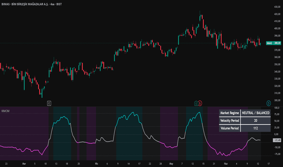
Kinetic Momentum & Capitulation Model (KMCM)🚀 KMCM Adaptive Regime Oscillator (KMCM)
The KMCM (Kinetic Momentum & Capitulation Model) is a volatility-adaptive market regime oscillator designed to quantify directional energy imbalance by integrating price momentum, volume mass dynamics, and statistical energy dispersion into a single bounded regime signal. Rather than treating price as a simple time series, KMCM reconstructs market behavior as an energy system where movement intensity is jointly determined by velocity and participation.
The core objective of KMCM is to detect regime transitions between momentum expansion, neutral equilibrium, and capitulation-driven stress phases. It does this by modeling market activity as a normalized kinetic system and transforming the resulting distribution into a bounded oscillator ranging approximately between -100 and +100.
Unlike traditional momentum indicators that rely primarily on price derivatives (ROC, RSI, MACD), KMCM incorporates volume-adjusted mass and volatility-adaptive scaling. This allows the indicator to remain structurally stable across different volatility regimes and asset classes while preserving sensitivity to regime shifts.
💡 Key Features
🧠 Kinetic Market Model:
KMCM interprets market behavior as a simplified physical system where price velocity represents momentum and volume represents mass. The resulting “energy” formulation captures the intensity of participation behind directional moves rather than price movement alone.
📊 Volume-Normalized Mass Scaling:
Volume is normalized against its adaptive moving average to construct a relative participation metric. This ensures that abnormal volume expansions or contractions are properly reflected in regime intensity rather than absolute scale distortions.
🔬 Volatility-Adaptive Period Engine:
All internal computation windows are dynamically adjusted using ATR-based volatility ratios. This prevents overfitting to fixed time horizons and ensures that the model self-adapts to changing market regimes.
⚡ Statistical Energy Transformation:
Directional energy is derived from velocity-squared magnitude scaled by participation mass, then standardized using z-score normalization. This produces a statistically consistent representation of market stress and expansion phases.
🛡️ Nonlinear Compression Layer:
A hyperbolic tangent transformation compresses raw statistical output into a bounded oscillator space. This preserves extreme regime information while preventing signal saturation during high volatility events.
📉 Dual-Threshold Regime Logic:
Market conditions are classified into three primary states:
* Expansion Regime (Above Upper Threshold): Strong directional imbalance and momentum continuation pressure
* Neutral Regime (Between Thresholds): Balanced market structure and reduced directional conviction
* Capitulation Regime (Below Lower Threshold): Stress-driven liquidation dynamics and downside exhaustion phases
🔬 Mathematical Logic and Structure
KMCM is built on a multi-layer statistical energy framework that converts raw market microstructure into a normalized regime oscillator.
The process begins by computing velocity as a rate of change over an ATR-adaptive window. This velocity is then combined with a volume-derived mass factor, which represents relative participation intensity compared to its historical baseline.
A kinetic energy proxy is constructed by squaring velocity and scaling it with normalized mass. This formulation ensures that large directional moves with strong participation are weighted disproportionately higher than low-volume price fluctuations.
To stabilize the signal, directional energy is standardized using a rolling mean and standard deviation, producing a z-score representation of market imbalance. This step transforms raw energy into a distribution-aware signal that is comparable across time and assets.
The z-score output is then passed through a hyperbolic tangent function, compressing it into a bounded regime oscillator. This step ensures nonlinear saturation control while preserving structural extremes.
Finally, exponential smoothing is applied to reduce microstructure noise, and slope filtering is used to eliminate short-term directional instability. This results in a stable regime oscillator that prioritizes structural shifts over transient fluctuations.
In essence, KMCM does not attempt to predict price direction. It models the *intensity and structure of market participation* as a kinetic system and translates it into a unified regime framework of expansion, neutrality, and capitulation.
🛠️ How to Use
1. Expansion Regime (Above Upper Threshold):
Indicates strong directional momentum supported by elevated participation. Trend continuation strategies and breakout positioning are statistically favored.
2. Capitulation Regime (Below Lower Threshold):
Represents forced liquidation, panic-driven behavior, or exhaustion of selling pressure. Reversal or mean reversion structures become more relevant.
3. Neutral Regime (Between Thresholds):
Signals equilibrium conditions where directional conviction is weak. Range-based strategies or reduced exposure conditions are more appropriate.
🎛️ Settings
* Minimum Velocity Period (7–21): Controls sensitivity of momentum detection
* Volume Period (30–150): Defines adaptive participation baseline
* Upper Threshold (30): Expansion boundary for regime classification
* Lower Threshold (-30): Capitulation boundary for regime classification
* Smoothing Length (7 EMA): Stabilization layer for signal refinement
📌 Credits and Origins
KMCM is engineered by @gunebak4n as a volatility-adaptive kinetic regime framework designed to unify momentum, volume, and statistical dispersion into a single structural oscillator. The model is intended for regime-based analysis rather than directional prediction, emphasizing structural transitions over raw price movement.
The design prioritizes robustness across volatility regimes, making it suitable for discretionary traders, quantitative researchers, and systematic strategy development workflows focused on regime awareness.
⚠️ Disclaimer
All outputs generated by KMCM are probabilistic and non-deterministic. This indicator does not predict future price direction or guarantee outcomes. It is a structural market analysis tool intended to support decision-making under uncertainty. Proper risk management is required at all times.
Indicateur
Quantum Imbalance Trap [MarkitTick]💡 This advanced analytical tool is a comprehensive market structure and momentum suite designed to identify high-probability institutional-style footprints through structural price imbalances, relative volume anomalies, and dynamic volatility tracking. By integrating a sophisticated multi-layered filtering engine, it provides traders with a complete visual and statistical ecosystem, featuring dynamic risk-to-reward mapping, session-specific filters, advanced RSI divergence checks, and automated JSON webhook alerts for seamless algorithmic integration.
✨ Originality and Utility
What sets this tool apart from conventional momentum oscillators is its holistic, data-driven approach to signal validation. It does not merely detect large candles; it synthesizes the candlestick's body-to-range ratio, compares localized volume to a historical moving average, and optionally requires structural liquidity sweeps and RSI divergences before flagging an event. Furthermore, the inclusion of fully formatted, localized JSON alerts containing precise targets and confidence scores makes this indicator highly utilitarian for traders utilizing automated execution bots. The real-time, non-invasive dashboard completely eliminates the need for manual risk-to-reward drawing tools, drastically reducing cognitive load.
🔬 Methodology and Concepts
The core engine operates on a strict, multi-variable confluence matrix:
Imbalance & Volume Detection: Evaluates the specific relationship between a candle's real body and its total range (high-to-low). A signal triggers only if this ratio exceeds a user-defined threshold simultaneously with a volume surge that breaches a defined multiplier of the historical volume SMA.
Momentum & Trend Alignment: Utilizes a fast versus slow Simple Moving Average crossover to dictate the immediate micro-trend, ensuring signals fire in the direction of the active order flow.
RSI Divergence: An optional mechanical filter that compares recent price action against a 14-period RSI to locate classic bullish or bearish divergences, adding a layer of exhaustion-reversal logic.
Liquidity Sweeps: Analyzes recent price nodes to determine if local swing highs or lows were structurally breached (swept) prior to the imbalance, indicating potential trap mechanics.
MTF Validation: Safely references a non-repainting higher timeframe (HTF) 20-period SMA. It dynamically penalizes the mathematical "Confidence Score" if the micro-signal contradicts the macro trend.
🎨 Visual Guide
• Chart Elements
Entry Zone Boxes: Semi-transparent cyan boxes indicating the optimal dynamic re-entry area based on a 0.35x ATR modifier.
Signal Labels: Upward (cyan) or downward (orange) triangles marking the exact trigger candle with localized text.
Risk-to-Reward Lines: Solid colored lines for the Entry point, dashed deep pink lines for the Stop Loss (SL), and dotted lines for Take Profit (TP) levels 1, 2, and 3.
Price Labels: Text annotations extending rightward from the action, detailing the exact price coordinate and R-multiple for each respective TP level.
• On-Chart Dashboard
Positioned in the top-right corner with a sleek, dark-themed background and custom-colored text mappings.
Row-by-Row Metrics: Displays the asset ticker, localized Micro Trend, HTF Macro Trend, Imbalance Percentage, Volume Spike Percentage, and an aggregated Confidence Score using active visual block meters (█/░).
Live Tracking: Monitors the active trade state (Long/Short/Idle), current ATR value, dynamically tracked Entry/SL/TP prices, and a live tracking of the floating Risk-to-Reward (R) metric.
📖 How to Use
Wait for a definitive signal label to plot on the chart, confirming that the baseline imbalance, volume, and enabled filters have aligned.
Consult the on-chart dashboard to review the "Confidence Score." A higher percentage (closer to 100%), supported by solid block meters and HTF alignment, indicates a structurally superior setup.
Utilize the automatically generated Entry, Stop Loss, and TP lines to establish risk parameters before executing a position. The shaded zone box identifies an optimal area to scale in.
For algorithmic setups, configure your external bot to parse the automated JSON alert strings to execute trades completely hands-free based on the indicator's defined R-multiples.
⚙️ Inputs and Settings
Every aspect of the logic and visual output is fully customizable through categorized input groups:
• Signal Detection
Imbalance Lookback (Bars): Dictates the lookback window for volume averages, momentum SMAs, and localized swing structures.
ATR Period: The lookback length for the Average True Range calculation, governing dynamic SL distances.
Body-to-Range Threshold: The minimum percentage the solid candle body must occupy relative to its entire wick-to-wick range.
Volume Spike Multiplier: The exact threshold multiplier by which current volume must exceed the volume SMA.
RSI Divergence Confirmation: A toggle to mandate an active RSI divergence for signal validation.
• Smart Money Concepts
Require Liquidity Sweep: When toggled, the engine mandates a structural sweep of the recent highest high or lowest low before plotting a signal.
• Order Flow
Higher Timeframe Alignment: Mandates that the localized signal matches the structural bias of a higher timeframe.
Higher Timeframe: A dropdown selection to dictate the exact MTF resolution referenced (e.g., 60 minutes).
Dynamic Re-entry Zone: Toggles the persistent forward extension of the Entry Zone boxes for continued visual reference.
• Risk Management
Stop Loss ATR Multiplier: Defines the precise mathematical distance of the stop loss line, scaling automatically with asset volatility.
Take Profit 1, 2, and 3 (R-Multiple): Exact floating-point settings to define the distances of targets based strictly on Risk-Reward multiples.
• Alerts & Sessions
Bullish / Bearish Signal Alert: Toggles for activating the fully structured JSON alert webhooks.
Enable Session Filter: Activates strict time-based operational windows.
London / New York Open: Specific boolean toggles to restrict signal detection exclusively to the London (07:00–10:30 UTC) and/or New York (12:30–15:00 UTC) trading sessions.
• Dashboard & Visual Style
Show Entry Zone / Show Price Labels: Toggles to hide or display specific on-chart visual elements to manage chart clutter.
Background / Text Colors: Dedicated color pickers for the dashboard table aesthetics.
Bullish / Bearish / Target Colors: Complete hex/RGB customization for trend alignments, signal labels, and every dynamically drawn Risk-to-Reward line.
🔍 Deconstruction of the Underlying Scientific and Academic Framework
The algorithmic foundation of this indicator heavily relies on volume-weighted price kinematics and statistical normalization. By isolating the body-to-range differential, the code mathematically abstracts the concept of aggressive, one-sided market participation, filtering out symmetric volatility (dojis) in favor of asymmetric momentum. The integration of relative volume acts as an independent confirming variable, a critical tenet in auction market theory, which postulates that true price discovery requires heavy transactional density.
The "Confidence Score" utilizes a multivariate linear normalization technique. It aggregates disparate data arrays—imbalance depth, volume intensity, and momentum velocity—into a bounded 0-100 percentage scale. Crucially, it applies a deterministic penalty if the micro-trend contradicts the macro-trend, rooted in the fractal nature of time-series analysis where higher-degree trends exhibit stronger gravitational pull on price action. Finally, the risk mechanics are anchored in dynamic expectancy models; by utilizing the Average True Range (ATR) multiplied by user-defined R-variables, the script ensures that standard deviation and local variance are constantly factored into target projection, honoring the mathematical realities of market heteroskedasticity.
⚠️ Disclaimer
All provided scripts and indicators are strictly for educational exploration and must not be interpreted as financial advice or a recommendation to execute trades. We expressly disclaim all liability for any financial losses or damages that may result, directly or indirectly, from the reliance on or application of these tools. Market participation carries inherent risk where past performance never guarantees future returns, leaving all investment decisions and due diligence solely at your own discretion. Indicateur

Sin RSI Footprint■ Overview
The Sin RSI Footprint【ALT_analyst】 indicator brings the concept of footprint charting to momentum oscillators.
Instead of mapping trading volume at price levels, this script peers inside the current higher-timeframe candle to map the internal momentum using Lower Timeframe (LTF) RSI data.
By visualizing exactly where and how momentum was distributed within a single bar, traders can identify hidden exhaustion, hidden accumulation/distribution, and intra-bar divergences that are invisible on standard charts.
■ Core Modes & How It Works
The script utilizes request.security_lower_tf to fetch an array of LTF RSI and Close prices for the duration of the current chart's bar. It then processes this data in one of two distinct visualization modes:
1. Matrix Mode (Traditional Price Level)
This mode acts like a traditional footprint or volume profile, but for RSI.
■ The Calculation
The script divides the high-to-low range of the current candle into user-defined bins (e.g., 10 rows). It calculates the step size:
step = (high - low) / Matrix Rows
For each LTF data point, it determines the correct row using:
math.floor((close - low) / step)
Why this calculation is used
To map momentum to specific price levels, allowing you to see if buyers or sellers were exhibiting strong momentum at the extremes or the middle of the candle.
Actual Output Values
The script outputs an averaged RSI value (ranging from 0.00 to 100.00) for each specific price row. The boxes are colored based on this average (0-9 for extreme oversold, 90-100 for extreme overbought).
2. Stack Mode (Vertical Momentum)
This mode stacks LTF RSI prints vertically above or below the candle based on a baseline threshold.
■ The Calculation
By default, if the LTF RSI is > 50, it is categorized as bullish and stacked above the candle's high. If <= 50, it is stacked below the candle's low. The height of each box is calculated dynamically using:
box_height = ATR * Box Height Multiplier
Why this calculation is used
Separating prints above and below the candle isolates bullish vs. bearish momentum bursts. Using ATR for box height ensures the boxes remain visually proportionate across different assets and timeframes regardless of absolute price volatility.
Actual Output Values
The output generates box coordinates (Top, Bottom, Left, Right) relative to the chart's price scale. The text inside represents the exact LTF RSI value at that sequence point (e.g., 72, 34).
■ Key Features
Noise Filter (Hide Range): Clean up the chart by hiding neutral RSI values (e.g., hiding everything between 40 and 60). This leaves only the significant momentum extremes visible.
Highlight & Enlarge: Automatically expand the width and height of boxes that contain extreme RSI readings (e.g., > 80 or < 20) to instantly draw your eye to critical exhaustion points.
Compression Logic: Consecutive LTF RSI prints that fall into the same color tier and threshold are grouped into a single, taller block to prevent chart clutter.
Custom Color Themes: Choose from Normal, Aurora, Rainbow, or Monochrome to suit your chart background.
Rendering Modes: Includes a Real-time mode for live trading and an "Ultra-Light" Historical Camera Track mode to efficiently review past data without exceeding Pine Script's drawing limits.
■ How to Use
1. Spotting Reversals (Matrix Mode)
Look for deep red (overbought) RSI footprints concentrated at the very top of a bullish candle. If the next candle fails to break that high, it suggests momentum exhaustion at resistance.
2. Confirming Breakouts (Stack Mode)
When price breaks a key level, look at the Stack Mode. A large stack of green/blue boxes above the candle confirms sustained LTF bullish momentum driving the move, rather than a single anomalous tick.
3. Filtering Noise
Set the "Hide Range" to 35-65. The indicator will now only display footprint boxes when the LTF RSI reaches true overbought/oversold extremes, making it highly effective for identifying turning points.
■ Developer's Note
As a fundamental characteristic of the RSI, momentum patterns observed on higher timeframes tend to carry greater reliability due to the natural reduction of market noise. To capture the purest momentum shifts, it is recommended to begin your analysis on larger timeframes.
Disclaimer: This script maps mathematical momentum and does not guarantee future price movements. It is best used in conjunction with price action and broader market context. Indicateur

Stockbee Signals DashboardStockbee Signals
Stockbee Signals combines three key Stockbee-style indicators into a single visual dashboard:
TI65 – Trend strength based on short-term vs. long-term moving averages.
MDT – Price position relative to the 126-day moving average.
M20 – Momentum breakout/breakdown signal based on 30-day price action.
The indicator displays each signal as a color-coded bar and provides an alert when all three signals are bullish.
Signal Colors
🟢 Green = Bullish
⚪ Gray = Neutral
🔴 Red = Bearish
Indicator Components
TI65
Measures the ratio of the 7-day moving average to the 65-day moving average.
Interpretation:
Green: TI65 > 1.05
Gray: TI65 between 0.95 and 1.05
Red: TI65 < 0.95
A green TI65 indicates a strong uptrend.
MDT
Measures the stock price relative to its 126-day moving average.
Interpretation:
Green: MDT > 1.10
Gray: MDT between 0.90 and 1.10
Red: MDT < 0.90
A green MDT indicates the stock is trading significantly above its longer-term trend.
M20
Identifies significant momentum moves over the previous 30 trading days.
Bullish M20 (Green):
Price is at least 20% above the 30-day low, or
Price has risen at least $20 from the 30-day low
Minimum volume requirement is met
Bearish M20 (Red):
Price is at least 20% below the 30-day high, or
Price has fallen at least $20 from the 30-day high
Minimum volume requirement is met
Neutral (Gray):
Neither bullish nor bearish conditions are met
Triple Green Signal
A Triple Green Signal occurs when:
TI65 is Green
MDT is Green
M20 is Green
When all three conditions are met, the indicator triggers the alert: “Stockbee Signal => GREEN”
This represents alignment across trend, relative strength, and momentum. These values can be used in TradingView Pine Screener (Add as favorite to use that way). This combination identifies stocks showing strong trend, relative strength, and momentum characteristics.
I personally use it as an overlay indicator in the lower pane behind another indicator which shows only when I bring mouse-over.
When all three continues to be green helps me make decision on holding the stocks longer as the overall trend is intact and maximize returns.
Disclaimer: This script is not validated or endrosed by Stockbee and solely based on interpretation of different videos I watched. If anyone sees the logic being inaccurate, please suggest. This tool is intended for scanning, watchlist building, and identifying stocks that may deserve further research. This indicator is for educational and research purposes only. It is not financial advice. Always perform your own analysis and risk management before making trading decisions. Indicateur

Indicateur

Indicateur

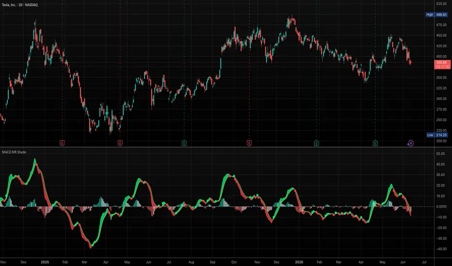
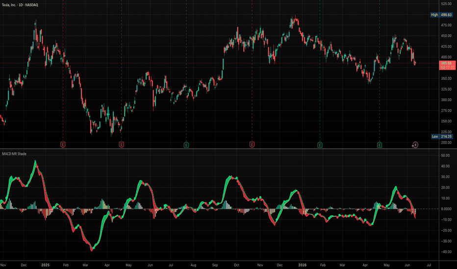
MACD Mean Reversion ShadingMACD Mean Reversion Shading
This indicator is a visual MACD tool designed to make MACD/signal-line momentum shifts easier to read at a glance.
Unlike a standard MACD display that only plots the MACD line, signal line, and histogram, this version emphasizes the relationship between the MACD and signal line by coloring the MACD line, plotting optional crossover dots, and shading the space between the MACD and signal line.
The purpose is to help traders quickly identify potential mean-reversion momentum turns after extended moves, especially when MACD begins crossing back toward the signal line.
How it works
The indicator calculates MACD using customizable EMA lengths. The default settings are:
Fast EMA: 8
Slow EMA: 21
Signal EMA: 5
These faster settings are designed to be more responsive than the traditional 12/26/9 MACD.
When the MACD line is above the signal line, the indicator colors the MACD line green and shades the area between the two lines green. When the MACD line is below the signal line, the MACD line turns red and the shaded area turns red.
Optional dots mark MACD/signal-line crossovers:
Green dot: MACD crosses above the signal line
Red dot: MACD crosses below the signal line
The histogram can be displayed using either two-color or four-color logic. The four-color mode distinguishes between rising/falling momentum above and below the zero line.
Multi-timeframe option
The script can calculate MACD using the current chart timeframe or an alternate user-selected timeframe. This allows traders to view higher- or lower-timeframe MACD behavior while staying on the current chart.
How to use it
This script is not intended to be a standalone buy/sell system. It is designed as a visual momentum and mean-reversion aid.
Potential uses include:
Spotting MACD/signal-line turns after extended directional moves
Identifying when bearish momentum is weakening
Identifying when bullish momentum is strengthening
Comparing MACD momentum across different chart timeframes
Using the shaded MACD/signal area as a quick visual trend/momentum filter
A green shaded region suggests MACD is above its signal line. A red shaded region suggests MACD is below its signal line. Traders should combine this with price structure, support/resistance, trend, volume, and broader market context.
Original contribution
The main contribution of this script is its visual treatment of MACD/signal-line interaction: dynamic line coloring, shaded MACD/signal spread, crossover dots, four-color histogram behavior, and optional multi-timeframe calculation in one configurable tool. Indicateur
Indicateur

McGinley Dynamic + LWPI ConfluenceWHAT IT DOES
This overlay combines two complementary reads of the market into a single confluence framework: the McGinley Dynamic, an adaptive trend line that speeds up when price runs and slows down in quiet conditions, and the Larry Williams Proxy Index (LWPI), a volatility-scaled balance-of-power oscillator. A signal prints only when both engines agree: trend direction from the McGinley Dynamic, momentum confirmation from the LWPI.
WHY COMBINE THEM
Every fixed-length moving average lags by a constant amount, which makes it too slow in fast markets and too jumpy in slow ones. The McGinley Dynamic addresses that by scaling its own smoothing factor with the ratio of price to its previous value — but, like any trend line, it says nothing about who is actually in control of the move. The LWPI measures exactly that: the average open-to-close pressure normalized by ATR. On its own, however, the LWPI whipsaws inside strong trends. Each component covers the other's blind spot, which is the reason for the mashup: the McGinley Dynamic decides direction, the LWPI decides timing.
HOW IT WORKS
1. Trend engine — McGinley Dynamic:
MD = MD + (price - MD ) / max(k * N * (price / MD )^4, 1)
The fourth-power ratio term automatically widens the divisor when price stretches away from the line, reducing overshoot and whipsaw versus EMAs of comparable length. Price above the line = bullish regime (line plots green), below = bearish (red).
2. Momentum engine — LWPI:
LWPI = 50 * SMA(open - close, N) / ATR(N) + 50
Readings below 50 mean closes are dominating opens relative to volatility (buyers in control); above 50, sellers are in control. Optional smoothing (SMA/EMA/WMA/RMA) is available for noisy symbols.
3. Confluence logic:
- Long state: price above McGinley Dynamic AND LWPI below 50
- Short state: price below McGinley Dynamic AND LWPI above 50
A triangle prints on the first bar a state becomes active. The optional candle coloring shows the full extent of each state; the dashboard in the top-right corner summarizes trend, momentum and confluence at a glance.
4. ATR reference bands:
Dotted bands at +/- ATR * multiplier around price provide volatility context, e.g. for evaluating whether a stop distance is realistic for the symbol and timeframe. They are informational and not part of the signal logic.
HOW TO USE IT
Works on any market and timeframe; it was designed with trending instruments in mind (crypto, FX majors, index futures). A simple workflow: read the regime from the line color, wait for the LWPI to hand momentum back to the trend side, and use the confluence triangle as your alert to start analyzing — not as an automatic entry. The three built-in alerts (long confluence, short confluence, trend flip) let you monitor multiple symbols without watching charts.
SETTINGS
All defaults are textbook values, not curve-fitted: McGinley length 14 with the standard 0.6 constant from the original formula, LWPI period 8, ATR 14 with a 2.0 multiplier. Every input is documented with tooltips.
CREDITS
The McGinley Dynamic concept belongs to John R. McGinley, CMT. The Larry Williams Proxy Index concept was popularized on TradingView by loxx, whose open-source work this script's momentum component builds on, with thanks.
DISCLAIMER
This is an educational tool for market analysis. It is not financial advice and no performance is implied or promised. Always do your own research.
Indicateur

Indicateur

Money Flow Accumulation Engine | Alpha S+Money Flow Accumulation Engine
Money Flow Accumulation Engine is a volume-flow oscillator designed to help users study accumulation, distribution, inflow, outflow, and flow divergence conditions.
The script combines several volume and price-pressure concepts into one normalized flow structure. It uses Money Flow Index behavior, Chaikin Money Flow logic, OBV deviation, price-location pressure, relative volume, and smoothed flow direction to create a broader view of whether volume behavior is leaning toward accumulation or distribution.
The script does not provide entry or exit recommendations. Its purpose is to help users study money-flow pressure, flow confirmation, flow weakness, divergence behavior, and accumulation or distribution zones in a structured oscillator format.
────────────────────
Core Concept
────────────────────
Volume can provide additional context that price alone does not show.
A rising price move with weak flow may have a different meaning from a rising price move with strong inflow.
A sideways price area with improving flow may suggest accumulation behavior.
A sideways or rising price area with weakening flow may suggest distribution behavior.
This script combines multiple flow components:
• MFI-based money flow pressure
• CMF-style volume pressure
• OBV deviation from its trend
• candle body and close-location pressure
• relative volume
• smoothed money-flow direction
• accumulation and distribution zone logic
• flow confirmation and flow weakness states
• divergence checks between price and flow
The goal is to give users a cleaner way to study whether volume pressure is strengthening, weakening, accumulating, or distributing.
────────────────────
What This Script Shows
────────────────────
The script can display:
• money flow histogram
• smoothed money flow line
• flow signal line
• smart money line
• accumulation ribbon
• distribution ribbon
• inflow and outflow guide levels
• strong inflow and strong outflow guide levels
• accumulation and distribution start labels
• flow confirmation markers
• flow out markers
• optional flow weakness labels
• optional divergence labels
• current state badge
• debug component plots
These elements are intended to help users review whether market participation is showing stronger inflow, outflow, accumulation, distribution, or weaker flow conditions.
────────────────────
How It Works
────────────────────
1. The script calculates Money Flow Index and converts it into a centered flow value.
2. It calculates a CMF-style money-flow component using close location within the candle range and volume.
3. It calculates OBV and measures OBV deviation from its EMA trend.
4. It calculates price-volume pressure from candle body direction, close location, and relative volume.
5. These components are combined into a single raw money-flow value.
6. The raw value is smoothed to create the main money-flow line.
7. A slower signal line is created from the flow value.
8. A smart money line is calculated from the smoothed flow.
9. Accumulation candidates are detected when price is flat or down, price is near the lower part of its range, flow improves, and relative volume is present.
10. Distribution candidates are detected when price is flat or up, price is near the upper part of its range, flow weakens, and relative volume is present.
11. Accumulation and distribution zones require conditions to persist for a selected number of bars.
12. Flow confirmation is detected when flow strength, smart money slope, signal-line alignment, and relative volume agree.
13. Flow out confirmation can be blocked near short-term lows to reduce late bearish labels.
14. Divergence checks compare price extremes with flow behavior over the selected lookback period.
15. Cooldowns reduce repeated labels in the same region.
16. Scores are calculated for accumulation, distribution, flow confirmation, weakness, and divergence states.
This structure helps users study money-flow behavior without relying on a single volume indicator.
────────────────────
Inputs And Customization
────────────────────
Users can adjust:
• source price
• money flow length
• flow smoothing
• OBV trend length
• CMF length
• volume moving average length
• accumulation lookback
• distribution lookback
• flat price ATR range
• flow confirmation level
• flow weak level
• divergence lookback
• signal cooldown bars
• accumulation and distribution zone minimum bars
• minimum divergence score
• minimum confirm score
• minimum accumulation score
• minimum distribution score
• flow-out filter near short-term lows
• near-low and near-high range thresholds
• histogram visibility
• flow line visibility
• smart money line visibility
• accumulation and distribution ribbons
• start labels
• signal labels
• small markers
• divergence labels
• guide lines
• current badge
• debug plots
• label language
• score visibility
The default settings are designed to keep the oscillator readable while highlighting only higher-priority flow states.
────────────────────
Visual Elements
────────────────────
The script includes:
• histogram columns
• flow line
• signal line
• smart money line
• upper and lower flow guide levels
• accumulation ribbon
• distribution ribbon
• compact markers
• optional text labels
• optional current badge
The histogram shows the current composite money-flow value.
The flow line smooths the composite flow pressure.
The signal line gives a slower comparison reference.
The smart money line is a secondary smoothed flow reference used in accumulation, distribution, and confirmation logic.
The ribbons mark persistent accumulation or distribution environments.
Markers and labels are prioritized so that accumulation and distribution zone starts appear before lower-priority states.
────────────────────
Reference States
────────────────────
Accumulation:
A persistent lower-range condition where price is flat or down, price remains near the lower part of its range, and flow behavior is improving.
Distribution:
A persistent upper-range condition where price is flat or up, price remains near the upper part of its range, and flow behavior is weakening.
Flow Confirm:
A stronger positive-flow state where flow, signal-line relationship, smart money slope, and relative volume support the same direction.
Flow Out:
A stronger negative-flow state where flow, signal-line relationship, smart money slope, and relative volume support outflow behavior.
Flow Weak:
A condition where price movement continues but flow behavior weakens compared with prior flow.
Bullish Flow Divergence:
Price forms a lower low while flow does not confirm the same weakness.
Bearish Flow Divergence:
Price forms a higher high while flow does not confirm the same strength.
These states are informational and should not be interpreted as trading instructions.
────────────────────
How To Use
────────────────────
Use this script as a money-flow and accumulation-distribution analysis tool.
General interpretation examples:
• Positive flow values suggest stronger inflow pressure.
• Negative flow values suggest stronger outflow pressure.
• Flow above the signal line can show improving flow pressure.
• Flow below the signal line can show weakening flow pressure.
• A rising smart money line can support improving flow context.
• A falling smart money line can support weakening flow context.
• Accumulation ribbons can help users study areas where price is not advancing strongly but flow conditions are improving.
• Distribution ribbons can help users study areas where price is not declining strongly but flow conditions are weakening.
• Flow Confirm labels can help users identify stronger positive-flow alignment.
• Flow Out labels can help users identify stronger negative-flow alignment.
• Divergence labels can help users compare price extremes with flow behavior.
• Scores can be used as a relative strength reference for each detected state.
This script is best reviewed together with price action, trend structure, support and resistance, volume context, volatility, and higher-timeframe conditions.
────────────────────
Confirmation And Repainting Notes
────────────────────
The script calculates flow values from current and historical price-volume data.
On realtime candles, values can change before the candle closes because price, volume, range position, MFI, CMF, OBV, and smoothing values can update intrabar.
For more conservative analysis, users should review flow states after candle confirmation.
The script does not use future price data to predict market direction.
Divergence and zone labels are based on selected lookback windows and may depend on how the current candle closes.
────────────────────
Limitations
────────────────────
This script does not predict future price movement.
It does not provide entry or exit recommendations.
Accumulation does not guarantee an upward move.
Distribution does not guarantee a downward move.
Strong inflow can appear during late-stage continuation or exhaustion.
Strong outflow can appear near short-term lows, which is why the script includes an optional flow-out filter.
Divergence can persist for a long time before price reacts.
Different symbols and timeframes may require different settings.
This script should not be used as a standalone trading system.
────────────────────
Disclaimer
────────────────────
This publication is for educational and informational chart analysis only.
It does not constitute financial advice, investment advice, or a recommendation to trade any financial instrument.
All trading and investment decisions are the responsibility of the user.
━━━━━━━━━━━━━━━━━━━━
Money Flow Accumulation Engine
Money Flow Accumulation Engine은 매집, 분산, 자금 유입, 자금 이탈, 흐름 다이버전스 조건을 분석하기 위한 거래량 기반 money-flow 오실레이터입니다.
이 스크립트는 여러 거래량 및 가격 압력 개념을 하나의 정규화된 flow 구조로 결합합니다. Money Flow Index, Chaikin Money Flow 방식의 압력, OBV 편차, 가격 위치 압력, 상대 거래량, smoothed flow direction을 사용해 거래량 행동이 accumulation 또는 distribution 쪽으로 기울고 있는지 분석합니다.
이 지표는 진입 또는 청산 추천을 제공하지 않습니다. 목적은 money-flow pressure, flow confirmation, flow weakness, divergence behavior, accumulation 또는 distribution zone을 구조화된 오실레이터 형태로 분석하는 것입니다.
────────────────────
핵심 개념
────────────────────
거래량은 가격만으로는 보이지 않는 추가 컨텍스트를 제공할 수 있습니다.
약한 flow를 동반한 가격 상승과 강한 inflow를 동반한 가격 상승은 서로 다르게 해석될 수 있습니다.
가격이 횡보하는 동안 flow가 개선되면 accumulation behavior를 검토할 수 있습니다.
가격이 횡보하거나 상승하는 동안 flow가 약해지면 distribution behavior를 검토할 수 있습니다.
이 스크립트는 다음 flow component를 결합합니다.
• MFI 기반 money flow pressure
• CMF 스타일 volume pressure
• OBV trend 대비 deviation
• candle body 및 close-location pressure
• relative volume
• smoothed money-flow direction
• accumulation 및 distribution zone logic
• flow confirmation 및 flow weakness states
• price와 flow 사이의 divergence checks
목표는 거래량 압력이 강화, 약화, 매집, 분산 중 어디에 가까운지 더 깔끔하게 검토할 수 있도록 돕는 것입니다.
────────────────────
이 스크립트가 보여주는 것
────────────────────
이 스크립트는 다음 요소를 표시할 수 있습니다.
• money flow histogram
• smoothed money flow line
• flow signal line
• smart money line
• accumulation ribbon
• distribution ribbon
• inflow and outflow guide levels
• strong inflow and strong outflow guide levels
• accumulation and distribution start labels
• flow confirmation markers
• flow out markers
• optional flow weakness labels
• optional divergence labels
• current state badge
• debug component plots
이 요소들은 시장 참여가 강한 inflow, outflow, accumulation, distribution 또는 weaker flow 조건 중 어디에 가까운지 검토하는 데 도움을 줍니다.
────────────────────
작동 방식
────────────────────
1. Money Flow Index를 계산하고 이를 중심화된 flow 값으로 변환합니다.
2. 캔들 범위 내 종가 위치와 거래량을 사용해 CMF 스타일 money-flow component를 계산합니다.
3. OBV를 계산하고 OBV가 EMA trend에서 얼마나 벗어났는지 측정합니다.
4. 캔들 몸통 방향, 종가 위치, 상대 거래량을 사용해 price-volume pressure를 계산합니다.
5. 이 component들을 하나의 raw money-flow value로 결합합니다.
6. Raw value를 평활화하여 main money-flow line을 만듭니다.
7. Flow value에서 더 느린 signal line을 만듭니다.
8. Smoothed flow에서 smart money line을 계산합니다.
9. Accumulation candidate는 가격이 flat 또는 down이고, 가격이 범위 하단부에 있으며, flow가 개선되고, relative volume이 존재할 때 감지됩니다.
10. Distribution candidate는 가격이 flat 또는 up이고, 가격이 범위 상단부에 있으며, flow가 약해지고, relative volume이 존재할 때 감지됩니다.
11. Accumulation 및 distribution zone은 조건이 선택한 봉 수 이상 지속되어야 합니다.
12. Flow confirmation은 flow strength, smart money slope, signal-line alignment, relative volume이 같은 방향으로 정렬될 때 감지됩니다.
13. Flow out confirmation은 단기 저점 부근에서 늦은 bearish label을 줄이기 위해 선택적으로 차단할 수 있습니다.
14. Divergence check는 선택한 lookback period에서 price extreme과 flow behavior를 비교합니다.
15. Cooldown은 같은 구간에서 반복 label을 줄입니다.
16. Score는 accumulation, distribution, flow confirmation, weakness, divergence state별로 계산됩니다.
이 구조는 단일 거래량 지표에만 의존하지 않고 money-flow behavior를 검토할 수 있게 합니다.
────────────────────
입력값 및 설정
────────────────────
사용자는 다음 항목을 조정할 수 있습니다.
• source price
• money flow length
• flow smoothing
• OBV trend length
• CMF length
• volume moving average length
• accumulation lookback
• distribution lookback
• flat price ATR range
• flow confirmation level
• flow weak level
• divergence lookback
• signal cooldown bars
• accumulation and distribution zone minimum bars
• minimum divergence score
• minimum confirm score
• minimum accumulation score
• minimum distribution score
• short-term low 부근 flow-out filter
• near-low 및 near-high range thresholds
• histogram visibility
• flow line visibility
• smart money line visibility
• accumulation and distribution ribbons
• start labels
• signal labels
• small markers
• divergence labels
• guide lines
• current badge
• debug plots
• label language
• score visibility
기본 설정은 오실레이터를 읽기 쉽게 유지하면서, 우선순위가 높은 flow state만 강조하도록 설계되어 있습니다.
────────────────────
시각 요소
────────────────────
이 스크립트는 다음 시각 요소를 포함합니다.
• histogram columns
• flow line
• signal line
• smart money line
• upper and lower flow guide levels
• accumulation ribbon
• distribution ribbon
• compact markers
• optional text labels
• optional current badge
Histogram은 현재 composite money-flow value를 보여줍니다.
Flow line은 composite flow pressure를 평활화한 값입니다.
Signal line은 더 느린 비교 기준선입니다.
Smart money line은 accumulation, distribution, confirmation logic에 사용되는 secondary smoothed flow reference입니다.
Ribbon은 persistent accumulation 또는 distribution environment를 표시합니다.
Marker와 label은 accumulation 및 distribution zone start가 낮은 우선순위 상태보다 먼저 표시되도록 정리되어 있습니다.
────────────────────
참고 상태
────────────────────
Accumulation:
가격이 flat 또는 down이고, 가격이 범위 하단부에 머물며, flow behavior가 개선되는 persistent lower-range condition입니다.
Distribution:
가격이 flat 또는 up이고, 가격이 범위 상단부에 머물며, flow behavior가 약해지는 persistent upper-range condition입니다.
Flow Confirm:
Flow, signal-line relationship, smart money slope, relative volume이 같은 방향으로 정렬된 stronger positive-flow state입니다.
Flow Out:
Flow, signal-line relationship, smart money slope, relative volume이 outflow behavior를 지지하는 stronger negative-flow state입니다.
Flow Weak:
가격 움직임은 이어지지만 flow behavior가 과거 flow와 비교해 약해지는 상태입니다.
Bullish Flow Divergence:
가격이 lower low를 만들지만 flow가 같은 약세를 확인하지 않는 상태입니다.
Bearish Flow Divergence:
가격이 higher high를 만들지만 flow가 같은 강세를 확인하지 않는 상태입니다.
이 상태들은 정보 제공용이며, 매매 지시로 해석해서는 안 됩니다.
────────────────────
사용 방법
────────────────────
이 스크립트는 money-flow 및 accumulation-distribution analysis tool로 사용하는 것이 적절합니다.
일반적인 해석 예시는 다음과 같습니다.
• Positive flow value는 stronger inflow pressure를 의미할 수 있습니다.
• Negative flow value는 stronger outflow pressure를 의미할 수 있습니다.
• Flow가 signal line 위에 있으면 improving flow pressure를 검토할 수 있습니다.
• Flow가 signal line 아래에 있으면 weakening flow pressure를 검토할 수 있습니다.
• Rising smart money line은 improving flow context를 보조할 수 있습니다.
• Falling smart money line은 weakening flow context를 보조할 수 있습니다.
• Accumulation ribbon은 가격이 강하게 상승하지 않더라도 flow condition이 개선되는 구간을 검토하는 데 사용할 수 있습니다.
• Distribution ribbon은 가격이 강하게 하락하지 않더라도 flow condition이 약해지는 구간을 검토하는 데 사용할 수 있습니다.
• Flow Confirm label은 stronger positive-flow alignment를 확인하는 데 사용할 수 있습니다.
• Flow Out label은 stronger negative-flow alignment를 확인하는 데 사용할 수 있습니다.
• Divergence label은 price extreme과 flow behavior를 비교하는 데 사용할 수 있습니다.
• Score는 각 detected state의 relative strength reference로 사용할 수 있습니다.
이 스크립트는 가격 행동, 추세 구조, 지지와 저항, 거래량 컨텍스트, 변동성, 상위 시간대 조건과 함께 검토하는 것이 좋습니다.
────────────────────
확인봉 및 리페인트 안내
────────────────────
이 스크립트는 현재 및 과거 price-volume data에서 flow value를 계산합니다.
실시간 캔들에서는 price, volume, range position, MFI, CMF, OBV, smoothing value가 봉 마감 전까지 변경될 수 있으므로 값이 변할 수 있습니다.
보다 보수적인 분석을 원한다면 봉 마감 이후 flow state를 검토하는 것이 적절합니다.
이 스크립트는 미래 가격 데이터를 사용해 시장 방향을 예측하지 않습니다.
Divergence 및 zone label은 선택한 lookback window와 현재 캔들의 마감 방식에 영향을 받을 수 있습니다.
────────────────────
한계
────────────────────
이 스크립트는 미래 가격 움직임을 예측하지 않습니다.
진입 또는 청산 추천을 제공하지 않습니다.
Accumulation이 상승 움직임을 보장하지 않습니다.
Distribution이 하락 움직임을 보장하지 않습니다.
Strong inflow는 late-stage continuation 또는 exhaustion에서도 나타날 수 있습니다.
Strong outflow는 단기 저점 부근에서도 나타날 수 있으며, 이를 줄이기 위해 선택형 flow-out filter가 포함되어 있습니다.
Divergence는 가격이 반응하기 전까지 오래 지속될 수 있습니다.
종목과 시간대에 따라 적절한 설정값이 달라질 수 있습니다.
이 스크립트를 단독 매매 시스템으로 사용해서는 안 됩니다.
────────────────────
중요 고지
────────────────────
본 게시물은 교육 및 정보 제공 목적의 차트 분석 자료입니다.
투자 자문, 특정 금융상품 거래 권유, 또는 수익 보장을 의미하지 않습니다.
모든 투자 판단과 그 결과에 대한 책임은 이용자 본인에게 있습니다. Indicateur

Indicateur

Indicateur

Indicateur

Indicateur

Indicateur

Adaptive Momentum Strength Score (AMSS)There is a specific kind of frustration that every serious trader knows.
The setup looks right. The candle closes with conviction. The oscillator confirms. You enter and the move immediately stalls, reverses, or dissolves into noise. Later you realize the volume was weak, volatility never truly expanded, or directional pressure had already started fading before the entry.
That frustration is not a discipline problem. It is an information problem.
Most momentum indicators measure one piece of the puzzle. RSI measures price velocity. Volume indicators measure participation. Bollinger Bands measure volatility state. Each tells part of the story. The Adaptive Momentum Strength Score was built on the conviction that momentum quality can only be evaluated meaningfully when several complementary market forces are read together, not after the fact, but simultaneously, on every bar.
The Core Framework
The purpose of the composite score is straightforward: to answer not just whether price is moving, but whether the move is supported by the conditions that tend to give momentum its staying power.
The score is normalized between 0 and 100 and built from three independent components. The first measures candle impulse relative to ATR not raw candle size, but how decisive the current bar is in the context of what normal looks like for this asset right now. The second measures volume participation by comparing current volume against its moving average, distinguishing genuine momentum expansion from the kind of low-participation drift that precedes failed breakouts far more often than it precedes continuation. The third measures volatility expansion through Bollinger Band width relative to its own average, detecting the transition from compression into expansion as a market begins releasing stored energy.
Each component is independently normalized before combining. By default, volume participation carries the greatest weight of the three — a deliberate choice reflecting the observation that genuine participation tends to be the most reliable differentiator between momentum that follows through and momentum that fades. Candle impulse and volatility expansion carry equal secondary weight, acknowledging that decisive price movement and volatility expansion both contribute meaningfully to momentum quality without either being treated as a primary condition on its own. All weights remain fully adjustable for traders who prefer a different emphasis across different assets or timeframes.
What separates this framework from most traditional oscillators is that momentum strength, directional pressure, market regime, momentum acceleration, and signal confirmation are kept as independent layers that work together while remaining individually interpretable. The goal is not to compress everything into a single binary output but to provide a structured view of how momentum is developing and whether broader conditions are genuinely supportive.
Adaptive Thresholds
A composite score is only as useful as the threshold that determines when it becomes meaningful.
The indicator supports two threshold modes. Fixed mode works cleanly in stable trending environments where volatility expression is consistent. Adaptive mode the recommended default calculates the threshold dynamically using rolling score averages and standard deviation scaling, then clamps it within a defined range. As market character shifts, the threshold recalibrates automatically rather than forcing traders to manually adjust a static level every time volatility conditions change.
The practical consequence is worth understanding directly. In a static-threshold oscillator, a compression phase floods the chart with false crossovers while a genuine expansion phase can produce delayed or missed signals. The adaptive threshold adjusts to both conditions without intervention. The active level is always displayed as the orange reference line, there is never ambiguity about where the signal boundary sits.
The score is additionally classified into Weak, Moderate, and Strong states relative to the active threshold, allowing momentum quality to be evaluated quickly without relying on raw numerical values alone.
Directional Pressure
The score measures momentum magnitude. Direction is handled through a completely separate layer.
Directional bias is established through a two-part confirmation test on every bar. Price must sit on the correct side of a short-period directional EMA, and the average ATR-normalized candle direction over the recent lookback must clear a pressure threshold, meaning a single extended wick or isolated candle cannot flip the directional label on its own. The result is a three-state classification that updates in real time: Bullish, Bearish, or Neutral. This label colors the score line and feeds directly into the signal confirmation logic.
Regime Classification
Not all momentum signals carry equal weight. A score crossover during an expanding market is a categorically different event from the same crossover inside a compressed, coiling environment and treating them identically is one of the more common ways momentum-based approaches produce inconsistent results.
The indicator measures the range of the score over a lookback window and classifies conditions into three states. Compressed means the score has been operating within a narrow band, the market is coiling, energy may be building, and momentum signals in this state generally exhibit lower follow-through and greater variability, although strong expansions can emerge from prolonged compression. Balanced reflects normal trending or ranging conditions. Expanding means the score range has broken above the expansion threshold the market is releasing energy, and momentum signals carry stronger continuation characteristics during this state.
Regime classification can be applied as a filter to triangle signals or used purely as context within the dashboard.
Momentum Velocity
Knowing where the score is tells you the current momentum level. Knowing how fast it is changing tells you something more useful, where momentum is likely heading before price makes it obvious.
The velocity engine calculates the rate of change of the score relative to its own standard deviation, producing a normalized reading that classifies momentum as Accelerating, Decelerating, or Flat. When the score is rising rapidly against its recent volatility baseline, conditions are classified as Accelerating. When the score is fading even if it remains above the threshold the label shifts to Decelerating, and the score line renders at reduced opacity as a visual signal that underlying momentum may be exhausting before price visibly reacts.
For traders who have held into momentum reversals that showed no obvious price-level warning, this layer provides an early internal warning signal within the indicator's architecture that conditions are beginning to shift.
Two Signal Tiers
The indicator produces signals on two distinct levels, and the distinction between them is worth understanding precisely.
Threshold dots appear whenever the score crosses the active threshold while directional pressure is already aligned. They are intentionally sensitive as early directional momentum awareness signals indicating that conditions are beginning to strengthen, even though the broader filter stack may not yet be confirmed. Experienced traders use them to shift attention and begin evaluating whether a fuller setup is developing.
Triangle signals are the fully confirmed output. A triangle only appears when the score crosses the threshold, directional pressure agrees, and every enabled filter in the active gate stack also confirms simultaneously. This is not a smoothed version of the dot signal. It is a categorically different signal type representing the convergence of multiple independent conditions at the same moment.
The separation is deliberate. Dots keep traders informed of developing momentum. Triangles reserve the strongest visual output for the moments that genuinely earn it.
The Signal Gate Stack
Before any triangle reaches the chart it passes through up to four independent gates, stackable in any combination.
The current-timeframe EMA filter blocks signals running counter to local trend structure. The higher-timeframe EMA filter adds a structural second opinion from a broader timeframe, 4-hour by default with an option to use only confirmed closed bars to avoid incomplete higher-timeframe calculations. The regime filter restricts signals during compressed conditions or limits them to expanding phases only. The cooldown gate enforces a minimum bar gap between consecutive signals, suppressing the cluster of repeat triggers that commonly fire around a single momentum event and dilute signal quality.
The dashboard always displays exactly which gates are active. Traders never need to guess why a triangle did or did not appear, the filter logic is visible at all times.
Reading the Indicator: A Practical Workflow
1. Assess market regime first . Check the Info Table before anything else. Compressed conditions mean the score has been coiling in a tight range crossovers here often require greater selectivity, as follow-through tends to be less reliable until expansion begins, and participation should be approached more selectively. Expanding conditions deserve closer attention, as momentum signals generally carry stronger continuation characteristics during these phases.
2. Verify directional alignment. Confirm that the score line color and the Direction label in the dashboard match your intended trade direction. A technically valid score crossover against prevailing directional pressure is a lower-quality setup by design.
3. Watch for the threshold dot on the score pane . A small circle plots on the score line the moment momentum crosses the active threshold while directional pressure is already aligned. This is your early awareness signal. It means conditions are beginning to strengthen, but the broader confirmation stack may not yet be complete. Use it to shift attention to the price chart, not necessarily to trigger execution.
4. Wait for the triangle on the price chart . The triangle is the confirmed execution signal. It only appears when the score has crossed the threshold, directional pressure agrees, and every enabled gate in your active filter stack has confirmed simultaneously. Depending on your settings, this may include EMA alignment, regime validation, and cooldown logic. No triangle means at least one required condition has not been met, regardless of how the score looks in the pane below.
5. Check momentum velocity before entry. An Accelerating label at the point of the triangle adds meaningful weight to the setup. A Decelerating label on an otherwise valid triangle is a caution not necessarily a reason to avoid the trade, but a reminder that momentum quality may be less aggressive, follow-through may develop more gradually, or reversal risk may be beginning to increase.
6. Manage the trade with velocity as context, not as a standalone exit signal . If the score remains above or near the threshold but the line has dimmed signaling Decelerating momentum the move may be losing force even while price continues in the same direction. This does not automatically invalidate the trade or imply immediate exit. Instead, use velocity as an additional layer of context alongside price structure, trend conditions, and your existing risk-management framework.
What This Indicator Is Designed For
The Adaptive Momentum Strength Score is not a standalone trading system and does not attempt to be one. It is a momentum context engine — a structured framework for evaluating whether the conditions behind a price move reflect genuine strength and participation or whether they represent the kind of isolated, low-quality momentum that tends to produce less reliable continuation.
Every design decision in this script traces back to a single conviction: durable edge in trading does not come from reacting faster to a single signal. It comes from reading multiple independent market forces simultaneously and acting only when they converge. That is what this indicator was built to do and that is the only thing it claims to do well.
My Scripts/Indicators/Systems are for educational purposes only! Indicateur