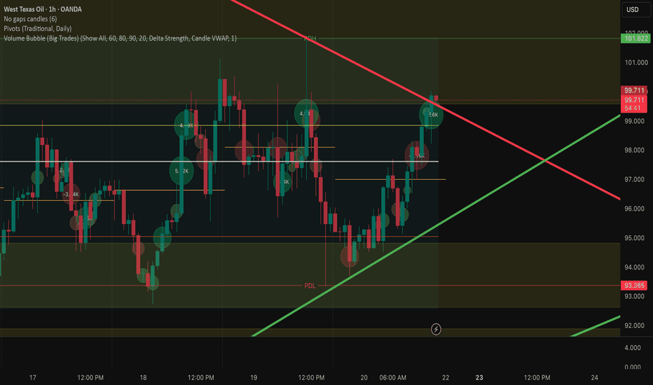
Volume Bubble (Big Trades)Gemini said
Delta Volume Bubbles: How It Works
The Delta Volume Bubbles indicator is a sophisticated order flow tool designed to visualize "aggressive" market activity directly on your price chart. Instead of looking at a separate sub-window for volume, this script places circular "bubbles" on the candles where significant buying or selling pressure occurs.
1. The Core Logic: Delta Calculation
At its heart, the indicator uses Volume Delta, which is the difference between buying volume (at the ask) and selling volume (at the bid).
Positive Delta: More aggressive buying; the bubble is typically green.
Negative Delta: More aggressive selling; the bubble is typically red.
To provide precision, the script uses Lower Timeframe (LTF) data. For example, if you are on a 1-hour chart, it scans 1-minute data to see how volume was distributed within that hour.
2. Bubble Placement & Size
The indicator doesn't just put a dot at the close. It offers two placement modes:
Candle VWAP: Places the bubble at the Volume Weighted Average Price of that specific candle, showing you exactly where the "heavy" trading occurred.
Middle: Places the bubble at the candle’s midpoint (HL/2).
The size of the bubble is dynamic, scaling based on the Z-Score (a statistical measure of how "extreme" the volume is compared to the recent average). A "Huge" bubble represents a significant statistical outlier in volume.
3. Filtering and Intensity
The script filters out "noise" so your chart isn't cluttered.
Percentile Filter: Only shows bubbles if the volume is in the top X% (e.g., top 60%) of recent history.
Intensity Mode: When enabled, the colors shift from "Buy/Sell" to a heat map (Gray → Blue → Orange → Red) based on the pure strength of the volume, regardless of direction.
4. Visual Clarity
The recent update introduces a Transparency Slider. This allows you to make the bubbles "ghost-like," ensuring they don't hide the wick or body of the candlestick. This is crucial for price action traders who need to see if a big volume bubble resulted in a reversal pin bar or a breakout. Indicateur
Volume Defense Zones [MarkitTick]💡 The Volume Defense Zones is a professional-grade liquidity analysis engine designed to identify institutional interest by isolating ultra-high volume transactions and mapping them as dynamic support and resistance zones. Unlike standard volume indicators that merely plot vertical bars, this script utilizes a sophisticated heatmap engine and a multi-timeframe (MTF) overlay to provide a three-dimensional view of market participation. By calculating the Volume Weighted Average Price (VWAP) specifically for high-intensity bars, the indicator creates "Defense Zones"—price levels where large-scale players have historically committed significant capital.
● ✨ Originality and Utility
This indicator distinguishes itself from the vast library of open-source tools through its unique "Search Depth" logic and automated zone merging capabilities. While many scripts identify volume spikes, they often clutter the chart with overlapping lines that lose relevance over time. This system solves that problem by:
• Dynamic Zone Consolidation
The script includes a proprietary merge threshold algorithm. If two high-volume defense levels are within a user-defined percentage of each other, the script automatically merges them into a single "Defense Box." This reflects the reality of market "zones" rather than surgical price points.
• Multi-Timeframe Institutional Benchmarking
By integrating a built-in MTF overlay, traders can visualize 4-hour or Daily volume defense zones while trading on a 5-minute chart. This ensures that the user is always aware of the "Big Picture" liquidity levels that are likely to hold during intraday volatility.
• Historical Ghosting and Breakout Analysis
The script tracks whether a zone is "active" or "broken." When price breaches a defense level, the zone doesn't simply disappear; it transforms into a "Ghost Zone" (dotted line), allowing traders to analyze S/R flips and historical retests of previously defended levels.
● 🔬 Methodology and Concepts
The core logic of the Volume Defense Zones is rooted in the identification of "Abnormal Volume" relative to a historical lookback period.
• Peak Volume Identification
The script maintains a rolling window of volume data defined by the "Comparison Length" input. A bar is classified as "Ultra High Volume" only if its volume exceeds the maximum volume recorded in that lookback window. This ensures that the signals adapt to changing market regimes (e.g., high-volatility sessions vs. low-volume holidays).
• The Defense Calculation
For every identified volume peak, the script calculates a localized VWAP using the internal formula:
Accumulated (Volume * Bar Body Center) / Total Volume.
This price level represents the "Average Cost Basis" of the participants during that specific high-intensity event. If the price remains above this VWAP, the level is treated as a Bullish Defense (Support). If price stays below it, it is a Bearish Defense (Resistance).
• Multi-Timeframe (MTF) Security
Using the request.security function with barmerge.lookahead_on (and appropriate offsets to prevent repainting), the script fetches high-volume levels from higher timeframes. This provides a top-down liquidity map that identifies where large institutions are "defending" their positions.
● 🎨 Visual Guide
The visual output is divided into three primary categories to ensure maximum clarity and actionable data visualization:
• The Volume Heatmap (Bottom Pane)
Instead of standard green and red bars, this script uses a professional 5-color heatmap gradient:
- Deep Blue (HM_C0): Low interest / baseline volume.
- Teal/Cyan (HM_C1/HM_C2): Rising interest.
- Gold (HM_C3): High participation.
- Bright Red (HM_C4): Ultra-High Volume.
These bars are framed with thicker borders when a new peak is detected, making the "Ultra Vol" events immediately visible.
• Defense Zones and Labels
- Green Boxes (ZONE_BULL_COL): Represent active bullish defense zones where buyers are currently in control of the high-volume level.
- Red Boxes (ZONE_BEAR_COL): Represent active bearish defense zones where sellers are successfully defending the level.
- Blue/Neutral Boxes (ZONE_INSIDE_COL): Represent zones where the price is currently trading inside the defense range, indicating a period of consolidation or "battle."
- Dotted Lines/Boxes: These are "Broken" or "Ghost" zones. They indicate levels that were previously significant but have been breached.
• Trend Climax Indicators
The script plots specific triangles on the volume bars:
- Green Up Triangle (▲): Bullish Climax. Occurs when price is trending down but a high-volume reversal is detected above the VWAP.
- Red Down Triangle (▼): Bearish Climax. Occurs when price is trending up but a high-volume rejection is detected below the VWAP.
• Professional Dashboard
A clean table in the top-right corner displays real-time statistics, including Total Volume, Max Volume, Average Volume, and the total count of analyzed bars.
● 📖 How to Use
Identifying Institutional Support: Look for thick green boxes formed during "Ultra High Vol" events. These are areas where price is likely to bounce upon a retest.
Trading the Breakout: When a red resistance zone is breached and turns into a dotted "Ghost" zone, wait for a retest of that level. If price holds above it, the old resistance has become new support.
Filtering with MTF: Only take long trades when the price is above the Purple MTF lines, which represent the higher-timeframe institutional defense levels.
Exhaustion Signals: Use the Climax Triangles (▲/▼) to identify potential trend reversals. A red triangle at the end of a long uptrend often signals that "smart money" is distributing their positions.
● ⚙️ Inputs and Settings
• Volume Settings
- Time Resolution: Allows you to change the granularity of the volume analysis.
- Comparison Length: Defines the lookback period (default 20) for determining what constitutes a "Peak" volume bar.
• Visual & Analysis
- Search Depth (Levels): Controls how many historical S/R zones are displayed on the chart. Increasing this provides more historical context but may clutter the view.
- Merge Threshold (%): A critical setting that defines how close two price levels must be to be grouped into a single zone.
- Show All Data Labels: Toggles the display of exact volume figures above the bars.
• Multi-Timeframe Overlay
- HTF Timeframe: Set the higher timeframe (e.g., 240 for 4-hour) to see macro defense zones.
- Max HTF Zones: Limits the number of MTF lines drawn to keep the chart clean.
● 🔍 Deconstruction of the Underlying Scientific and Academic Framework
The indicator is constructed upon the principles of **Auction Market Theory (AMT)** and **Volume Spread Analysis (VSA)**.
• Auction Market Theory
The fundamental premise is that the market is an ongoing auction where the purpose of price is to find the area where the most volume can be transacted. The "Defense Zones" calculated by this script represent "High Volume Nodes" (HVN). Scientifically, these are levels of high price acceptance. When price moves away from these zones and returns, the script tests whether the "Value" has shifted or if the previous participants are still willing to transact at that level.
• Statistical Outlier Theory
The "Ultra High Volume" detection utilizes a non-parametric approach to identify outliers. By comparing the current volume to the rolling maximum of the previous $N$ periods, the script effectively identifies events that fall outside the standard distribution of market activity. This is mathematically equivalent to identifying "Z-score" spikes in volume, signifying a significant shift in market sentiment or the injection of institutional liquidity.
• Volume Weighted Cost Basis (VWCB)
The use of VWAP within the defense zones is based on the academic concept of the "Volume Weighted Cost Basis." In institutional finance, the execution quality of a large trade is measured against the VWAP. Therefore, these levels act as psychological and financial "anchors" for large participants who need to protect their average entry price to maintain a profitable position.
⚠️ Disclaimer
All provided scripts and indicators are strictly for educational exploration and must not be interpreted as financial advice or a recommendation to execute trades. I expressly disclaim all liability for any financial losses or damages that may result, directly or indirectly, from the reliance on or application of these tools. Market participation carries inherent risk where past performance never guarantees future returns, leaving all investment decisions and due diligence solely at your own discretion. Indicateur

Indicateur

Indicateur
Indicateur

Indicateur

Indicateur
Indicateur

Absorption SignalsAbsorption Signals by QuantShok (JacobS369)
This script detects absorption candles — bars where aggressive selling is absorbed by buyers (bullish) or aggressive buying is absorbed by sellers (bearish). It uses TradingView's built-in volume delta to measure the net buying/selling pressure within each bar, then flags bars where the delta diverges from the price action on abnormally high volume. Each signal is scored on a 1–5 star confidence system so you can filter for only the highest-quality setups.
The core logic: a bullish absorption fires when the bar closes green (or flat) despite net negative delta on a volume spike — meaning sellers pushed hard but buyers absorbed it all and held price up. A bearish absorption is the mirror — the bar closes red despite net positive delta on a volume spike, meaning buyers pushed but sellers absorbed the pressure and drove price down.
Default settings are optimized for NQ (Nasdaq 100 Futures).
Settings Breakdown
Absorption Settings — "Volume Lookback Period" (default 20) is the number of bars on your current chart timeframe used to calculate average volume and standard deviation for the z-score. On a 5-minute chart, that's the last 20 five-minute bars. "Volume Z-Score Threshold" (default 1.5) sets how many standard deviations above average the current bar's volume needs to be to qualify as a spike — raise it to only catch bigger volume anomalies, lower it for more signals. "Minimum Wick Size %" is the input for wick filtering though the confidence system handles wick scoring internally at the 40% level. "Delta Timeframe" (default 1 minute) controls the resolution used to estimate volume delta — this is independent of your chart timeframe and pulls 1-minute data to approximate buy vs sell volume within each bar.
Confidence Settings — "Minimum Stars to Display" (default 2) filters out low-confidence signals so only setups meeting your threshold appear on the chart. The confidence scoring works by starting at 1 star for any valid absorption signal, then adding stars for: volume z-score above 2.0 (+1), volume z-score above 3.0 (+1), delta z-score above 2.0 (+1), significant wick size above 40% of bar range (+1), and multi-bar confirmation (+1), capped at 5. "Require Multi-Bar Confirmation" checks whether consecutive bars show absorption at the same price level. "Multi-Bar Tolerance" controls how close those consecutive bars need to be (as a percentage of ATR) to count as confirming each other.
Visuals — Toggle bubbles, confidence labels, and the dashboard independently. Bubble size scales with confidence (tiny for 1 star up to huge for 5 stars), and color intensity increases with higher confidence. The dashboard in the top right shows live volume z-score, delta z-score, net delta, current absorption signal, and multi-bar confirmation status. Hovering over any label shows a detailed tooltip with all the underlying stats for that signal.
Adapting to Other Instruments
The main settings to consider adjusting are the volume lookback period (shorter for faster-moving instruments, longer for steadier ones), the z-score threshold (lower it for instruments with less volatile volume patterns, raise it for noisier ones), and the multi-bar tolerance (widen it for instruments with larger ATR). The delta timeframe can stay at 1 minute for most instruments but you might try a higher resolution if your broker provides it.
How to Use
This is not a buy/sell signal generator — it identifies where institutional-level absorption is likely occurring. Use these signals as confluence with your existing strategy. A 4–5 star bullish absorption at a known support level or LVN is a very different setup than a 2-star signal in the middle of nowhere. The tooltip on each label gives you the full breakdown so you can evaluate the quality yourself. Indicateur

[ A L P H A X ] Range Profile ProAlphaX Range Profile Pro — Volume Profile, POC, Value Area, Delta & HVN Levels
Stop guessing where price wants to go. AlphaX Range Profile Pro builds a full volume profile over any custom bar range, automatically locating the Point of Control, Value Area High, Value Area Low, and High Volume Nodes — so you always know exactly where the market has accepted the most volume and where it is likely to react next. Built for Gold, Forex, Crypto, Indices, and Futures traders on any timeframe.
━━━━━━━━━━━━━━━━━━━━━━━━━━━━━━━━━━━━━━━━
🔍 What This Indicator Does
Volume profile is the single most powerful tool for understanding where institutional money has been most active. AlphaX Range Profile Pro scans every candle inside your selected range, distributes volume across price bins using a body-and-wick weighted algorithm, and renders a clean horizontal volume profile directly on your chart — complete with POC, Value Area, and optional HVN lines. Every level updates in real time as new bars form.
━━━━━━━━━━━━━━━━━━━━━━━━━━━━━━━━━━━━━━━━
⚡ Key Features
📊 Body & Wick Weighted Volume Distribution
Most volume profile tools split volume equally across the full candle range. AlphaX Range Profile Pro uses a precise body-and-wick weighting model — up volume is assigned to bullish body segments, down volume to bearish body segments, and wick volume is split proportionally. The result is a significantly more accurate representation of where buying and selling pressure actually occurred at each price level.
🎯 Point of Control (POC)
The POC line marks the single price level with the highest traded volume in the entire range — the most accepted price by the market. It acts as a magnet for price and is one of the most reliable reaction levels in any profile. The POC is displayed as a solid line with a clearly labelled price tag and volume percentage.
📦 Value Area (VAH & VAL)
The Value Area represents the price range containing a configurable percentage of total volume (default 70%). VAH and VAL are plotted as dashed lines with labels. The Value Area fill box shades the region across your chart for instant visual reference. Price trading inside the Value Area indicates acceptance. Price outside the Value Area indicates potential for a return or a breakout continuation.
🔵🟠 Up / Down Split Display
Each profile row is rendered in two segments — blue for buy-side volume and orange for sell-side volume — showing the delta composition of every price level at a glance. Three display modes are available: Up/Down Split, Total Only, and Delta Only, so you can view the profile in whichever format suits your analysis style.
📍 High Volume Nodes (HVN)
Optional HVN lines mark the top secondary volume levels outside the POC. These are the next most traded price clusters in the range and often act as strong support, resistance, and target levels. The number of HVN lines displayed is fully configurable.
📐 Flexible Range Selection
Choose between Fixed Bars mode to profile the last N candles, or From Date/Time mode to anchor the profile to a specific session or event start. Profile width, placement, and X offset are all adjustable so the profile sits exactly where you need it on your chart.
🖥 Professional Dark Panel Design
The profile renders inside a clean dark glass panel with an accent edge, subtle backdrop, and optional highlight — keeping the profile readable without cluttering your price action. All colors are individually customisable including up volume, down volume, value area fill, panel tint, border, and accent.
📋 Stats Table
A compact on-chart stats table displays all key metrics in one place: range bar count, POC price and volume percentage, VAH and VAL, total up and down volume, and net delta. Table position is configurable to any corner of the chart.
🔔 4 Built-In Alert Conditions — Webhook Ready
Cross Above POC — price closes above the Point of Control
Cross Below POC — price closes below the Point of Control
Cross Above VAH — price closes above the Value Area High
Cross Below VAL — price closes below the Value Area Low
All alerts fire on confirmed bar close. Connect to Telegram, 3Commas, Alertatron, n8n, or any webhook automation service.
━━━━━━━━━━━━━━━━━━━━━━━━━━━━━━━━━━━━━━━━
⚙ Settings Reference
Range
Range Mode — Fixed Bars or From Date/Time anchor
Number of Bars — how many bars back to profile (default 150)
Anchor Time — start timestamp for Date/Time mode
Max Lookback — maximum bars scanned in anchor mode
Profile
Row Size (bins) — number of horizontal price bins (default 24). Higher = more granular profile
Value Area Volume % — percentage of volume defining the Value Area (default 70%)
Display Mode — Up/Down Split, Total Only, or Delta Only
Profile Width — horizontal width of the profile in bars
Placement — Left inside chart or Right (future bars)
X Offset — fine-tune horizontal position
Levels
Shade Value Area — fills the VAH–VAL range across the chart
Show POC — toggle POC line
Show VAH / VAL — toggle Value Area lines
Show Range High / Low — toggle outer range boundary lines
Extend Lines — extend levels to the right or keep contained
Show Level Labels — toggle price labels on all levels
Show HVN Lines — toggle High Volume Node lines
HVN Count — number of HVN lines to display (1–5)
Style
Full color controls for POC, VAH, VAL, up volume, down volume, value area fill, panel background, border, accent edge, labels, and highlight tint
Line width controls for POC, VAH/VAL, HVN, and panel border
Row gap — spacing between profile bins
Stats
Stats Table — toggle the on-chart statistics panel
Table Position — Top Right, Top Left, Bottom Right, or Bottom Left
━━━━━━━━━━━━━━━━━━━━━━━━━━━━━━━━━━━━━━━━
🚀 How to Use
Add AlphaX Range Profile Pro to any chart — default settings work well across most markets
Set your Range Mode — use Fixed Bars for a rolling profile or anchor to a specific session open
Focus on the POC first — it is the highest conviction level in the entire profile
Use VAH and VAL as your Value Area boundaries — look for rejections at VAH in downtrends and VAL in uptrends
Watch for price to leave and return to the Value Area — these are high-probability mean reversion setups
Enable HVN lines to identify secondary reaction levels within the range
Set alerts on POC and VAH/VAL crosses for automated entry triggers
━━━━━━━━━━━━━━━━━━━━━━━━━━━━━━━━━━━━━━━━
👥 Who This Is For
🥇 Gold (XAUUSD) traders — volume profile is essential for reading institutional order flow in XAU
📈 ICT and Smart Money traders — use POC and Value Area to identify premium, discount, and equilibrium zones
📊 Volume profile traders — a clean, accurate, customisable profile built natively in Pine Script v6
📉 Forex and Index traders — works on all major pairs, US30, NAS100, SPX500, and more
🌍 Crypto traders — ideal for BTC, ETH, and high-volume altcoin analysis
🤖 Algo and bot traders — webhook-ready alerts on all key level crosses
📐 All timeframes — from M1 intraday scalping to Daily and Weekly swing analysis
━━━━━━━━━━━━━━━━━━━━━━━━━━━━━━━━━━━━━━━━
📝 Notes
Works on all asset classes — Gold, Forex, Crypto, Futures, Indices, Stocks
Profile recalculates fully on every bar close — always current
No repainting — all levels are based on confirmed historical volume data
Pine Script v6 — built for performance and forward compatibility
All visual elements are individually toggleable
Recommended timeframes: M5, M15, M30, H1, H4, Daily
━━━━━━━━━━━━━━━━━━━━━━━━━━━━━━━━━━━━━━━━
Built for traders who trade with the market, not against it. Indicateur

Magnet Map: AVWAP + Locked HVNs & LVNsMagnet Map: AAVWAP + Locked HVNs & LVNs
Magnet Map is a price-structure indicator designed to reveal where the market is statistically most likely to pause, react, or accelerate. It combines Daily VWAP, High-Volume Nodes (HVNs), and Low-Volume Nodes (LVNs) into a clean visual map of intraday “price magnets” and liquidity voids.
The indicator is intended to do one thing: highlight where price is likely to gravitate toward and where it may move quickly through to better gauge breakouts versus false flags that end up reversing.
Core Concepts:
All calculations work across all timeframes, but given its VWAP-focused nature, 5M, 15M, 30M and 1H charts work best, but has toggle features for everything, including number of bars or minutes to look back.
VWAP is auto anchored to the start of each day.
High-Volume Nodes (HVNs)
HVNs represent price levels where large amounts of volume have traded within the customized lookback window. The indicator identifies HVNs by scanning historical volume distribution and selecting the highest-volume price bins. (Not as accurate as real GEX/VEX data as it's not retrievable by TradingView just yet), but it has given a close approximation for much of my trading which has helped avoid making scalp plays only to see the setup invalidated by a key price point, i.e. SPY at $675, QQQ at $600, NVDA at $190, etc.
For anyone unfamiliar, these areas tend to act as price magnets where market makers either absorb the momentum, or have to buy back in, creating a gamma flip/squeeze-like condition.
Key features:
• Adjustable number of HVNs
• Optional strike-price snapping to round levels
• Minimum spacing logic to prevent clustering
• Optional zone bands based on ATR
Low-Volume Nodes (LVNs)
LVNs represent thinly traded areas, and for anyone unfamiliar, are usually described as liquidity gaps or air pockets.
The indicator performs the following two steps:
1. Build a Volume Distribution
The highest and lowest prices in the lookback window are found, and the entire price range is divided into a configurable number of price bins.
Each bar’s typical price (HLC3) is assigned to one of these bins, and the bar’s volume is added to that bin. (Simply put, this creates a simplified volume profile histogram of where trading activity has occurred, almost acting opposite to how a standard VRVP would make accumulate data to find high volume areas).
2. Identify Low-Volume Areas
Once the histogram is built, the script searches for bins with the lowest accumulated volume.
These bins represent price levels where very little trading occurred, which often correspond to:
• Liquidity gaps
• Fast-moving price areas
• Breakout acceleration zones
These create LVNs that signal on your chart.
3. Maintain Consistent Structure
To keep the levels it signals meaningful, readable, and not constantly moving, several filters are applied:
Zero-volume filtering (optional)
Bins with zero volume can be ignored to prevent selecting artificial gaps.
Minimum spacing rules
LVNs must be separated by a minimum distance determined by one of three modes:
• Grid multiple (based on strike increments)
• Fixed dollar distance
• ATR-based spacing
HVN separation
LVNs can optionally be prevented from appearing too close to HVNs.
4. Price Level Placement
The final LVN level is placed at the center of the selected bin.
If grid snapping is enabled, the level is rounded to the nearest strike or round price increment (e.g., $0.50, $1, $5).
Personally, I look at LVNs as the "path of least resistance;" not much price action at those levels, giving signals that nobody is going to go bankrupt if the price moves through those levels towards an HVN. HVNs are where hedge funds go bankrupt if not attended to properly, giving rise to big rejection levels as well as clearing significant breakout levels.
Level Locking
Magnet Map avoids dynamically constant shifting zones with a configurable locking logic, allowing levels to stabilize after the early session.
Lock options:
• Lock after X minutes
• Lock after X bars
• Never lock (fully dynamic)
Once locked, HVN and LVN levels remain fixed for the rest of the session.
Toggleable Filtering for Chart Clarity/Ease of Access
Grid Snap
• Optionally align levels to common strike increments ($0.50 / $1 / $2.50 / $5 etc. intended to behave as PTs with the highest OI. Can't backtest against OI directly without manually doing it, but it aligns almost perfectly with the highest volume areas on a VRVP across multiple indices and stocks, from MAG7 names to highly liquid penny stocks)
Minimum Spacing
Levels can be filtered using:
• Grid multiples
• Fixed dollar spacing
• ATR-based spacing
Zone Visualization
Each level can display an ATR-based band, creating a realistic reaction zone rather than a single line.
How To (And Who Should) Use This: Day traders and short-term options traders who want a quick view of where liquidity and structure are concentrated:
Mean Reversion when price returns to VWAP or HVN
Target Projection when price moves from an LVN toward an HVN
Support / Resistance at the HVN levels (particularly the $2.50 and $5 spacing for indices and other big names)
Breakout Validation when price either enters an LVN or clears a previously rejected HVN. Indicateur

Indicateur

Indicateur

Liquidity Thermal Map [BigBeluga]🔵 OVERVIEW
Liquidity Thermal Map visualizes where the highest traded volume has accumulated across price levels over a fixed lookback period.
Instead of plotting classic volume profiles with bars, the indicator builds a horizontal thermal heatmap directly on the chart, highlighting areas of strong and weak liquidity using smooth color gradients.
This makes it easy to identify high-interest price zones, volume clusters, and the dominant Point of Control (PoC) at a glance.
🔵 CONCEPTS
Price-Level Volume Aggregation — The indicator divides the entire price range of the selected lookback period into fixed horizontal bins.
Volume Binning — Each bin accumulates total traded volume whenever price closes near its midpoint.
Thermal Gradient Mapping — Volume intensity is translated into a color gradient, forming a continuous liquidity heatmap.
Point of Control (PoC) — The price level with the highest accumulated volume is highlighted using a distinct PoC color.
🔵 FEATURES
Liquidity Heatmap — Displays horizontal volume concentration directly on the chart background.
Fixed Resolution Bins — Uses 30 evenly spaced price levels to maintain a clean and readable structure.
Adaptive Lookback Period — Volume is calculated only within the user-defined historical window.
Two-Stage Color Gradient —
• Low volume → transparent / muted tones
• High volume → stronger, warmer colors
PoC Highlighting — The most traded price level is emphasized with a dedicated PoC color and volume label.
Range-Aware Scaling — Automatically adapts to the highest and lowest prices within the lookback period.
🔵 BUY / SELL LIQUIDITY SCALE
Directional Liquidity Breakdown — The vertical scale on the right side summarizes how total traded volume is distributed between bullish and bearish candles within the analyzed range.
Buy Liquidity (Green) — Represents the total traded volume during candles that closed higher than they opened.
This approximates aggressive buying pressure and shows how much volume has accumulated below the current price.
Sell Liquidity (Red) — Represents the total traded volume during candles that closed lower than they opened.
This reflects periods where selling pressure dominated and shows how much volume accumulated above the current price.
Liquidity Percentage — Each side displays the percentage share of total traded volume.
This helps quickly identify which side of the market controlled the majority of activity within the lookback range.
Volume Imbalance — The Imbalance value at the top shows the absolute difference between total buy and sell liquidity.
A larger imbalance suggests stronger directional dominance from either buyers or sellers.
Interactive Hover Details — Hovering over the liquidity bars reveals a tooltip showing the exact accumulated volume for that section (for example total liquidity below the current price).
This allows traders to quickly inspect how much volume has been concentrated on each side of the market.
Visual Pressure Gauge — The vertical red/green bar acts as a quick visual gauge of market pressure, allowing traders to instantly see whether buyers or sellers dominate liquidity within the selected range.
PoC Highlighting — The most traded price level is emphasized with a dedicated PoC color and volume label.
🔵 HOW TO USE
Identify Liquidity Clusters — Bright or dense zones indicate prices where significant trading activity occurred.
Support & Resistance Context — High-volume zones often act as reaction areas for price.
PoC Tracking — The PoC shows where the market spent the most time and volume.
Breakout Awareness — Moves away from dense liquidity areas may signal expansion into lower-volume zones.
Contextual Analysis — Use the heatmap as a background liquidity reference alongside trend or structure tools.
🔵 VISUAL LOGIC
Cooler Colors — Lower volume participation.
Warmer Colors — Higher volume concentration.
PoC Label — Displays the exact volume value of the strongest liquidity level.
🔵 CONCLUSION
Liquidity Thermal Map provides a clean, intuitive way to visualize where liquidity truly exists across price.
By transforming raw volume data into a continuous thermal layer, it helps traders quickly locate dominant trading zones, identify high-interest price levels, and better understand how volume is distributed within the market.
Indicateur

Adaptive Bollinger Bands [by Oberlunar]Adaptive Bollinger Bands by Oberlunar extends a classical Bollinger-style framework by building structured envelopes on highs and lows and then interpreting them through flow and regime context rather than through band touches alone. The script combines two moving-average bases, adaptive volume-distribution logic above and below price, a normalized TRIX component, and a multi-timeframe directional filter to distinguish between mean-reversion conditions and breakout conditions in a more organized way.
Its original value is not in any single component taken in isolation, but in the way these elements are fused into one coherent visual system. The bands define the price structure, the heatmap and tape show where directional pressure is stronger, the regime engine helps separate quieter rejection environments from more persistent expansion, and the support, resistance, and compression areas help mark zones where market behavior becomes more interpretable.
The indicator is designed to be read directly on standard charts. It does not use future-looking logic, and higher-timeframe requests are made with no lookahead. It is meant as a decision-support tool for chart reading, not as a promise of performance or as a substitute for risk management.
A common way to use the script is to observe how price behaves when it reaches the outer parts of the envelope and then compare that location with the active regime, the side-specific flow, and the multi-timeframe bias. In quieter conditions, signals near the edge of the channel can be interpreted as possible rejection areas. In stronger directional conditions, the same area can instead be read as part of a continuation or breakout sequence. The heatmap and tape help show whether pressure is building above or below price, while the marked zones can help the user keep track of relevant local structure.
Enjoy
by Oberlunar ✦👁 Indicateur

OB + Big Trades Signal# OB + Big Trades Signal Indicator
## Overview
The **OB + Big Trades Signal** indicator combines three powerful concepts into a single, clean signal layer: **Volume-based Order Blocks**, a **Big Trades (Whale) Detector**, and a **Daily VWAP filter**. A signal is only generated when all three conditions align — significantly reducing noise and increasing the quality of each entry.
---
## How It Works
### 1. Order Blocks with Volume
Order Blocks are price zones where a consolidation phase was followed by a strong breakout candle with above-average volume. These zones represent areas where institutional participants placed significant orders, and price tends to react when revisiting them.
- **Bullish Order Block** — forms when a consolidation is broken to the upside with high volume. Marks potential support / demand zones.
- **Bearish Order Block** — forms when a consolidation is broken to the downside with high volume. Marks potential resistance / supply zones.
Order Blocks are automatically removed ("mitigated") when price trades through them, keeping the chart clean and relevant.
### 2. Big Trades Detector
The Big Trades component analyzes intrabar volume intensity using a statistical model. It splits each candle's volume into estimated **buy pressure** and **sell pressure** based on the candle's close position within its range. A trade is classified as a "Big Trade" when its volume deviates significantly from the recent average — specifically beyond a configurable multiple of the standard deviation (sigma).
- **Big Buy** — abnormally high buying pressure on the current bar
- **Big Sell** — abnormally high selling pressure on the current bar
Three tiers of intensity are detected (T1, T2, T3), with T3 representing the most extreme whale activity.
### 3. Daily VWAP Filter
The Volume Weighted Average Price (VWAP) resets every day at 00:00 UTC. It acts as a directional bias filter:
- Price **above** VWAP → bullish bias → only Long signals are allowed
- Price **below** VWAP → bearish bias → only Short signals are allowed
---
## Signal Logic
| Signal | Conditions Required |
|--------|-------------------|
| **LONG** | Big Buy detected + Price near/inside a Bullish Order Block + Price above Daily VWAP |
| **SHORT** | Big Sell detected + Price near/inside a Bearish Order Block + Price below Daily VWAP |
All three conditions must be true simultaneously for a signal to appear.
---
## Settings
### Order Blocks
| Parameter | Description |
|-----------|-------------|
| Consolidation Lookback | Number of bars to evaluate for consolidation detection |
| Breakout Threshold % | Minimum breakout strength required to form an Order Block |
| Maximum Order Blocks | Maximum number of active Order Blocks shown on the chart |
| OB Proximity % | How close (in %) price must be to an Order Block to trigger a signal |
### Volume (Order Blocks)
| Parameter | Description |
|-----------|-------------|
| Volume Calculation Method | Simple, Relative, or Weighted volume comparison |
| Volume Lookback Period | Lookback for average volume calculation |
| Volume Threshold Multiplier | Minimum volume multiple required to confirm an Order Block |
### Big Trades Detector
| Parameter | Description |
|-----------|-------------|
| Lookback Period | Baseline period for statistical volume analysis |
| Sensitivity (Sigma) | Standard deviation multiplier — higher = fewer but more extreme signals |
### VWAP & Display
| Parameter | Description |
|-----------|-------------|
| Show Daily VWAP | Toggle VWAP line visibility |
| VWAP Color | Color of the VWAP line |
| Show Order Blocks | Toggle Order Block boxes on/off |
### Signal Labels
| Parameter | Description |
|-----------|-------------|
| Long / Short Label Color | Background color of the signal label |
| Long / Short Text Color | Text color of the signal label |
| Label Size | Tiny / Small / Normal / Large / Huge |
| Background Highlight | Tints the bar background when a signal fires |
### Alert Options
| Parameter | Description |
|-----------|-------------|
| Signal Direction | Filter alerts to Long + Short, Only Long, or Only Short |
| Push Notification | Sends a push alert via `alert()` directly — no manual alert setup needed |
| Enable Time Window | Restricts alerts to a defined time range |
| From / To Hour & Minute (UTC) | Start and end of the active alert window in UTC |
> **Time zone note:** The time window runs in UTC. Adjust for your local time zone when setting the hours (e.g. CET = UTC+1, so subtract 1 hour).
---
## Alerts Available
The indicator provides **9 alert conditions** selectable in the TradingView alert dialog:
1. `LONG – OB + Big Buy + VWAP` — Full Long signal (all filters active)
2. `SHORT – OB + Big Sell + VWAP` — Full Short signal (all filters active)
3. `Signal (Long or Short)` — Either direction
4. `Big Buy detected (unfiltered)` — Big Buy only, no OB/VWAP filter
5. `Big Sell detected (unfiltered)` — Big Sell only, no OB/VWAP filter
6. `Price in Bullish OB Zone (above VWAP)` — Price enters demand zone
7. `Price in Bearish OB Zone (below VWAP)` — Price enters supply zone
8. `Price crosses VWAP upward` — Bullish VWAP crossover
9. `Price crosses VWAP downward` — Bearish VWAP crossover
All signal alerts include an **anti-spam filter** — each alert fires only once per bar regardless of how many ticks meet the condition.
---
## Tips & Recommendations
- **Timeframe:** Works best on 5m–1h charts. Lower timeframes produce more signals; higher timeframes produce fewer but more significant ones.
- **Sensitivity tuning:** Start with Sigma = 3.0. Increase to 3.5–4.0 for stricter, less frequent signals. Decrease to 2.0–2.5 for more activity.
- **OB Proximity:** Set tighter (0.05–0.10%) for precise entries, wider (0.20–0.30%) if you want signals slightly ahead of the zone.
- **Push alerts:** Enable the Push Notification toggle and set your time window to only receive alerts during your active trading hours — no noise outside your session.
- **Combine with trend context:** For best results, trade Long signals during uptrends and Short signals during downtrends on a higher timeframe.
---
## Disclaimer
This indicator is a tool to assist analysis and does not constitute financial advice. Past signal performance is not indicative of future results. Always use proper risk management.
Indicateur

VWAP Volume Analyzer (Wyckoff) | Capitan-TradingMost traders focus only on price.
But price shows what happened , not necessarily why it happened .
Volume reveals participation.
The Anchored VWAP Volume Analyzer (Wyckoff Concept) is designed to help traders visualize market participation and better contextualize price movements using anchored volume analysis and VWAP-based structure.
Inspired by Wyckoff principles , this indicator focuses on the relationship between price, effort, and participation , helping traders assess whether a move is supported by real market participation or simply driven by short-term volatility.
Instead of relying on traditional volume bars that only color based on the candle close, this tool analyzes the internal structure of each candle to provide a more realistic interpretation of buying and selling pressure.
The objective is simple:
to offer a clearer and more informative way to read market behavior.
---
Key Features
Anchored VWAP with Dynamic Value Ribbon
At the core of the indicator is a user-anchored VWAP .
Around it, the script plots a dynamic ribbon based on standard deviation , representing the value area of the selected range.
The ribbon adapts to price positioning relative to VWAP, helping visualize directional bias and potential reaction zones .
---
Smart Volume Parsing
The script separates dominant buying or selling pressure from minor internal activity using a True Range based proxy calculation .
This provides a clearer view of intrabar participation compared to traditional volume indicators.
---
Reactivity Engine
Beyond historical anchored volume, the indicator measures recent participation momentum using a configurable lookback period .
This helps distinguish fresh market activity from older historical volume.
---
Quantitative Candle Colorization
Chart candles can optionally synchronize with the underlying volume structure, highlighting phases of:
• Accumulation
• Distribution
• Neutral market conditions
---
On-Chart Dashboard
A compact HUD dashboard displays key metrics directly on the chart:
• Net Volume
• Smart Net Volume
• Buy vs Sell pressure
• Distance from the anchored VWAP
This allows traders to quickly evaluate market participation without leaving the chart.
---
How to Use It
Simply anchor the indicator to a meaningful market point, such as:
• a significant swing high or swing low
• the start of a trading session
• the beginning of a structural move
• the start of a range or consolidation phase (Wyckoff Phase A)
From there, observe how price behaves around the VWAP and how participation evolves within the value ribbon.
---
This is the LITE version of the Capitan Trading quantitative suite.
Designed to remain clean, fast and practical while offering a professional perspective on volume-based market context and Wyckoff-style analysis .
Disclaimer: This indicator is a technical analysis tool and does not constitute financial advice.
________________________________________________________________________
# VERSIONE ITALIANA
Descrizione
Molti trader osservano soltanto il prezzo.
Ma il prezzo mostra cosa è successo , non sempre perché è successo .
I volumi rivelano la partecipazione del mercato.
L’ Anchored VWAP Volume Analyzer (Wyckoff Concept) è progettato per aiutare i trader a visualizzare la partecipazione del mercato e a contestualizzare meglio i movimenti del prezzo attraverso un’analisi volumetrica ancorata basata sul VWAP.
Ispirato ai principi di Wyckoff , questo indicatore si concentra sulla relazione tra prezzo, sforzo e partecipazione , aiutando a capire se un movimento è sostenuto da una reale attività di mercato oppure se è semplicemente guidato da volatilità di breve periodo.
Invece di affidarsi alle classiche barre di volume colorate solo in base alla chiusura della candela, questo strumento analizza la struttura interna di ogni candela per fornire una lettura più realistica della pressione di acquisto e vendita.
L’obiettivo è semplice:
offrire un modo più chiaro e informativo per leggere il comportamento del mercato.
---
Caratteristiche principali
VWAP ancorato con Value Ribbon dinamico
Il cuore dell’indicatore è un VWAP ancorabile dall’utente .
Attorno ad esso viene tracciato un ribbon dinamico basato sulla deviazione standard che rappresenta la value area del range selezionato.
Il ribbon si adatta alla posizione del prezzo rispetto al VWAP, aiutando a visualizzare bias direzionale e possibili zone di reazione .
---
Analisi intelligente dei volumi
Lo script separa la pressione dominante di acquisto o vendita dall’attività interna minore utilizzando un proxy basato sul True Range .
Questo consente una lettura più chiara della partecipazione intrabar rispetto ai classici indicatori di volume.
---
Motore di reattività
Oltre al volume storico ancorato, l’indicatore misura anche il momentum recente della partecipazione utilizzando un periodo di lookback configurabile .
Questo aiuta a distinguere l’ attività più recente dal volume storico passato.
---
Colorazione quantitativa delle candele
Le candele del grafico possono essere sincronizzate con la struttura volumetrica sottostante, evidenziando fasi di:
• Accumulo
• Distribuzione
• Neutralità
---
Dashboard sul grafico
Una dashboard compatta mostra direttamente sul grafico alcune metriche chiave:
• Volume netto
• Smart Net Volume
• Pressione Buy vs Sell
• Distanza dal VWAP ancorato
Questo permette di valutare rapidamente la partecipazione del mercato senza lasciare il grafico.
---
Come utilizzarlo
È sufficiente ancorare l’indicatore a un punto rilevante del mercato, ad esempio:
• un massimo o minimo significativo
• l’ inizio di una sessione di trading
• l’ inizio di un movimento strutturale
• l’ inizio di una zona di range o consolidamento (Fase A, Wyckoff)
Da quel momento è possibile osservare come il prezzo reagisce attorno al VWAP e come evolve la partecipazione all’interno del ribbon.
---
Questa è la versione LITE della suite quantitativa Capitan Trading.
Pulita, veloce ed essenziale per offrire una lettura professionale del contesto di mercato attraverso analisi dei volumi e logica Wyckoff .
Disclaimer: Questo indicatore è uno strumento di analisi tecnica e non costituisce consiglio finanziario. Indicateur

Luminous Volume Delta [Pineify]Luminous Volume Delta — Volume Polarity Oscillator with Surge Detection & Momentum Cloud
The Luminous Volume Delta is a volume-based momentum oscillator that decomposes total volume into buying and selling pressure, calculates the net delta, and overlays a smoothed oscillator with signal line crossovers and intelligent volume surge detection. Unlike standard volume indicators that simply display bar-by-bar volume, this indicator estimates the directional intent behind each bar's volume by classifying it as buyer- or seller-dominated based on candlestick polarity. The result is a MACD-style oscillator built entirely on volume data, giving traders a clear, actionable view of when buying or selling pressure is genuinely shifting — and when a volume surge makes that shift especially significant.
Key Features
Intrabar volume polarity estimation that splits each bar's volume into buy volume and sell volume based on candlestick direction
Raw volume delta histogram with adaptive transparency — surge bars appear vivid while normal bars remain faded for instant visual prioritization
EMA-smoothed delta line paired with an SMA signal line for MACD-style crossover detection
Volume surge detection using a configurable threshold (default: 1.618× the 50-bar average volume) to highlight bars with unusually high market participation
Momentum Cloud fill between the smoothed delta and signal line that visually encodes whether buyers or sellers currently hold the momentum advantage
Filtered buy and sell signals that only trigger when crossovers occur in optimal territory — oversold for buys, overbought for sells
How It Works
The indicator follows a three-stage calculation pipeline that transforms raw volume into a normalized momentum oscillator:
Stage 1: Volume Polarity Classification
Each bar's total volume is classified based on the relationship between its open and close prices. Bullish bars (close > open) assign 100% of volume to buyers. Bearish bars (close < open) assign 100% to sellers. Doji bars (close = open) split volume equally between buyers and sellers, reflecting market indecision. This simple yet effective heuristic provides a practical approximation of order flow without requiring tick-level data.
Stage 2: Delta Calculation and Smoothing
The raw volume delta (buy volume minus sell volume) is calculated for each bar. A positive delta indicates net buying pressure; a negative delta indicates net selling pressure. This raw delta is then smoothed using an Exponential Moving Average (EMA) with the user-defined "Delta Smoothing Length" (default: 14 periods) to reveal the underlying trend in volume flow. A Simple Moving Average (SMA) signal line is computed over the smoothed delta using the "Signal Line Length" (default: 9 periods), creating a slower reference for crossover analysis.
Stage 3: Surge Detection
A 50-period SMA of total volume establishes the baseline average volume. When the current bar's volume exceeds this average multiplied by the surge threshold (default: 1.618, inspired by the golden ratio), the bar is flagged as a volume surge. Surge bars receive vivid histogram coloring (low transparency) while normal bars remain faded (high transparency), instantly drawing the trader's attention to moments of exceptional market participation.
Trading Ideas and Insights
Accumulation and Distribution Detection — Sustained positive raw delta (green histogram bars) indicates accumulation by buyers, while sustained negative delta (red bars) reveals distribution by sellers. The smoothed delta line confirms whether this pressure is building or fading.
Momentum Crossover Entries — When the smoothed delta crosses above the signal line, buying momentum is accelerating relative to its recent average. When it crosses below, selling momentum is taking over. These crossovers function identically to MACD signal crossovers but are driven purely by volume dynamics.
Surge-Confirmed Moves — Volume surges that coincide with a delta crossover carry significantly more weight than crossovers on normal volume. A vivid green surge bar appearing alongside a bullish crossover suggests strong institutional participation behind the move.
Divergence Analysis — When price makes new highs but the smoothed delta fails to confirm with new highs of its own, it signals weakening buying conviction — a classic bearish divergence. The inverse applies for bullish divergences at price lows.
Zero-Line Context — The zero line represents equilibrium between buying and selling pressure. Crossovers of the smoothed delta above zero confirm a shift to net buyer dominance; crossovers below zero confirm net seller dominance.
How Multiple Indicators Work Together
The Luminous Volume Delta integrates three complementary analytical techniques into a unified volume analysis system:
The volume polarity estimation provides the raw directional data, the dual moving average system (EMA + SMA) creates a momentum oscillator framework, and the surge detection layer adds a volatility filter — together forming a complete volume-momentum analysis toolkit.
The raw delta histogram gives bar-by-bar granularity, showing the immediate balance of buying versus selling pressure. However, raw data is inherently noisy, which is why the EMA-smoothed delta line is overlaid to extract the trend from the noise. The EMA was chosen over an SMA for the delta line because it front-weights recent data, keeping the oscillator responsive to sudden shifts in volume flow.
The SMA signal line intentionally uses a different averaging method (SMA rather than EMA) to create a smoother, more stable reference. This deliberate mismatch between EMA and SMA produces more meaningful crossover events — the faster EMA reacts to changes in volume pressure while the slower SMA confirms that the shift is sustained rather than transient.
The surge detection system operates independently from the oscillator but provides critical context. A crossover signal on normal volume may represent routine market fluctuation, while the same crossover accompanied by a volume surge (highlighted by vivid histogram coloring) suggests genuine conviction behind the move. The golden ratio threshold (1.618×) provides a mathematically balanced sensitivity that captures meaningful volume spikes without flagging every minor uptick.
The Momentum Cloud fill between the delta and signal lines synthesizes the relationship between these two components into a single visual element — green when the delta leads (bullish momentum advantage) and red when the signal leads (bearish momentum advantage).
Unique Aspects
Volume-native oscillator — While most oscillators are price-derived (RSI, Stochastic, MACD), this indicator builds its entire oscillator framework from volume data, providing a fundamentally different perspective on market momentum.
Adaptive transparency histogram — The dual-transparency system (15% for surges, 75% for normal bars) creates an automatic visual hierarchy that highlights the most important volume events without requiring the trader to scan for them manually.
Golden ratio surge threshold — The default 1.618× multiplier is rooted in the golden ratio, providing a naturally balanced detection sensitivity that has been observed to align well with significant volume expansion events across various markets and timeframes.
Zone-filtered signals — Buy signals require the crossover to occur in negative territory (oversold accumulation), and sell signals require it in positive territory (overbought distribution). This filtering eliminates low-conviction signals that occur in neutral mid-range territory.
Mixed MA crossover design — Using an EMA for the delta line and an SMA for the signal line is a deliberate design choice that balances responsiveness with stability, producing higher-quality crossover signals than same-type MA pairs.
How to Use
Add the Luminous Volume Delta indicator to your chart. It will appear in a separate panel below the price chart.
Observe the histogram bars for immediate volume delta context — green bars indicate net buying pressure, red bars indicate net selling pressure. Vivid (bright) bars signal a volume surge event.
Monitor the blue smoothed delta line and orange signal line for crossover signals. A bullish crossover (delta crossing above signal) in negative territory suggests accumulation is beginning. A bearish crossover in positive territory suggests distribution is starting.
Use the Momentum Cloud color to confirm the prevailing volume momentum direction — green cloud means buyers are in control, red cloud means sellers dominate.
Pay special attention when surge bars coincide with crossover signals — these high-volume crossovers carry significantly more conviction than normal-volume crossovers.
Watch for divergences between price and the smoothed delta line to identify potential trend exhaustion before it becomes visible in price action.
Combine with price action analysis, support/resistance levels, or trend-following indicators for additional confirmation before executing trades.
Customization
Delta Smoothing Length (default: 14) — Controls the EMA period applied to the raw volume delta. Increase for smoother, longer-term volume trend analysis (20-30); decrease for more responsive, shorter-term signals (7-10).
Signal Line Length (default: 9) — Controls the SMA period applied to the smoothed delta. Higher values produce fewer but more reliable crossover signals; lower values increase signal frequency at the cost of more noise.
Volume Surge Threshold (default: 1.618) — The multiplier of the 50-bar average volume that triggers surge highlighting. Increase to only flag extreme volume events (2.0-3.0); decrease for more sensitive surge detection (1.2-1.5).
Bullish / Bearish Colors — Customize the histogram and cloud fill colors to match your chart theme.
Delta Line / Signal Line Colors — Adjust the oscillator line colors for optimal visibility against your chart background.
Conclusion
The Luminous Volume Delta offers a methodologically distinct approach to momentum analysis by building its oscillator framework entirely from volume polarity data rather than price. By combining intrabar volume classification, dual moving average smoothing, and adaptive surge detection into a single cohesive system, it provides traders with insights that pure price-based indicators cannot deliver — specifically, who is in control (buyers or sellers), how strongly they are in control (surge vs. normal volume), and when that control is shifting (crossover signals filtered by momentum zone). Whether you are a day trader looking for volume-confirmed entries, a swing trader seeking accumulation and distribution patterns, or a position trader monitoring institutional participation, this indicator provides a structured, visually intuitive framework for understanding the volume dynamics that drive price movement.
Indicateur

Indicateur

Mapa de Calor de Volume - Customizacao de OpacidadeDynamic Volume Heatmap (Custom Opacity & Color)
Overview
The Dynamic Volume Heatmap is a professional visual analysis tool based on the principles of Volume Spread Analysis (VSA). It identifies institutional conviction by dynamically modulating the transparency and color of candlesticks based on relative volume compared to a customizable Simple Moving Average (SMA).
Instead of cluttering the chart with external oscillators, this script integrates volume intelligence directly into the price action, allowing traders to filter out market noise and focus exclusively on high-effort moves.
Key Features
Tiered Visual Hierarchy: Automatically categorizes bars into three distinct volume tiers: Baseline (Normal), Level 3 (High), and Level 4 (Extreme/Climax).
Full Opacity Control: Users can manually set the exact percentage of opacity (0-100%) for each tier to create a "ghosting" effect for low-volume bars and a "solid" effect for institutional spikes.
Custom Color Mapping: Supports full RGB/Hex color customization for both Bullish and Bearish candles, ensuring compatibility with any dark or light chart theme.
Seamless Integration: The script redraws bodies, wicks, and borders to maintain visual consistency across all transparency levels.
How it Works
The indicator compares the current bar's volume against a user-defined lookback period (default is 20 bars).
Standard Volume (<2x Avg): Displays with a low opacity (default 25%) to minimize visual distraction.
Level 3 (2x - 3x Avg): Increases opacity (default 50%) to signal emerging institutional interest.
Level 4 (>3x Avg): Displays as a 100% solid color, marking market climaxes, major breakouts, or potential exhaustion points.
Settings
Volume Settings: Adjust the SMA period used to calculate the relative volume.
Opacity Settings: Three independent sliders to define how "vibrant" each volume level appears.
Color Pickers: Dedicated inputs for Buy and Sell candle colors. Indicateur

Mapa de Calor de Volume Here is the professional English description for your new indicator. This text is optimized for the TradingView community, explaining both the logic and the visual benefits of the tool.
Volume Intensity Heatmap (RGB Saturation)
Overview
The Volume Intensity Heatmap is a visual analysis tool that dynamically modifies candlestick colors based on relative volume. Unlike standard charts where all candles look the same regardless of the effort behind the move, this indicator uses RGB saturation and brightness to highlight institutional activity and market exhaustion in real-time.
How it Works
The script compares the current bar's volume against a customizable Simple Moving Average (SMA). It then categorizes the volume into five distinct visual stages:
Low Volume (Faded): Candles appear transparent/ghosted, indicating a lack of professional interest or market noise.
Level 1 (Transition): Subtle color appearance as volume starts to exceed the average.
Level 2 (Solid Color): The candle becomes 100% solid. This represents high-conviction moves and clear institutional participation.
Level 3 (Deep Tone): The color is darkened by 30%, showing significant effort and strong momentum.
Level 4 (Climax): The color is darkened by 60%, creating a "heavy" visual effect. This often marks market climaxes, major breakouts, or potential reversal points (VSA Exhaustion).
Key Features
True Color Logic: Uses RGB channel manipulation to ensure colors stay professional and easy on the eyes even at maximum intensity.
Customizable Baseline: You can adjust the Lookback Period for the volume average to fit different timeframes (e.g., 20 for scalping, 50 for swing trading).
Reduced Chart Noise: By fading low-volume bars, the trader can focus exclusively on the candles that actually move the market.
Full Visual Overhaul: Automatically adjusts the body, wicks, and borders of the candles for a seamless experience.
Settings
Volume Average Period: Set the SMA length for volume comparison.
Intensity Thresholds: Fully adjustable multipliers (e.g., 1.2x, 2.0x, 3.0x, 4.5x) to trigger color changes.
RGB Color Picker: Manually input the Red, Green, and Blue values to match your favorite chart theme. Indicateur

Indicateur

Indicateur