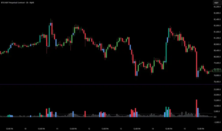
Volume Spike LevelsVolume Spike Levels detects abnormal volume candles, draws their price range as boxes or levels, and confirms whether the volume was resolved upward or downward.
-----------------------------------------------------------------------------------------------------
Volume Spike Levels is a clean volume spike indicator designed for visual price action analysis and intraday scalping.
Unlike a basic volume spike indicator that only places a marker on the candle where abnormal volume appears, this script first detects a volume spike candle and then draws the full price range of that candle as a box or horizontal levels.
The idea is simple:
when unusual volume appears, the range of that candle becomes important. Instead of only marking the volume candle, the indicator watches how price behaves around that range afterward.
If price breaks and confirms above the volume spike range, the indicator can mark it as VOL BUY.
If price breaks and confirms below the volume spike range, the indicator can mark it as VOL SELL.
This makes it easier to see whether the volume was actually absorbed, continued, inverted, or used as a reaction zone.
The indicator has two main marker modes:
Confirmed Direction mode:
The box or levels are drawn when the volume spike appears, but the directional marker appears only later, after price confirms above or below the spike range. Confirmation can be based on Wick, Body, or Close, depending on your settings.
Neutral Fast mode:
The indicator marks the volume spike immediately with a neutral marker. In this mode, the trader visually decides the direction based on price action around the box or levels.
Level display options:
You can display the volume spike range as a box, horizontal high/low levels, both, or turn the levels off and use markers only.
Volume strength:
The script supports weak, medium, and strong volume spike thresholds. These settings should be adjusted for your broker, symbol, and timeframe.
The screenshot shows XAUUSD on the 5-minute chart. The example settings were adjusted for OANDA gold data:
Weak Spike Multiplier: 1.9
Medium Spike Multiplier: 2.2
Strong Spike Multiplier: 3.0
Because volume data can differ between brokers and instruments, you should tune these multipliers so the number of signals on your chart feels useful and not overcrowded.
Alerts:
The indicator includes alerts for neutral volume spikes, bullish confirmed volume spikes, bearish confirmed volume spikes, and strong volume spikes only.
This tool can be useful for scalping, intraday trading, reaction zones, volume absorption, and identifying when volume appears in one area but price later confirms in the opposite direction.
Indicateur

HTF Profile Projection | Rainbow MatrixGENERAL OVERVIEW
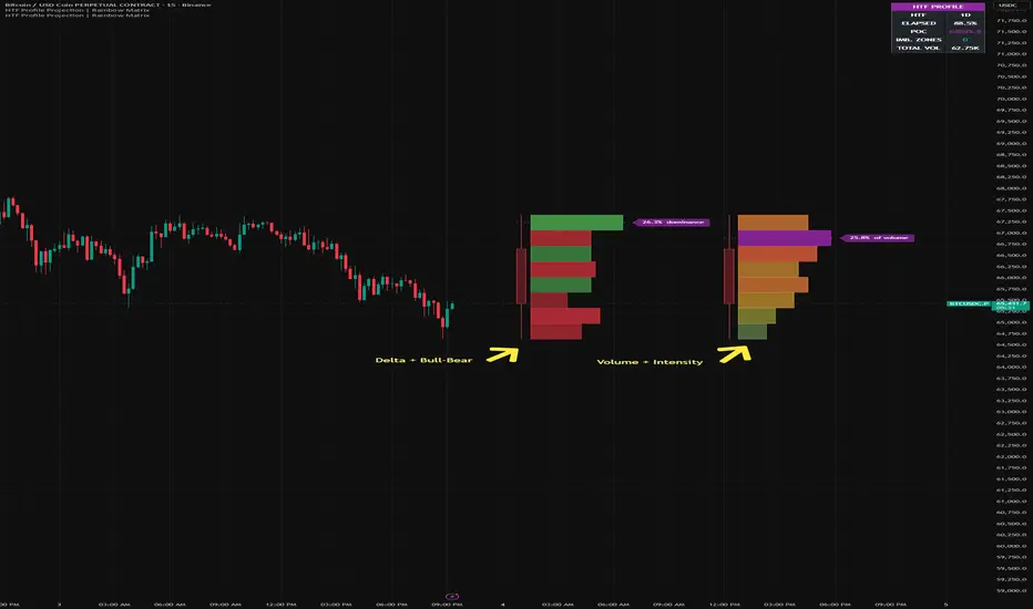
HTF Profile Projection is a live higher-timeframe X-ray. It takes the current, still-forming candle of a higher timeframe (for example the 4H or Daily candle) and projects it to the right of live price, then fills it with a horizontal profile that shows what is happening INSIDE that candle: where volume is concentrating, where buyers or sellers are dominating each price zone, and where price moved through empty space.
The goal is to let a trader read the internal structure of the higher-timeframe candle without leaving the current chart. Instead of seeing the 4H candle as a single block, you see its anatomy — the price levels that hold the most activity, the zones controlled by buyers versus sellers, and the thin gaps the candle ran through quickly. Every bar in the profile is built from real chart-bar data accumulated since the higher-timeframe candle opened, not drawn manually.
WHAT IS THE THEORY BEHIND THIS INDICATOR?
A higher-timeframe candle is a summary. A single 4H or Daily candle compresses hours of two-sided auction into one open, high, low, and close — and in doing so it hides where the volume actually traded and which side was in control at each price. Two candles with an identical body and identical range can have completely different internal structures: one built on heavy buying absorbed near the lows, the other on distribution near the highs. The standard candle cannot show that difference.
Most tools that try to surface this are built around the wrong constraint. Single-timeframe volume profiles describe the visible range, not the live higher-timeframe candle. Intrabar dissection tools that read true sub-candle data depend on functions that require additional data subscriptions and will not load on standard plans.
HTF Profile Projection takes a different route: it accumulates the chart's own bars since the higher-timeframe candle opened, and distributes each bar's activity across the price range it actually traversed. This reconstructs the internal volume and directional balance of the forming higher-timeframe candle using only standard data feeds — and projects it forward as a single, readable object.
The practical value: when price returns to a higher-timeframe candle later, the levels that mattered inside it — the high-volume node, the buyer- or seller-dominated zones, the empty imbalance gaps — are common revisit and reaction areas. Seeing them while the candle is still forming gives structural context that the candle body alone cannot.
HTF PROFILE PROJECTION FEATURES
The indicator includes these main components: a projected higher-timeframe candle, a range-spread movement profile, automatic resolution, a buy/sell dominance read, imbalance zones, a Point of Control marker, and a live info panel. Multilingual interface and full visual customization.
PROJECTED HTF CANDLE
🔹 What It Does
Reads the live, still-forming higher-timeframe candle and draws it (body + wicks) to the right of live price, color-coded by its direction. The horizontal profile attaches inside its price range.
🔹 Method
The higher-timeframe OHLCV is read via request.security() with lookahead=barmerge.lookahead_off, so no future information is used. The candle and its profile update in real time as the higher-timeframe bar forms — the intended live behavior — and reset cleanly when a new higher-timeframe period opens. If the chart timeframe is at or above the selected higher timeframe, the profile is hidden and a guard note is shown, because one chart bar covering the whole period cannot produce a meaningful internal read.
RANGE-SPREAD MOVEMENT PROFILE
🔹 What It Does
Splits the higher-timeframe candle's range into horizontal price buckets and fills each with the activity that occurred there.
🔹 Method
Since the higher-timeframe candle opened, each chart bar's volume and signed direction are accumulated, then distributed across every bucket the bar's low–high range spans — not dumped at a single midpoint. This range-spread approach makes both the per-zone volume and the per-zone buy/sell balance reflect where price actually traded inside the candle, rather than collapsing onto one level.
AUTOMATIC RESOLUTION
🔹 What It Does
The number of price buckets is chosen automatically from volatility. The higher-timeframe range is divided by the average chart-candle size (ATR), so each fraction of the profile corresponds to roughly one typical move of the chart timeframe.
🔹 Why It Matters
Calmer markets produce a finer profile; volatile markets produce a coarser one. The resolution matches the instrument and timeframe automatically, bounded between 4 and 50 buckets to keep the chart readable.
BUY/SELL DOMINANCE (DELTA MODE)
🔹 What It Does
In Delta mode (the default), each zone is colored by which side dominated: green for net buyers, red for net sellers, and gray for balanced zones where heavy two-way trade produced no clear winner. Bar length shows the magnitude of the imbalance.
🔹 Method
Each chart bar is classified by the sign of close versus open and contributes its volume as signed activity (+ for an up bar, − for a down bar). The net per zone is a direction-based proxy for buy/sell pressure, computed locally on standard data feeds — it is not exchange order-flow data, which Pine cannot access without additional subscriptions.
🔹 Volume Mode
Switching Source Metric to Volume colors the profile by a cold-to-hot intensity gradient instead, showing how much traded at each price regardless of direction.
IMBALANCE ZONES
🔹 What It Does
Price zones with little or no activity render distinctly. A contiguous run of empty buckets marks an imbalance — a price range the higher-timeframe candle moved through quickly with little participation.
🔹 Why It Matters
These gaps are not drawn as separate boxes; they emerge from the ABSENCE of activity in the profile. They are common revisit targets, since price often returns to fill ranges it previously skipped.
POINT OF CONTROL MARKER
🔹 What It Does
A horizontal marker tags the dominant bucket — the price level with the most activity (Volume mode) or the strongest net dominance (Delta mode). A label reports that level's share of the period's total.
LIVE INFO PANEL
🔹 What It Shows
A compact corner panel reports the higher timeframe in use, the percentage of the period elapsed, the Point of Control price, the number of imbalance zones, and the total higher-timeframe volume. When the chart-timeframe guard is active, the panel collapses to a single notice so the user always gets feedback.
🔹 Customization
The panel can be placed in any of the four chart corners and rendered in several font sizes. The display language is controlled by the System Language input.
HOW TO USE
This indicator is not a signal generator. It is a structural X-ray: it shows the internal anatomy of the forming higher-timeframe candle.
🔹 Setup
Set the Higher Timeframe input above your current chart timeframe (for example chart 15m, HTF 4H). The forward candle appears to the right of live price. If the chart timeframe is at or above the HTF, the profile hides and the guard note appears.
🔹 Reading Delta Mode (default)
Green zones mark prices where buyers dominated, red where sellers dominated, gray where the auction was balanced. The Point of Control marks the most decisive level inside the candle.
🔹 Reading Volume Mode
The rainbow profile shows where the most volume traded. Long bars are high-activity nodes; gaps are low-volume imbalance zones.
🔹 Tactical Reading
◇ A high-activity node is a price the higher timeframe has accepted — a common reaction level on revisit.
◇ A buyer- or seller-dominated zone shows which side controlled that price during the period.
◇ An imbalance gap is a range price ran through quickly — a frequent magnet for later revisits.
INPUTS EXPLAINED
🔹 System Language
Display language for the panel and labels. Options: English (default), Português, Español, Русский, 中文 (Chinese).
🔹 Higher Timeframe
The higher timeframe to project. Must be above the chart timeframe.
🔹 Show Forward HTF Candle
Toggle for the projected candle body and wicks.
🔹 Auto-Resolution ATR Length
Lookback for the average chart-candle size used to pick the bucket count.
🔹 Source Metric
Volume (intensity gradient) or Delta (buy/sell dominance, default).
🔹 Projection Offset / Profile Width
Position and maximum horizontal length of the profile to the right of price.
🔹 Spike Threshold / Imbalance Threshold
Controls for what counts as a high-activity node and what counts as an empty/imbalance zone.
🔹 Palette Mode
Intensity (cold-to-hot) or Bull-Bear (dominance coloring, default).
🔹 Profile Transparency / Show POC Marker
Visual styling for the profile and the Point of Control line.
🔹 Info Panel / Position / Font Size
Toggle, corner, and size for the live panel.
IMPORTANT NOTES
HTF Profile Projection works on any chart timeframe below the selected higher timeframe. It is built for liquid instruments with reliable volume data: crypto perpetual contracts, large-cap equities, futures, major forex pairs. On low-volume instruments the profile becomes less reliable.
This is a real-time tool. The forming higher-timeframe candle and its profile update intra-period by design; the profile resets when a new higher-timeframe period opens. It uses only request.security() and chart-bar accumulation, so it runs on standard data feeds without footprint() or request.security_lower_tf().
Pine Script v6. Open-source under Mozilla Public License 2.0.
UNIQUENESS
HTF Profile Projection is unique in how it unifies three reads into one object. Most higher-timeframe context tools stack separate features: a candle outline, fair-value-gap rectangles, and volume-spike markers. This indicator merges them — the forward higher-timeframe candle and its volume-by-price profile are a single object. High-activity zones appear as the profile's longest bars; imbalance zones are not drawn at all, they emerge from the absence of activity in the profile. The buy/sell dominance read is reconstructed from chart-bar direction and distributed across each bar's true price range, so it reflects where the auction was actually contested — and it does this on standard data feeds, without the order-flow subscriptions that comparable intrabar tools require. The combination of a live forward-projected candle, automatic volatility-matched resolution, range-spread accumulation, and dominance-versus-balance coloring produces a structural read that behaves differently from single-timeframe volume profiles and from static fair-value-gap tools. Indicateur

Indicateur

Indicateur

Ribbon Conviction SystemRibbon Conviction System — Trend, Flow, Value and Adaptive Stop
Overview
This is a single decision-support system for intraday traders. It answers three questions on one chart: which way is the trend, how much conviction is behind the current move, and where a logical trailing stop sits. A moving-average ribbon defines direction, a conviction score from 0 to 100% grades every signal, and an adaptive volatility stop marks risk. The components are designed to work together as one filtered signal, not as a loose collection of separate indicators.
Why these components are combined
A moving-average crossover on its own fires constantly in sideways markets and gives no sense of whether a cross is meaningful. Each part added here exists to fix a specific weakness of the part before it, so the result is one filtered signal rather than several indicators stacked on a chart.
Ribbon (direction). Five Fibonacci-length averages — 8, 13, 21, 34, 55 — using a mix of Hull, EMA and Kaufman Adaptive Moving Average (KAMA). The KAMA anchors deliberately flatten in choppy conditions, so the ribbon stops giving direction when there is no trend. Weakness it leaves open: a crossover can still fire on a weak, low-conviction move.
Conviction score (filter). Instead of taking every crossover, each signal is graded 0–100% by blending four independent readings of the same bar, chosen because they measure different things rather than repeat each other:
Buy/sell flow — net buying versus selling pressure, inferred from lower-timeframe price-and-volume behaviour.
Effort vs move — how far price travelled for the volume spent; absorption and churn are penalised.
Trend quality — Kaufman Efficiency Ratio: directional travel divided by total path, separating trend from noise.
Price location — is price on the right side of value? Blends session VWAP slope, a swing-anchored VWAP, the session volume-profile value area (VAH/VAL/POC), and the prior session's VWAP and unfilled POC.
A flow-toxicity proxy (VPIN-style) then lowers the score when flow looks one-sided and unstable. Weakness it leaves open: all four readings come from the chart timeframe, so they can agree for the wrong reason.
Higher-timeframe agreement (independent confirmation). The same volatility-stop direction is computed on 3×, 5× and 15× the chart timeframe and folded in as a multiplier, not a fifth blended input. It is kept separate precisely because it is the one genuinely independent check on the chart-timeframe score: full agreement raises conviction, disagreement lowers it.
Adaptive volatility stop (risk). A Chande-style volatility stop whose ATR period and multiplier adapt through the Efficiency Ratio, so the stop tightens in clean trends and widens in chop. This turns the tool from "where is the signal" into "where is my risk if I take it."
How they work together
Direction (ribbon) decides the side. The conviction score decides whether a crossover on that side is worth showing and how strongly. Higher-timeframe agreement scales that conviction up or down. The adaptive stop shows the exit reference. Every signal is the product of all four stages working in sequence.
What it plots
The five-average ribbon with shaded bands; the 55 line is the bold trend-reference band.
Signal badges at qualifying crossovers, labelled with the band crossed and the conviction percent (for example "21 65%").
Optional value references: session VWAP, swing-anchored VWAP with bands, volume-profile VAH/VAL/POC, and the prior session's VWAP and POC.
The adaptive volatility stop as a step line with a live distance label.
A compact dashboard summarising trend, conviction and each component, higher-timeframe agreement, the stop, and the data mode.
A small higher-timeframe agreement ribbon.
How to use
Add it to an intraday chart. The defaults suit index futures, but direction works on any symbol.
Spot vs futures: many spot indices publish no real volume, which the flow, value-area and toxicity parts depend on. Under "Data source" the script auto-detects this and switches the volume-based parts to a time-at-price method so everything still works; you can also set the mode manually. The dashboard "Data" row shows which mode is active.
Trade in the ribbon's direction. Prefer signals with a higher conviction percent and higher-timeframe agreement, and treat low-conviction crosses as noise. Use "Hide signals weaker than" to suppress them.
Use the adaptive stop as a trailing-risk reference, sized to your own plan.
The "Look & size" group controls signal size, dashboard size and position, a "Minimal" preset (ribbon + signals + stop only), and band lightness.
Originality
The individual techniques — adaptive moving averages, the Efficiency Ratio, effort-versus-result, VWAP, volume profile and volatility stops — are publicly documented. What is original here is the integration: a single conviction score that fuses chart-timeframe flow, effort, efficiency and value, damps it by flow toxicity, and scales it by independent higher-timeframe agreement, then gates an adaptive-stop-aware signal on that score. The components were selected so each covers a distinct weakness, and redundant filters were deliberately left out to keep one clear signal.
Credits
Perry Kaufman — Adaptive Moving Average and Efficiency Ratio. Tushar Chande — Volatility Stop concept. The effort-versus-result component is an original, compact reimplementation inspired by the publicly described effort-versus-result method from the volume-spread-analysis lineage.
Disclaimer
This script is for education and information only. It is not financial, investment or trading advice and does not guarantee any outcome. Signals describe current conditions; they do not predict the future. Markets carry substantial risk of loss. Volume-based readings depend on the data feed and are unreliable on instruments without real volume. Always test on your own market and timeframe, and manage risk with your own stops and position sizing. The author is not a licensed financial advisor; consult a qualified professional before making financial decisions. You are solely responsible for your own trading decisions. Indicateur

Indicateur

Indicateur

Volume Flames (hotchkiss)Volume Flames is a volume analysis indicator designed to visualize the intensity and momentum of market volume as a layered flame structure. Rather than displaying raw volume bars, it transforms volume data into a multi-layered heat gradient that rises and falls like fire — making it immediately intuitive to read at a glance how "hot" or "cold" volume pressure is at any given moment.
How it works:
The indicator stacks multiple exponential moving averages of volume on top of each other, each smoothed at a progressively faster rate. This creates a flame body with a dense dark core at the base, rising through deep reds and oranges into bright yellows and a white-hot tip. The outermost layer represents raw unsmoothed volume, giving the flame its sharp reactive spikes on high-volume bars. Gradient fills between each layer produce the signature fire glow effect.
What the signals mean:
White circles appear above the flame tip whenever volume surges significantly above its recent average — these are your burn signals, flagging explosive volume events that often precede sharp price moves. Yellow dots cluster near the base of the flame when volume momentum is building across consecutive bars, giving early warning that heat is rising before a full burn triggers. The dark maroon core columns underneath indicate baseline volume density, helping you distinguish genuine spikes from noise.
How to use it:
Watch for white circles breaking well above the flame body — that's a volume surge worth paying attention to. When yellow dots begin clustering and the flame layers start widening and brightening, it means momentum is accumulating. The taller and brighter the flame, the more volume pressure is building. A sudden spike of the white raw-volume tip far above the smoothed layers signals an aggressive market participant entering or exiting a position.
Best used on: Any liquid asset on any timeframe. Works particularly well on 1m–1h charts for intraday momentum reading, and daily charts for spotting accumulation and distribution phases. Indicateur

Indicateur

Institutional Order Flow Signals [PMT]Institutional Order Flow Signals applies a Gaussian Naive Bayes classifier — trained entirely within Pine Script® v6 — to cumulative volume delta divergence in order to surface, in real time, three mutually exclusive market regime states: bullish re-alignment, bearish re-alignment, and order flow divergence.
The core question this indicator addresses is distinct from threshold-crossover approaches: given the current statistical pattern of delta momentum, price/CVD divergence, and delta slope, what is the posterior probability that the market is entering — or exiting — a directional institutional order flow regime?
――――――――――――――――――――――――――――――――――――――
🔷 WHAT IT MEASURES
🔸 Cumulative Volume Delta (CVD)
CVD is the running sum of intrabar net order flow — buy volume minus sell volume — estimated via the close-position formula: bull_vol = volume × (close − low) / (high − low). The cumulative series tracks persistent institutional buying or selling pressure independently of price direction, making it a first-order proxy for directional order flow without requiring exchange-level bid/ask data.
🔸 Three Z-Score Normalised Features
Each bar, the classifier receives three inputs derived from CVD and z-score normalised for cross-instrument compatibility:
F1 — CVD Momentum : rate of change of CVD over N bars, normalised by its rolling mean and standard deviation. Encodes how rapidly buying or selling pressure is accelerating relative to its own recent baseline.
F2 — Price/CVD Divergence : price rate of change minus CVD rate of change. A large positive value signals price rising while order flow is falling — the classic institutional distribution pattern. Near-zero values indicate price and flow agreement.
F3 — CVD Slope : linear regression slope of CVD over a short window, z-score normalised. Provides a direction-of-flow signal independent of F1's momentum measure, satisfying the Naive Bayes conditional independence assumption as closely as CVD-derived features can.
🔸 Market Regime Labels
Three mutually exclusive regimes are recognised. A bullish re-alignment bar is one where both price ROC and CVD ROC are positive — institutional flow and price confirm each other to the upside. A bearish re-alignment bar is the symmetric case. A divergence bar occurs when price and order flow point in opposite directions — historically associated with regime transitions and distribution/accumulation activity.
――――――――――――――――――――――――――――――――――――――
🔷 THE CLASSIFIER
🔸 Welford Online Learning
The classifier accumulates running sufficient statistics — count, mean, and variance — for each of the nine (feature × regime) combinations using Welford's numerically stable online update. No historical arrays are stored. The model's parameters shift gradually with each new bar, making it adaptive to changing market microstructure conditions without a fixed lookback window.
🔸 Gaussian Likelihood + Bayesian Posterior
Each feature is modelled as a Gaussian distribution under each class. The joint likelihood of the current feature vector is computed by multiplying the three per-feature probability densities under the Naive Bayes independence assumption. A class prior — updated empirically from observed regime frequencies — is combined with the joint likelihood via Bayes' theorem to produce posterior probabilities P(Bull | F1,F2,F3) and P(Bear | F1,F2,F3) for the current bar. A warmup gate suppresses signals until the classifier has accumulated statistically meaningful training observations.
――――――――――――――――――――――――――――――――――――――
🔷 SIGNALS AND DISPLAY
🔸 High-Conviction Buy — P(Bull) > 85%
A long signal fires when the bull posterior clears the configurable threshold, CVD momentum confirms, and price is above the trend EMA. The threshold is surfaced on the label itself, making the confidence level explicit at every entry rather than hidden inside an opaque signal.
🔸 Bear Signal — CVD Divergence
A short signal fires when the bear posterior clears threshold and F2 is in active divergence territory — price moving up while order flow is declining, or the symmetric distribution case. CVD divergence without posterior confirmation does not produce a signal; both conditions are required simultaneously.
🔸 Bull Regime Band — CVD Aligned
A fill band anchored to the trend EMA expands when the classifier assigns high posterior probability to a sustained bullish re-alignment regime. The opacity of the band scales with the posterior — faint during low-confidence periods, saturated when the classifier considers the regime firmly established.
🔸 Info Table
Live readout displays current bull and bear posteriors, CVD direction, and training bar count. The Trained N counter confirms the classifier has completed warmup before acting on any signal.
――――――――――――――――――――――――――――――――――――――
🔷 INPUTS
Classifier Lookback — minimum training bars before signals activate. Default 100.
Entry Posterior Threshold — minimum posterior required. 0.60 permissive; 0.70 default; 0.80 high-conviction only.
CVD Momentum Period — lookback for F1 and F2 rate of change.
CVD Slope Period — regression window for F3.
Z-Score Period — normalisation window applied across all three features.
Trend EMA Period — macro filter; long signals only fire above EMA, short signals below.
――――――――――――――――――――――――――――――――――――――
🔷 REQUIREMENTS AND LIMITATIONS
The classifier requires a warmup period before signals are valid. The CVD estimator is synthetic — derived from intrabar price position, not actual bid/ask data — and introduces noise on instruments with low liquidity or wide spreads. The Naive Bayes independence assumption is partially violated because all three features are CVD-derived; the posteriors function as relative confidence scores rather than calibrated frequentist probabilities.
――――――――――――――――――――――――――――――――――――――
Built natively in Pine Script® v6. No external libraries, no data feeds, no fixed lookback arrays. The Gaussian Naive Bayes classifier trains continuously from the chart's own bar history using Welford's online algorithm. Open source — Mozilla Public License 2.0. Indicateur

Volume Waves (Buy / Sell / Delta) [footprint data]
⚠️ This indicator uses footprint data and requires TradingView Premium plan or higher. Without footprint support the waves will not appear.
━━━━━━━━━━━━━━━━━━━━━━━━━━━━━━━━━━━━━━━━
Volume Waves (Buy / Sell / Δ) is a footprint-based volume visualization that renders buy volume, sell volume and delta directly on the price chart as adaptive filled waves - no separate pane, everything stays on the candles where it belongs.
━━━━━━━━━━━━━━━━━━━━━━━━━━━━━━━━━━━━━━━━
What you see
━━━━━━━━━━━━━━━━━━━━━━━━━━━━━━━━━━━━━━━━
Three layers are rendered directly on the chart:
Volume wave (gray) — total buying or selling activity scaled to recent history. Shows how significant the current bar's volume is compared to the lookback window.
Delta wave (semi-transparent lime / purple) — positive delta (buyers dominated) is lime, negative delta (sellers dominated) is purple. Rendered on top of the volume wave, always stays within its boundaries.
Extreme delta (fully opaque lime / purple) — same colors, full opacity. Appears only when both volume and imbalance cross their thresholds simultaneously. The brighter the spike stands out against the semi-transparent background — the more significant that bar was.
The waves are normalized relative to recent market activity and scaled dynamically using ATR, allowing the visualization to remain readable across different instruments and timeframes without constant manual adjustment.
━━━━━━━━━━━━━━━━━━━━━━━━━━━━━━━━━━━━━━━━
Why footprint data matters
━━━━━━━━━━━━━━━━━━━━━━━━━━━━━━━━━━━━━━━━
Most "buy/sell volume" or "volume delta" indicators available on charts do not use actual trade classification. They approximate — typically by comparing the candle's close to its open and assuming the entire volume was either buying or selling, or by applying the same approximation from a lower timeframe (the accuracy does not improve from this — the method stays the same, only the scale changes).
Footprint data works differently. When supported by the broker and exchange feed, TradingView provides bid/ask-classified executed trades where each transaction is identified as aggressive buying or selling at the moment of execution. Not calculated from price behavior, not estimated from candle shape — recorded as a fact from the exchange order book.
This distinction becomes especially important around:
high-liquidity levels and absorption zones,
breakouts and exhaustion moves,
and news-driven volatility.
━━━━━━━━━━━━━━━━━━━━━━━━━━━━━━━━━━━━━━━━
Display modes
━━━━━━━━━━━━━━━━━━━━━━━━━━━━━━━━━━━━━━━━
Two sides — buy and sell waves expand in opposite directions from the baseline: buy volume upward, sell volume downward. Buyer and seller dominance is immediately visible.
One side — buy and sell volume are stacked upward together as total activity. Useful when focusing on participation intensity or volatility expansion. The delta wave remains visible and colored by sign — directional information is always present.
━━━━━━━━━━━━━━━━━━━━━━━━━━━━━━━━━━━━━━━━
How it is built
━━━━━━━━━━━━━━━━━━━━━━━━━━━━━━━━━━━━━━━━
Shared normalization. Buy and sell volume are both divided by the same highest total volume over the lookback window. This preserves the real proportion between them and ensures delta always reflects the correct sign and magnitude. Independently normalized sides would distort this relationship.
Adaptive ATR scaling. Wave height = normalized volume × ATR(200) × scale factor. This gives the indicator automatic adaptation across markets, stable visual proportions across timeframes, and consistent readability during volatility expansion. Quiet markets remain compact, volatile markets naturally expand. The scale factor setting provides additional manual control when needed.
Visible-area rendering. Waves are built only for bars currently visible on screen using chart.left_visible_bar_time and chart.right_visible_bar_time . The loop range accounts for the offset of the last bar from the right edge — correctly handling situations when recent bars are outside the viewport after scrolling left. When scrolling or zooming, the structure recalculates intentionally to preserve local proportionality.
Baseline positioning. The baseline can be placed manually via the position setting: top, bottom or middle of the visible range. In auto mode the indicator checks whether current price is in the upper or lower half of the visible range and positions the baseline on the opposite side — in most cases preventing overlap with candles without manual adjustment.
Extreme delta detection. A bar is marked as extreme only when two conditions are met simultaneously: total volume exceeds a configured percentile of recent history (Lookback Window
- 500 bars by default), and absolute delta exceeds a configured percentage of total bar volume. This filtering removes low-volume noise, small meaningless imbalances, and high-volume but balanced bars. Only bars where both participation and asymmetry are genuinely exceptional are highlighted. Both thresholds are independently adjustable.
━━━━━━━━━━━━━━━━━━━━━━━━━━━━━━━━━━━━━━━━
How to read it
━━━━━━━━━━━━━━━━━━━━━━━━━━━━━━━━━━━━━━━━
Dominance. When buy waves consistently exceed sell waves — buyers are participating more aggressively. When sell waves dominate — sellers control the auction. The relationship becomes visible instantly without requiring footprint tables or numerical inspection.
Delta as confirmation. Price rising with positive delta means real buying pressure is behind the move. Price rising while delta weakens or turns negative suggests passive absorption may be occurring — the move may lack genuine initiative participation.
Extreme highlights. Fully opaque spikes mark bars where both participation and directional imbalance were exceptional. These bars are often structurally important and tend to stand out clearly even on dense charts — absorption, exhaustion, breakout moments.
Info label. On the last bar a small label shows buy volume, sell volume, delta value and delta as a percentage of total volume — quick numerical context without opening a separate footprint panel.
━━━━━━━━━━━━━━━━━━━━━━━━━━━━━━━━━━━━━━━━
Settings
━━━━━━━━━━━━━━━━━━━━━━━━━━━━━━━━━━━━━━━━
side — one side or two sides visualization
position — baseline placement: auto / top / bottom / middle
shift — offset between baseline and chart edge
scale factor — overall wave height multiplier
Lookback Window — normalization and percentile range
Delta % threshold — minimum imbalance percentage for extreme detection
Volume Percentile % — minimum participation percentile for extreme detection
show volume — toggle buy/sell volume waves
show delta — toggle delta overlay and extreme highlights
delta transparency — two inline values: opacity for regular delta and for extreme highlights separately
show label — toggle information label on last bar
━━━━━━━━━━━━━━━━━━━━━━━━━━━━━━━━━━━━━━━━
Notes
━━━━━━━━━━━━━━━━━━━━━━━━━━━━━━━━━━━━━━━━
Footprint data required. The indicator uses request.footprint() available on TradingView Premium or higher. Availability also depends on broker and exchange feed support.
Updates on scroll. Waves recalculate every time the visible area changes — intentionally. You always see volume structure scaled to what is currently on screen.
If you find it useful — a boost or comment is appreciated. Feedback and suggestions are always welcome.
Indicateur

Indicateur

Indicateur
Average Daily Range Percentage (ADR%) and Average Daily VolumeTwo critical pre-trade filters, always visible right on your chart.
Before entering any swing trade, you need to know two things: is this stock volatile enough to move your account, and is it liquid enough to trade cleanly? This indicator answers both questions at a glance.
**ADR% (Average Daily Range)** measures how much a stock moves on an average day. Too low and it won't move your portfolio. Too high and the daily noise will stop you out randomly. The color tells you where you stand instantly.
**ADV (Average Dollar Volume)** measures how much money flows through the stock each day. Liquid stocks respect key levels, pull back cleanly to moving averages, and don't gap randomly on low volume. Illiquid stocks do the opposite.
Both values are color-coded against your thresholds:
🟢 Green — within your ideal range
🟠 Orange — borderline, proceed with caution
🔴 Red — outside your criteria, skip it
Fully customizable:
ADR% and ADV thresholds
Warning zones for borderline values
Lookback periods for both calculations
Colors for good, warning, and bad values
Default thresholds are calibrated for swing traders. Adjust to match your account size and risk tolerance.
Built for swing traders who want clean, fast chart reviews without second-guessing liquidity or volatility on every name. Indicateur

Stockbee Sugar Babies Pine Screener by QuadrantLowerPLEASE NOTE: this is intended to be used with TradingView's Pine Screener and not as a chart indicator!
At the time of writing, TradingView's Pine Screener is in Beta and, as a result, using this script is somewhat painful and should be considered experimental - it is a proof of concept and does not offer a great user experience. Sorry about that!
This script is for helping you generate a weekly Watchlist of Sugar Babies - this is Stockbee/Pradeep Bonde's concept of stocks which have a history of making 4%+ breakouts with institutional volume (9M+ on the day) - that you can then keep a close eye on and look for breakout, reversal and anticipation trades (as per Pradeep's methodology).
To use this screener:
Favourite the script so that it shows up in TradingView’s Pine Screener
Create watchlists to filter - unfortunately, this is how TradingView’s Pine Screener currently works - you can't simply scan the entire market. At the time of writing, TradingView has a limit of 500 symbols per Watchlist (for all subscriptions other than Basic, which has 30, and Ultimate, which has 1000), so you will need to split up the market into separate watchlists. This is painful, but possible, using a combination of TradingView’s Stock Screener, exporting to CSV, editing outside of TradingView and importing to create watchlists. You can significantly minimize the amount of work by reducing the size of the universe to your needs (e.g. minimum Market Cap, minimum Price, limit to certain sectors only etc.). On the plus side, once this is done, these watchlists are good for many months, but they will atrophy over time as they wont get updated with IPOs or symbol changes.
Launch the Pine Screener, select one of your Watchlists, select the indicator (it will only function on the 1D timeframe, but this is Pine Screener’s default so no worries), click on the columns options button (the three vertical lines button on the top right), enable all of the unchecked columns, then hit scan.
Once the scan is complete you should see the columns populated with data. The green columns represent Bullish EP9s, the red columns represent Bearish EP9s and the orange columns represent the sum of Bullish and Bearish EP9s. There are seven lookback periods – 2Y, 1Y, 6M, 3M, 1M, 10D and 5D. Longer lookbacks are not possible as Pine Screener has a 500 bar (i.e. 500 day) limit.
You can then sort the columns and save the top, say, five results given by each Total column into a separate watchlist – repeat for each of your watchlists until you have distilled your Universe of Sugar Babies for the week :)
Here is an example Sugar Babies Universe Watchlist. Don't ask me to update it - please make your own.
Here are all US stocks available on TradingView in May 2026 filtered by Mkt Cap >= 10M USD and Price >= 0.3 USD, then split in to 20 watchlists:
▚ US Market - Pt 01
▚ US Market - Pt 02
▚ US Market - Pt 03
▚ US Market - Pt 04
▚ US Market - Pt 05
▚ US Market - Pt 06
▚ US Market - Pt 07
▚ US Market - Pt 08
▚ US Market - Pt 09
▚ US Market - Pt 10
▚ US Market - Pt 11
▚ US Market - Pt 12
▚ US Market - Pt 13
▚ US Market - Pt 14
▚ US Market - Pt 15
▚ US Market - Pt 16
▚ US Market - Pt 17
▚ US Market - Pt 18
▚ US Market - Pt 19
▚ US Market - Pt 20
RISK DISCLAIMER
All content, including tools and scripts, released by QuadrantLower are purely for informational and educational purposes only. Nothing herein should be construed as financial advice or a recommendation to buy, sell, or hold any security or financial instrument. All trading involves risk and may not be suitable for all investors. You are solely responsible for your own trading decisions. Past performance is not indicative of future results. Indicateur

Aura Volume Delta Matrix [Pineify]Aura Volume Delta Matrix
This indicator measures the net demand pressure behind each bar by separating candle volume into buying and selling components, smoothing the difference, and plotting it as a gradient histogram against a signal line. Rather than treating volume as a single unsigned number, it asks: how much of this bar's volume was buying versus selling? The answer — volume delta — reveals whether the crowd was net accumulating or distributing, even when price barely moved.
Key Features
Candle-polarity volume split: full bar volume attributed to buyers when close > open, sellers when close < open, and split 50/50 on doji candles
Dual EMA smoothing pipeline — one pass to extract the trend from noisy raw delta, a second pass to generate a crossover signal line
Normalized gradient histogram: bar intensity scales to the 100-bar rolling maximum, so weak readings appear faint and strong readings appear saturated, giving an immediate visual sense of magnitude relative to recent history
Crossover signals that only fire when delta is already on the correct side of zero — filtering out shallow, mean-reverting crosses that would otherwise generate noise
How It Works
The calculation pipeline has three stages.
Volume attribution: Each bar's total volume is assigned to buyers or sellers based on candle polarity. A bullish close (close > open) attributes 100% to buyers; a bearish close (close < open) attributes 100% to sellers; equal open and close splits it evenly. This is a bar-level proxy for order flow — not tick-level CVD, but a reasonable approximation available on any timeframe without premium data.
Delta smoothing: Raw delta (bullVol − bearVol) is noisy on its own. A configurable EMA (default 14) removes single-bar spikes and reveals the directional bias over recent bars. This smoothed delta is what plots as the histogram.
Signal line: A second EMA (default 9) is applied to the smoothed delta. This behaves like the MACD signal line — when the histogram crosses above it while already positive, demand is re-accelerating from a bullish baseline; crossing below while negative signals the opposite.
The gradient coloring normalizes the histogram against its own 100-bar peak, so you can immediately tell whether current delta intensity is historically significant or just routine churn.
How the Components Work Together
The two-pass EMA structure is intentional. A single EMA of raw delta would react quickly but produce too many false crosses. By smoothing first and then deriving a signal from the smoothed output, the crossover logic only fires when momentum has already built enough to survive the first layer of filtering. The zero-side gate on signals adds a second filter: a bullish crossover below zero means demand is recovering within a still-bearish context, which is a weaker setup than a crossover that occurs while net buying is already dominant. Together these two conditions — crossover confirmed by zero-side context — push the signal rate down and focus it on higher-conviction shifts.
Trading Ideas and Insights
Use bullish crossovers (delta crosses above signal while delta > 0) as a candidate entry trigger on trending assets. Consider waiting for price to also be above a longer-period moving average before acting on the signal.
Divergence between price making a new high and delta making a lower high may indicate absorption — sellers stepping in at resistance without moving price yet. This is worth watching rather than acting on automatically.
On ranging markets, delta will oscillate around zero and the smoothing will compress toward the baseline. Low histogram intensity (faint gradient bars) visually signals low-conviction conditions where crossover signals are less reliable.
The signal line alert conditions can be used to push notifications when the crossover setup occurs, removing the need to watch the chart continuously. Still, confirm with price structure before entering.
As with any volume-based indicator, results vary by asset liquidity and data provider. Crypto and futures markets with transparent volume data tend to produce cleaner delta readings than instruments where reported volume is an estimate.
Unique Aspects
The gradient normalization against a rolling 100-bar peak is a visual improvement over fixed-scale histograms: it adapts to each instrument's typical volume range without manual scaling, making the chart readable across different assets.
The zero-side signal filter avoids a common problem in oscillator crossover systems — signals that fire during shallow pullbacks within a larger counter-trend, where the histogram is technically crossing but the broader context is unfavorable.
The doji split (50/50 at open = close) is a minor but honest edge case handling that most simplified volume delta scripts skip.
How to Use
Add the indicator to any chart. It works on all timeframes, though intraday timeframes tend to show more granular delta shifts.
Watch histogram color and intensity. Solid, saturated green bars suggest strong net buying relative to recent history; faint bars suggest low-conviction buying or a quiet session.
Look for crossovers of the orange signal line. Bullish: histogram rises through the signal line while above zero. Bearish: histogram falls below the signal while below zero. Half-crossovers (histogram crosses signal but is on the wrong side of zero) are filtered from alerts.
Set alerts via the indicator's alert conditions if you want to monitor for crossover setups without watching the chart.
Customization
Delta Smoothing Length (default: 14) — Controls how much the raw volume delta is smoothed before plotting. Higher values produce a slower, more stable histogram but introduce more lag. Lower values react faster and may show more noise.
Signal Line Length (default: 9) — The EMA length applied to the smoothed delta to create the crossover trigger. Shorter values generate more frequent signals; longer values are more selective.
Bullish / Bearish / Signal Colors — Fully customizable to match your chart theme or personal preference.
Conclusion
Aura Volume Delta Matrix translates raw bar volume into a directional demand measure, smooths it through a dual-EMA pipeline, and presents the result as a gradient histogram with a signal-line crossover system. It's most useful for traders who want a volume-based confirmation layer that isn't just "volume went up" but instead reflects which side of the trade had more participation. Pair it with price structure or trend context for best results — no volume indicator tells the full story on its own.
Indicateur

CandelaCharts - Distributed Volume Matrix📝 Overview
The Distributed Volume Matrix is an advanced volume profiling tool designed to provide a highly visual and granular breakdown of price-volume dynamics over a specified lookback window. Unlike traditional volume profiles, this indicator renders a "heatmap matrix" alongside the chart, allowing traders to instantly identify critical liquidity zones, high-volume nodes, and the Point of Control (POC) with exceptional clarity.
📦 Features
Bipolar Diverging Heatmap: Bins above the Point of Control are colored with a distinct warm palette, while bins below are colored with a cool palette. This immediately contextualizes price action relative to the highest volume node.
Heatmap Stepping: Toggle between a smooth color gradient or a quantized "stepped" heatmap. Stepping breaks volume intensity into distinct thresholds (Low, Medium, High, Extreme), providing a bolder, cleaner visual structure.
Value Area Calculation: Automatically calculates and displays the Value Area High (VAH) and Value Area Low (VAL) based on user-defined volume percentages (default 70%).
Dynamic Lookback Bounds: Clearly visualizes the exact high and low price bounds of the lookback period using beautifully styled dashed lines and semi-transparent bubbles.
Optimized Performance: Built using Pine Script's advanced array and user-defined type (UDT) capabilities to ensure lightning-fast rendering without graphical lag, automatically dynamically capping memory use to available chart history.
Big Order Bubbles: Dynamically highlights extraordinary trading volume directly on the price action. Bubbles are constrained precisely to the active matrix lookback window, scaling in size based on a customizable volume multiplier.
⚙️ Settings
Length: The number of historical bars to include in the volume distribution calculation.
Number of Bins: The vertical resolution of the matrix. Higher values provide finer granularity.
Source: The price source used to determine the volume distribution across bins.
Value Area (%): The percentage of total volume to encompass within the Value Area (VAH to VAL).
Colors: Fully customizable color settings for the Value Area lines, Histogram (Above/Below POC), Point of Control (POC), and Gap Color (bins with 0 volume).
Use Heatmap Stepping: Enable this to quantize the heatmap into solid opacity steps rather than a continuous gradient.
Show Volume: Toggle the display of the formatted volume number on the left side of each histogram bin.
Show Volume Columns: Displays traditional vertical volume columns per bar under the horizontal matrix profile.
Bubbles (Big Order Bubbles): Toggle the display of volume bubbles on the chart and adjust the threshold multiplier. A higher multiplier requires significantly more volume (relative to the moving average) for a bubble to appear.
⚡️ Showcase
Heatmap
Heatmap Stepping
Volume
Gaps
Big Order Bubbles
💡 Usage
Here are a few ways to utilize the Distributed Volume Matrix in your trading strategy:
Value Area Range Trading: Identify mean-reverting setups by fading moves that reject off the Value Area High (VAH) or Value Area Low (VAL), targeting the Point of Control (POC) or opposing side of the range.
Trend Reversal at Extreme Liquidity Nodes: Spot sharp price reversals when the market interacts with a high-volume node identified by the brightest heatmap bins at the edge of the Value Area.
Big Order Tracking: Align Big Order Bubbles with significant Value Area (VAH/VAL) rejections or POC interactions. An extreme volume bubble appearing right as price leaves the Value Area heavily reinforces the move's momentum.
🚨 Alerts
This indicator is purely visual and does not feature built-in alert conditions.
⚠️ Disclaimer
Trading involves significant risk, and many participants may incur losses. The content on this site is not intended as financial advice and should not be interpreted as such. Decisions to buy, sell, hold, or trade securities, commodities, or other financial instruments carry inherent risks and are best made with guidance from qualified financial professionals. Past performance is not indicative of future results.
Indicateur

Confluence Zone Engine [CZE]# Confluence Zone Engine
A structural analysis indicator that identifies support and resistance zones by clustering Anchored VWAPs and Anchored Volume Profile levels across the chart timeframe and up to three higher timeframes. Each zone is rated 1 to 5 stars based on how many independent sources cluster at the level and how diverse those sources are.
This is a structural analysis tool. It marks where multiple independent technical references agree at a price. It does not place trades or suggest entries, exits, targets, stops, or position sizes.
---
## What this script does
The engine runs a six-stage pipeline on every confirmed bar:
**Stage 1 — Pivot detection.** Detects pivot highs and pivot lows at Fibonacci-spaced lengths (3, 5, 8, 13, 21, 34, 55, 89). Each pivot becomes an "anchor" point. Default enabled tiers are 8, 21, and 34 — selected to give fast / medium / slow coverage without redundancy. The full Fibonacci set is configurable.
**Stage 2 — Per-anchor calculations.** For every anchor, the engine maintains:
- An Anchored VWAP (volume-weighted average price since the anchor bar)
- An Anchored Volume Profile, which produces a Point of Control (POC = most-traded price since anchor) and a Value Area (VAH and VAL = upper and lower edges of the 70% volume zone)
So a single pivot generates up to 4 contributor levels: AVWAP, POC, VAH, VAL.
**Stage 3 — Higher-timeframe replication.** The same pipeline (stages 1 and 2) re-runs on up to three configurable higher timeframes via non-repainting `request.security` calls. This produces a multi-timeframe view of structural anchors — pivots and AVWAPs from a 1H chart inform what the 5m engine treats as a higher-timeframe reference.
**Stage 4 — Cluster building.** All contributor levels from all enabled timeframes are collected. The cluster builder walks them in price order, merging any that fall within a configurable tolerance (default 0.08% of current price; preset-adjusted per asset class). A cluster with at least the minimum-count threshold becomes a candidate zone.
**Stage 5 — Star rating.** Each zone is rated 1 to 5 stars based on:
- Total contributor count
- Source-type diversity (how many of the 4 source categories — PH-AVWAPs, PL-AVWAPs, POCs, VAH/VAL — are present)
- HTF agreement (whether contributors from multiple timeframes align)
A "Premium" tier flag fires when top stars combine with HTF agreement.
**Stage 6 — State machine.** Each zone is tracked through a lifecycle:
- **Active** (forming, amber): the zone is currently accumulating contributors
- **Pending** (blue): contributor activity has paused; waiting for price to resolve the level
- **Resolved Support** (green), **Resistance** (red), or **Chop** (gray): determined by whether price moved decisively up, decisively down, or stayed range-bound after the zone activated
- **Tested** (dashed border): price entered the resolved zone but has not closed past the defending edge
- **Broken** (dashed orange + "Broken" label): price has closed past the defending edge
- **Flipped**: if a Broken state confirms over multiple closes past a threshold, the zone repaints to the opposite role (broken Resistance becomes Support, broken Support becomes Resistance)
---
## Why this indicator is original (not a simple mashup)
This is not "AVWAP indicator + Volume Profile indicator + multi-timeframe wrapper." Three design choices distinguish it from existing public indicators:
**1. Anchored at every Fibonacci pivot, not at a single user-selected point.** Standard AVWAP indicators require the user to manually click an anchor point. Standard Volume Profile indicators use either a fixed session or a single anchor. This engine automatically detects pivots at multiple Fibonacci lengths and runs an AVWAP + Volume Profile from each one. The number of active anchors at any time is typically 6 to 20, generating 24 to 80 contributor levels — far more than a manually-anchored tool can produce.
**2. Cross-timeframe clustering, not separate per-timeframe overlays.** The engine does not draw 5 separate AVWAPs from a 1H chart, plus 5 from a 4H, plus 5 from a daily. Instead, levels from all timeframes are collected into one pool and clustered in price space. A 1H AVWAP at 23,720 and a daily POC at 23,718 merge into a single zone marked as "two contributors from two timeframes." This produces structural information neither timeframe shows alone.
**3. Compositional bias from the contributor mix.** The cluster builder records *which type* of contributor formed each zone — pivot-high AVWAPs (trapped sellers' breakevens), pivot-low AVWAPs (trapped buyers' breakevens), POCs (acceptance), VAH or VAL (fair-value edges). The directional implication of each type is summed into a "compositional bias" score. A zone built mostly from PL-AVWAPs and VAL contributions leans support; one built from PH-AVWAPs and VAH contributions leans resistance. This is an analytical lens not present in standard S/R indicators, which generally treat all levels as direction-agnostic.
---
## Mashup justification — how the components work together
The four classes of technical analysis used (pivots, AVWAP, Volume Profile, multi-timeframe analysis) are not chosen arbitrarily. Each contributes a dimension the others do not, and the value comes from how they interact:
**Pivots provide the anchors.** Without pivots, AVWAP needs a manual anchor and Volume Profile needs an arbitrary session. Pivots at multiple Fibonacci lengths give the engine *automatic structural anchors* spanning timescales — short-term swings, intraday swings, session-level swings. The Fibonacci spacing (3, 5, 8, 13, 21, 34, 55, 89) ensures the anchors are non-redundant: each tier has a different bar requirement and catches different swings.
**AVWAP measures participant breakeven from each anchor.** This is the "where might trapped participants defend" dimension. An AVWAP from a pivot high is the volume-weighted breakeven for everyone who entered after that high (mostly net-short positions). An AVWAP from a pivot low is the breakeven for everyone who entered after that low (mostly net-long). When price returns to one of these AVWAPs, structurally those participants are at breakeven and have incentive to act.
**Volume Profile measures acceptance from each anchor.** This is the "what price has been most-accepted by volume" dimension. POC is the most-traded price; VAH/VAL are the edges of the 70%-volume range. AVWAP and POC measure different things — average price vs most-accepted price — and frequently disagree. When they *do* agree at a level, that's two independent signals saying "this price matters."
**Multi-timeframe replication tests for structural agreement.** A zone that exists only on the chart timeframe is one-timeframe noise. A zone where chart-TF contributors *agree with* higher-TF contributors at the same price is structural — the same level shows up no matter which timescale you measure from. The engine treats HTF agreement as a primary input to the star rating: HTF-aligned zones can earn an extra star (capped to prevent inflation).
**The clustering is where the value emerges.** Individually, none of these components produce reliable levels. AVWAP gets broken constantly. POC migrates. Pivot levels get violated. But when the engine sees that the 21-pivot AVWAP, the 34-pivot POC, the 8-pivot VAL, and a 1H AVWAP all land within 0.08% of each other at the same price, that's a confluence of independent references measuring different things — and that *coincidence* is what produces structural significance. The star rating quantifies how much agreement is present.
This is the mashup's purpose: not to combine indicators for their own sake, but to use convergence as a filter that turns individually noisy components into a rated structural signal.
---
## How to use the indicator
**Step 1: Apply to any chart timeframe.** All settings have sensible defaults. The asset-class preset (NSE Index Futures, NSE Stock, US Future, US ETF, US Stock, Commodity, Crypto, or Custom) auto-adjusts cluster tolerance and pivot defaults. Auto-selected higher timeframes scale with the chart — a 5m chart defaults to 15m/60m/240m HTFs, while a daily chart defaults to weekly/monthly HTFs.
**Step 2: Read the status panel (bottom-right).** This is the actionable summary:
- "Sup" row: nearest resolved Support below current price, with point distance
- "Res" row: nearest resolved Resistance above current price, with point distance
- "Top zone": the highest-rated zone overall
- "Data": indicator health (OK / Degraded / Critical) — if the underlying volume data is sparse, ratings are capped
**Step 3: Scan the chart for "Broken" labels.** Any zone in dashed orange with a "Broken" label is currently being violated. Watch for either recovery (border returns solid) or polarity flip confirmation (zone repaints to opposite role).
**Step 4: Find the active amber zone.** This is the current forming confluence. Look at the triangle shape: ▲ means the composition leans support, ▼ means it leans resistance, ◆ means neutral. The number next to the triangle is the star rating. A premium "★" prefix means HTF agreement is present.
**Step 5: Use the Major S/R lines as forward references.** Bold horizontal lines mark the top 2 strongest support levels below current price and top 2 strongest resistance levels above. Labels show price, stars, and distance.
**Step 6: Use the Range band as context.** The translucent aqua band marks the recent trading envelope (default last 50 bars). A narrow band means consolidation; a wide band means trending.
**Step 7: Hover any element for the full breakdown.** Every box, triangle, and line has a tooltip showing total contributors, type counts, HTF alignment, state, and history.
---
## How NOT to use the indicator
- **Do not treat the bias arrow as a trade signal.** It is a compositional description of contributors, not a directional forecast. A zone with a ▲ bias can still resolve as resistance.
- **Do not treat a "Broken" label as a trade trigger.** It tells you a known level is failing — not that you should enter a position in either direction.
- **Do not assume higher stars mean higher profit probability.** Stars measure the diversity and density of contributors, not historical performance or expected return.
- **Do not rely on it for low-volume instruments.** If the data-health badge shows "Degraded" or "Critical," the engine has capped ratings and may suppress zones entirely. This is a feature; the indicator is most accurate on liquid, volume-rich instruments (index futures, large-cap stocks, major crypto).
---
## How to read the star rating
Stars are a descriptive summary of confluence quality. They are not a probability of profit.
- 1 to 2 stars: minimum cluster; one or two source types. Background context.
- 3 stars: at least 5 contributors with 2 or more source types. Recurring intraday levels.
- 4 stars: at least 7 contributors with 3 or more source types, OR 3-star with HTF agreement.
- 5 stars: at least 10 contributors with all 4 source types present. Often boosted by HTF alignment.
By default, only 4-star and 5-star zones get triangle markers and qualify for Top-N or Major S/R lines. This is adjustable.
---
## Visual primitives
- **Confluence zones** — colored boxes marking each cluster. Boxes recolor as zones resolve. Border style indicates compromised state.
- **Triangle markers** — ▲ ▼ ◆ at each formation bar. Shape encodes direction. Color encodes lifecycle state.
- **Top-N S/R lines** — top 4 resolved zones by strength and recency project forward.
- **HTF confluence bands** — semi-transparent bands per higher timeframe (cyan, purple, orange).
- **Major S/R lines** — bold lines for top 2 supports below and top 2 resistances above current price.
- **Range band** — translucent band marking recent trading range with HI / LO labels.
- **Current price line** — thin dotted line at current price.
- **Status panel** — bottom-right summary.
---
## Technical notes
- Pine Script v6
- Non-repainting: all `request.security` calls use `barmerge.lookahead_off`
- Asset-class presets adjust cluster tolerance and pivot defaults
- Built-in data-integrity layer caps ratings when volume data is sparse or stale
- Seven alert conditions: new zone formed, high-quality (4 to 5 star) zone, HTF aligned, price entered support, price entered resistance, data health degraded, polarity flip
---
## Important risk disclosure
This indicator is provided for educational and informational purposes only and is not financial advice. Trading and investing involve substantial risk of loss, including the possible loss of all invested capital. The zones, ratings, bias shapes, and lines are descriptive summaries of structural confluence — they are not predictions of future price movement, indications of profitability, win rate, or expected return.
No backtested or hypothetical performance is claimed or implied. Past zones identified by the indicator are not indicative of future results.
You are solely responsible for any decisions you make. Consult a qualified, licensed financial advisor before trading. Past performance does not guarantee future results.
Indicateur

Indicateur

Indicateur

Indicateur

Indicateur

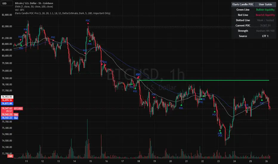
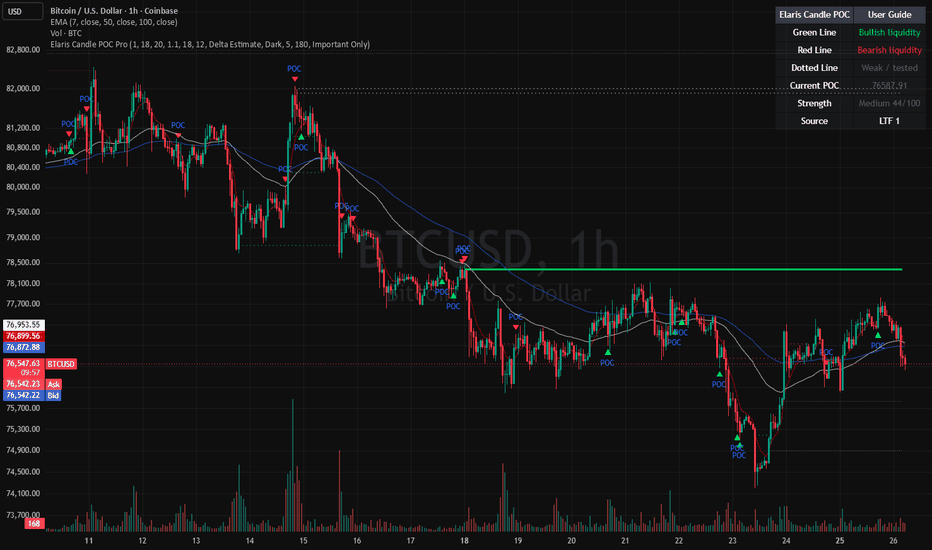
Elaris Volume Intelligence ProElaris Volume Intelligence Pro is a professional-grade volume analysis and smart money intelligence indicator designed to help traders understand market participation, hidden pressure, and potential reversal activity in real time.
Instead of displaying raw volume alone, Elaris Volume Intelligence Pro transforms market volume into actionable intelligence by combining relative volume analysis, volume delta estimation, CVD (Cumulative Volume Delta), absorption detection, climax activity, and smart flow momentum into a single clean and trader-friendly system.
The indicator is built for discretionary traders, scalpers, intraday traders, swing traders, and crypto traders who want deeper insight into market behavior beyond standard candles.
━━━━━━━━━━━━━━━━━━
FEATURES
━━━━━━━━━━━━━━━━━━
• Smart Volume Columns
Dynamically colored volume bars help identify bullish pressure, bearish pressure, climax activity, and absorption zones instantly.
• Relative Volume & Z-Score Engine
Detects abnormal market participation using relative volume and statistical volume expansion analysis.
• Volume Flow Momentum
A smoothed institutional-style flow model that helps traders identify whether aggressive buying or selling pressure is dominating the market.
• Bullish & Bearish Climax Detection
Highlights potential exhaustion candles during extreme participation and volatility conditions.
• Demand & Supply Absorption Detection
Detects high-volume compression behavior that may indicate hidden accumulation or distribution by larger participants.
• Volume & CVD Divergence Signals
Identifies possible reversal conditions when price action and cumulative volume behavior diverge.
• Smart Market State Dashboard
A clean built-in intelligence panel provides:
* Market bias
* Smart score
* Relative volume strength
* Volume Z-score
* Delta pressure
* Active signal state
• Dark Mode Optimized UI
Professionally designed visuals optimized for both dark and light TradingView themes.
• Fully Configurable
All thresholds, smoothing values, divergence sensitivity, and visual layers can be customized for different trading styles and markets.
━━━━━━━━━━━━━━━━━━
HOW TO USE
━━━━━━━━━━━━━━━━━━
• Strong Bullish Conditions
Look for:
* Bullish volume climax
* Positive flow momentum
* Increasing relative volume
* Bullish divergences
* Demand absorption
• Strong Bearish Conditions
Look for:
* Bearish climax candles
* Negative flow momentum
* High sell-side pressure
* Bearish divergences
* Supply absorption
• Best Use Cases
* Crypto futures trading
* Intraday momentum trading
* Breakout confirmation
* Reversal detection
* Smart money analysis
* Volume-based confluence systems
━━━━━━━━━━━━━━━━━━
ALERTS INCLUDED
━━━━━━━━━━━━━━━━━━
The indicator includes built-in alerts for:
* Bullish/Bearish Volume Climax
* Demand/Supply Absorption
* Bullish/Bearish Divergence
* Bullish/Bearish Pressure States
━━━━━━━━━━━━━━━━━━
IMPORTANT NOTES
━━━━━━━━━━━━━━━━━━
• This indicator does not use repainting logic.
• Signals are generated using confirmed candle data.
• Works best on liquid markets with reliable volume data.
• Designed for confirmation and confluence, not standalone financial advice.
Built by Elaris Group.
Financial intelligence for modern markets.
Indicateur