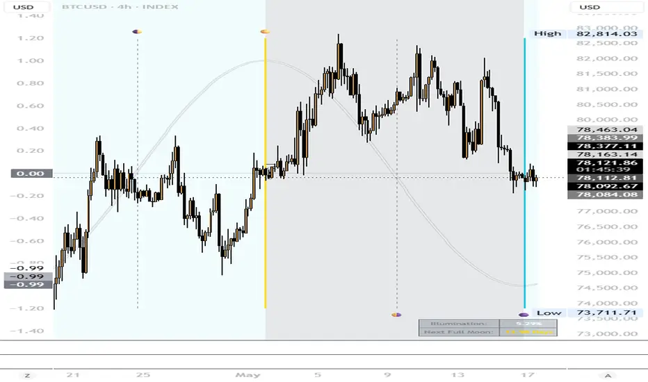
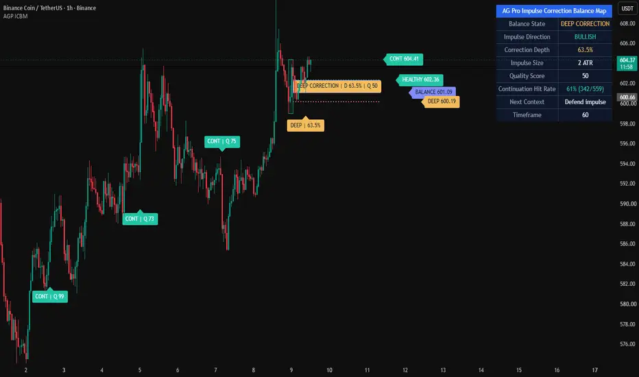
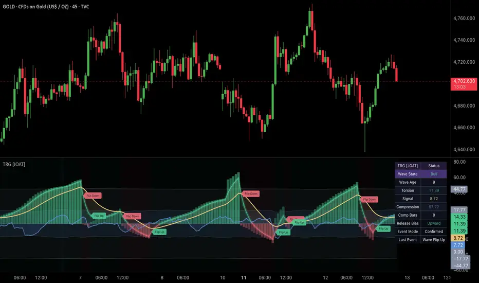
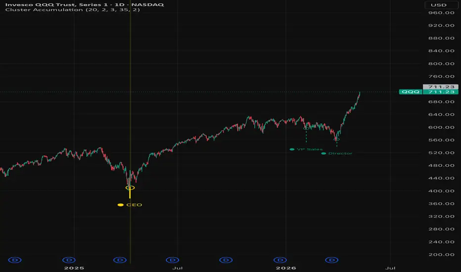
Volume Participation Curve [JOAT]Volume Participation Curve
Introduction
VPC Volume Participation Curve is an open-source volume seasonality indicator that compares current volume against historical participation for the same time bucket. It helps answer a simple but important question: is current activity meaningful compared with what usually happens at this time?
Instead of treating all volume bars equally, VPC builds recurring buckets by minute, hour, day, or month, then compares live volume against the expected bucket value. It also tracks session pace so traders can see whether the session is leading or lagging expected participation.
Core Concepts
1. Time-Bucketed Expected Volume
The indicator builds historical volume samples by time bucket. Auto mode chooses practical buckets based on the chart timeframe.
2. Median or Mean Summary
Expected volume can be calculated by median or mean. Median is the default because it is more robust against abnormal spikes.
3. Participation Ratio
The main curve is current smoothed volume divided by expected volume. A value above 1.0 means current activity is above expectation.
4. Session Pace
Session cumulative volume is compared with cumulative expected volume to determine whether the whole session is leading or lagging.
5. Regime Bands
Expansion and compression thresholds are shown as clean bands around the 1.0 baseline.
Features
Expected volume engine: Learns recurring volume behavior from historical buckets
Participation curve: Displays current volume relative to expected activity
Session pace curve: Shows whether cumulative session activity is ahead or behind
Expansion and compression bands: Identifies above-expected or below-expected participation
Dark-mode fills: Uses restrained green/red/neutral blends
Top-right dashboard: Shows bucket, participation, pace, surprise, growth, state, and sample count
Confirmed alerts: Includes expansion, compression, pace lead, and pace lag alerts
Input Parameters
Seasonality:
Historical Samples per Bucket
Bucket Mode: Auto, Minute, Hour, Day, or Month
Expected Value: Median or Mean
Curve:
Volume Smoothing
Session Pace Window
Visual:
Show Regime Bands
Show Pace Curve
Color Background
How to Use
Step 1: Read the participation curve relative to the 1.0 baseline.
Step 2: Treat readings above 1.2 as expansion context and readings below 0.8 as compression context.
Step 3: Confirm whether session pace agrees with the current bar's participation.
Step 4: Use the output as a participation filter for breakout, continuation, or reversal tools.
Limitations
New symbols or sparse histories may need time to build useful bucket samples
Unusual news or event-driven sessions can distort expected-volume comparisons
Volume reporting differs by asset class and exchange
This indicator does not predict direction; it measures participation context
Originality Statement
VPC is an original JOAT volume model combining time-bucketed expected volume, session pace, expansion/compression bands, and confirmed alerts in a Pine Script v6 pane indicator.
Disclaimer
This script is for educational and informational purposes only. It is not financial advice and does not guarantee future results. Trading involves risk, and users should apply their own risk management.
Made with passion by jackofalltrades
Indicateur

Hap Elliot [Dual Engine & Projections]Hap Elliot
Are you tired of subjective wave counts?
Elliott Wave Theory (EWT) is one of the most powerful concepts in technical analysis, but mapping it manually is subjective, time-consuming, and prone to human error.
Meet the Hap Elliot indicator—your streamlined, highly effective "magic pill" for Elliott Wave Analysis. We have transformed the complex guidelines of EWT into a strict, easy-to-digest mathematical algorithm. Featuring a unique Dual Engine Pivot System and Nested Sub-Waves, this script doesn't just draw past waves—it projects future targets in real-time.
KEY FEATURES & HOW IT WORKS:
1. Dual Pivot Engine (Choose Your Style):
ATR Distance Mode (Fast): Perfect for day traders. Detects pivots early based on volatility (ATR). Aggressive, but can be noisy on sharp wicks.
Fractal Confirmed Mode (Reliable): Waits for candle closes and fractal formations. Slower, but mathematically filters out market noise. Ideal for swing trading.
2. Strict EWT Guideline Enforcement:
Unlike basic zigzag indicators, Hap Elliot enforces EWT rules before validating a wave:
Wave 3 cannot be the shortest wave.
Enforces the "Rule of Alternation" between Wave 2 and Wave 4 (if W2 is deep, W4 must be shallow, etc.).
3. Macro & Micro Waves (Nested Structure):
The indicator scans two different time horizons simultaneously. You will see the Macro Wave (Major Trend) and the Micro Wave (Sub-waves inside the main trend) seamlessly overlaid.
4. Automated Fibonacci Projections & Reversal Boxes:
When a 1-2 wave sequence is detected, the algorithm immediately projects:
Wave 3 Targets: 1.0, 1.618, 2.618, and up to 3.618 (Super Extension).
Wave 4 Pullback Zones: Shallow (0.236) to Deep (0.5).
Wave 5 Reversal Box: Automatically draws a highlighted "Correction/Reversal Box" when the 5-wave cycle completes.
5. Real-Time Status Dashboard:
A sleek UI panel at the bottom right shows the current status of both Macro and Micro trends (e.g., "Bullish Expected", "Waiting for Box", "Perfect 5-Waves Done").
⚠️ IMPORTANT NOTE ON REPAINTING:
By its very nature, Elliott Wave Theory is dynamic. A Wave 3 can always extend into a "Super Extension." Therefore, as live price action develops, the algorithm will dynamically update the wave anchors and target projections. This is not a bug; it is the correct mathematical behavior of EWT.
💡 HOW TO USE:
Watch for a "Valid" status on the dashboard indicating a 1-2 sequence.
Use the projected Wave 3 (1.618) as your primary trend target.
When price enters the Wave 5 Reversal Box, expect an (A)(B)(C) correction and consider taking profits.
If you find this tool helpful, please leave a BOOST and share your feedback in the comments! Indicateur

Zfx Lunar Phase Engine
Zfx — Lunar Phase Engine
This indicator maps the synodic lunar cycle directly onto your price chart using precise astronomical timing. The lunar wave is calculated from a verified new moon epoch and plotted as a smooth sine oscillator on the left scale, allowing you to overlay the natural 29.5-day moon cycle against any market on any timeframe — without cluttering your price action.
What it does:
- Computes real-time lunar phase (0 = New Moon → 0.5 = Full Moon → 1 = back to New Moon) using the synodic month constant (2,551,442 seconds)
- Plots the wave on the left scale directly over price — candles remain fully readable
- Marks all four lunar phases with vertical lines and emoji anchors: 🌑 New Moon (cyan), 🌓 First Quarter, 🌕 Full Moon (gold), 🌗 Third Quarter
- Projects the next 3 upcoming phase events forward in time as dashed future lines
- Displays a live data table: current illumination % and days until the next New/Full Moon
- Optional waxing/waning background shading
Why it matters:
Lunar cycles have been studied in relation to market sentiment, liquidity windows, and turning points across commodities, indices, and crypto. This tool makes it effortless to visually correlate price behaviour with the moon's phase without any manual calculation.
Settings:
- Toggle quarter moon markers on/off
- Toggle background shading on/off
- Toggle the data table on/off
- All alert conditions included for all 4 phase transitions
Built for clean, uncluttered overlay use on any symbol and any timeframe.
---
That framing is distinct enough — it emphasises the astronomical calculation, the overlay approach, the left-scale design, and the forward projection, which differentiates it from generic lunar scripts. Indicateur

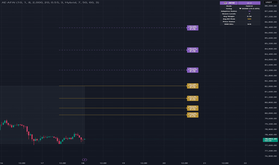
AetherEdge Adaptive Fibonacci AI🖊️ Overview
AetherEdge Adaptive Fibonacci AI is a machine-learning-driven adaptive Fibonacci engine that completely transcends traditional static ratios. A KNN (K-Nearest Neighbors) algorithm extracts the most similar historical regimes from up to 2,000 prior bars and learns which golden ratios actually worked in those analogous conditions. It then probabilistically computes a breakout probability for each level — a revolutionary tool that visualizes "which Fib will hold" as a forward-looking forecast.
🔶 Key Features
Dynamic Swing Detection: ATR-based filtering of meaningful swings only
KNN Similarity Engine: 6-dimensional feature × cosine similarity matching
Adaptive Fibonacci: Learns ratios that worked in similar regimes
3 Modes: Standard (fixed) / Adaptive (learned) / Hybrid (fused)
Breakout Probability Forecast: % probability displayed per level
3-Tier Color Coding: High / Mid / Low breakout probability
Predicted Extension Lines: 1.272 / 1.618 / 2.0 projection rendering
Dynamic Line Width: Higher similarity = thicker emphasis
Stats Panel: Visualizes similarity, ratio adoption, and processing state
🧠 Technical Architecture
This indicator is a KNN-driven Fibonacci AI that "learns from the past."
Swing Detection: pivothigh / pivotlow at swingLen, filtered by minSwingATR × ATR to eliminate noise. Swing ID tracking minimizes recomputation.
6-Dimensional Feature Vector: ①Return (f_ret) ②Volatility ratio (f_volaRatio) ③Volume ratio (f_volRatio) ④EMA slope (f_slope) ⑤Range position (f_rangePos) ⑥Normalized RSI (f_rsi) — vectorizes current market state.
Cosine Similarity: Computes similarity between the current vector and each historical state vector, quantifying regime resemblance on a -1 to 1 scale.
KNN Search: Scans historyBars range with sampleStep intervals, extracts top-K (knnK) similar states. similarityMin threshold filters out low-quality matches.
Level Harvesting: Reverse-engineers reactive price levels from analogous regimes, matches them against candidateRatios (18 ratios from 0.146 to 2.618), and accumulates them into adaptiveRatios.
Weighted Voting: Each ratio is quality-scored via similarity-weighted voting.
Breakout Probability: Calculated from price behavior (break vs. respect) around each level over probLookback bars.
Hybrid Mode: Combines standard Fibs with adaptive Fibs to harness both worlds.
⚙️ Recommended Settings & Tuning Guide
Crypto Defaults:
BTC (4H): swingLen=10, knnK=8, historyBars=2000, similarityMin=0.55
ETH (1H): swingLen=8, knnK=10, historyBars=1500, similarityMin=0.50
SOL/XRP (15M): swingLen=6, knnK=12, historyBars=1200, similarityMin=0.45
Long-Term (1D): swingLen=15, knnK=6, historyBars=3000, similarityMin=0.60
Tuning Guide:
Precision: similarityMin=0.70, knnK=5 for ultra-selective matching
Maximum learning: historyBars=4000, sampleStep=2 to maximize data
Speed priority: sampleStep=5, featureLen=15 to reduce load
Trending markets: includeExt=true, showBeyond=true for projection emphasis
Range markets: adaptMode=Adaptive to prioritize learned ratios
Beginners: adaptMode=Hybrid offers the safest standard + AI dual view
💡 How to Use in Practice
High-Probability Bounce: colLowProb (green) levels are strong S/R — bounce entry candidates
Breakout Plays: colHighProb (red) levels signal high break expectation — follow-through trades
Adaptive Edge: Non-standard ratios (0.65, 0.707, etc.) appearing in Adaptive mode are regime-specific key levels
Extension Targets: Use 1.272 / 1.618 / 2.0 projections for take-profit
Multi-Timeframe: Higher TF adaptive Fibs + lower TF entry refinement
AetherEdge Synergy: When Neural OB Evolution elite OBs overlap an adaptive Fib → confluence powerhouse zone
⚠️ Important Notes
The first several hundred bars lack training data, so Adaptive mode may not function well early on
Increasing historyBars improves accuracy but raises computational load (trade-off)
Effectiveness drops during sudden regime shifts that have no historical analog
Levels are not drawn until swings confirm (swingLen bars later)
KNN processing executes on bar close — real-time reflection occurs on the next bar
Excessively large featureLen risks over-referencing outdated patterns
🚨 Disclaimer
This indicator is provided for educational and research purposes only and does not constitute financial advice. KNN similarity and probability forecasts are based on historical data and do not guarantee future performance. All trading decisions are made at your own risk and should be accompanied by proper risk management.
Indicateur
Indicateur

Lunar Momentum Confluence (Moon Phases)Moon Phases Market Indicator 🌙📈
This indicator tracks the phases of the moon and compares them to market behavior to help traders spot potential bullish and bearish momentum shifts. It’s based on the idea that market psychology moves in cycles — just like the moon.
How It Works
New Moon 🌑
Often signals a market reset or fresh momentum. Traders commonly watch this phase for potential bullish reversals, trend beginnings, or accumulation zones.
Waxing Moon 🌒🌓🌔
As the moon grows brighter, market momentum can begin building. This phase is often associated with increasing strength, confidence, and bullish continuation.
Full Moon 🌕
The market tends to reach emotional extremes during full moons. This can lead to increased volatility, profit-taking, trend exhaustion, or bearish reversals.
Waning Moon 🌖🌗🌘
As the moon fades, momentum may weaken. Traders often associate this phase with slowing trends, pullbacks, consolidation, or bearish pressure.
Why Traders Use It
This indicator is not meant to predict the future like magic — it’s designed to help visualize market cycles, trader emotion, and momentum timing in a simple way. Many traders believe human psychology and market behavior naturally move in repeating patterns, and the lunar cycle can sometimes align surprisingly well with those shifts.
Bullish vs Bearish Interpretation
🌑 New Moon = Potential Bullish Energy
🌕 Full Moon = Potential Bearish or Reversal Energy
🌒 Waxing phases = Growing momentum
🌘 Waning phases = Weakening momentum
Simple Explanation
Think of the moon like a market mood tracker:
When the moon is growing → the market often gains energy.
When the moon is full → emotions peak and reversals can happen.
When the moon fades → momentum can slow down.
This gives traders another layer of confirmation alongside price action, volume, support/resistance, and trend analysis.
Best Used For
Swing Trading
Crypto Markets
Forex
Indexes
Market Cycle Analysis
Identifying possible reversal zones
⚠️ This indicator works best when combined with technical analysis and risk management — not as a standalone buy or sell signal. Indicateur

Lunar Momentum (Moon Phases)Moon Phases Market Indicator 🌙📈
This indicator tracks the phases of the moon and compares them to market behavior to help traders spot potential bullish and bearish momentum shifts. It’s based on the idea that market psychology moves in cycles — just like the moon.
How It Works
New Moon 🌑
Often signals a market reset or fresh momentum. Traders commonly watch this phase for potential bullish reversals, trend beginnings, or accumulation zones.
Waxing Moon 🌒🌓🌔
As the moon grows brighter, market momentum can begin building. This phase is often associated with increasing strength, confidence, and bullish continuation.
Full Moon 🌕
The market tends to reach emotional extremes during full moons. This can lead to increased volatility, profit-taking, trend exhaustion, or bearish reversals.
Waning Moon 🌖🌗🌘
As the moon fades, momentum may weaken. Traders often associate this phase with slowing trends, pullbacks, consolidation, or bearish pressure.
Why Traders Use It
This indicator is not meant to predict the future like magic — it’s designed to help visualize market cycles, trader emotion, and momentum timing in a simple way. Many traders believe human psychology and market behavior naturally move in repeating patterns, and the lunar cycle can sometimes align surprisingly well with those shifts.
Bullish vs Bearish Interpretation
🌑 New Moon = Potential Bullish Energy
🌕 Full Moon = Potential Bearish or Reversal Energy
🌒 Waxing phases = Growing momentum
🌘 Waning phases = Weakening momentum
Simple Explanation
Think of the moon like a market mood tracker:
When the moon is growing → the market often gains energy.
When the moon is full → emotions peak and reversals can happen.
When the moon fades → momentum can slow down.
This gives traders another layer of confirmation alongside price action, volume, support/resistance, and trend analysis.
Best Used For
Swing Trading
Crypto Markets
Forex
Indexes
Market Cycle Analysis
Identifying possible reversal zones
⚠️ This indicator works best when combined with technical analysis and risk management — not as a standalone buy or sell signal. Indicateur

Indicateur

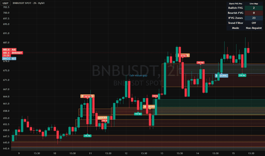
Elaris FVG Inversion ProElaris FVG Inversion Pro
Advanced Fair Value Gap & Inversion Mapping System
Elaris FVG Inversion Pro is a professional-grade market structure and imbalance visualization tool designed to help traders identify fair value gaps (FVGs), inversion fair value gaps (IFVGs), and potential reaction zones directly on the chart.
The indicator focuses on price inefficiencies created by aggressive directional movement and highlights areas where price may revisit, react, continue, or reverse.
Instead of displaying excessive noise, the system uses smart filtering logic, mitigation tracking, and optional trend confirmation to provide a cleaner and more structured view of market imbalance behavior.
━━━━━━━━━━━━━━━━━━
Core Features
━━━━━━━━━━━━━━━━━━
• Bullish & Bearish Fair Value Gap Detection
Automatically identifies three-candle imbalance structures in real time.
• Inversion Fair Value Gaps (IFVG)
Detects when previously established imbalance zones transition into potential reversal zones after invalidation.
• Non-Repainting Confirmed Detection
Signals and zones can be confirmed only after candle close to maintain stable historical plotting.
• Smart Gap Filtering
Optional ATR, volume, and EMA trend filters help reduce low-quality or insignificant zones.
• Dynamic Zone Management
Zones automatically extend forward and can be configured to expire or hide after mitigation.
• Mitigation Tracking
Supports multiple mitigation models including:
* Proximal
* Midpoint (50%)
* Distal
• Quality Scoring System
Each zone is evaluated using volatility and structure-based conditions to help prioritize stronger imbalances.
• Dark & Light Mode Compatible
Designed for clean visibility across different TradingView chart themes.
• Professional Dashboard
Displays active bullish, bearish, and inversion zones along with trend-state information.
━━━━━━━━━━━━━━━━━━
How It Works
━━━━━━━━━━━━━━━━━━
Bullish FVG:
Forms when price leaves an upside imbalance between candles, potentially creating a future demand area.
Bearish FVG:
Forms when price leaves a downside imbalance, potentially acting as future supply.
IFVG:
Occurs when price invalidates an existing FVG and the zone transitions into a potential reversal area.
The indicator can be used for:
* Trend continuation setups
* Pullback entries
* Liquidity-based reactions
* Market structure analysis
* Confluence with support/resistance or liquidity concepts
━━━━━━━━━━━━━━━━━━
Best Practices
━━━━━━━━━━━━━━━━━━
Higher timeframe FVGs generally produce stronger reactions than lower timeframe gaps.
Using the optional EMA and volume filters may help improve signal quality during volatile or choppy market conditions.
For confirmation-based trading approaches, combine FVG reactions with structure breaks, momentum shifts, or liquidity sweeps.
━━━━━━━━━━━━━━━━━━
Notes
━━━━━━━━━━━━━━━━━━
This indicator is intended for technical analysis and educational purposes.
No indicator guarantees future performance, and traders should always apply proper risk management and independent confirmation before making trading decisions.
Indicateur
Candlestick FootprintsThis layer builds the structural backbone of the indicator using confirmed market pivots.
Code behavior:
ta.pivothigh() detects swing highs
ta.pivotlow() detects swing lows
Both require confirmation (pivotLen delay), so they are non-repainting but lagging
Memory system:
The variables:
p1, p2, p3, p4
store the last four pivot points in sequence.
Each new pivot shifts the structure forward:
p1 → p2 → p3 → p4
Purpose:
This creates a market structural memory, allowing the system to analyze movement sequences instead of single candles.
2. CORE PROJECTION LAYER
This layer generates a directional projection based on the last impulse.
Core logic:
move = p4 - p3
proj = p4 + move
Interpretation:
The system assumes that:
the last impulse leg may repeat in magnitude
So it projects a mirrored movement forward from the last pivot.
Nature of this model:
This is a mirror impulse projection model, not a predictive statistical model.
It assumes structural repetition in price behavior.
3. CLUSTERING LAYER (CORE INTELLIGENCE)
This is the most important layer of the system.
It groups similar projected levels into liquidity zones.
Data structures:
bullMid / bullCnt → bullish clusters
bearMid / bearCnt → bearish clusters
Clustering logic:
If a new projection is close to an existing one:
abs(proj - old) < ATR * tolerance
Then:
the cluster count increases
the zone center is recalculated (averaged)
the liquidity zone becomes stronger
Outcome:
Repeated projections create:
liquidity magnet zones (price attraction areas)
4. VISUALIZATION LAYER
This layer is purely graphical.
Tools used:
box.new() for zones
label.new() for cluster information
Bull zones:
Aqua = weak bullish flow
Lime = strong bullish accumulation
Bear zones:
Red = bearish pressure zones
Important:
This layer does NOT generate trading signals.
It only visualizes clustered market structure.
5. DIRECTION LOGIC LAYER
Direction is determined by projection comparison:
isBull = proj > p4
isBear = proj < p4
Meaning:
If projection is above last pivot → bullish structure
If below → bearish structure
This is a structural direction classifier, not a momentum oscillator.
6. SYSTEM PHILOSOPHY
This indicator is not based on traditional technical indicators.
It does NOT use:
Moving averages
RSI
MACD
Instead, it focuses on:
structural repetition
pivot-based memory
clustering of projected price levels
Core idea:
Markets tend to revisit structurally repeated zones rather than random levels.
7. FINAL SYSTEM OUTPUT
The system produces:
Liquidity zones
Cluster strength (count-based)
Directional bias (bull/bear)
Visual heatmap of price memory
Final interpretation:
This is a structural probability map of where price tends to accumulate and react.
🇹🇷 TÜRKÇE AÇIKLAMA (TAM KATMANLI)
1. PIVOT YAPISI KATMANI
Bu katman sistemin iskeletini oluşturur ve piyasa pivotlarını kullanır.
Çalışma mantığı:
ta.pivothigh() swing high noktalarını bulur
ta.pivotlow() swing low noktalarını bulur
Pivotlar onaylıdır, bu yüzden gecikmelidir ama repaint yapmaz
Hafıza sistemi:
p1, p2, p3, p4
son 4 pivotu saklar.
Her yeni pivot geldiğinde yapı kayar:
p1 → p2 → p3 → p4
Amaç:
Bu yapı, tek mum değil:
piyasanın hareket dizisini analiz eden bir hafıza sistemi oluşturur
2. PROJEKSİYON KATMANI
Bu katman son hareketi baz alarak ileri projeksiyon üretir.
Temel hesap:
move = p4 - p3
proj = p4 + move
Mantık:
Sistem şunu varsayar:
son impuls hareket tekrar edebilir
Bu yüzden aynı hareketi ileri taşır.
Model tipi:
Bu bir:
ayna hareket projeksiyon modelidir
3. CLUSTER (KÜMELEME) KATMANI
Sistemin en önemli kısmıdır.
Benzer projeksiyonları aynı bölgede toplar.
Veri yapıları:
bullMid / bullCnt → bullish bölgeler
bearMid / bearCnt → bearish bölgeler
Çalışma mantığı:
Eğer yeni proje eski bölgeye yakınsa:
abs(proj - old) < ATR toleransı
Şunlar olur:
cluster sayısı artar
merkez yeniden hesaplanır
bölge güçlenir
Sonuç:
Tekrarlanan fiyat bölgeleri:
likidite mıknatıs alanları oluşturur
4. GÖRSELLEŞTİRME KATMANI
Bu katman sadece görsel sunum yapar.
Araçlar:
box.new() → zone çizimi
label.new() → bilgi etiketi
Bull bölgeler:
Aqua = zayıf bullish akış
Lime = güçlü bullish birikim
Bear bölgeler:
Red = satış baskısı
Önemli:
Bu katman sinyal üretmez.
Sadece yapıyı görselleştirir.
5. YÖN MANTIĞI KATMANI
Yön projeksiyona göre belirlenir:
isBull = proj > p4
isBear = proj < p4
Anlamı:
yukarı projeksiyon → bullish yapı
aşağı projeksiyon → bearish yapı
Bu bir momentum değil:
yapısal yön sınıflandırmasıdır
6. SİSTEM FELSEFESİ
Bu indicator klasik teknik analiz değildir.
Şunları kullanmaz:
MA (hareketli ortalama)
RSI
MACD
Bunun yerine:
piyasa tekrarları
pivot hafızası
cluster davranışı
kullanır.
Temel fikir:
Piyasa rastgele değil:
belirli yapısal bölgeleri tekrar ziyaret eder
7. SONUÇ
Sistem şunları üretir:
likidite bölgeleri
cluster gücü
yön biası (bull/bear)
fiyatın hafıza haritası
Final yorum:
Bu sistem fiyatın nerede reaksiyon verme ihtimalinin yüksek olduğunu gösteren yapısal bir olasılık haritasıdır. Indicateur

Online Logistic Forecaster [forexobroker]Online Logistic Forecaster trains a single-feature logistic regression in real time via stochastic gradient descent. The feature is the standardised price-EMA distance; the target is "next bar closes higher". Each bar updates weight w := w - eta * (sigmoid(w * x) - y) * x. Forecast probability of next-bar up = sigmoid(w * x). Adaptive learning without batch training.
🔶 ALGORITHM
1. EMA = ema(close, len); ATR = atr(14).
2. Feature x = (close - EMA) / ATR (ATR-normalised distance).
3. Online SGD step: y_prev = (close > close ); w := w - eta * (sigmoid(w * x ) - y_prev) * x .
4. Forecast: p_up = sigmoid(w * x).
5. Bull bias when p_up >= upper threshold; bear bias when <= lower threshold.
🔶 SIGNAL LOGIC
- Buy: bull bias edge (cross above upper threshold) AND not already long AND cooldown elapsed AND barstate.isconfirmed.
- Sell: bear bias edge.
- Position-lock state machine.
🔶 INPUTS
- Feature EMA Length (default 20)
- Learning Rate eta (default 0.05)
- Buy Probability (default 0.60)
- Sell Probability (default 0.40)
- Cooldown Bars (default 4)
- Visual: dashboard, glow, sigmoid line, buy / sell colors
🔶 ALERTS
OLF Buy, OLF Sell, OLF Any Signal, OLF Bull Edge, OLF Bear Edge, OLF High Conf Up, OLF High Conf Dn, OLF Strong Weight, OLF Webhook JSON.
🔶 LIMITATIONS
- One feature gives a 1D logistic forecast; multi-feature models would be more powerful but require explicit weight management.
- SGD with high eta can oscillate; defaults (eta = 0.05) balance convergence vs adaptation.
- The model needs warm-up of dozens of bars before w stabilises; early bars produce noisy forecasts.
- The "sigmoid line" visual is anchored at the EMA and scaled by ATR — purely informational.
Indicateur

Indicateur

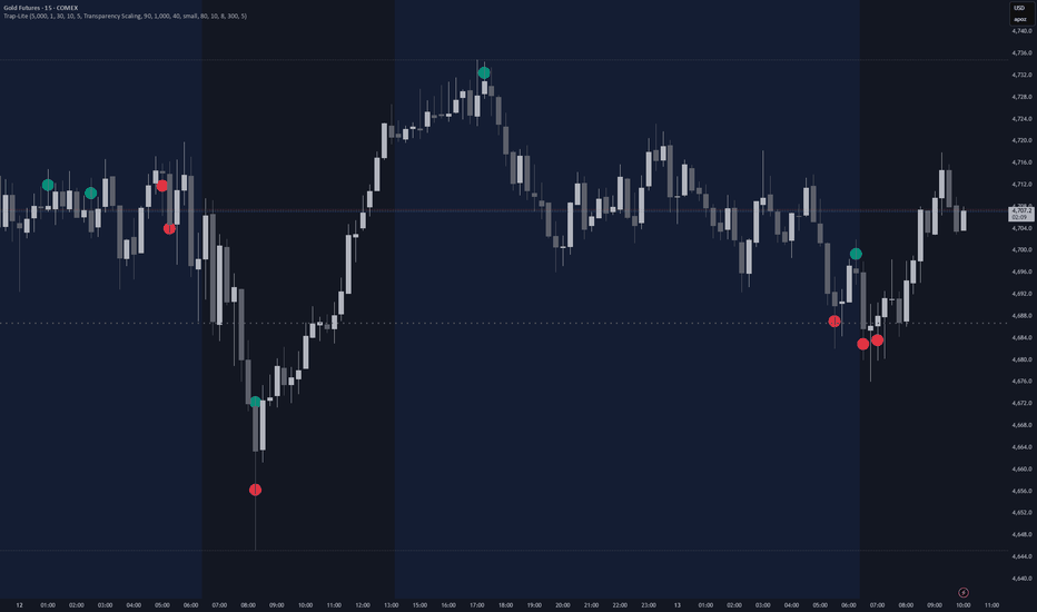
Bookmap Traps - LiteOverview
The Bookmap Traps (Lite) indicator is a highly advanced, machine-learning enhanced volume visualization tool designed to uncover hidden liquidity traps within candlestick wicks. Moving beyond traditional volume indicators, this script employs a synthetic lower-timeframe footprint engine to analyze the microstructure of price action, locating exactly where buyers or sellers have been caught offside. By plotting dynamic, volume-weighted bubbles directly on the chart, it allows traders to visualize trapped liquidity in real-time. This provides an x-ray view into order flow exhaustion and high-probability reversal zones, completely bypassing the need for expensive footprint data feeds.
Core Calculations & Logic
The indicator's engine relies on a granular breakdown of price delivery, utilizing multi-timeframe arrays, synthetic Volume Price Trend (VPT), and rigorous wick analysis to identify trapped volume:
Synthetic Footprint Generation: Instead of relying on premium data, the script uses `request.security_lower_tf` to fetch 1-minute (or user-defined lower timeframe) OHLCV data. It calculates a Volume Price Trend (VPT) ratio to accurately model the volume distribution within the parent candle, allowing for high-fidelity order flow analysis on the main chart.
Direct Wick Volume Measurement: The core logic isolates the parent candle's upper and lower wicks, identifying them as potential trap zones if they meet a minimum percentage of the total bar range. It then iterates through the lower timeframe data, mapping exactly how much relative volume was executed within those specific wick extremities.
Strict "Deep Wick" Filtering: To ensure only the most significant rejections are highlighted, the script features a "Deep Wick Only" mode. This forces the engine to disregard volume that occurred near the body of the candle, specifically tracking volume trapped in the outermost half of the wick where participants are most vulnerable.
Dynamic Outlier Auto-Scaling: The visualization engine constantly adapts to the current market environment. It calculates rolling volume percentiles to auto-scale the size or transparency of the trap bubbles, ensuring that massive volume anomalies stand out sharply while filtering out insignificant background noise.
The Machine Learning (kNN) Enhancement Engine
The standout feature of Bookmap Traps (Lite) is its built-in predictive k-Nearest Neighbors (kNN) algorithm, which actively scores the quality of detected traps based on historical success:
Feature Extraction & Normalization: Every time a trap forms, the script extracts key structural features—such as body-to-ATR ratios, upper/lower wick proportions, body positioning, and trapped volume metrics—and normalizes them for the ML model.
Pattern Recognition & Scoring: The kNN engine searches a rolling training window (e.g., the last 300 bars) to find the 'K' most structurally identical historical traps. It then analyzes the subsequent price action of those historical matches to determine a success rate.
Intelligent Volume Weighting: If historical data proves that a specific trap pattern consistently fails, the ML score suppresses its visual presence. Conversely, if a pattern is highly reliable, the ML score acts as a multiplier, boosting the trap's volume and amplifying its visual footprint on the chart.
How to Use in Practice
Identifying Exhaustion & Reversals: Watch for large teal (trapped buyers) bubbles forming in the upper wicks at resistance, or large red (trapped sellers) bubbles in the lower wicks at support. A massive bubble indicates high participation on the wrong side of the market, signaling an impending, aggressive mean reversion.
Interpreting Tooltips & ML Scores: By hovering over a bubble, traders can view the exact trapped volume and the ML confidence score. Prioritize trades where a high volume trap is backed by a high ML success percentage, filtering out statistically weak setups.
Customizing Visuals for Clarity: Utilize the "Size Scaling" or "Transparency Scaling" modes to fit your aesthetic preference. For cleaner charts, increase the "Show Top % of Traps" filter to only display the absolute most extreme liquidations (e.g., the top 15%), keeping the interface pristine.
Recommended Timeframes: Due to the granular nature of the synthetic lower-timeframe calculations, it is highly recommended to use this indicator on the 15-minute timeframe or higher. This allows the script to aggregate enough lower timeframe data (e.g., 1m candles) within the parent bar to somewhat effectively model the internal volume distribution.
Note: This script is an analytical tool intended to visualize market structure and trapped liquidity mechanics. It does not provide standalone buy/sell trading signals.
Indicateur
Impulse Correction Balance Map [AGPro Series]Impulse Correction Balance Map
🧠 Core Idea
Is the current correction still healthy compared with the prior impulse, or is the impulse losing structural balance?
📌 Overview / What it does
Impulse Correction Balance Map is a rule-based impulse and correction visualization tool designed to compare the current pullback with the prior directional swing leg.
The script identifies a valid bullish or bearish impulse, measures correction depth, maps the healthy-to-balanced correction pocket, and highlights whether price is still respecting the impulse structure or moving into failure risk.
It does not predict price direction, automate trades, or guarantee continuation after a pullback. It is a structured market-structure and wave-analysis tool for reading impulse strength, correction depth, balance, continuation, and failure context.
🎯 Purpose & Design Philosophy
Many pullback tools mark a retracement or draw generic Fibonacci levels.
This script was built to answer a more practical question:
Is the correction proportionate to the impulse that created it?
The design goal is to help traders evaluate pullbacks as part of a complete impulse-correction relationship instead of treating every retracement as equal.
⚡ Why This Script Is Different
Most tools focus on static retracement levels, generic trend strength, or simple pullback labels.
This script does NOT mark every pullback as a clean opportunity.
Instead, it builds the impulse leg first, measures the correction against that leg, separates healthy correction, balanced pullback, deep correction, continuation, and failure risk, then displays the story through premium chart visuals and a compact AG Pro panel.
⚙️ Methodology
1. Swing Detection
The script uses confirmed swing pivots to identify meaningful bullish or bearish impulse legs.
2. Impulse Validation
An impulse must meet a minimum ATR-normalized size before it becomes the active reference leg.
3. Correction Mapping
After the impulse forms, the script tracks the deepest correction point and calculates retracement depth as a percentage of the impulse.
4. Balance Evaluation
Correction depth is classified into healthy, balanced, deep, continuation, or failure states.
5. Visual Output
The chart displays the impulse box, correction pocket, depth ladder, centered pocket label, right-side tags, event labels, alerts, and a compact AG Pro decision panel.
🗺️ How to Read the Chart
Impulse Box = the prior validated directional swing leg.
Correction Pocket = the projected healthy-to-balanced retracement area.
Depth Ladder = reference rails for shallow, balanced, and deep correction zones.
Centered Pocket Label = the main visual anchor for the active balance pocket and quality score.
Right-Side Tags = current correction depth, balance state, and continuation reference.
Event Labels = key moments such as healthy correction, deep correction, continuation, or correction failure.
Panel = summarizes balance state, impulse direction, correction depth, impulse size, quality score, next context, and timeframe.
🚦 Signals & States
• HEALTHY CORRECTION → correction depth remains shallow relative to the impulse.
• BALANCED PULLBACK → correction is deeper but still inside the normal balance area.
• DEEP CORRECTION → correction is pressing into a riskier retracement zone.
• HIGH FAILURE RISK → correction is beyond the preferred balance area.
• CONTINUATION → price extends beyond the impulse end in the impulse direction.
• CORRECTION FAIL → price invalidates the impulse start area.
• WAIT IMPULSE → no valid impulse reference is active yet.
🔔 Alerts Logic
Alerts trigger when a major impulse-correction state appears.
• Healthy Correction → correction remains inside the healthy retracement area.
• Deep Correction Risk → correction depth moves into the deep-correction risk area.
• Continuation Trigger → price breaks beyond the impulse end in the impulse direction.
• Correction Failure → correction invalidates the impulse start area.
Alerts are attention markers, not trade instructions.
🧩 Confluence Logic
The context becomes stronger when:
• The impulse leg is large enough relative to ATR
• Correction depth remains proportionate
• Price respects the balance pocket
• Continuation appears after a controlled correction
• The panel state agrees with the event label
• Broader trend structure supports the impulse direction
If these elements do not align, the script avoids forcing a continuation interpretation.
📊 When to Use
• Trend continuation analysis
• Pullback evaluation
• Swing structure review
• Crypto, forex, stocks, and index markets
• Wave-style impulse and correction studies
• 1H, 4H, and daily charts
• Markets with clear directional legs and retracement behavior
⚠️ When NOT to Use
• Very low-liquidity symbols
• Extremely choppy markets with no clear swing structure
• News-driven candles where pivots may be distorted
• Ultra-low timeframes with excessive noise
• Markets where every pullback is immediately invalidated by volatility
• Situations where a single retracement should not be treated as a standalone decision
🎛️ Key Inputs
• Swing Pivot Length → controls how swing highs and lows are confirmed.
• Minimum Impulse ATR → defines how large the impulse must be before it becomes active.
• ATR Length → normalizes impulse size, label spacing, and correction context.
• Healthy Correction Max % → defines the upper boundary of the shallow correction zone.
• Balance Correction Max % → defines the upper boundary of the balanced correction zone.
• Deep Correction Max % → defines the deep-correction risk boundary.
• Projection Bars → controls how far correction pockets, rails, and tags project.
• Label Font Size → controls chart label and tag text size.
• Panel Font Size → controls panel text size.
🖥️ Interface & Visual Design
The visual hierarchy is built around the impulse-correction relationship.
The impulse box shows the directional leg.
The correction pocket shows where a controlled retracement can remain balanced.
The depth ladder shows where the correction becomes shallow, balanced, deep, or risky.
The centered badge makes the pocket readable at first glance.
The AG Pro panel summarizes the current state without forcing the user to inspect every level manually.
🧪 Practical Usage Workflow
1. Wait for a valid impulse leg to appear.
2. Check the correction pocket and depth ladder.
3. Read the current balance state in the panel.
4. Watch whether the correction stays healthy, becomes deep, or fails.
5. Look for continuation only after the correction context remains controlled.
6. Interpret the result inside broader trend, liquidity, and volatility context.
🔍 Interpretation Guidelines
A healthy correction does not guarantee continuation. It means the retracement is still proportionate to the prior impulse.
A deep correction does not guarantee reversal. It means the pullback is approaching an area where the original impulse is less structurally clean.
A continuation trigger does not guarantee follow-through. It means price extended beyond the impulse end according to the script's rule set.
A correction failure is a structural warning, not a trading command.
🚫 What This Script Is NOT
This script is not a prediction engine.
It is not financial advice.
It is not an auto-trading system.
It does not provide guaranteed entry or exit signals.
It is not a standard Fibonacci retracement tool.
It is not a full Elliott Wave counter.
⚠️ Limitations & Transparency
Swing detection depends on pivot confirmation, so signals can appear after pivots are confirmed.
Timeframe differences can change impulse and correction structure.
High volatility may cause correction depth to expand quickly.
Low-liquidity markets may produce unreliable swing pivots.
The script is designed for structured interpretation, not certainty.
🧠 Market Context Notes
Impulse-correction behavior is strongest when the market has a clear directional leg, a readable retracement, and enough liquidity for swing structure to matter.
The same correction depth can mean different things in a strong trend, a range, or a volatility shock.
The script should be read together with broader structure, volume, volatility, and market regime.
🧾 Use Case Examples
• If a bullish impulse forms and the correction remains shallow, the map may show healthy correction context.
• If a bearish impulse forms and price retraces deeply against it, the map may show deep correction or failure risk.
• If price breaks beyond the impulse end after a controlled correction, the map may show continuation.
🧱 System Philosophy
Impulse Correction Balance Map is part of the AGPro Series approach to decision-support tools:
clear structure, premium chart readability, honest interpretation, and no promise of certainty.
The goal is to help traders understand the relationship between impulse strength and correction depth without turning analysis into signal spam.
🔐 Non-Promise Statement
No script can know the future.
No correction depth guarantees continuation or reversal.
No signal should be interpreted without broader market context.
📉 Risk Disclosure
Trading involves risk.
Markets can move unpredictably.
This script is for educational and analytical purposes only.
It does not provide financial advice or guaranteed trading outcomes.
Users remain responsible for their own decisions.
📚 Educational Note
Use this script to study how impulses and corrections relate to each other.
The value is not only in the label. The value is in learning whether a pullback is proportionate, stretched, balanced, or structurally weak compared with the impulse that came before it.
Indicateur

Torsion Range [JOAT]Torsion Range
Introduction
Torsion Range is an open-source compression, expansion, and wave-energy panel designed to track whether the market is coiling, releasing, trending, or exhausting. The script combines wave direction, weighted energy accumulation, compression scoring, and exhaustion logic into one regime-aware panel.
The problem Torsion Range solves is fragmentation between wave tools and volatility tools. Traditional wave studies often ignore whether the market is compressing or expanding, while compression indicators often ignore directional wave state. Torsion Range merges both worlds so the user can monitor directional energy and structural volatility state together.
Core Concepts
1. Wave Direction Engine
The script supports multiple methods for determining directional wave state, including impulse, pressure, and hybrid behavior. This allows the model to adapt to different styles of price movement.
2. Weighted Energy Accumulation
Wave state is not just directional. It is weighted by body, range, ATR context, and optional relative volume to produce a more informative torsion core.
3. Compression Index
A 0-100 compression framework is built from fast and slow comparisons of range, body, and energy behavior. This allows the indicator to identify tight conditions before release.
4. Release and Exhaustion Logic
Confirmed-bar release events occur when compression gives way to directional expansion. Exhaustion logic looks for overstretched waves with weakening internal behavior.
5. Dashboard and Regime Visualization
The panel includes adaptive colors, background overlays, event flashes, and a top-right dashboard that summarizes wave state, bias, compression, and most recent event.
Features
Multi-method wave direction: Impulse, pressure, or hybrid state engine
Weighted energy accumulation: Uses price and optional relative volume
Compression scoring: Tracks coiling conditions on a normalized scale
Confirmed release logic: Detects transition from compression to directional expansion
Exhaustion detection: Flags overextended wave conditions
Adaptive gradient styling: Institutional panel presentation for dark charts
Regime overlays and event flashes: Highlights important state transitions cleanly
Top-right dashboard: Summarizes live wave and compression state
Confirmed event mode: Optional bar-close only event gating
Alertconditions: Wave flips, release events, and exhaustion states
How to Use This Indicator
Step 1: Read the Wave State
Determine whether directional energy currently favors bullish, bearish, or neutral behavior.
Step 2: Check Compression
High compression means stored energy but not yet confirmed release. Low compression with directional energy implies active movement rather than coiling.
Step 3: Watch Release Events
Release events matter most when they occur after genuine compression and align with the active wave bias.
Step 4: Respect Exhaustion
Exhaustion conditions can warn that a strong wave is becoming less efficient, even if trend has not yet fully reversed.
Indicator Limitations
Compression and exhaustion are relative, not absolute, conditions
Wave direction depends on the selected method and will respond differently across market types
This panel does not identify exact reversal bars and should not be treated as one
Release events are strongest when combined with separate structural context
Originality Statement
Torsion Range is original in its fusion of wave-state persistence, weighted energy accumulation, compression analysis, and exhaustion logic within one panel. It is not a basic Weis-style clone and not a plain volatility gauge. Its value comes from combining directional energy and volatility state into a single workflow.
Disclaimer
This indicator is provided for educational and informational purposes only. It is not financial advice. Compression, release, and exhaustion states are analytical conditions derived from historical chart behavior and do not guarantee future outcomes.
- Made with passion by jackofalltrades
Indicateur

Indicateur

AGT LevelsAGT Levels is a custom volume-profile-based support and resistance tool designed to highlight key High Volume Nodes and Low Volume Nodes directly on your chart.
Instead of using standard horizontal levels, this indicator builds a full right-side volume profile from the same data used to calculate the levels. The profile is plotted to the right of price and faces back toward the chart, making it easier to see where volume has built up and where price may react.
The main idea is simple:
High Volume Nodes can act as areas where price accepts value, consolidates, or reacts strongly.
Low Volume Nodes can act as rejection zones, thin liquidity areas, or fast-move regions where price may move quickly through or reject from.
The indicator includes:
• Full right-side volume profile
• Up/down volume split inside the profile
• HVN and LVN level detection
• Major and minor level zones
• Adjustable sensitivity settings
• Adjustable profile offset
• Level zones extending from the volume profile
• Optional boxes, midlines, or both
• Alerts for level touches and rejections
The Sensitivity setting controls both the volume profile resolution and the level detection logic:
Conservative gives cleaner, broader levels.
Balanced gives a good all-round view.
Aggressive gives more granular levels and a more detailed profile.
This tool is designed to help traders identify important volume-based reaction zones, rather than relying only on traditional highs/lows or manually drawn support and resistance.
Best used together with your own market structure, session bias, VWAP, orderflow, or liquidity-based strategy.
This script does not predict future price movement. It is intended for technical analysis, backtesting, and educational use only.
Not financial advice. Always do your own research and risk management. Indicateur

Cartograph Bands [JOAT]Cartograph Bands
Introduction
Cartograph Bands is an open-source price-space mapping overlay that translates internal momentum and regime pressure into adaptive bands around price. Instead of displaying momentum in a separate pane and forcing the user to mentally translate it back into price context, the script projects a composite regime score directly into layered price envelopes.
The problem Cartograph Bands solves is disconnected interpretation. Oscillators can show strength or weakness, but they often fail to communicate where that state matters on the chart. Cartograph Bands closes that gap by converting internal regime intensity into inner, outer, and far price-space bands, then combining that with multi-timeframe confirmation and volatility-state transitions.
Core Concepts
1. Composite Momentum Engine
The script blends several internal measurements including RSI, CMO, ROC normalization, and slope behavior to create a bounded momentum/regime score. This reduces reliance on any single oscillator.
2. Price-Space Mapping
That composite score is mapped into adaptive offsets around price using ATR and standard deviation inputs. The result is a set of bands that express regime intensity as chart structure rather than as a separate panel line.
3. Layered Band Geometry
Three band families are used:
Inner bands for local equilibrium
Outer bands for state extension
Far bands for exceptional displacement
4. Non-Repainting Higher Timeframe Confirmation
Confirmed higher-timeframe values are requested using offset expressions and lookahead handling intended to avoid future leakage on historical bars.
5. Compression and Expansion State Tracking
Cartograph Bands also classifies whether the current market state is compressing or expanding, which gives context to outer-band tests and re-entry events.
Features
Composite momentum model: Multiple internal regime factors instead of one oscillator
Mapped price-space bands: Regime intensity projected directly onto chart structure
Inner, outer, and far layers: Different depths of price displacement
MTF confirmation dashboard: Top-right summary with higher-timeframe agreement context
Compression and expansion tracking: Identifies volatility-state transitions
Outer-band re-entry events: Useful for exhaustion or reacquisition studies
State candle tinting: Visual context without heavy marker clutter
Gradient cloud system: Layered institutional-style fills
Confirmed-signal mode: Optional bar-close confirmation behavior
Alertconditions: Regime flips, re-entry, expansion, compression, and MTF conflict
How to Use This Indicator
Step 1: Read the Band State
Price inside the inner structure implies local balance. Sustained travel into outer and far layers implies stronger directional pressure.
Step 2: Check the Dashboard
Use the dashboard to confirm whether the chart-timeframe state aligns with higher-timeframe conditions.
Step 3: Watch Re-entry Behavior
Re-entry from outside the outer band can highlight exhaustion or failed extension, especially when expansion begins to fade.
Step 4: Use Compression and Expansion as Context
A compression state reduces the importance of directional interpretation. Expansion after compression matters more than random outer-band wandering.
Indicator Limitations
The mapping is adaptive, so band distance changes with symbol volatility
Higher-timeframe context is intentionally confirmed and may feel slower than live-developing HTF tools
Band interaction alone should not be treated as a complete trade system
The script maps internal regime state into price context, but it does not forecast exact reversal points
Originality Statement
Cartograph Bands is original in the way it blends multiple internal regime measurements and projects them into layered price-space geometry. Its value is not just an oscillator or just bands, but the interaction between regime scoring, mapped offsets, MTF confirmation, and state transitions.
Disclaimer
This indicator is provided for educational and informational purposes only. It is not financial advice. All mapped bands are analytical references derived from historical price behavior and should be used with sound judgment and risk management.
- Made with passion by jackofalltrades
Indicateur

Indicateur

Indicateur

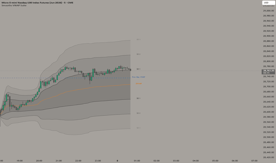
Smooths VWAP SuiteTitle: Smooth's VWAP Suite: Advanced Futures Context & Filtered Signals
Description:
Overview & Purpose
Smooth's VWAP Suite is a comprehensive volume-weighted average price toolkit engineered specifically for futures traders (e.g., NQ, ES).
The primary justification for combining these specific elements—Daily VWAP, Standard Deviation Bands, Session AVWAPs (Overnight, RTH, Weekly), and dynamic signals—into a single script is to solve the problem of "context fragmentation." Futures markets respect multiple volume anchors simultaneously. Rather than cluttering a chart with five individual, unlinked indicators, this suite unites micro (intraday) and macro (weekly) volume levels into one cohesive map. Furthermore, it introduces a custom "Current Day Only" filter mathematically anchored to the 18:00 EST futures open, fixing the common issue where standard indicators rely on the midnight calendar-day rollover.
How It Works: Underlying Concepts & Logic
This script calculates the Volume-Weighted Average Price by maintaining a cumulative running total of Price × Volume, divided by Total Volume.
Session AVWAPs & Previous Day: The script calculates distinct VWAPs based on specific time anchors. It automatically tracks the Weekly open, the Regular Trading Hours (RTH) open, and the Overnight (OVN) session. It also statically plots the Previous Day's closing VWAP value, acting as a critical pivot for the current session.
Standard Deviation Variance: The bands surrounding the Daily VWAP are calculated using the mathematical square root of volume-weighted variance. This provides dynamic, mathematically sound support and resistance zones based on current market volatility, plotted at user-defined multipliers (defaulting to 1.0, 2.0, and 3.0 SD).
Signal Engine & EMA Filter: The built-in signals are not basic crossovers. To prevent false signals in chopping ranging markets, the script requires an EMA (Exponential Moving Average) directional filter to confirm the trend.
Reversal/Cross Signals: Trigger when price straddles the VWAP, closes on the opposite side, is aligned with the EMA slope, and is positioned correctly relative to the Weekly VWAP.
Continuation Signals: Trigger when price pushes into a Standard Deviation band (e.g., SD 1 or SD 2) and actively rejects it, closing back toward the trend direction while maintaining the EMA slope.
How Traders Can Use It
This suite is designed for trend identification, mean-reversion targeting, and precise entry confirmation.
Macro Context Alignment: Use the Weekly and Previous Day VWAP lines to determine the broader bias. If the current Daily VWAP is trading above both, the macro trend is bullish.
Mean Reversion: When price extends into the SD 2 or SD 3 bands, the asset is statistically overextended based on current volume. Traders can look for price action weakness at these extremes to target a reversion back to the Daily VWAP (the mean).
Signal Execution: Utilize the script's visual markers (Arrows/Triangles) for entry confirmations. A bullish signal firing after a bounce off the lower SD 1 band, while the Daily VWAP remains above the Weekly VWAP, offers a high-probability continuation setup.
Chart Decluttering: For active day traders, toggle the "Current Day Only" setting. This utilizes custom logic to sever all historical visual data prior to the exact 18:00 EST futures anchor, keeping your screen entirely focused on the current session's price action.
Customization
Every element is modular. Traders can toggle specific bands, adjust standard deviation multipliers, change the EMA filter length for signals, and customize the visual offsets of the price labels to fit their specific screen layout. Indicateur
Volume Ledger [JOAT]JOAT Volume Ledger
Introduction
JOAT Volume Ledger is an open-source participation and volume-zone framework designed to identify where meaningful activity occurred, what type of activity it likely was, and which of those zones still matter now.
It is built around the idea that not all large volume is equal.
Some high-volume behavior represents sponsorship.
Some represents exhaustion.
Some represents churn or absorption.
Some leaves behind a meaningful footprint that the market later reacts to.
The problem the script solves is translation.
Raw volume bars alone do not explain whether heavy activity created useful levels.
They also do not organize those levels for later use.
Volume Ledger attempts to do both.
It begins with relative-volume heat and participation metrics.
It then uses confirmed pivot-based logic to create candidate zones.
Those zones are merged, ranked, extended, and reclassified as support or resistance based on how price returns to them.
Higher-timeframe carry-forward levels can also be displayed.
Core Concepts
1. Relative-Volume Heat
The script normalizes current volume against a baseline and color-grades it.
2. Delta, Churn, and Participation
A delta proxy, churn estimate, and participation line classify the quality of activity.
3. Confirmed Pivot-Zone Creation
When significant participation coincides with confirmed pivots, the script stores those prices as candidate zones.
4. Zone Merging and Ranking
Nearby zones are merged and stronger zones are prioritized.
5. Higher-Timeframe Carry-Forward Levels
Important HTF zones can be projected into the current chart.
6. Retest Logic
The script distinguishes whether an active zone is currently acting as support or resistance.
7. Overlay Box and Line Projection
Zones are projected forward into current chart space using managed boxes, lines, and labels.
8. Participation State Readout
The dashboard summarizes the dominant volume condition, active zones, and current participation quality.
Features
Relative-volume heatmap: current activity is normalized and color-graded
Delta, churn, sigma, and participation analytics: classifies the character of activity
Confirmed volume-origin zones: maps price areas linked to meaningful participation
Zone merging and ranking: reduces clutter and prioritizes stronger regions
Projected overlay boxes and lines: extends active zones into current price
Higher-timeframe ledger context: broader levels can be carried forward
Support / resistance retest logic: distinguishes how price is interacting with the zone
Bar tint and backdrop state: strong participation conditions are easy to spot
Dashboard: summarizes volume state and dominant zone structure
Input Parameters
Ledger Core:
Volume Comparison
Ledger Window
Participation Smoothing
Delta and Churn Settings
Relative Volume Thresholds
Zone Engine / Display:
Zone Extension
Merge Threshold
Zone Ranking Rules
Projected Levels
Higher-Timeframe Carry-Forward
Show Dashboard
Show Average
Show Participation Line
Show Projected Levels
Show Backdrop
Show Bar Tint
How to Use This Indicator
Step 1: Read current participation quality using the relative-volume state and participation line.
Step 2: Identify the dominant projected zones on the chart.
Step 3: Watch retests into those zones and compare them to current participation behavior.
Step 4: Compare active zones with higher-timeframe carry-forward levels.
Step 5: Use the script as confirmation beneath trend, liquidity, or retracement narratives.
Indicator Limitations
Volume proxies do not provide true exchange-level order-flow
High participation does not guarantee reversal or continuation
Very noisy markets can generate many candidate zones before merging and ranking simplify them
The script identifies footprints of activity, not certain turning points
Originality Statement
This script is original in the way it combines relative-volume heat, effort classification, pivot-zone construction, merging, ranking, higher-timeframe carry-forward, and retest-aware styling into a single participation ledger.
The purpose is not merely to show volume.
It is to preserve the most useful consequences of volume.
Disclaimer
This indicator is provided for educational and informational purposes only.
It is not financial advice.
Volume and participation footprints do not guarantee future support or resistance.
Always use independent analysis and risk management.
Best Use Cases
Studying where strong participation likely left a usable footprint
Comparing current price retests to historical participation zones
Separating constructive activity from churn-heavy activity
Adding participation context to trend, liquidity, or retracement narratives
Interpretation Notes
Not every high-volume event deserves the same weight.
The script is most useful when strong participation aligns with structural pivots and later retests.
Higher-timeframe carry-forward levels can be especially helpful when local price is approaching an older but still meaningful participation zone.
The strongest zones are not simply the largest bars.
They are the most meaningful surviving footprints after merging, ranking, and retest context are applied.
Publication Notes
This script is intended to be published with a clean chart where the dominant projected zones and the current participation state are clearly identifiable.
The chart should not be overloaded with extra unrelated studies.
The image should make the volume-to-zone relationship understandable to a first-time viewer.
-Made with passion by jackofalltrades
Indicateur

Indicateur