OPEN-SOURCE SCRIPT
Ulcer Index Baseline Deviation - Z Columns & Percentile
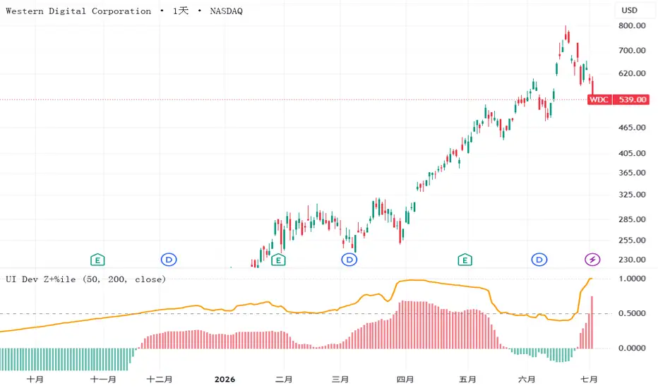
This indicator compares Peter Martin's Ulcer Index against its own long-term baseline, then shows the result through two scale-free readouts, so that readings carry the same meaning across different symbols.
The Ulcer Index (Martin and McCann, 1989) measures the depth and duration of percentage drawdowns from prior highs, in other words how painful it has been to hold a position. Unlike standard deviation, it looks only at the downside. Martin read the index against its own long-term average: pain rising above its normal range signals elevated downside risk.
The script computes the Ulcer Index over a rolling window (default 50 daily bars), subtracts its long-term EMA (default 200 bars, roughly one year on a daily chart) to obtain the deviation, then presents that deviation in two ways over the same 200-bar window. The columns are a robust z-score, built from the median and the median absolute deviation with the usual 1.4826 consistency factor, so column height reads in standard-deviation equivalents and keeps resolving even while new records are being set. Column color follows the sign of the z-score: red when the deviation sits above its trailing median, teal when below. The orange line is a percentile rank scaled to zero-to-one: 0.5 means today's deviation sits at the trailing median, 1 means it is the record of the window.
How to read it: tall red columns with the orange line pinned near 1 mark a genuine extreme. Tall columns with the line in mid-range mean a large move that is routine for this symbol. A pinned line above modest columns means a normally calm symbol breaking its own record at ordinary size. Columns are persistent and will stay one color for weeks inside a drawdown regime. Note that the color flip only approximates the true baseline crossover: the deviation series is right-skewed, its trailing median sits slightly below zero, so the flip typically leads the crossover by a few bars. For the exact regime, chart the raw Ulcer Index against its EMA.
Notes and limits: both readouts are normalized to each symbol's own history, so they compare rarity and relative size, not absolute drawdown. To compare absolute pain across symbols, chart the raw Ulcer Index instead. Use identical settings on every symbol you compare, and allow several hundred bars of history for warm-up. The deviation, z-score, and percentile layers are an original extension, not part of Martin's published work, so validate behavior against historical drawdowns you recognize. This is a risk-regime gauge, not a buy or sell signal generator, and nothing here is investment advice.
The Ulcer Index (Martin and McCann, 1989) measures the depth and duration of percentage drawdowns from prior highs, in other words how painful it has been to hold a position. Unlike standard deviation, it looks only at the downside. Martin read the index against its own long-term average: pain rising above its normal range signals elevated downside risk.
The script computes the Ulcer Index over a rolling window (default 50 daily bars), subtracts its long-term EMA (default 200 bars, roughly one year on a daily chart) to obtain the deviation, then presents that deviation in two ways over the same 200-bar window. The columns are a robust z-score, built from the median and the median absolute deviation with the usual 1.4826 consistency factor, so column height reads in standard-deviation equivalents and keeps resolving even while new records are being set. Column color follows the sign of the z-score: red when the deviation sits above its trailing median, teal when below. The orange line is a percentile rank scaled to zero-to-one: 0.5 means today's deviation sits at the trailing median, 1 means it is the record of the window.
How to read it: tall red columns with the orange line pinned near 1 mark a genuine extreme. Tall columns with the line in mid-range mean a large move that is routine for this symbol. A pinned line above modest columns means a normally calm symbol breaking its own record at ordinary size. Columns are persistent and will stay one color for weeks inside a drawdown regime. Note that the color flip only approximates the true baseline crossover: the deviation series is right-skewed, its trailing median sits slightly below zero, so the flip typically leads the crossover by a few bars. For the exact regime, chart the raw Ulcer Index against its EMA.
Notes and limits: both readouts are normalized to each symbol's own history, so they compare rarity and relative size, not absolute drawdown. To compare absolute pain across symbols, chart the raw Ulcer Index instead. Use identical settings on every symbol you compare, and allow several hundred bars of history for warm-up. The deviation, z-score, and percentile layers are an original extension, not part of Martin's published work, so validate behavior against historical drawdowns you recognize. This is a risk-regime gauge, not a buy or sell signal generator, and nothing here is investment advice.
Skrip open-source
Dengan semangat TradingView yang sesungguhnya, pembuat skrip ini telah menjadikannya sebagai sumber terbuka, sehingga para trader dapat meninjau dan memverifikasi fungsinya. Salut untuk penulisnya! Meskipun Anda dapat menggunakannya secara gratis, perlu diingat bahwa penerbitan ulang kode ini tunduk pada Tata Tertib kami.

Pernyataan Penyangkalan
Informasi dan publikasi ini tidak dimaksudkan, dan bukan merupakan, saran atau rekomendasi keuangan, investasi, trading, atau jenis lainnya yang diberikan atau didukung oleh TradingView. Baca selengkapnya di Ketentuan Penggunaan.
Skrip open-source
Dengan semangat TradingView yang sesungguhnya, pembuat skrip ini telah menjadikannya sebagai sumber terbuka, sehingga para trader dapat meninjau dan memverifikasi fungsinya. Salut untuk penulisnya! Meskipun Anda dapat menggunakannya secara gratis, perlu diingat bahwa penerbitan ulang kode ini tunduk pada Tata Tertib kami.
Pernyataan Penyangkalan
Informasi dan publikasi ini tidak dimaksudkan, dan bukan merupakan, saran atau rekomendasi keuangan, investasi, trading, atau jenis lainnya yang diberikan atau didukung oleh TradingView. Baca selengkapnya di Ketentuan Penggunaan.