PROTECTED SOURCE SCRIPT
Historical Crashes [Trademy]
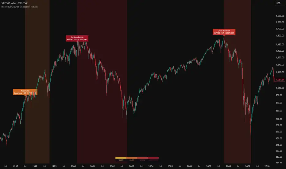
Trademy Historical Crashes indicator is a visual overlay that maps every major financial crisis from 1929 to 2025 directly onto your chart. Designed for investors and traders who want historical context at a glance, this indicator highlights crash periods with color-coded backgrounds so you can see exactly how the asset you're analyzing behaved during each crisis.
Load it on any chart like Bitcoin, S&P 500, Gold, Silver, NASDAQ, Oil and instantly see which crash periods overlap with the asset's price history. Each crisis label tells you the event name, the date range, and the severity measured against the hardest-hit market. This lets you compare how different assets responded to the same global event and understand which assets held up, which collapsed, and which actually rallied during turmoil.
CORE CONCEPTS
Why Historical Crashes Matter: Financial crises don't happen in isolation. The 2008 Great Recession crushed the S&P 500 by 57%, but Gold rallied over 25% during the same period. The 2020 COVID crash sent stocks down 34% in a month, yet Bitcoin recovered its losses within weeks and went on to a new all-time high. The 2022 inflation bear market hit Bitcoin for 77% and NASDAQ for 36%, but commodities like Oil and Wheat surged.
Understanding how YOUR asset behaves during crises is one of the most valuable edges you can have. This indicator gives you that context without needing to memorize dates or flip between charts.
The Crisis Database: The indicator includes 12 historically significant crash events spanning nearly a century of market history. Each event is mapped using its actual start and end dates based on when the decline began and when the market bottomed.
Classic Era:
Great Depression (1929–1932) — DJIA fell 89%, the worst crash in modern history
Oil Crisis (1973–1974) — S&P 500 fell 48%, triggered by OPEC embargo and stagflation
Black Monday (Oct 1987) — DJIA dropped 22% in a single trading session
Asian Financial Crisis (1997–1998) — Hang Seng fell 30%, contagion spread globally
Modern Era:
Dot-Com Bubble (2000–2002) — NASDAQ collapsed 78%, wiping out $5 trillion in tech value
Great Recession (2007–2009) — S&P 500 fell 57%, triggered by the subprime mortgage crisis
Flash Crash (May 2010) — DJIA dropped 9% in 36 minutes before recovering same day
China Stock Crash (2015–2016) — Shanghai Composite dropped 30%
Crypto Era:
Crypto Winter (2018) — Bitcoin fell 84% from its 2017 peak
COVID-19 Crash (Feb–Mar 2020) — S&P 500 dropped 34% in 33 days, the fastest crash in history
Inflation Bear Market (2021–2022) — Bitcoin fell 77%, NASDAQ fell 36% as interest rates surged
Tariff Crash (Apr 2025) — S&P 500 dropped 20% following global tariff announcements
Severity Classification: Each crisis is classified into one of four severity levels based on its impact on the hardest-hit major market. The severity determines the background color intensity on your chart.
Sharp — 10-20% drop. Amber background. Events like the Flash Crash or Tariff Crash that were fast and relatively contained.
Major — 20-30% drop. Orange background. Events like Black Monday, the Asian Crisis, and the China Crash where specific regions or markets were heavily impacted.
Severe — 30-50% drop. Red background. Events like the Oil Crisis, Great Recession, COVID crash, and Crypto Winter where broad markets saw significant destruction.
Catastrophic — 50%+ drop. Deep crimson background. The Great Depression and Dot-Com Bubble, where entire asset classes lost the majority of their value over extended periods.
KEY FEATURES
Crisis Background Zones
Color-Coded Backgrounds: Each crisis period paints the chart background with a severity-appropriate color, giving you instant visual context
Crisis Labels: At the start of each crisis, a label appears showing the event name, the reference market's decline, and the date range
Full History Coverage: Every crisis maps across your entire chart — scroll to any period and see which crashes were active
How Different Assets Behaved
This is where the indicator becomes truly valuable. Load it on different charts and compare:
Gold during the 2008 crash — while the S&P 500 fell 57%, Gold initially dipped but then rallied strongly, proving its safe-haven reputation
Bitcoin during COVID — crashed alongside stocks in March 2020 but recovered faster and went on to 10x within a year
Oil during the Oil Crisis — the commodity that caused the crash actually surged in price while stocks collapsed
Silver during the Inflation Bear — fell with risk assets despite being a "hard asset," challenging the inflation hedge narrative
NASDAQ during Dot-Com vs 2020 — took 17 years to recover from the Dot-Com crash but only 5 months to recover from COVID
By overlaying the same crisis periods across different asset charts, you build a real understanding of correlations, safe havens, and how markets actually behave under stress — not how people assume they behave.
WHAT MAKES THIS DIFFERENT
Multi-Asset Context — Each crisis label shows which market the percentage drop refers to (DJIA, S&P 500, NASDAQ, BTC, etc.), so the information stays relevant regardless of what chart you're viewing
12 Crashes in One — No need to memorize dates or draw manual zones. Every major crash from 1929 to 2025 is included with accurate start and end dates
Severity System — Not all crashes are equal. The four-tier severity classification gives you proportional visual weight based on actual impact
Compare Across Assets — The real power is loading this on multiple charts side by side. See how Gold, BTC, SPX, and Oil all responded to the same crisis
BEST PRACTICES
For Stocks (SPX, NASDAQ, DJIA): All 12 crashes are relevant. You'll see the full history of how equities responded to each crisis. Use Weekly or Monthly charts for the cleanest view.
For Bitcoin: Enable only the Crypto Era crashes (2018, 2020, 2022, 2025) and optionally the 2008 crash for context, since BTC didn't exist before 2009. Use Daily or Weekly charts.
For Gold and Silver: All crashes are relevant because precious metals have traded through every crisis. This is where you'll see the most interesting divergences — Gold often rallies when stocks crash.
For Commodities (Oil, Wheat, etc.): Focus on the Oil Crisis (1973), Great Recession (2008), COVID (2020), and Tariff Crash (2025) for the most relevant comparisons.
Cross-Asset Comparison: Open the same indicator on BTC, SPX, and Gold side by side. During each crisis zone, compare how the three assets moved. This builds real macro intuition that no textbook can teach.
Important Disclaimers:
This indicator is a tool for historical analysis and does not constitute financial advice
Past crises do not predict future market behavior
How an asset performed during one crisis does not guarantee similar behavior in future crises
Always practice proper risk management and never risk more than you can afford to lose
Trading and investing carry substantial risk of loss and are not suitable for all investors
Load it on any chart like Bitcoin, S&P 500, Gold, Silver, NASDAQ, Oil and instantly see which crash periods overlap with the asset's price history. Each crisis label tells you the event name, the date range, and the severity measured against the hardest-hit market. This lets you compare how different assets responded to the same global event and understand which assets held up, which collapsed, and which actually rallied during turmoil.
CORE CONCEPTS
Why Historical Crashes Matter: Financial crises don't happen in isolation. The 2008 Great Recession crushed the S&P 500 by 57%, but Gold rallied over 25% during the same period. The 2020 COVID crash sent stocks down 34% in a month, yet Bitcoin recovered its losses within weeks and went on to a new all-time high. The 2022 inflation bear market hit Bitcoin for 77% and NASDAQ for 36%, but commodities like Oil and Wheat surged.
Understanding how YOUR asset behaves during crises is one of the most valuable edges you can have. This indicator gives you that context without needing to memorize dates or flip between charts.
The Crisis Database: The indicator includes 12 historically significant crash events spanning nearly a century of market history. Each event is mapped using its actual start and end dates based on when the decline began and when the market bottomed.
Classic Era:
Great Depression (1929–1932) — DJIA fell 89%, the worst crash in modern history
Oil Crisis (1973–1974) — S&P 500 fell 48%, triggered by OPEC embargo and stagflation
Black Monday (Oct 1987) — DJIA dropped 22% in a single trading session
Asian Financial Crisis (1997–1998) — Hang Seng fell 30%, contagion spread globally
Modern Era:
Dot-Com Bubble (2000–2002) — NASDAQ collapsed 78%, wiping out $5 trillion in tech value
Great Recession (2007–2009) — S&P 500 fell 57%, triggered by the subprime mortgage crisis
Flash Crash (May 2010) — DJIA dropped 9% in 36 minutes before recovering same day
China Stock Crash (2015–2016) — Shanghai Composite dropped 30%
Crypto Era:
Crypto Winter (2018) — Bitcoin fell 84% from its 2017 peak
COVID-19 Crash (Feb–Mar 2020) — S&P 500 dropped 34% in 33 days, the fastest crash in history
Inflation Bear Market (2021–2022) — Bitcoin fell 77%, NASDAQ fell 36% as interest rates surged
Tariff Crash (Apr 2025) — S&P 500 dropped 20% following global tariff announcements
Severity Classification: Each crisis is classified into one of four severity levels based on its impact on the hardest-hit major market. The severity determines the background color intensity on your chart.
Sharp — 10-20% drop. Amber background. Events like the Flash Crash or Tariff Crash that were fast and relatively contained.
Major — 20-30% drop. Orange background. Events like Black Monday, the Asian Crisis, and the China Crash where specific regions or markets were heavily impacted.
Severe — 30-50% drop. Red background. Events like the Oil Crisis, Great Recession, COVID crash, and Crypto Winter where broad markets saw significant destruction.
Catastrophic — 50%+ drop. Deep crimson background. The Great Depression and Dot-Com Bubble, where entire asset classes lost the majority of their value over extended periods.
KEY FEATURES
Crisis Background Zones
Color-Coded Backgrounds: Each crisis period paints the chart background with a severity-appropriate color, giving you instant visual context
Crisis Labels: At the start of each crisis, a label appears showing the event name, the reference market's decline, and the date range
Full History Coverage: Every crisis maps across your entire chart — scroll to any period and see which crashes were active
How Different Assets Behaved
This is where the indicator becomes truly valuable. Load it on different charts and compare:
Gold during the 2008 crash — while the S&P 500 fell 57%, Gold initially dipped but then rallied strongly, proving its safe-haven reputation
Bitcoin during COVID — crashed alongside stocks in March 2020 but recovered faster and went on to 10x within a year
Oil during the Oil Crisis — the commodity that caused the crash actually surged in price while stocks collapsed
Silver during the Inflation Bear — fell with risk assets despite being a "hard asset," challenging the inflation hedge narrative
NASDAQ during Dot-Com vs 2020 — took 17 years to recover from the Dot-Com crash but only 5 months to recover from COVID
By overlaying the same crisis periods across different asset charts, you build a real understanding of correlations, safe havens, and how markets actually behave under stress — not how people assume they behave.
WHAT MAKES THIS DIFFERENT
Multi-Asset Context — Each crisis label shows which market the percentage drop refers to (DJIA, S&P 500, NASDAQ, BTC, etc.), so the information stays relevant regardless of what chart you're viewing
12 Crashes in One — No need to memorize dates or draw manual zones. Every major crash from 1929 to 2025 is included with accurate start and end dates
Severity System — Not all crashes are equal. The four-tier severity classification gives you proportional visual weight based on actual impact
Compare Across Assets — The real power is loading this on multiple charts side by side. See how Gold, BTC, SPX, and Oil all responded to the same crisis
BEST PRACTICES
For Stocks (SPX, NASDAQ, DJIA): All 12 crashes are relevant. You'll see the full history of how equities responded to each crisis. Use Weekly or Monthly charts for the cleanest view.
For Bitcoin: Enable only the Crypto Era crashes (2018, 2020, 2022, 2025) and optionally the 2008 crash for context, since BTC didn't exist before 2009. Use Daily or Weekly charts.
For Gold and Silver: All crashes are relevant because precious metals have traded through every crisis. This is where you'll see the most interesting divergences — Gold often rallies when stocks crash.
For Commodities (Oil, Wheat, etc.): Focus on the Oil Crisis (1973), Great Recession (2008), COVID (2020), and Tariff Crash (2025) for the most relevant comparisons.
Cross-Asset Comparison: Open the same indicator on BTC, SPX, and Gold side by side. During each crisis zone, compare how the three assets moved. This builds real macro intuition that no textbook can teach.
Important Disclaimers:
This indicator is a tool for historical analysis and does not constitute financial advice
Past crises do not predict future market behavior
How an asset performed during one crisis does not guarantee similar behavior in future crises
Always practice proper risk management and never risk more than you can afford to lose
Trading and investing carry substantial risk of loss and are not suitable for all investors
Skrip terproteksi
Skrip ini diterbitkan sebagai sumber tertutup. Namun, Anda dapat menggunakannya dengan bebas dan tanpa batasan apa pun – pelajari lebih lanjut di sini.

Pernyataan Penyangkalan
Informasi dan publikasi ini tidak dimaksudkan, dan bukan merupakan, saran atau rekomendasi keuangan, investasi, trading, atau jenis lainnya yang diberikan atau didukung oleh TradingView. Baca selengkapnya di Ketentuan Penggunaan.
Skrip terproteksi
Skrip ini diterbitkan sebagai sumber tertutup. Namun, Anda dapat menggunakannya dengan bebas dan tanpa batasan apa pun – pelajari lebih lanjut di sini.
Pernyataan Penyangkalan
Informasi dan publikasi ini tidak dimaksudkan, dan bukan merupakan, saran atau rekomendasi keuangan, investasi, trading, atau jenis lainnya yang diberikan atau didukung oleh TradingView. Baca selengkapnya di Ketentuan Penggunaan.