Sessions & HTF CandlesSession Range & HTF Candle Projection
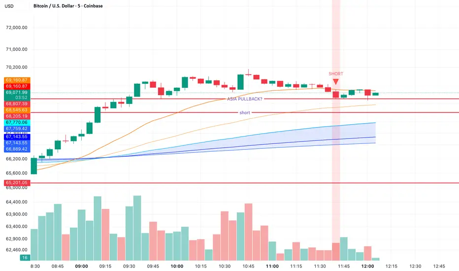
Session Range & HTF Candle Projection is a price-action tool designed to help traders visualize key session levels and higher-timeframe structure directly on their chart. By combining session range tracking with projected higher timeframe candles, the indicator provides a clearer understanding of market context, volatility, and potential breakout zones.
Key Features
Session Range Detection
Automatically tracks and plots the high and low of a selected trading session (Asia, London, New York, or custom).
Clearly highlights the session range so traders can identify consolidation zones and liquidity pools.
Helps spot range breakouts, fakeouts, and expansion phases.
HTF Candle Projection
Displays projected higher timeframe (HTF) candles on lower timeframes.
Allows traders to see how the current price movement is building the higher-timeframe candle in real time.
Useful for identifying HTF bias, rejection wicks, and momentum shifts before the candle closes.
Range Expansion Awareness
Quickly see when price breaks outside the session range.
Helps identify volatility expansion, which often leads to strong directional moves.
Clean Market Structure View
Reduces the need to constantly switch between timeframes.
Keeps key information visible while maintaining a minimal and clean chart layout.
How Traders Use It
Identify London or New York session breakouts.
Confirm trades with higher timeframe candle structure.
Spot liquidity grabs around session highs/lows.
Understand whether current price action supports the HTF directional bias.
Ideal For
Intraday traders
Scalpers
Smart-money / liquidity traders
Price action traders
This indicator helps traders stay aligned with session volatility and higher-timeframe context, making it easier to anticipate where the market may expand next. Indikator

DKJ H/L LevelsPrevious High & Low Levels — 4H | Daily | Weekly | Monthly
Price action trading, Support & resistance, Swing reversal.
Automatically plots the previous high and low for the 4-Hour, Daily, Weekly, and Monthly timeframes on any chart. These levels act as key areas of liquidity, support, and resistance — widely watched by institutional traders and market makers.
Lines anchor from the open of each new period and extend right. Alerts fire the moment price touches a level, including wicks. Each timeframe can be toggled independently, with full control over colours, line style, and width.
To set alerts: Add Alert → select this indicator → "Any alert() function call" — one alert covers all eight levels. Indikator

CUSUM Trend [AlgoPoint]The CUSUM Trend by AlgoPoint brings hedge-fund-level quantitative analysis directly to your charts. While standard moving averages suffer from lag and fakeouts, this script utilizes an advanced Cumulative Sum (CUSUM) algorithm, deeply re-engineered with adaptive volatility and volume-weighted metrics to identify true market regimes.
It is designed to protect traders from choppy markets and explicitly capture high-probability, volume-backed trend breakouts before they become obvious to the retail crowd.
🧠 Under the Hood: The Quant Mechanics
Instead of a basic price deviation model, the CUSUM Trend operates on four advanced pillars:
- Zero-Lag Kernel (Ehlers SuperSmoother): We replaced traditional MAs with John Ehlers' SuperSmoother filter to establish a mathematically zero-lag baseline.
- Volume-Weighted Residuals: Price deviations (residuals) only build up the CUSUM pressure pools if they are backed by institutional volume. Low-volume spikes are treated as noise and explicitly filtered out.
- Fractal Dimension (Adaptive Thresholds): By using a proxy for the Hurst Exponent, the engine "reads" the market state. In choppy conditions, the bands expand defensively to prevent fakeouts. In trending conditions, they tighten aggressively.
- Asymmetric Volatility: The algorithm calculates upside and downside variance independently, recognizing that market drops are often much sharper than rallies.
📊 How to Read the Chart
- The Dynamic Trend Cloud: The asymmetric bands represent the institutional pressure thresholds. When price breaks and confirms outside this zone, a regime change (Bull/Bear trend) is triggered.
- Gradient Candles: Candle colors dynamically shift based on the built-up CUSUM pressure. Bright green/red indicates extreme breakout momentum, while faded colors represent a stable trend or a ranging market.
- Trailing Stop: Once a trend is established, the opposite side of the threshold acts as a dynamic trailing stop line, allowing you to ride the trend to its mathematical exhaustion.
- Hybrid Dashboard: Monitor the internal breakout pressure, fractal regime, and exact trailing stop value in real-time without cluttering your main view.
⚙️ How to Use It
- Sensitivity Profiles: Choose between Fast (Day Trade), Balanced (Swing), or Slow (Trend) in the settings. The engine automatically recalculates all internal variance and fractal thresholds based on your choice.
- Automation Ready: Fully compatible with webhook automation (3Commas, PineConnector, etc.) via dynamic JSON alerts triggering on confirmed regime breakouts.
Disclaimer: This indicator is for educational and analytical purposes only. Past performance is not indicative of future results. Indikator

Indikator

Indikator

Advanced Fundamental Dashboard & Yield AnalyzerFull disclosure, this is a modified script that was originated by m_b05. The modification of m_b05 script was 100% completed by Gemini Pro. I doubled checked the calculations vs Gurufocus. The results are not exact to Gurufocus but is within a reasonable margin of error.
The Advanced Fundamental Dashboard is a comprehensive, on-chart table designed to bridge the gap between deep fundamental analysis and technical price action. Instead of digging through financial statements on separate tabs, this indicator pulls the most critical valuation, profitability, and yield metrics directly onto your chart.
Whether you are a value investor looking for strong capital allocation or a swing trader seeking fundamental confluence before a breakout, this dashboard provides a real-time, bird’s-eye view of a company's financial health.
Key Features & Metrics Included:
Valuation & Growth: Quickly assess a company's size and pricing with Market Capitalization, Price-to-Earnings (P/E), and Price-to-Sales (P/S) ratios. It also tracks 1-Year Revenue Growth to highlight expanding (or contracting) businesses.
Total Shareholder Yield (Custom Calculation): This dashboard goes beyond standard dividends. It calculates a "Meb Faber" style Total Shareholder Yield by combining Dividend Yield, Net Share Buyback Yield (1-year change in shares outstanding), and Debt Paydown Yield (1-year change in total debt). This gives you the truest picture of how management is returning value to shareholders.
Deep Yield Analysis: In addition to Shareholder Yield, it features EBITDA Yield and Free Cash Flow (FCF) Yield, allowing you to evaluate a company's cash-generating power relative to its market cap.
Profitability & Health: Monitor efficiency and leverage with Return on Equity (ROE %), Pretax Margin %, and the Debt-to-Equity Ratio.
Multi-Timeframe Technical Distances: It calculates the precise percentage distance to the All-Time High (ATH), 52-Week High, and 52-Week Low. These 52-week metrics are hardcoded to pull from the daily timeframe (request.security), ensuring they remain 100% accurate even if you are day trading on a 5-minute or 1-hour chart.
Visuals & Customization:
Dynamic Coloring: Values automatically color-code (Green for positive/growth, Red for negative/decline) for rapid visual scanning.
Fully Customizable UI: Use the settings menu to change the table's background color, text size, and position on your screen so it never obstructs your price action.
Note: This indicator relies on TradingView's fundamental data feeds. If a specific metric displays as "N/A" or "0.00%", it means the exchange or company has not reported that specific data point for the requested trailing twelve months (TTM) or fiscal quarter (FQ). Indikator

Indikator

Seasonality Advanced [Open]
Description
The Seasonality Advanced is a professional-grade Seasonality Analysis tool designed to project future price trends based on historical cyclical patterns. By releasing this script as Open-Source, traders and developers can study its underlying logic, particularly the array-based multi-cycle alignment and the statistical engine.
Unlike simple seasonal indicators that just average price, this script offers a statistical approach with a "Zero Gravity" (Joyplot-style) visualization mode and a real-time Data Dashboard.
Underlying Concepts & Methodology
The script calculates the seasonal tendency by averaging the price performance of the same day/week over a user-defined lookback period (e.g., 5, 10, or 15 years).
Data Alignment: It aligns historical data using arrays based on trading days or calendar days to create a coherent "Annual Cycle".
Smoothing: A Moving Average is applied to the raw seasonal data to filter out noise and reveal the true macro tendency.
Correlation Engine: It calculates the real-time Pearson correlation between the current price action and the projected seasonal line. This acts as a "Lie Detector"—if correlation is high, the seasonal pattern is currently valid.
Key Features
Multi-Cycle Analysis: Plot up to 3 different seasonal baselines simultaneously.
Zero Gravity View: Uses a dynamic separation algorithm to prevent lines from overlapping messily, making it easier to compare different cycles without cluttering the main price action.
Statistical Dashboard: A built-in table displays Avg Return, WinRate, Volatility Risk (Standard Deviation), and Correlation for each cycle.
How to Use
Projections: Use the lines extending into the future to anticipate potential turning points.
Filter: Watch the "Correlation" column in the table. Low or negative correlation means the current market is decoupling from history, so the seasonal signal should be ignored.
To comply with House Rules regarding non-English UI, here is the translation of the script's settings menu:
1. Cálculos Sazo 3 (Calculation Settings)
Dias de negociação = Trading Days (Fixed 252 or Variable)
Método de dias = Day Count Method (Min, Max, Avg)
Projeção Futura (Barras) = Future Projection (Bars)
Suavização (Média) = Smoothing (MA Length)
Deslocamento = Offset
2. Visualização e Layout (Visuals)
Empilhamento / Separação (%) = Stacking / Separation %
Distância Vertical = Vertical Distance
Distância da Etiqueta = Label Offset
3. Painel Estatístico (Statistics Panel)
Mostrar Tabela = Show Table
Mostrar Próximo Mês = Show Next Month
Mostrar Linha Méd/Alvo = Show Avg/Target Row
Texto Suave = Soft Text (Transparency)
Período Correlação = Correlation Period
Tema = Theme (Dark/Light)
Tamanho = Size
Posição = Position
4. Linha de Hoje (Today's Line)
Mostrar Linha = Show Vertical Line
Cor/Estilo/Espessura = Color/Style/Width
5. Linhas 1, 2, 3 (Seasonal Lines)
Ativar Linha = Enable Line
Período (anos) = Lookback Period (Years)
Cor/Estilo/Espessura = Color/Style/Width
Descrição
O Seasonality Advanced agora é open-source! Esta é uma ferramenta completa de Sazonalidade que projeta tendências futuras baseadas em padrões históricos de 5, 10 ou 15 anos. Ele inclui um painel estatístico exclusivo que mostra a probabilidade de acerto (WinRate), risco e a correlação do ciclo atual com o passado.
Funcionalidades
Projeção Futura: Desenha o comportamento provável do preço para as próximas semanas.
Painel Estatístico: Mostra retorno médio, risco e correlação em tempo real.
Zero Gravity: Visualização empilhada para facilitar a leitura de múltiplos ciclos sem poluir o gráfico. Indikator

Indikator

Indikator
Indikator

Imbalance Finder - Dynamic Candle Mitigation - guerracodeTired of your chart getting cluttered with annoying boxes and endless horizontal lines? Imbalance Finder is a minimalist, high-precision tool designed for Smart Money Concepts (SMC) and ICT traders looking to keep their charts 100% clean.
Unlike traditional indicators that project rectangles into the future and clutter your analysis, this algorithm detects Imbalances (Fair Value Gaps - FVG) and applies a visual highlight directly over the original expansion candle, marking solely and exclusively the exact area where the liquidity void exists.
🌟 Main Features (How it works):
Precise Imbalance Detection: The algorithm constantly scans price action to identify both Bullish and Bearish 3-candle liquidity voids.
Minimalist "In-Candle" Aesthetics: Instead of drawing zones into the future, the indicator "paints" a color stripe exactly over the body of the candle that generated the imbalance, cleanly showing what part of that candle represents the void.
💥 Dynamic Partial Mitigation (Smart Erase): This is its best feature! The indicator monitors price in real-time. If future price action retraces and fills the imbalance only halfway, the indicator will automatically shrink the candle's highlight. The color mark acts like an "eraser," showing at all times only the dollars that are yet to be filled.
Automatic Disappearance: Once the Imbalance is 100% mitigated, the highlight is completely erased, leaving the chart in its original state.
⚙️ Simple and Straightforward Configuration:
This indicator was built so it doesn't complicate your life. It has only two parameters in its menu:
Imbalance Color: Choose the color that best fits your visual theme to highlight the liquidity void. (Default: Blue).
Imbalance Width: Allows you to adjust the thickness of the marker (in pixels) so it fits perfectly with the width of the candles, depending on the zoom level or screen you prefer to use.
Keep your focus on the price, not the drawings. Ideal for scalping, day trading, and clean chart perfectionists! Indikator

Annual Performance TableAnnual Returns Table | Yearly Performance + Sharpe Ratio
A clean, customizable table displayed directly on your chart giving you an instant overview of any asset's yearly performance — stocks, ETFs, crypto, indices, commodities, forex.
What it shows
Annual return (%) for each complete year — incomplete years at the start of history are automatically excluded
Current year YTD performance (marked with *)
Sharpe Ratio per year (calculated from monthly returns, annualized ×√12)
A separate stats panel: Average annual return, Cumulative return, Global Sharpe Ratio, Total years of history
Key features
Works on Daily, Weekly, Monthly and Yearly timeframes
Automatic row wrapping when history is too long to fit on one line
Configurable: max years displayed, years per row, show/hide each row independently
Color coded: green for positive years, red for negative, gradient on Sharpe quality
Fully customizable colors
For informational purposes only. Not financial advice.
Indikator

Indikator
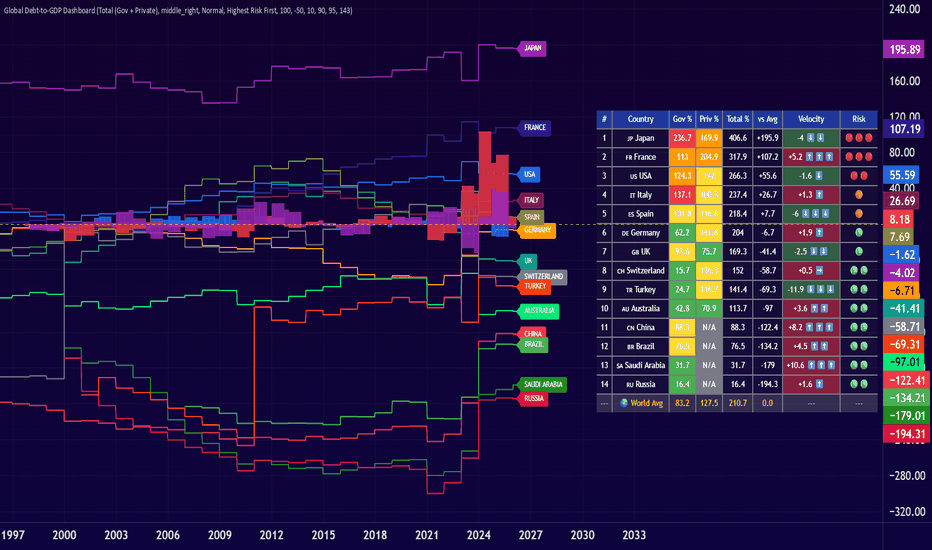
Global Debt-to-GDP DashboardI've created this macro indicator to monitor world debt. The Global Debt-to-GDP Dashboard helps you to track, compare, and analyze sovereign and private debt levels across 20 major economies.
It provides institutional-grade debt analysis, allowing traders, long term investors and macro investors to identify systemic risks, divergences from global norms, and accelerating debt trends that could signal future economic instability or opportunities.
What It Does
This indicator transforms complex macroeconomic data into actionable insights to understand country leverage by:
Tracking Dual Debt Metrics: Monitors both government debt-to-GDP and private debt-to-GDP ratios for 20 countries. This provides a complete picture of total leverage in each economy.
Divergence Analysis: Compares each country's debt levels against the world average (calculated from selected countries), instantly highlighting which economies are over-leveraged or under-leveraged relative to global norms.
Velocity Tracking: Calculates the rate of change in debt divergence, identifying which countries are rapidly increasing or decreasing their debt burden.
Risk Assessment: Automatically categorizes countries by risk level using color-coded visual indicators
Key Features
20 Major Economies: USA, China, Japan, Germany, UK, France, Italy, Canada, Spain, Australia, South Korea, Brazil, India, Mexico, Switzerland, Singapore, Norway, Saudi Arabia, Russia, and Turkey
Simultaneous Visualization: Plot all selected countries on a single chart with unique color coding for easy identification
Dynamic Country Selection: Enable/disable countries to focus on specific regions or economic blocs
Three Divergence Analysis Modes
Government Only: Analyze sovereign debt divergence from government debt average
Private Only: Focus exclusively on private sector leverage (excludes countries without private debt data)
Total (Gov + Private): Comprehensive view of total economy-wide debt burden
Use Cases
For Macro Traders
Identify Sovereign Risk: Spot countries with unsustainable debt trajectories before credit events
Currency Pairs: Correlate debt divergence with currency strength/weakness
Bond Markets: Anticipate yield spread movements based on relative debt positions
Risk-On/Risk-Off: Use global debt velocity as a systemic risk indicator
For Long-Term Investors
Country Allocation: Make informed decisions about geographic exposure
Risk Management: Avoid over-exposure to high-debt economies
Opportunity Identification: Find under-leveraged economies with growth potential
Portfolio Rebalancing: Use debt trends as signals for portfolio adjustments
How to Use
Initial Setup: Select the countries you want to monitor from the Settings panel
Choose Divergence Type: Select Government Only, Private Only, or Total debt analysis
Configure Display: Adjust table position, text size, and sorting preferences
Set Alerts (Optional): Define your alert thresholds and enable notifications
Table Risk Scores:
🔴🔴🔴 Extreme Risk: Divergence > +100pp above average
🔴🔴 High Risk: Divergence > +50pp above average
🟠 Moderate Risk: Divergence > 0pp above average
🟢 Low Risk: Divergence > -50pp below average
🟢🟢 Very Low Risk: Divergence < -50pp below average
NOTE: "Low Risk" and low-debt might also mean that a country is unable to finance through the issuance of government debt. This is not necessarily a good thing and might not correspond to low risk.
Velocity Indicators:
⬆️⬆️⬆️ Rapid Acceleration: +5pp or more per period
⬆️⬆️ Strong Acceleration: +2 to +5pp per period
⬆️ Moderate Increase: +0.5 to +2pp per period
➡️ Stable: -0.5 to +0.5pp per period
⬇️ Moderate Decrease: -2 to -0.5pp per period
⬇️⬇️ Strong Deceleration: -5 to -2pp per period
⬇️⬇️⬇️ Rapid Deceleration: -5pp or less per period
Important Notes
Data Availability: Some countries lack private debt data (e.g., China, India, Brazil).
World Average Calculation: The world average is dynamically calculated based on your selected countries, not a fixed global figure. This allows for custom peer group comparisons.
Percentage Points vs Percentages: All divergence values are in percentage points (pp), representing the absolute difference from the average, not a relative percentage change.
Let me know if you have comments or suggestions.
Truly yours, Henrique Centieiro
Indikator
Indikator

Indikator

Indikator

CNOOC Oil-Following Study | Extremes + DY Regime + 2-Factor What It Does
Your indicator is a 2-factor return attribution model with extreme event analysis and dividend yield regime conditioning. It answers one core question: When oil moves — especially violently — does CNOOC follow, and does its dividend yield affect that behavior?
The Architecture
Layer 1 — Rolling 2-Factor Regression
Every week, the model runs a rolling OLS regression: CNOOC return = β₁ × Brent + β₂ × SSE50 + residual. This decomposes CNOOC's performance into three streams: what came from oil, what came from the China market, and what is company-specific alpha. The auto-lag feature tests 0–8 week delays on Brent to find the strongest fit.
Layer 2 — Extreme Oil Detection
It computes a rolling Z-score of Brent returns. Any week where |Z| exceeds your threshold (default 2.0) gets flagged as an extreme oil event, classified as either up-extreme or down-extreme, and highlighted on the chart with green or red backgrounds.
Layer 3 — Conditional Beta Accumulation
This is the study's core innovation. Instead of just one rolling beta, it maintains separate running OLS accumulators for different market conditions: all bars, normal bars, extreme bars, up extremes only, down extremes only. This produces a conditional beta table showing how CNOOC's oil sensitivity changes depending on whether oil is behaving normally or experiencing a tail event.
Layer 4 — Dividend Yield Regime
It estimates CNOOC's trailing dividend yield (annual dividend / price) and classifies each week into High DY, Low DY, or Mid using rolling percentile thresholds. It then cross-tabulates this with the oil regime to produce betas for combinations like High DY + Extreme Oil, Low DY + Oil Down, etc. This tests whether valuation level affects oil sensitivity.
Layer 5 — Cumulative Decomposition
From a fixed start date, it geometrically compounds the oil contribution, index contribution, and residual separately, producing four cumulative return lines that visually show how much of CNOOC's total return came from each source.
Layer 6 — Event Window
Around any anchor date you choose, it accumulates returns within ± N weeks and reports the decomposition for that specific period, plus how many extreme oil bars fell within the window. Indikator

Indikator

Value Area Levels [crlmx]Calculated from native volume-at-price data vaLevels shows Value Area
levels (VAH, POC, VAL) across three independently configurable timeframes.
Requires TradingView Premium or above plan for Footprint data access,
Short of that refere to Lite version (coming soon).
Key Features
- Three independent VA slots with on/off toggles
- Timeframe selection: D, W, M, 30min, 1H, 4H, 8H, 12H
- Session-based VA on slot 3: NYC, London, Asia, Custom
- Custom session with user-defined time window and label prefix
- Auto-calculated row resolution per instrument type
- Manual ticks-per-row override for fine-tuning
- Configurable Value Area percentage (default 68%)
- Individual VAH, POC, VAL toggles per slot
- Optional price display in labels
- Requires TradingView Premium or Ultimate plan
- Streamlined input / UI brought to you by crlmx
Trading Applications
- Map previous day area against weekly and session VAs to identify confluence zones
- Track VAH/VAL as breakout triggers when price moves outside the prior value area
- Compare session VA (NYC/LDN) against daily VA to for reactions
- When daily and weekly VAs overlap, expect stronger reactions at the shared boundary
- Combine with prLevels for a complete prior-level picture (price levels + volume levels)
- Recommended Settings
Intraday S/R: D + W + NYC | Chart: 1-15 min
Session Trading: D + 4H + LDN | Chart: 1-5 min
Swing Reference: D + W + M | Chart: 30 min - 4H
Version History
- v0.10: Initial release
Indikator

Indikator

Indikator