Adaptive Supertrend MA Crossover StrategyAdaptive Supertrend MA Crossover
Overview
This strategy trades the crossover between a Moving Average and a Supertrend line - a classic trend-following combination - but with two design choices that set it apart from the standard version of this idea already published elsewhere:
1. The Supertrend and the Moving Average each take their own independently selectable price source (Open, High, Low, Close, HL2, HLC3, OHLC4, or HLCC4), rather than both being locked to Close.
2. A new Moving Average source option: "EMA of Supertrend." Instead of feeding the MA a raw price series, this applies an EMA directly to the Supertrend line itself, and then runs your chosen MA type (SMA/EMA/HMA/WMA) on top of that smoothed line. The result is a crossover between two different "views" of the same underlying trend structure, rather than a crossover between price and trend.
Why "EMA of Supertrend" matters
A standard Supertrend line is deliberately steppy - it holds a level and jumps, rather than moving smoothly, which is what makes it useful as a stop/trend marker but also means a plain price-vs-Supertrend crossover can be noisy on choppy days (price whipsaws across a flat Supertrend step repeatedly).
Applying an EMA to the Supertrend line first produces a smoothed trend proxy that still reacts to genuine Supertrend flips, but rounds off the sharp step edges. Running your chosen Moving Average on top of that, rather than on top of price, means the crossover signal is comparing two related measures of trend, not fighting against Supertrend's inherent steppiness. This tends to produce fewer false flips in sideways conditions while still catching genuine trend changes, without adding a second unrelated indicator to the chart.
This source option is exposed directly in the settings (MA Source = "EMA of Supertrend"), with its own dedicated smoothing period, so it's a toggle away from the standard price-source approach for direct comparison on your own charts.
Caption: Chart example on GOLDPETAL, 15-min: long & short entry on the MA-Supertrend crossover.
How it works
Supertrend: calculated from your selected source (default HL2, the traditional Supertrend basis) with a configurable ATR Period and ATR Factor. Unlike TradingView's built-in Supertrend function (which is hard-coded to HL2), this version lets the basis price and the trend-flip check both use whichever source you select.
Moving Average: choose SMA, EMA, HMA (Hull), or WMA, computed on your selected source, including the "EMA of Supertrend" option described above.
Entry signal: long when the Moving Average crosses above the Supertrend line, short on the opposite cross.
Reverse Trading Mode: a single toggle that inverts the signal (useful for quickly testing whether the opposite side of a crossover performs better on a given instrument/timeframe, without rebuilding the logic).
Stop Loss / Take Profit: both optional and independently toggleable, with a shared basis switch between Percentage (of entry price) and Points, so the same settings panel works whether you're trading a low-priced or high-priced instrument.
Settings guide
(select this whole list after pasting and click the bullet-list button)
Supertrend Source - price series used for the Supertrend basis and trend-flip check
ATR Period / ATR Factor - standard Supertrend volatility inputs
MA Type - SMA / EMA / HMA / WMA
MA Source - price source, or "EMA of Supertrend"
EMA of Supertrend Period - smoothing period applied to the Supertrend line (only active when MA Source = EMA of Supertrend)
Reverse Trading Mode - inverts long/short signals
Use SL / Use TP, Basis, Values - optional exit management, Percentage or Points
Caption: Strategy Tester summary, GOLDPETAL futures, 15-min, , default settings.
Disclaimer:
This script is a technical trading tool for educational and informational purposes. It does not constitute financial advice, and past performance in backtesting does not guarantee future results. Always test thoroughly on your own instruments and timeframes, and use appropriate risk management, before considering live use. Strategi

Mirror BiasSee the market from the other side.
Mirror Bias is a visual context indicator designed to challenge directional bias by displaying price action as a true vertical reflection of the underlying chart.
Instead of trying to predict whether the market is bullish or bearish, Mirror Bias asks a different question:
"Would this chart look the same to me if I couldn't rely on the usual visual direction of price?"
How it works
Mirror Bias mathematically reflects the OHLC data across a horizontal axis, i.e.,:
Mirrored Price = -Price
Because the transformation is applied to the actual OHLC values, the candles retain their original proportions, structure, gaps, wicks, and relationships. Time remains unchanged; only the vertical orientation is reversed.
This is a true geometric mirror of price action.
Why Mirror Bias is different
Some indicators described as "inverted candles" use a reciprocal transformation such as:
1 / Price
That is a nonlinear inverse-price transformation and is useful for certain comparative applications, but it is not a geometric reflection of the chart. TradingView seems to be lacking a true mirror of price action so I am adding this for public use.
Mirror Bias takes a different approach: the shape of the market is preserved while its visual orientation is reversed.
Use it as a bias-checking tool
Markets can be surprisingly difficult to evaluate objectively when our brains are conditioned to associate:
Rising charts with bullishness
Falling charts with bearishness
Green candles with opportunity
Red candles with danger
Mirror Bias provides an alternate visual perspective that can make familiar structures feel unfamiliar again.
Try analyzing the mirrored chart before looking back at the original chart. You may notice:
Trend structure you hadn't consciously recognized
Support and resistance relationships from a different perspective
Pullbacks that look different when the visual direction is reversed
How strongly candle colors influence your interpretation
Whether your market view is based on structure or simply visual habit
Optional contextual tools
Mirror Bias can remain completely clean and minimal, or additional context can be enabled when needed:
Swing Structure : Displays confirmed HH, HL, LH, and LL labels from the original price action.
Daily Open : Mirrors the current session's daily open.
Previous Day High / Low : Mirrors the prior day's key levels.
VWAP : Mirrors session VWAP on intraday charts.
20 / 50 / 200 EMA : Adds mirrored moving-average context.
Original Direction : Optionally reveals the underlying market's relationship to a selected EMA.
Candle Color Modes : Preserve the original colors, invert them, or use neutral candles.
All contextual elements are transformed into the same mirrored coordinate system so they remain consistent with the visual perspective.
A note on interpretation
The Mirror Bias script's purpose is perspective.
Use it to step outside an established narrative, question your assumptions, and compare your first impression with what you see when the same market is presented from the opposite visual direction.
Does your interpretation change simply because the chart was facing the other way?
Indikator

Breakout Failure RadarBreakout Failure Radar
Follow the breakout. Keep the original level. Recognize when the structure fails.
Breakout Failure Radar tracks what happens after a price-channel breakout. It freezes the original breakout level and volatility reference, then monitors whether price holds a retest or closes back through the failure threshold.
READ THE COLORS
Blue B+ / B− — Breakout detected
A new upward or downward breakout enters observation.
Green R+ / R− — Retest held
Price touches the frozen retest zone and closes back on the breakout side. Monitoring continues.
Orange F+ / F− — Breakout failed
Price closes beyond the failure threshold on the opposite side of the original level.
Gray square — Window complete
The observation window ends without a defined failure. This does not indicate a profitable trade.
The + and − signs always refer to the original breakout direction. F+ identifies a failed upward breakout; F− identifies a failed downward breakout.
HOW A BREAKOUT IS DETECTED
The default channel uses the highest high and lowest low of the previous 20 completed candles. The current candle is excluded.
An upward breakout requires:
• A close more than 0.10 ATR14 above the upper channel.
• The previous close to have been at or below its own previous upper channel.
Downward breakouts use the opposite conditions.
The channel boundary and ATR are frozen when the breakout is confirmed. Later price movements do not move these reference values.
RETEST OR FAILURE?
The default observation window covers the next five candles, excluding the breakout candle.
The retest zone extends 0.25 frozen ATR on either side of the original level. A held retest requires the candle’s range to intersect this zone and its close to finish more than 0.10 frozen ATR on the original breakout side.
A failure occurs when price closes more than 0.10 frozen ATR on the opposite side of the original level.
A held retest does not end the observation. The same breakout can hold a retest and still fail later.
WORKED EXAMPLE
Hypothetical prices using the default settings.
An upward breakout freezes a level of 100 and an ATR of 4. Price closes at 102, satisfying the breakout conditions.
• Retest zone: 99 to 101.
• Held retest: The candle touches this zone and closes above 100.40.
• Failure: A subsequent candle closes below 99.60 within the observation window.
• Still unresolved: A close at 99.80 is below the original level but has not crossed the failure threshold.
The buffers distinguish a small move around the level from a confirmed condition. They do not guarantee that price will continue or reverse.
MONITORING RULES
• Only one breakout is monitored at a time. Additional breakouts during an active observation are ignored.
• A held retest is reported only once per setup.
• A gap that skips the entire retest zone does not count as a touch.
• Failure takes priority over window completion on the final observation candle.
• A first held retest and window completion can occur on the same final candle.
• A new observation can start no earlier than the candle after the previous observation ends.
• A rejected crossing is not automatically activated later; a fresh channel crossing is required.
DISPLAY AND ALERTS
The frozen level and retest zone are displayed through the observation’s final candle. Historical markers remain on the candles where their conditions were confirmed.
The status panel shows:
• Original breakout direction and latest status.
• Frozen breakout level.
• Number of candles monitored.
• Distance from the latest confirmed close to the frozen level, measured in frozen ATR. Positive values indicate the original breakout side.
• Whether a held retest occurred during the observation.
Five alert conditions are available:
1. New breakout under observation.
2. Retest held.
3. Upward breakout failed.
4. Downward breakout failed.
5. Monitoring window complete.
Choose Once Per Bar Close when creating alerts.
CONFIRMED-CANDLE BEHAVIOR
State changes and event markers are confirmed at candle close. The script does not use future candles, backdated signals or lookahead requests.
Historical data corrections, changes to chart history and different input settings can still change historical results. Use standard candles for interpreting the price-based rules.
RESEARCH AND LIMITATIONS
The default rules were examined on daily BTC, ETH, SOL, BNB and XRP USD histories from January 2021 through September 10, 2026.
The proportion of completed observations meeting the failure definition was:
• 2021–2023: 44.93% across 276 observations.
• 2024–2025: 46.63% across 178 observations.
• 2026: 55.38% across 65 observations.
These figures describe how frequently the chosen failure condition occurred. They are not prediction accuracy or trading win rates.
Average price movement after a warning changed direction between the examined periods. The study therefore did not establish a stable advantage from automatically trading against failed breakouts.
The analysis does not model portfolio exposure, execution costs, funding, stop-losses or actual fills. The five cryptocurrencies are a selected and correlated sample.
The indicator can calculate on stocks and other timeframes, but this research covers cryptocurrency daily candles with the default settings only.
WHAT MAKES THIS TOOL DISTINCT
The implementation combines a Donchian-style channel and Wilder ATR with frozen reference levels, a defined observation window and continued monitoring after a held retest. Each component serves the specific purpose of tracking how an individual breakout develops.
It operates independently of Crypto Breakout Compass and does not import that indicator’s signals.
Breakout Failure Radar is a market-structure monitoring tool. A failure warning identifies a condition that has already occurred; it is not an automatic instruction to enter the opposite trade. Indikator

Crypto Breakout CompassCRYPTO BREAKOUT COMPASS
A clear framework for reading crypto breakouts — from market context to confirmed signals.
Crypto Breakout Compass highlights price-channel breaks that also meet trend, volatility and candle-strength conditions. Its purpose is to make breakout selection visible and explainable. It is a chart-analysis indicator, not an automated trading strategy.
THE SIGNAL PATH
Price-channel break → Trend alignment → Volatility & candle checks → Confirmed close → B+ or B−
Each filter has a specific job: the channel identifies a break, the EMAs establish direction, ATR limits volatility and extension, and candle location checks whether the move held into the close. A shared cooldown limits repeated alerts.
1. READ THE CHART
• Teal channel: highest high of the previous 20 completed candles.
• Red channel: lowest low of the previous 20 completed candles.
• Orange line: EMA50. Blue line: EMA200.
• Teal / red background: confirmed bullish / bearish trend alignment.
• B+: confirmed bullish breakout. B−: confirmed bearish breakout.
• Status panel: last confirmed trend, ATR percentage and current gate status.
The current candle is excluded from the channel calculation. A colored background alone is not a breakout signal.
2. WHAT QUALIFIES AS A SIGNAL?
Bullish — B+
The close moves above the upper channel, while the preceding close was at or below its own upper channel. Price must close above EMA50, EMA50 must be above EMA200, and EMA200 must be higher than five bars earlier. The close must finish in the top 30% of the candle.
Bearish — B−
The close moves below the lower channel, while the preceding close was at or above its own lower channel. Price must close below EMA50, EMA50 must be below EMA200, and EMA200 must be lower than five bars earlier. The close must finish in the bottom 30% of the candle.
Shared checks
• ATR14 must be positive and no more than 12% of the closing price.
• The close must extend no more than 1 ATR beyond the broken channel.
• At least 10 bars must separate signals, across both directions.
• The candle must be closed and the warmup complete.
A rejected breakout is not automatically accepted later. A fresh channel crossing is required. Zero-range candles receive a neutral close location and cannot meet the default candle-strength threshold.
3. WORKED EXAMPLES
Hypothetical prices, using the default settings. These illustrate the rules, not actual trades or forecast returns.
Example A — bullish qualification
Upper channel = 100 | ATR = 4
Candle: high 103, low 98, close 102
EMA50 = 99 | EMA200 = 95 and rising
The close is 2 points above the channel: 2 ÷ 4 = 0.5 ATR. Its location within the candle is (102 − 98) ÷ (103 − 98) = 80%, inside the top 30%. ATR is approximately 3.92% of close, below the 12% cap. If the previous-close crossing condition, warmup and cooldown are also satisfied, B+ appears at candle close.
Example B — bearish qualification
Lower channel = 100 | ATR = 4
Candle: high 102, low 97, close 98
EMA50 = 105 | EMA200 = 110 and falling
The close is 0.5 ATR below the channel and sits 20% of the way up the candle, inside the bottom 30%. ATR is approximately 4.08% of close. If the remaining conditions are satisfied, B− appears at candle close.
Example C — an extended move is rejected
Upper channel = 100 | ATR = 4 | Close = 106
The extension is 6 ÷ 4 = 1.5 ATR, exceeding the default 1 ATR limit. No B+ is printed, even if the trend is bullish. This illustrates the extension filter; it does not imply the price cannot continue higher.
4. QUICK START & ALERTS
Start with regular 1D cryptocurrency candles and the default inputs. The default warmup requires at least 205 previous bars. Separate alert conditions are available for bullish and bearish breakouts; choose “Once Per Bar Close” when creating an alert.
The research covers daily candles only. Other intervals display “Unvalidated timeframe”. Changing inputs also moves beyond the tested defaults. Bearish markers describe price direction; they do not imply that short selling is available on a spot market.
5. CONFIRMATION & DATA BEHAVIOR
Markers and saved status update only on confirmed candle closes. Channel lines and EMAs can move while a candle is open. The script uses no future bars, pivot backdating or lookahead requests. Historical data corrections, feed changes, available history and input changes can still affect historical signals.
The indicator runs entirely on TradingView chart data and requires no API key. Prices and day boundaries can differ between exchanges and USD/USDT pairs.
6. WHAT THE RESEARCH DOES — AND DOES NOT — SHOW
Fixed default rules were examined on historical daily BTC, ETH, SOL, BNB and XRP USD series from January 2021 through September 10, 2026. No parameter search was performed for this study.
The event study measures directional price change from the next daily open after a signal to the close of the tenth following candle. A simple 0.30 percentage-point round-trip cost deduction was also examined. This is not a portfolio backtest: it does not model funding, leverage, actual fills, stops or compounding.
In the 2024–2025 validation window, 67 filtered events had a mean directional change of +1.114% and a median of −1.236%. The unfiltered channel baseline, with the same cooldown, averaged +1.240% across 159 events. The worst filtered adverse excursion within an observation window was −34.744%.
The later 2026 window contained only 15 filtered events, of which 14 were bearish. This small, directionally concentrated sample does not establish a general trading edge. The five coins are also a selected, correlated sample. The evidence is mixed, and positive average event returns should not be interpreted as verified strategy profitability.
SCOPE & ORIGINALITY
This implementation combines a prior-bar Donchian-style channel, standard EMAs and Wilder ATR with directional candle location, extension limits and a shared signal cooldown. The code was written independently for this tool. Its contribution is the explicit qualification process and closed-bar status display, not a claim to have invented the underlying indicators.
Crypto Breakout Compass does not place orders or prescribe position sizes, stop-losses or exits. Use it to inspect market structure and test hypotheses; a marker is not a guarantee of follow-through. Indikator

FVG Precision | Exact Labels | 2R | WebhookFVG Precision | Exact Labels | 2R | Webhook is a Fair Value Gap (FVG) trading indicator designed to identify structured bullish and bearish FVG setups, wait for price to return into the imbalance, confirm rejection, and then display a complete trade setup with entry, stop loss, take profit, and trade direction.
HOW THE INDICATOR WORKS
The indicator looks for bullish and bearish Fair Value Gaps created by strong price displacement.
A bullish FVG is detected when price creates an upside imbalance between candles.
A bearish FVG is detected when price creates a downside imbalance between candles.
The script uses ATR-based filters to reduce very small or weak gaps and also checks for displacement strength before accepting an FVG.
After an FVG is identified, the indicator waits for price to return and fully fill the qualifying area.
When rejection confirmation is enabled, a trade signal is not generated simply because price touches the FVG. Price must fill the zone and then show confirmation back in the expected direction.
For bullish setups, the script looks for bullish rejection and a close back through the required portion of the FVG.
For bearish setups, the script looks for bearish rejection and a close back through the required portion of the FVG.
This helps filter out many simple touches that do not produce a confirmed reaction.
ENTRY
Once all conditions are satisfied, the indicator creates either a BUY or SELL signal.
The official entry price is based on the closing price of the candle that confirms the setup.
The indicator displays:
• BUY or SELL direction
• Exact entry price
• Signal time in Eastern Time
• Active entry FVG
• Stop Loss
• Take Profit
• Current trade status
STOP LOSS
Stops are structure-based rather than using an arbitrary fixed distance.
For BUY setups, the stop is placed below the most recently confirmed swing low, including the selected stop buffer.
For SELL setups, the stop is placed above the most recently confirmed swing high.
This allows the risk level to adapt to the current market structure.
TAKE PROFIT
The default take-profit target uses a 1:2 risk-to-reward ratio.
This means:
Risk = 1R
Target = 2R
For example:
If the distance between entry and stop loss is 5 points, the take-profit target is positioned approximately 10 points from the entry in the profitable direction.
The 2R level is automatically calculated for every qualifying setup.
ONE ACTIVE TRADE AT A TIME
The indicator is intentionally designed to manage only one active signal at a time.
While a BUY or SELL setup is active, the indicator will not issue another new trade signal.
A new setup becomes eligible after the current trade ends through:
• Take Profit
• Stop Loss
• FVG invalidation
• Weekend reset
This design helps prevent conflicting BUY and SELL signals from being active simultaneously.
ACTIVE FVG INVALIDATION
The original FVG remains part of the trade-management logic.
If price closes through the active FVG in the invalid direction before the trade completes, the indicator can classify the setup as:
FVG BROKEN
The active setup is then cancelled.
TRADING SESSION
Signals are restricted to the futures trading window used by this indicator:
Sunday 6:00 PM ET
through
Friday 4:00 PM ET
Saturday is disabled.
A weekend reset occurs Friday at 4:00 PM Eastern Time.
SUPPORTED CHART TIMEFRAMES
The indicator can visually operate on:
• 1 Minute
• 5 Minute
• 15 Minute
• 30 Minute
RECOMMENDED / PRIMARY TIMEFRAME: 15 MINUTES
The 15-minute timeframe is the primary timeframe this version is designed to be used with.
Compared with the lower timeframes, the 15-minute chart generally provides a cleaner view of market structure and reduces the amount of short-term price noise seen on very small candles.
IMPORTANT WEBHOOK RULE:
Only signals generated on the 15-minute timeframe are permitted to send trade-copier webhook events.
1 Minute:
Indicator can display setups, but website webhook transmission is OFF.
5 Minute:
Indicator can display setups, but website webhook transmission is OFF.
15 Minute:
Indicator displays setups AND webhook transmission is ON.
30 Minute:
Indicator can display setups, but website webhook transmission is OFF.
This restriction was intentionally added so an external trade copier or automation system receives only the selected 15-minute signals rather than signals from multiple chart timeframes.
WEBHOOK / AUTOMATION SUPPORT
The indicator contains machine-readable webhook functionality for integration with an external trade-management or trade-copying application.
Supported webhook lifecycle events include:
• ENTRY
• TP_HIT
• SL_HIT
• FVG_BROKEN
• WEEKEND_RESET
Every new trade receives a unique signal ID.
That same signal ID follows the trade throughout its lifecycle so an external application can associate subsequent events with the correct original signal.
ENTRY webhook data can include:
• Unique Signal ID
• Symbol
• TradingView Symbol
• BUY / SELL direction
• Timeframe
• Signal timestamp
• Entry price
• Stop Loss
• Take Profit
• Risk/Reward
This provides a structured foundation for webhook-based alerts and external automation.
BENEFITS
The purpose of FVG Precision is to make Fair Value Gap trading more structured and easier to interpret.
Key benefits include:
• Automatically identifies qualifying bullish and bearish FVGs
• Uses displacement and ATR filters to reduce weak setups
• Waits for FVG interaction instead of signaling immediately
• Optional rejection confirmation helps filter simple touches
• Automatically identifies BUY and SELL opportunities
• Displays exact entry prices
• Automatically calculates structure-based stop losses
• Automatically calculates a 2R profit target
• Displays the active FVG visually
• Prevents multiple active signals at the same time
• Provides FVG invalidation logic
• Restricts signals to the selected trading session
• Provides BUY, SELL, TP, SL and FVG Broken alerts
• Supports structured webhook integration
• Restricts automated webhook transmission to the preferred 15-minute timeframe
IMPORTANT
This indicator is a decision-support and automation tool. Signals are based on predefined technical conditions and do not guarantee profitable trades.
Historical or visually successful setups do not guarantee future results. Slippage, liquidity, market volatility, news events, execution quality, commissions, and other market conditions can materially affect actual results.
Users should test the indicator thoroughly and use appropriate risk management before using any signal for live trading. Indikator

Previous Day Levels & BOS (v4.0.0)Indicator Overview
This custom Pine Script v6 trading indicator combines Previous Day High/Low (PDH/PDL) boundary tracking, multi-trigger Break Signals, and Break of Structure (BOS) logic into a unified, clean charting tool. Designed for precision execution, the script tracks session boundaries strictly using calendar days to prevent Sunday and Monday session combining, while enforcing structural constraints on market structure breaks.
Core Functional Components
Previous Day Levels: Plots dynamic lines representing the high and low of the previous calendar day, adapting automatically as sessions roll over.
Break Signals: Evaluates multi-trigger crosses against PDH and PDL bounds, printing designated arrows whenever price breaks these key liquidity thresholds.
Structure Breaks (BOS): Identifies swing highs and lows post-PD break, restricting BOS prints strictly within the boundaries of the Previous Day High and Low levels.
Alert System: Fully equipped with built-in native alerts for bullish, bearish, and any combined BOS events.
Complete Revision History
v1.0.0: Established initial session logic and PDH/PDL level plotting.
v1.1.0: Transitioned to strict calendar day tracking to fix Sunday and Monday session combining issues.
v1.2.0: Introduced built-in alert conditions for Bullish, Bearish, and Any BOS configurations.
v1.3.0: Enforced sequence rules requiring a PD break before evaluating BOS structures.
v1.4.0: Removed price boundary filters on post-PD break swings to capture broader structural setups.
v1.5.0: Explicitly anchored version 6 header at line 1 to resolve compiler issues.
v1.6.0: Upgraded the BOS engine to utilize array tracking, preventing swing point overwriting.
v1.7.0: Added automated removal for BOS lines and labels upon level mitigation.
v1.8.0: Resolved loop execution errors by computing crossover logic outside array loops.
v1.9.0: Reverted mitigation deletion rules so BOS elements remain visible post-PD break.
v2.0.0: Overhauled the BOS engine to active single-level tracking to minimize chart clutter.
v2.1.0: Enforced strict boundary filtering to ensure BOS markers print exclusively inside PDH and PDL channels.
v2.2.0: Enabled multi-trigger tracking so every unique cross above PDH or below PDL prints an arrow signal.
v3.1.0 - v3.2.0: Experimental Fair Value Gap (FVG) and mitigation engines introduced and tested.
v4.0.0: Cleaned and streamlined the script by completely removing experimental FVG features, finalizing the layout down to core PD levels, break arrows, and precision BOS tracking. Indikator

OTT Rejection ZoneOTT Rejection Zone is a chart overlay for decision-making. Its purpose is to help you answer three questions before you take a trade:
Where are the orders? (Zones)
How proven is each level? (Touch count)
Which side is advancing right now? (Pressure lines)
What you see on the chart
1) The Boxes = "Buyer / Seller Zones"
Red zones form where sellers have repeatedly rejected price from above. Green zones form where buyers have repeatedly defended from below. A zone is only drawn after a level has been defended at least twice one-off swings don't qualify. Zone width scales with ATR, so the zones mean the same thing on any symbol and any timeframe.
How to use it
- Price approaching a red zone → expect supply; watch how price reacts, not just that it arrived.
- Price approaching a green zone → expect demand; same rule.
- A zone disappearing → price closed decisively through it; the defenders are gone. Don't expect a level to matter after it's been broken.
Simple mental model
- Zone = where orders have proven themselves
- No zone = price is in open water
2) The Number on Each Zone = "Touch Count"
Every zone shows how many separate times it has been defended for example, SELLERS x4. Touches include wick-tests: any candle that pushes into the zone and closes rejected adds to the count (with a small cooldown so one cluster of candles isn't over-counted).
How to use it
- x2 → a young level, lightly proven.
- x3–x4 → a real shelf; both sides know it's there.
- A count that keeps climbing while the zone holds → active defense, orders still there.
One caution: a heavily tested level is well-proven but also well-worn levels don't hold forever, and the break of a many-touch zone tends to travel.
3) Solid vs Faded Zones = "Hot / Cold"
Zones defended within the last 30 candles render solid that's live inventory. Zones that haven't been tested recently fade but remain valid.
How to use it
- Solid zone → participants are actively engaged there right now.
- Faded zone → still a reference level, but treat it as memory rather than presence.
4) The Dotted Lines = "Pressure Lines"
When three or more minor swing highs step down in a row, a dotted red line is drawn through them and extended forward: sellers accepting worse prices to get filled — which only happens when they're eager. The mirror in green: rising lows = buyers pressing. The line invalidates the moment price closes through it.
How to use it
- Falling red line into a red zone above → sellers are both positioned and advancing. The strongest bearish picture this tool draws.
- A pressure line breaking → the advance has paused; the side that was pressing just lost initiative.
Simple mental model
- Zone = where they sit
- Pressure line = they're walking toward you
How a beginner can use this (step-by-step)
Step 1 — Find the nearest zones. Above and below current price. That's your map.
Step 2 — Read the counts and shading. Solid, high-count zones deserve the most respect.
Step 3 — Check for a pressure line. If one side is pressing toward a zone, plan around that side keeping the initiative until the line breaks.
Step 4 — Let the reaction be your trigger. This tool tells you where the decision areas are you enter only on your own trigger at those areas (rejection candle, structure reclaim, session timing). The zones are the location, not the signal.
Settings
Swing strength (5) controls zone granularity higher gives fewer, more major levels. Minor swing strength (2) sets pressure-line sensitivity. Zone half-width (0.25 ATR) and break-through distance (0.5 ATR) are ATR-based so behavior is consistent across markets. Touches to draw (2) hides unproven swings; the 30-candle activity window separates hot from cold; the 3-bar cooldown prevents over-counting. Enable "Keep broken zones" to study break-and-retest behavior on faded boxes.
Limitations
Zones and lines appear only after a swing confirms (swing strength × bars later). This delay is deliberate nothing repaints retroactively but it means levels form with a lag rather than at the exact turn. Pressure lines are deleted and redrawn as new swings confirm. Everything here is inferred from price behavior: it shows where orders were defended, not a live order book, and a level having held before is never a guarantee it holds again.
OTT Rejection Zone is a chart overlay for decision-making. Its purpose is to help you answer three questions before you take a trade:
Where are the orders? (Zones)
How proven is each level? (Touch count)
Which side is advancing right now? (Pressure lines)
What you see on the chart
1) The Boxes = "Buyer / Seller Zones"
Red zones form where sellers have repeatedly rejected price from above. Green zones form where buyers have repeatedly defended from below. A zone is only drawn after a level has been defended at least twice one-off swings don't qualify. Zone width scales with ATR, so the zones mean the same thing on any symbol and any timeframe.
How to use it
- Price approaching a red zone → expect supply; watch how price reacts, not just that it arrived.
- Price approaching a green zone → expect demand; same rule.
- A zone disappearing → price closed decisively through it; the defenders are gone. Don't expect a level to matter after it's been broken.
Simple mental model
- Zone = where orders have proven themselves
- No zone = price is in open water
2) The Number on Each Zone = "Touch Count"
Every zone shows how many separate times it has been defended for example, SELLERS x4. Touches include wick-tests: any candle that pushes into the zone and closes rejected adds to the count (with a small cooldown so one cluster of candles isn't over-counted).
How to use it
- x2 → a young level, lightly proven.
- x3–x4 → a real shelf; both sides know it's there.
- A count that keeps climbing while the zone holds → active defense, orders still there.
One caution: a heavily tested level is well-proven but also well-worn levels don't hold forever, and the break of a many-touch zone tends to travel.
3) Solid vs Faded Zones = "Hot / Cold"
Zones defended within the last 30 candles render solid that's live inventory. Zones that haven't been tested recently fade but remain valid.
How to use it
- Solid zone → participants are actively engaged there right now.
- Faded zone → still a reference level, but treat it as memory rather than presence. Indikator

Sweep & Reverse | Liquidity Sweep Reversal StrategyThis strategy trades the liquidity-sweep reversal pattern: price wicks through a prior swing high or low — clearing out the stops resting there — then closes back inside the range, suggesting the move beyond that level was a stop-hunt rather than a genuine breakout.
How it works:
Confirmed swing highs and lows (via pivot detection) are stored as watched levels.
A sweep triggers when a bar wicks past a level but closes back on the other side.
Longs enter on swept lows, shorts on swept highs. The stop sits just beyond the sweeping wick (with an ATR buffer); the target is set from your chosen reward:risk ratio.
Levels expire if left untouched for too long, and new levels too close to an existing one (relative to ATR) are skipped to keep zones from cluttering.
Features:
Optional volume-spike filter — only counts sweeps backed by above-average volume
Optional rejection-wick filter — requires the sweeping wick to be meaningfully larger than the bar's body, filtering out weak/low-conviction sweeps
Optional next-bar confirmation — waits one bar past the sweep and only enters if price actually continues in the reversal direction, reducing whipsaw entries
Optional session window filter (defaults to the London/NY overlap, the highest-liquidity window)
Adjustable stop distance, minimum stop size, and reward:risk ratio
Breakeven stop management once a trade moves partway to target
Long/short can be toggled independently
Every trade's entry/SL/TP lines persist on the chart after the trade closes (auto-expiring after a configurable number of bars), so past trades stay visible for review
Styled performance dashboard: trade count, win rate, net profit, live position state
Warnings:
This is fundamentally a mean-reversion pattern. In strongly trending markets, sweeps frequently continue rather than reverse — no combination of filters here eliminates that risk.
Backtest results are sensitive to pivot length, stop distance, and which filters are enabled. A high win rate on a small number of trades is not statistically meaningful — test across multiple instruments and timeframes, and evaluate profit factor and max drawdown alongside net profit, not net profit alone.
Past performance in a backtest, including this one, does not guarantee future results. This is not financial advice. Strategi

TIS_SwingOVERVIEW
TIS_Swing detects swing highs and swing lows and, unlike most pivot tools, publishes the last confirmed level as a continuous value that other scripts can read.
Standard pivot indicators return a number only on the bar where the pivot is confirmed and nothing on every other bar. That is fine for drawing a dot on the chart, but it makes the level unusable for comparison: on any given bar you cannot ask whether the current price is above the last confirmed swing high, because on that bar the pivot series holds no value. TIS_Swing keeps the level alive between pivots, so that question can be answered on every bar, by you visually or by another script through the source dropdown.
HOW IT WORKS
A bar qualifies as a swing high when its high is greater than or equal to the highs of the bars that follow it, and strictly greater than the highs of the bars that precede it. The number of bars checked on each side is set by Strength Left and Strength Right. Swing lows use the mirrored rule. The comparison on the right side is inclusive, so a candidate that ties with a later bar still qualifies; this produces slightly more pivots than a strictly greater definition, and is intentional.
A pivot can only be confirmed once the bars to its right exist, so a pivot is always confirmed Strength Right bars after it forms. It is never confirmed earlier and it is never revised afterwards, so nothing repaints.
Once a pivot is confirmed, its price becomes the current level for that side and stays there until the next pivot on the same side replaces it. When the series trades through the level, the level is marked as broken. What happens next depends on Remove Broken Pivot Lines:
- ON, the default: the visible level is dropped and no level is shown until a new pivot forms. This is the familiar behaviour of most pivot tools.
- OFF: the visible level stays where it was until a new pivot replaces it, so a broken level remains on screen as a reference.
Either way, a second pair of values keeps the last level regardless of the setting. Those are the plots marked (persistent), and they exist so that comparisons are always possible.
WHAT YOU CAN DO WITH IT
Market structure on price. With the level available on every bar, a higher high is simply the current price trading above the last confirmed swing high, and a lower low is the mirror. You can read it off the chart or compute it in your own script by selecting Last Swing High (persistent) as a source and comparing it against the close.
Divergence on an oscillator. Turn on Use Other Source, point it at a stochastic, an RSI or any other plotted series, and move the script to its own pane. The pivots are then detected on the oscillator instead of on price. A higher swing low on the oscillator while price is still making lower lows is a classic divergence, and here it is visible as a stepped level moving up while price moves down.
Breakout timing. With Remove Broken Pivot Lines on, the moment the level disappears is the moment the last swing was taken out. That transition is also available as an alert.
PARAMETERS
Parameters
- Strength Left: bars to the left of the candidate that must be lower for a high, or higher for a low. Default 5.
- Strength Right: bars to the right required to confirm the pivot. Also the confirmation delay, in bars. Default 2.
- Remove Broken Pivot Lines: drop the visible level once it is broken. Default on. Does not affect the (persistent) plots.
- Use Other Source: detect pivots on another plotted series instead of the bar highs and lows. Both sides then use the selected series.
- Source: the series used when Use Other Source is on.
Visual Settings
- Show Levels: opacity of the stepped level lines.
- Show Persistent Levels: opacity of the thin lines that always keep the last level. Off by default to keep the chart clean.
- Show Pivot Markers: diamonds drawn on the confirmed pivot bars.
- Extend to the Right: horizontal line projected forward from the last pivot on each side.
- Swing High Color, Swing Low Color, Line Width, Extension Line Style.
The Show options change opacity only. The four series are always published, so another script can read them even when they are not visible on the chart.
OUTPUTS
Four values are available in the source dropdown of any other indicator or strategy:
- Last Swing High and Last Swing Low: the level as shown, honouring Remove Broken Pivot Lines.
- Last Swing High (persistent) and Last Swing Low (persistent): the last confirmed level, kept regardless of that setting.
Four alerts are available: New Swing High, New Swing Low, Swing High Broken, Swing Low Broken.
LIMITATIONS
- A pivot is confirmed Strength Right bars after the bar that forms it. On the chart this looks like a delay, and it is one. It is inherent to any pivot definition that requires confirmation from the right, and it is the price of not repainting.
- These levels are reference points, not entry signals. Nothing here tells you which way to trade.
- With Remove Broken Pivot Lines on, the level is dropped on the same bar as the break. A comparison such as close above Last Swing High will therefore never be true, because the value is already gone by the time it would be. Use the (persistent) plots for that comparison, or detect the break as the transition of the visible plot to no value.
- Before the first pivot on a side is confirmed, that side publishes no value.
- Pine fixes the pane at compile time, so with a non-price source the script has to be moved to its own pane manually.
- Larger Strength values give fewer and more significant levels but a longer confirmation delay. There is no setting that avoids that trade-off. Indikator

B8 UltimateB8 Ultimate
An Open Price Range indicator that automatically identifies the High/Low of a reference hour and extends this range over a configurable duration.
Features:
Up to 5 configurable symbols.
Zones are displayed only on their corresponding symbol.
Independent reference time for each symbol, in 30-minute increments.
Independent time zone for each symbol, with automatic Daylight Saving Time (DST) handling.
Rectangle duration and color configurable for each symbol.
Optional first-hour marker.
Configurable number of historical zones.
IG DAX and CAC preconfigured, with 3 additional free slots.
Behatsla’ha
Notes:
Uses 1H data for XX:00 reference times and aggregates 2 × 30-minute candles for XX:30.
Rectangle border width and transparency are configurable globally.
Rectangle fill can be enabled or disabled.
The optional first-hour marker automatically adapts to the chart timeframe.
The first-hour marker is displayed only on timeframes below 1H.
For XX:30 reference times on a 1H chart, the rectangle starts at the opening of the 1H candle containing XX:30. Example: 14:30 → displayed from 14:00.
The rectangle end is recalculated from this visual starting point. With a 24-hour duration: 14:00 → 14:00 the following day, preventing overlapping zones.
The High/Low is always calculated from the actual reference hour.
Short legend name: B8.
==========================================================================
Français :
B8 Ultimate
Indicateur de type "open price range" permettant de matérialiser automatiquement le High/Low d’une heure de référence et de prolonger cette zone sur une durée configurable.
Fonctionnalités :
Jusqu’à 5 actifs configurables.
Affichage uniquement sur l’actif correspondant.
Heure de référence configurable par actif, par pas de 30 minutes.
Fuseau horaire indépendant par actif, avec gestion automatique des changements d’heure.
Durée et couleur du rectangle configurables par actif.
Marqueur optionnel de la première heure
Nombre de zones historiques configurable.
DAX et CAC IG préconfigurés, avec 3 emplacements supplémentaires libres.
Behatsla’ha
Notes :
Calcul en 1H pour XX:00 et agrégation de 2 × 30 min pour XX:30.
Épaisseur et transparence du rectangle configurables globalement.
Option pour afficher ou masquer le remplissage du rectangle.
Marqueur optionnel de la première heure, adapté automatiquement à l’unité de temps affichée.
Le marqueur est affiché uniquement sur les timeframes inférieurs à 1H.
Pour XX:30 sur un graphique 1H, le rectangle commence à l’ouverture de la bougie 1H contenant XX:30. Exemple : 14:30 → affichage à partir de 14:00.
La fin est recalculée depuis ce début visuel. Avec une durée de 24 h : 14:00 → 14:00 le lendemain, afin d’éviter le chevauchement des rectangles.
Le High/Low est calculé sur l’heure réelle de référence.
Nom court dans la légende : B8. Indikator

Market Maker BoxMarket Maker Box draws the last completed candle’s high and low as a live trading box, then colors that box for the candle that is forming now.
The idea is simple: market structure from the previous candle becomes the range you scalp this candle. Green means the forming candle is leaning up. Purple means it is leaning down. No color means chop — stand down.
Built for 5m and 15m charts so price prints inside the box, not beside it.
The boxes
Turn on the timeframes you want. They all run the same engine.
4H — on by default. Prior 4-hour high/low over the current 4-hour window.
Daily — prior day high/low over today.
9-day — prior 9-day high/low over the current 9-day window.
When a window closes, that box dies and a new one starts from the candle that just completed. The box grows with printed bars and stops a few candles past price so the live bar is readable.
How to read it
Color Meaning Destination
Neon green
Forming candle leaning bullish
Upper half — median to high
Neon purple
Forming candle leaning bearish
Lower half — low to median
Orange / TF tint
Chop. No call.
No shade
The shaded half is where price is predicted to go on that candle, not where you blindly click.
Labels show the level and how far price is from it, in percent.
Optional fibs (0.236 / 0.382 / 0.618 / 0.786) draw on every box you have turned on.
The lean
Trend first. A dip does not flip a green box purple.
EMA stack and slope on that box timeframe
The two candles before the box
A higher-timeframe completed body (daily helps 4H, 9-day helps daily)
Live candle can confirm the trend
Live candle cannot reverse the color unless a sweep-and-reclaim prints late in the window
ADX chop gate — no color in a dead tape
Color must hold a few chart bars before it paints
Stack the boxes. A green 4H inside a green daily is the clean scalp. Mixed colors means wait.
How to use it
Green box, price in the lower quarter → look long toward the median, then the high
Purple box, price in the upper quarter → look short toward the median, then the low
Price already in the destination half → you are late; wait for a pullback or the next box
Narrow grey box → range is too thin; fees eat the trade
Box-timeframe closes outside the range → the box is dead. That is continuation, not a fade
The box is the map. Your entry is still a reclaim, a rejection, or a limit at the level.
Defaults that stay clean
4H box on. Daily and 9-day off. Median on. Extra fibs off. Destination shade on. Break stamps off.
Add daily and 9-day when you want higher-timeframe context. Leave them off when you only want the session range.
Alerts
Off by default. Optional:
Price taps the box high or low
Confirmed 4H lean flips to bull or bear
What this is not
Not a signal bot. Not a guarantee the forming candle closes that color. Not financial advice.
The box tells you where you are and which way this window is leaning. You still pick the trigger and the size.
Pine v6 · © SRUS · Education and research only. Indikator

Indikator

Indikator

FVG AtlasFVG Atlas — Multi-Timeframe Gap Mapping
FVG Atlas maps Fair Value Gaps across up to four timeframe layers, helping you see nearby zones, overlapping imbalances, and how price interacts with them.
Designed around a clean 1-minute NQ workflow, its timeframes, filters, and display settings are adjustable for other charts.
Features
Multi-timeframe FVGs: Track bullish and bearish gaps with independent colors and invalidation rules for each layer.
Focus mode: Display nearby zones while hidden records continue tracking fills, reactions, and statistics.
50% midpoint: Show consequent encroachment and emphasize it once reached.
Origin markers: Retain a small outline where an invalidated FVG originally formed.
BPR and confluence: Highlight opposing-gap overlaps within a layer and overlapping FVGs across distinct timeframes.
Session labels: Identify gaps formed during your configured regular-session window or outside it.
Nearest-gap panel: Show the distance in points to the closest active bullish and bearish FVG.
Third-candle classification: Describe confirmed FVG formation as Expansion, Inside, Opposing, or Neutral.
First-touch reactions: Mark confirmed rejections and provide hover details identifying the contributing zones.
Optional tools: Volume Imbalances, Opening Gaps, inverse FVGs, formation grading, and configurable lifecycle alerts.
How gaps are tracked
A bullish FVG forms when candle 3’s low is above candle 1’s high. A bearish FVG uses the opposite relationship.
Choose when a zone retires: first touch, midpoint reached, full wick penetration, or a confirmed chart close at or beyond its far edge. Invalidation and complete filling are tracked separately.
Live mode displays developing gaps that can change or disappear. Confirmation is processed when the next candle of that timeframe begins, so session breaks can delay confirmation. Higher-timeframe candles are assembled from chart data.
Reading the signals
Third-candle classifications describe formation behavior; they do not predict continuation or a fill.
Rejection triangles mark price touching a confirmed zone and subsequently closing back outside its near edge within the configured window. They represent observed reactions, not buy/sell instructions.
The dashboard reports detected zones, active records, invalidation statistics, and completed first-touch reactions. These are descriptive statistics—not strategy win rates.
Customization
Adjust minimum gap size, timeframe layers, drawing lookback, Focus limits, session hours, labels, colors, and alerts. Drawing and record limits keep the display manageable. Session labels use a configurable clock window rather than an exchange holiday calendar.
For alerts, enable the desired events in settings and create a TradingView alert using “Any alert() function call.” Indikator

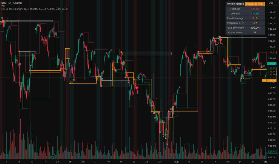
Liquidity Sweep Confirmation Zones [Pineify]Liquidity Sweep Confirmation Zones
Overview
This overlay separates a wick beyond known swing liquidity from a response that earns a zone. It shows rails, a candidate bridge, confirmed boxes, retest wear, and a dashboard.
Problem Definition
A basic sweep rule labels every wick beyond a prior high or low. It cannot separate rejection from a breakout near the level, and it ignores later response. Permanent lines remain prominent after failure. Back-plotting a pivot also hides that right-side bars were required to confirm it. The task is to find a closed-bar pierce and reclaim at a level already known, then require timely departure before creating support or resistance.
Design Rationale
Confirmed pivots provide structure that existed before the sweep. Each rail is armed once to stop repeated events. ATR scaling replaces raw ticks across price levels, while the sweep freezes its rail, extreme, close, and ATR so later bars cannot rewrite the test. A limited window rejects delayed movement. Net displacement alone was rejected because a choppy path can eventually travel as far; efficiency also measures progress versus total close travel. This can omit real reversals, but accepted events are easier to audit. Dual-rail sweeps are ignored as directionally ambiguous.
Key Features
One-shot confirmed swing rails.
ATR-scaled pierce and reclaim gates.
Frozen response, path efficiency, and age.
Zones beginning at confirmation, with retest wear and bounded life.
Closed-bar candidate, confirmation, and invalidation alerts.
How It Works
ATR is calculated while a pivot waits for its right-side bars; its rail appears only when confirmed. A later closed bar becomes a candidate when its wick pierces one armed rail by the required ATR fraction and its close reclaims it by the chosen distance. That rail is consumed, while a dual-rail reclaim is ignored.
The candidate freezes direction, rail, extreme, reclaim close, and ATR. Later bars accumulate close travel. Response is directional progress divided by frozen ATR, and efficiency divides positive response by total travel. Both thresholds must pass on the reclaimed side before timeout. Closing through the extreme also fails the candidate.
Confirmation creates a green support or red resistance box on that bar. Each new entry counts as a retest and increases transparency. Bullish zones invalidate below their extreme; bearish zones invalidate above it. Age stops extension, storage removes the oldest excess box, and warm-up shows no rail until ATR and a pivot exist.
How Multiple Indicators Work Together
The stages form one causal chain. Pivots supply pre-existing levels; ATR supplies scale; reclaim establishes rejection; displacement tests follow-through; efficiency rejects wandering paths; the time window links response to sweep. The box preserves that frozen evidence for retest and invalidation. Removing a stage changes the question, so the components are not an arbitrary mashup.
Trading Ideas and Insights
A circle records rejection, not completed follow-through. The amber bridge shows the pending interval while response develops. Green means a downside sweep received efficient upward confirmation; red means the inverse. Fading records more separate retests and can suggest wear for review. These states organize rejection, confirmation, retest, and failure, but do not define entries, targets, returns, or size.
Unique Aspects
The contribution separates event knowledge from outcome. A rail begins only when confirmed, a sweep consumes it once, and its facts are frozen. Promotion needs ATR-scaled progress plus path efficiency within a fixed window. The box starts at promotion, so history does not imply earlier confirmation. Retests count only new entries, not every bar inside. This is an auditable state sequence rather than a renamed pivot marker.
How to Use
Choose pivots for the intended structure horizon.
Watch armed rails; a circle marks a closed-bar pierce and reclaim.
Read bridge, response ATR, efficiency, and age while pending.
Treat a diamond and new box as confirmation on that bar; then monitor retests and failure.
Use Once Per Bar Close alerts with separate execution and risk rules.
Customization
Larger pivots select broader but later structure. Higher pierce or reclaim values filter shallow probes. Raising displacement or efficiency requires cleaner response but reduces events; longer windows weaken temporal linkage. Zone life sets the horizon, maximum zones bounds objects, and maximum retests changes wear shading only. Visual layers hide independently. Defaults are not universal optima.
Assumptions and Limitations
Confirmed pivots are assumed useful liquidity references and ATR an adequate scale. Pivot delay leaves recent structure unavailable. Only one candidate is tracked, and dual-rail sweeps are rejected. Bar-based efficiency cannot reveal intrabar order, actual liquidity, stops, or intent. Gaps, fast trends, thin markets, and poor settings can break interpretation. Closed bars drive state, but setting or data revisions can recalculate history. The script does not detect actual stop hunts, predict reversals, measure profitability, or decide whether to trade a zone.
Conclusion
The overlay turns a known swing, closed-bar reclaim, and bounded efficient response into a staged record. No zone exists before follow-through qualifies it; delay, wear, expiry, and failure stay visible.
Indikator
Trading ATR Framework# Trading ATR Framework
**Trading ATR Framework** is a rule-based volatility and market-location tool designed primarily for intraday futures trading.
The purpose of the indicator is not to generate automatic buy or sell signals. Instead, it provides a structured way to measure how far the current market has moved relative to its recent daily volatility and to identify predefined volatility expansion zones.
## Core Concept
The framework uses two main reference values:
1. **Previous Daily Close**
The previous completed trading day's close is used as the default reference price.
2. **Daily ATR(14)**
The indicator calculates the Average True Range over the last 14 completed daily bars. ATR measures the average daily price range and is used as a volatility reference.
From these two values, the indicator projects symmetrical volatility levels above and below the reference price.
The calculated levels are:
* +25% ATR
* +50% ATR
* +75% ATR
* +100% ATR
* -25% ATR
* -50% ATR
* -75% ATR
* -100% ATR
For example, if the previous daily close is 20,000 and the completed Daily ATR(14) is 400 points, the +25% ATR level would be:
**20,000 + (400 × 0.25) = 20,100**
The -50% ATR level would be:
**20,000 - (400 × 0.50) = 19,800**
This creates a standardized volatility map around the previous session's closing price.
## Why I Created This Framework
Many intraday traders evaluate price levels without considering how far the market has already travelled relative to its normal daily volatility.
This framework combines:
* previous-session price anchoring,
* completed Daily ATR volatility,
* fractional ATR expansion levels,
* tick-size normalization,
* directional location,
* and risk-to-reward calculations
into one visual framework.
The goal is to make market location more objective.
Instead of simply asking whether price is bullish or bearish, traders can evaluate questions such as:
* Is price still close to the previous daily close?
* Has the market already expanded 50% of its normal daily ATR?
* Is price approaching a 75% or 100% ATR expansion?
* Is a potential entry occurring early or late within the current volatility expansion?
* Does the available distance to the next relevant level justify the risk?
## Directional Context
The indicator also displays the current position of price relative to the ATR framework.
Price trading above the reference close indicates positive expansion, while price trading below the reference close indicates negative expansion.
This directional information is intended as **market context**, not as an automatic trend or trade signal.
A market trading above +50% ATR, for example, is in a very different volatility location than a market trading only +10% above the previous close.
The trader can use this information together with market structure to determine whether the market is:
* expanding,
* consolidating,
* approaching an extended volatility area,
* or returning toward its reference price.
## How to Use the Indicator
A typical workflow is:
**1. Identify market direction and structure**
Evaluate the broader session structure, previous highs and lows, trend direction, consolidation areas, or other structural references.
**2. Check the current ATR position**
Determine where price is currently located relative to the previous daily close and the projected ATR levels.
**3. Evaluate volatility expansion**
Consider whether the market is still in an early expansion area such as 25% ATR or has already reached a more extended area such as 75% or 100% ATR.
**4. Look for confirmation**
ATR levels are not intended to be traded mechanically.
They can be combined with tools such as:
* price action,
* support and resistance,
* volume,
* volume profile,
* order flow,
* footprint charts,
* delta,
* liquidity,
* session highs and lows,
* or other trader-defined confirmation methods.
**5. Evaluate risk-to-reward**
The built-in risk-to-reward tool can be used to compare the intended stop distance with a target based on a 2.5R reward-to-risk relationship.
## Tick-Size Normalization
ATR calculations can produce prices that do not correspond exactly to the minimum tick size of a futures contract.
The indicator therefore rounds calculated ATR levels to the instrument's valid tick size.
This makes the projected levels easier to use with futures contracts such as:
* NQ / MNQ
* GC / MGC
* CL / MCL
The framework can also be applied to other instruments where ATR-based volatility mapping is useful.
## Manual Reference Mode
By default, the framework uses the automatically calculated previous daily close and Daily ATR(14).
Optional manual inputs allow traders to override:
* the reference/settlement price,
* and the ATR value.
This can be useful when a trader wants to work with an exchange settlement value, an externally calculated ATR value, or another manually defined session reference.
## Risk-to-Reward Calculator
The indicator includes a simple **2.5R risk-to-reward calculation**.
This feature is intended to help traders evaluate whether sufficient price space exists between a potential entry, stop level, and target.
It is a planning tool and does not automatically determine whether a trade should be taken.
## Alerts
Alerts can be configured for important ATR level crossings.
This allows traders to monitor when price enters or crosses predefined volatility expansion zones without continuously watching the chart.
## Intended Markets
The framework was primarily developed for intraday futures markets, especially:
**Nasdaq**
NQ / MNQ
**Gold**
GC / MGC
**Crude Oil**
CL / MCL
However, because the calculations are based on price and ATR rather than instrument-specific signals, the framework can also be applied to other liquid markets.
## Important Interpretation
ATR measures volatility, not direction.
Reaching +75% ATR does not automatically mean price should reverse.
Likewise, reaching -100% ATR does not automatically mean a market should be bought.
Strong directional markets can continue beyond a full Daily ATR.
The ATR levels should therefore be interpreted as **volatility and decision zones rather than standalone entry signals**.
The framework is designed to answer:
**"Where is the market currently trading relative to its normal daily volatility?"**
The final trading decision remains dependent on market structure, confirmation, execution rules, and risk management.
Indikator

Coinbase Premium Barometer by tf1803 COINBASE PREMIUM — BAROMETER
WHAT IT DOES
This indicator measures the price difference between Coinbase — the regulated
US exchange where buyers pay in actual dollars — and an offshore reference
exchange quoted in USDT (Binance by default). That spread is a proxy for where
demand is coming from.
Above zero → Coinbase is more expensive. US buyers are paying up.
Below zero → Coinbase is cheaper. Selling pressure sits on the US side.
It is a context tool, not an entry signal. Its value lies in whether the spread
confirms or contradicts what price is doing.
HOW IT IS CALCULATED
Premium (USD) = Coinbase price − reference price
Premium (percent) = (Coinbase price − reference price) / reference price × 100
Both exchanges are requested on the timeframe of your chart, with no lookahead.
An optional USDT depeg adjustment converts the reference price into real dollars
via USDT/USD before comparing. This removes the portion of the spread that only
exists because the stablecoin itself is trading off its peg — useful during
periods of stablecoin stress, when a raw spread overstates the actual demand
imbalance.
FEATURES
- Absolute USD or percentage display
- Any symbol pair — works for ETH, SOL or anything listed on both venues
- Optional USDT depeg correction
- Signal moving average (EMA or SMA) to read the trend rather than the noise
- Extreme detection, either adaptive (standard deviation bands) or fixed
thresholds, with background shading
- Automatic trendlines connecting the last two pivot highs and pivot lows of
the premium itself, extended right — shows when a premium regime is losing
momentum before the zero line is crossed
- Markers at every zero crossing
- Info box with the current value, the signal MA and a Z-score
- Six alert conditions: zero crossings in both directions, signal MA crossings,
and entries into either extreme
HOW TO USE IT
Add it to a daily chart first. The daily is where the reading is cleanest; on
low timeframes the spread becomes noisy and the EMA smoothing input (try 5)
becomes necessary.
Then watch the relationship, not the number:
- Price rising while the premium stays negative — the move is not carried by US
spot demand. Weaker than it looks.
- Price rising with the premium turning positive — demand and price agree.
- Premium making higher lows while price chops sideways — accumulation building
under the surface. The automatic trendlines are there to make exactly this
visible.
- Extremes in either direction tend to mean-revert. They mark exhaustion more
often than continuation.
NOTES AND LIMITATIONS
Single spikes are noise. The signal is in the trend over days and weeks.
Part of any spread is structural rather than informational: USDT can trade off
its dollar peg, and the two venues differ in fees, liquidity and depth. The
depeg option addresses the first of these; the others remain.
The indicator reads the same on every chart it is applied to, because it pulls
both legs from the symbols set in the inputs rather than from the chart symbol.
This is a market-structure tool for context. It is not financial advice and
makes no claim about future prices.
COINBASE PREMIUM — BAROMETER
WAS ER MACHT
Der Indikator misst die Preisdifferenz zwischen Coinbase — der regulierten
US-Börse, an der in echten Dollar gekauft wird — und einer Offshore-Referenzbörse
in USDT (voreingestellt Binance). Diese Differenz ist ein Näherungsmaß dafür,
woher die Nachfrage gerade kommt.
Über null → Coinbase ist teurer. US-Käufer zahlen auf.
Unter null → Coinbase ist günstiger. Der Verkaufsdruck sitzt in den USA.
Es ist ein Kontextwerkzeug, kein Einstiegssignal. Der Wert liegt darin, ob die
Differenz bestätigt oder widerspricht, was der Preis tut.
BERECHNUNG
Premium (USD) = Coinbase-Preis − Referenzpreis
Premium (Prozent) = (Coinbase-Preis − Referenzpreis) / Referenzpreis × 100
Beide Börsen werden auf der Zeiteinheit des Charts abgefragt, ohne Lookahead.
Optional lässt sich der USDT-Depeg herausrechnen: Der Referenzpreis wird über
USDT/USD in echte Dollar umgerechnet, bevor verglichen wird. Das entfernt den
Anteil der Differenz, der nur daher kommt, dass der Stablecoin selbst von seiner
Bindung abweicht.
FUNKTIONEN
- Anzeige in absoluten USD oder in Prozent
- Beliebiges Symbolpaar — funktioniert für ETH, SOL und alles, was an beiden
Börsen gelistet ist
- Optionale USDT-Depeg-Korrektur
- Signal-MA (EMA oder SMA), um den Trend statt des Rauschens zu lesen
- Extremerkennung wahlweise adaptiv (Standardabweichungsbänder) oder über feste
Schwellen, mit Hintergrundfärbung
- Automatische Trendlinien auf dem Premium selbst, gezogen zwischen den letzten
beiden Pivot-Hochs bzw. -Tiefs und nach rechts verlängert — macht sichtbar,
wenn eine Phase ausläuft, bevor die Nulllinie gekreuzt wird
- Markierungen an jedem Nulldurchgang
- Info-Box mit aktuellem Wert, Signal-MA und Z-Score
- Sechs Alarmbedingungen: Nulldurchgänge in beide Richtungen, MA-Kreuzungen und
das Erreichen beider Extrembereiche
ANWENDUNG
Zuerst auf dem Tageschart. Dort ist die Ablesung am saubersten; auf kleinen
Zeiteinheiten wird die Differenz verrauscht, dann ist die EMA-Glättung nötig
(Startwert 5).
Dann auf das Verhältnis achten, nicht auf die Zahl:
- Preis steigt, Premium bleibt negativ — die Bewegung wird nicht von US-Spot-
Nachfrage getragen. Schwächer, als sie aussieht.
- Preis steigt und das Premium dreht ins Positive — Nachfrage und Preis stimmen
überein.
- Premium bildet höhere Tiefs, während der Preis seitwärts läuft — darunter baut
sich etwas auf. Genau dafür sind die automatischen Trendlinien da.
- Extreme in beide Richtungen neigen zur Rückkehr zum Mittel. Sie markieren
häufiger Erschöpfung als Fortsetzung.
HINWEISE UND GRENZEN
Einzelne Ausschläge sind Rauschen. Die Aussage liegt im Verlauf über Tage bis
Wochen.
Ein Teil jeder Differenz ist strukturell und nicht informativ: USDT kann von der
Dollarbindung abweichen, und die beiden Börsen unterscheiden sich in Gebühren,
Liquidität und Markttiefe. Die Depeg-Option adressiert den ersten Punkt, die
übrigen bleiben.
Der Indikator zeigt auf jedem Chart dasselbe, weil er beide Seiten aus den in
den Einstellungen gesetzten Symbolen zieht und nicht aus dem Chartsymbol.
Ein Werkzeug zur Marktstruktur-Einordnung. Keine Anlageberatung und keine
Aussage über künftige Kurse.
Indikator

LINK Above $12.20: Is $15 Back on the Table?Hey traders! 👋
After that solid push higher, LINK is now pulling back into the breakout zone, so $12.00–$12.20 is back on my radar. This was the area that kept a lid on price through most of August and I still see it as the key zone for keeping the bullish structure alive.
I’m definitely not the guy who wants to jump on a moving train just because everyone else is buying. 😄 My plan is simple and emotionless: close above $12.20, then checks three things before entering: price above the long-term SMA 200, RSI 14 above 50, and a bullish MACD 12/26/9.
This filter keeps us away from fake breakouts that lack real momentum.
For the trade itself, my preferred entry zone is $12.20–$12.30 after confirmation. With the strategy’s default settings, the SL is 1.5% below entry, which puts it around $12.02–$12.12, while the mechanical TP is 3% above entry, around $12.57–$12.67. These levels are calculated automatically from the actual entry price rather than being fixed on the chart.
📈 Where could LINK go next?
If LINK gets back above $12.20 and keeps the momentum going, $13.67 is the next level I’m watching closely. Above that, we have $14, and if buyers can push through that area cleanly, the bigger $15–$15.50 zone starts looking pretty interesting.
What about support?
🟢 $12.00 - key psychological support
🟢 $11.50 - first lower support
🟢 $11.00 - next support zone
🟢 $10.70 - deeper technical support
The beauty of this setup? No guessing tops or bottoms. We just wait for buyers to show up, let RSI and MACD confirm and execute.
So, what would you do here? 👀 Take the breakout above $12.20, or wait for LINK to clear $13.67 before getting involved? Drop your setup in the comments.
Disclaimer: Trading crypto involves substantial risk, and this is only my personal read of LINK’s market structure, not financial advice. I always define invalidation before entering, size positions carefully, and accept that price can do something different from my base case.
Strategi

Indikator

Liquidity Absorption Engine [StrixEDGE]TRADINGVIEW TITLE
Liquidity Absorption Engine Liquidity
DESCRIPTION
StrixEDGE Liquidity Absorption Engine is Engine #01 in the StrixEDGE indicator framework. It is a liquidity-focused market-state tool designed to identify changes in directional quality, liquidity behavior, volatility structure and confirmation strength without relying on a single conventional oscillator.
WHAT THIS INDICATOR IS DESIGNED TO DO
Scores wick absorption, sweep rejection and directional flow to identify defended liquidity zones.
Rather than treating one input as a complete signal, StrixEDGE combines the engine's dedicated core logic with an optional DNA layer. The final result is normalized into a 0–100 Strix Score so the same framework can be read consistently across different symbols and timeframes.
HOW TO READ THE STRIX SCORE
• Above 72: bullish state / long-side trigger zone.
• Below 28: bearish state / short-side trigger zone.
• Around 50: balanced or neutral state.
• A signal is generated on a transition into a trigger zone, not on every bar that remains inside it.
SIGNAL & POSITION FRAMEWORK
When a valid state transition is detected, the overlay version can create a structured trade plan containing:
• Entry
• DCA level
• TP1
• TP2
• TP3
• Stop Loss
Each projected level includes its percentage distance from Entry. When a level is reached, the same chart label is updated with a ✓ marker. TP and SL outcome tracking is mutually controlled so the dashboard does not report contradictory terminal results for the same setup.
PROFESSIONAL DASHBOARD
The built-in StrixEDGE dashboard summarizes the active market state in a compact TradingView table, including:
• Engine and category
• Strix Score and directional bias
• Signal / market regime
• Flow pressure and trend quality
• Relative volume and ATR volatility
• Structure / VWAP context
• Active position and signal age
• Entry, DCA, TP1, TP2, TP3 and SL
• Hit status for each projected level
COMBINATION PROFILE
• CORE BALANCE
• Active DNA modules: 3
• Lookback: 24
• Smoothing: 5
• Signal threshold: 72
ENGINE DNA
• Wick Absorption Pressure — Compares upper/lower wick asymmetry and amplifies it when relative volume is elevated.
• Liquidity Sweep Rejection — Detects previous-range stop sweeps that close back inside the broken boundary.
• Normalized Flow Acceleration — Smooths ATR-normalized return × relative volume to estimate directional flow.
MARKET / STYLE PROFILE
• Market focus: Crypto
• Intended style: Swing
• Core engine: #01 Liquidity Absorption Engine
• Category: Liquidity
NON-REPAINT / DATA HANDLING
By default, signals require a confirmed chart-bar close. This reduces intrabar signal fluctuation and makes historical signal placement more stable.
ALERTS
The generated script includes alert conditions for:
• Long state shift
• Short state shift
• DCA reached
• TP1 reached
• TP2 reached
• TP3 reached
• Stop Loss reached
HOW I USE IT
StrixEDGE is designed as a market-state and trade-structure tool rather than a standalone prediction system. Stronger setups generally occur when the Strix Score, market regime, flow pressure, structure and volatility context agree instead of relying on the trigger alone.
LIMITATIONS
No indicator can predict future price movement with certainty. Signals can fail during sudden news events, illiquid conditions, gaps, abnormal volatility, regime transitions or unreliable volume. DCA, TP and SL levels are systematic projections derived from the active setup and should not be interpreted as guaranteed outcomes.
Users should validate the indicator on the symbol, exchange and timeframe they trade, and should apply independent position sizing and risk management. Historical behavior does not guarantee future performance.
ORIGINALITY
StrixEDGE Engine #01 is built from generic price, volume, volatility, structure and confirmed-context primitives arranged in a dedicated engine formula and optional DNA layer. It is not intended to reproduce or rename a specific community indicator.
DISCLAIMER
For research and educational purposes only. This indicator is not financial advice and does not guarantee profitability. Indikator

MarketCraft FX - Liquidity Matrix V1.1MARKETCRAFT FX – LIQUIDITY MATRIX V1.1
The MarketCraft FX Liquidity Matrix is a free liquidity-mapping indicator designed to identify areas where buy-side and sell-side liquidity may be resting.
Rather than displaying every minor swing, the indicator evaluates confirmed pivot structure, relative volume and displacement away from the level. Qualified liquidity zones are then displayed clearly on the chart, helping traders identify potential targets, reaction areas and liquidity events.
KEY FEATURES
• Buy-Side Liquidity (BSL) zones above confirmed swing highs
• Sell-Side Liquidity (SSL) zones below confirmed swing lows
• Dual structural and relative-volume detection
• PRIMARY, STRONG and MAJOR zone classifications
• ATR-based zone depth
• Optional dynamic zone sizing
• Nearby-level merging to reduce chart clutter
• Zones extend automatically beyond current price action
• Separate liquidity-sweep and close-through identification
• Nearest BSL and SSL displayed in a compact dashboard
• Configurable colours, transparency and display limits
• Alerts for approaches, sweeps and candle close-through events
• Suitable for light and dark chart backgrounds
HOW THE LIQUIDITY ENGINE WORKS
A liquidity zone begins with a confirmed swing high or swing low.
The indicator then evaluates the quality of that swing using two independent qualification paths:
1. Structural displacement away from the swing
2. Relative volume surrounding the liquidity origin
This dual-detection method allows a meaningful structural level to qualify even when market volume is relatively quiet. It can also identify volume-backed liquidity that may not produce an unusually large immediate displacement.
ZONE CLASSIFICATIONS
PRIMARY
A confirmed liquidity-bearing swing that meets the minimum qualification requirements.
STRONG
A higher-quality level supported by additional displacement, relative volume or price-action confirmation.
MAJOR
A high-scoring liquidity level with multiple supporting factors. These zones represent the strongest levels identified by the engine.
READING THE ZONES
BSL zones appear above price and represent areas where liquidity may be resting beyond previous highs.
SSL zones appear below price and represent areas where liquidity may be resting beyond previous lows.
Each active zone extends beyond current price action by the selected number of bars. The default extension is 20 bars.
The zone remains live and continues moving forward until its outer boundary is reached.
ZONE STATES
FRESH
The liquidity zone has been created and has not yet been approached or swept.
APPROACHING
Price has moved within the selected ATR distance of an active liquidity zone.
LIQUIDITY SWEPT
Price has wicked through the outer boundary of the zone. The zone stops extending at the sweep candle and changes to a dashed historical level.
CLOSE-THROUGH
A candle has closed beyond the outer boundary. This is separated from a wick-only sweep because it may indicate acceptance beyond the liquidity zone rather than an immediate rejection.
COMPACT DASHBOARD
The dashboard displays:
• Current draw on liquidity
• Nearest active BSL
• Nearest active SSL
• Strength of each nearest zone
• Number of retained zones
• Latest liquidity event
IMPORTANT SETTINGS
Minimum Zone Grade controls the overall quality of zones displayed.
Dual Structural + Volume Detection allows zones to qualify through either displacement or relative volume.
Swing Length and Confirmation Bars control how significant a swing must be before it is confirmed.
Base Zone Depth controls zone thickness using ATR.
Merge Nearby Levels combines levels forming within the selected ATR distance.
Extend Past Current Price controls how far active zones project beyond the latest candle.
Retain Swept Zones determines whether completed liquidity events remain visible for historical analysis.
TRADING APPLICATION
The indicator can be used to help identify:
• Potential draws on liquidity
• Areas above highs or below lows where stops may be resting
• Potential reaction points
• Liquidity sweeps
• Failed sweeps and close-through events
• Confluence with market structure, order blocks, supply and demand, Fibonacci levels or higher-timeframe analysis
Liquidity zones should not be treated as automatic entry signals. A zone identifies an area of interest; traders should use their own confirmation process before making a trading decision.
MARKETCRAFT FX
Craft Your Edge. Master the Market.
This indicator is an original MarketCraft FX development created as a free educational and chart-analysis tool.
DISCLAIMER
This indicator is provided for educational and informational purposes only. It does not constitute financial advice, investment advice or a recommendation to buy or sell any financial instrument.
No indicator can predict future market movements or guarantee profitable results. Liquidity zones may fail, price may trade through them, and historical performance does not guarantee future performance.
Always conduct your own analysis and use appropriate risk management.
Indikator

MACD Matrix [Quantum Algo]MACD Matrix
═══════════════════════════════════════════════
🔶 OVERVIEW
MACD Matrix reads the Moving Average Convergence Divergence as a complete momentum system rather than a single line and histogram. It classifies momentum into four quadrants instead of one sign, aligns four timeframes into a live matrix with a scored consensus, detects histogram divergence and draws it on both the oscillator and the price candles, tracks histogram compression before expansion, and paints a momentum river through price so the entire reading lives on the chart — not only in the pane below it.
The result is a MACD you can read from the candles alone: the river's color tells you the quadrant, the aura tells you whether momentum is expanding or fading, gold beacons mark full multi-timeframe alignment, and every signal carries its own historical record on the exact symbol you are trading.
═══════════════════════════════════════════════
🔶 WHAT IS MACD?
The Moving Average Convergence Divergence, created by Gerald Appel, measures momentum as the distance between a fast and a slow exponential moving average. A signal line smooths that distance, and the histogram — introduced by Thomas Aspray — shows the gap between the two. MACD above zero means the fast average leads the slow one (bullish regime); the histogram rising means momentum is accelerating.
═══════════════════════════════════════════════
🔶 WHAT ARE THE FOUR MACD QUADRANTS?
Most traders read MACD as bullish or bearish. It actually has four distinct states, and the difference between them is where the money is:
— Expanding ▲: above zero and the histogram rising — momentum accelerating in an uptrend.
— Fading ▲: above zero and the histogram falling — the uptrend losing thrust, the earliest warning.
— Expanding ▼: below zero and the histogram falling — momentum accelerating in a downtrend.
— Fading ▼: below zero and the histogram rising — the downtrend losing thrust, the earliest turn.
MACD Matrix names the quadrant on every bar, colors the river and the aura by it, and stamps it into every signal's tooltip.
═══════════════════════════════════════════════
🔶 WHY IS THIS ORIGINAL?
1. The quadrant engine. Four momentum phases instead of two, made visible on the price chart through the momentum river and aura, so fading momentum is caught before the sign ever flips.
2. The timeframe matrix. Four configurable timeframes, each read as side-of-zero × expanding-or-fading, with a consensus score. A gold beacon prints on price the moment all four align with expanding momentum — a threshold event, not a vague "trend agreement."
3. Dual-canvas divergence. Histogram divergences are drawn as connectors in the pane AND as dashed twins across the corresponding price pivots on the chart, so the divergence is visible exactly where you trade it.
4. The histogram squeeze. Histogram amplitude is ranked inside its own recent history; when it compresses below a low percentile the momentum is coiled, marked with gold dots, and the expansion out of the coil fires a directional release signal — a compression concept almost never applied to MACD.
5. Signal families with per-symbol records. Zero-line crosses, early signal crosses on the correct side of zero, divergences and squeeze releases are tracked as separate families, each with ten-bar outcome statistics shrunk toward neutral at small samples and a Wilson lower bound — quoted in every tooltip and on the dashboard.
═══════════════════════════════════════════════
🔶 HOW IT WORKS
— MACD, signal and histogram are computed from configurable lengths; the quadrant is derived from the sign of MACD and the direction of the histogram.
— Four higher-timeframe MACD states are requested without lookahead and scored into the matrix.
— Histogram pivots are compared against price pivots to detect regular divergences, drawn on both canvases.
— Histogram amplitude is ranked against its own history for the squeeze; a mature coil that expands fires a release.
— Every signal family feeds its own first-in-first-out outcome samples; statistics are reported with sample counts.
Signals are evaluated on confirmed bars and do not repaint. Higher-timeframe matrix rows finalize when their own bar closes, as with any multi-timeframe reading. All drawings are capped.
═══════════════════════════════════════════════
🔶 HOW TO USE IT
— Trade the quadrant, not the sign: Expanding phases favor continuation entries; Fading phases favor taking profit or tightening risk, and they precede most zero-line crosses.
— Use the matrix as a filter: a 4/4 beacon is the highest-conviction environment; a divided matrix (2/4) warns that timeframes disagree.
— Divergence on the candles: when the dashed price line and the pane connector appear together, you have a momentum-versus-price disagreement located precisely on structure.
— Watch the coil: a long squeeze followed by a release is the setup for expansion; the R family record tells you how reliably releases have followed through here.
— Works on all markets and timeframes; configure the four matrix timeframes to match your trading horizon.
═══════════════════════════════════════════════
🔶 SETTINGS
— MACD: fast, slow and signal lengths.
— Timeframe Matrix: four timeframes.
— Signals & Squeeze: divergence pivot length, squeeze window and percentile, cooldown, signal visibility.
— Statistics: sample cap, minimum samples, shrinkage strength, Wilson z-score.
— Visuals and dashboard: river and aura toggles, river length, full color and position control.
═══════════════════════════════════════════════
🔶 ALERTS
— Matrix Aligned Bullish / Bearish — all four timeframes aligned with expanding momentum.
— Zero-Line Cross — MACD crossed zero.
— Histogram Divergence — a divergence printed.
— Squeeze Release — the histogram expanded out of its coil.
═══════════════════════════════════════════════
🔶 FAQ
Q: Does it repaint?
A: Signals are evaluated on confirmed bars and never change once printed. The higher-timeframe rows of the matrix update while their own bar is open and finalize at its close — this is inherent to any multi-timeframe reading, and no lookahead is used.
Q: How is this different from a standard MACD?
A: A standard MACD shows one line, one signal and one histogram in a pane. This tool adds the quadrant classification, the four-timeframe matrix and beacons, divergence drawn on the price chart itself, the histogram squeeze, the momentum river and aura on price, and per-family statistics.
Q: What does the momentum river represent?
A: A short exponential average of price colored by the current MACD quadrant. Its purpose is purely to carry the momentum reading onto the candles — bright when momentum expands, dimmed when it fades — so you can read momentum without looking away from price.
Q: What do the family percentages mean?
A: The share of past signals in that family after which price had moved favorably ten bars later, on the current symbol and timeframe, shrunk toward fifty percent at small samples. They describe history — they are not predictions.
Q: Which settings should I change first?
A: The four matrix timeframes, so the matrix reflects your own trading horizons. The MACD lengths follow the classic 12, 26, 9 defaults.
═══════════════════════════════════════════════
🔶 CREDITS
The Moving Average Convergence Divergence is by Gerald Appel; the MACD histogram is by Thomas Aspray (1986). The Wilson score interval is by Edwin B. Wilson (1927). The quadrant engine, timeframe matrix and beacon logic, dual-canvas divergence rendering, histogram squeeze, per-symbol statistics and all code in this script are original work — no third-party or open-source script code was reused.
═══════════════════════════════════════════════
🔶 LIMITATIONS
— MACD is a lagging momentum measure; the quadrant engine reduces but cannot eliminate lag.
— Divergences can extend before resolving; the family record exists to quantify this on your chart.
— Statistics describe the current chart's history only; past frequencies never guarantee future outcomes.
═══════════════════════════════════════════════
🔶 DISCLAIMER
This indicator is a research and charting tool provided for educational purposes. It is not financial advice, and nothing it displays is a recommendation to buy or sell any asset. Trading involves substantial risk of loss. Always do your own analysis and manage risk responsibly. Indikator

Indikator


