Advanced Liquidity Sweep [HexaTrades]Advanced Liquidity Sweep is a Smart Money Concepts (SMC) indicator designed to automatically identify liquidity pools, equal highs and lows, liquidity sweeps, and potential reversal areas. Rather than simply detecting wick breaks, it evaluates each sweep using multiple confirmation factors and assigns a strength score, helping traders distinguish between minor stop hunts and higher-quality liquidity events.
The indicator is designed for cryptocurrencies, stocks, forex, futures, commodities, and indices across all timeframes.
What is Liquidity?
Financial markets constantly search for liquidity before making significant moves.
Retail traders often place:
• Stop losses below swing lows
• Stop losses above swing highs
• Breakout orders above resistance
• Breakdown orders below support
These orders accumulate into liquidity pools. Large market participants frequently move prices into these areas to fill large positions before reversing or continuing the trend.
This indicator automatically identifies those liquidity pools and highlights when they are swept.
How it works :
- Map the liquidity.: Confirmed pivot highs become BSL lines, pivot lows become SSL lines. You choose Major and/or Minor swing sizes.
- Cluster equal highs/lows. Several highs (or lows) at nearly the same price form an EQH / EQL cluster, a bigger, juicier liquidity pool that scores higher.
- Detect the sweep (on closed candles only).
• Bearish: price trades above a BSL level but closes back below it.
• Bullish: price trades below an SSL level but closes back above it.
- Score it 0–100. Six factors rate how convincing the rejection was (see below). At/above your Strong threshold, it’s tagged STRONG.
- Draw a sweep zone. Optionally turn each sweep into a supply/demand zone you can watch for re-entry, with optional auto-expiry.
- Filter the noise. Optional Trend, Higher-Timeframe and Filter presets keep only the cleaner grabs.
Features
🔶 Major & Minor Swing Detection
The indicator detects both major and minor swing highs and lows.
Major swings represent stronger institutional liquidity and usually produce higher-quality reactions.
Minor swings identify shorter-term liquidity that is commonly targeted during intraday trading.
Users can monitor:
• Major swings only
• Minor swings only
• Both simultaneously
🔶Buy-Side Liquidity (BSL)
Buy-side liquidity forms above previous swing highs.
These areas usually contain:
• Short stop losses
• Breakout buy orders
• Momentum entries
When price trades above these highs before quickly closing back below, the indicator identifies a bearish liquidity sweep.
🔶 Sell-Side Liquidity (SSL)
Sell-side liquidity forms below previous swing lows.
These areas usually contain:
• Long stop losses
• Panic selling
• Breakdown entries
When price trades below these lows before closing back above, the indicator identifies a bullish liquidity sweep.
🔶 Equal Highs & Equal Lows
Equal highs and equal lows are some of the strongest liquidity pools because many traders place stops at nearly identical price levels.
The indicator automatically detects these structures using:
• ATR-based tolerance
• Percentage-based tolerance
Equal liquidity levels are highlighted separately and tracked independently from normal swing liquidity.
🔶 Zone Colors
Here are the zone and line colors used in this indicator and what each one means:
🔴 Red: Buy-Side Liquidity (BSL)
- Represents swing highs where buy-side liquidity is concentrated.
- Commonly contains short stop-loss orders and breakout buy orders.
- These are active, unswept liquidity levels and potential targets for a bearish liquidity sweep.
🟢 Green: Sell-Side Liquidity (SSL)
- Represents swing lows where sell-side liquidity is concentrated.
- Commonly contains long stop-loss orders and breakdown sell orders.
- These are active, unswept liquidity levels and potential targets for a bullish liquidity sweep.
🟠 Orange: Equal Highs / Equal Lows (EQH / EQL)
- Marks two or more highs or lows formed at nearly the same price.
- These levels are displayed using dashed lines and often contain larger clusters of resting liquidity.
- Sweeps of Equal Highs and Equal Lows typically produce stronger, higher-probability trading opportunities.
⚪ Gray: Swept (Inactive) Liquidity
- Indicates liquidity that has already been swept by price.
- Once a level has been taken, it changes to gray and becomes inactive.
- This helps distinguish spent liquidity from active levels that may still attract future price movement.
Sweep Signal Colors
🟩 Bullish Liquidity Sweep
-Appears when Sell-Side Liquidity (SSL) or an Equal Low (EQL) is swept.
-Price trades below the liquidity level but closes back above it, confirming a bullish liquidity sweep.
🟪 Bearish Liquidity Sweep
- Appears when Buy-Side Liquidity (BSL) or an Equal High (EQH ) is swept.
- Price trades above the liquidity level but closes back below it, confirming a bearish liquidity sweep.
🔶 Liquidity Sweep Detection
A liquidity sweep occurs when price temporarily breaks a liquidity level but fails to hold beyond it.
For a valid sweep:
Bearish Sweep
• Price trades above Buy-Side Liquidity
• The candle closes back below the level
Bullish Sweep
• Price trades below Sell-Side Liquidity
• The candle closes back above the level
Because the signal is generated only after the candle closes, the indicator does not repaint.
🔶Sweep Strength Score
Every sweep receives a strength score from 0 to 100.
The score combines multiple factors including:
• Wick rejection
• Candle body strength
• Penetration distance beyond liquidity
• Volume confirmation
• Distance from the EMA
• Equal High / Equal Low cluster strength
Higher scores generally indicate stronger liquidity events.
Strength tiers are classified as: Weak, Medium, Strong, and Elite
Users can also define a minimum score to filter out lower-quality sweeps.
🔶 Score Presets
Three scoring profiles are available:
Conservative: Places greater emphasis on clean rejection candles and body structure.
Balanced: Provides an even weighting across all scoring components and is suitable for most trading styles.
Aggressive: Places greater importance on volume and equal liquidity clusters, making it more responsive to institutional activity.
🔶 Trend & Higher Timeframe Filters
The indicator includes optional trend confirmation filters to help improve signal quality.
The Trend Filter uses the EMA 50 and EMA 200 to evaluate the current market direction and offers two modes:
Continuation : Displays only sweeps that align with the prevailing trend.
Reversal : Displays only sweeps that occur against the prevailing trend, helping identify potential market reversals.
For additional confirmation, the Higher Timeframe (HTF) Bias Filter compares price with a higher timeframe EMA. When enabled, sweeps are generated only if they align with the broader market trend, helping reduce false signals and improving overall trade selection.
🔶 Liquidity & Sweep Zones
The indicator provides two complementary ways to visualize liquidity on the chart.
Liquidity Zones highlight swing highs and lows as either horizontal lines, price zones, or both, making it easier to identify areas where liquidity is likely to accumulate. Users can choose between Lines Only, Zones Only, or Both to match their preferred chart style.
When a liquidity sweep occurs, the indicator automatically creates a Sweep Zone around the rejection candle. These zones can be extended into the future, automatically removed after a user-defined period, or kept indefinitely. Sweep zones often serve as potential support or resistance areas, making them useful for identifying future reaction zones, retests, and trade opportunities.
⭐️ Bullish Liquidity Sweep
Price sweeps below the Sell-Side Liquidity (SSL), triggering stop-loss orders before quickly reversing and closing back above the liquidity level. The Sweep Zone acts as a potential support area, while the strength score helps evaluate the quality of the setup. Traders may look for long opportunities on the confirmation or retest, targeting the next Buy-Side Liquidity (BSL).
Example:
⭐️Bearish Liquidity Sweep
Price sweeps above Buy-Side Liquidity (BSL), triggering breakout orders and stop-losses before reversing and closing back below the liquidity level. The Sweep Zone acts as a potential resistance area, while the strength score helps evaluate the quality of the setup. Traders may look for short opportunities on the rejection or retest, targeting the next Sell-Side Liquidity (SSL
example chart:
Alerts
Built-in alert conditions include:
• Bullish Liquidity Sweep
• Bearish Liquidity Sweep
• Equal High Sweep
• Equal Low Sweep
• Strong Bullish Sweep
• Strong Bearish Sweep
• Next-Candle Confirmed Sweep
• Any Liquidity Sweep
These alerts allow traders to automate notifications without monitoring charts continuously.
How to Use
The Advanced Liquidity Sweep indicator helps identify where liquidity exists, when it has been swept, and how strong the resulting market reaction is. For the best results, combine it with market structure, support and resistance, and proper risk management.
Bullish Setup:
- Wait for price to sweep a Sell-Side Liquidity (SSL) level.
- The candle should close back above the liquidity level, confirming a bullish sweep.
- Prefer Medium, Strong, or Elite sweep scores for higher-quality setups.
- Use the Trend Filter or Higher Timeframe Bias Filter for additional confirmation.
- Watch for a retest of the Sweep Zone before considering a long entry.
-Place the stop-loss below the sweep low and target nearby resistance or Buy-Side Liquidity.
Bearish Setup:
- Wait for price to sweep a Buy-Side Liquidity (BSL) level.
- The candle should close back below the liquidity level, confirming a bearish sweep.
- Focus on higher-strength sweep scores for better probability.
- Confirm the setup using the Trend or Higher Timeframe filters.
- Look for rejection from the Sweep Zone before entering a short position.
- Place the stop-loss above the sweep high and target nearby support or Sell-Side Liquidity.
Advanced Liquidity Sweep is designed to help traders understand where liquidity exists, identify when it has been taken, and evaluate the quality of each sweep using multiple confirmation factors. Rather than relying on simple wick breaks, it combines liquidity analysis, market structure, trend confirmation, and strength scoring to provide greater context for trading decisions. As with any technical tool, it should be used alongside sound risk management and additional market analysis for the best results.
We would love to hear your suggestions. If you have ideas for new features, indicators, analytics, or improvements, please share your feedback. Your input helps guide future updates and improve the indicator for all traders.
This indicator is for educational and analytical purposes only. It should not be considered financial advice. Always use proper risk management and make trading decisions based on your own analysis
Indikator

Indikator
Market Regime & Trend Filter🚀 MARKET REGIME & TREND FILTER PRO
The Market Regime & Trend Filter Pro (MRTF), engineered by gunebak4n, is an institutional-grade multi-dimensional trend classification and market structure isolation framework. It is designed to visually map macro price regimes, isolate structural expansions, and filter out low-liquidity market noise without a single pixel of signal repainting.
MRTF operates on the core principle that directional price movement cannot be evaluated in a vacuum. True, sustainable trends are defined by the mathematical convergence of statistical linear regression velocity and validated swing market structures (Higher Highs / Lower Lows). By unifying an asset-agnostic, normalized slope calculation with a lag-free swing matrix, MRTF projects multi-state market environments directly onto the user's chart.
Unlike traditional moving averages or standard trend-following tools that suffer from severe lag or generate devastating false signals during prolonged sideways consolidations, MRTF dynamically shifts across five distinct market regimes—instantly distinguishing a high-conviction breakout from a dangerous, low-velocity trap.
💡 CORE DESIGN PRINCIPLES
🧭 Normalized Statistical Velocity Engine
Standard linear regression slopes fail when comparing different assets or volatile timeframes because their raw values depend entirely on the asset's nominal price. MRTF solves this by processing the raw slope (Beta Coefficient) through a dynamic ATR (Average True Range) normalization matrix. This transforms ordinary regression into a universal, percentage-based momentum tracker that remains stable across Bitcoin, Apple, or Gold.
🧬 Non-Repainting Multi-Layer Validation
The framework continuously evaluates two distinct algorithmic layers:
Statistical Trend Component: A localized rolling covariance engine that measures the geometric slope of the price index over a user-defined lookback window.
Structural Swing Component: A strict, non-repainting pivot tracking system that marks qualified market structures based on strict historical confirmations.
The structural intersection of these layers determines the definitive macro market regime.
💡 KEY FEATURES
📊 Five-State Market Regime Matrix
Instead of a binary "bull or bear" output, MRTF classifies the market into 5 actionable phases to optimize strategy execution:
Strong Bullish: Market structure is breaking higher (HH/HL) and the normalized channel slope is expanding aggressively upward.
Weak Bullish: Structural trend is upward but momentum is flattening, OR macro momentum is extremely bullish despite temporary structural breaks.
Ranging / Choppy: The absolute trend slope is compressed inside the dead-zone threshold. Capital preservation mode.
Weak Bearish: Structural trend is downward but selling momentum is stalling, OR macro momentum is sharply negative despite minor upward structural retracements.
Strong Bearish: Market structure is breaking lower (LH/LL) and the normalized channel slope is accelerating aggressively downward.
🧪 Advanced Chart-Scale Alignment (Log/Linear)
A critical feature engineered into MRTF is its manual Price Scale Mode switch. Because Pine Script cannot natively detect whether a user's visual chart layout is set to Logarithmic or Linear, MRTF provides an input enum to match your chart. This prevents the mathematical distortion of regression slopes on long-term logarithmic charts, ensuring accurate momentum readings.
🛡️ Non-Repainting Historical Swing Mapping
The indicator utilizes advanced pivot logic to identify valid structural peaks and troughs. By utilizing a fixed right-bar confirmation offset, the system completely eliminates the risk of signal repainting. Shapes are placed historically precisely where the structural pivot occurred, offering an uncorrupted look back at structural market transitions.
🔬 MATHEMATICAL ARCHITECTURE
If Scale Mode is Logarithmic:
Y_val = ln(Close)
If Scale Mode is Linear:
Y_val = Close
• Mean_X = SMA(bar_index, Length)
• Mean_Y = SMA(Y_val, Length)
• Mean_XY = SMA(bar_index * Y_val, Length)
• Cov_XY = Mean_XY - (Mean_X * Mean_Y)
• Variance_X = Variance(bar_index, Length)
• Raw_Slope = Cov_XY / Variance_X
• ATR_Val = ATR(Length)
If Scale Mode is Logarithmic:
Normalized_Slope = Raw_Slope * 100
If Scale Mode is Linear:
Normalized_Slope = (Raw_Slope / ATR_Val) * 100
🛠️ USAGE FRAMEWORK
1. Candlestick Regime Coloring
Monitor the color shifts of the live candlesticks to instantly identify the dominant institutional phase:
Bright Lime Candles: Strong Bullish Expansion. (Ideal for riding strong macro trend extensions).
Muted Green Candles: Weak Bullish Phase / Potential Exhaustion or Minor Retracement.
Gray Candles: Ranging / Choppy Environment. Tighten stop-losses, avoid breakout chasing, and look for mean-reversion setups.
Muted Maroon Candles: Weak Bearish Phase / Defensive Posture.
Bright Red Candles: Strong Bearish Expansion. (Ideal for capital preservation or short-side exposure).
2. Analytical Control Dashboard
The real-time HUD (Heads-Up Display) in the corner of your chart provides a synchronized summary of market health:
Scale Mode: Confirms whether your mathematical engine is aligned with your visual chart scale.
Norm Slope: Displays the exact normalized statistical momentum score. Values crossing outside your threshold indicate volatility expansions.
Market Structure: Shows the structural orientation based on valid pivot series (Bullish, Bearish, or Undetermined).
3. Structural Pivot Turning Points
The small red and lime triangles plotted on the chart mark confirmed structural swing points. Because they are fully non-repainting, they represent concrete psychological levels where institutional order flow shifted, making them excellent levels for placing structural stop-losses or identifying major support/resistance zones.
⚙️ SYSTEM CHARACTERISTICS
Zero Repainting: All background calculations, candlestick color shifts, and swing markers are mathematically locked upon bar close.
Fully Parameterized Controls: Seamlessly adjust regression lengths, swing confirmations, and slope thresholds to adapt the script to Scalping, Day Trading, or Macro Swing Trading.
Asset-Agnostic Engine: Works flawlessly across Equities, Forex, Crypto, Indices, and Commodities by converting absolute price tracking into standardized volatility metrics.
Custom Visual Themes: Every single regime color and dashboard location parameter can be customized within the user settings panel to fit clean dark or light chart aesthetics.
📌 CREDIT
The Market Regime & Trend Filter Pro (MRTF) is officially engineered and published by gunebak4n on TradingView.
This script is built for professional traders who prioritize statistical clarity and structural confirmation over erratic, lagging indicators or noise-heavy lagging moving averages.
⚠️ DISCLAIMER
MRTF is a probabilistic statistical mapping model designed for data visualization. It does not issue absolute trading recommendations, financial advice, or automated profit guarantees. Always backtest your parameters and manage your risk exposure strictly according to your personal trading plan. Indikator

Heisenberg Uncertainty Bands [JOAT]HEISENBERG UNCERTAINTY BANDS
A novel band-and-state engine inspired by the Heisenberg uncertainty principle: the recognition that for a market, just as for a quantum particle, you cannot simultaneously be certain about both position (where price is) and momentum (how fast it is moving). Heisenberg Uncertainty Bands measures both uncertainties, tracks their empirical floor, classifies the current market into one of three quantum-inspired states — pure position |x⟩, pure momentum |p⟩, or mixed |ψ⟩ — and projects bands around price accordingly.
The principle, translated
In quantum mechanics, Δx · Δp ≥ ℏ/2 — the product of the position uncertainty and the momentum uncertainty cannot fall below a constant called Planck's reduced. For markets the analogue is:
Δx — the rolling standard deviation of price over a configurable window. The uncertainty in where price is sitting.
Δp — the rolling standard deviation of returns (log or arithmetic, configurable) over a separate window. The uncertainty in how fast price is moving.
ℏ̂ (hbar-hat) — the EMA-smoothed long-run product Δx · Δp. The script's empirical estimate of the market-specific lower bound.
Just like in physics, when the market is certain about position (price has been stable), it becomes uncertain about momentum (next direction is unknown) — and vice versa. The script measures both, computes the product, compares it to the empirical floor, and uses the ratio Δx/Δp as the state classifier.
Three quantum states
Pure Position State |x⟩ — Δx/Δp below the position threshold (default 0.40). Price is constrained to a tight band; the next directional move is uncertain. Yellow palette.
Pure Momentum State |p⟩ — Δp/Δx below the momentum threshold (default 0.40). Direction is committed; the range is widening. Magenta palette.
Mixed State |ψ⟩ — neither pure state condition holds. Violet palette.
The state badge on the right of the chart shows the bra-ket glyph (Unicode |x⟩ / |p⟩ / |ψ⟩ by default; can fall back to plain POS / MOM / MIX if your font lacks the brackets). A state cooldown (default 3 bars) debounces flicker.
Band projection
Two band families are projected around the live mid price:
Position bands — mid ± k × Δx. Solid by default. The classic "how wide is price ranging right now" envelope.
Momentum bands — mid ± k × (Δp scaled to the price axis). Dashed by default (configurable: Dashed / Dotted / Solid). Projected so their visual range matches the position bands.
When the two families are far apart in width, the state is decisive (|x⟩ if position is much tighter, |p⟩ if momentum is much tighter). When they are similar, the state is mixed.
Optional uncertainty-score candle tint
A toggleable layer recolours each candle based on how far the current Δx · Δp product deviates from the empirical floor ℏ̂. When the product is at the floor, the market is at its quantum-mechanical minimum — the most decisive setup; further from the floor means the market is "spending uncertainty" on both axes simultaneously.
Visual system
Position bands (solid, gradient fill optional).
Momentum bands (dashed / dotted / solid).
Mid line (style configurable).
State badge (right-side floating, configurable offset and size).
Background tint by state (configurable transparency, institutional default).
Optional candle re-tint by uncertainty score.
A locked Plasma palette (yellow position / magenta momentum / violet mixed on a deep-void ground) gives the chart a distinctive physics-inspired identity.
Dashboard
Monospaced table, positionable to any of nine corners, optional compact-no-header mode. Surfaces:
Current Δx and Δp values.
Δx · Δp product and its ratio to the ℏ̂ floor.
Δx / Δp ratio (drives the state).
Current state (|x⟩ / |p⟩ / |ψ⟩) with bar age.
Last state change with bars-ago.
Return mode (Log / Arithmetic) in use.
Alerts
Three alert conditions:
Pure Position State entry
Pure Momentum State entry
Mixed State return
How to read it
Two reads, in order of conviction:
Pure Momentum State |p⟩ entry is the script's directional commitment signal. Momentum has decisively exceeded position uncertainty — the move is real. Trend-following tools and breakout entries become high-conviction.
Pure Position State |x⟩ is the coil. Range has clamped down, direction is undecided. Reversion tools become high-conviction inside the band; the next state transition (back to |ψ⟩ or jumping to |p⟩) often produces a decisive breakout.
When Δx · Δp is close to ℏ̂ (the empirical floor) the market is at its most efficient — there is no slack in either axis to spare. These bars often coincide with the cleanest reversals and breakouts; the candle-tint layer is there specifically to highlight them.
Suggested settings
Defaults (position window 20, momentum window 20, hbar smoothing 100, k = 2.0, state threshold 0.40) are tuned for 15m–4H on liquid markets. For lower timeframes drop both windows to 10–14. For HTF (4H+) raise both to 30–50. Log returns are the theoretically-correct mode and the recommended default; switch to Arithmetic only if your instrument has trivially small price scale.
Originality
The implementation — the Δx / Δp dual-uncertainty pipeline, the EMA-smoothed empirical ℏ̂ floor, the three-state quantum-inspired classifier with bra-ket labelling, the dual-band projection with auto-scale, the uncertainty-score candle tint, the cooldown-debounced state machine, and the plasma palette — is JOAT-original. No third-party code reused. The Heisenberg principle is fundamental physics; the financial-market analogue and its implementation here are original work.
Limitations
The Heisenberg analogy is structural, not literal — markets do not obey the quantum-mechanical commutator relation; the script uses the concept of an inviolable joint-uncertainty floor as a market-regime classifier. The empirical floor ℏ̂ is estimated by EMA over a long window (default 100 bars) — on instruments with very short history the floor is approximate. State classification can flicker across the threshold; the cooldown is there to suppress this and is tunable.
—
-made with passion by jackofalltrades
Indikator

Indikator

Indikator
Solana Day Trader 1.08.1
SOLANA DAY TRADER 1.08.1 Final Version
Multi-timeframe capitulation entry system for SOL perpetual futures
━━━━━━━━━━━━━━━━━━━━━━━━━━━━━━━━━━━━━━━━
WHAT IT DOES
Solana Day Trader identifies high-probability long entries during washout conditions — the sharp, wick-heavy drops where weak hands are flushed out before a mean-reversion recovery. It monitors the 15m, 30m, and 1h timeframes simultaneously and grades each potential entry from BASE through SCALE to FULL based on how much confirming evidence lines up.
The result is a live multi-timeframe dashboard that shows exactly where each timeframe stands — gate status, entry tier, confluence score, regime quality, liquidity levels, and active exit signals — all in one panel.
━━━━━━━━━━━━━━━━━━━━━━━━━━━━━━━━━━━━━━━━
HOW IT WORKS
The system runs three filters in sequence. All three must pass for a FULL-tier entry; failing the third downgrades to SCALE or BASE.
1 — CAPITULATION GATES (must both pass)
The Williams VIX Fix (WVF Filtered) fires when the current low relative to recent highs reaches an extreme — the volatility-squeeze signature of a washout wick. A Fair Value Gap (FVG) must also be present: a 3-bar price imbalance that confirms institutional order flow was present at the move. Together these two gates filter out ordinary pullbacks and focus attention on structural lows.
2 — CONFLUENCE SCORE (determines BASE vs SCALE)
Once the gates pass, four factors add to a score: EMA 9>21 alignment, a VIDYA adaptive moving average in bull posture, OBV slope pointing upward (contrarian — rising buy-side pressure into the low), and a signed-volume DELTA measure. The score floor for BASE is 1; SCALE requires 2 or higher. Each weight is adjustable, and any factor can be zeroed out to simplify the model.
3 — REGIME GATE (SCALE → FULL escalation)
FULL tier requires the market to be in a ranging, low-momentum state: ADX below the configured threshold (default 25). High-ADX trending markets favor momentum strategies; low-ADX ranging markets are where mean-reversion setups have the clearest edge. Optionally, a BTC bull requirement can be added as an additional gate for FULL.
━━━━━━━━━━━━━━━━━━━━━━━━━━━━━━━━━━━━━━━━
THE DASHBOARD
The panel (default: middle-right, toggleable) displays a 3-column layout — one column per timeframe (15m / 30m / 1h) — with the active chart timeframe highlighted.
Row by row:
TIER — BASE / SCALE / FULL (or blank if no signal)
SIGNAL — current trade status (GET IN / IN TRADE / EXIT FULL / RE-ENTRY / etc.)
WVF — armed (✓) or not
FVG — armed (✓) or not
TQI gate — gating status when TQI gate is enabled
TQI — Trend Quality Index value (0–1), used for the optional gate and char-flip exit
Score — current confluence score
ADX < — ADX value vs. the FULL-tier threshold
REGIME — GREEN / YELLOW / RED composite regime
HTF / EMA — higher-timeframe EMA bias
ATF / BTC — adaptive trend fit classification + BTC lead direction
VWAP / OBV — swing VWAP position + OBV state
LEVELS — structural stop and ATR-based stop levels
Liq ↑ — nearest auto-detected sell-side liquidity above (resistance pool)
Liq ↓ — nearest auto-detected buy-side liquidity below (support pool)
OBSERVABLES — MBI, CVI, BBAWE, Bull Pressure composite line
Sweep — per-TF liquidity sweep detection
GATES — WVF / FVG gate arm state
GREEN regime = trending higher with measured momentum, favorable for recovery.
YELLOW regime = intermediate / mixed — entries here carry more risk.
RED regime = downtrend or high-volatility chop — approach with caution.
━━━━━━━━━━━━━━━━━━━━━━━━━━━━━━━━━━━━━━━━
EXIT SIGNALS
Four exit conditions are available (each independently toggleable):
• BB Break — closes below the Bollinger lower band; thesis invalidated
• WVF Top — volatility-spike exhaustion reading; momentum likely stalling
• CVI Top — CVI exhaustion signal at extended levels
• Char-Flip (default OFF) — TQI collapse: trend quality deteriorates sharply after entry
The dashboard SIGNAL row tracks trade state and flags when any exit fires. A re-entry signal also activates after a full exit if the entry conditions re-arm within the configured watch window.
━━━━━━━━━━━━━━━━━━━━━━━━━━━━━━━━━━━━━━━━
MANUAL TRADE PROJECTION
When you enter a trade, toggle "I am currently in a trade" ON and type your entry price into "My entry price." The indicator draws TP and SL lines on the chart so you can see your risk/reward at a glance. Toggle OFF when you exit.
━━━━━━━━━━━━━━━━━━━━━━━━━━━━━━━━━━━━━━━━
ALERTS
Three alert conditions are available — one per tier — so you can be notified on BASE, SCALE, and/or FULL fires independently. Configure in the Alert Filtering settings group.
━━━━━━━━━━━━━━━━━━━━━━━━━━━━━━━━━━━━━━━━
RECOMMENDED SETUP
Chart: SOL/USDT or SOLUSDT perpetual, any supported exchange.
Timeframe: 15m is the primary display TF. The indicator reads 15m, 30m, and 1h internally regardless of which TF the chart is set to, but the dashboard highlights whichever matches your chart.
Defaults: WVF gate ON, FVG gate ON, ADX threshold 25, all three timeframes enabled. These are sensible starting points — the system is designed to be used as-is.
The most conservative approach is to trade FULL-tier signals only during GREEN regime. BASE and SCALE signals in YELLOW regime are valid setups but carry wider outcome distributions.
━━━━━━━━━━━━━━━━━━━━━━━━━━━━━━━━━━━━━━━━
SETTINGS GROUPS
Display — panel location/size, chart overlays (BB bands, WVF markers, EMA/SMA lines), trade projection toggle and entry price.
Entry Engine — timing windows (core arm, active trade, exit escalation, cooldown, re-entry).
Gate Stack — toggle WVF, FVG, TQI gates and the BB anti-signal individually.
Tier Escalators — ADX threshold for FULL tier.
Exit Signals — toggle each exit condition independently.
Cores — toggle EMA and VIDYA cores.
Confluence Score — individual weights for EMA, VIDYA, OBV, DELTA; score floor for BASE and SCALE/FULL.
Regime Escalator — BTC — optional BTC bull requirement for FULL-tier entries.
Alert Filtering — enable/disable alerts per tier.
Regime Context — HTF bias timeframe, EMA lengths, ADX length, ATF settings, BTC symbol.
Timeframes — enable/disable 15m, 30m, 1h independently; per-TF entry offset bars.
GATE — WVF Filtered — WVF period, Bollinger parameters, range lookback, arm window.
GATE — FVG — minimum gap height as % of price.
GATE — TQI — Trend Quality Index lengths and thresholds (informational unless TQI gate is enabled).
━━━━━━━━━━━━━━━━━━━━━━━━━━━━━━━━━━━━━━━━
ATTRIBUTION
Williams VIX Fix methodology originally by LazyBear.
VIDYA adaptive moving average component from BigBeluga's Volumatic VIDYA.
━━━━━━━━━━━━━━━━━━━━━━━━━━━━━━━━━━━━━━━━
This indicator is built for SOL perpetual futures. It is a decision-support tool, not a signal service. All entries and exits are your own decision. Past entry conditions do not guarantee future results.
Indikator

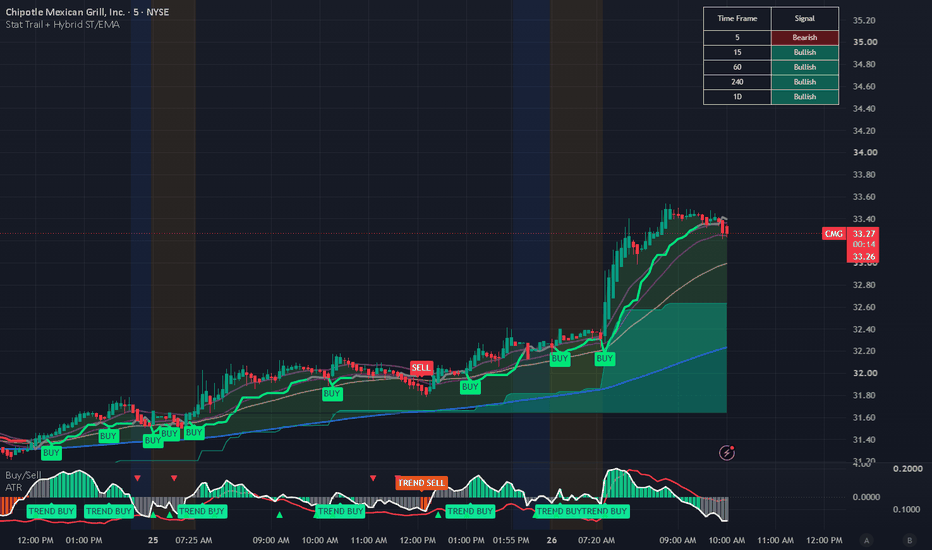
TW - Dual FlowZone MA Clouds## Dual FlowZone MA Clouds
Dual FlowZone MA Clouds is a trend visualization indicator designed to help traders quickly identify market direction, trend strength, and potential transitions before they become obvious.
Unlike traditional moving average indicators that simply plot one or two averages, Dual FlowZone MA Clouds uses two independent FlowZones to provide both short-term momentum and longer-term trend context in a single, easy-to-read visualization.
FlowZone A is designed to help identify momentum, pullbacks, and trend continuation, while FlowZone B provides higher timeframe directional bias and market context. When both FlowZones align, traders can quickly recognize strong trending conditions. When they diverge, the market may be transitioning or losing participation.
### Flow Status Table
The optional Flow Status table provides an instant summary of current market conditions without requiring traders to interpret multiple moving averages.
The table displays:
* **Primary Flow** – Current direction of FlowZone A (Bullish, Bearish, Neutral, or Weakening)
* **Secondary Flow** – Current direction of FlowZone B
* **Alignment** – Indicates whether both FlowZones are aligned or providing mixed signals
This allows traders to assess overall trend bias with a quick glance before analyzing price action.
### ORB-Style Visual Design
The Flow Status table uses the same visual style as the Traders Workshop ORB Sessions indicator, providing a consistent interface across the indicator suite.
### Chart Labels
When a FlowZone crossover occurs, optional chart labels identify the signal directly on the chart, making it easy to review historical trend changes without searching through moving average crosses.
The indicator also supports optional Flow Dots and subtle background bias to provide additional visual confirmation while keeping the chart clean and uncluttered.
### Features
• Two fully independent Moving Average FlowZones
• Supports SMA, EMA, WMA, RMA, VWMA and HMA
• Configurable MA lengths, colors and line widths
• Dynamic bullish, bearish and transition cloud coloring
• Optional Flow Status dashboard
• Optional crossover markers
• Optional Flow Dots
• Optional background trend bias
• Individual alerts for crossovers, trend changes and FlowZone alignment
Dual FlowZone MA Clouds is designed to complement price action—not replace it. Use it alongside market structure, volume, VWAP, auction concepts, and support/resistance to better understand trend quality and directional bias.
---
**Part of the Traders Workshop indicator collection**
**Real Trading. Real Testing. Real Results.**
Indikator

Pure CVD MACD (Momentum of Delta)Overview
Traditional MACD indicators are fantastic at measuring the momentum of price, but they are entirely blind to the actual order flow driving that price. The Pure CVD MACD shifts the focus from the result (price action) to the cause (market aggression).
Instead of asking "Are there more buyers or sellers?", this indicator asks "Is the buying or selling pressure accelerating or decelerating?"
Built using Pine Script Version 6 and the new ta.requestVolumeDelta function, this script calculates a classic MACD (Moving Average Convergence Divergence) entirely on the raw Cumulative Volume Delta (CVD), completely independent of price. This provides an institutional-grade look at the momentum of order flow.
How It Works
The script calculates a continuous Cumulative Volume Delta line by scanning lower timeframe data to find the exact net difference between buying and selling volume. It then applies standard MACD logic to that CVD line:
MACD Line (Blue): The difference between a Fast EMA and Slow EMA of the volume delta.
Signal Line (Orange): An EMA of the MACD Line itself.
Histogram: The visual difference between the MACD Line and the Signal Line, color-coded to show momentum shifts.
Key Order Flow Concepts to Trade
Momentum Shifts (Zero-Line Crossovers): When the histogram crosses above the zero line (Blue crosses over Orange), the volume delta is gaining bullish momentum. Even if the macro trend is down, this shows aggressive buyers are stepping in and accelerating their pace. A cross below zero signals accelerating bearish pressure.
Exhaustion (Histogram Fades): Watch for the color fades (Teal to Dark Teal, or Red to Dark Red). If you are watching a massive sell-off and the histogram prints a "Dark Red" bar, the selling pressure is decelerating. Sellers are running out of ammunition, often signaling an impending reversal.
Hidden Divergence: Compare the Pure CVD MACD to the price chart. If the price is grinding upward to make a Higher High, but the CVD MACD is crossing bearishly below its Signal Line, the breakout is running on fumes and a trap is likely being set.
Settings Breakdown
Anchor & Lower Timeframe: Defines the starting point for the cumulative delta and the timeframe used to calculate the intra-bar buying/selling volume. By default, it automatically selects the best lower timeframe.
Fast / Slow EMA Lengths (Default 12, 26): The lookback periods used to track the short-term vs. long-term trend of the volume delta.
Signal EMA Length (Default 9): The trigger line used to spot early momentum shifts in the delta.
Best Practices
Because this indicator measures the momentum of order flow rather than absolute volume, it pairs exceptionally well with structural price analysis or liquidity zones. When price taps a major support level and the Pure CVD MACD prints a bullish divergence or a histogram fade, you have highly confluent evidence that the level will hold. Indikator

Strategi
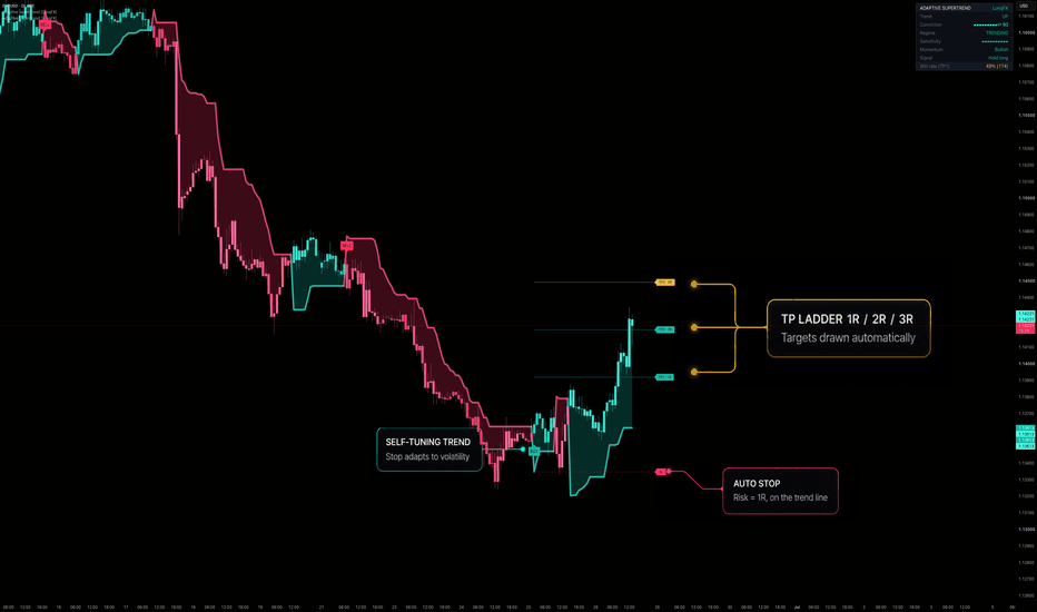
Adaptive SuperTrend -, Regime Filter & Buy/Sell Signals [LunqFX]Adaptive SuperTrend is a self-tuning trend indicator for TradingView that fixes the biggest flaw of the classic SuperTrend: a fixed multiplier that whipsaws in choppy markets and lags in fast ones. This version makes the SuperTrend multiplier adaptive — it automatically widens in high volatility and tightens in low volatility — and layers a regime filter and a momentum filter on top to deliver clean, non-repainting Buy/Sell signals with an automatic take-profit / stop-loss ladder and live performance stats. It works on forex, crypto, stocks, indices, futures, gold (XAUUSD) and Bitcoin (BTCUSD), on any timeframe, for scalping, day trading and swing trading. Built in Pine Script v6. Keywords: adaptive supertrend, supertrend, trend, trend following, buy sell signals, regime filter, ATR trailing stop, volatility, momentum, take profit, stop loss, risk reward, trend reversal, no repaint, scalping, day trading, swing trading.
◆ WHY ADAPTIVE
A normal SuperTrend uses one fixed multiplier for every market and every condition, so it gets shaken out in volatile phases and reacts too slowly in calm ones. Adaptive SuperTrend ranks current volatility against its own recent history (0–100%) and maps that onto a multiplier range — wide when the market is wild, tight when it is calm — with zero manual tuning. The same settings behave sensibly on EURUSD, BTCUSD and the S&P 500.
◆ WHAT IT DOES
Adaptive trend line + fill — a volatility-adjusted trailing stop that flips turquoise (up) / magenta (down).
Filtered Buy/Sell signals — a trend flip only fires as a signal when two filters agree.
Auto TP/SL ladder — on every signal it draws the stop (on the trend line) and TP1 / TP2 / TP3 at 1R / 2R / 3R, so you get a complete trade plan instantly.
Conviction Score 0–100 — one number summarising how strong the current setup is.
Live win-rate stats — the script tracks its own past signals on the fly.
Neon trend candles + a clean live dashboard.
◆ HOW IT WORKS (the concepts)
Adaptive multiplier: ATR is ranked by percentile over a lookback window; the percentile sets the SuperTrend multiplier between your min and max.
SuperTrend core: the standard trailing-stop formula, flipping direction when price closes beyond the band.
Regime filter (Kaufman Efficiency Ratio): directional travel divided by total path = how trending vs choppy the market is. Signals are blocked in low-efficiency (range) conditions to cut false signals.
Momentum check: a flip is only taken when price is on the matching side of its momentum EMA.
Conviction Score: a weighted blend of trend efficiency, momentum agreement and trend-line slope (0–100).
Live stats: each signal is tracked sequentially — a “win” = price reaches TP1 (1R) before the stop — with no lookahead.
◆ HOW TO USE IT
Take BUY / SELL labels in the direction of the new trend; the SL and TP1/2/3 ladder give you the exact plan and risk/reward.
Favour signals with a high Conviction Score and a TRENDING regime; stand aside when the dashboard shows RANGE.
Manage the trade to TP1/TP2/TP3 or trail with the adaptive line.
Tune Min/Max multiplier for tighter or looser stops and Efficiency threshold for how strict the range filter is.
Combine with your own support/resistance, structure or higher-timeframe bias for confluence.
◆ SETTINGS
Adaptive Trend: ATR length, min/max multiplier, volatility window.
Regime Filter: on/off, efficiency length, trend threshold.
Momentum Check: on/off, momentum EMA.
Visuals: trend fill, glow, neon candles, Buy/Sell labels.
Trade Levels & Stats: auto TP/SL ladder, live signal stats.
Panel: show/hide, position, background, accent.
◆ ALERTS
Buy signal · Sell signal · Trend flip up · Trend flip down.
◆ ORIGINALITY
The SuperTrend trailing-stop formula is a standard, public technique, implemented here from scratch. The adaptive volatility-percentile multiplier, the regime filter integration, the Conviction Score, the R-based TP/SL ladder and the live win-rate engine are my own original work. No third-party or copied code is used.
◆ LIMITATIONS
This is a trend/volatility tool, not a complete system — always confirm with price action and risk management.
Like all trend-following tools, it can chop in tight ranges; the regime filter reduces but cannot eliminate this.
The fixed-R stop in the ladder is a planning aid (constant 1R), separate from the trailing adaptive line — they are different stops by design.
The live win-rate is the indicator’s own TP1-vs-stop estimate; if a single bar tags both the stop and TP1 it is counted as a win, so treat the stat as indicative, not exact.
Past performance and live stats do not guarantee future results.
◆ NON-REPAINTING
Trend, regime, signals and stats are computed from confirmed bar data with no security() lookahead. A signal printed on a closed bar stays. As with any live tool, the forming bar updates in real time and settles on close.
Adaptive SuperTrend is an educational analysis tool, not financial advice. Always do your own research and manage risk. © LunqFX. Indikator
Indikator

Indikator
[ A L P H A X ] MERIDIAN - Session Intelligence EngineAlphaX MERIDIAN — Session Intelligence Engine: Multi-Session Range Tracking, Prior Session Break & Retest, Opening Range Breakout, Meridian Bounce & 7-Layer Confluence Scoring
AlphaX MERIDIAN is a professional-grade session-based trading system built around the foundational truth that institutional price delivery is not random across the clock — it is organized by session. The Asian session defines the overnight range. London breaks it. New York confirms the direction or reverses it. Every major intraday move originates from one of three specific events: a break and retest of the prior session's high or low, a breakout of the opening range, or a pullback to the session's meridian equilibrium level. MERIDIAN detects all three in real time across all three global trading sessions, scores every potential entry through a 7-layer confluence engine, and fires signals only when session bias, VWAP positioning, HTF alignment, volume, and setup quality all confirm simultaneously. The result is a system that puts every trade in its correct session context — not just where price is, but which session it is in , what the prior session established , and where the institutional session bias currently sits . Designed for active traders across forex, gold, indices, and crypto on M1 through H1 timeframes.
━━━━━━━━━━━━━━━━━━━━━━━━━━━━━━━━━━━━━━━━
🌐 The Session Framework — Why Sessions Define Institutional Flow
Every liquid market is driven by three geographically separated groups of institutional participants operating in overlapping but distinct time windows: Asian banks and sovereign funds, European institutional desks and London market makers, and American institutional desks and New York banks. Each group has a characteristic trading behavior that shapes price during their active window.
Asian Session — The Range Builder:
During Asian hours, liquidity is thinner and price tends to consolidate or range within a defined high-low channel. The Asian session range represents the overnight consolidation — the zone where price equilibrates before the European open. The extremes of the Asian range are the first liquidity pools that London will target.
London Session — The Trend Initiator:
London is the world's most liquid trading session. European institutional desks frequently break the Asian range in the first hours of the London open — hunting the liquidity sitting above and below the overnight extremes before establishing the day's primary directional trend. The London opening range (the first N minutes of the session) frequently establishes the high or low of the day.
New York Session — The Confirmer or Reverser:
New York either confirms the London trend with continuation, or reverses the late-London move in the early New York hours. The London/NY overlap (typically 13:00–17:00 UTC) is the highest-volume period of the day and frequently produces the largest directional moves.
MERIDIAN is built around this three-session cycle. The prior session's high, low, and meridian are the key reference levels. The opening range of London or NY is the breakout reference. The session VWAP and meridian divide the current session into institutional premium (above) and discount (below). Every signal is evaluated in the context of which session it occurred in and what the prior session established.
━━━━━━━━━━━━━━━━━━━━━━━━━━━━━━━━━━━━━━━━
⏱ Session Tracking Engine
MERIDIAN runs a fully independent session tracking system for all three global sessions simultaneously, configurable to any timezone.
Session detection:
Each session is defined by a configurable start and end hour in the selected timezone (default: UTC). The session engine detects the active session on every bar and correctly handles overnight sessions (sessions that span midnight). When no configured session is active, the system enters an OFF state and session-based calculations pause.
Session-by-session OHLC tracking:
From the first bar of each session, MERIDIAN tracks the rolling high, low, and open of the session in real time. Every new bar within the session extends these values — the session high and low expand with price, and the session meridian recalculates continuously as the range develops.
Session transition logic:
When a session changes, the completed session's high, low, and meridian are stored as the prior session reference. These prior session values persist until the next completed session overwrites them — giving you continuous access to the most recently completed session's key levels at all times.
Session VWAP (Volume Weighted Average Price):
A true session-anchored VWAP is computed from the first bar of each session — cumulative volume-weighted price divided by cumulative volume since the session open. This produces the purest possible VWAP calculation anchored to the correct institutional reference point: the session's opening bar.
Session Meridian (Equilibrium):
The midpoint of the current session's high-low range — (session high + session low) / 2. This level is the MERIDIAN line, plotted as a purple dotted line on the chart. It represents the current session's equilibrium — above is institutional premium, below is institutional discount, relative to where the session has traded.
Current session box:
The full range of the active session is visualized as a lightly tinted box extending from the session start bar to the current bar. Asian session boxes are gray, London boxes yellow-green tinted, and New York boxes red-tinted — providing immediate visual session identification across the chart.
━━━━━━━━━━━━━━━━━━━━━━━━━━━━━━━━━━━━━━━━
📍 Prior Session Levels — The Institutional Reference Grid
The most important reference levels in intraday trading are the extremes established by the prior session. These are not arbitrary horizontal lines — they represent the boundaries of the range where an entire session's worth of institutional activity occurred. Breaking these levels is how one session's institutional participants establish control over the next session's price delivery.
Prior Session High (red dashed):
The highest price reached during the most recently completed session. This is the sell-side resistance level — the level above which bears were unable to sustain prices in the prior session. A close above this level in the current session is a significant break of prior institutional resistance.
Prior Session Low (yellow-green dashed):
The lowest price of the prior session. This is the buy-side support level — where buyers successfully defended price in the prior session. A close below this level represents a break of prior institutional support.
Prior Session Meridian (purple dotted):
The midpoint of the prior session's range. This level frequently acts as a magnet — price is drawn to the prior session's 50% level on pullbacks, retracements, and continuation moves. It represents the most-traded price zone of the prior session in range-position terms.
All three prior session levels are plotted as forward-extending lines covering the relevant history window. The prior session name (ASIAN / LONDON / NEW YORK) is displayed on the dashboard so you always know which session's levels you are referencing.
━━━━━━━━━━━━━━━━━━━━━━━━━━━━━━━━━━━━━━━━
📦 Opening Range — The First N Minutes
The Opening Range (ORB) is one of the most consistently respected intraday reference structures across all liquid markets. It represents the range established in the first configurable number of minutes of the London or New York session (default: 30 minutes). Once the opening range is set, breakouts above and below its boundaries frequently produce the day's strongest directional moves.
How the opening range is built:
From the first bar of each London or New York session, MERIDIAN accumulates the highest high and lowest low across all bars that fall within the opening range time window. Once a bar falls outside the ORB time window, the range is locked — the ORB high and ORB low are fixed for the remainder of the session.
ORB visualization:
The completed opening range is rendered as an orange-tinted box on the chart, spanning from the first ORB bar to the last ORB bar. This box remains on the chart as a reference level for the session.
Dashboard ORB status:
The dashboard displays the ORB status as FORMING (while the range is still building) or SET (once locked), along with the exact ORB high and low prices. This gives you advance notice before the ORB is complete — you can watch it forming in real time and prepare for the Setup B breakout signal.
━━━━━━━━━━━━━━━━━━━━━━━━━━━━━━━━━━━━━━━━
📊 Session Bias — VWAP and Meridian Positioning
MERIDIAN defines the current session's directional bias through two independent price positioning checks that together create a clear institutional bias reading.
VWAP bias:
Price above the session VWAP indicates institutional net-buying for the session — the volume-weighted average of all transactions favors the bull side. Price below indicates net-selling. The VWAP bias is updated on every bar as new volume flows in.
Meridian bias:
Price above the session meridian (the session range midpoint) means price is in the upper, premium half of the session range. Price below is in the discount half.
Combined session bias:
sessBull — price is both above VWAP and above the session meridian. Both the volume-weighted and range-position measures confirm bullish institutional bias
sessBear — price is both below VWAP and below the session meridian. Both measures confirm bearish institutional bias
This combined bias is the most important single dashboard reading in MERIDIAN. A bullish session bias means the institutional context favors long entries. A bearish session bias favors shorts. Entries against the combined session bias carry the highest failure rate of any MERIDIAN setup.
━━━━━━━━━━━━━━━━━━━━━━━━━━━━━━━━━━━━━━━━
🏷 Three Setup Types — A, B, and C
MERIDIAN fires signals through three distinct setup configurations, each representing a different institutional entry scenario anchored to session-based reference levels. All three can be enabled simultaneously.
━━━━━━━━━━━━━━━━━━━━━━━━━━━━━━━━━━━━━━━━
Setup A — Prior Session Break & Retest
The most institutionally significant setup type. Fires when:
The current session's price closes above the prior session high (long) or below the prior session low (short) — the structural break of the prior session's boundary
Within 30 bars of the break, price pulls back to within ATR tolerance of the broken level
A qualifying rejection candle forms at the retest — confirming the broken level has flipped from resistance to support (long) or support to resistance (short)
Why prior session break and retest is the highest-quality setup: When London breaks the Asian high and then retests it, the break has been confirmed as a genuine institutional breakout rather than a wick spike. The retest at the prior session level provides the optimal entry price — buying exactly at the prior resistance that has now become support, with the stop below the level and the continuation target above. This is the institutional "break, retest, continue" sequence that produces the cleanest risk/reward in session-based trading.
Break detection markers: Small semi-transparent circles appear above (prior high break) or below (prior low break) the bar that closes through the prior session boundary — alerting you that a pending retest setup is now active. The system tracks the pending retest for up to 30 bars. If no qualifying retest occurs within that window, the pending state expires.
━━━━━━━━━━━━━━━━━━━━━━━━━━━━━━━━━━━━━━━━
Setup B — Opening Range Breakout
The high-momentum setup type. Fires when:
The opening range has been fully set (ORB locked after the opening range period has elapsed)
Price closes above the ORB high (long) or below the ORB low (short) — the first close-based break of the opening range boundary
The close is on the correct side of the prior bar's close relative to the ORB level — confirming the break is not a wick through and back
A qualifying bull or bear rejection candle (minimum 50% wick ratio) confirms the breakout bar's directional commitment
Why the ORB breakout is a high-conviction institutional signal: The opening range represents the indecision of the first N minutes of a session — the market testing price levels before committing to a direction. The first body close beyond the ORB boundary is the signal that the indecision has resolved and institutional order flow has committed to a direction. The rejection candle requirement ensures the break was not passive drift but a genuine directional conviction bar.
━━━━━━━━━━━━━━━━━━━━━━━━━━━━━━━━━━━━━━━━
Setup C — Meridian Bounce
The continuation and trend-following setup type. Fires when:
The session bias is fully established (sessBull for long, sessBear for short)
Price pulls back to within ATR tolerance of the session meridian (the session range midpoint)
A qualifying rejection candle forms — confirming the meridian held and price is rejecting back in the bias direction
Why the meridian bounce is a reliable continuation entry: In a trending session where price is above VWAP and above the session midpoint (sessBull), the meridian represents the natural pullback target — the highest-volume price zone within the session's lower half. Institutional buyers who missed the initial move use meridian pullbacks to add to positions. The rejection at the meridian in a sessBull environment is the continuation entry that offers the tightest stop (just below the meridian) with the continuation toward the session high as the target.
━━━━━━━━━━━━━━━━━━━━━━━━━━━━━━━━━━━━━━━━
🧠 The 7-Layer Confluence Engine
Every potential entry across all three setup types is scored through the same 7-layer confluence engine. The minimum default is 5 of 7.
━━━━━━━━━━━━━━━━━━━━━━━━━━━━━━━━━━━━━━━━
Layer 1 — Session Bias (Combined)
Awards 1 point when the combined session bias (sessBull for long, sessBear for short) agrees with the signal direction. This requires both VWAP positioning and meridian positioning to be aligned — the strongest single session-level directional indicator available.
━━━━━━━━━━━━━━━━━━━━━━━━━━━━━━━━━━━━━━━━
Layer 2 — VWAP Positioning
Awards 1 point when price is on the correct side of the session VWAP — above for longs, below for shorts. The VWAP layer is available independently from the combined session bias layer. On bars where price is above VWAP but below the meridian (or vice versa), the session bias may not score but the VWAP layer still contributes.
━━━━━━━━━━━━━━━━━━━━━━━━━━━━━━━━━━━━━━━━
Layer 3 — HTF Bias
Awards 1 point when the higher timeframe EMA structure (default: 60-minute, 21/55 EMA pair) agrees with the signal direction. Ensures the session-level setup is aligned with the macro institutional flow. A session setup against the HTF trend carries the highest failure rate of any setup type.
━━━━━━━━━━━━━━━━━━━━━━━━━━━━━━━━━━━━━━━━
Layer 4 — Trading Session Enabled
Awards 1 point when the current session is one of the configured tradeable sessions (London and NY on by default, Asian off by default). This layer enforces session selectivity — preventing signals from firing during sessions you have chosen not to trade. If the Asian session is disabled for trading, Asian session signals are blocked at this layer regardless of how strong the other confluences are.
━━━━━━━━━━━━━━━━━━━━━━━━━━━━━━━━━━━━━━━━
Layer 5 — Volume Expansion
Awards 1 point when the current bar's volume exceeds the volume moving average by the configured minimum multiplier (default: 1.1×). Confirms that the rejection candle or breakout bar has genuine institutional participation behind it — not a low-volume drift through a reference level.
━━━━━━━━━━━━━━━━━━━━━━━━━━━━━━━━━━━━━━━━
Layer 6 — Rejection Candle Quality
Awards 1 point when a qualifying bull or bear rejection candle is present. Bull rejection requires a bullish close with the close-to-low distance exceeding 50% of the bar range. Bear rejection requires a bearish close with the high-to-close distance exceeding 50%. This layer ensures the reference level produced a visible, decisive price rejection — not a passive touch.
━━━━━━━━━━━━━━━━━━━━━━━━━━━━━━━━━━━━━━━━
Layer 7 — Setup Type Trigger
Awards 1 point when any of the three enabled setup types fires on the current bar — a prior session retest (Setup A), an ORB breakout (Setup B), or a meridian bounce (Setup C). This layer is both a confluence score contributor and a hard prerequisite — no signal can fire without at least one setup type triggering.
━━━━━━━━━━━━━━━━━━━━━━━━━━━━━━━━━━━━━━━━
🕯 Rejection Candle Confirmation
All three setup types require a qualifying rejection candle for a signal to fire. Two candle types qualify:
Bull rejection: A bullish close (close above open) where the distance from close to bar low exceeds 50% of the total bar range. The bar closed in its upper half — buyers dominated and rejected the level being tested.
Bear rejection: A bearish close where the distance from bar high to close exceeds 50% of the total range. The bar closed in its lower half — sellers dominated the rejection.
The same 50% wick threshold applies across all three setup types, ensuring every MERIDIAN signal has a consistent, minimum candle quality standard regardless of which session event triggered it.
━━━━━━━━━━━━━━━━━━━━━━━━━━━━━━━━━━━━━━━━
🎯 Session-Anchored Stop Loss Placement
MERIDIAN places the stop loss at the most conservative of several session-based reference levels, plus an ATR buffer.
For bull signals: The stop is placed at the minimum of the current bar's low, the prior session high (the retested level), the ORB low (if applicable), and the session meridian — whichever is lowest — minus the configured ATR buffer (default: 1.0× ATR). This ensures the stop is beyond the level that would structurally invalidate the signal.
For bear signals: The stop is at the maximum of the current bar's high, the prior session low, the ORB high, and the session meridian, plus the ATR buffer.
Dynamic TP target: The take profit is computed as `risk × R multiple` (default: 2.5R) from the entry close — adapting to the actual stop distance rather than using a fixed ATR projection. On entries where the session reference stop is very close to entry, this naturally produces a tighter target; on wider stops, the target scales accordingly.
━━━━━━━━━━━━━━━━━━━━━━━━━━━━━━━━━━━━━━━━
📊 Live Dashboard
The 16-row real-time dashboard displays the complete internal state across five sections.
SESSION
Active — the currently active session: ASIAN, LONDON, NEW YORK, or OFF
VWAP Bias — ▲ ABOVE or ▼ BELOW, showing whether price is above or below the session VWAP. Color-coded yellow-green and red
Meridian — the exact price of the current session's equilibrium midpoint (session high + low / 2), color-coded purple
PRIOR SESSION
Prior Sess — which session completed most recently: ASIAN, LONDON, or NEW YORK
Prior Hi / Lo — the exact high and low of the prior session displayed as a price pair. These are the Setup A reference levels
OPENING RANGE
ORB Status — FORMING (still within the ORB time window) or SET (locked, breakout mode active). Orange when SET
ORB Hi / Lo — the exact opening range high and low prices once the range is locked
FILTERS
HTF Bias — higher timeframe EMA alignment: ▲ BULL, ▼ BEAR, or — FLAT
CONFLUENCE
Bull Score — live 0–7 score. Background highlights yellow-green when threshold is met
Bear Score — live 0–7 score. Background highlights red when threshold is met
Live confluence label: During active sessions, a small label near the session box displays B x/7 · S x/7 in real time, updated every bar — identical to ANCHOR, PIVOT, and the other systems in the AlphaX suite.
━━━━━━━━━━━━━━━━━━━━━━━━━━━━━━━━━━━━━━━━
📈 Chart Visual System
Current Session Box — a lightly tinted box covering the full range of the active session from its first bar to the current bar. Gray for Asian, yellow-green tinted for London, red tinted for New York
Session VWAP (cyan) — the volume-weighted average price anchored to the session start, plotted as a solid cyan line. The most important intraday reference for institutional fair value
Session Meridian (purple dots) — the session range midpoint (50% of the current session's high-low range), continuously updated
Prior Session High (red dashed) — the completed prior session's high. Setup A reference level for long setups
Prior Session Low (yellow-green dashed) — the prior session's low. Setup A reference level for short setups
Prior Session Meridian (purple dotted) — the midpoint of the prior session's range
Opening Range Box (orange tinted) — the locked ORB from the session start to the end of the opening range period. Setup B reference box
● Break markers (semi-transparent circles) — appear above the bar (prior high break) or below (prior low break) at the moment of the structural break, signaling a pending retest opportunity
▲ Triangle (below bar, yellow-green) — long signal. All conditions confirmed across any of the three setup types
▼ Triangle (above bar, red) — short signal
Live confluence label — B x/7 · S x/7 near the current session range on the last bar
SL Guide (red dotted circles) — session-anchored stop loss reference level
TP Guide (yellow-green dotted circles) — dynamically computed reward target
━━━━━━━━━━━━━━━━━━━━━━━━━━━━━━━━━━━━━━━━
🚀 How to Trade with AlphaX MERIDIAN — Step by Step
Step 1 — Begin Each Session with a Reference Review
At the start of each London or NY session, check the dashboard for Prior Hi / Lo — these are your key Setup A reference levels for the session
Note the ORB Status — during the first 30 minutes of London or NY, watch the ORB forming. The ORB Hi / Lo will be your Setup B breakout reference once SET
Check HTF Bias — does the higher timeframe trend favor longs or shorts? This is the filter that determines which direction's signals you prioritize
Step 2 — Monitor Session Bias Development
As the session opens and develops, watch the VWAP Bias and Meridian rows on the dashboard. When both show ▲ ABOVE, the session bias is fully bullish — prioritize long setups. Both ▼ BELOW = prioritize shorts
Watch the live B/S score label near the session box. When the bull or bear score approaches the threshold, a signal may be imminent
Step 3 — Enter on the MERIDIAN Signal
A ▲ triangle below the bar confirms one of the three setup types has fired with sufficient confluence
Read the signal context: did price just retest the prior session high? Break the ORB? Bounce from the session meridian? The setup type determines which level your stop references
The SL and TP guides appear as dotted circles. The SL is the session-anchored structural stop. The TP is the R-multiple target
Setup A retests are the highest-quality entries — the prior session level has been validated as the new support/resistance. Setup B ORB breaks are highest-momentum. Setup C meridian bounces are best in strongly trending sessions
Step 4 — Manage Within the Session Context
Watch the session VWAP as the trade develops — price returning to VWAP during a long trade is a warning sign that session bias may be weakening
If the session meridian switches sides (price moves from above to below the session midpoint), the session bias has flipped. Consider tightening the stop or taking partial profit
Session transitions are exits: if London closes while you are in a trade, the session reference levels will update to New York levels on the NY open. Reassess the position in the context of the new session
Step 5 — End of Session Reset
At session end, the current session's high, low, and meridian become the prior session reference for the next session
The ORB resets for the new session's opening
Review the completed session's range and meridian before the next session opens — these become your Setup A reference levels going forward
━━━━━━━━━━━━━━━━━━━━━━━━━━━━━━━━━━━━━━━━
⚠ Identifying Low-Quality Conditions — When Not to Trade
Stand aside when:
Session shows OFF — no active session is being tracked. All signals are blocked and session reference levels may be stale
Session bias is split — VWAP and Meridian disagree — price above VWAP but below the session meridian (or vice versa) means the session has no clear institutional direction. The combined session bias layer will not score, reducing confluence quality
HTF Bias opposes the session bias — a bullish session bias against a bearish HTF means the current session is moving counter to the macro trend. These setups carry significantly higher reversal risk
ORB Status shows FORMING — the opening range has not been locked. No Setup B signals can fire. Do not anticipate the ORB breakout before the range is set
Prior Hi / Lo shows — on the dashboard — no completed prior session data is available. Setup A setups cannot fire. This occurs at the start of the first session after the chart loads
Confluence score is at minimum threshold exactly — when the score is at exactly the minimum and one or two filters are failing, the setup is borderline. Reduce position size or wait for a higher-quality signal
Multiple setup types firing simultaneously in the same direction — this is usually a positive signal, but verify the session context. If the ORB breakout, prior session retest, and meridian bounce are all triggering at the same time in the same bar, one of them is likely being triggered by coincidental price overlap rather than genuine session mechanics
The ideal MERIDIAN setup:
London or NY session active with tradeSessOk confirmed
HTF Bias and Session Bias both aligned in the same direction
Prior session high or low recently broken (Setup A pending) OR ORB locked and ready for Setup B
Price returning to the reference level with VWAP and Meridian both on the correct side
Strong rejection candle with volume above average
Confluence score at 6/7 or 7/7
━━━━━━━━━━━━━━━━━━━━━━━━━━━━━━━━━━━━━━━━
⚡ Key Features
🌐 Three-session tracking engine — Asian, London, and New York sessions tracked simultaneously with configurable start/end hours and timezone support
📊 Session-anchored VWAP — true cumulative VWAP computed from the first bar of each session, providing the most accurate institutional fair value reference per session
📍 Prior session levels — high, low, and meridian of the most recently completed session maintained and displayed as dashed reference lines
📦 Opening Range Box — first N minutes of London/NY captured as an orange ORB box with live FORMING / SET status. Breakout reference for Setup B
⚖ Session Meridian (Equilibrium) — the session range midpoint plotted as a purple dotted line, the equilibrium level for Setup C bounces and the combined session bias divider
🏷 Three setup types — Setup A (Prior Session Break & Retest), Setup B (Opening Range Breakout), Setup C (Meridian Bounce) — all configurable independently
🔮 Pending retest tracking — 30-bar retest window after every prior session break, with break circle markers at the moment of the structural break
🧠 7-layer confluence engine — Session Bias, VWAP Position, HTF Bias, Trading Session Gate, Volume Expansion, Rejection Candle, and Setup Type Trigger scored independently every bar
📊 Live confluence label near the session box — B x/7 · S x/7 updating in real time on the current bar
🎯 Session-anchored stop loss — stop placed at the most conservative of multiple session reference levels, not a fixed ATR distance
💹 Dynamic R-multiple TP target — computed as risk × R multiple, adapting to the actual stop distance
📡 HTF EMA bias filter — dual-condition higher timeframe alignment (EMA crossover + price confirmation)
⏱ Session trading filter — independently enable or disable signal firing for each of the three sessions
🎨 Session-coded color system — session box tints differentiate Asian (gray), London (yellow-green), and New York (red) at a glance
📊 16-row live dashboard — Session, Prior Session, Opening Range, Filters, and Confluence sections updated in real time
🔔 6 alert conditions — long/short entry, prior high/low break, ORB long/short breakout
⚙ Fully configurable — all session hours, timezone, ORB duration, setup type enables, confluence minimum, HTF timeframe and EMAs, volume filter, session trading gates, SL buffer, R-multiple target, and all colors are independently adjustable
━━━━━━━━━━━━━━━━━━━━━━━━━━━━━━━━━━━━━━━━
⚙ Settings Reference
Session Engine
Session Timezone — UTC / America/New_York / Europe/London / Asia/Tokyo. Set to your preferred reference timezone
Track Asian Session — toggle Asian session tracking on or off
Asian Start / End (hour) — hour boundaries for the Asian session in the selected timezone (defaults: 0 / 8)
Track London Session — toggle London session tracking
London Start / End (hour) — hour boundaries for London (defaults: 8 / 13)
Track NY Session — toggle New York session tracking
NY Start / End (hour) — hour boundaries for NY (defaults: 13 / 21)
Opening Range (mins) — the number of minutes from the session open used to build the ORB (default: 30)
Entries & Confluence
Setup A · Prior Session Break & Retest — toggle the break-and-retest setup type
Setup B · Opening Range Breakout — toggle the ORB breakout setup type
Setup C · Meridian Bounce — toggle the session equilibrium bounce setup type
Retest Tolerance (xATR) — maximum ATR distance from the reference level that still qualifies as a retest (default: 0.35)
Min Confluence Layers (of 7) — minimum score to fire a signal (default: 5)
Show Entry Signals — toggle signal triangles
Show Confluence Label — toggle the live B/S score label near the session box
Signal Cooldown (bars) — minimum bars between consecutive signals (default: 6)
Filters
HTF Trend Filter — toggle the higher timeframe EMA alignment requirement
HTF Timeframe — the higher timeframe for EMA data (default: 60-minute)
HTF Fast / Slow EMA — EMA periods on the HTF (defaults: 21 / 55)
Volume Confirm — when on, entry volume must exceed the average by the minimum multiplier
Min Volume vs Avg — minimum volume ratio (default: 1.1)
Volume Avg Length — SMA length for volume baseline (default: 20)
Trade London Session — when on, signals can fire during London hours
Trade NY Session — when on, signals can fire during NY hours
Trade Asian Session — when on, signals can fire during Asian hours (default: off — Asian sessions typically produce lower-quality setups)
Exit Guidance
ATR Length — ATR calculation lookback (default: 14)
Show SL / TP Guides — toggle stop and target dotted circle plots
SL Distance (xATR) — ATR buffer added beyond the session-anchored stop reference (default: 1.0)
TP Reward (R) — take profit as a multiple of the actual risk from entry to stop (default: 2.5)
Display
Show Current Session Box — toggle the session range box
Show Prior Session H/L — toggle prior session high, low, and meridian dashed lines
Show Session VWAP — toggle the session VWAP line
Show Opening Range Box — toggle the ORB orange box
Show Dashboard — toggle the full dashboard panel
Dashboard Position — Top Left / Top Right / Bottom Left / Bottom Right
Colors
Bull / Bull Bright — yellow-green family for all bullish signals and London session elements
Bear / Bear Bright — red family for all bearish signals and NY session elements
Opening Range — orange for ORB box and status indicators
Meridian / EQ — purple for session meridian, prior session meridian, and equilibrium elements
Session VWAP — cyan for the session VWAP line
SL Guide / TP Guide — stop and target circle colors
Dash Text / Dash BG / Dash Header / Dash Section / Dash Frame — full dashboard color control
━━━━━━━━━━━━━━━━━━━━━━━━━━━━━━━━━━━━━━━━
🔔 Alert Conditions (6 total)
Entry Alerts
Meridian Long — all conditions confirmed. Long signal fired
Meridian Short — all conditions confirmed. Short signal fired
Structure Alerts
Meridian Break Prior High — price has closed above the prior session high. Setup A long retest window is now active — watch for the retest
Meridian Break Prior Low — price has closed below the prior session low. Setup A short retest window is now active
Opening Range Alerts
Meridian ORB Long — opening range broken to the upside with all setup and confluence conditions confirmed
Meridian ORB Short — opening range broken to the downside with all conditions confirmed
All alert messages are formatted as const strings for clean webhook and notification platform integration.
━━━━━━━━━━━━━━━━━━━━━━━━━━━━━━━━━━━━━━━━
🎯 Recommended Settings by Instrument & Timeframe
The default configuration is optimized for XAUUSD, major forex pairs, and indices on M5–M15 in UTC timezone:
Session hours in UTC — gold and forex are most active during London (08:00–13:00) and NY (13:00–21:00) hours. Asian session trading is disabled by default for clean intraday setups
ORB at 30 minutes — the classic institutional opening range. The first 30 minutes of London and NY frequently establish the session's directional commitment
Retest tolerance at 0.35× ATR — sensitive enough to catch genuine retests on M5–M15 without requiring price to tick exactly at the level
TP Reward at 2.5R — session-based setups on gold and forex typically produce moves sufficient to achieve 2.5R when the session bias is correctly identified
For other instruments or timeframes, adjust:
M1–M3 scalping — reduce Cooldown to 3, reduce SL Buffer to 0.5, reduce TP Reward to 1.5–2.0, use tighter Retest Tolerance at 0.2
H1 intraday swing — increase ORB to 60 minutes (capturing the first full H1 candle), increase Retest Tolerance to 0.5, increase TP Reward to 3.5–4.0, set HTF to H4 or Daily
Crypto (BTC, ETH) — use UTC timezone, enable all three sessions (crypto trades 24/7), reduce retest tolerance to 0.25 for the narrower wicks typical of crypto support/resistance retests
Indices (NAS100, US30) — focus exclusively on NY session (13:30–20:00 UTC for US equity cash session), disable London trading for equity index instruments, tighten ORB to 15 minutes (the US equity opening range is frequently set in the first 15 minutes)
More signals — lower Min Confluence to 4, enable Asian trading, disable volume filter
Highest-quality only — raise Min Confluence to 6–7, enable only Setup A and B (disable meridian bounce), require London and NY only
━━━━━━━━━━━━━━━━━━━━━━━━━━━━━━━━━━━━━━━━
👥 Who This Is For
⏱ Session traders and market structure players — MERIDIAN is the definitive session intelligence system. Every reference level, every bias indicator, and every signal type is anchored to the session clock
🥇 Gold (XAUUSD) and forex intraday traders — the three-session framework is most powerful on instruments where London and New York session transitions drive the most significant intraday moves. Default settings are calibrated for gold and major forex pairs
📊 Opening range traders — the ORB system provides a complete, rules-based opening range breakout framework with confluence scoring, volume confirmation, and rejection candle quality filtering
🎯 Break-and-retest traders — Setup A is the quantitative implementation of the prior session break and retest — the most reliable institutional intraday pattern across all liquid markets
🧠 Traders who use VWAP as a primary reference — the session-anchored VWAP and the VWAP-based bias scoring system make MERIDIAN the ideal companion for any VWAP-centric trading approach
📈 Traders who want session context on every trade — every signal label, every dashboard row, and every reference level in MERIDIAN tells you exactly where you are in the session cycle and what the institutional context is
⚠ Traders who struggle with time-of-day discipline — the session trading gates (enable/disable individual sessions) enforce time-of-day discipline automatically. If you do not trade the Asian session, disable it and no Asian signals will ever appear
━━━━━━━━━━━━━━━━━━━━━━━━━━━━━━━━━━━━━━━━
📝 Notes
All signals are confirmed on bar close — the indicator is non-repainting by design. Session state, VWAP, meridian, ORB values, and confluence scoring all finalize on confirmed bars only
The session boxes and prior session lines are redrawn on the last bar only for chart performance. On very fast timeframes with long chart history, this redraw happens on every new bar's render — this is normal behavior for last-bar-only visual updates
The VWAP is a true session-anchored VWAP — it resets at each session's first bar and accumulates correctly through the entire session. It is not a daily VWAP or a rolling VWAP
The prior session data updates at session transitions. On the very first session after the chart loads, no prior session data may be available — the Prior Hi / Lo dashboard rows will show — until the first session completes
The 30-bar retest window for Setup A (prior session break and retest) starts from the bar of the break. If no retest occurs within 30 bars, the pending retest state expires. On slower timeframes (H1), 30 bars may cover many hours — consider reducing the window or accepting that H1 retests sometimes take longer to develop
Maximum 500 labels, 500 lines, and 50 boxes are rendered. With three sessions each potentially drawing boxes and lines, the limit is practically sufficient for standard chart history. On very long chart histories on very fast timeframes, the oldest visual elements may be removed by TradingView's rendering limits
The session timezone setting must match the timezone in which you want session boundaries defined. UTC is the default and recommended for instruments that trade globally. For US equity index traders, America/New_York may be more intuitive
The indicator does not connect to any broker or account — the dashboard and signals are purely analytical
━━━━━━━━━━━━━━━━━━━━━━━━━━━━━━━━━━━━━━━━
⚠ Disclaimer
This indicator is a technical analysis and visualization tool intended for educational and informational purposes only. It does not constitute financial advice or a recommendation to buy or sell any financial instrument. All signals are generated from historical and real-time price data using mathematical calculations — their accuracy or profitability is not guaranteed. Past performance of any signal type does not guarantee future results. Always conduct your own analysis, use proper risk management, and consult a licensed financial advisor before making any trading decisions. The author accepts no responsibility for any losses incurred from the use of this indicator.
━━━━━━━━━━━━━━━━━━━━━━━━━━━━━━━━━━━━━━━━
Built for traders who understand that the market tells a different story in every session — and who want a system that reads each chapter in real time. Indikator
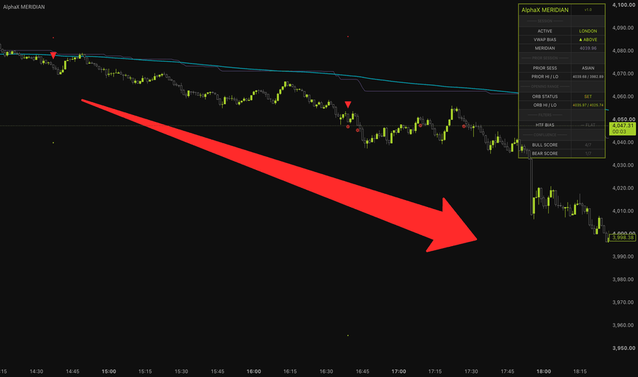
NLMS Volatility Trail [BackQuant]NLMS Volatility Trail
Overview
NLMS Volatility Trail is an adaptive trend-following overlay that combines a machine-learning style adaptive filter with a volatility-based trailing structure. It is built around the Normalized Least Mean Squares (NLMS) algorithm, then converts that adaptive estimate into an ATR-based trailing line designed to follow directional regimes while filtering out minor noise.
The indicator has two core layers:
An NLMS adaptive filter , which learns a dynamic price estimate from prior bars.
An ATR volatility trail , which converts that learned estimate into a step-like directional trailing structure.
The goal is to produce a trend line that is more adaptive than a traditional moving average and more structured than a raw adaptive filter. The NLMS engine learns the underlying price path, while the ATR trail adds volatility-aware confirmation so trend shifts only occur when the adaptive estimate moves meaningfully.
Core idea
Most trend filters use fixed smoothing rules. An EMA, SMA, WMA, or HMA always applies the same mathematical weighting scheme regardless of whether the market is trending, ranging, expanding, or compressing.
NLMS is different. It continuously updates its internal weights based on prediction error.
This means the filter is not just averaging price. It is constantly asking:
How well did the previous weighting structure predict the current bar?
How large was the error?
How should the weights adjust to reduce future error?
The second layer then takes that adaptive estimate and applies an ATR-based trailing mechanism around it. This creates a volatility-adjusted trend trail that reacts to confirmed shifts while ignoring smaller movements that do not exceed the range structure.
What NLMS is
NLMS stands for Normalized Least Mean Squares . It is an adaptive filtering algorithm from digital signal processing. It is closely related to the original LMS algorithm developed by Bernard Widrow and Ted Hoff, which became one of the foundational online learning methods used in adaptive systems.
Adaptive filters have historically been used in:
Noise cancellation
Echo cancellation
Telecommunications
Radar and sonar processing
Signal prediction
Control systems
The basic purpose is to estimate or predict a signal while continuously adapting to changing conditions.
In trading terms, this indicator uses NLMS to build a learned estimate of price from prior bars.
How the NLMS filter works
The filter uses a set of historical inputs called taps .
If taps = 72, the model uses the previous 72 bars:
source
source
source
...
source
Each tap has a learned weight.
The prediction is calculated as:
prediction = w1 × source + w2 × source + ... + wM × source
The filter then compares the prediction to the actual current source:
error = source - prediction
That error drives the weight update.
If the prediction was poor, the weights adjust more.
If the prediction was accurate, the weights adjust less.
This creates an adaptive estimate that evolves with market behavior.
Why it is normalized
The normal LMS algorithm updates weights based on the raw input and prediction error. The issue is that if the input signal becomes large or volatile, updates can become unstable.
NLMS solves this by dividing the update by the input power:
power = sum(source ²)
The update becomes:
w = w + (μ / (ε + power)) × error × input
This normalization makes the learning process more stable across different volatility environments.
When the input power is high:
Updates are scaled down.
The filter avoids overreacting.
When the input power is low:
Updates are allowed to remain meaningful.
This is why NLMS is better suited to markets than a basic adaptive filter. Markets constantly shift between quiet and volatile regimes.
Weight initialization
The script initializes all weights equally:
weight = 1 / M
This means the filter starts with an SMA-like prior. Before learning begins, every historical bar contributes equally.
Over time, the filter adapts away from that equal-weight baseline and learns its own weighting structure.
Inputs that control the NLMS engine
Filter Taps (M)
Controls how many historical bars the model learns from.
Higher taps:
More memory
Smoother adaptive estimate
Slower response to regime change
Lower taps:
Less memory
Faster reaction
More noise sensitivity
Step Size (μ)
Controls the learning rate.
Lower μ:
Slower learning
Smoother output
More stable
Higher μ:
Faster learning
More responsive
Can become noisy if too aggressive
This is one of the most important settings. It controls how quickly the model changes its internal weights.
Regularization (ε)
Prevents instability when input power is very low.
It acts as a stabilizer in the denominator:
ε + power
Higher values make updates more conservative.
Lower values allow stronger adaptation but can become less stable in quiet conditions.
From adaptive filter to volatility trail
The raw NLMS output is not plotted directly as the main trend line. Instead, it is passed into a volatility trailing structure.
The script builds an ATR band around the NLMS estimate:
Upper band = NLMS output + ATR × factor
Lower band = NLMS output - ATR × factor
Then it creates a trailing value that only updates when the NLMS band structure forces it to move.
This creates a trail that behaves similarly to a volatility stop, but the center is not price or hl2. It is the learned NLMS estimate .
ATR volatility trail logic
The trail starts from the NLMS output, then carries forward its previous value:
nlmsAtr := previous nlmsAtr
Then:
If lower band rises above the trail, the trail moves up.
If upper band falls below the trail, the trail moves down.
This creates a directional trailing structure:
In bullish regimes, the trail ratchets upward.
In bearish regimes, the trail ratchets downward.
It filters out small movements because price must move enough relative to ATR and the adaptive estimate to change the trail direction.
Why combine NLMS with ATR
NLMS alone gives an adaptive estimate, but it can still wiggle as the model learns.
ATR alone gives volatility structure, but it is usually tied to raw price and fixed smoothing.
Combining them gives:
Adaptive intelligence from NLMS.
Volatility confirmation from ATR.
Cleaner trend state transitions.
Less dependence on fixed moving-average assumptions.
The NLMS model learns the underlying price behavior, while ATR decides whether movement is large enough to matter.
Trend direction
Trend flips are detected from the trail itself:
Bullish when nlmsAtr crosses above its previous value.
Bearish when nlmsAtr crosses below its previous value.
This means signals are generated when the volatility trail changes direction, not when price simply crosses the line.
That is important because:
The trail must structurally move.
The signal is tied to confirmed trail direction.
Noise around the line does not automatically create a flip.
Visual design
The indicator includes several visual layers.
Main trail line
The central plotted line is the NLMS ATR trail. It changes color based on the current trend state:
Green for bullish trail direction.
Red for bearish trail direction.
Gray before a trend state is established.
Gradient fill
The script fills the space between price and the trail:
If price is above the trail, bullish fill is shown.
If price is below the trail, bearish fill is shown.
The fill is stronger near the trail and fades toward price, making the trail feel like the active structural reference.
Trail glow
A soft glow is drawn around the trail using a small ATR offset:
glow = ATR(14) × 0.06
This highlights the trail visually without cluttering the chart.
Trend candles
Candles are colored by trend state:
Bullish trend = bullish candles.
Bearish trend = bearish candles.
This allows the script to function as a complete regime overlay.
How to interpret the indicator
Bullish state
A bullish state occurs when the NLMS volatility trail turns upward.
This suggests:
The adaptive filter is shifting higher.
The ATR trail has confirmed upward structure.
Trend pressure has turned bullish.
Bearish state
A bearish state occurs when the NLMS volatility trail turns downward.
This suggests:
The adaptive estimate is shifting lower.
The volatility trail has confirmed downside structure.
Trend pressure has turned bearish.
Price above the trail
Generally indicates bullish structure.
Price below the trail
Generally indicates bearish structure.
But the most important signal is the direction of the trail itself, not every price touch.
How to use it in practice
1) Trend following
Use the trail direction as the primary bias:
Favor longs when the trail is bullish.
Favor shorts when the trail is bearish.
2) Dynamic support/resistance
The trail can act like a dynamic structural level:
In uptrends, pullbacks toward the trail can act as support.
In downtrends, rallies toward the trail can act as resistance.
3) Trade management
The trail can be used as:
A trailing stop guide.
A regime invalidation level.
A trend continuation reference.
4) Regime filtering
Because the line adapts using NLMS and only flips when the volatility trail turns, it can be used to filter other entries:
Take only long setups during bullish trail regimes.
Take only short setups during bearish trail regimes.
Avoid countertrend trades when the trail is strongly directional.
Difference from normal Supertrend or ATR trails
A normal ATR trail is usually built directly from price or hl2.
This indicator is different because the trail is built around an adaptive learned estimate.
That means:
The centerline is not raw price.
It is not a fixed moving average.
It is a continuously learned NLMS estimate.
So the trail has a different character:
More adaptive than a standard moving average trail.
More stable than a raw price-based ATR stop.
More responsive to changing market structure than fixed filters.
Difference from the NLMS Adaptive Trend Filter
The NLMS Adaptive Trend Filter plots the learned estimate directly and reads trend from its slope.
NLMS Volatility Trail goes one step further:
It uses the learned estimate as the base.
Then wraps it with ATR structure.
Then turns that into a trailing regime line.
So this version is more structure-oriented and better suited for trailing trend behavior.
Parameter tuning
Taps
Use higher taps for smoother trend structure.
Use lower taps for faster adaptation.
Step Size
Use lower step size for stability.
Use higher step size for responsiveness.
Regularization
Use higher regularization when the filter feels unstable.
Use lower regularization when the filter is too sluggish.
ATR Period
Controls volatility estimate:
Shorter = more reactive trail.
Longer = smoother trail.
ATR Factor
Controls band width:
Higher factor = wider trail, fewer flips.
Lower factor = tighter trail, more flips.
Strengths
Combines adaptive filtering with volatility trailing logic.
Learns from market structure instead of using fixed weights.
Uses ATR to reduce noise and confirm meaningful movement.
Good for trend following and trailing stop frameworks.
Visually clean with gradient fill and candle coloring.
Limitations
Still reactive, not predictive.
Can lag during violent reversals.
High learning rates may create noise.
Low ATR factors may cause whipsaws.
Requires tuning for timeframe and asset volatility.
Summary
NLMS Volatility Trail combines an adaptive NLMS predictor with an ATR-based trailing structure. The NLMS layer continuously learns a dynamic estimate of price from historical bars, while the ATR trail converts that estimate into a cleaner directional regime line. This makes the indicator more adaptive than a traditional moving average and more structured than a raw adaptive filter. It is best used as a trend-following overlay, dynamic support/resistance guide, and volatility-aware trailing framework.
Indikator
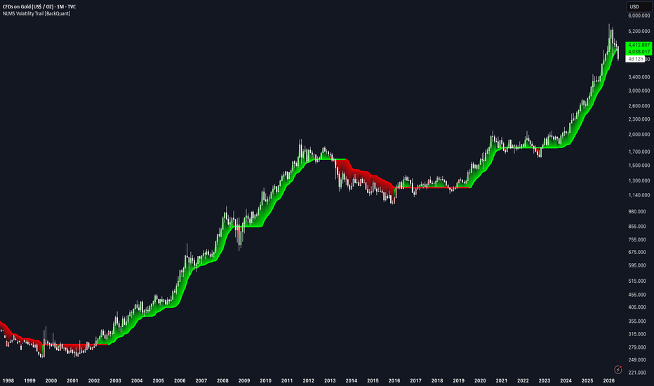
Indikator

Indikator

Indikator

Indikator

Indikator

Indikator

NG Trendlines & Market Structure# NG Trendlines & Market Structure
NG Trendlines & Market Structure is a proprietary trading indicator designed to identify high-probability market structure, trendline compression, and breakout opportunities.
The indicator combines dynamic trendlines, higher-timeframe directional bias, support and resistanceand market structure analysis to help traders identify periods of consolidation before momentum expansion.
## Features
* Automatic trendline detection
* Compression and breakout identification
* Multi-timeframe trend bias (5m, 15m, 1H, 4H)
* Dynamic support and resistance zones
* Market state identification (Bull, Bear, Range, Breakout)
* VWAP touch detection with customizable alerts
* Visual breakout confirmation
* Clean, non-repainting signals based on confirmed price action
## Alerts
Alerts can be configured for:
* Price touching VWAP
* Bullish breakout confirmation
* Bearish breakout confirmation
* Trend direction changes
* Market state transitions
This indicator is designed to assist traders in understanding market structure and improving trade timing. It is intended as a decision-support tool and should be used alongside proper risk management and trade confirmation.
**Disclaimer:** This indicator does not guarantee profits or trading success and should not be considered financial advice. Trading financial markets involves substantial risk, and past performance is not indicative of future results.
Indikator

Indikator