Echo Vector PVSRA Volume### Credits and licence
The starting point for the relative-volume and volume-spread classification framework was the open-source “Traders Reality PVSRA Volume Suite,” originally created by infernix with library integration by peshocore, under the Mozilla Public License 2.0.
This derivative is independently named and does not use the Traders Reality or Pattern Watchers names as its branding.
The imported library calculation has been replaced with script-level calculations. This implementation adds configurable volume tiers, price-extension filters, volume divergence, optional divergence lines, extreme-volume event detection, body-recovery measurements, expanded alerts, and simplified historical outcome tables.
### Overview
Echo Volume Structure is a volume-analysis indicator that classifies candles according to:
* reported volume;
* candle direction;
* candle range;
* volume multiplied by candle range;
* body size;
* price extension from a configurable EMA.
The classifications are displayed as colour-coded volume columns in a separate pane.
Users can optionally apply the same classification colours to the candles on the main price chart.
The script also includes:
* regular bullish and bearish volume divergence;
* divergence markers and configurable lines;
* extreme-volume event diamonds;
* body-recovery tracking;
* simplified divergence target/stop outcomes;
* recovery statistics;
* configurable alerts.
The indicator identifies when its mathematical conditions are present. It does not establish why the activity occurred and does not predict what price will do afterward.
### Data source
By default, the indicator uses OHLC and volume data from the active chart symbol and timeframe.
The requested values include:
* open;
* high;
* low;
* close;
* volume.
The data is requested with lookahead disabled.
### Symbol override
Users can optionally analyze data from a different symbol instead of the active chart symbol.
The override can also contain a combination of compatible feeds, such as multiple exchange symbols added together.
Adding several data feeds can increase processing requirements.
When symbol override is enabled, users should confirm that the selected source is meaningfully related to the active chart.
Differences in exchange activity, trading hours, price scale, market structure, and volume reporting can cause the classifications to differ from those produced by the chart symbol.
### Volume-spread calculation
The script calculates a volume-spread value by multiplying candle volume by the candle’s high-to-low range.
This allows the classification process to consider both:
* the amount of reported volume;
* the price range produced during that volume.
A candle may qualify for an elevated classification because its volume is unusually high, its volume-spread value is unusually large, or it meets a combination of volume, body-size, and price-extension conditions.
### Candle-classification hierarchy
The script applies a fixed priority hierarchy.
When a candle qualifies for more than one classification, the highest active tier determines its colour.
The hierarchy from highest to lowest is:
1. Echo Peak Up or Echo Valley Down;
2. Ultra Up or Ultra Down;
3. Echo Surge Up or Echo Surge Down;
4. Echo Pulse Up or Echo Pulse Down;
5. Normal Up or Normal Down.
The classifications are internal analytical categories. They are not measurements of trade quality and do not guarantee reversal or continuation.
### Default colour key
The default candle classifications and colours are:
* Echo Peak Up — bright green;
* Echo Valley Down — bright red;
* Ultra Up — dark green;
* Ultra Down — dark red;
* Echo Surge Up — lime green;
* Echo Surge Down — light red;
* Echo Pulse Up — blue;
* Echo Pulse Down — fuchsia;
* Normal Up — light grey;
* Normal Down — dark grey;
* Extreme Volume Event — yellow diamond;
* Bullish Volume Divergence — turquoise upward triangle;
* Bearish Volume Divergence — coral-red downward triangle.
All classification, divergence, and line colours can be adjusted in the indicator settings.
### Echo Peak Up — bright green
An Echo Peak Up candle is bright green by default.
It requires:
* an up candle;
* volume at or above the selected multiple of the longer-term average volume;
* a candle body above the selected multiple of its average body size;
* price above the selected EMA by more than the configured standard-deviation distance.
The longer-term volume, body, EMA, and deviation settings are independently configurable.
Echo Peak Up identifies an unusually large bullish candle occurring while price is extended above its recent mean.
It may be examined as possible climactic or blow-off activity, but it does not prove that a market top has formed.
Price may continue rising after an Echo Peak Up candle.
### Echo Valley Down — bright red
An Echo Valley Down candle is bright red by default.
It requires:
* a down candle;
* volume at or above the selected multiple of the longer-term average volume;
* a candle body above the selected multiple of its average body size;
* price below the selected EMA by more than the configured standard-deviation distance.
Echo Valley Down identifies an unusually large bearish candle occurring while price is extended below its recent mean.
It may be examined as possible climactic or exhaustion activity, but it does not prove that a market bottom has formed.
Price may continue falling after an Echo Valley Down candle.
### Ultra Up — dark green
An Ultra Up candle is dark green by default.
It occurs when:
* the candle closes above its open;
* volume reaches the selected Ultra multiple of the longer-term average;
* the candle does not meet all the additional body-size and price-extension requirements of Echo Peak Up.
Ultra Up identifies exceptionally high reported volume on an up candle relative to the selected baseline.
It does not determine whether the activity represents accumulation, distribution, continuation, short covering, or reversal.
### Ultra Down — dark red
An Ultra Down candle is dark red by default.
It occurs when:
* the candle closes at or below its open;
* volume reaches the selected Ultra multiple of the longer-term average;
* the candle does not meet all the additional body-size and price-extension requirements of Echo Valley Down.
Ultra Down identifies exceptionally high reported volume on a down candle relative to the selected baseline.
It does not determine whether the activity represents accumulation, distribution, liquidation, continuation, or reversal.
### Echo Surge Up — lime green
An Echo Surge Up candle is lime green by default.
It is an up candle that meets at least one of the following conditions:
* volume reaches the selected Surge multiple of the recent average volume;
* the candle’s volume-spread value reaches or exceeds the highest previous volume-spread value within the selected lookback.
The candle must not already qualify for Echo Peak Up or Ultra Up.
Echo Surge Up identifies elevated volume or volume-spread activity on an up candle.
It is not an automatic bullish entry signal and does not guarantee that price will continue rising.
### Echo Surge Down — light red
An Echo Surge Down candle is light red by default.
It is a down candle that meets at least one of the following conditions:
* volume reaches the selected Surge multiple of the recent average volume;
* the candle’s volume-spread value reaches or exceeds the highest previous volume-spread value within the selected lookback.
The candle must not already qualify for Echo Valley Down or Ultra Down.
Echo Surge Down identifies elevated volume or volume-spread activity on a down candle.
It is not an automatic bearish entry signal and does not guarantee that price will continue falling.
### Echo Pulse Up — blue
An Echo Pulse Up candle is blue by default.
It occurs when:
* the candle closes above its open;
* volume reaches the selected Pulse multiple of the recent average;
* the candle does not qualify for Echo Peak Up, Ultra Up, or Echo Surge Up.
Echo Pulse Up represents moderately elevated volume on an up candle relative to the selected lookback.
It does not guarantee that upward movement will continue.
### Echo Pulse Down — fuchsia
An Echo Pulse Down candle is fuchsia by default.
It occurs when:
* the candle closes at or below its open;
* volume reaches the selected Pulse multiple of the recent average;
* the candle does not qualify for Echo Valley Down, Ultra Down, or Echo Surge Down.
Echo Pulse Down represents moderately elevated volume on a down candle relative to the selected lookback.
It does not guarantee that downward movement will continue.
### Normal Up — light grey
A Normal Up candle is light grey by default.
It closes above its open but does not meet any enabled elevated-volume classification.
A normal classification does not mean that the candle is unimportant. It means only that the selected relative-volume and volume-spread thresholds were not reached.
### Normal Down — dark grey
A Normal Down candle is dark grey by default.
It closes at or below its open but does not meet any enabled elevated-volume classification.
A normal classification does not mean that the candle is unimportant. It means only that the selected relative-volume and volume-spread thresholds were not reached.
### How to interpret the colours
The colour describes the candle’s direction and the relative-volume tier detected by the script.
For example:
* bright green identifies Echo Peak Up;
* bright red identifies Echo Valley Down;
* dark green identifies Ultra Up;
* dark red identifies Ultra Down;
* lime green identifies Echo Surge Up;
* light red identifies Echo Surge Down;
* blue identifies Echo Pulse Up;
* fuchsia identifies Echo Pulse Down;
* light grey identifies Normal Up;
* dark grey identifies Normal Down.
The colour should be interpreted together with price location and market structure.
An elevated-volume up candle near resistance may have a different context from the same classification during a breakout.
An elevated-volume down candle near support may have a different context from the same classification during an established decline.
The colour identifies the configured mathematical condition. It does not identify the intent of market participants and is not an instruction to buy or sell.
### How to use the indicator
Apply the indicator to a liquid symbol with usable volume data.
A practical workflow is:
1. Review the broader price trend and market structure.
2. Observe the normal volume behaviour of the selected symbol and timeframe.
3. Identify where elevated-volume colours appear relative to support, resistance, breakouts, failed breakouts, and extended price movement.
4. Compare the direction of each classified candle with subsequent price behaviour.
5. Note whether the event is isolated or part of a sequence of elevated-volume candles.
6. Review any bullish or bearish divergence marker while accounting for its pivot-confirmation delay.
7. Inspect yellow extreme-volume diamonds and whether price later crosses their recovery level.
8. Use the historical tables only as simplified chart-based measurements.
9. Test alerts on the intended symbol and timeframe.
10. Combine the indicator with independent price, volatility, liquidity, and risk analysis.
Do not treat an individual colour, triangle, diamond, ratio, or alert as an automatic trade instruction.
### Example use of an Echo Peak Up candle
When a bright-green Echo Peak Up candle appears, consider:
* whether price is already extended above its recent mean;
* whether the candle appears near established resistance;
* whether the candle closes strongly or leaves a large wick;
* whether subsequent candles continue higher or fail to maintain progress;
* whether similar high-volume activity appeared earlier;
* whether a bearish divergence is also present.
The condition identifies unusual volume, body size, and price extension. It does not prove a reversal.
### Example use of an Echo Valley Down candle
When a bright-red Echo Valley Down candle appears, consider:
* whether price is already extended below its recent mean;
* whether the candle appears near established support;
* whether the candle closes strongly or leaves a large wick;
* whether subsequent candles continue lower or recover;
* whether similar high-volume activity appeared earlier;
* whether a bullish divergence is also present.
The condition identifies unusual volume, body size, and price extension. It does not prove a reversal.
### Example use of Surge and Pulse candles
Echo Surge and Echo Pulse candles identify lower relative-volume tiers than Echo Peak, Echo Valley, and Ultra candles.
A sequence of lime-green or blue up candles during a breakout can show repeated elevated activity.
A sequence of light-red or fuchsia down candles during a decline can show repeated elevated activity.
The same colours near failed breakouts or important support and resistance may have a different context.
The classifications describe relative volume and direction, not future price outcomes.
### Main-chart candle colouring
When main-chart candle colouring is enabled, the script applies the classification colour to the corresponding candles on the price chart.
When disabled, the original price-chart colours remain unchanged while the classified volume columns continue to appear in the indicator pane.
### Background preset
The Dark Background and Light Background options adjust the table text colour for visibility.
The preset does not change the candle-classification colour palette.
Individual candle and line colours can be changed separately.
### Volume moving average
An optional simple moving average can be displayed over the volume columns.
The moving-average period is configurable.
The visible moving average provides an additional reference for current volume, but it is separate from some of the internal classification averages.
Changing the visible moving-average period does not automatically change the internal Peak, Valley, Ultra, Surge, or Pulse thresholds.
### Regular volume divergence
The divergence module compares confirmed pivots in price with confirmed pivots in volume.
It identifies two regular divergence conditions:
* bullish volume divergence;
* bearish volume divergence.
The conditions show structural disagreement between price pivots and volume pivots.
They do not guarantee that price will reverse.
### Bullish volume divergence — turquoise upward triangle
A turquoise upward triangle marks a confirmed bullish volume divergence.
The condition requires:
* price to form a lower confirmed low;
* volume to form a higher confirmed low.
This means price reached a lower pivot while the volume pivot did not form a corresponding lower low.
Users may examine the condition together with:
* nearby support;
* reduced downward progress;
* candle structure;
* broader trend;
* subsequent volume classifications.
Price can continue lower after bullish volume divergence is confirmed.
### Bearish volume divergence — coral-red downward triangle
A coral-red downward triangle marks a confirmed bearish volume divergence.
The condition requires:
* price to form a higher confirmed high;
* volume to form a lower confirmed high.
This means price reached a higher pivot while the volume pivot did not form a corresponding higher high.
Users may examine the condition together with:
* nearby resistance;
* reduced upward progress;
* candle structure;
* broader trend;
* subsequent volume classifications.
Price can continue higher after bearish volume divergence is confirmed.
### Divergence pivot strength
The Divergence Pivot Strength setting is applied to both the left and right sides of each pivot.
Higher values generally produce:
* fewer pivots;
* broader pivot structures;
* later confirmation;
* fewer divergence markers.
Lower values generally produce:
* more pivots;
* narrower structures;
* earlier confirmation;
* greater sensitivity to short-term noise.
There is no universal pivot value that is suitable for every symbol and timeframe.
### Divergence confirmation delay
A divergence is not known on the exact historical pivot bar.
The script must wait for the selected number of right-side bars before the pivot can be confirmed.
Once confirmed, the triangle is displayed on the earlier pivot bar.
For example, a pivot strength of 5 requires five later bars before confirmation.
The marker therefore appears earlier on the historical chart than the time at which the condition became available.
### Divergence lines in the indicator pane
Optional panel lines connect the previous and current volume pivots associated with the divergence structure.
Users can configure:
* bullish line colour;
* bearish line colour;
* line width;
* solid, dashed, or dotted style.
These lines help users inspect the change in volume pivots.
They do not project future movement.
### Divergence lines on the price chart
Optional price-chart lines provide a visual reference between price points associated with the volume-pivot locations.
Users can configure their colour, width, and style independently from the panel lines.
These lines are visual aids and should not be interpreted as projected support, resistance, or a forecast of future price movement.
### Extreme Volume Event — yellow diamond
A yellow diamond identifies an Extreme Volume Event.
The condition requires a combination of:
* an already elevated-volume classification;
* volume at least four times the rolling average of recent qualifying elevated-volume candles;
* the highest volume within the recent 50-bar period;
* a candle range above the recent average range.
The rolling event-volume average becomes available only after the script has collected 30 qualifying elevated-volume observations.
The diamond identifies an unusually large volume-and-range event under the selected rules.
It does not prove:
* manipulation;
* institutional activity;
* accumulation;
* distribution;
* liquidation;
* an imminent reversal.
### Extreme-event recovery level
When an Extreme Volume Event occurs, the script calculates a configurable level inside the candle’s body.
At the default 50% setting, the recovery level is the midpoint between the candle’s open and close.
It is not the midpoint of the full high-to-low candle range.
A recovery is counted when closing price crosses the body-based level within the selected recovery lookback.
A wick touching the level without a qualifying close-to-close crossing does not count as a recovery.
A recorded recovery does not guarantee continued movement beyond the level.
### Recovery lookback
The Recovery Lookback setting controls how many bars are allowed for price to cross the active recovery level.
If the level is not crossed within the selected number of bars, that event is no longer tracked as unresolved.
The script tracks only one unresolved recovery event at a time.
If a new yellow-diamond event appears before the earlier event is resolved, the active recovery level is replaced by the newer event.
### Historical divergence outcome table
The left table displays:
* Wins;
* Losses;
* Ratio.
When no earlier hypothetical outcome is active, a confirmed bullish or bearish divergence creates a new measurement.
The script records the confirmation-bar closing price and calculates:
* a fixed percentage target;
* a fixed percentage stop.
For a bullish divergence:
* the target is above the recorded close;
* the stop is below the recorded close.
For a bearish divergence:
* the target is below the recorded close;
* the stop is above the recorded close.
The script records which threshold is detected first.
Only one hypothetical divergence outcome is tracked at a time.
A new divergence is ignored while an earlier outcome remains unresolved.
### Same-bar target and stop behaviour
The target is checked before the stop.
If both the target and stop are reached during the same chart bar, the script records the case as a win.
The script does not reconstruct the lower-timeframe path within that candle, so it cannot determine which level was actually reached first.
This is a material limitation of the table.
### Meaning of the win ratio
The displayed ratio is the number of recorded wins divided by the total number of recorded wins and losses.
It is a simplified historical chart measurement.
It is not equivalent to TradingView Strategy Tester results and does not model:
* commissions;
* slippage;
* spread;
* realistic order execution;
* position sizing;
* portfolio equity;
* liquidity;
* overlapping trades;
* all intrabar sequencing possibilities.
The ratio depends on:
* the symbol;
* timeframe;
* available chart history;
* divergence pivot strength;
* target percentage;
* stop percentage.
The displayed results do not imply future performance.
### Extreme-event recovery table
The right table displays:
* Recovered;
* Ratio.
Recovered is the number of yellow-diamond events for which closing price crossed the configured body-recovery level within the selected lookback.
The ratio is the number of recovered events divided by the total number of detected yellow-diamond events.
This is a simplified event measurement.
It is not:
* a reversal probability;
* an accuracy score;
* a trading win rate;
* evidence that future events will behave similarly.
### Alerts
Alerts are available for:
* any elevated-volume candle;
* Echo Peak Up;
* Echo Valley Down;
* Ultra Up or Ultra Down;
* Echo Surge Up or Echo Surge Down;
* Echo Pulse Up or Echo Pulse Down;
* bullish volume divergence;
* bearish volume divergence.
The general elevated-volume alert activates when any non-normal classification is detected.
### Current-bar behaviour
Volume, high, low, and close can continue changing while the current chart candle remains open.
As a result, candle classifications may appear, change tier, change colour, or disappear before the candle closes.
Extreme Volume Event conditions may also change while the current candle remains open.
Pivot divergence requires right-side confirmation, but the confirmation bar itself may still be open when the condition first becomes true.
Users seeking stable alerts should generally configure TradingView alerts for bar-close execution.
### Suggested starting settings
A practical starting process is:
1. Begin with the default settings on a liquid symbol.
2. Observe how frequently each colour appears.
3. Review the relationship between elevated-volume candles and nearby price structure.
4. Keep the default volume multiples until several historical examples have been inspected.
5. Enable chart-candle colouring only if it improves readability.
6. Enable the volume moving average for additional context.
7. Review divergence triangles while accounting for their confirmation delay.
8. Treat yellow diamonds as extreme-volume markers rather than proof of manipulation.
9. Treat both tables as simplified research measurements.
10. Test alerts before relying on them.
### Adjusting the volume tiers
Increase a tier’s volume multiple to make that classification less frequent.
Decrease the multiple to make it more frequent.
Changing the Echo Peak and Echo Valley body, EMA, or deviation settings affects how strictly the script defines price extension and candle size.
More restrictive values generally produce fewer classifications.
Less restrictive values generally produce more classifications.
Settings should be reviewed separately for each market and timeframe.
### What this implementation adds
Compared with the referenced open-source starting framework, this implementation adds or replaces:
* script-level volume calculations;
* script-level volume-spread calculations;
* configurable multi-tier candle classifications;
* longer-term extreme-volume thresholds;
* candle-body filters;
* EMA-extension filters;
* standard-deviation extension measurements;
* independently configurable classification colours;
* dark- and light-background table presets;
* optional main-chart candle colouring;
* regular price-versus-volume divergence;
* configurable divergence markers and lines;
* optional price-chart divergence references;
* Extreme Volume Event diamonds;
* body-based recovery measurements;
* recovery statistics;
* simplified divergence target/stop outcomes;
* expanded alert conditions.
These modules are combined to study relative volume, price response, divergence, and subsequent recovery within one indicator.
### Limitations
* Reported volume differs between exchanges, brokers, markets, and symbols.
* Some markets provide tick volume rather than centralized transaction volume.
* Combined or overridden data feeds can produce different results from the active chart.
* The classification tiers depend on configurable averages, lookbacks, and thresholds.
* An elevated-volume candle does not reveal the identity or intent of market participants.
* Echo Peak Up does not confirm a market top.
* Echo Valley Down does not confirm a market bottom.
* Ultra, Surge, and Pulse classifications are relative-volume categories, not trade-quality grades.
* Candle classifications may change before the current candle closes.
* Pivot divergence is delayed by the selected right-side confirmation length.
* Confirmed divergence markers are displayed on earlier pivot bars.
* Price-chart divergence lines are visual references and not projections.
* Extreme volume does not prove manipulation.
* Extreme-event detection requires sufficient qualifying historical samples.
* The recovery calculation uses body-based levels and closing-price crossings.
* Only one unresolved recovery event is tracked at a time.
* The historical tables are simplified measurements and not full strategy backtests.
* Only one unresolved divergence outcome is tracked at a time.
* Same-bar target and stop sequencing is not reconstructed.
* The outcome tracker checks the target before the stop.
* The indicator does not account for commissions, slippage, spread, liquidity, position sizing, or realistic execution.
* The indicator should not be used as the sole basis for a trading decision.
This indicator is an analytical tool and does not provide financial advice or guaranteed trading outcomes.
Indikator

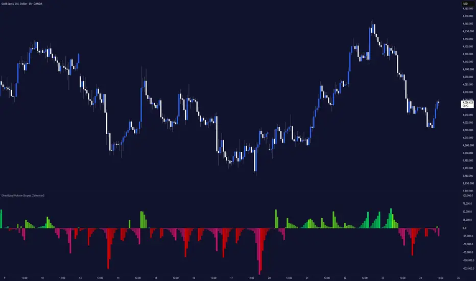
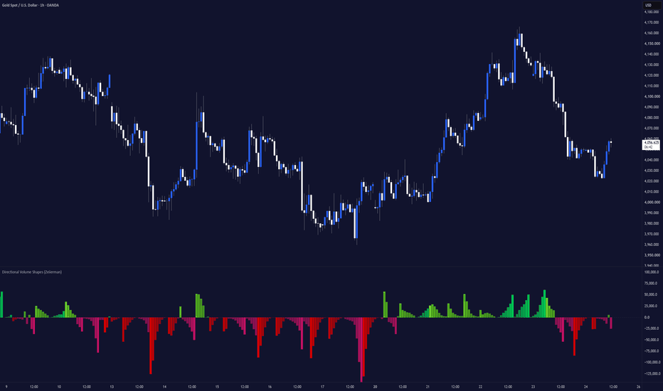
Directional Volume Shapes (Zeiierman)█ Overview
Directional Volume Shapes (Zeiierman) is a regime-classification oscillator that reframes volume analysis around a different question: not simply “how much volume traded,” but “what statistical shape has directional pressure been forming, and which way is it leaning?”
Instead of plotting raw buy and sell volume bar by bar, the indicator scores each candle for directional pressure using a triangular intrabar distribution model. It collects those scores in a rolling window, classifies the pattern into one of seven distribution shapes, and displays a smooth synthetic template of the detected shape.
The result is less like a traditional volume indicator and more like a distribution-regime display, showing the type of pressure environment currently developing.
⚪ Why Is This One Unique?
Most volume tools show exactly what happened: green bar up, red bar down, and taller bar equals more volume. This indicator uses a two-stage process: classify, then synthesize.
It combines:
• A triangular CDF candle scorer that estimates directional pressure from OHLC data
• A rolling shape classifier using skewness, Gaussian-smoothed peak detection, and time correlation
• Seven possible classifications: Bell, Right-skewed, Left-skewed, J-shaped, Reverse-J, Bimodal, and Multimodal
• A template generator that displays an idealized mathematical version of the active shape
• A separate EMA-based polarity engine that controls bullish or bearish direction
█ How It Works
⚪ 1. Scores Each Candle’s Directional Pressure
Instead of using a simple “close above open equals bullish” rule, the indicator models the candle’s high-low range as a triangular probability distribution centered at the close.
The scr() function evaluates the candle’s full OHLC structure and returns a value between 0 and 1. That result is then converted into a signed pressure score between -1 and +1.
dm = scr(open, high, low, close)
ps = 2.0 * dm - 1.0
Values near +1 represent stronger bullish pressure, while values near -1 represent stronger bearish pressure. Values near zero indicate a more balanced candle.
⚪ 2. Optionally Weights Pressure by Volume
When Volume Weighting is enabled, the pressure score is multiplied by raw volume.
src = vw ? volume * ps : ps
This gives high-volume bars more influence over the rolling shape-classification window. When disabled, the classifier uses directional pressure alone.
Volume still controls the height of the plotted columns regardless of this setting.
⚪ 3. Classifies Pressure Shape, Not Direction
The indicator stores recent pressure values in a rolling window. Before classification, it converts each value into its absolute magnitude.
for i = 0 to buf.size() - 1
mag.set(i, math.abs(buf.get(i)))
Using math.abs() removes bullish and bearish direction from the classification stage. The classifier analyzes how pressure strength has been distributed, not which direction it points.
It measures:
• Skewness in the raw pressure magnitudes
• Local peaks in a Gaussian-smoothed version of the data
• Whether pressure strength is generally increasing or decreasing through time
The final shape is selected using a fixed priority order:
if peaks >= 2
out := peaks == 2 ? "Bimodal" : "Multimodal"
else if corr > 0.5
out := "J-shaped"
else if corr < -0.5
out := "Reverse-J"
else if skew > 0.1
out := "Right-skewed"
else if skew < -0.1
out := "Left-skewed"
else
out := "Bell"
Multiple peaks are checked first, followed by rising or falling behavior, then skewness. Bell is used when no other condition is detected.
⚪ 4. Requires Persistence Before Changing Shapes
The active shape changes only after five consecutive bars produce a classification different from the shape currently displayed.
if ns != sh
sc += 1
else
sc := 0
if sc >= 5
sh := ns
ph := 0.0
sc := 0
The five classifications do not need to match each other. They only need to differ from the current active shape.
When the fifth differing classification arrives, the indicator switches to that bar’s shape and restarts the template cycle.
⚪ 5. Tracks Polarity Separately
Bullish or bearish polarity is calculated independently from the shape classification.
A short EMA is applied to the original signed pressure score:
pr = ta.ema(ps, pl)
string np = pr >= 0 ? "Bull" : "Bear"
When the EMA is above or equal to zero, polarity is Bull. When it is below zero, polarity is Bear.
Because polarity can change as soon as the EMA crosses zero, it usually reacts faster than the shape classifier.
⚪ 6. Displays a Synthetic Shape Template
Once a shape is selected, the indicator does not plot the original pressure values.
Instead, it generates an idealized mathematical template for the active shape. For example, Bell uses a Gaussian curve, J-shaped uses a squared rising curve, and Bimodal combines two separate Gaussian peaks.
The generated template is then scaled by recent average volume and signed according to polarity.
p = pol == "Bull" ? ph : 1.0 - ph
tv = tpl(sh, p)
sgn = pol == "Bull" ? 1.0 : -1.0
amp = ta.sma(volume, 3) * 1.8
y = amp * tv * sgn
The template advances by a fixed amount on each bar. Template Cycle Length controls how many bars are used to complete one full cycle.
█ Assumptions We Are Explicitly Making
The indicator’s usefulness depends on whether its modeling assumptions are suitable for the instrument and timeframe being analyzed.
These are not facts about market behavior. They are simplifying assumptions used because Pine Script does not provide true intrabar tick or order-flow data.
⚪ Intrabar Activity Is Approximated With a Triangular Distribution
The model approximates intrabar activity using a triangular distribution centered at the close. It does not know where price actually spent the most time within the candle.
Using another reference point, such as VWAP, the midpoint, or the open, could produce a different pressure score.
⚪ Shape and Direction Are Treated Separately
The shape classifier analyzes the magnitude of pressure but removes its bullish or bearish direction. Two windows with similar pressure-strength patterns but opposite directional bias can therefore receive the same shape classification.
The shape describes how pressure has been distributed, while the separate polarity calculation determines whether it is leaning Bull or Bear.
⚪ Seven Shapes Are Used to Describe Pressure Behavior
Every window is placed into one of seven fixed categories using predefined thresholds:
• Skewness thresholds of ±0.1
• Correlation thresholds of ±0.5
• Peak prominence above 10% of the smoothed envelope’s maximum
The classifier follows a fixed priority order rather than selecting the mathematically closest-fitting shape.
There is also no statistical significance test behind these thresholds, so borderline classifications may change because of noise.
⚪ The Displayed Curve Represents the Classification, Not the Raw Data
After classification, the indicator displays an idealized template rather than the original pressure values. Two different pressure windows classified as Bell will use the same normalized Bell template.
The final column height and direction can still differ because the template is scaled by recent volume and signed by polarity.
█ How to Use
⚪ Directional Volume Reading
Use the indicator as you would a traditional volume oscillator.
• Readings above zero indicate bullish volume strength.
• Readings below zero indicate bearish volume strength.
⚪ Divergences
Use the columns to identify divergences in volume strength.
• Bullish divergence: Price makes a lower low while the indicator forms a higher low.
• Bearish divergence: Price makes a higher high while the indicator forms a lower high.
⚪ Interpreting the Shape Labels
• Bell: Pressure intensity is relatively symmetric and contains one main area of activity.
• Right-skewed / Left-skewed: Pressure intensity is uneven and has a longer tail on one side of the distribution.
• J-shaped: Pressure intensity has generally increased toward the most recent bars.
• Reverse-J: Pressure intensity was stronger earlier in the window and has weakened toward the present.
• Bimodal / Multimodal: The smoothed pressure path contains two or more separate periods of stronger activity within the detection window.
⚪ Choosing the Shape Speed
Template Cycle Length controls how quickly the displayed shape moves through its synthetic cycle. It changes the visual speed of the columns, not the shape-detection window or Bull/Bear polarity.
• 3 bars, Fast: Creates tight, fast-moving shapes. This is the most responsive and active-looking setting.
• 4 bars, Balanced: Gives each shape slightly more time to develop while remaining responsive.
• 5 to 7 bars, Slow: Stretches the shape across more bars, creating smoother and slower visual cycles.
A value of 3 is useful when you prefer compact, fast-moving shapes. Increase the value when you want each shape to develop more gradually and remain visible for longer.
█ Settings
Use Volume Weighting: Controls whether volume multiplies directional pressure before shape classification. Volume still controls the plotted column height when this setting is disabled.
Detection Window: Sets the number of recent bars used to classify the current shape. Higher values produce slower and more stable classifications. Lower values react faster and may change shape more often.
Polarity Smoothing: Sets the EMA length used to determine Bull or Bear polarity. Higher values create steadier polarity. Lower values react faster.
Template Cycle Length: Sets the number of bars used to complete one synthetic shape template. Lower values create faster and tighter cycles. Higher values stretch the template over more bars.
Show Moving Average: Shows or hides a moving average of the final plotted output.
Type: Selects the moving-average method: SMA, EMA, RMA, or WMA.
Length: Sets the moving-average period.
Maximum Transparency: Sets the maximum transparency applied near the lower points of each template. A value of 0 disables the transparency fade.
-----------------
Disclaimer
The content provided in my scripts, indicators, ideas, algorithms, and systems is for educational and informational purposes only. It does not constitute financial advice, investment recommendations, or a solicitation to buy or sell any financial instruments. I will not accept liability for any loss or damage, including without limitation any loss of profit, which may arise directly or indirectly from the use of or reliance on such information.
All investments involve risk, and the past performance of a security, industry, sector, market, financial product, trading strategy, backtest, or individual's trading does not guarantee future results or returns. Investors are fully responsible for any investment decisions they make. Such decisions should be based solely on an evaluation of their financial circumstances, investment objectives, risk tolerance, and liquidity needs.
Indikator
Rolling Volume Delta█ OVERVIEW
Rolling Volume Delta (RVD) estimates net buying vs. selling pressure per bar, then weights that pressure by how much price actually moved — so a strong directional bar counts for more than a quiet, indecisive one. The result is summed over a rolling window, smoothed, and normalized against total volume so it reads consistently across different instruments and volume regimes.
█ CONCEPT
Most volume delta tools estimate buy/sell pressure and stop there. RVD adds one more step: it multiplies each bar's estimated delta by the magnitude of that bar's price change. The logic is that a bar where buyers dominate AND price actually moved higher represents more conviction than a bar with the same buy/sell split during a flat, choppy stretch. That weighted delta is then summed over a rolling window and smoothed, so the final line reflects sustained pressure rather than single-bar noise.
█ HOW IT WORKS
1. Buy/sell split: each bar's volume is divided between buy and sell based on where the close landed within that bar's high-low range (close near the high = buy-weighted, close near the low = sell-weighted).
2. Price weighting: that delta is multiplied by the percentage price change over a configurable lookback, so bars with bigger moves are weighted more heavily.
3. Rolling sum: the weighted delta is summed over a configurable lookback window.
4. Smoothing: an EMA is applied to reduce noise.
5. Normalization: the smoothed result is divided by total volume over the same window and expressed as a percentage, keeping the scale comparable across tickers and sessions.
█ HOW IT DIFFERS FROM OTHER VOLUME DELTA SCRIPTS
Other delta oscillators calculate buy/sell pressure and smooth it directly. RVD's price-weighting step means the indicator isn't just "how much delta happened" but "how much delta happened relative to how much the market actually moved" — filtering out high-volume, low-conviction chop from the signal.
█ SETTINGS
- Lookback Length — bars summed together for the rolling delta. Longer = smoother, slower.
- Smoothing — EMA length applied to the rolling sum.
- Momentum Lookback — bars back used to measure price change for weighting. Higher values emphasize sustained moves over single-bar spikes.
As bars carry more information on their own (higher timeframes), less summing and smoothing is needed for a clean read. Within any timeframe, trending conditions benefit from longer/smoother settings that confirm sustained pressure and filter chop, while ranging conditions benefit from shorter/quicker settings that catch reversals near the extremes at the cost of more false flips in the middle of the range.
Suggested starting points:
Timeframe | Condition | Length | Smoothing | Momentum Lookback
5-30 min | Trend / Price Discovery | 14-20 | 3-5 | 1-2
5-30 min | Range / Accumulation | 8-10 | 1-2 | 1
1-4 hour | Trend / Price Discovery | 10-14 | 2-3 | 2-4
1-4 hour | Range / Accumulation | 6-8 | 1-2 | 1-2
Daily+ | Trend / Price Discovery | 8-10 | 2 | 3-5
Daily+ | Range / Accumulation | 5-6 | 1 | 2
These are included in each input's tooltip in the settings popup as well.
█ NOTES
This is a volume-estimation tool based on standard OHLCV data (bar range and close position), not true tick-level buy/sell data — most retail data feeds don't provide that, so this is the same practical tradeoff most public volume delta scripts make. It's intended as a context tool for reading order flow alongside price action, not a standalone signal generator.
This publication is for educational purposes only and does not constitute financial advice. Past performance and visual patterns do not guarantee future results. Indikator

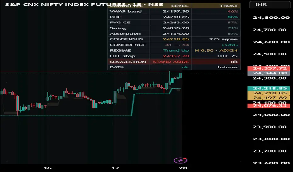
Candlestick Edge Auto-Preset MTF Self-CalibratingCandlestick Edge only fires a candlestick pattern when it is "rightly placed" — confirmed by a higher-timeframe trend AND by where price sits in the developing volume profile. Then it does what most pattern tools don't: it forward-tests every signal and reports the MEASURED edge per pattern, so you read realized performance instead of a marketing claim.
WHY THIS IS ONE TOOL (not a bundle)
The parts answer one question about one candle: "is this pattern in a place that has historically paid, and does it beat a coin-flip here?"
PATTERN detection says WHAT printed (24 classic candlestick patterns).
HTF ALIGNMENT says whether the bigger trend agrees.
VOLUME-PROFILE POSITIONING says WHERE it printed — reversals only at value-area edges, naked POC, HVN support/resistance, or liquidity sweeps; continuations only through low-volume voids or on a value breakout.
The CALIBRATION SPINE forward-resolves each signal with a triple barrier and reports Hit% vs a matched Base% (Edge) with a Wilson confidence interval, so a placed-and-confirmed pattern can be told apart from a small-sample fluke.
One pattern substrate, one location read, one calibration spine.
MEASUREMENT (the differentiator)
Each signal opens at close with target = ±TP·ATR, stop = ∓SL·ATR, over a fixed horizon. The first barrier touched decides win/loss (same-bar tie counts as the stop — conservative). Base% is the unconditional same-barrier win-rate for that direction. Edge = Hit% − Base%; a "*" marks rows whose Wilson 95% lower bound clears the base rate. A leave-one-out row prices each filter's marginal contribution, and a footer lists only the patterns that are green AND have enough samples to trust in the current configuration.
AUTO PRESET (default on)
Candlestick edges are timeframe-specific. Auto Preset reads the chart's timeframe and switches on the pattern subset plus higher-timeframe distance that performed best for that timeframe in the author's study of NSE index futures, and forces the two filters on. Turn it OFF for full manual research mode: all 24 patterns selectable, filters and HTF distance (3x / 5x / 15x / custom) under your control. Nothing is ever removed — the preset only curates which patterns are active by default per timeframe.
HOW TO USE
Leave Auto Preset on and read the labelled signals (teal = bullish, red = bearish, each tagged with the pattern name). Open "Show scoreboard" to see measured Edge per pattern — trust the EDGE column and the "*", never a raw hit-rate. Best behaviour is on intraday timeframes (1H and below).
ORIGINALITY
Standard techniques are credited below. What is original is the combination: a location-gated pattern engine whose every signal is forward-calibrated, a timeframe-adaptive auto-preset, a leave-one-out filter attribution, and an auto-surfaced tradeable set — measured edge, not asserted.
NON-REPAINT
Signals open on confirmed bars; triple-barrier outcomes resolve on bars AFTER the trigger; all higher-timeframe / lower-timeframe / prior-day-POC requests use lookahead_off and confirmed intrabars. Pivots used by sweeps confirm first.
DATA & MARKETS
Runs on any symbol that reports volume; the developing profile needs volume to be meaningful. Defaults are tuned for intraday index futures. On the Enhanced data tier the delta read uses intrabar aggregation (richer on paid plans) and auto-falls-back to an OHLCV proxy when intrabars aren't served — safe to leave on for any plan.
CONCEPT CREDITS (methods operationalized — original Pine re-derivations)
Candlestick patterns — Nison; pattern-performance framing per Bulkowski
Market / auction profile, POC / Value Area — Steidlmayer; Dalton
Bulk Volume Classification — Easley, Lopez de Prado & O'Hara (2012)
Triple-barrier labelling — Lopez de Prado
Wilson score interval — Wilson (1927)
HONESTY / LIMITS
The profile is an ATR-binned developing session profile (not tick POC). Delta is an estimate (proxy or intrabar reconstruction), not true bid/ask. Reported edge is context measured on loaded history — not a prediction or a promise. The preset defaults were tuned on one instrument over a recent window, so treat them as a well-measured hypothesis, not proven alpha.
Educational tool. Not financial advice — you alone are responsible for your trading decisions. Indikator
Seller Exhaustion DetectorSeller Exhaustion Detector (SED)
Overview
Seller Exhaustion Detector identifies the point where a downtrend's selling pressure is spent and buyers begin absorbing supply — the transition from distribution to accumulation. Instead of reacting to a single pattern, it scores seven independent exhaustion footprints and only confirms a signal when structural gates prove the low is actually holding.
How It Works
The detector scores confluence across a 16-point scale:
Liquidity Sweep + Reclaim (3 pts) — tracks untapped pivot-low liquidity pools; a wick below a pool followed by a close back above it marks a stop run absorbed by passive buyers.
CVD Bullish Divergence (3 pts) — price makes a lower low while session-reset cumulative volume delta makes a higher low: sell orders are no longer moving price.
RSI Bullish Divergence (2 pts) — momentum fails to confirm the new price low.
Sell-Volume Dry-Up (2 pts) — red-candle volume contracts near the lows; motivated sellers are done.
Absorption (2 pts) — elevated volume, compressed range, close in the upper half: supply being eaten without downside progress.
Higher Low (2 pts) — first structural higher pivot after the low.
Selling Climax Watch (1 pt) and Confirmed Wick Rejection (1 pt) — capitulation context and next-bar-confirmed hammer rejections.
A score alone never fires a signal. Three hard gates must also pass: the low must have held for a configurable number of bars (or a fresh sweep-reclaim substitutes as confirmation), price must be above a rising/flat EMA9, and fast volume delta must be positive. This eliminates premature signals printed while price is still making new lows.
Signals
Orange circle — selling climax (capitulation bar; watch window begins)
Gold diamond — liquidity pool swept and reclaimed
EXHAUSTION label — confirmed exhaustion (score + all gates)
ACCUMULATE label — post-exhaustion structure reclaim with positive delta
STOP-OUT label — the exhaustion low broke; the signal is invalid
Dashboard — live score breakdown and gate status, with selectable text size
Recommended Use
Built for 1-minute to 5-minute intraday charts on liquid symbols. Use EXHAUSTION as location, ACCUMULATE as trigger, and the invalidation print as a hard exit reference. Tune Climax Multiplier down (~1.7) and Pivot Left/Right to 3–4 for faster symbols.
Limitations
Volume delta is approximated from candle direction (up-volume minus down-volume), not exchange bid/ask data, so absorption and CVD reads are estimates. All components are derived from OHLCV and confirm after the fact by design — the detector locates high-probability reversal conditions; it does not predict bottoms. Not financial advice. Indikator

Indikator

Burst Size Flow Divergence Large vs Small CVDOverview
A single cumulative-delta line tells you net buying or selling, but hides who is doing the pushing. Burst-Size Flow Divergence splits the flow inside each bar by the size of each volume burst — small / medium / large sub-intervals — and runs a separate signed delta on each tier. The signal is the divergence between the large-burst delta and the small-burst delta: concentrated bursts leaning one way while trickle flow leans the other. It is a flow-structure read, not a signal to trade alone.
What this is — and is NOT (read this before using)
This measures activity-burst size, not per-trade size. Pine cannot see individual trades — it sees a bar's volume and, via lower-timeframe requests, the volume of each sub-interval within the bar. "Large" here means a sub-interval that printed a lot of volume relative to normal — not a large single trade, and not "institutional." Institutions deliberately slice big orders into many small child-orders, so burst size is a proxy, not proof of who is behind the flow. The classification is honest about this, and the built-in harness is there precisely to test whether the divergence carries any information rather than to assert that it does.
Why these components are ONE tool (mashup justification)
Each stage exists because the previous one is ambiguous on its own:
Intrabar bucketing. Each lower-timeframe sub-bar is classed small/medium/large by its volume against an adaptive average, so "large" means large for this symbol and session, not a fixed lot count. A fixed threshold would misclassify on every instrument and every volatility regime.
Per-tier directional imbalance. Each tier gets its own signed delta (up sub-bar → +volume, down → −volume), expressed as net ÷ gross in — what fraction of that tier was net buying versus selling. Normalising this way lets the tiers' directions be compared apples-to-apples even though the large tier moves far less total volume than the small one.
The divergence. The large-minus-small spread is the object. Three separate delta lines would just be clutter to eyeball; the disagreement between the concentrated and the trickle flow is the actual read, so the tool computes it directly.
The calibration harness. "Concentrated bursts are informed" is a hypothesis, not a law — so when the spread is strong, the harness checks forward whether price actually followed the large tier more than the unconditional base rate, and reports Hit / Base / Edge on confirmed bars. That's what turns the divergence from a story into something you can verify on your instrument.
How it works
For each chart bar the finest available sub-bars are requested. Each is signed by close-versus-open (a tick-rule aggressor proxy) and bucketed by volume against the adaptive average. Per-tier signed volume becomes a net÷gross imbalance in , the large-minus-small spread is smoothed into the oscillator, and a strong gated spread is the divergence signal.
How to use it
Read the histogram (the large-minus-small spread): green means large bursts are accumulating while small flow lags or sells; red means large bursts are distributing. The bold line is the large-tier imbalance, the faint line the small tier. A gated turn in the spread suggests concentrated flow is leading, and is marked in the pane and — optionally — on the price chart. Always check the Coverage row (how much real sub-bar resolution the current bar received) and the Edge row (whether the divergence has actually led on this instrument). It is never a standalone trigger.
Plan-adaptive & data note
Sub-bar precision auto-selects the finest your plan serves (seconds on Premium+, else 1-minute). Lower-timeframe data exists only for recent bars, so older bars fall back to whole-bar flow and the coverage read shows it. The tool needs an instrument with real volume — a cash index reports none, so use the futures. The adaptive average and the calibration harness advance only on confirmed bars, so they never drift or inflate intrabar. Edge is in-sample, no costs — a study aid, not a backtest.
Originality
The parts are public: cumulative volume delta, the close-vs-open (tick-rule) aggressor proxy, and the general idea of size-partitioned / flow-toxicity order flow. What's assembled here is the specific construction — the adaptive intrabar size-tiering, the net÷gross per-tier imbalance that makes tiers of very different volume directly comparable, the large-minus-small divergence as the headline object, and the forward-calibration harness that scores it against the base rate. This is a clean-room implementation; no third-party Pine code is reused.
Concept credits
Cumulative Volume Delta — standard order-flow technique.
Close-vs-open (tick-rule) aggressor classification — after the classic trade-sign literature (Lee & Ready).
Size-partitioned / flow-toxicity order flow (VPIN) — Easley, López de Prado & O'Hara.
Disclaimer
Research and educational tool only. Not financial advice, no recommendation, no guarantee of results. Burst size is not trade size and does not identify institutions versus retail; the up/down sign is a close-vs-open proxy for the aggressor, not the true tape. Indicators describe past behaviour; they do not predict the future. Trading carries risk of loss. Test out-of-sample and make your own decisions. The author accepts no liability. Indikator

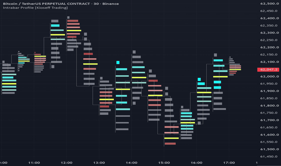
Intrabar Profile [Kioseff Trading]Hello Traders!
🔹 Intrabar Profile
Intrabar Profile is a lower-timeframe profile tool designed to draw a volume profile or delta profile on each individual candle .
Instead of only looking at where a candle opened, closed, wicked, or changed color, this indicator attempts to show:
Where did volume actually trade inside the bar?
It focuses on answering a deeper question:
What happened inside the candle that normal candlesticks do not show?
volume profile on every visible bar
delta profile on every visible bar
lower-timeframe volume distribution
POC detection per candle
value area visualization
buy-side vs sell-side imbalance display
optional volume-at-level labels
adaptive scaling as the chart zooms in or out
🔹 What the indicator shows
🔸 Intrabar Volume Profile
The indicator reconstructs a mini volume profile for each candle using lower timeframe data.
This allows you to see:
where volume was concentrated inside each bar
which price level had the highest volume
how volume was distributed across the candle range
whether volume was balanced or concentrated near specific levels
This shifts your perspective from:
“this candle closed bullish or bearish”
to:
“where did participation actually take place inside this candle?”
🔸 POC Per Candle
Each intrabar profile includes a Point of Control , or POC.
The POC marks the price level inside the candle where the highest amount of volume was detected.
This helps identify:
where the most trading activity occurred inside the bar
whether volume was concentrated near the high, low, or middle of the candle
potential areas of intrabar acceptance or rejection
where participation clustered before price moved away
🔸 Value Area Per Candle
The indicator can also display a value area for each profile.
The value area is calculated from total volume and highlights the region where the majority of volume occurred inside the bar.
This helps separate:
high-participation areas
lower-participation areas
balanced candles
thin or inefficient areas of the candle
Together, the POC and value area help show the internal structure of each candle instead of only the candle body and wick.
🔸 Intrabar Delta Profile
Intrabar Profile can also switch from standard volume profile mode to delta profile mode .
Delta mode estimates buy-side and sell-side pressure using lower timeframe price movement and volume.
This allows you to see:
where positive delta appeared inside the candle
where negative delta appeared inside the candle
whether aggressive activity was concentrated at the top, middle, or bottom of the bar
when total volume and directional pressure tell different stories
This can help answer:
Was volume only present, or was it meaningfully skewed toward buyers or sellers?
🔸 Volume Profile vs Delta Profile
The indicator includes two profile modes:
VP - displays total volume distribution inside each candle
Delta - displays directional volume imbalance inside each candle
Volume profile mode focuses on:
where participation occurred
where volume was concentrated
where the candle’s POC and value area formed
Delta profile mode focuses on:
which side had more pressure
where buy-side or sell-side imbalance appeared
whether pressure was distributed evenly or concentrated at specific levels
🔸 Adaptive Mini Profiles
The profiles are drawn directly on top of the chart candles and are designed to stay proportional as the chart is adjusted.
This means the visual structure adapts as you:
zoom in
zoom out
stretch the chart
compress the chart
The goal is to keep the profile readable without turning the chart into visual clutter.
🔹 Granularity Options
The indicator uses lower timeframe data to build each intrabar profile.
Available granularity options include:
5-minute
1-minute
1-second
1-tick
Lower granularity can provide a more detailed reconstruction of intrabar activity, depending on the symbol and data available from TradingView.
Important Note
Some lower timeframe data options may require specific TradingView data access or plan availability. If a selected granularity is not available on your chart or account, the indicator can only work with the data TradingView provides.
🔹 How to read it
Each candle can be read as its own mini profile.
larger profile rows show more volume or stronger absolute delta
the POC marks the highest-volume level inside the candle
the value area highlights the primary participation zone
gray areas show volume outside the selected value area
positive delta shows stronger buy-side pressure
negative delta shows stronger sell-side pressure
This helps you compare:
where the candle closed
where the most volume traded
where delta was strongest
whether the candle’s appearance matches its internal activity
🔹 Example interpretations
bullish candle + volume concentrated near the high → possible acceptance higher
bullish candle + heavy volume near the low → possible absorption or delayed response
bearish candle + negative delta near the low → aggressive selling into the bottom of the bar
large candle + thin profile → fast movement with less balanced participation
small candle + heavy profile → high activity with limited price movement
strong delta but weak candle movement → potential absorption or opposition
🔹 Why this indicator is useful
Intrabar Profile gives you a way to look beyond standard candles.
It helps you see:
where volume formed inside each candle
where the candle’s POC developed
whether participation was concentrated or spread out
whether buyers or sellers dominated specific levels
how volume and delta behaved inside the bar
whether the candle’s structure supports or contradicts the price action
Instead of only asking:
“Did this candle close green or red?”
you can ask:
“Where did the trading actually happen inside this candle?”
🔹 Best use cases
studying intrabar volume structure
analyzing candle quality
identifying high-volume zones inside individual bars
spotting possible absorption or imbalance
comparing price action against internal volume distribution
enhancing volume profile, order flow, or liquidity-based analysis
🔹 Inputs you can customize
profile type: VP or Delta
granularity: 5-minute, 1-minute, 1-second, or 1-tick
number of profile rows
buy-side and sell-side colors
POC color
mini profile transparency
value area visibility
volume-at-level labels
🔹 Important note
This script uses lower timeframe data to approximate intrabar volume and delta structure.
This means:
accuracy depends on available lower timeframe data
different symbols may behave differently
1-second or tick data may not be available for every user or market
delta is estimated from lower timeframe price movement and volume
this is an analytical visualization tool, not a predictive engine
Closing Notes
Intrabar Profile is built to show the internal volume structure of each candle .
It helps turn a normal candlestick chart into a more detailed profile-based view of participation, imbalance, and intrabar activity.
As always, thank you TradingView! Indikator
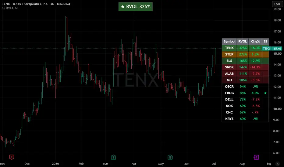
Strong Start RVOL Dashboard (Auto-Exchange)📢 Important Note: Adapted Replica
This script is an authorized and adapted replica of the original "Strong Start RVOL Dashboard" by @finallynitin . A huge thank you to him for approving this publication! You can check out his original work and implementation details here:
💡 What makes this version different? (The "Auto-Exchange" feature)
The main purpose of this adaptation is to remove the original script's restriction of using a forced default exchange (like NSE) for bare tickers.
With this update, there is no need to set a default exchange. If you paste a plain ticker, TradingView's global search engine will automatically resolve it and display the asset with the highest trading volume and market interest—exactly the same as when you search for a symbol manually on your chart.
📌 Best Practices for Watchlists:
US & Major Stocks: This automated system works flawlessly for common US equities and heavily traded assets. Just paste the ticker (e.g., AAPL, DELL, NVDA).
Dual-Listed or Low Volume Assets: If you are trading smaller names or assets listed across multiple global exchanges with lower volume, it is highly recommended to follow the original script's fully-qualified format to avoid any ambiguity: Exchange:Ticker (e.g., NYSE:DELL or NASDAQ:FROG).
⚠️ Notes & Limitations (Auto-Exchange Updates):
Double-check your list : Since the script automatically picks the exchange with the highest volume for bare tickers, it is always a good practice to double-check the results. You might be tracking a ticker from a different global exchange without realizing it.
Dynamic matching risk : TradingView resolves bare tickers dynamically based on current market interest and liquidity. If a low-volume stock you are tracking suddenly shares a ticker name with a highly active asset on another exchange, the script's selection might shift.
Absolute certainty : If you want to ensure 100% accuracy and lock a specific asset permanently into your dashboard, skip the auto-matching and manually input the exact Exchange:Ticker format.
Indikator

Volume Force FieldVolume Force Field — TradingView publication kit
Volume Force Field turns a volume profile into a force map. A normal profile shows you where value is. This overlay shows you the net pull on price at every level — the slope of the volume landscape toward the nearest magnet — and then it measures, on your own history, whether that pull actually leads price. One plain-language panel tells a non-technical trader what it means at a glance.
What it plots
The force field — coloured bands across price. Green means price at that level is being drawn up toward a high-volume magnet; red means drawn down. Band opacity scales with how much volume sits there.
POC and magnets — the yellow line is the Point of Control (the single strongest magnet); green lines are secondary magnets; dashed red lines are low-volume ridges that price tends to cross quickly.
Value Area — the shaded band holding your chosen % of volume around the POC: the range where trade has been accepted.
Value centre ± band — a moving equilibrium (rolling VWAP / adaptive MA / EMA) with a σ band: the drift level price is pulled back toward.
Guidance panel — plain English: the current bias (pulling up / down / balanced), location vs value (inside / stretched above / stretched below), the nearest magnet and distance, and one line on what to watch.
Past signal marks — small triangles wherever the net pull historically turned strongly up or down, so you can eyeball how the field has behaved.
Why these components are one tool (not several indicators stacked)
Each part answers a question the others cannot, and removing any one breaks the read:
Volume kernel density builds a smooth value landscape whose peaks are magnets. Optional lower-timeframe slicing distributes each bar's volume across its true intrabar path; an optional half-life lets recent volume outweigh old, so the field is a living map, not a flat lookback.
The density gradient turns that landscape into a force — the direction and steepness of attraction at each level, which a plain density cloud never exposes.
The Value Area frames where price is accepted versus stretched, so the force is read in context.
The moving value centre adds the mean-reversion pull toward equilibrium.
The calibration harness back-measures the whole thesis: when the pull is strong, did price actually travel toward the magnet more often than the base rate? It reports Hit %, Base % and Edge.
Density is a picture; the gradient makes it a force; the Value Area frames it; the centre adds drift; the harness keeps it honest. Together they are one decision object.
How to use it
Read the guidance panel first — it states the bias, where price sits versus value, the nearest magnet, and what to watch. On the chart, treat green bands as upward pull toward the magnet above and red as downward pull; the POC and magnet lines are targets; dashed lines are fast low-volume gaps; the Value Area is the accepted range; the centre ± band is the drift equilibrium. Turn on the Calibration table and read Edge: a strong pull with a positive, matured Edge is the context this tool is built to surface. An Edge near zero means the attraction is not exploitable on that symbol/timeframe — that is useful information, not a trade trigger. This is a context map, not a signal generator; combine it with your own risk and execution rules.
Universal across markets
Price source and volume feed are inputs, so it runs on any symbol. Instruments without real volume fall back automatically to a price-density field. Default settings target an index-futures 1-minute chart; change the lookback, centre and slice resolution to suit other assets and timeframes.
Originality
The building blocks are standard and credited below; the original work is the coupling and the rendering — a volume kernel density whose gradient is drawn as a directional force field, fused with a Value Area and a moving value centre, with magnet/ridge extraction and a forward base-rate harness that reports each strong-pull setup's realised Edge instead of asserting that magnets work. No third-party Pine code is reused.
Concept credit
Kernel density estimation — Emanuel Parzen (1962) and Murray Rosenblatt (1956); bandwidth rule — B. W. Silverman (1986). Point of Control / Value Area / Market Profile — J. Peter Steidlmayer. Moving-equilibrium ("price in a moving potential") market models — Hideki Takayasu, Takayuki Mizuno and Tsutomu Watanabe. Not affiliated with, nor endorsed by, any third party.
Honesty / limitations
No tick or order-book tape is available to scripts, so the density is built from OHLCV and optional lower-timeframe slices — a proxy, not the true traded distribution. Lower-timeframe slices exist only for recent bars; older bars use bar price automatically. "Force" is a hypothesis the Edge stat exists to falsify. The harness uses a light proxy of the field (the full grid cannot be recomputed on every bar), so it tests the idea rather than the exact drawn object. Like any volume profile, the last (forming) bar's field refreshes in real time; on closed bars it is fixed. Edge figures are in-sample, close-to-close, without costs — a study aid, not a verified backtest. Nothing here predicts price.
Disclaimer
For research and educational purposes only. This script is not financial advice, not a recommendation, and not a guarantee of future results. Indicators describe past behaviour; they do not predict the future. Trading carries risk of loss. Test on out-of-sample data and make your own decisions. The author accepts no liability for any use of this script. Indikator

Auction & Liquidity Command Center Volume Profile, MeasuredAuction & Liquidity Command Center — Volume Profile, Measured
The levels traders already use — prior POC, value area, naked POCs, prior day high/low, session AVWAP, HVN/LVN — each scored by its measured reaction on this chart: how often price rejects vs breaks, and what the fade has been worth in R. Levels with evidence, not levels with vibes. Never a buy or sell.
What it does
Every structure tool draws levels. None of them measures what happens when price gets there. This tool builds the session-anchored auction map with profile-grade accuracy, detects qualified touches of every level, resolves each touch through a triple-barrier outcome, and pools the results by level TYPE into a live scoreboard: pPOC +0.01R · rej 50% · n156. You see not just where the levels are, but which kinds of levels have actually meant something on this chart — and which are coin flips.
The components, and why they are combined
This is a deliberate synthesis of four parts, each covering the previous one's weakness:
A profile-grade level engine (Market Profile — J. P. Steidlmayer). Nine level types from the session volume-at-price profile and session extremes: prior POC, prior VAH/VAL (classical two-row 70% expansion), naked POCs (prior POCs never revisited), prior day high/low, the session's anchored VWAP, and HVN/LVN volume nodes (prominence-filtered local extremes). Accuracy choices: each bar's volume is distributed range-proportionally across the rows it overlaps (not binned at one point); POC ties break toward the session center. Weakness left open: a drawn level says nothing about whether it matters.
A qualified-touch detector. A level must be ARMED — price fully away from it by at least k×ATR — before a touch of it can count, and it disarms after every touch. Chop sitting on a line cannot enter the record. Approach direction is stored with every event. Weakness left open: a touch is not an outcome.
Triple-barrier outcome resolution (outcome labelling — M. López de Prado). From each touch: REJECT if price moves m×ATR back the way it came first, BREAK if it moves m×ATR through first, TIMEOUT after T bars. Purity rules: barriers are fixed at the ATR of the touch moment; evaluation starts the bar after the touch; a bar hitting both barriers is a timeout, never a guess. Weakness left open: one level's history is n = 1.
Per-TYPE pooling with honesty gates. Statistics pool by level type, never by individual line — a type is a real sample. A type shows no score until a minimum number of its touches have resolved (default 20); until then it reads BUILDING with its count. Timeouts are reported in n but excluded from the reject/break ratio. Fade expectancy = (rejects − breaks) / (rejects + breaks), in R.
How to read it
Rails are colored and styled by type (solid profile levels, dashed day levels, dotted volume nodes, violet naked POCs); each label carries its type's live score or its BUILDING count.
Evidence on the chart: a gray • at every qualified touch, then ○ (teal) where the touch rejected and ✕ (amber) where it broke. Every number on the scoreboard can be audited against the chart.
Dashboard: nearest level and its score, with a plain-language verdict (tends to hold / coin flip / tends to break) so the read needs no statistics background; per-type scoreboard (fade R · reject % · n) for all nine types; touch counts; the exact engine settings in the NOTE row.
Honest expectations: most types on most charts score near zero — that is the truthful baseline, and seeing it protects you from folklore. The value is in the exceptions this chart's own history reveals (for example, day extremes often carry a modest positive fade expectancy while POC retests are a coin flip), and in knowing the difference.
How to use it
Use the scoreboard to weight your own playbook: give more respect to touches of types that have measured well here, less to types that grade as noise — and size accordingly. The "Touch of a MEASURED level" alert fires only when price reaches a type with a real sample behind it. This is context about where price reactions have had structure — never a direction, never an entry signal.
Non-repaint & universality
Profiles, POC/VA/nodes and day levels commit only at session close on confirmed bars; touches and outcomes resolve on confirmed bars; the AVWAP is cumulative within its session. Nothing repaints. The script requests no external data of any kind — no lower timeframes, no security calls — so it runs identically on every plan and every symbol with volume.
Use on any market
Volume source, profile rows, value-area %, node thresholds, arm distance, barriers and sample gates are all inputs. Defaults suit liquid intraday index futures; intraday timeframes give the engine the most touches to learn from.
Originality & credits
The synthesis — a range-proportional session profile, qualified-touch detection, touch-time-ATR triple-barrier outcomes, and per-type pooled reaction statistics displayed as a live scoreboard — is original work for this publication. Concept credits: Market Profile / point of control / value area — J. Peter Steidlmayer; naked (virgin) POC — market-profile literature; anchored VWAP — as popularised in modern trading literature; triple-barrier outcome labelling — M. López de Prado. Implementation and charting design are the author's own.
Disclaimer
Research and education only. NOT financial advice, NOT a signal service, NOT a guarantee of future results. Reaction statistics are empirical frequencies from this chart's limited history, pooled per level type; they change with regime and sample, and a positive expectancy is not a promise. Validate independently and manage your own risk. Indikator

Naked POC Magnetism Fill Probability & Median WaitNaked POC Magnetism — Fill Probability & Median Wait
What it is
A naked POC is the highest-volume price of a past session that price has not revisited since. Traders treat them as magnets — but "it usually gets filled" is folklore until it's measured. This tool measures it. Every historical naked level on your chart becomes a data point (how many sessions it survived before being touched, or whether it never was), and a survival model (discrete-hazard life table) turns that history into, for each live naked level: the probability it fills within the next N sessions and the median wait. Levels are drawn with their measured magnetism, not just their location.
How the statistics work — and their honest limits
Each session's volume-at-price profile is built from that session's bars; at session close the peak-volume price (POC) becomes a naked level.
A level is filled the first time a later bar's range touches it; its age in sessions at that moment is one observation. Levels removed unfilled (history cap) are censored at their age — counted as "survived this long," never as fills. This is the standard treatment of incomplete observations from survival analysis (Kaplan–Meier 1958; classical life tables).
Hazard at age j = fills at age j ÷ levels at risk at age j. Survival multiplies (1 − hazard) across ages; fill-probability within a horizon and the median wait follow directly.
Reliability gates, enforced not footnoted: no probability is displayed until a minimum number of levels have resolved (input, default 20) — until then the tool says BUILDING and shows only counts. And hazard estimates at ages with fewer than 5 at-risk observations are truncated rather than trusted, per standard life-table convention.
Probabilities are empirical frequencies from this symbol and timeframe's own history — they change with regime and sample, and a 70% is not a promise.
Seeing the evidence
Every historical fill prints a small ◈ marker where a naked level was touched — the resolved observations the probabilities are measured from, visible on the chart rather than hidden in a table.
The dashboard shows both the NEAREST level and the STRONGEST magnet (highest fill probability) — they are often not the same level, and the strongest one is the better answer to "where is price most drawn".
An honest design note: this tool deliberately has NO multi-timeframe stack and NO state-debounce, unlike its siblings in this suite — sessions are the model's clock regardless of chart timeframe (a higher-timeframe copy would measure the same sessions with coarser bins), and nothing here chatters (levels are born at session close and resolve on touch). Features are added where they inform, not everywhere.
How to use it
Add to a liquid intraday chart; 5m–15m gives the model the most sessions to learn from. Let it run until the dashboard reads MEASURED.
Each rail is labelled like "NPOC 24512 · 68% /5s · med 3s" — the measured chance it fills within the horizon and the median sessions historically needed. Warm, saturated rails = strong magnets; faded = weak or unrated.
The dashboard shows the nearest level's read and — deliberately — the sample size behind every number.
Use magnetism as context about where price is drawn (targets, fade zones, expectations management), never as an entry signal by itself.
What makes it original
Naked-POC indicators draw lines. This one attaches a measured fill-probability and expected wait to each line, estimated with a proper survival model that handles censoring and refuses to show numbers it can't support. Turning a folklore level into a level with a live, honest statistic is the contribution.
Concept credits
Market Profile / point of control — J. Peter Steidlmayer. Naked (virgin) POC — market-profile trading literature. Survival estimation from incomplete observations — E. L. Kaplan & P. Meier (1958); classical life-table method. Implementation and charting design are the author's own.
Important disclaimer
Research and education only. Not financial advice, not a signal service, not a guarantee of future results. Fill probabilities are empirical frequencies measured on this chart's limited history. Validate independently and manage your own risk. Indikator

Order Aggression Heatmap (Asymmetrical Volume Visualizer)Order Aggression Heatmap is a footprint-based visualization tool designed to highlight high-volume aggressive and/or asymmetrical buy/sell activity at individual price rows.
User-defined filters allow you to eliminate noise and only show the highest volume heat blocks.
Using TradingView’s footprint data, the indicator analyzes volume at individual price rows and identifies areas where one side demonstrates a meaningful advantage over the other. Qualifying rows are displayed as heatmap blocks, with or without text, allowing traders to quickly spot volume concentrations, directional pressure, and potential areas of market response.
The indicator is intended as a supplemental order-flow visualization and can be used alongside price action, support/resistance levels, supply-demand zones, volume profiles, or other market structure tools.
How It Works
For each footprint price row, the script evaluates:
Total traded volume
Buy volume
Sell volume
Delta (buy volume minus sell volume)
Relative dominance between buyers and sellers
Rows are displayed only when user-defined thresholds are met.
The filtering process allows traders to focus on meaningful participation while reducing visual noise from lower-volume activity.
Available Filters
Minimum Row Volume
Requires a footprint row to contain at least the specified amount of traded volume before it can be displayed.
Increasing this value reduces noise and emphasizes higher-activity areas.
Minimum Absolute Delta
Requires a minimum difference between buy and sell volume.
Higher values focus on stronger directional pressure.
Aggression Ratio
Measures how dominant one side is relative to the other.
Example:
Ratio = 2.0
Buy Volume = 100
Sell Volume = 50
The row qualifies because buyers traded at least twice the volume of sellers.
Aggressive Rows Only
When enabled, only rows meeting the aggression ratio requirement are displayed.
When disabled, rows may still qualify through volume and delta thresholds alone.
Visual Features
•Heatmap-style overlays
•Custom buy and sell colors
•Optional footprint Point of Control (POC) highlighting
•Adjustable historical display window
•Adjustable heatmap persistence
•Optional row volume and delta labels
•Heat intensity can be customized through the selected color and opacity settings.
Suggested Applications
This indicator may be useful for:
•Identifying areas of concentrated participation
•Monitoring directional pressure within a move
•Comparing buyer and seller dominance at specific price levels
•Studying footprint behavior around support and resistance
•Evaluating activity near supply and demand zones
•Visualizing market response after large directional candles
Notes
This indicator uses TradingView footprint data.
It does not use Level 2, DOM, or market-by-order data.
It does not identify individual trades or individual order sizes.
Results may vary depending on symbol, exchange data, and footprint resolution settings.
The snapshots above show the heatblocks hidden by the candles, but in use they appear in front of the candles. Indikator

Session Value Ribbon [EXCAVO]Anchored volume-weighted mean with a harmonic value ribbon and HTF confluence
The Session Value Ribbon plots a volume-weighted mean of price and a volatility-scaled sigma envelope, then partitions the space between them into a harmonic value ribbon (0.236, 0.382, 0.5, 0.618, 0.786). Three anchor modes let the wave adapt to any chart: Rolling (a sliding N-bar window, default), Timeframe (classical anchored VWAP that resets each session), and Date (fixed anchor). A second accumulator on a slower reference timeframe runs the same math and plots as an HTF confluence line for multi-scale reads.
This is not a basic VWAP indicator. The ribbon layers, the volatility-regime scaling of the sigma bands, the HTF confluence overlay, and the auto-resolver that picks the anchor from the chart timeframe turn a single-line mean into a full value map of the current session.
━━━━━━━━━━━━━━━━━━━━━━━━━━━━━━━━━━━━━━━
▸ HOW TO USE
Step 1 → Add the indicator. The anchored mean, sigma envelope
and value ribbon draw immediately on whatever anchor
mode is selected (Rolling by default).
Step 2 → Read the mean as fair value for the active anchor.
Price above the mean = participants are bidding higher
than the anchor-window average; price below = lower.
Step 3 → Watch the outer sigma bands. A close beyond them
means price is stretched from fair value; the ribbon
layers below act as pullback shelves.
Step 4 → Use ribbon layers as intraday shelves. The 0.5 layer
is the midpoint between mean and outer band; the 0.236
layer sits close to the mean; the 0.786 layer sits
close to the outer band. Look for stalls and false
breaks at each layer.
Step 5 → Cross-check with the HTF confluence line. When the
primary mean and the HTF mean converge, price is in a
multi-scale value zone; when they diverge, one session
is running ahead of the other.
Step 6 → Read the dashboard for anchor mode, current mean,
distance from mean in sigmas, slope regime and bar
count since the anchor.
━━━━━━━━━━━━━━━━━━━━━━━━━━━━━━━━━━━━━━━
▸ HOW IT CALCULATES
◆ Volume-Weighted Mean
The mean is a running weighted average of the selected price source. Weights come from volume with three modes: Full uses raw volume (classical MIDAS weighting), Root uses the square root of volume (dampens single-bar spikes so one huge candle cannot drag the mean), and None uses equal weight (the mean degenerates to a plain arithmetic average of the source).
◆ Anchor Modes
Rolling accumulates over a sliding N-bar window (default 200 bars), so the wave is always N bars long regardless of chart timeframe. Timeframe resets the accumulator on each boundary of the chosen anchor timeframe (Daily by default), matching the behaviour of a classical anchored VWAP. Date locks the anchor to a specific timestamp and keeps accumulating forever after.
◆ Sigma Envelope
Sigma is computed from the anchor-window weighted variance, E − (E )². The outer bands are drawn at ±sigmaMultiplier × sigma around the mean. Optional Volatility Regime Adjust multiplies sigma by an ATR-relative factor, bounded between 0.7x and 1.4x, so the bands breathe with the current activity state, giving tighter bands in quiet regimes and wider bands in wild ones.
◆ Harmonic Value Ribbon
The space between the mean and each outer band is split into harmonic layers at 0.236, 0.382, 0.5, 0.618 and 0.786 of the sigma distance. The ribbon is rendered as a progressive-opacity fill, not as separate labelled lines, so the eye reads a continuous value gradient instead of a stack of horizontal ledger lines.
◆ HTF Confluence Layer
A second accumulator runs the exact same math on the next slower anchor timeframe (Rolling with a longer window when the primary is Rolling; the next-slower TF step when the primary is Timeframe). The HTF mean plots as a thin coloured line. When the primary mean and the HTF mean align, price is in a multi-scale value zone.
◆ Slope-Based Regime Classifier
The classifier measures the slope of the primary mean over the slope-lookback window and normalises it by ATR. If |slope|/ATR exceeds the slope threshold (default 0.05 xATR), the ribbon and mean tint bull or bear. Below the threshold the regime is flat and the palette stays neutral.
━━━━━━━━━━━━━━━━━━━━━━━━━━━━━━━━━━━━━━━
▸ WHAT MAKES IT DIFFERENT
◆ Chart-Timeframe Auto-Resolver
The anchor timeframe is resolved automatically from the chart timeframe, so the wave shape stays consistent across intraday, swing and position TFs without manual tuning.
◆ Volatility-Regime Scaling
The sigma envelope adapts to activity state instead of being fixed at a static multiplier. Tight regimes contract the bands, wild regimes widen them, with a bounded 0.7x to 1.4x multiplier so the visual stays stable.
◆ Harmonic Ribbon as Progressive Fill
The intra-band space is drawn as a smooth value gradient rather than a stack of horizontal lines. Layer count is user-selectable (Harmonic 3, 5 or 7).
◆ HTF Confluence Overlay
A second anchored mean on the next slower timeframe plots as a companion line so multi-scale value alignment is visible without a second indicator on the chart.
◆ Distance-In-Sigma Readout
A right-edge readout reports the current mean and the current distance from mean in sigmas, so the extreme readings are legible without measuring.
◆ EXCAVO Overlay Visual
Chart-anchored overlay only, with no pane oscillator and no floating badges. The wave, ribbon and HTF line share a single tonal palette that stays out of the way of price action.
━━━━━━━━━━━━━━━━━━━━━━━━━━━━━━━━━━━━━━━
▸ DASHBOARD
Real-time panel (top right by default) with all key metrics:
Anchor - active anchor mode with its parameter (Rolling N, Timeframe TF, or Date)
Mean - current value of the anchored mean
Distance - price distance from mean in sigmas, signed
Regime - Up / Down / Flat classification from the slope-based regime engine
Bars in Anchor - bar count since the anchor started accumulating
Legend table (bottom left) explains every glyph and colour used on the chart. Toggle in Dashboard settings.
━━━━━━━━━━━━━━━━━━━━━━━━━━━━━━━━━━━━━━━
▸ SETTINGS
Anchor
Anchor Mode - Rolling (default), Timeframe, or Date
Rolling Length (bars) - 200 (window used in Rolling mode)
Anchor Timeframe - D (used in Timeframe mode)
Anchor Date - 01 Jan 2025 (used in Date mode)
Source
Price Source - (H+L+C)/3 (typical price)
Volume Weight - Full (raw volume) - Root (square root of volume) - None (equal weight)
Sigma Bands
Sigma Multiplier - 2.0 (band distance in sigmas)
Volatility Regime Adjust - OFF (ATR-scaled sigma with 0.7x-1.4x bounds)
Value Ribbon
Show Value Ribbon - ON
Ribbon Set - Harmonic 5 (0.236 / 0.382 / 0.5 / 0.618 / 0.786)
Ribbon Opacity Base - 80
Show Zone Fill - ON
Zone Fill Opacity - 88
HTF Confluence
Enable HTF Confluence - ON (draws a second mean from the next slower anchor)
Regime Coloring
Slope Regime Coloring - ON
Slope Lookback - 20 bars
Slope Threshold (xATR) - 0.05
Visualization
Bull Color - deep blue
Bear Color - red
Flat Color - neutral grey
HTF Confluence Color - amber
Show Right-Edge Readout - ON
Dashboard
Show Dashboard - ON
Dashboard Position - Top Right
Show Legend - ON
━━━━━━━━━━━━━━━━━━━━━━━━━━━━━━━━━━━━━━━
▸ ALERTS
Directional alerts only.
Price Crossed Above Anchored Mean - close crosses over the primary anchored mean
Price Crossed Below Anchored Mean - close crosses under the primary anchored mean
━━━━━━━━━━━━━━━━━━━━━━━━━━━━━━━━━━━━━━━
Built on MIDAS anchored VWAP (Paul Levine, 1990s), extended with three anchor modes (Rolling / Timeframe / Date), selectable volume weighting, volatility-regime scaling of the sigma bands, a harmonic ribbon rendered as a progressive-opacity fill, an HTF confluence layer, a slope-based regime classifier, and a right-edge distance-in-sigma readout.
Best regards,
EXCAVO
Disclaimer
Trading involves significant risk. This indicator is a technical analysis tool
and does not constitute financial advice, investment recommendations, or a
guarantee of future results. Past indicator behavior does not guarantee future
performance. Always use proper risk management and your own judgment.
Indikator

Adaptive Consensus Trail Structure, Regime & SelfAdaptive Consensus Trail — Structure, Regime & Self-Test
A trailing stop that sits on the agreement of several structural references, adapts to the market regime, and forward-tests its own signals so the numbers it shows are measured, not asserted.
What it is
Most trailing stops follow one idea — an ATR band, a SuperTrend, a moving average. This one places the stop where a small committee of independent structural references agree, reads how confident that agreement is, widens or tightens itself according to the market regime, and then continuously audits its own flips and reports the edge it actually produced on your data.
The committee has five members, each locating support/resistance from a different lens:
Anchored VWAP band — fair value for the session/week/month
Session / naked volume Point-of-Control — the price the most volume traded at, carried forward until revisited
Fair-Value-Gap midpoint — unfilled imbalance
Swing pivot — structural memory
Order-flow absorption — where aggressive buying/selling was absorbed (via Bulk Volume Classification)
Why these parts belong in one script (mashup justification)
Each reference alone whipsaws on an index, and each is right in different conditions. They are combined because they correct one another, and the entire value of the script is in that interaction — not in any single line:
A reliability layer scores every reference's historical respect rate with a Wilson lower bound, so a reference that keeps getting ignored loses its vote instead of dragging the stop around.
A consensus layer keeps only the densest agreeing cluster of references, so the stop sits on genuine agreement rather than on an average nobody respects, and far-apart references never force a permanent "no signal."
A regime layer (efficiency ratio + ADX + band-width + a volatility-cluster read + a Hurst persistence estimate) widens the band and tightens the flip confirmation in chop — this is what removes the whipsaw.
A self-test layer forward-scores every flip and recalibrates the confidence number so it means what it says.
Split apart, these are five overlays that each mislead in a range. Wired together, they are one self-correcting, self-auditing trail. That is the reason for combining them.
How it works (six layers)
References are computed on the bar close.
Reliability — rolling-capped respect counts per reference give a Wilson lower-bound "trust." POC is a magnet, so it is judged by forward reaction (did price reject away before breaking through?), not a same-bar close, which keeps its trust honest.
Consensus — the densest agreeing cluster within an ATR band becomes the trail's target; the envelope and confidence are measured on that cluster only.
Adaptive backbone — an efficiency-ratio / regime-adaptive band (Adaptive, Chandelier, or Blend) that widens in chop.
The trail — high confidence pulls the stop toward structure (floored a minimum ATR off price); low confidence rides the wide band, so it flips less in noise.
Self-test — every flip is forward-resolved by triple-barrier first-touch against an unconditional base rate, split by strength tier and by regime, with a walk-forward in-sample→out-of-sample check, a runs test of independence, a Brier score, and a confidence recalibration.
How to use it
Read the top banner for the one-line bias — BULLISH / BEARISH / WAIT — and the READ legend for what to do. The coloured line is your stop: support in an uptrend, resistance in a downtrend. BUY / SELL labels print only on confirmed, sufficiently-confident, higher-timeframe-aligned flips.
The dashboard gives detail top-down: each reference's level and trust, the consensus, raw → calibrated confidence, regime (with Hurst and ADX), the higher-timeframe invalidation stop, and a FULL / HALF / STAND-ASIDE suggestion.
Before sizing, open the Self-Test panel and read the Edge column (hit% − base%), not the raw hit-rate. A ★ means the edge's confidence interval clears the base rate. Prefer signals where the walk-forward change isn't badly negative and the runs test isn't "streaky." Being honest about it: on many indices this tool shows real edge in range and volatile regimes on higher timeframes and little-to-none on very low timeframes or once a trend is already confirmed — the panel makes that transparent so you can pick your spots.
Works on any market
Set the Price source, and for symbols with no native volume set a Borrow-volume proxy (e.g. a futures contract). The panel theme adapts to your chart background automatically. Backbone: Adaptive / Chandelier / Blend. Absorption: order-flow (BVC) or simple. An optional intrabar resolution builds a finer volume profile where available.
Originality
The committee-of-references design, the cluster-not-average consensus, the reliability weighting that lets references lose their vote, the forward-reaction POC respect test, and the confidence self-calibration are the author's own work. The underlying techniques are standard and fully credited below.
Non-repaint
References, regime, consensus and the trail all evaluate on the close of the bar; the live bar is provisional and settles on close. Self-test events are logged and resolved only on confirmed bars and resolve on bars after their trigger at fixed barriers, so hit / base / edge use no look-ahead. The higher-timeframe stop uses a lookahead-off request.
Concept credits
Wilson score interval (E. B. Wilson); efficiency ratio (P. Kaufman); ADX / DMI / ATR / volatility-stop lineage (J. W. Wilder); anchored VWAP (industry standard); volume profile / value area / point-of-control — Market Profile (J. P. Steidlmayer, developed by J. F. Dalton); triple-barrier first-touch labelling (M. López de Prado); runs test of randomness (A. Wald & J. Wolfowitz); rescaled-range / Hurst exponent (H. E. Hurst); Brier score (G. W. Brier); Bulk Volume Classification / VPIN (D. Easley, M. López de Prado & M. O'Hara); reliability-bin (isotonic-style) calibration is standard forecasting practice.
Limitations & disclaimer
"Absorption" is a volume proxy — base data has no true tick order flow, so the buy/sell split is estimated from bar moves, not measured. Confidence is context, not a promise of profit. The self-test is descriptive of past behaviour on the loaded symbol (fixed barriers, no costs or slippage) — a study aid, not a backtest and not a guarantee. A measured edge is what flips did historically here, not a forecast.
This script is for research and education only. It is not financial advice, not a recommendation to buy or sell, and not a guarantee of any outcome. Trading carries risk of loss; your decisions are your own. Test on your own data and use independent risk management before relying on it. Indikator

Adaptive Structural Trail Order Flow, Imbalance & RegimeAdaptive Structural Trail — Order Flow, Imbalance & Regime
What it is
Adaptive Structural Trail is a single, self-contained market-structure framework that re-clocks the chart by participation instead of time, marks the imbalances that real activity leaves behind, lets order flow decide which of those levels still matter, asks a regime filter whether trending behaviour can be trusted right now, and trails the strongest surviving level as an adaptive stop — all summarised in a plain-language dashboard that tells you, at a glance, whether the picture says ride, wait, or stand aside.
It is designed to be market-agnostic: every raw input (price, volume, and the volatility-index reference) is user-selectable, so the same logic runs on index futures, equities, FX, crypto or commodities without touching the code. Defaults are set for NIFTY index futures; change the volatility symbol and (if needed) the volume source for other instruments.
Why the components are combined (this is one tool, not a bundle)
Each layer measures a different facet of one process — activity creating structure, structure decaying or being defended, and a regime deciding whether to act. They are not independent indicators stacked for visual effect; remove any one and the others lose their meaning:
Delta clock (the substrate). A virtual bar closes only when cumulative signed volume becomes statistically significant (σ × a multiplier). Every downstream reading is therefore spaced by participation, not by the clock — a quiet 10 minutes and a violent 10 seconds are treated differently, which is the whole point.
Imbalance / fair-value-gap detection runs on those virtual bars, so a level is recorded only where genuine activity gapped price, not on arbitrary time bars.
Order-flow lifecycle (charge → decay → breaker/dead). When price returns to a level, delta adjudicates the outcome: absorbed-and-defended levels are reborn as breakers; levels that are surged through are killed. Flow decides what structure survives.
Regime gate (efficiency ratio + volatility burst). This routes everything. The trail is shown and signals arm only where trend behaviour is statistically credible; in range/transition/high-volatility states the tool deliberately stands aside.
Confidence fusion. Structure strength, cumulative-delta slope and flow toxicity (VPIN) are blended into one confidence number, which the dashboard converts into a plain instruction.
That coupling — a volume-significance clock feeding imbalance detection whose survival is adjudicated by order flow and gated by regime, fused into a single trailing level and a decision read-out — is the original contribution here.
How to use it
Add it to any liquid instrument. It is built for intraday timeframes (1–15 min is the sweet spot on index futures).
Read the dashboard top-down: the ACTION banner is the headline (e.g. LONG · ride the trail, RANGE · stand aside). Below it: bias + confidence, market state, the actual trail-stop price, order flow, flow toxicity, volatility context, and a plain "what to do" line.
Treat the coloured trail as a structure-based stop while the market state is a trend; when the state leaves trend, the trail disappears by design.
The imbalance zones show where unfilled activity sits; fresh, tapped and breaker levels are colour-coded (see the on-chart legend).
Edge-calibration panel (bottom-right): for transparency it scores past signals against a regime-matched base rate and reports EDGE = Hit − Base with a 95% confidence interval. Read the Edge column, not the raw hit-rate. This is descriptive of the past on your symbol — not a backtest and not a forward guarantee.
Key-info panel (top-left): instrument, timeframe, the live data source (see honesty note), threshold, ATR and level counts.
Honest note on data (please read)
TradingView exposes no true tick-by-tick aggressor delta and cannot build custom bars, so delta here is a proxy: signed intrabar volume taken from the finest lower timeframe your data plan returns — 1-second where available, otherwise 1-minute — falling back to bar-shape when no lower-timeframe data exists. The live source is shown as "Delta source" in the Key-info panel, so you always know which mode is active. Non-repaint: the delta clock advances and structure/regime/signals resolve only on confirmed bars; the trail line itself updates within the forming bar as a current estimate.
Originality
The novelty is the synthesis and coupling, not any single classical block. A participation clock is used to gate imbalance detection; order flow is used to adjudicate level survival; regime is used to route the entire read; and the whole thing collapses into one trailing level plus a decision dashboard and a self-calibration panel. Every raw input is user-selectable so the framework generalises across markets.
Concept credits
This tool synthesises well-established, publicly documented ideas; credit to their originators:
Information / volume-driven bars & VPIN flow toxicity — Marcos López de Prado; Easley, López de Prado & O'Hara.
Efficiency Ratio (trend vs. noise) — Perry J. Kaufman.
Trade-side classification (tick rule) — Lee & Ready.
Market impact & absorption (square-root law) — Almgren; Tóth & Bouchaud.
Wilson score interval (small-sample proportion CI) — E. B. Wilson.
Imbalance / fair-value-gap and trailing-stop concepts are long-standing, widely used market-structure ideas. The synthesis and the Pine implementation are the author's own.
Exported outputs (for use in other scripts)
Available via input.source() in any other indicator, with clean generic names: Bias Score (signed conviction, ±10), Trail Stop, Trail Direction, Regime State, Confidence, Leading Strength, CVD Slope, Flow Toxicity, Cumulative Delta, Volatility ROC, Volatility Bias.
Disclaimer
For research and education only. This is an analytical tool — not financial advice, not a signal service, and not a guarantee of future results. No indicator has an inherent edge; validate with your own testing, apply realistic costs, and manage risk. You are solely responsible for your trading decisions. Indikator

Projected Volume (Intraperiod Estimate)Projected Volume (Intraperiod Estimate)
════════════════════════════════════════
OVERVIEW
Projected Volume replaces the standard volume study with a live, forward-looking
estimate of where the current bar's volume is likely to finish. Volume is only
known with certainty once a bar closes, which makes it hard to judge in real time
whether the bar in progress is trading heavy or light. This indicator solves that
by drawing the volume already traded as a solid column and projecting the
remaining, not-yet-traded volume as a hollow cap on top — so the anticipated
final volume of the developing bar is visible at a glance. The projection is
rebuilt on every update of the live bar and adapts to your chart timeframe and to
the data your subscription can access.
WHAT IT PLOTS
• Directional volume columns on every bar — green when close ≥ open, red when
close < open (the standard volume read you already use).
• On the current, unfinished bar only:
– a solid column for the volume traded so far;
– a hollow outline extending from the top of the solid column up to the
projected final volume;
– an optional label with the projected total and the percent of the period
elapsed.
As the bar fills in, the solid portion grows and the hollow cap shrinks toward
zero. At the close, projected equals actual.
HOW THE PROJECTION WORKS
The indicator uses two methods and selects between them automatically based on
whether sub-bar (intrabar) data is available.
1) Intraperiod volume profile — primary method
For each of the last N completed bars, the script requests lower-timeframe
volume and measures how volume accumulates through the period: what fraction of
the period's total volume is typically complete by the end of each time-slice —
the classic "how much of the day's volume is usually done by the first hour, the
second hour…" shape. That cumulative curve is averaged across the lookback window
to form a typical accumulation profile.
For the developing bar the script determines how far through the period it has
progressed, reads the typical cumulative fraction f at that point, and estimates:
projected total = volume so far ÷ f
Because the profile captures the real intraperiod shape — the U-shaped session
volume common in equities, or the flatter distribution of 24/7 crypto — the
estimate reflects typical behavior rather than assuming volume arrives at a
constant rate.
2) Average-of-increment — base-resolution fallback
When the chart is already at the lowest interval your data plan provides (for
example a 1-minute chart on a plan without seconds data), there is no sub-bar to
sample and the profile method does not apply. In that case the script projects:
projected total = volume so far + (1 − elapsed) × average volume of last N bars
This equals a typical bar early in the period, tracks the realized volume as the
bar fills, always sits at or above the volume already traded, and converges to
the actual figure at the close. It requires no lower-timeframe data and cannot
error. Elapsed time is measured from the clock, so no sub-bar feed is needed.
Automatic method selection
The script detects whether a usable lower timeframe exists that your plan can
serve. If so, it uses the profile method — and floors sub-sampling at one minute,
so 5m / 15m / 1h charts still build a genuine profile from 1-minute intrabars. If
not, it uses the average-of-increment fallback. The active method is shown in the
on-chart label, where a "· avg" suffix denotes fallback mode.
SETTINGS
• Intraperiod slices (12 / 24 / 48) — number of time-slices used to model the
accumulation curve within each period. 24 is roughly hourly on a daily chart.
• Lookback periods — number of completed bars averaged for the profile and the
fallback average (default 30).
• Auto sub-period timeframe — when on, the script chooses the intrabar sampling
resolution automatically. Turn off to set it manually.
• Manual sub-period timeframe — used when Auto is off; must be lower than the
chart timeframe.
• Allow seconds sub-sampling — off by default. Enable only if your plan provides
seconds data; when off, the script never requests sub-minute data and therefore
cannot error on a 1-minute chart.
• Min % elapsed before projecting — suppresses unstable projections in the
opening moments of a new bar.
• Up / Down volume colors and a toggle for the projection label.
READING THE LABEL
The label reads, for example, "Proj 1.2M (35% elapsed)" — the projected final
volume and how far the current period has progressed. A "· avg" suffix indicates
the average-of-increment fallback is active because intrabar data is unavailable
at that resolution.
BEHAVIOR, NOTES & LIMITATIONS
• Real-time by design. The projection exists only on the current, unfinished bar
and recalculates as that bar develops. Historical bars display actual traded
volume only — the indicator does not restate closed bars, but the live estimate
moves tick to tick as new volume arrives. This is expected behavior for a
forward projection, not hidden repainting.
• It is an estimate, not a guarantee. Accuracy is lowest in the first fraction of
a new bar and improves as the bar fills; the "Min % elapsed" input guards the
earliest, noisiest moments.
• The profile method depends on intrabar data availability, which varies by
symbol and subscription. Where it is unavailable, the indicator degrades
gracefully to the average-based method.
• Works across asset classes and timeframes. Because elapsed progress is measured
from intrabar count where available (and otherwise from the clock), it adapts to
both continuous (crypto) and session-based (equities/futures) markets.
• Volume reflects the data feed of the chart's symbol; index or aggregated tickers
may report volume differently from a single exchange.
CONCEPT
The tool pairs a standard directional volume histogram with an
intraperiod-accumulation model and presents the realized-versus-projected split
visually as a filled column plus a hollow cap. The aim is a single, glanceable
read on whether the bar in progress is on pace to finish heavy or light relative
to recent norms. Indikator

Liquidity Walls [TradingIQ]Hello Traders!
🔹 Liquidity Walls
Liquidity Walls is an order-flow efficiency and absorption tool designed to highlight areas where aggressive buying or selling pressure fails to move price as expected.
Instead of only showing where price moved, this indicator asks a deeper question:
Did the market respond properly to the pressure behind the move?
When strong delta enters the market but price does not travel efficiently, that can suggest absorption, trapped aggression, or opposing liquidity .
Liquidity Walls is built to identify those moments and project potential liquidity clusters directly onto the chart.
lower timeframe delta analysis
delta-implied price movement
inefficient candle detection
absorption-based liquidity zones
adaptive expected close modeling
active liquidity wall tracking
automatic zone invalidation
🔹 What the indicator shows
🔸 Delta-Based Expected Close
The indicator estimates where price should have closed based on the relationship between delta and price movement.
It compares:
actual price movement
delta-driven expected movement
how much price should have moved based on recent behavior
This creates a delta-implied close , shown directly on the chart.
The core idea is simple:
If aggressive buyers or sellers entered the market, price should usually respond.
When it does not, that mismatch can reveal hidden liquidity.
🔸 Inefficient Candle Detection
Candles are colored when the script detects inefficient movement between delta and price.
This means:
delta was strong, but price response was weak
price failed to move as much as expected
aggressive pressure may have been absorbed
the market may be interacting with a liquidity wall
The stronger the inefficiency, the more aggressively the candle is highlighted.
This helps you quickly identify bars where:
the effort was high, but the result was weak.
🔸 Absorption Logic
Liquidity Walls uses a regression-style model to estimate the expected price move from delta.
It calculates:
lower timeframe signed volume
net delta
actual movement in ticks
expected movement in ticks
difference between expected and actual movement
When the difference becomes statistically extreme, the indicator treats that candle as a potential absorption event.
In simple terms:
Strong delta + weak price response = possible absorption.
🔸 Liquidity Wall Zones
When absorption is detected, the indicator creates a projected liquidity zone.
If buy-side aggression is absorbed, a zone is drawn above price.
If sell-side aggression is absorbed, a zone is drawn below price.
These zones represent areas where price may have interacted with significant opposing liquidity.
absorbed buying can suggest overhead liquidity
absorbed selling can suggest downside liquidity
zones remain active until price invalidates them
invalidated zones fade automatically
This allows you to visually track areas where the market previously struggled to move through pressure.
🔸 Active Zone Tracking
Liquidity zones extend forward until price breaks through them.
When price clears a zone, the indicator:
stops extending the box
fades the visual appearance
removes it from the active liquidity wall list
This keeps the chart focused on currently relevant liquidity zones instead of cluttering the screen with old levels.
🔸 Granularity Selection
The indicator allows you to choose the lower timeframe source used for delta reconstruction.
Available granularity options include:
1-Minute
1-Second
1-Tick
Lower granularity can provide more detailed flow analysis when data is available.
Important Note
Lower timeframe accuracy depends on the symbol, exchange, TradingView plan, and available historical data. Tick and second-based data may not be available on all markets.
🔹 How the model works
The script looks at the relationship between:
net delta
price movement in ticks
recent correlation between delta and price movement
recent volatility of both delta and price movement
From this, it estimates how far price should have moved based on the current delta.
Then it compares that expected move to the actual move.
If price dramatically underperforms relative to delta, the script marks the candle as inefficient and creates a potential liquidity wall.
🔹 How to read it
🔸 Highlighted candles
Highlighted candles suggest inefficient price movement.
This means aggressive flow entered the market, but price did not respond normally.
Possible interpretations:
absorption
hidden liquidity
exhaustion
trapped aggression
failed continuation
🔸 Liquidity walls above price
A zone above price can suggest that aggressive buying was absorbed.
This may indicate:
overhead liquidity
resistance from passive sellers
buyers pushing into supply
possible failed breakout conditions
🔸 Liquidity walls below price
A zone below price can suggest that aggressive selling was absorbed.
This may indicate:
downside liquidity
support from passive buyers
sellers pushing into demand
possible failed breakdown conditions
🔹 Example interpretations
strong buy delta + weak upward movement → buying may be absorbed
strong sell delta + weak downward movement → selling may be absorbed
price returns to a liquidity wall → possible reaction area
price breaks through a wall → zone is invalidated
multiple inefficient candles near the same level → potential liquidity cluster
🔹 Why this indicator is useful
Liquidity Walls helps shift your analysis from:
“price moved here”
to:
“how did price respond to the pressure behind the move?”
This is useful because not all movement is equal.
Sometimes large aggressive volume creates a clean directional move.
Other times, large aggressive volume gets absorbed and price barely moves.
This indicator is designed to highlight those moments.
🔹 Best use cases
spotting absorption near highs and lows
identifying weak breakouts
tracking potential liquidity clusters
finding areas where aggressive traders may be trapped
confirming failed continuation attempts
adding order-flow context to price action
analyzing reaction zones around key levels
🔹 Inputs you can customize
Granularity
Inefficient candle coloring
Liquidity cluster color
🔸 Granularity
Controls which lower timeframe data is used to estimate signed volume and delta behavior.
🔸 Show Inefficient Candles
Turns candle coloring on or off.
When enabled, candles are colored based on the strength of the inefficiency signal.
🔸 Liquidity Cluster Color
Controls the color used for liquidity walls, inefficient candles, and projected absorption zones.
🔹 Important Notes
This script uses lower timeframe data to approximate aggressive buying and selling activity.
This means:
accuracy depends on available lower timeframe data
results may vary between markets
tick and second data may not be available everywhere
the model is interpretive, not predictive
zones should be used as context, not standalone signals
Liquidity Walls does not predict the future.
It identifies areas where recent order-flow pressure did not produce the expected price response.
That information can help traders better understand where liquidity may be absorbing movement.
🔹 Closing Notes
Liquidity Walls is built to visualize the relationship between aggression, efficiency, and absorption .
It helps reveal when the market is moving cleanly — and when price is struggling against hidden liquidity.
As always, thank you TradingView! Indikator

Intraday RVOL Overlay: Time Of Day Relative VolumeIntraday RVOL Overlay — Time-of-Day Relative Volume
The purpose of this script is to provide a time-of-day adjusted intraday volume comparison while keeping the information visible on the main price chart, to do this, the indicator plots intraday relative volume directly on the price chart.
It is designed to answer one specific question:
Is today’s volume running above or below normal for this exact point in the trading session?
A standard volume moving average compares recent candles with other recent candles. That can be useful, but it does not account for the natural shape of intraday volume. Volume is usually heavier near the market open, quieter around midday, and may increase again near the close.
This script takes a different approach. It compares today’s cumulative intraday volume with the average cumulative volume at the same time of day over previous trading sessions.
For example, if the chart is at 14:45, the script compares today’s cumulative volume from the start of the session up to 14:45 with the average cumulative volume from the start of the session up to 14:45 over the selected lookback period.
The result is shown as an RVOL multiple.
How RVOL is calculated
RVOL = today’s cumulative intraday volume so far / average cumulative intraday volume by the same time of day.
Example:
Today cumulative volume: 4.05M
Average cumulative volume by this time: 6.30M
RVOL = 4.05M / 6.30M = 0.64x
This means the symbol is trading at around 64% of its normal cumulative volume for that point in the session.
What makes this script different
Instead of asking whether the current candle has high volume compared with the last few candles, it asks whether today’s total traded volume so far is high or low compared with what is normally expected at this stage of the session.
The script combines three ideas:
Cumulative intraday volume tracking
Historical same-time-of-day volume comparison
Price-chart overlay scaling
How to read the lines
The main RVOL line shows today’s cumulative intraday relative volume.
RVOL below 1.0x means volume is running below normal
RVOL around 1.0x means volume is running around normal
RVOL above 1.5x means volume is meaningfully above average
RVOL above 2.0x means volume is unusually strong
The script also plots reference lines for average volume and high volume.
If the RVOL line is below the 1.0x line, today’s cumulative volume is below average for this point in the session.
If the RVOL line is above the 1.5x line, today’s cumulative volume is meaningfully above average for this point in the session.
Important note about price scaling
RVOL is a ratio, not a price.
Because this script is plotted as an overlay on the main price chart, the RVOL values are visually mapped into a small band inside the recent price range.
This means the price-axis values shown beside the RVOL plots are only visual placement values. They are not support levels, resistance levels, targets, or actual price signals.
The overlay is price-scaled only so the RVOL information can be viewed directly alongside price action without requiring a separate indicator pane.
Inputs
Average over previous trading days : controls how many prior trading sessions are used to calculate the average cumulative volume baseline
Price scaling lookback bars : controls the recent price range used to place the RVOL overlay band on the chart
RVOL value plotted at top of band : controls the visual cap for the overlay. For example, with a cap of 3.0, RVOL values of 3.0x or higher are plotted at the top of the visual band
Overlay band position : allows the RVOL band to be placed near the top or bottom of the price chart
Overlay band height : controls how much vertical space the RVOL overlay uses inside the price chart
Fallback search minutes : allows the script to look backwards for nearby historical volume slots when exact same-minute data is missing
Suggested use
This indicator is intended for intraday charts.
Recommended chart timeframes:
5 minute
15 minute
1 hour
Supported chart timeframes:
Intraday charts from 1 minute upward
Not supported:
Seconds charts
Daily charts
Weekly charts
Monthly charts
Practical interpretation
This script can help give volume context to intraday price movement.
A price move with RVOL below 1.0x may be happening on weaker-than-normal participation
A price move with RVOL above 1.5x may have stronger-than-normal participation
A breakout attempt with RVOL above 2.0x may be occurring during unusually active trading
This does not mean the move will continue. It only shows whether volume participation is above or below normal for that time of day.
Limitations
This script works best on liquid symbols with regular intraday trading activity.
Results may be affected by:
Extended-hours data
Half trading days
Market holidays
Trading halts
Low-liquidity symbols
Missing historical bars
Unusual trading sessions
Symbols with irregular volume patterns
The script does not generate buy or sell signals.
It should be used as a volume context tool alongside price action, trend, liquidity, volatility, and risk management.
Disclaimer
This script is provided for educational and research purposes only.
It is not financial advice.
It does not predict price direction and should not be used as the sole basis for trading decisions.
Indikator

Intraday RVOL Overlay: Time-of-Day Relative Volume
## Intraday RVOL Overlay — Time-of-Day Relative Volume
This indicator plots intraday relative volume directly on the price chart.
It is designed to answer a specific question:
Is today’s volume running above or below normal for this exact point in the trading session?
A standard volume moving average compares recent candles with other recent candles. That can be useful, but it does not account for the natural shape of intraday volume. Volume is usually heavier near the market open, often quieter around midday, and may increase again near the close.
This script takes a different approach. It compares today’s cumulative intraday volume with the average cumulative volume at the same time of day over previous trading sessions.
For example, if the chart is at 14:45, the script compares:
today’s cumulative volume from the start of the session up to 14:45
with
the average cumulative volume from the start of the session up to 14:45 over the selected lookback period
The result is shown as an RVOL multiple.
How RVOL is calculated
The script calculates:
RVOL = today’s cumulative intraday volume so far / average cumulative intraday volume by the same time of day
Example:
Today cumulative volume: 4.05M
Average cumulative volume by this time: 6.30M
RVOL = 4.05M / 6.30M = 0.64x
This means the symbol is trading at around 64% of its normal cumulative volume for that point in the session.
What makes this script different
This is not a basic volume moving average and it is not a standard RSI or moving-average crossover setup.
The original purpose of this script is to provide a time-of-day adjusted intraday volume comparison while keeping the information visible on the main price chart.
The script combines three ideas:
1. Cumulative intraday volume tracking
2. Historical same-time-of-day volume comparison
3. Price-chart overlay scaling
Instead of asking whether the current candle has high volume compared with the last few candles, it asks whether today’s total traded volume so far is high or low compared with what is normally expected at this stage of the session.
How to read the lines
The main RVOL line shows today’s cumulative intraday relative volume.
RVOL below 1.0x = volume is running below normal
RVOL around 1.0x = volume is running around normal
RVOL above 1.5x = volume is meaningfully above average
RVOL above 2.0x = volume is unusually strong
The script also plots reference lines:
1.0x average volume line
1.5x high-volume threshold line
If the RVOL line is below the 1.0x line, today’s cumulative volume is below average for this point in the session.
If the RVOL line is above the 1.5x line, today’s cumulative volume is meaningfully above average for this point in the session.
Important note about price scaling
RVOL is a ratio, not a price.
Because this script is plotted as an overlay on the main price chart, the RVOL values are visually mapped into a small band inside the recent price range.
This means the price-axis values shown beside the RVOL plots are only visual placement values. They are not support levels, resistance levels, targets, or actual price signals.
The overlay is price-scaled only so the RVOL information can be viewed directly alongside price action without requiring a separate indicator pane.
Inputs
Average over previous trading days
Controls how many prior trading sessions are used to calculate the average cumulative volume baseline.
Price scaling lookback bars
Controls the recent price range used to place the RVOL overlay band on the chart.
RVOL value plotted at top of band
Controls the visual cap for the overlay. For example, with a cap of 3.0, RVOL values of 3.0x or higher are plotted at the top of the visual band.
Overlay band position
Allows the RVOL band to be placed near the top or bottom of the price chart.
Overlay band height
Controls how much vertical space the RVOL overlay uses inside the price chart.
Fallback search minutes
Allows the script to look backwards for nearby historical volume slots when exact same-minute data is missing.
Suggested use
This indicator is intended for intraday charts.
Recommended chart timeframes:
5-minute
15-minute
1-hour
Supported chart timeframes:
Intraday charts from 1 minute upward
Not supported:
Seconds charts
Daily charts
Weekly charts
Monthly charts
Practical interpretation
This script can help give volume context to intraday price movement.
For example:
A price move with RVOL below 1.0x may be happening on weaker-than-normal participation.
A price move with RVOL above 1.5x may have stronger-than-normal participation.
A breakout attempt with RVOL above 2.0x may be occurring during unusually active trading.
This does not mean the move will continue. It only shows whether volume participation is above or below normal for that time of day.
Limitations
This script works best on liquid symbols with regular intraday trading activity.
Results may be affected by:
extended-hours data
half trading days
market holidays
trading halts
low-liquidity symbols
missing historical bars
unusual trading sessions
symbols with irregular volume patterns
The script does not generate buy or sell signals. It should be used as a volume context tool alongside price action, trend, liquidity, volatility, and risk management.
Disclaimer
This script is provided for educational and research purposes only. It is not financial advice. It does not predict price direction and should not be used as the sole basis for trading decisions.
Indikator

Ease-of-Movement Flow OscillatorEase-of-Movement Flow Oscillator
A volume oscillator that measures how easily price moves — distance travelled relative to the volume required to travel it. Large travel on light volume = high ease (a frictionless drift); small travel on heavy volume = low ease (absorption — effort without result). Above zero, price advances with little resistance; below zero, it declines with little resistance. It adds an absorption warning and a plain-language forward-calibration layer, so you can tell at a glance whether a move is frictionless or being absorbed, and whether the signal has actually paid here.
Why these parts are combined (not a mashup for show). Ease of movement relates distance to the volume needed for it — a different question from "buying vs selling." A frictionless advance and an absorbed advance look identical on a price chart but behave differently next, so that's the core read. An effort-vs-result check (price making a new extreme while ease does not) flags absorption — heavy volume no longer moving price — which the raw line alone misses. Forward calibration removes blind faith: instead of assuming a cross "should" pay, it measures whether it actually has, with realistic profit/stop outcomes. Together they form one coherent volume-flow tool.
How it works. Distance moved = midpoint change; box ratio = (volume ÷ scale) ÷ range. Ease = distance ÷ box ratio, smoothed, standardized and soft-bounded to ±100 that auto-fits its own magnitude. A signal fires only when ease decisively clears a confirmation band beyond zero (filtering the constant zero-line chatter). Absorption divergence is detected from confirmed price pivots versus the ease line. Each signal is then labelled by a triple barrier — a profit target and equal stop in ATR units plus a time limit — split into in-sample and recent out-of-sample, with a confidence interval and a multiple-testing check.
How to use. Read the Verdict row (Long/Short, Absorption, or Wait) and the Conviction row, which reads "High" only when that signal type shows a positive edge that survives the test on this symbol. Green above zero = easy up, red below = easy down; shaded bands = strong ease; the faint band lines mark where signals fire. Best used with your own trend and risk plan, not alone.
What's original. The absorption (effort-vs-result) flag, auto volume scaling, a noise-filtering signal band, the forward triple-barrier calibration with an out-of-sample split, and a conviction read that openly admits when there's no proven edge.
Volume note. This needs real volume — use a futures contract such as NSE:NIFTY1!. On a cash index it reports "No volume" rather than printing noise.
Honesty & limitations. Edge figures are computed on this chart's own history with overlapping windows and no costs — context, not a guaranteed backtest; past behaviour doesn't predict the future. Volume quality varies by feed and instrument.
Disclaimer: for research and education only. Not financial advice. Trading carries risk of loss; manage your own positions. Indikator

Indikator

Indikator