Indikator

Indikator

CVD ZonesCVD Zones maps cumulative volume delta aggression across price levels, building a thermal heatmap that reveals where institutional buyers and sellers have been genuinely active — not just where volume happened to trade.
Price has memory. Levels where aggressive order flow has historically concentrated tend to act as future support and resistance because the participants who built those positions are still there, defending them. A high-intensity bullish zone below current price represents a level where aggressive buyers absorbed supply repeatedly — that absorption does not disappear when price moves away. It becomes a floor that participants are motivated to protect. Conversely, a high-intensity bearish zone above price marks a level where sellers were persistent and in control.
CVD vs raw volume — why it matters
Most volume-based tools use raw volume. Raw volume tells you how much traded at a price level, but it says nothing about who was in control. A high-volume candle could be a battle between aggressive buyers and passive sellers, or it could be one-sided distribution. You cannot tell from volume alone.
The distinction that matters is between passive and aggressive order flow. Passive participants post limit orders and wait. They provide liquidity but do not move markets. Aggressive participants use market orders to take liquidity immediately at whatever price is available — they are the ones who actually drive price.
CVD Zones uses Cumulative Volume Delta to read that fingerprint. Each bar's volume is decomposed into aggressive buying and aggressive selling using the bar's price structure. That directional bias is accumulated into each price bin — so the heatmap reflects not just where activity occurred, but the nature and intent behind it.
Two CVD modes
Cumulative CVD — Accumulates total aggression per bin with directional coloring based on price position. Clean structural read of where the market has been most active.
Net CVD — Subtracts sell aggression from buy aggression per bin. Bins where buyers have dominated show bullish heat regardless of price position. Surfaces conviction rather than activity.
Hotspot overlay
In addition to the heatmap, CVD Zones includes an optional Hotspot Overlay that automatically identifies the highest-conviction price bins and renders them as labeled zones. Each hotspot displays the buy/sell aggression split inside the bin, giving you an immediate read on who controlled that level. A proximity filter based on ATR ensures hotspots remain meaningfully spaced rather than clustering at a single area.
Settings worth knowing
Profile Depth — Controls how much historical data builds the CVD profile. Shallow (100 bars), Balanced (300 bars), or Deep (600 bars).
CVD Threshold % — Filters out low-conviction bars from the calculation. Only meaningful aggression events contribute to the heatmap.
Gradient Normalization — Linear, Square Root, or Cube Root scaling. Square Root and Cube Root modes surface faint bins without collapsing contrast on instruments with uneven volume distribution.
Volume-Weighted Midpoint — Assigns each bar to its bin using typical price (HLC/3) rather than close, more accurately reflecting where the bar actually traded.
Color Themes — Seven built-in themes (Traditional, Modern, Heatwave, Stealth, Aurora, Magma, Plasma) plus a fully Custom option.
Notes
Deep Profile is the recommended setting for most use cases. On lower-end hardware or symbols with very large bar histories, reducing Profile Depth to Balanced or Shallow will resolve any loading issues. The heatmap remains fully functional — you are simply trading historical depth for stability.
CVD Zones builds on the bin framework from Liquidity Thermal Map by BigBeluga. Indikator

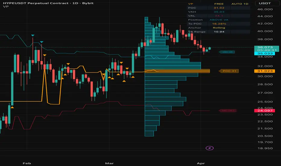
Volume Profile█ VOLUME PROFILE
Volume-at-Price Analysis with POC, VAH & VAL
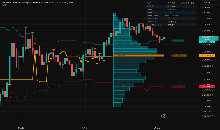
A powerful volume-at-price analysis overlay that calculates and visualizes the Point of Control (POC) , Value Area High (VAH) , and Value Area Low (VAL) directly on your chart. It reveals where the most trading activity occurred and provides real-time price position analysis — helping you identify high-probability support/resistance levels and mean-reversion zones.
Free and Open Source.
█ THE CONCEPT: WHY VOLUME PROFILE MATTERS
Price charts show when trading happened. Volume Profile shows where it happened. The distribution of volume across price levels reveals the market's true valuation zones:
Point of Control (POC) — The price with the highest accumulated volume. Acts as a magnet for price and the strongest single S/R level.
Value Area (70%) — The range containing 70% of all traded volume. Defines what the market considers "fair value."
Above/Below VA — Price outside the value area signals potential overextension or breakout.
Institutional traders, market makers, and algorithmic systems all reference volume profile levels.
█ CORE FEATURES
1. Volume Profile Engine
Distributes each bar's volume proportionally across the price rows it spans, building a precise volume-at-price histogram:
POC — Highest volume row = strongest support/resistance
VAH — Upper boundary of the 70% value area = resistance
VAL — Lower boundary of the 70% value area = support
Row count is configurable (10-50 levels).
2. Profile Anchoring
Three anchor modes control how the profile is built:
Rolling — Continuously recalculated over the last N bars. Best for real-time analysis.
Session — Resets every new trading day. Best for intraday context.
Week — Resets every new trading week. Best for swing context.
3. Price Position Analysis
Real-time classification of price relative to the value area:
ABOVE VA — Potential overextension or breakout
BELOW VA — Potential undervaluation or breakdown
AT POC — High-probability mean-reversion zone
IN VA — Normal trading range
4. Bounce & Rejection Signals
Automatic detection of price interaction with key volume levels:
POC Bounce Up/Down — Price touches POC and reverses
VAL Rejection — Price tests VAL and bounces up (bullish)
VAH Rejection — Price tests VAH and bounces down (bearish)
5. Volume Histogram Visualization
A horizontal bar chart displayed directly on the price chart showing the volume distribution. POC row highlighted with a distinct color.
█ AUTO-TIMEFRAME ADAPTATION
All parameters automatically adjust based on the chart timeframe:
1-5 min → Lookback 30, 18 Rows, Histogram Width 8
15-30 min → Lookback 40, 20 Rows, Histogram Width 10
1 Hour → Lookback 50, 24 Rows, Histogram Width 15
4 Hour → Lookback 70, 28 Rows, Histogram Width 18
Daily → Lookback 100, 32 Rows, Histogram Width 22
Weekly+ → Lookback 150, 40 Rows, Histogram Width 30
█ DASHBOARD
A compact, dark-themed info panel displaying:
POC — Current Point of Control price level
VAH / VAL — Value Area boundaries
Position — Current price position (ABOVE VA / BELOW VA / AT POC / IN VA)
To POC — Distance from current price to POC in percent
Anchor — Active profile anchor mode
VA Range — Width of the value area in price units
█ ALERTS (4 CONDITIONS)
POC Bounce Up — Bullish bounce off the Point of Control
POC Bounce Down — Bearish bounce off the Point of Control
VAL Rejection — Bullish rejection at Value Area Low
VAH Rejection — Bearish rejection at Value Area High
█ NON-REPAINTING
The volume profile is calculated from confirmed bar data only. Rolling mode recalculates the full lookback window on each bar using historical high/low/volume — no future data is used. Session and Week modes accumulate incrementally within the anchor period. No repainting.
█ WORKS ON
Crypto, Forex, Stocks, Futures, Indices — any timeframe from 1 minute to Monthly.
█ DISCLAIMER
This indicator is for educational and informational purposes only. It does not constitute financial advice. Always do your own research and manage your risk. Past performance does not guarantee future results. Trading involves substantial risk of loss.
Indikator
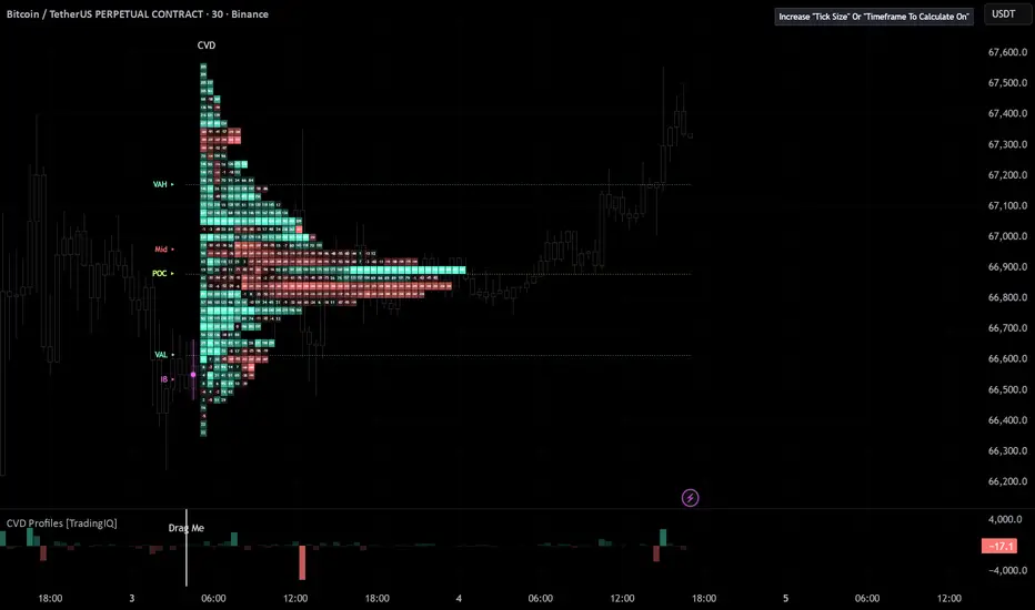
CVD Profiles [TradingIQ]Hello Traders!
🔹 CVD Profiles
CVD Profiles is a profile-based order flow visualization tool designed to show how participation distributes across price levels - not just over time, but through price itself .
Think volume profile data + TPO time segmenting!
Instead of looking at cumulative delta as a single line, this tool breaks it down into a price-based structure , revealing where activity, imbalance, and participation actually occurred within the session.
It focuses on answering a more important question:
Where did participation concentrate… and how did it distribute across price/time?
cumulative delta distributed by price level
buy vs sell activity mapped into profiles
imbalance and dominance across structure
value areas and point of control
activity concentration (volume, USD, or delta-based)
how participation builds within a session
🔹 What the tool shows
🔸 CVD Profile (price-based structure)
Instead of viewing delta as a time series, this tool distributes it across price levels - forming a profile of participation .
This allows you to see:
where buying pressure accumulated
where selling pressure dominated
which price levels attracted the most activity
🔸 Imbalance Ratio (dominance structure)
Imbalance mode shifts the focus from raw participation to relative dominance between buyers and sellers at each price level.
Each level reflects the ratio between buy and sell activity, highlighting where one side clearly outweighed the other.
This allows you to see:
where buyers strongly dominated sellers
where sellers overwhelmed buying pressure
areas of clear directional conviction
High imbalance levels often represent:
aggressive participation
momentum-driven behavior
one-sided control at specific prices
Balanced areas, on the other hand, suggest:
indecision
two-sided trade
lack of conviction
🔸 Activity Mode (participation intensity)
Activity mode focuses on how much trading activity occurred at each price level, regardless of direction.
Instead of separating buyers and sellers, this mode aggregates total participation to reveal:
high interest zones
areas of heavy interaction
where the market spent the most effort
This helps identify:
key auction areas
high liquidity regions
zones where price is likely to react
Low activity areas often indicate:
inefficient movement
thin liquidity
potential for fast price movement
This mode is about effort - not direction.
🔸 USD Volume Mode (capital-weighted activity)
USD Volume mode builds on activity by incorporating price-weighted participation .
Instead of just counting volume, it measures:
“where was the most capital traded?”
This highlights:
price levels with the highest notional value traded
areas of significant financial commitment
where larger participants may be involved
Compared to raw activity, this mode emphasizes:
higher-priced transactions
capital concentration rather than trade count
This is especially useful for:
spotting institutional interest
identifying meaningful participation zones
filtering out low-value noise
This mode is about capital — not just volume.
www.tradingview.com
🔸 Multiple profile models
The script supports different ways to interpret participation:
CVD → raw cumulative delta distribution
Imbalance Ratio → relative dominance (buy vs sell strength)
Activity → total participation intensity
USD Volume → capital-weighted activity
Each model answers a slightly different question about the market.
🔸 Value Area & POC
The tool automatically calculates:
Point of Control (POC) → highest participation level
Value Area High (VAH)
Value Area Low (VAL)
This helps identify:
fair value
high liquidity regions
areas where price is most accepted
These levels often act as key reference points for structure and reaction.
🔸 Initial Balance (IB)
The script tracks the initial balance range.
This highlights:
early session structure
range expansion vs containment
where price begins its auction
It provides context for how the session develops relative to its starting range.
🔸 Profile stacking (time progression)
Profiles are built over time and stacked horizontally, showing how participation evolves.
This allows you to observe:
shifts in dominance over time
expansion of participation into new price zones
whether activity is building or fading
Instead of a static snapshot, you get a dynamic structural progression .
🔸 Gradient-based intensity
Color gradients represent the magnitude of activity.
This helps highlight:
high participation nodes
low interest areas
extreme dominance zones
Stronger colors = stronger participation.
🔸 CVD Delta / Acceleration histogram
An off-chart histogram shows:
CVD Delta → change in participation
CVD Acceleration → change in momentum of participation
CVD Delta represents the amount of buying vs selling pressure added during the current bar.
In simple terms:
positive delta → more buying than selling
negative delta → more selling than buying
This tells you who was in control during that bar .
CVD Acceleration takes it one step further.
It measures how quickly delta itself is changing:
increasing acceleration → pressure is building
decreasing acceleration → pressure is slowing
sharp shifts → potential transitions in control
This helps answer a deeper question:
“Is participation just present… or is it expanding?”
Together, they give you a clearer read on:
whether buying/selling is increasing
whether momentum is building or fading
when participation is strengthening vs weakening
Think of it like this:
CVD Delta = current pressure
CVD Acceleration = change in pressure
Strong trends are often accompanied by:
consistent delta in one direction
positive acceleration early in the move
While weakening moves often show:
falling delta
negative or declining acceleration
🔹 How to read it
Each component provides a different layer:
Profile → where participation occurred
POC / VA → where value is established
Model selection → what type of participation you're measuring
Histogram → how participation is changing
🔹 Example interpretations
high activity at a level → strong interest / potential reaction zone
thin profile areas → low liquidity / fast movement zones
POC holding → acceptance
POC shifting → changing value
expanding profile → active auction
contracting profile → consolidation
🔹 Why this tool is useful
It gives you:
price-based participation mapping
clear visualization of where trading actually occurred
context for value and liquidity
insight into dominance and imbalance
a structural view of order flow instead of just time-based data
🔹 Best use cases
identifying key reaction levels
analyzing auction behavior
tracking value shifts across sessions
confirming strength or weakness at price
enhancing liquidity-based or structure-based strategies
🔹 Important note
This tool uses lower timeframe data to reconstruct participation.
This means:
it is an approximation of order flow
accuracy depends on available intrabar data
lower timeframe selection impacts precision
🔹 Important consideration
CVD and participation:
can drive price
can fail to move price
can be absorbed by opposing liquidity
Location matters just as much as magnitude.
🔹 Inputs you can customize
The script includes flexible controls such as:
profile model selection
lower timeframe input
profile resolution (tick size)
value area percentage
fixed start vs rolling sessions
color customization
histogram mode (delta vs acceleration)
Closing Notes
This tool is built to shift your perspective from time-based indicators to price-based participation analysis .
It helps you understand not just what the market did — but where it mattered most .
It may receive updates based on feedback - stay tuned!
Thank you TradingView as always! Indikator

Indikator

TPO Single Prints + nPOCThis indicator brings two core Market Profile concepts to TradingView in a clean, automated way: the Naked Point of Control (nPOC) and Single Prints. Both are calculated from real TPO (Time Price Opportunity) logic using configurable tick sizes, and both are tracked live — updating and removing themselves as price interacts with them.
The indicator supports both daily and weekly timeframes simultaneously, giving you a layered view of unfilled structures across multiple session lengths. Everything is drawn directly on the chart as lines and boxes with fully customizable colors.
Naked Point of Control
The price level with the highest TPO count in a completed session that has not yet been revisited by price. Drawn as a horizontal line extending forward in time until touched.
Single Prints
Price levels within a session's body that were only visited by a single TPO period. These form thin zones representing areas of fast, one-sided movement — can act as magnet for future price action.
Tick-Precise Logic
All calculations are snapped to configurable tick sizes (BTC: $24, ETH: $2, SOL: $0.1, or manual). This ensures the indicator correctly represents the granularity of the underlying asset.
Tick Settings
Tick Preset
Selects a predefined tick size for the asset. BTC = $24, ETH = $2, SOL = $0.10. Choose MANUAL to enter a custom value.
Manual Tick Size
Active only when Tick Preset is set to MANUAL. Defines the price increment for profile row construction. Should match the asset's meaningful price granularity.
Naked POC Settings
Show Daily nPOC
Enables nPOC lines from daily sessions. Each completed day that has not had its POC revisited will show a horizontal line.
Show Weekly nPOC
Same as above but for weekly sessions. Weekly nPOCs tend to be stronger, longer-lasting reference points.
Single Prints Settings
Show Daily SPs
Enables Single Print boxes from daily sessions.
Show Weekly SPs
Enables Single Print boxes from weekly sessions.
Keep Touched SPs
When enabled, fully filled SP zones are not deleted. Instead they are recolored to a faded gray and stop extending, leaving a visual record of where fills occurred.
How traders use this
nPOC as Magnet Levels
Markets statistically tend to revisit past POC levels. Naked POCs are strong candidates for mean-reversion targets, especially when price is trending away from a cluster of unfilled levels.
Single Prints as Impulse Markers
Single prints form during fast, directional moves with little acceptance. When price returns to these zones, it often does so quickly — making them useful for entries in the direction of the original move. Indikator

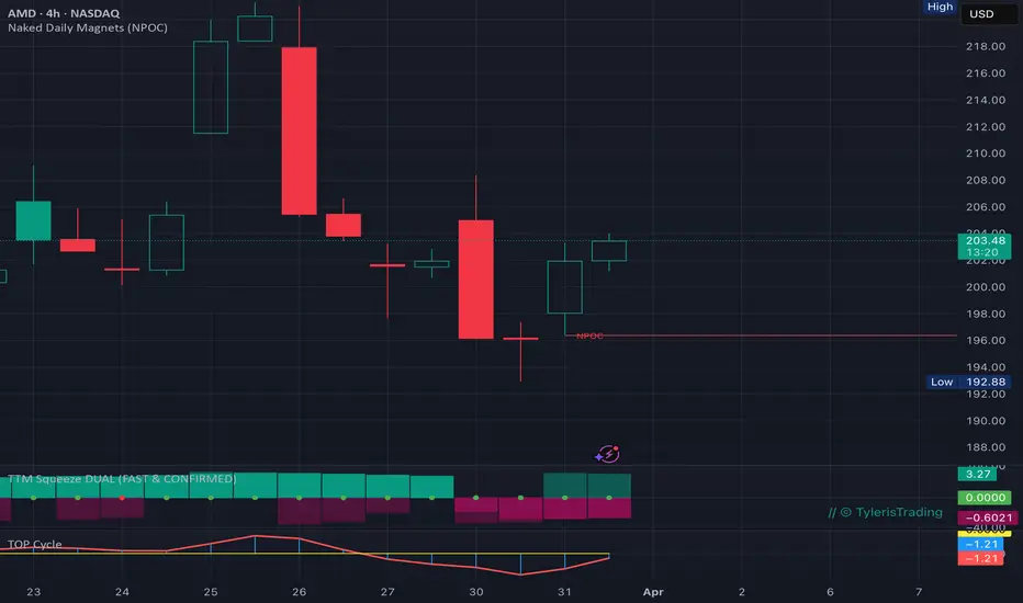
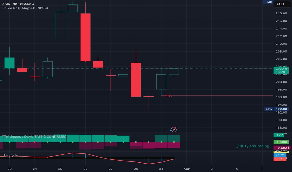
Naked Daily Magnets (NPOC)Naked Daily Magnets (NPOC)
The Strategy: Trading the Market's "Unfinished Business"
The Naked Point of Control (NPOC) looks "inside" the candles to identify exactly where the highest volume of shares changed hands during each daily session.
When the market moves aggressively away from a high-volume area and never returns to retest it, it leaves behind a "Naked" level. These levels act as massive price magnets because they represent areas of high institutional interest, unfilled limit orders, and trapped participants.
Note: This indicator is intended to be complementary to my Magnet Map indicator, which tracks institutional order flow and adjusts dynamically based on PA and volume. It can be found here:
How it Works:
Intraday Volume Scanning: The script uses lower-timeframe (1-minute) data to calculate the true Point of Control (POC) for every daily bar.
The "Naked" Logic: A horizontal magnet is projected forward into the future only if the price has NOT yet returned to that specific high-volume level.
Automatic Mitigation: As soon as a future candle "tags" or "touches" the level, the magnet is considered "cleared" and is automatically removed from your map.
Static Targets: Unlike dynamic indicators that shift with current price, these are fixed levels that provide objective targets for take-profits or high-probability entries for bounces.
How to Trade with Magnets:
Targets: If you are in a trend, look for the nearest NPOC as your primary "Exit" or "Take Profit" target. Price is statistically drawn to these high-volume "vacuums."
Support/Resistance: Naked POCs from previous days often act as the "ultimate" floor or ceiling. Expect a sharp reaction (bounce or rejection) when a line is hit for the first time in days or weeks.
The Gap Fill: Use these levels to identify where institutions are likely to defend their positions after a major gap or news event.
Key Features:
Lookback Filtering: Control how many days of historical data to scan to keep your "Map" clean and focused on recent relevant levels.
Customizable Precision: Adjust the "POC Precision" to refine how the volume bins are calculated.
Understanding "POC Precision" (Volume Bins)
Most standard indicators only look at the Open, High, Low, and Close of a day. This script is different—it "drills down" into the day and slices the price range into horizontal "bins" (like shelves). It then counts every single share traded on each shelf to find the one with the most weight.
The "Bin" Logic:
Imagine AMD traded between $200 and $210 today.
If your precision is 10, each bin is $1.00 wide ($200-201, $201-202, etc.).
If your precision is 100, each bin is only $0.10 wide.
This indicator works best on Daily (1D) or Higher Intraday (4H, 12H) timeframes to provide a high-level "Map" of the market's structural gravity.
Script by TylerisTrading Indikator
Indikator

Indikator

AG Pro Volume Profile POC Magnet Map [AGPro Series]AG Pro Volume Profile POC Magnet Map
Overview
AG Pro Volume Profile POC Magnet Map is a chart-overlay indicator built around one practical question: how strongly is the current Point of Control attracting, holding, or losing price?
Instead of trying to replicate a full volume-profile workstation, this script focuses on the behavior of the active POC and the surrounding value area. The goal is to turn a familiar volume-profile concept into a cleaner decision-support map that helps users judge whether price is still interacting with the current fair-value center, rejecting it, reclaiming it, or beginning to establish value elsewhere.
The script is designed for users who want a visual framework around POC behavior without covering the chart with heavy histogram structures or overly complex dashboards. It highlights the active POC, the current Value Area High (VAH), the current Value Area Low (VAL), a compact magnet band around the POC, and a small set of reaction labels that describe how price is interacting with that area.
In short, this indicator is not trying to tell users what to buy or sell. It is trying to make one specific market reference more readable: the relationship between price and the current POC region.
What the script does
At a high level, the script does five things:
1) It builds a fixed-lookback volume-distribution map from recent chart data.
2) It derives the active POC, VAH, and VAL from that distribution.
3) It measures how close price is to the current POC and how often price revisits or accepts that region.
4) It converts those observations into a compact Magnet Score and state readout.
5) It marks a small set of price/POC interaction events such as Tag, Reject, and Reclaim.
The result is a visual tool that combines reference levels and contextual interpretation in one overlay.
Unique edge
Many indicators can show a POC. This script is built to answer a more specific question: what is the quality of the current POC as a magnet for price?
That difference matters. A raw POC line can be useful, but by itself it does not explain whether price is repeatedly returning to it, drifting away from it, rejecting it, or stabilizing around it. This script adds that missing context by combining the active POC with a behavior layer.
The design goal is not “more features.” The design goal is clearer interpretation:
- Is price still accepting the current value center?
- Is the POC functioning as a pullback magnet?
- Is price rejecting the area instead of accepting it?
- Is value beginning to migrate?
That is the role of the score, the state engine, and the reaction labels.
Methodology
The script uses a fixed lookback window and divides the recent price range into user-defined bins. It then allocates each bar’s volume to one price bin using the selected bar source, which can be Close or HLC3. From that distribution it identifies:
- POC: the highest-volume bin in the lookback window
- VAH: the upper boundary of the selected value area percentage
- VAL: the lower boundary of the selected value area percentage
After the levels are derived, the script evaluates how price is behaving relative to the active POC region.
The Magnet Score is built from multiple components:
- Distance: how far current price is from the POC, normalized by ATR
- Revisit behavior: how often price has returned to the POC region
- Acceptance behavior: how often price has closed near the POC region
- Stability: whether the POC is relatively stable or drifting quickly
- Rejection pressure: whether interactions with the POC region are ending in rejection rather than acceptance
These components are combined into a bounded 0-100 score. Higher readings suggest that the current POC remains a stronger center of attraction. Lower readings suggest weaker pull, weaker acceptance, or a market beginning to operate away from the current value center.
The script then classifies context into states such as:
- Magnet Strong
- Magnet Active
- POC Tagged
- POC Rejected
- Accepted Away
- Magnet Weakening
This state layer is designed to summarize the current context rather than generate automatic trading instructions.
How to read the chart
POC
The POC is the main reference line. It marks the highest-volume price zone inside the selected lookback distribution. If price repeatedly returns to it, reacts from it, or consolidates around it, that line is functioning as an active center of interest.
VAH and VAL
VAH and VAL define the current value-area boundaries. These help users judge whether price is still operating inside value or beginning to establish acceptance above or below it.
Magnet band
The magnet band is a narrow region around the POC. It exists to make POC interaction easier to read visually. It is not a claim that every touch is meaningful. It is simply a compact visual tolerance zone around the active POC.
Reaction labels
The script can display a small set of event labels:
- Tag: price reached the current POC region
- Reject: price interacted with the area and moved away
- Reclaim: price crossed back through the active POC after being on the other side
These labels are meant to help describe interaction, not to replace confirmation logic, risk management, or broader market context.
Panel
The panel summarizes:
- Magnet Score
- POC Distance
- POC Drift
- Value Context
- Last Reaction
- Current POC / VAH / VAL values
This gives users a quick status view without needing to inspect every line manually.
Typical use cases
This indicator may be useful when users want to:
- monitor whether pullbacks are still returning to the active POC
- judge whether price is still auctioning inside value or beginning to accept away from value
- compare different symbols for how “sticky” the current POC region appears to be
- add context to an existing structure, trend, or mean-reversion workflow
- keep a cleaner chart while still tracking basic volume-profile behavior
The script is intended as a context and interpretation layer. It is not a complete trading plan on its own.
Key inputs
Lookback Bars
Controls the size of the historical window used for the profile calculation. A larger value creates a broader context. A smaller value makes the profile more reactive.
Rows / Bin Count
Controls profile granularity. Higher values create more detailed binning. Lower values produce a smoother, simpler map.
Value Area %
Defines how much of total lookback volume is included inside the value area used to derive VAH and VAL.
Price Source For Bin Allocation
Lets users choose whether each bar’s volume is allocated using Close or HLC3. This changes how the profile is distributed across bins.
ATR Length
Used in normalization and spacing calculations, including the distance component and label positioning.
Magnet Band Width (ATR)
Controls the thickness of the tolerance zone around the active POC.
Distance Ceiling (ATR)
Caps how far price can be from the POC before the distance component is treated as maximally weak.
Revisit Window and Acceptance Window
These affect how the script measures repeated interaction and acceptance around the active POC region.
POC Drift Lookback
Used to estimate whether the active POC is relatively stable or shifting.
Label controls
Users can adjust label visibility, density, cooldown behavior, and right-edge line labels to keep the chart cleaner or more descriptive depending on preference.
Alerts
The script includes alert conditions for:
- POC Tag
- POC Reject
- POC Reclaim
- Magnet Strong
- Magnet Active
- Magnet Weakening
- Accepted Away
These alerts are event-based notifications tied to the script’s contextual logic. They are not performance claims and they should not be interpreted as guaranteed entry or exit signals.
Limitations and transparency
This script uses a fixed-lookback, bar-based approximation of volume distribution. It does not reconstruct native exchange-level order flow, bid/ask delta, or true tick-by-tick auction detail.
Volume is allocated to bins using a selected bar source rather than full intrabar volume-at-price reconstruction. That means the profile is intentionally simplified so it can remain lightweight and readable inside a standard Pine overlay.
Because the script uses a rolling lookback window, the active POC, VAH, and VAL can change as older bars leave the window and newer bars enter it. That is normal behavior for this design.
The reaction labels are descriptive, not predictive. A Tag does not imply reversal. A Reject does not guarantee continuation. A Reclaim does not guarantee trend resumption. They are context markers showing how price interacted with the current POC area according to the script’s definitions.
This tool should be read in conjunction with price structure, volatility, liquidity conditions, and user-defined execution rules.
What this script is not
This script is not:
- a full session volume-profile suite
- an order-flow or footprint tool
- a prediction engine
- a guaranteed reversal detector
- a stand-alone trade system
It is a focused overlay for interpreting how price is behaving around the current Point of Control and value-area structure.
Practical interpretation notes
In many markets, the POC acts like a reference area rather than a directional signal. The more often price returns to it and the more often price stabilizes near it, the more useful that region can become as a working fair-value reference.
By contrast, when price begins to hold above VAH or below VAL and stops interacting meaningfully with the POC region, the script may shift toward weaker magnet states or accepted-away context. That does not automatically imply trend continuation, but it does suggest that the current value center may be losing influence.
Users may find this especially useful when comparing:
- balanced conditions vs. directional conditions
- shallow pullbacks vs. deeper value retests
- symbols that keep rotating through value vs. symbols that are clearly accepting away from it
Risk disclosure
This indicator is for chart analysis and market context only. It does not provide investment advice, trading advice, or guaranteed outcomes.
All indicators simplify market behavior. This script is no exception. Markets can ignore previously important value references, react differently across symbols and timeframes, and change behavior as volatility regimes shift.
Users are responsible for their own confirmation process, execution decisions, and risk management. Indikator

IQ Candles [TradingIQ]Hello Traders!
🔹IQ Candles
IQ Candles is a brand new chart type - a pressure-based visualization tool designed to break down what’s happening inside each candle.
Gone are the days of traditional candlesticks - it's time for an upgrade!
Instead of treating candles as simple open-high-low-close structures, this chart type reconstructs how buying and selling pressure actually developed within the bar using lower timeframe data.
It focuses on answering a more refined question:
Where did the pressure come from… and how did it translate into price?
buy vs sell pressure inside each candle
true dominance within the bar
imbalances driven by aggressive participation
absorption of pressure by opposing liquidity
hidden strength or weakness behind candle structure
🔹What the chart type shows
🔸Pressure candles (internal structure)
Each candle is reconstructed to reflect the internal distribution of buying and selling pressure.
This allows you to instantly see:
where buying pressure accumulated
where selling pressure dominated
how evenly or unevenly the candle was built
Instead of a single body, you see the composition of the move.
The example above shows a candlestick that is majority green and about 20% red. This indicates that aggressive buys dominated the candle/price area, and contributed made the highest contribution to the structure of the candle.
The example above shows a candlestick that is majority red and about 10% green. This indicates that aggressive sells dominated the candle/price area, and contributed made the highest contribution to the structure of the candle.
The example above shows a candlestick that is 50% green and 50% red. This indicates equal contribution.
🔸Smoothed Contribution
When smoothing is enabled, the chart type applies a moving average to buying and selling pressure.
This reduces noise and highlights the underlying trend of participation over time.
Instead of focusing on every short-term fluctuation, you get a clearer view of:
sustained buying pressure
sustained selling pressure
gradual shifts in control between buyers and sellers
This is especially useful for:
filtering out erratic lower timeframe noise
identifying persistent dominance
understanding whether pressure is building or fading over multiple bars
In fast or choppy conditions, raw pressure can fluctuate rapidly.
🔸Absorption detection
The chart type detects when strong pressure fails to move price effectively.
This is one of the most important concepts in order flow.
It highlights:
buying absorbed at highs
selling absorbed at lows
hidden liquidity opposing aggressive traders
potential exhaustion or reversal conditions
This helps answer:
“Was that pressure actually effective?”
The image above shows an example of the chart type when buyers are absorbed.
The image above shows an example of the chart type when sellers are absorbed.
🔸Imbalance detection
When one side heavily outweighs the other, the chart type highlights imbalance conditions.
This helps identify:
aggressive one-sided participation
momentum-driven moves
bars where one side clearly overpowered the other
Imbalances are not just about direction - they show conviction.
The image above shows the chart type detecting a buy-side imbalance candle.
The image above shows the chart type detecting a sell-side imbalance candle.
🔸Buy vs Sell pressure histogram
A histogram displays total buying and selling pressure per bar.
This gives you a quick read on:
which side is in control
how dominant that control is
whether pressure is increasing or fading
🔸Delta mode (pressure expansion)
Delta mode emphasizes the difference between dominant and opposing pressure.
This is useful for:
highlighting extreme dominance
isolating one-sided control
visualizing pressure expansion during strong moves
The image above shows how to read positive delta candles for the chart type.
The image above shows how to read negative delta candles for the chart type.
🔸Candle Radar (live table)
A live table summarizes current bar activity, including:
buy pressure
sell pressure
buy/sell percentages
delta ratio
dominant side
imbalance status
absorption status
This provides a quick overview without needing to interpret the chart visually.
🔹How to read it
Each component gives a different layer of information:
Histogram → total pressure (who is active)
Candle structure → how pressure translated into price
Imbalance → when one side dominates
Absorption → when dominance fails
Together, this shifts your perspective from:
“price moved up”
to:
“buying pressure dominated — but did it actually succeed?”
Example interpretations:
strong buy pressure + strong close → clean continuation
strong buy pressure + weak close → possible absorption
balanced pressure → indecision / consolidation
extreme imbalance → momentum or potential exhaustion
absorption signals → potential reversal or liquidity interaction
🔹Why this chart type is useful
It gives you:
internal candle structure
clear separation of buying and selling pressure
context for whether pressure is effective
imbalance detection for momentum
absorption detection for reversals
a deeper understanding of how price actually forms
🔹Best use cases
analyzing strength behind moves
confirming continuation vs weakness
spotting absorption at key levels
understanding liquidity interactions
enhancing price action or liquidity-based models
🔹Important note
Pressure can:
drive moves
fail to move price
or be absorbed by opposing liquidity
Context always matters.
🔹Important consideration
This script uses lower timeframe data to approximate internal pressure.
This means:
accuracy depends on available data
different symbols may behave differently
lower timeframe selection impacts results
🔹Inputs you can customize
The script includes flexible controls such as:
lower timeframe selection
smoothing of pressure
imbalance threshold
absorption sensitivity
delta mode behavior
extended move filtering
visual styling and colors
Closing Notes
And that’s about it!
This script is built to reveal what candles are actually doing beneath the surface -turning price into something you can interpret, not just observe.
It may receive updates based on feedback - stay tuned!
Thank you TradingView as always! Indikator

HTF Volume Spike & Imbalance Projection [LuxAlgo]The HTF Volume Spike & Imbalance Projection indicator provides a comprehensive multi-timeframe analysis tool that projects higher timeframe (HTF) candle structures, volume spikes, and volume profiles directly onto the current chart. This script aims to bridge the gap between different time horizons, allowing traders to identify institutional interest, supply/demand zones, and significant order flow imbalances within an HTF context without ever switching timeframes.
🔶 USAGE
🔹 The Core Concept
While standard charts only show the OHLC of a candle, this indicator deconstructs a single large candle (e.g., a 1-hour candle) into its individual internal components. It looks for Volume Spikes (moments of high activity) and Stacked Imbalances (where aggressive participants stepped in repeatedly) to reveal the "story" inside the bar.
🔹 Reading the Projection
The indicator projects two visual blocks to the right of your current price action:
Ghost Bar (Left Block): This represents the previous completed HTF candle. It is faded out to provide historical context and show where the previous "value" was established. Current Bar (Right Block): This represents the HTF candle currently forming and updates in real-time as new data arrives.
Each block is divided into three distinct visual sections:
HTF Candle: A standard candle representation of the higher timeframe (Open, High, Low, Close). Scatter Plot (The Bubbles): Every bubble represents a volume spike that occurred on the lower timeframe (LTF) granularity. The size of the bubble indicates higher volume, while the color indicates buying (Green) or selling (Red) pressure. Dotted lines connect the High and Low of the candle to this zone for reference. Volume Profile (The Histogram): Displays the total distribution of volume across the entire HTF candle, highlighting high-volume nodes.
🔹 Key Feature: Stacked Imbalances
Look for the solid colored boxes behind the scatter plot bubbles. These "Stacked Imbalances" appear when 3 or more volume spikes of the same direction occur at the same price level within one HTF candle.
Bullish Imbalance (Green Box): Indicates a strong area of buying interest. These often act as support levels. Bearish Imbalance (Red Box): Indicates a strong area of selling interest. These often act as resistance levels.
🔹 On-Chart Bubbles
The bubbles visible on the actual candles of your chart are the same spikes shown in the projection.
A cluster of large bubbles at the top of a candle indicates exhaustion or heavy selling at the highs. Large bubbles at the bottom indicate a strong floor being built by buyers.
🔶 DETAILS
The indicator uses
request.security_lower_tf()
to pull granular data. By analyzing volume at this "Spike Granularity," the script can pinpoint specific price levels where volume exceeded a moving average by a user-defined multiplier.
🔹 Trading Tips
Identify Point of Control: Use the Volume Profile in the projection to see where the "Value" is. Trading usually gravitates back to high-volume areas. Trade the Imbalances: When price returns to a previously formed "Stacked Imbalance" box from the Ghost Bar, look for a reversal. These are high-probability areas where institutional activity was detected. Volatility Detection: If the scatter plot is empty, the current move is "low conviction" (low volume). If it's filled with large bubbles, big players are active.
🔶 SETTINGS
🔹 Higher Timeframe (Anchor)
HTF Anchor Timeframe: Defines the timeframe of the main projection. The "Auto" setting selects a logical HTF based on your current chart.
🔹 Volume Spike Detection
Spike Granularity: The lower timeframe used to find individual spikes. Volume Spike Multiplier: The threshold used to define a "spike" relative to the volume average. Volume MA Length: The lookback period for the volume average.
🔹 Advanced Features
Show Ghost (Previous) Bar: Toggles the visualization of the previous HTF period. Highlight Stacked Imbalances: Enables detection of price zones with high-frequency aggressive volume. Show Anchor Connection Lines: Toggles lines connecting chart levels to the projection block. Show Bubbles on Chart Candles: Toggles the LTF volume spikes directly on the main chart bars. Indikator

Indikator

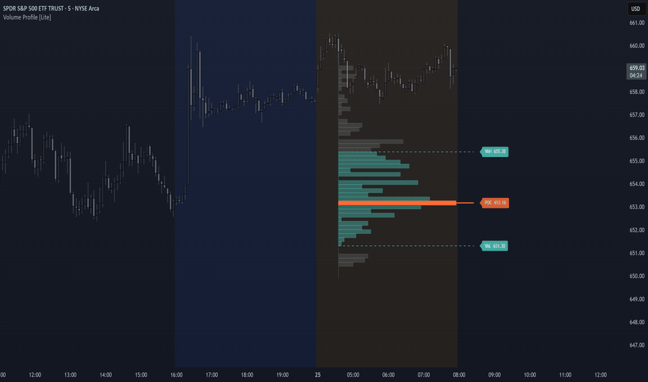
Volume Profile [Lite]Volume Profile — POC / VAH / VAL
Volume Profile is a clean, open, fully readable implementation of the core concepts every serious trader should have on their chart — Point of Control, Value Area High, Value Area Low, and a visual histogram showing exactly where the market has done its real work over your chosen lookback window.
No fluff. No black box. Just honest volume analysis.
POC - The single price level where the most volume traded. The market's true anchor.
VAH / VAL - The upper and lower boundary of the Value Area, defaulting to the standard 70% convention used by professional TPO traders.
Histogram - Color-coded bars showing relative volume distribution at a glance. Inside the value area, outside it, and the POC all render distinctly.
Built for the community.
This is intentionally a lite version. The source is short, commented, and structured so that whether you're just starting out in Pine Script or looking to extend a solid foundation into something more advanced — session-based profiles, multi-timeframe levels, alerts, you name it — the path forward is obvious.
Use it as-is. Fork it. Tear it apart. Build something better and share it forward.
That's how this community grows.
Settings: Lookback Bars · Profile Rows · Value Area % · Bar Width · Custom Colors · Labels on/off Indikator
Institutional Volume Profile [Quantum Algo]Institutional Volume Profile
Developed by QuantumAlgo
█ OVERVIEW
The Institutional Volume Profile by Quantum Algo is a next-generation volume profile indicator that goes far beyond what standard volume profile tools offer on TradingView. While most volume profile scripts render a static histogram with flat coloring, Quantum Algo's Institutional Volume Profile introduces gradient heat mapping, buy/sell delta visualization, automatic node classification, a migration trace for tracking institutional repositioning, and a live analytics dashboard — all in one overlay.
This is the volume profile that institutional desks use, rebuilt for TradingView by QuantumAlgo.
Institutional Volume Profile by Quantum Algo — gradient heat map mode on BTCUSDT Perpetual showing Control Level, Equilibrium Zone edges, and analytics dashboard.
The gradient heat map mode above shows how volume density is distributed across price. Warmer tones (vivid cyan) indicate heavy institutional participation. Cooler tones (muted gray) indicate thin levels where price passed through quickly. The Control Level (amber line) marks peak density. Dashed cyan lines mark the Equilibrium Zone boundaries. The analytics dashboard in the corner provides real-time readouts of all key levels.
█ WHAT MAKES THIS DIFFERENT FROM OTHER VOLUME PROFILES
Most volume profile indicators on TradingView — including the top-ranked ones — share the same limitations: flat single-color bars that make every level look equally important, no way to see buy vs sell dominance within the profile, no automatic identification of high-volume and low-volume nodes, and no live dashboard showing where current price sits relative to the value area.
The Quantum Algo Institutional Volume Profile solves every one of these problems:
Flat bars → Gradient heat mapping that instantly shows which levels carry real institutional weight
No directional insight → Buy/sell delta coloring that reveals hidden directional bias at every price level
No node detection → Automatic Dense Node and Void Node classification with configurable thresholds
No context → Live analytics panel showing Control Level, Equilibrium Zone edges, total density, zone width, and whether price is in Premium, Discount, or Equilibrium
Static POC → Optional Migration Trace showing how the control level drifts over time as institutions reposition
This combination of features does not exist in any other volume profile indicator on TradingView. Built entirely from scratch by Quantum Algo using a proprietary direct-mapped accumulation engine.
█ SEVEN CORE FEATURES
▸ 1 — Gradient Heat Mapping
Every row in the profile transitions smoothly from cool (sparse volume, muted gray) to warm (dense volume, vivid cyan) based on its density relative to the peak. Inside the Equilibrium Zone, the gradient shifts to a brighter cyan spectrum. The result is an instant visual heat map — your eye is drawn to the institutional clusters without reading a single number.
Institutional Volume Profile by Quantum Algo — heat map with Equilibrium Zone shading on BTCUSDT Perpetual]
Above: The heat map creates a clear visual hierarchy. The densest levels glow bright while thin levels fade into the background. The Equilibrium Zone (between the dashed lines) stands out as the fair value range.
▸ 2 — Buy/Sell Delta Background
When enabled, the profile bars are colored by directional dominance at each price level. Levels where buy-side volume exceeds sell-side show green. Levels where sell-side dominates show red. Neutral levels fall back to the standard color scheme. The intensity of the green or red scales with how extreme the dominance is.
Institutional Volume Profile by Quantum Algo — delta mode showing buy-side (green) and sell-side (red) dominance on BTCUSDT Perpetual]
Above: Delta mode reveals the directional story hidden inside the aggregate profile. You can immediately see where buyers were dominant (green zones) versus where sellers controlled the action (red zones). This is information that a standard flat-colored volume profile completely hides from you.
▸ 3 — Control Level with Style Options
The Control Level is the single price with peak accumulated density — the center of institutional gravity. Drawn as a prominent horizontal line extending across the full analysis window with configurable color, weight, and line style (Solid, Dashed, or Dotted). In the analytics panel, the exact price is displayed for precision.
▸ 4 — Equilibrium Zone (Value Area)
The zone containing the configured share of total density (default 68%, matching one standard deviation). All rows within the zone receive boosted coloring — brighter gradient in heat map mode, stronger delta colors in delta mode. Upper and lower edge lines are drawn as dashed horizontals for use as dynamic support and resistance.
Price above the upper edge is in Premium territory. Price below the lower edge is in Discount. Price inside is at Equilibrium. The analytics panel shows which context applies in real time.
▸ 5 — Dense Node and Void Node Classification
The indicator automatically scans the completed profile and labels levels as Dense Nodes (HVN — abnormally high density, strong S/R magnets) or Void Nodes (LVN — negligible density, fast-travel zones). Thresholds are configurable as multiples of the profile mean. Labels appear on the right edge of the profile for instant identification.
▸ 6 — Migration Trace (Developing POC)
An optional feature that tracks how the Control Level migrates over the scan window. A dotted trail is drawn showing where peak density sat at each sampling interval as the session developed. A flat trace means institutions were committed to one level. A migrating trace reveals active repositioning. This is a feature available on institutional platforms like Sierra Chart and Bookmap, brought to TradingView by QuantumAlgo.
▸ 7 — Live Analytics Dashboard
A compact on-chart panel displays key profile metrics in real time: Control Level price, Equilibrium Zone upper and lower edges, total accumulated density (formatted as K/M/B), zone width in price terms, and whether current price is in Premium, Discount, or Equilibrium. The panel follows the Quantum Algo dark design language and updates automatically.
Institutional Volume Profile by Quantum Algo — full feature view with analytics dashboard, Equilibrium Zone, and Control Level on BTCUSDT Perpetual]
Above: The complete Quantum Algo Institutional Volume Profile with all features active — gradient heat mapping, Control Level, Equilibrium Zone edges, and the analytics dashboard providing full context at a glance.
█ HOW TO USE
Control Level as gravity — In ranges, price oscillates around it. A sustained break with volume confirms a directional move.
Equilibrium edges as dynamic S/R — Longs near the lower edge with stops below. Shorts near the upper edge with stops above. These levels are grounded in actual institutional participation.
Delta mode for directional bias — Switch on delta coloring to see if institutions were net buyers or net sellers at each level. If the profile shows heavy green below current price and heavy red above, the structure is bullish.
Dense Nodes as reversal zones — When price approaches a Dense Node, expect consolidation or reversal. Position for mean reversion.
Void Nodes as acceleration zones — When price enters a Void Node, expect fast movement to the next Dense Node.
Dashboard context — If the panel shows "Discount," you are below the zone — look for longs. "Premium" means above — look for shorts or exit longs. "Equilibrium" means inside fair value — range conditions.
█ SETTINGS
📐 Scan Window — Auto-fit to visible or fixed bar count up to 3000.
📊 Resolution & Layout — Vertical resolution up to 490 levels, row weight, horizontal spread, chart margin.
⚡ Participation Filter — All Participants, Buy-Side Only, or Sell-Side Only.
📊 Delta Background — Toggle buy/sell dominance coloring with customizable buy and sell tones.
🌈 Heat Mapping — Toggle gradient visualization with customizable warm and cool tones.
🎯 Control Level — Toggle, weight, tone, and line form (Solid/Dashed/Dotted).
📈 Migration Trace — Toggle and customize the developing POC trail color.
🏦 Equilibrium Zone — Set the share percentage, toggle edge lines, customize tone and weight.
🔥 Node Classification — Independent toggles for Dense and Void nodes with configurable detection thresholds.
📋 Analytics Panel — Toggle, choose corner position.
█ RECOMMENDED SETTINGS
Crypto perpetual futures on 1H to Daily: default 200-bar scan, 490 vertical resolution. Lower timeframes (5m, 15m): reduce scan to 100-150 bars. Weekly/Monthly: increase to 500-1000 bars.
For delta mode, compare the profile with delta on and off — sometimes the aggregate profile shows a symmetrical shape, but delta reveals that one side is overwhelmingly dominant. This hidden bias is invisible on standard volume profile indicators.
The Institutional Volume Profile pairs naturally with other Quantum Algo tools. Use it alongside the Zeno oscillator by Quantum Algo for timing entries within the structural framework the volume profile provides.
█ ARCHITECTURE
Unlike standard volume profile scripts that scan all price levels for every bar (O(bars × levels)), the Quantum Algo engine uses direct range-mapped accumulation: each bar's high/low range is mapped to level indices first, then volume is distributed only across the touched levels. This produces the same accurate result with significantly fewer operations, enabling 490-level resolution without performance issues.
The rendering pipeline is split into seven independent phases — accumulate, analyze, render rows, render control and edges, trace migration, classify nodes, and build the analytics panel — each handling a distinct responsibility. This modular architecture is unique to QuantumAlgo on TradingView.
█ NOTES
Pine Script v6. Overlay indicator. Direct-mapped accumulation engine. Supports up to 490 vertical levels and 3000-bar scan windows. All drawing objects managed within TradingView limits. Scale-anchored for correct overlay behavior.
Built by Quantum Algo. Part of the Quantum Algo institutional analysis suite developed by QuantumAlgo. Indikator

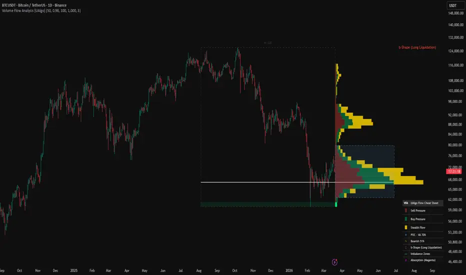
Volume Flow Analysis [UAlgo]Volume Flow Analysis is a price mapped volume study that distributes historical activity across price levels and separates that activity into directional pressure, stealth style movement, imbalance zones, absorption zones, Point of Control, Value Area, and profile shape. Instead of reading volume only bar by bar, the script converts a rolling section of chart history into a horizontal market map where each price level receives its own buy pressure, sell pressure, and movement efficiency profile.
The script works on the latest bar and rebuilds the full map from a rolling historical window. That window can either use the full user selected lookback or a shorter effective depth when decay is enabled. This gives more recent bars a stronger influence while older bars gradually lose weight. The result is a profile that can behave either like a stable historical map or like a more adaptive flow view depending on the selected decay factor.
Inside each price bucket, the script estimates directional pressure by splitting volume into buy side and sell side portions based on where price closed inside the bar range. It then distributes those portions across all buckets touched by the bar using proportional overlap. At the same time, it builds a separate stealth flow style measure based on range per unit of volume, which acts as a proxy for how much price movement occurred relative to participation.
From there, the script identifies the Point of Control, expands outward to build the seventy percent Value Area, classifies the overall profile shape, highlights extreme buy or sell imbalances, detects absorption style conditions, and optionally extends those key zones across the historical range. A legend table summarizes the active state of the map so the user can read the distribution quickly.
In practical use, Volume Flow Analysis is useful for studying where participation concentrated, where directional pressure was strongest, where flow became unbalanced, and whether the profile currently resembles a balanced, short covering, long liquidation, or double distribution structure.
🔹 Features
🔸 Price Bucket Volume Mapping
The script divides the active price range into user defined buckets and allocates volume into those levels according to actual price overlap. This creates a true horizontal flow map instead of a simple vertical volume display.
🔸 Buy Pressure and Sell Pressure Separation
Each price bucket stores both estimated buy side volume and estimated sell side volume. These two components are then drawn side by side so the user can see which side dominated each price level.
🔸 Decay Weighted Historical Memory
Older bars can gradually lose influence through the decay factor. This lets the profile emphasize fresher activity while still preserving historical structure.
🔸 Stealth Flow Layer
The script includes an additional stealth flow style metric based on range relative to volume. This highlights zones where price moved efficiently with relatively less participation.
🔸 Point of Control and Value Area
The indicator automatically finds the highest volume bucket as the Point of Control and expands from that level until seventy percent of total volume is captured to form the Value Area.
🔸 Imbalance Detection
Price levels with one sided pressure above the selected imbalance ratio are highlighted as buy or sell imbalance zones. These can also be extended across the profile range.
🔸 Absorption Detection
Buckets with unusually high total volume but unusually low stealth flow are marked as absorption. This can suggest heavy participation with reduced price efficiency.
🔸 Profile Shape Classification
The script classifies the overall profile as D shape, B shape, P shape, or b shape using the distribution of volume across the upper, middle, and lower thirds of the profile.
🔸 Range Box and Historical Scope Label
A dashed range box shows the active calculation window and displays the effective number of bars used in the current map.
🔸 Built In Legend and Summary Table
A table in the lower right corner explains the map colors and also reports the current buy sell balance, profile shape, and whether imbalance or absorption layers are active.
🔹 Calculations
1) Determining the Effective Historical Window
int nCalc = i_decay == 1.0 ? i_lookback : int(math.ceil(math.log(0.01) / math.log(i_decay)))
int N = math.max(1, math.min(nCalc, i_lookback))
N := math.min(N, bar_index)
This is the first major step of the script.
If decay is set to 1.0, the script simply uses the full user selected lookback.
If decay is below 1.0, the script solves for how many bars are needed until the decay weight falls to roughly one percent of its original value. That value becomes the effective calculation depth.
Then the script clamps that depth so it never exceeds the lookback input and never exceeds available chart history.
So the map can behave in two different ways:
a full fixed history profile,
or a dynamically shortened profile where older bars become practically irrelevant.
2) Finding the Active Price Range and Bucket Size
float pH = high
float pL = low
for i = 0 to N - 1
pH := math.max(pH, high )
pL := math.min(pL, low )
float bSz = (pH - pL) / i_buckets
This block establishes the vertical bounds of the map.
The script scans the effective historical window and finds the highest price and lowest price inside it. Then it divides that full range by the selected number of price levels.
The result is the bucket size, which determines the height of every price cell in the flow map.
So the whole analysis space is always defined by the actual recent trading range rather than by arbitrary static levels.
3) Initializing Buy, Sell, and Stealth Arrays
array bVol = array.new(i_buckets, 0.0)
array sVol = array.new(i_buckets, 0.0)
array stV = array.new(i_buckets, 0.0)
These three arrays are the main storage layer of the profile.
bVol stores buy pressure per bucket.
sVol stores sell pressure per bucket.
stV stores the stealth flow style metric per bucket.
As each historical bar is processed, its weighted contribution is distributed into these arrays according to price overlap.
So the script is building three parallel price maps at the same time.
4) Splitting Each Bar Into Buy and Sell Pressure
float b_v = rng == 0 ? (v_i / 2) : (v_i * (c_i - l_i) / rng)
float s_v = v_i - b_v
This is the directional volume model.
If a bar has zero range, volume is split evenly between buy side and sell side.
Otherwise, the script estimates buy pressure from where the close sits inside the bar range. A close nearer the high gives more weight to buy pressure. A close nearer the low gives less weight to buy pressure. Sell pressure is simply the remainder.
This is not exchange level aggressor data, but it is a practical price location based estimate of directional pressure inside each candle.
So every bar contributes both a buy component and a sell component to the profile.
5) Defining the Stealth Flow Proxy
float st_m = v_i == 0 ? rng : rng / v_i
This line creates the stealth flow style measurement.
The idea is simple. If price covers a relatively large range with relatively little volume, the ratio becomes larger. If price needs heavy volume to achieve the same range, the ratio becomes smaller.
So this metric behaves like a movement efficiency proxy:
higher values suggest cleaner movement per unit of volume,
lower values suggest heavier participation per unit of movement.
It is important to interpret this as a derived proxy rather than a direct exchange measured stealth order flow.
6) Applying Decay Weight to Historical Bars
float d_m = math.pow(i_decay, i)
Every historical bar receives a decay multiplier based on how far back it is.
The most recent bar gets the largest weight. Older bars receive progressively smaller weights as long as decay is below one.
This means the final profile is not just a raw accumulation of past activity. It is a weighted accumulation where recent flow can dominate older structure if the user wants a more adaptive map.
7) Distributing a Bar Across All Touched Buckets
int minIdx = math.max(0, math.floor((l_i - pL) / bSz))
int maxIdx = math.min(i_buckets - 1, math.floor((h_i - pL) / bSz))
for j = minIdx to maxIdx
float b_min = pL + j * bSz
float b_max = b_min + bSz
float ovr = math.max(0, math.min(h_i, b_max) - math.max(l_i, b_min))
if ovr > 0
float prop = ovr / rng
bVol.set(j, bVol.get(j) + b_v * prop * d_m)
sVol.set(j, sVol.get(j) + s_v * prop * d_m)
stV.set(j, stV.get(j) + st_m * prop * d_m)
This is one of the most important calculations in the whole script.
For every bar, the script determines which price buckets were touched by that bar. It then measures how much of the bar overlapped each bucket. That overlap fraction is used to distribute buy pressure, sell pressure, and stealth flow into the correct levels.
So if a bar spends more of its range inside a given bucket, more of its volume contribution goes into that bucket.
This makes the map much more realistic than assigning the full bar volume to only one price level.
8) Handling Zero Range Bars
else
int idx = math.max(0, math.min(i_buckets - 1, math.floor((c_i - pL) / bSz)))
bVol.set(idx, bVol.get(idx) + b_v * d_m)
sVol.set(idx, sVol.get(idx) + s_v * d_m)
stV.set(idx, stV.get(idx) + st_m * d_m)
If a bar has no range, the script cannot distribute it by overlap. In that case, it assigns the full weighted contribution to the bucket containing the close.
This ensures that flat or compressed bars still contribute to the profile without breaking the overlap logic.
9) Building Total Volume, Point of Control, and Summary Totals
float tVolMax = 0.0
float stMax = 0.0
float stMin = 1e10
int poc = 0
float pocV = 0.0
float sumV = 0.0
array tVol = array.new(i_buckets, 0.0)
for j = 0 to i_buckets - 1
float t = bVol.get(j) + sVol.get(j)
float st = stV.get(j)
tVol.set(j, t)
sumV += t
if t > tVolMax
tVolMax := t
if t > pocV
pocV := t
poc := j
After all bars are processed, the script combines buy and sell pressure for each bucket into total volume.
At the same time, it calculates:
the total profile volume,
the maximum bucket volume,
the Point of Control bucket,
and the minimum and maximum stealth values.
The Point of Control is simply the bucket with the largest accumulated total volume.
So this stage turns the raw arrays into a complete profile summary.
10) Calculating the Seventy Percent Value Area
float trg = sumV * 0.70
float cur = pocV
int vH = poc
int vL = poc
while cur < trg and (vH < i_buckets - 1 or vL > 0)
float vUp = vH < i_buckets - 1 ? tVol.get(vH + 1) : -1.0
float vDn = vL > 0 ? tVol.get(vL - 1) : -1.0
if vUp >= vDn and vUp >= 0
vH += 1
cur += vUp
else if vDn > vUp and vDn >= 0
vL -= 1
cur += vDn
else
break
This is the Value Area expansion algorithm.
The script starts at the Point of Control and keeps adding the next larger neighboring bucket, either above or below, until the accumulated total reaches seventy percent of overall profile volume.
The upper and lower boundaries of that expansion become the Value Area High and Value Area Low.
So the Value Area always forms around the Point of Control and grows toward whichever neighboring levels contain the most activity.
11) Classifying the Profile Shape
float vTop = 0.0
float vMid = 0.0
float vBot = 0.0
int third = math.floor(i_buckets / 3)
for j = 0 to i_buckets - 1
float v = tVol.get(j)
if j < third
vBot += v
else if j < third * 2
vMid += v
else
vTop += v
string shp = "D-Shape (Balanced)"
if vTop > sumV * 0.20 and vBot > sumV * 0.20 and vMid < sumV * 0.50
shp := "B-Shape (Double Dist)"
else if poc > i_buckets * 0.5 and vTop > vBot * 1.3
shp := "P-Shape (Short Covering)"
else if poc < i_buckets * 0.5 and vBot > vTop * 1.3
shp := "b-Shape (Long Liquidation)"
The script divides the profile into upper, middle, and lower thirds and compares how much volume sits in each section.
If upper and lower thirds both carry meaningful volume while the middle is relatively weak, the script labels the profile as a B shape.
If the Point of Control sits high and the upper section dominates, it labels the profile as a P shape.
If the Point of Control sits low and the lower section dominates, it labels the profile as a b shape.
Otherwise, the default label is D shape.
So the shape classifier is reading where the distribution is concentrated and how balanced it looks across the full price range.
12) Computing the Average Stealth Level
float avgSt = 0.0
int stCnt = 0
for j = 0 to i_buckets - 1
if stV.get(j) > 0
avgSt += stV.get(j)
stCnt += 1
avgSt := stCnt > 0 ? avgSt / stCnt : 0.0
This block computes the average positive stealth value across all populated buckets.
That average later becomes part of the absorption logic. Buckets with much lower than average stealth, combined with very high total volume, are flagged as absorption.
So the script uses the stealth map not only for display width, but also for analysis.
13) Detecting Imbalances and Absorption
bool imbB = i_showImb and s > 0 and b / s >= i_imbRatio
bool imbS = i_showImb and b > 0 and s / b >= i_imbRatio
bool absr = i_showAbs and t > avgV * 1.5 and st < avgSt * 0.5
These are the main analytical event conditions.
A buy imbalance exists when buy pressure is at least the selected ratio times larger than sell pressure.
A sell imbalance exists when sell pressure is at least the selected ratio times larger than buy pressure.
Absorption is defined differently. It requires:
total bucket volume above one and a half times the average bucket volume,
and stealth flow below half the average stealth value.
That means the bucket saw heavy participation but relatively poor movement efficiency, which can suggest absorbed flow.
So imbalances mark one sided aggression, while absorption marks heavy activity with suppressed movement.
14) Scaling the Visual Width of Each Layer
int wS = int((s / tVolMax) * i_width)
int wB = int((b / tVolMax) * i_width)
int wSt = int(((st - stMin) / math.max(1e-10, stMax - stMin)) * (i_width / 2))
The map is drawn horizontally, so the script converts each metric into width.
Sell pressure width and buy pressure width are scaled relative to the largest total bucket volume.
Stealth flow width is scaled separately relative to the stealth range and is limited to half the main map width.
So every bucket gets a visual footprint that reflects its relative pressure and stealth intensity.
15) Drawing the Buy, Sell, and Stealth Blocks
if wS > 0
_boxes.push(box.new(xStart, pHi, xStart + wS, pLo, bgcolor = cS, border_color = bc, border_width = bw))
if wB > 0
_boxes.push(box.new(xStart + wS, pHi, xStart + wS + wB, pLo, bgcolor = cB, border_color = bc, border_width = bw))
if i_showSt and wSt > 0
_boxes.push(box.new(xStart + wS + wB, pHi, xStart + wS + wB + wSt, pLo, bgcolor = c_stealth, border_color = bc, border_width = 1))
This is the actual map renderer.
The sell block is drawn first.
The buy block is drawn immediately after it.
If stealth flow display is enabled, the stealth block is drawn after both pressure blocks.
So each price level becomes a compact three part flow bar:
sell pressure,
buy pressure,
and optional stealth flow.
16) Extending Imbalance and Absorption Zones Across the Range
if i_showZones
if imbB
_boxes.push(box.new(bar_index - N + 1, pHi, bar_index + 1, pLo, bgcolor = color.new(c_buy, 90), border_color = na))
if imbS
_boxes.push(box.new(bar_index - N + 1, pHi, bar_index + 1, pLo, bgcolor = color.new(c_sell, 90), border_color = na))
if absr
_boxes.push(box.new(bar_index - N + 1, pHi, bar_index + 1, pLo, bgcolor = color.new(color.rgb(255, 0, 255), 85), border_color = na))
If zone extension is enabled, the script projects imbalance and absorption buckets horizontally across the entire historical calculation window.
This makes key buckets easier to see in relation to actual price bars rather than only inside the right side profile map.
So the indicator can show both a profile view and a chart level zone view at the same time.
17) Drawing the Range Box and Historical Scope Label
if i_showRng
_boxes.push(box.new(bar_index - N + 1, pH, bar_index + 1, pL, bgcolor = na, border_color = c_range, border_style = line.style_dashed))
_labels.push(label.new(bar_index - int(N / 2) + 1, pH, "N: " + str.tostring(N), textcolor = c_range, style = label.style_label_down, color = color.new(color.black, 100), size = size.small))
This block outlines the active analysis window on the chart.
The dashed box marks the highest and lowest prices used by the profile, and the label shows the effective bar count N.
So the user can always see exactly which portion of chart history is feeding the current flow map.
18) Drawing the Point of Control
if i_showPOC
float pPrice = pL + (poc + 0.5) * bSz
int endX = i_extPOC ? bar_index + i_width : bar_index + 1
_lines.push(line.new(bar_index - N + 1, pPrice, endX, pPrice, color = c_poc, width = 2))
The Point of Control line is drawn at the midpoint of the highest volume bucket.
If extension is enabled, the line continues forward through the map width. Otherwise it stops at the right edge of the historical window.
So the Point of Control remains a clear reference level for the most active price area inside the map.
19) Drawing the Value Area
if i_showVA
float vaTop = pL + (vH + 1) * bSz
float vaBot = pL + vL * bSz
_boxes.push(box.new(bar_index + 1, vaTop, bar_index + 1 + i_width, vaBot, border_color = c_va, bgcolor = color.new(c_va, 90), border_style = line.style_dashed))
This draws the seventy percent Value Area as a translucent box on the right side of the profile.
The top and bottom are derived from the expanded Value Area bucket boundaries, and the box spans the full map width.
So the user can immediately see where most of the profile activity was concentrated around the Point of Control.
20) Buy Sell Dominance Summary
float tB = bVol.sum()
float tS = sVol.sum()
float tV = tB + tS
float pB = tV > 0 ? (tB / tV) * 100 : 0
float pS = tV > 0 ? (tS / tV) * 100 : 0
string dTxt = pB >= pS ? "Bullish " + str.tostring(pB, "#") + "%" : "Bearish " + str.tostring(pS, "#") + "%"
This block calculates the total buy side share and total sell side share across the whole profile.
Whichever side holds the greater percentage becomes the dominant flow label in the table.
So the summary does not only show local bucket conditions. It also provides a broad view of which side controlled more of the weighted participation inside the entire mapped range. Indikator

Geass SRV - Support Resistance VolumeGeass SRV - Support Resistance Volume
by MasterTony
Volume profile engine adapted from Zeiirman's work — used with respect and full credit.
Most indicators tell you where price is. This one tells you where the market lives. The Support Band + Volume Profile is built around a single idea: price gravitates toward zones where real participation has happened, and it respects dynamic boundaries defined by the market's own momentum structure. This indicator surfaces both at once — a trend-adaptive zone on price and the volume history behind it.
How It's Calculated
Trend Direction (ADX + 200 SMA)
Market direction is read continuously using the DMI system — DI+ vs DI− for directional dominance, with the 200 SMA as a tiebreaker when they are equal. There is no neutral state. The indicator always commits to bull or bear, and all colors and zone behavior follow from that.
The Support Band (SMA 20 / EMA 21)
The innermost layer is a filled zone between the 20-period SMA and the 21-period EMA. These two averages are nearly identical in length but calculated differently, so the gap between them stays tight — producing a precise dynamic level rather than a wide smear. This is the mean of the recent trend. In a bull market it is the floor price returns to on pullbacks. In a bear market it is the ceiling price fails at on rallies. Green in a bull trend, red in a bear trend.
The Kijun Band — Main Trend Support and Resistance
The outer layer is the primary structural boundary of the indicator. The Kijun-Sen and Tenkan-Sen form a filled zone that acts as the main dynamic support in uptrends and the main dynamic resistance in downtrends, derived from Ichimoku Cloud. When price holds above this band the trend is intact. When price breaks through it and cannot reclaim it, the trend is in trouble.
Both lines adapt their lengths based on market conditions — compressing when momentum is strong and price is trending cleanly, expanding when conditions are weak or choppy. This means the boundary zone tightens in fast trends and widens when the market is uncertain, automatically adjusting to the environment. The lines are colored cyan in a bull regime and magenta in a bear regime, keeping them distinct from the inner band at all times.
The Kijun line within that band is the single most important level to watch. It is the baseline the trend must hold. Everything else in the indicator gives context to what happens at the Kijun.
Volume Profile — Reading the Zones
Volume profile engine adapted from Zeiirman's original work.
The volume profile is drawn to the right of price covering the last 240 bars. It answers the question the bands cannot: how much real participation has happened at each price level. A band sitting on a high-volume node is structurally different from a band sitting in empty space.
Point of Control (POC): The price level with the highest total volume — the market's center of gravity. When the POC aligns with the Kijun or the support band, that level is not just a moving average. It is a price the market has repeatedly chosen, making it the highest-conviction read the indicator can produce.
Value Area: The central 68% of all volume, shown as the brightest bars on the profile. The edges of the Value Area are high-probability reaction levels. Price approaching from outside tends to stall at the boundary or accelerate into the core. When the band zone overlaps a Value Area edge, dynamic structure and volume history are stacked at the same level.
Buy/Sell Split: Every row is divided between buying volume (green) and selling volume (red). When one side exceeds 60% it renders as a strong single color. This shows not just where volume was high — it shows who was in control. A dominant green node below price is demand. A dominant red node above is supply.
Low Volume Gaps: Rows with very little volume are structural gaps. Price moves through them quickly with little friction and accelerates until it hits the next meaningful cluster. When the band sits at the edge of a gap, a break can be fast and directional.
Freshness Fade: Recent volume glows brighter. Older volume fades. This prevents the profile from treating a level from 200 bars ago the same as one from yesterday.
Price Pivot S/R Lines
The last three swing highs and swing lows drawn as horizontal dashed lines — red for resistance, green for support. These are price memory. The exact levels where the market has previously reversed.
Bollingerbands
Custom Bollinger bands that can be toggled on to see outer lines of directional trend
How to Read It
The zone between the support band and the Kijun boundary is the core read. Green means the corridor is support — healthy pullbacks happen here. Red means it is resistance — rallies fail here. A tight narrow zone signals strong trend momentum. A wide zone signals a slower or more uncertain market.
The Kijun line is the level that matters most. A pullback that holds above it and bounces is trend continuation. A close below it is a warning. A reclaim from below is the first sign of a potential reversal. Every trade setup built with this indicator lives or dies at the Kijun.
The volume profile tells you whether the Kijun level carries real weight. A Kijun sitting on a large green volume node has been defended by buyers repeatedly — it has structural backing. A Kijun sitting in thin faded volume is unproven. When the POC and the Kijun are at the same price, that is the strongest signal this indicator can produce.
Value Area edges add a second volume-based reference layer. Watch for the band or Kijun to overlap with the top or bottom of the Value Area — that is confluence of two independent structural forces at the same level.
Pivot lines show the nearest price structure above and below. A green pivot just below the Kijun in a bull trend means two separate historical references are stacked — structural and volume-based support reinforce each other.
How to Trade With It
Bull Trend Pullback
Band is green. Price pulls back into the support band or toward the Kijun. Check the volume profile — is there a high-volume green node or the POC near that level? If yes, the zone has volume backing. Wait for a reversal signal inside the zone. Enter long with a stop below the Kijun. The nearest green pivot below is your hard invalidation.
Bear Trend Rally
Band is red. Price rallies into the band or toward the Kijun. Check the volume profile — is there a high-volume red node or the POC near the Kijun? If yes, the resistance is volume-confirmed. Wait for rejection inside the zone. Enter short with a stop above the Kijun. The nearest red pivot above is your invalidation.
Volume Gap Move
When price breaks out of the band and enters a low-volume section of the profile, expect the move to accelerate. There is no structural resistance in that gap. Price will run until it hits the next meaningful volume cluster. Use the profile to identify where that cluster is and target it.
Trend Change Warning
When the band flips color, stop trading the previous direction. Wait for price to pull back and hold the newly-colored zone on a retest before entering the new direction. Check the POC — if it is already on the new direction's side of price, the flip has volume support and is more likely to hold.
Confluence Filter
The cleanest setups occur when everything agrees: band color matches the trade direction, price is testing the Kijun, the POC or a high-volume node is at or near that level, and a pivot line adds nearby structure. When all of that stacks at one price, the zone is as high-conviction as this indicator gets.
Credits
Volume profile engine — Gaussian volume distribution, buy/sell split, POC calculation, Value Area logic, and freshness fade — adapted from Zeiirman's original work. Full credit to Zeiirman for the foundation that powers the volume layer of this indicator. Indikator

Indikator
Fair Value Gap Profile + Rolling POC [BigBeluga]🔵 OVERVIEW
FVG Profile builds a price-level profile based on detected Fair Value Gaps (FVGs) over a fixed lookback period.
Instead of measuring traded volume alone, this tool aggregates bullish and bearish FVG occurrences into horizontal bins, allowing traders to see where price inefficiencies are most concentrated.
Each profile level represents how many bullish and bearish FVGs formed near that price zone, along with their relative strength, imbalance, and delta volume.
🔵 CONCEPTS
FVG Detection —
• Bullish FVG: when the high two bars back is below the current low.
• Bearish FVG: when the low two bars back is above the current high.
Price Binning — The full price range of the lookback period is divided into fixed bins.
FVG Aggregation — Each detected FVG is mapped to its nearest price bin and counted.
Directional Separation — Bullish and bearish FVGs are stored separately inside each bin.
🔵 FEATURES
Bull / Bear FVG Profile —
• Green segments represent bullish FVG counts.
• Orange segments represent bearish FVG counts.
• Each bin visually shows how many FVGs occurred at that level.
Strength Percentage —
• Each bin displays a % value based on total FVG count.
• The strongest bin is normalized to 100%.
Delta Volume —
• Calculates the difference between bullish and bearish FVG volume per bin.
• Positive delta = bullish dominance.
• Negative delta = bearish dominance.
Heatmap Mode —
• Colors profile levels by relative strength.
• Color direction is driven by delta volume (bullish vs bearish).
Live FVG Visualization — Optionally plots individual bullish and bearish FVG boxes on the chart.
Profile Background — A background frame highlights the full analyzed price range.
🔵 Rolling POC Logic
Unlike a static profile, the Rolling POC moves with price.
It continuously calculates the "peak imbalance level" for the last X bars, providing a moving average of where the market's most significant gaps are forming.
🔵 Moving Average Integration
The indicator features a customizable Moving Average (SMA, EMA, WMA, VWMA, etc.).
This MA helps identify if the price is currently trending toward or away from high-density FVG zones.
An "Auto" length feature is included that scales the MA based on the selected lookback period for optimal smoothing.
🔵 HOW TO USE
Identify FVG Clusters — Strong profile levels highlight prices where inefficiencies repeatedly formed.
Directional Bias — Compare bullish vs bearish segments to determine dominance at each level.
Delta Confirmation — Use delta volume to confirm whether bullish or bearish FVGs control the zone.
Reaction Zones — High-strength bins often act as areas of interest for price reactions.
Heatmap Context — Enable heatmap to quickly spot dominant imbalance zones across the range.
🔵 CONCLUSION
FVG Profile transforms Fair Value Gaps into a structured price-level profile, revealing where inefficiencies cluster and which side dominates those zones.
By combining FVG count, directional balance, delta volume, and strength normalization, it provides a powerful way to analyze imbalance behavior beyond traditional volume profiles. Indikator

Indikator

Session Analytics [EXCAVO]Multi-Session Volume Profile with Smooth Wave Visualization
The Session Analytics indicator overlays Tokyo, London, and New York trading
sessions directly on the price chart. Each session displays a dynamic range box
with a volume profile wave inside — showing the distribution of traded volume
across the session's price range. Session names appear as colored labels above
each box for instant identification on any background.
This is not a simple session highlighter. The core engine accumulates volume data
at a configurable lower timeframe, builds a real-time profile for each active
session, and renders it as a smooth Catmull-Rom curve. The wave shape shows where
the most volume concentrated within each session.
━━━━━━━━━━━━━━━━━━━━━━━━━━━━━━━━━━━━━━━
▸ HOW TO USE
Step 1 → Add the indicator to an intraday chart (up to 1H). Colored boxes
appear marking each active session's price range. A colored label
above each box shows the session name (ASIA, LONDON, NEW YORK).
Step 2 → Look at the volume wave inside each session box. The wave peaks
show where the most volume traded — the session's value concentration.
Flat areas indicate low-volume price zones.
Step 3 → Use wave peaks for context. Price returning to a peak area is
re-entering high-volume territory — potential support or resistance.
Price in flat wave areas is in low-volume space — expect faster moves.
Step 4 → Check the dashboard for real-time session status (OPEN or CLOSED)
for each tracked session.
Step 5 → Set up alerts for session open/close events. All alerts fire on
confirmed bars only — no repainting.
━━━━━━━━━━━━━━━━━━━━━━━━━━━━━━━━━━━━━━━
▸ WHAT MAKES IT DIFFERENT
◆ LTF Volume Profile Per Session
Standard session indicators show only high, low, and open. This engine requests
lower-timeframe volume data and builds a full profile for each session using
configurable bin resolution. The result is a proper volume-at-price distribution,
not a simple range overlay.
◆ Smooth Wave Rendering
Volume data is double-smoothed and rendered as a Catmull-Rom spline curve.
The wave is drawn using time-based coordinates for consistent smoothness across
all intraday timeframes — from 1-minute to 1-hour charts. No stepping or
staircase artifacts on higher timeframes.
◆ Three Sessions, One Engine
Tokyo, London, and New York sessions share the same volume accumulation engine.
Each session builds its own independent profile using LTF data. When a session
closes, its final wave shape is preserved. Active sessions update in real time
as new volume arrives.
◆ How Components Interact
The volume accumulation engine feeds into the wave renderer in real time. As LTF
volume data arrives, it is binned into the active session's profile. The renderer
smooths the bin data and generates a polyline wave clamped to the session box.
When the chart timeframe equals the LTF setting, the engine falls back to
chart-level volume to ensure waves appear on all timeframes.
━━━━━━━━━━━━━━━━━━━━━━━━━━━━━━━━━━━━━━━
▸ DASHBOARD
Real-time panel (configurable position) with session status:
Asia - OPEN (blue) or CLOSED (gray)
London - OPEN (yellow) or CLOSED (gray)
New York - OPEN (red) or CLOSED (gray)
Legend table (bottom left) explains every visual element. Toggle in Dashboard settings.
━━━━━━━━━━━━━━━━━━━━━━━━━━━━━━━━━━━━━━━
▸ SETTINGS
Sessions
Track Asia (Tokyo) - ON (01:00-09:00 UTC)
Track London - ON (07:00-16:00 UTC)
Track New York - ON (13:00-22:00 UTC)
Volume Profile
LTF Resolution - 1 (minute timeframe for volume data)
Profile Resolution - 30 (number of price bins)
Visualization
Asia / London / New York Color - customizable session colors
Box Transparency - 85 (0 = opaque, 100 = invisible)
Show Volume Profile - ON (wave display inside session box)
Dashboard
Show Dashboard - ON
Dashboard Position - Top Right (configurable corner)
Show Legend - ON
Alert Settings
Allow Repainting - OFF (signals on bar close only, recommended)
JSON Alerts (for bots) - OFF (enable for bot-ready JSON payloads)
━━━━━━━━━━━━━━━━━━━━━━━━━━━━━━━━━━━━━━━
▸ ALERTS
6 alert conditions for session open/close events. By default, all alerts fire on
confirmed bars only (non-repainting). Enable "Allow Repainting" for real-time signals.
Asia Session Open - Asia session starts (01:00 UTC)
Asia Session Close - Asia session ends (09:00 UTC)
London Session Open - London session starts (07:00 UTC)
London Session Close - London session ends (16:00 UTC)
NY Session Open - New York session starts (13:00 UTC)
NY Session Close - New York session ends (22:00 UTC)
JSON mode sends bot-ready payloads with ticker, session name, action, price,
and timeframe fields. Compatible with 3Commas, Wunderbit, and custom webhooks.
━━━━━━━━━━━━━━━━━━━━━━━━━━━━━━━━━━━━━━━
Works on all intraday timeframes up to 1 hour and all instruments.
Sessions are active on weekdays only (Monday-Friday).
Original script by EXCAVO, written from scratch.
Disclaimer
Trading involves significant risk. This indicator is a technical analysis tool
and does not constitute financial advice, investment recommendations, or a
guarantee of future results. Past indicator behavior does not guarantee future
performance. Always use proper risk management and your own judgment.
Indikator

LVN FinderLVN Finder by QuantShok (JacobS369)
This script automatically identifies Low Volume Nodes (LVNs) from a calculated volume profile and plots them as horizontal levels on your chart. LVNs are price levels where relatively little volume has traded compared to surrounding areas — these zones often act as areas of low resistance where price moves quickly, or as potential support/resistance when retested.
The script builds a high-resolution volume profile over a configurable lookback period, pulls in 1-minute data for added granularity, scans for statistically significant volume valleys, merges nearby levels to reduce clutter, and draws them on your chart with a price table for quick reference.
Default settings are optimized for NQ (Nasdaq 100 Futures) on a 5-minute chart.
Settings Breakdown
Volume Profile Settings — These control the foundation of the profile itself. "Number of Rows" sets the resolution of the volume profile — higher means more granular detection but heavier computation. "LVN Lookback Days" determines how many trading days of data the profile is built from; shorter lookbacks give you more recent/relevant levels, longer lookbacks capture broader structure. "Rebuild Interval" controls how often the profile recalculates — set to 1 for a fresh rebuild every trading day.
LVN Detection — This is where you fine-tune what qualifies as a true LVN. "Window Size %" sets how wide the local neighborhood is when checking if a price row is a volume minimum — smaller values find tighter, more precise valleys while larger values only catch broader dips. "LVN Prominence %" is the most important filter — it requires that the volume valley drops at least this much below the surrounding peaks. Raise it to only see the most significant LVNs, lower it to surface more levels. "Use LVN Min Volume Filter" lets you exclude valleys that fall in extremely low-activity zones where the level may not be meaningful.
LVN Display — Toggle visibility, pick your line color, and set the line width.
Level Management — "Merge Nearby Levels" combines LVNs that are close together into a single level, keeping the one with the lowest volume. You can control the merge threshold by tick distance or percentage — useful to avoid clusters of redundant lines. "Extend Lines" controls how far the levels project forward on your chart. "Limit LVN Count" caps the total number of levels shown, prioritizing the lowest-volume (strongest) LVNs first.
Adapting to Other Instruments
If you're using this on something other than NQ, the main settings to adjust are merge distance (ticks and percentage) since different instruments have different tick sizes and price scales, prominence percentage depending on how cleanly volume distributes on that instrument, and lookback days based on how far back the relevant volume structure extends. For tighter instruments like ES, you might lower the merge ticks. For something like crypto with wider ranges, bump up the merge percentage and potentially lower the prominence threshold. Indikator