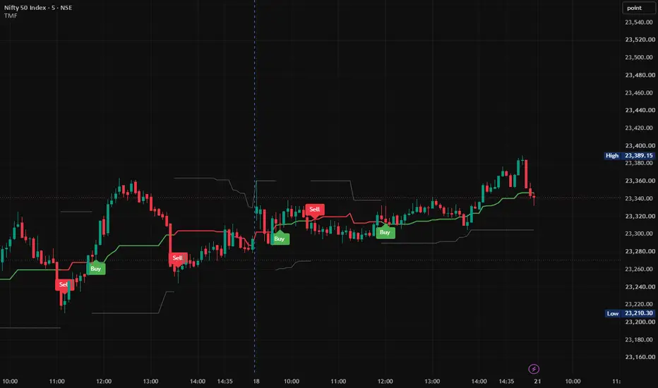
Trend My Friend🚀 Trend My Friend (TMF)
Dynamic Midrange Breakout & Multi-Candle Confirmation System
Trend My Friend (TMF) is a Pine Script® v6 trend and momentum indicator designed to identify bullish and bearish market regimes using a Dynamic Price Range, Equilibrium Midrange, and Multi-Candle Confirmation methodology.
Rather than relying on a single candle crossing the midrange, TMF evaluates consecutive candle closes relative to the dynamically calculated equilibrium level. This provides a structured framework for monitoring directional momentum, trend transitions, and dynamic market structure.
________________________________________
📊 Core Concept
TMF is built around three primary components:
Dynamic Range → Midrange Equilibrium → Multi-Candle Confirmation
The indicator continuously calculates the recent high and low of the selected lookback period, determines the midpoint between those extremes, and then evaluates consecutive candle closes around that midpoint.
This creates a simple framework for identifying whether the current market structure is developing above or below its dynamic equilibrium.
________________________________________
⚙️ How Trend My Friend Works
1. Dynamic Range Calculation
TMF first calculates the current market range using the Range Sensitivity Set.
With the default setting of 25, the indicator calculates:
• Upper Range = Highest High of the selected lookback period
• Lower Range = Lowest Low of the selected lookback period
These boundaries update dynamically as new candles are formed.
Upper Range
Represents the highest price recorded during the selected lookback period.
Lower Range
Represents the lowest price recorded during the selected lookback period.
Together, they form the indicator's dynamic structural range.
________________________________________
2. Equilibrium Midrange
After calculating the Upper Range and Lower Range, TMF calculates their midpoint:
Midrange = Lower Range + (Upper Range − Lower Range) ÷ 2
The midrange represents the central equilibrium level of the current range.
It provides the primary directional reference:
Price above Midrange → Bullish Zone
Price below Midrange → Bearish Zone
________________________________________
3. Multi-Candle Confirmation
The key feature of TMF is its Multi-Candle Confirmation mechanism.
The indicator does not confirm a directional regime simply because one candle crosses the midrange.
Instead, TMF checks the number of consecutive candles specified by the Signal Confirmation setting.
The default setting is 3 candles.
🟢 Bullish Confirmation
A bullish regime is confirmed when the required number of consecutive candles close strictly above the midrange.
For the default setting of 3:
Candle 1 → Above Midrange ✓
Candle 2 → Above Midrange ✓
Candle 3 → Above Midrange ✓
Once all required candles satisfy the condition, the bullish regime becomes active.
🔴 Bearish Confirmation
A bearish regime is confirmed when the required number of consecutive candles close strictly below the midrange.
For the default setting of 3:
Candle 1 → Below Midrange ✓
Candle 2 → Below Midrange ✓
Candle 3 → Below Midrange ✓
Once all required candles satisfy the condition, the bearish regime becomes active.
________________________________________
4. Directional Regime
Once the confirmation condition is satisfied, TMF establishes the corresponding market regime.
🟢 Bullish Regime
When the required consecutive closes are above the midrange:
• Trend state becomes Bullish
• Midrange is displayed in Green
• Lower Range becomes the active downside structural reference
• A new Buy signal can be generated
🔴 Bearish Regime
When the required consecutive closes are below the midrange:
• Trend state becomes Bearish
• Midrange is displayed in Red
• Upper Range becomes the active upside structural reference
• A new Sell signal can be generated
________________________________________
🎯 Buy & Sell Signal Generation
TMF is designed to generate signals when a new directional regime is established, rather than repeatedly printing the same signal while the regime remains active.
🟢 Buy Signal
A Buy signal is generated when the bullish regime changes from inactive to active.
Previous State → Not Bullish
Current State → Bullish
→ BUY
This means the Buy label represents the newly established bullish condition according to the indicator's confirmation rules.
🔴 Sell Signal
A Sell signal is generated when the bearish regime changes from inactive to active.
Previous State → Not Bearish
Current State → Bearish
→ SELL
Once the bearish regime remains active, TMF does not repeatedly print Sell labels on every candle.
________________________________________
📈 Visual Interpretation
TMF uses three primary structural lines:
Upper Range
Midrange — Directional Equilibrium
Lower Range
The Midrange changes color according to the confirmed directional state:
🟢 Green Midrange → Bullish Regime
🔴 Red Midrange → Bearish Regime
⚪ Gray Midrange → No Confirmed Directional Regime
The selected SL Line Color is used for the appropriate structural range boundary according to the active trend state.
________________________________________
🔄 TMF Logic — Complete Process
The complete methodology can be summarized as:
1. Highest High + Lowest Low
2. Dynamic Price Range
3. Calculate Equilibrium Midrange
4. Check Consecutive Candle Closes
5. Confirm Bullish or Bearish Regime
6. Detect New Directional Transition
7. Generate Buy / Sell Signal
8. Continue Monitoring the Dynamic Range
This creates a straightforward process for reading directional market structure.
________________________________________
🎛️ Input Parameters
Parameter Default Function
Range Sensitivity Set 25 Number of bars used to calculate the Upper and Lower Range.
Signal Confirmation 3 Number of consecutive candle closes required above or below the Midrange.
SL Line Color Gray Controls the color used for the structural range boundary.
Range Sensitivity Set
This controls the lookback period used to calculate the dynamic range.
Lower value
• More responsive to recent price movements
• Faster structural changes
• More sensitive to short-term market movement
Higher value
• Broader range
• Slower structural changes
• More focused on larger market movements
Signal Confirmation
This controls how many consecutive closes are required to establish a directional regime.
Lower value
• Earlier confirmation
• More responsive to price changes
Higher value
• Requires more sustained movement
• Later confirmation
The appropriate setting depends on the instrument, timeframe, volatility, and trading methodology.
________________________________________
🧭 Trading Framework
TMF can be incorporated into a broader trading methodology as a trend-confirmation and market-structure tool.
🟢 Bullish Framework
After a Buy signal, traders may evaluate:
• Price structure above the Midrange
• Higher highs and higher lows
• Momentum continuation
• Breakout or retest conditions
• Volume confirmation
• Broader market trend
🔴 Bearish Framework
After a Sell signal, traders may evaluate:
• Price structure below the Midrange
• Lower highs and lower lows
• Momentum continuation
• Breakdown or retest conditions
• Volume confirmation
• Broader market trend
TMF is therefore best understood as a technical confirmation tool, rather than a complete standalone trading system.
________________________________________
🛡️ Risk Management
The dynamic range boundaries can be monitored as structural reference levels when developing a risk-management plan.
Long Positions
The Lower Range can be monitored as a potential downside structural reference.
Short Positions
The Upper Range can be monitored as a potential upside structural reference.
Stop-loss placement should be determined according to the trader's individual strategy, volatility, position sizing, market structure, and risk tolerance.
________________________________________
🎯 Trade Management
TMF does not prescribe a mandatory profit-taking method.
Traders can combine TMF signals with their preferred trade-management techniques, such as:
• Fixed risk-to-reward targets
• Previous swing highs/lows
• Trailing stops
• Structural support/resistance
• Opposite TMF regime signals
• Volatility-based exits
An opposing TMF signal may also be monitored as an indication that the current directional regime has changed.
________________________________________
🌐 Suitable Markets
TMF can be applied across a variety of actively traded markets, including:
• Equities
• Index Futures
• Forex
• Cryptocurrencies
• Commodities
• Other liquid instruments
Signal behavior can vary depending on the instrument, timeframe, volatility, liquidity, and selected parameters.
________________________________________
⏱️ Timeframe Considerations
TMF can be used across multiple timeframes, including:
Intraday
• 5-Minute
• 15-Minute
• 1-Hour
Swing / Higher Timeframes
• 4-Hour
• Daily
• Weekly
There is no single parameter configuration that is optimal for every market. Traders should evaluate the settings according to their specific instrument, timeframe, and methodology.
________________________________________
🔔 TradingView Alerts
TMF includes built-in TradingView alert conditions for directional regime transitions.
TMF Long
Triggered when a new bullish regime is established.
TMF Short
Triggered when a new bearish regime is established.
These alerts can be used for chart monitoring and compatible TradingView automation workflows.
________________________________________
💡 Why Multi-Candle Confirmation?
A single candle can temporarily move above or below an important price level before quickly reversing.
TMF therefore requires consecutive candle closes for directional confirmation.
For example, with:
Signal Confirmation = 3
One isolated close above the Midrange is not enough to establish a bullish regime.
The required three consecutive closes must remain above the Midrange.
Likewise, three consecutive closes below the Midrange are required for bearish confirmation.
This makes the methodology focused on confirmed directional movement rather than a single-candle price crossing.
________________________________________
⚠️ Important Considerations
TMF is a technical-analysis and market-structure indicator. It does not predict future prices and does not guarantee profitable trades.
No indicator can completely eliminate market noise, false breakouts, or losing trades under all market conditions.
Signal behavior may differ during:
• Sideways markets
• Low-liquidity conditions
• High-volatility events
• Sharp reversals
• Gap movements
• Rapidly changing market regimes
Users should apply appropriate risk management and consider additional market-structure or confirmation techniques where appropriate.
________________________________________
🔥 Trend My Friend (TMF)
Dynamic Midrange. Multi-Candle Confirmation. Clear Market Structure.
Trend My Friend (TMF) transforms rolling price extremes into a structured visual framework for monitoring directional market regimes.
By combining a Dynamic Price Range, Equilibrium Midrange, and Multi-Candle Confirmation, TMF provides a clean way to monitor when price establishes sustained movement above or below its dynamic equilibrium.
Structured Confirmation — Dynamic Market Structure — Clear Directional Signals
________________________________________
📌 Disclaimer
This indicator is provided for analytical and educational purposes to assist with technical analysis. Past performance does not guarantee future results. Trading involves substantial risk, and users should manage risk appropriately.
Indikator
ICT Setup 05 [TradingFinder] Liquidity Sweep & OB Retest🔵 Introduction
Liquidity sweeps are one of those things traders see all the time, but they are easy to misread when viewed on their own. Price can run above a previous high or below a previous low, grab liquidity, and still continue in the same direction. What matters is what happens after the sweep. This indicator was built around that idea, using Liquidity Sweeps, CHoCH, Order Blocks, and OB Retests as parts of one complete setup instead of treating them as separate signals.
The setup starts from the New York Opening Range. Its high and low act as important liquidity references, and the indicator watches for price to sweep either Buy-Side Liquidity (BSL) or Sell-Side Liquidity (SSL).
After that sweep, it waits for a clear change in structure before considering the move valid. This helps separate a simple liquidity grab from a more meaningful shift in market direction.
Once a CHoCH is confirmed, the script identifies the relevant Demand or Supply Order Block and waits for price to come back into that area. The BUY or SELL signal does not appear just because an Order Block exists. Price first has to retest the zone and then show a directional reaction back out of it.
In practice, the full idea is simple :
Liquidity Sweep
CHoCH
Order Block
Retest
Reaction.
The indicator also marks Imbalance / Fair Value Gap (FVG) areas that appear after the structural shift. These zones are there to give more context to the move and make displacement easier to read, while the actual trading signal still comes from the Order Block retest and reaction. The result is a cleaner way to follow an ICT-style setup without having to manually connect every Liquidity Sweep, CHoCH, Order Block, Imbalance, and Retest on the chart.
🔵 How to Use
This indicator is designed to be read as a sequence, not as a collection of independent signals. The Liquidity Sweep, CHoCH, Order Block, Imbalance, and BUY/SELL marker are all showing different stages of the same setup. The main idea is to first see liquidity taken from one side of the New York Opening Range, then wait for price structure to shift, and only after that look for a reaction from the Order Block.
The indicator tracks the New York Opening Range from 08:00 to 09:30 New York time and then looks for setups during the 09:30 to 17:00 trading session. The Opening Range high acts as the Buy-Side Liquidity reference, while the Opening Range low acts as the Sell-Side Liquidity reference. A sweep by itself is not considered an entry. The setup only develops further if price confirms a structural change after that liquidity event.
🟣 Buy Setup
The bullish setup is the mirror image of the bearish sequence. It begins when price trades below the low of the New York Opening Range and takes Sell-Side Liquidity (SSL). The Opening Range low is treated as the liquidity reference, and when price moves below it, the SSL sweep is marked on the chart. Again, this sweep should not be read as a BUY signal by itself. It only tells the trader that liquidity below the range has been taken and that a potential bullish setup can now develop.
After the SSL sweep, the indicator starts looking for the opposite reaction in structure. It searches backward for a bullish candle body and uses the surrounding opening prices to define the bullish structural confirmation level. This level becomes the point price must reclaim before the liquidity sweep is treated as part of a valid bullish reversal sequence.
The bullish CHoCH is confirmed when price closes above that calculated structure level within the active life of the setup. Once this happens, the indicator marks the structural change on the chart. The important idea here is that the BUY setup does not assume that every move below the Opening Range low is a reversal. Price must first show that buyers have regained enough control to break the relevant structure.
After the bullish CHoCH, the indicator identifies and refines a Demand Order Block connected to the move. This becomes the main area to watch for the next stage of the setup. Instead of chasing price immediately after the structure break, the logic waits to see whether price returns to the Demand Order Block.
When price comes back into the Demand Order Block, the indicator records the retest. At this point, there is still no automatic BUY signal. A retest is only meaningful if price can actually respond from the zone.
The bullish confirmation requires price to print a bullish candle, close above the upper boundary of the Demand Order Block, and finish strongly enough within the candle's own range. This means the reaction needs to show that price has not simply touched the zone but has actually moved back out of it with bullish intent. As with the bearish side, Signal Mode controls how strict this confirmation needs to be.
The complete bullish sequence can therefore be read as :
SSL Sweep
Bullish CHoCH
Demand Order Block
OB Retest
Bullish Reaction
BUY
The Demand Order Block is invalidated if price closes below its lower boundary before the required reaction appears. The reaction also has a limited confirmation window after the first retest, so the script does not keep waiting indefinitely for a late bullish candle after price has already spent too much time around the zone.
A bullish Imbalance / FVG may also appear after the CHoCH when price creates sufficient displacement and leaves an inefficiency between candles. This can provide useful visual context for the strength of the bullish move, especially when the Imbalance and Demand Order Block are located close to each other. However, the Imbalance should be treated as additional context rather than a mandatory entry condition. The BUY signal itself is generated from the confirmed reaction after the Demand Order Block retest.
The easiest way to read the indicator is therefore to avoid starting from the BUY or SELL marker. Start from the liquidity event and follow the setup forward. When the Sweep, CHoCH, Order Block, Retest, and reaction all belong to the same sequence, the chart becomes much easier to understand and the final signal has clear structural context behind it.
🟣 Sell Setup
A bearish setup starts when price trades above the high of the New York Opening Range. This area is treated as Buy-Side Liquidity (BSL) because stops and breakout orders often accumulate above an established high. When price moves above this level, the indicator marks the BSL sweep on the chart. Importantly, the script is looking for the first side of the Opening Range to be taken. If both sides have already been swept, that event is not treated in the same way as the initial one-sided liquidity sweep.
The BSL sweep is only the beginning of the setup. Price moving above the Opening Range high does not automatically mean that a reversal is coming, and the indicator does not issue a SELL signal at this point. Instead, it starts looking for evidence that the bullish move has lost control and that bearish order flow is beginning to appear.
After the BSL sweep, the script searches backward through recent candles to locate the structural reference used for bearish confirmation. In the current logic, it looks for a bearish candle body and builds the confirmation level from the nearby opening prices around that structure. This level is then monitored as the point price must break to confirm the shift.
The next important event is the CHoCH. For the bearish setup, price must close below the calculated bearish structure level while the setup is still valid. When that happens, the indicator marks the CHoCH on the chart.
This is the point where the setup moves from a simple liquidity sweep into a confirmed bearish structural shift. If price does not confirm the break within the allowed life of the setup, the armed condition expires instead of remaining active indefinitely.
Once the bearish CHoCH is confirmed, the indicator identifies the relevant Supply Order Block associated with that move. The Order Block is refined before being displayed, so the highlighted zone represents the area the script considers most relevant for a potential bearish reaction rather than simply marking an entire candle without refinement.
From this point, the trader is no longer waiting for another structure break. The focus shifts to the Order Block Retest. The Supply Order Block remains active while price stays within its validity conditions. If price later returns into the block, the indicator records that first interaction as the retest.
A touch of the Order Block alone still does not produce a SELL signal. This distinction is important because price can enter an Order Block, remain inside it, or continue through it without producing a meaningful reaction. The script therefore waits for a bearish response after the retest.
For a bearish signal, price must produce a bearish candle and close back below the lower boundary of the Supply Order Block. The candle must also close sufficiently toward the lower portion of its own range. This additional close-location requirement is used to avoid treating weak or indecisive candles as confirmed bearish reactions. The exact strictness changes with the selected Signal Mode. When these conditions are satisfied, the indicator prints the SELL marker.
At that stage, the full bearish sequence has been completed :
BSL Sweep
Bearish CHoCH
Supply Order Block
OB Retest
Bearish Reaction
SELL
The Order Block can also become invalid before producing a signal. For a Supply Order Block, a close above the top of the zone invalidates it. The block also has a maximum lifetime of 1000 bars from its origin, so very old zones are not allowed to remain active indefinitely and generate late signals far away from the original setup.
The chart may also show a bearish Imbalance after the CHoCH. This happens when the move creates the required three-candle Fair Value Gap structure together with sufficient displacement. The Imbalance can help visually confirm that the structural shift was accompanied by aggressive price movement, but it is not required for the SELL marker itself. The actual signal is still based on the Supply Order Block retest and the bearish reaction from that zone.
🔵 Settings
Signal Mode : Controls how selective the setup is. More Signals uses wider confirmation windows and looser reaction requirements to capture more setups. Balanced provides a middle ground between signal frequency and confirmation quality. High Quality applies stricter confirmation conditions, shorter setup windows, stronger displacement requirements, and cancels an active setup when the opposite side of the Opening Range is swept.
Show Pattern : Shows or hides the structural elements of the setup, including the BSL/SSL liquidity levels and CHoCH markers. Turning it off keeps the underlying logic active while reducing visual information on the chart.
Show Signals : Shows or hides the BUY and SELL markers generated after a confirmed Order Block retest and reaction. The signal logic itself remains active even when the markers are hidden.
Order Block : Changes the colors used for bullish Demand Order Blocks and bearish Supply Order Blocks. These zones represent the refined areas monitored for a potential price retest and reaction.
Imbalance : Controls the colors of bullish and bearish Imbalance areas. These zones are displayed as additional context after the structural shift and do not directly control the BUY or SELL signal.
Show Opening Range : Displays the New York Opening Range high and low on the chart. These levels are calculated from the 08:00–09:30 New York session and are used as the main liquidity references for the setup.
Alert : Enables or disables automatic BUY and SELL alerts generated by the indicator. When enabled, the script can notify the trader when a confirmed bullish or bearish signal is completed.
🔵 Conclusion
The ICT Setup 05 Liquidity Sweep & OB Retest indicator is built to connect several ICT and Smart Money Concepts into one readable sequence. Instead of treating a Liquidity Sweep, CHoCH, Order Block, Imbalance, and Retest as separate events, it shows how they can develop together around the New York Opening Range and form a complete setup from liquidity grab to reaction.
Its main purpose is to make the structure behind BUY and SELL signals easier to read directly on the chart. By waiting for a Liquidity Sweep, structural confirmation, a refined Order Block, and then a valid retest and reaction, the indicator helps traders focus on context rather than isolated signals. Imbalance zones add another layer of visual information, while the final signal remains centered on the confirmed Order Block reaction.
Indikator

PRO TREND BOX
PRO SMC 2 MACD is a multi-confirmation market analysis indicator designed to analyze price action candle by candle. Instead of relying on a single indicator, it combines two MACD systems, EMA trend structure, trend path, market structure, Break of Structure (BOS), support/resistance and supply/demand areas to identify potential bullish and bearish opportunities.
The purpose of the indicator is not simply to display BUY and SELL labels. Every signal is generated from a combination of market conditions, allowing traders to understand why a particular candle receives a bullish, bearish, or neutral interpretation.
---
🟢 BUY SIGNAL — Complete Reason
When a BUY signal appears, the indicator looks for several bullish confirmations.
1. MACD 1 — Short-Term Momentum
The first MACD analyzes shorter-term momentum.
When MACD 1 becomes bullish, it suggests that buying momentum is increasing and buyers are beginning to gain control over the short-term price movement.
2. MACD 2 — Larger Momentum Confirmation
The second MACD uses slower settings and therefore provides a broader momentum confirmation.
When both MACDs point upward at the same time, the probability of the bullish setup being stronger increases compared with relying on only one MACD.
3. EMA 20 Above EMA 50
When the 20 EMA is above the 50 EMA, short-term price momentum is stronger than the medium-term trend.
This supports the idea that the market is developing a bullish structure.
4. EMA 50 Above EMA 200
The 50 EMA and 200 EMA are used as a major trend filter.
When:
EMA 20 > EMA 50 > EMA 200
the overall market structure is considered strongly bullish.
5. Trend Path
The Trend Path follows the underlying price direction and helps visually identify whether the market is moving upward or downward.
A rising Trend Path supports bullish conditions, while a falling Trend Path supports bearish conditions.
6. Market Structure
The indicator observes important swing highs and swing lows.
When price begins creating:
Higher Highs + Higher Lows
it indicates that buyers are gaining structural control.
7. Bullish BOS
A Bullish Break of Structure (BOS) occurs when price breaks above an important previous swing high.
This can indicate that buyers have overcome a previous resistance level and that the market structure may be continuing upward.
8. Support / Demand Area
If bullish momentum develops near an important support or demand area, the setup receives additional structural support.
This is important because the indicator is not only looking at momentum—it is also considering where the price is trading.
9. Final BUY Confirmation
When multiple conditions align:
Bullish Momentum + Bullish Trend + Bullish Structure + Support/Demand + BOS
the candle can receive a BUY confirmation.
---
🔴 SELL SIGNAL — Complete Reason
When a SELL signal appears, the indicator looks for the opposite conditions.
1. MACD 1 — Bearish Momentum
MACD 1 moves below its signal line, indicating that short-term selling momentum is increasing.
2. MACD 2 — Bearish Confirmation
MACD 2 also confirms bearish momentum.
When both MACDs agree, the bearish setup receives stronger momentum confirmation.
3. EMA 20 Below EMA 50
When the 20 EMA moves below the 50 EMA, short-term momentum is weaker than the medium-term trend.
This supports a bearish environment.
4. EMA 50 Below EMA 200
When:
EMA 20 < EMA 50 < EMA 200
the broader trend is considered bearish.
5. Falling Trend Path
A declining Trend Path supports the idea that sellers are controlling the current market direction.
6. Bearish Market Structure
The indicator observes whether price is forming:
Lower Highs + Lower Lows
This structure suggests that sellers are gaining control.
7. Bearish BOS
A Bearish Break of Structure occurs when price breaks below an important previous swing low.
This can indicate that sellers have successfully broken a structural support level.
8. Resistance / Supply Area
When price reaches an important resistance or supply area and bearish momentum develops, the setup receives additional confirmation.
9. Final SELL Confirmation
When multiple bearish conditions align:
Bearish Momentum + Bearish Trend + Bearish Structure + Resistance/Supply + BOS
the candle can receive a SELL confirmation.
---
⚪ NO TRADE — Why Some Candles Have No Signal
A professional system should not force a BUY or SELL signal on every candle.
A candle may remain neutral when:
MACD 1 is bullish but MACD 2 is bearish
MACD 1 and MACD 2 are conflicting
EMA 20 and EMA 50 are moving sideways
Price is trapped between support and resistance
Market structure is unclear
No valid BOS has occurred
Price is moving sideways/choppy
Buyers and sellers have similar strength
The trend is not sufficiently confirmed
In these situations, the safest interpretation is:
NO CLEAR CONFIRMATION → WAIT
---
🧠 Candle-by-Candle Decision Process
The indicator follows a structured process:
1. Price Candle
↓
2. Momentum Analysis
↓
3. MACD 1 Confirmation
↓
4. MACD 2 Confirmation
↓
5. EMA Trend Analysis
↓
6. Trend Path
↓
7. Market Structure
↓
8. BOS / Structural Break
↓
9. Support, Resistance & Zones
↓
10. Final BUY / SELL / NO TRADE Decision
This makes the indicator more than a simple crossover system. It attempts to combine momentum + trend + structure + location into one trading framework.
---
⭐ Signal Strength Concept
🟢 Strong Bullish Environment
2 MACD Bullish + EMA Bullish + Higher High/Higher Low + Bullish BOS + Demand/Support
🔴 Strong Bearish Environment
2 MACD Bearish + EMA Bearish + Lower High/Lower Low + Bearish BOS + Supply/Resistance
🟡 Weak / Uncertain Environment
MACD Conflict + Sideways EMA + No Clear Structure
➡️ Wait for confirmation.
---
⚠️ Important
This indicator provides technical-analysis signals, not guaranteed predictions. A BUY or SELL signal represents a combination of programmed conditions and does not guarantee that price will move in the expected direction. Proper risk management, confirmation and independent analysis are still important. Indikator

Trident Swing Projector [MarkitTick]💡 A structured swing-projection tool that automates Charles Lindsay's Trident quarter-swing method, turning a manual charting technique into a filtered, alert-ready framework for identifying retracement setups and projecting forward trade levels from a confirmed three-point swing structure.
✨ Originality and Utility
This script's value is not in reinventing pivot detection — left/right bar pivot confirmation is a known technique — but in the specific architecture built around it. The 25/50/75/100% level ladder projected from the retracement point follows the quarter-swing framework described by Charles Lindsay in his Trident work: a method of projecting Support/Resistance, Critical, and Equality points from a confirmed A-B-C swing. Everything surrounding that ladder — the pullback-depth gate, the dominant-trend filter, the ADX and higher-timeframe confluence layers, the configurable stop buffer, the armed-setup expiry, and the post-TP1 break-even handling — are MarkitTick design additions layered on top of Lindsay's original concept, not part of it.
The reason these pieces are combined rather than published separately is that a quarter-swing projection on its own is only as useful as the swing that produced it. A shallow, weak, or counter-trend retracement produces a projection ladder that is statistically less meaningful than one built from a decisive, trend-aligned impulse. The trend filter, pullback-depth window, ADX threshold, and HTF bias check all exist to answer one question before a projection is drawn: was this A-B leg significant enough to justify projecting from it? The trade-management layer (stop buffer, expiry, break-even) then exists to turn that projection into something that can be monitored and alerted on in real time, rather than only viewed as a static drawing. Each component is a gate or a consequence of the others; none of them functions as an independent indicator bolted on for its own sake.
The script is an indicator, not a strategy — it does not backtest or simulate equity. It identifies swing structures, projects levels from them, tracks whether those levels are subsequently reached, and reports all of this through a live dashboard and structured alert payloads.
🔬 Methodology and Concepts
● Confirmed Pivot Detection
Swing highs and lows are identified using a left/right bar-count pivot method: a candidate high or low is only confirmed once it has stood as the extreme point across both the bars to its left and the bars to its right, using the Pivot Left and Pivot Right settings. Because the check always references bars that have already closed, a pivot is never inferred from the currently forming bar — it is published exactly one bar after its right-side confirmation window completes. This is a deliberate implementation choice made to keep pivot detection non-repainting.
● The A-B-C Swing Structure
Once two consecutive confirmed pivots exist, the script watches for a third pivot that retraces into the prior leg:
Point A — the origin pivot (a confirmed swing low ahead of a bullish setup, or swing high ahead of a bearish one).
Point B — the impulse pivot that follows A, defining the A-B leg.
Point C — a new, opposing pivot that pulls back into the A-B leg by a percentage between the Min Pullback % and Max Pullback % settings (23.6–78.6% by default). Pullbacks shallower or deeper than this window are rejected and no setup is formed.
If the Trend Filter is enabled, the A-B leg must also break the previous confirmed swing extreme in the same direction (B must exceed the prior swing high for a bullish setup, or undercut the prior swing low for a bearish one) before a retracement at C is allowed to qualify. This restricts setups to legs that are extending the dominant swing rather than forming inside a range.
● Leg Measurement and Smoothing
The A-B leg is measured either in raw price points or as a percentage move, depending on the Swing Unit setting. Before that leg size is used to derive projection levels, it can optionally be passed through one of five smoothing methods — SMA, RMA, WMA, HMA, or VWMA — set by Signal Smoothing and Smoothing Length. The smoothing is applied as a ratio between the smoothed and raw leg size and multiplied into the current leg, so that projection distances are influenced by the recent typical swing size on the instrument rather than reacting entirely to the size of a single leg. With Signal Smoothing set to None, the raw leg size is used unmodified.
● Quarter-Swing Level Projection
From point C, four levels are projected using fixed fractions of the A-B leg, applied in the direction of the new setup:
25% of the leg → Entry level.
50% of the leg → TP1, labeled as the Critical level in Lindsay's terminology.
75% of the leg → TP2.
100% of the leg → TP3, the Equality target — a projected swing from C equal in size to the original A-B leg.
The Stop is placed at point C itself, with an optional buffer applied beyond it — either a fixed number of ticks or a fraction of the current ATR (ATR Length setting) — configured through Stop Buffer, Buffer Ticks, and Buffer ATR Fraction.
● Confluence Filters
Two independent filters can each block a setup from arming even after a valid A-B-C structure is found:
ADX Filter — requires the DMI-derived ADX value (ADX Length setting) to be at or above the ADX Threshold before a setup is allowed to arm, intended to avoid projecting swing levels during weak-trend, low directional-strength conditions.
HTF Confirmation — requests a higher timeframe's close (HTF Timeframe setting) and compares it against the prior higher-timeframe close to derive a simple directional bias. A setup is only allowed to arm if this bias agrees with the setup's direction. The higher-timeframe read uses a confirmed prior-bar close with lookahead correctly paired to that offset, so this filter does not draw on unconfirmed higher-timeframe data.
● Trade Management and State
Once a setup arms, it steps through a defined state sequence: Armed, Active (entry triggered), TP1 hit, TP2 hit, TP3 hit, Stopped, or Cancelled. Entry triggers when a confirmed close crosses the Entry level; a setup is cancelled if its Armed Expiry Bars limit is reached before entry, or if price closes back through point C first. If Stop to Breakeven after TP1 is enabled, the internally tracked stop moves to the entry price once TP1 is hit — this managed stop is reported in the dashboard and in alert payloads, but the stop line and label drawn on the chart intentionally remain at the original level, so the chart never displays a level implying a fill that did not actually occur at that price.
● Confirmation Lag Notice
Because pivot confirmation requires Pivot Right bars to elapse, and entry/cancellation logic checks a confirmed prior-bar close, every swing structure, entry trigger, and cancellation event appears with a built-in lag relative to the exact bar that produced it. This is a structural trade-off, not a defect: it is what keeps the A-B-C structure and its projected levels from repainting once drawn. Separately, TP1/TP2/TP3 target detection and the corresponding alerts monitor the current bar's high/low in real time rather than waiting for bar close, so a target can be marked and alerted as reached intrabar, before that bar has finished forming. This is standard behavior for real-time level-touch monitoring, but it means the exact moment a target fires can occur before the bar closes.
🎨 Visual Guide
A · B · C labels — small grey markers placed at the three confirmed pivots that define the active setup, drawn once the pattern is confirmed (so they sit slightly in the past relative to the bar that produced them).
Projected Leg — a dashed grey line running from point C forward to the TP3 price level, spanning a time distance matched to the original A-B leg's bar length. This shows the projection visually before price has necessarily reached it.
Entry line and label — a dashed blue line at the 25% projection level, labeled with the exact price.
Stop line and label — a solid line at point C (plus buffer, if configured), colored to match the Bearish color setting, labeled with the exact price. The label updates to show a hit confirmation and the resulting percentage move once the stop is reached, noting separately if the exit was a trend-failure stop or a break-even exit.
TP1 / TP2 / TP3 lines and labels — dashed lines at the 50/75/100% levels, each labeled with price and the resulting reward-to-risk multiple. Each label updates to show a hit confirmation and percentage move once reached.
BULL / BEAR entry marker — a small label placed at the bar where the Entry level is actually crossed, confirming the setup transitioned from Armed to Active.
Dashboard table — a live panel (toggled and positioned via the Dashboard settings) showing direction, state, entry/stop/managed-stop/target prices, reward-to-risk bars for each target, pullback depth, A-B swing size, bars since entry, HTF bias, ADX condition, and active smoothing method.
Non-standard chart warning — if the chart is displaying Heikin Ashi, Renko, Kagi, Point & Figure, Linebreak, or Range bars, a warning label appears directly on the chart, since projected price levels are not meaningful on synthetic bar types.
📖 How to Use
Wait for a confirmed A-B-C structure to complete. The A and B markers appear once a swing has formed, and the C marker (with entry/stop/target lines) appears only once a pullback within the configured percentage window is confirmed.
Treat the Entry line as the level the script is watching for a confirmed close through, not an instruction to enter immediately at C.
Use the Stop line as the invalidation level for the setup — a confirmed close back through point C cancels an armed setup outright.
Read TP1 (Critical), TP2, and TP3 (Equality) as sequential projection targets rather than a single expected outcome; the dashboard's reward-to-risk bars for each target update as price approaches or reaches them.
Check the HTF Bias and ADX rows in the dashboard if those filters are enabled, to understand why a structurally valid A-B-C pattern may not have armed.
Use the webhook alert payload's state and event fields to drive automation, rather than relying on price levels alone, since the payload also reports the managed (break-even) stop separately from the originally drawn stop.
⚙️ Inputs and Settings
● Core
Pivot Left / Pivot Right — bar counts required on each side of a swing point before it is confirmed as a pivot. Larger values produce fewer, more significant, and later-confirmed pivots.
Swing Unit — measures the A-B leg in raw price Points or as a Percent move, changing how leg size (and therefore all projected distances) is calculated.
● Filters
Trend Filter — requires the A-B leg to break the prior confirmed swing extreme in the setup's direction.
Min Pullback % / Max Pullback % — the acceptable retracement depth window for point C, as a percentage of the A-B leg.
HTF Confirmation / HTF Timeframe — requires a higher-timeframe directional bias to agree with the setup direction before arming.
ADX Filter / ADX Length / ADX Threshold — requires trend strength (via DMI/ADX) to clear a minimum threshold before arming.
Signal Smoothing / Smoothing Length — applies SMA, RMA, WMA, HMA, or VWMA smoothing to the leg magnitude used for projections.
● Trade Tools
Lock Signal — freezes the current signal and blocks any new setup from arming.
Stop Buffer / Buffer Ticks / Buffer ATR Fraction / ATR Length — adds extra distance beyond point C when placing the stop, either as a fixed tick count or a fraction of ATR.
Armed Expiry Bars — cancels an armed (not yet triggered) setup if the Entry level isn't closed through within this many bars.
Stop to Breakeven after TP1 — moves the internally tracked (managed) stop to entry once TP1 is hit, reported in the dashboard and alerts without moving the drawn stop line.
● Visuals and Dashboard
Trade Levels / A · B · C Markers / Projected Leg / Entry Markers — independent toggles for each chart element.
Keep Last N Setups — limits how many historical setups' drawings remain on the chart, to stay within drawing object limits.
Show Dashboard / Position — toggles and positions the live info panel.
● Alerts
Long / Short / Close Long / Close Short / Info Action strings — customizable text values inserted into the "action" field of the JSON alert payload, for direct use in webhook automation.
● Colors
Independent color controls for bullish/bearish/neutral tones, stop, entry, target, A·B·C markers, projected leg, label text, and dashboard header/body/text colors.
🔍 Deconstruction of the Underlying Scientific and Academic Framework
The projection ladder at the core of this script is drawn from the Trident method associated with Charles Lindsay, a framework built around measuring a swing's magnitude and projecting proportional fractions of it forward from a retracement point to derive Support/Resistance, Critical, and Equality levels. The underlying premise is that markets frequently move in self-similar proportional legs, so a retracement of a known size can be used to project plausible forward extension distances — the 50% "Critical" level and the 100% "Equality" level (a projected move matching the original leg) are the two most emphasized points in that framework, reflected here in TP1 and TP3 respectively.
The pullback-depth window applied to point C (23.6–78.6% by default) situates the acceptable retracement zone within a range commonly associated with Fibonacci retracement theory, without asserting that Fibonacci ratios themselves drive the projection math — the projection ladder here is a fixed 25/50/75/100% division of the leg, independent of the retracement percentage that qualified point C.
The ADX/DMI filter is grounded in Welles Wilder's directional movement framework, which measures trend strength by comparing the smoothed magnitude of directional price movement to overall volatility; applying a minimum threshold is a common approach to excluding range-bound conditions from directional setups, though ADX is a lagging, smoothed measure and does not itself predict continuation.
The higher-timeframe bias filter reflects multi-timeframe confluence theory: the idea that a directional bias visible on a longer aggregation of price is a useful, if imperfect, filter for shorter-timeframe setups, since it reduces (but does not eliminate) the chance of trading against the prevailing higher-timeframe trend.
The leg-smoothing step applies standard moving-average theory (simple, exponential-family, weighted, Hull, and volume-weighted variants) not to price directly, but to the derived leg-size series, an approach intended to make projected distances reflect a instrument's typical recent swing amplitude rather than the idiosyncrasies of a single leg.
⚠️ Disclaimer
All provided scripts and indicators are strictly for educational exploration and must not be interpreted as financial advice or a recommendation to execute trades. We expressly disclaim all liability for any financial losses or damages that may result, directly or indirectly, from the reliance on or application of these tools. Market participation carries inherent risk where past performance never guarantees future returns, leaving all investment decisions and due diligence solely at your own discretion. Indikator

Indikator

TMA Volatility BandsTMA Volatility Bands
TMA Volatility Bands is a trend and volatility indicator built around a smoothed Triangular Moving Average (TMA) and dynamically calculated deviation bands.
The indicator is designed to show the current market trend, volatility range, and potential reversal areas through a structured set of expanding TMA bands.
The TMA acts as the central trend reference, while the surrounding bands expand according to the current deviation of price from the TMA. This creates three volatility levels on both sides of the TMA, helping visualize how far price has moved from its smoothed average.
Main Settings
TMA Trend Line
The central TMA provides a smooth representation of the underlying price trend and reduces short-term market noise.
Dynamic Volatility Bands
Three band levels are calculated above and below the TMA. The bands automatically adapt to changing price volatility, creating a dynamic market range.
Multi-Level Band Structure
The first band represents the primary volatility boundary, while the middle and outer bands extend progressively farther from the TMA. This makes it easier to identify stronger extensions in price movement.
Trend Strength Gradient
The TMA changes color according to the direction and strength of its movement relative to ATR-based volatility. Stronger TMA movement produces a stronger color transition, while weaker movement moves toward a neutral color.
Buy and Sell Signals
The indicator includes automatic reversal-style signals based on price extending beyond the primary volatility band and then forming an opposite-direction candle.
A Buy signal appears when the previous candle moves below the lower primary band and the current candle closes bullish.
A Sell signal appears when the previous candle moves above the upper primary band and the current candle closes bearish.
Adjustable Settings
TMA Period controls the smoothing and responsiveness of the central TMA.
Band Deviation controls the distance of the primary volatility bands from the TMA.
Price Source allows the calculation to use the selected price source.
Trend Threshold controls the sensitivity of the TMA trend-strength gradient.
TMA Volatility Bands is designed to provide a clean visual framework for analyzing trend direction, volatility expansion, price extensions, and potential reversal areas.
The signals should be used as part of a broader trading strategy and confirmed with price action, market structure, or other analysis tools.
Indikator

STP Trade Idea AnalysisThe STP Trade Idea Analysis Indicator is a conditional price-path projection engine designed to help traders evaluate potential market direction, important reaction levels, and alternative price scenarios directly on the chart.
Rather than relying on a single technical signal, the indicator combines multiple forms of market structure and price action analysis to provide a clearer view of where price may move next. The system evaluates Elliott-wave structure, Fibonacci levels, Fair Value Gaps (FVGs), Supply and Demand, trend information, and technical confluence to identify meaningful areas of support, resistance, and potential price reactions.
A key feature is the Primary and Secondary Elliott price paths. The Primary path represents the currently favored scenario based on the available market structure, while the Secondary path provides an alternative if price action develops differently. These paths are conditional projections rather than fixed predictions and can adjust as new market information becomes available.
Key Features
Conditional Price-Path Projection – Displays Primary and Secondary Elliott-style scenarios based on current market structure.
Primary Elliott Path – Shows the currently favored 1–5 impulse and A–B–C corrective price path.
Secondary Elliott Path – Displays an alternative scenario if market structure begins to shift.
Fibonacci Levels – R1–R4 and S1–S4 levels derived from the 6:00 AM ET anchor and prior regular-session trading range.
Bullish FVGs – Green shaded areas identify bullish price imbalances that may act as future reaction or support zones.
Bearish FVGs – Red shaded areas identify bearish price imbalances that may act as future reaction or resistance zones.
Supply and Demand Zones – Identify areas where buying or selling pressure may influence future price action.
Confluence Support and Resistance – Highlights important decision zones where multiple independent technical levels cluster.
21 and 50 EMAs – Provide additional visual context for trend direction and price structure.
How to Use the Indicator
For the clearest analysis, I recommend using the indicator primarily on the 1-hour and Daily charts.
Start with the Daily chart to understand the larger market structure, longer-term trend, major support and resistance areas, and the broader Primary and Secondary price-path scenarios. This provides the higher-timeframe context for the trade.
Next, move to the 1-hour chart for a more detailed view of the current setup. Use the 1-hour chart to evaluate developing Elliott structure, FVGs, Fibonacci levels, Supply and Demand, and nearby confluence zones.
Pay particular attention to the Primary Elliott path. This represents the currently favored scenario based on the market information available to the indicator. The Secondary Elliott path should not be ignored. It represents an alternative scenario and can help identify where your original trade thesis may be weakening or where market structure may be changing.
Use the Confluence Support and Resistance zones as potential decision areas. These zones are especially important because they represent areas where multiple independent technical factors cluster, rather than a level derived from a single calculation.
Bullish and Bearish FVG shaded zones can provide additional context. Watch how price behaves as it approaches or enters these imbalances. A reaction, rejection, continuation, or fill can provide useful information about whether the Primary price path remains intact.
The Fibonacci R1–R4 and S1–S4 levels provide additional reference points for potential price reactions and targets. They are established using the 6:00 AM ET anchor and prior regular-session range.
Suggested Workflow
1. Start with the Daily chart
Identify the broader trend, Elliott scenario, major zones, and directional context.
2. Move to the 1-hour chart
Evaluate the current price structure and more actionable Primary and Secondary paths.
3. Identify Confluence Support and Resistance
Look for areas where price may react, consolidate, reverse, or break through.
4. Review FVGs and Fibonacci Levels
Use these as additional confirmation and as potential areas for reaction.
5. Compare the Primary and Secondary paths
The Primary path represents the favored scenario. The Secondary path helps you prepare for an alternative outcome.
6. Let price action confirm the scenario
The projected path should be used as a roadmap, not as a guarantee. As price structure changes, the favored scenario can change as well.
Understanding the Projection
The goal of the indicator is not to predict an exact future price. Instead, it provides a structured framework for answering a more useful trading question:
If the current market structure continues, what is the most probable price path, and what alternative path should I be prepared for if conditions change?
Using the Daily chart for broader context and the 1-hour chart for trade analysis allows traders to evaluate both the larger market structure and the developing setup before making a trading decision.
Important: The STP Trade Idea Analysis Indicator is intended for technical analysis, education, and trade planning. Primary and Secondary price paths are conditional scenarios based on available market data and should not be interpreted as guaranteed future price movements.
Indikator

Liquidity & FVG Engine MTF [Pro]Liquidity & FVG Engine MTF
OVERVIEW
This tool watches price the way a discretionary ICT trader watches it: it keeps track of untouched swing highs and lows across several timeframes at once, flags the moment one of those levels actually gets taken out, and then looks for the Fair Value Gap that tends to show up right after that liquidity grab. Instead of forcing you to flip between chart timeframes to manually mark highs and lows, it does that bookkeeping for you and leaves a clean, readable map of what has been swept, what is still resting, and where price left a gap on its way through.
HOW IT THINKS
Every time a pivot high or low forms on any of the timeframes you enable (1H and 4H by default, with Daily, Weekly and a custom timeframe also available), the script stores it as a pending liquidity level and marks it with a dot. That level stays on the chart, untouched, until price actually interacts with it.
When price takes out a level, the indicator does three things at once. It fades the dot into a swept line so you can see exactly where and when liquidity was taken. It checks the impulse that caused the sweep for a Fair Value Gap, since sweeps and gaps tend to travel together in this kind of price action. And if no gap is found immediately, it keeps watching the next several candles for a reversal gap to form, on the theory that the real move often shows up a few bars after the initial grab, not on the sweep candle itself.
SESSION LIQUIDITY
On top of the swing based levels, the script builds its own Asia and London session ranges directly from the UTC session hours, independent of your broker's timezone or the exchange your chart is set to. The high and low of each session become liquidity levels in their own right, and get swept and reacted to exactly like any swing high or low.
MITIGATED FVGs, EXPLAINED
A gap does not disappear the moment price touches it. What this indicator calls "mitigated" is simply a Fair Value Gap that has been revisited by price after it formed. The box does not vanish when that happens. It turns grey, gets tagged "Mitigated", and is kept on your chart as history rather than being deleted.
The reason that matters is that a mitigated gap is not necessarily a dead gap. Some get tapped once and hold, becoming the base of the next leg. Others get tapped and sliced straight through. Keeping the grey boxes visible for a while lets you scroll back and actually see which behaviour happened at that location, instead of having the evidence erased the instant it stops being "active". You control how many of these grey boxes stay on your chart at once through the history setting, so you can keep as much or as little of that visual record as you want without cluttering the chart forever.
A PRACTICAL WAY TO USE IT
None of this is a signal generator that tells you to buy or sell. It is a map, and the way most people use a map like this is roughly the same three step read every time.
Note which liquidity level is still sitting untouched nearby, on whichever timeframe you trust for bias. An untouched high or low is a magnet until it isn't.
Wait for the sweep itself. A wick that pierces the level and a close that snaps back inside it is a very different event from a candle that just closes through and keeps going, so pay attention to which sweep mode you have configured and what actually happened on that candle.
Look at what the indicator draws immediately after the sweep. A fresh, opposite direction Fair Value Gap appearing in the following bars is the classic follow through many ICT style traders look for as confirmation that the sweep was a genuine reversal event rather than the start of a continuation.
From there, how a person actually structures the trade is personal. Some will look to enter on the first retracement into that fresh gap, treating its edge as an entry zone with a stop beyond the sweep wick. Others prefer to wait for a shift in short term structure after the gap forms before committing, using the gap as confluence rather than as the trigger itself. Either way, the mitigated gap history is useful here too, since it lets you go back and study how price has behaved around similar gaps at similar levels earlier in the session, which is a quick way to build a feel for whether the pair or symbol you're trading tends to respect these zones cleanly or chop through them.
Treat every level and every gap as one piece of evidence, not a standalone signal. The most convincing setups tend to be where a session liquidity sweep, a higher timeframe level, and a fresh FVG all line up in the same place at the same time, rather than any single one of them appearing in isolation.
SETTINGS AT A GLANCE
Pivot Left and Right Bars control how sensitive swing detection is. Lower values catch more, smaller swings.
Merge Tolerance lets nearby levels from different timeframes combine into a single label instead of stacking duplicate dots on top of each other.
Sweep Detection Mode switches between a strict wick and close ICT style sweep, or a looser touch based definition.
Up to five independent timeframes can be enabled for swing liquidity, each with its own colour and label.
Asia and London session ranges can be toggled on or off independently, with their own colours.
The FVG engine has its own ATR based minimum and maximum size filters, so you can exclude gaps that are too small to matter or too large to be realistic entries.
Visual and memory settings let you cap how many active levels, historical swept lines, and mitigated FVGs stay on the chart at once, keeping things readable on lower timeframes over long sessions.
ALERTS
Two alert conditions are built in. One fires the moment any liquidity level is swept. The other fires when a Fair Value Gap forms following a sweep. Both can be wired into TradingView's standard alert system so you do not have to watch the chart tick by tick.
A NOTE ON RISK
This script is a decision support tool, not a trading signal or a promise of future performance. It plots historical and current price behaviour so you can build and test your own approach around it. Always use proper risk management and position sizing, and treat any strategy built around it as something to validate on your own before trading it with real capital. Nothing in this description or in the indicator constitutes financial advice.
Indikator

CTZ Bitcoin Cycle Master
**CTZ Cycle Trader + Confluence**
Three independent forecasting methods on one chart, gated so a signal only counts when they agree. Cyclical timing, statistical swing projection, and momentum triggering work together to show where price is likely to turn, when, and whether to act.
**① The Cycle Framework**
A four-tier cycle model — Daily (DCL), Weekly (WCL), Yearly (YCL) and 4-Year (4YCL) cycle lows — each with confirmation logic, running counts, and forward-projected timing windows. Asset presets auto-tune the cycle lengths to the instrument you load (Bitcoin, metals, indices, forex, energy). A live dashboard tracks days since each low, which windows are open, and the projected dates for the next turns.
**② Dual Swing Prediction Zones**
Drawing on the full history of the instrument's price swings, the tool projects **two forward target zones at once** — a green LOW-target box below price and a red HIGH-target box above it. Each is built from the statistical spread of past swings in that direction: how far they typically ran, and how long they lasted. Rather than guessing a single direction, it brackets the expected reversal range on both sides, so you can see where the next swing low and swing high are statistically due before price arrives. Green and red shading also colours every completed swing across history, making the market's rhythm visible at a glance.
**③ The Tidewave Trigger**
A WaveTrend + RSI momentum engine fires bull and bear reversal arrows, auto-adjusting from scalping frames to the macro. These are the entries — the moment the turn actually begins.
**The confluence**
The layers gate each other. A bull arrow carries full weight only inside the green low zone and near a projected cycle low; a bear arrow only in the red high zone near a cycle high. The cycle says a turn is *due*, the zone says *where and by how much*, momentum says *it's happening now*. A dedicated confluence alert fires only when all three agree.
**⚓ The 4-Year Anchor — and keeping it current**
Bitcoin's cycles nest inside the 4-year rhythm — every daily, weekly, and yearly low sits within the larger cycle that begins at each bear-market bottom. This tool lets you anchor the entire cycle clock to that bottom with a single date.
By default the anchor is set to **21 Nov 2022**, Bitcoin's last bear-market low. Every cycle phase and projection counts forward from there, so the timing is measured from a structurally meaningful origin rather than a mid-cycle pivot.
**Updating it:** each cycle bottom is a moving reference. When the next 4-year low forms and confirms, open the indicator settings, find the **4YCL Master Anchor** group, and change the **4YCL Anchor Date** to the new bottom (for the current cycle, that will be the 2026 low once it's in). The whole cycle clock re-bases from the new date instantly — no code editing required. Set it to the exact bottom candle, since the anchor is load-bearing: a few days off shifts every downstream projection by those days. Because you update it only after the low has confirmed, you'll always know the precise date. You can also toggle the anchor off to fall back to auto-detected pivots.
**Built to be read at a glance**
The dashboard consolidates cycle counts, open windows, due-dates, prediction-zone status, and anchor position into one panel. State labels, arcs, and extras stay off by default for a clean chart, and every layer has its own toggle — run pure cycles, pure signals, or the full confluence view.
*The cycle tells you when. The zones tell you where. Momentum tells you it's happening. Together they tell you whether to act.*
*For educational purposes. Not financial advice — always confirm with your own analysis and test on your own instruments and timeframes before trading live.*
Indikator

Bitcoin Liquidity WaveBTC Liquidity Wave
What it does
This indicator values Bitcoin against global central bank liquidity instead of against calendar time or halving cycles. It draws a liquidity based baseline, a wave that shifts above or below that baseline as liquidity accelerates or contracts, and a channel around the wave that narrows as Bitcoin matures. It also projects the model forward, using liquidity data that is already published for the first part of the projection.
The liquidity index
The script builds a global liquidity index in US dollars from eleven series:
Fed total assets minus the Treasury General Account minus overnight reverse repo, plus the balance sheets of the ECB, the Bank of Japan, the People's Bank of China and the Bank of England, each converted to dollars at the spot rate. Every component can be switched off in the settings. The index is expressed in trillions of dollars.
How the model works
Baseline (green): the log of price is modeled as a function of the log of the liquidity index, read with a 60 day lead, plus a time term with curvature. Time stands in for adoption; the curvature term lets the growth rate slow as the asset ages. Liquidity enters with an exponent of about 1.5, so a doubling of the index corresponds to roughly a 2.8x change in the baseline, all else equal.
Wave (magenta): the baseline is shifted by a liquidity impulse, defined as the smoothed 270 day change in the log of the index, applied with a 90 day lead. When liquidity has been expanding, the wave rides above the baseline; when it has been contracting, it sits below. Because the impulse uses a lead, the next 90 days of the wave are determined by liquidity that has already been reported.
Channel: the outer levels are the wave multiplied and divided by an envelope that shrinks with the age of the asset. The upper envelope decays faster than the lower one, which matches the observation that upside overshoots have compressed far more than downside ones. Inner levels sit halfway between the wave and the outer levels.
Projection: for the first 60 to 90 days the projection uses liquidity that is already known. Beyond that the index is extended at its trailing three year growth rate by default, or at a fixed rate you choose, so you can compare a tightening scenario with an easing scenario. A dashed vertical line marks where published data ends.
How to read it
Load the script on a daily Bitcoin chart, for example INDEX:BTCUSD. It also works on weekly charts, since every lookback is converted from days to bars.
Green is the liquidity baseline. Magenta is the baseline adjusted for the current liquidity impulse. The colored bands around the wave are the channel; the background turns green when price touches the lower outer level and red when it touches the upper one. Optional extras in the settings include the baseline channel with its sub levels and shading, markers where the liquidity impulse crosses zero, and a mode that paints the close by its position inside the baseline channel.
The Fit group exposes every coefficient. They were estimated by least squares on daily data from mid 2012 to September 2026, then the envelope was scaled to the cycle extremes over that period. Changing them changes the model; the defaults are the fitted values.
What is original here
The concept of drawing a trend with colored bands around it is a well known family of Bitcoin charts. This script differs in what drives the lines. The baseline is not a function of time alone: liquidity is inside the valuation equation, the wave is generated by measured liquidity momentum rather than by a fixed sine cycle, the channel decays with age instead of using fixed multipliers, and the projection is fed by real liquidity data before it switches to an assumed growth rate. All code was written from scratch for this indicator.
Limitations
This is a descriptive model fitted to past data. The coefficients were chosen after the fact and will not necessarily hold in the future. The projection is a scenario, not a forecast; its later part depends entirely on the growth rate you assume for liquidity. Foreign balance sheets are converted at spot exchange rates, so part of what the index measures is the strength of the dollar. Nothing here is financial advice. Indikator

Geometrics - Elliott Wave Auto Counter (Impulse, ABC, Triangles)Overview
The Geometrics - Elliott Wave Auto Counter is an advanced, fully automated technical analysis tool designed to identify and plot Elliott Wave structures directly on your chart. Built strictly around the three cardinal rules of Elliott Wave Theory, this indicator takes the heavy lifting out of wave counting by dynamically tracking pivot points and projecting geometric structures in real-time.
Whether you are tracking standard motive waves, complex diagonals, or corrective structures, this script provides a clear, visual roadmap of potential market cycles.
Key Features
Impulse Waves (1-2-3-4-5): Automatically identifies valid 5-wave impulse structures. It ensures that Wave 2 does not retrace 100% of Wave 1, Wave 3 is never the shortest, and Wave 4 does not enter the price territory of Wave 1. It also calculates and displays the exact Fibonacci retracement and extension percentages on the chart.
Leading & Ending Diagonals: Detects diagonal wedge structures where Wave 4 is permitted to overlap Wave 1. The script even dives into the inner wave structures to classify whether the diagonal follows a 5-3-5-3-5 or 3-3-3-3-3 pattern.
Corrective Waves (A-B-C): Once a 5-wave sequence is completed, the script actively looks for and plots the subsequent A-B-C corrective structure.
Triangle Detection: Identifies both Contracting and Expanding triangles (A-B-C-D-E). It automatically draws the upper and lower boundary lines and projects geometric breakout targets based on the width of the initial A-B leg.
Dynamic Target Projections: Takes the guesswork out of taking profits. The script projects forward-looking target boxes for:
Wave 3 (161.8% - 261.8% of Wave 1)
Wave 5 (61.8% - 100% of Waves 0-3)
A-B-C Corrections (38.2% - 61.8% retracement of the entire 1-5 structure)
Smart Invalidation & Automatic Alt-Counts: This is a standout feature. The script plots a strict invalidation line at the start of the wave (Point 0). If the price action breaks this level, the current count is instantly marked as invalid. The script will then automatically scan historical pivot windows to find and plot a valid Alternative Count (Alt Count) and its new targets.
Customization & Settings
The indicator is highly modular. Via the settings panel, users can:
Adjust the Timeframe and Pivot Length to fine-tune the sensitivity of the ZigZag tracking.
Toggle specific structures on or off (e.g., hide Triangles if you only want to see Impulses).
Fully customize the colors and styling of lines, labels, and target boxes to fit your personal chart theme.
⚠️ Important Disclaimer
This script is a geometric counting tool based strictly on the three rigid, textbook rules of Elliott Wave. As seasoned practitioners know, real-world wave counting is highly subjective and context-dependent. Multiple valid interpretations of a chart can exist simultaneously. This indicator does not cover every possible sub-classification (like expanded/running flats or complex WXYXZ combinations) and should be used as an analytical aid alongside your own market analysis, not as a standalone buy/sell signal. Indikator

SDCA System | TR📊 OVERVIEW
The SDCA System | TR is an advanced trading indicator that combines three powerful technical metrics (RSI, ROC, and Sharpe Ratio) into a single weighted score, then applies a Symmetric Dollar-Cost Averaging (SDCA) strategy to manage entries and exits. This system provides both visual signals and automated position management based on extreme market conditions.
🎯 CORE CONCEPT
The indicator normalizes and smooths three independent indicators, combines them with user-defined weights, and generates buy/sell signals when the combined score crosses predefined thresholds. The SDCA logic then executes position adjustments using a percentage-based allocation model.
🔧 KEY COMPONENTS
1. RSI (Relative Strength Index)
Length: Adjustable (default 42)
Normalized and smoothed using a two-stage exponential smoothing process
Clipped to prevent extreme values
Range: -100 to +100
2. ROC (Rate of Change)
Length: Adjustable (default 14)
Normalized and smoothed with the same double-smoothing technique
Clipped to control sensitivity
Range: -100 to +100
3. Sharpe Ratio
Calculates risk-adjusted returns
Lookback period: Adjustable (default 42)
Includes risk-free rate adjustment
Normalized and smoothed similarly to RSI and ROC
Range: -100 to +100
4. Combined Weighted Score
Weighted average of all three indicators
User-adjustable weights (default: RSI 1.0, ROC 1.0, Sharpe 0.5)
Final score range: -100 to +100
5. SDCA Position Management
Buy Signal: Score ≤ Lower Threshold (default: -80)
Sell Signal: Score ≥ Upper Threshold (default: +80)
Percentage-based allocation per signal (default: 10% of capital)
Tracks capital, position size, average price, and total return
📈 HOW IT WORKS
Normalization Process:
Each raw indicator is calculated
Values are clipped to control outliers
First exponential smoothing applied
Normalized to 0-100 range
Second exponential smoothing applied
Final transformation: (smooth2 - 50) × 2 → Range: -100 to +100
Signal Generation:
BUY when: Weighted Score ≤ Lower Threshold AND not in a sell cycle
SELL when: Weighted Score ≥ Upper Threshold AND not in a buy cycle
Cycle states prevent conflicting signals
Position Management:
Each buy signal invests a fixed percentage of remaining capital
Each sell signal liquidates the same percentage of current position
Tracks:
Remaining capital
Position size (shares/units)
Average entry price
Total portfolio value
Total return percentage Indikator

STOC - Moving Average Trend & SignalsSTOC – Moving Average Trend & Signals is a trend-following indicator designed to simplify moving-average analysis using four widely followed averages:
• 10 EMA – Short-term momentum
• 20 EMA – Short/intermediate trend
• 50 SMA – Intermediate trend
• 200 SMA – Long-term market structure
The indicator combines price position, moving-average direction and MA alignment to identify potential entries, exits and broader trend conditions.
SIGNAL MODES
1. MA Stack
A Buy signal occurs when the averages newly align in bullish order:
10 EMA > 20 EMA > 50 SMA > 200 SMA
The standard exit occurs when this bullish alignment breaks.
2. Price vs MA
A Buy signal occurs when price crosses above the selected signal MA. The standard exit occurs when price crosses below it.
The selectable signal averages are:
• 10 EMA
• 20 EMA
• 50 SMA
• 200 SMA
3. Fast/Slow Crossover
A Buy signal occurs when the 10 EMA crosses above the 20 EMA. The standard exit occurs when the 10 EMA crosses below the 20 EMA.
EXIT METHODS
1. MA Signal Exit
Uses the corresponding exit condition of the selected signal mode.
2. ATR Trailing Exit
Replaces the standard MA exit with a volatility-adjusted trailing stop. The ATR stop follows the highest price reached after entry and never moves downward during an active trade.
The ATR exit is confirmed only when a candle closes below the trailing stop. Intrabar touches do not trigger an exit.
OPTIONAL FILTERS
• Moving-average slope confirmation
• Volume confirmation
• Minimum separation between the 10 EMA and 200 SMA
• Bar-close signal confirmation
• Flat or choppy market filter
DASHBOARD
The high-contrast dashboard is designed to remain visible on both light and dark chart themes. It displays:
• Current market trend
• Moving-average alignment
• Selected signal MA
• Price position
• MA direction
• Active exit method
• Current ATR stop
• Volume-filter status
• Current trade status
VISUAL FEATURES
• Individually configurable moving-average plots
• Buy and Exit labels
• Bullish and bearish trend backgrounds
• Optional ATR trailing-stop line
• Adjustable dashboard position and size
ALERTS
Alert conditions are included for:
• Buy signals
• All exit signals
• MA-based exits
• ATR trailing exits
• Beginning of a strong uptrend
• Beginning of a strong downtrend
For more reliable live alerts, keep “Confirm Signals on Bar Close” enabled and select “Once Per Bar Close” when creating the TradingView alert.
SUGGESTED USE
The indicator can be used across stocks, indices, futures, forex and cryptocurrencies. Higher timeframes such as 4-hour, daily and weekly charts generally provide cleaner trend signals, while lower timeframes may generate more frequent signals and market noise.
This indicator is a trend-following decision-support tool. It does not predict future prices or guarantee profitable trades. Signals should be combined with appropriate position sizing, risk management, support and resistance analysis, and independent market evaluation. Indikator

Dynamic Liquidity ZonesDynamic Liquidity Zones is a price-action indicator designed to identify equal highs and equal lows where resting liquidity may be concentrated.
The indicator compares confirmed pivot points and creates a liquidity zone when two pivot highs or two pivot lows form within the selected equality threshold.
Liquidity Zone Types
EQH — Equal High liquidity zone
Equal highs may represent buy-side liquidity resting above previous highs. EQH zones are displayed using the selected bearish-zone color.
EQL — Equal Low liquidity zone
Equal lows may represent sell-side liquidity resting below previous lows. EQL zones are displayed using the selected bullish-zone color.
Dynamic Detection
The indicator uses adjustable left- and right-side pivot lengths to confirm meaningful swing highs and lows.
When two confirmed pivots are within the selected percentage threshold, a zone is drawn between their prices. The two pivot locations are marked with circular points, making it easier to identify the structure responsible for creating the zone.
Each active zone automatically extends to the latest bar until price sweeps its outer boundary.
Liquidity Sweeps
An EQH zone is considered swept when price trades above its highest boundary.
An EQL zone is considered swept when price trades below its lowest boundary.
After a sweep, the user can choose to:
• Keep the zone visible in a faded historical state
• Automatically delete the swept zone from the chart
Retained zones are relabeled as Swept EQH or Swept EQL, allowing previous liquidity events to remain available for market-structure review.
Volume Information
Optional volume labels display the volume associated with each pivot bar. The active zone label displays the combined pivot-bar volume used to form the liquidity zone.
Large values are automatically formatted using K and M abbreviations.
Zone Consolidation
Nearby active zones of the same type are grouped visually to reduce label congestion.
When multiple EQH or EQL zones exist within the consolidation range, the indicator displays a combined label such as:
2x EQH
3x EQL
The label can also display the combined pivot volume for the grouped zones.
Features
• Automatic equal-high and equal-low detection
• Adjustable pivot confirmation lengths
• Adjustable equality threshold
• Tracks multiple active liquidity zones
• Optional combined pivot-volume display
• Optional dashed zone midline
• Custom bullish and bearish colors
• Adjustable zone transparency
• Active zone-label consolidation
• Automatic sweep detection
• Option to retain or delete swept zones
• Optimized active-zone limit for lower-timeframe charts
Liquidity zones represent areas where orders may be resting, but they do not guarantee a reversal or continuation. Price can sweep a liquidity area and continue moving in the same direction.
This indicator should be combined with market structure, displacement, trend, session context, and appropriate risk management.
For educational and informational purposes only. This indicator is not financial advice and does not guarantee future results.
Indikator

Indikator

Curved Market Structure & SMC Liquidity [ ICT ]================================================================================
CURVED MARKET STRUCTURE & SMC LIQUIDITY
================================================================================
Curved Market Structure and SMC Liquidity ICT is an all-in-one institutional trading suite designed for precision analysis across Crypto, Forex, Commodities, and Stocks. It merges smooth mathematical volatility curves with automated Smart Money Concepts (SMC) structure, body glow momentum candles, dynamic equilibrium range tracking, and a visible right-side volume profile.
--------------------------------------------------------------------------------
1. CORE FEATURES & MECHANICS
--------------------------------------------------------------------------------
• Dynamic Smooth Curve Bands
Uses double-exponential smoothing and standard deviation to generate adaptive high-probability trend curves. The lower curve marks an institutional demand/liquidity sweep zone, while the upper curve identifies overextended supply areas.
• Institutional Structure Mapping (BOS & CHoCH)
Automatically tracks key swing highs and lows. Upon structure breakout, it draws precise Break of Structure (BOS) or Change of Character (CHoCH) lines starting exactly from the broken swing level to the breakout candle.
• Filtered Sweep Signals & Cooldown Engine
Liquidity sweep signals require candle close confirmation and directional momentum alignment. An internal cooldown counter suppresses repetitive signals during tight consolidation phases.
• Body Glow Candle Dynamics
Recolors candle bodies based on directional strength and candle range. Active expansion bars highlight bright green or red, while low-volatility range candles render in neutral gray.
• Dynamic 0.5 Equilibrium & Confluence Zones
Continuously projects the 0.5 discount/premium equilibrium midpoint of the active swing range, alongside borderless demand and supply confluence zones.
• High Visibility Volume Profile
Renders a clean volume profile histogram on the right side of the chart to reveal High Volume Nodes (HVN) and Low Volume Nodes (LVN) over the selected lookback range.
--------------------------------------------------------------------------------
2. HOW TO USE FOR TRADING
--------------------------------------------------------------------------------
1. Determining Market Bias
Check whether current price action is trading above or below the 0.5 Equilibrium level and observe the direction of the latest BOS or CHoCH structural break.
2. Bullish Entry Rules
Wait for price to sweep or touch the lower green curve band. Enter long upon receiving a confirmed Buy Sweep signal accompanied by a green Body Glow candle near the demand zone.
3. Bearish Entry Rules
Wait for price to sweep or touch the upper red curve band. Enter short upon receiving a confirmed Sell Sweep signal accompanied by a red Body Glow candle near the supply zone.
4. Profit Targets & Risk Management
Set primary take-profit targets at the 0.5 Equilibrium line and secondary targets at the opposite curve band or major structural swing levels.
--------------------------------------------------------------------------------
3. SCALPING & TIMEFRAME GUIDANCE
--------------------------------------------------------------------------------
• Lower Timeframe Scalping (1m, 5m, 15m)
Lower the Swing Sensitivity setting to 3 or 5 for rapid structural tracking. Use right-side volume profile peaks to trade reversals back toward low-volume gaps.
• Higher Timeframe Bias (1H, 4H, Daily)
Use the 0.5 Equilibrium line to divide the market into Premium (favorable for shorts) and Discount (favorable for longs) zones before taking trades.
--------------------------------------------------------------------------------
4. SETTINGS BREAKDOWN
--------------------------------------------------------------------------------
• Curve Smoothing Factor: Controls band smoothness and responsiveness to price.
• Curve Multiplier: Adjusts upper/lower curve expansion based on market volatility.
• Signal Cooldown: Sets the required bar gap between signals to filter noise.
• Consolidation Threshold: Sets the body-to-range ratio for identifying neutral gray range candles.
• Swing Sensitivity: Sets pivot lookback length for validating swing highs and lows.
• Text Placement Settings: Customizes horizontal and vertical label alignments.
• Profile Lookback Range: Defines historical bar depth for the volume profile histogram.
--------------------------------------------------------------------------------
5. THINGS TO AVOID
--------------------------------------------------------------------------------
• Do not trade signals against the higher-timeframe trend direction.
• Avoid taking Buy signals during an active bearish BOS sequence without a fresh CHoCH confirmation.
• Avoid entering trades during major economic news releases or low-liquidity market sessions.
• Do not rely on printed shapes in isolation. Always combine signals with SMC structure, 0.5 Equilibrium levels, and volume confluences.
--------------------------------------------------------------------------------
DISCLAIMER
--------------------------------------------------------------------------------
This script is built exclusively for educational and chart visualization purposes. Past performance of visual signals does not guarantee future market results. Always manage risk responsibly. Indikator

Multi Anchor Confluence EngineA price-chart ribbon indicator that lets you choose how the trend anchor and its surrounding envelope are calculated, while a 16-instrument, 4-benchmark cross-asset engine determines how much to trust what's showing — via a Signal Strength score that controls the ribbon's color, opacity, and width in real time.
How it works
The core visual is a single anchor line with a multi-layer gradient ribbon around it, plus optional lean-colored candles. Two independent dropdowns control the shape of that visual:
Anchor Mode — 11 selectable algorithms for the centerline itself: Session VWAP, KNN Trend (nearest-neighbor smoothed regression), Dynamic Flow Ribbons' adaptive trailing band, Hull MA, Twin Range Filter, Ichimoku Kijun, a long EMA trend, a momentum-scaled "Quantum Field" center, a harmonic RMA baseline, a Wilder's-ATR chandelier trail, and a session-adaptive SuperTrend whose multiplier reacts to how current volatility compares to the prior session's.
Envelope Mode — 9 selectable algorithms for the band shape around that anchor: statistical standard deviation, K-means price clustering, ATR deviation bands, Ichimoku's Kumo cloud, a momentum-scaled amplitude band, Donchian channel, prior-day high/low, a dual-timeframe auction corridor, and a classic Keltner Channel.
Underneath, 16 futures/instruments (indices, metals, energy, crypto, agriculturals, and volatility) are each scored for relative strength against a user-weighted blend of four macro benchmarks (equity index, dollar index, and two Treasury yields). Two outputs from that engine feed back into the ribbon:
Composite — the net bullish/bearish lean across all enabled instruments, which sets the ribbon and candle color direction.
Confluence — what fraction of instruments are simultaneously reading a strong signal, blended with Composite magnitude into a single Signal Strength score. Low strength renders as a faded, wider ribbon (low conviction — don't over-read it); high strength renders as vivid and tighter (broad agreement across markets).
Every one of the 20 algorithms has its own dedicated, clearly labeled settings group, so tuning one doesn't require hunting through unrelated options.
Settings overview
Display: text scale, dashboard toggle
Ribbon: colors, layer count, dynamic width/layer behavior
Benchmark 1–4: symbol, price source, and blend weight for each macro benchmark
Anchor: one settings group per algorithm (11 total)
Envelope: one settings group per algorithm (9 total)
Instruments: enable, symbol, price source, and weight for each of the 16 tracked markets
Notes
This is a discretionary confluence tool, not a signal generator — it's designed to help you gauge whether current price action is broadly corroborated across markets, not to produce buy/sell calls on its own.
Running many instruments and algorithms simultaneously is computationally heavy; if you hit Pine's memory limit, reducing the number of enabled instruments is the most direct fix.
Default symbols for a few of the 16 tracked instruments are best-guess placeholders — verify they match what you intend to track before relying on the readings.
Credits
This indicator adapts concepts and, in places, code structure from several publicly shared scripts. With thanks to:
LuxAlgo — AI Channels (K-means clustering envelope), CC BY-NC-SA 4.0
BigBeluga — Dynamic Flow Ribbons (adaptive trailing band, iridescent ribbon rendering), CC BY-NC-SA 4.0
Zeiierman — AI Trend Navigator (KNN nearest-neighbor trend line)
J. Ehlers / PineCoders — SuperSmoother filter concept
BCeyhan / Hassonya — Hull MA system
The Twin Range Filter, Blackflag FTS, HAFT Acceleration, Ichimoku , VIX Bars, UCS Snapback, Foundry Range Ledger, Sequences of Fibonacci, ScalpMaster Pro, CSVWAP, and CoffeeShopCrypto Supertrend Liquidity Engine authors, whose published concepts informed individual anchor/envelope options. Indikator

AMD Po3 with Live Edge Stats [WillyAlgoTrader]📊 AMD Po3 with Live Edge Stats is a free overlay indicator that detects the complete Power of Three cycle — Accumulation → Manipulation → Distribution — using a strict finite-state machine, validates every liquidity sweep by its return (not its depth), projects a Fibonacci-extension target from the full manipulation leg, and then does something most pattern indicators never do: it tracks its own results bar by bar and shows you the honest walk-forward statistics right on the chart.
The core insight: in the AMD model, a "smart money" cycle starts with a quiet accumulation range, continues with a manipulation (a fake breakout that sweeps resting stop-losses beyond the range boundary), and resolves with a distribution — the real move in the opposite direction. The single detail that separates a manipulation from a genuine breakout is the return : manipulated price snaps back inside the range quickly, a real breakout does not. This indicator is built entirely around that distinction.
New to the concept? Here is the whole idea in plain language. Markets often pause in a sideways box (accumulation). Below and above that box sit thousands of stop-loss orders. Sometimes price pokes out of the box just far enough to trigger those stops (manipulation), then reverses hard and travels through the box to the other side (distribution). This indicator finds the box, waits for the poke, demands proof that it was a fake-out (the return), and only then marks the expected move with an Entry, a Stop, and a Target — while a built-in scoreboard counts how often the pattern actually reaches that target on your symbol.
Works on all markets — crypto, forex, stocks, indices, futures — and all timeframes (tuned by default for 15M). Completely free.
🧩 WHY THESE COMPONENTS WORK TOGETHER
A range detector alone draws boxes but cannot tell a fake-out from a breakout. A sweep detector alone fires on every wick beyond a level with no context of where the range came from. A fib tool alone needs you to pick the anchors by hand. And none of them ever tell you whether the pattern has been working lately.
This indicator chains them into one pipeline where each stage feeds the next:
Compression detection → Range anchoring with impulse-tail trim → Boundary breach → Return-based sweep validation → Trade-at-manipulation reference model (Entry / Stop) → Fib-extension target from the manipulation leg → Outcome tracking → Walk-forward statistics dashboard
Compression finds ranges that are statistically quiet, not just visually flat. Tail trimming keeps the leftovers of the previous impulse out of the boundaries, so the box measures real accumulation. The breach arms a candidate sweep; the return deadline decides whether it was a manipulation or a breakout. Only a confirmed return opens the reference trade — and because the sweep extreme is known at that exact bar, the stop and the fib target are fully determined with zero lookahead. Finally, every closed cycle feeds the statistics engine, so the dashboard always answers the only question that matters: does this pattern currently have an edge on this chart?
Remove any link and the chain breaks: without compression the boxes are arbitrary; without the return rule every breakout poisons the signal set; without the reference model there is nothing to measure; without the statistics you are trading a story instead of data.
🔍 WHAT MAKES IT ORIGINAL
1️⃣ The full AMD cycle as a strict finite-state machine.
Most Po3 scripts paint boxes and arrows independently. Here the cycle is a formal FSM with phases IDLE → ACCUMULATION → SWEEP? → DISTRIBUTION, where every transition fires only on a confirmed bar close. A cycle cannot skip a stage, cannot exist twice, and every cycle ends in exactly one outcome: TARGET, STOP, TIMEOUT, EXPIRED, FAILED or BREAKOUT. This is what makes honest statistics possible — each detected cycle is one countable experiment.
2️⃣ Statistical compression detection with impulse-tail trimming.
A range is anchored only when the market is measurably quiet:
— Donchian(20) width must sit in the bottom N-th percentile (default 25) of its own distribution over a 200-bar window: percentrank(high20 − low20, 200) ≤ 25
— Minimum range width filter (default 0.15% of price) rejects micro-ranges where stop and target would drown in the spread
— Impulse-tail trim (default 15%): while removing the oldest bar of the anchoring window shrinks the range width by more than 15%, that bar is dropped — so the tail of a preceding impulse leg never contaminates the boundaries. The window can never shrink below the minimum range maturity
— Boundaries come from confirmed pivots (default) or absolute extremes, and may "breathe" within a tolerance (default 10% of width) without resetting the range
3️⃣ Sweep validation by RETURN, not by depth.
A breach beyond the boundary (plus tolerance) does not make a sweep. The close must come back inside the range within a hard deadline (default 6 bars). If it does — manipulation confirmed. If it does not — the move is labeled BREAKOUT , no trade is ever opened, and the cycle is excluded from trade statistics (it is counted separately as pattern diagnostics). Optional strictness filters: sweep depth capped at a True Range percentile, required equal highs/lows (min 2 confirmed pivots within 0.1× width over 96 bars) beyond the boundary, and London / New York killzone session windows.
4️⃣ Trade-at-manipulation reference model — everything is fixed on one bar.
The reference trade opens on the very bar where the manipulation confirms (the M/D bar). All three levels are fully determined by data already printed:
— Entry = the close of that bar
— Stop = beyond the FULL sweep excursion (including that bar's wick) ± a buffer of 0.4 × ATR-anchor
— ATR-anchor is ATR(14) taken from the bar BEFORE the range started — this cures a subtle circularity where volatility measured inside the compression would shrink the buffer exactly when it matters most
— riskR = |entry − stop|, floored at one tick, so R math can never divide by zero
No waiting for extra confirmation candles, no repainting, no lookahead anywhere.
5️⃣ Fibonacci-extension target of the manipulation leg.
The target is not a fixed multiple of the range width — it scales with the manipulation itself. A fib grid is anchored from the sweep extreme (level 0) to the OPPOSITE accumulation boundary (level 1); the target sits at the extension level (default 1.5):
— Short: target = rangeLow − (fibExt − 1) × (sweepExtreme − rangeLow)
— Long: target = rangeHigh + (fibExt − 1) × (rangeHigh − sweepExtreme)
A deeper stop-hunt means a longer measured leg and a farther target — target and stop scale from the same extreme, which keeps the R:R profile consistent across cycles. Common values: 1.272, 1.5, 1.618, 2.0. Important: this level is the expected reach of the distribution , a structural projection — not a take-profit ladder.
6️⃣ Honest, conservative walk-forward statistics.
Every closed cycle is scored in R against the reference model, in strict chronological order, with three deliberately pessimistic rules:
— If one bar touches BOTH the target and the stop, the cycle counts as a STOP (−1R) and increments a separate "ambiguous" counter — intrabar order is unknowable, so the model refuses to guess in its own favor
— Percentages and Average R stay hidden until a minimum sample (default 10 cycles) is collected — a "78% win rate" built on 4 trades is noise dressed as insight
— TIMEOUT cycles (neither level within 64 bars) close at the actual R from the final close and are included in Average R, not silently dropped
7️⃣ Period statistics engine with a form strip.
The Stats section can be switched between 24 Hours, 30 Days and All-Time. Period figures come from a rolling timestamped buffer (31-day horizon); All-Time reads the full-history counters. A target-rate gauge (▰▰▰▰▱▱▱▱) and a form strip of the last 10 cycles (▰ = target, ▱ = stop, ◌ = timeout) let you read the recent behavior of the pattern in one glance.
8️⃣ Re-arm — the double-sweep scenario.
When the optional higher-timeframe bias filter (HTF close vs EMA50, fetched repaint-free from the last CLOSED HTF bar) rejects the projected direction, the range is not discarded: it re-arms and waits for a sweep of the opposite side, with a fresh time budget and a block on repeating the same side. Double-sweep cycles are tracked with their own Average R so you can see whether the second sweep carries a different edge.
9️⃣ Pattern diagnostics separated from trade results.
BREAKOUT (sweep never returned) and FAILED (returned, but the HTF filter rejected it with no re-arm left) are counted outside the trade statistics — no trade was opened, so there is nothing to score. The Failed / Breakout row answers a different question than the Target rate: not "does the trade work?" but "how often does this market actually play the manipulation game at all?"
⚙️ HOW IT WORKS — CALCULATION FLOW
Step 1 — Warm-up: the indicator waits for the statistics window (default 200 bars) before detecting anything.
Step 2 — Compression: on each confirmed bar in IDLE, the Donchian width percentile and minimum-width checks decide whether a range is born; the impulse tail is trimmed and boundaries are anchored (pivot or absolute mode). A 10-bar cooldown separates cycles.
Step 3 — Accumulation: the range ages, boundaries may breathe within tolerance. A breach of both boundaries on one bar (news spike) resets the cycle; exceeding the max age (default 96 bars) expires it; a breach before minimum maturity (default 12 bars) is an early break, not a sweep.
Step 4 — Sweep candidate: a qualifying breach starts the return countdown. The excursion extreme keeps updating with every wick.
Step 5 — Resolution: close back inside within the deadline → manipulation confirmed → the M and D labels print, the reference trade opens (Entry / Stop / Target drawn, DIST alert fires). No return in time → BREAKOUT. HTF filter rejection → re-arm or FAILED.
Step 6 — Outcome: from the next bar, each confirmed bar is checked against target and stop (conservative ambiguity rule) until TARGET, STOP or TIMEOUT closes the cycle, prints the outcome label with its R value, fires the outcome alert and updates every statistic.
📖 HOW TO USE
🎯 Quick start:
1. Add the indicator to a 15M chart (any symbol; other timeframes work too)
2. Let it load history — the dashboard starts collecting cycles immediately
3. Watch the phases: blue box = accumulation, orange box = sweep in progress, M = manipulation confirmed, D ▲/▼ = distribution direction with Entry / Stop / Target lines
4. Do nothing until the Stats section reaches the minimum sample (default 10 cycles)
5. Then read Target rate and Avg R — that is the measured edge of the pattern on THIS symbol and timeframe
👁️ Reading the chart:
— 🔵 Dashed blue box = accumulation range (boundaries + fill)
— 🟠 Orange box = manipulation excursion beyond the boundary; solid when the sweep is confirmed
— M label = manipulation confirmed at the sweep extreme (M ↻ = re-armed, M ✗ = failed)
— D ▲ / D ▼ = distribution direction, below the bar for longs, above for shorts; hover it for a tooltip with sweep side, all levels and R:R
— 📏 Level lines: subtle dotted Entry, solid Stop, dashed Target — each with a price label and % distance from entry
— 🟢 Target line turns solid teal with "Target ✓" when reached; it dims gray on timeout
— 🏷️ Outcome labels: ✓ +xR (target), ✗ −1R (stop), AMB ✗ (ambiguous bar), ◌ xR (timeout), plus EXPIRED / NEWS BAR / BREAKOUT markers
— Older cycles fade to outlines (or hide) — configurable history depth
📊 Dashboard fields:
— Header : current phase, colored green/red during a live distribution
— Market : Phase (+ bars in it), Compression percentile with a tightness gauge, active Range boundaries, HTF Bias, timeframe (with a ⚠ hint when off 15M)
— Cycle : Long/Short @ Entry, Stop, Target, R:R, Risk %, Age — or a one-line status when no cycle is live
— Stats : Cycles (with double-sweep count), Target / Stop / Timeout with percentages, Target rate gauge, Avg R, Form strip, Failed / Breakout diagnostics — all switchable between 24H / 30D / All-Time
— Every row has a hover tooltip explaining exactly what it measures
🔧 Tuning guide:
— Too few cycles: raise the compression percentile (25 → 35) or lower minimum range width
— Too many breakouts: your market resolves ranges by trending — raise "Max bars until return" (6 → 8-12) to admit slower manipulations, or enable the sweep depth cap to reject wide breaches early
— Targets rarely reached: lower the fib extension (1.5 → 1.272); targets too easy — raise it (1.618 / 2.0)
— Stopped by wick retests: increase the stop buffer (0.4 → 0.6 × ATR-anchor)
— Only trade with the trend: enable HTF bias — rejected directions will re-arm for the opposite sweep
⚙️ KEY SETTINGS
⚙️ Range (Accumulation):
— Min range maturity (default 12 bars): breaches before this = reset, not sweep
— Max range age (default 96): time budget before EXPIRED
— Compression threshold (default 25): width percentile ceiling
— Distribution window (default 200): statistical lookback for percentiles
— Boundary tolerance (default 0.10), Min range width % (default 0.15), Boundary method (pivot / absolute), Impulse-tail trim (default 15%)
🌀 Manipulation (Sweep):
— Max bars until return (default 6): the manipulation deadline
— Require liquidity beyond boundary (off): EQH/EQL confirmation
— Soft depth cap (100 = off): True Range percentile ceiling for the excursion
— Allow re-arm (on): double-sweep second chance under the HTF filter
🎯 Reference Model & Stats:
— Stop buffer (default 0.4 × ATR-anchor), Fib extension target (default 1.5)
— Level lines / price labels / % distance toggles, line styles per level
— Distribution timeout (default 64 bars)
🔍 Filters: Killzones (London / New York sessions, any timezone), HTF bias (EMA50, any higher timeframe, validated at load)
🎨 Visual: Auto / Dark / Light theme, per-layer toggles (boxes, event labels, killzone highlight, watermark), event and level label font sizes, history depth and style, Min sample for % and Avg R (default 10)
📊 Dashboard: position, font size, per-section toggles (Market / Cycle / Stats), stats period (24 Hours / 30 Days / All-Time)
🔔 ALERTS
— 🌀 SWEEP — boundary swept: side, ticker, TF, price, time, cycle id
— 🟢/🔴 DIST — manipulation confirmed and the reference trade opened: direction, sweep side, Entry, Stop, Target, R:R
— 🎯/🛑/⏱ OUTCOME — cycle closed: result (target / stop / ambiguous / timeout), R value, reference entry
All alerts fire once per bar close, support plain text and JSON webhook payloads, and are wired via a single "Any alert() function call" condition. A master switch disables everything at once.
⚠️ IMPORTANT NOTES
— 🚫 No repainting. Every FSM transition, signal and outcome is evaluated strictly on confirmed bar closes (barstate.isconfirmed). Higher-timeframe data uses the last CLOSED HTF bar via the + lookahead idiom. Alerts fire once per bar close. Boundaries use confirmed pivots with equal left/right lookback — delayed confirmation, not repainting of future values.
— 📐 The statistics measure a reference model , not your execution: fills at bar close, no commissions, no slippage, no position sizing. Real results will differ. Past performance does not guarantee future results.
— 📐 The ambiguity rule is intentionally pessimistic: same-bar target+stop counts as a stop. Your live numbers can only be equal or better than this assumption, never worse because of it.
— ⚖️ Statistics reset when the chart reloads and depend on the loaded history depth. The period stats buffer covers a rolling 31 days.
— ⚖️ This is a cycle DETECTOR with an embedded measurement model — it does not manage positions, trail stops or scale out. The target is a structural projection, not trade advice.
— 🛠️ This is an analysis tool, not an automated trading bot. It detects AMD cycles, projects levels and reports honest statistics — trade decisions remain yours.
— 🌐 Works on all markets and timeframes; defaults are tuned for 15M charts (the dashboard reminds you when you are on a different timeframe). Indikator

Smart Money Structure & Dynamic Equilibrium Suite [ICT Pro]Smart Money Structure & Dynamic Equilibrium Suite
Overview & Purpose
Smart Money Structure & Dynamic Equilibrium Suite is an advanced, high-precision technical analysis visual tool engineered for Pine Script v6. Designed specifically for modern Price Action, Smart Money Concepts (SMC), and Inner Circle Trader (ICT) analysts, this script provides clean visual overlays for key liquidity boundaries, trend momentum, and range midpoints without cluttering chart aesthetics.
Instead of displaying unnecessary lines or repainting historical indicators, this suite focuses purely on real-time structural clarity, dynamic range evaluation, and institutional volume tracking.
Key Features & Technical Components
1. Auto-Swept Previous Day High & Low (PDH / PDL)
- Institutional Liquidity Levels: Automatically tracks and plots the Previous Day High (PDH) and Previous Day Low (PDL) as horizontal daily boundaries.
- Dynamic Disappear / Swept Logic: Once price crosses or sweeps a daily liquidity level during an active trading session, the swept level automatically vanishes from the chart. This ensures your view remains clean and focused only on active, unmitigated daily liquidity targets.
- Full Visual Customization: Adjust line colors, text colors, line thickness, and stroke style (Solid, Dashed, or Dotted) directly from the inputs menu.
2. Connected Dynamic Equilibrium Range
- 50% Midpoint Calculation: Continuously calculates the real-time 50% Equilibrium price zone based on customizable local swing lookback periods.
- Connected Line Extension: Features an extended horizontal line that connects seamlessly to the "EQUILIBRIUM" text label on the right margin, eliminating visual gaps or confusion about range boundaries.
3. Smart Volume Spike & Trend Candle Glow Engine
- Directional Candle Glow: Color-codes chart candles based on dual Moving Average alignments—Neon Green during bullish momentum and Neon Red during bearish momentum.
- Golden Volume Spike Highlighting: Dynamically overlays high-volume institutional candles in a distinct Glowing Gold color whenever current bar volume exceeds customizable moving average multipliers. This makes it effortless to spot institutional expansion bars.
4. Major Intermediate Term Swing Badges (ITH / ITL)
- Structural Pivot Badges: Automatically flags confirmed major high and low points using clear ITH (Intermediate Term High) and ITL (Intermediate Term Low) badges.
- Customizable Sensitivity: Adjust the pivot lookback sensitivity to tailor the detector for scalp, intraday, or higher-timeframe swing trading.
Full Inputs & Parameter Configuration Guide
1. Moving Average & Ribbon Controls
- Show MAs: Enables or disables the visibility of the two core Moving Averages on the chart.
- MA Type: Choose between EMA (Exponential), SMA (Simple), or WMA (Weighted) calculation methods.
- Fast MA Length: Defines the lookback period for the fast directional moving average (Default: 9).
- Slow MA Length: Defines the lookback period for the baseline moving average (Default: 21).
- MA Line Thickness: Adjusts stroke width for both moving averages (1 to 4 pixels).
- Show MA Ribbon Glow: Toggles the background color fill between the Fast and Slow MAs on or off.
2. Smart Candle Glow Settings
- Enable Trend Candle Coloring: Toggles custom candle coloring based on MA trend direction.
- Highlight Volume Spikes: Turns on or off the special Golden Candle overlay for high-volume bars.
- Volume Spike Threshold: Set the volume multiplier relative to the 20-period volume average (Default: 1.8x).
3. Equilibrium Settings
- Show Equilibrium Level: Turns the 50% range midpoint line on or off.
- Equilibrium Lookback Period: Sets the number of historical bars evaluated to compute the local range midpoint.
- Line Style & Thickness: Customize whether the line appears Solid, Dashed, or Dotted, as well as its thickness and color.
4. Daily Liquidity Settings (PDH / PDL)
- Show PDH & PDL: Toggles display of Previous Day High and Low levels.
- PDH/PDL Line Style & Thickness: Select custom visual preferences for daily boundaries.
- Color Pickers: Separate line and text color options for both High and Low daily levels.
Step-by-Step Guide: How to Use This Tool Effectively
Step 1: Determine Structural Bias
Use the Trend Ribbon Cloud and candle coloring to establish current market bias. Green candles and ribbons indicate bullish control, while Red candles signify bearish dominance.
Step 2: Monitor Daily Liquidity Targets
Observe active PDH and PDL lines as primary liquidity pools. When a line disappears from your chart, it confirms that liquidity at that level has been swept by price.
Step 3: Evaluate Value Zones
Refer to the Equilibrium step-line to determine whether current price trades above 50% (Premium territory) or below 50% (Discount territory) relative to recent market swings.
Step 4: Identify Institutional Volume Expansion
Pay close attention to Glowing Gold candles. Volume spikes often coincide with smart money entries, order block mitigations, or explosive range breakouts.
Trading Disclaimer & Risk Warning (House Rules Compliance)
Educational Disclaimer:
This script is strictly a visual analysis and charting utility designed for technical educational purposes. It does NOT offer financial advice, trade signals, investment recommendations, or automated buy/sell algorithms.
Risk Acknowledgment:
Financial trading carries inherent risk, and historical market behavior depicted by visual indicators does not guarantee future results. Users are fully responsible for their own trading decisions and risk management strategies. Indikator

Indikator

Supertrend Confirmed Close | forexs# Supertrend Confirmed Close
Supertrend Confirmed Close is an open source modification of the classic ATR based Supertrend indicator. Its main purpose is to confirm trend reversals only after the current bar has closed, so temporary intrabar crossings do not create confirmed Buy or Sell signals.
## How it works
The indicator builds trailing volatility bands from Average True Range and a user selected price source.
Default settings:
ATR Period: 10
ATR Multiplier: 3.0
Source: HL2
ATR Method: Wilder ATR
An SMA of True Range can also be selected as an alternative ATR calculation.
During a bullish state, the lower Supertrend band trails price. During a bearish state, the upper Supertrend band trails price.
A bullish reversal is confirmed when the previous trend state is bearish and a completed bar closes above the previous bearish Supertrend band.
A bearish reversal is confirmed when the previous trend state is bullish and a completed bar closes below the previous bullish Supertrend band.
## What is different in this version
This implementation adds explicit closed bar confirmation to the reversal logic. The trend state, Buy signal, Sell signal, and direction change alerts are not confirmed until the bar is complete.
It also includes an optional "Freeze Supertrend Line Until Candle Close" setting. When enabled, the displayed active Supertrend line remains at its previous confirmed value while the realtime bar is forming, then updates when the bar closes.
Other additions include Pine Script v6 compatibility, organized inputs, optional trend change circles, trend highlighting, and separate alert conditions for bullish, bearish, and any confirmed direction change.
## Signals and alerts
BUY marks a confirmed change from a bearish Supertrend state to a bullish Supertrend state.
SELL marks a confirmed change from a bullish Supertrend state to a bearish Supertrend state.
These labels describe the indicator's trend state. They are not forecasts or guarantees of future price direction.
Alert conditions are provided for confirmed Buy, confirmed Sell, and confirmed direction changes. Users may also select TradingView's Once Per Bar Close frequency when creating an alert.
## Settings
Users can adjust the ATR period, ATR multiplier, source, and ATR calculation method. Buy and Sell labels, trend change circles, trend highlighting, and realtime line freezing can also be enabled or disabled.
## Limitations
Supertrend is a trend following method. In sideways or choppy markets it can change direction frequently and produce false or late signals.
Closed bar confirmation intentionally waits until the bar is complete. This avoids treating temporary intrabar crossings as confirmed reversals, but it can also make signals occur later than an intrabar implementation.
ATR settings materially affect sensitivity. Different symbols, market conditions, and timeframes can produce different behavior.
This indicator does not include position sizing, stop loss rules, profit targets, trade management, or performance guarantees. It should not be treated as a complete trading system.
For signal based use, apply it to standard price charts such as regular candles or bars rather than synthetic chart types whose prices do not represent directly traded market prices.
## Credits and open source reuse
This script reuses and modifies the open source SuperTrend implementation published by TradingView author KivancOzbilgic. That publication also credits everget, Alex Orekhov, for inspiration related to highlighting, signals, and alerts.
The reused Supertrend logic is credited here in accordance with TradingView's open source reuse requirements. This modified publication should remain open source unless the necessary permission for another publication mode has been obtained from the original author.
## Disclaimer
This indicator is provided for technical analysis and educational purposes only. It is not financial or investment advice. No signal or indicator can guarantee a profitable outcome.
Indikator

Wavelet Transform Trend [QuantAlgo]🟢 Overview
The Wavelet Transform Trend is a trend-following indicator built on multi-level undecimated Haar wavelet decomposition rather than moving averages or fixed volatility bands. It separates the price series into approximation components that carry structural trend and detail components that carry short-term noise, discards or shrinks the noise, then reconstructs a denoised wavelet path from what remains. That path is wrapped in an ATR confirmation band that price must close beyond before the trend state flips, helping traders separate genuine directional structure from local oscillation across every timeframe and market.
🟢 How It Works
The core engine is a dilated à trous cascade. Each stage widens the Haar filter by a factor of two and splits the series into a coarser approximation and the detail band at that scale, with no downsampling, so the decomposition stays shift invariant and every bar receives a coefficient at every level:
float a1 = (a0 + a0 ) * 0.5
float d1 = a0 - a1
float a2 = wavelet_levels >= 2 ? (a1 + a1 ) * 0.5 : a1
float d2 = a1 - a2
Wavelet Period sets how much history the trend component draws on, and Wavelet Levels determines how that span is divided across scales. The dilation schedule is derived from both, so the deepest approximation always spans the requested period. Reconstruction is exact by construction, meaning the deepest approximation plus every detail band returns the original source, so removing or shrinking detail is the only thing that changes the output. With Wavelet Approximation Only enabled the details are discarded outright. With it disabled, each band is soft thresholded against its own estimated noise magnitude, so the same setting behaves consistently on any instrument.
The resulting path is smooth but continuous, so direction comes from wrapping it in an ATR band and requiring a close through it. Each band only trails in the favorable direction and freezes otherwise:
lower_band := lower_raw > prev_lower or prev_close < prev_lower ? lower_raw : prev_lower
upper_band := upper_raw < prev_upper or prev_close > prev_upper ? upper_raw : prev_upper
The result is a binary state that holds through pullbacks inside the band and flips only on a confirmed close beyond it. The entire engine runs on confirmed bar data, so the wavelet path, the bands, the trailing level, the trend state, and the alerts all hold their last closed-bar values and the indicator does not repaint.
🟢 Signal Interpretation
▶ Bullish Trend (Green): When price closes above the upper confirmation band, the indicator enters bullish mode with green coloring applied across the trend line, glow, radial layering, wave trail, and optional bar and background coloring. The trailing level switches to the lower band and ratchets upward with the wavelet path, holding through pullbacks that fail to close beneath it.
▶ Bearish Trend (Red): When price closes below the lower confirmation band, the indicator enters bearish mode with red coloring across all visual elements. The trailing level switches to the upper band and only tracks lower from that point, requiring a close above it before the state can flip back.
🟢 Features
▶ Preconfigured Presets: Three parameter sets cover different trading approaches. "Default" targets swing trading on 1-hour and daily charts. "Fast Response" shortens the span, reduces decomposition depth, and narrows the band for intraday charts where the indicator needs to adapt to shorter-duration moves. "Smooth Trend" extends the span, deepens the decomposition, and widens the band for position trading on daily and weekly timeframes, where the cost of a false flip is higher than the cost of a delayed one. Selecting a preset overrides the individual wavelet and ATR inputs.
▶ Built-in Alerts: Three alert conditions cover all directional states. "Bullish Wavelet Trend" fires on the bar where the trend direction flips from bearish to bullish. "Bearish Wavelet Trend" fires on the bar where it flips from bullish to bearish. "Any Wavelet Trend Flip" combines both into a single condition for traders who want a unified notification regardless of direction.
▶ Visual Customisation: Two display modes cover different reading styles. Line plots the confirmed trailing level with glow and optional radial layering, Wave instead builds a smoke-trail from copies of the wavelet path with configurable layers, span, and brightness. Six colour presets (Classic, Aqua, Cosmic, Cyber, Neon, and Custom) apply coordinated bullish and bearish schemes across the trend line, glow, radial layering, wave shades, and optional bar and background colouring. Bar colouring tints price candles with the active trend colour at a configurable transparency level, and background colouring extends the directional tint across the full chart pane.
Indikator

Classic Big ClockClassic Big Clock
Overview
Classic Big Clock is a clean, highly visual, and fully customizable dynamic clock overlay designed for traders who need precise time tracking across different global sessions directly on their chart.
Whether you trade forex sessions, market opens/closes, or specific economic news events, having the exact local or target timezone time immediately visible helps you stay synchronized with the markets without leaving your TradingView interface.
Key Features
Complete UTC Timezone Coverage: Easily switch between Exchange time, UTC, or any global offset from UTC-12 to UTC+14 (including non-standard offsets like UTC+5:30 IST).
High-Visibility & Dynamic Sizing: Choose between multiple display sizes (Huge, Large, Normal, Small).
Enhanced Visual Frame: Includes an option to expand the cell frame padding to make the Huge display stand out even more on high-resolution screens.
Fully Customizable Appearance: Adjust table position (any corner), background color/opacity, text color, border color, and border thickness to match your personal chart layout or theme.
Lightweight & Efficient: Built on Pine Script v6 using real-time execution (barstate.islast), ensuring fast chart rendering without performance lag.
How to Use
Position: Select where the clock appears on your screen (Top Right, Top Left, Bottom Right, Bottom Left).
Clock Size: Pick the text size that best fits your screen layout.
Enlarge Cell Frame: Toggle this setting on when using Huge mode to give the clock extra visual weight and padding.
Timezone: Select Exchange to stick with the symbol's native time, or choose your desired UTC offset from the list (e.g., UTC-5 for New York, UTC+1 for Europe/CET, UTC+9 for Tokyo/JST) to track global trading hubs. Indikator