Relative Strength Ranking [QuantAlgo]
🟢 Overview
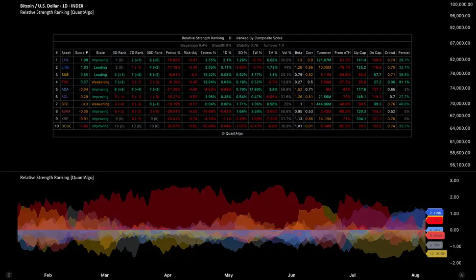
The Relative Strength Ranking is a multi-asset leadership and rotation toolkit that ranks a custom universe of up to twenty instruments side by side. It scores momentum across multiple horizons, measures period returns, risk-adjusted performance, and excess versus a benchmark, and surfaces rotation state, rank history, liquidity, crowding, and capture metrics in one dashboard. Analysis runs on a dedicated Measurement Timeframe independent of the chart, so the same leaderboard can support systematic rebalancing or live monitoring across crypto, equities, indices, commodities, and forex.

🟢 How It Works
Relative strength ranking answers which assets deserve capital inside a defined opportunity set, not only whether a single chart looks strong. Absolute return can mislead when everything is rising or falling together: a name up twenty percent may still lag its peers, while the best-holding asset in a broad decline can be the only one worth rotating into.
The indicator ranks each enabled symbol against the rest of your board using the sort metric you choose. By default, Sort Ranking By, Plot Metric, and performer labels all use Composite Score, so the table, pane, and labels start on the same leadership read with no extra setup. You can later set the table and plot to different metrics if you want (for example rank by composite while plotting Period %). An optional benchmark adds excess return, rotation state, beta, correlation, and upside or downside capture so you can see who is leading the market rather than simply rising with it. Confirmed Bars Only freezes every figure on the last fully closed data bar for rebalancing and comparable screenshots; turn it off when you want the table to update live as price moves. Keep the chart at the Measurement Timeframe or faster so rank history and benchmark sample series stay fully populated.
The ranking table is the main decision surface. The pane plot and performer labels give a visual read of the same universe over time. Use the table for allocation and screening; use the plot to watch leadership shift bar by bar.

🟢 Key Features
▶ Flexible Twenty-Asset Universe
Twenty independent slots accept any TradingView symbol, including crypto, stocks, ETFs, cash equity indices, commodity futures, forex, and index futures, so you can rank a sector book, a majors basket, an index set, a commodity complex, or a mixed multi-asset board. Each slot has its own enable toggle, symbol, and color used in the pane and the table. Disable slots you do not trade to keep the board short. If you leave the default crypto set, update the Benchmark Symbol as well so excess, state, beta, and correlation stay meaningful for your universe (for example BTC for crypto, a broad market index for equities or indices, or a related futures contract or commodity index for commodities).

▶ Measurement & Ranking Controls
Measurement Timeframe sets the bar size used for analysis metrics. It is not the chart interval. Window Sizing (Auto or Manual) controls how lookbacks map onto that data series.
Annualization Basis scales volatility and risk-adjusted figures to a trading year. It does not change rank order, only the risk numbers shown. Choose the preset that matches the bulk of your book:
Primary Lookback drives Period %, excess, and risk-adjusted return. Sort Ranking By chooses the metric that drives the # column, rank history, Stability, Turnover, and alerts (default Composite Score). Plot Metric is separate and defaults to Composite Score as well. Leading Group Size sets how many top names count as the leading group for alerts and Rank Persistence.

▶ How to Read the Ranking Table
Each row is one asset. Columns can be turned on or off so beginners can keep a clean board and advanced users can open the full toolkit.

→ # (Current Rank)
Position by the active sort metric, from 1 for the strongest name in this universe. Rank is relative to the group only. In a broad decline, rank 1 is the asset holding up best, not necessarily an asset that is up. Use Period % color and Breadth to see whether the board is rising or falling. The active sort column is marked with ▼ in the header.
→ Composite Score
The recommended default sort and default plot. A higher score means stronger multi-horizon momentum relative to the rest of the universe. Positive means above the group average; negative means below it. In a weak market the leader can still print a positive score while Period % is red. Readings beyond roughly 1.5 mark a clear outlier. Color grades from red through amber to green as the score improves.
→ Rotation State
Requires benchmark metrics. Four labels from short versus long excess versus the benchmark:
Use Leading and Improving for candidates; treat Weakening as a warning that leadership may be fading.
→ 3D / 7D / 30D Rank (or P / B Rank)
Where this asset stood at each rank-history horizon. Headers use D (days), P (measurement periods), or B (chart bars) depending on settings and whether the chart is slower than the data interval. A name at #1 today that was #12 a week ago is a fresh leader; one that has held top ranks across all three horizons is more persistent. Prefer the chart at or faster than Measurement Timeframe so D and P meanings stay clean.
→ Period %
Return over the primary lookback on the Measurement Timeframe. Label is always Period %. Default primary 90 on daily is about a quarter, so it differs from 1M %. Green is up over that window; red is down. This is the plain performance read next to the relative score.
→ Risk-Adjusted
Period return divided by annualized realized volatility. It answers how much return each asset delivered per unit of risk. Two assets both up forty percent can differ here by a large factor; the lower reading is the one that hurt more to hold. Useful when you size positions by risk. Volatility annualization follows the Annualization Basis you selected above.
→ Excess %
Period return of the asset minus period return of the benchmark over the same window. Positive means beating the benchmark; negative means the benchmark would have been better. Requires benchmark metrics and a benchmark that represents this universe.
→ 1D % / 3D % / 1W % / 1M %
Fixed calendar returns from daily closes only. They are not driven by Primary Lookback or Measurement Timeframe. Use them for short-horizon heat (1D, 3D) and standard week or month screens (1W, 1M) while Period % stays on a longer primary span by default.
→ Volatility
Annualized realized volatility on the measurement series (same Annualization Basis as risk-adjusted). Compare position size across the board and spot when a leader has become far more volatile than the group.
→ Beta / Correlation
Sensitivity and co-movement versus the benchmark over the beta window. Requires benchmark metrics. Show a dash when the chart is slower than the data interval. High beta leaders amplify benchmark moves; low correlation leaders are less tied to the same driver.
→ Turnover
Average traded value over recent measurement bars, scaled to K / M / B / T. Color is judged against your Minimum Turnover floor: green clears it comfortably, amber just clears it, red is below, white means no floor is set. Instruments without volume (many cash indices, some spot forex) report unavailable and are never caught by the liquidity filter. Optionally exclude names below the floor when the table drives live allocation.
→ From High
How far the close sits below the highest high of the drawdown window. Always negative or zero. A leader pinned near 0% is extended; moderate distance often offers a better entry timing read.
→ From ATH
How far the close sits below the highest high on record for that symbol. Cycle position rather than entry timing: separates assets making new highs from those still working back through an older peak.
→ Upside Capture / Downside Capture
How the asset behaves on bars when the benchmark rose or fell. Upside above 100 means more upside than the benchmark on up bars. Downside below 100 means less downside than the benchmark on down bars (preferable). Pair them: 110 up / 60 down is a different profile from 110 up / 130 down. Requires benchmark metrics and enough valid samples.
→ Crowding
Average correlation of this asset to every other name currently on the board. Does not require the benchmark. Low crowding on a top-ranked name suggests it is leading on its own driver rather than riding the same wave as the rest of the book.
→ Rank Persistence
Share of the rank-history log in which this asset sat inside the leading group (size set by Leading Group Size). A name in the top group for most of the log is a different animal from one that arrived yesterday.
→ Statistics row
When enabled: Dispersion is how spread out primary returns are across the board; Breadth is the share with a positive primary return (below 50% means most of the board is falling); Stability and Turnover summarize whether leadership is settled or reshuffling (they show a dash when the chart is slower than the data interval).
▶ How to Read the Asset Ranking Plot
The pane plots every enabled asset so you can see magnitude and leadership shift without reading every cell.

Color for each series matches the asset slot color in the table so the two views stay linked.
▶ Built-in Alert System
Pre-configured alerts cover leader changes, top 3 / 5 / 10 reshuffles, any ranking change, leading-group entries and exits (size set by Leading Group Size), each of the four rotation states, breadth turning positive or negative, and the board flipping between churning and settled leadership. Use named conditions for specific events, or Any alert() function call for a single stream that embeds the asset name and reading where they apply. Pair with Once Per Bar Close for automated workflows.

🟢 Quick start (beginners): enable the assets you care about (any mix of crypto, stocks, indices, commodities, forex, or futures), leave Sort Ranking By and Plot Metric on Composite Score, set Annualization Basis to match your book (Crypto; Commodities, Forex and Futures; or Stocks and Indices), keep Use Confirmed Bars Only on for decisions you will act on, and watch #, Composite Score, Period %, and Rotation State first. Add Rank Persistence and Excess % when you want durability and benchmark context.
🟢 Deeper use (advanced): change table sort and plot metric independently when you want (for example sort by Composite Score while plotting Period %), open capture, crowding, and beta columns, align Measurement Timeframe with your rebalance cadence, match Annualization Basis (or Custom bars per year) to your session type, set a liquidity floor, and drive alerts from leading-group size equal to the number of positions you hold.
The Relative Strength Ranking is a multi-asset leadership and rotation toolkit that ranks a custom universe of up to twenty instruments side by side. It scores momentum across multiple horizons, measures period returns, risk-adjusted performance, and excess versus a benchmark, and surfaces rotation state, rank history, liquidity, crowding, and capture metrics in one dashboard. Analysis runs on a dedicated Measurement Timeframe independent of the chart, so the same leaderboard can support systematic rebalancing or live monitoring across crypto, equities, indices, commodities, and forex.
🟢 How It Works
Relative strength ranking answers which assets deserve capital inside a defined opportunity set, not only whether a single chart looks strong. Absolute return can mislead when everything is rising or falling together: a name up twenty percent may still lag its peers, while the best-holding asset in a broad decline can be the only one worth rotating into.
The indicator ranks each enabled symbol against the rest of your board using the sort metric you choose. By default, Sort Ranking By, Plot Metric, and performer labels all use Composite Score, so the table, pane, and labels start on the same leadership read with no extra setup. You can later set the table and plot to different metrics if you want (for example rank by composite while plotting Period %). An optional benchmark adds excess return, rotation state, beta, correlation, and upside or downside capture so you can see who is leading the market rather than simply rising with it. Confirmed Bars Only freezes every figure on the last fully closed data bar for rebalancing and comparable screenshots; turn it off when you want the table to update live as price moves. Keep the chart at the Measurement Timeframe or faster so rank history and benchmark sample series stay fully populated.
The ranking table is the main decision surface. The pane plot and performer labels give a visual read of the same universe over time. Use the table for allocation and screening; use the plot to watch leadership shift bar by bar.
🟢 Key Features
▶ Flexible Twenty-Asset Universe
Twenty independent slots accept any TradingView symbol, including crypto, stocks, ETFs, cash equity indices, commodity futures, forex, and index futures, so you can rank a sector book, a majors basket, an index set, a commodity complex, or a mixed multi-asset board. Each slot has its own enable toggle, symbol, and color used in the pane and the table. Disable slots you do not trade to keep the board short. If you leave the default crypto set, update the Benchmark Symbol as well so excess, state, beta, and correlation stay meaningful for your universe (for example BTC for crypto, a broad market index for equities or indices, or a related futures contract or commodity index for commodities).
▶ Measurement & Ranking Controls
Measurement Timeframe sets the bar size used for analysis metrics. It is not the chart interval. Window Sizing (Auto or Manual) controls how lookbacks map onto that data series.
Annualization Basis scales volatility and risk-adjusted figures to a trading year. It does not change rank order, only the risk numbers shown. Choose the preset that matches the bulk of your book:
- Crypto (24/7): continuous trading; bar count is derived automatically from the data interval.
- Commodities, Forex and Futures (24/5): roughly 260 weekdays of twenty-four-hour trading. Use for most commodity futures (gold, oil, copper, and similar), spot or futures FX, and many index futures.
- Stocks and Indices (6.5h Session): 252 cash equity sessions of about six and a half hours. Use for individual stocks, ETFs, and cash equity indices (for example SPX, NDX, DJI).
- Custom: enter data-interval bars per year yourself for mixed books, unusual hours, or when none of the presets fit.
Primary Lookback drives Period %, excess, and risk-adjusted return. Sort Ranking By chooses the metric that drives the # column, rank history, Stability, Turnover, and alerts (default Composite Score). Plot Metric is separate and defaults to Composite Score as well. Leading Group Size sets how many top names count as the leading group for alerts and Rank Persistence.
▶ How to Read the Ranking Table
Each row is one asset. Columns can be turned on or off so beginners can keep a clean board and advanced users can open the full toolkit.
→ # (Current Rank)
Position by the active sort metric, from 1 for the strongest name in this universe. Rank is relative to the group only. In a broad decline, rank 1 is the asset holding up best, not necessarily an asset that is up. Use Period % color and Breadth to see whether the board is rising or falling. The active sort column is marked with ▼ in the header.
→ Composite Score
The recommended default sort and default plot. A higher score means stronger multi-horizon momentum relative to the rest of the universe. Positive means above the group average; negative means below it. In a weak market the leader can still print a positive score while Period % is red. Readings beyond roughly 1.5 mark a clear outlier. Color grades from red through amber to green as the score improves.
→ Rotation State
Requires benchmark metrics. Four labels from short versus long excess versus the benchmark:
- Leading: beating the benchmark and accelerating
- Weakening: still ahead but losing ground
- Improving: behind but recovering
- Lagging: behind and still falling back
Use Leading and Improving for candidates; treat Weakening as a warning that leadership may be fading.
→ 3D / 7D / 30D Rank (or P / B Rank)
Where this asset stood at each rank-history horizon. Headers use D (days), P (measurement periods), or B (chart bars) depending on settings and whether the chart is slower than the data interval. A name at #1 today that was #12 a week ago is a fresh leader; one that has held top ranks across all three horizons is more persistent. Prefer the chart at or faster than Measurement Timeframe so D and P meanings stay clean.
→ Period %
Return over the primary lookback on the Measurement Timeframe. Label is always Period %. Default primary 90 on daily is about a quarter, so it differs from 1M %. Green is up over that window; red is down. This is the plain performance read next to the relative score.
→ Risk-Adjusted
Period return divided by annualized realized volatility. It answers how much return each asset delivered per unit of risk. Two assets both up forty percent can differ here by a large factor; the lower reading is the one that hurt more to hold. Useful when you size positions by risk. Volatility annualization follows the Annualization Basis you selected above.
→ Excess %
Period return of the asset minus period return of the benchmark over the same window. Positive means beating the benchmark; negative means the benchmark would have been better. Requires benchmark metrics and a benchmark that represents this universe.
→ 1D % / 3D % / 1W % / 1M %
Fixed calendar returns from daily closes only. They are not driven by Primary Lookback or Measurement Timeframe. Use them for short-horizon heat (1D, 3D) and standard week or month screens (1W, 1M) while Period % stays on a longer primary span by default.
→ Volatility
Annualized realized volatility on the measurement series (same Annualization Basis as risk-adjusted). Compare position size across the board and spot when a leader has become far more volatile than the group.
→ Beta / Correlation
Sensitivity and co-movement versus the benchmark over the beta window. Requires benchmark metrics. Show a dash when the chart is slower than the data interval. High beta leaders amplify benchmark moves; low correlation leaders are less tied to the same driver.
→ Turnover
Average traded value over recent measurement bars, scaled to K / M / B / T. Color is judged against your Minimum Turnover floor: green clears it comfortably, amber just clears it, red is below, white means no floor is set. Instruments without volume (many cash indices, some spot forex) report unavailable and are never caught by the liquidity filter. Optionally exclude names below the floor when the table drives live allocation.
→ From High
How far the close sits below the highest high of the drawdown window. Always negative or zero. A leader pinned near 0% is extended; moderate distance often offers a better entry timing read.
→ From ATH
How far the close sits below the highest high on record for that symbol. Cycle position rather than entry timing: separates assets making new highs from those still working back through an older peak.
→ Upside Capture / Downside Capture
How the asset behaves on bars when the benchmark rose or fell. Upside above 100 means more upside than the benchmark on up bars. Downside below 100 means less downside than the benchmark on down bars (preferable). Pair them: 110 up / 60 down is a different profile from 110 up / 130 down. Requires benchmark metrics and enough valid samples.
→ Crowding
Average correlation of this asset to every other name currently on the board. Does not require the benchmark. Low crowding on a top-ranked name suggests it is leading on its own driver rather than riding the same wave as the rest of the book.
→ Rank Persistence
Share of the rank-history log in which this asset sat inside the leading group (size set by Leading Group Size). A name in the top group for most of the log is a different animal from one that arrived yesterday.
→ Statistics row
When enabled: Dispersion is how spread out primary returns are across the board; Breadth is the share with a positive primary return (below 50% means most of the board is falling); Stability and Turnover summarize whether leadership is settled or reshuffling (they show a dash when the chart is slower than the data interval).
▶ How to Read the Asset Ranking Plot
The pane plots every enabled asset so you can see magnitude and leadership shift without reading every cell.
- Plot Metric (default Composite Score): same relative leadership score as the table by default, so the plot and labels match #1 on the board immediately. Switch to Period % for plain performance, Risk-Adjusted for return per unit of risk, or Excess vs Benchmark for outperformance (falls back to Period % if the benchmark is off). Plot metric is independent of table sort if you change either later.
- Performer labels always follow Plot Metric (not table sort): rank order and label height use the same values as the bars or lines you are looking at.
- Plot Style: Columns for a classic screener snapshot and easy magnitude comparison; Histogram for thinner bars when many slots are on; Line to follow how leadership has shifted over time; Area to emphasize the strongest movers in a smaller universe.
- Gradient Bar Fill (Columns and Histogram): bars near zero fade toward the background; the strongest movers render at full strength so leaders and laggards separate before you read a number.
- Labels Shown: floating labels on the top 1 to 20 names by Plot Metric. Keep Top 3 or Top 5 for a typical rotation book; use more labels on a tall pane when you want the whole leading half mapped.
- Zero Line: optional horizontal reference so the split between advancing and declining assets is obvious at a glance.
- Table Position: includes Middle Center plus the usual corners and mid sides.
Color for each series matches the asset slot color in the table so the two views stay linked.
▶ Built-in Alert System
Pre-configured alerts cover leader changes, top 3 / 5 / 10 reshuffles, any ranking change, leading-group entries and exits (size set by Leading Group Size), each of the four rotation states, breadth turning positive or negative, and the board flipping between churning and settled leadership. Use named conditions for specific events, or Any alert() function call for a single stream that embeds the asset name and reading where they apply. Pair with Once Per Bar Close for automated workflows.
🟢 Quick start (beginners): enable the assets you care about (any mix of crypto, stocks, indices, commodities, forex, or futures), leave Sort Ranking By and Plot Metric on Composite Score, set Annualization Basis to match your book (Crypto; Commodities, Forex and Futures; or Stocks and Indices), keep Use Confirmed Bars Only on for decisions you will act on, and watch #, Composite Score, Period %, and Rotation State first. Add Rank Persistence and Excess % when you want durability and benchmark context.
🟢 Deeper use (advanced): change table sort and plot metric independently when you want (for example sort by Composite Score while plotting Period %), open capture, crowding, and beta columns, align Measurement Timeframe with your rebalance cadence, match Annualization Basis (or Custom bars per year) to your session type, set a liquidity floor, and drive alerts from leading-group size equal to the number of positions you hold.
זמין במרחב בתשלום
האינדיקטור הזה זמין רק למנויי QuantAlgo Essential. הצטרף כדי לקבל גישה לזה ולסקריפטים נוספים של QuantAlgo.

🟢 Access our best trading & investing tools: joinquantalgo.com/plans
🟢 Free Special Edition indicators: joinquantalgo.com/special-editions
🟢 Discord: discord.gg/hJaFyGEAyX
🟢 Free Special Edition indicators: joinquantalgo.com/special-editions
🟢 Discord: discord.gg/hJaFyGEAyX
כתב ויתור
המידע והפרסומים אינם מיועדים להיות, ואינם מהווים, ייעוץ או המלצה פיננסית, השקעתית, מסחרית או מכל סוג אחר המסופקת או מאושרת על ידי TradingView. קרא עוד ב־תנאי השימוש.
זמין במרחב בתשלום
האינדיקטור הזה זמין רק למנויי QuantAlgo Essential. הצטרף כדי לקבל גישה לזה ולסקריפטים נוספים של QuantAlgo.
🟢 Access our best trading & investing tools: joinquantalgo.com/plans
🟢 Free Special Edition indicators: joinquantalgo.com/special-editions
🟢 Discord: discord.gg/hJaFyGEAyX
🟢 Free Special Edition indicators: joinquantalgo.com/special-editions
🟢 Discord: discord.gg/hJaFyGEAyX
כתב ויתור
המידע והפרסומים אינם מיועדים להיות, ואינם מהווים, ייעוץ או המלצה פיננסית, השקעתית, מסחרית או מכל סוג אחר המסופקת או מאושרת על ידי TradingView. קרא עוד ב־תנאי השימוש.