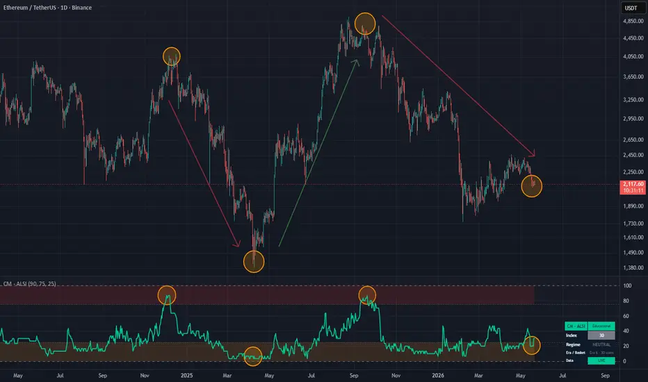
XRP HODLER Framework / Infinity Signal v2.0The XRP HODLER Framework is a long-term investor decision-support indicator designed to help identify when market conditions may be favorable for:
• Cost Averaging Down
• Cost Averaging Up
• Reducing Risk
• Waiting for Alignment
The indicator combines multiple market measurements into a single framework that is easy to interpret and designed to remove emotion from the decision-making process.
Core Components
The framework evaluates:
• Relative Strength Index (RSI)
• Stochastic RSI
• Money Flow Index (MFI)
• Optional Fear & Greed Sentiment
These components are combined into a scoring system that determines overall market pressure and investor positioning.
Value Zone
Value Zones identify periods where accumulation conditions are developing while price remains below the long-term trend.
These zones are intended to represent potential Cost Average Down environments.
The objective is not to identify an exact bottom, but to identify areas where value may be improving.
Trend Confirmation
Trend Confirmation Zones identify periods where accumulation conditions remain favorable while price trades above the long-term trend.
These zones are intended to represent potential Cost Average Up environments.
Rather than buying weakness, investors may choose to add to positions after evidence of trend recovery appears.
Reduce Risk
Reduce Risk Zones identify periods where market conditions may be becoming increasingly extended.
These zones may be useful for:
• Profit-taking evaluation
• Exposure reduction
• Risk management review
The framework is not designed to identify exact market tops.
Instead, it highlights areas where risk may be increasing.
Market Pressure Dashboard
The dashboard displays:
• Market State
• Market Pressure
• HODLER Mode
• RSI
• Stochastic RSI
• MFI
• Fear & Greed
• Buy Score
• Sell Score
• Final Signal
This allows investors to quickly assess current market conditions from a single location.
Final Signals
COST AVERAGE DOWN
Multiple accumulation conditions are aligning while price remains below the long-term trend.
COST AVERAGE UP
Multiple accumulation conditions are aligning while price remains above the long-term trend.
REDUCE RISK
Multiple risk conditions are aligning, and market conditions may be becoming increasingly
extended.
How To Use
Step 1
Select the timeframe you wish to analyze.
Many long-term investors prefer the Weekly chart, while active investors may prefer the Daily chart.
Step 2
Monitor the HODLER MODE row.
COST AVERAGE DOWN
Potential value conditions may be developing below the long-term trend.
COST AVERAGE UP
Accumulation conditions remain favorable while price trades above the long-term trend.
Step 3
Review the Buy Score and Sell Score.
Higher Buy Scores indicate increasing accumulation pressure.
Higher Sell Scores indicate increasing risk pressure.
Step 4
Review the Final Signal.
WAIT FOR ALIGNMENT
Remain patient.
COST AVERAGE DOWN
Potential value accumulation conditions are present.
COST AVERAGE UP
Trend recovery conditions are present.
REDUCE RISK
Market conditions may be becoming increasingly extended.
Step 5
Use the framework as a decision-support tool rather than a prediction tool.
The objective is not to identify exact tops or bottoms.
The objective is to identify improving or deteriorating market conditions while maintaining discipline and consistency.
WAIT FOR ALIGNMENT
Market conditions remain mixed, and additional confirmation may be required.
Important Notes
The XRP HODLER Framework is designed to identify changing probabilities rather than predict future prices.
No indicator can consistently identify exact market tops or bottoms.
This framework is intended to provide structure, discipline, and context for long-term investors.
Disclaimer
This script is provided for educational and informational purposes only.
It does not constitute financial advice, investment advice, trading advice, or a recommendation to buy or sell any financial instrument.
Always conduct your own research and use proper risk management. אינדיקטור

אינדיקטור

אינדיקטור

אינדיקטור

אינדיקטור

אינדיקטור

אינדיקטור
אסטרטגייה
אינדיקטור

Household Equity Allocation -- Positioning Gauge█ OVERVIEW
This indicator plots, in its own pane, the percentage of United States household financial assets held in corporate equities, requested live from the Federal Reserve Z.1 financial accounts. It ranks the current reading against an embedded multi-decade history, classifies it into posture zones, and reports an indicative long-horizon estimate, presenting household equity positioning as a slow, low-frequency context gauge rather than a price-derived trading signal.
█ HISTORY / BACKGROUND
The series shown is published by the Federal Reserve Board in the Z.1 Financial Accounts of the United States, formerly the Flow of Funds, available quarterly since 1945. It measures households' directly and indirectly held corporate equities as a share of their financial assets. Its use as a forward-looking context measure was popularized by the analyst writing as Philosophical Economics in 2013, who examined its historical relationship with subsequent long-horizon equity returns and contrasted it with Robert Shiller's cyclically adjusted price-to-earnings ratio.
The conceptual basis is an accounting identity rather than a behavioral model: investors in aggregate must hold the entire outstanding supply of equities, so the equity share of household assets can rise only when equity prices rise relative to the supply of other assets. The measure is therefore a positioning and relative-valuation reading expressed in committed dollars, not a sentiment survey. The script applies no proprietary transformation to the series; it requests the published values and contextualizes them.
█ HOW IT WORKS
- The script requests the series named by the FRED series input (default FRED:BOGZ1FL153064486Q) with request.security at a quarterly (3M) resolution, lookahead disabled and gaps off, taking the published close as the current allocation reading.
- A fixed baseline of annual year-end values from 1945 through 2025 is loaded once into an array on the first bar. After a hardcoded cutoff (Q4 2025) the script appends each new distinct live reading to that array, so the baseline extends automatically as new quarters are published.
- A percentile routine counts the baseline entries less than or equal to the current reading and returns that count as a percentage of the array size, giving the reading's full-history percentile.
- The reading is classified into one of four zones by comparison against the three threshold inputs: below Bottom-quintile , below Top-quintile , below Above historical range , or at or above it. Each zone maps to a color and a posture label.
- An indicative estimate is computed as a fixed linear function of the reading, with intercept 12.338 and slope -0.3978, using constants hardcoded in the script. When the reading exceeds the in-sample maximum of 38.7, the estimate is marked as an extrapolation.
- The allocation is drawn as a line colored by the active zone. Three dashed horizontal lines mark the thresholds, and an optional background tint shades the pane by zone. An optional table in the top right reports the current value, its full-history percentile, the posture, the indicative estimate (flagged when extrapolated), the in-sample maximum, and the data source. The table is built only on the last bar.
█ HOW TO USE
The output is read from the pane and the table.
- The line and its color show where positioning currently sits: green for the lowest band, gold for a neutral band, amber for an elevated band, and red for a reading above the historical range. The posture label in the table names the same state.
- The dashed lines are the zone thresholds, and the optional background tint repeats the active zone for quick reading.
- The table states the current value, its percentile against the full history, the posture, and the indicative long-horizon estimate, with a flag when that estimate is extrapolated beyond the historical range.
Recommended timeframe: the underlying data is quarterly and the script requests it at a quarterly resolution regardless of the chart's timeframe, so the displayed value is identical on every chart timeframe. A monthly or weekly chart on a long-history instrument is suggested only so the plotted line spans a useful visual range; the value and table do not depend on the chart timeframe or the chart symbol. Because the series is slow and lagged, it is intended for strategic, low-frequency context, not intraday or short-term use.
█ SETTINGS
- FRED series (symbol, default FRED:BOGZ1FL153064486Q): the economic series the script requests and contextualizes.
- Shade posture zones (on or off, default on): toggles the background tint that colors the pane by the active zone.
- Show info table (on or off, default on): toggles the top-right summary table.
- Bottom-quintile (cheap) below (number, default 14.0): the upper bound of the lowest zone, in percent.
- Top-quintile (underweight) above (number, default 28.0): the level above which the reading is treated as elevated.
- Above historical range above (number, default 39.0): the level above which the reading is treated as beyond the historical range.
█ WHAT MAKES IT ORIGINAL
The script does not compute a price-based study. It is a self-contained method for contextualizing a single external economic series on a chart. Its construction is specific: it pulls the series live through request.security; it ranks the current reading against a historical distribution embedded directly in the script and extended automatically after a cutoff date, so the percentile is point-in-time and does not depend on how much chart history is loaded; it maps the reading to posture zones by user thresholds; and it computes an indicative estimate from a fixed linear fit while explicitly flagging when the current reading lies beyond the data range that produced the fit. The combination of an embedded, self-extending baseline for percentile ranking, the posture zoning, and the extrapolation flag, presented together for this macro series in one pane and table, is what distinguishes it. It applies no proprietary formula on price; the contribution is the contextualization method.
█ NOTES / LIMITATIONS
- Data dependence: the script plots an external economic series, not chart price, and requires access to the configured economic symbol through your data subscription. If the symbol cannot be resolved the request returns na, the line does not plot, and the table shows n/a.
- Chart history and rendering: the percentile baseline and the table are independent of chart history because the baseline is embedded in the script, but the plotted line spans only the bars loaded on the chart, so on a short chart the visible line is short. The table is built only on the last bar.
- Frequency and revision: the source is quarterly and reported with a lag, so the value changes only when a new quarter is published, and the most recent value can be revised by the source.
- Request behavior: the series is requested with lookahead disabled, so no future data is placed on historical bars, and values are carried forward between releases. Historical readings do not repaint; only the most recent reading can change as the source releases or revises a quarter.
- Baseline granularity and cutoff: the embedded baseline holds one value per year (annual year-end) from 1945 through 2025, and live values are appended only after the hardcoded Q4 2025 cutoff, so the percentile reference is annual before that date and extends quarterly thereafter.
- Extrapolation: the indicative estimate is fit over readings up to 38.7, and current readings exceed that, so the estimate lies outside the fitted range and is flagged as such.
- Symbol scope: the script is independent of the chart symbol and can be applied to any chart, since it does not read the chart's price.
This script displays historical economic data and a derived estimate for research and educational purposes. It is not investment advice. אינדיקטור

HAP 3 Pressure BandsHAP 3D Pressure Bands
HAP (Hybrid Adaptive Pressure Bands) is a price-overlay indicator designed to visualize momentum pressure, volatility compression, and expansion directly on the chart without requiring a separate oscillator panel.
Unlike traditional Bollinger Bands, which are built purely from price volatility, HAP derives its structure from RSI behavior and projects that information back onto the price chart. This creates a dynamic pressure field that adapts to both momentum and volatility conditions.
The indicator calculates an RSI-based equilibrium zone and transforms it into a price-scaled band structure. The result is a visual representation of market pressure, allowing traders to identify periods of contraction, expansion, and potential breakout conditions.
━━━━━━━━━━━━━━━━━━━━
HOW IT WORKS
━━━━━━━━━━━━━━━━━━━━
• RSI Engine
The core of the indicator is built around RSI. The average RSI and its standard deviation create an adaptive momentum envelope.
• Dynamic Price Projection
Instead of displaying RSI in a separate panel, HAP converts RSI deviations into price-scaled bands using market volatility. This projects momentum information directly onto the chart.
• 3D Pressure Bands
The layered fills create a depth effect that highlights areas of compression and expansion. The visual intensity increases as pressure builds inside the structure.
• Squeeze Detection
When band width contracts below its historical average, the indicator enters a squeeze state. This represents reduced volatility and potential energy accumulation.
• Release Signals
A squeeze release occurs when the market exits a compressed state. These events often precede strong directional moves and can help traders identify expansion phases.
━━━━━━━━━━━━━━━━━━━━
HOW TO USE
━━━━━━━━━━━━━━━━━━━━
Bullish Conditions:
• Price breaks and holds above the upper pressure band.
• Squeeze releases upward.
• RSI pressure expands after a compression phase.
Bearish Conditions:
• Price breaks and holds below the lower pressure band.
• Squeeze releases downward.
• Momentum pressure expands to the downside.
Neutral Conditions:
• Price remains inside the band structure.
• Market is balancing between buyers and sellers.
• Compression may be building for a future breakout.
━━━━━━━━━━━━━━━━━━━━
INTERPRETATION
━━━━━━━━━━━━━━━━━━━━
The bands should not be viewed as traditional support and resistance levels. Instead, they represent dynamic pressure zones where market participants are either accumulating energy or releasing it.
Narrow bands indicate compression.
Wide bands indicate expansion.
Breakouts outside the pressure field suggest a potential shift in market control.
HAP is not intended to predict future price movements. It is designed to visualize the relationship between momentum and volatility in a way that is intuitive, clean, and directly integrated into the price chart.
Best used alongside trend analysis, market structure, volume studies, and higher timeframe confirmation.
HAP 3D Pressure Bands
HAP (Hybrid Adaptive Pressure Bands), momentum baskısını, volatilite sıkışmasını ve genişlemesini doğrudan fiyat grafiği üzerinde göstermek amacıyla tasarlanmış bir fiyat üstü (overlay) göstergedir.
Klasik Bollinger Bantları yalnızca fiyat volatilitesine dayanırken, HAP yapısını RSI davranışından oluşturur ve bu bilgiyi tekrar fiyat grafiğine taşır. Böylece hem momentum hem de volatiliteyi dikkate alan dinamik bir baskı alanı oluşturur.
Gösterge, RSI'ın ortalama ve standart sapma yapısını kullanarak bir denge bölgesi hesaplar. Daha sonra bu yapı fiyat ölçeğine dönüştürülerek grafik üzerine yerleştirilir. Sonuç olarak yatırımcılar piyasadaki sıkışma, genişleme ve olası kırılım bölgelerini daha net görebilir.
━━━━━━━━━━━━━━━━━━━━
NASIL ÇALIŞIR?
━━━━━━━━━━━━━━━━━━━━
• RSI Motoru
Göstergenin temelinde RSI bulunur. RSI'ın ortalaması ve standart sapması adaptif bir momentum zarfı oluşturur.
• Dinamik Fiyat Projeksiyonu
RSI ayrı bir panelde gösterilmek yerine, fiyat volatilitesi kullanılarak fiyat grafiğine dönüştürülür. Böylece momentum bilgisi doğrudan fiyatın üzerinde görüntülenir.
• 3D Baskı Bantları
Katmanlı dolgu yapısı sıkışma ve genişleme bölgelerini görsel olarak daha belirgin hale getirir. Baskı arttıkça bantların görsel yoğunluğu da artar.
• Sıkışma (Squeeze) Tespiti
Bant genişliği kendi tarihsel ortalamasının altına düştüğünde gösterge sıkışma durumuna geçer. Bu durum genellikle volatilitenin azaldığını ve enerjinin biriktiğini gösterir.
• Release (Boşalma) Sinyalleri
Sıkışma sona erdiğinde oluşan release sinyalleri, piyasanın yeni bir hareket başlatabileceğini gösterir. Bu bölgeler çoğu zaman güçlü yönlü hareketlerin başlangıç noktaları olabilir.
━━━━━━━━━━━━━━━━━━━━
NASIL KULLANILIR?
━━━━━━━━━━━━━━━━━━━━
Yükseliş Senaryosu:
• Fiyat üst baskı bandının üzerine çıkar ve üzerinde tutunur.
• Squeeze yukarı yönlü sonlanır.
• Momentum baskısı sıkışma sonrasında genişlemeye başlar.
Düşüş Senaryosu:
• Fiyat alt baskı bandının altına iner ve altında kalır.
• Squeeze aşağı yönlü sonlanır.
• Momentum baskısı aşağı yönde genişler.
Nötr Senaryo:
• Fiyat bant yapısının içinde hareket eder.
• Alıcı ve satıcılar arasında denge oluşur.
• Gelecekteki olası kırılım için enerji birikiyor olabilir.
━━━━━━━━━━━━━━━━━━━━
YORUMLAMA
━━━━━━━━━━━━━━━━━━━━
Bu bantlar klasik destek ve direnç bölgeleri olarak değerlendirilmemelidir. HAP'ın amacı fiyatın etrafındaki baskı alanlarını göstermek ve piyasanın enerji biriktirdiği veya enerjiyi serbest bıraktığı bölgeleri görselleştirmektir.
Dar bantlar sıkışmayı,
Geniş bantlar genişlemeyi,
Bant dışı hareketler ise olası kontrol değişimini ifade eder.
HAP geleceği tahmin etmeyi amaçlayan bir gösterge değildir. Amaç, momentum ile volatilite arasındaki ilişkiyi sade, görsel ve anlaşılır bir yapıda fiyat grafiğinin üzerine taşımaktır.
En iyi sonuçlar trend analizi, piyasa yapısı, hacim çalışmaları ve üst zaman dilimi teyitleri ile birlikte kullanıldığında elde edilir.
אינדיקטור

Generalized Fisher Transform [LB] Concept
The Generalized Fisher Transform extends John F. Ehlers' classic Fisher Transform (2002) by introducing an adjustable shape parameter that controls the sensitivity profile of the transformation. While the original Fisher Transform maps any normalized input to a near‑Gaussian output to highlight statistical extremes, this generalized version allows traders to emphasize central regions (shape < 1) or extreme tails (shape > 1) depending on their strategy.
Mathematical Foundation
The indicator first normalizes price to a bounded range using a rolling min‑max window of length N :
x = 2 × (P - L_min) / (H_max - L_min) - 1
A signed power is then applied with a shape factor p :
x_p = sign(x) × |x|^p
The generalized Fisher Transform is computed as :
F = 0.5 × ln( (1 + x_p) / (1 - x_p) )
When p = 1 , the formula reduces to the classic Fisher Transform. Values of p < 1 amplify sensitivity near zero (central price region), while p > 1 amplify sensitivity near the edges (extreme price region). The result is smoothed by an EMA for noise reduction.
What Problem Does It Solve ?
Classic oscillators such as RSI or Stochastic use fixed non‑linear mappings that cannot adapt to different market regimes or trader preferences. The classic Fisher Transform offers a single sensitivity profile. The Generalized Fisher Transform solves this by exposing the shape parameter p , giving traders direct control over where the indicator is most responsive — near the mean or near the extremes — without changing the underlying logic or introducing additional indicators.
How To Interpret
The indicator operates in two selectable modes :
Extremes Mode – the background turns red when Fisher exceeds the upper threshold (statistically overbought), and green when it drops below the lower threshold (statistically oversold). These zones suggest potential mean‑reversion.
Direction Mode – the background turns cyan when Fisher is above zero (bullish bias) and orange when below zero (bearish bias). This mode is suited for trend‑following or directional confirmation.
In both modes, the Fisher line crossing zero indicates a shift in the price distribution relative to its recent range.
Parameters
Source – price data used for the calculation (default: close).
Normalization Period – number of bars used to compute the rolling min‑max for the normalization.
Shape Factor – exponent applied to the normalized price before the Fisher transform. 1 = classic Fisher, < 1 = center‑sensitive, > 1 = tail‑sensitive.
Smoothing Period – EMA length applied to the raw Fisher output.
Coloration Mode – switches between "Extremes" (overbought/oversold highlighting) and "Direction" (bullish/bearish highlighting).
Upper Threshold – Fisher level above which the background turns red in Extremes mode.
Lower Threshold – Fisher level below which the background turns green in Extremes mode.
Reference
Ehlers J.F., "Using the Fisher Transform", Technical Analysis of Stocks & Commodities, Vol. 20, No. 11, pp. 40‑45, November 2002.
Ehlers J.F., "Cybernetic Analysis for Stocks and Futures", Chapter 4 – The Fisher Transform, John Wiley & Sons, 2004. אינדיקטור

אינדיקטור

אינדיקטור

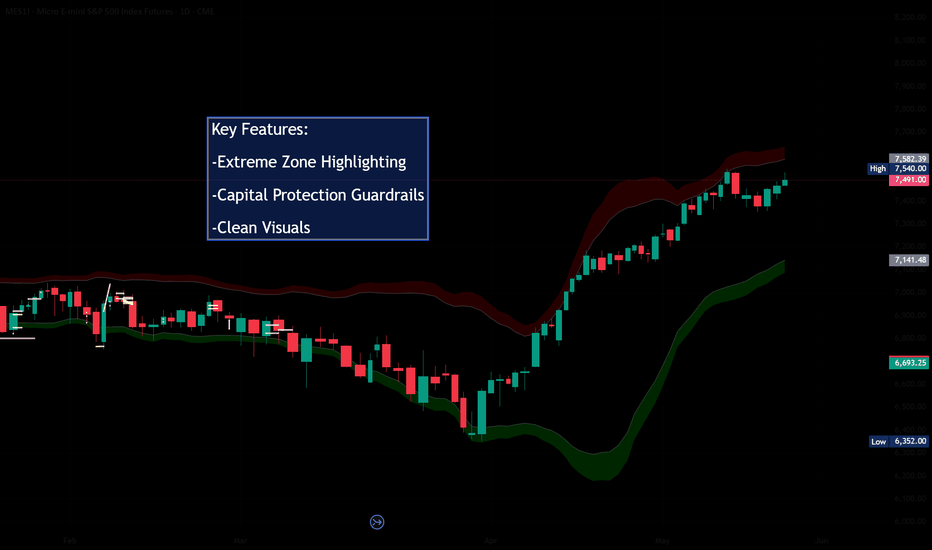
Mean Reversion ZonesMean Reversion Zones is an indicator that helps evaluate how far price has deviated from the balance line.
The indicator builds a dynamic mean-reversion channel around the calculated balance line. The upper red zones show areas where price has deviated above balance. The lower green zones show areas where price has deviated below balance. The central grey area represents the balance zone, where price is closer to its current average value.
This tool is designed to help traders read market context, identify stretched price conditions, and understand where the market is currently located: near balance, above balance, below balance, or inside an extreme deviation zone.
How it works
The script uses endpoint kernel smoothing to calculate a non-repainting balance line. Around this line, it builds several adaptive zones based on the mean absolute deviation of price from balance and current volatility conditions.
The channel can work in two width modes:
Fixed : the channel width is calculated based on the selected multiplier.
Adaptive : the channel expands and contracts depending on the current ATR compared with its average value.
The zones are divided into several areas:
Balance Zone : price is close to its average value.
Upper Risk Zone : price has deviated above balance.
Upper Extreme / Outer Risk Zone : price is strongly stretched to the upside.
Lower Opportunity Zone : price has deviated below balance.
Lower Extreme / Outer Opportunity Zone : price is strongly stretched to the downside.
Extreme dots
Red dots appear only when price reaches the upper extreme area or moves above the outer upper zone.
Green dots appear only when price reaches the lower extreme area or moves below the outer lower zone.
These dots are not trading signals. They are visual markers showing that price has reached a statistically stretched area relative to the current balance line.
Dashboard
The Dashboard briefly shows the current market context:
Zone : the current position of price inside the channel.
Reading : a simple text description of the current deviation.
Trend : EMA-based trend context: Uptrend, Downtrend, or Sideways.
Volatility : current ATR compared with its average value.
Hint : an educational context hint, not a trading recommendation.
How to use
The indicator may be useful for traders who want to answer several questions:
1. Is price close to balance or already far away from it?
2. Has the market deviated upward or downward?
3. Is the current deviation moving with the trend or against it?
4. Is volatility normal, high, or extreme?
5. Is it better to wait for price to return closer to balance before making a decision?
Important limitations
The indicator does not predict future price movement.
Upper zones are not automatic short signals. Lower zones are not automatic long signals. Extreme dots are not entry signals. They only show that price is currently stretched relative to the calculated balance line.
Mean-reversion tools can remain in a stretched condition for a long time during strong trends. Therefore, this indicator should always be used together with market structure analysis, trend analysis, volume, risk management, and your own trading plan.
Alerts
The script includes alerts for the following events:
Price enters the upper risk zone.
Price enters the extreme upper risk zone.
Price moves above the outer upper risk zone.
Price enters the lower opportunity zone.
Price enters the extreme lower opportunity zone.
Price moves below the outer lower opportunity zone.
Price returns to the balance zone.
These alerts are intended only for tracking market context and should not be treated as standalone trading signals.
אינדיקטור

אינדיקטור

אינדיקטור

P&D Short Signal v4.0 [4H]═══════════════════════════════════════════════════════════
TRADINGVIEW PUBLISH — P&D Short Signal v4.0
Author: Kevko87 | Open Source
═══════════════════════════════════════════════════════════
TITLE:
P&D Short Signal v4.0 — Pump & Dump Distribution Detector
───────────────────────────────────────────────────────────
SHORT DESCRIPTION (shown in search):
───────────────────────────────────────────────────────────
Detects post-pump distribution phases on crypto futures using
OBV, RSI divergence, MFI, and Delta-Volume across 4H / 1H / Daily.
Generates Tier 1 and Tier 2 short signals with auto TP/SL levels.
───────────────────────────────────────────────────────────
FULL DESCRIPTION:
───────────────────────────────────────────────────────────
## P&D Short Signal v4.0
This indicator identifies **post-pump distribution phases** on crypto
perpetual futures, designed to catch the dump after a Pump & Dump cycle.
Built and validated on Bitget Futures over 30+ live trading sessions.
---
### How it works
The indicator uses a **multi-timeframe confluence approach**:
- **4H** — Base timeframe (OBV slope, RSI, MFI, Delta-Volume)
- **1H** — OBV confirmation
- **Daily** — Gate-keeper: coins with Daily OBV > 500M are skipped
(high OBV = genuine buying pressure = no short)
A signal fires only when multiple conditions align simultaneously,
filtering out noise and false setups.
---
### Signal Tiers
**🔴 TIER 1 — High Confidence (≥85%)**
- Daily OBV < 500M (gate-keeper passes)
- 4H OBV falling + 1H OBV falling (distribution confirmed)
- RSI > 65 AND (bearish divergence OR below MA)
- MFI > 75 AND falling for 2+ bars
- Delta-Volume negative (optional, toggleable)
**🟠 TIER 2 — Moderate Confidence (~70%)**
- Daily OBV < 500M
- 4H OBV falling
- RSI > 65
- MFI > 65 AND falling
**🔴 MFI Extreme Background Alert**
- MFI ≥ 85 and falling with valid Daily OBV
- Precursor warning — check OBV manually
---
### Auto TP / SL
On every signal, the indicator automatically plots:
- **SL**: Entry High + ATR × 3 (default)
- **TP1**: −15% | **TP2**: −25% | **TP3**: −40% | **TP4**: −60%
All levels fully adjustable via inputs.
---
### Status Table (top right)
Live dashboard showing the current state of all filters:
D-OBV · OBV 4H · OBV 1H · RSI · MFI · Delta · D-RSI · Signal · Trade
---
### Alerts
Three built-in alert conditions:
- 🔴 TIER 1 SHORT
- 🟠 TIER 2 SHORT
- ⚠️ MFI EXTREME
Set alerts via TradingView's alert manager on any ticker.
---
### Recommended Usage
- **Market**: Crypto perpetual futures (Bitget, Bybit, Binance)
- **Timeframe**: 4H (indicator is built for 4H, do not use on other TFs)
- **Best targets**: Low-cap coins after +30–50% pumps within 24h
- **Risk management**: Always use the auto-generated SL. DCA entries
recommended for high-ATR setups.
---
### Key Filter: Daily OBV Gate
The most important filter in this system. If Daily OBV > 500M,
the move has genuine buying pressure behind it — shorting against
that is high risk. The indicator automatically skips these coins.
---
### Inputs
| Parameter | Default | Description |
|-----------|---------|-------------|
| Daily OBV Max | 500M | Skip coins above this OBV |
| OBV Slope Bars | 3 | Lookback for OBV direction |
| RSI Length | 14 | Standard RSI period |
| RSI Min for Entry | 65 | Minimum RSI for overbought |
| Divergence Lookback | 5 | Bars for price/RSI divergence |
| MFI Length | 14 | Standard MFI period |
| MFI Min Tier 1 | 75 | MFI threshold for Tier 1 |
| MFI Min Tier 2 | 65 | MFI threshold for Tier 2 |
| MFI Extreme | 85 | Background alert level |
| SL ATR Multiplier | 3.0 | Stop loss distance |
| TP1–TP4 | 15/25/40/60% | Take profit levels |
---
### Changelog
**v4.0**
- Base timeframe changed from 1H to 4H (higher win rate in backtesting)
- 5 bars on 4H = 20h = one full pump cycle captured
- Tier 1: RSI divergence OR below MA (previously required both)
- MTF structure: 4H base / 1H confirmation / Daily gate-keeper
- Status table added
---
*Open source. Use at your own risk. Not financial advice.*
*Built by Kevko87 — validated on live crypto futures trading.*
אינדיקטור

אינדיקטור

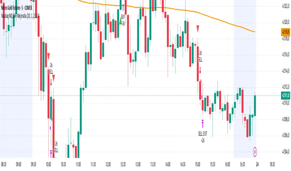
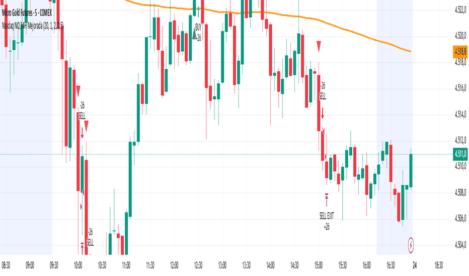
RSI Lead MomentumRSI Lead Momentum Engine is an advanced evolution of the classic RSI specifically designed for scalping and day trading on fast-moving markets such as Nasdaq (NQ), US100, CFD indices, and futures.
Unlike traditional RSI indicators that mainly react after price movement occurs, this indicator is designed to detect situations where RSI momentum leads the actual price structure.
Its primary objective is to identify pre-impulsive market phases in order to provide early entries before major directional expansions.
## Core Concept
The indicator analyzes the structural disconnection between:
* RSI structure,
* RSI slope,
* momentum acceleration,
* and real price structure.
The “RSI Lead” engine specifically detects situations where:
* RSI breaks a previous swing low or swing high,
* RSI momentum accelerates aggressively,
* while price has not yet confirmed the breakout or breakdown.
This behavior frequently appears on fast algorithmic markets and can signal:
* upcoming bullish or bearish continuation,
* volatility expansion phases,
* institutional momentum building before visible price displacement.
## Features
### RSI Lead Momentum Engine
Early signal detection:
* Early SELL
* Early BUY
Based on:
* RSI structural breaks,
* momentum acceleration,
* price compression,
* price lag versus RSI.
### RSI Divergences
Built-in detection:
* Regular Bullish
* Regular Bearish
### Compression & Momentum Explosion
Detection of:
* volatility compression,
* explosive momentum expansion.
### Dynamic RSI Coloring
Automatic RSI coloring based on:
* bullish momentum,
* bearish momentum,
* acceleration,
* breakout conditions.
### Detection Modes
* FAST → ultra-reactive mode for aggressive scalping.
* CONFIRMED → cleaner signals with additional price confirmation.
## Optimized For
* Nasdaq / NQ
* US100
* 1m / 2m / 5m scalping
* Momentum day trading
* Continuation setups
* Early entries
* Fast breakdowns and breakouts
## Indicator Philosophy
This indicator does not treat RSI as a simple overbought/oversold oscillator.
Instead, RSI is treated as:
an advanced directional pressure engine capable of anticipating certain price displacements before they become visually obvious on the chart.
The core of the algorithm is therefore based on:
detecting momentum displacement before price displacement.
אינדיקטור

אינדיקטור

Trend Pulse OBVTrend Pulse OBV Strategy
Trend Pulse OBV is an educational long-only strategy designed to study trend-channel breakouts that are confirmed by volume flow and a higher-level regime filter.
The strategy combines three main ideas:
1. A Trend Pulse Channel breakout.
2. OBV confirmation using On-Balance Volume relative to its EMA.
3. A regime filter using price relative to an EMA.
The purpose of the script is to test whether upside breakouts above an adaptive channel are more selective when confirmed by both volume accumulation and broader trend direction.
This is a strategy script for research, backtesting, and forward-testing only. It is not financial advice, does not predict future price movement, and does not guarantee profitable results. Historical strategy results are hypothetical and can differ significantly from live trading because of slippage, commissions, liquidity, spread, execution quality, timeframe selection, and market regime changes.
Core concept
The strategy is built around a Trend Pulse Channel. The channel uses a smoothed filter based on the selected source price and a filtered true-range calculation to create an upper breakout band.
A long entry can occur when price crosses above the Trend Pulse Channel upper band, but only if the selected confirmation filters are satisfied.
The strategy does not open short positions.
Entry logic
A long entry occurs when all selected conditions are satisfied:
* Price crosses above the Trend Pulse Channel upper band.
* Price is within the selected date range.
* The regime filter is satisfied, if enabled.
* The OBV confirmation filter is satisfied, if enabled.
* No long position is already open.
The strategy is designed to avoid entering every channel breakout. Instead, it requires confirmation that price is breaking out while broader trend and volume conditions support the move.
Trend Pulse Channel
The Trend Pulse Channel is calculated from:
* A selected source price, default HLC3.
* A multi-pole smoothing filter.
* A filtered true-range stream.
* A range multiplier used to define the upper band.
The upper channel band is used as the breakout trigger.
The midline is used as a possible exit reference when the midline exit is enabled.
OBV confirmation filter
The OBV filter compares On-Balance Volume to an EMA of OBV.
When the filter is enabled, long entries are allowed only when OBV is above its EMA. This is intended to require evidence that volume flow supports the upside breakout.
This does not guarantee continuation. It only adds a volume-based confirmation condition to the channel breakout.
Regime filter
The regime filter compares price to a selected EMA.
When enabled, long entries require price to be above the regime EMA. This is intended to reduce long entries during weaker or downward market environments.
The regime EMA can also be used as an exit condition if the regime exit is enabled.
Lag Mode
Lag Mode applies a zero-lag style pre-transform to both the price source and the true-range stream before they are filtered.
This can make the Trend Pulse Channel respond faster to new price movement, but it can also increase sensitivity and may create more false signals in choppy markets.
Exit logic
The strategy has multiple exit mechanisms:
1. ATR stop
At entry, the script calculates a fixed stop price using the previous bar’s ATR multiplied by the selected ATR stop multiplier. This stop remains fixed after entry.
2. Midline exit
When enabled, the strategy exits if price closes below the Trend Pulse Channel midline.
3. Regime EMA exit
When enabled, the strategy exits if price closes below the regime EMA.
The first active exit condition to trigger can close the position.
Risk and position sizing
The default strategy uses percent-of-equity position sizing.
Users should review the default order size carefully before publishing or relying on backtest results. A large percent-of-equity allocation can make historical results look stronger or weaker than they would under more conservative risk assumptions.
For public publication, users should use realistic position sizing, commission, and slippage assumptions that match the market being tested.
Default strategy properties
The script uses the following strategy properties:
* Initial capital: 1,000
* Position sizing: percent of equity
* Default order size: 70% of equity
* Commission: 0.1%
* Slippage: defined in the strategy settings
* Pyramiding: 1
* Fill orders on standard OHLC: enabled
* Calculate on every tick: disabled
* Calculate on order fills: disabled
* Bar magnifier: disabled
* Process orders on close: disabled
* Long-only execution
These values are provided for testing and can be changed by the user. They should not be interpreted as recommended risk settings.
Important backtesting note
TradingView strategy results are simulations based on historical chart data. They are not live trading results.
Backtest results can change significantly depending on:
* Symbol.
* Timeframe.
* Date range.
* Liquidity.
* Spread.
* Commission.
* Slippage.
* Position size.
* Trend Pulse period.
* Number of poles.
* Range multiplier.
* Lag Mode setting.
* OBV EMA length.
* Regime EMA length.
* ATR length.
* ATR stop multiplier.
* Exit settings.
* Market regime.
Users should test the strategy on a sufficiently large number of trades and across different market conditions before drawing conclusions. A small sample of trades is not enough to evaluate a strategy reliably.
How to use it
A practical workflow is:
1. Select the symbol and timeframe to test.
2. Use a realistic date range that includes different market regimes.
3. Confirm that the strategy produces a sufficient number of trades.
4. Adjust commission and slippage to reflect the market being tested.
5. Review whether the percent-of-equity order size is suitable.
6. Compare results with the OBV filter on and off.
7. Compare results with the regime filter on and off.
8. Compare exits using the midline exit, regime exit, and ATR stop behavior.
9. Forward-test before considering any real-world use.
Inputs
Date Range
* Start Date: first date included in the backtest.
* End Date: last date included in the backtest.
Trend Pulse Channel
* Source: price source used in the channel calculation.
* Poles: smoothing pole count used by the filter.
* Period: main channel smoothing period.
* Range Multiplier: controls the distance of the upper channel band.
* Lag Mode: applies the zero-lag pre-transform before filtering.
OBV Confirmation Filter
* Require OBV > EMA(OBV, N): enables or disables OBV confirmation.
* OBV EMA Length: EMA length applied to OBV.
Regime Filter
* Require close > regime EMA: enables or disables the regime filter.
* Regime EMA Length: EMA length used for the regime filter.
Exit Logic
* Exit on close < TPC midline: exits when price closes below the channel midline.
* Exit on close < regime EMA: exits when price closes below the regime EMA.
Risk — ATR Stop
* ATR Length: ATR period used for stop calculation.
* ATR Stop Multiplier: ATR multiplier used to set the fixed stop distance at entry.
Visual elements
The strategy plots:
* Trend Pulse Channel upper band.
* Trend Pulse Channel midline.
* Regime EMA.
* Long entry markers.
* Long exit markers.
Limitations
This strategy is long-only and does not evaluate short trades.
The strategy can underperform during sideways, choppy, low-volume, or news-driven conditions.
OBV confirmation can reduce some weak breakouts, but it cannot eliminate false breakouts.
The regime EMA is a lagging trend filter and may delay entries or exits.
The ATR stop is fixed at entry and may not adapt to changing volatility after the trade opens.
A breakout above the channel does not guarantee trend continuation.
No backtest can guarantee future performance.
Recommended use
Trend Pulse OBV is used as an educational framework for studying channel breakout behavior with volume-flow confirmation and regime filtering.
It should be used with realistic backtesting assumptions, conservative position sizing, and independent validation before any trading decision.
אסטרטגייה

אינדיקטור