Dashboard Pro | RSI - Fib - S/R - VolumeOverview
MTF Dashboard Pro is a multi-timeframe confluence engine that scans four timeframes simultaneously — 15-minute, 1-hour, 4-hour, and daily — and evaluates four independent technical conditions on each one. When all conditions align in the same direction, the dashboard issues a high-conviction LONG or SHORT signal. Everything is displayed inside a professional color-coded table directly on your chart, with optional S/R lines and a projected Golden Zone overlay.
What makes this different
Most multi-timeframe dashboards simply display RSI or MACD values across timeframes and leave interpretation to you. This indicator goes further: it defines explicit bullish and bearish conditions for each metric, scores them per timeframe, and only triggers a signal when a configurable number of conditions agree. The result is a systematic, rules-based directional bias — not a subjective reading of scattered numbers.
The four conditions
Each timeframe is scored on these four independent tests:
1 — RSI Momentum (Default: 14-period)
RSI above 50 registers as bullish. RSI below 50 registers as bearish. This captures the underlying momentum direction without relying on overbought/oversold extremes, which lag in trending markets.
🟢 Bullish: RSI > 50
🔴 Bearish: RSI < 50
2 — Fibonacci Golden Zone (0.618 – 0.786)
Calculated from the highest high and lowest low of the last N candles (default: 20 bars). The Golden Zone sits between the 0.618 and 0.786 Fibonacci retracement levels of that range. Price position relative to this zone determines the condition:
🟢 Bullish: Price at or above the 0.618 level (inside or above the Golden Zone)
🔴 Bearish: Price below the 0.618 level (rejected from the zone)
The Golden Zone is drawn on the chart as a projected box extending 20 bars to the right of the current candle, with dashed borders at 0.618 and 0.786, and a dotted midline at 0.702.
3 — Support / Resistance Positioning
Strong Support is the lowest low of the lookback period. Strong Resistance is the highest high. The midpoint between them defines the range center.
🟢 Bullish: Price above the midpoint (upper half of range — strength)
🔴 Bearish: Price below the midpoint (lower half of range — weakness)
Support and Resistance lines are drawn on the chart starting from the exact candle where the high or low occurred, extending to the right of the current bar. A subtle zone band (ATR-based) highlights each level as a zone rather than a single line.
4 — Volume Confirmation (USDT-denominated)
Volume is calculated as volume × close to approximate USDT-denominated volume. This is compared against a simple moving average (default: 20 periods).
🟢 Confirmed: Current volume above the average
🔴 Not confirmed: Current volume below the average
Volume confirmation applies equally to both LONG and SHORT signals — high volume validates the move regardless of direction.
Signal logic
For each timeframe, the indicator counts how many of the four conditions are bullish and how many are bearish.
LONG ▲ — Triggered when the bullish count reaches the minimum threshold (default: 4 out of 4)
SHORT ▼ — Triggered when the bearish count reaches the minimum threshold
NEUTRAL — Mixed conditions, no clear directional consensus
You can lower the threshold to 3 for more frequent signals with slightly less conviction, or keep it at 4 for maximum confluence.
Dashboard table
The on-chart table displays 13 rows across 5 columns (one label column + four timeframe columns):
Row 1 — RSI value with color-coded background (green > 50, red < 50)
Row 2 — Golden Zone status: ABOVE, IN ZONE, or BELOW
Row 3 — Golden Zone price range (0.618 and 0.786 levels)
Row 4 — Strong Support price (green text)
Row 5 — Strong Resistance price (red text)
Row 6 — S/R Position: BULLISH or BEARISH
Row 7 — Volume USDT with formatted K/M/B suffix
Row 8 — Individual condition checklist (✓ or ✗ for each of the 4 conditions)
Row 9 — Score (e.g. "4/4 BULL" or "3/4 BEAR")
Row 10 — Final signal: LONG ▲ / SHORT ▼ / NEUTRAL
Every data cell is background-colored to show its directional bias at a glance. Hover over any label cell to see a tooltip explaining the logic.
Chart overlay
Strong Support and Strong Resistance are drawn as horizontal lines originating from the exact candle where the extreme price occurred within the lookback period. Each line includes a subtle zone band for visual clarity and price labels at the right edge.
The Golden Zone is projected as a filled box extending 20 bars to the right of the current candle. The box includes dashed borders at 0.618 and 0.786, a dotted midline at 0.702, and a centered "GOLDEN ZONE" label.
You can choose which timeframe's levels to display on the chart — Current, 15M, 1H, 4H, or Daily. When plotting a higher timeframe on a lower timeframe chart, bar offsets are automatically scaled to the correct chart positions.
Settings
Table Display
— Position: 9 options (Top/Middle/Bottom × Left/Center/Right)
— Text Size: Tiny, Small, Normal, Large
Indicator Settings
— RSI Period: Default 14 (range 2–100)
— S/R and Golden Zone Lookback: Default 20 bars (range 5–500)
— Volume SMA Period: Default 20 (range 2–200)
Signal Logic
— Minimum Conditions: Default 4 (range 1–4). Controls how many conditions must agree for a signal.
Chart Lines
— Show/Hide toggle for all chart drawings
— Timeframe selection for plotted levels
— Individual color pickers for Support, Resistance, and Golden Zone
— Line width and style (Solid, Dashed, Dotted)
— Show/Hide price labels
— Golden Zone fill toggle and transparency control
Alerts
10 pre-configured alert conditions:
— LONG and SHORT alerts for each individual timeframe (8 alerts)
— "Any TF LONG" — fires when at least one timeframe triggers LONG
— "Any TF SHORT" — fires when at least one timeframe triggers SHORT
Set these up in TradingView's alert dialog to receive notifications when signals change.
Best practices
— Use this as a confluence filter alongside your own price action analysis, not as a standalone entry signal.
— When multiple timeframes show the same signal simultaneously, conviction is significantly higher than a single-timeframe signal.
— For crypto pairs, the Volume USDT calculation is most accurate. For forex and equities, the volume column still shows relative volume strength but does not represent actual USDT value.
— The 20-bar lookback on a 15-minute chart covers roughly 5 hours. On a daily chart, it covers 20 trading days. Keep this asymmetry in mind when comparing timeframe signals.
— Start with the default threshold of 4/4 to learn the indicator's behavior before experimenting with lower thresholds.
Disclaimer
This indicator is a technical analysis tool for educational and informational purposes. It does not constitute financial advice, and past performance does not guarantee future results. Always use proper risk management. Never risk capital you cannot afford to lose. The signals generated are mathematical calculations based on historical price and volume data and should be used as one component of a broader, well-tested trading strategy. אינדיקטור

אינדיקטור

Smart Structure Mapper [StrixEDGE]Overview
AetherZone is a market structure analysis toolkit that maps the internal architecture of price action in real time. It identifies swing points, tracks structural shifts (BOS & CHoCH), detects order blocks (supply and demand zones), and highlights fair value gaps — consolidating the core framework of institutional price analysis into a single, self-managing overlay.
What This Indicator Does
AetherZone operates through five interconnected analytical layers:
Swing Detection Engine
Identifies confirmed pivot highs and pivot lows using a configurable lookback window. Each swing point is labeled directly on the chart as "Swing High" or "Swing Low" in clean, neutral text. Pivots are confirmed after the required bars have closed on both sides, ensuring the indicator does not repaint or revise historical swing points. Each swing is classified relative to its predecessor as a Higher High (HH), Lower High (LH), Higher Low (HL), or Lower Low (LL).
Market Structure Tracker
Continuously evaluates the relationship between consecutive swing highs and swing lows to determine the prevailing market structure:
- Bullish Structure — Higher Highs + Higher Lows (HH/HL)
- Bearish Structure — Lower Highs + Lower Lows (LH/LL)
- Ranging — Mixed signals or insufficient structural data
BOS & CHoCH Detection
AetherZone uses a flag-based detection system to identify structural breaks. When a new swing point is confirmed, its level becomes active. The first bar where price closes beyond that level triggers the event:
- BOS ↑ / BOS ↓ (Break of Structure) — Price breaks a swing level in the direction of the prevailing trend, confirming continuation. Labeled with directional arrows on the chart.
- CHoCH ↑ / CHoCH ↓ (Change of Character) — Price breaks a swing level against the prevailing trend, signaling a potential reversal. Displayed with a more prominent label and color to draw attention to the structural shift.
A dashed level line is drawn at the broken swing point for visual reference.
Order Block Detection
AetherZone identifies potential institutional interest zones through two configurable modes:
"All Swings" mode (default): An Order Block is created at every confirmed swing point, providing comprehensive zone coverage. On each confirmed pivot low, the last bearish candle near that swing becomes a Demand zone. On each confirmed pivot high, the last bullish candle near that swing becomes a Supply zone.
Bullish OB
"BOS/CHoCH Only" mode: Order Blocks are created only when a structural break occurs, providing fewer but potentially higher-conviction zones.
Fair Value Gap (FVG) Detection
- BULL FVG — Current candle's low is above the candle-two-bars-ago's high (gap up)
- BEAR FVG — Current candle's high is below the candle-two-bars-ago's low (gap down)
FVGs are filtered by a minimum size threshold (percentage of ATR) to eliminate insignificant gaps, and are automatically removed when filled by subsequent price action or when they exceed their maximum age.
Inputs & Customization
Structure
- Show BOS / Show CHoCH — Independent visibility toggles for each structural event type.
Order Blocks
- OB Source — "All Swings" (OB at every pivot, more zones) or "BOS/CHoCH Only" (fewer, higher-conviction zones). Default: All Swings.
- Max OB Age — Bars before an OB is removed due to aging. Default: 120.
- Mitigation Grace — Bars after creation during which an OB cannot be mitigated. Default: 10.
- Max Active OBs — Limits simultaneously displayed OBs per side. Default: 6.
Fair Value Gaps
- Max FVG Age — Bars before an unfilled FVG is removed. Default: 50.
- Min FVG Size (% of ATR) — Minimum gap size to qualify. Default: 10%.
- Max Active FVGs — Limits simultaneously displayed FVGs per side. Default: 5. אינדיקטור

Support - Resistance & Fibonacci [StrixEDGE]StrixZONE automatically detects Support and Resistance zones from price structure and overlays Fibonacci retracement levels — with a deliberate visual separation between the two. S/R zones are drawn historically (left of current price), while Fibonacci levels project into the future (right of current price). This separation ensures zero overlap and a clean, readable chart.
━━━━━━━━━━━━━━━━━━━━━━━━━━━━━━━━━━
HOW IT WORKS
The indicator operates on two independent analytical layers:
LAYER 1 — SUPPORT & RESISTANCE (Historical)
Automatically detects swing highs and swing lows using configurable pivot lookback detection. The most recent three resistance levels (R1, R2, R3) and three support levels (S1, S2, S3) are tracked and displayed as colored zones extending across the historical portion of the chart, stopping at the current bar.
R1/S1 is the most recent and visually strongest. R2/S2 and R3/S3 progressively fade, reflecting their age and diminishing relevance. Resistance zones are red, support zones are teal. Each zone has a configurable thickness based on ATR, creating a price band rather than a single line — because in practice, support and resistance are zones, not exact prices.
LAYER 2 — FIBONACCI RETRACEMENT (Forward Projection)
Calculates the highest high and lowest low over a 120-bar lookback and draws seven standard Fibonacci levels between them: 0%, 23.6%, 38.2%, 50%, 61.8%, 78.6%, and 100%. All levels project forward from the current bar by a configurable number of bars (default 20), showing where key retracement levels sit ahead of price.
The 50% and 61.8% levels are drawn with thicker solid lines. All others use thinner dashed lines. The 50%–61.8% region is highlighted as the Golden Zone — the area where retracements most frequently find support or resistance in trending markets. Each level displays its exact price at the right edge.
━━━━━━━━━━━━━━━━━━━━━━━━━━━━━━━━━━
VISUAL SEPARATION — WHY IT MATTERS
Most indicators that combine S/R with Fibonacci draw everything on top of the same price area, creating visual clutter that makes the chart harder to read. StrixZONE deliberately separates the two layers in time:
→ S/R zones occupy the left side of the chart (historical price action where the levels were established)
→ Fibonacci levels occupy the right side (projected forward where price is heading)
→ The current bar is the boundary — S/R stops here, Fibonacci starts here
This means you can see at a glance where historical structure sits versus where retracement math says the next key levels are. When a Fibonacci level aligns with a nearby S/R zone, that confluence is immediately visible without the two drawing systems overlapping.
━━━━━━━━━━━━━━━━━━━━━━━━━━━━━━━━━━
SUPPORT & RESISTANCE DETAILS
Detection uses the standard pivot high/low method with a configurable lookback (default 10 bars). A swing high requires the bar's high to be higher than all bars within the lookback window on both sides. The same logic applies in reverse for swing lows.
Levels shift automatically as new pivots are detected. When a new resistance pivot forms, R1 becomes R2, R2 becomes R3, and the new level takes the R1 position. This ensures the most current market structure is always prioritized.
Visual hierarchy:
→ R1 / S1 — most opaque, largest label (most recent, most relevant)
→ R2 / S2 — slightly faded (still relevant but older)
→ R3 / S3 — most faded (historical context, may be invalidated)
Zone width is ATR-based (default 0.2× ATR), so zones automatically adapt to the instrument's volatility. A high-volatility asset gets wider zones; a stable asset gets tighter zones.
━━━━━━━━━━━━━━━━━━━━━━━━━━━━━━━━━━
FIBONACCI DETAILS
Levels are calculated from the absolute highest high and lowest low over the lookback period (default 120 bars). This captures the dominant price range for retracement analysis.
All seven levels are drawn as horizontal lines projecting right from the current bar:
→ 0% and 100% — range boundaries (dashed, subtle gray)
→ 23.6% and 78.6% — minor retracement levels (dashed)
→ 38.2% — standard retracement (dashed)
→ 50% — midpoint (solid, thick, yellow)
→ 61.8% — golden ratio (solid, thick, orange)
The Golden Zone (50%–61.8%) is filled with a translucent highlight and labeled. This is the area where price most commonly reverses during healthy retracements in trending markets.
Each level includes a price label at the right edge showing the percentage and exact price value, making it easy to set orders at these levels.
━━━━━━━━━━━━━━━━━━━━━━━━━━━━━━━━━━
DASHBOARD
A compact table in the top-right corner displays:
→ R1 — nearest resistance price
→ S1 — nearest support price
→ FIB 50% — the midpoint price for quick reference
→ POSITION — current price as a percentage of the Fibonacci range (e.g., 72% means price is in the upper portion of the range)
━━━━━━━━━━━━━━━━━━━━━━━━━━━━━━━━━━
SETTINGS
Support & Resistance:
• Pivot Lookback (default 10) — bars required on each side to confirm a swing. Higher values detect fewer but more significant levels.
• Zone Width (default 0.2 ATR) — thickness of each S/R zone. Increase for wider zones on volatile instruments.
Fibonacci:
• Fibonacci Bars Right (default 20) — how far the levels project into the future.
• Golden Zone toggle — show or hide the 50–61.8% highlight.
Display:
• Show S/R Zones — toggle the entire S/R layer.
• Show Fibonacci — toggle the entire Fibonacci layer.
• Show Dashboard — toggle the status table.
━━━━━━━━━━━━━━━━━━━━━━━━━━━━━━━━━━
WHAT MAKES THIS ORIGINAL
StrixZONE is not simply S/R lines drawn next to Fibonacci lines. Its originality lies in the deliberate temporal separation: S/R zones render historically from where they were established, while Fibonacci levels project exclusively into the future. This design choice eliminates the visual clutter that occurs when both systems draw over the same price bars — a problem common to multi-layer overlay indicators. The ATR-adaptive zone width, the three-tier visual hierarchy for level relevance, and the clean forward projection of Fibonacci create a tool that is structurally distinct from standard S/R or Fibonacci indicators.
━━━━━━━━━━━━━━━━━━━━━━━━━━━━━━━━━━
RECOMMENDED USE
Designed for all timeframes and all markets with OHLC data: crypto, forex, stocks, indices, commodities. Particularly effective on 15-minute to 4-hour charts for day and swing trading. Works well as a standalone structural analysis tool or alongside momentum indicators like StrixEDGE or StrixPULSE.
Look for confluence: when a Fibonacci level (especially 50% or 61.8%) sits near an S/R zone, that price area carries double significance as a potential reversal or breakout point.
━━━━━━━━━━━━━━━━━━━━━━━━━━━━━━━━━━
ALERTS
Two alert conditions available:
→ Resistance Breakout — price closes above R1
→ Support Breakdown — price closes below S1
━━━━━━━━━━━━━━━━━━━━━━━━━━━━━━━━━━
DISCLAIMER
This indicator is a technical analysis tool, not financial advice. No indicator guarantees profitable outcomes. Past performance does not indicate future results. Always apply proper risk management. אינדיקטור

אינדיקטור

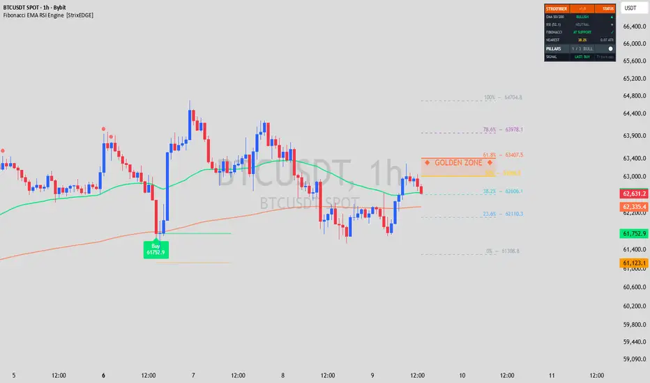
Fibonacci EMA RSI Engine [StrixEDGE]StrixFIBER is a three-pillar confluence indicator that combines automatic Fibonacci retracement levels, EMA 50/200 trend structure, and RSI overbought/oversold detection into a single chart overlay. Signals fire only when multiple pillars confirm the same direction, with separate labels for standard and strong (all-three) confluence.
━━━━━━━━━━━━━━━━━━━━━━━━━━━━━━━━━━
🔶 THE THREE PILLARS
PILLAR 1 — AUTO FIBONACCI
The indicator automatically calculates Fibonacci retracement levels (0%, 23.6%, 38.2%, 50%, 61.8%, 78.6%, 100%) from the highest high and lowest low over a configurable lookback period. All seven levels are plotted on the chart with price labels at the right edge.
The 50%–61.8% range is highlighted as the "Golden Zone" — the area where price most commonly finds support or resistance during healthy retracements. When price is within ATR proximity of a key Fibonacci level, the indicator scores it as "at support" or "at resistance" depending on price position relative to the 50% midpoint.
PILLAR 2 — EMA 50 / 200
The classic dual exponential moving average system. EMA 50 is colored green when above EMA 200 (bullish structure) and red when below (bearish structure). Golden Cross (EMA 50 crossing above EMA 200) and Death Cross (EMA 50 crossing below EMA 200) events are marked with diamond shapes on the chart.
The EMA pillar provides the trend context. Fibonacci support levels are more meaningful in a bullish EMA structure; resistance levels are more meaningful in a bearish structure.
PILLAR 3 — RSI OVERBOUGHT / OVERSOLD
RSI is calculated at a configurable length (default 14) with configurable OB/OS thresholds (default 70/30). The RSI line itself is not plotted (this is an overlay indicator), but OB and OS entries are marked as small colored circles above and below price bars.
OVERBOUGHT
OVERSOLD
The RSI pillar fires a bullish score when RSI recovers from oversold (crosses back above the OS threshold) and a bearish score when RSI drops from overbought (crosses back below the OB threshold). This captures the reversal moment, not just the extreme reading.
━━━━━━━━━━━━━━━━━━━━━━━━━━━━━━━━━━
🔶 CONFLUENCE LOGIC
Each pillar scores +1 (bullish), −1 (bearish), or 0 (neutral) independently. The scores are aggregated:
→ 3/3 Pillars = "Strong Buy" or "Strong Sell" — all three pillars fully aligned. Highest conviction.
BUY -
SELL -
→ 2/3 Pillars = "Buy" or "Sell" — two of three pillars agree. Standard conviction.
→ 1/3 Pillars = No signal by default (configurable).
The minimum number of pillars required for a signal is adjustable (1, 2, or 3). Default is 2.
Additional signal filtering:
→ Flip-Only Logic: After a Buy, the next signal must be a Sell (and vice versa). No consecutive same-direction signals.
→ Cooldown: Configurable minimum bars between signals (default 10).
━━━━━━━━━━━━━━━━━━━━━━━━━━━━━━━━━━
🔶 VISUAL FEATURES
Fibonacci Levels
→ All 7 standard levels plotted as colored lines (thicker for 50% and 61.8%)
→ Golden Zone (50–61.8%) highlighted with a translucent fill
→ Price labels at the right edge of each level showing the exact price value
EMA System
→ EMA 50 colored by trend direction (green above EMA 200, red below)
→ EMA 200 as a steady reference line
→ Golden Cross (GC) and Death Cross (DC) diamond markers
RSI Markers
→ Small green circles below bars when RSI enters oversold
→ Small red circles above bars when RSI enters overbought
→ RSI value displayed in the dashboard (not as a separate pane line)
Signals
→ Buy / Sell labels with exact entry price
→ "Strong Buy" / "Strong Sell" labels when all 3 pillars align (darker color for distinction)
→ Entry price horizontal line persists for 20 bars
→ ATR-based stop-loss level plotted below/above entry
Dashboard
→ EMA trend status with direction
→ RSI current value and zone (Overbought / Oversold / Neutral)
→ Fibonacci proximity status (At Support / At Resistance / Between)
→ Nearest Fibonacci level with distance in ATR units
→ Pillar confluence count and direction
→ Last signal direction and age (bars ago)
━━━━━━━━━━━━━━━━━━━━━━━━━━━━━━━━━━
🔶 SETTINGS GUIDE
Fibonacci
• Lookback Period (default 120) — Bars used for highest high / lowest low. Increase for wider retracement levels, decrease for tighter ones.
• Fibonacci Proximity (default 0.5 ATR) — How close price must be to a level to count as "at support/resistance." Lower = stricter.
EMA
• Fast EMA (default 50) — The responsive trend line.
• Slow EMA (default 200) — The structural trend anchor.
RSI
• Length (default 14) — Standard RSI lookback.
• Overbought (default 70) / Oversold (default 30) — Zone thresholds.
Signals
• Minimum Pillars (default 2) — Set to 3 for highest quality signals only.
• Cooldown (default 10 bars) — Minimum spacing between signals.
━━━━━━━━━━━━━━━━━━━━━━━━━━━━━━━━━━
🔶 WHAT MAKES THIS ORIGINAL
While Fibonacci, EMA, and RSI are individually common, StrixFIBER integrates them through a structured pillar scoring system with proximity-based Fibonacci detection, RSI recovery signals (not raw readings), and automatic signal strength classification. The confluence layer evaluates whether a Fibonacci level is meaningful (is the EMA structure supporting it? is momentum confirming it?) rather than displaying the three tools independently. The ATR-based proximity detection for Fibonacci levels, combined with the transition-based RSI scoring and flip-only signal enforcement, creates a framework that is more than the sum of its parts.
━━━━━━━━━━━━━━━━━━━━━━━━━━━━━━━━━━
🔶 RECOMMENDED USE
Designed for day trading on 15-minute to 1-hour charts across all markets: crypto, forex, stocks, indices, and commodities. Works well alongside StrixEDGE (trend confluence overlay) and StrixPULSE (pressure spectrum in a separate pane) for a complete multi-indicator setup.
━━━━━━━━━━━━━━━━━━━━━━━━━━━━━━━━━━
⚠️ DISCLAIMER
This indicator is a technical analysis tool, not financial advice. No indicator guarantees profitable outcomes. Past performance of any signal does not indicate future results. Always apply proper risk management and use this tool as one component of a complete trading plan.
━━━━━━━━━━━━━━━━━━━━━━━━━━━━━━━━━━
5 alert conditions: Buy Signal, Sell Signal, Any Signal, Golden Cross, Death Cross. אינדיקטור

Forex: Custom Index Widgets [invincible3]Forex: Custom Index Widgets
Forex: Custom Index Widgets is a professional currency-strength dashboard designed to visualize real-time strength, weakness, momentum quality, and market rotation across the eight major forex currencies: USD, EUR, GBP, JPY, AUD, NZD, CAD, and CHF.
Unlike a simple EMA-based strength meter, this indicator builds custom currency indices from the 28 major FX crosses and displays them as compact mini index widgets directly on the chart. Each currency index is reconstructed from its related currency pairs, allowing traders to observe the independent behavior of each currency rather than relying only on the chart symbol.
The indicator combines two major components:
1. Custom Currency Index Widgets
2. Professional Composite Force Table
The custom index widgets show the short-term structure of each selected currency index using mini candles. This makes it easier to visually compare whether a currency is trending, drifting, compressing, or impulsively expanding. The widget section also includes a volatility smart layer, which adjusts candle appearance according to volatility conditions such as quiet movement, expansion, or extreme impulse.
The table section ranks currencies using a composite force model. Instead of using EMA direction alone, the table evaluates multiple strength components, including relative strength, breadth, efficiency, impulse, acceleration, and phase. This gives a more complete view of currency behavior and helps identify clean strength, weak currencies, rotation conditions, and potential strongest-versus-weakest pair opportunities.
Key Features
* Builds custom indices for USD, EUR, GBP, JPY, AUD, NZD, CAD, and CHF.
* Uses 28 major forex crosses to construct currency strength.
* Displays mini custom index widgets directly on the chart.
* Optional EMA overlay on the custom index widgets.
* Volatility-aware widget candles.
* Composite force ranking table.
* Measures strength beyond simple EMA direction.
* Includes breadth, efficiency, impulse, acceleration, and phase logic.
* Highlights strongest and weakest currencies.
* Suggests the best strongest-versus-weakest pair bias.
* Professional table design for both dark and light TradingView themes.
* Theme-adaptive colors for improved readability.
* Adjustable widget layout, table position, and display options.
* Designed to remain lightweight by avoiding unnecessary multi-timeframe request overload.
How the Custom Indices Work
Each currency index is calculated by combining its related FX pairs. For example, USD strength is derived from pairs such as EURUSD, GBPUSD, AUDUSD, NZDUSD, USDCAD, USDCHF, and USDJPY. When USD is the quote currency, the pair movement is inverted; when USD is the base currency, the movement is used directly.
This directional aggregation allows the indicator to estimate the independent strength of each major currency.
For example:
* If EURUSD falls, USD strength increases.
* If USDJPY rises, USD strength increases.
* If GBPUSD rises, GBP strength increases.
* If AUDJPY falls, JPY strength increases.
This approach gives a broader currency view than looking at one forex pair alone.
Composite Force Table
The table is designed to act as the main decision dashboard. It ranks all currencies from strongest to weakest using a multi-factor force score.
The force model includes:
Relative Strength
Measures how strongly a currency index has moved compared with others.
Breadth
Checks whether the currency strength is broad-based across its related pairs or caused by only one or two pairs.
Efficiency
Measures how clean the move is. A currency that trends smoothly receives a stronger quality score than one that moves in a choppy manner.
Impulse
Detects whether current movement is expanding with force compared with recent movement.
Acceleration
Shows whether strength is increasing or fading.
Phase
Classifies the current currency condition into practical market states such as bullish expansion, bearish expansion, build-up, drift, exhaustion, or rotation.
Market Phase Interpretation
The phase column helps traders understand the quality of the move:
Bull Expand
The currency is strong, broad, and moving with impulse.
Bear Expand
The currency is weak, broad, and moving lower with impulse.
Bull Build
Strength is developing, but the move may still be in an early stage.
Bear Build
Weakness is developing, but downside pressure may still be forming.
Bull Drift / Bear Drift
The currency has directional bias, but the movement is not yet highly aggressive.
Bull Exhaust / Bear Exhaust
The currency is still strong or weak, but acceleration is fading. This can warn of possible rotation or pullback.
** Rotation **
No clear dominant force. Market conditions may be mixed or neutral.
Strongest vs Weakest Logic
One of the most useful ways to apply a currency strength meter is to compare the strongest currency against the weakest currency.
For example:
* If USD is strongest and AUD is weakest, the dashboard may highlight a USD/AUD long bias where available, or an AUD/USD short bias.
* If EUR is strongest and JPY is weakest, EURJPY may become a high-priority pair to watch.
* If GBP is weakest and CHF is strongest, GBPCHF may become a short-bias candidate.
This does not mean traders should enter immediately. The table is designed to identify directional bias and currency selection. Entry timing should still be confirmed with market structure, price action, support/resistance, liquidity zones, session timing, or the trader’s own strategy.
Widget Section
The mini index widgets provide a visual snapshot of each currency index. They allow traders to see whether the index is pushing higher, selling off, compressing, or moving with volatility expansion.
Widget features include:
* Mini candle visualization of selected currency indices.
* Optional EMA overlay.
* Customizable widget height and spacing.
* Volatility-based candle width and transparency.
* Labels showing index name, current movement, timeframe, and volatility state.
* Clean theme-adaptive styling for professional chart layouts.
EMA Usage
EMA is included as an optional visual guide on the custom index widgets. It should be treated as a secondary confirmation tool, not the main strength engine.
The main ranking logic comes from the composite force model, while EMA helps visually confirm whether the mini index structure is trending or flattening.
Suggested Usage
This indicator can be used for:
* Finding the strongest and weakest currencies.
* Selecting high-probability forex pairs.
* Confirming directional bias before entering trades.
* Avoiding weak or conflicting currency combinations.
* Detecting currency rotation.
* Monitoring whether strength is broad or narrow.
* Comparing currency behavior across all major FX groups.
* Supporting intraday, swing, and session-based trading workflows.
A common workflow is:
1. Check the table for the strongest and weakest currencies.
2. Confirm that the force gap is meaningful.
3. Check the phase column for expansion, build-up, or exhaustion.
4. Use the mini widgets to visually confirm index direction.
5. Move to the actual forex pair chart for entry confirmation.
6. Use your own price-action or risk-management rules for execution.
Important Notes
This indicator is a market analysis tool, not an automatic buy/sell system. It is designed to show currency strength, weakness, rotation, and relative force. The strongest currency can remain strong for a long period, but it can also become exhausted. The weakest currency can continue falling, but it can also sharply reverse during rotation phases.
Always combine this tool with proper risk management and independent trade confirmation.
Best For
Forex traders
Currency strength analysis
Intraday trading
Swing trading
Strongest-versus-weakest pair selection
Market rotation analysis
Multi-currency dashboard workflows
Traders who want more than a basic EMA strength meter
Summary
FX Custom Index Force Meter PRO is designed to give traders a complete view of major currency behavior. It combines custom-built currency index widgets with a professional multi-factor force table, allowing traders to see not only which currency is strong or weak, but also whether that strength is broad, efficient, impulsive, accelerating, or fading.
The goal is to help traders move beyond simple EMA-based analysis and toward a more structured, professional currency selection process.
אינדיקטור

Pressure Spectrum Analyzer [StrixEDGE]StrixEDGE is a pressure spectrum analyzer that decomposes each candle into its buying vs selling pressure components, then visualizes pressure alignment across eight Fibonacci-based lookback periods as a real-time colored heatmap ribbon. Instead of relying on derived calculations from close prices alone, it reads the internal anatomy of every candle to reveal what buyers and sellers are actually doing.
━━━━━━━━━━━━━━━━━━━━━━━━━━━━━━━━━━
🔮 CORE CONCEPT — CANDLE PRESSURE DECOMPOSITION
Most indicators process the closing price through mathematical formulas. StrixEDGE starts differently: it decomposes each candle's anatomy into a net pressure score.
→ Buying pressure = (close − low) / (high − low)
→ Selling pressure = (high − close) / (high − low)
→ Net pressure = buying − selling → ranges from −1 to +1
A candle closing at its absolute high scores +1 (pure buying dominance). A candle closing at its low scores −1 (pure selling dominance). A doji closing at the midpoint scores 0 (equilibrium). This raw pressure reading captures information that close-price-only indicators miss entirely: wick rejections, body dominance, and where within the range the session actually settled.
━━━━━━━━━━━━━━━━━━━━━━━━━━━━━━━━━━
🔮 THE FIBONACCI SPECTRUM — 8 BANDS
The raw net pressure is then smoothed with an EMA at eight Fibonacci lookback periods:
Band 1 → 3 bars (ultra-fast, reacts to individual candles)
Band 2 → 5 bars
Band 3 → 8 bars
Band 4 → 13 bars
Band 5 → 21 bars
Band 6 → 34 bars
Band 7 → 55 bars
Band 8 → 89 bars (trend anchor, moves slowly)
Each band is displayed as a horizontal color stripe. The result is an 8-layer heatmap ribbon that updates every bar:
→ Bright green = strong buying pressure at that period
→ Pale green = moderate buying
→ Gray = neutral / equilibrium
→ Pale red = moderate selling
→ Bright red = strong selling pressure
The visual effect is immediate: when all 8 bands turn the same color, the market is in full alignment. When they diverge (top bands green, bottom bands red, or vice versa), the market is in transition — and that transition is where the edge lives.
━━━━━━━━━━━━━━━━━━━━━━━━━━━━━━━━━━
🔮 HOW TO READ THE RIBBON
ALL BANDS GREEN — Full bullish convergence. Buying pressure dominates across all timeframes from 3-bar to 89-bar. Strong trend in progress.
ALL BANDS RED — Full bearish convergence. Selling pressure dominates across all timeframes. Strong downtrend in progress.
MIXED COLORS — Disagreement between timeframes. The market is choppy, consolidating, or transitioning. No clear edge.
BOTTOM BANDS FLIP FIRST — The fast periods (3, 5, 8) change color before the slow periods (34, 55, 89). This is a momentum wave forming — an early reversal signal before the full spectrum converges. StrixEDGE marks these moments with yellow diamond markers (◆).
TOP BANDS HOLD WHILE BOTTOM FLIP — The trend anchor (slow periods) remains in one direction while fast periods temporarily flip. Often a pullback within a larger trend, not a reversal.
━━━━━━━━━━━━━━━━━━━━━━━━━━━━━━━━━━
🔮 WAVE DETECTION — EARLY REVERSAL WARNING
StrixEDGE includes a proprietary wave detection system. It identifies when the three fastest bands (3, 5, 8) have already flipped direction while the three slowest bands (34, 55, 89) have not. This divergence between fast and slow pressure readings often precedes a full spectrum convergence by several bars, giving an early warning of potential trend shifts.
Wave markers appear as yellow diamonds (◆) on the ribbon. They are not entry signals — they are attention signals. When a wave marker appears, watch for the remaining bands to follow. If they do, a full convergence signal follows.
━━━━━━━━━━━━━━━━━━━━━━━━━━━━━━━━━━
🔮 SIGNAL GENERATION
Buy and Sell signals fire when the spectrum achieves convergence:
1. Convergence Threshold — A configurable minimum number of bands (default 6 out of 8) must agree on the same direction.
2. Transition Detection — The signal fires only on the bar where the convergence count first crosses the threshold, not on every bar it remains above it.
3. Flip-Only Logic — After a Buy signal, the next signal must be a Sell (and vice versa). No consecutive same-direction signals.
4. Cooldown — A configurable minimum number of bars between signals (default 10).
━━━━━━━━━━━━━━━━━━━━━━━━━━━━━━━━━━
🔮 THE PULSE LINE
A composite line overlaid on the ribbon shows the average pressure across all 8 bands, scaled to the ribbon's visual range. It provides a single-glance summary of the aggregate market pressure:
→ Pulse above midline and green = net buying pressure
→ Pulse below midline and red = net selling pressure
→ Pulse at midline and gray = equilibrium
The pulse line often leads the ribbon visually — it can curl toward the midline before the individual bands start flipping, providing another layer of early warning.
━━━━━━━━━━━━━━━━━━━━━━━━━━━━━━━━━━
🔮 DASHBOARD
The on-chart dashboard displays:
→ Real-time pressure reading for each of the 8 bands with directional arrows
→ Convergence count and direction (e.g., "6 / 8 BULL")
→ Composite pulse value
→ Current wave status (Bull Forming / Bear Forming / None)
━━━━━━━━━━━━━━━━━━━━━━━━━━━━━━━━━━
🔮 SETTINGS GUIDE
Spectrum
• Bullish Threshold (default 0.15) — Pressure above this value counts as bullish for convergence scoring. Lower = more sensitive.
• Bearish Threshold (default −0.15) — Pressure below this counts as bearish. Closer to zero = more sensitive.
Signals
• Convergence Minimum (default 6) — How many of the 8 bands must agree. Range 3-8. Higher = fewer but stronger signals.
• Signal Cooldown (default 10 bars) — Minimum spacing between consecutive signals.
Display
• Show Pulse Line — Toggle the composite pressure overlay.
• Show Wave Markers — Toggle early reversal diamonds.
• Show Dashboard — Toggle the status table.
━━━━━━━━━━━━━━━━━━━━━━━━━━━━━━━━━━
🔮 WHAT MAKES THIS ORIGINAL
StrixEDGE is not a wrapper around existing indicators. Its originality lies in three layers:
1. The data source is candle anatomy (body position within range), not close price or volume alone. This extracts buying/selling pressure information that close-price-derived indicators structurally cannot access.
2. The multi-period spectrum approach displays pressure alignment across eight simultaneous timeframes in a single visual. Standard oscillators show one reading at one lookback period. StrixPULSE shows eight readings simultaneously as a heatmap, making convergence and divergence visible at a glance.
3. Wave detection identifies the propagation pattern — when fast periods lead slow periods in a directional flip — as a standalone analytical feature. This captures the internal momentum dynamics of a trend change, not just the result.
━━━━━━━━━━━━━━━━━━━━━━━━━━━━━━━━━━
🔮 RECOMMENDED USE
Designed for day trading timeframes (15-minute to 1-hour). Works across all markets with standard OHLC data: crypto, forex, stocks, indices, commodities. Best used as a companion below the main chart alongside an overlay indicator (such as StrixEDGE or any trend-following system). The ribbon provides the conviction layer — it answers "should I trust this signal?" by showing whether the pressure spectrum supports the trade direction.
━━━━━━━━━━━━━━━━━━━━━━━━━━━━━━━━━━
⚠️ DISCLAIMER
This indicator is a technical analysis tool, not financial advice. No indicator guarantees profitable outcomes. Past performance of any signal does not indicate future results. Always apply proper risk management and use this tool as one component of a complete trading plan.
━━━━━━━━━━━━━━━━━━━━━━━━━━━━━━━━━━
5 alert conditions: Buy Signal, Sell Signal, Any Signal, Bull Wave, Bear Wave. אינדיקטור

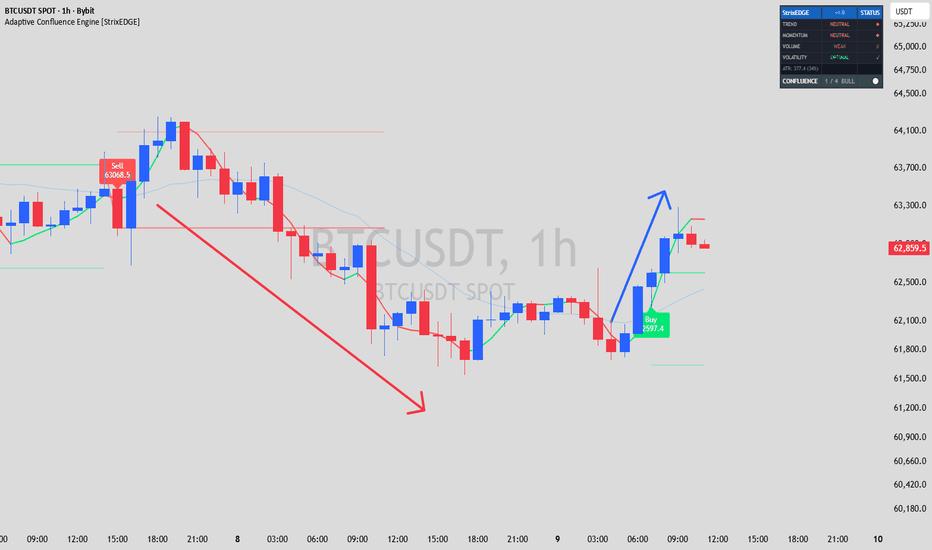
Adaptive Confluence Engine [StrixEDGE]Adaptive Confluence Engine
🔷 HOW IT WORKS
The indicator evaluates the market through four independent modules. Each module scores the current bar as bullish (+1), bearish (−1), or neutral (0). Volume and volatility modules act as confirmation filters and score +1 (confirmed) or 0 (not confirmed). The individual scores are aggregated into a confluence score ranging from 0 to 4 for each direction.
A signal fires only when:
→ The confluence score crosses above the minimum threshold (transition detection)
→ The previous signal was in the opposite direction (flip-only logic — no consecutive Buy-Buy or Sell-Sell)
→ A cooldown period has elapsed since the last signal
━━━━━━━━━━━━━━━━━━━━━━━━━━━━━━━━━━
🔷 THE FOUR MODULES
MODULE 1 — TREND
Uses a Hull Moving Average (HMA) for responsive trend direction and a Weighted Moving Average (WMA) as a trend position filter. Bullish: HMA rising AND price above WMA. Bearish: HMA falling AND price below WMA. The HMA reacts faster than a standard EMA while filtering out noise, and the WMA acts as a structural trend gate.
MODULE 2 — MOMENTUM
Combines RSI zone analysis with MACD histogram acceleration. RSI is evaluated against configurable directional thresholds (default 55/45), not traditional overbought/oversold levels. The MACD histogram must be positive AND increasing for bullish momentum (or negative AND decreasing for bearish). This captures momentum that is actively building, not fading.
MODULE 3 — VOLUME
Volume must exceed its simple moving average by a configurable multiplier AND the short-term volume trend (5-bar SMA) must be rising relative to the medium-term (10-bar SMA). This confirms that participation is genuine and sustained, not a single-bar spike.
MODULE 4 — VOLATILITY FILTER
Calculates the ATR percentile rank over a configurable lookback period. Signals are suppressed when volatility falls below the low percentile (indicating a dead, range-bound market with no follow-through potential) or above the high percentile (indicating chaotic conditions where stops are too wide and reversals too sudden). Only the "sweet spot" of volatility passes.
━━━━━━━━━━━━━━━━━━━━━━━━━━━━━━━━━━
🔷 SIGNAL LOGIC
The signal generation uses three layers of filtering:
1. Transition Detection — Signals fire only on the bar where the confluence score first crosses the minimum threshold, not on every bar it remains above it.
2. Flip-Only Mode — After a Buy signal, the next signal must be a Sell (and vice versa). This prevents consecutive same-direction signals and ensures alternating entries.
3. Cooldown — A configurable minimum number of bars must pass between any two signals, preventing rapid-fire entries during volatile transitions.
━━━━━━━━━━━━━━━━━━━━━━━━━━━━━━━━━━
🔷 VISUAL FEATURES
→ Buy / Sell labels with exact entry price displayed on the chart
→ Entry price horizontal line (persists for 20 bars after signal)
→ ATR-based dynamic stop-loss levels
→ Hull Moving Average (colored by direction) and WMA overlay
→ Background shading when confluence is active
→ Real-time dashboard showing status of all four modules, ATR reading with percentile, and aggregate confluence score
━━━━━━━━━━━━━━━━━━━━━━━━━━━━━━━━━━
🔷 SETTINGS GUIDE
Trend Module
• Fast HMA Length (default 9) — Lower values react faster but produce more noise.
• Slow WMA Length (default 21) — The structural trend gate. Higher values require stronger trends.
Momentum Module
• RSI Bullish/Bearish Threshold (default 55/45) — These are directional filters, not overbought/oversold. Widen to 60/40 for stricter momentum requirements.
• MACD settings (12/26/9) — Standard defaults. Adjust for faster or slower momentum reads.
Volume Module
• Volume SMA Length (default 20) — Lookback for average volume calculation.
• Volume Threshold (default 1.0) — Multiplier applied to the volume SMA. Increase to 1.2–1.5 to require above-average volume.
Volatility Filter
• ATR Length (default 14) — Period for ATR calculation.
• ATR Lookback (default 100) — Number of bars for percentile ranking.
• Low/High Vol. Percentile (default 10/90) — Defines the acceptable volatility range. Narrow to 20/80 for stricter regime filtering.
Signal Control
• Min. Confluence Score (default 3) — Number of modules that must agree. Higher = fewer but higher-quality signals.
• Signal Cooldown (default 5 bars) — Minimum spacing between signals.
• Stop-Loss ATR Multiple (default 1.5) — Distance of the stop-loss from the signal bar.
━━━━━━━━━━━━━━━━━━━━━━━━━━━━━━━━━━
🔷 WHAT MAKES THIS ORIGINAL
StrixEDGE does not replicate any single built-in indicator. Its value lies in the confluence scoring architecture: four independent analysis dimensions, each evaluating a different market property (direction, momentum, participation, regime), aggregated through a transition-based scoring system with flip-only signal control. The combination of ATR percentile volatility filtering, MACD histogram acceleration (not just crossover), and alternating-direction signal enforcement creates a framework that is structurally distinct from standard indicator overlays.
━━━━━━━━━━━━━━━━━━━━━━━━━━━━━━━━━━
🔷 RECOMMENDED USE
Designed for day trading timeframes (15-minute to 1-hour charts). Works across all markets with volume data: crypto, forex, stocks, indices, commodities. Start with the default settings and adjust based on the instrument's behavior. Use the dashboard to understand why signals fire or don't fire.
━━━━━━━━━━━━━━━━━━━━━━━━━━━━━━━━━━
⚠️ DISCLAIMER
This indicator is a technical analysis tool, not financial advice. No indicator guarantees profitable outcomes. Past performance of any signal does not indicate future results. Always apply proper risk management and use this tool as one component of a complete trading plan.
━━━━━━━━━━━━━━━━━━━━━━━━━━━━━━━━━━
5 alert conditions available: Buy Signal, Sell Signal, Any Signal, Bull Active, Bear Active. אינדיקטור
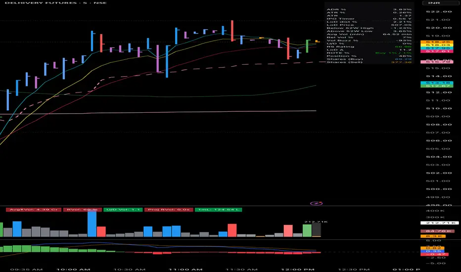
Rally Leader Screener (2x Market)Rally Leader Screener (2x Market) — with Resisting-Weakness Flag
What it does
This indicator is built for the Pine Screener and identifies stocks demonstrating institutional-grade relative strength in two distinct market regimes:
Rally Leaders — After a market correction, the first stocks to rally 2x (or more) the index's move during the initial 6–7 session bounce are frequently the emerging leaders of the new uptrend. This tool automates that measurement: it pulls the benchmark index return over your chosen lookback window and flags any stock whose return is at least a user-defined multiple of the index return.
Resisting Weakness — When the market is flat or declining over the lookback window, the "Leader" logic correctly stays silent (there is no rally to lead). Instead, a second flag identifies stocks that are rising strongly despite market weakness — a classic early sign of accumulation and often the leader list of the next cycle.
Concept
The methodology draws on well-known momentum research (O'Neil, Minervini): true market leaders declare themselves in the first days of a new rally by outrunning the index by a wide margin, and/or by refusing to decline while the broad market corrects. This script quantifies both behaviors.
Screener columns
Stock Return % — the stock's return over the lookback window
Nifty Return % — the benchmark's return over the same window (default NSE:NIFTY, changeable to any index)
RS Multiple — stock return ÷ index return; shown only when the index return is positive (a ratio against a negative or near-zero denominator is meaningless, so it displays blank)
Leader — 1 when the index return is positive AND the stock's return ≥ (multiple × index return), plus liquidity/trend filters
Resisting — 1 when the index return is ≤ 0 AND the stock is up by at least the user-set minimum, plus the same filters
Ret Spread % — stock return minus index return; an all-weather relative-strength column that remains valid in up, down, and flat markets, useful for sorting when RS Multiple is blank
Inputs
Rally lookback (sessions): default 7 — match this to the actual length of the bounce
Leadership multiple: default 2.0 (the "2x the market" rule)
Benchmark index: default NSE:NIFTY; set to any index matching your watchlist universe
Minimum price and 20-day average volume: liquidity filters
Optional filters: close above 50 SMA, and up-day requirement
Resist flag minimum return %: threshold for the weak-market flag (default 5%)
How to use
Add the script to favorites, open Pine Screener, and select a watchlist (e.g., a broad index universe).
During/after a 6–7 day market rally: filter Leader == 1, sort by RS Multiple descending, and save the top names as a fixed watchlist. The intended workflow is to trade setups only within that list for the following weeks rather than re-scanning continuously.
During corrections or flat markets: filter Resisting == 1, sort by Ret Spread % descending, to build a pre-watchlist of stocks under accumulation.
Names appearing on both lists across a correction→rally sequence historically carry the highest leadership probability.
Notes
Designed for the daily timeframe.
This is a screening/ranking tool, not a buy/sell signal generator. Entries and exits should be based on your own setup criteria and risk management.
Works on any market — change the benchmark symbol to match (e.g., SPX for US stocks). אינדיקטור
stockguruvip
A fully customizable on-chart watermark for stocks. Displays company name, ticker & timeframe, sector/industry, market cap, daily ATR (14) with color-coded volatility alerts, position relative to a configurable daily moving average (default 150), and days remaining until the next earnings report — all in one clean, non-intrusive overlay table.
Includes a separate, independently positioned branding/logo text watermark with adjustable size, color, background badge, and bold styling — so you can label your charts with your own name or brand.
Fully configurable: position (9 anchor points), text size, colors, and toggles for every data row, so you only see what matters to you.
Inspired by an original script by Micha.Micha.Stocks Custom Watermark (MSWM)
אינדיקטור

stockgurvipA fully customizable on-chart watermark for stocks. Displays company name, ticker & timeframe, sector/industry, market cap, daily ATR (14) with color-coded volatility alerts, position relative to a configurable daily moving average (default 150), and days remaining until the next earnings report — all in one clean, non-intrusive overlay table.
Includes a separate, independently positioned branding/logo text watermark with adjustable size, color, background badge, and bold styling — so you can label your charts with your own name or brand.
Fully configurable: position (9 anchor points), text size, colors, and toggles for every data row, so you only see what matters to you.
Inspired by an original script by Micha-Micha.Stocks Custom Watermark (MSWM) אינדיקטור

אינדיקטור

Quantum Market FlowQuantum Market Flow
Overview
Quantum Market Flow is an advanced trend and momentum indicator designed to help traders identify high-quality market opportunities by combining trend analysis, volatility measurement, and momentum confirmation into a single, easy-to-read tool. Rather than relying on a single indicator, Quantum Market Flow evaluates multiple market conditions simultaneously to provide clearer market context and improve trading confidence.
The indicator is built for traders who prefer clean charts without sacrificing analytical depth. It can be used for trend following, pullback trading, breakout confirmation, and general market analysis across multiple asset classes.
---
Key Features
Dynamic Trend Engine
Uses adaptive trend calculations to identify bullish and bearish market conditions while filtering out unnecessary market noise.
Smart Momentum Filter
Evaluates momentum strength before generating signals, helping reduce weak or low-quality entries during ranging markets.
Volatility Analysis
Incorporates market volatility into its calculations, allowing the indicator to adapt automatically as market conditions change.
Buy & Sell Signals
Generates easy-to-read visual signals when multiple market conditions align, making it suitable for discretionary trading and trade confirmation.
Trend Background
Displays market bias directly on the chart using background colors, allowing traders to recognize trend direction instantly.
Fully Customizable
Every major parameter can be adjusted to suit different trading styles, assets, and timeframes.
TradingView Alerts
Supports built-in TradingView alerts so traders can receive notifications whenever a new trading signal appears.
---
Best Markets
Quantum Market Flow is designed to work on a wide range of financial markets, including:
- Cryptocurrency
- Forex
- Stocks
- Indices
- Commodities
- Futures
---
Recommended Timeframes
The indicator performs well across multiple timeframes, including:
- 5 Minute
- 15 Minute
- 30 Minute
- 1 Hour
- 4 Hour
- Daily
- Weekly
Higher timeframes generally produce stronger trend confirmation, while lower timeframes provide more frequent trading opportunities.
---
How to Use
Bullish Conditions
- The indicator identifies an established uptrend.
- Momentum confirms buying strength.
- Volatility supports continued price movement.
- A buy signal appears, indicating a potential long opportunity.
Bearish Conditions
- The indicator identifies a downtrend.
- Momentum confirms selling pressure.
- Volatility supports downside continuation.
- A sell signal appears, indicating a potential short opportunity.
For improved decision-making, combine Quantum Market Flow with support and resistance, market structure, volume analysis, or your preferred risk management strategy.
---
Risk Management
No indicator can predict the market with complete accuracy. Quantum Market Flow is intended to assist traders by providing additional market context rather than guaranteeing profitable trades.
Always:
- Use stop-loss orders.
- Manage your position size.
- Avoid excessive leverage.
- Confirm signals with your own analysis before entering a trade.
---
Why Choose Quantum Market Flow?
- Clean and user-friendly interface
- Adaptive calculations for changing market conditions
- Designed for multiple asset classes
- Suitable for beginners and experienced traders
- Lightweight and efficient
- Supports real-time alerts
- Easy to customize
---
Disclaimer
Quantum Market Flow is an analytical tool intended solely for educational and informational purposes. It should not be considered financial or investment advice. Trading financial markets involves substantial risk, and past performance does not guarantee future results. Always conduct your own research and use proper risk management before making any trading decisions.
Thank you for using Quantum Market Flow. Your feedback and suggestions are always appreciated and will help guide future updates and improvements. אינדיקטור

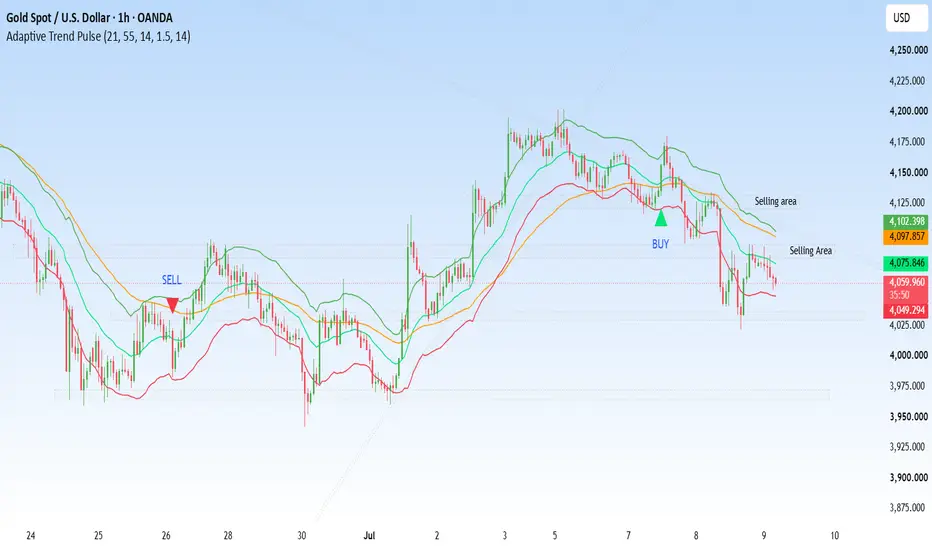
Adaptive Trend PulseAdaptive Trend Pulse
Overview
Adaptive Trend Pulse is a trend-following indicator designed to help traders identify market direction, momentum, and potential entry opportunities using a combination of moving averages, volatility, and momentum analysis. Instead of relying on a single technical indicator, Adaptive Trend Pulse combines multiple market factors into one clean and easy-to-read system that helps reduce noise while keeping traders aligned with the prevailing trend.
The indicator is suitable for beginners looking for a simple trend confirmation tool, as well as experienced traders who want an additional layer of confirmation before entering or exiting trades.
---
How It Works
Adaptive Trend Pulse analyzes price action through a combination of:
• Fast and Slow Exponential Moving Averages (EMAs) to determine the current market trend.
• Average True Range (ATR) to dynamically measure market volatility and generate adaptive price bands.
• Relative Strength Index (RSI) to confirm momentum and filter out weak trading signals.
By combining these components, the indicator attempts to highlight higher-probability trading opportunities while filtering out many false signals that occur during sideways market conditions.
---
Features
✔ Adaptive Trend Detection
Uses a dual EMA system to identify bullish and bearish market structure.
✔ Dynamic ATR Bands
Volatility-based bands automatically adjust according to current market conditions, providing a better understanding of price expansion and contraction.
✔ Momentum Confirmation
RSI confirmation helps improve signal quality by ensuring momentum aligns with the current trend.
✔ Buy & Sell Signals
Generates visual buy and sell signals when trend and momentum conditions align.
✔ Background Trend Visualization
The chart background changes color to quickly identify bullish and bearish market environments.
✔ Customizable Inputs
All major settings including EMA lengths, ATR parameters, RSI period, and display options can be customized to fit different trading styles.
✔ Alert Support
Built-in TradingView alerts allow traders to receive notifications whenever a new signal is generated.
---
Best Timeframes
Adaptive Trend Pulse works across multiple timeframes, including:
• 5 Minute
• 15 Minute
• 30 Minute
• 1 Hour
• 4 Hour
• Daily
Higher timeframes generally provide stronger and more reliable trend signals, while lower timeframes may generate more frequent opportunities.
---
Markets Supported
The indicator is designed to work on virtually any liquid financial market, including:
• Forex
• Cryptocurrencies
• Stocks
• Indices
• Commodities
• Futures
---
Suggested Trading Approach
Bullish Conditions
• Fast EMA is above the Slow EMA.
• Price remains above the Fast EMA.
• RSI confirms bullish momentum.
• Buy signal appears.
Bearish Conditions
• Fast EMA is below the Slow EMA.
• Price remains below the Fast EMA.
• RSI confirms bearish momentum.
• Sell signal appears.
For improved results, consider combining Adaptive Trend Pulse with support and resistance levels, higher-timeframe trend analysis, volume analysis, or sound risk management techniques.
---
Risk Management
No technical indicator can predict future market movements with complete accuracy. Adaptive Trend Pulse should be used as a decision-support tool rather than a standalone trading system.
Always:
• Use appropriate stop-loss levels.
• Manage position sizing carefully.
• Avoid overleveraging.
• Confirm signals with your own market analysis.
---
Customization
Users can adjust:
• Fast EMA Length
• Slow EMA Length
• ATR Length
• ATR Multiplier
• RSI Length
• ATR Band Visibility
These settings allow the indicator to adapt to different assets, market conditions, and trading strategies.
---
Disclaimer
Adaptive Trend Pulse is an analytical tool designed to assist traders in identifying trends and momentum. It does not guarantee profits or eliminate trading risk. Past performance is not indicative of future results. Traders should always perform their own research and use proper risk management before making any trading decisions.
Thank you for using Adaptive Trend Pulse. I hope it becomes a valuable addition to your TradingView toolkit. Feedback and suggestions are always welcome and will help shape future improvements and updates. אינדיקטור

JSS - SMC / ICT Time-Fibs & LiquidityAn all-in-one institutional toolkit designed to trade the New York Session using Time-Based Standard Deviations, Smart Money Concepts (SMC), and algorithmic liquidity targets.
Instead of drawing random Fibonacci retracements, this indicator traps the opening volatility of the market and mathematically projects exactly where the algorithms will exhaust.
Core Features :
The Time-Box Fibs : Automatically maps the Overnight Macro Range (22:00–11:00) and the New York Open Micro Range (15:00–16:00).
Institutional Liquidity Lines : Automatically draws your essential daily, weekly, and monthly HTF midpoints (PDH, PDL, PD50, PW50, PM50, and True Daily Open).
Dynamic FVG & IFVG Scanner : Highlights Fair Value Gaps with dashed equilibrium lines. When an FVG is closed through, it transforms into an Inverted FVG. To keep your chart perfectly clean, the engine tracks all gaps in the background but only highlights the exact IFVG closest to live price. אינדיקטור

אינדיקטור

אינדיקטור

אינדיקטור

EMA Pulse Momentum System [StrixEDGE]Overview
The EMA Pulse Momentum System is a trend-following indicator that combines a triple exponential moving average (EMA) ribbon with an RSI-based momentum gate to produce high-confidence directional signals on trending instruments. Unlike single-crossover systems that generate excessive noise, this indicator requires simultaneous alignment across three conditions before printing an entry — which significantly reduces false positives in ranging or choppy market environments.
How the signal logic works
The system operates on a three-layer confirmation model:
1. EMA Ribbon Alignment. Three EMAs are computed: a fast EMA (default 8), a mid EMA (default 21), and a slow EMA (default 55). For a valid long setup, all three must be fully stacked in ascending order (EMA 8 above EMA 21, EMA 21 above EMA 55). The reverse applies for short setups. This stacking condition eliminates entries during period of EMA compression or crossover noise, and acts as a structural trend filter. The ribbon also fills with a color-coded cloud between EMA 8 and EMA 21, providing instant visual feedback on trend health.
2. RSI Momentum Gate. Even with a clean ribbon, markets can trend without momentum confirmation — particularly after extended runs. A 14-period RSI is applied as a secondary gate: RSI must be above 52 to confirm bullish momentum, or below 48 to confirm bearish. These thresholds are intentionally set close to the 50 midline rather than the classic 70/30 extremes, because the goal is to confirm that momentum is directionally engaged, not to identify overbought or oversold conditions. The RSI thresholds are fully adjustable in settings.
3. Crossover Trigger. The entry fires only when EMA 8 crosses above EMA 21 (long) or below (short) while both the ribbon stack and RSI gate are simultaneously satisfied. The crossover itself does not generate a signal if either condition fails.
Risk management — ATR-based TP and SL
All risk levels are calculated dynamically using the Average True Range (ATR) over 14 periods, which adapts automatically to current market volatility. This means tighter levels during low-volatility regimes and wider levels during expansion — no manual adjustment required.
— Take Profit: Entry price ± (ATR × 2.0)
— Stop Loss: Entry price ± (ATR × 1.2)
— Default Risk-to-Reward ratio: 1.67 : 1 minimum
TP, SL, and entry lines are drawn forward 30 bars from each signal and labeled with exact price levels. All multipliers are adjustable via the settings panel.
Information table
A real-time dashboard table (position configurable: Bottom Right, Bottom Left, Top Right, Top Left) displays:
— Current trend direction (Bullish / Bearish / Neutral)
— Live RSI value with color coding
— Current ATR value for sizing context
— Last signal direction (Long / Short)
— Calculated Risk-to-Reward ratio
— EMA stack status (aligned or mixed)
Recommended usage
Best timeframes: 4H and Daily. The indicator functions on all timeframes but performs most reliably where EMA 8/21/55 have enough separation to define structure. On 1H or below, the signal frequency increases but false positives also rise — compensate by tightening RSI thresholds in settings.
Compatible with all liquid markets: Forex majors, Crypto (BTC, ETH, majors), Stocks, Indices, and Futures.
Avoid using this indicator as a standalone system during known high-impact news events (FOMC, NFP, CPI) where price gaps can invalidate ATR-based stops instantly.
Alerts
Two built-in alert conditions are included:
— "EMA Pulse — Long Entry": fires when all long conditions are satisfied
— "EMA Pulse — Short Entry": fires when all short conditions are satisfied
Configure via the Alerts panel in TradingView using "Once per bar close" for cleanest signals.
Settings reference
EMA Fast (default 8) — reduce for more sensitivity, increase to reduce noise
EMA Mid (default 21) — core crossover reference line
EMA Slow (default 55) — structural trend filter
RSI Length (default 14) — period for momentum gate
RSI Bull Threshold (default 52) — minimum RSI for long confirmation
RSI Bear Threshold (default 48) — maximum RSI for short confirmation
ATR Length (default 14) — volatility lookback for TP/SL
TP Multiplier (default 2.0) — take profit distance in ATR units
SL Multiplier (default 1.2) — stop loss distance in ATR units
Limitations
This indicator is a technical analysis tool and does not constitute financial advice. Past signal performance does not guarantee future results. Always use proper position sizing and risk management independent of any indicator output. אינדיקטור

אינדיקטור

אינדיקטור

CP Algo Pro V2.3CP Algo Pro V2
CP Algo Pro V2 is a technical analysis indicator designed to identify high-probability trading opportunities by combining trend, momentum, and market structure.
Features
Automatically detects BUY and SELL signals.
Displays Entry, Stop Loss, TP1, TP2, and TP3.
Supports both Fast and Normal modes.
Automatically adjusts TP/SL based on the selected Symbol and Timeframe.
Allows manual TP/SL customization.
Includes a built-in daily performance dashboard.
Supports multiple markets, including XAUUSD, XAGUSD, BTCUSD, and custom symbols.
Compatible with TradingView Alerts for Telegram notifications and Webhook integrations.
Dashboard
Total Trades
TP1 Hit
TP2 Hit
TP3 Hit
SL Hit
Win Rate
TP Statistics
Take-profit statistics are calculated based on the highest target actually reached by price:
If price reaches TP1, TP1 is counted.
If price reaches TP2, both TP1 and TP2 are counted.
If price reaches TP3, TP1, TP2, and TP3 are all counted.
Stop Loss is counted only if price has not reached TP1.
This ensures:
TP1 ≥ TP2 ≥ TP3
Performance statistics accurately reflect the actual progression of price movement.
Disclaimer
CP Algo Pro V2 is designed to assist traders with technical analysis and trade management. It should be used alongside proper risk management and independent market analysis before making any trading decisions. Past performance does not guarantee future results. אינדיקטור