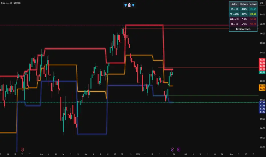
Swing + Value Setup [Marcos]Swing + Value Setup — Descripción para TradingView
Título sugerido
Swing + Value Setup — Multi-Filter Entry Signal
Descripción (inglés — recomendado para mayor alcance)
🎯 What is this indicator?
Swing + Value Setup is a multi-condition entry filter designed for swing traders looking for high-quality setups in stocks with strong technical and structural foundations. Instead of relying on a single signal, this indicator requires 6 simultaneous conditions to be met before printing an entry label — dramatically reducing false signals and noise.
It also features a real-time status panel that shows exactly which conditions are passing or failing on any given bar, so you always know how close a setup is to triggering.
⚙️ How it works
The indicator combines trend, momentum, volume, and structure analysis into a single unified signal:
✅ 6 Required Conditions (all must be true simultaneously):
Price above EMA 200 — confirms the stock is in a long-term uptrend
Supertrend bullish — active trend filter, eliminates choppy/sideways markets
RSI between 40–55 — entry during healthy pullback, not extreme oversold
MACD signal — bullish crossover OR histogram rising below zero (momentum recovering)
OBV above its EMA — confirms institutional accumulation behind the move
Pullback to EMA 21 or EMA 50 (±1.5%) — optimal entry zone, not chasing price
⭐ High Conviction Bonus:
When a bullish RSI divergence is also detected (price making lower lows while RSI makes higher lows), the label upgrades to a High Conviction signal — historically the strongest setups.
📊 Visual elements
EMA 21 / 50 / 200 plotted directly on price
Supertrend line changes color with trend direction
Green background shading when a valid setup is active
Brighter shading for high conviction entries
Labels printed at signal candles (standard ✅ or high conviction 🎯)
Status table (top-right corner) showing live ✅/❌ for each condition
🔔 Built-in Alerts (3 total)
AlertTriggerSetup Swing/ValueAll 6 conditions met for the first timeSetup ALTA CONVICCIÓN ⭐Full setup + RSI divergence confirmedDivergencia RSI BullishBullish divergence in uptrend (early warning)
Set alerts from the indicator menu → Add Alert → select the condition.
🕐 Recommended Timeframes
TimeframePurposeWeeklyOverall bias and macro structureDailyPrimary signal timeframe (recommended)4H / 1HEntry timing and fine-tuning
Best results on Daily charts for swing positions of 5–30 days.
📐 Trade Management (suggested)
Stop Loss: Below the signal candle low or EMA 50
Target 1: Prior resistance / VPVR high-volume node
Target 2: Fibonacci 1.272 or 1.618 extension
Minimum R:R: 1:2.5
⚠️ Disclaimer
This indicator is a technical analysis tool only. It does not constitute financial advice. Always manage your risk, use stop losses, and do your own research before entering any trade. Past performance of any indicator does not guarantee future results.
Descripción (español — versión alternativa)
🎯 ¿Qué es este indicador?
Swing + Value Setup es un filtro de entrada multi-condición diseñado para swing traders que buscan setups de alta calidad en acciones con estructura técnica sólida. En lugar de depender de una sola señal, el indicador exige que 6 condiciones se cumplan simultáneamente antes de generar una señal — reduciendo drásticamente las falsas entradas y el ruido del mercado.
Incluye un panel de estado en tiempo real que muestra exactamente qué condiciones están activas o fallando en cualquier vela, para que siempre sepas qué tan cerca está un setup de activarse.
⚙️ Cómo funciona
✅ 6 Condiciones obligatorias (todas deben cumplirse a la vez):
Precio sobre EMA 200 — confirma tendencia alcista de largo plazo
Supertrend alcista — filtra mercados laterales y tendencias bajistas
RSI entre 40 y 55 — entrada en pullback sano, sin sobreventa extrema
Señal MACD — cruce alcista O histograma subiendo bajo cero
OBV sobre su media — confirma acumulación institucional detrás del movimiento
Pullback a EMA 21 o EMA 50 (±1.5%) — zona de entrada óptima sin perseguir precio
⭐ Bonus Alta Convicción:
Cuando además se detecta una divergencia bullish en RSI (precio haciendo mínimos más bajos mientras el RSI hace mínimos más altos), la señal se convierte en Alta Convicción — históricamente los setups más fuertes.
🔔 Alertas incluidas
Setup Swing/Value — cuando se cumplen las 6 condiciones
Setup Alta Convicción ⭐ — setup completo + divergencia RSI
Divergencia RSI Bullish — aviso temprano de posible giro
⚠️ Aviso legal
Este indicador es únicamente una herramienta de análisis técnico. No constituye asesoramiento financiero. Gestiona siempre tu riesgo y realiza tu propio análisis antes de operar.
swing trading value ema supertrend rsi macd obv multi-condition stocks entry signal divergence trend following pullback screener alerts אינדיקטור

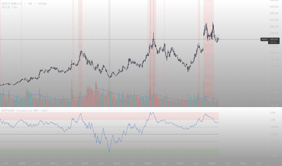
OBV with Kalman Filter Improv [TechnicalZen]Reversals, Breakouts & Re-Entries: OBV with Kalman Filter Improv
What This Indicator Does
This indicator transforms On-Balance Volume into a visual momentum instrument. Raw OBV is normalized to a 0-100 scale, rendered as stair-step candles with a continuous color gradient, and overlaid with a dual Kalman-filtered ribbon that tracks the flow trend with adaptive precision.
The result is a single pane that answers three questions at a glance: Is volume flow accumulating or distributing? How strong is the conviction? Where are the reversal, breakout, and re-entry points?
No footprint data required. No premium subscription needed. Pure price action and volume.
━━━━━━━━━━━━━━━━━━━━━━━━━━━━━━
Why OBV Matters More Than Raw Volume
Raw volume bars tell you how much traded. They do not tell you which direction the volume was pushing. A high-volume bar during a selloff looks identical to a high-volume bar during a breakout rally.
On-Balance Volume assigns direction. When price closes up, the bar's volume is added. When price closes down, it is subtracted. The running total — OBV — reveals the persistent pressure beneath the surface. Rising OBV with flat price means accumulation. Falling OBV with rising price means distribution. These divergences are invisible on a standard volume histogram.
This indicator takes OBV further by normalizing it into a bounded oscillator, smoothing it for clarity, and applying Kalman filtering for adaptive trend detection.
━━━━━━━━━━━━━━━━━━━━━━━━━━━━━━
How It Works
The indicator processes OBV through four stages.
Stage 1 — Normalize to 0-100
Raw OBV is an unbounded cumulative number that grows indefinitely. This makes it difficult to compare across time periods or instruments. The indicator applies a rolling min-max normalization over a configurable lookback window (default 100 bars), mapping OBV into a 0-100 scale.
At 100, OBV is at its highest point within the lookback. At 0, its lowest. At 50, it sits at the midpoint of its recent range. This creates a bounded oscillator from a trending series.
Stage 2 — Stair-Step Candles
The normalized OBV is rendered as candles where each bar's open equals the previous bar's close. This creates seamless stair-step blocks with no gaps and no overlaps. The candles show the direction and magnitude of each bar's contribution to the flow — a tall green block means a strong volume push upward, a tall red block means aggressive selling pressure.
Stage 3 — Position-Based Color Gradient
Candle color is determined by where the candle sits in the 0-100 range, not merely whether it went up or down:
Bright green (above 70) — strong bullish accumulation zone
Yellow-green (50-70) — moderate bullish flow
Yellow (around 50) — neutral, transition zone
Orange (30-50) — weakening flow, bearish lean
Red (below 30) — strong bearish distribution zone
This gradient reveals the market's volume state at a glance. Candles clustered at the top in green signal sustained accumulation. Candles dropping through yellow into red signal a regime shift.
Stage 4 — Dual Kalman Ribbon
Two Kalman-filtered lines track the normalized OBV at different speeds:
Short KF (default 20) — responsive to recent flow shifts
Long KF (default 80) — tracks the underlying flow trend
When the short line is above the long line, the ribbon fills bullish. When below, bearish. The Kalman filter adapts its responsiveness automatically — smoothing through noise while responding quickly to genuine regime changes. This is fundamentally superior to any fixed-length moving average.
━━━━━━━━━━━━━━━━━━━━━━━━━━━━━━
Reading the Three Signals
Reversals
A reversal signal appears when candles have been clustered at one extreme (above 70 or below 30) and begin migrating toward the midline. The color gradient shifts — green fading to yellow, or red fading to orange. The Kalman ribbon begins to narrow as the short line approaches the long line. When the ribbon flips color, the reversal is confirmed by volume flow, not just price action.
Breakouts
A breakout appears as a large candle that punches through the 70 or 30 threshold line with expanding body size. The Kalman ribbon is already aligned in the breakout direction (short above long for bullish, below for bearish). This confirms that volume flow is supporting the price move — not just a wick or a fake breakout.
Re-Entries
After a breakout, price often pulls back. During a healthy pullback, the candles dip toward the midline (50) but the Kalman ribbon stays in the trend direction . Candles may turn yellow briefly but do not reach the opposite extreme. When candles resume their original color and move away from the midline, that is the re-entry — volume flow confirms the trend is intact.
━━━━━━━━━━━━━━━━━━━━━━━━━━━━━━
Why Kalman Filtering — Not EMA, SMA, or Hull
Traditional moving averages apply a fixed smoothing recipe regardless of market conditions. In a quiet market, they lag. In a volatile market, they whipsaw. The trader is forced to manually change the length setting as conditions change.
The Kalman filter solves this structurally. It maintains an internal estimate of both the value and its uncertainty . On every bar, it computes a gain that automatically balances between trusting the new data and trusting its prediction. When data is noisy, the gain drops and the filter smooths aggressively. When a genuine shift occurs, the gain rises and the filter responds immediately.
Two parameters control this behavior:
R (Measurement Noise) — how much noise is expected in each bar's data. Higher values produce smoother output.
Q (Process Noise) — how quickly the underlying trend is expected to change. Higher values allow faster adaptation.
The dual-line ribbon (short KF vs long KF) combines the adaptive smoothing with trend direction detection. The crossover of two Kalman-filtered lines is more reliable than traditional MA crossovers because the filter has already absorbed the noise before the crossover happens.
━━━━━━━━━━━━━━━━━━━━━━━━━━━━━━
Reading the Indicator
The Candles
Green blocks at top — strong sustained buying pressure. Trend is healthy.
Red blocks at bottom — strong sustained selling. Downtrend confirmed by volume.
Yellow/orange blocks at midline — indecision. Flow is balanced. Wait for direction.
Color transition — the gradient shift (green to yellow, or red to orange) often leads price by several bars.
The Kalman Ribbon
Green fill (short above long) — volume flow trend is bullish
Red fill (short below long) — volume flow trend is bearish
Ribbon narrowing — trend weakening, potential flip ahead
Ribbon widening — trend conviction increasing
The Threshold Lines
70 line — overbought in volume flow terms. Sustained presence above = strong trend, not necessarily a sell signal.
50 line — equilibrium. Transitions through this level signal regime changes.
30 line — oversold in volume flow terms. Sustained presence below = strong downtrend.
Line colors match the candle gradient — they shift with the regime.
━━━━━━━━━━━━━━━━━━━━━━━━━━━━━━
Key Settings
Normalization Lookback (default: 100)
Rolling window for min-max scaling. Higher values produce smoother oscillation with fewer extremes. Lower values make the indicator more reactive to recent volume changes.
HA Smoothing Passes (default: 1)
Number of additional smoothing passes on the normalized OBV. 1 = standard stair-step. 2-3 = smoother candles with less noise.
Short KF / Long KF Length (default: 20 / 80)
Controls the responsiveness of the two Kalman lines. The gap between them determines how quickly the ribbon detects trend changes.
Measurement Noise R (default: 0.01)
Higher = smoother Kalman output. Lower = more reactive to each bar.
Process Noise Q (default: 0.10)
Higher = faster adaptation to regime shifts. Lower = more rigid trend following.
Upper / Lower Threshold (default: 70 / 30)
Defines the overbought/oversold boundaries for the volume flow oscillator.
━━━━━━━━━━━━━━━━━━━━━━━━━━━━━━
Divergence — The Most Powerful Signal
When price makes a new high but the OBV candles fail to reach the upper zone (or are falling), volume is not confirming the move. This bearish divergence often precedes reversals by several bars. The Kalman ribbon will begin narrowing before the price chart shows any weakness.
Conversely, when price makes a new low but OBV candles hold above the lower zone or begin rising, that is bullish divergence — accumulation is happening beneath the surface.
The gradient coloring makes these divergences immediately visible. Price may look strong, but if the candles are orange instead of green, the volume story disagrees.
━━━━━━━━━━━━━━━━━━━━━━━━━━━━━━
What This Indicator Is Not
It does not generate automated buy or sell signals . It provides visual regime information for the trader to interpret.
It does not use footprint or order flow data . It is built on standard OBV which infers direction from price close. For actual bid/ask decomposition, a footprint-based indicator is required.
It does not predict future price direction . It reveals the current state and trend of volume flow. What the market does with that flow is never guaranteed.
It is not a standalone trading system . It is a confirmation and divergence detection tool designed to complement price action analysis.
━━━━━━━━━━━━━━━━━━━━━━━━━━━━━━
Disclaimer
This indicator is provided for educational and informational purposes only. It is not financial advice, and it does not constitute a recommendation to buy, sell, or hold any financial instrument.
All trading involves risk. Past performance of any signal, regime detection system, or volume analysis mechanism does not guarantee future results. The normalized OBV readings, Kalman-filtered trend lines, and color gradient zones represent a computational assessment of publicly available price and volume data. They are not predictions and should not be treated as certainties.
On-Balance Volume assigns all of a bar's volume to one direction based solely on whether the close was higher or lower than the previous close. This is an approximation. A bar that closes up by one tick with heavy selling throughout will register as entirely bullish volume in OBV. Traders should be aware of this limitation.
The Kalman filter parameters (R and Q) affect responsiveness. Poorly tuned parameters can produce either excessive lag or excessive noise. The default values are designed for general use but may require adjustment for specific instruments or timeframes.
No indicator, algorithm, or model can account for all market variables including liquidity events, news-driven gaps, exchange outages, or sudden regime changes. Traders should always use independent risk management, position sizing, and their own judgment before entering any trade.
By using this indicator, you acknowledge that you are solely responsible for your own trading decisions and that the authors accept no liability for any losses incurred.
אינדיקטור

אינדיקטור
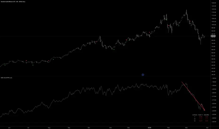
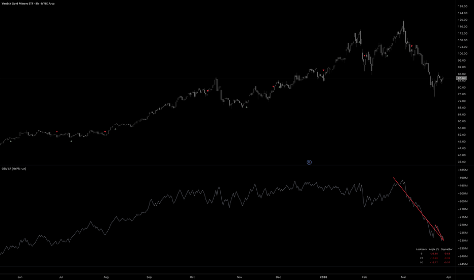
OBV Linear Regression Multi-Slope [HYPR-run]DESCRIPTION:
Three linear regression slopes fitted to On-Balance Volume. Measures whether accumulation or distribution is accelerating, decelerating, or reversing across short, medium, and long lookbacks simultaneously. Raw OBV tells you the cumulative direction of volume flow. Fitting a linear regression to it gives you the rate of change: the slope. Three slopes at different lookbacks show the structure of volume commitment. When all three agree, volume flow is structurally committed in one direction. When they disagree, the timeframes are in conflict.
DISCOVERING EDGE
Dual and triple slope alignment has proven to be a staple confirmation signal in our most reliable automated strategies for both entries and exits. When two or three independent lookbacks agree on the direction of volume flow, the commitment is structural, not noise. When alignment breaks, the first slope to flip tells you exactly where conviction cracked. We built this indicator to surface that alignment as a first-class signal rather than something you eyeball across separate panes.
THREE LR SLOPES vs RAW OBV LINE
Three slopes at different lookbacks show whether all timeframes of volume flow agree or conflict. Dual alignment (short + long) is the entry signal; triple (all three) confirms later for pyramids. When triple breaks, that's the exit. Values above 0.3 mean the slope is steeper than one standard deviation per bar (very strong trend). Sigma/bar above 0.1 means the slope is statistically strong; below 0.05 is weak.
FEATURES
- Three linear regression slope lines on OBV (short 9, medium 26, long 50)
- Optional adaptive short lookback (ATR-scaled for low timeframes)
- Slope alignment detection: dual (short+long) and triple (all three)
- Universal angle normalization (slope/sigma x 45 degrees)
- Sigma/Bar ratio: slope strength relative to OBV noise
- Auto-adjusts all lookbacks by timeframe (weekly/monthly compress)
- Webhook alerts on slope flip or triple alignment
- Full bar filter rejects doji/wick-heavy bars
- Dashboard with lookback, angle, and sigma/bar for all three lines
HOW IT WORKS
Linear regression calculates the best-fit line through OBV values over a lookback window. The slope of that line is the rate of volume flow. Positive slope = accumulation accelerating. Negative slope = distribution accelerating. The universal angle normalizes raw slope by OBV standard deviation so the dashboard reads consistently across any asset (BTC's OBV in millions, a low-cap's in thousands, same angle scale).
UNIVERSAL ANGLE
Slope divided by OBV standard deviation per bar, multiplied by 45. A value of 45 degrees means the slope equals one standard deviation per bar. Makes angle comparable across any asset and timeframe: 30 degrees on BTC means the same relative strength as 30 degrees on SOL.
ALERT MODES
Slope Flip: fires when selected lookback crosses zero. Negative to positive = accumulation starting (LONG). Positive to negative = distribution starting (SHORT). Triple Alignment: fires when all three slopes agree on direction. Fewer signals, higher conviction. Alert payload is built into the script as JSON; works with any webhook receiver.
CREDITS
On-Balance Volume: Joseph Granville, Granville's New Key to Stock Market Profits (1963) אינדיקטור
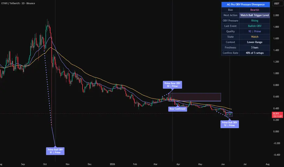
AG Pro OBV Pressure Divergence [AGPro Series]AG Pro OBV Pressure Divergence
Overview
AG Pro OBV Pressure Divergence is a context-aware divergence quality map built around the relationship between price structure and On-Balance Volume pressure.
The script is designed to identify bullish and bearish divergence events, then rank those events by participation quality, structural context, and follow-through behavior. Instead of treating every divergence as equally important, it separates weaker pressure disagreements from more meaningful setups and organizes them into a cleaner decision framework.
This is not a generic divergence marker that prints every local mismatch between price and an underlying series. Its purpose is to classify divergence events through a layered process that includes pivot structure, price displacement, OBV behavior, trend context, confirmation timing, and visual emphasis.
The result is a tool that can be used to study when price and participation begin to disagree, while still preserving a practical chart view that remains readable during live market conditions.
What this script does
- Detects bullish divergence when price forms a lower low while OBV forms a higher low
- Detects bearish divergence when price forms a higher high while OBV forms a lower high
- Filters divergence candidates using pivot separation and ATR-based price swing requirements
- Scores events by quality instead of treating all signals the same
- Highlights the strongest events with more prominent chart objects
- Tracks confirmation and invalidation behavior after the initial event
- Displays a compact summary panel for state, pressure, context, and freshness
Unique Edge
Many divergence tools stop at basic detection. They show a disagreement between price and an oscillator or cumulative volume series and leave the rest to the user.
This script takes a different approach.
Its goal is not to maximize the number of divergence labels on the chart. Its goal is to classify divergence quality.
That difference matters. A simple divergence can appear in noisy conditions, in weak structural locations, or without any meaningful follow-through. In those cases, the event may still be technically valid, but not equally useful from an analytical point of view.
AG Pro OBV Pressure Divergence attempts to address that by combining several layers:
1. Structural divergence detection
2. ATR-normalized price displacement filtering
3. OBV pressure comparison between pivots
4. Local trend context using fast and slow EMA structure
5. Setup monitoring through confirmation and invalidation logic
6. Visual hierarchy that distinguishes lower-quality from higher-quality events
Because of this design, the script is better understood as a divergence classification framework rather than a simple divergence marker.
It is also distinct from breakout, reclaim, or trend continuation tools. It does not evaluate break-retest mechanics, VWAP reclaim logic, or general trend strength as its primary objective. Its focus is the quality of price-versus-participation disagreement.
Methodology
The script begins by identifying swing pivots through a configurable pivot length. These pivots form the structural anchor points used to compare price and OBV behavior.
For bullish divergence:
- price must form a lower low
- OBV must form a higher low
For bearish divergence:
- price must form a higher high
- OBV must form a lower high
After a raw divergence is found, the script applies additional requirements before the event is accepted:
Pivot Separation
A minimum bar gap is enforced between pivots so that tightly packed micro-swings do not dominate the output.
Minimum Price Swing
The distance between the two relevant pivots is measured relative to ATR. This prevents very small structural changes from being treated like full-quality events.
Pressure Evaluation
The OBV relationship between the two pivots is examined to determine whether participation is actually improving or weakening in a meaningful way.
Trend Context
Fast and slow EMA structure is used to frame whether the event is appearing against or within the prevailing price environment.
Contextual Location
The script also evaluates where the event is occurring in its local range structure. This helps separate mid-range noise from more interesting reversal or exhaustion locations.
Scoring
All of the above components contribute to a quality score. That score is then used to separate lower-priority events from stronger ones.
Confirmation
After the initial event, the script tracks a confirmation window. During that window, the setup may confirm, remain pending, expire, or become invalidated.
This layered structure is intentional. The script does not assume that a divergence label alone is enough.
Signal Structure
The script organizes events into a sequence instead of a single binary output.
Event Detected
A new bullish or bearish divergence is found and scored.
Pending State
The event remains active while the script monitors whether follow-through appears within the confirmation window.
Confirmed
If the confirmation condition is met within the allowed window, the event is marked as confirmed.
Invalidated
If price fails the setup before confirmation, the event is marked as invalidated.
Expired
If no confirmation occurs within the defined number of bars, the setup is no longer treated as active.
This state-based behavior is useful because it prevents the chart from presenting all divergence events as finalized conclusions the moment they appear.
Quality Model
The script uses a quality threshold and a premium threshold to distinguish event strength.
Lower-quality events can still be displayed when the user wants a fuller map of all structure, but the script can also be configured to focus only on stronger setups.
This creates three practical layers of interpretation:
Building
A divergence exists, but the score is lower and the event should be treated with more caution.
High
The event passes the main quality threshold and receives stronger visual treatment.
Premium
The event exceeds the premium threshold and receives the strongest category treatment in the script.
This does not mean that premium events are guarantees, and it does not imply that lower-quality events are unusable. It simply reflects that not every divergence deserves the same level of attention.
Panel Summary
The summary panel is intended to give quick context without forcing the user to inspect every label one by one.
The panel includes:
- Bias
A simple view of the current directional background based on the fast and slow EMA relationship.
- Pressure
A quick summary of whether OBV pressure is rising, falling, or mixed.
- Last Event
Shows the most recent detected divergence direction.
- Quality
Displays the score and current classification of the most recent event.
- State
Shows whether the most recent tracked setup is in watch, confirmed, invalidated, or idle state.
- Context
Provides a compact view of the local environment, such as trend-up, trend-down, or range-related placement.
- Freshness
Indicates how many bars have passed since the latest tracked event.
Visual Design
The chart output is intentionally organized with hierarchy.
Qualified events are easier to spot than weaker ones.
Confirmation labels are visually distinct from initial event labels.
Link lines help explain which two pivots created the divergence.
Optional background pulse and active setup zone provide temporary emphasis without permanently dominating the chart.
EMA context remains available but is visually secondary to the divergence structure.
Tooltips are included for key settings so that the logic behind the inputs remains understandable directly from the settings panel.
Signals and Alerts
The script includes alert conditions for the main state transitions:
- New Bullish Pressure Divergence
- New Bearish Pressure Divergence
- Premium Bullish Pressure Divergence
- Premium Bearish Pressure Divergence
- Bullish Pressure Divergence Confirmed
- Bearish Pressure Divergence Confirmed
- Pressure Divergence Invalidated
These alerts are designed to reflect internal script states rather than making claims about future price outcomes.
Key Inputs
Pivot Length
Controls how swings are defined. Higher values reduce noise but may delay detection.
OBV Smoothing
Smooths the OBV series before divergence analysis. Higher values create a cleaner but slower pressure curve.
Minimum Pivot Separation
Prevents overly compressed pivots from producing excessive clustering.
Minimum Price Swing (ATR)
Requires meaningful structural movement before a divergence is accepted.
Quality Threshold
Defines the minimum score required for a divergence to be treated as a qualified event.
Premium Threshold
Defines the score level required for premium classification.
Confirmation Window (Bars)
Controls how long a pending event is monitored before it expires.
Use Close-Based Confirmation
Switches confirmation logic between close-based behavior and intrabar high/low behavior.
Main Label Size
Scales event, confirmation, and invalidation labels.
Panel Text Size
Controls panel readability independently from chart labels.
Drawing Emphasis
Adjusts how visually prominent lines, EMA context, and active zone objects appear on the chart.
How to use it
This script is best approached as a context tool, not as a stand-alone decision engine.
A practical workflow may look like this:
1. Identify whether the panel context is aligned with a broad directional background or whether the market is behaving more like a range.
2. Observe whether a new divergence appears in a meaningful local location rather than in the middle of random price noise.
3. Compare the quality score and classification.
4. Watch whether the event confirms or invalidates within the chosen time window.
5. Combine the information with your own structure, risk, and execution framework.
The script is often more informative when used to reduce attention on weaker disagreements and concentrate on better-formed pressure divergences.
Who it may be useful for
This script may be useful for users who want:
- a more structured way to study price and OBV disagreement
- a cleaner divergence map with stronger visual hierarchy
- a chart that distinguishes raw detection from confirmed follow-through
- a volume-pressure oriented lens that is different from standard oscillator-only divergence tools
It may be less suitable for users who want a high-frequency signal stream, a one-click entry engine, or a tool that treats every local divergence as equally relevant.
Limitations and Transparency
This script has important limitations.
First, divergence is an analytical concept, not a guaranteed turning-point mechanism. A divergence can appear and still fail, extend, or resolve slowly.
Second, the scoring model is a ranking method, not a prediction formula. A higher score does not mean certainty. It only means that the event better satisfies the script's internal conditions.
Third, pivot-based logic requires structure to form. This means the script necessarily depends on completed swing information and will not behave like a forward-only projection model.
Fourth, confirmation and invalidation logic are simplifications intended to organize event follow-through. They do not replace full trade management, execution rules, or independent risk control.
Fifth, any indicator that uses volume-derived inputs depends on the characteristics of the underlying market data. Users should be aware that data quality and market structure can differ across symbols and venues.
This script is therefore best used as a contextual classification tool rather than a complete standalone methodology.
What this script is not
- It is not a guarantee of reversals.
- It is not a promise engine.
- It is not a fully automated trading system.
- It is not a substitute for independent structure analysis or risk management.
- It is not designed to predict every local top or bottom.
- It is not intended to imply that premium signals are always superior in every market condition.
Its purpose is narrower and more practical:
to organize OBV-based divergence events into a more useful analytical framework.
Risk Disclosure
This script is for chart analysis and research purposes only.
It does not provide financial advice, investment advice, portfolio advice, or a guarantee of future market behavior. Market conditions can change quickly, and any signal or classification generated by the script can fail or become invalid.
Users should make independent decisions and apply their own risk controls before acting on any chart output.
In summary
AG Pro OBV Pressure Divergence is a public, chart-based tool for analyzing divergence quality through the interaction of price structure and OBV pressure.
Its main contribution is not that it detects divergence, but that it attempts to rank divergence events by structural relevance, pressure context, and follow-through state.
For users who want a cleaner way to study whether price and participation are beginning to disagree, this script aims to provide a more selective and better-organized framework than a raw all-events divergence marker.
אינדיקטור

TX Volume Spike Overview:
TX Volume Spike Pro is a sophisticated technical analysis tool designed to identify high-probability breakout and breakdown opportunities in STOCK trading. The core philosophy is "Volume confirms price." By combining price action breakout levels with directional volume spikes and advanced momentum filters, this script helps traders filter out market noise and identify institutional accumulation or distribution.
Key Features:
Directional Volume Spike Logic: Unlike standard volume indicators, TX Pro distinguishes between Bullish Spikes (accumulation) and Bearish Spikes (distribution). A signal is only valid if the recent volume surge aligns with the candle's direction.
Hybrid Confirmation System: The "Hybrid" mode integrates several technical indicators—On-Balance Volume (OBV), Money Flow Index (MFI), and Volume Oscillator—to ensure that momentum and money flow are fully supporting the price move.
Breakout/Breakdown Engine: Automatically identifies dynamic resistance (High) and support (Low) levels based on user-defined lookback periods.
Institutional Trend Filter: Includes a 200-period SMA filter to ensure traders stay on the right side of the long-term trend, significantly reducing risk in trending markets.
Professional UI: Features clean visual plots of key levels, directional bar highlighting for volume anomalies, and optimized signal labels.
How to Use:
Bullish Signal (BUY): Triggered when the price crosses over the Resistance level, confirmed by a Bullish Volume Spike within the lookback window, and supported by Hybrid filters (OBV/MFI/VO) if enabled.
Bearish Signal (SELL): Triggered when the price crosses under the Support level, confirmed by a Bearish Volume Spike, and supported by momentum filters.
Recommended Setting: Use the "Hybrid (All Filters)" mode for stock trading to ensure maximum confirmation.
Disclaimer:
This script is a technical analysis tool and should not be considered financial advice. Always use proper risk management and stop-loss orders in your trading strategy. אינדיקטור

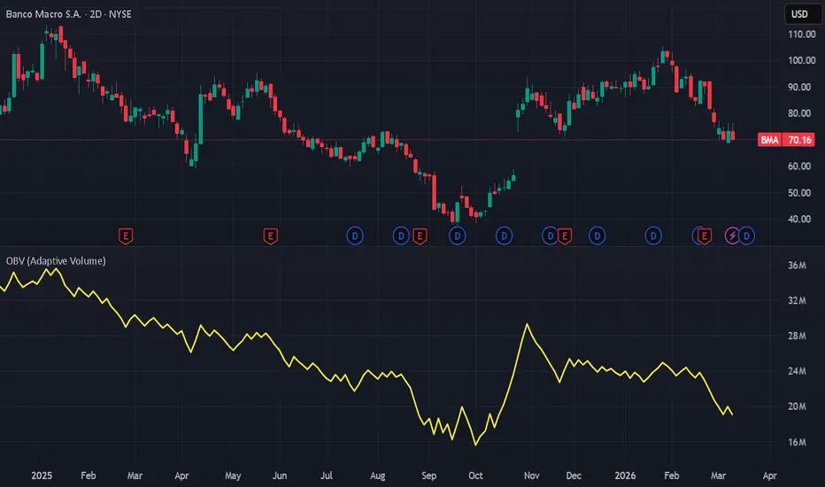
OBV Adaptive Volume [G IV]OBV Adaptive Volume
This is the foundational Commitment component of the ET Massif Framework Research suite.
Description
G IV is an adaptive On-Balance Volume that caps extreme volume spikes and accepts any source as input, producing a clean and raw measure of accumulation and distribution pressure without the skew caused by abnormal volume events.
Features
Volume spike control – A configurable cap limits the impact of abnormal volume bursts, preventing volume spikes from overwhelming the cumulative total. By default, volume is capped at 2.5× the 180-period SMA of volume.
Flexible input source – The indicator can be applied to any source, not just closing prices (HL2, OHLC4, or even other indicators).
Raw participation focus – Designed to remain a direct measure of volume participation. Avoids the lag and noise common in heavily smoothed or oscillator-based OBV variants.
Volume Spikes Matter
Traditional volume indicators can be distorted when unusually large volume spikes occur. These spikes may reflect temporary liquidity events, news reactions, or block trades, which can heavily skew the OBV line and obscure the broader participation trend. Beyond a certain level of volume per bar, additional volume often represents churn rather than direction.
How to Use
Same as standard OBV: Rising values = accumulation; Falling values = distribution
Confirmation Layer
Apply the OBV transformation of any source to create a volume confirmation layer for other analytical tools (e.g. standard or custom indicators). Optionally, run a visual or z-score comparison between this output and the original source to identify divergences.
In the above example, the OBV transformation is applied to TRIX (Triple Exponential Average) and shown alongside the original.
Default Settings
Source: Close
Volume Cap: 2.5
Volume Lookback: 180
Volume cap and lookback can be adjusted depending on the instrument and market conditions.
日本語概要 (Japanese Summary)
G IVは、極端な出来高スパイクを上限設定(180日SMAの2.5倍)で制御し、任意のソースを入力可能な適応型OBVです。価格だけでなくEMA等の各種指標にも出来高を反映した累積計算を適用でき、異常値による歪みを排除したクリーンな蓄積(Accumulation)と分配(Distribution)の傾向を、ラグを抑えた市場参加データとして視覚化します。
中文概要 (Chinese Summary)
G IV 是一款自適應 OBV 指標,具備成交量上限機制(預設 180 週期 SMA 的 2.5 倍)以防止極端數值干擾,並支援自定義輸入來源。它能將成交量加權應用於價格或 EMA 等各類技術指標,有效排除異常波動帶來的偏誤,提供最原始且無滯後的市場吸納(Accumulation)與派發(Distribution)壓力數據。
Disclaimer
This script is intended for research and educational purposes only.
It does not constitute financial advice. Trading involves risk.
אינדיקטור

EOL Labs - Paragon HUD v2.2 Heads-Up Display for Trade Readiness─────────────────────────────────────────────────────────────
🧪 EOL Labs • Paragon HUD v2.2 — Heads-Up Display for Trade Readiness
─────────────────────────────────────────────────────────────
A three-stage trade readiness system that walks you through
the setup process — PREP, ARM, FIRE — so you never jump the
gun on a trade that hasn't fully confirmed.
▸ HOW IT WORKS
PREP — Conditions are aligning. Bias, slope, and filters
agree that a move may be developing near VWAP.
ARM — Price has crossed VWAP in the expected direction.
Setup is loaded. Wait for the trigger.
FIRE — EMA crossover confirms entry. Execute.
▸ KEY FEATURES
• Three-stage state machine (PREP → ARM → FIRE)
• VWAP proximity band for entries near fair value
• T3-smoothed slope confirmation with configurable lookback
• Higher-timeframe T3 directional gate (longs require HTF
upslope, shorts require HTF downslope — symmetric logic)
• OBV momentum filter with optional dynamic volume gate
• ATR-based stop loss and risk-multiple take profit levels
• Live SL/TP lines on chart (active side only, not spammed)
• Floating HUD panel: state, side, entry, SL, TP, R:R, timer
• Bar countdown timer shows seconds until current bar closes
• Static alertcondition() for TradingView alert dialogs
• Dynamic alert() with price levels for webhook automation
▸ RECOMMENDED SETTINGS
Works on any instrument and timeframe. Designed for intraday
trading on 1m–15m charts with a 60m HTF confirmation gate.
Default parameters are tuned for general use — adjust the
Bias Gate and ATR Stop multiplier for your instrument's
volatility profile.
▸ NON-REPAINTING
The HTF security call uses the close + lookahead_on
pattern to ensure confirmed-only higher-timeframe data.
Dynamic alerts fire only on barstate.isconfirmed. אינדיקטור

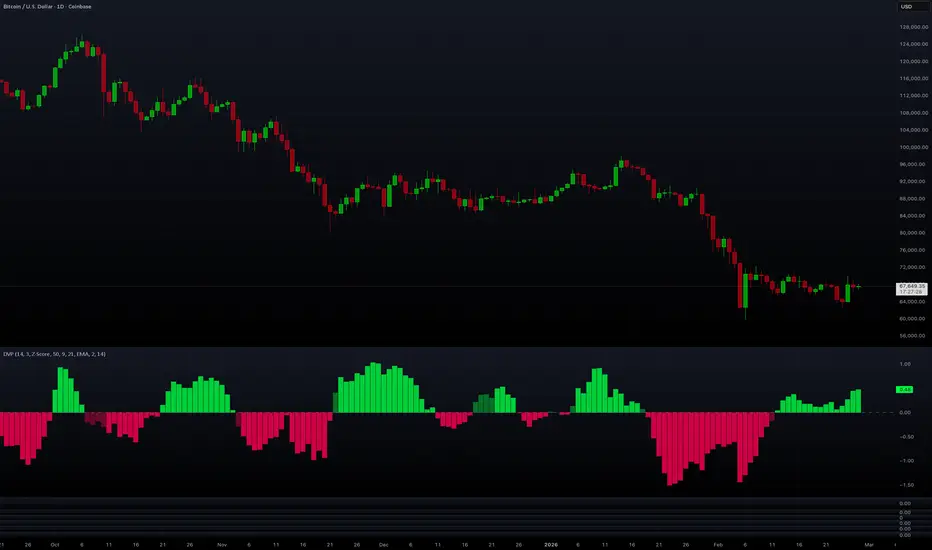
Directional Volume Pressure (DVP) Directional Volume Pressure (DVP)
Directional Volume Pressure (DVP) is a volume-based oscillator that estimates who is “winning” inside each candle (buyers or sellers), then smooths and optionally normalizes that estimate into a clean signal you can use for trend confirmation, momentum shifts, absorption spotting, and divergence.
Unlike many “up volume vs down volume” tools that only look at whether the candle closed green/red, DVP also considers how much of the candle was real body vs wick. That matters, because a big wick often represents rejection, while a big body often represents acceptance/commitment.
DVP outputs a histogram that oscillates around 0:
Above 0 = net buying pressure (bulls dominating)
Below 0 = net selling pressure (bears dominating)
Crossing 0 = potential regime shift / momentum flip
You can optionally add:
Fast/Slow moving averages of the pressure (for regime + cross signals)
Absorption detection (high volume, low real movement = likely large passive liquidity)
Divergence detection (price makes new extreme, pressure fails to confirm)
±1 “zone” lines (when normalized) to highlight stronger-than-normal pressure
1) What the indicator is measuring (plain English)
Every candle has:
Range = high - low
Body = abs(close - open)
Body ratio = body / range (how much of the candle is “real move” vs wicks)
DVP uses body ratio as a proxy for conviction:
Large body / small wicks → stronger directional intent
Small body / large wicks → more indecision / rejection
Then it allocates the candle’s volume into two buckets:
Bull volume
Bear volume
Finally it computes:
Net Pressure = bull_volume - bear_volume
Smooth it over time
Normalize (optional) so it’s easier to compare across assets/timeframes
This gives you a single line/histogram that answers:
“Is volume pressure currently more bullish or bearish—and how unusually strong is it compared to recent history?”
2) How DVP splits volume into bullish vs bearish (how it works)
A) If the candle closes green (close > open)
The candle is treated as bull-dominant, and the body ratio decides how dominant:
bull_volume = volume * body_ratio
bear_volume = volume * (1 - body_ratio)
So:
Big green body → bull volume gets most of the volume
Green candle with long wicks → bull volume gets less (because conviction is weaker)
B) If the candle closes red (close < open)
Mirror logic:
bull_volume = volume * (1 - body_ratio)
bear_volume = volume * body_ratio
So:
Big red body → bear volume gets most of the volume
Red candle with long wicks → bear volume gets less
C) If the candle is a doji (close == open)
It uses a simple heuristic:
Find the candle midpoint (high + low)/2
If the close is above the midpoint, it leans bullish; otherwise bearish
It assigns 60/40 instead of 50/50 to avoid flatlining
This prevents doji candles from always being “neutral” (because in real trading they often aren’t).
3) The smoothing pipeline (why it’s there)
Raw volume pressure is noisy. So DVP smooths in two stages:
Pressure sum
pressure_sum = EMA(net_pressure, period)
Final smoothing
pressure_smooth = EMA(pressure_sum, smooth)
What these do:
Period controls the “memory” of pressure (how many bars matter).
Smoothing is a final noise filter so the histogram isn’t jittery.
Typical use:
Lower timeframes (1m–15m): increase smoothing a bit
Higher timeframes (4H–1D): you can reduce smoothing
4) Normalization options (how to choose)
DVP offers 4 normalization modes. This is important because raw volume values are not comparable across markets (BTC vs a low-cap alt, or NY session vs Asia session, etc.).
4.1 Raw
Shows the smoothed net pressure in absolute units.
Best if you only trade one instrument and want pure, unscaled behavior.
Downside: A volume regime change can distort interpretation.
4.2 Percent
pressure_smooth / EMA(volume, period)
Converts pressure into a relative fraction of recent volume
Good for comparing across instruments a bit more fairly than Raw.
Downside: Still not “statistically standardized.”
4.3 Z-Score (recommended)
It computes a Z-score of pressure vs its recent history:
mean = SMA(pressure_smooth, stat_period)
std = StDev(pressure_smooth, stat_period)
z = (pressure - mean) / std
Then it clamps to avoid extreme outliers and rescales:
clamp z to
divide by 2 → roughly maps into about
Why it’s powerful:
Z-score tells you when pressure is unusually strong relative to the last stat_period bars.
This is the best mode if you want:
consistent “strong/weak” thresholds
zone lines (±1) to mean something
4.4 Adaptive
Scales pressure to a rolling min/max range:
norm_adaptive = 2*(pressure - low)/(high-low) - 1
This forces output into based on recent extremes.
Use it when:
You want clean bounded visuals
You trade assets with wildly changing volatility/volume
Downside: It’s relative to the window, so extreme prints can “compress” everything else until they roll off.
5) Reading the histogram (the core skill)
5.1 Basic interpretation
Green bars above 0: bullish pressure dominance
Red bars below 0: bearish pressure dominance
5.2 Strength and “trend quality”
In Z-score or Adaptive, the height of the bars matters a lot.
Taller bars = stronger imbalance between bull vs bear volume allocation.
A healthy trend often shows:
bullish trend → consistent positive bars, pullbacks don’t push deeply negative
bearish trend → consistent negative bars, bounces don’t push deeply positive
5.3 The “tell”
One of the strongest tells is price moving up while DVP falls, or price moving down while DVP rises. That’s where absorption/divergence logic becomes useful.
6) Moving averages, regimes, and crosses (optional overlays)
DVP can plot:
Fast MA (default 9)
Slow MA (default 21)
MA type: SMA / EMA / WMA / VWMA
6.1 Regime definition
Bullish regime: ma_fast > ma_slow
Bearish regime: ma_fast < ma_slow
The histogram color intensity changes depending on regime:
When pressure aligns with regime, colors are “stronger”
When pressure contradicts regime, colors are “faded”
6.2 Cross signals
Bullish cross: fast MA crosses above slow MA
Bearish cross: fast MA crosses below slow MA
These are best used as:
confirmation after a structure break
early warning when pressure trend flips before price
Tip: Crosses are more meaningful when:
they occur near the zero line, or
they occur alongside a strong Z-score push
7) Absorption detection (optional)
Idea: Sometimes volume explodes, but price barely moves. That often implies absorption:
large passive limit orders absorbing aggressive market orders
“someone big” taking the other side without allowing progress
How DVP flags absorption
It checks two things:
Volume Z-score is high
Computes Z-score of volume over stat_period
Triggers when it exceeds absorption_threshold (default 2.0 sigma)
Price movement is small (relative to ATR)
Measures body size vs ATR(14)
Triggers if body/ATR is small (< 0.5)
Then it classifies:
If absorption happens while DVP is positive → bullish absorption marker
If absorption happens while DVP is negative → bearish absorption marker
How to use it
Absorption is not automatically bullish or bearish. It’s more like:
Bullish absorption can indicate “sellers got absorbed” and a base is forming
Bearish absorption can indicate “buyers got absorbed” near tops/distribution
Best practice:
Use absorption at key levels (prior highs/lows, VWAP bands, value areas, trendlines)
Combine with follow-through: the next few candles should confirm direction
8) Divergence detection (optional)
DVP can look for simple divergence patterns over div_lookback bars:
Bullish divergence (the concept)
Price prints a lower low
DVP prints a higher low
And DVP is below 0 (selling pressure context)
This often means:
“Price pushed lower, but the selling pressure did not expand—downside may be weakening.”
Bearish divergence (the concept)
Price prints a higher high
DVP prints a lower high
And DVP is above 0 (buying pressure context)
This often means:
“Price pushed higher, but the buying pressure did not expand—upside may be weakening.”
Important: Divergence works best when:
it appears after an extended move
it forms at prior liquidity (previous highs/lows)
it’s followed by a clear structure break or zero-line shift in DVP
9) The ±1 zone lines (optional)
If you enable Show ±1 Zones and you are not in Raw mode, the script plots:
+1 zone
−1 zone
In Z-score mode, those zones are especially useful because they represent “unusually strong” pressure relative to recent history.
Simple rule of thumb:
Sustained bars beyond +1 → strong bullish control
Sustained bars beyond −1 → strong bearish control
Failure to reach zones during trend continuation attempts → weakening trend
10) Practical setups (copy/paste playbooks)
Setup A — Clean trend confirmation (recommended)
Normalization: Z-Score
Period: 14
Smoothing: 3–5
Show MAs: ON (9/21 EMA)
Show Crosses: optional
How to trade it:
Bias long when DVP > 0 and fast MA > slow MA
Bias short when DVP < 0 and fast MA < slow MA
Reduce risk when DVP starts contradicting regime repeatedly
Setup B — Momentum shift + entries
Z-Score
Show Crosses: ON
Watch for:
pressure crossing 0
MA cross
bar height expansion (strong push)
Use it to confirm a breakout:
Breakout candle + DVP expansion + bullish regime = higher quality breakout
Setup C — Reversal hunting (advanced)
Show Absorption: ON
Show Divergence: ON
Use Z-score zones
Reversal checklist:
Divergence near a key level
Absorption print occurs around the same zone
DVP crosses 0 or MA cross confirms
Price breaks minor structure (swing high/low)
11) Common mistakes
Treating DVP as a standalone entry signal. It’s strongest as a confirmation tool.
Using Raw mode across multiple assets/timeframes and expecting consistent thresholds.
Over-trusting divergence in choppy ranges without structure confirmation.
Ignoring session effects (volume regimes change dramatically in some markets).
12) What each setting does (quick reference)
Core Settings
Period: lookback for pressure EMA (bigger = smoother/laggier)
Smoothing: extra EMA smoothing on top (bigger = less noise)
Normalization
Raw: absolute pressure
Percent: pressure relative to volume
Z-Score: statistically standardized pressure (best for thresholds)
Adaptive: min/max scaled to
Statistical Period: lookback for Z-score + adaptive range
Moving Averages
Show MAs: plots fast/slow MA on pressure
Show Crosses: plots ▲/▼ when fast crosses slow
Fast / Slow MA: sensitivity vs stability
MA Type: smoothing style
Signals
Show Absorption: highlights absorption bars + A markers
Absorption Threshold: how extreme volume must be (sigma)
Show Divergence: plots D markers
Divergence Lookback: scan window for extremes
Show ±1 Zones: plots zone lines when normalized
13) Short “store page” style summary (if you need it)
Directional Volume Pressure (DVP) estimates buyer vs seller dominance by allocating each candle’s volume based on body-to-range structure, then smoothing and normalizing it into an oscillator around zero. Use it to confirm trends (pressure above/below zero), identify regime shifts (MA crosses and zero-line flips), spot absorption (high volume with low real movement), and detect divergences when price extremes are not confirmed by volume pressure. Z-score normalization is recommended for consistent thresholds and zone-based interpretation across markets and timeframes. אינדיקטור

Phantom Support & Resistance Auto [PT-IND-SR.001]Overview
Phantom Support & Resistance Auto is a context-focused support and resistance indicator designed to visualize price interaction zones derived from multiple market behaviors.
The script does not generate buy or sell signals.
Instead, it provides a structured map of potential reaction areas, allowing traders to better understand where price has historically reacted, consolidated, or extended liquidity.
This indicator is intended to be used as a decision-support and contextual analysis tool, not as a standalone trading system.
How the Script Works
The indicator combines several independent but complementary methods of identifying support and resistance.
Each method captures a different type of market behavior, and all components can be enabled or disabled independently.
1) High / Low Zones (Range Extremes)
This module tracks the highest high and lowest low over a configurable lookback period.
These levels represent recent range boundaries, which often act as reaction zones during consolidation or pullbacks.
They are visualized as extended horizontal levels to preserve historical context.
2) Pivot Zones (Filtered & Merged Levels)
Pivot zones are derived from confirmed pivot highs and lows.
To avoid excessive and overlapping levels, the script applies a merge tolerance based on either:
ATR distance, or Percentage distance from price
Nearby pivot levels are merged into a single zone, and each zone tracks how many times price has interacted with it.
This interaction count adjusts visual strength, creating a relative importance hierarchy rather than treating all levels equally.
An optional higher-timeframe source can be used to project structurally significant levels onto lower timeframes.
3) Wick Liquidity Zones
This module detects candles with disproportionately large wicks relative to their bodies.
Such candles often indicate liquidity grabs, stop runs, or rejection areas.
Detected wick levels are extended forward to highlight areas where liquidity was previously absorbed.
This component focuses on price rejection behavior, not trend direction.
4) PR Levels (Volatility-Adjusted Predicted Ranges)
PR levels are derived from a volatility-adjusted average price model.
Using ATR as a normalization factor, the script calculates a central average along with upper and lower projected zones.
These levels are adaptive, expanding and contracting with volatility, and are intended to represent probabilistic price ranges, not fixed targets.
5) MACD-Based Support & Resistance (Heikin Ashi Source)
This module derives dynamic support and resistance levels based on MACD momentum shifts, calculated from Heikin Ashi price data to reduce noise.
When MACD momentum transitions occur, recent highs and lows are captured and projected as potential reaction zones.
This component focuses on momentum-driven structural changes, rather than static price levels.
Why These Components Are Combined
Each component captures a different dimension of market behavior:
High / Low zones → Range extremes
Pivot zones → Structural reaction points
Wick zones → Liquidity and rejection behavior
PR levels → Volatility-normalized price ranges
MACD S&R → Momentum-based structural shifts
By combining these sources, the indicator provides a layered view of support and resistance, allowing traders to evaluate confluence, alignment, or divergence between different types of levels instead of relying on a single method.
The script does not assume all levels are equal; visual weighting helps distinguish structural levels from situational ones.
Visualization & Outputs
Color-coded horizontal zones with strength-based opacity
Optional glow effects for visual clarity
Independent toggles for each S&R source
A table showing percentage distances between projected PR levels, helping users contextualize price location within its current range
All visual components are configurable and can be selectively disabled to reduce chart clutter.
How to Use
Use this indicator as a context and mapping tool
Observe areas where multiple zone types align for higher contextual significance
Combine with your own entry logic, confirmations, and trade management rules
Suitable for multi-timeframe analysis and market structure studies
Risk Management Notice
This indicator should always be used as part of a well-defined risk management plan.
Support and resistance zones represent areas of potential interaction, not guaranteed reactions.
Users are responsible for applying appropriate:
Position sizing
Stop placement
Risk-to-reward rules
The indicator does not manage risk automatically and should not replace proper risk management practices.
What This Script Is NOT
It is not a buy/sell signal generator
It does not predict future price direction
It does not guarantee reactions at every level
It should not be used as a standalone trading strategy
Originality & Purpose
The originality of this script lies in its structured integration of multiple support and resistance methodologies, each preserved as a distinct analytical layer rather than blended into a single opaque output.
The purpose is to help traders understand where price has interacted with liquidity, structure, and volatility, not to automate trade decisions.
אינדיקטור

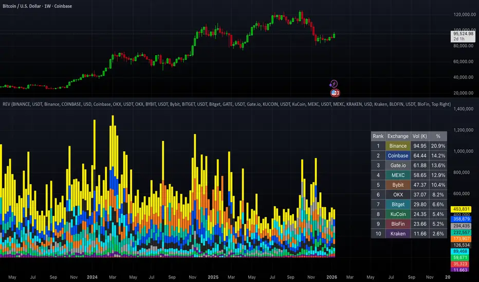
Ranked Exchange Volume (REV)📊 Ranked Exchange Volume (REV) - Multi-Venue Volume Distribution Visualizer
## Stop Guessing Where the Real Volume Is. See It.
Most traders look at aggregate volume and miss the critical story: **where** that volume actually traded. Ranked Exchange Volume (REV) solves this by revealing the complete liquidity landscape across multiple trading venues in a single, elegant visualization.
This isn't just another volume indicator—it's a **dynamic stratified histogram** that automatically reorganizes exchange layers by magnitude on every bar, showing you **instant market dominance** at a glance.
---
## 🎯 The Core Innovation: Self-Organizing Volume Layers
REV displays volume from up to 10 different exchanges as **stacked, color-coded bars** where the largest volume source literally rises to the top. Watch as exchanges compete for dominance in real-time:
- **Largest volume = Top of the bar** (most visible position)
- **Smallest volume = Bottom of the bar** (foundation layer)
- **Everything in between = Automatically sorted on every candle**
This visual hierarchy makes it instantly obvious which venues are leading the market—no mental math required.
---
## ✨ Key Features
### 🔄 **Dynamic Layer Sorting**
Unlike static stacked charts, REV uses real-time stratification. If Binance had 60% of volume last bar but Coinbase takes 70% this bar, you'll see Coinbase jump to the top. The hierarchy reflects current reality, not a fixed order.
### 🎨 **10 Fully Customizable Exchange Slots**
Each exchange slot offers complete control:
- **Enable/Disable toggle** - Turn exchanges on/off without losing your configuration
- **Custom prefix** - Track ANY exchange on TradingView (BINANCE, KRAKEN, OANDA, FXCM, etc.)
- **Custom suffix** - Specify quote currency (USDT, USD, EUR, or leave blank for stocks/forex)
- **Display name** - Control how exchanges appear in the rankings table
- **Color selection** - Match your chart theme or use brand colors for instant recognition
### 📊 **Live Rankings Table**
A real-time leaderboard shows:
- **Rank** - Current position (1 = highest volume)
- **Exchange name** - With color-coded background
- **Volume** - Intelligently formatted with K/M/B units
- **Percentage** - Exact market share
**Table positioning:** Choose from 9 screen positions (top/middle/bottom × left/center/right) to keep your chart clean.
### 🧮 **Intelligent Volume Formatting**
REV automatically detects volume magnitude and applies the appropriate scale:
- **Billions** - Displays as "1.5B" for readability
- **Millions** - Displays as "342.8M"
- **Thousands** - Displays as "45.2K"
- **Full numbers option** - Toggle to see complete values (23,456,789)
The scale adjusts per-bar, so you always see the clearest representation.
### 🚨 **Three Built-In Alert Conditions**
1. **Exchange Dominance Alert (>50%)**
- Triggers when a single venue controls majority of volume
- Signals potential liquidity concentration risk or exchange-specific events
2. **Volume Spike Alert (>2x average)**
- Detects unusual aggregate activity across all venues
- Catches breakouts, news events, or institutional flow
3. **Liquidity Migration Alert**
- Fires when market leadership shifts between exchanges
- Reveals arbitrage opportunities or changing market structure
### 📈 **Optional Total Volume Line**
Display aggregate volume from all exchanges as a reference overlay with customizable color.
---
## 🌍 Market Compatibility: Beyond Crypto
While optimized for cryptocurrency (its primary design), REV works across multiple asset classes:
### ✅ **Cryptocurrency (Perfect Fit)**
**Why it excels:** Crypto trades 24/7 across dozens of global exchanges simultaneously. REV reveals true price discovery.
**Example configurations:**
- **BTC/USDT:** Compare Binance, Coinbase, OKX, Bybit, Kraken, Bitget
- **ETH/USD:** Track institutional venues (Coinbase, Kraken, Gemini) vs retail (Binance, Gate.io)
- **Altcoins:** Identify which exchanges have the deepest liquidity before placing large orders
**Trading applications:**
- **Arbitrage detection** - Spot when volume migrates between venues (price differential opportunities)
- **Exchange risk** - Don't trade on exchanges with suspiciously low volume
- **Whale tracking** - Sudden Coinbase dominance often signals institutional activity
- **Market maker identification** - Consistent Binance leadership suggests MM concentration
### ✅ **Forex (Excellent Fit)**
**Why it works:** Forex doesn't have centralized exchanges—it trades OTC across multiple broker feeds. REV shows which data providers are seeing the action.
**Example configurations:**
- **EUR/USD:** Compare OANDA, FXCM, FOREX.COM, FX_IDC, CAPITALCOM
- **GBP/JPY:** Track volatility across broker feeds
- **Exotics:** Verify liquidity before trading thin pairs
**Setup notes:**
- Leave **suffix field blank** for forex
- Use broker prefixes: OANDA, FXCM, FOREXCOM, FX_IDC, SAXO
- Symbol constructs as "OANDA:EURUSD"
**Trading applications:**
- **Spread verification** - Higher volume feeds typically offer tighter spreads
- **News event tracking** - See which brokers capture the most flow during announcements
- **Session analysis** - Watch London/NY volume shifts across different providers
### ⚠️ **Stocks (Limited But Useful)**
**Where it works:**
- **Dual-listed stocks** - Canadian companies on TSX and NYSE
- **International ADRs** - Same company, different exchanges
- **ETF arbitrage** - Compare volume across regional listings
**Example configurations:**
- **Shopify (SHOP):** Compare TSX vs NYSE volume
- **Alibaba (BABA):** NYSE vs HKEX volume
- **European stocks:** Compare primary exchange vs secondary listings
**Setup notes:**
- Leave **suffix field blank**
- Use exchange prefixes: NYSE, NASDAQ, TSX, LSE, XETRA
- Note: TradingView doesn't show per-venue volume for U.S. equities (NYSE vs BATS vs ARCA all aggregate)
**Limitations:** Most stocks trade primarily on one exchange, so REV is less valuable than in crypto/forex.
### ❌ **Futures (Not Recommended)**
Futures contracts differ by exchange (CME's ES ≠ EUREX's FESX), so volume isn't comparable.
---
## 📚 Practical Use Cases
### 1. **Pre-Trade Liquidity Analysis**
Before entering a large position, check which exchanges have sufficient volume to fill your order without slippage.
**Example:** You want to sell 50 BTC. REV shows Binance has 2,340 BTC volume this hour while a smaller exchange has only 87 BTC. Route your order to Binance for better execution.
### 2. **Exchange Risk Management**
Identify "fake volume" or wash trading by comparing venues.
**Red flag pattern:** An exchange consistently shows 10x the volume of competitors but with minimal price impact—likely artificial.
### 3. **Arbitrage Opportunity Detection**
When volume suddenly concentrates on one exchange, price premiums/discounts often appear.
**Alert pattern:** Liquidity Migration alert fires → Check price differences → Execute arb if spread exceeds fees.
### 4. **Institutional Flow Tracking**
In crypto, institutions typically use regulated exchanges (Coinbase, Kraken, Gemini).
**Pattern to watch:** Coinbase volume spikes to 60%+ dominance → Often precedes directional moves as institutions position.
### 5. **Market Structure Analysis**
Watch long-term trends in exchange dominance to understand market evolution.
**Example insight:** "Binance's market share has dropped from 70% to 45% over 6 months as traders diversify to OKX and Bybit."
### 6. **Event Response Comparison**
During major news events, see which exchanges react first.
**Analysis:** If one exchange shows volume spike 5 minutes before others, that feed may have faster news incorporation.
---
## ⚙️ Technical Specifications
- **Maximum exchanges:** 10 simultaneous venues
- **Sorting algorithm:** Bubble sort (O(n²) but optimal for n=10, prioritizes stability)
- **Update frequency:** Real-time, every bar
- **Data handling:** Gracefully ignores invalid symbols, treats NA as zero
- **Chart type:** Non-overlay (separate pane below price)
- **Performance:** Lightweight, no lag on any timeframe
---
## 🚀 Getting Started
### Quick Setup (5 Minutes)
**For Crypto Traders (Default Configuration):**
1. Add indicator to any crypto chart (BTC, ETH, SOL, etc.)
2. Works immediately—top 10 exchanges pre-configured
3. Customize colors if desired
4. Position table to your preference
**For Forex Traders:**
1. Open any forex pair (EUR/USD, GBP/JPY, etc.)
2. Go to Exchange 1 settings
3. Change prefix to "OANDA" (or your preferred broker)
4. **Clear the suffix field** (leave it blank)
5. Repeat for other exchanges (FXCM, FOREXCOM, FX_IDC, etc.)
6. Disable any unused exchange slots
**For Stock Traders (Dual-Listed):**
1. Open a dual-listed stock (e.g., SHOP on TSX)
2. Exchange 1: Prefix = "TSX", Suffix = blank, Name = "Toronto"
3. Exchange 2: Prefix = "NYSE", Suffix = blank, Name = "New York"
4. Disable exchanges 3-10
5. Compare volume distribution
### Advanced Customization
**Tracking Regional Markets:**
Want to compare Korean vs Japanese crypto exchanges?
- Exchange 1: UPBIT (Korean)
- Exchange 2: BITHUMB (Korean)
- Exchange 3: BITFLYER (Japanese)
- Exchange 4: COINCHECK (Japanese)
**Isolating Institutional Volume:**
Focus only on regulated U.S. exchanges:
- Enable: Coinbase, Kraken, Gemini
- Disable: All others
- Watch for >50% dominance alerts
---
## 👥 Who Is This For?
### ✅ **Perfect for:**
- **Crypto day traders** - Need to know where liquidity actually is
- **Arbitrage traders** - Spot cross-exchange inefficiencies
- **Institutional traders** - Validate execution venues before large orders
- **Forex scalpers** - Compare broker feeds for best execution
- **Market structure analysts** - Track long-term exchange dominance trends
### ❌ **Less useful for:**
- **Long-term investors** who don't care about short-term liquidity
- **Single-exchange traders** who never compare venues
- **Futures traders** (contracts differ by exchange)
---
## 🎓 Understanding the Visualization
**What each colored segment means:**
Each horizontal stripe represents one exchange's volume contribution. The **height** of each stripe shows that exchange's volume relative to others.
**Reading the pattern:**
- **Dominant top layer** (50%+ of bar) = Clear market leader
- **Evenly distributed layers** (10-15% each) = Fragmented liquidity
- **Sudden layer reorganization** = Liquidity migration event
- **Shrinking bottom layers** = Exchanges losing market share
**Color coding strategy:**
The indicator defaults to exchange brand colors for instant recognition:
- Yellow = Binance (their signature gold)
- Blue = Coinbase (their brand blue)
- Purple = Kraken (their brand purple)
- etc.
You can customize all colors to match your chart theme.
---
## 🔧 Configuration Tips
### **Best Practices:**
1. **Start with defaults** - Test on BTC/USDT to understand behavior
2. **Disable unused exchanges** - Cleaner visualization, faster computation
3. **Match your trading venues** - Only track exchanges you actually use
4. **Use brand colors initially** - Helps build visual pattern recognition
5. **Enable alerts strategically** - Don't spam yourself; focus on actionable signals
### **Common Mistakes to Avoid:**
❌ Tracking too many irrelevant exchanges (creates visual noise)
❌ Forgetting to clear suffix for forex/stocks (symbol won't construct properly)
❌ Using the same color for multiple exchanges (defeats instant recognition)
❌ Hiding the table permanently (you lose the percentage data)
---
## 📊 Performance Notes
- **Lightweight computation** - No impact on chart performance
- **Works on all timeframes** - 1-minute to monthly
- **Historical analysis** - Full bar history available (max_bars_back=5000)
- **Multi-monitor friendly** - Table positioning adapts to any screen layout
---
## 🆕 Future Enhancements (Planned)
While the current version is feature-complete, potential additions include:
- Volume-weighted average price (VWAP) overlay per exchange
- Historical dominance charts (which exchange led most this week/month)
- Correlation matrix (do exchanges move together or independently?)
**User feedback shapes development** - Comment with your requests!
---
## 💡 Pro Tips
### **Tip 1: The "Whale Exchange" Filter**
In crypto, institutions use Coinbase/Kraken. Enable ONLY these two exchanges to isolate professional flow and ignore retail noise.
### **Tip 2: The "Arbitrage Scanner"**
Set Liquidity Migration alert on 1-minute timeframe. When it fires, check price across exchanges—often there's a temporary premium/discount.
### **Tip 3: The "Liquidity Gauge"**
Before placing a large market order, switch to 5-minute timeframe and check last 10 bars. If your target exchange consistently has <20% of volume, you'll face slippage.
### **Tip 4: The "Market Structure Tracker"**
Take screenshots of the table weekly. Over time, you'll see exchange market share trends that reveal fundamental shifts in trader preferences.
### **Tip 5: The "News Event Validator"**
During major announcements (Fed decisions, earnings, etc.), watch which exchange shows volume first. That's where informed traders are positioned.
---
## 🎯 Summary
**Ranked Exchange Volume (REV) transforms volume analysis from a single number into a complete market microstructure view.**
Instead of seeing "1.2M volume," you see:
- Binance: 640K (53%)
- Coinbase: 280K (23%)
- OKX: 180K (15%)
- Bybit: 100K (9%)
**That's actionable intelligence.**
Whether you're executing a large crypto trade, arbitraging forex across brokers, or validating liquidity before buying a dual-listed stock, REV shows you **where the market actually is**—not where you assume it is.
---
## 📖 Quick Reference Card
| Feature | What It Does | Why It Matters |
|---------|-------------|----------------|
| **Dynamic Sorting** | Largest volume rises to top | Instant dominance identification |
| **10 Custom Slots** | Track any exchanges | Works for YOUR trading venues |
| **Live Rankings** | Real-time leaderboard | Precise market share data |
| **Smart Formatting** | Auto K/M/B scaling | Always readable, never cluttered |
| **Dominance Alert** | Warns at >50% concentration | Risk management for large orders |
| **Migration Alert** | Fires on leadership change | Arbitrage opportunity signal |
| **Spike Alert** | Detects 2x volume surges | Breakout/news confirmation |
| **Total Line** | Shows aggregate volume | Reference for overall activity |
| **Table Positioning** | 9 screen locations | Adapts to your layout |
| **Full/Short Toggle** | Complete vs abbreviated numbers | Flexibility for different assets |
---
## ✅ Installation & Support
**Install:** Add to your TradingView favorites, apply to any chart
**Updates:** Automatic through TradingView
**Support:** Comment with questions—active developer community
**Like this indicator?** Leave a ⭐ rating and share with fellow traders who need better volume intelligence.
---
**🚀 Start seeing the complete volume picture. Add Ranked Exchange Volume to your charts today.** אינדיקטור

Anchored OBV + A/DAnchored OBV + A/D is a single-pane indicator that allows On-Balance Volume (OBV) and Accumulation/Distribution (A/D) to be plotted together using a period-anchored approach.
OBV and A/D are cumulative by nature, which makes their full-history absolute values arbitrary and often incomparable when plotted side-by-side . This script addresses that limitation by anchoring each indicator to a user-defined period (daily, weekly, monthly, etc.) and plotting their relative change from that baseline rather than their raw values. The result is a comparison that preserves each indicator’s internal structure (trends, inflections, and divergences) while minimizing scale conflicts.
How it Works
At the start of each selected anchor period, the script records the current OBV and A/D values as baselines. All subsequent values are plotted as changes relative to those baselines:
- Percent mode measures the % change from the baseline.
- Delta mode measures the absolute change from the baseline.
Optional anchor markers and a zero line make it easy to see when resets occur and how each indicator behaves relative to the period’s starting point.
Advantages vs using OBV and A/D separately
- Direct visual comparison: Both indicators are on the same anchored scale, making relative movement immediately readable.
- Preserved analytical structure: Trends, inflections, and divergences remain intact; time-based shape is not distorted.
- Cleaner workflow: One indicator, one pane, and less chart clutter.
Interpretation
- Values above zero indicate net accumulation or positive volume pressure since the anchor.
- Values below zero indicate net distribution or negative volume pressure since the anchor.
- Trend confirmation: Rising price accompanied by rising anchored OBV and A/D suggests healthy participation.
- Price Divergence: Price making new highs or lows while one or both indicators fail to confirm can indicate weakening participation or a potential change in behavior.
- OBV vs A/D Interaction: When both move together, volume and close-location effects broadly agree. When they diverge, it highlights differences between net up/down volume (OBV) and intrabar accumulation/distribution (A/D).
Warnings!
- Percent mode can become visually unstable when baseline OBV or A/D values are near zero due to division effects inherent in percent-change calculations.
- It is not recommended to interpret structure across periods as each period is relative to a different baseline. Structure is not preserved across periods - only within each individual period.
Credits
This script is inspired by Multi-Ticker Anchored Candles (MTAC) by @SamRecio . MTAC's anchored-baseline concept and open-source nature provided an important conceptual foundation for adapting the same idea to OBV and A/D. Many thanks to @SamRecio for publishing his work openly. אינדיקטור

אינדיקטור

אינדיקטור

HTF BIAS FILTER🧭HTF Bias Filter Indicator: 5 in 1 indicator
Technical Overview
The Bias Filter is a comprehensive multi-timeframe tool designed to confirm directional bias using five key indicators before entering a trade. It plots higher-timeframe Moving Averages directly on the chart and provides an immediate status summary via a static dashboard.
The more confluence on the dashboard, the greater the probability of the direction of the trade.
1. 📊 Display Components
A. Plotted Lines
The indicator uses the request.security function to draw Moving Averages from higher timeframes onto your current chart:
1H EMA 21 (Purple): The 21-period Exponential Moving Average calculated on the 1-Hour (60 min) chart. Plotted using a step-line style.
4H EMA 50 (Red): The 50-period Exponential Moving Average calculated on the 4-Hour (240 min) chart. Plotted using a step-line style.
B. Directional Dashboard
A fixed-position summary table is anchored to the bottom-right corner of the chart, providing a quick glance at the current status of all five filters.
2. 🎨 Colour Logic
Each of the five indicators is assigned a colour based on its current directional signal. The more indicators that show the same colour (confluence), the stronger the signal and the higher the likelihood of a high-probability trade.
🟢 Green indicators are signaling UP/BUY (Bullish momentum or trend).
🔴 Red indicators are signaling DOWN/SELL (Bearish momentum or trend).
⚫ Gray indicators are signaling Mixed or flat directions (neutral or undecided).
Note: The dashboard's main header color is determined by a strict confluence logic (All four 4H filters must align for Green/Red), while individual indicator colors follow the simple rules above.
3. 📋 Indicator Breakdown and Logic
The dashboard provides the direction of five different filters.
3.1. Higher-Timeframe (HTF) Trend Indicators
These two signals determine the immediate slope and direction of the primary Moving Averages:
4H EMA 50:
Timeframe: 4-Hour (240 min)
Logic: Compares the current EMA value to the value two bars ago on the 4H chart.
Output: UP ↑, DOWN ↓, or FLAT ⏸
1H EMA 21:
Timeframe: 1-Hour (60 min)
Logic: Compares the current EMA value to the value two bars ago on the 1H chart.
Output: UP ↑, DOWN ↓, or FLAT ⏸
3.2. 4-Hour Confluence Filters
These three indicators provide supplementary confirmation on Volume, Price Position, and Momentum, all calculated on the 4-Hour (240 min) chart:
4H OBV (Smoothed):
Timeframe: 4-Hour (240 min)
Logic: Direction is based on the current value of the 21-bar smoothed On-Balance Volume (OBV) compared to its value nine bars ago.
Output: UP ↑, DOWN ↓, or FLAT ⏸
4H ATR DIR (EMA Proxy):
Timeframe: 4-Hour (240 min)
Logic: Determines the price position by comparing the current Close price against the 4H EMA 50.
Output: BUY 🟢 (Close > EMA 50), SELL 🔴 (Close < EMA 50), or FLAT ⏸️ (Close = EMA 50).
4H RSI (14):
Timeframe: 4-Hour (240 min)
Logic: Momentum check comparing the 14-period Relative Strength Index (RSI) value against the 50 level.
Output: BUY 🟢 (RSI > 50), SELL 🔴 (RSI < 50), or FLAT ⏸️ (RSI = 50). אינדיקטור

On Balance VolumeThis indicator provides an implementation of the classic On Balance Volume (OBV) momentum indicator, enhanced with a built-in divergence detection engine.
Key Features:
Full Divergence Suite (Class A, B, C): The primary feature is the integrated divergence engine. It automatically detects and plots all three major types of divergences:
Regular (A): Signals potential trend reversals.
Hidden (B): Signals potential trend continuations.
Exaggerated (C): Signals weakness at double tops/bottoms.
Divergence Filtering and Visualization:
Price Tolerance Filter: Divergence detection is enhanced with a percentage-based price tolerance (pivPrcTol) to filter out insignificant market noise, leading to more robust signals.
Persistent Visualization: Divergence markers are plotted for the entire duration of the signal and are visually anchored to the OBV level of the confirming pivot.
Note on Confirmation (Lag): Divergence signals rely on a pivot confirmation method to ensure they do not repaint.
The Start of a- divergence is only detected after the confirming pivot is fully formed (a delay based on Pivot Right Bars).
The End of a divergence is detected either instantly (if the signal is invalidated by price action) or with a delay (when a new, non-divergent pivot is confirmed).
Multi-Timeframe (MTF) Capability:
MTF OBV Line: The OBV line itself can be calculated on a higher timeframe, with standard options to handle gaps (Fill Gaps) and prevent repainting (Wait for...).
Limitation: The Divergence detection engine (pivDiv) is disabled if a timeframe other than the chart's timeframe is selected. Divergences are only calculated on the active chart timeframe.
Integrated Alerts: Includes 12 comprehensive alerts that trigger on the start and end of all 6 divergence types (e.g., "Regular Bullish Started", "Regular Bullish Ended").
DISCLAIMER
For Informational/Educational Use Only: This indicator is provided for informational and educational purposes only. It does not constitute financial, investment, or trading advice, nor is it a recommendation to buy or sell any asset.
Use at Your Own Risk: All trading decisions you make based on the information or signals generated by this indicator are made solely at your own risk.
No Guarantee of Performance: Past performance is not an indicator of future results. The author makes no guarantee regarding the accuracy of the signals or future profitability.
No Liability: The author shall not be held liable for any financial losses or damages incurred directly or indirectly from the use of this indicator.
Signals Are Not Recommendations: The alerts and visual signals (e.g., crossovers) generated by this tool are not direct recommendations to buy or sell. They are technical observations for your own analysis and consideration. אינדיקטור
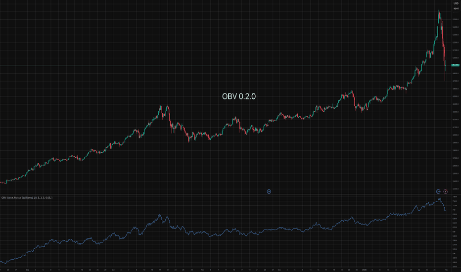
אינדיקטור

אינדיקטור
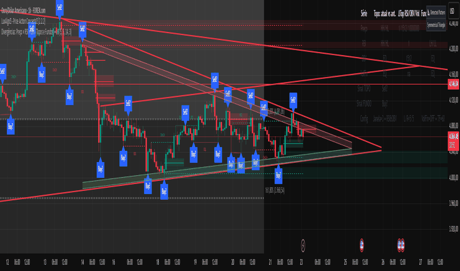
CMF, RSI, CCI, MACD, OBV, Fisher, Stoch RSI, ADX (+DI/-DI)Eight normalized indicators are used in conjunction with the CMF, CCI, MACD, and Stoch RSI indicators. You can track buy and sell decisions by tracking swings. The zero line is for reversal tracking at -20, +20, +50, and +80. You can use any of the nine indicators individually or in combination. אינדיקטור

אינדיקטור

אינדיקטור

Nirvana True Duel전략 이름
열반의 진검승부 (영문: Nirvana True Duel)
컨셉과 철학
“열반의 진검승부”는 시장 소음은 무시하고, 확실할 때만 진입하는 전략입니다.
EMA 리본으로 추세 방향을 확인하고, 볼린저 밴드 수축/확장으로 변동성 돌파를 포착하며, OBV로 거래량 확인을 통해 가짜 돌파를 필터링합니다.
전략 로직
매수 조건 (롱)
20EMA > 50EMA (상승 추세)
밴드폭 수축 후 확장 시작
종가가 상단 밴드 돌파
OBV 상승 흐름 유지
매도 조건 (숏)
20EMA < 50EMA (하락 추세)
밴드폭 수축 후 확장 시작
종가가 하단 밴드 이탈
OBV 하락 흐름 유지
진입·청산
손절: ATR × 1.5 배수
익절: 손절폭의 1.5~2배에서 부분 청산
시간 청산: 설정한 최대 보유 봉수 초과 시 강제 청산
장점
✅ 추세·변동성·거래량 3중 필터 → 노이즈 최소화
✅ 백테스트·알람 지원 → 기계적 매매 가능
✅ 5분/15분 차트에 적합 → 단타/스윙 트레이딩 활용 가능
주의점
⚠ 횡보장에서는 신호가 적거나 실패 가능
⚠ 수수료·슬리피지 고려 필요
📜 Nirvana True Duel — Strategy Description (English)
Name:
Nirvana True Duel (a.k.a. Nirvana Cross)
Concept & Philosophy
The “Nirvana True Duel” strategy focuses on trading only meaningful breakouts and avoiding unnecessary noise.
Nirvana: A calm, patient state — waiting for the right opportunity without emotional trading.
True Duel: When the signal appears, enter decisively and let the market reveal the outcome.
In short: “Ignore market noise, trade only high-probability breakouts.”
🧩 Strategy Components
Trend Filter (EMA Ribbon): Stay aligned with the main market trend.
Volatility Squeeze (Bollinger Band): Detect volatility contraction & expansion to catch explosive moves early.
Volume Confirmation (OBV): Filter out false breakouts by confirming with volume flow.
⚔️ Entry & Exit Conditions
Long Setup:
20 EMA > 50 EMA (uptrend)
BB width breaks out from recent squeeze
Close > Upper Bollinger Band
OBV shows positive flow
Short Setup:
20 EMA < 50 EMA (downtrend)
BB width breaks out from recent squeeze
Close < Lower Bollinger Band
OBV shows negative flow
Risk Management:
Stop Loss: ATR × 1.5 below/above entry
Take Profit: 1.5–2× stop distance, partial take-profit allowed
Time Stop: Automatically closes after max bars held (e.g. 8h on 5m chart)
✅ Strengths
Triple Filtering: Trend + Volatility + Volume → fewer false signals
Mechanical & Backtestable: Ideal for objective trading & performance validation
Adaptable: Works well on Bitcoin, Nasdaq futures, and other high-volatility markets (5m/15m)
⚠️ Things to Note
Low signal frequency or higher failure rate in sideways/range markets
Commission & slippage should be factored in, especially on lower timeframes
ATR multiplier and R:R ratio should be optimized per asset
אסטרטגייה

Bias + VWAP Pullback — v4 (PA + BOS/CHOCH)Simple idea: I identify the trend (bias) from the larger timeframe, and only trade pullbacks to the VWAP/EMA during liquidity (London/New York). When the trend is clear, gold moves strongly, and its pullbacks to the balance lines provide clear opportunities.
Timeframe and Sessions (Cairo Time)
Analysis: H1 to determine the trend.
Implementation: 5m (or 1m if professional).
Trading window:
London Opening: 10:00–12:30
New York Opening: 16:30–19:00
(avoid the rest of the day unless there is exceptional traffic).
Direction determination (BIAS)
On H1:
If the price is above the 200 EMA and the daily VWAP is bullish and the price is above it → uptrend (long-only).
If the price is below the 200 EMA and the daily VWAP is bearish and the price is below it → bearish trend (short-only).
Determine your levels: yesterday's high/low (PDH/PDL) + approximate Asia range (03:00–09:30).
Entry Rules (Setup A: Trend Continuation)
Asia range breakout towards Bias during liquidity window.
Wait for a withdrawal to:
Daily VWAP, or
EMA50 on 5m frame (best if both cross).
Confirmation: Confirmation low/high on 5m (HL buy/LH sell) + clear impulse candle (Body is greater than average of last 10 candles).
Entry:
Buy: When the price returns above VWAP/EMA50 with a confirmation candle close.
Sell: The exact opposite.
Stop Loss (SL): Below/above the last confirmation low/high or ATR(14, 5m) x 1.5 (largest).
Objectives:
TP1 = 1R (Close 50% and move the rest Break-even).
TP2 = 2.5R to 3R or at an important HTF level (PDH/PDL/Bid/Demand Zone).
Entry Rules (Setup B: Reversion to VWAP – “Mean Reversion”)
Use with extreme caution, once daily maximum:
Price deviation from VWAP by more than ~1.5 x ATR(14, 5m) with rejection candles appearing near PDH/PDL.
Reverse entry towards the return of VWAP.
SL small behind rejection top/bottom.
Main target: VWAP. (Don't get greedy — this scenario is for extended periods only.)
News Filtering and Risk Management
Avoid trading 15–30 minutes before/after strong US news (CPI, NFP, FOMC).
Maximum daily loss: 1.5–2% of account balance.
Risk per trade: 0.25–0.5% (if you are learning) or 0.5–1% (if you are experienced).
Do not exceed two consecutive losing trades per day.
Don't chase the market after the opportunity has passed — wait for the next pullback.
Smart Deal Management
After TP1: Move stop to entry point + trail the rest with EMA20 on 5m or ATR Trailing = ATR(14)×1.0.
If the price touches a strong daily level (PDH/PDL) and fails to break, consider taking additional profit.
If VWAP starts to flatten and breaks against the trend on H1, stop trading for the day.
Quick Checklist (Before Entry)
H1 trend is clear and consistent with 200EMA + VWAP.
Penetrating the Asia range towards Bias.
Clean pull to VWAP/EMA50 on 5m.
Confirmation candle and real push.
SL is logical (behind swing/ATR×1.5) and R :R ≥ 1:2.
No red news coming soon.
Example of "ready-made" settings
EMA: 20, 50, 200 on 5m, 200 only on H1.
VWAP: Daily (reset daily).
ATR: 14 on 5m.
Levels: PDH/PDL + Asia Band (03:00–09:30 Cairo).
Gold Notes
Gold is fast and sharp at the open; don't get in early — wait for the draw.
Fakeouts are common before news: it is best to call with the trend after the price returns above/below VWAP.
Don't expect 80% consistent wins every day — the advantage comes from discipline, filtering out bad days, and only withdrawing when you're on the right track.
تعتبر شركة الماسة الألمانية أحد المؤسسات العاملة بالمملكة العربية السعودية ولها تاريخ طويل من الخدمات الكثيرة والمتنوعة التى مازالت تقدمها للكثير من العملاء داخل جميع مدن وأحياء المملكة حيث نقدم أفضل ما لدينا من خلال مجموعة الشركات التالية والتي من خلالها ستتلقي كل ما تحتاج إلية في كل المجال المختلفة فنحن نعمل منذ عام 2015 ولنا سابقات اعمال فى مختلف المجالات الحيوية التى نخدم من خلالها عملائنا ونوفر لهم أرخص الأسعار وبأعلى جودة من الممكن توفرها فى المجالات التالية :-
خدمات تنظيف المنازل والفلل والشقق
خدمات عزل الخزانات تنظيف غسيل صيانة اصلاح
خدمات جلي البلاط والرخام والسيراميك
خدمات نقل العفش عمالة فلبينية مدربة
خدمات مكافحة الحشرات بجدة
كل هذة الخدمات وأكثر نوفرها لكل المتعاقدين بأفضل الطرق مع توفير خطط وبرامج متنوعة لأتمام العمل المسنود إلينا بأفضل وأحدث الطرق الحديثة والعصرية سواء فى شركات النظافة بجدة ومكة المكرمة أو شركات نقل العفش بجدة عمالة فلبينية وباقى الخدمات مثل جلي وتلميع الرخام بمكة وجدة ولا ننسي شركة مكافحة حشرات بجدة التى ساعدت آلاف المواطنين على تنظيف منازلهم من الحشرات بأفضل مبيدات حشرية. אינדיקטור