Trendline X-RAY
TRENDLINE X-RAY — Multi-Timeframe Wedges & Channels
Most automatic trendline indicators answer a limited question:
“Which two pivots can be connected?”
TRENDLINE X-RAY asks a much more useful question:
"Which multi-timeframe structures are sufficiently well supported to deserve attention?”
Rather than placing arbitrary lines between isolated highs and lows, TRENDLINE X-RAY analyzes wedge and channel geometry across four structural timeframes simultaneously. It evaluates competing structures, scores their quality, and projects the strongest qualifying boundaries onto one chart.
The result is a systematic top-down view of the market’s structural landscape—without repeatedly switching between charts or manually drawing dozens of trendlines.
Why this is more powerful than random trendlines
Almost any two pivots can produce a trendline. That does not make the line meaningful.
A randomly selected trendline may:
Depend on one convenient pair of pivots
Ignore violations between its anchors
Represent only one side of the market
Lack balanced support from the opposite boundary
Be too narrow, too old, or structurally immature
Look convincing only because it was drawn after the move occurred
TRENDLINE X-RAY is designed to reduce that subjectivity.
Instead of treating every possible line equally, its structure engine evaluates complete bilateral formations. Upper and lower boundaries are considered together as a wedge or channel, then measured using several structural criteria:
Boundary touches
Touch spacing
Balance between upper and lower validation
Price violations
Structural span
Width relative to volatility
Anchor recency
Valid convergence and boundary ordering
The indicator compares eligible structures and displays the strongest qualifying geometry for each active timeframe.
This does not mean every projected boundary will hold. It means the displayed lines have passed a consistent structural evaluation instead of being selected arbitrarily.
Multi-timeframe structure on one chart
Markets rarely respond to only one timeframe.
A 5-minute chart may appear to be approaching resistance while the 1-hour chart is near support. A minor intraday breakout may be heading directly into a major 4-hour boundary. Two different timeframes may also identify nearly the same structural area, creating potential confluence.
TRENDLINE X-RAY makes those relationships visible by projecting four independently calculated timeframe structures onto the active chart.
Each slot has its own:
Timeframe
Color
Line width
Line style
Visibility control
Structure-quality reading
This allows traders to distinguish immediate price structure from the larger geometry surrounding it.
Purpose-built analysis modes
TRENDLINE X-RAY includes several top-down presets:
Swing
Weekly
Daily
4-hour
1-hour
Intraday
4-hour
1-hour
30-minute
15-minute
Day Trade
1-hour
30-minute
15-minute
5-minute
Scalp
30-minute
15-minute
5-minute
1-minute
Custom
Four independently selectable timeframes
Changing modes automatically updates the structural hierarchy. Individual slots can still be hidden when a cleaner chart is preferred.
The Structure Quality dashboard
The dashboard provides a compact summary of the active analysis:
Timeframe
Structure Quality
Structure Type
Selected Mode
Structure Quality measures how well the detected formation satisfies the indicator’s structural criteria. It is based on characteristics such as touch validation, balance, violations, span, width, and recency.
A higher score represents stronger structural validation within the model.
It is important to understand what the score does—and does not—mean:
It measures the quality of the detected geometry. It is not directional, and it is not a predicted win rate.
The dashboard can be positioned in nine locations:
Top left, center, or right
Middle left, center, or right
Bottom left, center, or right
Designed as a companion to Automatic Wedge & Channel Detector
TRENDLINE X-RAY was designed to work alongside my "Automatic Wedge & Channel Detector (AWCD)".
The two indicators serve related but different purposes.
Automatic Wedge & Channel Detector answers:
What is the primary wedge or channel governing the chart I am currently trading?
AWCD is the focused execution-chart tool. It identifies the active formation, highlights its boundaries, and helps distinguish actionable edges from the gray middle of the structure.
TRENDLINE X-RAY answers:
What important structures exist above and around my current chart timeframe?
TRENDLINE X-RAY is the top-down context tool. It projects multiple structural layers onto one chart so traders can see whether an AWCD boundary is isolated, supported by a higher-timeframe structure, or approaching conflicting geometry.
Together, they create a structure-first workflow:
TRENDLINE X-RAY identifies the larger structural landscape.
AWCD defines the active execution structure.
Multi-timeframe confluence highlights potentially important locations.
Price action determines whether the boundary holds, breaks, or accepts beyond it.
For example, a lower AWCD boundary becomes more noteworthy when it overlaps a rising 1-hour or 4-hour TRENDLINE X-RAY boundary. Likewise, an AWCD breakout deserves additional caution when it runs directly into higher-timeframe resistance.
TRENDLINE X-RAY is therefore not intended to replace AWCD. It expands AWCD’s structural context.
Practical applications
TRENDLINE X-RAY can be used to:
Conduct top-down analysis without changing charts
Identify higher-timeframe support and resistance
Find multi-timeframe boundary confluence
Recognize when price is trapped between conflicting structures
Avoid entries in structurally poor locations
Evaluate breakout destination and obstruction risk
Compare short-term setups with larger market geometry
Add structural context to opening-range breakouts
Separate execution structure from higher-timeframe context
The indicator is especially useful when asking:
Is price at the edge or in the middle of meaningful structure?
Does a lower-timeframe boundary agree with the higher timeframe?
Is this breakout moving into open space or another major line?
Which structural layer is most likely to matter next?
Is the current formation well validated or relatively weak?
Recommended workflow
TRENDLINE X-RAY is best used as a location and context tool—not as a standalone entry generator.
A practical process is:
Select the mode that matches the intended holding period.
Identify the nearest higher-timeframe boundaries.
Look for agreement between multiple structural layers.
Use AWCD to evaluate the active execution structure.
Wait for price to demonstrate rejection, acceptance, breakout, or retest behavior.
Manage risk independently using predefined invalidation levels.
The strongest use case is not simply:
“Price touched a line.”
It is:
“Price reached a systematically validated structural area, multiple timeframes agree, and price action confirmed the reaction.”
Important limitations
TRENDLINE X-RAY is an analytical tool, not a predictive system.
Trendlines and structural classifications can change as new pivots form.
A high-quality structure can still break.
Lower-timeframe formations are generally more sensitive to market noise.
Different timeframes may produce conflicting information.
Projected lines should not be interpreted as guaranteed reversal levels.
Quality scores do not represent probabilities or historical win rates.
The indicator does not replace risk management or independent analysis.
All calculations are based on historical price structure. Use the indicator to organize market geometry, identify potentially meaningful locations, and improve contextual awareness—not to assume certainty.
TRENDLINE X-RAY transforms trendline analysis from a collection of arbitrary lines into a structured, multi-timeframe decision framework.
AWCD shows the structure you are trading.
TRENDLINE X-RAY shows the structural world surrounding it.
אינדיקטור

Entry TerminalEntry Terminal — Market Structure, FVG & Liquidity Suite
Entry Terminal is a multi-component market structure and execution framework. It combines confirmed structure shifts, liquidity levels, rejected blocks, FVG/IFVG zones, Fibonacci projections, ATR boundaries, higher-timeframe reference levels, and contextual momentum data.
Main Features
Confirmed CHoCH and directional BOS structure detection.
Live BLVL candidates classified as Trend Continuation or Potential CHoCH.
Bullish and bearish Rejected Block detection using wick percentage and ATR filters.
Rejected Block retest tracking.
FVG, Breaker and IFVG detection with configurable mitigation rules.
FVG overlap filtering, midpoint visualization, raids, and directional filtering.
Structured execution sequence:
CHoCH → Rejected Block → RB Retest → BOS/FVG → Final FVG Retest
Optional BUY/SELL labels after the complete sequence.
Previous-regime HH/LL liquidity targets.
Optional 0.5 ATR target zones above HH and below LL.
Two-pivot liquidity trend lines with confirmed break markers.
CHoCH-based ATR High/Low boundaries.
ATR boundary breaks classified as MATCH or COUNTER relative to the CHoCH direction.
CHoCH-based one-way ATR trailing line.
Fibonacci Entry Box, reaction zones, and dynamic expansion zones.
Selected higher-timeframe Opening Price.
Previous HTF High/Low lines originating from their exact wick candles.
HTF levels freeze when first touched.
Dashboard with:
USDT Dominance correlation and structure
Risk-On/Risk-Off context
DI+ and DI−
ADX
Momentum
Elder Force Index
Optional VWAP, SMA, EMA, and WMA overlays.
Individual and combined alerts for major events.
Suggested Entry Workflow
Long Setup
Wait for a confirmed bullish CHoCH.
Observe whether the ATR High breaks with a MATCH result.
Wait for a bullish Rejected Block to form and receive a valid retest.
Require a bullish BOS and bullish FVG association.
Consider entry when price returns to the final bullish FVG and the indicator prints BUY.
Use the Entry Box, HTF opening price, USDT.D context, and dashboard readings as additional context—not mandatory signals.
Short Setup
Wait for a confirmed bearish CHoCH.
Observe whether the ATR Low breaks with a MATCH result.
Wait for a bearish Rejected Block to form and receive a valid retest.
Require a bearish BOS and bearish FVG association.
Consider entry when price returns to the final bearish FVG and the indicator prints SELL.
Evaluate the HTF opening price, PH/PL levels, USDT.D structure, and dashboard conditions before execution.
Risk and Target Framework
Potential invalidation may be placed beyond the Rejected Block, final FVG, or relevant swing.
Potential targets include HH/LL liquidity, ATR target boxes, HTF previous levels, and Fibonacci reaction zones.
Position size should be calculated from the invalidation distance.
Avoid risking a fixed position size without accounting for volatility.
Dashboard values are contextual and should not be treated as mandatory filters.
Important Behavior
Pivot-based structures require right-side confirmation and therefore appear after the pivot is confirmed.
Primary structural events and execution signals are confirmed on closed bars.
This is an indicator, not an automated strategy, and it does not place or manage orders.
Users should independently test all settings for their symbol, timeframe, fees, and execution conditions.
Disclaimer
This script is provided for educational and informational purposes only. It does not constitute financial, investment, or trading advice. No indicator can predict market movements or eliminate the risk of loss. Even high-quality setups may fail or be stopped out. Always perform your own research, use appropriate risk management, and consult a qualified financial professional where necessary. The author assumes no responsibility for trading decisions, losses, or damages resulting from the use of this script. אינדיקטור

Pivot Channel TrendLines [BigBeluga]🔵 OVERVIEW
The Pivot Channel TrendLines is an advanced technical analysis indicator designed by BigBeluga to automatically map structural pivot points, project dynamic trendline channels, and track directional breakout signals directly on the chart. Traditional manual trendline drawing is often subjective and time-consuming, while standard indicators fail to account for slope progression and volatility filters. To solve this limitation, this script combines an automated pivot detection engine with ATR-filtered extension lines and real-time breakout triggers.
The indicator visualizes key market highs and lows, dotted projection channels, and directional signals. The core calculations identify confirmed pivot extremes using configurable lookback periods, compute slope values between successive pivots, and filter out insignificant structures using Average True Range thresholds. Customizable color palettes, line styles, and extension lengths allow traders to fine-tune the geometric mappings across various asset classes and timeframes.
🔵 HOW IT WORKS
The system operates through an integrated architecture where each component dynamically influences chart behavior:
1 — Automated Pivot Detection Engine
Lookback Scanning: Evaluates bar ranges using user-defined lookback criteria to identify significant swing highs and lows.
ATR Filtering: Compares successive pivot price differentials against Average True Range thresholds to ensure only meaningful structural shifts generate active channels.
2 — Dynamic Trendline Projection & Channels
Confirmed Trendlines: Connects historical pivot points with solid boundary lines to map ongoing trend channels.
Dotted Extensions: Projects sloping extension lines forward by a user-defined bar length to monitor future support and resistance interactions.
3 — Directional Breakout & Price Dash System
Breakout Triggers: Monitors active extension lines in real time, plotting directional labels ("Up" or "Down") whenever price closes beyond expected threshold boundaries.
Last Pivot Dashes: Renders customizable horizontal dashed or dotted lines alongside precise price level tags for the latest identified high and low pivots.
🔵 HOW TO USE
Apart from serving as an automated structural mapping tool, the indicator can be applied in several ways:
Identify Trend Channels: Follow the solid and dotted trendlines connecting major pivot highs and lows to track prevailing market direction and channel boundaries.
Catch Structural Breakouts: Monitor the chart for Up or Down directional labels indicating when price has successfully broken through active projected extension lines.
Track Recent Reference Prices: Use the last pivot price dashes to quickly reference key support and resistance boundaries established by the most recent market swings.
🔵 NOTES
Why this implementation is unique:
It automates complex pivot channel mapping and slope projections directly on the chart.
Features integrated ATR volatility filters to eliminate insignificant structural noise.
Fully optimized for high-performance rendering under Pine Script version 6 standards.
אינדיקטור

EVA Ai + POC, Liquidity & Smart Money## Overview
**EVA Ai+ Volume Profile — POC, Value Area & Liquidity** is a market-structure and volume-distribution indicator designed to analyze where trading activity is concentrated across price.
Its primary purpose is to combine price-based Volume Profile information with confirmed liquidity structure in one analytical framework.
The script calculates a horizontal volume distribution, Point of Control (POC), Value Area, High-Volume Nodes (HVN), Low-Volume Nodes (LVN), directional volume estimates, and confirmed buy-side/sell-side liquidity pools.
These components are not intended to function as independent entry signals. They are combined to help answer a specific analytical question:
**Where is price currently being accepted, where is participation relatively low, and where does confirmed unswept liquidity remain in relation to that auction structure?**
The indicator does **not** generate automatic LONG or SHORT recommendations and does not execute trades.
---
## Purpose of the combined architecture
Volume Profile and liquidity analysis describe different aspects of market behavior.
Volume Profile measures how the available volume data is distributed across price.
Liquidity structure identifies confirmed areas around comparable swing highs and lows that have not yet been fully cleared according to the script's rules.
EVA combines these concepts because either one viewed in isolation can omit relevant context.
For example:
* POC and Value Area describe the center and boundaries of accepted value;
* HVNs identify local concentrations of calculated participation;
* LVNs identify comparatively low-volume regions;
* directional volume provides context about the composition of the calculated profile;
* confirmed BSL/SSL pools identify unresolved liquidity structures;
* distance and quality calculations place those structures in relation to current volatility and price.
The intended result is a single auction map showing **value, participation, low-volume structure, and confirmed liquidity context together**.
This interaction is the principal reason these components are included in one script.
---
## Volume Profile
The script distributes the available volume across horizontal price rows within the active calculation range.
The profile is intended to show where the selected market spent comparatively more or less trading activity.
### Point of Control — POC
POC is the price row containing the largest amount of calculated profile volume.
It represents the highest-volume row of the current profile calculation.
It should not be interpreted as an automatic support, resistance, entry, or reversal signal.
### Value Area
The Value Area contains the configured percentage of calculated profile volume surrounding the profile's primary volume concentration.
A commonly used setting is 70%.
The script displays:
* **VAH** — Value Area High;
* **VAL** — Value Area Low.
Price inside the Value Area indicates that it is trading within the profile's calculated value region.
Price above VAH or below VAL indicates that it is outside that region, but this condition alone does not imply continuation or reversal.
---
## HVN and LVN structure
### High-Volume Nodes — HVN
HVNs are local concentrations within the calculated profile where neighboring rows contain comparatively high volume.
They can be used to identify areas of previous acceptance or repeated participation.
Possible market behavior around an HVN can include rotation, consolidation, retesting, support/resistance behavior, or no meaningful reaction at all.
The script does not assume that an HVN must hold.
### Low-Volume Nodes — LVN
LVNs are local low-volume regions between areas of greater calculated participation.
They can highlight portions of the profile where historical acceptance was comparatively limited.
Price may sometimes traverse these areas more quickly, but an LVN does not guarantee acceleration or determine direction.
HVN and LVN structures remain components of the calculated profile and can change when the active profile range changes.
---
## Directional volume context
When lower-timeframe data is available, the script classifies lower-timeframe volume according to candle direction and aggregates that information into the profile.
The resulting values are displayed as:
* Up Volume;
* Down Volume;
* Delta.
**Delta in this indicator is the difference between the script's classified Up Volume and Down Volume.**
It is important to distinguish this from exchange-level bid/ask order-flow delta.
Pine Script does not provide the script with a complete historical exchange order book or universal historical bid/ask footprint data.
Therefore, EVA does not claim to reconstruct those datasets.
Directional volume is an approximation derived from the available lower-timeframe OHLCV data.
---
## BSL and SSL liquidity structure
The liquidity component identifies confirmed structures around comparable pivot highs and lows.
### BSL — Buy-Side Liquidity
BSL structures are created above qualifying comparable swing highs.
### SSL — Sell-Side Liquidity
SSL structures are created below qualifying comparable swing lows.
The script does not label every swing high or swing low as liquidity.
A liquidity structure requires multiple confirmed pivot observations that satisfy the script's similarity, spacing, volatility, and quality conditions.
This filtering is intended to reduce the number of insignificant structures displayed on the chart.
Liquidity terminology in this script represents a technical model based on price structure. It does not imply direct observation of hidden orders or stop orders in an exchange order book.
---
## Liquidity Quality
Each qualifying liquidity structure receives a quality value based on several measurable properties of the detected structure.
Depending on the active configuration, these properties include factors such as:
* relative volume;
* rejection characteristics;
* spacing between qualifying pivots;
* volatility-adjusted geometry.
The quality value is used for filtering and ranking detected structures.
It is a relative analytical score created by this script. It is **not a probability of a profitable trade or a prediction that a liquidity level will be reached or swept**.
---
## Liquidity states
Detected pools can move through several states.
### FRESH
The qualifying structure has been confirmed and has not yet met the script's test or sweep conditions.
### TESTED
Price has interacted with the structure according to the configured testing rules without completing the full sweep condition.
### OFF
The structure remains internally valid but falls outside the configured volatility-adjusted working radius and is therefore not displayed as an active nearby structure.
### SWEPT
Price has crossed the structure's defined far boundary.
Once this condition is confirmed, the corresponding active pool drawings are removed.
The state system prevents historical liquidity structures from remaining visually active after the script considers them resolved.
---
## Nearest structural references
The dashboard identifies nearby calculated structures such as:
* BSL;
* SSL;
* HVN;
* LVN.
Distances can be normalized using ATR so that the displayed distance is comparable across instruments with different nominal prices and volatility.
These values describe **location**, not trade expectancy.
A nearby BSL, SSL, HVN, or LVN should not be interpreted as a recommendation to enter a position.
---
## Profile modes
The script supports several ways to define the profile range.
### Visible Range
The profile is calculated from the chart region used by the script's visible-range logic.
Changing the visible chart area can therefore change the profile.
This behavior is intentional.
A Visible Range profile is dynamic and should not be interpreted as an immutable historical signal.
### Session
The profile is calculated using the selected session boundaries.
This mode can be used to examine session-specific POC, Value Area, and volume distribution.
### Fixed Range
The profile is calculated between user-defined time boundaries.
This mode can be used to inspect a specific impulse, consolidation, expansion, or other manually selected market segment.
---
## Adaptive configuration
The optional adaptive mode adjusts selected calculation parameters according to chart conditions.
Depending on configuration, this can include:
* lower-timeframe selection;
* profile row density;
* HVN/LVN sensitivity;
* pivot sensitivity;
* liquidity-zone width;
* minimum liquidity-quality threshold;
* volatility-adjusted display radius.
The purpose of this mode is to maintain usable analytical resolution across different chart timeframes and price scales.
Adaptive configuration does not optimize for future profitability and does not predict future market direction.
Users can disable adaptive behavior and use manual settings where required.
---
## Dashboard
The dashboard summarizes the current calculated state of the indicator.
Depending on the selected configuration, it can display:
### Auction
The location of current price relative to VAH, VAL, and the calculated Value Area.
### Range / Source
The active profile mode and the data source currently used by the calculation.
### Rows × Step
The effective number of price rows and the price increment represented by each row.
### Up / Down / Delta
The directional volume classification generated from the available data.
### POC / Distance
The current POC and price distance from it.
### Nearest BSL / SSL
The nearest qualifying liquidity structure together with distance, quality, and state.
### Nearest HVN / LVN
The nearest calculated high-volume and low-volume structures.
### Structure
A descriptive classification of the current volume distribution.
### Status
Information concerning the current calculation mode and available data.
The dashboard summarizes calculated information; it does not produce trading instructions.
---
## How to interpret the map
### Price inside Value Area
Price inside VAH and VAL is trading within the profile's calculated value region.
POC and HVNs can help locate concentrations of historical participation.
This does not necessarily imply a ranging market or predict that price will remain inside the Value Area.
### Price above VAH
Price above VAH is outside the upper boundary of the calculated Value Area.
Whether the move continues or returns into value depends on subsequent market behavior.
VAH alone is not a breakout confirmation.
### Price below VAL
Price below VAL is outside the lower boundary of the calculated Value Area.
VAL alone does not confirm bearish continuation.
### Interaction with an LVN
An LVN identifies a region of comparatively low calculated participation.
It can be used to observe how price behaves when entering a low-volume region, but it does not guarantee rapid movement through that area.
### Interaction with liquidity
When price reaches a BSL or SSL structure, users can observe whether the level remains active, becomes tested, or satisfies the script's sweep condition.
A sweep is a structural event only.
**A liquidity sweep does not by itself imply a reversal or continuation.**
---
## Data handling and confirmation
Where available, lower-timeframe OHLCV data is used to improve the allocation of volume within higher-timeframe chart candles.
When the requested lower-timeframe sample is unavailable or insufficient for the selected calculation, the script can use its documented fallback calculation instead of presenting an incomplete lower-timeframe profile as if it were complete.
Liquidity structures are based on confirmed pivot events.
Because a pivot requires subsequent bars for confirmation, a newly confirmed liquidity structure can appear later than the historical bar on which the pivot itself occurred.
The script does not interpret this confirmation delay as advance knowledge.
Developing profiles can change as additional data arrives.
Visible Range profiles can also change when the chart viewport changes.
These behaviors are inherent to dynamic profile calculations and should not be interpreted as historical trade signals being rewritten.
---
## Originality and design rationale
The script uses established analytical concepts such as Volume Profile, POC, Value Area, pivots, ATR normalization, and liquidity terminology.
It does not claim that those individual concepts are proprietary.
The distinctive functionality of this implementation is their integration into a unified state-based analytical system.
Instead of independently displaying several unrelated indicators, EVA:
1. builds a common price-row volume model;
2. derives POC and Value Area from that same distribution;
3. identifies local HVN/LVN structure within the profile;
4. estimates directional volume from lower-timeframe data where available;
5. independently confirms comparable pivot structures;
6. applies volatility-, geometry-, and participation-based filtering to those structures;
7. maintains lifecycle states for active liquidity pools;
8. relates nearby volume and liquidity structures to current price using a common dashboard and normalized distance model;
9. provides explicit fallback behavior when detailed source data is unavailable.
The purpose of the integration is to provide one coherent representation of **auction value, relative participation, low-volume structure, and unresolved price-based liquidity** rather than a collection of independent signals.
---
## Why the source code is protected
The source code is protected to preserve the implementation of the script's integrated profile construction, adaptive parameter logic, node-classification methods, liquidity-quality filtering, state transitions, data-fallback handling, and visualization architecture.
Closed-source visibility is not intended to prevent users from understanding the indicator's behavior.
This description therefore documents the script's purpose, inputs, main calculations, interpretation, data limitations, and expected dynamic behavior without exposing implementation-specific formulas and thresholds.
---
## Important limitations
Users should understand the following limitations before using the indicator:
* The script only has access to data supplied to Pine Script by TradingView and the active symbol's data provider.
* Volume characteristics differ between markets and symbols.
* On some Forex instruments, the available volume can represent tick volume rather than centralized exchange volume.
* The script does not have access to a complete historical exchange order book.
* It does not know the location of actual individual traders' stop orders.
* BSL and SSL are price-structure models, not observations of hidden orders.
* Directional volume is derived from available candle data and is not equivalent to true exchange bid/ask footprint delta.
* Confirmed pivots necessarily introduce confirmation delay.
* Visible Range calculations can change when the chart viewport changes.
* Developing profiles can change as new bars or intrabars become available.
* HVNs, LVNs, POC, VAH, VAL, BSL, and SSL do not predict future price behavior.
* No individual component should be interpreted as a guaranteed support, resistance, breakout, reversal, entry, or target.
* Different symbols, sessions, timeframes, and data feeds can produce materially different profile structures.
---
## Intended use
EVA is intended as a **market-reading and contextual-analysis tool**.
A typical workflow is:
1. identify the current Value Area and POC;
2. inspect the shape of the volume distribution;
3. locate nearby HVN and LVN structures;
4. identify confirmed active BSL and SSL structures;
5. compare those structures with current price and volatility;
6. observe subsequent price and volume behavior;
7. perform an independent trade and risk assessment.
The indicator deliberately does not convert this information into automatic LONG or SHORT instructions.
---
## Risk disclosure
This script is an analytical indicator and does not execute orders.
It does not provide financial advice, guarantee trading outcomes, or predict future market behavior.
Historical structures and previous market reactions do not establish how price will behave in the future.
Users remain responsible for independent analysis, position sizing, execution decisions, and risk management.
אינדיקטור

Auto Trendlines [AFD]Traders!
If this draws fewer lines than the last auto-trendline script you tried, that is not a bug.
Almost every free entrant in this category will connect any two points and call the result a trendline, including points price has already traded straight through. This one will not draw that line at all.
WHAT IT DOES
Two confirmed same-side pivots define a diagonal line - two swing highs for a descending line, two swing lows for an ascending one. Before it is drawn, the pair has to pass four checks, all required:
Same side. Never one high paired with one low.
Progressive. The second pivot has to be lower than the first on a descending line, higher on an ascending one.
No pierce. No bar between the two anchors may have traded through the line.
Still intact now. No bar since the second anchor may have violated it either.
The third check is the one almost everyone in this category skips, and the fourth closes the gap right behind it - a pivot needs time to confirm, so without the fourth check a line could pass the first three and still be dead on arrival, already traded through in the bars since its own anchor. Of every pair that clears all four, the one nearest current price is the one drawn.
It keeps three lines per side by default - one at your Swing Strength setting, and two more at longer multiples of it - so a short, a medium and a long trendline can all be live on the same side at once, each resting on a different swing rather than three readings of the same one.
HOW A LINE LIVES AND DIES
A live line is maintained, not redrawn - its right edge follows price, and its label counts how many bars have touched it within your tolerance. It is retired, dimmed and kept on the chart, never silently deleted, for exactly one of two reasons: price violated it, or its anchor aged past your Bars to Apply setting. A retired line's colour, width and style are yours to set - the defaults reproduce a plain grey dotted line, but a violated line and an aged-out line both use the same styling, because both are "no longer live" and neither claims anything about what happens next.
When a side has nothing to show, an optional note names the refusal directly instead of leaving a blank chart that reads as broken - something like "No valid ascending line - recent pivot pairs failed the validity rule." It disappears the moment a line forms on that side.
THE TWO ALERTS
One alert per side, on one event: a line was violated and retired, on the bar that just closed. That is the whole alert surface.
It does not fire on a developing bar - only once a bar closes.
It does not fire when a line is retired for age. An aged line was not violated, and an alert saying it was would be a false statement about your chart.
It does not tell you what to do next. It names the event and points at the settings that produced it.
There is no alert for a line forming, for a touch, or for price approaching a line.
SETTINGS WORTH KNOWING FIRST
Swing Strength sets how many bars either side of a pivot must confirm it - higher means steadier, later pivots; lower means more of them, sooner and noisier. Pivots Searched sets how many recent pivots each length keeps in its pool to test pairs from. Pierce Tolerance and Touch Tolerance are both a multiple of ATR: Pierce is how far price may travel through a line before it counts as pierced or violated, and Touch is the separate band used only for counting touches. Bars to Apply bounds how old a line's anchor may get before it ages out - 0 means no limit.
Minimum Touches is worth reading twice, because it does not do what it sounds like. Requiring touches before a line can be drawn does not find a better line - it defers the same line's appearance into a later, shorter-lived part of its own life, since touches accrue before the line is drawn, not after. What it actually buys is recency: the lines that survive it are the ones price is currently working on.
Label position offers "Right of line" (default, floats along the line's own slope) or "Below, centered" (sits directly under the line's tip). Either way the label is a plain box with no pointer.
WHAT IT WILL NOT DO
It is not a signal tool. It does not grade a line's strength, does not rank one line against another, and does not name a target, a breakout, or a bounce - each of those is a claim about the bar after the one that just closed, and this script has no view on that. A touch count is a count of what already happened, shown with the tolerance that produced it, nothing more.
WHAT IS DISCLOSED RATHER THAN HIDDEN
A line appears late by design - its anchors are confirmed pivots, so a line shows up Swing Strength bars after the bar that anchors it. That lag is the price of not drawing lines that vanish a bar later.
Whether this script repaints has not been observed on a replay and is not claimed here either way. Its behaviour on a logarithmic price scale is likewise unobserved and unclaimed.
Zero request.*() calls of any kind - every calculation reads the chart's own series.
Open source under the Mozilla Public License 2.0. אינדיקטור

Gravity Bands [JOAT] Price orbits value. An anchored VWAP core with true volume-weighted deviation shells, on clean monochrome candles.
◆ WHAT IT IS
Gravity Bands treats fair value as a gravity core that price orbits and keeps returning to. The core is an anchored VWAP , and the bands around it are true volume-weighted standard deviations — not simple percentage or ATR envelopes. A signature "Lunar Mono" candle mode repaints the chart in clean white/grey so the gravity field is the only color on screen. It is a pure context tool with no buy/sell signals.
This is 100% original code, written from scratch. It is not a repackaged VWAP or bands script.
◆ HOW IT WORKS
1. The gravity core. A volume-weighted average price is accumulated from a chosen anchor — Session, Week or Month — resetting each new period. This is the center of value that price gravitates toward.
2. Volume-weighted shells. The bands are computed from the volume-weighted variance of price around the core, giving genuine ±1σ, ±2σ and ±3σ deviation shells. Because they are volume-weighted, the shells reflect where real activity occurred, not just where price ranged.
3. Stretch. The core distance is expressed in sigma — how many standard deviations price has escaped value. Small stretch means price is orbiting fair value; large stretch means it is extended and statistically stretched from the mean.
4. Lunar Mono candles. An optional mode repaints candles in white (up) and slate grey (down) so the colored gravity field reads instantly without competing with candle colors — the signature look of this tool.
◆ WHAT YOU SEE
• The gravity core (anchored VWAP) with a soft ±1σ / ±2σ / ±3σ gravity field
• Optional Lunar Mono monochrome candles
• An extreme-stretch background wash when price escapes the outer shell
• A resizable dashboard showing the core value, the stretch state and an orbit gauge, the upper and lower shell prices, the 1σ width in price and as a percent, the anchor mode, and a volume-feed check
◆ HOW TO USE IT
• Treat the core as the day's (or week's/month's) fair value — a magnet price often reverts to.
• Use the shells as objective stretch zones: reaching ±2σ or ±3σ marks a statistically extended condition where mean-reversion or exhaustion becomes more likely.
• Reclaiming or losing the core is a simple bias flip .
• Match the anchor to your horizon — Session for intraday, Week/Month for swing context.
• Requires a symbol with a real volume feed.
◆ NOTES & LIMITATIONS
Gravity Bands needs a genuine volume feed — without one the core approximates price and the shells lose meaning (the dashboard flags this). Deviation shells describe statistical stretch, not direction: price can stay extended in a strong trend. It is a context tool, not financial advice. Use it with your own method and risk management.
— made with passion by officialjackofalltrade
אינדיקטור

Pressure Transfer ZoneMany reversal indicators tell you when a market looks stretched. Pressure Transfer Zone asks a harder question: when price returns to the extreme, can the side that drove it there still make meaningful progress?
This indicator was built to identify a specific form of failed continuation. It waits for a strong directional drive, a real retreat, and then a second attempt at the extreme. If that second attempt makes little progress and closes with clear rejection, the script freezes the structure into a decision zone. From there, price must prove that control has actually transferred before a signal is confirmed.
The goal is not to call every top or bottom. The goal is to isolate the moments when a mature move may be losing control, show that process directly on the chart, and give the trader clear confirmation and invalidation levels.
WHO IT IS FOR
Pressure Transfer Zone is designed for intraday, swing, and position traders who use price action and want a more disciplined way to evaluate exhaustion, failed breakouts, failed continuation, and early reversals.
It is designed for liquid stocks, futures, forex, and cryptocurrency on standard candlestick charts. The engine does not run on Heikin Ashi, Renko, or other synthetic chart types because their prices can distort the structure being measured.
THE IDEA BEHIND IT
A strong trend does not end simply because price is overbought, oversold, or extended. Strong moves can remain extended for a long time. What matters is whether the original side can still produce results when it gets another opportunity.
The pattern develops in five stages:
1. A mature directional drive establishes real displacement.
2. Price makes a meaningful retreat away from the extreme.
3. The original side returns for a second attempt.
4. That second attempt produces limited progress and a weaker close.
5. Price confirms the transfer with a qualified break of the selected boundary or, in Sniper mode, with that break followed by a successful first retest.
This is an effort-versus-result test expressed entirely through price. The script does not claim to measure order flow, bid/ask delta, institutional activity, hidden liquidity, or volume pressure.
HOW THE MATHEMATICS WORKS
The first filter is directional efficiency:
Directional efficiency = net directional change / total absolute bar-to-bar movement
A clean drive that travels mostly in one direction receives a higher score. A noisy move that covers a lot of distance but makes little net progress receives a lower score.
The selected Source is used for net displacement and path efficiency. The zone itself is always built from confirmed OHLC prices.
The drive must also meet volatility, range, closing-location, and local-extreme requirements. Under the default pace profiles, it must:
* Produce at least 1.25 ATR of net directional displacement.
* Span at least 2.00 to 2.50 ATR, depending on the selected pace.
* Meet a directional-efficiency threshold of 0.40 to 0.48.
* Close in the outer 28% of the drive range.
* Create a fresh local extreme.
ATR is measured with a 14-bar lookback and frozen when the sequence begins. This prevents later volatility changes from moving the event’s established thresholds.
The retreat must travel at least the greater of 0.55 ATR or 18% of the original drive range, and the closing price must confirm that full retreat distance.
When price returns to the extreme, the second attempt must show deterioration. By default:
* Price must return to within the greater of 0.30 ATR or 8% of the original drive range from the first extreme.
* New progress beyond the first extreme cannot exceed 0.20 ATR.
* The second push cannot exceed 72% of the original drive range.
* The close must migrate away from the first attempt by at least 0.10 ATR.
* Rejection must equal at least the greater of 0.25 ATR or 25% of the developing zone.
* The rejection bar must close within the directional outer 45% of its range.
* The completed zone cannot exceed 60% of the original drive range.
Together, these filters are intended to remove many one-candle reactions, shallow pauses, and weak two-test formations. The model wants to see a legitimate first drive, real separation between attempts, and measurable deterioration on the return.
THE ZONE
Once the second attempt qualifies, the structure is armed and its levels are frozen:
* Outer edge: the most extreme price reached by the two attempts.
* Inner edge: the counter-extreme formed between the two attempts.
* Midpoint: the halfway point of the zone.
* Invalidation: 0.15 ATR beyond the outer edge in the direction of the original move.
For a bullish setup, price must transfer upward after a mature downward drive. For a bearish setup, price must transfer downward after a mature upward drive.
Invalidation requires a confirmed close beyond the buffered outer edge. The invalidation level is structural information, not an automatic stop-loss recommendation.
ENTRY TIMING
Early
Confirms on a qualified close through the zone midpoint. This is the fastest mode and can trigger on the same confirmed bar that arms the zone. It offers earlier recognition with a greater risk of false starts.
Balanced
Confirms on a later qualified close beyond the structural inner edge. Balanced is the default middle ground between earlier recognition and additional structural confirmation.
Sniper
Requires a qualified break of the inner edge followed by the first later retest of that level. The retest must remain shallow and close back in the transfer direction. The first retest decides the setup; a failed first retest cannot become a signal later.
The breakout candle must move in the transfer direction, span at least 0.35 ATR, have a real body covering at least 45% of its range, close within the directional outer 32% of the candle, and finish no more than 0.45 ATR beyond the selected boundary. The final limit is an anti-chase filter.
A valid Sniper retest must stay within 15% of the frozen zone depth, close at least 0.05 ATR back beyond the inner edge, have a directional body covering at least 35% of the candle, and close within the directional outer 40% of its range.
HOW TO READ THE CHART
With the default color palette:
* Amber: the pattern is still developing. It is information, not an entry signal.
* Violet: the structure is complete, armed, and waiting for confirmation.
* Cyan: the action area between the midpoint and inner edge.
* Green: a bullish pressure transfer has been confirmed.
* Red: a bearish pressure transfer has been confirmed.
* Faint gray: an armed setup failed, expired, or was invalidated.
The right-edge label shows the current phase and the next required action. Once the structure is armed, it also displays the confirmation boundary and invalidation price. A diamond appears only when the selected timing mode produces a confirmed trigger.
When Keep Recent Resolved Zones is enabled, the script retains a limited number of recent successful and failed zones. The default is eight, adjustable from one to twelve, so failures remain visible without overwhelming the chart.
PRACTICAL USE
1. Treat an amber zone as a developing idea, not permission to trade.
2. When the zone turns violet, note its direction, confirmation boundary, and invalidation price.
3. Wait for the exact requirement of Early, Balanced, or Sniper mode.
4. Use the broader trend, nearby support and resistance, liquidity, session conditions, and scheduled news as separate context.
5. Apply your own position sizing, stop placement, targets, and trade-management rules.
ADAPTIVE PACE
Auto mode adjusts the engine according to the chart timeframe:
* Fast: 15-minute charts and below.
* Swing: above 15 minutes through 4 hours.
* Position: above 4 hours.
Fast, Swing, and Position can also be selected manually. The selected pace changes the drive and local-extreme lookbacks, minimum drive size, efficiency threshold, formation lifetime, armed lifetime, and Sniper retest window. It does not change the meaning of the pattern.
ALERTS
The indicator includes five alerts:
* Long Zone Armed
* Short Zone Armed
* Long Pressure Transfer
* Short Pressure Transfer
* Pressure Transfer Invalidated
Create alerts using Once Per Bar Close.
Trigger alerts and chart diamonds use the same confirmed-bar event. If an Early setup resolves on the same bar it arms, the temporary armed alert is suppressed so users do not receive a stale or redundant notification.
CONFIRMED-BAR DESIGN
Actionable signals are confirmed only after the chart bar closes. They are not backdated and do not use future data, pivot backpainting, negative offsets, higher-timeframe requests, or lookahead logic.
Amber developing zones are intentionally provisional and can change or disappear because the pattern is not complete. Once a zone turns violet, its structural prices and invalidation level are frozen for that event.
LIMITATIONS
Pressure Transfer Zone identifies structural-exhaustion candidates, not guaranteed reversals. It tracks one active sequence at a time and can miss fast V-shaped turns that never form two separate attempts.
Strong trends can repeatedly invalidate countertrend setups. Thin markets, price gaps, news shocks, and irregular sessions can also reduce the usefulness of ATR-based thresholds.
This is an indicator, not a strategy. It does not place orders, calculate position size, set profit targets, or claim a win rate. Its job is narrower: determine whether the original directional side returned to the extreme, failed to produce enough additional progress, and then met the model’s confirmation rule at a clearly defined price.
אינדיקטור

HH/LL Trendlines [twr]Automatically detects swing structure (HH/HL/LH/LL) using pivot highs/lows, labels each swing point, and — the key feature — draws trendlines connecting same-type consecutive pivots: LH→LH on the high side, HL→HL on the low side. This visualizes the two "structure lines" traders watch for trend continuation and potential breaks.
How it works
Pivot detection & classification
Uses ta.pivothigh()/ta.pivotlow() with a user-defined Swing Length (fractal-style, symmetric lookback/lookforward)
Each new swing high is compared to the prior swing high: higher → labeled HH (bullish, green), lower → labeled LH (bearish, red)
Each new swing low is compared to the prior swing low: lower → labeled LL (bearish, red), higher → labeled HL (bullish, green)
First pivot on each side gets a neutral "x" label since there's nothing to compare against yet
Trendline logic
Only connects pivots of the same classification — so a LH connects to the previous LH (skipping over any HH in between), and a HL connects to the previous HL. This produces clean descending-resistance / ascending-support structure lines rather than zigzagging between every pivot.
Lines are capped per side (Max Trend Lines Shown) using an array-based pool with oldest-first trimming, so the chart doesn't get cluttered over time
Live projection
If Project Lines Forward is enabled, each line's slope is recalculated every bar and extended to the current bar (getProjectedY()), so the structure line behaves like a live trend channel boundary rather than a static segment frozen at the two pivot points
Optional Remove Line Once Price Crosses It will auto-delete a line when price closes (or wicks, depending on Cross Source) through the projected level — useful for treating the line as an invalidated trendline break
Inputs summary
Structure: swing length, label toggle
Trend Lines: enable high/low connections independently, line width/style, max lines per side
Projection: forward extension toggle, cross-removal toggle, cross source (Close vs High/Low)
Colors: bullish/bearish color customization
אינדיקטור

BarrettFVG Trendline**BarrettFVG Trendline**
BarrettFVG Trendline plots dynamic, self-adjusting liquidity trendlines from swing pivots and flags the moment price breaks structure — giving a clean visual read on trend continuation vs. exhaustion, with built-in alerts for both directions.
**How it works**
- Detects pivot highs/lows over a configurable lookback period and connects consecutive pivots into a sloped trendline (upper resistance line from lower pivots, lower support line from higher pivots).
- Lines auto-extend and re-slope each bar until price closes through them, at which point the line is invalidated and a new one begins forming from the next valid pivot sequence.
- A padded "buffer zone" (ATR-based) is plotted alongside each line and filled, giving a visual cushion rather than a single hard price level.
- When price closes through an active line, the indicator marks a breakout signal (triangle up/down) and fires an alert.
**How to use it**
- Use the trendline breaks as a read on structural shifts — a break of a rising support line can signal loss of upward momentum; a break of a falling resistance line can signal a shift toward buyers regaining control.
- Works on any timeframe and instrument; built and tested primarily on MNQ futures.
- Combine with your own bias/context tools (HTF trend, session levels, order flow) rather than trading breaks in isolation — this indicator identifies structure breaks, it does not predict direction on its own.
**Alerts**
Three alert conditions are built in — right-click the indicator → Add Alert:
- *Breaking Up* — fires when the resistance trendline is broken to the upside
- *Breaking Down* — fires when the support trendline is broken to the downside
- *Any Breakout* — fires on either signal
**Settings**
- Period — pivot lookback length
- Padding — width of the buffer zone around each trendline
- Line colors (up/down)
- Toggle for breakout markers
**Credit**
This script is built on the open-source trendline/breakout logic originally published by **StratifyTrade** ("Liquidity Trendline With Signals"), used and adapted under the terms of its **CC BY-NC-SA 4.0** license. Alert functionality and rebranding added by BarrettFVG.
---
## Disclaimer
*This script is for educational and informational purposes only and does not constitute financial, investment, or trading advice. Trading futures and other financial instruments involves substantial risk of loss and is not suitable for all investors. Past performance, backtested results, or historical signals are not indicative of future results. Always conduct your own due diligence and consult a licensed financial professional before making trading decisions. The creator assumes no liability for any losses incurred from use of this script.*
--- אינדיקטור

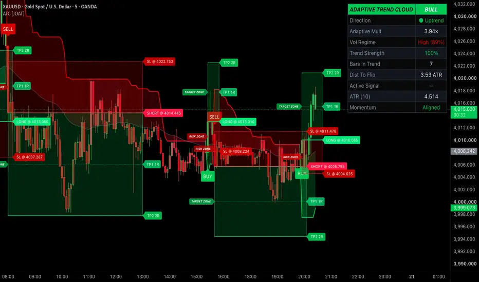
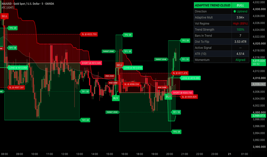
Adaptive Trend Cloud [JOAT]═══ ADAPTIVE TREND CLOUD ═══
A volatility-adaptive ATR SuperTrend that breathes with the market. Instead of a fixed multiplier, the band width auto-scales to the live volatility regime, then paints a filled cloud to a signal EMA, colors your candles by trend strength, and drops ATR-anchored SL/TP zones on every confirmed flip. One clean, self-contained trend engine with a cyberpunk chrome readout.
▎ WHAT IT DOES
It tracks the prevailing trend with a SuperTrend line whose ATR multiplier adapts to how volatile price currently is — wider in turbulence to avoid whipsaw, tighter in calm to catch turns earlier. The space between that line and a signal EMA is filled as a Trend Cloud , candles are shaded by how far price sits from the line, and momentum-confirmed BUY / SELL labels fire only when trend, regime, and momentum agree.
▎ HOW IT WORKS
• Adaptive multiplier — current ATR is percentile-ranked against its recent window to place volatility on a 0–1 scale. The base multiplier is then scaled up or down within an adjustable range, so high volatility widens the bands and low volatility narrows them.
• SuperTrend core — upper and lower bands are built from your chosen price basis (hl2, close, or ohlc4) ± adaptive-multiplier × ATR, and direction flips when price closes through the opposite band.
• Trend Cloud — a fill is drawn between the SuperTrend line and an EMA (which doubles as the regime filter), tinted green in uptrends and red in downtrends.
• Trend strength — measured as the distance from close to the SuperTrend line in ATR units, clamped and normalized so roughly 3 ATR reads as fully saturated. This drives the candle and cloud gradient from weak to strong.
• Momentum confluence — an optional filter requiring RSI above/below its midline, or MACD histogram sign, to agree with the flip direction.
• Signal logic — a BUY needs a bullish flip plus price above the EMA plus momentum agreement; a SELL needs the mirror. All three conditions must line up.
• SL/TP zones — on each signal, stop distance is ATR × your SL multiple, TP1 sits at 1R, and TP2 at your risk:reward ratio; boxes, lines, and labels live-extend forward while the trade runs, then freeze on the next flip.
▎ HOW TO USE IT
• Trade with the cloud: green cloud and green-shaded candles favor longs, red favors shorts.
• Treat BUY / SELL labels as your trigger — they only appear on a confirmed flip that also passes the EMA and momentum filters.
• Use the RISK ZONE (red) and TARGET ZONE (green) boxes to frame a trade at a glance: entry line, dashed SL, dotted TP1 at 1R, and TP2 at your chosen R multiple.
• Read candle brightness as conviction — deeply saturated candles mean price is stretched from the line and the trend is strong; pale candles signal a weakening or fresh move.
• Optionally enable the VWAP + σ bands for an intraday mean-reference and to gauge stretch from the session average.
• Combine with your own structure, higher-timeframe bias, and levels — this is context, not a standalone system.
▎ KEY SETTINGS
• Engine — ATR length, base multiplier, adaptive range (0 = fixed multiplier), volatility rank window, and band source.
• Filters — signal/trend EMA length, momentum toggle, RSI vs MACD, RSI length and midline.
• Risk — show zones on/off, SL in ATR units, risk:reward ratio, zone projection length, and how many past zones to keep.
• Visuals — cloud toggle and transparency, gradient candles, line/EMA/label toggles, VWAP bands and σ, label size, and the four bull/bear gradient colors.
• Dashboard — show/hide, panel position, and text size.
▎ DASHBOARD
A compact chrome panel reports live: current Direction , the Adaptive Multiplier in effect, the Volatility Regime (Low / Normal / High with a percentile), Trend Strength %, Bars In Trend , Distance To Flip in ATR, the Active Signal state, the current ATR value, and whether Momentum is aligned or divergent.
▎ ALERTS
• Bull Flip — SuperTrend turns up with price above EMA and momentum aligned.
• Bear Flip — SuperTrend turns down with price below EMA and momentum aligned.
• Any Flip — either signal fires.
Each includes ticker and interval placeholders.
▎ NOTES
• Works on any market and any timeframe — the adaptive engine re-ranks volatility to whatever chart you load.
• Signals confirm on the close of the flip bar and do not repaint after that bar closes.
• Fully self-contained with no external libraries; every visual layer (cloud, candles, zones, VWAP, dashboard) has its own toggle so you can keep the chart as clean as you like.
For research and education only. This is not financial advice. No indicator can predict the future, and past behavior does not guarantee future results. Always do your own analysis and manage your own risk.
Made with passion by JackOfAllTrades ⚡ אינדיקטור
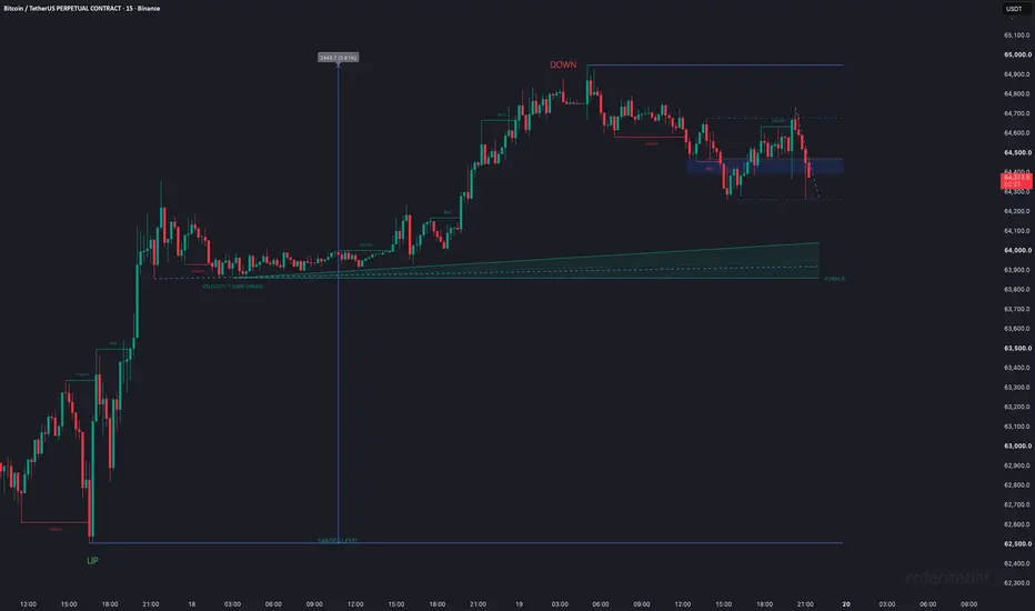
Price Reaction ZonesPrice Reaction Zones (PRZ) is an advanced structural analytics tool designed for traders who focus on market microstructure, dynamic support/resistance levels, and liquidity sweeps. By blending traditional Change of Character (CHoCH) concepts with a custom-engineered "AXIS Motor", this indicator offers dynamic kinetic sensitivity and highly strategic Fibonacci-based target zones.
This script maps out historical structure ranges, isolates liquidity traps (sweeps), and projects tactical ghost vectors to evaluate micro-trend strength.
Key Features:
1. Smart Market Structure & Dynamic Fib Boxes
When a valid Break of Structure (BOS) or Change of Character (CHoCH) occurs, the indicator identifies the absolute extremes (Highest High and Lowest Low wicks) of the most recently broken structure.
Bullish CHoCH (Upward Break): Creates a dynamic Fibonacci box between 0.318 and 0.500 of the previous downward structure.
Bearish CHoCH (Downward Break): Creates a dynamic Fibonacci box between 0.618 and 0.790 of the previous upward structure.
These boxes act as immediate high-probability reaction zones for the very next wave. An Equilibrium (EQ - 0.5) limit line is also drawn to clearly divide the market bias.
2. External Ranges & Liquidity Sweep Detection
Instead of cluttering the chart with every single swing high or low, PRZ calculates an overarching "External Range" based on a lookback of the last 6 structural phases.
It automatically frames a beautiful Price Range Box mapping the exact tick difference and percentage span of the overarching macro structure.
Rejected Wick Logic (Sweeps): If price pierces the external High or Low boundaries but closes inside the range, a permanent "UP" or "DOWN" text is pinned to that wick. This signals a textbook liquidity sweep (a trap for breakout traders) and potential reversal.
Alerts are fully integrated for UP and DOWN sweep detections.
3. The AXIS Engine & Auto-Kinetic Sensitivity
Unlike static trendlines, the integrated AXIS Engine measures the "Velocity" of the market.
Auto-Kinetic Multiplier: By analyzing the real-time sum of bullish vs. bearish momentum (close to open differences) over a rolling window, the script dynamically adjusts the slope sensitivity of the resistance and support lines entirely independent of one another.
Tactical Ghost Vectors: Projects subtle, short-term momentum paths (Minor Lookbacks) to help you visualize the micro-trend inside the macro-structure, offering early warnings of momentum shifts before structural breaks happen.
4. Highly Customizable Interface
You have complete control over visualization. Tweak kinetic multipliers manually, adjust lookback lengths, alter Fibonacci box colors, and toggle lines to keep your chart as clean or as detailed as you prefer. A minimalist "erdensedat" watermark is embedded dynamically on the chart.
How to Use:
Use the Fibonacci boxes inside the latest active CHoCH range to enter pullbacks.
Watch the boundaries of the macro Price Range Box. Enter mean-reversion trades when "UP" or "DOWN" liquidity sweep labels appear.
Utilize the AXIS lines to trail your stops dynamically based on the current market velocity.
Disclaimer:
This indicator is designed for educational and analytical purposes only. It does not constitute financial advice. Trading in financial markets involves significant risk. The concepts of market structure, CHoCH, and liquidity sweeps are interpretive; always combine this tool with your own risk management strategy and other confluences. Past performance of any setup does not guarantee future results. אינדיקטור

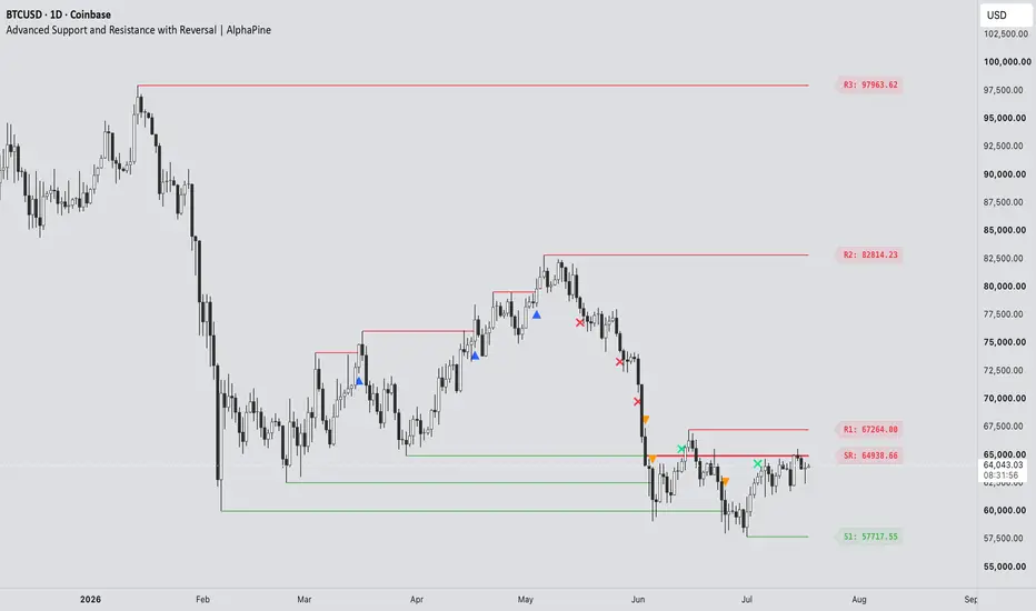
Advanced Support and Resistance with Reversal [AlphaPine]Advanced Support and Resistance with Reversal | AlphaPine
I built this indicator for a simple reason: a breakout line on its own does not tell me enough. I also want to know whether price comes back, holds the level from the other side, and later loses it again.
The script starts with confirmed swing highs and lows. Those become resistance and support. It then follows each level through three possible events: breakout, retest, and failure. Nothing here predicts the next move. It is a way to keep market structure organised without redrawing the same levels by hand.
The image below shows the full level lifecycle in one view, including the symbols that appear at each stage:
How a level is created
A resistance level comes from a confirmed pivot high. A support level comes from a confirmed pivot low. If zones are enabled, the zone uses the wick range of the pivot candle rather than an arbitrary fixed width.
Pivot confirmation takes time. With Pivot Length set to 10, for example, the script needs ten bars on the right side of the pivot before the level exists. This delay is intentional.
Pivot Length controls how selective the swing detection is. A larger value usually gives fewer levels and confirms them later.
Lookback Period sets how long a level remains in the script's working history.
Maximum Levels per Type limits stored resistance and support records so the chart does not keep growing indefinitely.
Wick Dominance Filter keeps only pivot candles whose rejection wick is larger than the body and opposite wick.
Merge Nearby Active Levels removes clutter by skipping a new pivot when an active level of the same type is already nearby. Broken levels do not block a fresh one.
The merge distance uses ATR-14, so it adjusts to the instrument instead of relying on one fixed price interval.
Breakouts
The default breakout mode is Close . Resistance must close above its boundary, while support must close below it. This avoids counting every small wick through a level.
Wick mode reacts earlier. It triggers when the high or low crosses the boundary during the live candle. The recorded extreme cannot retract, but price can still close back inside the level, so Wick mode will naturally include more intrabar fakeouts.
Breakout Buffer adds an optional ATR-based distance beyond the level. Leave it at zero for the exact boundary, or raise it if very small breaks are not useful for your chart.
By default:
A resistance breakout prints an upward blue triangle below the candle.
A support breakout prints a downward orange triangle above the candle.
The marker colours are fully adjustable.
Retests and role reversals
After resistance breaks, the script waits to see whether price can retest it as support. After support breaks, it watches for the same level to act as resistance.
RS means old resistance has been confirmed as new support.
SR means old support has been confirmed as new resistance.
Reversal Confirmation controls what counts as a retest:
Close (default) requires the retest candle to touch the original zone and close back beyond the whole zone on the new-role side.
Touch accepts any later overlap with the zone. It is more sensitive and less strict.
Once confirmed, the new role stays fixed. An RS level remains tracked as support; it does not turn red merely because the latest candle happens to sit below it.
When a flip fails
A flipped level is removed when a confirmed candle closes through the far side of its zone. In other words, RS support fails below the zone and SR resistance fails above it.
If Show Reversal Failures is enabled, an ✕ marks the failure candle. The flipped line stops there, but the cross stays on the chart as a record of where the level died. That is why a failure cross can appear without a continuing line.
Breakout triangles and failure crosses use the original pivot as their Lookback anchor. This keeps their expiry on the same structural clock as the level they came from instead of giving every marker a new lifetime from its event candle.
Reading the chart
R1 is the nearest active resistance above price, followed by R2, R3, and so on.
S1 is the nearest active support below price, followed by S2, S3, and so on.
RS marks a confirmed resistance-to-support flip.
SR marks a confirmed support-to-resistance flip.
Triangles mark breakouts. Crosses mark failed flips.
A breakout marker is an event, not an entry instruction. I find the retest more useful than the first break, but how it is traded still depends on trend, execution, and risk rules outside this indicator.
Lines, zones, and historical placement
Historical Level Start decides where an original level begins:
Confirmation (default) starts it on the bar where the pivot became known in real time.
Pivot extends it back to the swing candle. This is useful for visual context, but the level was not available on that earlier candle.
Display as Zones replaces the single-price lines with the original pivot-wick range. If that level flips, the same price range is preserved; the zone is not moved to the opposite side of the price.
Colours
The Colors group separates colours by purpose, so changing a label does not force the matching line to use the same colour.
Resistance and support lines/zones.
RS and SR lines/zones.
Resistance, support, RS, and SR price labels.
Resistance and support breakout triangles.
Support and resistance failure crosses.
Zone fills and borders use transparent versions of the selected line colour so candles remain visible underneath.
Alerts
Seven alert conditions are included:
Resistance Breakout
Support Breakout
Resistance to Support Flip
Support to Resistance Flip
Flipped Support Failed
Flipped Resistance Failed
Any S/R Event
The combined alert is useful when one alert should cover every structural event. Separate conditions are available when different actions are needed for breaks, flips, or failures.
A sensible starting setup
The defaults use Close confirmation for both breakouts and retests. Start there if you prefer signals that wait for the candle to finish. Wick breakout and Touch retest are available when earlier, more sensitive reactions are more important.
If the chart feels crowded, try increasing Pivot Length, increasing Merge Distance, enabling the Wick Dominance Filter, or reducing Maximum Levels per Type. Settings should be adjusted for the instrument and timeframe rather than treated as universal values.
Important limitations
Confirmed pivots always arrive late by Pivot Length bars. That is how pivot confirmation works, not a hidden predictive signal.
Pivot historical placement back-draws a confirmed level for context. Use Confirmation placement when real-time availability matters.
Wick mode can mark a breakout that later closes back inside the level.
The current-bar drawings rebuild while the candle updates.
The script uses chart data only. It does not request higher-timeframe data or use lookahead.
It does not place orders, calculate position size, or guarantee that a level will hold.
Use it as a structure tool, then apply your own trade plan and risk management.
אינדיקטור

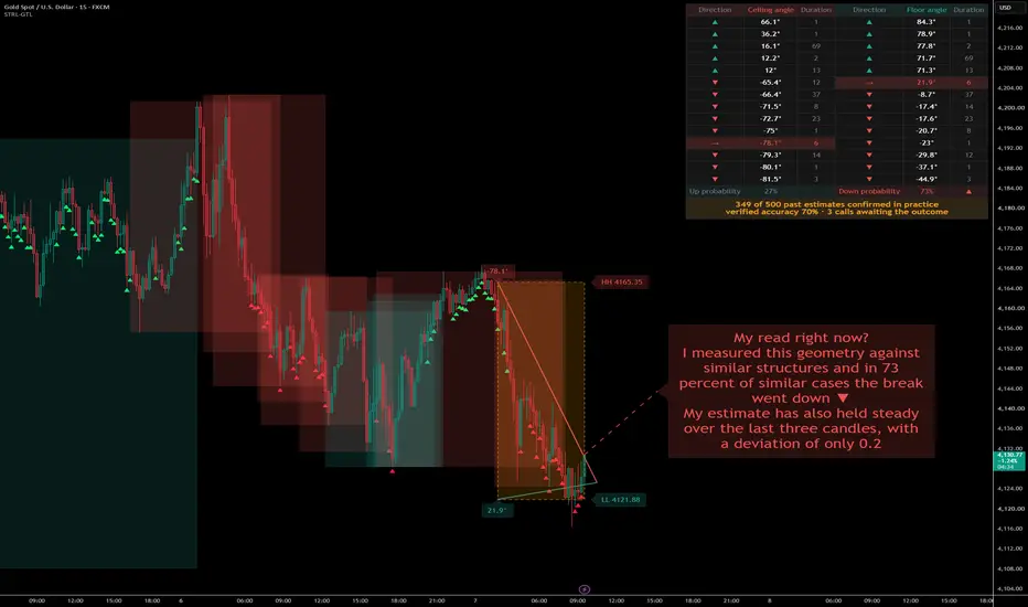
SmartTraders Research Labs -Geometric Trend Lines - GTLGEOMETRIC TREND LINES (GTL)
GTL is a research indicator that studies the geometry of price structures. It freezes structural anchors in the past, stretches two right-triangles between those anchors and the live candle, and reads their angles inside a dimensionless coordinate space — then learns from every completed structure to estimate, with calibrated statistics, which way the current one is leaning. It is a structural analysis and research tool, not a trading system.
█ STEP OUT OF THE CHART PLANE
Every trader has drawn a trendline and called it steep. Steep compared to what? Stretch the chart window and the angle flattens. Jump from Bitcoin to a quiet blue-chip stock and a "45-degree rally" becomes a completely different animal. The chart plane mixes two quantities that were never meant to share axes — price and time — so any angle drawn on it is a property of your zoom level, not of the market.
My standard, before any geometry begins, is to take the shape out of the chart plane entirely. GTL maps every point into an Isotropic Coordinate System (ICS) where both axes are pure numbers:
y = log(price) / σ
x = bars / lookback
Price is expressed in units of the instrument's own volatility (σ, estimated with the Yang-Zhang method over 500 bars), and time in units of the analysis window. Nothing on either axis carries dollars, lira, satoshis or minutes anymore.
In this space, a degree finally means something. The angle
θ = atan(Δy / Δx) × 180 / π
is intrinsic: a 60° ceiling angle on gold's 30-minute chart describes the same geometric event as a 60° ceiling angle on a 3-minute meme-coin chart. The instrument's personality — its price level, its tick size, its temperament — has been normalized away, and what remains is pure trajectory. Everything else in this indicator stands on that ground.
The same rally, two zoom levels, two different angles — and on the right, the dimensionless ICS home where θ finally becomes a property of the market, not of your screen.
█ THE TRIANGLE — A SHAPE THAT CARRIES DATA
Of all the shapes humanity has leaned on, the triangle is the one that never let us down. It raised the pyramids, it holds every bridge truss and roof frame you have ever walked under, and it is the only polygon that cannot be deformed without changing the length of a side. Engineers call that property rigidity. I read it as trustworthiness — a triangle does not lie about its geometry.
That is why I chose it as the measuring instrument. On every structure, GTL constructs two right-triangles inside ICS:
The ceiling triangle — from the frozen HH anchor to the live candle's high.
The floor triangle — from the frozen LL anchor to the live candle's low.
Each triangle is not a drawing; it is a container. Four measurements live inside it at every bar:
θ — the signed angle of the hypotenuse, the indicator's core reading
Δy — the signed magnitude of the move in volatility units
area — the geometric surface the structure has swept
centroid — the shape's center of mass in ICS
While price grinds below a frozen ceiling, the ceiling angle sinks degree by degree into negative territory. When price presses up from a frozen floor, the floor angle climbs. Two triangles breathe with the market — one watching from above, one from below — and their angles are the raw language everything downstream of this indicator speaks.
One triangle watches from above, one from below — and θ, Δy, area and centroid live inside each of them.
█ AN ANCHOR IN THE PAST — MEASURING FROM CALM WATER
Picture a storm at sea, and two people trying to measure the waves. One stands on the shore. One sits in a boat, right among them. The observer on the shore, feet on solid ground, reads the height of every wave with precision — however wild the water gets, the ground beneath him does not move. The observer in the boat rises and falls with the very thing he is trying to measure; every number he writes down is contaminated by his own motion.
Most swing-based tools are the observer in the boat. Their reference points — the latest swing high, the latest swing low — are redefined by the market again and again, so any angle or distance measured from them mixes two movements at once: the price's, and the reference's own.
GTL plants its observer on the shore. At the birth of every structure, the highest high and the lowest low of the lookback window are frozen — locked to a fixed bar in the past — and from that moment they do not move. Every angle is measured from calm, settled water toward the storm of the live candle. The reading stays pure: when θ changes, it is because price moved, and for no other reason.
The anchors hold until price closes beyond one of them. That close is the break — the moment the structure completes, is archived with its full geometry, and a fresh pair of anchors freezes for the next chapter.
One naming note, so the chart reads correctly: what GTL labels HH and LL are these frozen anchor levels, not the traditional trailing swing highs and lows.
Solid ground measures the storm precisely; a boat measures mostly itself — GTL is the observer on the shore, and the frozen box below is exactly that shore.
█ WHY 23 — A PRIME WINDOW
The lookback window — the number of bars GTL scans before freezing a new pair of anchors — defaults to 23. The choice is arithmetic, not aesthetic.
23 is prime: its only divisors are 1 and itself. Stated as a condition,
gcd(23, k) = 1 for every k < 23
For a rolling window, that matters mechanically. If a periodic component of length k shorter than the window is present in the data, the window boundary does not keep meeting that component at the same phase. Because 23 and k are coprime, the alignment steps through all k possible phase offsets before it repeats. A composite window gives that protection away: 24 divides cleanly by 2, 3, 4, 6, 8 and 12, so components at those lengths can meet repeated window boundaries at the same phase, allowing anchor placement to inherit regularity from the measuring frame itself.
Engineering solved the same problem with hunting-tooth gear design: tooth counts are chosen coprime so each tooth eventually meshes with every counterpart, instead of the same pairs meeting forever and wearing a repeated pattern into the metal. Periodical cicadas offer a biological analogy — 13- and 17-year emergence cycles, both prime, reduce overlap with shorter recurring cycles.
This is a design principle stated in number theory, not a performance claim. A prime window does not make GTL better by itself, and it does not prove anything about future price. It simply reduces one avoidable source of arithmetic resonance, so repetition in the readings is less likely to be created by the measuring window. The lookback remains a user input; 23 is the default I stand behind.
Every window from 20 to 25 shares a divisor with at least one shorter cycle length — 23 is the only empty row, which is exactly why it is the default.
█ HOW THIS SERIES IS BUILT — CSV OUT, ANALYSIS IN
This episode follows a working method I now treat as the standard for the whole series: nothing ships on intuition alone. The indicator exports its own internal life — every angle, every structure, every break — as plain columns in the Data Window, ready for CSV export. Before publication, those exports were analyzed with AI assistance across a deliberately diverse panel:
7 instruments × 2 timeframes = 14 datasets
gold, Bitcoin, Tesla, Brent crude, Turkish Airlines, Dogecoin, Saudi Aramco
30-minute and 3-minute bars — roughly 550,000 bars, ~30,000 completed structures
What came back from that study entered the code as design decisions, not as promises. Exactly five constants in the learning layer are hard-coded. They are not presented as universal truths or performance guarantees; they are documented design constants selected from the development study and kept fixed so the live model remains transparent and reproducible:
CAL_LAMBDA = 0.999 — fading-factor decay for the calibration counters
CAL_JUMPTH = 2.0 — empirical jumpiness threshold between steady and choppy estimates
CAL_MINW = 30 — minimum effective sample weight before a calibration cell is trusted
CAL_ROLL = 20 — length of the live recent-record window
JUMP_WIN = 5 — bars used for the short-term stability measurement
The methods behind the layer are standard enough to be named — fading-factor prequential counting for online calibration, adaptive Gaussian KDE for local probability estimation, and Kish-style effective sample size for weighted evidence — and the next section walks through each of them with its reference. The fixed values above are GTL's calibrated defaults from that study, not claims that these numbers are optimal for every market, symbol, or timeframe. Everything else the statistics need — bandwidth, confidence, significance — is computed live from the chart's own history.
Two honest disclosures. First, this analysis is development documentation, not an independent audit, and this description makes no accuracy claims from it. Second, the same door is open to you: every column used in that study is exported by the script itself, so you can pull the CSV from your own chart and put the same questions to any tool you trust.
The build loop of this series: the script exports its own life as CSV, analysis turns it into five documented design constants, and the same door stays open to every user.
█ FROM GEOMETRY TO STATISTICS — THE MATH, WITH ITS REFERENCES
An angle is a measurement; an estimate is a statement. Moving from one to the other honestly requires statistics. GTL does not present this layer as a private invention. It combines established statistical components, named here with their sources, and applies them to one specific object: the geometry of frozen price structures.
Volatility normalization. The σ in the ICS y-axis comes from the Yang-Zhang volatility estimator (Yang & Zhang, Journal of Business, 2000). It uses open, high, low and close data, including overnight, open-to-close and Rogers-Satchell-style range components. In GTL, this is what lets angles be measured in volatility-normalized space instead of raw price units.
Local probability. While a structure is alive, its current angle pair (θC, θF) is compared with archived breaks. Each historical break receives a Gaussian weight that decays with distance in angle space. This is a Gaussian KDE-style local weighting scheme. Its bandwidth follows Silverman's rule-of-thumb logic for two dimensions, h = σ̂ · n^(−1/6), recomputed from the chart's own history. Nothing is manually tuned.
Honest sample size. Weighted evidence can look larger than it really is: many tiny weights are not the same as many strong neighbors. GTL therefore uses the Kish effective sample size (Kish, Survey Sampling, 1965),
n_eff = (Σw)² / Σw²
to estimate how much effective evidence the weighted neighborhood actually contains.
Probability with humility. The weighted up/down vote is passed through a Beta(1,1) posterior, using n_eff as the effective evidence scale. The label only speaks when the posterior mean clears a one-sided 95% normal-approximation check against the 50/50 baseline. When that threshold is not met, the label does not force a call; it simply says the structure is too close to call.
Verification. The principle that probability forecasts must be scored against what actually happened goes back to Brier's 1950 paper in Monthly Weather Review, "Verification of Forecasts Expressed in Terms of Probability." In GTL, every estimate is graded when the break reveals the outcome.
Online calibration. Graded outcomes update fading-factor prequential counters, following the stream-learning evaluation framework of Gama, Sebastião and Rodrigues (Machine Learning, 2013). Fresh evidence receives more weight, while older evidence decays with λ = 0.999. The display can therefore show both the raw estimate and how estimates of the same kind have behaved on the current chart.
Stability. GTL also tracks estimate "jumpiness": the population standard deviation of the last five probability readings. The term and the general idea come from ensemble-forecast consistency research, especially Zsóter, Buizza and Richardson (Monthly Weather Review, 2009). GTL uses a chart-specific adaptation of that idea: a steady estimate and a choppy estimate are labeled differently, because a choppy estimate may still flip.
Nothing in this chain is exotic, and none of it is a performance guarantee. The original part is where the chain is pointed: at frozen structural geometry, measured inside a dimensionless coordinate space.
█ WHAT YOU SEE ON THE CHART
Frozen anchors. Two dashed horizontal lines mark the frozen HH and LL of the current structure, each with its exact level, and a dotted vertical line marks the anchor bar in the past where the freeze happened. These lines do not trail price — that is the whole point.
Geometric trend lines. Two solid lines run from the anchors to the live candle: ceiling from HH to the current high, floor from LL to the current low. They are the triangle hypotenuses. When the two lines converge, they stop at their intersection instead of crossing. The live θC and θF values sit as labels at the anchor.
Structure boxes. Every completed structure is archived as a box: one border color for structures that broke up, another for structures that broke down, and a dashed box for the structure still being built. How many past boxes you see is your choice.
Angle map. A table sorts the recent breaks by their break angles — ceiling side and floor side, each with direction and duration. An arrow row shows where the current live reading ranks among them, so you can literally see where "now" sits in the break history. The footer row carries the up/down estimate; once the calibration cell has enough samples, it shows two numbers, raw → calibrated.
Estimate label. A label floats ahead of the last candle and speaks in sentences: which direction the odds favor, what signals of this kind have actually done on this chart (or the estimated odds while calibration is still warming up), whether the signal is steady or choppy, and a living record — how many of the last 20 estimates were right. It only takes a side when the significance check passes; otherwise it says, honestly, that the structure is too close to call.
The pending phase. Between a break and the next freeze, preview anchors appear as dotted gray lines, the table shows an hourglass, and the estimate quietly switches to a second model trained on pending-phase angles to estimate the direction of the NEXT structure's break.
One disclosure that matters: on the live bar, angles and estimates can change until the candle closes. Everything the indicator learns from — and every alert it fires — reads confirmed bars only.
█ UNDER THE CHART — 29 EXPORTED COLUMNS
Everything drawn above is only a rendering. The numbers underneath are all exported to the Data Window, which means TradingView's "Export chart data" hands you a complete CSV audit trail:
Live geometry & estimate, every bar:
Ceiling θ / Floor θ — the two live angles in ICS
Probability UP / Probability DOWN — the per-bar estimate (these two are also plots, so you can build threshold alerts on them directly)
Log Jump Bar — the stability (jumpiness) of the estimate
Log Cell Bar — which calibration cell this bar fell into
Structure snapshot, printed on every break bar:
Str Duration — how many bars the structure lived
Str Frozen HH / Str Frozen LL — the anchor levels
Str Max High / Str Min Low — the extremes reached inside
Str θ Ceil @Max / Str θ Floor @Min — the angles at those extremes
Str Break Dir — +1 up, −1 down
Estimate audit trail, on birth and break events:
Log Event — 1 = birth, 2 = break, 3 = both on one bar
Log θC Birth / Log θF Birth / Log P Birth / Log Sig Birth / Log nEff Birth — the forecast made the moment the structure was born
Log θC Pend / Log θF Pend / Log P Pend / Log Sig Pend / Log nEff Pend — the pending-phase forecast carried into this break
Log Hit Birth / Log Hit Pend — each forecast graded 1 or 0 against the actual break
Log Acc Birth / Log Acc Pend — the running accuracy of each estimate type
This is the same door the development study walked through. Export the CSV from your own chart, open it in a spreadsheet, in Python, or hand it to an AI assistant — and audit every sentence the label has ever told you.
█ SETTINGS THAT STAY OUT OF YOUR WAY
The settings menu is deliberately small: the lookback window, a few visual choices — colors, transparency, border style, table position, label size and offset, how many past boxes to show — and simple on/off toggles. That is the whole surface, because everything statistical is computed live from the chart itself: the KDE bandwidth from Silverman's rule, the effective sample size from Kish's formula, significance from the posterior, the calibrated rate from the fading counters, the pending-phase model switching in and out on its own. There is nothing to tune, and that is by design. The five documented constants from the development study are the only fixed numbers in the machine.
█ ALERTS
Three alerts cover the estimate's life cycle: Signal turns up, Signal turns down, and Signal gets choppy. Each fires once, on entering its state, and reads only confirmed bars — so what fired is what you will still see on the closed candle. For custom thresholds, Probability UP and Probability DOWN are exposed as plots: build Crossing Up or Greater Than alerts on them directly in TradingView's alert dialog, at any level you like, as many as you like. Recommended frequency: Once Per Bar Close.
█ SEVENTEEN LANGUAGES
The angle map, the anchor labels and the estimate label speak 17 languages: English, Türkçe, Deutsch, Italiano, Français, Español, Bahasa Indonesia, Bahasa Melayu, Ελληνικά, Русский, 中文, 日本語, 한국어, हिन्दी, العربية, فارسی and עברית. Right-to-left scripts — Arabic, Persian, Hebrew — mirror the table layout automatically. One honest limitation: input settings and alert messages stay in English, because Pine requires compile-time constant strings there.
█ WHAT THIS IS — AND WHAT IT IS NOT
GTL is a research and structural analysis tool. It measures the geometry of frozen price structures, keeps honest statistics about its own estimates, and shows you both — the raw number and the track record, side by side. It is not a trading system, its estimates are not trade signals, and nothing in this script or this description is financial advice. The calibrated rates describe what has already happened on your chart's own history; they are not a promise about the next bar. On the live candle, readings can change until the close — confirmed statistics and learning update on closed bars only.
Read it the way it was built to be read: as an instrument standing on the shore, measuring the storm. אינדיקטור

Trend Momentum Breakout [AlphaPine]Overview
Trend Momentum Breakout is built for traders who use trendline breaks as part of their market-structure review.
The indicator displays support and resistance trendline references, keeps the chart focused on recent structure, and highlights breakout conditions based on the selected confirmation settings.
It is designed to answer one focused chart-reading question:
Where is price showing a confirmed break of a support or resistance trendline reference?
This indicator is not a complete trading system. It is a structure layer that can be used alongside broader market context, price action, volume, higher-timeframe bias, risk planning, and a trader's own execution rules.
What It Shows
Support and resistance trendline references.
Bullish breakout markers after resistance breaks.
Bearish breakout markers after support breaks.
Smaller and larger structure views.
Optional volume confirmation.
Optional moving averages for trend context.
Optional structure point markers for visual review.
Alerts for monitored breakout conditions.
Visual Legend
Red line: resistance trendline reference.
Green line: support trendline reference.
Thicker line: larger structure.
Thinner line: smaller structure.
Dashed line: projected or recently broken trendline segment.
Green up marker: bullish resistance breakout.
Red down marker: bearish support breakout.
Gray marker: optional structure point marker.
How To Use
Add the indicator to a liquid market and start with the default settings.
Use the visible trendline references as market-structure context. When a breakout marker appears, treat it as a confirmed structure event, not as an automatic trade entry.
Traders can adjust the structure scale, chart cleanliness, breakout confirmation, optional volume filter, display style, and optional moving averages to match their chart-reading workflow.
Alerts can be used to monitor breakout conditions without watching every chart continuously. Alerts should be treated as notifications, not automatic trade instructions.
Confirmation Behavior
Breakout markers appear only after the indicator has enough confirmed chart structure to display an active trendline reference. A marker is shown when price confirms a break under the selected settings.
Optional volume confirmation can be enabled for traders who want an additional participation filter.
Important Live-Chart Note
This indicator uses confirmed chart structure. Confirmed structure requires time to form, so historical trendlines can look cleaner than what a trader would have seen live at the original turning point.
This is normal for structure-based indicators. Historical plots should be used for review and learning, not as proof of profitability or as evidence that every past marker was tradable in real time.
For live use, wait for the current bar to close, the trendline to be confirmed, and the breakout marker or alert to appear under the selected settings.
Settings Overview
The default settings are designed to keep the chart readable while showing recent support and resistance trendline structure.
Available controls include:
Structure lookback and scale.
Maximum visible lines.
Trendline selectiveness.
Advanced structure sensitivity.
Scan depth and chart-performance balance.
Breakout confirmation strictness.
Optional volume confirmation.
Recent marker display.
Marker size and visibility.
Trendline and marker colors.
Optional moving averages.
Alert controls and cooldown.
Moving Averages
Moving averages are included as an optional chart overlay only.
They are useful when traders want basic trend context without adding a separate moving average indicator. They do not turn Trend Momentum Breakout into a trend-following system and should still be interpreted with the broader chart.
Best Use
This indicator is intended for markets and timeframes where traders already use trendline structure as part of their analysis.
Good fit:
Trendline breakout review.
Market structure mapping.
Support and resistance break monitoring.
Discretionary trade planning.
Multi-timeframe chart review.
Breakout watchlists with alert support.
Less suitable for:
Automatic buy/sell execution.
Low-liquidity markets with erratic candles.
Choppy conditions where trendline breaks may be less informative.
Using historical markers as standalone proof of profitability.
Trading Notes
Resistance and support are often better understood as areas, not perfect single-price levels. This indicator draws trendlines as visual references because its purpose is trendline breakout mapping. Traders should still account for spread, volatility, liquidity, candle context, and nearby support/resistance zones.
Breakouts can fail. A confirmed trendline break does not remove the need for risk management, invalidation planning, and broader market context.
What Makes It Useful
Trend Momentum Breakout helps organize trendline breakout analysis by combining structure references, confirmation markers, visual controls, optional volume context, optional moving averages, and alert support into one focused indicator.
The goal is not to replace a trader's decision process. The goal is to make trendline breakout structure easier to see, review, and monitor.
Disclaimer
This indicator is for educational and analytical use only. It is not financial advice and does not guarantee any trading result. Traders are responsible for their own analysis, risk management, and execution decisions. אינדיקטור

אינדיקטור

Hurst Regime Sentinel [JOAT]HURST REGIME SENTINEL
A proper R/S Hurst-exponent regime classifier — the single most respected statistical test for "is this market trending, mean-reverting, or random?". On top of the textbook R/S analysis, the Sentinel adds a five-class regime taxonomy (Strong MR, MR, Random, Trend, Strong Trend), a confirmation-bars filter to suppress flicker, a right-side floating Hurst badge, a regime-tinted background, and — uniquely — a Suggested JOAT Indicator dashboard row that names the best-fit companion script in the JOAT suite for the current regime.
The Hurst exponent, properly
The Hurst exponent H is a number between 0 and 1 that characterises the long-run persistence of a time series:
H < 0.5 — anti-persistent / mean-reverting. The series tends to reverse its recent direction.
H = 0.5 — random walk (Brownian motion). No memory.
H > 0.5 — persistent / trending. The series tends to continue its recent direction.
The classical estimator is R/S analysis (rescaled range): split the window into sub-segments, compute the range of cumulative deviations from each sub-mean, normalise by the sub-stdev, average, and fit a log-log slope. This script implements that estimator over a configurable lookback (default 100, the canonical value), with optional log-return source for theoretical correctness, and an EMA smoother on top of the raw H series to give a stable regime read.
Five-class regime taxonomy
The Sentinel does not just classify into trend/MR/random — it sub-classifies the trend and MR sides:
Strong MR — H below the strong-MR boundary (default 0.30). Severely anti-persistent. Aggressive reversion regime.
MR — H between strong-MR and the MR upper (default 0.40). Mean-reverting.
Random — H between MR upper and trend lower (default 0.55). No statistical edge from persistence assumptions.
Trend — H above trend lower. Trending.
Strong Trend — H above the strong-trend boundary (default 0.65). Strongly persistent. Aggressive momentum regime.
A Minimum-bars-to-confirm filter (default 3 bars) suppresses regime flicker; a change must persist this many bars before it is committed.
Suggested JOAT Indicator row (unique)
The dashboard exposes a Suggested Indicator row that names the best-fit companion script from the JOAT suite for the current regime. The user can pick which suggestions appear (defaults: Volatility Reversion Bands Pro for MR, Quantum Trend Matrix for Trend, Liquidity Magnet Pro for Random — but every other JOAT indicator is selectable). This converts the abstract regime read into a concrete next action: when the regime changes, the script tells you which other tool in the suite to put on the chart.
Visual system
Right-side floating label — anchored N bars to the right of the latest bar with current H value, regime, and sub-class.
Regime-change labels — drawn at the bar where a confirmed regime change occurs.
Background tint by regime — violet for MR, teal for Trend, untinted for Random. Strong sub-classes use a stronger (lower-transparency) alpha than mild sub-classes. Both alphas are configurable.
Optional Hurst line companion — when enabled, plots the H series scaled to a configurable fraction of the visible price range. Use to visually track H movement over time. Off by default for a clean chart.
Optional reference levels at 0.40 / 0.50 / 0.55 when the line is shown.
A locked Mystic palette (teal trend / violet MR / white random on a midnight-blue ground) gives the chart a distinctive structural identity.
Dashboard
Monospaced table positionable to any of nine corners. Surfaces:
Current H value (raw and smoothed).
Regime classification with glyph.
Sub-class (Strong MR / MR / Random / Trend / Strong Trend).
Bars in current regime.
Distance from H to nearest threshold.
Suggested JOAT Indicator row (toggleable).
Source series in use (Close / HL2 / HLC3 / OHLC4 / Log Returns).
Alerts
Multiple alert conditions, each independently controllable:
Regime changed to MR / Random / Trend
Sub-class changed to Strong MR / Strong Trend
H crosses 0.50 (random-walk centre)
How to read it
Three reads, in order of conviction:
Sub-class entry (Strong MR or Strong Trend) — the highest-conviction read. The market has decisively committed to a persistence regime; the suggested companion indicator becomes high-conviction.
Regime change confirmed (after the minimum-bars filter) — meaningful enough to switch toolkits. If you were trading momentum and the script now reads MR, your edge has just rotated.
H crossing 0.50 — the structural fault line. Above, persistence is positive; below, it is negative. Even without a sub-class entry, a clean cross of 0.50 is a regime warning.
Suggested settings
Defaults (lookback 100, EMA smoothing 14, MR upper 0.40, trend lower 0.55, strong boundaries 0.30 / 0.65) are tuned for daily and 4H charts on liquid markets — the timeframes where R/S analysis is statistically most meaningful. For 1H and below the indicator works but the H estimate becomes noisier; raise the EMA smoother to compensate. For very long horizons (1W+) increase lookback to 200.
Originality / what's reused
The R/S Hurst estimator is the textbook 1951 method — public-domain statistics, implemented from the original Hurst paper. The implementation here — the bounded-loop R/S computation with sub-segment averaging, the five-class regime taxonomy with strong sub-classes, the confirmation-bars regime-change filter, the regime-driven background tint with mild/strong alpha tiers, the optional scaled Hurst-line overlay, the right-side floating badge, and the suggested-JOAT-indicator dashboard row — is JOAT-original. No third-party code reused.
Open source
Published open-source under the default Mozilla Public License 2.0. The R/S loop, the regime classifier, the suggested-indicator router, and the dashboard are isolated modules. Forks welcome with credit.
Limitations
Hurst R/S is statistical — it describes the recent past, it does not predict the future. The estimator carries the natural noise of finite-sample R/S; the EMA smoother is there to suppress flicker but cannot eliminate underlying noise on short lookbacks. The "Suggested JOAT Indicator" row is a heuristic mapping from regime to tool, not a prediction that any specific signal from that tool will fire — it tells you which corner of the toolkit to look at; the tool itself tells you when to act.
—
-made with passion by jackofalltrades
אינדיקטור
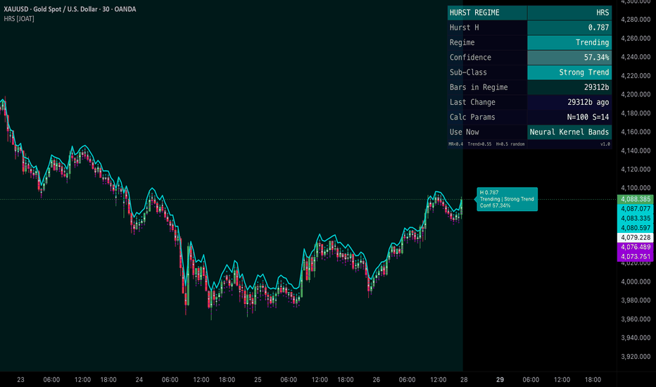
Doppler Velocity Shift [JOAT]DOPPLER VELOCITY SHIFT
A trend-acceleration / exhaustion detector built on the Doppler shift principle : a stationary observer (the baseline frequency) compared to a moving source (the instant frequency) produces a measurable shift whose sign tells you whether the source is approaching (compression / acceleration) or receding (rarefaction / exhaustion). For markets the analogue is simple: when the residual wave's oscillation frequency is slower than its long-run baseline, momentum is accelerating into the trend; when it is faster than baseline, the trend is exhausting into chop.
The Doppler analogue, translated
The script's pipeline:
Detrend price by subtracting an EMA (configurable length). The result is a residual wave oscillating around zero.
Optionally normalise by ATR so the wave amplitude is regime-aware.
Count zero-crossings of the residual over a short window — this gives the instant frequency .
Count zero-crossings over a long window — this gives the baseline frequency .
Compute the Doppler shift = (instant − baseline) / baseline. Positive shift = faster than baseline → exhaustion. Negative shift = slower than baseline → acceleration.
EMA-smooth the shift to reduce flicker.
The output is a percentage that is intuitive to read: +0.30 means oscillations are 30% faster than baseline (approaching exhaustion); −0.30 means 30% slower (accelerating into trend).
Two-threshold event detection
Exhaustion — shift > +exhaustion threshold (default +0.30) for N consecutive bars (configurable, default 3). Fires the Exhaustion label.
Acceleration — shift < −acceleration threshold (default −0.30) for N consecutive bars. Fires the Acceleration label.
Frequency Anomaly — when |shift| crosses threshold × multiplier (default 2.0× → ±0.60). The anomaly alert fires and the chart background tints accordingly.
A configurable Event Cooldown (default 8 bars) prevents same-type events from stacking. A multi-bar confirmation gate prevents single-bar noise from triggering events.
Visual system
Detrend residual line (overlay) with configurable transparency and cosmetic display scale.
Vertical event lines at each Acceleration / Exhaustion event, with optional full-height extension for emphasis.
Event labels — Unicode glyphs by default (toggleable to plain text ACCEL / EXHAUST).
Frequency anomaly background tint when the |shift| crosses the anomaly trigger.
Pane companion (toggleable, on by default) — plots instant frequency, baseline frequency, and Doppler shift % in a separate pane below the chart.
A locked Cyber Aqua palette (electric blue acceleration / hot pink exhaustion / muted blue-gray stable on a near-black ground) gives the indicator a distinctive physics-inspired identity.
Dashboard
Monospaced table, positionable to any of nine corners, with row-fade gradient. Surfaces:
Instant frequency (zero-crossings in the short window).
Baseline frequency (zero-crossings in the long window).
Doppler shift % (signed).
Current status (ACCEL / EXHAUST / STABLE).
Last event direction with bars-ago.
Configuration: detrend length, frequency window, baseline window.
Anomaly flag when triggered.
Alerts
Three alert conditions, each independently controllable:
Trend Acceleration (shift < −threshold for N bars)
Approaching Exhaustion (shift > +threshold for N bars)
Frequency Anomaly (|shift| > threshold × multiplier)
How to read it
Two reads, in order of conviction:
Acceleration label after a quiet period — the script's intended trend-entry signal. Frequency has slowed, meaning the residual is making fewer mid-line crossings — the wave has lengthened and is now committed in one direction. Pair with a directional indicator for entry.
Exhaustion label inside an extended trend — the script's intended trend-exit signal. Frequency has risen above baseline — the residual is making more crossings, meaning the trend is fragmenting. Reduce / exit trend exposure; the next move is often a reversal.
The Frequency Anomaly alert is the script's headline event — when |shift| spikes far past threshold the market is in an extreme state, almost always associated with either an explosive breakout (acceleration anomaly) or an exhaustion blowoff (exhaustion anomaly).
Suggested settings
Defaults (detrend EMA 20, frequency window 40, baseline window 200, smoothing EMA 3, ±0.30 thresholds, 3-bar confirmation) are tuned for 15m–1H on liquid markets. For lower timeframes drop windows proportionally (10 / 20 / 100). For HTF (4H+) raise windows (30 / 80 / 400). The ATR-normalised residual is the recommended default — without it, the script's behaviour drifts on instruments with changing volatility levels.
Originality
The Doppler shift is a fundamental result of classical physics; the financial-market analogue and its implementation here are original. The pipeline — the EMA-detrended residual wave with optional ATR normalisation, the rolling zero-crossing frequency estimator at two scales, the (instant − baseline) / baseline shift formula, the EMA-smoothed shift, the multi-bar confirmed event classifier with cooldown, the anomaly multiplier layer, the vertical event line render, the pane-companion three-series overlay, and the dashboard — is JOAT-original. No third-party code reused. The use of oscillation-frequency shift as a trend acceleration / exhaustion metric is the original quantitative contribution.
Limitations
Zero-crossing frequency estimation is noisy on short windows; the smoothing input (default 3) exists to suppress that. The frequency-anomaly trigger is a heuristic — it tells you the market is in a rare state, not which direction it will resolve. Events confirm only after the multi-bar threshold; events are non-repainting but lag by the confirmation window.
-made with passion by jackofalltrades
אינדיקטור

Trend Market by erdensedatThis indicator ("Trend Market") is a highly comprehensive trading system that brings together modern Smart Money Concepts (SMC), Price Action analysis, and dynamic trend structures under one roof. Breaking away from the lagging nature of traditional indicators, it focuses entirely on the real-time market structure dictated by price itself.
Here are the core features of the indicator and what they mean for your trading:
1. Market Structure (MS) Breakouts
The indicator instantly detects shifts in market structure. When price breaks through previous lower highs or higher lows, it labels them as BOS (Break of Structure) to indicate trend continuation, or CHoCH (Change of Character) at points where the trend changes direction. These breakouts are the most fundamental Price Action components for understanding where the price wants to go.
2. Order Blocks and High-Probability Entries (Re-Tests)
When a BOS or CHoCH occurs, the indicator automatically draws "Order Block" zones, which highlight where the institutional volume that initiated the breakout is concentrated.
Why it matters: Order Blocks (OB) are areas where "smart money" enters the market with large volume. After these breakouts, price often retraces (re-tests) these zones to grab liquidity. Entering a trade when a trend-aligned Order Block is tested provides the highest risk-to-reward (R/R) ratio and the most robust, reliable entry opportunities (sniper entries).
3. FVG (Fair Value Gaps)
The indicator detects FVGs, which represent imbalances in the market.
Why it matters: FVGs occur during rapid, high-volume price movements when there is an imbalance between buyers and sellers. FVGs formed at the beginning of a new trend (especially alongside a CHoCH) confirm the strength of that trend. FVGs formed while a trend is ongoing act as magnets for the price during pullbacks, serving as potential support/resistance and target areas.
4. Ghost Trend Engine
Unlike traditional static trendlines, this feature calculates the slopes of price wicks to generate dynamic trendlines that adapt to the market's momentum. It draws both Minor (Ghost) and Major (Confirm) resistance and support slopes.
The Confirmation Mechanism: If price bounces off one of these dynamic Ghost/Confirm trendlines during an Order Block re-test or an FVG fill, your entry signal becomes "double confirmed." Furthermore, when these trendlines are broken, they serve as early warning signs of an impending trend reversal.
5. Dynamic TP (Take Profit) Machine (Infinite Fibonacci)
It plots automatic Fibonacci extension levels calculated from your entry point (CHoCH/BOS) and the peak/trough of the current structure.
How it works: As price hits these targets (TP1, TP2, etc.), the indicator automatically extends the targets higher/lower, creating an infinite sequence of Take Profit levels. No matter how far a trend extends, your potential target levels will always be ready on your chart.
Summary: How to Trade with It?
Determine the market direction using the CHoCH and BOS labels.
Don't rush in immediately after a breakout; wait for the price to retrace (Re-test) into the Order Block (OB) or FVG zones.
When price reaches these zones, observe the reaction from the Ghost Trend lines to confirm that the trend will continue.
Once you enter a trade, use the automatically generated Dynamic TP levels for scaled profit-taking.
Disclaimer
This indicator is designed for educational, analytical, and informational purposes only. The signals, labels, or support/resistance zones provided do not constitute financial or investment advice. Trading cryptocurrencies, stocks, and forex involves a high degree of risk and can result in the loss of your entire capital. All trades taken using this indicator are strictly at your own risk and responsibility. Please ensure you apply your own risk management and trading plan. אינדיקטור

Alpha Signal Engine Pro [MarkitTick]🎁 Our gift to the TradingView community.
This indicator was previously available as a paid, invite-only tool. Today, it is permanently and unconditionally free — open to every trader on TradingView without restriction, without a subscription, and without an expiration date.
No catch. No trial period. Ours to you, forever.
💡A comprehensive trend-following and market-state detection framework . It operates by generating a dynamic, volatility-adjusted trailing band that reacts not just to price movements, but to the shifting structural regimes of the asset. By analyzing True Range, historical price percentiles, and momentum simultaneously, this indicator filters out market noise and isolates high-probability directional shifts. It inherently guards against false signals during flat or consolidating markets through a multi-layered filtering matrix, ensuring that traders are presented with actionable data only when strict momentum and structural conditions are met.
● ✨ Originality and Utility
Most trend-following systems rely on static multipliers or fixed lookback periods, rendering them susceptible to sudden market regime changes. The primary utility of this engine lies in its adaptive nature. It introduces a Volatility Fingerprint module that constantly scans the environment, classifying the market into distinct regimes: Alpha, Beta, Gamma, and Delta. Based on this continuous assessment, the indicator autonomously scales its sensitivity, smoothing depth, and filter thresholds. This means the engine tightens its criteria during erratic, low-liquidity chop and expands its bands during high-volatility expansions, providing an organic, self-adjusting framework that eliminates the need for constant manual parameter tuning.
● 🔬 Methodology and Concepts
• Dynamic Trailing Core
At the heart of the engine is a composite distance formula that calculates a dynamic half-band. Instead of relying solely on a basic Average True Range (ATR) multiplier, it combines three elements: an absolute band multiplier, an ATR weight normalized against the closing price, and a raw price move weight. This composite value is then smoothed using an Exponential Moving Average (EMA) alpha factor. The resulting smoothed band is applied to the median price to establish upper and lower boundaries, forming the basis of the trendline.
• Volatility Fingerprinting
The script normalizes the ATR as a percentage of the closing price and ranks it against a historical lookback window using non-parametric percentile thresholds. By splitting the historical distribution into quartiles (25th, 50th, and 75th percentiles), the asset's current volatility is placed into a specific bucket. The core mathematical weights and matrix thresholds are then dynamically multiplied by regime-specific scalars.
• Alpha Filtering Matrix
To prevent whipsaws, the script employs a five-layer matrix that acts as a logical gatekeeper before any signal is validated:
- Trendline Stall: Measures the absolute change in the trendline against a fraction of the ATR.
- Slope Regression: Computes the linear regression slope of the trendline over a rolling window and normalizes it.
- Volume Gate: Compares current volume to a dynamic simple moving average of volume.
- Range Gate: Checks if the current bar's High-Low range exceeds a specific historical percentile.
- Basis Point (BPS) Delta: Ensures the trendline shift meets a minimum percentage threshold.
• Breakout Override
If the market suddenly explodes with extreme momentum, a Breakout Override function bypasses the filtering matrix. If the absolute change in price heavily exceeds a set multiple of the ATR, the system immediately forces engagement to capture the breakout.
● 🎨 Visual Guide
• Dynamic Trendline
A solid line plots the active trailing stop and trend direction. By default, it is colored Cyan for a Bullish trend and Magenta for a Bearish trend. This line steps up or down along with price action, providing a clear visual anchor for the current structural bias.
• Dynamic Bar Coloring
The chart's candlesticks are dynamically colored using a visual gradient. The script measures the normalized distance of the closing price from the trendline. When price is near the trendline, candles assume a neutral slate-blue tone. As momentum carries price further away, the color interpolates into bright Cyan (Bullish) or Magenta (Bearish), immediately illustrating trend strength.
• Cloud Fill
A semi-transparent cloud is drawn between the primary trendline and a smoothed moving average of the typical price. This creates a visual "value zone" on the chart, helping users quickly identify the spatial relationship between the current trend anchor and the smoothed price core.
• HUD Dashboard
A comprehensive heads-up display is positioned in the top-right corner of the chart. It outputs real-time diagnostic data:
- Direction: Displays the current structural bias (Bullish/Bearish).
- Signal: Indicates if an actionable Buy or Sell signal is present.
- Override: Shows the status of the Breakout Override (Off, Nominal, or Engaged in Orange).
- Matrix Pillars: Five rows display the status of the Stall, Slope, Volume, Range, and BPS Delta filters. A Red "Flat" tag indicates the filter is blocking signals, while a Green "Active" tag indicates the path is clear.
- VF Regime: The bottom row explicitly states the current volatility state (Alpha, Beta, Gamma, or Delta) with corresponding color codes.
• Signal Labels
When a directional flip occurs and the matrix conditions are met, explicit "BUY" (Upward pointing, subtle green) or "SELL" (Downward pointing, subtle red) labels are plotted precisely at the trendline level.
• Non-Standard Chart Warning
If the user applies the script to Heikin Ashi, Renko, Line Break, Kagi, or Point & Figure charts, a bold Red warning table will appear in the top-left corner. This warns the user that standard signals may repaint due to the synthetic price data of non-standard charts.
📌 Note : the best way to resolve visual overlap is to navigate to the Object Tree and drag the indicator above the main chart layer, or simply hide the native candles in your chart settings.
● 📖 How to Use
• Identifying Entries
Wait for a clear crossover of the closing price over the dynamic trendline. For a valid entry, ensure the HUD Dashboard confirms the matrix conditions are "Active" and not "Flat." The emergence of a defined BUY or SELL label serves as the primary action trigger.
• Managing the Trade
Once in a position, the dynamic trendline serves as a logical trailing stop-loss level. As the trendline steps in the direction of the trade, users can manually trail their risk. The color gradient on the bars provides a secondary gauge; fading colors suggest weakening momentum and a potential reversion to the mean.
• Regime Awareness
Monitor the VF Regime status on the dashboard. In "Alpha" or "Beta" (lower volatility), expect tighter bands and slower movements. In "Gamma" or "Delta" (extreme volatility), be prepared for wider stops and aggressive price action. The indicator will automatically handle the mathematical adjustments, but position sizing should reflect the increased environmental risk.
• Repaint Warning Note
Always utilize this indicator on standard candlestick or bar charts. The underlying calculations depend on absolute close, high, and low values. Applying this to Heikin Ashi will cause lookahead bias and repainting signals.
🏆 Golden Rule — Before You Trade This Indicator:
Never rely on the default settings, every asset behaves differently. Every timeframe has its own rhythm. Default settings are a starting point — not a strategy.
The best configuration is the one you build yourself, through deliberate testing:
Adjust the settings methodically until false signals are minimized and entry/exit accuracy is maximized.
Test on your specific asset. Test on your specific timeframe. Then lock in what works.
The trader who takes time to configure is the trader who profits consistently.
● ⚙️ Inputs and Settings
• Volatility Fingerprint Group
Allows users to toggle the adaptive engine on or off, and set the lookback length used to determine the historical percentiles for regime classification.
• Core Engine Parameters
Controls the baseline foundation. Adjust the ATR period, the absolute Band Multiplier, the relative ATR Weight, the Price Move Weight, and the EMA Smoothing Length. When VF is enabled, these act as the baseline from which multipliers scale.
• Alpha Filtering Matrix
Provides granular control over the five anti-chop filters. Users can toggle each filter independently and adjust their strictness, such as the Flatness Threshold, Regression Length, Slope Threshold, Volume MA Length, and Range Percentile.
• Display & Cloud Configuration
Permits full aesthetic customization of the Bull/Bear colors, neutral gradient tones, visibility of the dashboard, signal labels, and the transparency parameters of the cloud fill.
• Alert Actions
Customizable string inputs that feed directly into the JSON webhook alert system, allowing automated traders to define syntax for Long, Short, Close Long, and Close Short actions.
● 🔍 Deconstruction of the Underlying Scientific and Academic Framework
• Autoregressive Smoothing and Moving Averages
The system employs an Exponential Moving Average (EMA) to smooth its dynamic raw band. The mathematical alpha factor is defined as 2 / (N + 1), where N is the user-defined smoothing length. This recursive formula assigns geometrically decreasing weights to older observations, ensuring the trendline remains highly responsive to recent price vectors while mathematically filtering high-frequency noise.
• Non-Parametric Rank Statistics
To evaluate the volatility state, the script calculates the nearest-rank percentile of the normalized ATR over a rolling window. Unlike standard standard-deviation bands (such as Bollinger Bands) that assume a normal Gaussian distribution of returns, this non-parametric percentile approach does not assume normality. This is statistically robust for financial time series, which exhibit leptokurtic (fat-tailed) distributions, ensuring accurate classification even during severe market outliers.
• Linear Regression and Slope Normalization
The Slope Filter relies on the Ordinary Least Squares (OLS) linear regression of the trendline. By calculating the change between the current linear regression value and the previous bar's value, it extracts a pure mathematical slope. To make this slope asset-agnostic, it is normalized by dividing the raw slope by the ATR, yielding a dimensionless ratio that accurately represents directional velocity regardless of the instrument's absolute price.
⚠️ Disclaimer
All provided scripts and indicators are strictly for educational exploration and must not be interpreted as financial advice or a recommendation to execute trades. We expressly disclaim all liability for any financial losses or damages that may result, directly or indirectly, from the reliance on or application of these tools. Market participation carries inherent risk where past performance never guarantees future returns, leaving all investment decisions and due diligence solely at your own discretion. אינדיקטור

Volatility Regime Compass [JOAT]Volatility Regime Compass
Introduction
Volatility Regime Compass is an open-source volatility state classifier that continuously measures where current ATR stands relative to its own historical distribution and maps it to one of four named regimes: Compressed, Normal, Elevated, and Extreme. The classification is not binary (high or low) — it uses a rolling percentile ranking against configurable lookback windows so the regime reflects where current volatility stands within its recent history, not against a fixed absolute threshold that becomes stale as market conditions evolve.
The practical value is in strategy switching: mean-reversion techniques tend to work in compressed regimes, breakout and momentum techniques in elevated ones. Knowing which regime is active before selecting a technique reduces category errors that produce losses.
Core Concepts
1. ATR Percentile Ranking
Rather than comparing ATR to a static multiplier, the indicator ranks the current ATR value within a rolling distribution of historical ATR values. This produces a percentile score from 0 to 100 that is self-normalizing across different instruments and timeframes:
float atrHi = ta.highest(atrVal, i_rankLen)
float atrLo = ta.lowest (atrVal, i_rankLen)
float atrPct = (atrHi - atrLo) > 0 ?
(atrVal - atrLo) / (atrHi - atrLo) * 100.0 : 50.0
A reading of 80 means current ATR is in the 80th percentile of its recent range — clearly elevated. A reading of 15 means ATR is near multi-period lows — compressed.
2. Four-State Regime Classification
The percentile score maps to four regimes with configurable boundary thresholds. Defaults are: Compressed (below 25th percentile), Normal (25th to 60th), Elevated (60th to 85th), Extreme (above 85th). Crossing a regime boundary triggers a transition event labeled on the chart.
3. Multi-Band Visualization
Five ATR bands project above and below close at configurable multiples (0.5×, 1×, 1.5×, 2×, 2.5× ATR). Each band is color-coded by regime — tighter bands in compressed regimes shade cooler, wider bands in extreme regimes shade hotter using a 5-stop gradient. This gives instant visual calibration of price's relationship to current volatility structure.
4. Volatility Trend
The rate of change of ATR is computed and smoothed. Positive volatility trend (ATR rising) is labeled differently from negative trend (ATR contracting). This distinguishes a currently-elevated but contracting regime from one that is expanding — the former is more likely to produce consolidation, the latter continuation.
Features
ATR percentile ranking: Self-normalizing volatility score relative to recent history
Four volatility regimes: Compressed, Normal, Elevated, Extreme with configurable boundaries
Regime transition labels: On-chart labels at every regime change event
Five ATR expansion bands: Projected above and below close, gradient-colored by regime
Volatility trend direction: Rising vs contracting ATR tracked independently of level
Candle coloring: Candles reflect current volatility regime in real time
Regime background shading: Chart background tint corresponds to current regime
Dashboard: Current ATR, percentile, regime, trend direction, and band levels
Input Parameters
ATR Settings:
ATR Period: ATR calculation length (default: 14)
Percentile Lookback: Rolling window for ATR percentile ranking (default: 100)
Regime Thresholds:
Compressed Below: Percentile below which regime is Compressed (default: 25)
Elevated Above: Percentile above which regime is Elevated (default: 60)
Extreme Above: Percentile above which regime is Extreme (default: 85)
How to Use This Indicator
Step 1: Check the Current Regime
Read the REGIME row in the dashboard. This tells you whether to expect range-bound or trending behavior in the near term.
Step 2: Watch for Regime Transitions
A transition from Compressed to Elevated is the setup for breakout strategies. A transition from Extreme back toward Normal may signal trend exhaustion.
Step 3: Use Bands as Structural Reference
The ATR bands define statistically reasonable price excursion limits for the current volatility state. Closes beyond the 2× or 2.5× band while in a Compressed regime are structurally significant events.
Step 4: Combine with Directional Indicators
This indicator classifies volatility magnitude, not direction. Pair it with a trend or momentum tool to apply regime context to directional decisions.
Indicator Limitations
Percentile ranking depends on lookback length; very short lookbacks can produce unstable regime classifications during sudden volatility spikes
The four-state classification is a simplification; volatility is continuous and regime boundaries are heuristic
Volatility expansion does not indicate direction — it only measures magnitude of movement
Originality Statement
The combination of a self-normalizing ATR percentile ranking, a four-state regime classifier with configurable percentile boundaries, gradient-coded multi-band projection, and a simultaneous volatility trend tracker in a single Pine Script v6 publication constitutes the original contribution. Standard ATR indicators display the raw value or a fixed-multiple band without regime classification or percentile normalization.
Disclaimer
This indicator is provided for educational and informational purposes only. It is not financial advice. Volatility regime classifications are statistical summaries of historical data and do not predict future price movement. Trading involves substantial risk of loss.
-Made with passion by jackofalltrades
אינדיקטור

Kalman Trend Filter [JOAT]Kalman Trend Filter
Introduction
Kalman Trend Filter is an open-source trend detection indicator that applies a two-state Kalman filter to price, tracking both the filtered price level and its velocity simultaneously. Unlike exponential moving averages — which apply a fixed exponential decay to past data — the Kalman filter dynamically adjusts its responsiveness based on the ratio of process noise to measurement noise. When price is moving consistently in one direction, the filter trusts new measurements more heavily. When price is noisy, it trusts its own model more heavily.
The practical result is a trend line that responds faster than an equivalent EMA during genuine trends while remaining smoother during chop. The velocity state is the direct indicator of trend direction and strength — it is what drives signal generation and candle coloring.
Core Concepts
1. Two-State Kalman Filter
The filter tracks two quantities: price (position state) and the rate at which price is changing (velocity state). The prediction step projects both states forward using simple kinematic equations. The correction step updates them based on how much the current close deviates from prediction:
// Prediction
float xPred = xEst + vEst
float pPred = pEst + qNoise
// Kalman gain
float kGain = pPred / (pPred + rNoise)
// Correction
float xEst = xPred + kGain * (close - xPred)
float vEst = vEst + kGain * (close - xPred)
The process noise (qNoise) and measurement noise (rNoise) parameters control how much the filter trusts its own momentum model versus new price data.
2. Velocity as Trend Proxy
The velocity state is the most analytically useful output. Positive velocity means the filtered price is accelerating upward; negative means downward. The magnitude of velocity indicates trend strength. Velocity crossing zero is a higher-quality trend reversal signal than a moving average crossover because it reflects the momentum of the filtered series, not the level.
3. Gradient Candle Coloring
Candles are painted using a two-sided gradient driven by the velocity state. Strongly positive velocity produces bright cyan candles; strongly negative produces bright magenta. Near-zero velocity transitions to neutral. The gradient intensity scales with velocity magnitude rather than applying a binary color switch.
4. Velocity Oscillator
The velocity state is plotted as a separate sub-indicator below the main chart, providing a visual oscillator that crosses zero at trend reversals. Unlike momentum oscillators derived from price differences, this oscillator represents the Kalman filter's internal estimate of trend rate — it is inherently smooth without additional EMA smoothing.
Features
Two-state Kalman filter: Tracks price level and velocity simultaneously
Configurable noise parameters: Process and measurement noise control filter responsiveness
Filtered price line overlay: Smooth trend line drawn on the price chart
Velocity oscillator: Kalman velocity state as a zero-line oscillator
Velocity zero-cross signals: Bull and bear signals when velocity crosses zero
Gradient candle coloring: Cyan for upward velocity, magenta for downward, scaled by magnitude
Dashboard: Current filtered price, velocity, trend state, and noise parameters
Alerts: Velocity zero-cross and extreme velocity alerts
Input Parameters
Kalman Engine:
Process Noise (Q): How much the filter trusts its own velocity model (default: 0.01)
Measurement Noise (R): How much the filter trusts new price measurements (default: 1.0)
Initial Velocity: Starting velocity state (default: 0.0)
Display:
Show Filter Line toggle
Show Velocity Oscillator toggle
Show Candle Color toggle
How to Use This Indicator
Step 1: Read Velocity Direction
Positive velocity (oscillator above zero, cyan candles) indicates the filter is trending upward. Negative velocity (below zero, magenta candles) indicates downward trend. The magnitude tells you how strong.
Step 2: Use Velocity Zero-Cross as Trend Change Signal
When velocity crosses from negative to positive, the filter's internal momentum model has flipped bullish. This is more reliable than a price crossover because it reflects the rate of change of the filtered series.
Step 3: Tune Noise Parameters to Timeframe
On faster timeframes, increase Q slightly (0.02–0.05) to make the filter more responsive. On weekly charts, reduce Q (0.001–0.005) for a smoother, slower-adjusting filter.
Step 4: Combine with Regime Context
The Kalman filter performs best in trending regimes. Combine with Fractal Dimension Oscillator: when FDO shows a trending regime, Kalman velocity direction provides the trend bias.
Indicator Limitations
The Kalman filter assumes a linear motion model; non-linear price dynamics (sudden gaps, news events) produce temporary distortion in the filter state
Optimal Q and R values are instrument and timeframe dependent; no universal setting works everywhere
Velocity zero-crosses during low-volatility consolidation can produce frequent false signals
Originality Statement
The two-state Kalman filter implementation combined with a velocity-driven gradient candle coloring system, a dedicated velocity oscillator, and dual-input noise parameter configuration in a single publication is the original contribution here. Most published Kalman filter scripts on TradingView implement a single-state position filter with no velocity tracking and no gradient visualization.
Disclaimer
This indicator is provided for educational and informational purposes only. It is not financial advice. Kalman filter outputs are mathematical estimates based on prior observations and do not predict future price. Trading involves substantial risk of loss.
-Made with passion by jackofalltrades
אינדיקטור

Entropic Structure Bands [JOAT]Entropic Structure Bands
Introduction
Entropic Structure Bands is an open-source overlay indicator that dynamically selects the best-fitting Ordinary Least Squares regression window from recent structural pivots and surrounds that regression channel with entropy-adjusted deviation bands. The key innovation over standard regression channel indicators is twofold: the window length is selected optimally each bar by searching through available pivot anchors for the highest R² × log(N) quality score, and the band width is modulated by the current Shannon entropy of log returns — widening during chaotic periods and tightening during orderly ones.
Core Concepts
1. Optimal Regression Window Search
Rather than using a fixed lookback, the indicator records the bar index of every confirmed pivot high and low. Each bar, it tests several candidate windows anchored at recent pivots and selects the one that maximizes a performance score: R² multiplied by the natural log of the window length. This rewards both fit quality and window depth simultaneously:
float score = r2 * math.log(float(N))
// highest score wins; window updates every bar
if trial.perfScore > bestScore
bestScore := trial.perfScore
bestMdl := trial
The regression channel therefore adapts to where significant price structure has occurred, not to an arbitrary fixed period.
2. Shannon Entropy Modulation
Shannon entropy of the log return distribution is computed using a histogram-binning approach. Low entropy means returns are concentrated — price is moving in an organized, directional way. High entropy means returns are evenly distributed — chaotic, noisy conditions. Band width scales with entropy:
float entAdjDev = bestMdl.stdErr * (1.0 + entNorm * 0.8)
When entropy is low (below the configurable threshold), the market is classified as orderly and signals are enabled. This prevents signals from firing into chaotic conditions where regression bands have less predictive value.
3. Trend-Confluence Signal Logic
Signals require simultaneous alignment of six conditions: regression slope direction, price position relative to midline, recent pullback to the inner band, momentum confirmation, optional HTF slope alignment, optional ADX trending gate, and optional RSI gate. Each condition is individually toggleable. This multi-factor gate replaces simple band-crossover logic with a structured confluence requirement.
4. Forward Projection
The regression channel extends forward by a configurable number of bars beyond the right edge of the chart. A projection target label marks the estimated price at the end of the projection window based on the current slope and intercept. This gives visual context for where the regression model expects price to be if the current trend continues.
5. Z-Score Candle Coloring
Each candle's position within the channel is expressed as a Z-score (standard deviations from the regression midline). Candles far above the midline (overbought extension) are tinted bear-color; candles far below (oversold extension) are tinted bull-color. This provides immediate visual context for where price stands within its current regression structure.
Features
Dynamic regression window: Optimal window selected each bar from pivot anchor scan
R² quality gate: Configurable minimum R² prevents low-fit windows from being used
Entropy-adjusted bands: Band width scales with Shannon entropy of log returns
Multi-factor signal gate: Six independently configurable confluence conditions
Forward projection: Channel extended beyond right edge with target label
Z-score candle coloring: Candles painted by standard deviation position in channel
Inner and outer bands (±1σ, ±2σ): Gradient-filled channel layers
Glow-effect midline: Double-drawn center line with transparency for depth
10-row dashboard: R², entropy, Z-score, duration, HTF alignment, ADX, RSI, signal state
JSON webhook alerts: Alert messages formatted as JSON with EP, TP, SL, and R²
Input Parameters
Regression Engine:
Pivot Scan Horizon: Number of pivots to evaluate as regression anchors (default: 20)
Pivot Sensitivity: Left/right bars for pivot confirmation (default: 5)
Min R² Quality Gate: Minimum fit quality to use a window (default: 0.50)
Band Multiplier 1/2: Inner and outer band standard deviation multiples (default: 1.0, 2.0)
Entropy System:
Entropy Lookback: Bars for entropy calculation (default: 20)
Entropy Bins: Histogram bins for return distribution (default: 10)
Low Entropy Threshold: Threshold below which market is classified as orderly (default: 2.5)
How to Use This Indicator
Step 1: Read the Slope Bias
Check the dashboard's Slope Bias row. BULLISH or BEARISH indicates the current regression direction. This is the primary directional input.
Step 2: Check Entropy State
LOW (orderly) entropy is the condition under which signals are most reliable. HIGH entropy warns that the regression model is operating in a chaotic environment.
Step 3: Wait for Signal Labels
LONG and SHORT labels appear only when the full confluence gate is satisfied. Each label shows entry price, TP1, TP2, stop loss, and R² quality.
Indicator Limitations
Regression channels repaint historically when the optimal window shifts to a new anchor; use the confirmed-bar signals for non-repainting entry logic
In markets with very few pivots, the scan horizon may find suboptimal windows with low R²
Shannon entropy requires sufficient lookback to produce stable estimates
Originality Statement
The dynamic pivot-anchored regression window search using R² × log(N) scoring, combined with Shannon entropy-modulated band width and a six-condition confluence signal gate, is the original analytical architecture of this publication. No existing published Pine Script regression channel indicator implements adaptive window selection from pivot anchors with entropy modulation in this manner.
Disclaimer
This indicator is provided for educational and informational purposes only. It is not financial advice. Regression channels are mathematical models of past price behavior and do not predict future price. Trading involves substantial risk of loss.
-Made with passion by jackofalltrades
אינדיקטור
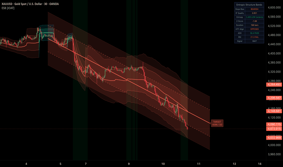
אינדיקטור