
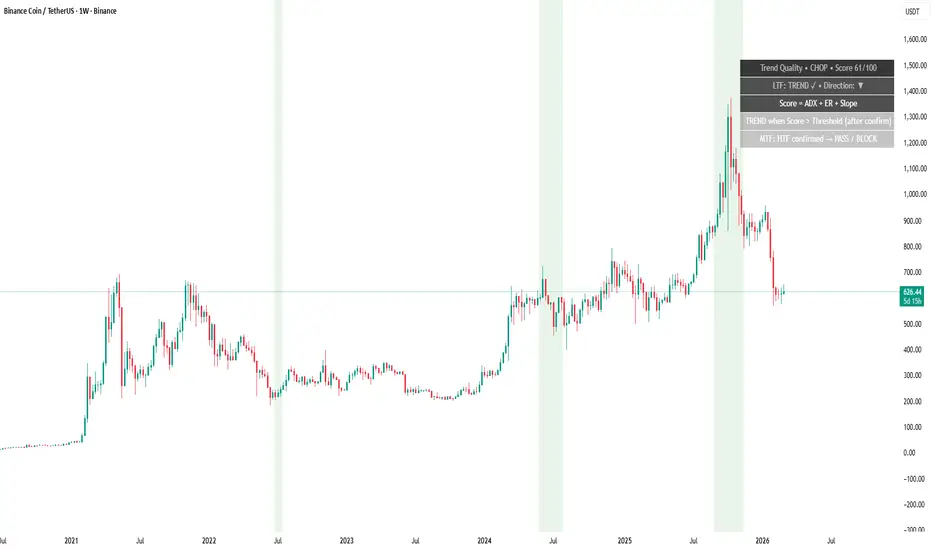
Panel UX & Chart Highlight - Building a Clean “Context Layer” You Can Actually Keep On‑Chart
A context indicator succeeds or fails on usability.
If the panel is too big, too noisy, or hard to read, traders turn it off — and then lose the benefit.
AG Pro Trend Quality is designed as a compact, configurable HUD:
- Position presets (top/middle/bottom; left/center/right)
- Text size presets (Tiny → Huge)
- Adaptive layout (fewer lines in CHOP if desired)
- Smart Clamp (auto-shortens text when space is limited)
- Optional gauge and direction style (arrows/text/off)
- Optional help lines that explain the scoring logic
- Optional background highlight by regime (TREND / CHOP / Both)
Two useful display modes
1) Execution Mode (minimal distraction)
- Panel on
- Help lines off
- Gauge optional
- Background highlight subtle (or off)
- Hide panel in CHOP if you only want trend windows visible
2) Study Mode (learning and review)
- Panel on
- Help lines on (to remember what the score represents)
- Score plot in pane (optional) to see regime transitions over time
- Event markers on (optional) to journal flips
Why this matters
A good regime tool should feel like a seatbelt:
always there, not intrusive — but helpful exactly when conditions change.
Limitations
Display settings improve readability, not market outcomes. The tool is still a context layer and should be used with risk management.
Risk disclosure
Educational content only. Not financial advice.
A context indicator succeeds or fails on usability.
If the panel is too big, too noisy, or hard to read, traders turn it off — and then lose the benefit.
AG Pro Trend Quality is designed as a compact, configurable HUD:
- Position presets (top/middle/bottom; left/center/right)
- Text size presets (Tiny → Huge)
- Adaptive layout (fewer lines in CHOP if desired)
- Smart Clamp (auto-shortens text when space is limited)
- Optional gauge and direction style (arrows/text/off)
- Optional help lines that explain the scoring logic
- Optional background highlight by regime (TREND / CHOP / Both)
Two useful display modes
1) Execution Mode (minimal distraction)
- Panel on
- Help lines off
- Gauge optional
- Background highlight subtle (or off)
- Hide panel in CHOP if you only want trend windows visible
2) Study Mode (learning and review)
- Panel on
- Help lines on (to remember what the score represents)
- Score plot in pane (optional) to see regime transitions over time
- Event markers on (optional) to journal flips
Why this matters
A good regime tool should feel like a seatbelt:
always there, not intrusive — but helpful exactly when conditions change.
Limitations
Display settings improve readability, not market outcomes. The tool is still a context layer and should be used with risk management.
Risk disclosure
Educational content only. Not financial advice.

🧠 Trading Suite - Flagship Workflow
tradingview.com/script/XJmX3p98-Trading-Suite-AGPro-Series/
🔷 Crypto Setup Planner - Multi-Symbol Planner
tradingview.com/script/LgVRo7Ql-Crypto-Setup-Planner-AGPro-Series/
tradingview.com/script/XJmX3p98-Trading-Suite-AGPro-Series/
🔷 Crypto Setup Planner - Multi-Symbol Planner
tradingview.com/script/LgVRo7Ql-Crypto-Setup-Planner-AGPro-Series/
Disclaimer
The information and publications are not meant to be, and do not constitute, financial, investment, trading, or other types of advice or recommendations supplied or endorsed by TradingView. Read more in the Terms of Use.
🧠 Trading Suite - Flagship Workflow
tradingview.com/script/XJmX3p98-Trading-Suite-AGPro-Series/
🔷 Crypto Setup Planner - Multi-Symbol Planner
tradingview.com/script/LgVRo7Ql-Crypto-Setup-Planner-AGPro-Series/
tradingview.com/script/XJmX3p98-Trading-Suite-AGPro-Series/
🔷 Crypto Setup Planner - Multi-Symbol Planner
tradingview.com/script/LgVRo7Ql-Crypto-Setup-Planner-AGPro-Series/
Disclaimer
The information and publications are not meant to be, and do not constitute, financial, investment, trading, or other types of advice or recommendations supplied or endorsed by TradingView. Read more in the Terms of Use.