
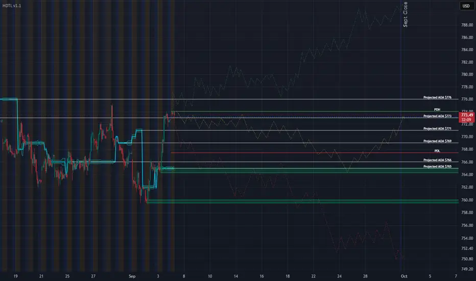
This is a 1-hour SPY chart, and the scenarios on it extend all the way through the end of September.
That is much longer than most of the scenario maps I normally share, so before we talk about Green, Yellow or Red, I want to explain exactly what this chart is — and what it is not.
First: these dotted lines are NOT predictions
I am not saying:
“SPY will be at this exact price on September 14, then it will drop on September 18, then rally again on September 25.”
I cannot know that.
Nobody can.
Think of this chart like looking at a map before taking a road trip.
You might say:
If Highway A is clear, I can take that route.
If there is traffic, I can take Highway B.
If both roads are blocked, I have another route.
You are not predicting which road will have traffic.
You are simply making sure you know what to do before you get there.
That is what these scenarios are.
Preparation > Prediction.
Where SPY is starting
At the time of this chart, SPY is around 773–774.
HDTL is showing several important Areas of Agreement around price:
776 — major upper Projected AOA
773 — Projected AOA
771 — Projected AOA
769 — Projected AOA
~767–768 — prior-day structure
766 — Projected AOA
765 — Projected AOA / demand area
~760 — another important demand area
If you are new to HDTL, an Area of Agreement is basically an area where price has previously spent enough time doing business that I expect traders to care about it again.
Think of them like floors in a building.
Price can move from one floor to another.
Sometimes it walks right through.
Sometimes it stops.
Sometimes it gets rejected and goes back downstairs.
That is why I am much more interested in how price behaves around these levels than I am in trying to predict every candle.
What is Wall Street saying?
Interestingly, Wall Street is still broadly optimistic.
A recent Reuters survey of 46 strategists put the median year-end S&P 500 target around 7,900. J.P. Morgan recently raised its own target to 8,000, citing strong corporate earnings and continued AI-related investment.
So the professional consensus is not:
“The market is about to collapse.”
It is closer to:
“We still think the market can finish the year higher, but the path may be messy.”
That distinction matters.
A bullish year-end target does NOT mean September has to go straight up.
SPY could fall 3%, rally 5%, chop sideways for two weeks, and still finish the year higher.
This is one reason I do not build my trading around somebody else's year-end price target.
Charles Schwab recently made this exact point. Their research showed that Wall Street targets are often changed after the market moves. When prices fall, analysts lower targets. When prices recover, they raise them again.
In other words, even very smart analysts are frequently reacting to the market rather than predicting it.
So I listen to analysts.
I read their reasoning.
But I do not treat their target like a magic number.
What is the media saying?
The media has two major stories right now.
Story #1: September has a bad reputation
Historically, September has been one of the weaker months for stocks.
And because this is also a U.S. midterm-election year, some historical studies show September has tended to be even rougher than normal.
But this is where people get themselves in trouble.
“September is historically weak” does not mean:
“SPY must fall this September.”
Seasonality is a tendency.
It is not a law.
If I told you Missouri is usually cold in January, that would be useful information.
It would not tell you the exact temperature on January 17.
Same idea.
Story #2: The Fed, inflation and interest rates still matter
The market is currently trying to figure out what the Federal Reserve will do at its September 15–16 meeting.
That decision will depend heavily on economic data.
Today we get the August jobs report.
Next week we get inflation data.
PPI comes first.
Then CPI.
Those numbers can move expectations for interest rates very quickly.
Earlier this week the market was pricing a much greater chance of another rate increase.
Then Fed Governor Christopher Waller sounded more comfortable waiting if inflation continues improving, and those expectations moved back toward roughly 50/50.
This is important because interest rates affect almost everything.
Higher rates make borrowing more expensive.
They also make bonds more attractive compared with stocks.
That can pressure expensive growth stocks.
Lower or stable rates generally remove some of that pressure.
Then we have oil and geopolitics
The U.S.-Iran conflict has pushed energy prices higher and added another inflation risk.
If oil keeps rising, businesses pay more for transportation, manufacturing and energy.
Those costs can eventually make their way into inflation.
That creates a very simple chain:
Higher oil → more inflation pressure → potentially higher interest rates → tougher environment for stocks.
That is one reason I refuse to throw the Red scenario away just because the chart currently looks constructive.
Geopolitics can change the market very quickly.
What are regular investors saying?
This is where things get especially interesting.
The newest AAII sentiment survey has:
39.7% bullish
37.6% bearish
22.7% neutral
So bulls barely outnumber bears.
Bearish sentiment is also still above its long-term average.
That is not extreme excitement.
It is not extreme fear either.
It is basically:
“I think stocks may go higher.”
standing beside:
“I don't trust this market at all.”
😂
And social-media sentiment looks just as confused.
Stocktwits reported SPY sentiment still leaning bearish, while QQQ had moved back toward bullish this morning.
Again, mixed.
That matters because markets often become most interesting when price is strong but people still do not completely trust the move.
What is the options market saying?
The VIX closed Thursday around 14.32.
The VIX is often called the market's “fear gauge.”
When it gets very high, traders are paying a lot for protection against big moves.
When it is low, traders are generally expecting less near-term volatility.
At 14.32, the options market is not currently pricing panic.
So we have a strange combination:
The news sounds scary.
Oil is elevated.
Rates matter.
We have war risk.
We have a major Fed meeting coming.
September has a bad historical reputation.
But actual market volatility is still relatively calm.
That is worth paying attention to.
Now let's talk about the scenarios
🟢 GREEN — SPY proves it wants higher
The Green scenario is the straightforward bullish case.
The most important level for me is around 776.
I do NOT care if SPY simply touches 776.
I want to see acceptance above it.
What does acceptance mean?
Imagine jumping over a fence.
Touching 776 is like jumping over the fence for one second and immediately falling back.
Acceptance means:
SPY gets above the fence…
stays above the fence…
and starts walking around on the other side.
That could mean hourly closes above it, successful retests, buyers defending it and new structure forming above it.
If that happens, Green becomes much more believable.
From there, the upper 780s and eventually the area around 790 are completely reasonable possibilities during September.
But here is where I want to be very clear.
Once SPY gets above 776, HDTL currently gives me fewer established reference points.
That means the exact green dotted path becomes increasingly speculative.
So I like the Green idea.
I do not pretend I know the exact Green route.
Green gets stronger if:
776 breaks and holds.
Pullbacks become shallow.
Buyers defend reclaimed levels.
Treasury yields remain under control.
Inflation data is not hotter than expected.
Earnings and economic growth remain strong.
Green gets weaker if:
SPY repeatedly reaches 776 and gets slapped back underneath it.
🟡 YELLOW — My heaviest-weighted scenario
Yellow is still the scenario I currently like the most.
And I want to explain why, because Yellow is probably the hardest one for newer traders to understand.
Yellow does NOT mean:
“I think the market is bearish.”
It means:
“I think the market may need time to figure out what it wants to do.”
Markets do not always trend.
Sometimes buyers and sellers spend days fighting over the same territory.
That could mean SPY moves:
773 → 771 → 769 → 766
then back up again.
Maybe it tests 776.
Maybe it fails.
Maybe it pulls back into 765.
Maybe buyers show up there again.
That is what I mean by negotiation.
Imagine two people trying to agree on the price of a house.
Seller wants $400,000.
Buyer wants $370,000.
They might go:
Eventually they agree.
Markets do the same thing.
That is what these Areas of Agreement help us visualize.
And look at how much structure sits between 765 and 776.
There are multiple HDTL levels packed into a relatively small range.
That makes this an extremely logical area for price to spend time negotiating.
Why Yellow makes sense fundamentally too
Yellow also fits the current economic situation.
We have reasons to be bullish:
Corporate earnings have been strong.
Wall Street remains constructive.
AI investment remains a major growth driver.
The broader trend has been strong.
The VIX is not signaling panic.
But we also have reasons to be cautious:
September seasonality.
High Treasury yields.
Elevated oil prices.
Geopolitical risk.
Inflation uncertainty.
A Fed decision right in the middle of the month.
That's almost the definition of a rotational environment.
There is enough good news to keep buyers interested.
There is enough risk to prevent everyone from blindly chasing.
That is why Yellow remains my heaviest-weighted scenario.
🔴 RED — Something actually starts breaking
The Red scenario is not:
“I think the market crashes.”
It is:
“What happens if buyers stop defending the structure underneath us?”
The first cracks could appear around 769 and the prior-day area underneath it.
But those are not my biggest concern.
The real battlefield is around 765.
There is a cluster of HDTL structure there plus visible demand.
If SPY falls to 765 and buyers immediately step in?
Fine.
Yellow may still be alive.
If SPY drops underneath 765 and then begins staying underneath it?
Now we have a different conversation.
That would tell me the market has stopped respecting an area that previously mattered.
Then I start watching approximately 760.
If 760 fails too, the Red scenario becomes much more serious.
At that point, a move into the low 750s is not crazy.
And people sometimes hear “750” and think that means Armageddon.
It doesn't.
From the 770s, that's only a few percent lower.
Markets have ordinary corrections like that all the time.
Could Red become worse than I drew?
Absolutely.
And this is where I need to criticize my own chart.
The Red scenario I drew represents what I would call a normal bearish outcome.
It does NOT represent every possible disaster.
Imagine:
Inflation comes in much hotter than expected.
Oil explodes higher.
The Fed becomes much more aggressive.
Treasury yields surge.
The geopolitical situation gets dramatically worse.
Could SPY fall below my red dotted path?
Of course.
A scenario map is not supposed to contain every possible future.
If new information arrives, we update the map.
That is not failure.
That is trading.
And Green could surprise us too
Same thing in the other direction.
Suppose:
Jobs are fine.
Inflation cools.
The Fed holds rates.
Oil drops.
Geopolitical tensions calm down.
Corporate earnings remain excellent.
SPY could blow through 776 and move faster than my Green scenario suggests.
Again:
That would not make the chart “wrong.”
It would mean new evidence caused Green to deserve more weight.
So what are my weights?
Before today's jobs report, if you forced me to assign rough weights, I would say:
🟡 Yellow: 45%
🟢 Green: 30%
🔴 Red: 25%
These are NOT mathematical probabilities.
I did not run 100,000 simulations.
They simply describe how I currently rank the possibilities.
Yellow first.
Green second.
Red third.
And those weights can change as evidence changes.
That's important.
If today's data completely changes the environment, I am allowed to completely change my opinion.
There is no prize for being loyal to Friday's opinion on Tuesday.
What could change the entire chart?
A lot.
That is why mapping an entire month is so interesting.
Between now and the end of September we have:
Today's jobs report.
PPI inflation.
CPI inflation.
The September 15–16 Federal Reserve meeting.
Retail-sales data.
More labor data.
More inflation data later in the month.
The market will learn a lot more between now and September 30.
That means our scenarios should evolve too.
The biggest lesson in this chart
I don't actually care whether Yellow ends September looking almost exactly like the yellow dots I drew.
Seriously.
That is not how I grade this.
What I care about is whether these decision areas help us recognize when the market changes character.
For example:
If we are under 776?
Don't pretend Green has been confirmed.
If we're bouncing around 765–776?
Yellow makes sense.
If 765 breaks and sellers start controlling the area?
Red deserves more attention.
If 776 breaks and turns into support?
Green deserves more attention.
Very simple.
This is also why I prefer scenarios over analyst targets
Wall Street can say the S&P 500 will finish the year at 7,900 or 8,000.
Maybe they are right.
But that does not help me much if the market falls 5% first.
A trader has to live through the path, not just the destination.
That's what Charles Schwab's criticism of year-end targets gets right: markets change regimes, macro conditions change, forecasts get revised, and the journey can matter far more than the December closing number.
That is exactly what scenario planning is built for.
I don't need to know where SPY closes September 30.
I need to recognize what SPY is telling me along the way.
The simplest way to read this entire chart
Forget all the squiggly lines for a second.
Remember three things:
ABOVE 776
Green starts getting interesting.
Show me acceptance.
765–776
Yellow battlefield.
Expect negotiation.
BELOW 765
Red starts getting interesting.
Then 760 becomes very important.
That's it.
Everything else is detail.
Why I practice this every week
I believe one of the biggest mistakes traders make is waiting until something happens before deciding what it means.
SPY suddenly drops.
Panic.
SPY suddenly rallies.
FOMO.
SPY goes sideways.
Boredom.
Then people make emotional decisions.
Scenario planning flips that around.
I ask myself beforehand:
What if it rallies?
Okay.
What if it sells off?
Okay.
What if it does absolutely nothing?
Okay.
Now when one of those things actually happens, I have already thought about it.
That does not mean I know the future.
It means the future has fewer ways to surprise me.
And that's the entire point.
We did the same thing last Sunday.
We mapped bullish, bearish and rotational possibilities before the week started.
Yellow was my heaviest-weighted scenario.
Then the market spent the week moving through many of the exact decision areas we had already identified.
Not because we predicted the future.
Because we prepared for it.
None of what happened this week was shocking because we already said it could happen.
That is much longer than most of the scenario maps I normally share, so before we talk about Green, Yellow or Red, I want to explain exactly what this chart is — and what it is not.
First: these dotted lines are NOT predictions
I am not saying:
“SPY will be at this exact price on September 14, then it will drop on September 18, then rally again on September 25.”
I cannot know that.
Nobody can.
Think of this chart like looking at a map before taking a road trip.
You might say:
If Highway A is clear, I can take that route.
If there is traffic, I can take Highway B.
If both roads are blocked, I have another route.
You are not predicting which road will have traffic.
You are simply making sure you know what to do before you get there.
That is what these scenarios are.
Preparation > Prediction.
Where SPY is starting
At the time of this chart, SPY is around 773–774.
HDTL is showing several important Areas of Agreement around price:
776 — major upper Projected AOA
773 — Projected AOA
771 — Projected AOA
769 — Projected AOA
~767–768 — prior-day structure
766 — Projected AOA
765 — Projected AOA / demand area
~760 — another important demand area
If you are new to HDTL, an Area of Agreement is basically an area where price has previously spent enough time doing business that I expect traders to care about it again.
Think of them like floors in a building.
Price can move from one floor to another.
Sometimes it walks right through.
Sometimes it stops.
Sometimes it gets rejected and goes back downstairs.
That is why I am much more interested in how price behaves around these levels than I am in trying to predict every candle.
What is Wall Street saying?
Interestingly, Wall Street is still broadly optimistic.
A recent Reuters survey of 46 strategists put the median year-end S&P 500 target around 7,900. J.P. Morgan recently raised its own target to 8,000, citing strong corporate earnings and continued AI-related investment.
So the professional consensus is not:
“The market is about to collapse.”
It is closer to:
“We still think the market can finish the year higher, but the path may be messy.”
That distinction matters.
A bullish year-end target does NOT mean September has to go straight up.
SPY could fall 3%, rally 5%, chop sideways for two weeks, and still finish the year higher.
This is one reason I do not build my trading around somebody else's year-end price target.
Charles Schwab recently made this exact point. Their research showed that Wall Street targets are often changed after the market moves. When prices fall, analysts lower targets. When prices recover, they raise them again.
In other words, even very smart analysts are frequently reacting to the market rather than predicting it.
So I listen to analysts.
I read their reasoning.
But I do not treat their target like a magic number.
What is the media saying?
The media has two major stories right now.
Story #1: September has a bad reputation
Historically, September has been one of the weaker months for stocks.
And because this is also a U.S. midterm-election year, some historical studies show September has tended to be even rougher than normal.
But this is where people get themselves in trouble.
“September is historically weak” does not mean:
“SPY must fall this September.”
Seasonality is a tendency.
It is not a law.
If I told you Missouri is usually cold in January, that would be useful information.
It would not tell you the exact temperature on January 17.
Same idea.
Story #2: The Fed, inflation and interest rates still matter
The market is currently trying to figure out what the Federal Reserve will do at its September 15–16 meeting.
That decision will depend heavily on economic data.
Today we get the August jobs report.
Next week we get inflation data.
PPI comes first.
Then CPI.
Those numbers can move expectations for interest rates very quickly.
Earlier this week the market was pricing a much greater chance of another rate increase.
Then Fed Governor Christopher Waller sounded more comfortable waiting if inflation continues improving, and those expectations moved back toward roughly 50/50.
This is important because interest rates affect almost everything.
Higher rates make borrowing more expensive.
They also make bonds more attractive compared with stocks.
That can pressure expensive growth stocks.
Lower or stable rates generally remove some of that pressure.
Then we have oil and geopolitics
The U.S.-Iran conflict has pushed energy prices higher and added another inflation risk.
If oil keeps rising, businesses pay more for transportation, manufacturing and energy.
Those costs can eventually make their way into inflation.
That creates a very simple chain:
Higher oil → more inflation pressure → potentially higher interest rates → tougher environment for stocks.
That is one reason I refuse to throw the Red scenario away just because the chart currently looks constructive.
Geopolitics can change the market very quickly.
What are regular investors saying?
This is where things get especially interesting.
The newest AAII sentiment survey has:
39.7% bullish
37.6% bearish
22.7% neutral
So bulls barely outnumber bears.
Bearish sentiment is also still above its long-term average.
That is not extreme excitement.
It is not extreme fear either.
It is basically:
“I think stocks may go higher.”
standing beside:
“I don't trust this market at all.”
😂
And social-media sentiment looks just as confused.
Stocktwits reported SPY sentiment still leaning bearish, while QQQ had moved back toward bullish this morning.
Again, mixed.
That matters because markets often become most interesting when price is strong but people still do not completely trust the move.
What is the options market saying?
The VIX closed Thursday around 14.32.
The VIX is often called the market's “fear gauge.”
When it gets very high, traders are paying a lot for protection against big moves.
When it is low, traders are generally expecting less near-term volatility.
At 14.32, the options market is not currently pricing panic.
So we have a strange combination:
The news sounds scary.
Oil is elevated.
Rates matter.
We have war risk.
We have a major Fed meeting coming.
September has a bad historical reputation.
But actual market volatility is still relatively calm.
That is worth paying attention to.
Now let's talk about the scenarios
🟢 GREEN — SPY proves it wants higher
The Green scenario is the straightforward bullish case.
The most important level for me is around 776.
I do NOT care if SPY simply touches 776.
I want to see acceptance above it.
What does acceptance mean?
Imagine jumping over a fence.
Touching 776 is like jumping over the fence for one second and immediately falling back.
Acceptance means:
SPY gets above the fence…
stays above the fence…
and starts walking around on the other side.
That could mean hourly closes above it, successful retests, buyers defending it and new structure forming above it.
If that happens, Green becomes much more believable.
From there, the upper 780s and eventually the area around 790 are completely reasonable possibilities during September.
But here is where I want to be very clear.
Once SPY gets above 776, HDTL currently gives me fewer established reference points.
That means the exact green dotted path becomes increasingly speculative.
So I like the Green idea.
I do not pretend I know the exact Green route.
Green gets stronger if:
776 breaks and holds.
Pullbacks become shallow.
Buyers defend reclaimed levels.
Treasury yields remain under control.
Inflation data is not hotter than expected.
Earnings and economic growth remain strong.
Green gets weaker if:
SPY repeatedly reaches 776 and gets slapped back underneath it.
🟡 YELLOW — My heaviest-weighted scenario
Yellow is still the scenario I currently like the most.
And I want to explain why, because Yellow is probably the hardest one for newer traders to understand.
Yellow does NOT mean:
“I think the market is bearish.”
It means:
“I think the market may need time to figure out what it wants to do.”
Markets do not always trend.
Sometimes buyers and sellers spend days fighting over the same territory.
That could mean SPY moves:
773 → 771 → 769 → 766
then back up again.
Maybe it tests 776.
Maybe it fails.
Maybe it pulls back into 765.
Maybe buyers show up there again.
That is what I mean by negotiation.
Imagine two people trying to agree on the price of a house.
Seller wants $400,000.
Buyer wants $370,000.
They might go:
Eventually they agree.
Markets do the same thing.
That is what these Areas of Agreement help us visualize.
And look at how much structure sits between 765 and 776.
There are multiple HDTL levels packed into a relatively small range.
That makes this an extremely logical area for price to spend time negotiating.
Why Yellow makes sense fundamentally too
Yellow also fits the current economic situation.
We have reasons to be bullish:
Corporate earnings have been strong.
Wall Street remains constructive.
AI investment remains a major growth driver.
The broader trend has been strong.
The VIX is not signaling panic.
But we also have reasons to be cautious:
September seasonality.
High Treasury yields.
Elevated oil prices.
Geopolitical risk.
Inflation uncertainty.
A Fed decision right in the middle of the month.
That's almost the definition of a rotational environment.
There is enough good news to keep buyers interested.
There is enough risk to prevent everyone from blindly chasing.
That is why Yellow remains my heaviest-weighted scenario.
🔴 RED — Something actually starts breaking
The Red scenario is not:
“I think the market crashes.”
It is:
“What happens if buyers stop defending the structure underneath us?”
The first cracks could appear around 769 and the prior-day area underneath it.
But those are not my biggest concern.
The real battlefield is around 765.
There is a cluster of HDTL structure there plus visible demand.
If SPY falls to 765 and buyers immediately step in?
Fine.
Yellow may still be alive.
If SPY drops underneath 765 and then begins staying underneath it?
Now we have a different conversation.
That would tell me the market has stopped respecting an area that previously mattered.
Then I start watching approximately 760.
If 760 fails too, the Red scenario becomes much more serious.
At that point, a move into the low 750s is not crazy.
And people sometimes hear “750” and think that means Armageddon.
It doesn't.
From the 770s, that's only a few percent lower.
Markets have ordinary corrections like that all the time.
Could Red become worse than I drew?
Absolutely.
And this is where I need to criticize my own chart.
The Red scenario I drew represents what I would call a normal bearish outcome.
It does NOT represent every possible disaster.
Imagine:
Inflation comes in much hotter than expected.
Oil explodes higher.
The Fed becomes much more aggressive.
Treasury yields surge.
The geopolitical situation gets dramatically worse.
Could SPY fall below my red dotted path?
Of course.
A scenario map is not supposed to contain every possible future.
If new information arrives, we update the map.
That is not failure.
That is trading.
And Green could surprise us too
Same thing in the other direction.
Suppose:
Jobs are fine.
Inflation cools.
The Fed holds rates.
Oil drops.
Geopolitical tensions calm down.
Corporate earnings remain excellent.
SPY could blow through 776 and move faster than my Green scenario suggests.
Again:
That would not make the chart “wrong.”
It would mean new evidence caused Green to deserve more weight.
So what are my weights?
Before today's jobs report, if you forced me to assign rough weights, I would say:
🟡 Yellow: 45%
🟢 Green: 30%
🔴 Red: 25%
These are NOT mathematical probabilities.
I did not run 100,000 simulations.
They simply describe how I currently rank the possibilities.
Yellow first.
Green second.
Red third.
And those weights can change as evidence changes.
That's important.
If today's data completely changes the environment, I am allowed to completely change my opinion.
There is no prize for being loyal to Friday's opinion on Tuesday.
What could change the entire chart?
A lot.
That is why mapping an entire month is so interesting.
Between now and the end of September we have:
Today's jobs report.
PPI inflation.
CPI inflation.
The September 15–16 Federal Reserve meeting.
Retail-sales data.
More labor data.
More inflation data later in the month.
The market will learn a lot more between now and September 30.
That means our scenarios should evolve too.
The biggest lesson in this chart
I don't actually care whether Yellow ends September looking almost exactly like the yellow dots I drew.
Seriously.
That is not how I grade this.
What I care about is whether these decision areas help us recognize when the market changes character.
For example:
If we are under 776?
Don't pretend Green has been confirmed.
If we're bouncing around 765–776?
Yellow makes sense.
If 765 breaks and sellers start controlling the area?
Red deserves more attention.
If 776 breaks and turns into support?
Green deserves more attention.
Very simple.
This is also why I prefer scenarios over analyst targets
Wall Street can say the S&P 500 will finish the year at 7,900 or 8,000.
Maybe they are right.
But that does not help me much if the market falls 5% first.
A trader has to live through the path, not just the destination.
That's what Charles Schwab's criticism of year-end targets gets right: markets change regimes, macro conditions change, forecasts get revised, and the journey can matter far more than the December closing number.
That is exactly what scenario planning is built for.
I don't need to know where SPY closes September 30.
I need to recognize what SPY is telling me along the way.
The simplest way to read this entire chart
Forget all the squiggly lines for a second.
Remember three things:
ABOVE 776
Green starts getting interesting.
Show me acceptance.
765–776
Yellow battlefield.
Expect negotiation.
BELOW 765
Red starts getting interesting.
Then 760 becomes very important.
That's it.
Everything else is detail.
Why I practice this every week
I believe one of the biggest mistakes traders make is waiting until something happens before deciding what it means.
SPY suddenly drops.
Panic.
SPY suddenly rallies.
FOMO.
SPY goes sideways.
Boredom.
Then people make emotional decisions.
Scenario planning flips that around.
I ask myself beforehand:
What if it rallies?
Okay.
What if it sells off?
Okay.
What if it does absolutely nothing?
Okay.
Now when one of those things actually happens, I have already thought about it.
That does not mean I know the future.
It means the future has fewer ways to surprise me.
And that's the entire point.
We did the same thing last Sunday.
We mapped bullish, bearish and rotational possibilities before the week started.
Yellow was my heaviest-weighted scenario.
Then the market spent the week moving through many of the exact decision areas we had already identified.
Not because we predicted the future.
Because we prepared for it.
None of what happened this week was shocking because we already said it could happen.

Related publications
Disclaimer
The information and publications are not meant to be, and do not constitute, financial, investment, trading, or other types of advice or recommendations supplied or endorsed by TradingView. Read more in the Terms of Use.
Related publications
Disclaimer
The information and publications are not meant to be, and do not constitute, financial, investment, trading, or other types of advice or recommendations supplied or endorsed by TradingView. Read more in the Terms of Use.