
Another US Recession Brewing?
US Recession Study: Rates, Inflation, Treasury Yields, and Commercial Bank Balance Sheets
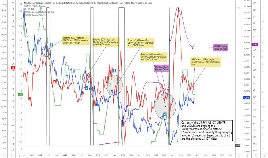
This chart compares several macroeconomic indicators that have historically aligned in a very specific way prior to, or around, major US recessions.
The purpose of this analysis is not to claim that a US recession is guaranteed, nor to predict an exact timing window. Rather, the purpose is to highlight a recurring macro-structural pattern that has appeared before several historic recessionary periods, namely:
declining policy rates, elevated or rising US 10Y yields, rising inflation pressure, and an expanding commercial banking balance sheet.
When these four variables begin to align, it may indicate that the economy is moving into a late-cycle or stress-transition phase, where monetary policy, inflation, bond yields, and banking-sector liquidity are no longer moving in a clean expansionary sequence.
________________________________________
Indicator Legend
The chart includes the following indicators:
USINTR — Green Step Line
USINTR represents the US interest rate / Federal Reserve policy rate.
On the chart, this is shown as the green step line. Because policy rates are adjusted in steps by the Federal Reserve, the indicator naturally appears as a stair-step structure rather than a smooth line. Historically, a falling USINTR has often appeared before or during recessionary periods because the Federal Reserve usually begins cutting rates when it sees economic weakness, financial stress, or disinflationary pressure building in the system. However, an important point is that rate cuts themselves are not automatically bullish. In early-cycle environments, rate cuts can support recovery. But in late-cycle environments, rate cuts may instead confirm that the Fed is responding to underlying economic deterioration.
In other words, the meaning of declining USINTR depends heavily on the wider macro context.
________________________________________
US10Y — Blue Line
US10Y represents the US 10-Year Treasury yield.
On the chart, this is shown as the blue line.
The US 10Y yield reflects longer-term expectations around inflation, growth, term premium, fiscal pressure, and bond-market risk. Prior to several recessionary periods, the US 10Y yield either increased, remained elevated, or failed to decline as quickly as the Federal Reserve policy rate. This is important because if the Fed is cutting rates while the 10Y yield remains elevated, financial conditions may not loosen as much as the policy rate alone would suggest.
In other words, declining short-term rates do not necessarily mean the broader economy is receiving relief if long-term yields remain high.
This creates a potentially stressful macro configuration: the Fed is trying to ease, but the long end of the bond market is not fully cooperating. That type of divergence can signal persistent inflation concerns, fiscal stress, bond-market resistance, or a loss of confidence in the ability of rate cuts alone to stabilize the system.
________________________________________
USIRYY — Red Line
USIRYY represents the US inflation rate year-over-year.
On the chart, this is shown as the red line.
Inflation is critical in this comparison because it determines how much flexibility the Federal Reserve actually has. If inflation is low and falling, the Fed can cut rates aggressively without much conflict. But if inflation is rising or remains sticky while growth begins to weaken, the Fed faces a much more difficult policy environment. Historically, several recessionary environments were preceded by or accompanied by periods where inflation pressures remained problematic even as the economy was weakening. That creates a difficult “policy trap”: cutting rates may be necessary because growth is weakening, but cutting too much may risk reigniting inflation or weakening confidence in the currency and bond market. In this chart, the red USIRYY line is therefore important because rising inflation pressure can reduce the effectiveness of falling policy rates.
________________________________________
USCBBS — Purple Line
USCBBS represents the US Commercial Bank Balance Sheet.
On the chart, this is shown as the purple line.
This indicator helps show the size of commercial banking-sector balance sheets.
An increase in USCBBS can reflect expanding banking-sector assets, liquidity support, credit-system changes, or balance-sheet growth within the financial system.
The key point is not that a rising commercial bank balance sheet is automatically bearish. In many environments, balance-sheet expansion can be supportive.
However, in the context of recession analysis, a rising USCBBS becomes more interesting when it occurs alongside: falling policy rates, elevated long-term yields, and rising inflation pressure.
That combination can suggest that liquidity or balance-sheet expansion is occurring not because the economy is entering a clean growth phase, but because the system may be requiring more support, more credit accommodation, or more balance-sheet absorption. This is especially important after 2019 and 2020, where the purple USCBBS line increased significantly and has remained structurally elevated compared to previous cycles.
________________________________________
Historic Recession Pattern
Across several historic recession windows, the same general structure can be observed:
Prior to the 1990 recession
US10Y and USIRYY increased while USINTR also moved higher into the late-cycle period. This reflected a classic tightening/inflation-pressure environment, where elevated rates and inflation eventually contributed to macro stress.
Prior to the 2001 recession
US10Y and USIRYY increased while USINTR moved lower. This was a different type of setup.
The Fed began easing, but the broader macro backdrop still contained inflation/yield pressure. This suggested that cutting short-term rates did not immediately remove stress from the system.
Prior to the 2008 recession
A similar pattern appeared again. US10Y and USIRYY increased while USINTR moved lower.
This was particularly important because the Fed had already begun responding to economic and financial stress, yet the system continued moving toward recession.
Again, the decline in policy rates was not a clean bullish signal. Instead, it reflected the Fed reacting to deteriorating conditions.
Prior to the 2020 recession
US10Y and USIRYY increased while USINTR remained lower compared to the preceding tightening phase.The 2020 recession was unique because of the external shock, but the macro system was already showing signs of vulnerability before the recession formally began.
The USCBBS line also became highly relevant from 2019 onward, as the commercial banking balance sheet began rising significantly.
________________________________________
Current Setup
Currently, the chart shows another potentially important alignment:
USIRYY, US10Y, USINTR, and USCBBS are aligning in a manner that resembles prior pre-recessionary or recession-adjacent macro structures. The current configuration is notable because: USINTR has declined, suggesting the Federal Reserve is no longer in a pure tightening phase. US10Y remains elevated, meaning long-term yields are still applying pressure to the economy, borrowers, valuations, housing, credit, and fiscal sustainability. USIRYY has increased, showing that inflation pressure has not fully disappeared. USCBBS has been rising again since December 2025, suggesting renewed expansion or support within the commercial banking balance-sheet structure. The important point is the interaction between these indicators.
If policy rates are falling but long-term yields remain elevated, then monetary easing may not translate into broad relief. If inflation is rising at the same time, then the Fed may have less room to cut aggressively. And if commercial bank balance sheets are expanding during this same window, it may suggest that the financial system is already moving into a more defensive or support-dependent phase. This does not mean a recession must happen immediately.
But historically, this type of alignment has not been a clean “risk-on” macro signal. It has often appeared when the economy was transitioning from late-cycle expansion into stress, slowdown, or recession.
________________________________________
Why This Pattern Matters
A common mistake in recession analysis is to focus on one indicator in isolation.
For example: Falling rates can look bullish. Rising bank balance sheets can look supportive.
Elevated yields can look like confidence in growth. Inflation can look like nominal strength.
But when all of these appear together, the interpretation changes. The structure becomes more complex. The Fed may be easing, but the bond market may still be tight. Inflation may be rising, limiting policy flexibility. Commercial bank balance sheets may be expanding, but not necessarily because the economy is healthy. This is why the combined alignment matters more than any single line on the chart. The recessionary signal is not one isolated indicator.
The signal is the macro contradiction between them.
________________________________________
Relationship to My FCBI Indicators
I originally intended to publish this chart with my custom FCBI indicators included.
However, because the analysis contained my custom FCBI scripts, TradingView would not allow the chart idea to be published in that form. For that reason, I removed the custom FCBI indicators from this version so that the recession comparison study could be published.
Users can still apply my FCBI indicators separately to perform a deeper version of this analysis.
The FCBI indicators are designed to measure the relationship between financial conditions and inflation pressure. In simple terms, they help assess whether financial conditions are acting as a brake or whether they are becoming too loose relative to inflation.
This matters because recessions often emerge not simply from high rates or low rates, but from the interaction between: inflation pressure, bond yields, policy rates, liquidity conditions, and the broader financial system. The FCBI framework is therefore useful as a separate overlay because it can help identify when financial conditions are tightening, loosening, or diverging from the inflation backdrop.
In this chart, even without the FCBI indicators attached, the same macro logic can still be observed through the relationship between USINTR, US10Y, USIRYY, and USCBBS.
________________________________________
Conclusion
The current macro setup does not confirm a recession by itself. However, the alignment between: declining USINTR, elevated US10Y yields, rising USIRYY, and rising USCBBS
is worth monitoring closely because similar configurations have appeared before or around previous US recessions. The key takeaway is that falling policy rates are not automatically bullish when long-term yields remain elevated, inflation begins rising again, and commercial bank balance sheets expand. Instead, that combination may suggest that the economy is entering a more fragile phase, where the Federal Reserve is attempting to ease while the broader financial system remains under pressure. For now, this chart should be viewed as a macro warning structure rather than a recession call.
The signal is not certainty.
The signal is alignment.
And historically, this type of alignment has often deserved attention.
This chart compares several macroeconomic indicators that have historically aligned in a very specific way prior to, or around, major US recessions.
The purpose of this analysis is not to claim that a US recession is guaranteed, nor to predict an exact timing window. Rather, the purpose is to highlight a recurring macro-structural pattern that has appeared before several historic recessionary periods, namely:
declining policy rates, elevated or rising US 10Y yields, rising inflation pressure, and an expanding commercial banking balance sheet.
When these four variables begin to align, it may indicate that the economy is moving into a late-cycle or stress-transition phase, where monetary policy, inflation, bond yields, and banking-sector liquidity are no longer moving in a clean expansionary sequence.
________________________________________
Indicator Legend
The chart includes the following indicators:
USINTR — Green Step Line
USINTR represents the US interest rate / Federal Reserve policy rate.
On the chart, this is shown as the green step line. Because policy rates are adjusted in steps by the Federal Reserve, the indicator naturally appears as a stair-step structure rather than a smooth line. Historically, a falling USINTR has often appeared before or during recessionary periods because the Federal Reserve usually begins cutting rates when it sees economic weakness, financial stress, or disinflationary pressure building in the system. However, an important point is that rate cuts themselves are not automatically bullish. In early-cycle environments, rate cuts can support recovery. But in late-cycle environments, rate cuts may instead confirm that the Fed is responding to underlying economic deterioration.
In other words, the meaning of declining USINTR depends heavily on the wider macro context.
________________________________________
US10Y — Blue Line
US10Y represents the US 10-Year Treasury yield.
On the chart, this is shown as the blue line.
The US 10Y yield reflects longer-term expectations around inflation, growth, term premium, fiscal pressure, and bond-market risk. Prior to several recessionary periods, the US 10Y yield either increased, remained elevated, or failed to decline as quickly as the Federal Reserve policy rate. This is important because if the Fed is cutting rates while the 10Y yield remains elevated, financial conditions may not loosen as much as the policy rate alone would suggest.
In other words, declining short-term rates do not necessarily mean the broader economy is receiving relief if long-term yields remain high.
This creates a potentially stressful macro configuration: the Fed is trying to ease, but the long end of the bond market is not fully cooperating. That type of divergence can signal persistent inflation concerns, fiscal stress, bond-market resistance, or a loss of confidence in the ability of rate cuts alone to stabilize the system.
________________________________________
USIRYY — Red Line
USIRYY represents the US inflation rate year-over-year.
On the chart, this is shown as the red line.
Inflation is critical in this comparison because it determines how much flexibility the Federal Reserve actually has. If inflation is low and falling, the Fed can cut rates aggressively without much conflict. But if inflation is rising or remains sticky while growth begins to weaken, the Fed faces a much more difficult policy environment. Historically, several recessionary environments were preceded by or accompanied by periods where inflation pressures remained problematic even as the economy was weakening. That creates a difficult “policy trap”: cutting rates may be necessary because growth is weakening, but cutting too much may risk reigniting inflation or weakening confidence in the currency and bond market. In this chart, the red USIRYY line is therefore important because rising inflation pressure can reduce the effectiveness of falling policy rates.
________________________________________
USCBBS — Purple Line
USCBBS represents the US Commercial Bank Balance Sheet.
On the chart, this is shown as the purple line.
This indicator helps show the size of commercial banking-sector balance sheets.
An increase in USCBBS can reflect expanding banking-sector assets, liquidity support, credit-system changes, or balance-sheet growth within the financial system.
The key point is not that a rising commercial bank balance sheet is automatically bearish. In many environments, balance-sheet expansion can be supportive.
However, in the context of recession analysis, a rising USCBBS becomes more interesting when it occurs alongside: falling policy rates, elevated long-term yields, and rising inflation pressure.
That combination can suggest that liquidity or balance-sheet expansion is occurring not because the economy is entering a clean growth phase, but because the system may be requiring more support, more credit accommodation, or more balance-sheet absorption. This is especially important after 2019 and 2020, where the purple USCBBS line increased significantly and has remained structurally elevated compared to previous cycles.
________________________________________
Historic Recession Pattern
Across several historic recession windows, the same general structure can be observed:
Prior to the 1990 recession
US10Y and USIRYY increased while USINTR also moved higher into the late-cycle period. This reflected a classic tightening/inflation-pressure environment, where elevated rates and inflation eventually contributed to macro stress.
Prior to the 2001 recession
US10Y and USIRYY increased while USINTR moved lower. This was a different type of setup.
The Fed began easing, but the broader macro backdrop still contained inflation/yield pressure. This suggested that cutting short-term rates did not immediately remove stress from the system.
Prior to the 2008 recession
A similar pattern appeared again. US10Y and USIRYY increased while USINTR moved lower.
This was particularly important because the Fed had already begun responding to economic and financial stress, yet the system continued moving toward recession.
Again, the decline in policy rates was not a clean bullish signal. Instead, it reflected the Fed reacting to deteriorating conditions.
Prior to the 2020 recession
US10Y and USIRYY increased while USINTR remained lower compared to the preceding tightening phase.The 2020 recession was unique because of the external shock, but the macro system was already showing signs of vulnerability before the recession formally began.
The USCBBS line also became highly relevant from 2019 onward, as the commercial banking balance sheet began rising significantly.
________________________________________
Current Setup
Currently, the chart shows another potentially important alignment:
USIRYY, US10Y, USINTR, and USCBBS are aligning in a manner that resembles prior pre-recessionary or recession-adjacent macro structures. The current configuration is notable because: USINTR has declined, suggesting the Federal Reserve is no longer in a pure tightening phase. US10Y remains elevated, meaning long-term yields are still applying pressure to the economy, borrowers, valuations, housing, credit, and fiscal sustainability. USIRYY has increased, showing that inflation pressure has not fully disappeared. USCBBS has been rising again since December 2025, suggesting renewed expansion or support within the commercial banking balance-sheet structure. The important point is the interaction between these indicators.
If policy rates are falling but long-term yields remain elevated, then monetary easing may not translate into broad relief. If inflation is rising at the same time, then the Fed may have less room to cut aggressively. And if commercial bank balance sheets are expanding during this same window, it may suggest that the financial system is already moving into a more defensive or support-dependent phase. This does not mean a recession must happen immediately.
But historically, this type of alignment has not been a clean “risk-on” macro signal. It has often appeared when the economy was transitioning from late-cycle expansion into stress, slowdown, or recession.
________________________________________
Why This Pattern Matters
A common mistake in recession analysis is to focus on one indicator in isolation.
For example: Falling rates can look bullish. Rising bank balance sheets can look supportive.
Elevated yields can look like confidence in growth. Inflation can look like nominal strength.
But when all of these appear together, the interpretation changes. The structure becomes more complex. The Fed may be easing, but the bond market may still be tight. Inflation may be rising, limiting policy flexibility. Commercial bank balance sheets may be expanding, but not necessarily because the economy is healthy. This is why the combined alignment matters more than any single line on the chart. The recessionary signal is not one isolated indicator.
The signal is the macro contradiction between them.
________________________________________
Relationship to My FCBI Indicators
I originally intended to publish this chart with my custom FCBI indicators included.
However, because the analysis contained my custom FCBI scripts, TradingView would not allow the chart idea to be published in that form. For that reason, I removed the custom FCBI indicators from this version so that the recession comparison study could be published.
Users can still apply my FCBI indicators separately to perform a deeper version of this analysis.
The FCBI indicators are designed to measure the relationship between financial conditions and inflation pressure. In simple terms, they help assess whether financial conditions are acting as a brake or whether they are becoming too loose relative to inflation.
This matters because recessions often emerge not simply from high rates or low rates, but from the interaction between: inflation pressure, bond yields, policy rates, liquidity conditions, and the broader financial system. The FCBI framework is therefore useful as a separate overlay because it can help identify when financial conditions are tightening, loosening, or diverging from the inflation backdrop.
In this chart, even without the FCBI indicators attached, the same macro logic can still be observed through the relationship between USINTR, US10Y, USIRYY, and USCBBS.
________________________________________
Conclusion
The current macro setup does not confirm a recession by itself. However, the alignment between: declining USINTR, elevated US10Y yields, rising USIRYY, and rising USCBBS
is worth monitoring closely because similar configurations have appeared before or around previous US recessions. The key takeaway is that falling policy rates are not automatically bullish when long-term yields remain elevated, inflation begins rising again, and commercial bank balance sheets expand. Instead, that combination may suggest that the economy is entering a more fragile phase, where the Federal Reserve is attempting to ease while the broader financial system remains under pressure. For now, this chart should be viewed as a macro warning structure rather than a recession call.
The signal is not certainty.
The signal is alignment.
And historically, this type of alignment has often deserved attention.

Disclaimer
The information and publications are not meant to be, and do not constitute, financial, investment, trading, or other types of advice or recommendations supplied or endorsed by TradingView. Read more in the Terms of Use.
Disclaimer
The information and publications are not meant to be, and do not constitute, financial, investment, trading, or other types of advice or recommendations supplied or endorsed by TradingView. Read more in the Terms of Use.