Market recovery starting?Hello fellow traders and investors,
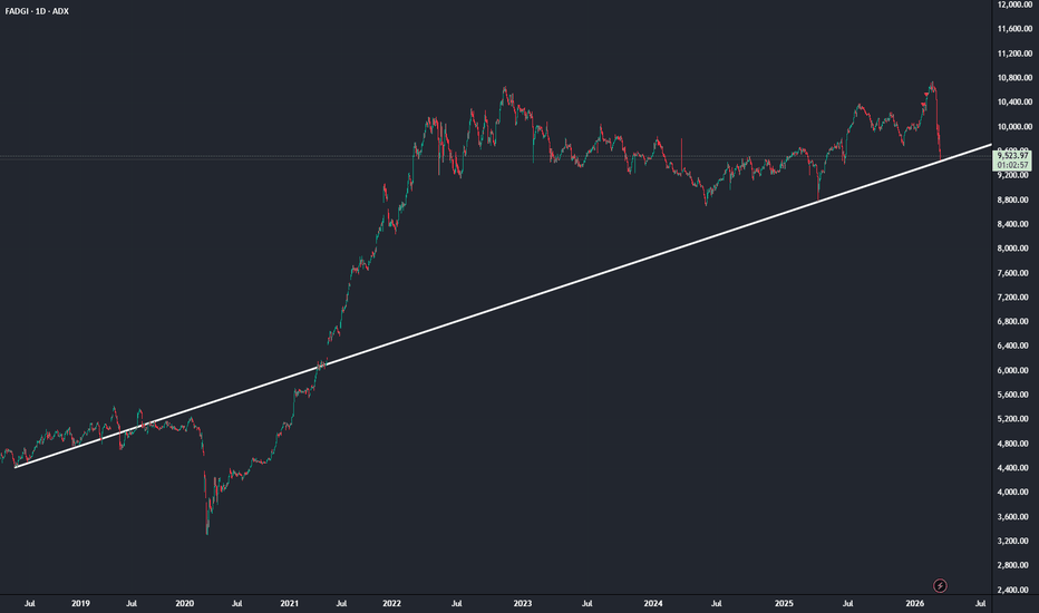
ADX is back at its mean reversion trendline that dates all the way back to 2018. Since then, ADX has spiraled around it nicely. This also coincides with a very strong support level around which it started to consolidate since 2022. It looks like ADX is bouncing off at this point and some stocks are starting to recover. As the market breadth is improving, we could see the biggening of market recovery next week. This will be a tremendous opportunity for wealth creation. We need to prepare our shortlists and watch closely how stocks behave on Monday, perhaps even pull the trigger!
All the best everyone!!!
Economic Cycles
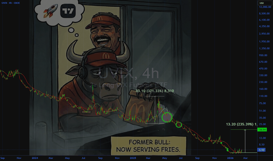
"I'll have that with a side of UVIX"Always keep an eye on the TVC:VIX if you hold a bullish bias. Significant volatility is not a fleeting affair.
Its like an aroma that fills the fry shop and stays in the air.. in your clothes when you get back home from work to sleep.
Personally, prefer to hedge with CBOE:UVIX (2x volatility). Its all in the 4 - 6 week span that VIX pops off. Seeing a lot of markets topping heavy right now. Some heavier than most.
Be safe, keep your funds, and make a meme about it.
GBPCAD Daily: Broken Support Retest for Potential DropHello Trading Fam! 👋
Price broke below the major daily support zone on GBPCAD, then retested it from underneath, so the idea is that this zone now acts as resistance and price may continue dropping from there.
Don’t forget to like and share your thoughts in the comments! ❤️
AFTER HEAVY REJECTION, OIL LIKELY TO FIND SUPPORT BELOW 80President Trump's intervention in the rising crude oil price caused it to crash after reaching a high of 119.48, and the price may retest its bearish order candle after finding good support below 80
N.B!
- USOIL price might not follow the drawn lines . Actual price movements may likely differ from the forecast.
- Let emotions and sentiments work for you
- ALWAYS Use Proper Risk Management In Your Trades
#usoil
#ukoil
Bitcoin Long Term Analysis & Price Prediction rev.1Updating my previous long term analysis from 2024 because the BLX price chart that I used is no longer active, which means that prices don't update after mid 2025.
We also didn't get the blow off top that I expected, but my prediction for a recession in 2026 still holds.
Bitcoin seems to be moving in the new green trend channel, and if we continue to follow the standard 4 year cycle; that means we probably topped in 2025 and might see a bottom sometime late 2026 or early 2027.
In 2028 the next halving cycle begins, and that could mean a new cycle top in 2029.
What could change this? If we get a longer recession in global markets, the downturn could get deeper and more drawn out. Or we could bottom here and break out of the trend channel to the upside. But that would also mean that the 4 year cycle is dead, which isn't my main thesis.
BTC Market Cap: 145-Bar Cycle Low Forming on the 1HBitcoin total market cap has pulled back from 1.48T to 1.36T over the past week. The dominant 145-bar cycle on the 1-hour chart is converging near a trough right around current levels.
The 145-hour cycle is approaching its low point, suggesting this area could mark a local floor. Previous cycle lows on this chart preceded bounces of 5-10%. The shorter harmonics have already bottomed and are turning up.
The CCI (80) is sitting near the zero line after a prolonged decline from overbought territory. Previous cycle bottoms on this chart aligned with CCI crossing back above zero.
Near-term support sits around 1.34T in the current cycle low zone. First upside target is 1.42T at the mid-cycle peak, with 1.48T as the full cycle projection.
Not financial advice. Cycles measure rhythm, not price.
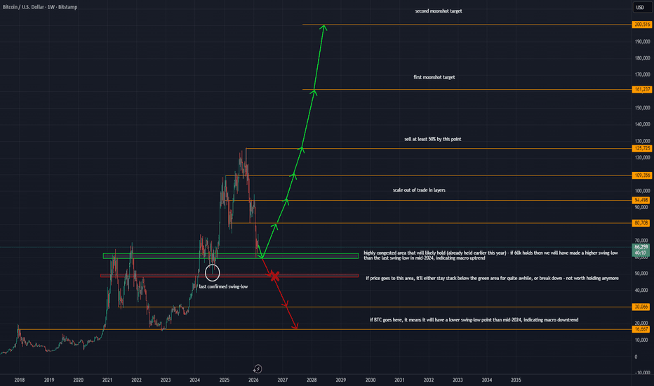
Do or Die // BTCUSD MACROHello Traders,
It's been about a year and a half since my last public crypto call. You can check the linked ideas in this post for my previous macro calls.
No indicators this time.
We are at an inflection point near:
2021 ATH
2022 ATH
Mid 2024 chop
The last time price found this level as support, we saw the run to 125k ATH.
We are currently re-testing this critical level as support.
If price breaks to the downside to 50k, the long thesis is invalidated. BTC would have made a lower swing-low in that case and price will likely either continue to fall or spend a significant time attempting to reclaim 60k.
However, if 60k is treated as support, expect a strong bounce to the upside. This momentum may carry us to previous ATH and beyond. Moonshot targets exist, but previous ATH is a safe partial take profit.
In my opinion, the risk/reward on trade setups that adhere to this thesis are quite strong, offering up to ~6:1.
At this critical time, it is important to monitor price action in the next 1-2 weeks to see how the 60k level is being treated by market participants. If a viable long exists, around now would be the time it reveals itself.
As always, see you at the top! (~January 2027)
Best in all,
dysonring2050
Bitcoin Long Term Analysis & Price PredictionSince 2013, Bitcoin has followed a clear trend of setting tops the year after the most recent halving event. It has also been moving in a very clear trend channel in that time.
Bitcoin has yet to experience a real prolonged bear market. My prediction is predicated on us not having a recession until 2026. If we do, the market is probably going to top much sooner and lower than this chart.
If we have a recession in 2026, I expect the price of Bitcoin to break the current trend channel and head into a lower one as per the chart.
If on the other hand we have a true soft landing, I expect Bitcoin to stay in the current trend channel and head for another post halving year top in 2029.
USOIL - Weekly Chart outlookQuick take:
- Squeeze of Geopolitical where price has risen for $25 - 92 where a large choke of oil is in play.
Pullback on the daily- awaiting a reload zone:
Pullback retracements of that move:
Fib Price
0.236 ~86
0.382 ~82.5
0.5 ~79.5
0.618 ~76.5
Short term pull back:
0.236–0.382 retracement of the squeeze
• Prior weekly resistance / liquidity
• Under the $90 breakout area
current state of play: at $92 which is a strong growth and hitting a zone of interest on the 50% retracement , so will act accordingly.
Risk Warning
Trading leveraged products such as Forex, commodities and CFDs, carries with it a high level of risk and so may not be suitable for every investor. Prior to trading the foreign exchange, commodity or CFD market, consider your investment objectives, level of experience and risk appetite. You should never risk more than you can afford to lose. If you fail to understand or are uncertain of the risks involved, please seek independent advice and remember to conduct due diligence as criteria varies to suit the individual.
Do you enjoy the setups?
Professional analyst with 8+ years experience in the capital markets
Focus on technical output not fundamentals
Focus on investing for long term positional moves
Provide updates where necessary - with new updated ideas tracking the progress.
If you like the idea, please leave a like or comment.
To all the followers, thank you for your continued support.
--private script removed--
Crypto's Boom5 – Important DatesConsidering we've fallen below the previous cycle's top ($69k), it's fair to say the 2021 cycle has come to an end. No supercycle this time guys.
This chart predicted this cycle’s top within 21 days – so let’s apply the same methodology to predict the next cycle’s top (in 2029)
No other market has a built in predictable/programmatic/immutable issuance schedule like bitcoin does. Which is why regardless of issuance decreasing every 4 years (the halving), I believe it will continue to drive the cycles indefinitely (more here).
While every cycle is different, they all rhyme. Eliminate the noise & you can simply count the days between:
top to bottom
bottom to new ATH
new ATH to top
Take the averages from past cycles to get a shockingly accurate predictor of important DATES (not prices) in the next cycle.
For the coming cycle, aka Boom5, we get the following:
Top to bottom:
2013: 410 days
2017: 363 days
2021: 376 days
2025: ~383 days (Oct 24th 2026)
Bottom to new high:
2013: 771 days
2017: 732 days
2021: 716 days
2025: ~740 days (Nov 2nd 2028)
New high to Top:
2013: 297 days
2017: 329 days
2021: 334 days
2025: ~320 days (Sept 18th 2029)
Will be fun to hit the play button on this chart 4 years from now and see how things line up.
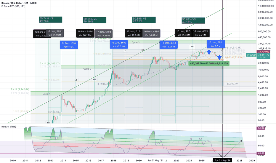
BTC - This time it's differentMost analysts are still waiting for the classic Bitcoin blow-off top.
I’m not convinced we’ll get one.
Every cycle rhymes with the previous one, but none are identical. What matters more than narratives is structure, time symmetry and momentum.
On the monthly chart the cycle still shows a near balance in time — roughly 50% expansion vs 50% contraction. That rhythm has appeared repeatedly throughout Bitcoin’s history.
The RSI is still trading inside its long-term channel, as shown on the chart. Previous cycle tops occurred when RSI pushed toward the upper boundary of that channel, entering extreme momentum territory. We are nowhere near that zone yet.
Today’s push higher is interesting, but technically it is happening right into resistance:
• the rim of the reverse cup-and-handle structure
• the upper boundary of the current range
• and the top of the previous cycle
That cluster makes this area structurally important.
If the reverse cup-and-handle resolves lower, the measured move points toward ~45k, which also aligns with the golden ratio Fibonacci zone — a level that often acts as equilibrium during cycle resets.
It would also represent roughly a 63% correction, a fair retracement for a maturing asset class.
What makes this setup interesting is that three independent models converge here:
1️⃣ Time symmetry of the cycle (roughly 50/50 expansion vs contraction), which has so far remained valid and even predicted the previous top with almost monthly accuracy.
2️⃣ RSI macro cycle channel behavior. The channel itself is gradually declining. Instead of a classic blow-off top, this cycle could form a head-and-shoulders structure on the RSI.
3️⃣ Logarithmic growth structure combined with Fibonacci extensions.
When multiple independent models start pointing toward the same area, it’s usually worth paying attention.
The crowd is still waiting for the same parabolic ending as previous cycles.
But markets rarely repeat perfectly.
Cycles don’t copy themselves.
They **rhy
What the Nifty/Gold Ratio is ScreamingHistory is Rhyming: Is 2026 the New March 2020?
What the Nifty/Gold Ratio is Screaming
I’ve been staring at the Nifty/XAUINRG ratio chart lately, and honestly, it’s the only thing keeping my heart rate down while the news headlines are screaming about wars and market crashes.
For those who don’t know, this ratio is simple: you take the Nifty 50 and divide it by the price of 1 gram of gold in India. It’s like a “Value Meter” for the Indian economy. When it’s high, stocks are expensive. When it’s low, stocks are on a clearance sale.
How I’m Reading This Chart
History doesn’t repeat perfectly, but man, does it rhyme. I’ve noticed a pattern that seems to act like a magnet:
The “Greed” Zone (4.5 ~ 5.0): When the ratio climbs here, stocks are “overheated.” Everyone is a genius, and gold is forgotten. This is usually when I start tucking some profits into gold.
The “Fear” Zone (2.0 ~ 1.5): This is where it gets interesting. When the ratio drops this low, it means stocks are dirt cheap compared to gold. Most people are too scared to buy stocks here, but the chart says this is where the smart money shifts from gold back into the stock market.
Why March 2020 was the Ultimate Lesson
Look at the image I’ve attached. See that massive dip in early 2020?
“This looked like the end of the world on the news, but on this chart, it was the best time in a decade to buy stocks.”
Back then, the pandemic had everyone selling everything. But the ratio hit that 1.5 ~ 2 level and practically screamed that the “shift” was coming. If you moved into Nifty then, you caught the ride of a lifetime.
The 2026 Situation: War, Tariffs, and the “Fog of War”
Fast forward to today, March 2026. Between the escalating US-Israel-Iran tensions, the disruption in the Strait of Hormuz, and those massive FII sell-offs we saw in February, the “Fear” is back.
Gold is hitting record highs (over ₹1.6 Lakh per 10g!), and the Nifty is feeling the heat. But look at the ratio—it’s sliding back toward that below 2.0 level again.
As a trader, I’m not an expert, but I am curious. Every time the world feels this “unsafe” and the ratio hits this zone, it serves as a guiding signal. While the news makes me want to hide under my bed, this chart makes me want to start shopping for quality stocks.
My Takeaway
I’m not saying the bottom is in today or tomorrow, but I am saying that I’ve learned to trust the ratio more than the news. With the ratio currently hovering near that historical support of 2.0, I’m looking at this market with a lot of curiosity.
While everyone else is running for cover, the ratio is screaming that the “Shift” might be closer than we think.
Disclaimer:
I’m just a trader sharing what I see on my screen. This isn’t financial advice—just a look at the “hidden” logic of the markets.
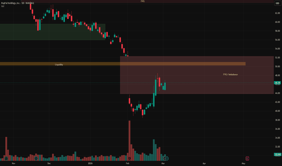
PYPL follow-up - Potential Gap Closure - Trade idea
Last week we talked about the institutional accumulation showing in volume, that helped push price higher a bit and start testing the weekly FVG in the $43–$48 zone.
The high probability setup was to fill the 1W FVG within 2 weeks before any real price direction.
One week later the small bull run and a liquidity adjustment NASDAQ:PYPL still respecting the area, volume continues to look like smart money positioning. Gap fill still feels like the most likely next move.
Last week I shared two simple ideas for those comfortable with options/spot:
Buy spot and target ~10% upside if the gap closes within two weeks.
July 19 $55 call if $52 fills, that could double the position (or close to it) depending on how price behaves.
So far both ideas are holding positive, still in the green as price approaches the zone.
We’re not there yet, but if it gets close soon, might take some profits early or let it run to full fill.
Neutral stance overall: neither bullish nor bearish until we see how it reacts after the gap closes (continuation, shakeout, or consolidation?).
For now, the play is patience and watching liquidity/institutional flow around $52.
What are you seeing in the tape/volume this week? Still expecting the fill soon?
Share your thoughts in the comments below
Thanks for reading
Gold is it Getting Momentum Again Could it Rich $60000?🔥 Market Insight:
Gold has been showing strong momentum recently, with a sharp upward movement after a period of consolidation. As the price continues to rise, there’s a real question: Could Gold push all the way up to $6,000? 💰
🔍 Key Observations:
After a significant rally, we’re seeing price continuation, indicating bullish strength.
Resistance levels seem to be giving way as momentum builds up.
Market structure supports further bullish continuation, but will $6,000 be the next key level? 🤔
💬 What do you think?
Is $6,000 the next big milestone for Gold? Or will this momentum fade soon?
Could consolidation be coming before this next big move?
Let me know your thoughts below! 👇
💡 Pro Tip: Always watch for momentum shifts in the market. When price is moving strongly in one direction, the next resistance or target can often be closer than you expect.
⚠️ Disclaimer: This is not financial advice. Always conduct your own research before making any trading decisions.
🔔 Follow for more market insights and setups like this one!
USDJPY: Major Resistance Rejection ImminentHello Trading Fam! 👋
The Big Picture
The Trend: The price is moving inside two blue lines. This shows the value has been generally climbing upward for many months.
The Ceiling: There is a red box at the top. This acts like a "ceiling" or resistance zone. Every time the price hits this area, it struggles to go higher.
Current Situation
Rejection: The red arrows show places where the price tried to break through the ceiling but got pushed back down.
The Prediction: The pink arrow suggests that because the price hit that ceiling again, it might drop back down toward the bottom blue line.
Summary
The market is in an uptrend, but it is currently hitting a tough barrier. The expectation shown here is a short-term dip.
Don’t forget to like and share your thoughts in the comments! ❤️
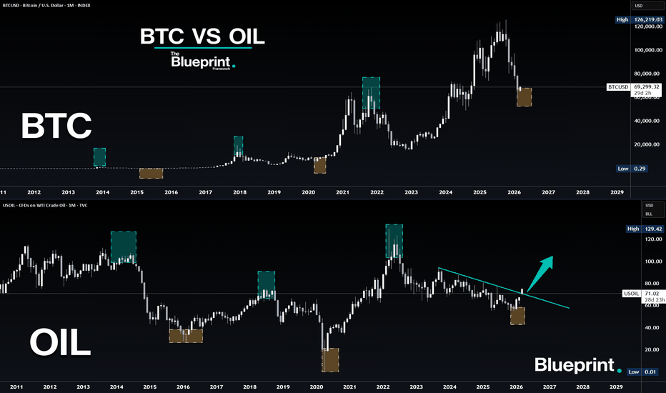
Bitcoin vs OIL - Bitcoin to breakout from here?Lets compare BTC vs OIL for a moment, You can see that OIL is in general bottoming earlier than BTC but then shows the path forward for Bitcoin.
I have been talking about energies that they are the last asset to run in the overall 18.6 year cycle. OIL have been in a downtrend for 4 years and finally broke out. Will Bitcoin follow? ISM did recently close above 50 for the second month since 2022. This is another indicator that RISK is ON again.
While the current narrative is playing out that the bear market is on and that the war wont end in a long time I believe that a big push for Risk assets will come soon. As I already mentioned. High 70s for bitcoin is very likely to be seen in not so short amount of time. War headlines is almost never a crash indicator. Usually you get bounces first or just continue up.
What will be the hardest part of all of this is what will happen once bitcoin goes to 75-80k? Is there a possibilty that we see 100k+ and alts to absolutely dominate for few months? As I have been mentioning earlier BTC Dominance look incredible weak and is ready to drop by atleast 10% any time now, Could ofc take months until it happens but it is on the verge to do so in not too big of a timeframe.
2026 should be EXTREMELY volatile and unpredictable because of the end of the 18.6 year cycle. I do still expect everything to set in their tops late 2026 or the first half of 2027.
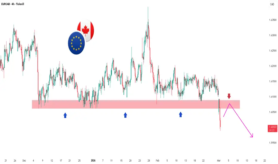
EURCAD 4H: Support Break & Bearish Retest SetupHello Trading Fam! 👋
Now price has broken below that support, which suggests:
The level may turn into resistance
A pullback to retest the zone is possible (pink path up)
Then potential continuation downward (bearish move)
In short: Support broke → possible retest → bearish continuation bias.
Don’t forget to like and share your thoughts in the comments! ❤️
AUDCAD - Rejection at ResistanceHello Trading Fam! 👋
The pair has been rising steadily for a while.
Price climbed along a blue upward-sloping trendline (support line).
It recently reached a strong resistance zone (red shaded area at the top).
In that zone, sellers pushed back hard → price made a sharp drop
The pair looks weaker after hitting that ceiling → more downside possible in the short term. Sellers took control at the key level.
Don’t forget to like and share your thoughts in the comments! ❤️
Context: The Difference Between Random and Quality TradesA setup is only a small part of a trade. Context determines its meaning.
The same WRB setup will often behave differently depending on where it forms within the swing.
In this video, I’ll lay out a simple way to think about and understand context using swing zones. The swing is divided into three main zones — the Swap Zone, the Pressure Cooker Zone, and the Clean Air Zone.
For each WRB, you should ask:
• Which zone it formed in — Swap, Pressure Cooker, or Clean Air
• Which type of entry makes the most sense — continuation or fade
• How it fits into the larger structure — trend, range, or transition
Your setups become clearer when you can say,
“This WRB is happening here in the swing, so its message is probably this.” With practice, you will begin to understand how price behaves in different parts of the swing cycle.
Live trade plan: NXT Clean Air WRB fade.
We’ll apply this context framework to a Clean Air WRB fade trade on the weekly NXT chart, defining entry, stop, and target with the WRB Trade Planner rules.