 Long
Long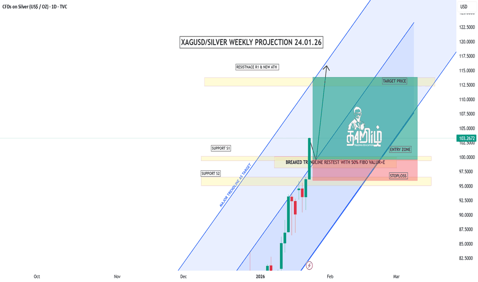
 Long
Long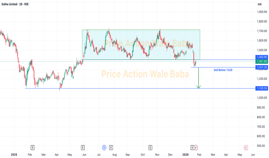
 Long
Long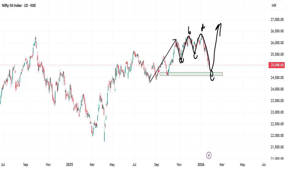
 Long
Long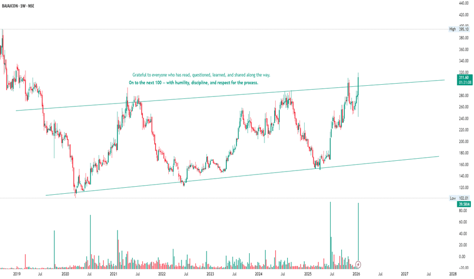
SUPREMEIND – STWP Equity Snapshot 📊 SUPREMEIND – Technical & Educational Snapshot
Ticker: NSE: SUPREMEIND
Sector: 🧪 Chemicals / Plastics
CMP: 3,500.80 ▲ (+4.15% | 22 Jan 2026)
Learning Rating: ⭐⭐⭐⭐☆ (Neutral–Range with Recovery Bias)
Chart Pattern Observed: 📊 Range Structure with Recovery from Demand
Candlestick Pattern Observed: Bullish Engulfing
📊 Technical Snapshot
SUPREMEIND is attempting a short-term stabilisation after a sharp corrective phase, with the latest daily candle showing a strong bullish response from lower demand zones. RSI is placed near 52.5, indicating neutral momentum with early signs of internal strength but no overbought pressure yet. Stochastic is around the mid-zone, suggesting recovery from oversold conditions rather than trend exhaustion. Bollinger Bands remain wide, reflecting elevated volatility and a market still adjusting after the decline, while price continues to trade below major supply zones — keeping the broader structure range-bound with recovery bias. MACD remains subdued, highlighting that momentum improvement is still developing rather than fully established. Price is currently interacting near the CPR band, which is relatively wide, typically associated with range-bound or two-sided price action. As long as price remains within or below the CPR zone, upside moves may face supply pressure, while sustained acceptance above the CPR pivot would be required to signal any meaningful directional shift.
📊 Volume Analysis
🔹 Current Volume: ~536K
🔹 Average Volume (20-period): ~252K ✅
💥 Volume is running at more than 2× the recent average, confirming active participation during the rebound from demand.
💡 Interpretation: Higher-than-average volume near support zones suggests genuine buying interest and supply absorption. However, for any sustained move toward upper range resistance, similar volume expansion will be required near higher levels to confirm acceptance.
🔑 Key Levels – Daily Timeframe
Support Areas: 3373 | 3258 | 3194
Resistance Areas: 3552 | 3616 | 3731
These are zones where price has paused or reacted earlier.
What’s Catching Our Eye: Sharp demand-led rebound with strong participation.
What to Watch For: Acceptance above CPR and nearby resistance.
Failure Zone: Loss of the recent demand base.
Risks to Watch: Overhead supply and wide CPR.
What to Expect Next: Range-bound move with recovery bias.
Bullish Case: Sustained Demand absorption may support recovery.
Bearish Case: Failure to hold Demand base risks deeper reversion.
Momentum Case: Strong Rebound momentum, needs follow-through.
STWP Equity Snapshot – SUPREMEIND
Intraday Setup:
Entry: 3,500.8
Invalidation level: 3,237.11
Reference 1: 3,817.23
Reference 2: 4,028.18
Swing Setup (Hybrid Model – 2–5 days):
Entry: 3,500.8
Invalidation level: 3,151.67
Reference 1: 4,199.06
Reference 2: 4,722.75
STWP View: Momentum: Strong | Trend: Range | Risk: High |Volume: High
Learning Note: Focus on structure, risk per trade and clean reviews – not prediction.
Disclaimer:
Educational view only. Not a Buy/Sell recommendation. Please consult a SEBI-registered advisor before making any decision. STWP is not responsible for trading decisions based on this post.
💬 Did this help you read the chart better?
🔼 Boost | ✍️ Comment | 🔁 Share with a learner
👉 Follow STWP for clean chart-reading insights
🚀 Stay Calm. Stay Clean. Trade With Patience.
 Long
Long
Geopolitical tensions || XAUSD-Goldcurrent market data for January 22, 2026, gold prices are experiencing a sharp pullback after hitting historic highs. This shift is primarily driven by a "thaw" in geopolitical tensions regarding the US-Greenland situation.
What's Going On?
The Pullback: After surging to a peak of nearly $4,887 per ounce (and over ₹1,58,000 per 10g in India) on Wednesday, gold prices have dropped by roughly 1–2% today.
The Catalyst: President Trump retreated from immediate tariff threats against Europe over the Greenland issue, easing the "geopolitical risk premium." This has caused some investors to "sell the news" and take profits.
Current Price Levels: Spot gold (XAUUSD) is currently hovering around $4,780–$4,815 per ounce.
Strategy for Next Steps
Whether you should buy or sell depends on your time horizon:
1. If You Are Selling (Taking Profits)
The Window: If you bought during the early January consolidation (around $4,500–$4,600), you are still in a strong profit position.
Next Step: Consider trailing your stop-loss or selling a portion of your position now. While the long-term trend is bullish, the "Greenland premium" is deflating, which could push prices down to the $4,712 support level before they stabilize.
2. If You Are Buying (New Entry)
Wait for Support: Do not "catch a falling knife" during today’s drop. Analysts are watching the $4,750 and $4,712 levels as potential zones where buyers might step back in.
Next Step: Look for a "bounce" or stabilization at these support levels. If prices hold above $4,710, it confirms the uptrend is still healthy despite the news.
Long-term Outlook: Major banks like Goldman Sachs and J.P. Morgan have raised their 2026 targets toward $5,000–$5,400, suggesting that pullbacks today are likely "buying opportunities" for long-term holders.  Long
Long
 Long
Long
 Long
Long
USDCHF – Gap Down From Resistance, Price Testing Key Support!USD/CHF was trading near a well-defined resistance zone where price has faced repeated rejection in the past. This clearly showed that sellers were active at higher levels and the market was struggling to sustain upside momentum.
From this resistance, the market opened with a gap down, which often signals aggressive selling and position unwinding rather than a slow intraday move. The gap was also supported by short-term U.S. dollar weakness, as the market adjusted expectations around risk sentiment and interest rates. When dollar weakness aligns with technical resistance, price usually reacts sharply.
After the gap down, price moved lower toward a major support zone, an area where buyers have previously stepped in. This makes the current zone a key decision point, either buyers defend again, or further downside continuation opens up.
This move is a result of both technical rejection and fundamental pressure, not random price action.
Disclaimer
This analysis is for educational purposes only and does not constitute financial advice. Trading involves risk, and past performance does not guarantee future results. Please manage risk responsibly.  Long
Long
 Long
Long
W. D. Gann TIME CYCLE VS ASTRO-TIME CYCLE (Real Estate Boom)W. D. GANN TIME CYCLE VS ASTRO TIME CYCLE
W. D. Gann and "Astro Time Cycles" are not actually opposing forces; rather, astrology was the secret engine behind Gann’s most famous time cycles.
While modern technical analysis often separates "Gann Angles" (math) from "Astro Cycles" (planets), Gann himself viewed them as the same thing. He believed the "Law of Vibration" governed both the movement of planets and the movement of stocks.
Here is the breakdown of how these two concepts relate and where they differ in application.
The Core Relationship : Geometry vs. Astronomy
Gann used geometry and math to "hide" his astrological findings. He often spoke in "code" because astrology was controversial in the early 20th-century financial world.
Gann’s "Fixed" Time Cycles
Gann identified several specific time intervals that he claimed were "natural" cycles of the market. While these look like simple math, they are almost all derived from the movement of the Earth or other planets.
The 1-Year Cycle (365 days): One full orbit of the Earth around the Sun.
The 10-Year & 20-Year Cycles: Closely linked to the Jupiter-Saturn cycle (which meets every ~20 years).
The 30-Year Cycle: Based on the orbit of Saturn (~29.5 years).
The 60-Year Cycle: Gann’s "Great Cycle," which is three Saturn orbits or one full cycle of the Chinese Sexagenary system.
The 90-Day Cycle: A "Square" in astrology (90° aspect), representing a period of seasonal change and market friction.
Modern "Astro Time Cycles" vs. Gann
Today, traders who use "Astro Cycles" without the Gann label focus strictly on:
Planetary Retrogrades: Specifically Mercury and Venus, often linked to market reversals or "fake-outs."
Inversion/Ingress : When a planet moves into a new zodiac sign (e.g., Sun entering Aries).
Eclipses : Used as "wildcard" markers for extreme volatility.
This was a topic for an astro-cycle discussion, but today we'll talk about what happens to real estate when Jupiter is in a water sign and how rallies begin.
For example, I am using the chart for Godrej Properties Ltd stock.
The water signs in the zodiac are as follows: (Cancer, Scorpio, and Pisces).
Jupiter is considered 'Guru' (teacher) in Vedic astrology, symbolizing expansion, wealth, and wisdom. When it comes to the stock market, Jupiter governs sectors that form the backbone of the economy. Jupiter is the planet of wealth.Wealth includes assets/property as well.Real Estate & Housing Finance (The 4th House Connection). Cancer traditionally rules the 4th House—the domain of land, buildings, and comfort.
We are likely to see a "Housing Super-Cycle." This isn't just about luxury condos, but Affordable Housing and Housing Finance Companies (HFCs).
Friends, whenever Jupiter begins its transit through a water sign, just look at the kind of surge we see in the stock market! It's incredible. This realization comes when you learn to correlate the charts with the planetary positions according to astrology. And this technique goes far beyond chart patterns and price action. We hesitate to use astrological methods, even though it is a part of our own heritage.
 Education
RBL Bank Shows a Powerful Cup Pattern Breakout on Weekly ChartRBL Bank has completed a textbook Cup & Handle pattern on the weekly timeframe, signaling a meaningful shift from a long consolidation phase into a fresh bullish trend. The rounded base formation highlights a gradual transition from distribution to accumulation, indicating growing confidence among long-term market participants.
The most critical development is the decisive breakout above the handle resistance zone, which had previously acted as a strong supply area. This breakout is supported by strong price expansion and follow-through candles, confirming that buyers are in control. Such breakouts from multi-month bases often lead to sustained trending moves rather than short-lived rallies.
From a price projection standpoint, the measured move of the cup suggests an initial upside target around 380+, followed by an extended projected target near 440+ if momentum continues to build. The current structure also shows healthy consolidation above the breakout level, which is a positive sign and often acts as a base for the next leg higher.
Risk management remains clearly defined in this setup. As long as the price holds above the breakout support zone near 280–290, the bullish structure stays intact. Any sustained breakdown below this area would invalidate the pattern and shift the outlook back to neutral or corrective.
Overall, RBL Bank appears to be transitioning into a new medium-to-long-term uptrend, backed by a strong chart structure and favorable risk–reward dynamics. This makes it a compelling setup for positional traders and investors who prefer structurally confirmed breakouts with clear targets and controlled downside risk.  Long
Long
Tata Steel Ltd The chart exhibits a Cup and Handle pattern on Tata Steel’s daily timeframe.
1. Pattern structure:
Cup: Formed from Nov to early Jan, with a rounded decline and recovery, creating the “U” shape.
Handle: A tighter consolidation from mid‑Jan to Feb, retracing ~10–15% of the cup’s advance, which is typical for a healthy handle.
2. Breakout:
The price has pierced the handle’s resistance (≈₹178) with decent volume (26 M shares), confirming the bullish signal.
The breakout candle is relatively strong, suggesting momentum behind the move.
3. Volume analysis:
Volume spikes during the cup’s formation and at the breakout, indicating institutional interest.
Handle volume is lower, showing reduced selling pressure and consolidation.
4. Target calculation:
Measured move: The depth of the cup (≈₹26.05) is projected upward from the breakout point, giving a target of ₹212 (13.93% upside).
Intermediate target: +₹9.32 (4.99%) to ₹197, often hit first in a gradual climb.
5. Support & resistance:
Immediate support now lies at the handle’s base (≈₹168–172).
Strong resistance is the previous high near ₹212.
6. Trading considerations:
Entry: Confirm close above ₹178 with volume > average; enter long.
Stop‑loss: Place below the handle’s low (≈₹168) to limit risk.
Position sizing: Allocate based on risk tolerance and the ~13% target upside.
 Long
Long
Understanding Inverted Head & Shoulder Pattern & RSI MomentumBase Chart : TATA CONSUMER PRODUCTS LIMITED
🔍 What is an Inverted Head & Shoulder Pattern?
Definition: The inverted head & shoulder is a bullish reversal pattern that often signals the end of a downtrend or prolonged consolidation.
Structure:
Left Shoulder: A decline followed by a rebound.
Head: A deeper decline forming the lowest point.
Right Shoulder: A shallower decline followed by recovery.
Neckline: The resistance line connecting the peaks between the shoulders and the head.
Psychology: It reflects weakening selling pressure and strengthening buying interest, often preceding a trend reversal.
📊 Importance of Neckline Breakout on Long-Term Charts
Confirmation: The pattern is validated only when price breaks above the neckline with strong volume.
Long-Term Significance: On weekly charts, a breakout suggests sustained bullish momentum, not just short-term noise.
Target Projection: Traders often estimate upside potential by measuring the distance from the head to the neckline and projecting it upward from the breakout point.
⚡ RSI Indicator and Momentum Levels
RSI Above 50: Indicates bullish bias. Prices are generally supported by stronger buying interest.
RSI Approaching 60: Signals strengthening momentum. Crossing above 60 often aligns with medium- to long-term uptrends.
Momentum Confirmation: When RSI rises alongside a neckline breakout, it adds conviction to the bullish setup.
🛡️ Risk Management in Trading the Pattern
Entry Strategy: Enter only after a confirmed breakout above the neckline, ideally with volume support.
Target : Target is usually set to the height of the deep of the shoulder from neckline.
Stop-Loss Placement: Commonly set just below the right shoulder or neckline to limit downside risk.
Position Sizing: Avoid overexposure; allocate capital proportionally to risk tolerance.
False Breakouts: Be cautious of premature entries. Wait for sustained closes above the neckline.
💡 Investors’ and Traders’ Takeaway
For Traders: The inverted head & shoulder combined with RSI momentum offers a high-probability setup, but discipline in execution and risk management is crucial.
For Investors: On long-term charts, such patterns can mark the beginning of multi-month or multi-year uptrends, making them valuable for portfolio positioning.
Balanced Approach: Technical signals should be paired with fundamental analysis for stronger conviction.
✨ In summary, the inverted head & shoulder is a powerful bullish signal, especially when confirmed by RSI strength above 50 and 60. However, risk management remains the cornerstone of successful trading. Education 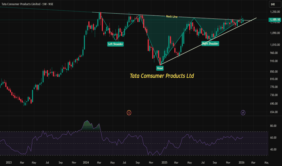
 Long
Long
SBI Life: Double Top Signals Short-Term Downside RiskSBI Life Insurance is showing signs of a short-term trend reversal after forming a well-defined double top near the ₹2,105–2,110 zone on the hourly chart. The stock has slipped below its neckline support around ₹2,065, confirming bearish structure and indicating distribution at higher levels.
Momentum indicators reinforce the downside bias, with the RSI trending near 39 and MACD remaining in negative territory, suggesting selling pressure is still dominant. As long as prices remain below ₹2,085–2,100, the stock is vulnerable to further downside toward ₹2,040, followed by ₹2,020 and 2,000.  Short
Short
 Long
Long


