Nifty at a Critical Crossroad: Bounce or Breakdown?Nifty is currently trading near a major support zone after facing multiple rejections from a falling resistance trendline. The chart clearly shows a series of lower highs, indicating that sellers continue to defend higher levels aggressively. At the same time, buyers have repeatedly stepped in around the 23,200–23,300 support region, making this one of the most important short-term levels on the chart.
The recent decline pushed Nifty back into this demand zone, where a strong intraday recovery emerged. This suggests that bulls are still active, but they need confirmation through sustained buying and higher highs. As long as the index holds above the support trendline, a relief rally toward 23,800–24,000 remains possible.
Bullish Scenario:
If Nifty continues to defend the current support zone and forms higher lows, a bounce toward the falling resistance trendline can develop. A breakout above the resistance zone near 23,900–24,000 would signal a shift in momentum and could trigger a stronger upside move in the coming sessions.
Bearish Scenario:
If support around 23,200 fails decisively, the market structure would weaken significantly. In that case, selling pressure may accelerate, leading to a move toward the 23,000 level initially and potentially extending toward the 22,200–22,300 region as indicated by the projected bearish path on the chart.
Key Levels to Watch:
• Immediate Support: 23,200–23,300
• Major Resistance: 23,900–24,000
• Bullish Trigger: Sustained move above resistance trendline
• Bearish Trigger: Breakdown below support trendline
The overall structure remains neutral-to-bearish until Nifty breaks the descending resistance line. The current support zone is acting as a make-or-break area where the next major directional move is likely to emerge. Traders should closely monitor price action around these levels before taking aggressive positions.
Community ideas
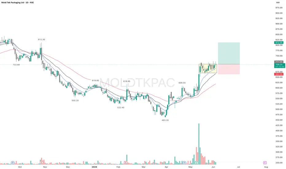
MOLDTKPAC - Consolidation after DisplacementMOLDTKPAC is showing a bullish structure on the daily chart with a clear higher high–higher low formation.
After the strong displacement move in early May, backed by a significant surge in volume, the stock has entered a healthy consolidation phase near its recent highs. Rather than witnessing aggressive profit booking, price has been contracting in a tight range while continuing to hold above the key EMAs.
An encouraging sign is the decline in volume during the consolidation. Strong volume on the breakout followed by lower volume during the pullback often indicates reduced selling pressure and suggests that the market is absorbing supply.
As long as the stock remains above its key moving averages and the consolidation range holds, the bullish structure remains intact. A breakout from the current range could lead to a fresh upside move toward the next resistance zone.
Keep this stock on your watchlist and manage risk accordingly.
✅ If you like my analysis, please follow me here as a token of appreciation :)
in.tradingview.com/u/SatpalS/
📌 For learning and educational purposes only, not a recommendation. Please consult your financial advisor before investing.
INFY | Breakout Confirmed, Momentum Building📊 INFY | Breakout Confirmed, Momentum Building 👀
INFY appears to have confirmed an inverse Head & Shoulders breakout while reclaiming descending resistance — a development that may signal a broader trend transition after an extended corrective phase.
Trend
Bullish, with momentum and structure improving.
Structure & Price Action
The stock has formed a visible inverse Head & Shoulders pattern and moved above neckline resistance near 1206. Price has also reclaimed the descending trendline, supported by improving participation and stronger follow-through.
This is no longer a recovery setup — the chart is attempting a fresh directional phase.
Key Levels
🔹 Breakout / Entry Zone: 1206
🔹 Support / Risk Zone: 1143
Upside Scenario 📈
Sustained strength above breakout levels may open room toward:
🎯 1320
🎯 1379
🎯 1441
🎯 1533
🎯 1639
🎯 1728 *(extended)*
Downside Risk 📉
Failure to sustain above breakout levels may invite consolidation toward support before continuation.
Indicator Overview
📌 RSI — Positive, with room before overheated territory
📌 ADX — Trend strength improving
📌 MACD — Bullish crossover with momentum expansion
📌 Bollinger Bands — Expansion following compression
📌 Volume — Participation supportive of the move
View
A technically constructive setup supported by breakout structure and improving momentum.
1206 defines strength.
1143 defines risk.
*Breakouts matter most when momentum and structure align.* 👀
#INFY #Infosys #InfosysShare #InfosysSharePrice #INFYAnalysis #StockMarketIndia #TechnicalAnalysis #SwingTrading #NSE #TradingView
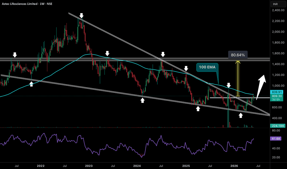
A Four-Year Base Is Starting To ReleaseFor nearly four years, Astec Lifesciences remained trapped beneath a declining supply line while market participants gradually lost interest in the stock. What most traders ignored was the steady absorption taking place near the lower boundary of the structure. Every major decline attracted buyers, selling pressure weakened over time, and the stock quietly built a foundation beneath a massive resistance ceiling. Now price has reclaimed a critical supply zone, pushed through a multi-year downtrend line, and is challenging the 100 EMA for the first time in years.
This breakout is significant because it shifts the conversation from survival to expansion. The market has spent years compressing liquidity into a narrowing range, and that stored energy is beginning to release. If buyers successfully defend the 780-820 region and sustain above the breakout zone, the next major liquidity magnet sits near the 1450-1500 historical supply area — almost 80% higher from current levels. Momentum is strengthening, participation is improving, and a structure that took years to build is finally showing signs of awakening.
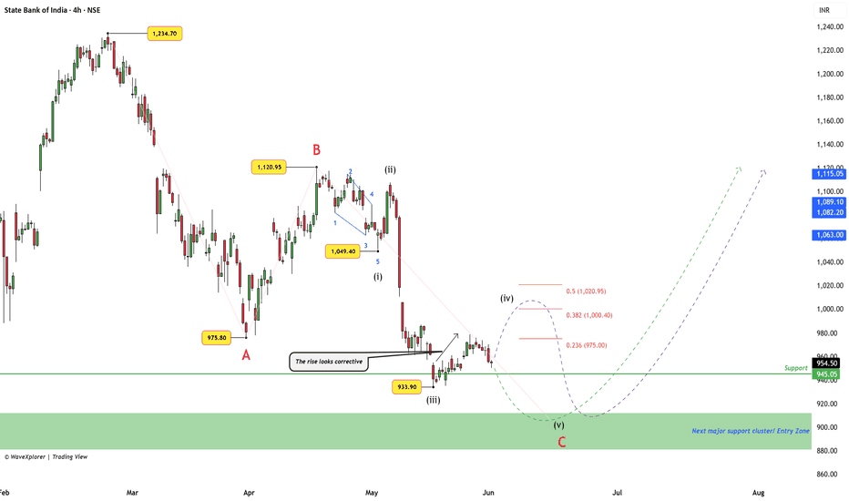
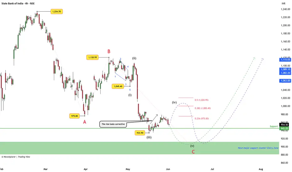
SBIN (4H): Mapping Wave C : 5-Wave Impulse v/s Complex BounceState Bank of India (SBIN) has been in a corrective phase since reaching its peak at 1,234.70 . Looking closely at the 4-hour chart, the price action seems to be carving out a larger three-part correction (an ABC structure).
Right now, we are tracking the final leg of this move, which appears to be unfolding in a five-step downward sequence. Here is a neutral, step-by-step look at the two most likely paths ahead and the exact levels where this current outlook changes.
The Near-Term Paths: Green vs. Purple
The chart highlights two ways the market might move over the coming weeks. Both paths ultimately point toward the same major structural area below, but they take different routes to get there:
The Green Path (Direct Drop): This scenario assumes the recent minor bounce near 978.80 was the entire fourth step (Wave iv). Because the bounce was shallow, it shows sellers are currently heavy. If this path continues, the price is likely already starting its final downward step (Wave v) directly toward the major support zone.
The Purple Path (Deeper Bounce First): This scenario suggests the bounce needs more time to develop. The price could recover slightly higher to test the 1,000 to 1020 price range, which aligns with key Fibonacci retracement levels. Once that temporary relief bounce finishes, the price would then turn downward for its final step.
The Critical Invalidation Line: 1,049.40
For this specific five-step downward count, the invalidation level is 1,049.40 (the low of the first downward step).
If the price goes above 1,049.40: The structure changes completely. A move above this level invalidates the idea of a final drop. It would strongly indicate that the entire correction already finished early at the 933.90 low.
The Exception (Ending Diagonal): The only way the price can cross 1,049.40 and still move lower later is if it forms a slow, overlapping, wedge-like pattern. We will only consider this complex scenario if the price action starts to behave that way. For now, 1,049.40 remains our main invalidation point.
The Major Support Cluster (880–912)
Both the green and purple paths converge on a major structural support zone between 880 and 912 .
If the price reaches this zone, we will look for clear, confirmed bullish price action (such as strong rejection candles or reversal patterns) to signal a potential entry point.
The Big Picture After the Turn
Once the price tests the support cluster, the resulting upward move will likely lead to one of two macro developments:
A New Trend: The entire correction is over, and a fresh, long-term upward trend begins.
A Complex Correction (WXY): The bounce out of the support box is a temporary relief leg (Wave X), which will eventually lead to another leg down later in the year to complete a longer, multi-part correction.
By keeping an eye on the 1,049.40 invalidation level and waiting for clear confirmation in the 880–912 support zone, we can navigate the next structural move step-by-step.
Disclaimer: This post is for educational purposes only and is not financial advice. I am not a SEBI-registered analyst. Please do your own research and manage your risk carefully.
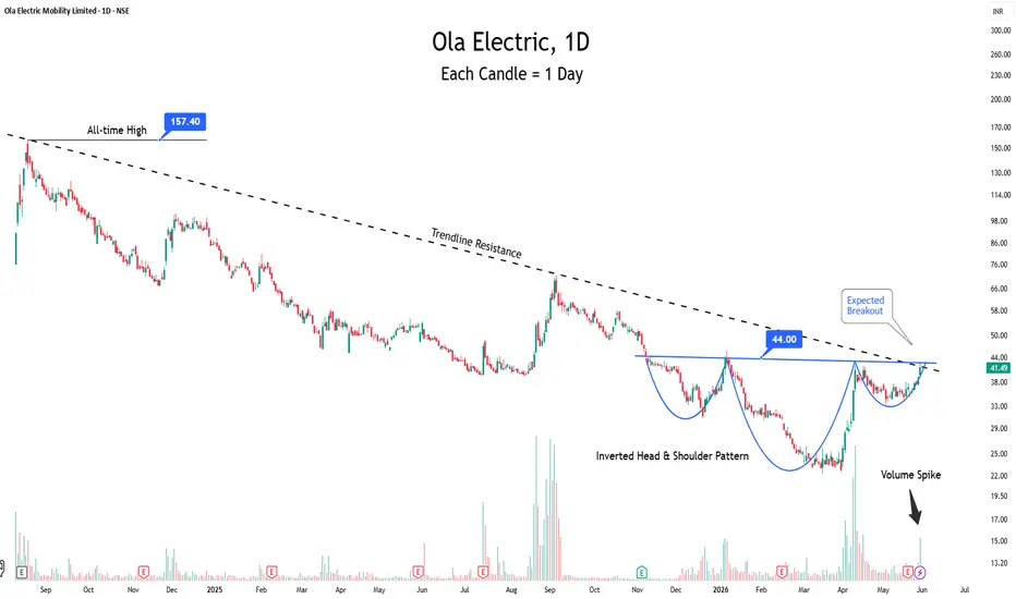
Ola Electric at a Make-or-Break Level. Is the Recovery Real?The Setup
Ola Electric has formed an Inverted Head and Shoulders over the past several months. Neckline at ₹44 coincides with the long-term descending trendline from the ₹157 ATH.
Volume spike confirms accumulation interest. Double confluence at ₹44 = key decision zone.
Fundamental Trigger
Q4 FY26 quietly showed a reset working:
Gross margin: 38.5% (vs 13.7% YoY)
Opex: cut 50% YoY
First-ever positive operating cash flow: ₹91 crore
Service TAT: 9 days to 1 day
Q1 FY27 orders expected to double to 45,000 units
Gigafactory scaling to 6 GWh with 20 GWh path ahead
Risk
Still loss-making (₹1,833 crore FY26 net loss).
Volume recovery guided but not proven.
Bajaj and TVS competition intensifying.
Pattern needs confirmed close above ₹44 with volume. Below ₹34 = invalidation.
Bottom Line
Early-stage turnaround with a technically significant setup forming. Not a chase. Needs confirmation above ₹44. One for the watchlist, not the portfolio, until the neckline breaks.
👇 Turnaround or value trap? Drop your view.
🚀 Boost if helpful.
Not financial advice. DYOR.
KERNEX (Weekly Chart)1. Primary Trend Analysis
The stock is in a strong long-term uptrend.
Evidence:
Price is making higher highs and higher lows.
Weekly candles are trading above both major moving averages.
Rising trendline from 2024 continues to act as dynamic support.
Conclusion: Long-term trend remains bullish.
2. Moving Average Analysis
50-Week Moving Average (Blue Line)
Price is trading well above the 50-week SMA.
SMA is sloping upward.
Indicates medium-term momentum remains positive.
200-Week Moving Average (Orange Line)
Strongly rising.
Price is significantly above the 200-week SMA.
Confirms structural bull market.
Interpretation:
When price remains above rising 50 and 200-week averages, institutions generally consider the stock in a primary uptrend.
3. Trendline Analysis
The upward-sloping trendline has been respected multiple times:
Mid-2024 support
Mid-2025 support
Early-2026 support
Each correction has found buyers near the trendline.
Technical Significance:
A trendline tested three or more times becomes highly reliable support.
Current trendline support zone:
₹1,350 – ₹1,450
4. Breakout Analysis
The most important observation:
➡️ Last week the stock closed above its previous swing high.
This is a classic:
Higher High Breakout
The breakout indicates:
Buyers are willing to pay higher prices.
Supply at previous resistance has been absorbed.
Trend continuation is likely as long as breakout levels hold.
5. Volume Analysis
Volume expansion is visible during advances.
What this means:
Institutional participation.
Genuine demand rather than speculative movement.
Higher conviction behind the breakout.
A breakout supported by volume is far stronger than a low-volume breakout.
Technical Summary
Trend: Strong Bullish
Moving Averages: Bullish Alignment
Trendline: Acting as Support
Volume: Positive
Structure: Higher High–Higher Low Formation
Long-Term View: Bullish as long as the breakout zone and rising trendline continue to hold.
Key Observation: The most bullish feature on this chart is the recent weekly breakout above the previous swing high while remaining above a rising trendline and major moving averages.
Gujarat Gas LimitedHello Traders
In my point of view Guj Gas Ltd formed a cup and handle pattern showing bullish trend with RSI of > 60 which is indicating positive momentum and strengthening buying interest. From a price action perspective, the stock has established key support levels around ₹309, followed by a stronger support zone near ₹282.Exponential Moving Averages (EMAs) suggests a bullish bias. A breakout above the ₹429–₹436 Gann zone may trigger further bullish momentum and hit the target price of 510 which is also the 52 week high of the stock. The overall trend remains bullish. NFA
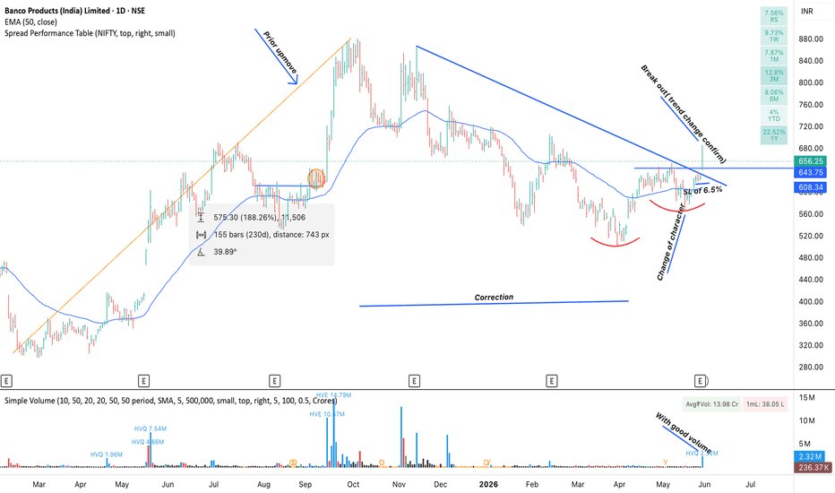
BANCO PRODUCT INDIA LIMITED ANALYSISI am going to buy this stock because of following reasons.
1. good prior up move.
2. then good correction.
3. followed by CHoCh.
4.good breakout with good volume.
5. YoY revenue and profit is up.
6. bit of an lagard in the inductry so expected to perform well.
7. ratio chart wrt nifty looks awesome.
QPOWER - Swing trade - May 2026Swing trade setup - QPOWER
IPO base breakout followed by consolidation and rounding bottom formation.
Stock gave strong breakout candle after volume contraction and accumulation.
Will look for entry on retest zone.
SL below SL zone on closing basis.
Target will be the marked target zone with minimum 1:2.5 R:R .
Recent results were strong.
Sales: 159% up YoY
Profit: 73% up YoY
Debt to equity: 0.07
ROCE: 31.5%
PEG ratio: 0.86 as per screener.in
Major concerns:
1. Huge dip in margins from 28% to 11%.
2. Commodity price fluctuations which can impact margins further again. But company is managing them through higher inventory levels and passing to customers.
Overall recent concall's commentary was bullish.
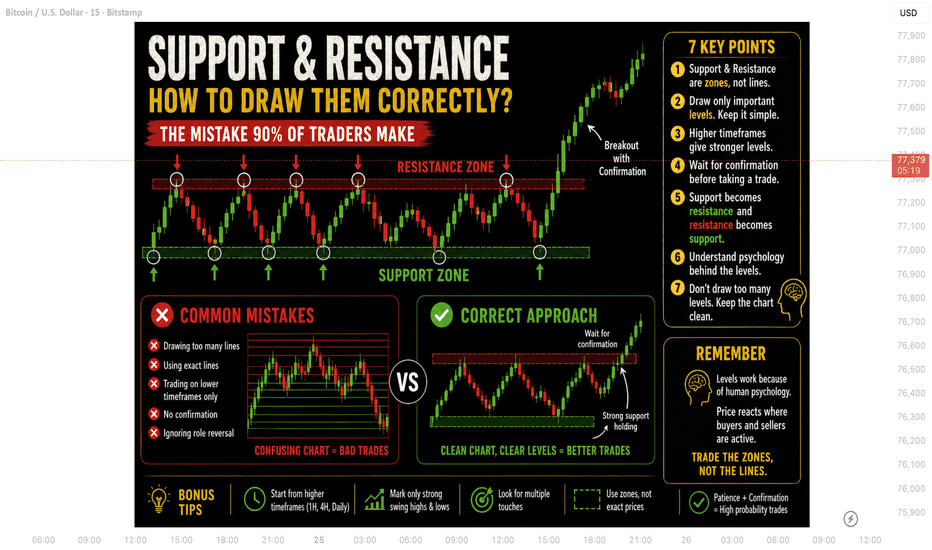
Support & ResistanceThe Mistake 90% of Traders Make
Support and Resistance are among the first things every trader learns.
Almost every strategy in trading uses them.
But here’s the problem:
Most traders draw Support & Resistance the wrong way.
That’s why many beginners experience:
* fake breakouts,
* stop loss hits,
* bad entries,
* and confusion on charts.
The truth is, Support & Resistance is not about drawing perfect lines.
It’s about understanding where buyers and sellers are active.
In this article, we’ll learn the correct way to draw Support & Resistance in simple and practical language.
1. Support & Resistance Are Zones, Not Lines
This is the biggest mistake beginners make.
Most traders draw one exact line and expect price to reverse perfectly from that point.
But markets do not work with perfect precision.
Instead of lines, think of Support & Resistance as areas or zones where price reacts.
Sometimes price:
* moves slightly above resistance,
* or below support,
before reversing again.
That is completely normal.
Professional traders focus on reaction areas, not exact prices.
2. Don’t Draw Too Many Levels
Another common mistake is filling the chart with dozens of lines.
When every small move becomes support or resistance, the chart becomes confusing and useless.
Good traders keep charts clean.
Focus only on important levels where:
* price reacted strongly,
* volume increased,
* or major reversals happened.
Simple charts help traders make better decisions.
3. Higher Timeframes Give Stronger Levels
Many beginners only use 5-minute or 15-minute charts.
But stronger Support & Resistance levels usually come from:
* 1-hour,
* 4-hour,
* daily,
* or weekly charts.
Why?
Because large institutions and smart money traders mostly focus on higher timeframes.
A support level on the daily chart is usually much stronger than one on the 5-minute chart.
Always start from higher timeframes before moving lower.
4. Wait for Confirmation — Don’t Trade Blindly
Just because price reaches support or resistance does not mean you should instantly enter a trade.
Many traders lose money because they enter too early.
Instead, wait for confirmation like:
* strong rejection candles,
* breakout failures,
* volume increase,
* or market structure shifts.
Confirmation helps avoid fake breakouts and emotional trades.
Patience is more important than speed in trading.
5. Support Becomes Resistance — And Resistance Becomes Support
This is one of the most powerful concepts in trading.
When price breaks a resistance level strongly, that same level often becomes new support.
Similarly:
* broken support can become resistance.
This is called a role reversal.
Understanding this concept helps traders find:
* better entries,
* stronger trends,
* and cleaner setups.
Professional traders use this idea regularly.
6. Psychology Plays a Big Role
Support & Resistance work because traders react emotionally around important levels.
At support:
* buyers become confident.
At resistance:
* sellers become active.
The market moves based on fear, greed, and trader behavior.
That’s why these levels repeat again and again in every market:
* stocks,
* forex,
* crypto,
* and commodities.
Charts change, but human psychology stays the same.
7. Final Thoughts
Support & Resistance look simple, but most traders use them incorrectly.
The goal is not to draw perfect lines.
The goal is to understand how price reacts around important areas.
Remember:
* treat levels as zones,
* keep charts clean,
* use higher timeframes,
* and wait for confirmation.
Sometimes one well-drawn Support or Resistance level is more powerful than ten indicators.
In trading, clarity always beats complexity.
Big Pattern Observed in SBI Cards & Payments Ltd The stock is currently moving within a classic 6-year Bow & Tie pattern and is trading near a strong support zone. It appears to be in the final stage of its 8th wave formation.
A bounce back from the current support area could initiate the 9th wave, which may offer upside potential of around 80% to 100% over the next 1 to 1.5 years.
However, always use a logical stop-loss and proper risk management to protect capital.
Note: This analysis is for educational purposes only and is not intended as a recommendation or trading advice.
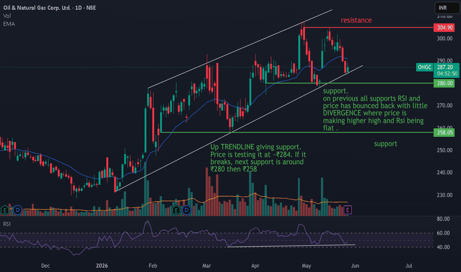
ONGC mildly bullish 1 DAY chartTrend: Overall uptrend since Jan 2026 is still intact, but momentum stalled. The white trendline is the make-or-break level right now
Momentum: RSI below 50 = mild bearish momentum. But that divergence is worth watching if trendline holds
Key zones: Hold above ₹285-287 keeps the uptrend alive for a bounce toward ₹295-300. Break below trendline opens ₹270-275
Motherson. Simple chart, Holding good.Motherson. Very simple and very attractive chart pattern visible.
Do i have to say something about it.. Haha..
Lets discuss.
Multiple confirmations, Multiple Breakout.
Cup & handle, Sustaining above the multiple time checked resistance,& Consolidating.
Breakout above all these factors can be really a rally.
Target as per cup and handle ,,,... Around 190.. Hope So..
Breakout above the resistance ( Thick Black Line ) around 150.
Should consolidate above 145-150 for next leg of run..
Tempting. Isnt it!!
All the best!!
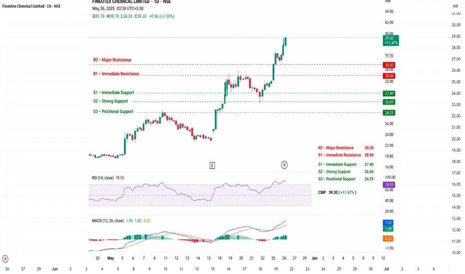
Fineotex ChemicalCMP Zone: ₹26–28
Immediate Resistance (R1): ₹28.90
Major Resistance (R2): ₹30.30
Breakout Zone: Above ₹30.50 can trigger fresh rally toward ₹33–35
Immediate Support (S1): ₹27.40
Strong Support (S2): ₹26.60
Positional Support (S3): ₹24.00–24.50
Technical Structure
Trend is positive above ₹26.
20 EMA and 50 EMA both showing uptrend strength.
RSI near 75–82 indicates strong momentum but slightly overheated conditions.
Sustaining above ₹28.80 can give momentum breakout.
Bullish Scenario
If stock closes above ₹30.50:
Targets: ₹33 → ₹35 → ₹38
Momentum traders can look for breakout continuation.
Bearish Scenario
If stock slips below ₹26:
Weakness can extend toward ₹24 and ₹22 support zone.
Trading Plan
Swing Buy Zone: ₹26.5–27.5
Stop Loss: ₹24.9
Targets: ₹30 / ₹33 / ₹35
Plan To Become a Profitable Trader In 6 MonthsPROFITABLE TRADER IN 6 MONTHS — A COMPLETE ROADMAP
Trading is simpler than most businesses — yet harder to master. Here's how to bridge that gap.
WHY TRADING IS DIFFERENT FROM OTHER BUSINESSES
At its core, trading is one of the simplest businesses in the world. Every trader — from a hedge fund veteran to a college student — sees the exact same price fluctuations at the exact same time. The information is equal. The only decision is: Buy or Sell.
Compare that to running a bakery — supply chains, employees, rent, marketing. In trading, your entire battlefield is a screen. That's the beauty of it.
THE MARKET IS THE GREAT EQUALIZER
The market doesn't care about your suit, your degree, or your experience. A Dalal Street veteran and a first-time trader see the same candlestick at the same second.
Your success as a trader depends on three things:
1 — Developing a profitable strategy
2 — Executing it with discipline
3 — Managing your risk effectively
WHY NEW TRADERS FAIL
No Trading Plan
Entering the market without a plan is like jumping into a pool without knowing how to swim. Impulsive, emotional decisions are the fastest way to blow an account.
Poor Risk Management
This is the 1st silent killer of trading accounts. Without proper risk controls, even a good strategy will eventually wipe you out.
Overtrading
More trades ≠ more profits. Overtrading leads to mistakes, fatigue, and abandoning good setups for bad ones.
Chasing Tips & Signals
You're scrolling through your phone, And you come across a that message & Social Media channel promising guaranteed returns? Most aren't even SEBI-registered. Build your own edge — don't borrow someone else's.
THE 6-MONTH ROADMAP
Month 1 & 2 — Build Your Foundation
Learn the basics: technical analysis, price action, and risk management. Don't overcomplicate it. Simple things work. Focus on understanding how price moves.
Month 3 — Develop & Backtest
Build your strategy and test it on historical data. Find your edge. Fix the flaws before real money is on the line.
Month 4 — Enter the Real Market
Start small. Trade cautiously. Treat every trade as a learning experience, not a lottery ticket.
Month 5 — Analyse & Adjust
Review your trades. What worked? What didn't? Refine your strategy based on real data — not emotions.
Month 6 — Optimise & Diversify
Add complementary strategies. Be patient. Consistency over fireworks.
DOS & DON'TS FOR THE FIRST 6 MONTHS
✅ DO:
Keep a Trading Journal — Your personal mentor. It shows you exactly what's working and what's not.
Stick to Your Plan — Your plan is your compass. Don't abandon it mid-trade.
Be Disciplined — The market punishes impulsivity every single time.
❌ DON'T:
Don't Overtrade — No setup = no trade. Simple as that.
Don't Ignore Stop-Losses — Every big loss story starts with someone removing their stop. It's your safety net. Use it.
FINAL THOUGHTS
Everyone stares at the same screen. Everyone watches the same candles. What separates profitable traders from the rest isn't intelligence or luck — it's process, patience, and discipline.
Set your goals. Draft your plan. Manage your risk. Keep refining.
Six months from now, you could be the one sharing your edge with the world.
The only limits in this market are the ones you set for yourself.
let's learn together.
BANDHAN BANK — Quiet Accumulation Before Repricing?BANDHAN BANK — Quiet Accumulation Before Repricing?
The market still remembers Bandhan Bank as a weak chart.
That memory is exactly why this structure is becoming interesting.
After a prolonged destruction phase, the stock is now showing the first signs of institutional stabilization.
Not excitement.
Not euphoria.
Stabilization.
And that is how larger reversals usually begin.
Structure Read
• Weekly chart has shifted from lower lows to higher base formation
• Daily structure reclaimed major moving averages aggressively
• Sharp upside expansion confirms demand is returning
• Current consolidation near 190–195 looks healthy after vertical rally
• Momentum is cooling without structural damage
The important observation is not price alone.
It is participation.
Institutional ownership has increased.
Asset quality and business metrics are gradually stabilizing.
The market may start repricing future expectations before headlines fully change.
Trading Framework
Accumulation Zone: 185–195
Deep Retest Zone: Around 180 if volatility expands
Invalidation: Sustained weakness below 168
Upside Path:
• 210 — immediate breakout memory
• 225 — trend continuation zone
• 250+ — if banking momentum accelerates
The strongest reversals often emerge from sectors nobody wants to revisit emotionally.
Psychological Read
Most traders still see Bandhan through the lens of its past collapse.
But markets reward transition, not history.
If price continues holding above the reclaimed structure, this may become one of those “ignored recovery” charts that slowly turns into leadership.
#BandhanBank #BankNifty #SwingTrading #PriceAction #MarketStructure #NSE #TradingView
NIFTY 50 – Multiple Bottom Reactions Near Support | Breakout Set🟢 Simple Chart Explanation:
* NIFTY is showing a strong support reaction around the 23,250–23,300 zone
* Price has taken support from this area multiple times, showing buyers are defending the level
* Market is now moving inside a tight consolidation range
* The 23,820–23,850 zone is acting as immediate resistance
📌 What Makes This Interesting?
* Multiple higher lows suggest bullish strength building
* Buyers are slowly pushing price upward after every dip
* A clean breakout above resistance can trigger a strong momentum move
🎯 Key Levels to Watch:
* Support Zone: 23,250–23,300
* Immediate Resistance: 23,820–23,850
* Breakout Target Zone: 24,500+
* Invalidation: Sustaining below 23,580
💡 Price Action Insight:
* Equal support reactions = strong demand zone
* Compression near resistance often leads to volatile breakout moves
* Bulls remain active while price holds above support
📈 Bias:
* Bullish above support
* Watch for breakout confirmation above resistance zone for next expansion move
⸻
⚠️ Disclaimer
This analysis is shared only for educational purposes.
I am not a SEBI-registered investment advisor.
This is not financial advice or a buy/sell recommendation.
Trading and investing in the stock market involve market risks.
Please do your own research or consult a SEBI-registered advisor before making any investment or trading decisions.
⸻
❤️ If this analysis helped, do LIKE & SAVE the chart for future reference
(Important intraday levels are worth saving 📌)
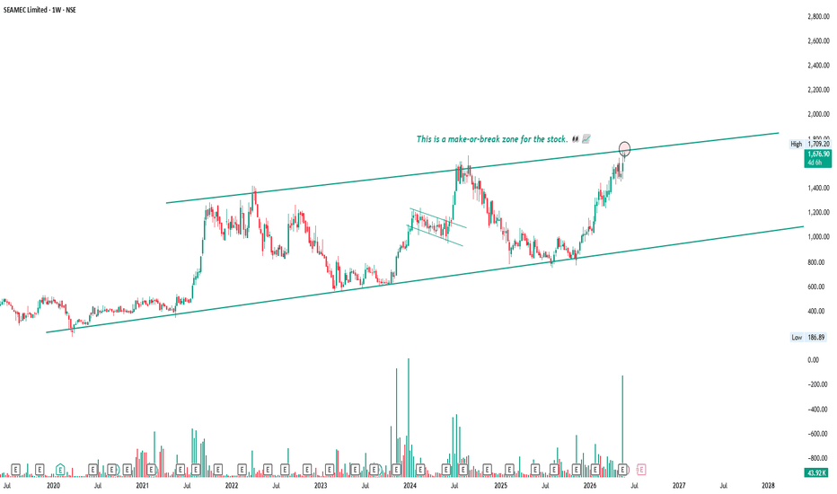
SEAMEC — 7 Years. One Channel. Upper Band Reached (2019–2026)Some charts demand your full attention. This is one of them.
SEAMEC has been moving inside a clean ascending channel since 2019 — seven full years. Every time price touched the lower band buyers showed up without fail. No exceptions. The structure has been respected through bull markets, bear markets and everything in between.
Now here is where it gets interesting.
From the 2025 low of ₹800 the stock has rallied 113% in under 12 months — straight into the upper boundary of that 7 year channel. And this week it got there with 38.74K volume — the biggest weekly volume in years. That kind of volume at a major resistance level is not noise. That is institutions making a decision.
Two scenarios from here.
If the upper band holds — price pulls back to mid channel ₹1,200 to ₹1,300. Healthy correction. Channel intact. Next opportunity to accumulate.
If the upper band breaks — 7 year channel breakout on record volume. Measured target opens up to ₹2,200 to ₹2,500. That is 30 to 50% from current levels.
The answer comes with a weekly close above ₹1,750.
Seven years of structure. Record volume. Upper band on test.
These setups don't come often. When they do — you pay attention.
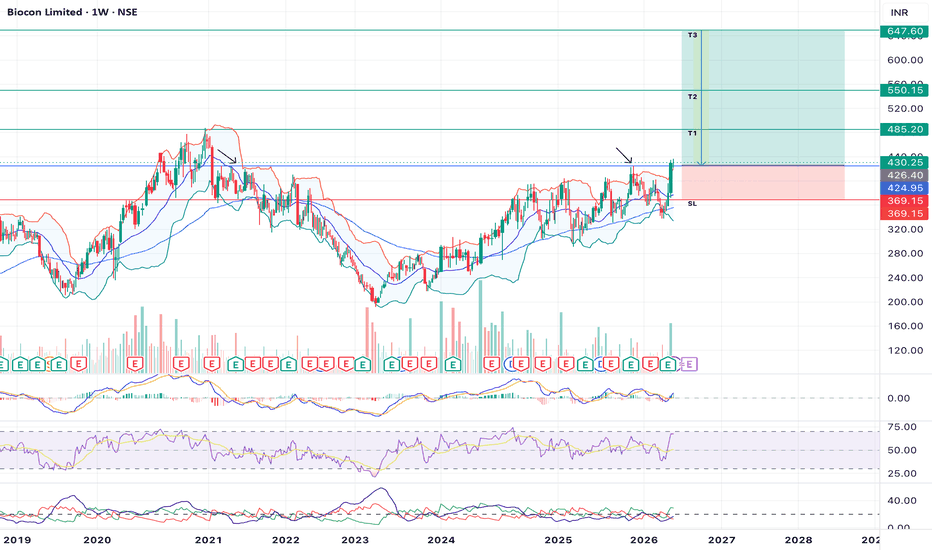
BIOCON- MULTIYEAR BREAKOUT SETUP 📊 BIOCON – Next Week Trade Setup
BIOCON has entered a decisive technical zone and stands out on the weekly chart as price attempts to challenge a long-standing resistance area after a prolonged phase of consolidation.
🔹 **Chart Structure**
Price has gradually recovered from lower levels and is now testing a major resistance zone that has capped previous advances. The broader structure suggests improving momentum with the possibility of a larger breakout move if confirmation sustains.
🔹 **Technical View**
• Weekly chart showing improving structure
• Price challenging major resistance zone
• MACD turning supportive of bullish momentum
• RSI strengthening and holding positive territory
• Breakout attempt visible on higher timeframe
🔹 **Trade Plan**
📍 Entry Zone: Around 425–430
🛑 Stop Loss: 369
🎯 Target 1: 485
🔹 **Possibility:**
🎯 Target 2: 550
🎯 Target 3: 647
🔹 **What I’m Watching**
The 425–430 zone is critical. A sustained breakout and weekly strength above resistance may trigger fresh buying momentum and open room toward higher targets. However, rejection near this zone could lead to consolidation or retest of support levels. Watching for confirmation and follow-through rather than early aggression.
⚠️ Not a recommendation — sharing my technical view and planned setup for educational and journal purposes.
#BIOCON #NSE #SwingTrading #TechnicalAnalysis #IndianStockMarket #PriceAction #TradingSetup
GAIL — Weekly Chart Analysis 24May26NSE:GAIL GAIL (India) Limited is currently attempting to recover after taking support from a major weekly demand zone near ₹135–140. The stock had been under pressure for several months, but recent price action suggests buyers are slowly regaining control from lower levels.
The highlighted support/breakdown zone has historically acted as a strong accumulation area, and the current rebound from this region may indicate the beginning of a medium-term recovery phase.
Current Market Structure
Price is still trading below the descending resistance trendline, which continues acting as a dynamic supply zone. However, the recent bounce from support shows improving sentiment and increasing probability of trend reversal if momentum continues building.
The stock now appears to be entering an important phase where breakout confirmation could trigger stronger upside movement.
Resistance Zones
First major resistance zone remains near ₹195–200. This area may act as an important breakout entry zone because previous selling pressure emerged from this region.
A successful breakout above ₹200 with strong weekly closing could open the path toward the higher resistance zone near ₹240–246.
Technical Observations
Weekly RSI is recovering from lower levels and attempting to move back into bullish territory.
Price has formed a strong reaction from the major support zone around ₹135–140.
The descending resistance trendline remains the key barrier for bullish continuation.
Volume participation during the rebound phase may become important for confirming breakout strength.
Bullish Scenario
If the stock sustains above the breakout resistance zone near ₹195–200, momentum could accelerate toward higher targets around ₹240–246 in the longer timeframe.
Support Levels
Major weekly support remains near ₹135–140. A breakdown below this zone may weaken the bullish recovery structure and increase downside risk.
Conclusion
GAIL is currently showing early signs of recovery after defending a critical long-term support zone. The stock remains in a rebuilding phase, and confirmation of a larger bullish trend reversal will likely come only after a decisive breakout above the major resistance area.
Disclaimer: This analysis is for educational purposes only and not financial advice. Always manage risk properly before taking any trade.
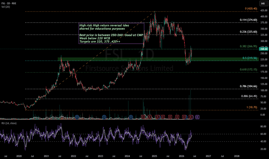
Firstsource looks to be cranked up for ATH levels!Uncertainty in global economy is causing a slowdown in overall IT industry.
However, FSL is looking all good for a strong reversal.
The volume at 50% Fib retracement support is an indicator of the same.
Q4 Revenue & EBITDA posted by company is at record high.
Stock can be one of the earliest stock to reach ATH if IT sector starts to recover. Don't miss to keep this in your watchlist.
The risk is around 15% and reward is more than 50%.
This is not a recommendation and is strictly for educational purposes
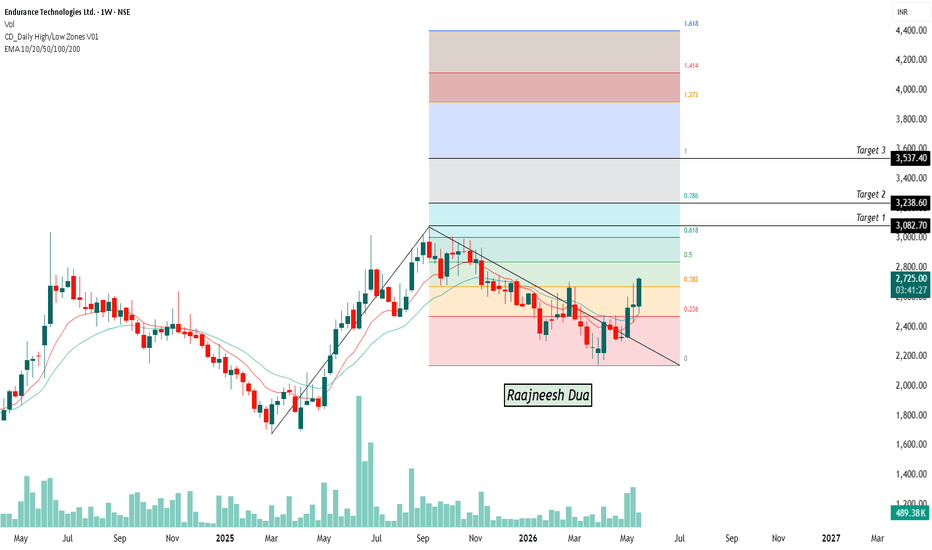
ENDURANCE - weeklyTrend (EMA + Structure): The weekly trend is turning strongly positive. Price has reclaimed the short-term moving averages and is now trading above them. The recent candles show a breakout from a falling trendline, which indicates a possible end of the correction phase and the beginning of a fresh upward move.
Price Structure: The stock had a corrective phase after the previous rally and formed a descending structure. Recently, price broke above the downward trendline and also moved above the 0.236 Fibonacci zone (~2500–2550). This breakout changes the structure from bearish to bullish.
Volume Analysis: The latest bullish candles are supported by rising volume, which is important because breakout moves without volume are usually weak. Increased participation suggests stronger buying interest and gives more reliability to the breakout.
Fibonacci Analysis: The stock is now entering the first resistance area after the breakout:
• Immediate resistance: 2800–2850
• Target 1: 3082
• Target 2: 3238
• Target 3: 3537
These levels align with your Fibonacci extension zones and may act as profit-booking areas.
Momentum View: Price is showing strong upward momentum after breaking the downtrend structure. Since the stock is coming from a correction base, continuation toward higher Fibonacci levels becomes possible if the breakout sustains.
Trading perspective: • Bullish confirmation: Weekly close above 2750–2800 with strong volume
• Immediate support: 2500–2550 (breakout zone)
• Strong support: 2350–2400
• Bearish confirmation: Weekly close back below 2500
Current View: This currently looks like a weekly trend reversal / positional breakout setup, not just a short-term bounce. As long as price stays above 2500–2550, the probability favors movement toward 3000+ levels over the coming weeks/months.