Education

 Education

 Education

Education

 Education

Trading Masterclass #1Institutional trading means trading like hedge funds, banks, prop firms, and professional desks. They do not trade based on emotions, random tips, or gambling. They use systems, probabilities, risk control, position sizing, discipline, and psychology.
Retail traders often lose because they focus only on “entry.” Institutions focus on:
Risk Management
Capital Protection
Position Sizing
Probability
Psychology
Consistency
Repeatable Edge
In options trading, if you think like institutions, your results can improve significantly
 Education

 Education

BTC/USD (1H): Rejection at Supply Zone & Descending Trendline ?Market Overview
Bitcoin (BTC/USD) on the 1-hour timeframe continues to print lower highs and lower lows, heavily guided by a descending trendline. Recent structural movements indicate Smart Money Concepts (SMC) behavior, including a Market Structure Shift (MSS), Break of Structure (BOS), and liquidity sweeps of Equal Lows (EQL).
Key Technical Elements
Market Structure: Downward momentum remains intact following multiple liquidity sweeps (Liq Sweep) and structural breaks on the lower timeframe.
Supply Zone ($63,000 – $63,200): Price is currently retracing into a marked Supply Zone that converges directly with the descending trendline resistance.
Invalidation / Overhead Resistance: A strong candle close above the trendline and the upper boundary of the supply zone (~$63,200–$63,300) invalidates this short bias.
Trade Plan & Execution
Bias: Bearish / Short
Entry Area: Rejection price action inside the Supply Zone ($63,000 – $63,200) near the descending trendline.
Target: $62,400 (Recent swing lows / liquidity target marked at the base).  Short
Short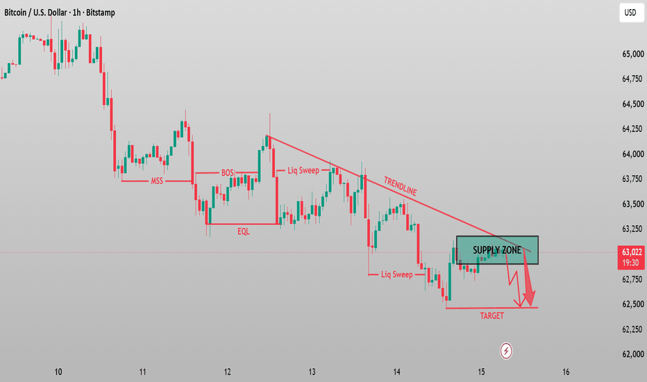
Bitcoin 1H: SMC Setup —Rejection from Supply Zone Target $62,700Bitcoin (BTC/USD) 1H Analysis — Bearish Continuation Setup
Overview:
Bitcoin continues to trade within a well-defined bearish channel on the 1-hour timeframe following a Change of Character (CHOCH) and a clear Market Structure Shift (MSS) higher up.
Key Technical Factors:
Descending Trendline Confluence: Price has consistently respected the descending trendline resistance, driving the price lower.
Supply Zone Rejection: The green highlight ($63,300–$63,600) represents a key supply zone that aligns directly with the descending trendline resistance.
Liquidity Grab & BOS: Following the sweep of the Equal Lows (EQL) and a clear Break of Structure (BOS), market structure remains firmly in favor of the bears.
Trade Execution Plan:
Bias: Short / Bearish 📉
Sell Zone (Supply Area): ~$63,300 – $63,550
Take Profit Target: ~$62,750 (Recent liquidity lows)
Stop Loss: Above the top of the Supply Zone / Trendline (~$63,700–$63,800) Short 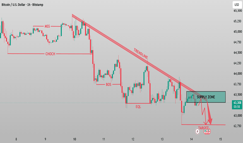
 Education
Long 
XAUUSD Breakdown: Hunting Sell-Side Liquidity at $4,300XAUUSD (1H) — Channel Breakdown & Retest of Supply Zone
Gold has experienced a significant shift in market structure on the 1-hour timeframe following a sweep of Buy-Side Liquidity (BSL) near the top of the Upward Channel.
Key Technical Insights:
Market Structure Shift (MSS): Price broke out of the ascending channel to the downside and closed below the critical swing low level around $4,380, establishing a bearish Market Structure Shift.
Supply Zone Retest: The corrective move upward retested the fresh Supply Zone / Resistance ($4,365 – $4,395). Rejection from this area indicates institutional selling interest.
Liquidity Target: The overall bias favors a continued sell-off toward major liquidity pools resting below current structural lows.
🎯 Trade Setup & Parameters:
Bias: Bearish / Short
Entry Zone: $4,360 – $4,385 (Supply Zone retest)
Invalidation / Stop Loss: Above $4,400 (Above the Supply Zone/Resistance)
Take Profit 1: $4,318 (Intermediate Target)
Take Profit 2: $4,300 (Sell-Side Liquidity / SSL)
⚠️ Risk Management: Always manage your position size carefully and adjust stop losses to break-even once Target 1 is achieved. Market conditions can change rapidly around high-impact news. Short 
#NIFTY Intraday Support and Resistance Levels - 14/08/2026Nifty is expected to open with a gap-up, but the index is still within the broader consolidation zone. The immediate resistance is around 24,450–24,550, while 24,250 remains an important support.
If Nifty sustains above 24,550, buying can be considered with targets of 24,650, 24,700 and 24,750+. On the downside, if Nifty breaks below 24,450, selling can be considered with targets of 24,350, 24,300 and 24,250.
Overall, after the gap-up opening, traders should watch 24,550 closely for a sustained breakout. Until then, the market may continue to remain consolidated. #BANKNIFTY Intraday PE & CE Levels(14/08/2026)Bank Nifty is expected to open flat, with the index likely to continue consolidating around the current range. The immediate support is around 57,550, while 57,950–58,050 remains the key resistance zone.
If Bank Nifty sustains above 57,600, buying can be considered with targets of 57,750, 57,850 and 57,950+. On the downside, if it breaks below 57,450, selling can be considered with targets of 57,250, 57,150 and 57,050.
Overall, Bank Nifty is consolidating in the 57,450–57,950 range. Traders should wait for a clear breakout or breakdown for a stronger directional move. Short 
 Long
Long
 Long
Long
BTCUSD Liquidity Sweep & Bullish Recovery Setup
BTCUSD is showing signs of a potential bullish recovery after a strong intraday sell-off, with price reacting from the highlighted demand area near the recent weak low. The sharp decline appears to have swept downside liquidity before buyers stepped in, creating an opportunity for a short-term reversal.
The recent CHoCH followed by BOS suggests that market structure is beginning to shift in favor of buyers. As long as price continues to defend the demand zone and holds above the weak low, the current pullback can be viewed as a potential liquidity sweep and accumulation phase rather than a confirmed bearish continuation.
The key confirmation is a sustained reclaim of 64,107, which would strengthen bullish momentum. A successful break and hold above 64,433 could open the way toward the next upside liquidity around 64,900, while the larger strong high near 65,400 remains a major target if momentum expands.
However, the bullish scenario remains conditional. If BTC fails to hold the demand zone and breaks below the 63,182 weak low with strong selling pressure, the recovery setup would be invalidated and further downside could develop. Long 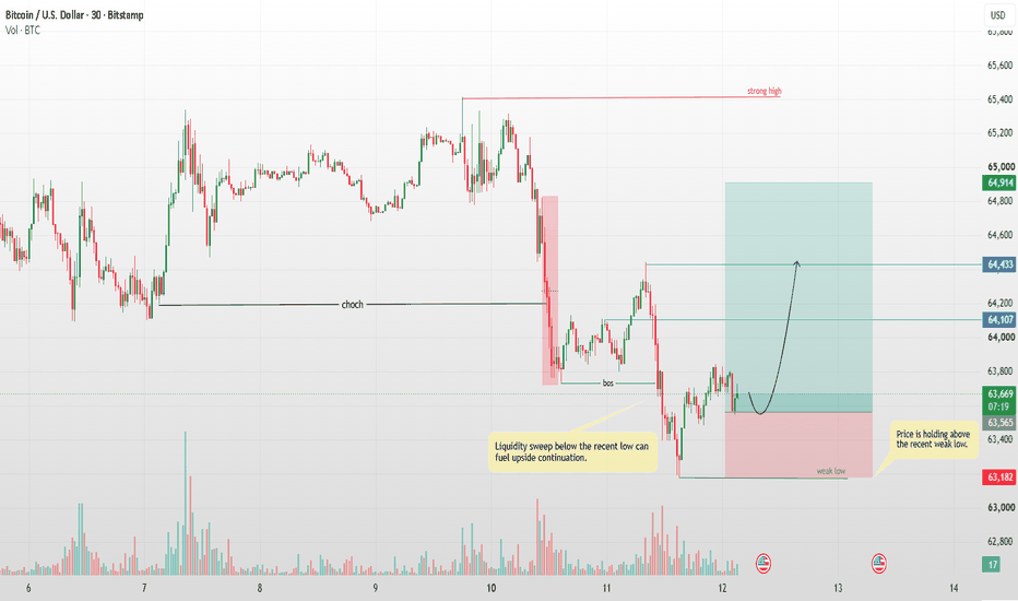
ASTRAL Symmetrical Triangle Breakout Attempt📊 Astral Ltd.: Daily Technical Snapshot – Symmetrical Triangle Breakout Attempt
📊 STWP Technical Analysis
________________________________________
MARKET STRUCTURE SNAPSHOT | NSE: ASTRAL | DAILY
• Closing Price: 1,592.00 (+128.00 | +8.74%)
• Core Trend: Uptrend Developing
• Market State: 1-Month Range Expansion / Breakout Attempt
• Price Structure: Price has moved sharply towards the upper boundary of a well-defined 1-month range, with the latest session showing a strong bullish expansion candle and exceptional volume participation.
________________________________________
OPERATIONAL PRICE GRID & KEY REFERENCE LEVELS
• Higher Range Reference: 1,600.00
• Hard Invalidation Level: 1,416.70
• Structural Risk: 183.30 (11.51%)
• Resistance Levels: R1 1,631 | R2 1,670 | R3 1,740
• Support Levels: S1 1,522 | S2 1,452 | S3 1,413
• Lower Range Reference: 1,312.90
• Higher Timeframe Observation Zones: 1,783 | 1,967
• Current Bias: BULLISH — BREAKOUT CONFIRMATION WATCH
• CPR State: Bullish Zone | CPR Moving Up | Wide
• Today's CPR: Pivot 1,451.20 | Top 1,457.60 | Base 1,444.80
• Tomorrow's CPR: Pivot 1,561.00 | Top 1,576.50 | Base 1,545.50
________________________________________
💡 STWP QUICK READ
Range Expansion: Price has surged towards the 1,600 upper-range reference.
Volume Confirmation: 12.37M shares vs 1.06M average — approximately 11.63x average volume.
Momentum: RSI 72.94 confirms strong momentum, while Stochastic 95.61 highlights an extended short-term condition.
Key Observation: Sustained acceptance above 1,600–1,631 would provide stronger confirmation of the range breakout.
________________________________________
📚 EDUCATIONAL OBSERVATION
Astral has delivered a powerful 1-month range expansion, gaining 8.74% in the latest session and closing at 1,592. The price structure shows the stock approaching the upper boundary of a clearly defined range, with 1,600 marked as the higher range reference.
The latest move is particularly noteworthy because of the participation behind it. Volume expanded to 12.37 million shares against a 20-day average of 1.06 million, representing approximately 11.63x average volume. Such an exceptional expansion in volume indicates a significant increase in market participation accompanying the price move.
However, the chart should not be treated as a confirmed breakout yet. Price closed at 1,592, just below the 1,600 higher-range reference. Therefore, the important observation is whether price can sustain acceptance above 1,600 and subsequently overcome the 1,631-resistance zone.
ADX at 17.56 indicates that trend strength is still developing. This is important because a sharp price expansion does not automatically establish a sustained trend. Follow-through and continued participation will provide additional information about the quality of the move.
The immediate resistance structure is positioned at 1,631, 1,670 and 1,740. On the downside, 1,522 is the first important support, followed by 1,452 and 1,413. The lower range reference around 1,312.90 provides a broader structural reference for the existing range.
The projected CPR has shifted significantly higher, with tomorrow's Pivot at 1,561.00 and a projected CPR range between 1,545.50 and 1,576.50. The upward shift in CPR indicates improving price acceptance, although the actual price behaviour around the 1,600–1,631 zone remains the key confirmation area.
From an STWP perspective, this setup demonstrates an important principle: a price breakout attempt becomes more meaningful when supported by exceptional participation, but confirmation still comes from sustained price acceptance rather than a single candle.
________________________________________
🏢 BUSINESS & FUNDAMENTAL UPDATE | Q1 FY27
Astral delivered a strong Q1 FY27, with consolidated revenue rising 15.9% YoY to 1,578 crore, while adjusted PAT increased approximately 48% YoY to 120.2 crore. EBITDA grew 25.8% to 244 crore, with EBITDA margin improving to 15.5% from 14.3% a year ago. The plumbing business recorded 10.1% revenue growth, while the India Adhesive business grew strongly and the company continued to make progress across its paints and other value-added businesses. Management is also progressing with its CPVC backward-integration project, which is expected to support margins and reduce dependence on external resin procurement over time.
STWP Fundamental Takeaway: The Q1 numbers show improving revenue growth, strong EBITDA expansion and margin recovery. The combination of better fundamentals with today's Symmetrical Triangle breakout attempt and exceptional volume expansion makes the price action particularly worth observing.
________________________________________🎯 STWP LEARNING POINT
Price is approaching the range ceiling + volume is exceptionally high + momentum is strong.
But the next question is not “How far can it go?”
The better question is:
“Can price sustain above the range boundary and convert resistance into support?”
That is where the next phase of market structure becomes important.
________________________________________
⚠️ DISCLAIMER
• This analysis is provided strictly for educational and informational purposes.
• This is not financial, investment or trading advice and should not be considered a recommendation to buy or sell any security.
• Stock market investments are subject to market risks, including possible loss of capital.
• Past performance, historical observations, chart patterns and technical indicators do not guarantee future results.
• Please conduct your own research and consult a SEBI-registered investment adviser before making investment decisions.
• STWP assumes no responsibility or liability for any financial loss arising directly or indirectly from the use of this information.
Long 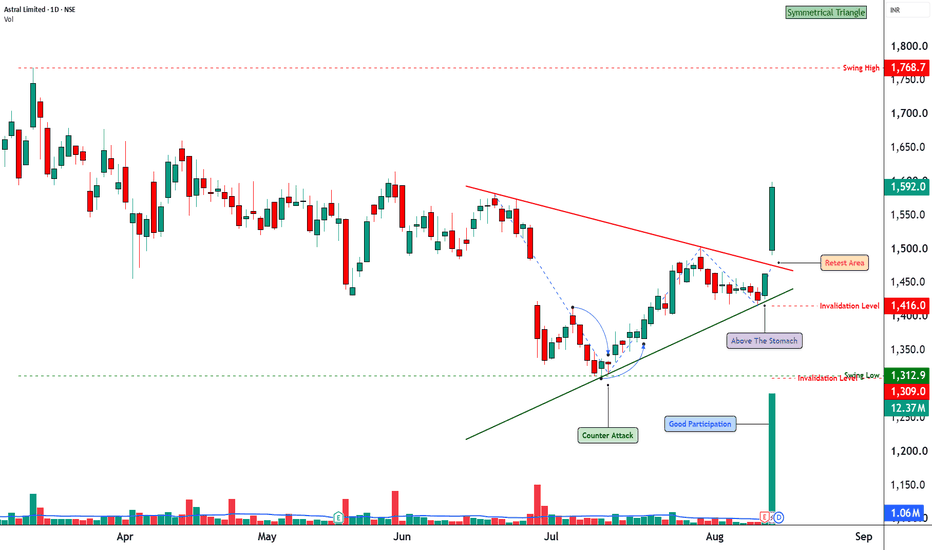
Part 2: The Breakout That Was Never Meant to ContinueHow Some Breakouts Exist Mainly to Trap Traders
A breakout looks exciting because it gives traders the feeling that something important has changed.
Price was stuck below resistance, and suddenly it moves above it.
Many traders see this and immediately think, “The resistance is broken. Price is going higher.”
But not every breakout is real.
Sometimes price breaks the level, attracts buyers, and then quickly reverses.
This is known as a false breakout.
1. What is a false breakout?
A false breakout happens when price moves above an important resistance level but cannot stay there.
For example:
A stock has been struggling around **$500** for several days.
Every time it reaches $500, sellers appear and push it lower.
Then one day, price suddenly moves to $510.
Traders see the move and start buying.
But instead of continuing higher, price falls back below $500.
The breakout has failed.
2. Why do traders get trapped?
Because the first move looks convincing.
When price crosses resistance, traders often believe that the market has finally changed.
They may buy because:
- Resistance has been broken.
- The chart looks bullish.
- They expect a bigger move.
- They do not want to miss the opportunity.
The problem starts when price cannot hold above the breakout level.
Now these traders are sitting in a position that is moving against them.
3. The breakout attracts buyers
This is what makes a false breakout dangerous.
The market may move just far enough above resistance to make traders believe the breakout is real.
For example, resistance is at **$500**.
Price moves to $505, then $510.
A trader sees this and enters at $510.
But instead of moving toward $520 or $530, price starts falling.
Suddenly, the trader who entered at $510 is trapped.
4. The old resistance becomes important again
One of the clearest signs of a failed breakout is when price comes back below the old resistance.
If $500 was resistance and price breaks above it, traders expect $500 to become support.
But if price falls back below $500, that is a warning.
It tells us that buyers were not strong enough to hold the breakout.
The market tried to move higher but failed.
5. Stop-losses can make the fall faster
Many breakout traders place their stop-loss just below the old resistance.
Suppose the breakout happens at $500.
A trader buys at $505 and places a stop-loss around $495.
If price falls back below $500, more traders may start exiting.
Once their stop-losses are triggered, additional selling can enter the market.
This can make the reversal much faster.
6. A failed breakout can move strongly in the opposite direction
This is one of the most interesting parts.
A normal rejection is one thing.
But when many traders have bought the breakout and then suddenly realize they are wrong, they may all try to exit around the same time.
That can create strong selling pressure.
So a failed breakout can sometimes produce a sharper fall than the original rejection.
7. Do not assume every breakout is a trap
This is equally important.
Not every breakout is designed to trap traders.
Many breakouts are genuine.
The point is not to become afraid of breakouts.
The point is to understand that **crossing a resistance level is not enough**.
You need to see whether price can actually hold above it.
8. What does a healthy breakout look like?
A stronger breakout usually shows acceptance above the old resistance.
For example:
Price breaks $500.
It moves to $505.
Then $510.
It pulls back slightly but remains above $500.
Buyers step in again.
Price starts moving higher.
This tells us that the market is accepting prices above the old resistance.
9. What does a weak breakout look like?
A weak breakout often has different behaviour.
Price breaks $500.
It moves to $505 or $510.
Then buyers stop pushing.
Price starts falling.
It comes back to $500.
Then it breaks below $500.
This is a warning that the breakout may have failed.
10. Watch the reaction, not just the breakout
This is one of the most important lessons.
Do not focus only on the moment price crosses resistance.
Watch what happens afterward.
Ask:
Can buyers keep price above the level?
If yes, the breakout becomes more convincing.
If no, the breakout becomes suspicious.
The reaction after the breakout often tells you more than the breakout itself.
11. Volume can give extra information
Volume can also help.
A breakout with strong volume can show that many traders are participating.
A breakout with very low volume may deserve more caution.
But volume alone does not prove that a breakout is real.
Even high-volume breakouts can fail.
Always look at the price behaviour along with volume.
12. Fear of missing out creates many bad entries
One reason traders get trapped is FOMO.
They see price breaking resistance and think:
“If I don't buy now, I will miss the move.”
So they enter immediately.
But the market does not care whether you entered or not.
Sometimes waiting for confirmation gives you a much better picture.
If the breakout is genuine, price can continue higher.
If it is false, waiting may keep you out of the trap.
13. The simple way to think about it
When price breaks resistance, do not immediately ask:
“Should I buy?”
First ask:
“Can price stay above this level?”
That one question can change the way you look at breakouts.
A breakout that holds can become a real move.
A breakout that quickly fails can become a trap.
14. The key takeaway
A breakout is not confirmed simply because price moves above resistance.
You need to see acceptance.
Watch whether price stays above the level.
Watch whether buyers continue to show strength.
Watch whether the old resistance turns into support.
And most importantly, watch what happens if price falls back below the level.
The first move gets your attention.
The reaction tells you whether the breakout was real.
By @BrightRally_Research Education 
Part 1: The Market Remembers Where It Was HurtMarkets have a memory. Not in the way people do, of course, but price often reacts around the same areas where it reacted strongly in the past.
This is why an old rejection zone can become important again.
Imagine a stock moving from ₹400 to ₹500. Buyers are excited and keep pushing the price higher. But when the stock reaches around ₹500, sellers suddenly become aggressive. The price struggles to move above that area and eventually falls back to ₹450.
That ₹500 area has now become important.
Months later, the stock starts moving higher again and comes back toward ₹500. At first glance, you might think, “That happened a long time ago. Why should this level matter now?”
The answer is simple: the traders who were involved in the earlier move may still remember what happened there.
Some traders may have bought around ₹500 and then watched the stock fall. They were trapped in a losing position. If the stock eventually comes back to ₹500, they may see it as a chance to get out without a loss.
They may simply think, “I have been waiting for this level. I am selling now.”
Now imagine many traders thinking the same thing.
That can create selling pressure when price reaches the old zone again.
But it is not only trapped traders who matter. New traders looking at the chart can also see the previous rejection. They know that sellers were strong around that area before. Because of this, some of them may expect another rejection and start selling when price gets close.
This is one reason old rejection zones can remain relevant for a long time.
However, there is an important difference between saying a level is important and saying price will definitely reverse there.
An old rejection zone is not a guaranteed sell signal.
It is simply an area where traders should start paying closer attention.
What matters most is how price behaves when it returns.
Suppose price approaches the old zone slowly. The candles become smaller, the stock struggles to move higher, and sellers begin appearing again. That tells us the old zone may still have influence.
Now imagine the opposite.
Price reaches the same zone with strong momentum. Buyers continue pushing higher, the stock breaks above the previous rejection area, and price stays above it.
That tells us something has changed.
The sellers who controlled that area in the past may no longer be strong enough to stop the buyers.
This is why you should never trade an old rejection zone blindly.
The old level gives you a place to watch. The current price action gives you the information you need.
Another important point is that these zones are usually areas, not exact numbers.
If a stock was rejected between ₹495 and ₹505, you should not assume that ₹500 is a special number. Markets do not always respect exact prices.
Price may move slightly above ₹500 before sellers appear. It may also turn around at ₹497 or ₹503.
What matters is the overall behaviour around the area.
You also need to look at the bigger picture.
An old rejection zone during a strong uptrend may eventually break because buyers keep getting stronger.
The same zone during a weak or falling market may lead to a much stronger rejection.
The level is the same, but the market around it has changed.
This is why old rejection zones should be treated as context, not certainty.
They tell us where the market struggled before.
They show us where buyers and sellers had a strong fight.
They can reveal where traders may still be trapped or waiting for an opportunity to exit.
And when price comes back to that area, all of those factors can come into play again.
The most important lesson is simple.
Do not assume the old reaction will repeat. Watch what price does when it reaches the old zone.
The past gives you the level to watch.
The present tells you whether that level still matters.
By @BrightRally_Research Education 
Long 
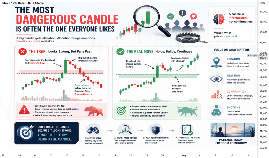
The Most Dangerous Candle Is Often the One Everyone LikesA large bullish or bearish candle is one of the most attractive things on a chart. When traders see a strong green candle breaking a resistance level, the immediate thought is often, “The trend has started.” When a large red candle breaks support, many immediately expect further downside. The candle looks powerful, clean and convincing. But sometimes, that is exactly what makes it dangerous.
The problem is not the candle itself. The problem is what happens after everyone notices it. A strong candle attracts attention because it shows urgency. Traders who were waiting for confirmation enter late, breakout traders jump in, and traders who were on the opposite side may rush to exit. This sudden increase in participation can push price even further, making the move look stronger than it really is.
A Strong Candle Can Hide Weak Positioning
Imagine a stock has been moving sideways for several days. Suddenly, a huge green candle breaks above the range. The candle closes near its high, volume increases and everything looks bullish.
A trader who sees this for the first time may think the safest decision is to buy immediately.
But there is an important question to ask:
Who is buying at this point?
Some traders may have bought much earlier near the bottom of the range. They are already sitting on profits. New buyers, however, are entering after price has already moved significantly.
This creates an interesting situation. The candle may represent genuine buying, but it may also become the point where late buyers enter just before existing holders start taking profits.
That is why a strong candle should not automatically be treated as a signal to enter.
The Candle Is Information, Not Confirmation
One of the biggest mistakes traders make is treating one candle as a complete story.
A candle only tells us what happened during a particular period. It does not tell us what will happen next.
A large breakout candle tells us that buyers were aggressive during that period. It does not guarantee that buyers will remain aggressive afterward.
The next few candles are often more important.
If price breaks resistance and continues holding above it, the breakout becomes more convincing. But if price quickly falls back below the breakout level, the meaning of that original candle changes completely.
What looked like strength may have been a trap.
The Real Danger Comes From Chasing
There is nothing wrong with buying a breakout. The danger comes from buying simply because the candle looks impressive.
This is where emotions take over.
A trader sees price moving quickly and feels that waiting means missing the opportunity. The candle becomes bigger, the fear of missing out becomes stronger, and the trader enters without thinking about where the trade is invalidated.
Ironically, the stronger the candle looks, the more tempting it can be to chase.
Good trading is often about doing the opposite: when everyone is excited, slow down and examine the structure.
Ask where price was before the candle appeared. Ask whether the breakout is happening from an important level. Ask whether the candle is closing outside the range or merely pushing through it temporarily.
These questions are more useful than simply asking whether the candle is bullish or bearish.
Watch What Happens After the Candle
The candle itself is not the final signal. The reaction after it is often more valuable.
Suppose a stock produces a massive bullish candle above resistance. Instead of buying immediately, watch what happens next.
If price pulls back slightly, holds the breakout area and then starts moving higher again, the market is showing that buyers are willing to defend the new level.
But if price quickly falls back into the previous range, the breakout deserves much more suspicion.
The same logic works on the downside.
A huge red candle breaking support may look extremely bearish. But if price immediately recovers and closes back above the broken support, the breakdown may have simply collected stop-loss orders before reversing.
This is why the candle after the big candle can sometimes tell you more than the big candle itself.
Look at the Location, Not Just the Candle
A large candle in the middle of nowhere is not the same as a large candle appearing at an important market structure.
This is one of the simplest ways to improve candle analysis.
A huge bullish candle after a long decline and near a major support zone has a different meaning from a huge bullish candle that appears after price has already rallied sharply into resistance.
The shape may be almost identical.
The context is completely different.
Instead of asking:
“Is this a strong candle?”
Ask:
“Where did this strong candle appear?”
That small change in thinking can prevent many impulsive trades.
Sometimes the Best Trade Is the Second Move
You do not have to catch the first move.
This is something many traders struggle to accept.
Markets give multiple opportunities. If a huge candle breaks a level, you can wait for the market to prove whether that breakout is genuine.
Sometimes price will retest the broken level. Sometimes it will form a small consolidation above it. Sometimes it will completely reject the breakout.
Waiting may mean entering at a slightly higher or lower price than the first candle, but you may gain something much more valuable: **better information**.
The goal is not to enter as early as possible.
The goal is to enter when the probability and risk make sense.
The Lesson:
A powerful candle deserves attention, but it does not automatically deserve a trade.
The most dangerous candle can sometimes be the one that looks perfect because it creates the strongest emotional reaction. Everyone sees it. Everyone talks about it. Everyone wants to participate.
That is exactly when a trader should stop and ask what the market is actually doing.
A candle is only one piece of information. Its location, the preceding structure, volume, follow-through and reaction around the breakout level all matter.
Don't trade the candle because it looks strong. Trade the story behind the candle.
The market does not reward the trader who reacts fastest to every impressive candle. It rewards the trader who understands why that candle appeared and what price does next. Education