Indicator

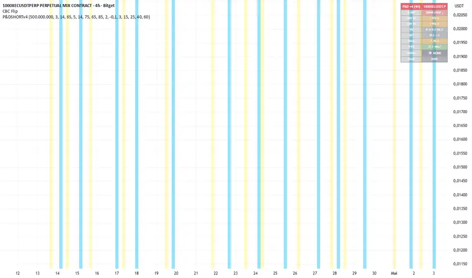
P&D Short Signal v4.0 [4H]═══════════════════════════════════════════════════════════
TRADINGVIEW PUBLISH — P&D Short Signal v4.0
Author: Kevko87 | Open Source
═══════════════════════════════════════════════════════════
TITLE:
P&D Short Signal v4.0 — Pump & Dump Distribution Detector
───────────────────────────────────────────────────────────
SHORT DESCRIPTION (shown in search):
───────────────────────────────────────────────────────────
Detects post-pump distribution phases on crypto futures using
OBV, RSI divergence, MFI, and Delta-Volume across 4H / 1H / Daily.
Generates Tier 1 and Tier 2 short signals with auto TP/SL levels.
───────────────────────────────────────────────────────────
FULL DESCRIPTION:
───────────────────────────────────────────────────────────
## P&D Short Signal v4.0
This indicator identifies **post-pump distribution phases** on crypto
perpetual futures, designed to catch the dump after a Pump & Dump cycle.
Built and validated on Bitget Futures over 30+ live trading sessions.
---
### How it works
The indicator uses a **multi-timeframe confluence approach**:
- **4H** — Base timeframe (OBV slope, RSI, MFI, Delta-Volume)
- **1H** — OBV confirmation
- **Daily** — Gate-keeper: coins with Daily OBV > 500M are skipped
(high OBV = genuine buying pressure = no short)
A signal fires only when multiple conditions align simultaneously,
filtering out noise and false setups.
---
### Signal Tiers
**🔴 TIER 1 — High Confidence (≥85%)**
- Daily OBV < 500M (gate-keeper passes)
- 4H OBV falling + 1H OBV falling (distribution confirmed)
- RSI > 65 AND (bearish divergence OR below MA)
- MFI > 75 AND falling for 2+ bars
- Delta-Volume negative (optional, toggleable)
**🟠 TIER 2 — Moderate Confidence (~70%)**
- Daily OBV < 500M
- 4H OBV falling
- RSI > 65
- MFI > 65 AND falling
**🔴 MFI Extreme Background Alert**
- MFI ≥ 85 and falling with valid Daily OBV
- Precursor warning — check OBV manually
---
### Auto TP / SL
On every signal, the indicator automatically plots:
- **SL**: Entry High + ATR × 3 (default)
- **TP1**: −15% | **TP2**: −25% | **TP3**: −40% | **TP4**: −60%
All levels fully adjustable via inputs.
---
### Status Table (top right)
Live dashboard showing the current state of all filters:
D-OBV · OBV 4H · OBV 1H · RSI · MFI · Delta · D-RSI · Signal · Trade
---
### Alerts
Three built-in alert conditions:
- 🔴 TIER 1 SHORT
- 🟠 TIER 2 SHORT
- ⚠️ MFI EXTREME
Set alerts via TradingView's alert manager on any ticker.
---
### Recommended Usage
- **Market**: Crypto perpetual futures (Bitget, Bybit, Binance)
- **Timeframe**: 4H (indicator is built for 4H, do not use on other TFs)
- **Best targets**: Low-cap coins after +30–50% pumps within 24h
- **Risk management**: Always use the auto-generated SL. DCA entries
recommended for high-ATR setups.
---
### Key Filter: Daily OBV Gate
The most important filter in this system. If Daily OBV > 500M,
the move has genuine buying pressure behind it — shorting against
that is high risk. The indicator automatically skips these coins.
---
### Inputs
| Parameter | Default | Description |
|-----------|---------|-------------|
| Daily OBV Max | 500M | Skip coins above this OBV |
| OBV Slope Bars | 3 | Lookback for OBV direction |
| RSI Length | 14 | Standard RSI period |
| RSI Min for Entry | 65 | Minimum RSI for overbought |
| Divergence Lookback | 5 | Bars for price/RSI divergence |
| MFI Length | 14 | Standard MFI period |
| MFI Min Tier 1 | 75 | MFI threshold for Tier 1 |
| MFI Min Tier 2 | 65 | MFI threshold for Tier 2 |
| MFI Extreme | 85 | Background alert level |
| SL ATR Multiplier | 3.0 | Stop loss distance |
| TP1–TP4 | 15/25/40/60% | Take profit levels |
---
### Changelog
**v4.0**
- Base timeframe changed from 1H to 4H (higher win rate in backtesting)
- 5 bars on 4H = 20h = one full pump cycle captured
- Tier 1: RSI divergence OR below MA (previously required both)
- MTF structure: 4H base / 1H confirmation / Daily gate-keeper
- Status table added
---
*Open source. Use at your own risk. Not financial advice.*
*Built by Kevko87 — validated on live crypto futures trading.*
Indicator

Indicator

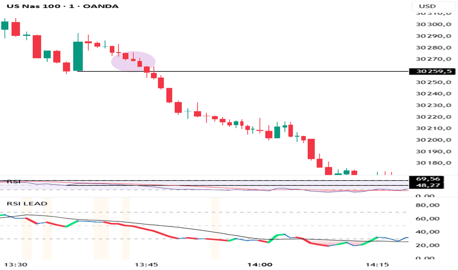
RSI Lead MomentumRSI Lead Momentum Engine is an advanced evolution of the classic RSI specifically designed for scalping and day trading on fast-moving markets such as Nasdaq (NQ), US100, CFD indices, and futures.
Unlike traditional RSI indicators that mainly react after price movement occurs, this indicator is designed to detect situations where RSI momentum leads the actual price structure.
Its primary objective is to identify pre-impulsive market phases in order to provide early entries before major directional expansions.
## Core Concept
The indicator analyzes the structural disconnection between:
* RSI structure,
* RSI slope,
* momentum acceleration,
* and real price structure.
The “RSI Lead” engine specifically detects situations where:
* RSI breaks a previous swing low or swing high,
* RSI momentum accelerates aggressively,
* while price has not yet confirmed the breakout or breakdown.
This behavior frequently appears on fast algorithmic markets and can signal:
* upcoming bullish or bearish continuation,
* volatility expansion phases,
* institutional momentum building before visible price displacement.
## Features
### RSI Lead Momentum Engine
Early signal detection:
* Early SELL
* Early BUY
Based on:
* RSI structural breaks,
* momentum acceleration,
* price compression,
* price lag versus RSI.
### RSI Divergences
Built-in detection:
* Regular Bullish
* Regular Bearish
### Compression & Momentum Explosion
Detection of:
* volatility compression,
* explosive momentum expansion.
### Dynamic RSI Coloring
Automatic RSI coloring based on:
* bullish momentum,
* bearish momentum,
* acceleration,
* breakout conditions.
### Detection Modes
* FAST → ultra-reactive mode for aggressive scalping.
* CONFIRMED → cleaner signals with additional price confirmation.
## Optimized For
* Nasdaq / NQ
* US100
* 1m / 2m / 5m scalping
* Momentum day trading
* Continuation setups
* Early entries
* Fast breakdowns and breakouts
## Indicator Philosophy
This indicator does not treat RSI as a simple overbought/oversold oscillator.
Instead, RSI is treated as:
an advanced directional pressure engine capable of anticipating certain price displacements before they become visually obvious on the chart.
The core of the algorithm is therefore based on:
detecting momentum displacement before price displacement.
Indicator
Indicator
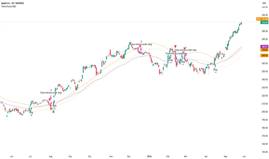
Trend Pulse OBVTrend Pulse OBV Strategy
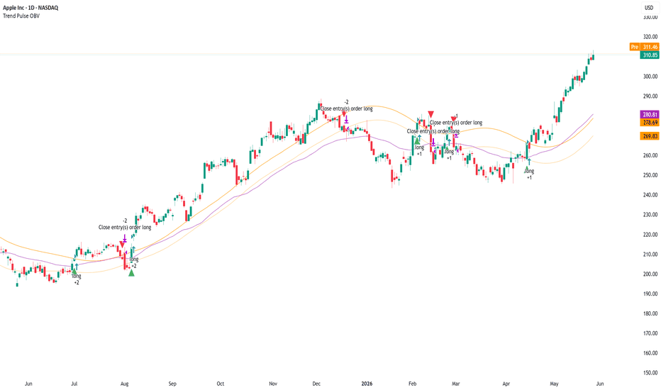
Trend Pulse OBV is an educational long-only strategy designed to study trend-channel breakouts that are confirmed by volume flow and a higher-level regime filter.
The strategy combines three main ideas:
1. A Trend Pulse Channel breakout.
2. OBV confirmation using On-Balance Volume relative to its EMA.
3. A regime filter using price relative to an EMA.
The purpose of the script is to test whether upside breakouts above an adaptive channel are more selective when confirmed by both volume accumulation and broader trend direction.
This is a strategy script for research, backtesting, and forward-testing only. It is not financial advice, does not predict future price movement, and does not guarantee profitable results. Historical strategy results are hypothetical and can differ significantly from live trading because of slippage, commissions, liquidity, spread, execution quality, timeframe selection, and market regime changes.
Core concept
The strategy is built around a Trend Pulse Channel. The channel uses a smoothed filter based on the selected source price and a filtered true-range calculation to create an upper breakout band.
A long entry can occur when price crosses above the Trend Pulse Channel upper band, but only if the selected confirmation filters are satisfied.
The strategy does not open short positions.
Entry logic
A long entry occurs when all selected conditions are satisfied:
* Price crosses above the Trend Pulse Channel upper band.
* Price is within the selected date range.
* The regime filter is satisfied, if enabled.
* The OBV confirmation filter is satisfied, if enabled.
* No long position is already open.
The strategy is designed to avoid entering every channel breakout. Instead, it requires confirmation that price is breaking out while broader trend and volume conditions support the move.
Trend Pulse Channel
The Trend Pulse Channel is calculated from:
* A selected source price, default HLC3.
* A multi-pole smoothing filter.
* A filtered true-range stream.
* A range multiplier used to define the upper band.
The upper channel band is used as the breakout trigger.
The midline is used as a possible exit reference when the midline exit is enabled.
OBV confirmation filter
The OBV filter compares On-Balance Volume to an EMA of OBV.
When the filter is enabled, long entries are allowed only when OBV is above its EMA. This is intended to require evidence that volume flow supports the upside breakout.
This does not guarantee continuation. It only adds a volume-based confirmation condition to the channel breakout.
Regime filter
The regime filter compares price to a selected EMA.
When enabled, long entries require price to be above the regime EMA. This is intended to reduce long entries during weaker or downward market environments.
The regime EMA can also be used as an exit condition if the regime exit is enabled.
Lag Mode
Lag Mode applies a zero-lag style pre-transform to both the price source and the true-range stream before they are filtered.
This can make the Trend Pulse Channel respond faster to new price movement, but it can also increase sensitivity and may create more false signals in choppy markets.
Exit logic
The strategy has multiple exit mechanisms:
1. ATR stop
At entry, the script calculates a fixed stop price using the previous bar’s ATR multiplied by the selected ATR stop multiplier. This stop remains fixed after entry.
2. Midline exit
When enabled, the strategy exits if price closes below the Trend Pulse Channel midline.
3. Regime EMA exit
When enabled, the strategy exits if price closes below the regime EMA.
The first active exit condition to trigger can close the position.
Risk and position sizing
The default strategy uses percent-of-equity position sizing.
Users should review the default order size carefully before publishing or relying on backtest results. A large percent-of-equity allocation can make historical results look stronger or weaker than they would under more conservative risk assumptions.
For public publication, users should use realistic position sizing, commission, and slippage assumptions that match the market being tested.
Default strategy properties
The script uses the following strategy properties:
* Initial capital: 1,000
* Position sizing: percent of equity
* Default order size: 70% of equity
* Commission: 0.1%
* Slippage: defined in the strategy settings
* Pyramiding: 1
* Fill orders on standard OHLC: enabled
* Calculate on every tick: disabled
* Calculate on order fills: disabled
* Bar magnifier: disabled
* Process orders on close: disabled
* Long-only execution
These values are provided for testing and can be changed by the user. They should not be interpreted as recommended risk settings.
Important backtesting note
TradingView strategy results are simulations based on historical chart data. They are not live trading results.
Backtest results can change significantly depending on:
* Symbol.
* Timeframe.
* Date range.
* Liquidity.
* Spread.
* Commission.
* Slippage.
* Position size.
* Trend Pulse period.
* Number of poles.
* Range multiplier.
* Lag Mode setting.
* OBV EMA length.
* Regime EMA length.
* ATR length.
* ATR stop multiplier.
* Exit settings.
* Market regime.
Users should test the strategy on a sufficiently large number of trades and across different market conditions before drawing conclusions. A small sample of trades is not enough to evaluate a strategy reliably.
How to use it
A practical workflow is:
1. Select the symbol and timeframe to test.
2. Use a realistic date range that includes different market regimes.
3. Confirm that the strategy produces a sufficient number of trades.
4. Adjust commission and slippage to reflect the market being tested.
5. Review whether the percent-of-equity order size is suitable.
6. Compare results with the OBV filter on and off.
7. Compare results with the regime filter on and off.
8. Compare exits using the midline exit, regime exit, and ATR stop behavior.
9. Forward-test before considering any real-world use.
Inputs
Date Range
* Start Date: first date included in the backtest.
* End Date: last date included in the backtest.
Trend Pulse Channel
* Source: price source used in the channel calculation.
* Poles: smoothing pole count used by the filter.
* Period: main channel smoothing period.
* Range Multiplier: controls the distance of the upper channel band.
* Lag Mode: applies the zero-lag pre-transform before filtering.
OBV Confirmation Filter
* Require OBV > EMA(OBV, N): enables or disables OBV confirmation.
* OBV EMA Length: EMA length applied to OBV.
Regime Filter
* Require close > regime EMA: enables or disables the regime filter.
* Regime EMA Length: EMA length used for the regime filter.
Exit Logic
* Exit on close < TPC midline: exits when price closes below the channel midline.
* Exit on close < regime EMA: exits when price closes below the regime EMA.
Risk — ATR Stop
* ATR Length: ATR period used for stop calculation.
* ATR Stop Multiplier: ATR multiplier used to set the fixed stop distance at entry.
Visual elements
The strategy plots:
* Trend Pulse Channel upper band.
* Trend Pulse Channel midline.
* Regime EMA.
* Long entry markers.
* Long exit markers.
Limitations
This strategy is long-only and does not evaluate short trades.
The strategy can underperform during sideways, choppy, low-volume, or news-driven conditions.
OBV confirmation can reduce some weak breakouts, but it cannot eliminate false breakouts.
The regime EMA is a lagging trend filter and may delay entries or exits.
The ATR stop is fixed at entry and may not adapt to changing volatility after the trade opens.
A breakout above the channel does not guarantee trend continuation.
No backtest can guarantee future performance.
Recommended use
Trend Pulse OBV is used as an educational framework for studying channel breakout behavior with volume-flow confirmation and regime filtering.
It should be used with realistic backtesting assumptions, conservative position sizing, and independent validation before any trading decision.
Strategy
Indicator
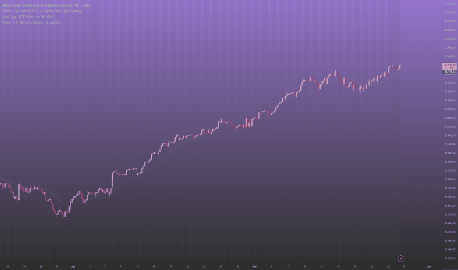
Compass | AnonycryptousCompass | Anonycryptous
Description & user manual
Credits
The weekly psychological level calculation in this indicator is based on open-source code originally published on TradingView. The original script was created by plasmapug. Continued development was done by infernixx, Peshocore, and xtech5192 in collaboration with TradersReality. Significant modifications have been made to integrate this component into the Compass framework.
Why this indicator is different
Most indicators answer one question. A moving average tells you the trend direction. An oscillator tells you momentum. A session box tells you the time. A volume indicator tells you participation. Each one is useful. None of them tells you where you are.
Before placing a trade, a trader needs to answer several questions simultaneously. What session is active and what does that mean for the type of price action to expect? Where does the macro trend stand? Is volume confirming the move or contradicting it? Are there open imbalances nearby that price may return to? How much of the day's expected range has already been consumed? Where are the key structural levels — pivots, the daily open, prior week references?
Answering each of these questions separately requires stacking tool after tool until the chart becomes unreadable. Compass answers all of them at once.
It is not a signal indicator. It does not fire arrows or tell you when to buy or sell. What it does is something more fundamental: it gives you a complete read of the market environment before any decision is made. Sessions, trend, volume, imbalances, range levels, pivots, psychological references — all in one overlay, all configurable, all on one chart.
The design philosophy is orientation first. Decision second. Compass tells you where you are. What you do with that is your responsibility.
Important notice
Compass does not generate trading signals.
It does not tell you when to buy or sell.
It does not predict market direction.
It does not replace your trading strategy or your own analysis.
All illustrative examples in this manual are for educational purposes only and are not trading recommendations.
All trading decisions remain entirely with the user.
Always apply your own judgment and manage your own risk.
1. Overview
Compass is a comprehensive market context indicator that combines eleven independent analysis frameworks into one unified overlay. Every component is individually toggleable. Six presets are included for different trading styles, from fast scalping to full multi-component analysis.
What it includes:
- Five-EMA suite with adaptive cloud around the EMA 50
- EMA crossover system with configurable signals and candle coloring
- Stochastic RSI background alerts with four alert types and RSI divergence detection
- PVSRA volume vector candle analysis with zone tracking and configurable thresholds
- Eight global market sessions with automatic DST awareness
- Average daily, weekly, and monthly range levels with 50% midpoints
- Classic pivot points with mid-point levels
- Daily open reference line with historical opens
- Fair value gap detection with partial absorption tracking
- Weekly psychological level tracking
- Live dashboard with eighteen data points across all active components
2. EMA suite
Five exponential moving averages are plotted simultaneously: EMA 5, EMA 13, EMA 50, EMA 200, and EMA 800. Together they cover short-term momentum, medium-term trend direction, macro trend, and long-term structural bias.
The EMA 50 is wrapped in a dynamic cloud calculated from two standard deviations of price. The cloud expands during volatility and contracts during consolidation. A widening cloud indicates active price discovery. A thinning cloud indicates equilibrium or compression before a directional move.
The EMA 200 is the primary macro bias filter. Price above it defines a broadly bullish environment. Price below it defines a broadly bearish environment. This is shown in the dashboard at all times.
The EMA 800 provides long-term structural context, particularly useful on mid to higher timeframes where it marks the gravitational center of multi-month price structure.
All five EMA lengths are configurable. Each has individual color and transparency controls. An EMA label option displays the current value at the right edge of each line.
3. EMA cross system
The EMA cross tracks a configurable fast EMA crossing a configurable slow EMA and marks the crossover bar. All candles after a cross continue in the direction of that cross until the opposite cross fires.
Three display modes are available: show both the fast and slow EMA lines, show a single consolidated EMA line, or hide the EMA lines entirely while keeping the crossover signals visible.
This component is a trend state indicator, not a trade trigger. A bull cross does not mean buy. It means the short-term trend has shifted upward relative to the medium-term average.
Signals and candle coloring can be toggled independently.
4. Stochastic RSI
The stochastic RSI component runs a standard stochastic RSI calculation and generates background color alerts based on crossover conditions at configurable band levels.
Four alert types are available, each independently toggleable:
Middle band crossover — K line crosses D line near the 50 level. Indicates a possible trend shift in momentum.
Overbought/oversold crossover — K line crosses D line from overbought or oversold territory. Indicates a potential reversal from an extreme.
Entering overbought — K line crosses above the upper band. Indicates that momentum has moved into overbought territory.
Entering oversold — K line crosses below the lower band. Indicates that momentum has moved into oversold territory.
The dashboard displays the current stochastic RSI state and the RSI value. RSI appears in green when above the midline and in red when below. Regular bullish and bearish divergence is detected automatically and shown in the dashboard as a directional label. When divergence is active, a thin reference line appears on the price chart marking the divergence candles.
5. PVSRA volume vector analysis
PVSRA analysis colors candles based on volume relative to the 10-bar average and the relationship between volume and candle spread.
Four vector types:
Green vector — bullish bar where volume is at or above the green/red threshold (default 200% of the 10-bar average), or where volume multiplied by spread is the highest of the last 10 bars. Indicates strong bullish institutional participation.
Red vector — same conditions on a bearish bar. Indicates strong bearish institutional participation.
Blue vector — bullish bar where volume is at or above the blue/violet threshold (default 150% of average). Indicates elevated bullish volume below the institutional threshold.
Violet vector — same conditions on a bearish bar. Indicates elevated bearish volume.
Grey — no vector conditions met. Normal volume.
Both thresholds are configurable directly from the settings panel. Blue and violet signals are strictly exclusive from green and red — a bar cannot qualify for both simultaneously.
Vector candle zones draw boxes at each vector candle location and remain active until price moves through the zone, marking areas where elevated institutional activity was detected at the time the candle formed.
The PVSRA override input allows a different symbol to be used for the volume calculation. This is useful when the charted instrument has unreliable volume data, such as CFDs, perpetual swaps, or instruments where the primary volume is on a related market.
6. Market sessions
Eight global trading sessions are tracked simultaneously, each with automatic DST awareness. Sessions are displayed as expanding boxes with high and low lines and a real-time label showing the session open.
Sessions included:
- London: 08:00–16:30 UTC
- New York: 14:30–21:00 UTC
- Tokyo: 00:00–06:00 UTC
- Hong Kong: 01:30–08:00 UTC
- Sydney: 22:00–06:00 UTC
- EU brinks: 08:00–09:00 UTC
- US brinks: 14:00–15:00 UTC
- Frankfurt: 07:00–16:30 UTC
DST is handled automatically for London, New York, and Sydney. No manual adjustment is needed. Each session can be toggled individually, and box color, transparency, and label color are fully configurable per session.
Session context matters because market behavior differs significantly depending on which participants are active. London and New York overlap produces the highest volume and fastest price movement. Tokyo and Sydney sessions tend to consolidate. The brinks windows mark the transition periods where session highs and lows often form.
7. Range levels
Three statistical range frameworks measure the expected price range for the current period based on historical averages.
Average daily range (ADR) — the expected high and low for the current trading day. When price reaches the ADR level, the day's expected range has been consumed. Moves beyond the ADR are extension moves that occur with lower statistical probability and often mean-revert. The dashboard shows ADR % used — how much of today's expected range has already been consumed. Above 80% indicates the day is approaching its expected limit.
Average weekly range (AWR) — the same concept applied to the current week. Useful for assessing how much room the week has left to move.
Average monthly range (AMR) — the same concept applied to the current month. Provides macro context for position sizing and target expectations.
Each framework includes a 50% midpoint level marking the center of the expected range. The ADR measure from daily open option calculates the range starting from that day's open price rather than the statistical high, making the levels static for the entire day.
All three frameworks have individual lookback period inputs, color controls, line styles, and label toggles.
8. Pivot points
Classic pivot points are calculated from the prior day's high, low, and close. Levels include PP, R1/S1, R2/S2, R3/S3, and M mid-point levels between each major level.
Pivot points provide structural reference for the current session. Price above PP defines a broadly bullish day structure. R levels act as potential resistance targets. S levels act as potential support targets. M levels provide intermediate precision references between major pivots.
All levels can be toggled individually. Lines extend rightward from the prior session and can optionally extend in both directions. Each level has individual color and line style controls.
9. Daily open
A horizontal line marks the current day's opening price. This is one of the most referenced structural levels among short-term traders because it defines the starting point for the day's price discovery.
Price above the daily open reflects a bullish session bias. Price below reflects a bearish session bias. When price oscillates around the daily open without committing direction, the session is in balance — a lower probability environment for trend trades.
Historical daily opens can optionally be shown as reference for prior day context.
10. Fair value gaps
A fair value gap is a three-bar imbalance where price moved through a range without leaving two-sided trade — the low of the upper candle is above the high of the lower candle (bullish gap) or vice versa (bearish gap). These areas represent unfinished business where the market may return to achieve balance.
Gaps are filtered by a minimum width threshold expressed as a multiple of ATR. Gaps narrower than the threshold are excluded. Partial absorption is tracked — as price returns into the gap, the fill color changes to show how much of the imbalance has been recovered.
Fully mitigated gaps can be kept on the chart as historical reference or deleted automatically to maintain a clean view.
11. Psychological levels
Weekly psychological levels mark the prior week's high and low as calculated by a specific session-anchored method. These levels represent deliberate structural references where participants have previously committed size — breakouts and rejections around these levels tend to be more intentional than random price noise.
Three GMT offset options accommodate the session anchor calculation for different global market structures. Two mode options are available: crypto (weekly reset on Saturday Sydney open) and forex (weekly reset on Monday Tokyo open).
12. Settings reference
Preset
- Custom: full manual control over all settings.
- Clean scalper: sessions, EMA suite, FVG, subtle candle coloring. Low noise.
- Full context: everything on, medium transparency. Best for analysis.
- Signal focus: EMA cross, stoch RSI background, PVSRA bar color prominent. Rest subtle.
- Minimal: sessions, daily open, ADR only. No signals.
- PVSRA pro: PVSRA and vector candle zones central. EMA 200 and 800 only.
Global settings
- Master opacity offset (custom preset only): shifts all transparency values simultaneously.
- Show bull/bear label text: shows or hides text on EMA cross signal triangles.
EMA suite
- Show EMA suite and labels
- Individual EMA color and transparency controls
- EMA cloud fill and border transparency
- EMA line width
EMA cross
- Show EMA cross signals
- Fast EMA, slow EMA, and consolidated EMA lengths
- Show both EMAs or consolidated only
- Bull, bear, and neutral colors and transparency
- Cross EMA line width
Stochastic RSI
- Show stochastic RSI background alerts
- RSI length and stochastic length
- Overbought and oversold band levels
- Individual alert type toggles (four types)
- Alert colors and transparency
- RSI divergence lookback period
- Divergence line color and width
PVSRA
- Vector colors (red, green, violet, blue, regular up/down)
- Green/red threshold (× average volume, default 2.0)
- Blue/violet threshold (× average volume, default 1.5)
- Include spread filter for green/red classification
- Override symbol toggle and input
- Show vector candle zones with transparency and width settings
Candle coloring
- Enable candle coloring
- Coloring mode: EMA cross / PVSRA / EMA 200 / off
- Bull and bear candle color and transparency
Market sessions
- Show market sessions
- Session timezone
- Show sessions on weekends
- Session high/low line style and width
- Per session: toggle, box color, transparency, label color
Range levels
- Show ADR, AWR, AMR (individual toggles)
- Lookback periods for each
- Show 50% midpoint levels
- Measure from daily open (ADR only)
- Color, transparency, line width, line style, labels
Pivot points
- Show PP, R1/S1, R2/S2, R3/S3, M levels individually
- Show labels
- Extend lines both directions
- Individual level colors and line styles
- Pivot line width
Daily open
- Show daily open
- Show label
- Show historical daily opens
- Color, transparency, line width
Fair value gaps
- Show fair value gaps
- Width filter (ATR multiplier)
- Extend to current bar
- Bullish and bearish FVG colors
- Mitigation fill colors
- Keep historical FVGs after mitigation
Psychological levels
- Show psy levels and labels
- Show historical psy levels
- GMT offset (GMT+1, GMT+2, GMT+3)
- Psy type: crypto or forex
- High and low colors and transparency
Dashboard
- Show dashboard
- Position: top left, top right, bottom left, bottom right
- Size: tiny, small, normal
13. Dashboard reference
The dashboard provides eighteen live data points across all active components:
Session — the currently active market session.
EMA cross — current EMA cross direction: bull or bear.
EMA 200 — whether price is above or below the EMA 200.
Stoch RSI — current stochastic RSI condition.
RSI — current RSI value, colored green above midline and red below.
RSI divergence — active bullish or bearish divergence, or none.
PVSRA — current candle vector type.
ADR % used — how much of today's expected daily range has been consumed.
FVG active — count of open unmitigated fair value gaps and mitigation percentage.
Psy level — whether price is above or below the prior week's psychological level.
Timezone — active session timezone setting.
VCZ active — count of active vector candle zones above and below current price.
Pivot PP — current pivot point value.
Daily open — current daily open price and direction.
14. How to use
14.1 Initial setup
Select a preset that matches your primary trading style. Adjust the session timezone to match your location or your primary exchange. If you trade an instrument with unreliable volume data, enable the PVSRA override and set it to a correlated liquid instrument. Set the ADR lookback period to your preference — 14 days is a standard starting point. For FVGs, set the width filter to 0.5 or higher to exclude minor gaps.
14.2 Reading the dashboard
The dashboard is the fastest way to orient yourself on a new chart or a new session. Check session, EMA cross direction, EMA 200 position, stoch RSI state, and ADR consumed before anything else. Five seconds to a full picture of where the market stands.
14.3 Reading the chart
Check EMA alignment. When EMA 13, EMA 50, and EMA 200 are stacked in the same direction, the trend is more significant than a single crossover. Divergence between them reflects a transition or competing timeframe pressures.
Check ADR percentage. Below 50% means the day has statistical room to move. Above 80% means the day is near its expected limit and extension moves are less probable.
Look for open FVGs near current price. An unmitigated FVG in the direction of the prevailing trend is a precision reference area where price has historically returned.
Check the psy level. If price is approaching the prior week's high or low, be aware that participant behavior around those references tends to be deliberate.
14.4 Timeframe guide
1 minute to 3 minutes — clean scalper preset, candle coloring set to EMA cross.
5 minutes to 15 minutes — clean scalper or signal focus preset.
30 minutes to 1 hour — full context preset, use ADR and pivot points.
4 hours to daily — full context or minimal preset.
14.5 Tips
PVSRA override — use when your broker's volume data is unreliable, when you trade a CFD or derivative with synthetic volume, or when you want spot market volume for a futures chart.
Master opacity offset — adding 10 to 20 increases overall transparency and dims the chart if it feels cluttered. Subtracting 10 to 20 makes all elements more prominent. This shifts all transparency values simultaneously without changing individual settings. Only active in custom preset.
Not every component needs to be active at once. Most traders will find three to four components provide the context they need for their specific setup.
15. Disclaimer
This indicator is provided for educational and informational purposes only.
Nothing in this document constitutes financial advice or any form of trading recommendation.
Trading financial instruments involves substantial risk of loss.
Past performance is not indicative of future results.
You may lose all of your invested capital.
All trading decisions are made entirely by the user.
Use at your own discretion.
Indicator

Indicator

Indicator
Indicator

Indicator
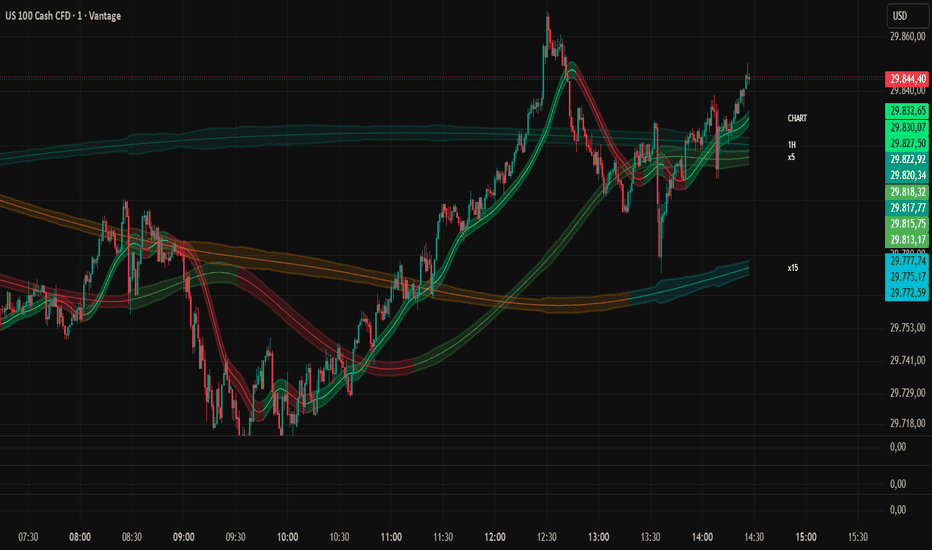
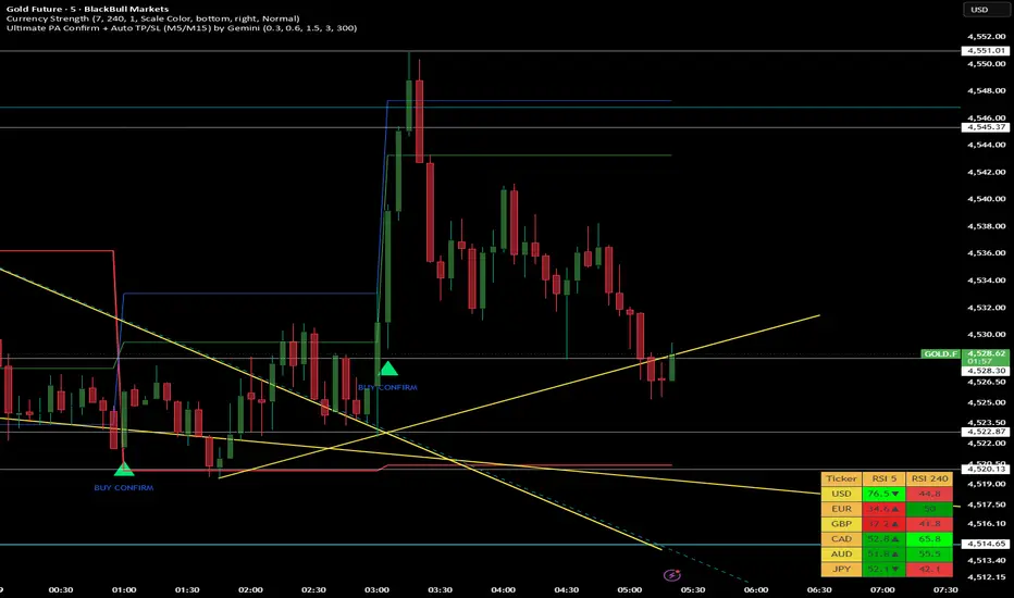
RSI Multi-Timeframe DashboardRSI Multi-Timeframe Dashboard
═══════════════════════════════════════════
WHAT IT DOES
═══════════════════════════════════════════
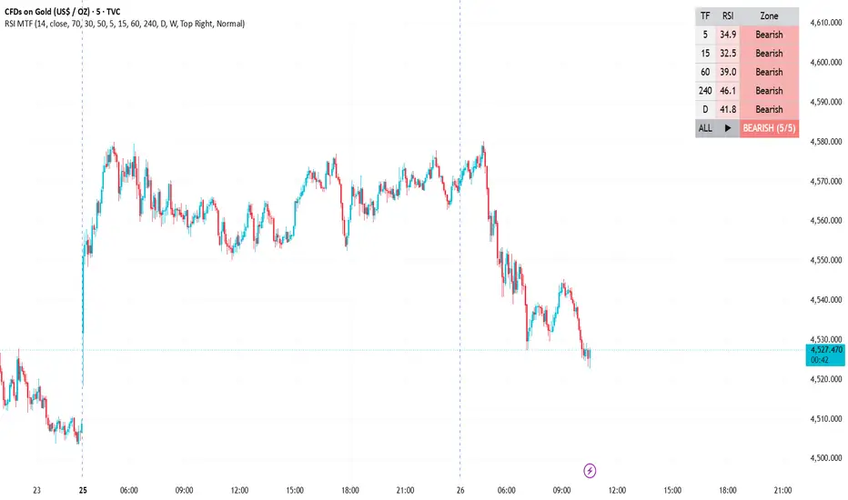
This tool displays the Relative Strength Index (RSI) of up to six timeframes
at once in a compact on-chart table, so you can judge momentum across the
whole timeframe stack without switching charts. Instead of reading RSI on a
single timeframe, you see how short-, medium- and higher-timeframe momentum
line up — and a consensus row summarises the overall picture.
It is designed as a CONFLUENCE tool: a way to see whether the broader market
agrees with what you're seeing on your trading timeframe.
═══════════════════════════════════════════
HOW IT WORKS
═══════════════════════════════════════════
RSI is calculated with the standard Wilder method (default length 14) on each
selected timeframe using request.security(). Each row is classified into a zone:
- Overbought — RSI at or above the overbought level (default 70)
- Oversold — RSI at or below the oversold level (default 30)
- Bullish — RSI above the midline (default 50)
- Bearish — RSI below the midline (default 50)
The "ALL" row aggregates only the enabled timeframes:
- If every enabled timeframe is oversold → "STRONG BUY ZONE"
- If every enabled timeframe is overbought → "STRONG SELL ZONE"
- Otherwise it shows the majority bias and a score, e.g. "BULLISH (4/5)"
These are descriptions of momentum conditions — not instructions to buy or sell.
═══════════════════════════════════════════
HOW TO USE IT IN A TRADE
═══════════════════════════════════════════
The core idea is alignment. Higher-timeframe RSI defines the bias; lower-timeframe
RSI helps with timing inside that bias.
Example long workflow:
1. Bias — Confirm the higher timeframes (e.g. 4H, Daily) are Bullish (above the
midline). This says the dominant momentum favours longs.
2. Timing — Wait for a lower timeframe (e.g. 5m/15m) to dip toward Oversold and
turn back up, offering a pullback entry in the direction of the higher-TF bias.
3. Confluence — A "BULLISH (5/5)" or rising consensus score adds conviction;
a "MIXED" reading is a reason to wait.
4. Management — Define your stop from price structure (recent swing), not from
RSI alone, and size the position to your own risk rules.
The short workflow is the mirror image (higher TFs Bearish, lower TF rallies into
Overbought and rolls over).
Things to respect:
- RSI can remain Overbought in a strong uptrend (and Oversold in a strong
downtrend) for a long time. "Overbought" is not automatically "sell."
- Counter-trend signals (e.g. Oversold while higher TFs are Bearish) are
lower-probability and best avoided or treated as scalps only.
- This indicator does not place trades, set stops, or manage risk for you.
═══════════════════════════════════════════
SETTINGS
═══════════════════════════════════════════
- RSI — length, source, and the overbought / oversold / midline levels.
- Timeframes to monitor — up to 6 slots, each with an on/off toggle and its own
timeframe. Set them equal to or higher than your chart timeframe.
- Style — table position, text size, and your own bullish / bearish colours.
═══════════════════════════════════════════
ALERTS
═══════════════════════════════════════════
- All timeframes oversold
- All timeframes overbought
- Consensus turned bullish (majority crossed above the midline)
- Consensus turned bearish (majority crossed below the midline)
═══════════════════════════════════════════
NOTES, REPAINTING & LIMITATIONS
═══════════════════════════════════════════
- Monitored timeframes should be greater than or equal to your chart timeframe;
requesting a lower timeframe is not meaningful.
- Repainting: values use lookahead_off, so a higher-timeframe RSI updates live
until that bar closes — this is intended for real-time reading. The reading on
a closed higher-TF bar is final.
- RSI is a momentum oscillator, not a forecast. This dashboard organises that
information across timeframes; it does not predict price.
This script is published open-source. Study it, learn from it, and adapt it to
your own process. It is provided for educational purposes only and is not
financial advice. Past behaviour of any indicator does not guarantee future
results — always do your own analysis and manage your risk. Indicator

CVD Multi-Timeframe DashboardCVD Multi-Timeframe Dashboard
═══════════════════════════════════════════
WHAT IT DOES
═══════════════════════════════════════════
Most CVD tools only show you the timeframe you're standing on. This one shows
you the whole stack at once. Stay on your execution chart — 1m, 3m, 5m,
whatever you trade — and read the net buying vs. selling pressure of the 5m,
15m, 1h, 4h, Daily and Weekly in a single on-chart table.
In one glance you know whether the bigger picture is backing your trade or
fighting it.
═══════════════════════════════════════════
WHY IT'S USEFUL
═══════════════════════════════════════════
Price can rise while volume delta quietly turns negative — buyers stepping
back even as the candle stays green. That divergence is an early warning, and
it's far more powerful when you can see it line up (or break down) across
multiple timeframes:
- All rows green → broad, one-sided buying. Trend trades have the wind behind them.
- All rows red → broad selling pressure. Longs are swimming upstream.
- Mixed rows → the timeframes disagree — often a pullback, rotation, or a
turning point forming.
This turns CVD from a single-timeframe reading into a top-down confluence tool.
═══════════════════════════════════════════
HOW IT WORKS
═══════════════════════════════════════════
Volume Delta = volume hitting the offer (buying) minus volume hitting the bid
(selling). The script uses TradingView's ta.requestVolumeDelta() engine, which
scans lower-timeframe data to approximate that split as accurately as the
data allows.
Each row anchors that engine to a different timeframe and reports the NET delta
of that timeframe's CURRENT, developing bar — i.e. how much net buy/sell flow
has built up since that candle opened. As a higher-timeframe bar progresses,
its value accumulates; when a new bar opens, it resets. That's why the rows
genuinely differ from one another instead of repeating the same number.
═══════════════════════════════════════════
READING THE TABLE
═══════════════════════════════════════════
TF → the monitored timeframe
CVD Δ → net volume delta of its current bar (auto-formatted K / M / B)
Bias → BUY (positive) or SELL (negative), colour-coded
═══════════════════════════════════════════
SETTINGS
═══════════════════════════════════════════
- Timeframes to monitor — up to 6 slots, each with its own on/off toggle and
timeframe. Set them equal to or higher than your chart timeframe.
- Lower timeframe — resolution used to approximate up/down volume. Automatic
by default; lower = more precise, higher = more history.
- Style — table position, text size, and your own positive/negative colours.
═══════════════════════════════════════════
ALERTS
═══════════════════════════════════════════
"CVD bias flip" fires the moment any monitored timeframe's delta crosses
between positive and negative — useful for catching a shift in flow without
staring at the screen.
═══════════════════════════════════════════
NOTES & LIMITATIONS
═══════════════════════════════════════════
- Monitor timeframes ≥ your chart timeframe; lower ones aren't meaningful.
- The symbol must provide volume data, or the script will tell you.
- Lower-timeframe scanning approximates buy/sell volume — it isn't true
tick or bid/ask data. Use it as a directional gauge, not an exact figure.
Built on TradingView's open-source CVD logic and the ta.requestVolumeDelta()
function from the TradingView/ta library. Open-source — feedback and forks
welcome. Indicator

Indicator

Indicator

Indicator

Indicator

Strategy

Indicator

Indicator
Indicator

Indicator