Indicator

Adaptive Trend Checklist (EMA + Adaptive ST + ADX + MTF)svm22GHere is a polished **English description** for publishing your **Pine Script v5** on TradingView:
---
**Adaptive Trend Checklist PRO v5**
Adaptive Trend Checklist PRO v5 is an advanced trend-following and market-structure checklist designed to help traders evaluate whether market conditions are favorable for a long, short, or no-trade decision.
This script was built as an enhanced evolution of the classic checklist concept, combining trend confirmation, strength analysis, structure, momentum, and trade planning into a single visual framework.
### What it does
The indicator analyzes multiple layers of market context and converts them into a practical decision-making panel directly on the chart.
It combines:
* EMA baseline trend bias
* Adaptive SuperTrend
* ADX and DI directional strength
* Multi-timeframe confirmation
* BOS / CHoCH structure logic
* liquidity sweep detection
* Premium / Discount location
* Fair Value Gap context
* pullback and extension filters
* optional volume and session filters
The goal is not just to show trend direction, but to help determine whether the current setup is strong enough to justify a trade.
### Main features
**1. Adaptive trend framework**
The script uses an EMA baseline together with an Adaptive SuperTrend.
Unlike a fixed SuperTrend, the ATR multiplier adapts to ADX conditions, making it more responsive during strong trends and more conservative during weaker conditions.
**2. Trend strength and directional confirmation**
ADX and DI are used to measure whether price is trending with enough strength and whether bulls or bears are in control.
**3. Multi-timeframe alignment**
Optional MTF filters allow the user to confirm higher-timeframe direction before taking signals on the current chart.
**4. Market structure integration**
The script includes BOS and CHoCH logic, helping traders identify whether price is confirming continuation or possible structural reversal.
**5. Premium / Discount context**
A rolling range is used to classify price as trading in discount, equilibrium, or premium, which can help improve directional decision-making.
**6. Fair Value Gap filter**
Bullish and bearish FVG zones can be used as an additional contextual filter to improve selectivity.
**7. Pullback and extension control**
The script avoids chasing overextended price and can require pullback conditions before allowing a signal.
**8. Decision checklist panel**
A professional side panel summarizes all relevant conditions, including:
* bias
* EMA state
* SuperTrend state
* ADX condition
* DI direction
* MTF alignment
* regime
* structure
* PD location
* FVG state
* pullback / extension state
* bull vs bear score
* final status
### Visual trade planning
This makes it easier to plan the trade visually and quickly assess risk-to-reward.
### Designed for
This script is especially useful for:
* crypto traders
* altcoin intraday trading
* momentum traders
* trend-following traders
* discretionary traders who want a structured checklist before entering
It can also be adapted to other markets, but the logic was primarily optimized for fast-moving crypto conditions.
### Important note
This indicator is a decision-support tool, not a guarantee of future performance.
It is designed to improve selectivity, filter weak setups, and provide a more structured framework for trade planning. As with any trading tool, it should be used alongside sound risk management and market judgment.
Indicator

Indicator

Stock Option Seller - Open Road
## 📌 Description — Open Road · Option Seller
**Open Road · Option Seller** is a structured decision-support indicator designed for **systematic option sellers** trading monthly credit spreads on large-cap Indian equities.
It converts price action, momentum, and volatility into a **clear, rules-based structure selection**:
* **Put Credit Spread**
* **Call Credit Spread**
* **Iron Condor**
* **Wait (no trade)**
The goal is simple:
Remove discretion and provide a **repeatable framework for directional and non-directional option selling**.
---
## ⚙️ Core Logic
The system is built on a **multi-factor scoring model**:
### 1. Trend Engine (3-factor scoring)
* EMA positioning (20/50)
* Short-term consistency (last 5 closes vs EMA)
* 21-day momentum
This produces a **Trend Score (-3 to +3)**:
* +3 → Strong Bullish
* -3 → Strong Bearish
* Between → Neutral / Lean bias
---
### 2. Market Condition Filters
* **RSI (14)**
* Identifies exhaustion and conflicts with trend
* **ADX (14)**
* Distinguishes trending vs range-bound environments
---
### 3. Structure Selection Logic
* **Low trend / extreme RSI → Iron Condor**
* **Trend + clean RSI + ADX confirmation → Directional spreads**
* **Conflict → No trade (WAIT)**
This ensures trades are taken only when **market structure is aligned**.
---
### 4. Strike & Risk Framework
* Uses **ATR-based wing sizing**
* Automatically rounds to practical strike intervals
* Provides **approximate strike suggestions** for:
* Short legs
* Hedge legs
---
## 📊 Visual Panels
The indicator includes 4 diagnostic panels:
1. **EMA Distance Panel**
→ Measures price positioning vs trend
2. **RSI Panel**
→ Highlights overbought / oversold regimes
3. **ADX Panel (+DI / -DI)**
→ Identifies trend strength and direction
4. **Trend Score Histogram**
→ Clean visual representation of directional bias
---
## 🧠 Signal Output
On the latest candle, the system displays a **decision panel** with:
* Trend classification
* Score (out of 3)
* RSI & ADX interpretation
* ATR + wing size
* Final structure recommendation
* Suggested strike levels
---
## 🎯 Designed For
* Monthly option sellers
* Systematic traders (rule-based execution)
* Traders who want to avoid discretionary bias
* Large-cap equity option strategies
Best suited for:
**RELIANCE, HDFCBANK, TCS, SBIN, AXISBANK (Daily timeframe)**
---
## ⚠️ Important Notes
* This is a **decision-support tool**, not a fully automated trading system
* Strike suggestions are **approximate** and should be validated with live option chain data
* Works best when combined with **risk management and position sizing discipline**
---
## 🧩 Philosophy
Most option sellers fail not because of strategy, but because of **inconsistent structure selection**.
Open Road enforces:
* When to sell directionally
* When to stay neutral
* When to not trade
That alone removes a large part of edge erosion.
Indicator

Indicator
Indicator

Indicator

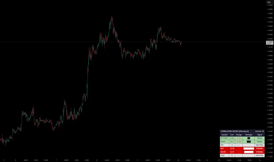
Market Correlation Matrix [NikaQuant]Market Correlation Matrix
A real-time correlation dashboard that displays Pearson correlation coefficients between the current chart symbol and up to 6 user-defined comparison symbols.
═══ FEATURES ═══
• Track correlations for up to 6 symbols simultaneously (default: BTCUSDT, GOLD, SPX, DXY, US10Y, QQQ)
• Heatmap-colored table with intuitive color coding from strong positive (green) to strong negative (red)
• Correlation change tracking — see how correlations are shifting over a configurable lookback period
• Visual strength bars showing absolute correlation magnitude at a glance
• Signal classification labels: STRONG+/-, MOD+/-, WEAK+/-, NEUTRAL
• Built-in alerts for strong positive/negative crosses (±0.7) and zero-line crosses
• Fully customizable: table position, text size, all colors, border styling
═══ HOW IT WORKS ═══
The indicator calculates Pearson correlation over a user-defined period (default: 50 bars) between the chart’s close price and each comparison symbol’s close price. It then renders a compact table showing:
1. Symbol — Ticker of the comparison asset
2. Corr — Current correlation value (-1 to +1)
3. Change — How much the correlation shifted vs N bars ago (with directional arrows)
4. Strength — Block-style visual bar representing absolute correlation
5. Signal — Classification from NEUTRAL to STRONG+/-
═══ SETTINGS ═══
Symbols: Configure up to 6 comparison symbols (leave blank to skip)
Correlation Period: Lookback length for Pearson calculation (default: 50)
Change Lookback: Compare current vs past correlation (default: 10 bars)
Display: Table position, show/hide title
Style: Full color customization for heatmap, headers, borders, and change indicators
═══ ALERTS ═══
• Strong positive correlation cross (above +0.7) per symbol
• Strong negative correlation cross (below -0.7) per symbol
• Any symbol crossing the zero line
═══ USE CASES ═══
• Monitor intermarket relationships in real time
• Identify regime changes when correlations break down or strengthen
• Confirm or filter trade setups using cross-asset correlation context
• Track USD, bonds, equities, and crypto correlations from a single chart Indicator

Indicator

Indicator

Indicator

Saga System [LB]
hello friend here is
Saga System
The Saga System is an advanced algorithmic trend-following tool designed to detect phases of institutional accumulation and distribution . By combining Relative Volume Analysis with Price Momentum , it filters out low-quality market noise and highlights only the most meaningful directional moves through dynamic Action Zones .
Overview
The core idea behind the Saga System is simple:
Identify when abnormal volume enters the market.
Confirm that this volume aligns with directional price momentum.
Display the result as a visual zone to help traders read market intent more clearly.
This allows traders to quickly identify whether the market is under strong buying pressure or selling pressure , while keeping the chart clean and readable.
📈 Buy Setup (Long Entries)
Conditions:
Wait for a Green Saga Zone to appear.
This confirms a bullish impulse supported by an institutional volume expansion.
Make sure price remains structurally above the system’s internal EMA trend line.
Key observations:
Zone size matters: the larger the green zone, the stronger the underlying buying pressure.
Momentum stacking: two separate consecutive green zones often indicate stronger continuation potential than a single isolated signal.
Entry precision: for better timing, combine the signal with horizontal support levels, discount zones, or RSI oversold conditions.
📉 Sell Setup (Short Entries)
Conditions:
Wait for a Red Saga Zone to form.
This reflects an aggressive bearish impulse confirmed by elevated volume.
Confirm that price is trading below the system’s fast control line.
Key observations:
Zone expansion: a wide red zone often reflects strong directional volatility and can mark the start of a sustained bearish leg.
Trend confirmation: multiple consecutive red zones show that sellers remain in control of market psychology.
Risk control: the system is designed to capture the core part of the move; a close back through the opposite side of the zone often signals momentum neutralization.
before reading any other text here are somme other screen
How to Read the Zones
The Action Zones are not just visual markers — they represent moments where volume and momentum align in the same direction .
Green Zone: bullish pressure, accumulation, and potential continuation.
Red Zone: bearish pressure, distribution, and potential continuation to the downside.
Large zones: stronger conviction and greater directional intent.
Repeated zones: increased probability that the trend is strengthening rather than fading.
⚙️ Technical Methodology
The Saga System is built on three core calculation layers:
1. Institutional Volume Filter
The script calculates a Simple Moving Average (SMA) of volume over a user-defined lookback period. A zone is triggered only when current volume exceeds a predefined threshold:
Current Volume > (SMA Volume * Multiplier)
This condition helps eliminate low-liquidity noise and improves the quality of detected impulses.
2. Directional Bias Confirmation
The system uses a reactive Exponential Moving Average (EMA) to determine short-term directional bias. For a zone to remain valid, price must move in agreement with the EMA slope.
In other words:
Bullish zones require price to remain aligned with upward momentum.
Bearish zones require price to remain aligned with downward momentum.
This ensures that volume is not analyzed in isolation , but in direct relation to trend direction.
3. Dynamic State Engine
Unlike static indicators, the Saga System updates zone coordinates in real time. Each zone evolves with market structure and automatically ends when momentum weakens, typically when price crosses the ultra-fast EMA used as the internal momentum control.
This creates a clean and adaptive block-style visualization, helping the trader focus only on relevant expansion phases.
Best Use Cases
The Saga System performs best when used in confluence with other high-quality tools or structural references:
Support and resistance levels
Market structure breaks
RSI exhaustion zones
Trend continuation setups
High-volume breakout environments
It is especially useful for traders looking to isolate high-conviction trend continuation phases rather than random short-term fluctuations.
Disclaimer
Disclaimer: Trading involves substantial risk. The Saga System is a decision-support tool only and does not constitute financial advice. Past performance does not guarantee future results.
Indicator

Indicator

Tactical Deviation MiniTactical Deviation Mini is an overlay indicator that shows up to three independent higher-timeframe VWAPs on one chart—1-hour, 4-hour, and 8-hour—each with 1σ, 2σ, and 3σ standard-deviation bands. By default, only the 4-hour VWAP and its bands are enabled; 1H and 8H are optional toggles. This keeps the chart readable while still letting you stack contexts when you want them.
Why it is useful
Many traders watch where price sits relative to VWAP and to volatility-sized bands across intraday structure. This script puts those references on the same pane as your execution timeframe, so you can compare alignment across 1H / 4H / 8H without switching charts. Optional band fills separate the 1σ–2σ and 2σ–3σ zones. An optional table summarizes sigma distance from VWAP (per enabled timeframe) and RSI(14) on the current bar for quick context.
How it works (concepts)
For each enabled timeframe, the script maintains a running volume-weighted mean of hlc3 and a running volume-weighted second moment so it can derive population-style variance and standard deviation on the fly. When a new bar opens on that higher timeframe, the cumulative sums reset, so each VWAP is anchored to that higher timeframe’s bar sequence (not to the chart’s session template unless your symbol’s bars happen to match that). Band width is standard deviation × your chosen multipliers (defaults 1, 2, 3).
Optional “dynamic” mode
When enabled, the script scales the deviation multipliers using recent volatility (ATR relative to price) so bands can widen in more volatile conditions and narrow in calmer ones. This is a heuristic adjustment, not a guarantee of any particular risk or outcome.
How to use it
Enable the timeframe(s) you want under Timeframe Selection.
Adjust σ multipliers if you want tighter or wider bands.
Toggle Show Deviation Clouds and opacity if you want filled zones.
Use Colors to separate 1H / 4H / 8H visually.
Read the table (if visible) for σ from VWAP and RSI; treat these as context, not instructions.
What this script does not do
It does not plot buy/sell markers, strategy orders, or alerts. It does not rank setups, predict direction, or estimate profitability. Past or hypothetical behavior of VWAP or bands does not imply future results.
Limitations and honesty
VWAP and σ bands depend on volume and bar data available on your symbol and timeframe. On some instruments or sessions, volume or bar construction may differ from what you expect, which affects VWAP and bands. RSI in the table is a standard momentum oscillator shown for reference only.
Disclaimer
This tool is for informational and educational purposes only and is not investment, tax, or trading advice. You are responsible for how you use any charting tool. No warranty is made as to accuracy, fitness, or results. Indicator

Indicator

Strategy

Kijun-sen Dual-MTF Future Bridge [KJ-BRIDGE] Kijun-sen Dual-MTF Future Bridge
The KJ-BRIDGE is a high-performance technical engine that evolves the classic Ichimoku Kijun-sen logic into a predictive "bridge" for price action. By integrating a 144-bar Linear Regression Slope, it projects a mathematical corridor 52 bars into the future, allowing traders to visualize potential targets and volatility zones before they materialize.
🚀 Key Features
* Dual-MTF Engine: Unlike standard indicators, KJ-BRIDGE allows you to define different timeframes for your Upper (Resistance) and Lower (Support) boundaries. Overlay Daily resistance on a 1H chart for a truly macro-to-micro perspective.
* Predictive Projections: Utilizing a 144-bar lookback, the script calculates the current trend's trajectory and projects a Target Label and Time Bridge 52 bars ahead.
* Hybrid Volatility Bands:
* *Percentage Mode:* Ideal for stable assets, maintaining a fixed-width corridor.
* *StDev Mode:* Adapts instantly to market expansion and contraction (Bollinger-style).
* Momentum Vacuum Logic: Features advanced bar coloring. Candles inside the bridge are Grey (Neutral), while candles breaking outside turn Bright Green/Red, signaling a high-velocity "vacuum" move.
* Squeeze Alert System: When volatility drops below historical averages, the channel edges turn White, alerting you to a potential explosive breakout.
🛠️ How to Use
1. The Bridge Target: Look to the right of the current bar. The `🎯 KJ-BRIDGE TARGET` provides a mathematical "fair value" target based on the current slope.
2. Trend Confirmation: * Green Ribbon: Bullish slope confirmed.
* Red Ribbon: Bearish slope confirmed.
* White Edges: Market is "Squeezing"—expect a major move soon.
3. The Neutral Zone: When price is inside the grey bars, the market is in equilibrium. Wait for a "Color Breakout" (Bright Green or Red) to enter high-probability momentum trades.
⚙️ Settings
* Timeframe Settings: Select the specific TF for Upper and Lower bands. Leave empty to lock to the current chart.
* Calculation Logic: Toggle between Percentage (%) or Standard Deviation. Adjust the Kijun-sen Period (Default 26) to change the core sensitivity.
* Visual Style: Toggle Advanced Bar Coloring and Future Projections to customize your workspace.
📌 Credits
- Original Kijun-sen Logic: Goichi Hosoda (Ichimoku Sanjin)
*Disclaimer: All predictions are probabilistic. KJ-BRIDGE uses mathematical regressions which may change as new data arrives. Always use stop-losses.* Indicator

OpenRoad_NiftyOptions
**Open Road V3 — NIFTY Weekly Option Selling Framework**
A rules-based, regime-aware indicator for NIFTY 50 weekly option sellers. Built from 3 years of backtested data (Apr 2023–Apr 2026), this framework tells you *what* to sell, *where* to sell it, and *when to sit out* — every Wednesday morning.
**How It Works**
The indicator runs two engines:
*Engine A — Weekly Directional Spreads*
Uses a V2 Regime Filter (2-of-3 vote system) to determine market direction, then generates exact credit spread strikes with 200-point wings. In a bear regime, it signals bear call spreads. In a bull regime, bull put spreads. In range-bound markets, iron condors. VIX-based position sizing automatically scales you down in high or low volatility.
*Engine C — Monthly Iron Condor*
Activates only during calm, range-bound months when VIX is below 16. Places wide iron condors at 1.5× the monthly expected move with 300-point wings. Designed as a carry engine for low-volatility environments.
**The V2 Regime Filter**
Three independent signals vote on market direction:
1. EMA Slope — Rate of change of EMA20 normalized by ATR. Catches trend acceleration early.
2. Consecutive Closes — Counts days closing above/below EMA20. 4+ consecutive closes = directional conviction.
3. 5-Day Range Position — Where price sits within its recent range. Near the bottom = bearish, near the top = bullish.
If 2 of 3 agree → trade that direction only. No agreement → iron condor or skip.
**Dashboard (Top-Right)**
Live readings updated every bar:
- Regime verdict + individual signal values
- India VIX level with color coding
- Position size % (auto-adjusted by VIX)
- Strike multiplier (1.3× wider strikes when VIX < 12)
- Weekly expected move in points
- Engine A structure and exact strikes
- Engine C status and reason if skipped
**Chart Visuals**
- Background color: red (bear), green (bull), orange (range)
- Step-lines showing sell and buy strikes for active spreads
- Yellow shaded expected move zone
- Wednesday labels with full trade details (structure, strikes, VIX, sizing)
- Blue monthly IC labels when Engine C activates
**VIX-Based Sizing**
| VIX | Size | Strike Mult |
|---|---|---|
| < 10 | 50% | 1.3× wider |
| 10–12 | 75% | 1.3× wider |
| 12–20 | 100% | 1× |
| 20–25 | 75% | 1× |
| 25–35 | 50% | 1× |
| > 35 | Skip | — |
**Key Design Principles**
- Risk-first: every signal includes position sizing and defined max loss
- No naked selling — all structures are defined-risk credit spreads
- Regime-aware: doesn't blindly sell iron condors into trends
- Low-VIX adapted: wider strikes (1.3×) when premiums are thin, validated by backtest
- Monthly IC only in confirmed range markets — avoids selling premium into crashes
**How to Use**
1. Apply to NIFTY 50 daily chart
2. Set VIX Symbol to `NSE:INDIAVIX` in settings
3. Check dashboard every Wednesday morning
4. Execute the indicated structure at the shown strikes on your broker
5. Hold to Tuesday expiry. Stop at 2× premium loss.
**What This Is NOT**
This is not a signal generator or auto-trader. It is a decision framework that shows you the regime, the structure, and the strikes. You still need to check option chain liquidity, verify bid-ask spreads, and size according to your capital.
**Settings**
All parameters are adjustable: EMA length, slope threshold, consecutive close count, range position thresholds, wing widths, VIX thresholds, and strike multipliers. Defaults are the backtested values.
Built as part of the Open Road project — documenting the journey of learning institutional NIFTY option selling from first principles.
Indicator

Indicator
Advanced CVD Div by E3KE3K CVD Div — Cumulative Volume Delta Divergence Detector
This indicator calculates Cumulative Volume Delta (CVD) from intrabar data and detects divergences between price action and order flow across higher timeframe periods.
What it does
Price makes a new high, but buyers aren't actually in control — or price sweeps a low, but sellers aren't really there. This indicator catches those moments by comparing price extremes against CVD extremes across HTF periods, exposing the disagreement between what price shows and what volume confirms .
How it works
- CVD is built from lower-timeframe delta (buy vs. sell volume), giving you true intrabar precision — not just close > open approximations on your chart timeframe
- Each HTF period (auto-selected or manual) tracks CVD and price highs/lows independently
- When a new HTF period's price extreme exceeds the prior period but CVD fails to confirm, a divergence is flagged
- Supports both 2-period and 3-period divergence patterns for deeper structural reads
Two detection methods
- HTF Sweep — Only fires when price wicks beyond a prior HTF high/low (body stays inside). Fewer signals, higher conviction. Designed for sweep-and-reverse setups.
- All — Flags any directional disagreement between price and CVD across HTF periods. More signals, includes hidden divergences.
Key features
- High-precision CVD candles with proper wicks (built from LTF data — auto-selects appropriate resolution)
- Divergence strength scoring (0–1) with adjustable minimum threshold
- Separate bull/bear divergence colors with strength-based opacity
- Optional volume confirmation filter (requires above-average volume)
- Optional rejection candle filter (wick ≥ 60% of bar range)
- Delta spike detection — highlights statistical outlier bars (configurable σ threshold)
- Divergence expiry — auto-removes stale signals after N bars
- Configurable CVD anchor (continuous, daily, weekly, monthly)
- HTF alignment boxes to visualize period boundaries
- Rich alerts with strength, pattern type, method, ticker, and timeframe context
Recommended use
Works on any instrument with volume data. Best on liquid markets (futures, crypto, large-cap equities). Pair with price structure — divergences mark where smart money disagrees with price, but timing depends on your setup.
Credits
Original concept by cdikici71 & tncylyv — original script . Refactored and extended by Euro3000 — Pine v6, typed architecture, precision CVD engine, sweep-aligned divergences, and signal filtering.
Indicator

High Timeframe Candles - HTFHigh Timeframe Candles - HTF
High Timeframe Candles - HTF indicator is a professional analysis dashboard developed for traders who want to maintain a clear view of Higher Timeframe (HTF) market structure and liquidity gaps while operating on Lower Timeframes (LTF). Based on ICT (Inner Circle Trader) concepts, this tool dynamically draws up to six selected higher timeframes and their respective imbalances on the right side of the chart (offset). The indicator is specifically designed for "upward" timeframe analysis, meaning it displays only periods higher than your current chart (e.g., viewing 15m, 1H, and 4H candles while on a 5m chart) and does not show lower timeframe data on the dashboard.
One of the indicator's strongest features is its real-time data synchronization. HTF candles are updated instantaneously with every price movement on the lower timeframe. This allows you to monitor the formation, wick length, and expansion of a 15-minute or hourly candle while actively trading on a 1-minute chart. Additionally, it maximizes time management by providing dynamic countdown timers for each HTF candle closing and Day of Week (DOW) labels for daily candles.
In terms of imbalance detection, this tool offers advanced features by automatically identifying Fair Value Gap (FVG) and Volume Imbalance (VI) zones directly on the HTF candles. This functionality enables you to see which high-timeframe gap the price is gravitating toward or which levels it might react to without ever switching charts. Specifically, it includes options to align daily candle calculations with critical ICT "True Day Open" benchmarks, such as Midnight, 08:30, or 09:30 New York time.
Designed with a user-friendly interface, this indicator is fully customizable and optimized to reduce workspace clutter while protecting trader psychology. By eliminating the need to constantly flip through different timeframes, it helps you maintain focus during execution. Coded with the latest Pine Script v6 performance standards, this tool provides a comprehensive roadmap for both scalping and intraday trading strategies. Indicator

Killzones & Key LevelsThe ICT Killzones + Key Levels indicator is a comprehensive technical analysis tool that consolidates institutional trading logic and ICT (Inner Circle Trader) concepts into a single interface. Its primary distinction lies in optimizing all calculations based on actual market opening times—specifically the New York 18:00 session rollover—rather than the standard midnight (00:00) reset.
It visually represents critical Killzone regions, such as Asia, London, New York AM/PM, and New York Lunch, using dynamic boxes on the chart. These zones highlight periods of peak volatility and liquidity, clarifying areas where price is most likely to react. Additionally, it calculates session-based Daily, Weekly, and Monthly (DWM) open levels to align with institutional data, making intraday bias much easier to determine.
The indicator provides a True Day Open (TDO => NYMO) level as a vital reference point throughout the day while automatically tracking Previous Day, Week, and Month Highs and Lows (H/L). By drawing vertical day-divider lines at 18:00, it allows traders to see the "true" trading day. This enables Futures and Forex traders to analyze market cycles based on institutional liquidity flow rather than just calendar hours.
Finally, it includes a volatility analysis table that displays the current price range for each session. With a fully customizable structure, you can adjust sessions, colors, and timeframes to fit your specific strategy. In essence, this tool serves as a professional roadmap for Smart Money Concepts (SMC) traders who prioritize session structure over traditional timekeeping. Indicator

Indicator