Indicator
Breadth Indicators
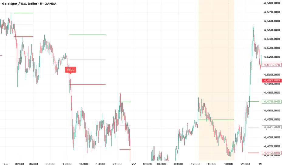
Dual MA Crossover + Volatility FilterOverview
The Dual MA Crossover + Volatility Filter is a comprehensive, trend-following framework designed primarily for futures and high-liquidity assets. Unlike standard moving average strategies that suffer during "choppy" or sideways markets, this system employs a multi-layered filtering process to ensure trades are only taken when momentum, volatility, and timing are in alignment.
Core Logic
The strategy triggers a signal when a Fast Moving Average crosses a Slow Moving Average. However, the signal must pass through three distinct "gates" before an order is executed:
Volatility Expansion Filter (ATR): Compares a short-term ATR against a longer-term baseline. Entries are only permitted when current volatility is higher than the baseline, signaling that a "breakout" or strong trend is likely beginning.
Momentum Filter (RSI): Confirmation of the trend's strength. Longs are only taken if RSI is above a user-defined threshold (default 50), ensuring we are not buying a "dead cat bounce."
Session Time Filter: Specifically designed for intraday traders. It allows users to skip the initial market "noise" (e.g., the first 30 minutes of the NY open) before allowing entries.
Key Features
Dynamic Risk Management: Automatically calculates position size based on a fixed percentage of account equity and the current ATR-based stop distance.
Smart Exit Logic: * Initial Stop: Set at a multiple of ATR from entry.
Breakeven Trigger: Moves the stop to entry price once the trade reaches a user-defined "R" (Risk) multiple.
Trailing Stop: Activates a trailing ATR-stop only after the breakeven trigger is hit, protecting profits during extended trends.
Time Stop: Closes the position if the market fails to make a new High (long) or Low (short) within a specific number of bars.
Futures Optimized: Includes built-in point value calculations for major contracts like ES, NQ, RTY, CL, and GC.
How to Use
Select MA Type: Choose between EMA, SMA, WMA, or HMA based on your preference for speed vs. lag.
Adjust Volatility Filter: If the strategy is too selective, increase the ATR Comparison Length.
Risk Settings: Set your Risk Percent per Trade (e.g., 1.0% for conservative trading).
Time Filter: On intraday charts (1m, 5m, 15m), set the Bars to Skip to avoid the opening volatility.
Disclaimer
This script is for educational and backtesting purposes only. Past performance does not guarantee future results. Trading futures and equities involves significant risk of loss
Strategy

Triple Signal + Market DashboardTriple Signal Logic: Combines Stochastic RSI, Trend CCI, and Chaikin Money Flow. It triggers a BUY or SELL signal when all three reach their oversold or overbought levels within your chosen lookback window.
Market Condition Dashboard: A real-time table showing:
Individual indicator states (Oversold, Overbought, or Neutral).
Overall Market Condition (Strong Bullish, Bullish, Strong Bearish, Bearish, or Neutral) based on price relation to the 200 EMA and indicator alignment.
Webhook Alerts: The script includes alert() calls for both Buy and Sell signals. When setting up an alert on TradingView, choose the "Any alert() function call" option to use these for webhooks.
Trend Filter: I added a 200-period EMA to the chart to help you visualize the long-term trend, which is also used for the market condition logic.
You can customize the dashboard position, text size, and indicator periods in the script settings.
Use MACD to help with the timing.
Indicator
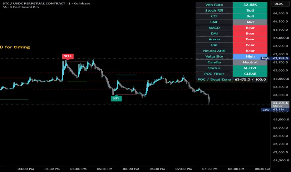
Triple Signal + Market DashboardTriple Signal Logic: Combines Stochastic RSI, Trend CCI, and Chaikin Money Flow. It triggers a BUY or SELL signal when all three reach their oversold or overbought levels within your chosen lookback window.
Market Condition Dashboard: A real-time table showing:
Individual indicator states (Oversold, Overbought, or Neutral).
Overall Market Condition (Strong Bullish, Bullish, Strong Bearish, Bearish, or Neutral) based on price relation to the 200 EMA and indicator alignment.
Webhook Alerts: The script includes alert() calls for both Buy and Sell signals. When setting up an alert on TradingView, choose the "Any alert() function call" option to use these for webhooks.
Trend Filter: I added a 200-period EMA to the chart to help you visualize the long-term trend, which is also used for the market condition logic.
You can customize the dashboard position, text size, and indicator periods in the script settings.
Use MACD to help with the timing.
Indicator

customizable Hourly FVG Range & 5m Inversioncustomizable version of my range entry system should be able to change almost every component now
Indicator

Bollinger Band Jumper (BBJ) Signalsthis is the most perfect script Bollinger Band Jumper (BBJ) Signalsbands and others
Indicator

Indicator

KIMCHI_PREMIUM(UPBIT/COINBASE)**KIMCHI PREMIUM (UPBIT / COINBASE)**
This indicator measures the Kimchi Premium — the price difference between Bitcoin traded on a Korean exchange (Upbit, KRW pair) and a global USD-based reference (Coinbase BTCUSD), adjusted for the USD/KRW exchange rate.
---
### 🔍 Concept
The Kimchi Premium is calculated as:
* **KRW Price** → Upbit BTC/KRW
* **USD Price** → Coinbase BTC/USD
* **USDKRW** → Exchange rate
This ensures that the comparison is normalized into the same currency (KRW), allowing a clean measurement of relative price deviation.
---
### ✅ What This Indicator Shows
* **Positive values** → Bitcoin is trading at a premium in Korea
* **Negative values** → Bitcoin is cheaper in Korea (reverse premium)
* **Near 0%** → Prices are aligned globally
---
### ⚙️ Why Coinbase BTCUSD?
This script uses **BTCUSD (not BTCUSDT)** to maintain strict currency consistency:
* Eliminates stablecoin-related distortions (e.g., USDT depeg)
* Provides a cleaner, “theoretical” premium based on fiat pricing
---
### ⚠️ Important Notes
* This reflects **relative price deviation**, not arbitrage profitability
* Does **not account for**:
* fees
* transfer constraints
* slippage
* capital controls
* Coinbase may not always reflect the fastest-moving global price (compared to derivatives-heavy exchanges like Binance)
---
### 📊 Practical Interpretation
* Rising premium → strong local demand / capital inflow
* Falling premium → weakening domestic demand or global price catching up
* Divergence between price and premium can signal structural imbalance
---
### 🧠 Suggested Use
This indicator is best used alongside:
* BTCUSD or BTCUSDT price trends
* USDKRW (currency strength)
* Market liquidity / sentiment indicators
---
### 📌 Summary
This script provides a **clean, currency-consistent Kimchi Premium metric**, isolating domestic vs global Bitcoin pricing without stablecoin distortion.
---
Indicator

SMA Cross Toggle & Trend Logic
This script uses two Simple Moving Averages (SMA) to detect trend shifts through crossover events.
1. What the SMA Cross Represents
A crossover occurs when the relative position of the fast and slow SMA changes:
Bullish Cross → Fast SMA moves above Slow SMA
Bearish Cross → Fast SMA moves below Slow SMA
This marks a change in directional dominance, not just price movement.
2. Cross Visualization (Toggle: plot.style_cross)
The script provides a toggle to display crosses directly on the SMA curve using:
plot.style_cross → plots crosses on the SMA value itself
Cross appears only at the exact crossover point (event-based plotting)
This keeps the chart clean and structurally aligned with the moving average, avoiding candle-level noise.
3. Alternative Mode: Line-Based Visualization
When cross markers are replaced with a line connection approach:
Each crossover becomes a node
Consecutive nodes are connected to form a dynamic line
This line behaves like a derived trend line, offering an additional layer of interpretation.
4. Additional Logic from Line Mode
When using line-based plotting instead of crosses:
The system transitions from event detection → structure tracking
The connecting line represents phase continuity between trend shifts
Traders can interpret:
Slope of line → strength of trend transition
Break of line → potential structural failure
This effectively adds a second logic layer:
Not just when trend changes, but how the trend evolves between changes
5. Practical Interpretation Framework
Mode Function Use Case
Cross Mode Discrete signal detection Entry/exit timing
Line Mode Structural continuity Trend following
6. Key Insight
A crossover is not just a signal — it is a state transition in the relationship between two moving averages.
Cross Mode → highlights the moment of transition
Line Mode → captures the path of transition
Indicator

Smart MCDX FINAL PROSmart MCDX FINAL PRO is a clean and optimized interpretation of the Smart Money Concept using volume-weighted pressure.
It visualizes the interaction between Banker (Smart Money), Hot Money, and Retail flow, while providing clear trend context, timing signals, and multi-timeframe confirmation.
🔍 Core Concept
This indicator is built around one key idea:
Markets move when Smart Money (Banker) takes control.
🔴 Banker (Red) → Institutional / Smart Money pressure
🟡 Hot Money (Yellow) → Transitional / momentum phase
🟢 Retail (Green) → Weak hands / late participation
The goal is to identify:
When Smart Money enters the market
When trends are strong
When pullbacks offer continuation opportunities
⚙️ Key Features
📊 Multi-Layer Histogram
Displays Banker, Hot Money, and Retail pressure simultaneously
Helps visualize market phases and dominance shifts
📈 Banker Moving Average (White Line)
Smooths Smart Money activity
Acts as a dynamic structure / pullback reference
⚡ MA Cross Dots (Neon Signals)
🟢 Green Dot → Bullish momentum shift
🔴 Red Dot → Bearish momentum shift
Plotted directly on the Banker MA for precise timing
🌐 HTF Banker (x5)
Higher timeframe Smart Money flow in the background
Provides trend context without clutter
🟩 Trend Band (Zero Zone)
Highlights active trend conditions around the zero line
Helps quickly identify:
Trend continuation
No-trade conditions
📏 Symmetrical Levels
+40 / +20 / +10 / 0 / -10 / -20 / -40
Clearly define:
Trend strength
Extremes
Reversal zones
🧠 How to Read the Indicator
🔴 Bearish Conditions
Banker below 0
HTF Banker trending down
Red dots appear after pullbacks
→ Look for short continuation setups
🟢 Bullish Conditions
Banker above 0
HTF Banker trending up
Green dots appear after pullbacks
→ Look for long continuation setups
⚪ Neutral / Range
Banker around 0
Weak histogram structure
No clear HTF direction
→ Avoid trading
🎯 Trading Guidelines (IMPORTANT)
✅ Trade WITH the trend
Follow the direction of:
Banker position (above/below 0)
HTF Banker direction
❌ Avoid counter-trend trades
Signals against the dominant trend should be ignored
❌ Do NOT trade in sideways markets
Low momentum = unreliable signals
Wait for clear expansion
⚠️ Use additional confirmation
For better results, combine with:
EMA (trend direction)
VWMA (volume-based trend)
🧩 Best Use Case
This indicator is designed for:
Intraday trading (especially lower timeframes like M1–M5)
Trend continuation strategies
Pullback entries in strong moves
⚡ Pro Tip
Not all signals are equal:
Signals aligned with HTF → high probability
Early signals before HTF → aggressive entries
Signals against HTF → avoid
🚀 Summary
Smart MCDX FINAL PRO gives you:
Clear Smart Money activity
Clean trend structure
Precise entry timing
Higher timeframe context
All in one streamlined view — without unnecessary noise.
Indicator

option 3Multi-Strike Tracking: It fetches live data for 3 Call strikes and 3 Put strikes simultaneously to get an average view of option premium movement.
Relative Performance: Instead of showing raw prices, it calculates the Percentage Change (%) of each strike. This shows you exactly how much premium is decaying or expanding in real-time.
VIX Correlation: It overlays the India VIX movement as color-coded bars (Red for rising volatility/fear, Green for falling volatility/calm).
Trend Identification:
Bullish: When the Blue line (Call Avg) is above the Orange line (Put Avg) and VIX is falling.
Bearish: When the Orange line (Put Avg) is above the Blue line (Call Avg) and VIX is rising.
Live Sync Verification: It features a real-time Table at the bottom-right that confirms exactly which 6 strikes are being calculated, ensuring your manual inputs are correctly synced with the chart.
Indicator

MARKET PULSE Read the Energy, Not the Direction👉 Join the community, ask questions, share setups: discord.gg/8H4qdBDaEu
MARKET PULSE — Read the Energy, Not the Direction
Every indicator you've ever used tells you the same thing: which way price might go. RSI, MACD, stochastics — they're all measuring direction in different ways. Market Pulse does something fundamentally different. It measures the energy state of the market — the rhythm underneath price that exists before any move happens.
The concept is simple: markets breathe. Before every significant move, price compresses — ranges tighten, candles shrink, volatility collapses inward. The market is inhaling. Then it exhales. Price erupts, ranges expand, energy releases. Market Pulse makes that cycle visible in real time across four components stacked in a single clean pane.
BREATH (top section — blue/amber line)
This is the core reading. True range normalized against its own long-term average, so 1.0 always means "normal." When the line drops below the blue band (0.7), the market is compressing — inhaling, coiling, building potential energy. When it rises above the amber band (1.3), the market is expanding — exhaling, releasing, moving with conviction. A breath line that stays flat and low for many consecutive bars is the most important signal this indicator produces. That is a spring being loaded.
RHYTHM (middle section — green/red histogram)
Rhythm measures the rate of change of breath. Are we expanding faster than we were, or compressing faster? Green bars above the midline mean expansion is accelerating — the exhale is gaining momentum. Red bars below mean compression is deepening — the coil is getting tighter. The most powerful moment is when rhythm crosses from red to green after a prolonged compression period. That is the first sign the exhale has begun.
TENSION (bottom section — gradient fill)
Every bar that breath spends below 1.0 (below-normal range) accumulates tension. The fill builds from blue to amber as pressure increases. High tension means the spring has been coiled for a long time and release is statistically overdue. Tension does not decay instantly — it bleeds out slowly on expansion bars, reflecting how energy releases gradually after a long coil. When tension is at its peak and breath is still compressed, you are looking at maximum potential energy in the market.
PULSE RATE (dotted circles — overlay on breath section)
This tracks the average interval between breath peaks — how fast energy cycles are completing. When the dots are high, cycles are churning quickly (active, volatile market). When dots drop, cycles are slowing down. A decelerating pulse rate often precedes market exhaustion, regime change, or a significant transition in character. It is the one component that operates on a longer timescale than the others.
BACKGROUND ALERTS
🔵Blue background tint — Tension above 75% AND breath compressed below 0.7. The coil is tight. Maximum potential energy. The market is wound up.
🟠Amber background tint — Breath above 1.3 AND rhythm positive. Active release in progress. Energy is being deployed.
HOW TO USE IT
This indicator does not tell you to buy or sell. It tells you what state the market is in so you can make better decisions with whatever strategy you already use.
Use it to avoid trading in the wrong state — entering a trend trade during deep compression usually means getting chopped. Entering a range trade during active expansion means getting run over.
Use it to time entries on your existing signals — a buy signal that fires while tension is at extreme highs and breath is turning up is a very different trade than the same signal firing in a neutral state.
Use it to identify when something is about to happen — not what, but when the energy conditions are right for a significant move.
Use it across timeframes — compression on the daily while expansion fires on the 4H often means a powerful intraday move within a larger coiling structure.
SETTINGS
Base Period (default 20) — The lookback for ATR and breath calculation. Higher values = smoother, slower readings. Lower = more reactive.
Smoothing (default 5) — Applied to all components. Increase to reduce noise on lower timeframes.
Tension Lookback (default 50) — How far back tension and rhythm normalize themselves. Higher = tension builds more slowly, more selective extremes.
Pulse Rate Period (default 10) — How many breath cycles to average for the pulse rate calculation.
WORKS ON
All markets (Forex, Crypto, Equities, Futures, Indices) — All timeframes — Pine Script v6
This is not a signal generator. It is a market state reader. Learn the rhythm before you trade the move.
Indicator

volatility new Volatility Filtering (The "VIX" Brain)
The code constantly monitors the India VIX (Volatility Index).
Dynamic Bands: Instead of fixed levels, the Buy/Sell bands expand or contract based on VIX. If the market is "nervous" (High VIX), the bands widen to protect you from "noise" and fake breakouts.
Safety Switch: It uses a VIX EMA 25 to determine if volatility is stable. If VIX spikes too high (sudden panic), it may block a "Buy" signal to keep you safe from a potential trap.
2. Trade Signals
BUY (Bullish): Triggered when the price breaks above the Upper Band while the VIX is relatively stable (no sudden spike).
SELL (Bearish): Triggered when the price breaks below the Lower Band while VIX is showing strength (above its average).
SIDEWAYS (Grey): When the price is trapped between the bands or the trend has ended, the background turns Grey, indicating a "No Trade" zone.
3. Trend Management & Exit
Trailing Stop: The Orange Line (EMA 25) acts as your exit trigger.
In a Buy trade, if the price closes below the Orange line, the trend is over.
In a Sell trade, if the price closes above the Orange line, the trend is over.
4. Real-Time Dashboard
The table in the top-right corner gives you a "Quick Look" at:
Trend: Shows BULLISH, BEARISH, or SIDEWAYS.
VIX Status: Tells you if the market is STABLE or in HIGH VOL mode.
Entry Price: Remembers exactly where the signal started so you can track your potential profit/loss.
In short: It is a smart trend-follower that "widens" its filters when the market gets crazy and "tightens" them when the market is calm.
Indicator

Hourly FVG Range & 5m Inversionan idea for hourly entries using the range theory this isnt going to be perfect as it shows every possibility or oppotunity in the market so take this with bias and your own discretion
Indicator

Indicator

Volumetric Order Blocks - BensonDeveloped a script that identifies Order Blocks (OBs) and analyzes the volume profile within them. It calculates the Buy and Sell volume percentages for the candle that forms the block, displaying these metrics directly on the chart using boxes and labels.
Key Features:
Order Block Detection: Identifies Bullish OBs (the last bearish candle before a strong bullish break) and Bearish OBs (the last bullish candle before a strong bearish break).
Volumetric Analysis: Calculates Buy and Sell volume percentages based on price action within the OB candle.
Visual Representation: Displays the zones as green (bullish) and red (bearish) boxes, with the volume data (e.g., "B 100% | S 0%") and total volume (e.g., "5.0K") shown clearly.
Strength Filtering: You can adjust the "Expansion Multiplier" to only highlight OBs that resulted in a significant move.
Indicator

Indicator
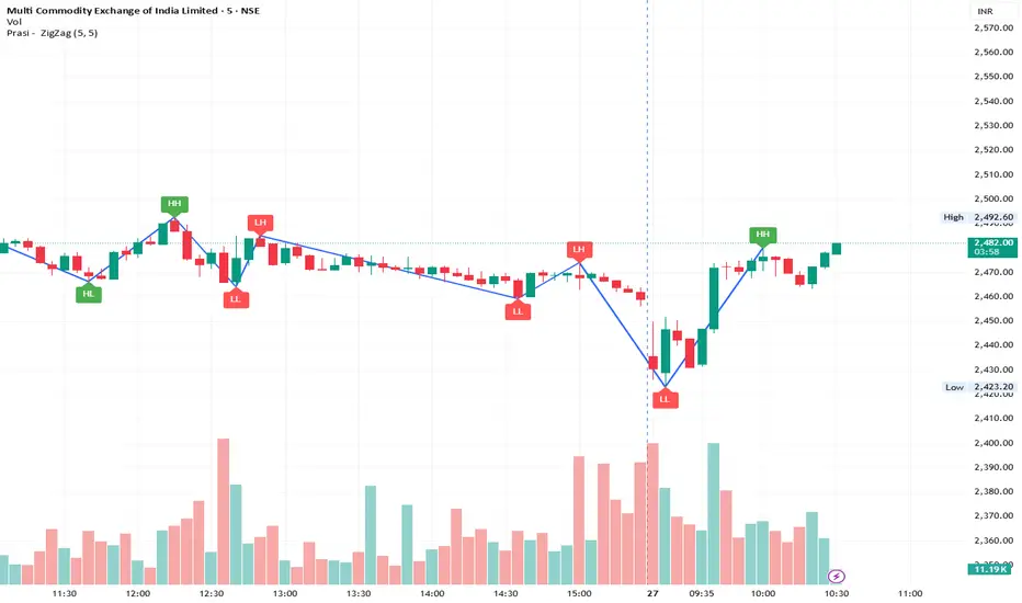
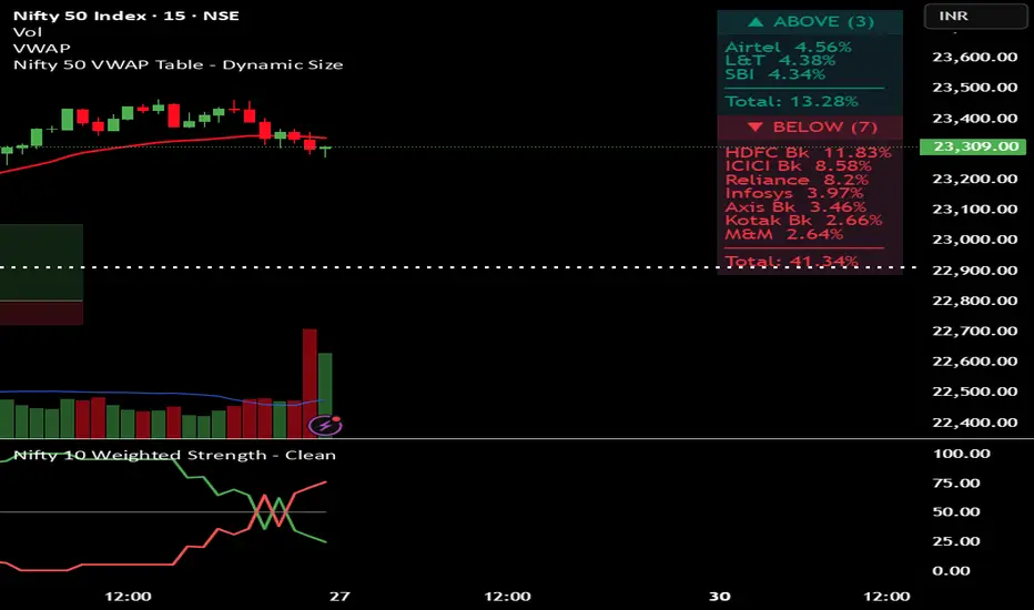
nifty vwap 3.1Monitors the "Big Players"
It tracks the 10 most important stocks (like HDFC Bank, Reliance, and ICICI Bank) because these stocks carry the most "weight" and usually decide where the Nifty index goes.
2. The VWAP Test (The Filter)
For each stock, the code checks:
Is the current price Above its average price (VWAP)?
Or is it Below its average price?
Why? If a stock is above VWAP, it is considered Strong (buyers are in control). If it is below, it is Weak (sellers are in control).
3. Calculates "Power" (Weightage)
Instead of just counting stocks, it calculates their combined percentage in the Nifty.
Example: If only 3 stocks are "Above VWAP" but they are the biggest ones (like HDFC and Reliance), the "Total Weight" might still be very high (e.g., 30%), suggesting the market has underlying strength despite fewer stocks being green.
4. Visual Table
It puts all this info into a neat Table on the top-right of your chart.
Teal Section: Shows stocks that are Strong/Bullish.
Red Section: Shows stocks that are Weak/Bearish.
Summary: It tells you exactly how many stocks are on each side and their total percentage impact.
Indicator

nifty vwap 3 Monitors the "Big Players"
It tracks the 10 most important stocks (like HDFC Bank, Reliance, and ICICI Bank) because these stocks carry the most "weight" and usually decide where the Nifty index goes.
2. The VWAP Test (The Filter)
For each stock, the code checks:
Is the current price Above its average price (VWAP)?
Or is it Below its average price?
Why? If a stock is above VWAP, it is considered Strong (buyers are in control). If it is below, it is Weak (sellers are in control).
3. Calculates "Power" (Weightage)
Instead of just counting stocks, it calculates their combined percentage in the Nifty.
Example: If only 3 stocks are "Above VWAP" but they are the biggest ones (like HDFC and Reliance), the "Total Weight" might still be very high (e.g., 30%), suggesting the market has underlying strength despite fewer stocks being green.
4. Visual Table
It puts all this info into a neat Table on the top-right of your chart.
Teal Section: Shows stocks that are Strong/Bullish.
Red Section: Shows stocks that are Weak/Bearish.
Summary: It tells you exactly how many stocks are on each side and their total percentage impact.
Indicator
Indicator

TPrecision MARKET PULSE Read the Energy, Not the DirectionHere's the full TradingView description text, ready to paste:
MARKET PULSE — Read the Energy, Not the Direction
Every indicator you've ever used tells you the same thing: which way price might go. RSI, MACD, stochastics — they're all measuring direction in different ways. Market Pulse does something fundamentally different. It measures the energy state of the market — the rhythm underneath price that exists before any move happens.
The concept is simple: markets breathe. Before every significant move, price compresses — ranges tighten, candles shrink, volatility collapses inward. The market is inhaling. Then it exhales. Price erupts, ranges expand, energy releases. Market Pulse makes that cycle visible in real time across four components stacked in a single clean pane.
BREATH (top section — blue/amber line)
This is the core reading. True range normalized against its own long-term average, so 1.0 always means "normal." When the line drops below the blue band (0.7), the market is compressing — inhaling, coiling, building potential energy. When it rises above the amber band (1.3), the market is expanding — exhaling, releasing, moving with conviction. A breath line that stays flat and low for many consecutive bars is the most important signal this indicator produces. That is a spring being loaded.
RHYTHM (middle section — green/red histogram)
Rhythm measures the rate of change of breath. Are we expanding faster than we were, or compressing faster? Green bars above the midline mean expansion is accelerating — the exhale is gaining momentum. Red bars below mean compression is deepening — the coil is getting tighter. The most powerful moment is when rhythm crosses from red to green after a prolonged compression period. That is the first sign the exhale has begun.
TENSION (bottom section — gradient fill)
Every bar that breath spends below 1.0 (below-normal range) accumulates tension. The fill builds from blue to amber as pressure increases. High tension means the spring has been coiled for a long time and release is statistically overdue. Tension does not decay instantly — it bleeds out slowly on expansion bars, reflecting how energy releases gradually after a long coil. When tension is at its peak and breath is still compressed, you are looking at maximum potential energy in the market.
PULSE RATE (dotted circles — overlay on breath section)
This tracks the average interval between breath peaks — how fast energy cycles are completing. When the dots are high, cycles are churning quickly (active, volatile market). When dots drop, cycles are slowing down. A decelerating pulse rate often precedes market exhaustion, regime change, or a significant transition in character. It is the one component that operates on a longer timescale than the others.
BACKGROUND ALERTS
🔵Blue background tint — Tension above 75% AND breath compressed below 0.7. The coil is tight. Maximum potential energy. The market is wound up.
🟠Amber background tint — Breath above 1.3 AND rhythm positive. Active release in progress. Energy is being deployed.
HOW TO USE IT
This indicator does not tell you to buy or sell. It tells you what state the market is in so you can make better decisions with whatever strategy you already use.
Use it to avoid trading in the wrong state — entering a trend trade during deep compression usually means getting chopped. Entering a range trade during active expansion means getting run over.
Use it to time entries on your existing signals — a buy signal that fires while tension is at extreme highs and breath is turning up is a very different trade than the same signal firing in a neutral state.
Use it to identify when something is about to happen — not what, but when the energy conditions are right for a significant move.
Use it across timeframes — compression on the daily while expansion fires on the 4H often means a powerful intraday move within a larger coiling structure.
SETTINGS
Base Period (default 20) — The lookback for ATR and breath calculation. Higher values = smoother, slower readings. Lower = more reactive.
Smoothing (default 5) — Applied to all components. Increase to reduce noise on lower timeframes.
Tension Lookback (default 50) — How far back tension and rhythm normalize themselves. Higher = tension builds more slowly, more selective extremes.
Pulse Rate Period (default 10) — How many breath cycles to average for the pulse rate calculation.
WORKS ON
All markets (Forex, Crypto, Equities, Futures, Indices) — All timeframes — Pine Script v6
This is not a signal generator. It is a market state reader. Learn the rhythm before you trade the move.
👉 Join the community, ask questions, share setups: discord.gg/8H4qdBDaEu
Indicator

Macro DashboardOverview
A three-panel macro surveillance dashboard built for top-down discretionary and systematic traders. Aggregates real-time data from 35 cross-asset feeds — rates, credit, liquidity, volatility, and positioning — into a single overlay table that updates on Daily, Weekly, and Monthly charts with automatic lookback calibration for each cadence.
What It Does
Left Panel — Macro Regime & Rates
- Classifies the current macro environment into one of ten named regimes (Goldilocks, Boom, Stagflation, Easing, etc.) by synthesizing growth, inflation, and liquidity conditions in real time.
- Decomposes rate moves into their underlying drivers — breakeven inflation vs. real rate — so you can see why yields are moving, not just that they moved.
- Monitors yield curve dynamics (bull/bear steepening/flattening), high-yield credit spreads, forward inflation expectations, and the stock-bond correlation regime.
- Tracks Fed balance sheet components, net liquidity, M2, bank reserves, and initial claims with directional momentum readings.
Middle Panel — Volatility & Positioning
- Surfaces the full vol complex: equity vol, rates vol (MOVE), the implied-vs-realized premium, term structure shape, skew, vol-of-vol, and put/call sentiment — condensed into a composite tail-risk gauge.
- Estimates CTA/trend-follower positioning across equities, bonds, gold, and the dollar using a multi-horizon momentum proxy, and shows whether systematic flows are adding, holding, or cutting.
- Models a vol-target leverage signal that tracks how risk-parity and vol-controlled strategies would be adjusting exposure based on recent realized volatility.
- Rolls all of the above into a Signal Alignment section that scores conviction across four independent domains (macro, vol, credit, flows), flags which signal diverges when conviction is high, and generates a one-line narrative summary.
Right Panel — Cross-Asset Pulse
- Provides a full technical scorecard for 20+ instruments spanning equities, Treasuries, credit, precious metals, industrial commodities, energy, FX, crypto, and global equity markets.
- Each row displays price, bar change, momentum, comparative relative strength vs. SPY, volatility-normalized mean-reversion distance, 52-week range positioning, and short-term / long-term trend states, culminating in a single actionable quadrant signal (LEAD / WATCH / REDUCE / AVOID).
Decision Output
- A composite risk-mode score derived from the four signal domains, expressed as a z-score with a directional label (Risk-On, Neutral, Defensive, Risk-Off) and a trend reading (Improving / Stable / Deteriorating).
- Translates the score into allocation-level guidance: equity weight bias, duration posture, and hedge urgency — all internally consistent so the output never contradicts itself.
- Breaks the view into three time horizons (Short-Term, Medium-Term, Long-Term) to separate tactical positioning from structural backdrop.
Who It's For
Macro-oriented traders and portfolio managers who want a single-screen answer to "What regime are we in, what's the vol surface saying, where is systematic flow headed, and do those signals agree?"
Settings
- Adjustable lookback lengths for momentum, relative strength, correlation, and historical volatility.
- Configurable CTA target volatility and max leverage.
- Table position and text size controls. Optional sleeve z-score display for the risk mode composite.
Indicator

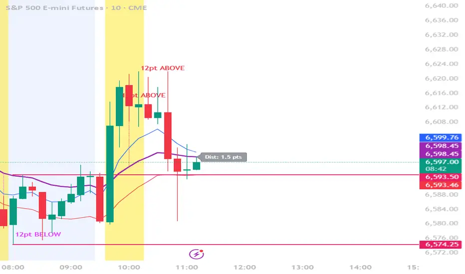
20 EMA - 12 Points Distance Alert + LineNotifies you when the price gets at least 12 points away from the 20 ema
Indicator