Volatility Time WindowsVolatility Time Windows finds the hours of the day when a market statistically moves the most and draws them on your chart as zones: past occurrences, the window that is running right now, and the next one coming up.
WHAT IT DOES
Every intraday market has a rhythm. Some hours are consistently wild, others are consistently dead. This script measures that rhythm from your chart's own history instead of relying on fixed session times. It splits the day into time slots (default 60 minutes), measures how much price moves in each slot, and merges the slots that are consistently above average into "volatile windows". Those windows are then drawn as boxes around the actual high-low range of every occurrence, so you can see at a glance where the movement clusters.
HOW IT WORKS
1. For every bar, the high-low range in percent of price is measured.
2. To make different regimes comparable, each value is normalized by the average range of the previous 24 hours. A wild week in 2022 therefore counts the same as a quiet week today, only the intraday pattern matters.
3. The normalized values are aggregated per time slot across all loaded bars (minimum 20 samples per slot). The result is a ratio per slot: 1.00 = average hour, 1.50 = 50 % more movement than an average hour.
4. Consecutive slots at or above the threshold (default 1.2x average) are merged into one window. A single slot between two volatile slots joins the window if it is at least average, so a small dip does not split a session in two.
5. Windows are ranked by their average ratio and the top ones (default 2) are shown.
WHAT YOU SEE
- Blue boxes around the high-low range of every past occurrence of a window, with a label showing the time span and the average high-low range of that window in percent (e.g. 13:00-17:00 · Ø 1.35 %).
- The window that is running right now is drawn slightly stronger and its label shows when it ends.
- The next occurrence within the following 24 hours is drawn as a dashed box around the current price. Its height equals the average range of that window, so you get a feeling for the expected move, and its label counts down to the start.
- Hover a label to see the ratio of the window versus the daily average.
HOW TO USE IT
- Use an intraday chart that is not larger than the chosen time resolution (e.g. a 5m, 15m or 1h chart with 60-minute slots). More history means more reliable statistics; the script uses everything TradingView loads.
- Set the timezone to the one you think in. Slot boundaries and labels follow that timezone, so daylight saving changes are handled correctly.
- Use "Mon-Fri" for crypto if weekends dilute your profile, or "Sat-Sun" to study weekend behaviour separately.
- Lower the threshold (e.g. 1.15) for longer windows, raise it (1.3 or more) to isolate the peak hours only.
- Alerts: "Volatility window starts" fires at the start of a window. The heads-up alert warns a configurable number of minutes before the start (create the alert with "Any alert() function call").
SETTINGS
Time resolution: size of the slots the day is split into (15 / 30 / 60 / 120 min).
Timezone: timezone used for slot boundaries and labels.
Days: which weekdays enter the statistics.
Volatile if ≥ x average volatility: threshold for a slot to count as volatile.
Windows to show: how many of the top windows are drawn.
Days of history: how far back zones are drawn (0 = all loaded bars).
Show next occurrence: dashed projection of the upcoming window.
Labels, text size, zone color.
Heads-up minutes: lead time for the pre-alert.
NOTES
- The statistics are descriptive, not predictive. They show when the market has moved the most in the loaded history, which helps with timing entries, sizing stops and avoiding dead hours, but a volatile window is not a directional signal.
- TradingView limits a script to 500 boxes and labels, so the oldest zones drop off once the limit is reached.
- Works on any symbol with intraday data: crypto, forex, indices, futures, stocks. Indicator

Volatility of Returns | NickJoanVolatility of Returns | NickJoan
Core Idea
Volatility of Returns measures the standard deviation of logarithmic returns over a user-defined lookback window. This is the industry-standard approach to calculating historical volatility, widely used in finance for risk management, option pricing, and portfolio analysis.
The indicator displays volatility as an annualized percentage, making it easy to compare across different assets and timeframes. An optional moving average helps smooth the volatility series and identify trends in volatility itself.
Calculation Logic
The indicator follows a straightforward three-step process:
1. Log returns calculation
For each bar, the script calculates the logarithmic return:
• logRet = log(close / close )
2. Standard deviation calculation
The script calculates the standard deviation of log returns over the specified lookback period:
• stdevLogRet = stdev(logRet, length)
This measures how much returns typically deviate from their mean.
3. Annualization
The raw standard deviation is then annualized by multiplying by the square root of the annualization period:
• volatility = stdevLogRet × √annPeriod × 100
For daily crypto charts, the default is √365. This converts the per-bar volatility into an annualized percentage.
Chart Output
The indicator displays in a separate pane below the price chart:
Volatility line
• Shows the annualized volatility percentage
• Plotted in blue
Moving average line (optional)
• Shows the smoothed volatility trend
• User-selectable type: SMA, EMA, WMA, or RMA
• Plotted in gray with thicker linewidth
• Can be toggled off via input
Inputs
CALCULATION
• Volatility Lookback (bars): window for standard deviation calculation. Default: 90.
• Annualize: toggles annualization on/off. Default: true.
• Annualization Period: period used for annualization. Default: 365.
MOVING AVERAGE
• Show Moving Average: toggles MA overlay visibility. Default: true.
• MA Type: MA calculation method (SMA, EMA, WMA, RMA). Default: EMA.
• MA Length: MA lookback period. Default: 30.
How to Use It
Volatility level assessment
• Low volatility: calm, consolidating market
• Medium volatility: normal market conditions
• High volatility: turbulent, fast-moving market
Note: "Low" and "High" are relative to the asset class. Crypto naturally has higher volatility than stocks or forex.
Volatility trend identification
Use the moving average to identify whether volatility is rising or falling:
• Volatility above MA: elevated relative to recent trend
• Volatility below MA: suppressed relative to recent trend
• MA sloping up: volatility is increasing
• MA sloping down: volatility is decreasing
Risk management
Use volatility to adjust position sizing and risk parameters:
• High volatility: reduce position size, widen stop losses
• Low volatility: can increase position size, tighter stops
• Rising volatility: prepare for potential breakout or increased uncertainty
• Falling volatility: consolidation phase, wait for direction
Best Use Cases
• Historical volatility measurement
• Risk management and position sizing
• Volatility trend analysis
• Cross-asset volatility comparison
• Portfolio risk monitoring
Notes
The indicator is designed for daily crypto charts but works on any timeframe.
• Daily timeframe: use Annualization Period = 365
• 4H timeframe: use Annualization Period = 2190 (365 × 6)
• 1H timeframe: use Annualization Period = 8760 (365 × 24)
• Or disable annualization for raw per-bar volatility
The lookback period determines sensitivity:
• Shorter lookback (20-30 bars): more reactive to recent spikes
• Medium lookback (60-90 bars): balanced approach
• Longer lookback (180-365 bars): smooth, long-term trends Indicator

Volatility Regime Tracker | NickJoanVolatility Regime Tracker | NickJoan
Core Idea
Volatility Regime Tracker measures the dispersion of price relative to its recent average and classifies the current market environment into distinct volatility states. Instead of just showing raw volatility values, the indicator uses percentile-based thresholds combined with moving average direction to identify three persistent regimes: LOW, NEUTRAL, and HIGH.
The script goes beyond simple volatility measurement by tracking how long each regime has lasted and comparing it to historical averages, giving you a statistical expectation for when the current regime might end.
The indicator can be used in two ways:
• As a volatility gauge, where you monitor the current volatility percentage and its trend.
• As a regime detection tool, where the background colors and duration table help you anticipate volatility state changes.
Calculation Logic
The indicator works through three main stages:
1. Volatility calculation
For the selected price source, the script first calculates the standard deviation over a user-defined lookback window. This absolute volatility is then normalized by the average price to produce a percentage-based measure.
• The script calculates the standard deviation of the source over the lookback period.
• It calculates the simple moving average of the source over the same period.
• It divides standard deviation by average price and multiplies by 100.
• It optionally annualizes the result using √365 for crypto daily charts.
This creates a coefficient of variation measure that shows how much price typically deviates from its recent average as a percentage.
2. Regime classification
The script then determines whether current volatility is high, low, or neutral relative to recent history.
• It calculates the percentile rank of current volatility over a regime lookback window.
• It compares this percentile to user-defined thresholds (default: 30th and 70th percentiles).
• It classifies volatility as HIGH (above upper threshold), LOW (below lower threshold), or NEUTRAL (between thresholds).
3. Dual confirmation
To reduce false signals, the script combines percentile ranking with moving average direction.
• It calculates a moving average of the volatility series.
• It checks whether current volatility is above or below this MA.
• It assigns regime states based on both percentile and MA direction.
This dual-confirmation approach produces five distinct visual states that map to three underlying regimes.
Background Color Logic
The script uses a two-layer color system to show both regime state and confidence level.
Strong signals (darker colors)
• Dark red: High percentile AND above MA (strong high volatility)
• Dark green: Low percentile AND below MA (strong low volatility)
Moderate signals (lighter colors)
• Light red: Neutral percentile but above MA (rising volatility)
• Light green: Neutral percentile but below MA (falling volatility)
Uncertain signals
• Gray: Percentile and MA direction disagree (conflicting signals)
This color structure allows you to distinguish between high-confidence regime readings and transitional or uncertain states.
Regime State Mapping
The indicator consolidates the five color states into three regime categories for duration tracking:
• LOW (0): Any green shade (dark or light) - volatility is low or falling
• NEUTRAL (1): Gray - volatility is in transition or conflicting
• HIGH (2): Any red shade (dark or light) - volatility is high or rising
This mapping ensures the duration statistics reflect the broader regime environment rather than short-term color fluctuations.
Duration Tracking Logic
The script continuously monitors regime changes and builds a historical record of how long each regime typically lasts.
Duration measurement
• When a regime change is detected, the script calculates how many bars the previous regime lasted.
• This duration is stored in an array specific to that regime type (LOW, NEUTRAL, or HIGH).
• The process repeats for each regime change, building a distribution of historical durations.
Statistical analysis
• The script calculates the average duration for each regime type from the stored history.
• It calculates the standard deviation of those durations.
• It computes confidence intervals at ±1 standard deviation (~68% confidence).
Real-time tracking
• The script counts how many bars the current regime has lasted.
• It displays this count alongside the historical average and confidence bounds.
• This allows you to see whether the current regime is typical, unusually short, or unusually long.
Duration Table Output
The table displays four rows of information for each regime type:
• Current bars in regime (if active) or "—" (if inactive)
• Historical average duration for LOW regimes
• Lower bound (average − 1 SD)
• Upper bound (average + 1 SD)
Interpretation
• If current bars < lower bound: regime is unusually short (may extend further)
• If current bars ≈ average: regime is typical (no strong expectation either way)
• If current bars > upper bound: regime is unusually long (may be nearing end)
Chart Output
The indicator displays three visual elements in a separate pane below the price chart:
Volatility line
• Shows the current annualized volatility percentage
• Plotted in blue for clear visibility
Moving average line
• Shows the smoothed volatility trend
• Plotted in gray with thicker linewidth
• Can be toggled off via input
Background color
• Shows the current volatility regime state
• Uses five color states mapped to three regimes
• Can be toggled off via input
Duration table
• Positioned at middle-right of the chart
• Shows current bars, average, and confidence intervals
• Can be toggled off via input
Inputs
The indicator has four main input groups.
CALCULATION
• Volatility Lookback (bars): defines the window used to calculate standard deviation. Default: 50.
• Annualize (√365): toggles annualization of volatility. Recommended for crypto daily charts.
• Source: selects the price series used in the calculation (default: close).
MOVING AVERAGE
• Type: chooses the MA type (SMA, EMA, WMA, RMA). Default: EMA.
• Length: sets the MA lookback period. Default: 30.
• Show Moving Average: toggles MA visibility on the chart.
VOLATILITY REGIME
• Regime Lookback (bars): defines the window used for percentile rank calculation. Default: 100.
• Low Threshold (percentile): sets the lower percentile boundary. Default: 30.
• High Threshold (percentile): sets the upper percentile boundary. Default: 70.
• Show Background Color: toggles regime coloring.
DURATION TABLE
• Show Duration Table: toggles the statistics table visibility.
• History Lookback (days): controls how many bars of history to use for average calculations. Default: 365.
Alerts
The script includes four alert conditions:
Volatility Regime Change
• Triggers on any regime transition (LOW → NEUTRAL, NEUTRAL → HIGH, etc.)
• Useful for monitoring all state changes
Low Volatility Regime
• Triggers when entering LOW regime (green background)
• Useful for breakout preparation or position size increase
Neutral Volatility Regime
• Triggers when entering NEUTRAL regime (gray background)
• Useful for identifying transition periods
High Volatility Regime
• Triggers when entering HIGH regime (red background)
• Useful for risk reduction or heightened awareness
How to Use It
This indicator is best used as a volatility filter and regime-aware positioning tool, not as a standalone entry signal.
Volatility regime filter
Use the regime colors to filter your trading approach:
• LOW regimes (green): Favor breakout strategies, increase position size
• HIGH regimes (red): Reduce position size, exercise caution (volatility can persist or reverse depending on market context)
• NEUTRAL regimes (gray): Wait for clearer signals or reduce exposure
Duration-based anticipation
Use the duration table to anticipate regime changes:
• If current bars approach upper bound: expect potential regime change soon
• If current bars are well below average: expect regime to continue
• If current bars exceed upper bound: regime is extended, watch for reversal
Trend confirmation
Use the volatility trend to confirm price action:
• Rising volatility (light red → dark red): confirms trend expansion or increased uncertainty
• Falling volatility (light green → dark green): confirms consolidation or stabilization
• Conflicting signals (gray): suggests uncertainty or transition
Practical Interpretation
Here is a simple way to read the results:
LOW regime (green)
• Price is tightly clustered around its average
• Volatility is below historical norms
• Often precedes breakout moves
• Good for trend-following entries
HIGH regime (red)
• Price is widely dispersed from its average
• Volatility is above historical norms
• Can indicate trending expansion, shock events, or panic conditions
• Reduce position size; assess whether context suggests continuation or reversion
NEUTRAL regime (gray)
• Volatility is transitioning or conflicting
• No clear regime signal
• Wait for clearer confirmation
Duration statistics
• Average: typical length of this regime type
• Lower/Upper bounds: normal range (~68% of cases)
• Current bars: where you are in the distribution
Best Use Cases
Typical uses include:
• Crypto volatility regime detection
• Position sizing based on volatility state
• Breakout vs. consolidation strategy filter
• Risk management and exposure control
• Multi-asset volatility comparison
• Regime-aware trade timing
It is especially useful when you want to objectively measure whether volatility is high or low relative to recent history, and whether the current regime is typical or extended.
Notes
The indicator is designed for daily crypto charts but works on any timeframe.
• Daily timeframe: "History Lookback (days)" represents calendar days
• Other timeframes: "History Lookback (days)" represents bars, not calendar days
The metric table is only as good as the selected lookback periods and thresholds.
• Shorter volatility lookback: more reactive but noisier
• Longer volatility lookback: smoother but may lag sudden changes
• Shorter regime lookback: faster regime detection but more whipsaws
• Longer regime lookback: more stable but slower to detect changes
• Tighter thresholds (e.g., 25/75): fewer regime changes, higher confidence
• Wider thresholds (e.g., 35/65): more regime changes, earlier detection
The Z-Score-style duration statistics are relative to the selected history window, so their meaning depends on how much data you include. Indicator

Intraday Volatility ClockThe Concept
A stop is a distance, and every distance is really a bet about how much the market can move before you are wrong. But intraday volatility is nowhere near constant — it is loud at the open, quiet through the middle of the session, and wakes up again into the close. On liquid intraday instruments the gap between the busiest and calmest half-hours is routinely four to five times in variance, which is roughly double in standard deviation. A stop set on the session's average volatility is therefore far too tight in the first half hour and needlessly wide at midday. Same number of points, completely different meaning. Volatility Clock measures that shape from the instrument's own history and hands it back as a single number per time slot, so you can see which part of the day you are standing in before you decide what a distance is worth.
What It Shows
🕐 Time-of-Day Multiplier — a stepped line showing how much variance this slot of the session normally carries, expressed against the session average. 1.00 is a typical slot for this market; 3.00 means this slot usually runs three times as hot
📊 Curve Table — the fitted profile slot by slot, with the number of sessions behind each one so you can see which parts of the day are well measured and which are thin. Long sessions cut into small slots can outrun the table; when that happens it says how many slots were left off rather than quietly dropping the tail
📐 Sigma Mode — the same curve as a standard-deviation multiplier rather than a variance one, for scaling stop distances and expected move directly
⚖️ Session Average Line — the 1.00 reference. Above it the market is normally more active than its own daily baseline, below it less
🎛️ Fit Controls — slot width, how many sessions to measure over, and how hard to shrink thinly-observed slots toward neutral
How It Is Built
Squared log returns are pooled into time-of-day slots, one row per session. Each session's slots are divided by that session's own average before anything is compared across days, so a violent session contributes its shape and not its scale — otherwise one wild day writes the curve for every other. The statistic across sessions is the median, for the same reason. Thin slots are shrunk toward 1.00 in log space, so a slot with three observations degrades to "no opinion" rather than to a confident wrong number. The finished curve is renormalised to average 1.00, which is what makes it orthogonal to whatever volatility estimate you already use: applying it moves variance around inside the day without changing the overall level.
Slots are measured from the session open , not from midnight. On a market that opens at 09:15, a midnight grid would produce a first slot labelled 09:00 holding only fifteen minutes of trading — the hottest fifteen minutes of the day, reading high for the wrong reason. Anchoring to the open keeps every slot the same width and keeps sessions that run past midnight in the right order.
How To Use
Add it to an intraday chart with a decent number of completed sessions and read it as context, not as a trigger. It has no bullish or bearish opinion and never will.
• Scale distances, do not shift them. Switch on Sigma Mode and treat the number as a multiplier on whatever stop or target width you already use. A 2.00 reading means the same setup deserves roughly twice the room it would get at midday
• Mind the trough. The quietest part of the session is where fixed-distance stops look safest and are actually the loosest relative to what the market is doing. It is also where a trade needs the most time to travel anywhere
• Respect the open. The first slot is usually the largest number on the chart by a wide margin. Positions taken there carry far more range than the rest of the day, whichever way it goes
• Check the sample column. A slot backed by three sessions is a guess; one backed by forty is a measurement. Thin slots are deliberately pulled toward 1.00 rather than shown as confident extremes
• Compare instruments. The shape is not universal. Index futures, single stocks and commodities each have their own profile, and a commodity trading across two continents' hours can look nothing like an index
• Match the slot to the chart. Slot width must be at least the bar interval, and works best as an exact multiple of it. The script says so in the table rather than fitting a curve on a broken grid
Using It In A Trade
Everything below is one idea: the multiplier tells you what a point is worth right now, so anything you measure in points should be read through it. None of it is a signal, and none of it says which way to face.
1. Stops. Turn on Sigma Mode. If your working stop is X points and the reading is 1.80, the comparable stop in that slot is about 1.8X — not because the trade needs more room emotionally, but because the market covers that distance 1.8 times as easily there. Running one fixed number all day means you are unknowingly trading a tight stop at the open and a loose one at lunch.
2. Targets and the ratio you are actually getting. Scaling the stop without scaling the target quietly changes your risk-reward. If both move with the multiplier, the ratio survives. If only the stop moves, a 1:2 setup at midday is something else entirely at the open.
3. Position size. The inverse of the sigma multiplier is a size scalar. Half the size at a 2.00 slot and full size at a 1.00 slot puts roughly the same rupee risk on the table in both, which is usually what you meant by "fixed risk" in the first place.
4. Time budget for a trade. A trade needs the market to travel. In a 0.60 slot it travels slowly, so the same target takes materially longer and the trade will sit through more time doing nothing. If you scalp with a time-based exit, the exit is worth scaling too.
5. Choosing when to be in the market. Some approaches want movement — breakouts, momentum, anything paid by range. Those live in the peaks. Others want stillness — mean reversion, range fades, anything that assumes price comes back. Those live in the trough. The curve tells you which regime the clock has put you in before the chart does.
6. Breakout filtering. The same size of break means different things at different times. A move that clears yesterday's high in a 0.50 slot required real force to happen there. The identical move in the opening slot is inside what the market does routinely without meaning anything. Comparing break size against the local multiplier is a cheap sanity check.
7. Options and anything short premium. Premium sellers are paid for time and punished by movement, and the two are not distributed the same way through the day. The peaks are where a written position takes its damage; the trough is where decay does its work relatively undisturbed. Stop distances on short-premium positions are exactly the kind of fixed number that this curve says should not be fixed.
8. Comparing a session to its own norm. Take the realised movement of the current slot and divide by what the curve says that slot normally carries. Above one means today is running hot for that time of day, below one means it is quiet — a cleaner read on "is today unusual" than comparing against a flat daily average that has the time-of-day shape baked into it.
Works on any symbol on intraday timeframes. Larger bar intervals let the chart hold more sessions, which usually gives a steadier profile than squeezing more detail out of fewer days.
Notes
This measures where volatility concentrates, not where price goes. Nothing here forecasts direction, and no combination of settings will make it do so. It is a description of how the instrument distributes its movement across the trading day.
Non-repainting. The profile is recalculated once at each session open using completed sessions only, and only completed bars are ever added to the sample. The value displayed on any bar was knowable before that session began, and history is not redrawn as the current session develops.
Regular session only, by default. Pre-market and auction prints are not ordinary trading. Left in the sample, a single auction gap can double the opening slot on its own. The setting can be turned off, but the profile it produces should be read with that in mind.
History requirement. The profile needs several completed sessions before it will display anything. Below that it shows how many sessions it has gathered so far rather than drawing a curve nobody should trust. On non-intraday timeframes it says so and draws nothing. A slot with no observations behind it draws nothing rather than defaulting to 1.00.
A profile is not a promise. Any individual session can ignore the shape entirely — news, expiry and holidays all override it. The curve describes the central tendency of many days, not the obligation of the next one.
No alerts in this version.
Indicator

Segmented Momentum PeakSegmented Momentum Peak (SMP) by Chao Ivans
This indicator builds an adaptive momentum threshold by collecting peak and trough readings from a series of past time segments and averaging them into a reference. A current move is treated as significant only when it matches or exceeds what the instrument has historically been capable of producing.
Calculation
The process runs in four stages.
First , Rate of Change is measured on closing prices over a defined period. This value feeds everything that follows.
Second , the chart is divided into segments of a set length. From each segment, one highest reading and one lowest reading is taken. This repeats across the chosen number of segments, gathering a collection of peak samples and trough samples spanning a substantial stretch of history.
Third , all peak samples are averaged into an upper reference and all trough samples into a lower reference. Both are then divided by the sensitivity parameter to produce the working thresholds drawn on the panel.
Fourth , the system counts how many times ROC has broken those thresholds within a recent window of bars. A signal appears only when the count meets the required quota and the current bar is breaking as well.
Logic Behind the Formula
The approach used here is known as block maxima, where extreme values are drawn from each block of data and their distribution is studied. Peaks are used rather than a plain average because averaging every reading would be dominated by the far more numerous quiet bars, dragging the threshold too low and flooding the chart with signals. Collecting only peaks produces a threshold that reflects how strong a move the market has genuinely been capable of delivering.
A useful consequence is that the threshold is self scaling across instruments. On a sluggish asset it settles low on its own. On a volatile asset it rises accordingly. No recalibration is needed when switching markets.
The cluster counting layer exists because a single threshold break is often nothing more than a momentary spike. When real pressure enters, breaks tend to arrive repeatedly within a short span. The quota requirement is what separates the two.
Function
The indicator identifies momentum that is statistically unusual relative to the instrument's own history, then filters it further through a repetition requirement. The output is a directional marker on the main chart whenever buying or selling pressure is confirmed as sustained.
How to Use
The lower panel shows three elements. Columns represent the ROC reading, turning green when breaking the upper threshold, red when breaking the lower threshold, and grey when sitting between them. Two thick lines represent the adaptive thresholds, which shift as volatility conditions change.
Pay attention to the threshold line colours. A blue upper line and a purple lower line indicate the thresholds sit at a meaningful level, so any break carries weight. A black line warns that the threshold has collapsed to a very low level, which typically happens in thin or dormant markets. Breaks come easily under those conditions but signify little, so signals should be ignored or treated with caution.
A green triangle below the bar marks a confirmed cluster of buying pressure. A red triangle above the bar marks selling pressure. These triangles are pressure markers, not entry commands. Use them to confirm a plan already built from price structure rather than as a standalone reason to open a position.
Tuning Guide
Start with sensitivity. If signals feel too scarce, raise it gradually. If the chart gets crowded, lower it.
Segment Length shapes the character of the threshold. Small values give a nimble threshold that tracks current conditions. Large values give one that only shifts when volatility changes on a broad scale.
Number of Segments Sampled controls stability. A large sample count makes the threshold resistant to one or two extreme events, but also slower to adapt when the market regime turns.
Cluster Window and Minimum Hits work as a pair. A narrow window with a high quota demands tightly packed pressure and produces the fewest but firmest signals. A wide window with a low quota is permissive and produces more. Indicator

Realized Volatility Comparator [AlgoTraderPro]What it does
Plots the annualized realized volatility of the chart's symbol and of a second symbol of your choice in the same pane, so you can compare how "nervous" two assets actually are — and how that changes across years. The default comparison is gold, which makes it useful for one specific long-term study: watching Bitcoin's volatility mature toward that of older stores of value.
How it works
For each symbol the script computes the standard deviation of logarithmic returns over a configurable window, then annualizes it:
realized vol = stdev( ln(close / close ), window ) × √(periods per year) × 100
The annualization factor is derived from the chart timeframe automatically (a 365-day year), so the reading is comparable across daily and weekly charts. The comparison symbol's volatility is computed in its own symbol context via request.security, using its own bar series. An optional simple moving average smooths both lines, and a readout table shows the current value for each symbol plus the ratio between them.
Inputs
Realized volatility window — bars in the standard deviation (default 26; suggested 26 on weekly ≈ six months, 90 on daily ≈ one quarter). Shorter = more reactive, longer = smoother regime view.
Smoothing — SMA applied to both lines; 1 = off.
Comparison symbol — any symbol (default OANDA:XAUUSD). Indices, FX, equities all work.
Show readout table — toggles the current-values table.
Colors — line colors for each series.
How to read it
The absolute level tells you the market's current disagreement about the asset's value: a young or contested asset prints high realized volatility; a settled one prints low. The slope across years tells you whether that disagreement is widening or narrowing. The ratio in the table condenses the comparison into one number — how many times more volatile the chart symbol is than the reference.
Suggested study
Load on BNC:BLX (Bitcoin Liquid Index, history back to 2010) on a weekly chart with the default gold comparison. The full history shows Bitcoin's realized volatility declining cycle after cycle while gold's stays in a low band — a maturation pattern gold itself went through after 1971.
Other uses
Position sizing context (size inversely to the regime), comparing any two assets' risk regimes before pairing them in a portfolio, or checking whether a "quiet" market is genuinely quiet by historical standards. Indicator

VWAP Rope Band by ByblloVWAP Rope Band plots a smoothed trend line (the "rope") that only moves once price has traveled beyond a VWAP-deviation threshold from its last position - small back-and-forth noise around VWAP is absorbed, and the line only steps when a move is statistically meaningful.
The threshold is the standard deviation of (close - VWAP) over a lookback period, scaled by a multiplier, so the surrounding band automatically widens or narrows with how far price is currently dispersing from VWAP - no manual adjustment needed as volatility changes.
A genuine trend reversal is only registered once the rope actually reverses direction (not on every VWAP wiggle). That short transition window gets its own color, an optional gradient cloud, and an optional Buy/Sell badge at the exact bar the reversal is confirmed.
INTENDED USE
Works well for short-term futures scalping - Nasdaq futures, KOSPI200 futures, and similar instruments. Built and tested primarily on the 1-minute chart, but the underlying VWAP/rope/band logic is timeframe-agnostic and holds up well on 2, 3, and 5-minute charts and other intraday timeframes too. The StdDev Length and Band Multiplier adapt to volatility automatically, but it's worth rechecking them when you switch timeframe or instrument.
FEATURES
- Threshold-based "rope" trend line that ignores VWAP noise, only stepping on statistically meaningful deviations
- Volatility-adaptive band (self-widening/narrowing standard-deviation envelope around the rope)
- True-gradient cloud fill between rope and band, with adjustable steepness
- Confirmed-reversal transition detection with its own color/cloud, auto-expiring after 5 bars if unresolved
- Optional Buy/Sell badge plotted at the exact bar a reversal is confirmed
- Two alert families: simple rope crossover/crossunder, and confirmed Buy/Sell signal alerts
- Works on any chart type (candlestick, Heikin Ashi, Renko, etc.) since prices are pulled via request.security() from the underlying ticker
This is a visual/alerting tool only - it does not place real orders. For educational and informational purposes only, not financial advice. Always verify how the rope and bands behave on your specific symbol and timeframe before relying on them for live trading. Indicator

Quantile Threshold Bands | NickJoanQuantile Threshold Bands | NickJoan
Core Idea
Quantile Threshold Bands measures the position of price within a lookback window and uses that information to define adaptive upper and lower threshold bands. The script calculates two percentile levels from a user-defined lookback window and uses them to classify the current source value as bullish or bearish.
When the price moves above the upper quantile, the indicator turns bullish. When the price moves below the lower quantile, it turns bearish. When it returns inside the band area, the script keeps the last active state until the opposite threshold is crossed again. This gives the indicator a persistent regime structure.
Calculation Logic
The indicator works through three steps:
Source selection.
- The user chooses the price series to analyze.
Quantile calculation.
- The script looks back over a chosen number of bars.
- From that window, it calculates a lower quantile band and an upper quantile band.
- These values are obtained with a nearest-rank percentile calculation.
State assignment.
- If the source is above the upper band, the state becomes bullish.
- If the source is below the lower band, the state becomes bearish.
- If the source is between the bands, the previous state remains active.
What the Bands Mean
The lower and upper bands represent the selected percentile levels inside the recent price window.
The lower band marks a lower threshold within recent price behavior.
The upper band marks a higher threshold within recent price behavior.
The area between them defines the central zone where price is neither breaking upward nor downward.
Because the levels are recalculated on every bar, they adjust as the market changes. The result is a dynamic set of thresholds that follow the market’s own recent distribution.
Chart Output
The script displays four visual elements on the chart:
Lower Quantile line.
Upper Quantile line.
Filled zone between the two bands.
Colored candles showing the active state.
The color logic is:
Aqua when the regime is bullish.
Olive when the regime is bearish.
No color yet before the first valid state is established.
The output is designed to make the current state readable at a glance.
Inputs
The indicator has four primary inputs:
Source - The series used in the quantile calculation.
Lookback - The number of bars used to build the rolling window.
Lower Quantile % - The percentile used for the lower band.
Upper Quantile % - The percentile used for the upper band.
The lower percentile must be smaller than the upper percentile.
Alerts
The script includes alerts for regime changes:
Long Signal - Triggers when the state turns bullish.
Short Signal - Triggers when the state turns bearish.
These alerts are designed to notify the trader when price breaks into a new regime.
How to Use It
This indicator can be used as a regime filter or market bias tool.
Typical use cases include:
Directional bias filter. Use the bullish state when price is above the upper quantile and the bearish state when price is below the lower quantile.
Threshold-based alerts. Use the long and short alerts to notify you when price breaks into a new percentile regime.
Range / compression read. The distance between the two bands can help show whether recent price action has been compressed or expanded. A narrow band zone suggests tighter recent movement, while a wider band zone suggests broader recent movement.
Trade filtering. Use it to decide whether to allow only long setups, only short setups, or no directional trades depending on regime.
Indicator

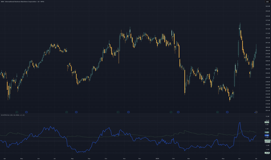
GreenStar ATR% Extension MonitorGreenStar ATR% Extension Monitor
The GreenStar ATR% Extension Monitor answers two questions in one window:
1) How volatile is the name? (14-period ATR as a percent of price)
2) How far has price stretched from a moving average, in relation to historical data?
Some names routinely stretch to 10-12x before mean-reverting. Others rarely clear 5x.
Scroll back on a daily chart to see extension habits for that symbol.
Why extension matters
Dollar distance from a 50-day MA does not compare a $15 name to a $400 name.
Dividing percent gain from the MA by ATR% provides a multiple of normal daily range.
That is the blue xFromMA line.
The green ATR% stepline shows the denominator: typical range relative to price.
These are separate formulas on the same pane and timeline to show correlation.
(It does not draw on the price chart.)
Two plots with independent calculations
ATR% (green stepline): 14-period ATR as a percent of price. Typical daily range relative to price level.
xFromMA (blue line): how many ATR% units price sits above or below the MA.
ATR% = ATR(14) / close x 100
xFromMA = ((close - MA) / MA x 100) / ATR%
Zero on xFromMA means price is at the MA.
A negative value indicates price is currently below the MA level.
Reading the pane
Both lines declining together often means the name is compressing toward the MA. Volatility and stretch easing at the same time.
Both rising means it's expanding.
Diverging slopes happen too.
xFromMA climbing while ATR% falls can mean price drifting from the MA while day-to-day volatility cools.
Read each line first, then note whether they agree.
Note: The lines share a pane for context, not because they combine into a signal.
A green/blue touch or cross is not a buy or sell event.
Visible-range markers (optional)
High, low, and mean for xFromMA are calculated from the visible bars on the chart.
There is no fixed lookback period.
They update on scroll or zoom, comparing current stretch to recent visible history.
The mean is the average xFromMA over those visible bars, not the midpoint between high and low.
Visible-range mean requires high/low lines enabled in the same settings group.
Optional zero line (dotted): xFromMA = 0, full width of the pane.
ATR% high/low bands exist too, off by default.
Settings
MA period (default 50)
MA type (default SMA)
ATR period (default 14)
Line colors and widths (default: dark green ATR%, blue xFromMA)
Zero line (default on)
High/low bands, xFromMA (default on)
Visible-range mean (default on)
ATR% high/low bands (default off)
Disclaimer
Context tool only. Not a signal, not financial advice. No entry or exit triggers. Past extension habits do not predict future price action.
Indicator
Advanced Volatility1. Normalized ATR (%) - The Blue Line
What it is: The standard Average True Range (ATR) divided by the current closing price.
Why it matters: It tells you exactly what percentage the asset moves on an average bar. If the nATR is 2.0%, you know the asset swings roughly 2% per candle. This is incredibly useful for setting dynamic stop losses and take profits that scale mathematically with the asset's price, rather than guessing arbitrary dollar amounts.
2. BB Width (%) - The Orange Line
What it is: The distance between the Upper and Lower Bollinger Bands, divided by the Middle Band.
Why it matters: This acts as a highly effective "Squeeze" proxy. Volatility is cyclical; it contracts, then it expands. When you see the Orange line drop to extremely low historical levels, it means the Bollinger Bands are pinching tight. This contraction indicates that energy is building up, and a massive breakout/expansion move is imminent.
3. Historical Volatility (%) - The Fuchsia Line
What it is: A strict statistical calculation heavily used in options pricing (often referred to as HV or Realized Volatility). It calculates the standard deviation of logarithmic returns over a period, and annualizes it (multiplying by √252 trading days).
Why it matters: It gives you the "true" statistical variance of the asset. A rising Fuchsia line means the market is becoming highly chaotic and unpredictable, while a falling line means the market is returning to a stable, directional grind.
By layering all three of these metrics on one panel, you can easily spot when a market has compressed to zero (all lines dropping near the Zero Base) right before a massive trend erupts! Indicator

Indicator
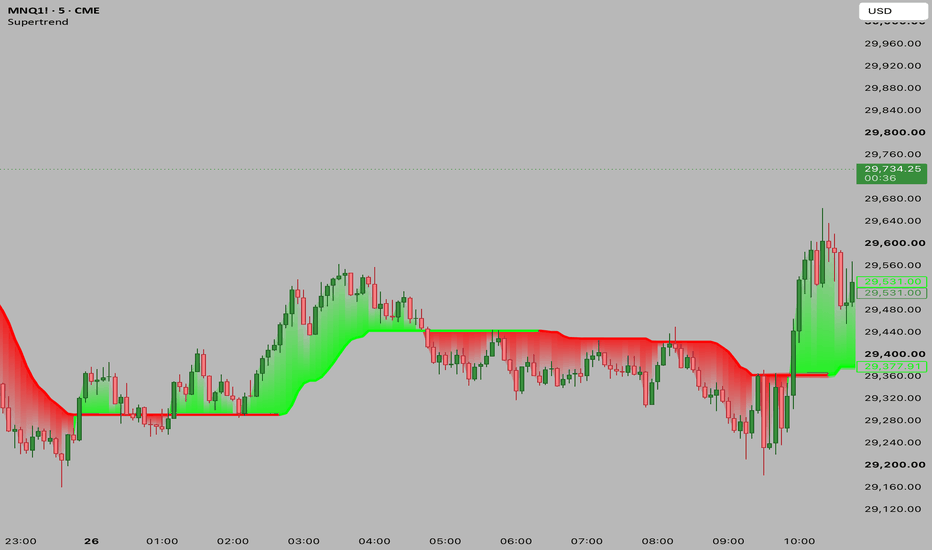
IV Rank & Percentile XVI (S&P/ASX200 VIX)Most IV Rank and IV Percentile indicators on TradingView are built for the US VIX. This one is built specifically for XVI — the S&P/ASX 200 VIX (A-VIX) — so Australian index traders, and anyone trading XJO options, finally get the same volatility context without borrowing a US proxy. It reads straight off the published XVI value, so there's no option-chain reconstruction or estimation involved.
The core idea:
XVI is the ASX's "fear number" — the implied volatility of the XJO, the market's estimate of how much it's about to move over the next 30 days. The problem is that a raw XVI value is meaningless on its own. Is 16 high? Low? You can't know without context. This indicator's whole job is to give that context by answering one question: compared to its own recent history, is volatility currently rich, normal, or cheap?
The two ways it measures that:
IV Rank is the simple one. It looks at the highest and lowest XVI over your lookback window (a year by default) and asks where today sits on that line. XVI at its yearly low reads 0. At its yearly high, 100. Halfway between, 50. That's it — it's just "where in the range are we."
IV Percentile asks a slightly different question: of all the days in the window, what percentage had a lower XVI than today? If it reads 70, then vol is higher than it was on 70% of the past year's days. The reason this one's usually better is that IV Rank gets distorted by a single spike — one brief crash sets a sky-high "yearly high," and then every reading afterward looks artificially low against it for a whole year. Percentile doesn't have that problem because it counts days, so one freak day is just one day. That's why the regime label runs off Percentile by default.
The regime label:
This translates those 0–100 numbers into a single word so you don't have to interpret them each time. You set two thresholds — default 80 and 20. Above 80 it reads HIGH (vol is richer than most of the past year). Below 20, LOW (vol is cheap). Anything between, NORMAL. The thresholds are yours to move: if you think 80 is too strict and want it flagging "high" earlier, drop it to 70. The cutoffs define what you consider rich versus cheap. You can also switch whether the label reads off Percentile or Rank.
Live updating:
The ranking history is built from daily XVI closes (you want to rank against a year of daily data, not intraday noise), but the current reading floats live against that history. As XVI moves through the session, IV Rank, IV Percentile, and the regime word update with it rather than waiting for the daily close.
Settings:
Volatility index — defaults to ASX:XVI. Can be pointed at another volatility index if you want to reuse the tool elsewhere.
History timeframe — the bar size the ranking history is measured on. Daily is standard.
Lookback — how far back it ranks. 252 ≈ one year. Drop it to 90 or 60 for a tighter, more recent read; the long-window and short-window answers genuinely differ when the past year contains a stale spike, so comparing the two is useful.
Regime read from / High threshold / Low threshold — choose whether the label is driven by Percentile or Rank, and set the two cutoffs.
Display — plot the Percentile line on or off, and position the readout table in any corner.
Reading it:
The pane plots IV Rank (aqua) and IV Percentile (orange) on a 0–100 scale, with dashed guide lines at your high and low thresholds and a dotted midline at 50. The corner table shows the live XVI level alongside both readings and the current regime.
A note on the data: because XVI is a calculated index rather than a traded instrument, your reading is only as live as your XVI data feed. On delayed feeds it updates with that delay, which is still perfectly adequate for volatility-regime context.
This script is a volatility-context tool, not a trading system. It tells you where implied volatility sits relative to its own history; it does not generate buy or sell signals, and nothing here is financial advice. Indicator

Daily Return Z-Score / OutlierDaily Return Z-Score / Outlier
What this indicator does
Daily Return Z-Score / Outlier measures how unusual today's daily return is relative to the instrument's own historical return distribution. It converts the current return into a Z-Score (standard-deviation scale) and colours the bars according to whether the return sits in the normal range, a warning zone, or an extreme zone (fat-tail event).
The goal is to make statistical outliers visible — days on which the price move is materially larger than the recent history would suggest.
How it works
Data basis (daily context): Daily returns are sampled on the daily timeframe ("D") via request.security, independent of the chart timeframe currently displayed. This keeps the statistical reference consistent.
Return calculation: Either simple percentage returns (close − close ) / close or log returns ln(close / close ).
Distribution statistics over a rolling window (default: 252 trading days ≈ 1 year). Two methods are available:
MAD (robust): Median and median absolute deviation. Insensitive to individual extreme values. The Z-Score is computed as 0.6745 · (return − median) / MAD (scaled to the normal distribution).
Classic: Mean and standard deviation. Z = (return − mean) / stdev. More reactive to, and distorted by, extreme values.
Empirical percentiles: In addition to the Z-Score, warning and extreme thresholds are derived directly from the observed percentiles of the return distribution (e.g. 5% / 95% for warning, 1% / 99% for extreme). Bar colour follows these empirical percentiles rather than normality assumptions.
Live return: The running return is computed against yesterday's daily close, so the classification updates intraday as the current day develops.
Display
Histogram of the Z-Score on a common sigma scale.
Reference lines at 0, ±1, ±2 and ±3 sigma for visual orientation.
Live label showing the current Z-Score on the last bar.
Values table (optional, bottom-right) with Z-Score, band classification, selected method, today's return, the dispersion measure (MAD or stdev), warning/extreme thresholds, and the effective sample size.
Colour logic
Normal — return within the warning percentiles.
Warn + / − — return beyond the warning percentile.
EXTREME + / − — return beyond the extreme percentile (fat tail).
Settings
Method: MAD (robust) or Classic (mean/stdev).
Lookback (days): Length of the statistics window (5–1000).
Log returns: Log instead of percentage returns.
Warning percentile % and Extreme percentile %: Colouring thresholds.
Colours for bullish/bearish warning and extreme zones.
Show values table.
Alerts
Extreme outlier UP — daily return beyond the upper extreme percentile.
Extreme outlier DOWN — daily return beyond the lower extreme percentile.
Extreme outlier (both directions) — combined condition.
How to use it
The indicator helps highlight days with a statistically notable move — for example to add context to news days, to watch for volatility clustering, or as a filter alongside an existing strategy. The MAD method is recommended when the history contains isolated strong outliers.
Notes
A Z-Score measures how unusual a move is, not its direction as a forecast.
Significance depends on a sufficiently large sample (see the "Sample" field in the table).
This script is an analysis tool and does not constitute financial advice. Past distributions are no guarantee of future behaviour.
═══════════════════════════════════════
Daily Return Z-Score / Outlier — Deutsch
Was macht dieser Indikator?
Daily Return Z-Score / Outlier misst, wie ungewöhnlich der heutige Tages-Return im Vergleich zur eigenen historischen Verteilung des Wertpapiers ist. Der Indikator wandelt den aktuellen Return in einen Z-Score (Standardabweichungs-Skala) um und färbt die Balken danach ein, ob sich der Return im normalen Bereich, in einer Warn-Zone oder in einer Extrem-Zone (Fat-Tail-Ereignis) befindet.
Ziel ist es, statistische Ausreisser sichtbar zu machen — also Tage, an denen die Kursbewegung deutlich grösser ausfällt, als es die jüngste Historie nahelegt.
Wie es funktioniert
Datenbasis (Daily-Kontext): Über request.security werden die Tages-Returns auf dem Tages-Timeframe ("D") erhoben, unabhängig vom aktuell angezeigten Chart-Timeframe. So bleibt der statistische Bezug konsistent.
Return-Berechnung: Wahlweise einfache prozentuale Returns (close − close ) / close oder Log-Returns ln(close / close ).
Verteilungsstatistik über ein rollierendes Fenster (Standard: 252 Handelstage ≈ 1 Jahr). Zwei Methoden stehen zur Wahl:
MAD (robust): Median und Median-Absolutabweichung. Unempfindlich gegen einzelne Extremwerte. Der Z-Score wird als 0.6745 · (Return − Median) / MAD berechnet (skaliert auf die Normalverteilung).
Klassisch: Mittelwert und Standardabweichung. Z = (Return − Mean) / Stdev. Reagiert stärker auf Extremwerte und wird von diesen verzerrt.
Empirische Perzentile: Zusätzlich zum Z-Score werden Warn- und Extrem-Schwellen direkt aus den beobachteten Perzentilen der Return-Verteilung gebildet (z. B. 5% / 95% für Warnung, 1% / 99% für Extrem). Die Balkenfarbe richtet sich nach diesen empirischen Perzentilen, nicht nach Normalverteilungs-Annahmen.
Live-Return: Der laufende Return wird gegen den gestrigen Tages-Schluss berechnet, sodass die Einordnung schon während des laufenden Tages aktualisiert wird.
Anzeige
Histogramm des Z-Scores auf einer gemeinsamen Sigma-Skala.
Referenzlinien bei 0, ±1, ±2 und ±3 Sigma zur visuellen Orientierung.
Live-Label mit dem aktuellen Z-Score am letzten Balken.
Werte-Tabelle (optional, unten rechts) mit Z-Score, Band-Einstufung, gewählter Methode, heutigem Return, Streuungsmass (MAD bzw. Stdev), Warn-/Extrem-Schwellen sowie der effektiven Stichprobengrösse.
Farb-Logik
Normal — Return innerhalb der Warn-Perzentile.
Warn + / − — Return jenseits des Warn-Perzentils.
EXTREM + / − — Return jenseits des Extrem-Perzentils (Fat Tail).
Einstellungen
Methode: MAD (robust) oder Klassisch (mean/stdev).
Lookback (Tage): Länge des Statistik-Fensters (5–1000).
Log-Returns: Log- statt prozentuale Returns.
Warn-Perzentil % und Extrem-Perzentil %: Schwellen für die Färbung.
Farben für bullische/bärische Warn- und Extrem-Zonen.
Werte-Tabelle anzeigen.
Alerts
Extrem-Ausreisser HOCH — Tagesreturn jenseits des oberen Extrem-Perzentils.
Extrem-Ausreisser RUNTER — Tagesreturn jenseits des unteren Extrem-Perzentils.
Extrem-Ausreisser (beide Richtungen) — kombinierte Bedingung.
Verwendung
Der Indikator eignet sich, um Tage mit statistisch auffälliger Bewegung hervorzuheben — etwa zur Kontext-Einordnung von News-Tagen, zur Beobachtung von Volatilitäts-Clustern oder als Filter neben einer bestehenden Strategie. Die MAD-Methode wird empfohlen, wenn die Historie einzelne starke Ausreisser enthält.
Hinweise
Ein Z-Score misst die Ungewöhnlichkeit einer Bewegung, nicht deren Richtung im Sinne einer Prognose.
Die Aussagekraft hängt von einer ausreichend grossen Stichprobe ab (siehe Feld "Sample" in der Tabelle).
Dieses Skript ist ein Analyse-Werkzeug und stellt keine Anlageberatung dar. Vergangene Verteilungen sind keine Garantie für zukünftiges Verhalten.
Indicator

Indicator

Indicator

Indicator

Indicator

Compass | AnonycryptousCompass | Anonycryptous
Description & user manual
Credits
The weekly psychological level calculation in this indicator is based on open-source code originally published on TradingView. The original script was created by plasmapug. Continued development was done by infernixx, Peshocore, and xtech5192 in collaboration with TradersReality. Significant modifications have been made to integrate this component into the Compass framework.
Why this indicator is different
Most indicators answer one question. A moving average tells you the trend direction. An oscillator tells you momentum. A session box tells you the time. A volume indicator tells you participation. Each one is useful. None of them tells you where you are.
Before placing a trade, a trader needs to answer several questions simultaneously. What session is active and what does that mean for the type of price action to expect? Where does the macro trend stand? Is volume confirming the move or contradicting it? Are there open imbalances nearby that price may return to? How much of the day's expected range has already been consumed? Where are the key structural levels — pivots, the daily open, prior week references?
Answering each of these questions separately requires stacking tool after tool until the chart becomes unreadable. Compass answers all of them at once.
It is not a signal indicator. It does not fire arrows or tell you when to buy or sell. What it does is something more fundamental: it gives you a complete read of the market environment before any decision is made. Sessions, trend, volume, imbalances, range levels, pivots, psychological references — all in one overlay, all configurable, all on one chart.
The design philosophy is orientation first. Decision second. Compass tells you where you are. What you do with that is your responsibility.
Important notice
Compass does not generate trading signals.
It does not tell you when to buy or sell.
It does not predict market direction.
It does not replace your trading strategy or your own analysis.
All illustrative examples in this manual are for educational purposes only and are not trading recommendations.
All trading decisions remain entirely with the user.
Always apply your own judgment and manage your own risk.
1. Overview
Compass is a comprehensive market context indicator that combines eleven independent analysis frameworks into one unified overlay. Every component is individually toggleable. Six presets are included for different trading styles, from fast scalping to full multi-component analysis.
What it includes:
- Five-EMA suite with adaptive cloud around the EMA 50
- EMA crossover system with configurable signals and candle coloring
- Stochastic RSI background alerts with four alert types and RSI divergence detection
- PVSRA volume vector candle analysis with zone tracking and configurable thresholds
- Eight global market sessions with automatic DST awareness
- Average daily, weekly, and monthly range levels with 50% midpoints
- Classic pivot points with mid-point levels
- Daily open reference line with historical opens
- Fair value gap detection with partial absorption tracking
- Weekly psychological level tracking
- Live dashboard with eighteen data points across all active components
2. EMA suite
Five exponential moving averages are plotted simultaneously: EMA 5, EMA 13, EMA 50, EMA 200, and EMA 800. Together they cover short-term momentum, medium-term trend direction, macro trend, and long-term structural bias.
The EMA 50 is wrapped in a dynamic cloud calculated from two standard deviations of price. The cloud expands during volatility and contracts during consolidation. A widening cloud indicates active price discovery. A thinning cloud indicates equilibrium or compression before a directional move.
The EMA 200 is the primary macro bias filter. Price above it defines a broadly bullish environment. Price below it defines a broadly bearish environment. This is shown in the dashboard at all times.
The EMA 800 provides long-term structural context, particularly useful on mid to higher timeframes where it marks the gravitational center of multi-month price structure.
All five EMA lengths are configurable. Each has individual color and transparency controls. An EMA label option displays the current value at the right edge of each line.
3. EMA cross system
The EMA cross tracks a configurable fast EMA crossing a configurable slow EMA and marks the crossover bar. All candles after a cross continue in the direction of that cross until the opposite cross fires.
Three display modes are available: show both the fast and slow EMA lines, show a single consolidated EMA line, or hide the EMA lines entirely while keeping the crossover signals visible.
This component is a trend state indicator, not a trade trigger. A bull cross does not mean buy. It means the short-term trend has shifted upward relative to the medium-term average.
Signals and candle coloring can be toggled independently.
4. Stochastic RSI
The stochastic RSI component runs a standard stochastic RSI calculation and generates background color alerts based on crossover conditions at configurable band levels.
Four alert types are available, each independently toggleable:
Middle band crossover — K line crosses D line near the 50 level. Indicates a possible trend shift in momentum.
Overbought/oversold crossover — K line crosses D line from overbought or oversold territory. Indicates a potential reversal from an extreme.
Entering overbought — K line crosses above the upper band. Indicates that momentum has moved into overbought territory.
Entering oversold — K line crosses below the lower band. Indicates that momentum has moved into oversold territory.
The dashboard displays the current stochastic RSI state and the RSI value. RSI appears in green when above the midline and in red when below. Regular bullish and bearish divergence is detected automatically and shown in the dashboard as a directional label. When divergence is active, a thin reference line appears on the price chart marking the divergence candles.
5. PVSRA volume vector analysis
PVSRA analysis colors candles based on volume relative to the 10-bar average and the relationship between volume and candle spread.
Four vector types:
Green vector — bullish bar where volume is at or above the green/red threshold (default 200% of the 10-bar average), or where volume multiplied by spread is the highest of the last 10 bars. Indicates strong bullish institutional participation.
Red vector — same conditions on a bearish bar. Indicates strong bearish institutional participation.
Blue vector — bullish bar where volume is at or above the blue/violet threshold (default 150% of average). Indicates elevated bullish volume below the institutional threshold.
Violet vector — same conditions on a bearish bar. Indicates elevated bearish volume.
Grey — no vector conditions met. Normal volume.
Both thresholds are configurable directly from the settings panel. Blue and violet signals are strictly exclusive from green and red — a bar cannot qualify for both simultaneously.
Vector candle zones draw boxes at each vector candle location and remain active until price moves through the zone, marking areas where elevated institutional activity was detected at the time the candle formed.
The PVSRA override input allows a different symbol to be used for the volume calculation. This is useful when the charted instrument has unreliable volume data, such as CFDs, perpetual swaps, or instruments where the primary volume is on a related market.
6. Market sessions
Eight global trading sessions are tracked simultaneously, each with automatic DST awareness. Sessions are displayed as expanding boxes with high and low lines and a real-time label showing the session open.
Sessions included:
- London: 08:00–16:30 UTC
- New York: 14:30–21:00 UTC
- Tokyo: 00:00–06:00 UTC
- Hong Kong: 01:30–08:00 UTC
- Sydney: 22:00–06:00 UTC
- EU brinks: 08:00–09:00 UTC
- US brinks: 14:00–15:00 UTC
- Frankfurt: 07:00–16:30 UTC
DST is handled automatically for London, New York, and Sydney. No manual adjustment is needed. Each session can be toggled individually, and box color, transparency, and label color are fully configurable per session.
Session context matters because market behavior differs significantly depending on which participants are active. London and New York overlap produces the highest volume and fastest price movement. Tokyo and Sydney sessions tend to consolidate. The brinks windows mark the transition periods where session highs and lows often form.
7. Range levels
Three statistical range frameworks measure the expected price range for the current period based on historical averages.
Average daily range (ADR) — the expected high and low for the current trading day. When price reaches the ADR level, the day's expected range has been consumed. Moves beyond the ADR are extension moves that occur with lower statistical probability and often mean-revert. The dashboard shows ADR % used — how much of today's expected range has already been consumed. Above 80% indicates the day is approaching its expected limit.
Average weekly range (AWR) — the same concept applied to the current week. Useful for assessing how much room the week has left to move.
Average monthly range (AMR) — the same concept applied to the current month. Provides macro context for position sizing and target expectations.
Each framework includes a 50% midpoint level marking the center of the expected range. The ADR measure from daily open option calculates the range starting from that day's open price rather than the statistical high, making the levels static for the entire day.
All three frameworks have individual lookback period inputs, color controls, line styles, and label toggles.
8. Pivot points
Classic pivot points are calculated from the prior day's high, low, and close. Levels include PP, R1/S1, R2/S2, R3/S3, and M mid-point levels between each major level.
Pivot points provide structural reference for the current session. Price above PP defines a broadly bullish day structure. R levels act as potential resistance targets. S levels act as potential support targets. M levels provide intermediate precision references between major pivots.
All levels can be toggled individually. Lines extend rightward from the prior session and can optionally extend in both directions. Each level has individual color and line style controls.
9. Daily open
A horizontal line marks the current day's opening price. This is one of the most referenced structural levels among short-term traders because it defines the starting point for the day's price discovery.
Price above the daily open reflects a bullish session bias. Price below reflects a bearish session bias. When price oscillates around the daily open without committing direction, the session is in balance — a lower probability environment for trend trades.
Historical daily opens can optionally be shown as reference for prior day context.
10. Fair value gaps
A fair value gap is a three-bar imbalance where price moved through a range without leaving two-sided trade — the low of the upper candle is above the high of the lower candle (bullish gap) or vice versa (bearish gap). These areas represent unfinished business where the market may return to achieve balance.
Gaps are filtered by a minimum width threshold expressed as a multiple of ATR. Gaps narrower than the threshold are excluded. Partial absorption is tracked — as price returns into the gap, the fill color changes to show how much of the imbalance has been recovered.
Fully mitigated gaps can be kept on the chart as historical reference or deleted automatically to maintain a clean view.
11. Psychological levels
Weekly psychological levels mark the prior week's high and low as calculated by a specific session-anchored method. These levels represent deliberate structural references where participants have previously committed size — breakouts and rejections around these levels tend to be more intentional than random price noise.
Three GMT offset options accommodate the session anchor calculation for different global market structures. Two mode options are available: crypto (weekly reset on Saturday Sydney open) and forex (weekly reset on Monday Tokyo open).
12. Settings reference
Preset
- Custom: full manual control over all settings.
- Clean scalper: sessions, EMA suite, FVG, subtle candle coloring. Low noise.
- Full context: everything on, medium transparency. Best for analysis.
- Signal focus: EMA cross, stoch RSI background, PVSRA bar color prominent. Rest subtle.
- Minimal: sessions, daily open, ADR only. No signals.
- PVSRA pro: PVSRA and vector candle zones central. EMA 200 and 800 only.
Global settings
- Master opacity offset (custom preset only): shifts all transparency values simultaneously.
- Show bull/bear label text: shows or hides text on EMA cross signal triangles.
EMA suite
- Show EMA suite and labels
- Individual EMA color and transparency controls
- EMA cloud fill and border transparency
- EMA line width
EMA cross
- Show EMA cross signals
- Fast EMA, slow EMA, and consolidated EMA lengths
- Show both EMAs or consolidated only
- Bull, bear, and neutral colors and transparency
- Cross EMA line width
Stochastic RSI
- Show stochastic RSI background alerts
- RSI length and stochastic length
- Overbought and oversold band levels
- Individual alert type toggles (four types)
- Alert colors and transparency
- RSI divergence lookback period
- Divergence line color and width
PVSRA
- Vector colors (red, green, violet, blue, regular up/down)
- Green/red threshold (× average volume, default 2.0)
- Blue/violet threshold (× average volume, default 1.5)
- Include spread filter for green/red classification
- Override symbol toggle and input
- Show vector candle zones with transparency and width settings
Candle coloring
- Enable candle coloring
- Coloring mode: EMA cross / PVSRA / EMA 200 / off
- Bull and bear candle color and transparency
Market sessions
- Show market sessions
- Session timezone
- Show sessions on weekends
- Session high/low line style and width
- Per session: toggle, box color, transparency, label color
Range levels
- Show ADR, AWR, AMR (individual toggles)
- Lookback periods for each
- Show 50% midpoint levels
- Measure from daily open (ADR only)
- Color, transparency, line width, line style, labels
Pivot points
- Show PP, R1/S1, R2/S2, R3/S3, M levels individually
- Show labels
- Extend lines both directions
- Individual level colors and line styles
- Pivot line width
Daily open
- Show daily open
- Show label
- Show historical daily opens
- Color, transparency, line width
Fair value gaps
- Show fair value gaps
- Width filter (ATR multiplier)
- Extend to current bar
- Bullish and bearish FVG colors
- Mitigation fill colors
- Keep historical FVGs after mitigation
Psychological levels
- Show psy levels and labels
- Show historical psy levels
- GMT offset (GMT+1, GMT+2, GMT+3)
- Psy type: crypto or forex
- High and low colors and transparency
Dashboard
- Show dashboard
- Position: top left, top right, bottom left, bottom right
- Size: tiny, small, normal
13. Dashboard reference
The dashboard provides eighteen live data points across all active components:
Session — the currently active market session.
EMA cross — current EMA cross direction: bull or bear.
EMA 200 — whether price is above or below the EMA 200.
Stoch RSI — current stochastic RSI condition.
RSI — current RSI value, colored green above midline and red below.
RSI divergence — active bullish or bearish divergence, or none.
PVSRA — current candle vector type.
ADR % used — how much of today's expected daily range has been consumed.
FVG active — count of open unmitigated fair value gaps and mitigation percentage.
Psy level — whether price is above or below the prior week's psychological level.
Timezone — active session timezone setting.
VCZ active — count of active vector candle zones above and below current price.
Pivot PP — current pivot point value.
Daily open — current daily open price and direction.
14. How to use
14.1 Initial setup
Select a preset that matches your primary trading style. Adjust the session timezone to match your location or your primary exchange. If you trade an instrument with unreliable volume data, enable the PVSRA override and set it to a correlated liquid instrument. Set the ADR lookback period to your preference — 14 days is a standard starting point. For FVGs, set the width filter to 0.5 or higher to exclude minor gaps.
14.2 Reading the dashboard
The dashboard is the fastest way to orient yourself on a new chart or a new session. Check session, EMA cross direction, EMA 200 position, stoch RSI state, and ADR consumed before anything else. Five seconds to a full picture of where the market stands.
14.3 Reading the chart
Check EMA alignment. When EMA 13, EMA 50, and EMA 200 are stacked in the same direction, the trend is more significant than a single crossover. Divergence between them reflects a transition or competing timeframe pressures.
Check ADR percentage. Below 50% means the day has statistical room to move. Above 80% means the day is near its expected limit and extension moves are less probable.
Look for open FVGs near current price. An unmitigated FVG in the direction of the prevailing trend is a precision reference area where price has historically returned.
Check the psy level. If price is approaching the prior week's high or low, be aware that participant behavior around those references tends to be deliberate.
14.4 Timeframe guide
1 minute to 3 minutes — clean scalper preset, candle coloring set to EMA cross.
5 minutes to 15 minutes — clean scalper or signal focus preset.
30 minutes to 1 hour — full context preset, use ADR and pivot points.
4 hours to daily — full context or minimal preset.
14.5 Tips
PVSRA override — use when your broker's volume data is unreliable, when you trade a CFD or derivative with synthetic volume, or when you want spot market volume for a futures chart.
Master opacity offset — adding 10 to 20 increases overall transparency and dims the chart if it feels cluttered. Subtracting 10 to 20 makes all elements more prominent. This shifts all transparency values simultaneously without changing individual settings. Only active in custom preset.
Not every component needs to be active at once. Most traders will find three to four components provide the context they need for their specific setup.
15. Disclaimer
This indicator is provided for educational and informational purposes only.
Nothing in this document constitutes financial advice or any form of trading recommendation.
Trading financial instruments involves substantial risk of loss.
Past performance is not indicative of future results.
You may lose all of your invested capital.
All trading decisions are made entirely by the user.
Use at your own discretion.
Indicator

Indicator

Indicator

Rolling Sharpe Ratio Oscillator | Astral Vision Rolling Sharpe Ratio Oscillator | Astral Vision 🌠💠
The Sharpe Ratio measures risk-adjusted return: how much excess return is being generated per unit of volatility. Applied as a rolling oscillator to Bitcoin's daily log returns, it answers a question that neither price nor momentum indicators address: is the current appreciation being earned efficiently relative to the risk being taken, or is it a volatile, noisy move that consumes large drawdowns to produce modest gains?
High rolling Sharpe values indicate sustained, low-volatility uptrends where return per unit of risk is structurally elevated, historically coinciding with the most efficient phases of Bitcoin's bull runs. Negative Sharpe values indicate periods where volatility exceeds returns, marking drawdowns and bear phases.
This indicator plots the annualized rolling Sharpe as a smoothed oscillator with configurable thresholds, and back-projects those thresholds onto the price chart as dynamic levels representing the price that would produce each Sharpe extreme given current return and volatility conditions.
Calculation ⚙️
`Log Return = log(close / close )`
`Rolling Sharpe = (SMA(Log Return, length) / StdDev(Log Return, length)) × √365`
The ratio is annualized by multiplying by the square root of 365, expressing it in standard annual terms. An EMA of configurable length is then applied to smooth the raw Sharpe before threshold evaluation and coloring.
The price bands invert the Sharpe thresholds back to price space:
`Band Price = close × exp(threshold × StdDev / √365 × length)`
This produces a dynamic price level representing what price would need to be, given current volatility, to produce the specified Sharpe value.
Plots 📊
Smoothed Sharpe oscillator line in the indicator panel, colored by regime or continuous gradient
Overbought and oversold threshold lines
Fill between oscillator and overbought threshold when breached (distribution zone)
Fill between oscillator and oversold threshold when breached (accumulation zone)
Dynamic overbought and oversold price bands on the price chart, EMA-smoothed
Candle coloring on the price chart by regime or gradient
Background highlight on the price chart when either threshold is active
Inputs 🎛️
`Lookback Period (days)`: rolling window for mean and standard deviation of log returns (default 365)
`Smoothing EMA Length`: EMA applied to the raw Sharpe before all output (default 30)
`Oversold Threshold`: Sharpe level marking risk-adjusted accumulation extremes (default −1.5)
`Overbought Threshold`: Sharpe level marking risk-adjusted distribution extremes (default 2.8)
`Use Gradient Color`: toggles between continuous gradient coloring across the −2 to +2 range and discrete regime-based coloring
Colors 🎨
5 Astral Vision presets + custom override. Default: Futura. In gradient mode, color transitions continuously from negative to positive across the Sharpe range. In discrete mode, positive color activates above the overbought threshold, negative below the oversold threshold, and neutral between them.
Purpose 🎯
Standard momentum indicators like RSI and MACD measure price direction and speed, but are blind to whether that directional move is being achieved efficiently. A 30% Bitcoin rally with 80% annualized volatility carries very different risk-adjusted implications than the same rally with 40% volatility, yet both look identical on a price or momentum chart.
The rolling Sharpe makes that distinction explicit. The price band back-projection eliminates the need to mentally translate Sharpe values into price context: the bands show directly on the chart what price level corresponds to each statistical extreme given current volatility, updating dynamically as the volatility regime evolves.
The gradient coloring option provides a continuous read of risk-adjusted efficiency across the entire oscillator range, not just at binary threshold crossings.
Disclaimer ⭕️
It is not financial advice, not an investment recommendation, and not affiliated with any financial institution, research firm, or organization of any kind. All content is provided for educational and informational purposes only. Always conduct your own research before making any financial decision. Indicator

Volatility Gated Supertrend [BackQuant]Volatility Gated Supertrend
Overview
Volatility Gated Supertrend is a regime-aware trend-following indicator built around a modified Supertrend engine with an integrated volatility filter . Unlike a traditional Supertrend, which flips direction whenever price crosses its trailing bands, this version introduces a gating mechanism that can block trend reversals during low-volatility conditions .
The purpose of the indicator is simple:
Keep the responsiveness and structure of a Supertrend.
Reduce false flips during sideways or compressed conditions.
Allow trend transitions primarily when volatility is expanding enough to justify participation.
The result is a smoother and more selective trend engine designed to suppress whipsaws while still reacting to meaningful directional movement.
The full source structure for the indicator can be referenced here: :contentReference {index=0}
Core idea
Traditional Supertrend indicators work well during directional markets but struggle in compressed environments:
Price repeatedly crosses the trailing bands.
Trend direction flips too frequently.
False reversals appear during chop.
This indicator attempts to solve that problem by asking:
“Is there enough volatility expansion to justify accepting a new trend?”
Instead of blindly allowing every flip, the indicator measures:
Current volatility,
Baseline volatility,
Relative expansion or compression.
Only when volatility conditions are sufficient does the trend engine allow a directional transition.
What the Supertrend is
The Supertrend is a volatility-based trailing trend indicator built from:
ATR (Average True Range)
A central price source
A directional trailing stop structure
The classic logic:
Upper band = price source + ATR × multiplier
Lower band = price source − ATR × multiplier
These bands trail price dynamically:
In bullish conditions, the lower band ratchets upward.
In bearish conditions, the upper band ratchets downward.
When price crosses one of the bands:
The trend flips direction.
This creates a clean directional regime model.
How this version differs
The major difference is the volatility gate .
A normal Supertrend asks:
“Did price cross the band?”
This indicator asks:
“Did price cross the band, and is volatility strong enough to trust the move?”
That additional filter dramatically changes behavior in sideways conditions.
ATR and volatility structure
The indicator uses two ATR measurements:
Fast ATR → current short-term volatility
Slow ATR → baseline long-term volatility
The core ratio:
Volatility Ratio = Fast ATR / Slow ATR
Interpretation:
Ratio above threshold → volatility expansion
Ratio below threshold → volatility compression
This becomes the gate logic.
Volatility Gate Logic
The gate opens only when:
Fast ATR / Slow ATR ≥ Gate Threshold
If volatility is too compressed:
The gate closes.
Trend flips are blocked.
Importantly:
The Supertrend bands still calculate normally.
Price can still cross them.
But the directional state will not update while the gate is closed.
This distinction matters because it means:
The market may technically trigger a reversal,
But the indicator intentionally ignores it if volatility conditions are weak.
Why this helps
Most trend-following systems fail in chop because:
Small meaningless moves trigger directional flips.
There is insufficient range expansion.
The market lacks trend persistence.
By requiring volatility confirmation:
Weak reversals are filtered out.
Trend state becomes more stable.
Noise is reduced.
This makes the indicator particularly useful during:
Low-volatility consolidations,
Mean-reverting conditions,
Slow drifting ranges.
Band construction
The indicator uses:
hl2 as the central source,
ATR for dynamic width,
A configurable multiplier for sensitivity.
Formulas:
Upper Band = hl2 + ATR × multiplier
Lower Band = hl2 − ATR × multiplier
The trailing logic prevents the bands from moving backward unnecessarily:
Bullish lower band only rises.
Bearish upper band only falls.
This creates the staircase-style trailing structure common in Supertrend systems.
Trend state
Trend direction is binary:
1 = bullish
-1 = bearish
A raw bullish flip occurs when:
Close > trailing upper band
A raw bearish flip occurs when:
Close < trailing lower band
However:
The trend only updates if the volatility gate is open.
This is the defining behavior of the script.
Blocked flips
One of the most important features is the visualization of blocked signals .
When:
Price crosses a band,
But volatility is insufficient,
The script:
Plots an X-cross marker,
Keeps the existing trend state,
Refuses the flip.
This gives traders visibility into:
Potential but unconfirmed reversals,
Areas of weak participation,
Fake breakouts or low-energy transitions.
Visual behavior
Trend band
The active trailing band changes color based on trend direction:
Bullish → bullish color
Bearish → bearish color
Gate closed → gated color (dimmed)
Trend fill
The script fills the space between price and the active band:
Bullish fill during bullish regimes
Bearish fill during bearish regimes
This creates a cleaner directional overlay.
Outer glow
An additional glow layer expands slightly beyond the trend band:
Adds directional emphasis,
Improves trend readability,
Visually reinforces active regime.
When the gate closes:
The band and candles dim.
This visually communicates:
“The trend engine is currently suppressing flips.”
Candle coloring
Candles can optionally inherit the trend state:
Bullish regime → bullish candles
Bearish regime → bearish candles
Gate closed → dimmed neutral appearance
This allows the indicator to function as a full-chart regime overlay.
Signal logic
Bullish signal
Occurs when:
Trend flips from bearish to bullish,
AND the gate is open.
Bearish signal
Occurs when:
Trend flips from bullish to bearish,
AND the gate is open.
Blocked signal
Occurs when:
A raw flip condition appears,
BUT volatility ratio is below threshold.
This distinction is important:
A blocked signal is not ignored information.
It is a rejected transition.
How to interpret the gate
Gate open
Volatility is active.
Market expansion is sufficient.
Trend flips are allowed.
Gate closed
Market is compressed.
Conditions are likely choppy.
Trend reversals are suppressed.
This effectively turns the indicator into a:
Trend-following system during expansion,
Trend-holding system during compression.
Why ATR ratio works well
ATR ratio is a powerful regime detector because it measures:
Current volatility relative to normal volatility.
Not just:
“Is volatility high?”
But:
“Is volatility high relative to its recent baseline?”
This adaptive behavior allows the gate to work across:
Different assets,
Different timeframes,
Different volatility environments.
Input guide
ATR Multiplier
Controls band width:
Higher = wider bands, fewer flips
Lower = tighter bands, more sensitivity
ATR Length
Controls volatility calculation for the Supertrend itself.
Fast ATR
Short-term volatility measure.
Slow ATR
Long-term baseline volatility measure.
Gate Threshold
Controls how strict the gate is:
Lower threshold = more permissive
Higher threshold = more restrictive
Example:
0.6 → allows more flips
1.0 → requires current volatility to match baseline
1.2 → requires expansion regime
Strengths
Reduces Supertrend whipsaws in chop.
Adds regime awareness.
Uses adaptive volatility filtering.
Clean trend visualization.
Blocked-signal logic provides extra context.
Limitations
Can delay reversals during early expansion.
Very high thresholds may suppress legitimate transitions.
Still fundamentally a trend-following system.
Not designed for low-volatility mean reversion trading.
Best use case
Volatility Gated Supertrend works best as:
A directional regime filter,
A swing trend overlay,
A volatility-aware trend confirmation tool,
A way to suppress noise during consolidations.
It is particularly useful for traders who:
Like Supertrend logic,
But dislike how often it flips in sideways markets.
Summary
Volatility Gated Supertrend extends the classic Supertrend framework by introducing a volatility-aware gating engine that blocks trend reversals during compressed market conditions. By comparing fast ATR against slow ATR, the script determines whether enough volatility expansion exists to justify a directional transition. The result is a cleaner, more stable trend system that retains the strengths of Supertrend logic while dramatically reducing whipsaws during low-energy market regimes. Indicator

Relative ATR Volatility IndicatorThis relative volatility regime indicator measures whether current volatility is high, low, or "normal" compared to its own recent historical range.
It calculates ATR, then compares the current ATR reading against a rolling percentile window. By default, it looks back over the last 100 bars and marks:
The upper volatility threshold, based on the 80th percentile of recent ATR readings (red)
The lower volatility threshold, based on the 20th percentile of recent ATR readings (green)
With the default settings of a 100-bar Rolling Window Length, Top Percentile of 80, and Bottom Percentile of 20:
If the white ATR line is above the red line, current volatility is in the highest 20% of recent ATR readings.
If the white ATR line is below the green line, current volatility is in the lowest 20% of recent ATR readings.
In other words, the script ranks current ATR against its own recent history and highlights volatility extremes. This makes it easier to objectively identify whether a market is currently in a high-volatility, low-volatility, or normal-volatility regime.
The indicator is directionally agnostic. A high ATR reading does not mean price is bullish or bearish; it simply means the market is moving more than usual. High ATR can occur during bullish expansion, bearish selloffs, large gaps, or choppy high-range conditions.
The main values are:
White line = current ATR value
Red line = upper ATR percentile threshold
Green line = lower ATR percentile threshold
Grey line = middle 50th percentile (turned off in Style Settings by default)
ATR Ratio Upper = current ATR divided by the upper threshold
ATR Ratio Lower = current ATR divided by the lower threshold
The ATR Ratio values can be used as an input by other scripts or strategies:
ATR Ratio Upper above 1 means ATR is above the upper volatility threshold
ATR Ratio Lower below 1 means ATR is below the lower volatility threshold
This script uses Pine Script's ta.percentile_nearest_rank() function to calculate rolling ATR percentile thresholds.
This is a lagging indicator, like most indicators, but it provides a useful way to classify volatility regimes objectively. Indicator