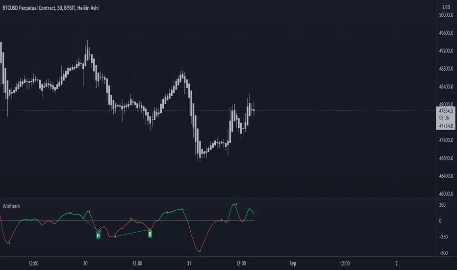
Indicator

5min MACD scalp by JoelThis strategy is inspired by a youtuber called Joel on Crypto. He trades this using Ema, MACD indicators and his own experience. For more information, check out his Best Crypto Scalping Strategy for the 5 Min Time Frame video. I have tried to automate this a little.
Long or Short trades are determined with a crossing of the fast Ema over the slow Ema for Long and the opposite for Short. Trades should only happen close to the crossovers. Then for Long we use the MACD indicator with a 1min TF (I had better results using the 5min) where we look for high peaks in negative values for Long and vice versa for Shorts. These should be significantly higher than other peaks (or if you will lower peaks for a Long).
Hence, the key is to detect high peaks on the histogram, which I try to achieve by checking if the last 2 values were higher than X bars back. If you want to make it even more specific, then you can turn on the additional checkbox which compares the current value to the average value of X bars back, and if it is greater than, say, 50% the value of the average (= 1.5x the average), then it's ok for the trade.
I also noticed that the strategy often bought at the top or bottom, so I added a check that compares whether the last evaluated bar is the first rising bar (for Long) or falling bar (for Short). This can be turned on or off.
Target profit 0,5% and stop loss 0,4% are based on his recommendation. The strategy is set to take only 1 trade at a time , and you can have a back tester table on.
I'm still a pine script beginner, so the strategy is certainly not perfect and could be improved. If you have any tips on how to improve it further, please let me know. I will try to update it when I have time.
I would also like to thank Joel on Crypto for sharing the strategy and @ZenAndTheArtOfTrading for his great library and code (thanks to him we have a back tester table in here), but especially his educational videos on youtube, which taught me a lot about pine script.
Strategy

Indicator

Indicator

Strategy

Strategy

Indicator

Indicator

Indicator

Indicator

Indicator

Indicator

Indicator

MACD PlusMoving Average Convergence Divergence – MACD
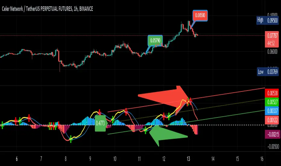
The MACD is an extremely popular indicator used in technical analysis. It can be used to identify aspects of a security's overall trend. Most notably these aspects are momentum, as well as trend direction and duration. What makes the MACD so informative is that it is actually the combination of two different types of indicators. First, the MACD employs two Moving Averages of varying lengths (which are lagging indicators) to identify trend direction and duration. Then, it takes the difference in values between those two Moving Averages (MACD Line) and an EMA of those Moving Averages (Signal Line) and plots that difference between the two lines as a histogram which oscillates above and below a center Zero Line. The histogram is used as a good indication of a security's momentum.
Added Color Plots to Settings Pane.
Switched MTF Logic to turn ON/OFF automatically w/ TradingView's Built in Feature.
Added Ability to Turn ON/OFF Show MacD & Signal Line.
Added Ability to Turn ON/OFF Show Histogram.
Added Ability to Change MACD Line Colors Based on Trend.
Added Ability to Highlight Price Bars Based on Trend.
Added Alerts to Settings Pane.
Customized Alerts to Show Symbol, TimeFrame, Closing Price, MACD Crosses Up & MACD Crosses Down Signals in Alert.
Alerts are Pre-Set to only Alert on Bar Close.
Added ability to show Dots when MACD Crosses.
Added Ability to Change Plot Widths in Settings Pane.
Added in Alert Feature where Cross Up if above 0 or cross down if below 0 (OFF By Default).
Squeeze Pro
Traditionally, John Carter's version uses 20 period SMAs as the basis lines on both the BB and the KC.
In this version, I've given the freedom to change this and try out different types of moving averages.
The original squeeze indicator had only one Squeeze setting, though this new one has three.
The gray dot Squeeze, call it a "low squeeze" or an "early squeeze" - this is the easiest Squeeze to form based on its settings.
The orange dot Squeeze is the original from the first Squeeze indicator.
And finally, the yellow dot squeeze, call it a "high squeeze" or "power squeeze" - is the most difficult to form and suggests price is under extreme levels of compression.
Colored Directional Movement Index (CDMI) , a custom interpretation of J. Welles Wilder’s Directional Movement Index (DMI), where :
DMI is a collection of three separate indicators ( ADX , +DI , -DI ) combined into one and measures the trend’s strength as well as its direction
CDMI is a custom interpretation of DMI which presents ( ADX , +DI , -DI ) with a color scale - representing the trend’s strength, color density - representing momentum/slope of the trend’s strength, and triangle up/down shapes - representing the trend’s direction. CDMI provides all the information in a single line with colored triangle shapes plotted on the bottom. DMI can provide quality information and even trading signals but it is not an easy indicator to master, whereus CDMI simplifies its usage. The CDMI adds additional insight of verifying/confirming the trend as well as its strength
Label :
Displaying the trend strength and direction
Displaying adx and di+/di- values
Displaying adx's momentum (growing or falling)
Where tooltip label describes "howto read colored dmi line"
Ability to display historical values of DMI readings displayed in the label.
Added "Expert Trend Locator - XTL"
The XTL was developed by Tom Joseph (in his book Applying Technical Analysis ) to identify major trends, similar to Elliott Wave 3 type swings.
Blue bars are bullish and indicate a potential upwards impulse.
Red bars are bearish and indicate a potential downwards impulse.
White bars indicate no trend is detected at the moment.
Added "Williams Vix Fix" signal. The Vix is one of the most reliable indicators in history for finding market bottoms. The Williams Vix Fix is simply a code from Larry Williams creating almost identical results for creating the same ability the Vix has to all assets.
The VIX has always been much better at signaling bottoms than tops. Simple reason is when market falls retail traders panic and increase volatility , and professionals come in and capitalize on the situation. At market tops there is no one panicking... just liquidity drying up.
The FE green triangles are "Filtered Entries"
The AE green triangles are "Aggressive Filtered Entries" Indicator

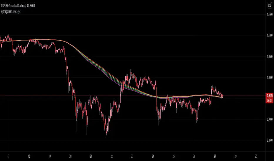
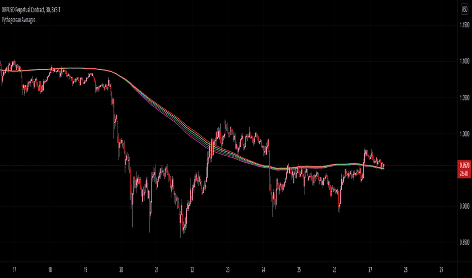
Pythagorean Moving Averages (and more)When you think of the question "take the mean of this dataset", you'd normally think of using the arithmetic mean because usually the norm is equal to 1; however, there are an infinite number of other types of means depending on the function norm (p).
Pythagoras' is credited for the main types of means: his harmonic mean, his geometric mean, and his arithmetic mean:
Harmonic Average (p = -1):
- Take the reciprocal of all the numbers in the dataset, add them all together, divide by the amount of numbers added together, then take the reciprocal of the final answer.
Geometric Average (p = 0):
- Multiply all the numbers in the dataset, then take the nth root where n is equal to the amount of number you multiplied together.
Arithmetic Mean (p = 1):
- Add all the numbers in the dataset, then divide by the amount of numbers you added by.
A couple other means included in this script were the quadratic mean (p = 2) and the cubic mean (p = 3).
Quadratic Mean (p = 2):
- Square every number in the dataset, then divide by the amount of numbers your added by, then take the square root.
Cubic Mean (p = 3):
- Cube every number in the dataset, then divide by the amount of numbers you added by, then take the cube root.
There are an infinite number of means for every scenario of p, but they begin to follow a pattern after p = 3.
Read more:
www.cs.uni.edu
en.wikipedia.org
en.wikipedia.org
Note : I added the functions for the quadratic mean and cubic mean, but since market charts don't have those types of graphs, the functions don't usually work. It's the same reason why sometimes you'll see the harmonic average not working.
Disclaimer : This is not financial or mathematical advice, please look for someone certified before making any decisions. Indicator
MACD AdvancedHello traders!
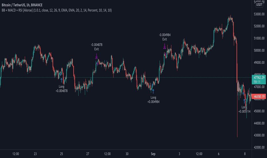
As you know, MACD is one of the oldest and the most popular indicators for trading. It seems to be a «Hello world indicator» of most technical analysis beginners. It’s easy to interpret and rather useful for many styles of trading. There are many arguments about its accuracy but in my opinion, this indicator can show very good results. However, you should squeeze every drop of its opportunities and we'll help you with it. We invented this script to make the lives of both professionals and freshmen easier.
Our new indicator uses all the opportunities that MACD gives. It takes into consideration divergencies, crossovers, the MACD, and signal line location. It seems to be rather difficult to take into consideration all MACD signals when you don’t use algorithmic trading, but it’ll be trivial using our script. We have integrated some innovations that’ll make traders’ staff easier. As you know, the crossover is considered to be a false signal in conjunction with hidden divergence which predicts another movement. Thus, we catch all types of divergencies and if it’s hidden of another «value» we skip it. However, if there's a crossover with bullish divergence or cross under with bearish, the signal seems to be strong and accurate. In this case, divergence is playing for us and makes the point of entrance more trustable. Our script takes into consideration this case and the innovative divergence chaser doesn’t give any mistakes. Moreover, if crossover takes place above zero line and crosses under bellow it, these signals are considered to be false too. It’s a trivial task comparing with the previous, thus it’s extremely simple for our script. We called it MACD Advanced cause it uses all the power of MACD with the power of invasive divergence chasers. The usage of it is trivial. Just add it to the chart, tune the parameters like MACD and tune the divergence chaser and get very accurate signals. We decided not to draw the bars to make signals more visible. It seems to be very nice!
I hope guys you'll enjoy it and it'll become a part of your trading staff.
Indicator

Strategy
Indicator
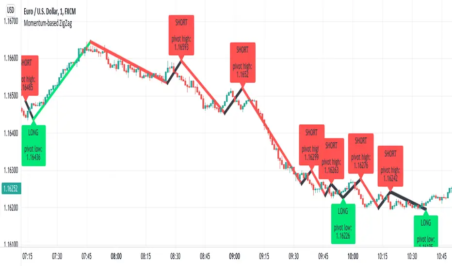
Momentum-based ZigZag (incl. QQE) NON-REPAINTINGI spent a lot of time searching for the best ZigZag indicator. Difficulty with all of them is that they are always betting on some pre-defined rules which identify or confirm pivot points. Usually it is time factor - pivot point gets confirmed after a particular number of candles. This methodology is probably the best when market is moving relatively slow, but when price starts chopping up and down, there is no way the ZigZag follows accurately. On the other hand if you set it too tight (for example pivot confirmation after only 2 or even 1 candle), you will get hundreds of zigzag lines and they will tell you nothing.
My point of view is to follow the market. If it has reversed, then it has reversed, and there is no need to wait pre-defined number of candles for the confirmation. Such reversals will always be visible on momentum indicators, such as the most popular MACD. But a single-line moving average can be also good enough to notice reversals. Or my favourite one - QQE, which I borrowed (and improved) from JustUncleL, who borrowed it from Glaz, who borrowed it from... I don't even know where Quantitative Qualitative Estimation originates from. Thanks to all these guys for their input and code.
So whichever momentum indicator you choose - yes, there is a pick-your-poison-type selector as in in-famous Moving Average indicators - once it reverses, a highest (or lowest) point from the impulse is caught and ZigZag gets printed.
One thing I need to emphasize. This indicator DOES NOT REPAINT. It might look like the lines are a bit delayed, especially when compared to all the other ZigZag indicators on TradingView, but they are actually TRUE. There is a value in this - my indicator prints pivot points and Zigzag exactly on the moment they have been noticed, not earlier faking to be faster than they could be.
As a bonus, the indicator marks which impulse had strength in it. It is very nice to see a progressing impulse, but without force - a very likely that reversal on a bigger move is happening.
I'm about to publish some more scripts based on this ZigZag algo, so follow me on TradingView to get notified.
Enjoy! Indicator

Strategy

Strategy

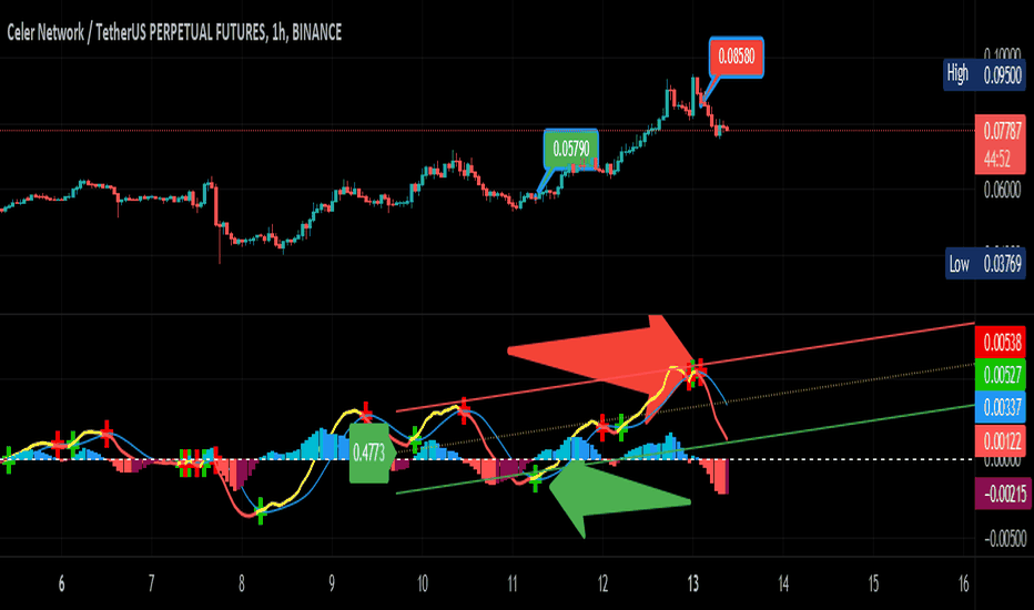
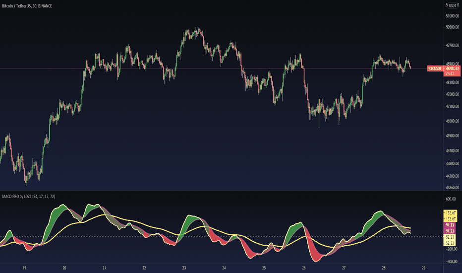
MACD PRO by LDZ1LANDZZ1 MACD Pro was developed to show the first signs of reversal, direction, and also trend strength.
Unlike normal MACD, this indicator has 3 lines as information. A white line (short EMA), a purple line (sign), and a yellow line (long EMA).
The Purple Line "Signal" is a 17-period Exponential Moving Average.
The White Line "Short EMA" is a 34-period Exponential Moving Average.
The Yellow Line "Long EMA" is a 72-Period Exponential Moving Average.
When the background color turns green it indicates that we are above 0 (positive trend) and above the Signal line (positive trend)
When the background color turns Yellow it indicates that we are above 0 (positive trend) but below the Signal line (Indicating Attention to a possible trend reversal or price correction)
When the background color turns Red it indicates that we are below 0 (negative trend) and below the Signal line (negative trend)
When the background color turns Orange it indicates that we are below 0 (negative trend) and above the signal line (Indicating attention to a possible trend reversal or price correction)
The Yellow line is like a watershed, when the White Line "Short EMA" crosses above or below it, it indicates that a stronger price movement may occur.
Tip:
Only enter Long Positions when the background color turns green and the Short EMA (White line) is above the yellow line and/or the white dotted horizontal line.
Only enter Short Positions when the background color turns red and the Long EMA (Yellow line) is below the white dotted horizontal line.
Note the difference of MACD Pro by LANDZZ1 as the traditional MACD.
----------------------------------------------------------
Description in Portuguese-BR
MACD Pro by LANDZZ1 foi desenvolvido para mostrar os primeiros sinais de reversão, direção e também força da tendência.
Diferente do MACD normal, este indicador tem como informação 3 linhas. Uma linha branca (short EMA), uma linha roxa(signal) e uma linha amarela (long EMA).
A Linha Roxa "Signal" é uma Média Móvel Exponencial de 17 períodos.
A Linha branca "Short EMA" é uma Média Móvel Exponencial de 34 períodos.
A Linha Amarela "Long EMA" é uma Média Móvel Exponencial de 72 Períodos.
Quando a cor de fundo ficar verde indica que estamos acima de 0 (tendência positiva) e acima da linha de Sinal (tendência positiva)
Quando a cor de fundo ficar Amarelo indica que estamos acima de 0 (tendência positiva) porém abaixo da linha de Sinal (Indicando Atenção a uma possível reversão de tendência ou correção de preço)
Quando a cor de fundo ficar vermelho indica que estamos abaixo de 0 (tendência negativa) e abaixo da linha de Sinal (tendência negativa)
Quando a cor de fundo ficar laranja indica que estamos abaixo de 0 (tendência negativa) e acima da linha de sinal (Indicando atenção a uma possível reversão de tendência ou correção do preço)
A linha amarela é como um divisor de águas, quando a linha branca (Short EMA) cruza para cima ou para baixo dela, indica que um movimento mais forte forte de preço poderá ocorrer.
Dica:
Apenas entre em Long Positions quando a cor de fundo ficar verde e se a Short EMA (linha Branca) estiver acima da linha amarela e/ou da linha horizontal pontilhada branca.
Apenas entre em Short Positions quando a cor de fundo ficar Vermelha e se a Long EMA (linha Amarela) estiver abaixo da linha horizontal pontilhada branca.
Repare a diferença do MACD Pro by LANDZZ1 como o MACD tradicional.
Indicator
Indicator