This is the Paid Space by CarusoInsights. You now can get access to their paid content directly on TradingView. Learn more about Paid Spaces (CF|360) Caruso Financial Dashboard The Caruso Financial 360 Dashboard (CF|360) revolutionizes your TradingView charts by seamlessly integrating comprehensive Fundamental, Statistical, Technical, Performance, and Event information into an intuitively organized dashboard. This empowers users to make informed investment decisions effortlessly, eliminating the need to switch between pages or applications.
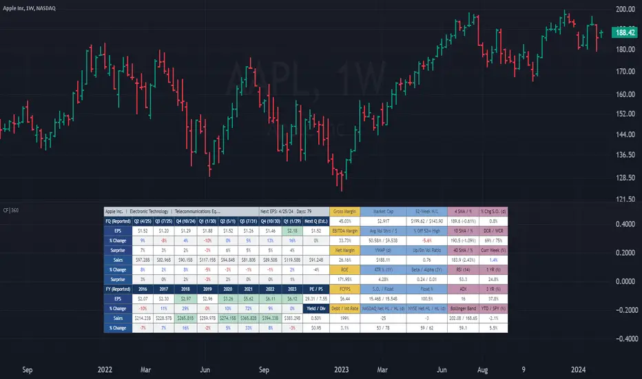
The dashboard is strategically divided into five distinct sections, each color-coded for user-friendly navigation. A quick glance at the dark blue "Fundamentals" table reveals two years of quarterly EPS and Sales data, YoY % change, and Surprise %, complete with report dates. Users can explore eight years of annual data and choose between Non-GAAP EPS, Diluted EPS, and Basic EPS for versatile analysis. Opting for Non-GAAP EPS also unveils next quarter estimates. The Fundamentals section further encompasses P/E and P/S data, alongside TTM dividend and dividend yield information.
In the yellow "Extended Fundamentals" section, users gain insights into Gross, EBITDA, and Net margins for easy profitability comparisons within the same industry group. Return on Equity data and Free Cashflow per share provide perspectives on profitability, efficiency, and financial flexibility.
The light blue "Statistics" section furnishes essential statistical measures for a rapid grasp of a company's trading characteristics. Metrics such as Market Cap, Average Volume per day (Shares and $ value), VWAP, Up/Down volume ratio, ATR%, Alpha, Beta, Shares Outstanding & Float, 52-week High/Low, and % distance from the 52-week high are presented. Additionally, market breadth is depicted through Nasdaq and NYSE 52-week high/low data.
The purple "Technical & Performance" section seamlessly integrates both Technical Analysis data and Performance statistics, enabling users to assess the stock's technical context and performance against the market over different periods. Technical indicators, including three customizable moving average types, RSI, ADX, Bollinger Band, Keltner Band, and daily and weekly closing ranges, are featured.
The grey top "Events" section offers a quick overview of the next earnings release date, countdown, and associated color changes as the date approaches. Company name, sector, and industry details are also presented.
To enhance information visibility, record EPS and Sales data are highlighted, emphasizing new records, along with highlights for new 52-week highs and lows.
The CF|360 offers customization options , including three display styles for Desktops, Desktop Slim, and Mobile devices.
Users can also tailor the lengths of technical indicators to suit their preferences. International market enthusiasts will appreciate that the CF|360 provides financial and market data for various regions, including the US, EU, Canada, and beyond.
88 Metrics Included:
Fundamentals Section (Dark Blue Group)
EPS (Adjusted Non-GAAP, Diluted, Basic)
- Quarterly, YoY % Chg, Surprise, Report Date, Next Quarter Estimate (Adjusted EPS only)
- Annual, YoY % Chg
Sales
- Quarterly, YoY % Chg, Surprise, Report Date, Next Quarter Estimate
- Annual, YoY % Chg
P/E ratio
P/S ratio
Dividend TTM
Dividend TTM Yield
Fundamentals Extended (Yellow Group)
Gross Margin
EBITDA Margin
Net Margin
Return on Equity (ROE)
Free Cashflow per Share (FCFPS)
Debt to Equity (Debt)
Effective Interest Rate (Int Rate)
Statistics (Light Blue Group)
Market Cap
Average Daily Volume (Shares)
Average Daily Volume (Dollar Value)
VWAP (Daily)
Average True Range Percent
Shares Outstanding
Shares in Float
Percentage of Share in Float
52-Week High
52-Week Low
% off of 52-Week High
Up / Down Volume Ratio
Beta
Alpha
Nasdaq Net 52-Week High/Lows
Nasdaq 52-Week Highs
Nasdaq 52-Week Lows
NYSE Net 52-Week High/Lows
NYSE 52-Week Highs
NYSE 52-Week Lows
Technical & Performance (Purple Group)
Moving Average Value (3 different averages)
Distance from Moving Average (3 different averages)
Relative Strength Index (RSI)
Average Directional Index (ADX)
Bollinger Band Value (Upper/Lower)
%b
Keltner Band Value (Upper/Lower)
%k
Percentage Changes Since Today’s Open
Daily Closing Range (DCR)
Weekly Closing Range (WCR)
Current Week % Change
1 Month % Change
3 Month % Change
6 Month % Change
1 Year % Change
3 Year % Change
YTD % Change
S&P 500 YTD % Change
Name, Group, & Events (Grey Section)
Company Name
Sector
Industry
Next Earnings Date
Days Until Next Earnings Date
Event Highlights
Record EPS (Quarterly/Annual)
Record Sales (Quarterly/Annual)
52-Week High
52-Week Low
Layout Types
Desktop
Get the full experience with the Desktop view.
Desktop Slim
Save screen real estate with a slim version of the dashboard.
Mobile
Take the most vital metrics with you on your mobile device. For the best experience, view in landscape mode.
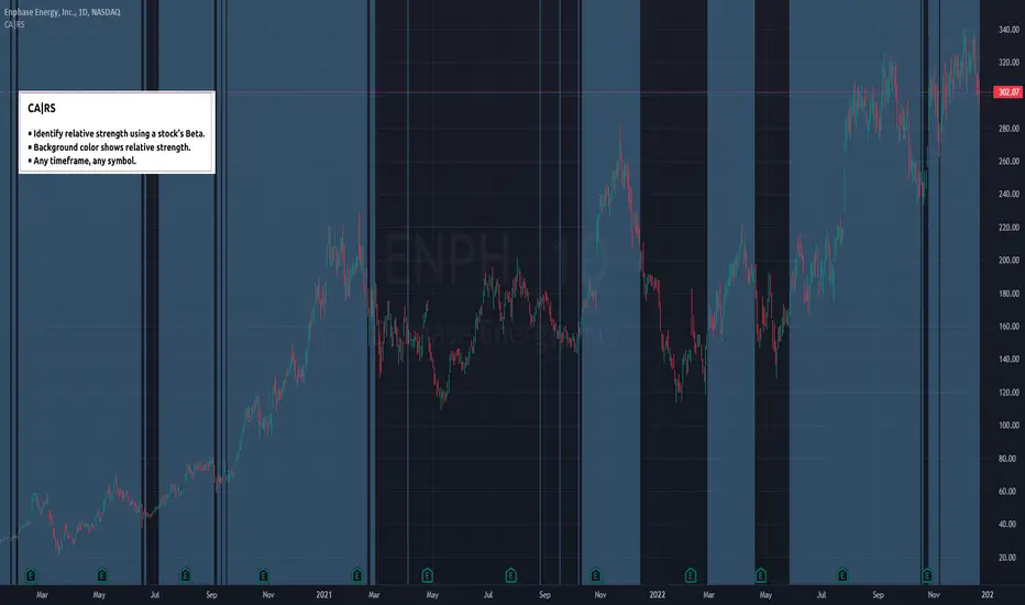
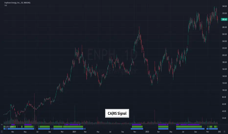
(CA|RS) Caruso Adaptive Relative Strength Caruso Adaptive Relative Strength helps an investor identify when a stock is performing better than an index on a relative basis. Going beyond traditional Relative Strength(RS) methods, CARS uses a stock's Beta to determine when Relative Strength is present when adjusting for the individual stock's volatility and correlation to its benchmark. Therefore, it allows investors to not only visualize if a stock is outperforming an index but rather if it is outperforming when considering the stock's Beta. This allows Relative Strength to be more easily viewed in lower volatility equities as well as ETFs, Commodities, and alternative assets. To be as effective as possible, I have built CARS to be an RS composite, and it factors in RS from different time periods in making its calculation.
To make the application as simple as possible, I designed CARS to change the background of the chart to blue when Relative Strength is identified. You also have the option to display a box around the data or plot symbols along the bottom of the chart to best suit your visual need. CARS access comes with CARS Signal access which is a separate indicator that plots below the price chart. It provides greater insight into the robustness of the CARS signal by displaying how many core internal components of CARS are displaying RS.
Importantly, you can also change which index or symbol you would like to use for comparison purposes. I have the default set to the S&P 500, but you can use any index, ETF, or security for comparison.
CARS is also adaptable to any time frame.
The greatest benefit in identifying Relative Strength is to discover which stocks are outperforming an index, therefore are undergoing accumulation. It is important to then time your entry into the stock when the price confirms. If an investor is seeking absolute price gains, then this last point of timing an entry is critical because a stock can outperform an index yet still fall - albeit less than the index.
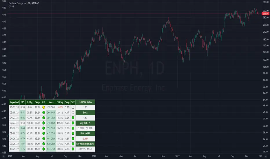
(CF|DB) Caruso Financial Dashboard The Caruso Financial Dashboard brings a rich amount of company financial data straight to your TradingView chart along with additional vital stock-related information. At a glance, you can see EPS (Diluted), Sales, growth rates, and EPS/Sales surprises either quarter by quarter on the daily chart or for Fiscal Years on the weekly chart.
On the daily chart, the financial table also has helpful highlights to visually display if a quarter’s EPS or Sales are higher than the same quarter a year ago. Also, EPS and Sales data has a helpful green shading when a new record high number has been achieved for the metric. Additional stock-based metrics include the stock’s Up/Down volume ratio, Beta, Average Daily Volume in terms of shares traded or dollar value traded, the percentage distance to a moving average of choice, as well as the stock’s 52-week high and low.
The weekly chart shows financial data for fiscal years. It also has additional stock-based metrics from those available on the daily chart. These include; Market Cap, Shares in Float and the Float as a percentage of all shares outstanding, the distance from the stock’s 52-week high, the distance to a moving average of choice (10 sma by default), the P/E and P/S ratios.
To further help an investor understand a company’s growth rates, the CF|DB allows a user to hide all or part of the table and plot EPS, EPS TTM (Trailing Twelve Months), and Sales TTM lines on the chart. This can be applied to either the daily or weekly chart.
The CF|DB provides financial and market data for international markets (US, EU, Canada, Australia, Hong Kong, Japan, and more), making its applicability global.
Features On Daily Chart
· Quarterly EPS
· Quarterly EPS growth rate YoY
· Quarterly EPS Surprise vs consensus estimate
· Quarterly Sales
· Quarterly Sales growth rate YoY
· Quarterly Sales Surprise vs consensus estimate
· Green/Red dot highlighting YoY growth or decline
· EPS/Sales green highlight for 8 quarter high or record high numbers
· Up/Down Volume Ratio
· Beta
· Average Daily Volume (shares trade). Period for the average can be configured
· Average Daily Volume (dollar value traded). Period for the average can be configured
· Distance to a moving average. The average can be configured. 21 ema by default
· 52-week high and low
· New 52-week highs and lows are highlighted by a red or green box shading
· Ability to plot EPS, EPS TTM, Sales lines
· Ability to hide part or all of the financial data table
Features On Weekly Chart
· FY EPS
· FY EPS growth rate YoY
· FY EPS Surprise vs consensus estimate
· FY Sales
· FY Sales growth rate YoY
· FY Sales Surprise vs consensus estimate
· EPS/Sales green highlight for 8-year high or record high numbers
· Market Cap
· Shares in float
· Share in float as a percentage of all shares outstanding
· Distance to new 52-week highs
· Distance to a moving average. The average can be configured. 10 sma by default
· Ability to plot EPS, EPS TTM, Sales lines
· Ability to hide part or all of the financial data table