Indicator
Indicator
STRONG S/R Lines/Zones MTF Only[EXPERIMENTAL] by Chaitu50cSTRONG S/R Lines / Zones (MTF Only) — EXPERIMENTAL by Chaitu50c
Overview
This indicator is a higher-timeframe based Support and Resistance detection system designed to project strong structural levels onto lower-timeframe charts without repainting. All calculations are performed exclusively on a selected higher timeframe (30-minute, 45-minute, or 1-hour), while the plotted levels adapt smoothly to the active chart timeframe. The main objective is to highlight price areas where strong institutional buying or selling pressure has already been confirmed on the higher timeframe.
Higher Timeframe Logic
The indicator operates strictly on confirmed higher-timeframe candles. It tracks completed higher-timeframe bars and evaluates their open, high, low, and close values only after the candle is fully closed. This ensures that every detected support or resistance level is final and will not shift or repaint during live market conditions.
Resistance Detection
Resistance levels are identified when bearish price action appears after bullish structure on the higher timeframe. The logic looks for either a two-candle or three-candle sequence where selling pressure becomes dominant and price closes below important prior lows. Once such a sequence is confirmed, the resistance area is constructed using a combination of wick highs and candle body highs from the triggering higher-timeframe candles. This defines a realistic supply zone rather than a thin, arbitrary line.
Support Detection
Support levels are detected using the opposite logic. When bullish price action emerges after bearish structure and the higher-timeframe candle closes above key prior highs, the indicator interprets this as strong buying acceptance. The support area is formed using wick lows and candle body lows from the relevant higher-timeframe candles, capturing the price region where demand clearly outweighed supply.
Strength and Overlap Handling
When newly detected support or resistance levels overlap with existing ones, the indicator does not create additional zones. Instead, it strengthens the existing level internally. Each overlap increases the strength count of that level, which is visually represented through increased line thickness or adjusted opacity. This allows strong, repeatedly respected levels to stand out naturally while keeping the chart uncluttered.
Line Mode vs Zone Mode
Users can choose whether levels are plotted as single horizontal lines or as full price zones. Line mode provides precise levels suitable for scalping and exact reaction entries. Zone mode displays the complete price range where rejection or acceptance occurred, which is useful for managing volatility and broader structure analysis. Both modes use identical detection logic; only the visual representation changes.
Zone and Line Extension Control
The “Number of Past Zones to Extend” option controls how many previously detected support and resistance levels remain visible and extended into the future. A value of zero extends only the most recent support and resistance, keeping the chart minimal. Higher values preserve additional historical higher-timeframe levels that may still influence current price action.
Visual Customization
Line appearance can be customized using user-defined colors, styles, and base widths. These settings define how new levels initially appear on the chart. As levels gain strength through repeated confirmations, the indicator automatically adjusts visual properties to reflect their growing importance, without requiring manual changes.
Non-Repainting Behavior
All higher-timeframe data is requested with lookahead disabled. This guarantees that every level is drawn only after the higher-timeframe candle has fully closed. Once a support or resistance level appears, it remains fixed and reliable for live trading, backtesting, and replay analysis.
Practical Usage
This indicator is intended to be used as a structural reference rather than a standalone buy or sell signal. It is most effective when combined with price action confirmation, volume analysis, or lower-timeframe entry techniques. The tool excels at identifying high-probability reaction zones, pullback areas, and major breakout levels derived from higher-timeframe structure.
Final Notes
This indicator is marked as experimental and is designed for traders who understand higher-timeframe structure and contextual analysis. When used correctly, it provides a clean, non-repainting view of strong support and resistance levels that align lower-timeframe decisions with higher-timeframe intent. Indicator

Failed 2 Evaluator v2.2-Failed 2 Evaluator & Continuation EngineDescription:
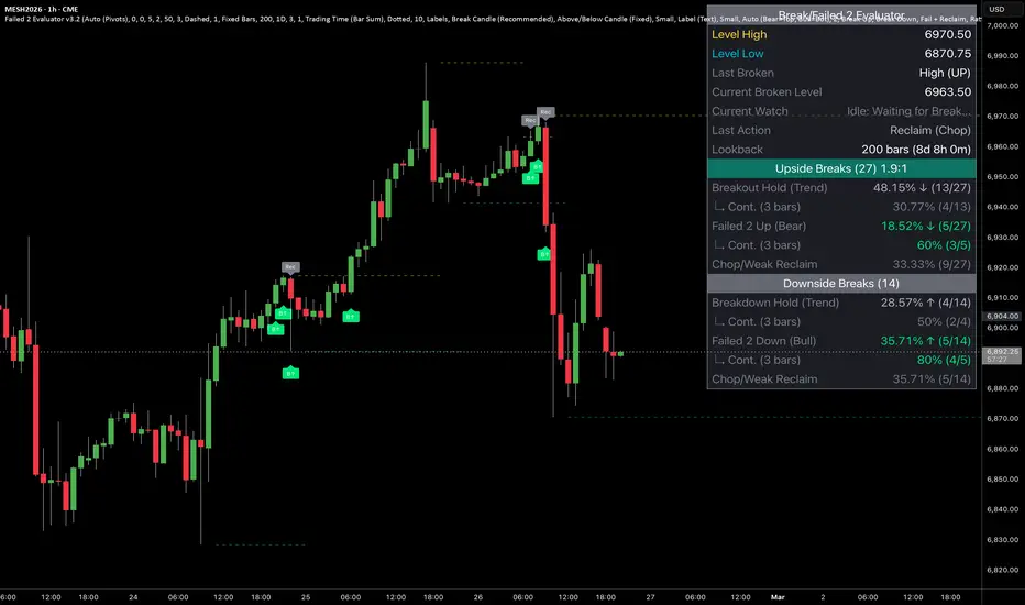
The Failed 2 Evaluator & Continuation Engine is an objective price-action analysis tool designed to categorize, visualize, and statistically track how Failed 2 candles behave when interacting with key market levels.
This indicator evaluates whether a breach of a level results in price expansion, choppy price action, or a strict structural failure (a "Failed 2" in Strat terminology), providing traders with a quantitative view of historical follow-through.
How It Is Calculated
The script operates in three distinct phases:
1. Level Generation & Trigger
The indicator establishes boundaries using either auto-calculated Pivot Highs/Lows (with user-defined left/right lengths) or manually inputted price levels. The evaluation sequence is triggered the moment a candle's total range (wick) physically breaches one of these active levels.
2. Strict Outcome Evaluation (On Close)
Once the triggering candle closes, the script strictly categorizes the outcome into one of three buckets:
Breakout/Breakdown Expansion: The candle successfully closes outside the breached level, indicating a continuation of the break.
Strict Failed 2 (F2U / F2D): The candle breaches the level but immediately reverses, failing to hold the extreme. To qualify as a true Failed 2, the script enforces a strict structural rule: the candle must close back inside the level and must be a directional reversal candle (e.g., an F2U requires the close to be below the level and below its own open).
Neutral Reclaim (Chop): The candle breaches the level and falls back inside, but fails the strict color/directional logic of a true Failed 2.
3. The Continuation Engine
When a strict Failed 2 is confirmed, the script activates a forward-looking continuation tracker. It records the closing price of the Failed 2 candle and waits a user-defined number of bars (e.g., 3 bars). It then checks if the price at that future bar successfully continued in the direction of the reversal, logging the historical frequency of structural follow-through.
Dashboard Features & Chart Visuals
Real-Time Watcher: A dynamic table row alerts the user when a live, unconfirmed candle is actively testing a level, prompting observation for either a Continuation or a Failed 2.
Historical Distribution: The dashboard calculates the exact percentage breakdown of Expansions, True Failed 2s, and Chop over a user-defined lookback window.
Chart Markers: Clean, unobtrusive visual tags pinpoint exactly where Breaks (B↑/B↓) and True Reversals (F2U/F2D) occurred on the chart for easy visual backtesting.
Analytical Purpose
The primary benefit of this tool is the removal of emotional bias and subjectivity from "false breakout" analysis. By rigidly defining what constitutes a failed move and statistically tracking its historical continuation rate, this indicator allows analysts to quantify an asset's unique behavior at range extremes. It transforms abstract price action theories into measurable, observable data. Indicator

Prev day High, Low, Close + continuing trend
📊 Yesterday's Levels: Market Strength and Sentiment (HLC)
This indicator is designed for intraday traders who need to quickly identify the previous day's key levels (High, Low, and Close) and, most importantly, understand the sentiment of the previous session at a glance.
🔍 What does this indicator do?
Unlike other “Daily High/Low” indicators, this tool cleans up historical noise and pre-market gapping to provide a purist view of the regular session.
Real Static Levels: Draws the YHP (Yesterday's High Price), YLP (Yesterday's Low Price), and YCP (Yesterday's Close Price).
No “Steps”: Lines only appear in the current session and start exactly at the market open (RTH), eliminating annoying pre-market tails.
Thirds Strength Analysis: Applies an algorithmic rule based on the location of the close relative to the previous day's total range:
Green Shading (Bullish Strength): If the price closed in the upper third of the range (dominant buying pressure).
Red Shading (Bearish Strength): If the price closed in the lower third of the range (dominant selling pressure).
No color: If the close was neutral (in the middle third).
### 💡 How to use it?
* **Trend Continuity**: If you see green shading and the price opens above the PDC, buyers are in control.
* **Reaction Levels**: The PDH and PDL act as natural support and resistance levels where institutions tend to make decisions.
* **Session Filter**: Ideal for avoiding “traps” during the pre-market, as the indicator only activates when real liquidity begins.
### 🛠 Technical Features
* **Optimized for MSTR and volatile assets**: Filters weekend gaps to maintain data accuracy.
* **Dynamic Tags**: Level names automatically scroll to the right so as not to obstruct the candles.
* **Clean Code**: Written in Pine Script v5 with corrected `lookahead` logic to avoid repainting.
Indicator

Neural SR [BeNice]Neural SR — Description
Neural SR is an advanced support and resistance indicator that automatically detects, manages, and visualizes pivot-based price levels derived from multiple timeframes. Beyond simple line plotting, the indicator evaluates the quality and relevance of each level by analyzing price interaction behavior such as touches, reactions, and retests, and dynamically filters the results accordingly.
Core Methodology
• Generates support and resistance levels from pivot highs and pivot lows
• Supports dual higher-timeframe (HTF) analysis within a single chart
• Scores levels based on real market interaction instead of static occurrence counts
• Reduces noise through cluster merging of nearby levels
• Optionally visualizes levels as zones rather than single price lines
Key Features
1) Dual Timeframe Support (TF1 + TF2)
The indicator allows two independent higher timeframes to be displayed simultaneously, enabling users to monitor both local and major structural levels in one environment.
Each timeframe includes independent controls for:
• Pivot sensitivity (left/right bars)
• Maximum number of levels
• Color, width, and style
• Line extension behavior
2) Adaptive Touch Detection (Wick / Body / Wick+Body)
Users can define how price interaction with a level is interpreted:
• Wick only
• Candle body only
• Combined wick and body
Tolerance can be controlled using ATR-based or tick-based deviation, ensuring consistent behavior across instruments with different volatility characteristics.
3) Strength Scoring Engine
Instead of treating all levels equally, the indicator computes a strength score based on market behavior:
• Number of touches (from above and below)
• Measured reactions after contact within a defined window
• Break and retest occurrences
• Cluster merge density
This score dynamically controls:
• Line thickness
• Transparency (visual prominence)
Weak levels can be automatically filtered using configurable thresholds.
4) Break & Retest Detection
An optional module tracks confirmed breaks and subsequent retests within a configurable time window. When a valid retest occurs, the indicator marks it directly on the chart, providing contextual confirmation of structural shifts.
ATR-based buffers can be applied to define break validity.
5) Zone Mode
Levels can be displayed as price zones instead of single lines. Zone width can be derived from ATR or tick values, which is particularly useful in high-volatility environments where price interaction rarely occurs at an exact level.
6) Cluster Merge Logic
Nearby levels within a configurable tolerance are automatically merged into a single representative level. This approach:
• Reduces visual clutter
• Improves chart readability
• Highlights areas with higher structural significance
7) Volume and Range Filters (Optional)
Level generation can be filtered based on the conditions of the pivot bar:
• Volume Filter — Accept levels only if volume exceeds a moving average threshold
• Range Filter — Accept levels only if true range exceeds an ATR-based threshold
Differentiation
Neural SR differs from conventional support and resistance tools by focusing on behavior-driven validation rather than static level detection.
Key distinctions include:
• Dynamic strength modeling based on market interaction
• Automatic prominence adjustment to emphasize relevant levels
• Intelligent merging of overlapping levels to reduce noise
• Volatility-adaptive tolerance using ATR and tick scaling
• Integrated multi-timeframe architecture within a single indicator
Usage Notes
• Because the indicator is pivot-based, levels become confirmed only after pivot validation (left/right bar confirmation delay is expected)
• When filters and automatic strength thresholds are enabled, weaker levels may be intentionally hidden to maintain clarity
• This tool is designed for technical analysis support and should not be considered a standalone trading signal Indicator

Indicator

Indicator

Indicator

True Baseline Median SuperTrendTrue Baseline Median SuperTrend (TBM SuperTrend) | MisinkoMaster
True Baseline Median SuperTrend is a volatility-adaptive trend indicator designed to refine traditional SuperTrend logic by introducing a volatility-filtered baseline and median-based smoothing techniques.
Instead of relying on a fixed midpoint calculation, TBM SuperTrend dynamically constructs its baseline from structurally significant price observations, then applies layered median smoothing to reduce noise while preserving trend integrity.
The result is a cleaner, more stable trend-following tool that reacts to meaningful shifts in volatility and directional pressure without excessive whipsaws.
Core Philosophy
Most SuperTrend-style indicators anchor their bands to a simple price midpoint and apply an ATR-based offset. While effective, this approach can be overly sensitive during volatile consolidations.
TBM SuperTrend improves this structure by:
• Building a volatility-qualified baseline
• Filtering insignificant price movements
• Applying median smoothing instead of simple averaging
• Retaining ATR-based adaptive band distance
This creates a trend structure that prioritizes meaningful price expansion over random noise.
Key Features
Volatility-qualified baseline construction
Median-smoothed upper and lower bands
ATR-based adaptive volatility envelope
Dynamic trend state detection
Automatic candle coloring
Clear long and short transition labels
Reduced whipsaw behavior compared to standard SuperTrend
Works across intraday and higher timeframes
Designed for trend continuation and breakout frameworks
How It Works (Conceptual)
The indicator operates in three structural layers:
Volatility Measurement
Market volatility is assessed using an ATR-based structure.
Baseline Construction
Instead of averaging all recent prices, the script filters price samples based on volatility conditions. Only structurally relevant bars contribute to the baseline calculation. This ensures that the baseline reflects meaningful movement rather than passive drift.
Median Smoothing
Both the volatility-adjusted bands and the baseline structure undergo median smoothing. Median smoothing is less sensitive to outliers than standard averaging, which helps stabilize the trend line during erratic price spikes.
After the adaptive bands are constructed, price interaction with those bands determines directional bias:
• Price closing above the upper threshold confirms bullish trend state
• Price closing below the lower threshold confirms bearish trend state
Internal implementation details remain proprietary in the protected version.
Trend Logic Explained
Bullish State
When price maintains strength above the adaptive upper boundary, the indicator confirms a long bias. The trailing structure shifts beneath price, acting as dynamic support.
Bearish State
When price closes below the adaptive lower boundary, the indicator confirms a short bias. The trailing structure shifts above price, acting as dynamic resistance.
State transitions occur only when decisive boundary breaks happen, helping reduce false flips.
Visual Components
Trend Lines
Only the active directional band is displayed, reducing clutter and emphasizing current bias.
Shaded Volatility Zone
A filled region between price and the active band visually highlights trend dominance.
Long / Short Labels
Clear on-chart labels mark confirmed trend transitions.
Candle Coloring
Price candles automatically reflect current trend state for immediate visual recognition.
Inputs Overview
Source
Defines the price series used for baseline construction.
ATR Length
Controls the volatility lookback period.
True Baseline Length
Determines the window used for constructing the volatility-qualified baseline.
Factor
Adjusts the volatility multiplier that expands or contracts the adaptive bands.
Median Period
Controls the median smoothing strength applied to the bands.
Lower values increase responsiveness.
Higher values improve stability and reduce noise.
Why Median Smoothing Matters
Traditional smoothing methods (like EMA or SMA) can be distorted by sharp price spikes. Median-based smoothing reduces the impact of extreme values, making TBM SuperTrend particularly effective in:
• Crypto markets
• High-volatility equities
• News-driven instruments
• Lower timeframe trading
This improves structural consistency during sudden volatility expansions.
Best Use Cases
Trend-following systems
Breakout confirmation
Pullback entries within established trends
Trailing stop framework
Directional bias filtering
Volatility-adaptive strategy design
Parameter Tuning Guidance
Shorter ATR Length
→ Faster adaptation
→ More sensitivity
→ Suitable for intraday trading
Longer ATR Length
→ Smoother volatility structure
→ Better for swing trading
Higher Factor
→ Wider bands
→ Fewer signals
→ Stronger trend confirmation
Lower Factor
→ Tighter bands
→ Earlier entries
→ More reversals
Longer Median Period
→ Smoother band structure
→ Reduced whipsaws
Shorter Median Period
→ Faster reaction
→ More sensitivity to shifts
Practical Strategy Integration
Use TBM SuperTrend as:
• Primary directional filter
• Trailing stop mechanism
• Confirmation layer for breakout systems
• Bias alignment tool across multiple timeframes
It performs best when combined with momentum confirmation or volume expansion tools.
Summary
True Baseline Median SuperTrend enhances traditional SuperTrend logic by introducing volatility-qualified baseline construction and median smoothing for structural stability.
The result is a cleaner, more adaptive trend tool that prioritizes meaningful price movement while minimizing noise. It is well suited for traders seeking a disciplined, volatility-aware trend framework that remains robust across changing market conditions. Indicator

Prior Levels [crlmx] Previous Levels (prLevels) is a Multi-timeframe horizontal price level tool, presenting current/previous day, previous week and custom sessions with optional Initial Balance.
Key Features
- Offering: Open, High, Low, Mid levels on all timeframes
- On/off visibility toggle for sections and individual levels
- Optional price display labels
- Session presets: NYC, London, Asia
- Custom Session timeframes: 4H, 8H, 12H, Month
- Initial Balance: first-hour box with extending H/L reference lines
- Weekday-only session detection for accurate weekend display
- Streamlined input / UI brought to you by crlmx
Trading Applications
- Automated key previous levels for support and resistance read
- Disable unused sections to keep charts clean and reduce visual noise
- Track session-specific ranges for multi-session markets
- Use Initial Balance as directional reference for the day
- Combine with volume or momentum indicators to confirm level reactions
- Intraday Levels: Current Day + Previous Day | Chart: 1-15 min
- Swing Reference: Previous Day + Previous Week | Chart: 15 min - 1H
- Session Trading: Custom Session (NYC/LDN/Asia) + IB | Chart: 1-5 min
- Multi-Session: Stack multiple instances with different session presets
- Initial Balance: Works on 1-5 min charts and can resolve into S/Rs
- Previous Week: Levels for context on session breaks and failed auctions
Version History
- v0.47: Initial release
Indicator

Indicator

Indicator
Indicator

Sweep Scan Pro+ [BeNice]Sweep Scan Pro+ – Multi-Asset Liquidity Dashboard
Sweep Scan Pro+ is a professional Liquidity Surveillance Tool designed to track 8 different assets across 3 timeframes simultaneously. It instantly detects institutional liquidity raids, saving you from switching through dozens of charts manually and providing a bird's-eye view of the market.
💎 Key Features
8 Symbols & 3 Timeframes: Monitor up to 8 symbols (e.g., BTC, ETH, SOL) across 3 different timeframes (e.g., 15m, 1h, Daily) from a single master dashboard.
BreakOut vs. Deviation: Identify if price successfully held above a level ( BreakOut ) or just "poked" through to grab liquidity before reversing ( Deviation ). The panel updates in real-time.
Instant Raid Alerts: Receive dynamic notifications the moment any pair "Takes a High" or "Takes a Low," ensuring you never miss a high-probability institutional setup.
Fully Customizable UI: Complete control over table positioning, color schemes, text sizes, and custom labels to fit your personal chart aesthetic.
💡 How to Trade
Dashboard Scan: Identify a Deviation signal on a High Timeframe for your chosen asset on the board.
Verification: Switch to that specific chart to confirm the local reversal structure (SFP).
Execution: Enter trades based on institutional liquidity sweeps with precision and clear technical confirmation. Indicator

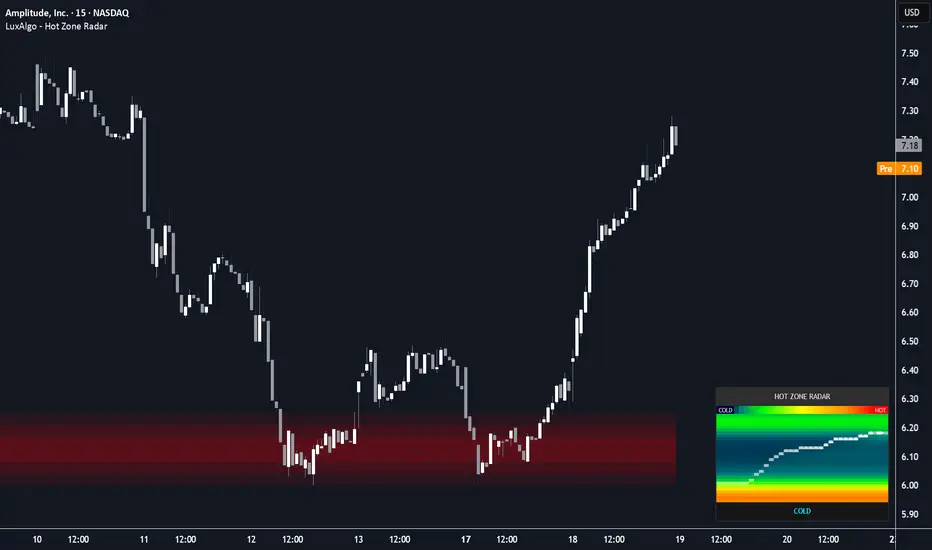
Hot Zone Radar [LuxAlgo]The Hot Zone Radar indicator is a sophisticated market liquidity visualization tool that combines a dynamic thermal heatmap dashboard with gradient-mapped support and resistance zones. It aims to provide traders with a real-time "weather map" of price density, identifying where the market is likely to find high-volume friction or low-volume "vacuum" gaps.
🔶 USAGE
The indicator features a dual-component interface: a high-resolution "Radar" dashboard and on-chart "Glow Zones."
The Radar Dashboard
The dashboard displays a historical matrix of volume distribution. Unlike a static volume profile, the radar shifts horizontally over time, allowing you to see how liquidity nodes have evolved.
Price Trace: The current price path is plotted directly onto the heatmap using a series of markers (●) ending in a "Current" pointer (▶). This allows you to see exactly where price is relative to historical "Hot" (High Volume) and "Cold" (Low Volume) zones. Color Scale: The heat map transitions from Deep Blue/Cyan (Cold/Low Liquidity) to Bright Red (Hot/High Liquidity). Market Status: A simplified status bar at the bottom provides immediate context: HOT: Price is currently oscillating within a major liquidity hub. WARM: Price is trending toward a high-volume area. COLD: Price is in a low-volume "vacuum," often associated with fast breakout movements. STABLE: Price is moving through neutral, average volume areas.
🔹 On-Chart Gradient S/R
The script automatically identifies the most significant "Hot Zones" from the profile and projects them onto the chart as gradient-filled boxes. These zones act as dynamic support and resistance. When price enters a zone, the gradient shifts color to indicate active interaction, signaling a potential reversal or consolidation point.
🔶 DETAILS
The core logic relies on a rolling Volume Profile engine that feeds into a 2D History Matrix.
Thermal Data Engine
The script calculates volume distribution across a user-defined price range (Resolution). As new bars form, the oldest volume data is "aged out," and the matrix shifts. This creates the horizontal flow effect in the radar, showing not just where volume is, but how long it has been sitting at those levels.
Diffusion Blur
To ensure the heatmap is readable and aesthetic, a "Diffusion Blur" algorithm is applied to the matrix. This smooths out jagged volume spikes into cohesive "thermal clouds," making it easier to identify significant structural zones versus noise.
🔶 SETTINGS
🔹 Radar Logic
Profile Lookback: The number of bars used to calculate the volume distribution. Resolution (Heatmap Grid): Controls the number of vertical bins and horizontal steps in the radar. Higher values provide more detail but require more processing. Diffusion Blur: Adjusts the smoothness of the heatmap colors. Intensity Gamma: Controls the sensitivity of the color gradient; lower values make "Hot" zones appear more easily.
🔹 Support/Resistance Zones
Show Gradient S/R Zones: Toggles the on-chart liquidity boxes. S/R Sensitivity %: Determines the volume threshold required to trigger a zone. Higher percentages show only the most intense liquidity hubs. Gradient Steps: Sets the number of layered boxes used to create the "glow" effect.
🔹 Dashboard Styling
Position: Choose between Top Right, Bottom Right, or Bottom Left. Overall Panel Size: Scales the entire UI (text and grid) to fit your screen resolution. Indicator

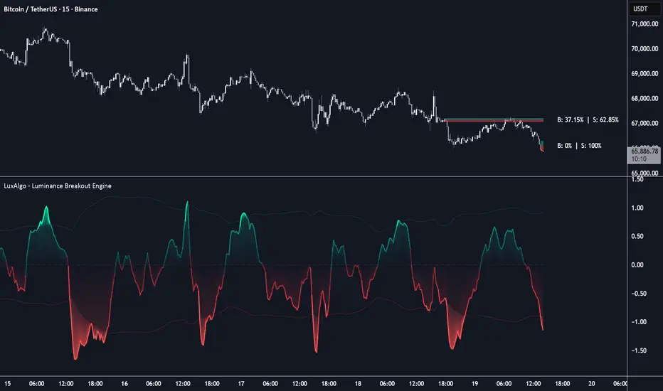
Luminance Breakout Engine [LuxAlgo]The Luminance Breakout Engine indicator is a high-performance momentum oscillator designed to identify institutional breakout zones and trend transitions through multi-timeframe analysis and adaptive volatility thresholds.
🔶 USAGE
The indicator functions as a comprehensive momentum "engine," mapping price velocity across four different timeframes into a single composite oscillator. It identifies high-probability breakout zones by monitoring when this composite momentum breaches adaptive volatility bands.
🔹 Luminance Glow Zones
When the oscillator enters the "Glow" zones (beyond the dotted thresholds), it indicates an extreme momentum breakout. These zones are often the precursor to sustained trends or significant institutional expansions. The oscillator changes color to a neon glow to highlight these high-intensity moves.
🔹 Institutional Order Blocks
At the exact moment a "Glow" breakout is triggered, the engine identifies the origin candle of that move and plots a Luminance Order Block (OB) on the price chart. These blocks represent areas where institutional liquidity was likely deployed to start the move.
🔹 Volume Breakdown Stats
Each Order Block features a unique "Volume Split" dashboard on the right edge. This provides a percentage-based breakdown of Bullish vs. Bearish volume during the five bars leading up to the breakout, helping traders understand the quality of the move's participation.
🔶 DETAILS
The script utilizes a weighted Composite Rate of Change (ROC) calculation across four periods (Fast, Medium, Slow, and Macro). This ensures that the oscillator only reaches extreme "Glow" levels when momentum is synchronized across multiple time-horizons.
The thresholds are not static; they use a standard deviation of the oscillator's own history to create an adaptive "envelope." This allows the indicator to remain sensitive during low-volatility periods while filtering out noise during highly volatile market conditions.
The Order Blocks remain active on the chart until "mitigated" (when a candle closes through the zone). Once mitigated, the internal volume data is cleared, and the zone becomes a dotted historical reference.
🔶 SETTINGS
🔹 Oscillator Settings
Fast/Medium/Slow/Macro Period: The lookback periods used for the multi-timeframe composite ROC calculation. Smoothing: The EMA length applied to the final oscillator to reduce noise.
🔹 Visual Settings
Threshold Multiplier: Controls the sensitivity of the breakout "Glow" zones. Higher values require more extreme momentum to trigger. Show Base Heatmap: Toggles the gradient fill between the zero line and the signal. Show Threshold Glow: Toggles the neon fills that appear during volatility breakouts.
🔹 Order Blocks
Show Luminance OBs: Enables the plotting of institutional zones on the price chart. Max OBs per Side: Limits the number of active/historical zones to keep the chart clean. Show Volume Stats: Toggles the B:XX% ┃ S:YY% volume breakdown labels. Label Offset: Shifts the statistics labels to the right to prevent overlap with price action. Label Size: Adjusts the text size of the volume statistics (Tiny, Small, Normal, Large).
🔹 Color Settings
Momentum Colors: Sets the primary colors for bullish and bearish trends. Glow Colors: Sets the high-intensity colors used during breakout phases. Zero Line Color: Customizes the appearance of the central equilibrium line. Indicator

Indicator

Mean Deviation Trend [BackQuant]Mean Deviation Trend
Overview
Mean Deviation Trend is a structure-based trend and regime indicator that measures directional pressure as the market’s sustained deviation from a moving “mean,” then uses that pressure to drive an adaptive band , dynamic coloring, and a level engine that marks deviation peak extremes after momentum fades.
Most trend tools start with direction, for example slope or MA cross, then try to estimate strength later. This script does the reverse:
It first quantifies how far price is displaced from a central mean in volatility-adjusted units .
It then smooths and accumulates that deviation to determine trend direction and conviction .
Finally it converts conviction into a band that tightens when pressure is strong and widens when pressure is weak.
The result is a single framework that blends:
A mean anchor (EMA).
A signed deviation engine normalized by ATR.
A conviction score based on sustained deviation.
An adaptive band that behaves like dynamic support/resistance.
A “deviation peak” level system that plants levels at extremes after the push fades.
Optional glow, fills, candle coloring, and flip markers.
Core concept: deviation from mean as trend fuel
A trend is not just “price up” or “price down.” A trend is a persistent imbalance where price spends time displaced from fair value and keeps re-asserting that displacement. This indicator treats the mean as a moving fair value proxy, and it measures how aggressively price is departing from it.
Key idea:
If price stays above the mean and that displacement is sustained, bullish pressure is dominant.
If price stays below the mean and that displacement is sustained, bearish pressure is dominant.
If price keeps snapping back and deviation cannot sustain, regime is weak and uncertainty is high.
This is why the script doesn’t rely on a single moment like a cross. It cares about persistence .
Mean anchor (the “center of gravity”)
The mean is defined as an EMA of close:
mean = EMA(close, meanLen)
Why EMA:
It responds faster than SMA to regime changes.
It provides a stable anchor without overreacting to single bars.
The mean line is not just a moving average here, it is the reference line that deviation is measured against. Everything downstream depends on the mean being a consistent “center.”
Volatility normalization (why ATR is essential here)
Raw distance from mean is meaningless across volatility regimes. A $200 deviation on BTC might be noise one week and huge another week. To fix this, the script normalizes deviation by ATR:
atr = ATR(14)
rawDev = (close - mean) / atr
Interpretation:
rawDev is “how many ATR units price is away from the mean.”
This makes deviation comparable across timeframes and volatility states.
This is critical because it turns the indicator into a dimensionless pressure metric rather than a price-distance tool.
Deviation smoothing (instantaneous pressure vs noisy pressure)
Instantaneous deviation can spike on one candle and mean nothing. So the script applies EMA smoothing to raw deviation:
devSmooth = EMA(rawDev, devLen)
What this does:
Reduces single-bar spikes.
Keeps the sign and general magnitude of displacement.
Creates a cleaner “pressure line” that responds but does not jitter.
This is the first stage of filtering: “Are we meaningfully deviating, or just wicking?”
Deviation accumulation (turning pressure into conviction)
This is the part that makes the indicator behave like a trend conviction model rather than a simple oscillator.
The script computes:
cumDev = SMA(devSmooth, devAccum)
Even though it’s coded as an SMA, conceptually it behaves like a rolling accumulation of the deviation signal:
If devSmooth stays positive for multiple bars, cumDev rises and stays positive.
If devSmooth stays negative for multiple bars, cumDev drops and stays negative.
If devSmooth flips sign repeatedly, cumDev compresses toward zero.
This is the key “persistence detector.” It converts short-term deviation into a medium-term conviction read.
Trend direction and flips
Trend direction is derived purely from the sign of cumulative deviation:
tDir = cumDev > 0 ? +1 : -1
flip = tDir != tDir
Interpretation:
Bull regime means the market’s sustained deviation is above the mean (pressure up).
Bear regime means sustained deviation is below the mean (pressure down).
A flip marks a regime transition where the sustained bias changes sign.
This is intentionally simple because all the complexity is in how cumDev is built.
Measuring conviction: devNorm (adaptive strength scale)
The script measures absolute conviction:
devAbs = abs(cumDev)
Then it normalizes it relative to a rolling peak:
devHigh = highest(devAbs, 80)
devNorm = devHigh > 0 ? min(devAbs / devHigh, 1) : 0
Meaning:
devNorm is a 0..1 strength scale.
0 means current conviction is tiny relative to recent extremes.
1 means conviction is at the strongest level seen in the last ~80 bars.
This is not a z-score, it’s a “relative-to-recent-peak” normalization. That matters because it makes the band behavior adapt to each instrument’s recent character, not a fixed threshold system.
Adaptive band logic (tight when confident, wide when uncertain)
The band is built to behave differently depending on conviction. When conviction is strong, the band should hug price and act like a close structural guide. When conviction is weak, the band should widen and stop pretending it is precise.
This is done by interpolating between two ATR multipliers:
bandTight = ATR multiplier when devNorm is high
bandWide = ATR multiplier when devNorm is low
bandMult = bandWide - devNorm * (bandWide - bandTight)
bandW = atr * bandMult
Interpretation:
devNorm near 1 → bandMult approaches bandTight → band width shrinks.
devNorm near 0 → bandMult approaches bandWide → band width expands.
So the band width is not arbitrary. It is a direct function of trend conviction.
Active band placement (trend-aware support/resistance)
The “active band” is placed on the opposite side of the mean depending on direction:
If bullish: activeBand = mean - bandW
If bearish: activeBand = mean + bandW
So in bullish regimes, the band behaves like a dynamic support zone beneath the mean. In bearish regimes, it behaves like dynamic resistance above the mean.
Then it is smoothed:
activeBand = EMA(activeBand, 3)
This prevents the band from stepping too harshly when ATR shifts.
Outer band (secondary structure reference)
A second band is created at half width on the opposite side:
bull: outerBand = mean + bandW * 0.5
bear: outerBand = mean - bandW * 0.5
Then smoothed again. This outer line is not the main “stop band,” it is more of an additional structure marker to show where the mean plus/minus partial deviation zone sits. It can help visually gauge whether price is extended relative to the mean structure while still in the same regime.
Color system (strength-aware gradient)
The trend color is not binary. It is strength-weighted:
If bullish, devNorm drives a gradient from a faint bull tint to full bull.
If bearish, devNorm drives a gradient from a faint bear tint to full bear.
This gives you an immediate read:
Bright strong color = conviction high.
Faded color = conviction low, regime fragile.
It also ties into the glow and fill so the whole visual language matches the same underlying “pressure” variable.
Deviation peak level engine (how the script plants levels)
This indicator includes a separate mechanism that marks important extremes after a strong deviation push fades. The idea is:
When trend pressure peaks and then collapses, the extreme price printed at peak deviation often becomes a reaction level later.
This is similar in spirit to:
exhaustion extremes,
climactic deviation points,
distribution/accumulation turning zones,
but the script formalizes it using the deviation engine.
1) Track the strongest deviation peak
The script stores a running peak:
peakDev: maximum devAbs seen since last reset
peakPrice: the extreme price at that peak (high for bull, low for bear)
peakDir: direction at peak
peakBar: bar index of peak
When devAbs prints a new high, it updates those values.
2) Define “fade” (momentum has cooled)
A fade event triggers when:
peakDev is meaningfully large (peakDev > 0.3)
current devAbs drops below a fraction of the peak: devAbs < peakDev * fadeThr
fadeThr is the key user control. Lower fadeThr requires a deeper drop from peak before planting a level.
What “fade” means in practice:
A strong push happened (deviation expanded).
That push is no longer active (deviation contracted).
So the extreme created during the push is now “locked in” as a candidate level.
3) Plant a level at the extreme
When faded:
A dashed horizontal line is created at peakPrice.
The line is projected forward (bar_index + 60).
It is stored in an array with direction and retest state.
It also respects maxLvls by deleting the oldest levels to avoid clutter.
4) Maintain levels and delete invalid ones
Each bar, levels are checked:
If price breaks far beyond the level (by about 2 ATR in the wrong direction), the level is deleted.
That “broken” rule is a pragmatic invalidation filter. If price rips through a former deviation extreme by a large margin, the level is no longer acting like a meaningful reaction zone.
5) Detect retests and mark them
A retest is detected when:
close is within ~0.25 ATR of the level,
and two bars ago price was not near it (distance > 0.5 ATR),
and the level hasn’t already been marked as retested.
When that happens:
A diamond marker is printed (◆) above or below depending on approach.
The level is flagged as retested so it won’t spam markers.
So levels are not just static drawings. They have state: naked vs retested, and they get culled if invalidated.
Glow system (volatility-scaled aesthetic, strength-scaled intensity)
Glow is not random decoration here. Its width scales with devNorm:
glowMult = 0.4 + devNorm * 1.2
glowW = atr * 0.08 * glowMult
So in strong trends:
Glow band expands.
The mean core visually “radiates” more.
In weak trends:
Glow shrinks and becomes less prominent.
The glow is built using multiple invisible plots above and below the mean, then layered fills with different transparencies. It creates a soft gradient aura around the mean that encodes strength.
Band fill and line break behavior
The active band is plotted with plot.style_linebr and forced to break on flips:
bandBrk = flip ? na : activeBand
This prevents the band from drawing a misleading connecting line across a regime change. It visually resets when direction flips, which matters because the band swaps sides of the mean when regime changes.
Fill is drawn between:
the active band line
and hl2 (mid-price reference)
So you get a shaded zone that reflects the current regime color and strength.
Candles and flip labels
Candles can be colored by the same strength-weighted regime color, which makes the entire chart consistent.
On flips:
Bull flip prints ▲ at the low.
Bear flip prints ▼ at the high.
These are regime markers, not “entry signals” by default. They simply identify when the cumulative deviation sign changed.
How to read this indicator in practice
1) Regime and conviction
Direction comes from cumDev sign.
Conviction comes from devNorm intensity.
Bright color + stable band on one side means strong sustained pressure.
Faded color + widening band means weak sustained pressure and higher uncertainty.
2) Using the active band as structure
In a bullish regime, activeBand is below mean and can behave like:
dynamic support,
risk boundary,
trend “line in the sand.”
In bearish regime, it flips above mean and acts like dynamic resistance.
Because the band widens when conviction is low, it naturally tells you “do not treat this as a tight stop zone when the trend is weak.”
3) Using deviation peak levels
Peak levels represent exhaustion extremes after a strong deviation impulse faded:
If price returns to a naked level, that area can act as a reaction zone.
Once retested, the script marks it and treats it as less “special.”
If price breaks it by a wide margin, the script removes it as invalid.
This level engine is best viewed as “structural memory of deviation events,” not generic support/resistance.
4) Extreme deviation alert
devNorm > 0.85 means the current sustained deviation is near the strongest seen recently. That’s useful for:
identifying trend climax states,
detecting when continuation is strong but risk of snapback rises,
flagging conditions where mean reversion pressure is building.
It does not guarantee reversal, it flags “stretch.”
Inputs and what they actually change
Mean Length (meanLen)
Controls the anchor responsiveness:
Lower = mean follows price more closely, deviation shrinks, more frequent flips.
Higher = mean is slower, deviation grows, trend regimes last longer.
Deviation Smoothing (devLen)
Controls how noisy the deviation signal is:
Lower = faster response, more jitter.
Higher = smoother pressure, slower flips.
Deviation Accumulation (devAccum)
Controls persistence requirement:
Lower = trend conviction reacts quickly but can whipsaw.
Higher = requires sustained deviation, fewer flips, more confirmation.
Band Tight / Band Wide
These define the band behavior range:
bandTight: how close the band gets when conviction is strong.
bandWide: how far it drifts when conviction is weak.
If you want the band to behave more like a stop guide, reduce bandWide. If you want it to act more like a regime boundary, increase bandWide.
Fade Threshold + Max Levels
These shape the level engine:
fadeThr lower = requires bigger cooling before planting levels (fewer, more meaningful).
fadeThr higher = plants levels earlier (more levels, more noise).
maxLvls controls clutter and historical depth.
Alerts (what they represent)
Dev Bull / Dev Bear: regime flips, cumulative deviation changed sign.
Dev Faded: a deviation peak cooled enough to plant a level.
Extreme Dev: sustained deviation is near local maximum, stretch condition.
Summary
Mean Deviation Trend models trend as sustained, volatility-normalized displacement from a mean rather than simple direction. It smooths and accumulates signed deviation to extract regime and conviction, then converts that conviction into an adaptive ATR band that tightens when pressure is strong and widens when pressure is weak. On top of that, it tracks deviation peak extremes and plants forward levels only after deviation fades, creating a structured map of “where trend impulses peaked” and how price reacts when those zones are revisited. Indicator

Liquidity Pools + Sweep Signals [Metrify]If breakouts feel like a scam, it’s because they often function like one.
Most charts are taught like they’re a clean story of supply and demand. But real price action is messier: it’s a sequence of tests, traps, and collections. The market doesn’t need to “respect” your line, it needs to find liquidity.
And liquidity usually sits in predictable places: swing highs, swing lows, prior reaction points, the levels everyone can see.
This Liquidity Sweep Canvas is a market-structure overlay that tracks liquidity pools built from swing highs/lows, then monitors how price interacts with those pools over time (touches → sweeps → breaks/expiry). The goal is not to “predict” — it’s to map where liquidity is parked, highlight when it’s raided with rejection, and keep a clean, visual “canvas” of relevant pools near current market.
It builds two sides:
SELL liquidity pools (from pivot highs, shown in red)
BUY liquidity pools (from pivot lows, shown in teal)
Each pool is zoned around the pooled level, merges nearby levels (optional aggressiveness), tracks hits, and can transition through states:
Active (building / being respected)
Swept (liquidity taken + rejection confirmed)
Ended (broken through or expired)
Sweep logic in plain terms
A sweep is detected when price pierces beyond a pool boundary and then closes back through the pool’s midline in the opposite direction (rejection).
Bear sweep (SELL liquidity): price wicks above a SELL pool, then closes back below the pool mid.
Bull sweep (BUY liquidity): price wicks below a BUY pool, then closes back above the pool mid.
Optionally, you can require a second-step confirmation:
Displacement confirm waits for follow-through (within a small window) where price breaks beyond the sweep candle’s reference (with a minimum body size in ATR). This filters some noise, at the cost of being delayed.
🔥 Scoring system (how “quality” is decided)
Sweeps are common. Clean sweeps are not. We uses a weighted scoring model (0–100) so you can filter out weak sweeps and keep the ones that show stronger intent.
A sweep starts when price penetrates beyond the pool boundary (takes liquidity) and reclaims back inside the zone (closes through the pool mid). From there, a score is built from two layers:
✅ Layer 1 —> Sweep candle “core bundle” (base part)
This is computed immediately on the sweep candle (or stored if you require displacement). The base bundle blends:
Penetration: how deep the wick pushed beyond the pool in ATR terms (not “deeper is always better”, it’s shaped to reward a realistic sweet spot).
Reclaim strength: how much of the candle reclaimed back (close relative to the range).
Wick ratio: rejection wick size vs body (controlled by 'Wick Ratio Scale').
Body bias: bullish body for bull sweeps / bearish body for bear sweeps gets rewarded.
EMA context: measures whether the sweep is happening with a favorable distance relative to EMA 200.
Line age/maturity: longer pools can score differently via a length score, then get penalized by a separate age penalty.
🧠 Layer 2 —> Context add-ons
After the base bundle, the final score can include:
MSS context: a simple structural reference (recent swing extreme lookback) to rate whether the sweep is happening with useful positioning.
Effort score: combines range expansion (ATR) with volume vs volume MA to reward sweeps that show actual participation.
Displacement score (optional): if enabled, the sweep is only confirmed after follow-through within a small window.
How to use it
1. Build a two-stage decision: location bias, then trigger selection
Use pools to decide directional bias before you even consider entries. If price is pressing into SELL pools repeatedly and the dashboard shows dense sell-side activity, your bias shifts toward expecting a sell-side raid (sweep up then rejection) rather than a clean breakout. If price is pressing into BUY pools, same logic for downside raid and bounce. Then decide your trigger style manually:
If you trade fast mean reversion, you can use immediate sweeps as the “first alarm” and enter on the reclaim + tight invalidation.
If you trade safer confirmation, require displacement confirm, and only act once price has proven it can leave the pool with force.
Either way, the script helps you separate where it matters (pools) from where it doesn’t (middle of nowhere).
2. Use hit count to judge liquidity density and trap probability
The LP xN hit count is a manual edge if you treat it correctly: more hits generally implies more eyes, more orders, more liquidity, and therefore more potential for a meaningful raid. When you see a pool with high hits near current price, don’t assume it’s “strong support/resistance.” Instead, assume it’s a liquidity magnet.
If price repeatedly taps a high-hit pool without breaking cleanly, it often sets up a sweep (stop run + reverse).
If price breaks and stays outside with follow-through, that’s not a sweep environment, it’s a continuation environment.
So you use hit count to anticipate which levels are likely to be hunted, then use candle behavior + displacement to judge whether the hunt was successful and rejected.
3. Turn sweeps into ‘event markers’ for post-move structure mapping
Instead of treating a sweep as “enter now,” treat it as: a structural event happened here.
After a sweep prints, manually re-map microstructure: identify the last minor swing before the sweep, then track whether price breaks it (MSS/BOS style) and whether the first pullback respects that break.
4. Use the channel read as a regime filter (premium/discount logic)
The nearest pool edges effectively form a liquidity channel. Use it like a regime filter:
Inside SELL zone / premium: prioritize short-side narratives
Inside BUY zone / discount: prioritize long-side narratives
Middle channel: treat as uncertainty, tighten your standards (or step aside).
5. Use scoring as a ‘quality gate’, then you do the narrative check”
If you enable scoring, stop thinking of it as “higher score = higher win.” Think of it as a gate that filters out low-effort pokes. Once a high-score sweep prints, manually audit it.
6. Use it as a ‘sweep journal’ to study your market’s behavior
A very “pro” use is not trading it at all for a week. Turn on historical traces and sweep markers, and just observe: Which sessions produce the cleanest sweeps? Do high-score sweeps outperform low-score? Do confirmed sweeps reduce chop at the cost of late entries? Does your instrument sweep more on highs or lows? The dashboard counts help you quantify frequency. After you collect observations, you tune inputs (Swing Length, Merge Distance, Minimum Score, Volume thresholds) to match the instrument’s microstructure.
This is how you turn a generic sweep concept into a market-specific playbook—and the script becomes your data-driven visual log, not a guessing machine.
⚙️ Tuning tips (fast)
Too many pools / too noisy → increase Swing Length / Merge Distance.
Sweeps trigger too often → enable Activate Scoring and raise Min Score.
Wick quality not valued enough → reduce Wick Ratio Scale.
Effort scoring feels too easy/hard → adjust Min Volume / MA and Volume MA Length.
A higher score is not a guarantee of a better trade, it simply means the sweep event matched more of the model’s criteria (penetration, reclaim, rejection wick, effort, context components, and optional displacement). Markets are adaptive: what high quality looks like changes by instrument, timeframe, and session. Use scoring to reduce noise, then manually validate. Indicator

Indicator
GCM Aether Market Structural Pulse📘 Description:
Title: GCM Aether Market Structural Pulse
"Master the Chaos: Where Market Structure Meets Precision Pulse."
Trading is often a battle against market noise. The GCM Aether Market Structural Pulse (AMSP) is designed to distill that chaos into a high-definition roadmap. Built on the latest Pine Script v6 engine, this tool doesn't just track price; it analyzes the structural integrity of the trend.
GCM Aether Market Structural Pulse (AMSP) is a multi-dimensional analysis tool designed for traders who prioritize market structure and momentum alignment. Built on Pine Script v6, it integrates volatility envelopes, dual-layered trend filtering, and automated structural projections.
Key Features:
• Aether Core Pulse: Uses an ALMA (Arnaud Legoux Moving Average) midline within Bollinger-style bands to define the "heartbeat" of price action.
• Dual-Trend Framework: Combines a high-frequency "Turbo" trend for candle coloring and a macro "STC Cloud" to ensure you are trading with the primary trend.
• Seamless Structural Projector: Dynamically projects support and resistance floors based on Hull MA (HMA) momentum shifts, helping you visualize future pivots.
• Dynamic Breakout S/R: Automatically identifies Pivot Highs/Lows and visually changes style (Solid to Dotted) once a level is breached.
• Sniper Entry System: Volatility-based yellow circle triggers designed to catch high-probability momentum bursts.
The Integrated Double Cloud Theory
The "Double Cloud" is not just a visual aid—it is a sophisticated filter that integrates Volatility (Bollinger) with Directional Trend (Supertrend).
• The ST Cloud (Macro Navigator): Acts as your structural compass. It defines the dominant market regime (Bullish/Bearish).
• The BB Cloud (The Pulse): Powered by an ALMA-smoothed (Arnaud Legoux) engine, this cloud tracks the market's heartbeat. It shows expansion (energy) and contraction (accumulation).
• The Synergy: True market mastery occurs when the Pulse expands in perfect harmony with the Navigator. When these clouds align, the "Chaos" disappears, leaving only high-probability trade setups.
How to Use:
1.Trend Alignment: Look for the STC Cloud color. Green = Bullish, Red = Bearish.
2. The Trigger: Wait for a Sniper Circle (Yellow) to appear in the direction of the cloud.
3. Structure: Use the Dashed Projected Lines as trailing stop-loss levels or immediate targets.
4. Dark theme: Set your chart to a dark theme for the most "Premium" visual impact.
⚠️ Risk Disclaimer
Trading involves significant risk. This indicator is an analytical tool for educational purposes and does not constitute financial advice. Always practice sound risk management.
HAPPY TRADING
________________________________________
ಕನ್ನದಲ್ಲಿ ವಿವರಣೆ
(Explanation in Kannada language)
📘 ವಿವರಣೆ
ಶೀರ್ಷಿಕೆ: GCM ಈಥರ್ ಮಾರುಕಟ್ಟೆ ರಚನಾತ್ಮಕ ಪಲ್ಸ್
"ಮಾರುಕಟ್ಟೆಯ ನಾಡಿಮಿಡಿತ ನಿಮ್ಮ ಕೈಯಲ್ಲಿ: ನಿಖರತೆ ಮತ್ತು ರಚನೆಯ ಅದ್ಭುತ ಸಂಗಮ."
ಟ್ರೇಡಿಂಗ್ ಎನ್ನುವುದು ಮಾರುಕಟ್ಟೆಯ ಗೊಂದಲಗಳ ನಡುವೆ ಸರಿಯಾದ ದಾರಿಯನ್ನು ಹುಡುಕುವ ಕಲೆ. GCM Aether Pulse ಈ ಗೊಂದಲಗಳನ್ನು ನಿವಾರಿಸಿ, ನಿಮಗೆ ಸ್ಪಷ್ಟವಾದ ದಾರಿಯನ್ನು ತೋರಿಸಲು ವಿನ್ಯಾಸಗೊಳಿಸಲಾಗಿದೆ. GCM Aether Market Structural Pulse (AMSP) ಎನ್ನುವುದು ಮಾರುಕಟ್ಟೆಯ ರಚನೆ (Market Structure) ಮತ್ತು ವೇಗವನ್ನು (Momentum) ಅರ್ಥಮಾಡಿಕೊಳ್ಳಲು ವಿನ್ಯಾಸಗೊಳಿಸಲಾದ ಒಂದು ಸುಧಾರಿತ ಟ್ರೇಡಿಂಗ್ ಸಾಧನವಾಗಿದೆ.
ಇಂಟಿಗ್ರೇಟೆಡ್ ಡಬಲ್ ಕ್ಲೌಡ್ ಥಿಯರಿ
ಇದು ಮಾರುಕಟ್ಟೆಯ ಟ್ರೆಂಡ್ (Trend) ಮತ್ತು ಅಸ್ಥಿರತೆಯನ್ನು (Volatility) ಒಟ್ಟಿಗೆ ವಿಶ್ಲೇಷಿಸುವ ಒಂದು ವಿಶಿಷ್ಟ ತಂತ್ರಜ್ಞಾನವಾಗಿದೆ:
• ST ಕ್ಲೌಡ್ (The Navigator): ಇದು ಮಾರುಕಟ್ಟೆಯ ದಿಕ್ಸೂಚಿ. ಇದು ಮಾರುಕಟ್ಟೆಯು ಯಾವ ದಿಕ್ಕಿನಲ್ಲಿ ಸಾಗುತ್ತಿದೆ ಎಂಬುದನ್ನು ನಿರ್ಧರಿಸುತ್ತದೆ.
• BB ಕ್ಲೌಡ್ (The Pulse): ಇದು ಮಾರುಕಟ್ಟೆಯ ನಾಡಿಮಿಡಿತ. ALMA ತಂತ್ರಜ್ಞಾನ ಬಳಸಿ, ಮಾರುಕಟ್ಟೆಯಲ್ಲಿ ಎಷ್ಟು ಶಕ್ತಿಯಿದೆ ಮತ್ತು ಬೆಲೆಯು ಯಾವಾಗ ಸ್ಫೋಟಗೊಳ್ಳಲು ಸಿದ್ಧವಾಗಿದೆ ಎಂಬುದನ್ನು ಇದು ತೋರಿಸುತ್ತದೆ.
• ಸಂಯೋಜನೆಯ ಶಕ್ತಿ: ಯಾವಾಗ ಮಾರುಕಟ್ಟೆಯ ದಿಕ್ಕು (ST) ಮತ್ತು ಅದರ ನಾಡಿಮಿಡಿತ (BB) ಎರಡೂ ಒಂದೇ ಲಯದಲ್ಲಿ ಇರುತ್ತವೆಯೋ, ಆಗ ಅತ್ಯಂತ ಯಶಸ್ವಿ ಟ್ರೇಡ್ಗಳು ಸಂಭವಿಸುತ್ತವೆ.
ಪ್ರಮುಖ ವೈಶಿಷ್ಟ್ಯಗಳು:
• Aether Core Pulse: ಇದು ALMA ಮತ್ತು ಬೋಲಿಂಜರ್ ಬ್ಯಾಂಡ್ ಬಳಸಿ ಮಾರುಕಟ್ಟೆಯ ಅಸ್ಥಿರತೆಯನ್ನು (Volatility) ನಿಖರವಾಗಿ ತೋರಿಸುತ್ತದೆ.
• Dual-Trend Framework: ಸಣ್ಣ ಬದಲಾವಣೆಗಳನ್ನು ಗುರುತಿಸಲು "ಟರ್ಬೊ" ಟ್ರೆಂಡ್ ಮತ್ತು ದೊಡ್ಡ ಬದಲಾವಣೆಗಳಿಗಾಗಿ "STC ಕ್ಲೌಡ್" ಅನ್ನು ಇದು ಹೊಂದಿದೆ.
• Structural Projector: ಮಾರುಕಟ್ಟೆಯ ಮುಂದಿನ ಸಂಭಾವ್ಯ ದಿಕ್ಕನ್ನು ತೋರಿಸಲು ಡ್ಯಾಶ್ ಲೈನ್ಗಳನ್ನು (Dashed lines) ಬಳಸುತ್ತದೆ.
• Dynamic S/R: ಸಪೋರ್ಟ್ ಮತ್ತು ರೆಸಿಸ್ಟೆನ್ಸ್ ಮಟ್ಟಗಳನ್ನು ತಾನಾಗಿಯೇ ಗುರುತಿಸುತ್ತದೆ. ಬೆಲೆಯು ಈ ಮಟ್ಟವನ್ನು ದಾಟಿದಾಗ ಲೈನ್ ಶೈಲಿಯು ಬದಲಾಗುತ್ತದೆ (Breakout alert).
• Sniper Entry: ಮಾರುಕಟ್ಟೆಯಲ್ಲಿ ಹಠಾತ್ ಬದಲಾವಣೆ ಆದಾಗ ಹಳದಿ ವೃತ್ತಗಳ ಮೂಲಕ ಸಿಗ್ನಲ್ ನೀಡುತ್ತದೆ.
ಬಳಸುವುದು ಹೇಗೆ:
1. ಟ್ರೆಂಡ್ ಪತ್ತೆಹಚ್ಚಿ: STC ಕ್ಲೌಡ್ ಹಸಿರಾಗಿದ್ದರೆ ಬೈ (Buy) ಮತ್ತು ಕೆಂಪಾಗಿದ್ದರೆ ಸೆಲ್ (Sell) ಕಡೆ ಗಮನಹರಿಸಿ.
2. ಸಿಗ್ನಲ್: ಕ್ಲೌಡ್ ಬಣ್ಣಕ್ಕೆ ಅನುಗುಣವಾಗಿ ಹಳದಿ ಸ್ನೈಪರ್ ವೃತ್ತ (Yellow Circle) ಬಂದಾಗ ಟ್ರೇಡ್ ಪರಿಗಣಿಸಿ.
3. ರಿಸ್ಕ್ ಮ್ಯಾನೇಜ್ಮೆಂಟ್: ಚಾರ್ಟ್ ಮೇಲಿರುವ ಡ್ಯಾಶ್ ಲೈನ್ಗಳನ್ನು ಸ್ಟಾಪ್-ಲಾಸ್ ಆಗಿ ಬಳಸಬಹುದು.
4. ಡಾರ್ಕ್ ಥೀಮ್: ನಿಮ್ಮ ಚಾರ್ಟ್ ಅತ್ಯಂತ "Premium" ಮತ್ತು ವೃತ್ತಿಪರವಾಗಿ ಕಾಣಲು, ಬ್ಯಾಕ್ಗ್ರೌಂಡ್ ಅನ್ನು Dark Theme (ಕಪ್ಪು ಬಣ್ಣದ ಥೀಮ್) ಗೆ ಬದಲಾಯಿಸಿಕೊಳ್ಳಿ.
⚠️ ಅಪಾಯದ ಎಚ್ಚರಿಕೆ (Risk Disclaimer)
ಟ್ರೇಡಿಂಗ್ ಹೆಚ್ಚಿನ ಹಣಕಾಸಿನ ಅಪಾಯವನ್ನು ಒಳಗೊಂಡಿರುತ್ತದೆ. ಈ ಇಂಡಿಕೇಟರ್ ಕೇವಲ ಶೈಕ್ಷಣಿಕ ಉದ್ದೇಶಗಳಿಗಾಗಿ ಮತ್ತು ಮಾರುಕಟ್ಟೆಯನ್ನು ವಿಶ್ಲೇಷಿಸಲು ಇರುವ ಒಂದು ಸಾಧನವಾಗಿದ್ದು, ಇದು ಯಾವುದೇ ರೀತಿಯ ಹಣಕಾಸಿನ ಸಲಹೆಯಲ್ಲ (financial advice). ಯಾವಾಗಲೂ ಸರಿಯಾದ ರಿಸ್ಕ್ ಮ್ಯಾನೇಜ್ಮೆಂಟ್ ನಿಯಮಗಳನ್ನು ಅನುಸರಿಸಿ.
ಹ್ಯಾಪಿ ಟ್ರೇಡಿಂಗ್ Indicator

Indicator