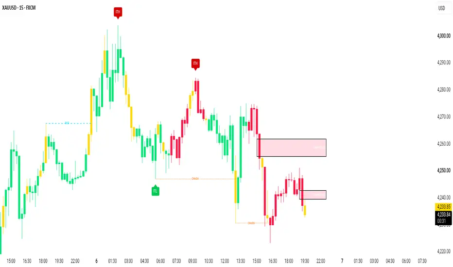
ICT FVG + VI + SBThis indicator maps four related price inefficiencies from ICT (Inner Circle Trader) methodology on one chart, across as many timeframes as you like at once: Fair Value Gaps, Volume Imbalances, Full Gaps, and Suspension Blocks. Each is drawn as a time-anchored zone, colour-coded by type and shaded by timeframe, and each is tracked through its whole life — open, partially consumed, and fully filled.
The Four Inefficiencies (how each is defined)
Fair Value Gap (FVG) — a three-candle, wick-based gap: the third candle's low is above the first candle's high (bullish), or its high is below the first candle's low (bearish). The gap is the untraded space between those wicks. Drawn in orange.
Volume Imbalance (VI) — a two-candle gap between the candle bodies (measured body-edge to body-edge) where the wicks still overlap, so it is not a full gap. Drawn in blue. Measuring body-to-body keeps the zone correct regardless of each candle's colour.
Full Gap — a two-candle gap with no overlap at all, not even the wicks. Drawn in red.
Suspension Block (SB) — a Fair Value Gap that has a Volume Imbalance on BOTH of its junctions. This "block" of stacked inefficiency is optionally separated out and highlighted in purple, and labelled SB.
Why these belong together
FVGs, Volume Imbalances and Full Gaps are the same idea at different degrees — untraded/inefficient price left behind by a move — and in practice they overlap and stack at the exact same swings. Showing them in one tool, sharing one detection pass and one fill model, lets you see how an FVG's edges are (or are not) reinforced by imbalances (the Suspension Block case), and lets you judge which zones are "clean" versus already partly consumed. Splitting them across three separate scripts would hide those relationships and triple the drawing overhead.
Multi-timeframe
Turn on any combination of Monthly, Weekly, Daily, 4h, 2h, 1h, 90m, 30m, 15m, 5m, 3m, 2m and 1m. All enabled timeframes are detected and plotted together, and the shorter the timeframe the darker its shade, so you can tell at a glance whether a zone is a higher- or lower-timeframe inefficiency. "Always show current timeframe" keeps the chart's own timeframe on even if its box is unchecked. Timeframes below the chart's resolution can't be computed and are skipped.
The lifecycle of a zone
Open — an unfilled zone is shown in its element colour and extended to the right.
Partially filled — as price trades into a zone, the consumed part is shaded grey while the untouched part keeps its colour (a bullish zone is eaten from its top down to the lowest low reached; a bearish zone from its bottom up to the highest high). Optional.
Filled (mitigated) — once price fully trades back through a zone it is treated as mitigated: it is either removed, or kept in light grey (right edge frozen at the fill) as a record. Grey therefore always means "filled".
Levels
An optional midline (50%, consequent encroachment) can be drawn inside every zone, plus 25/75% quarter lines and 12.5/37.5/62.5/87.5% eighth lines inside the Daily/Weekly/Monthly zones.
How To Use It
Add it to any chart. By default it shows only the current timeframe's inefficiencies; enable higher timeframes to build a top-down map.
Treat unfilled zones as reference areas where price may react. The 50% midline and the quarter/eighth levels give internal reference points.
Use the partial-fill shading to see how far a zone has already been consumed, and the grey "filled" zones as a history of where inefficiencies were rebalanced.
Watch for Suspension Blocks (purple/SB) — an FVG braced by volume imbalances on both sides — as higher-interest zones.
"Min Size — All Gaps" filters out tiny noise; raise it on fast, low-timeframe charts.
Settings Overview
Elements: Fair Value Gaps (with "Include related Volume Imbalances" to merge edge VIs into the FVG box, and "Highlight Suspension Blocks"), Pure Volume Imbalances, Full Gaps.
Timeframes: individual toggles grouped into HTF / Hours / Minutes, plus "Always show current timeframe".
Colors: one base colour per element (FVG, Suspension Block, VI, Full Gap), a per-timeframe darkening step, and optional borders.
Display: extend distance, gap labels and their side, max open gaps per timeframe, remove-on-fill, show/partially-fill filled gaps in grey, max filled gaps, and per-element minimum sizes.
Level Lines: midline, quarters and eighths (the latter on Daily/Weekly/Monthly zones).
Technical Notes / Repainting
Higher-timeframe zones are detected with request.security on CONFIRMED, already-closed candles, so plotted zones do not repaint historically. The current, still-forming bar updates live: a zone can fill (turn grey or be removed), the partial-fill shading grows, and the newest zone on a timeframe only appears once its forming candle has closed. To stay within TradingView's drawing-object limits the tool keeps a rolling window — the most recent open zones, and the most recent filled (grey) zones, per element and per timeframe — so the oldest zones are dropped as new ones form rather than every zone in history being retained. This is an original implementation; it does not reuse external open-source code. After a code update, remove and re-add the indicator so it re-binds to the price scale. Indicator

Premium and Discount Pivot Matrix [BigBeluga]Premium and Discount Pivot Matrix is an advanced market-structure terminal engineered for TradingView. It maps macroeconomic structural equilibrium by tracking historical price extremes and calculating accurate institutional auction zones.
Instead of printing static linear channels, this framework uses an active multi-pivot state matrix to calculate premium ceiling and discount floor boundaries. It pairs these levels with a real-time 100-Bin Volume Profile Matrix plotted directly at the leading edge of the chart, providing immediate clarity on volume distribution relative to the market's fair-value equilibrium.
NSE:NIFTY
BINANCE:BTCUSDT
🔵 CHANNEL CALCULATION METHODOLOGY
The central core of the indicator relies on a multi-layered geometric calculation engine to establish its tracking bands. The engine follows a distinct three-step sequence to construct the structural matrix:
1. Multi-Pivot Array Extraction Engine
Asymmetric Window Scanning Nodes: The engine scans the chart for structural price peaks and troughs using an adjustable lookback window ( Pivot Left/Right Bars ). For a pivot to be verified, it must be the absolute highest or lowest value within that specified bar radius.
FIFO Array Storage Matrix: When a high pivot is logged, it is pushed into the highPivots array; low pivots are funneled into the lowPivots array. The script features memory guardrails ( Max Pivots to Track ) that automatically shift old elements out of memory, limiting array depth to prevent memory allocation drag.
// Manage Arrays via FIFO (First-In, First-Out) Storage Architecture
if not na(pHi)
array.push(highPivots, pHi)
if array.size(highPivots) > arraySize
array.shift(highPivots)
if not na(pLo)
array.push(lowPivots, pLo)
if array.size(lowPivots) > arraySize
array.shift(lowPivots)
2. Mathematical Boundary Selection
Premium Ceiling Isolation Grid: The terminal continuously runs an evaluation sweep across the active high memory array and extracts the absolute highest peak value using an optimized maximum tracking filter node. This serves as the outer resistance band.
Discount Floor Isolation Grid: Concurrently, the engine sweeps the active low memory array to extract the absolute lowest trough value, setting the hard outer support band floor.
Step-Line Price Plotting Framework: Because it selects the maximum high and minimum low of a rolling historical lookback set, the boundaries plot on your canvas as clean, structural step-lines. These lines only shift when a new macro extreme is logged or when an older extreme drops out of the tracking array.
3. Dynamic Equilibrium Tracking State Machine
Fair Value Midline Matrix: The Equilibrium Midline represents the exact mathematical center of the active trading channel. It calculates the mid-point price by taking the average of the resistance ceiling and support floor arrays.
Structural Shifting Trend Cloud Filters: This midline acts as a real-time tracker for the value center of the asset. The internal state machine monitors this line on every tick and applies dynamic visual treatments: it flashes the Midline Rising Color when the value structure is shifting upward, and instantly mutates to the Midline Falling Color when structural value drops downward.
// Extract Channel Levels
float resistance = na
float support = na
if array.size(highPivots) > 0
resistance := array.max(highPivots)
if array.size(lowPivots) > 0
support := array.min(lowPivots)
// Calculate Midline
float midline = not na(resistance) and not na(support) ? (resistance + support) / 2 : na
🔵 CORE STRUCTURAL LAYOUT FEATURES
1. 100-Bin Volume Profile Distribution Matrix
Intra-Channel Grid Binning Engine: When enabled ( Show Volume Profile at Channel End? ), the indicator runs a localized calculation over a specified historical range ( Volume Profile Lookback ). It divides the vertical space between the resistance ceiling and support floor into 100 equal vertical bins .
Adaptive Transparency Histogram Blocks: It calculates the exact volume distribution for each candle across these bins, scaling the horizontal width of the resulting histogram bars ( Volume Profile Max Width ). Premium distribution bars (above the midline) use an automatic gradient that gets brighter near the resistance ceiling to flag overextended premium supply. Discount distribution bars (below the midline) flash brighter near the support floor to highlight historical institutional accumulation blocks.
2. Volumetric Breakdown & Reversal Markers
Boundary Breach Telemetry Glyphs: The terminal closely monitors interactions with the channel boundaries. If a candle breaks completely out of the rolling step-line range, it triggers high-visibility telemetry circle shapes directly on the chart canvas (Bullish Reversal on downward breaks, Bearish Reversal on upward crosses).
Time-Index Signal Buffer Guards: To prevent messy clutter, the script suppresses repetitive signals using a strict index tracking buffer rule. When a valid breach is confirmed, it stamps the signal with clean text labels tracking the exact transaction volume traded during the breakout bar.
// 100 Bin Volume Profile Matrix Execution snippet
int binsCount = 100
float channelRange = resistance - support
float binStep = channelRange / binsCount
array binVolumes = array.new_float(binsCount, 0.0)
array binHighs = array.new_float(binsCount, 0.0)
array binLows = array.new_float(binsCount, 0.0)
for i = 0 to binsCount - 1 by 1
array.set(binLows, i, support + i * binStep)
array.set(binHighs, i, support + (i + 1) * binStep)
🔵 SYSTEMATIC EXECUTION STRATEGIES & RISK INTERPRETATION
Premium Zone Reversals: When an asset rallies into the upper channel gradient, enters the PREMIUM zone, and tests the resistance ceiling, monitor the 100-Bin Volume Profile. If the profile shows fading volume bars at the highs, look for short setups targeting a mean-reversion move back down to the Equilibrium Midline.
Discount Value Accumulation Trim: When price action drops into the DISCOUNT zone and approaches the channel floor, check the volume profile. Heavy volume concentration at these lows confirms strong institutional interest. Look for long positions here, using the step-line support floor as a strict trade invalidation level.
Equilibrium Breakout Continuations: Watch the behavior of the asset when the Equilibrium Midline shifts color. A sharp upward shift in the midline accompanied by a validated volume expansion signature suggests a structural trend shift, opening up long continuation options up to the premium line.
🔵 INTERFACE CONFIGURATION AND PARAMETERS
Pivot Structure Configuration Blocks: Adjust left/right bar strengths and internal array memory slots to optimize the indicator for short-term swing scalping or long-term macro trend tracking.
Volume Profile Matrix Settings: Fine-tune lookback depths and maximum bar widths to scale the volume profile layout for any financial asset class or chart timeframe.
Styling & Visual Aesthetics Overrides: Fully customize colors for rising structures, falling boundaries, interior gradient fills, and background profiles to integrate seamlessly with your preferred light or dark charting interface.
Transform your charting layout from traditional linear indicators into a highly automated, volume-anchored volatility tracking network with the Premium and Discount Pivot Matrix terminal. Indicator

CPR, Floor and Camarilla Pivots🍀Overview
CPR, Floor and Camarilla Pivots combines 3 popular pivot-point systems in one TradingView indicator. It calculates levels from the previous completed higher-timeframe candle and displays them directly on the price chart.
The indicator includes Central Pivot Range levels, traditional Floor Pivot support and resistance levels, and Camarilla levels. Each pivot group can be enabled, customized, extended, and labeled independently.
🍀Features
Displays CPR levels: Pivot, Top Central (TC), and Bottom Central (BC).
Displays Floor Pivot resistance levels R1–R4 and support levels S1–S4.
Displays Camarilla levels H1–H5 and L1–L5.
Uses the previous completed higher-timeframe candle to calculate pivot levels.
Includes an automatic higher-timeframe selection mode:
Charts below 1D use daily pivots.
Charts below 1M use monthly pivots.
Charts below 12M use yearly pivots.
Charts at or above 12M use 12-month pivots.
Allows a user-defined higher timeframe when more control is required.
Optionally shows only the current higher-timeframe period or preserves previous pivot periods on the chart.
Provides independent visibility controls for each pivot group and individual level.
Allows custom colors, line styles, and thickness for each level.
Supports line extensions to the left, right, both directions, or no extension.
Displays labels for active levels with optional price values.
🍀Inputs
General
HTF Method: Select Auto or User Defined for the pivot calculation timeframe.
Time Frame: Higher timeframe used when User Defined is selected. Default: D.
Show Only Current HTF Period: When enabled, removes previous pivot lines when a new higher-timeframe period begins.
CPR Pivots
Show CPR Group: Displays or hides the entire CPR group.
Label Offset: Controls the horizontal distance between CPR labels and the current bar.
Show Prices on Labels: Displays the calculated price beside each CPR label.
Pivot, TC, and BC: Enable or disable each CPR level and customize its color, line style, and thickness.
Floor Pivots
Show Floor Group: Displays or hides the entire Floor Pivot group.
Label Offset: Controls the horizontal distance between Floor Pivot labels and the current bar.
Show Prices on Labels: Displays the calculated price beside each Floor Pivot label.
R1–R4 and S1–S4: Enable or disable individual resistance and support levels and customize their colors, line styles, and thicknesses.
Camarilla Pivots
Show Camarilla Group: Displays or hides the entire Camarilla group.
Label Offset: Controls the horizontal distance between Camarilla labels and the current bar.
Show Prices on Labels: Displays the calculated price beside each Camarilla label.
H1–H5 and L1–L5: Enable or disable individual Camarilla levels and customize their colors, line styles, and thicknesses.
🍀Usage
Use the CPR Pivot as a central reference level for assessing price location and potential intraday bias. The TC and BC levels define the Central Pivot Range and can help identify the area around which price may consolidate or react.
Floor Pivot resistance levels R1–R4 and support levels S1–S4 can be used as potential reaction, target, breakout, or risk-management reference levels.
Camarilla levels can provide additional intraday reference points. The H3 and L3 levels are commonly monitored for potential directional reactions, while H4/H5 and L4/L5 may help identify stronger expansion or extended-price areas.
The indicator uses the previous completed higher-timeframe candle, so the plotted levels remain stable throughout the current higher-timeframe period. For example, daily pivot levels are calculated from the previous completed day when the daily timeframe is selected.
When multiple pivot systems overlap or cluster near the same price, that area may be useful as a stronger reference zone. Pivot levels are not guaranteed support or resistance and should be interpreted alongside price action, trend, volume, volatility, and broader market conditions.
🍀Disclaimer
This indicator is provided for informational and educational purposes only. It is not financial advice, investment advice, or a recommendation to buy or sell any asset.
Pivot levels are calculated reference points and do not guarantee that price will reverse, continue, or reach a particular level. Trading involves substantial risk, and past market behavior does not guarantee future results. Always conduct your own analysis and use appropriate risk management before making trading decisions.
Indicator

Session Auction Profile - Spectre TradesThe Spectre Trades Session Auction Profile is a customizable intraday volume-profile and auction-market analysis indicator designed to help traders evaluate where volume is developing during a selected trading session.
The indicator estimates volume-at-price using chart-bar OHLCV data and displays a developing session profile with the Point of Control, Value Area High, Value Area Low, and Value Area Midpoint. The profile can be positioned on either side of the session and configured to expand left or right. The default layout places the profile to the left of the session with the histogram facing right, helping preserve visibility around current price action.
Main features
Developing session volume profile
Adjustable number of profile rows
Customizable value-area percentage
Point of Control, VAH, VAL, and Value Area Midpoint
Adjustable profile width, placement, offset, and direction
Left-side profile placement with right-facing volume rows
Optional standard or migration-based profile coloring
POC-slope, Value MID-slope, and price-versus-value migration modes
Developing POC trail
Previous-session POC, VAH, VAL, and midpoint
Untested and tested naked POCs
Current Session High and Current Session Low
Initial Balance High, Low, and Midpoint
Developing or completed-only Initial Balance display
Adjustable line styles, widths, colors, labels, label sizes, and offsets
Auction-status dashboard
Alerts for profile levels, session extremes, Initial Balance levels, naked POCs, and migration changes
Profile migration module
The profile-box migration module provides a visual representation of directional value development. Traders can color the profile according to:
POC Slope: identifies whether the developing Point of Control is moving higher, lower, or remaining neutral.
Value MID Slope: evaluates directional movement in the center of the developing value area.
Price vs. Value MID: compares current price with the developing Value Area Midpoint.
Standard Colors: displays traditional value-area, non-value-area, and POC colors without directional migration coloring.
Migration signals are intended to help traders recognize whether value is being accepted at higher prices, accepted at lower prices, or remaining balanced.
Initial Balance module
The Initial Balance module calculates the high, low, and midpoint of the first user-defined number of minutes after the selected session opens. The levels can update while the Initial Balance is developing and then lock once the period is complete.
Traders can choose to display the Initial Balance while it is developing or show only the completed levels.
Intended use
This indicator is designed for futures, index, forex, cryptocurrency, and other intraday markets where session structure and volume development are relevant.
It may help traders evaluate:
Developing value and market acceptance
Balance versus price discovery
POC and value-area migration
Reactions at VAH, VAL, MID, and POC
Initial Balance breakouts and rejections
Current-session range expansion
Untested historical Points of Control
Potential areas of support, resistance, continuation, and mean reversion
The indicator is best used as a contextual and confluence tool alongside price action, market structure, liquidity, order flow, and disciplined risk management.
Important calculation note
This script estimates volume-at-price by distributing each chart candle’s reported volume across the price rows touched by that candle. It does not use exchange-level bid-and-ask footprint data and may differ from TradingView’s built-in Volume Profile or profiles calculated from lower-timeframe data.
Results may vary based on the selected chart timeframe, symbol, session, data feed, number of rows, and value-area settings.
Disclaimer
This indicator is provided for educational and informational purposes only. It does not constitute financial advice, investment advice, or a recommendation to buy or sell any financial instrument.
No indicator can predict future market movement or guarantee profitable results. Historical levels, volume distributions, migration signals, alerts, and auction classifications may fail or produce false signals. Traders are responsible for independently evaluating all trading decisions and managing their own risk.
Trading futures, options, forex, cryptocurrency, and leveraged financial products involves substantial risk and may not be suitable for every trader. Past performance does not guarantee future results. Indicator

Automated Liquidity & Key Levels Matrix PROAutomated Liquidity & Key Levels Matrix PRO
Automated Liquidity & Key Levels Matrix PRO is an advanced, multi functional technical analysis script designed for quantitative traders and technical analysts. It automatically isolates high probability support and resistance zones, tracks real time market structure breakouts with split line clarity, highlights high volume expansion candles, and provides an attractive glowing trend wave layer.
Key Features Overview
1. Ultra Attractive Glowing Trend Wave
Includes a smooth dynamic trend wave with adjustable halo glow effects, line width, and colors to easily visualize dynamic trend direction.
2. Clean Split Line Market Structure Signals
Features refined Break of Structure and Change of Character signals. The structure line splits cleanly around the centered label, leaving a gap so the text stands out clearly without line overlap.
3. Text Free Clean Major Swing Badges
Isolates major macro swing high and low extremes using text free, solid color directional badges to keep chart visuals clean and minimal.
4. Dynamic Support and Resistance Zones
Automatically maps key supply and demand ranges across price action. To keep your chart clean and easy to read, broken or mitigated zones automatically disappear as soon as price breaks through them.
5. Volume Weighted Smart Candlestick Heatmap
Combines dynamic structural trend direction with volume expansion detection. High volume expansion bars render in distinct neon pink highlights for instant volatility identification.
6. Comprehensive Customization Panel
Includes independent controls for line thickness, text colors, line colors, font sizes, wave parameters, and zone fill opacity.
How to Use
Step 1: Trend Identification
Observe the Glowing Trend Wave and Volume Weighted Smart Candlestick theme to gauge underlying trend direction.
Step 2: Monitor Dynamic Key Zones
Look for price interactions around active, unmitigated support and resistance zones.
Step 3: Analyze Clean Structure Signals
Watch for Break of Structure and Change of Character signals displayed with split lines and centered labels.
Settings Overview
Glowing Wave Settings
- Show Glowing Wave Layer: Toggle display of the dynamic trend wave.
- Wave Period & Line Thickness: Adjust wave sensitivity and visual halo glow.
Market Structure Settings
- Show Breakout Signals: Toggle structural lines and labels.
- Independent Colors & Sizes: Customize BOS/CHoCH line colors, text colors, and font sizes separately.
Support and Resistance Settings
- Show Dynamic Support & Resistance: Toggle zone rectangles.
- Zone Fill Transparency: Customize fill opacity from 0 to 100.
Major Swing Settings
- Show Clean Major Swing Badges: Toggle text free ITH/ITL pivot badges.
Disclaimer
This script is built strictly for educational, analytical, and charting enhancement purposes. It does not provide financial advice, trade recommendations, or guaranteed results. Always practice proper risk management. Indicator

Institutional SMC & Order Flow Matrix PROInstitutional SMC & Order Flow Matrix PRO
Institutional SMC & Order Flow Matrix PRO is a clean, modern, and highly versatile technical charting tool engineered for traders practicing Smart Money Concepts and Order Flow Trading. Built with a focus on visual clarity, it eliminates unnecessary chart clutter by utilizing auto mitigating execution zones, swing anchored market structure lines, and an intelligent trend heatmap.
Key Features Overview
1. Precision Anchored Market Structure
Tracks Break of Structure and Change of Character signals with extreme precision. Lines originate directly from actual swing high or low pivot prices, while structure text labels sit neatly in the center of lines to prevent candle overlap.
2. Smart Auto Mitigating Order Block Zones
Automatically maps active institutional order blocks and imbalance execution zones. Mitigated zones automatically vanish from your chart once price fills the imbalance, keeping your workspace clean and professional.
3. Institutional Candle Heatmap
Features dynamic candlestick coloring driven by macro structural pivots. Bullish trend phases render in clean vibrant green, bearish phases in deep red, and high momentum displacement candles highlight in glowing gold.
4. Major Intermediate Term High and Low Badges
Automatically detects macro structural extremes. Displays solid red Intermediate Term High badges at major resistance tops and green Intermediate Term Low badges at major support bottoms.
5. Complete Manual Customization Suite
Includes comprehensive user settings for every element. Customize line styles, line thickness, border widths, box transparency, text alignment, text colors, and font sizes.
How to Use
Step 1: Identify Macro Trend Bias
Observe the Institutional Candle Heatmap theme to quickly determine current directional order flow.
Step 2: Monitor Centered Structure Signals
Look for precise Break of Structure lines and Change of Character signals anchored directly from swing points.
Step 3: Spot Gold Displacement Candles
Identify gold highlighted expansion candles that create fresh institutional order blocks.
Step 4: Trade Active Execution Zones
Utilize unmitigated bullish and bearish order block zones for high probability entries.
Settings Overview
Market Structure Settings
- Show Market Structure: Toggle structural line displays.
- Line Style and Thickness: Choose between Solid, Dashed, or Dotted lines with adjustable width.
Order Block Zone Settings
- Show Active Order Blocks: Toggle order block rectangles.
- Zone Fill Transparency: Adjust fill opacity from 0 to 100.
- Zone Text Settings: Customize display text, text alignment, font size, and text color.
Major Pivot Settings
- Show Major ITH / ITL Badges: Toggle visibility of macro pivot badges.
- Sensitivity: Adjust pivot lookback sensitivity.
Candle Heatmap Settings
- Enable Trend Candle Heatmap: Toggle dynamic trend candles and gold displacement highlights.
Disclaimer
This indicator is built strictly for educational, analytical, and charting enhancement purposes. It does not provide financial advice, trade recommendations, or guaranteed results. Always apply proper risk management principles. Indicator

[Kpt-Ahab] Poor Man's Orderflow Simple AlgoPilotImportant Notice and Risk Warning
The published settings were selected solely based on historical data for the asset and timeframe shown.
The displayed result may be random or over-optimized and cannot automatically be transferred to other assets, timeframes, or future market conditions. Even with the presented settings, the strategy may cause significant losses at any time, including the complete loss of the allocated strategy capital.
This script is intended exclusively for analysis and testing purposes. It does not constitute investment advice or a trading recommendation.
Description
This script uses reused and adapted code components from ** Auto RiskManagement & Backtest System 2.1b** and the ** Poor Mans Orderflow Simulator **.
These components have been combined into a standalone strategy that integrates simplified orderflow signals with position management, risk management, and backtesting functions.
How It Works
The strategy uses a simplified approximation of orderflow. It evaluates the relationship between candle body size and candle range, relative volume, candle direction, and recurring absorption and impulse events.
It does not use actual bid/ask, footprint, Level 2, or order book data.
Depending on the selected signal mode, direct breakouts, confirmed absorption clusters, impulse candles, or combinations of these conditions may generate long and short signals.
Position and Risk Management
The script supports, among other features:
* Long and short positions
* Fixed or trailing stop-loss levels
* Multiple partial profit targets
* Breakeven after the first profit target
* Optional additional entries
* Further entries may also be disabled after the specified total number of losing trades has been reached or when the maximum permitted drawdown is exceeded.
* Internal or external trading signals
* Automatic parameters based on asset class and timeframe
Additional entries and simulated leverage may significantly increase the risk of loss.
Backtest Limitations
Strategy Tester results are based exclusively on historical market data. Real-world results may differ significantly due to commissions, spreads, slippage, liquidity, price gaps, and execution delays.
Past performance is not a reliable indication of future results.
Position Closing Settings
The **Open Position Signals** setting determines how new signals are handled while a position is already open:
* **Wait-End-Deal:** All indicator signals are ignored until the current position has ended.
* **Wait-Signal-Close:** Only explicit signals for closing a long or short position are processed.
* **Wait-Reversal:** An opposing entry signal may also close the current position.
Several closing conditions are available for the integrated orderflow logic. For example, a position may be closed by an opposing impulse, a combination of a cluster and an impulse, or a confirmed opposing entry signal.
Further trading may also be restricted after a specified number of losing trades or when the maximum permitted drawdown is reached.
Trailing Stop, Breakeven, and Liquidation Line
The strategy supports both a fixed stop-loss and a trailing stop. The selected percentage represents the direct price distance from the average entry price and is not automatically adjusted by the simulated leverage.
In trailing mode, the stop is only moved in a direction that is favorable to the position. If the average entry price changes due to an additional entry, the existing stop is adjusted accordingly.
The stop may optionally be moved to the average entry price after the first profit target has been reached. A stop mode must be enabled for this function to operate.
The displayed liquidation line is only an internal estimate based on the simulated position and account values. It may differ significantly from the actual liquidation calculation used by a broker or exchange.
Using External Indicators
An external numerical signal source may be used instead of the integrated Poor Man’s Orderflow Simulator.
The external indicator must provide a selectable plot series containing the following values:
* **+1:** Long or buy signal
* **−1:** Short or sell signal
* **+2:** Close short position
* **−2:** Close long position
All other values, including `na`, produce no new signal.
The external indicator must output the required numerical values through a selectable plot. This plot can then be selected under **External Source**.
Whether and how an external signal is processed while a position is open also depends on the selected **Open Position Signals** setting.
-----------------------------------
Wichtiger Hinweis und Risikowarnung
Die veröffentlichten Einstellungen wurden ausschließlich anhand historischer Daten für das dargestellte Asset und den verwendeten Zeitrahmen gewählt.
Das Ergebnis kann zufällig oder überoptimiert sein und lässt sich nicht automatisch auf andere Assets, Zeitrahmen oder zukünftige Marktphasen übertragen. Auch mit den dargestellten Einstellungen kann die Strategie jederzeit erhebliche Verluste verursachen und das eingesetzte Strategiekapital vollständig verlieren.
Dieses Skript dient ausschließlich zu Analyse- und Testzwecken und stellt keine Anlageberatung oder Handelsempfehlung dar.
Beschreibung
Dieses Skript verwendet wiederverwendete und angepasste Codebestandteile aus Auto RiskManagement & Backtest System 2.1b und dem Poor Mans Orderflow Simulator .
Die Komponenten wurden zu einer eigenständigen Strategie verbunden, die vereinfachte Orderflow-Signale mit Positions-, Risiko- und Backtestfunktionen kombiniert.
Funktionsweise
Die Strategie verwendet eine vereinfachte Annäherung an Orderflow. Sie wertet das Verhältnis von Kerzenkörper und Handelsspanne, relatives Volumen, Kerzenrichtung sowie wiederkehrende Absorptions- und Impulsereignisse aus.
Dabei werden keine echten Bid-/Ask-, Footprint-, Level-2- oder Orderbuchdaten verwendet.
Abhängig vom gewählten Signalmodus können direkte Ausbrüche, bestätigte Absorptionscluster, Impulskerzen oder Kombinationen dieser Bedingungen Long- und Short-Signale erzeugen.
Positions- und Risikomanagement
Das Skript unterstützt unter anderem:
Long- und Short-Positionen
feste oder nachlaufende Stop-Loss-Marken
mehrere Teilgewinnziele
Breakeven nach dem ersten Gewinnziel
optionale zusätzliche Einstiege
Drawdown-Begrenzung und Begrenzung nach einer festgelegten Anzahl an Verlusttrades
interne oder externe Handelssignale
automatische Parameter nach Assetklasse und Zeitrahmen
Zusätzliche Einstiege und ein simulierter Hebel können das Verlustrisiko deutlich erhöhen.
Einschränkungen des Backtests
Die Ergebnisse des Strategietesters basieren ausschließlich auf historischen Kursdaten. Reale Ergebnisse können durch Gebühren, Spread, Slippage, Liquidität, Kurslücken und Ausführungsverzögerungen erheblich abweichen.
Vergangene Ergebnisse sind kein verlässlicher Hinweis auf zukünftige Ergebnisse.
Schließungseinstellungen
Über **Open Position Signals** wird festgelegt, wie neue Signale während einer bereits geöffneten Position behandelt werden:
* **Wait-End-Deal:** Alle Indikatorsignale werden bis zum Ende der Position ignoriert.
* **Wait-Signal-Close:** Nur ausdrückliche Signale zum Schließen einer Long- oder Short-Position werden berücksichtigt.
* **Wait-Reversal:** Zusätzlich kann ein entgegengesetztes Einstiegssignal die aktuelle Position schließen.
Für die integrierte Orderflow-Logik stehen verschiedene Schließungsbedingungen zur Verfügung. Eine Position kann beispielsweise durch einen gegensätzlichen Impuls, eine Kombination aus Cluster und Impuls oder ein bestätigtes entgegengesetztes Einstiegssignal geschlossen werden.
Zusätzlich kann der weitere Handel nach einer festgelegten Anzahl an Verlusttrades oder beim Erreichen des maximal erlaubten Drawdowns begrenzt werden.
Trailing-Stop, Breakeven und Liquidationslinie
Die Strategie unterstützt einen festen Stop-Loss sowie einen nachlaufenden Trailing-Stop. Der eingestellte Prozentwert beschreibt dabei den direkten Abstand zum durchschnittlichen Einstiegspreis und wird nicht automatisch durch den simulierten Hebel verändert.
Im Trailing-Modus wird der Stop nur in eine für die Position günstigere Richtung nachgezogen. Verändert sich der durchschnittliche Einstiegspreis durch einen zusätzlichen Einstieg, wird auch der bestehende Stop entsprechend angepasst.
Optional kann der Stop nach dem Erreichen des ersten Gewinnziels auf den durchschnittlichen Einstiegspreis verschoben werden. Hierfür muss ein Stop-Modus aktiviert sein.
Die angezeigte Liquidationslinie ist lediglich eine interne Schätzung auf Basis der simulierten Positions- und Kontowerte. Sie kann deutlich von der tatsächlichen Liquidationsberechnung eines Brokers oder einer Börse abweichen.
Verwendung externer Indikatoren
Anstelle des integrierten Poor-Man’s-Orderflow-Simulators kann eine externe numerische Signalquelle verwendet werden.
Hierfür muss der externe Indikator eine auswählbare Plot-Serie mit den folgenden Werten ausgeben:
* **+1:** Long- beziehungsweise Kaufsignal
* **−1:** Short- beziehungsweise Verkaufssignal
* **+2:** Short-Position schließen
* **−2:** Long-Position schließen
Bei allen anderen Werten oder bei `na` wird kein neues Signal ausgeführt.
Der externe Indikator muss die benötigten Zahlenwerte direkt über einen auswählbaren Plot bereitstellen. Anschließend wird dieser Plot unter **External Source** ausgewählt.
Ob und wie ein externes Signal während einer geöffneten Position verarbeitet wird, hängt zusätzlich von der gewählten Einstellung unter **Open Position Signals** ab. Strategy

Z-Edge | Confluence Z-score StrategyA multi-factor trading strategy that standardizes three independent market signals — momentum, RSI, and relative volume — into a single composite Z-score, then trades either trend-following or mean-reversion setups off that score. Position size and stop placement are calculated automatically from ATR-based risk, so every trade is sized consistently regardless of the asset's volatility.
Features
Multi-factor composite — blends price momentum (rate of change), RSI, and relative volume into one Z-scored reading, with adjustable weights so you can lean the composite toward whichever factor you trust most for a given market.
Adaptive smoothing — the EMA smoothing length isn't fixed. It automatically shortens in high-volatility regimes (faster response) and lengthens in calm regimes (less noise), driven by an ATR percentile rank.
Two entry modes — Zero Cross (trend-following: enter when the composite crosses through zero) or Threshold Reversion (mean-reversion: enter when the composite reverses from an extreme).
Divergence detection — flags when price makes a new high/low that the composite Z-score doesn't confirm, a classic early-warning signal the underlying factors alone don't show.
ATR-based risk sizing — every trade's position size is calculated from your risk-per-trade %, account equity, and ATR stop distance, with a hard cap on max % of equity per position.
Automatic stop-loss placement — stops are placed directly from the ATR calculation, not just displayed.
How the algorithm works
Factor calculation — momentum is measured as rate-of-change over a configurable lookback, RSI uses a standard length, and relative volume is current volume divided by its moving average.
Standardization — each factor is converted to a Z-score (value − mean) / stdev over a shared lookback period, making them comparable regardless of asset or scale.
Composite blend — the three Z-scores are combined using your weight inputs into one composite reading.
Adaptive smoothing — an ATR percentile rank (0–100) determines where the current volatility regime sits historically, and that percentile scales the EMA smoothing length between your min/max settings.
Signal generation — depending on the selected mode, entries fire either on a zero-line cross (trend) or on a reversal from a threshold extreme (reversion); exits fire on the opposite condition or when the ATR stop is hit.
Sizing — position size = (account equity × risk %) ÷ (ATR × stop multiplier), capped at a max % of equity.
Tips for use
Match the mode to the market. Zero Cross mode is built for trending assets; Threshold Reversion is built for range-bound ones. Running the wrong mode on the wrong market condition is the most common way this underperforms.
Start on the daily timeframe. Default lookbacks (100-period Z-score, 100-period ATR percentile) are sized for daily bars; shrink them proportionally for lower timeframes.
Test on liquid assets. Relative volume is one of the three factors — thin, erratic volume data will make the composite noisier.
Backtest across a full cycle. Use at least 2+ years of data spanning both trending and ranging periods so you're not fitting to one regime.
Watch the % of equity cap. On very low-volatility assets, ATR-based sizing can push toward very large positions; the equity cap prevents unrealistic leverage but will also silently reduce your intended risk-per-trade when it kicks in — check the info table to see when that's happening.
Divergence is a filter, not a standalone signal. It's most useful for skipping or flagging entries near likely reversals, not as an independent trigger.
Strategy

Volatility Cone & Analog Path ProjectionVolatility Cone & Analog Path Projection — Forward Price Envelope with Fractal Replay and Terminal Probability Distribution
Overview
Nearly every overlay on TradingView describes the past: where price has been, where volume traded, where structure broke. This tool points in the other direction. It builds a forward projection zone from the current bar using three independent layers — a realized-volatility cone, a replay of the historically most similar price fractals, and a terminal probability profile that combines both into a distribution of possible outcomes at the projection horizon.
The result is not a forecast. It is a bounded expectation: a visual answer to "given how this instrument has actually been moving, what range is normal over the next N bars, and where has price historically ended up after conditions that looked like this?"
Conceptual Framework
Price uncertainty grows with the square root of time, not linearly. A 24-bar projection is not 24 times as wide as a 1-bar projection — it is roughly 4.9 times as wide. Traders who size targets and stops on a straight-line mental model consistently misjudge what is achievable in a given number of bars.
The cone makes that curvature visible. Its width at each future bar is sigma * sqrt(t), where sigma is the standard deviation of log returns over the volatility window. Three nested bands are drawn, so you can immediately see which targets sit inside the ordinary range, which sit at the statistical edge, and which would require an exceptional move.
The Gaussian model alone, however, is a poor description of real markets: returns have fat tails, and volatility clusters. The analog layer addresses this by ignoring models entirely and asking an empirical question instead — what actually happened, historically, after the market printed this exact shape?
How It Works
Volatility estimation. Log returns are computed bar to bar. Their standard deviation over the volatility window gives the per-bar sigma; their mean gives the drift. Drift can be included or excluded from the cone's centerline.
Cone construction. For each future bar t from 1 to the horizon, the upper and lower bounds are close * exp(drift*t ± k*sigma*sqrt(t)) for each of the three band multipliers. Each band is rendered as a closed polygon with layered transparency, producing depth from the centerline outward.
Fingerprint extraction. The most recent N bars of log returns are z-scored — mean removed, divided by their own standard deviation. This makes the pattern scale-invariant: the same shape is recognised whether it happened during a quiet range or a volatile expansion, and at any price level.
Historical scan. Every candidate window inside the scan depth is z-scored the same way and compared to the current fingerprint by summed squared difference. Lower distance means a closer shape match. Candidates that overlap an already-selected match without improving on it are rejected, so the top results are not five copies of the same event shifted by one bar.
Forward replay. For each of the top matches, the bars that followed it are converted into a relative path and re-anchored to the current close. The path each analog is drawing forward is exactly the move that occurred after that historical fingerprint — nothing is fitted or optimised. Paths ending above the current price are drawn bullish, below bearish, and a thick median line traces the bar-by-bar median across all analogs.
Terminal probability profile. At the projection horizon a horizontal distribution is built across the cone's full range. Each row's density blends the Gaussian probability implied by the volatility model with an empirical kernel centred on each analog's endpoint. The Model Weight input controls that mix: 1.0 is purely theoretical, 0.0 is purely historical, and the default sits between them. The widest row — the mode of the blended distribution — is marked as the most probable zone.
Interpretation
Cone bands define what is statistically ordinary. A target beyond the outer band within the horizon is not impossible, it is simply rare — treat it accordingly when planning holding time.
Cone width itself is information. A narrow cone means compressed volatility, which historically resolves into expansion. A wide cone means the market is already moving; chasing inside it carries a worse risk profile.
Analog dispersion matters more than analog direction. Five paths that fan out in all directions means the current shape carried no historical edge. Five paths clustering in one direction is the meaningful configuration.
Best Match Quality in the panel scores how closely the nearest historical fingerprint resembles the present one. Below roughly 60%, treat the analog layer as noise and rely on the cone alone.
The most probable zone is where the blended distribution peaks. It is a magnet-style reference, not a target — the distribution is wide by construction.
Volatility Regime compares short-window volatility to the full window. Expanding means the cone is likely to understate near-term movement; contracting means the opposite.
Settings
Setting Effect
Projection Horizon Bars projected forward. Also the endpoint of the profile
Volatility Window Sample size for sigma and drift. Longer = smoother, slower to adapt
Include Drift Tilts the cone with the window's mean return
Inner / Mid / Outer Band Sigma multipliers for the three layers
Fingerprint Length Bars compared for similarity. Shorter = more matches, less specific
Scan Depth How far back to search for analogs
Number of Analogs How many historical paths to replay
Profile Rows / Width Resolution and horizontal size of the terminal distribution
Model Weight Gaussian versus empirical blend in the distribution
Redraw on Bar Close Only Recommended on. The scan is heavy; this runs it once per bar
Limitations — read this
This is not a prediction and must not be traded as one. The cone describes a statistical range under an assumption of stable volatility. Real volatility is not stable, and returns have fatter tails than the Gaussian model implies, so moves outside the outer band occur more often than the model suggests.
Analog matching is weak evidence. A few dozen bars of shape similarity is a small sample; markets are non-stationary and a pattern that resolved one way in the past carries no obligation to repeat. The paths are historical context, not a probability statement about the future.
Nothing repaints, but the whole projection is recomputed each bar. Yesterday's cone is not preserved — the drawing always reflects current data only. It is anchored to the last bar by design.
On low-volume, illiquid, or heavily gapped instruments the return distribution is distorted and both layers degrade.
No entries, no stops, no targets, no signals. This is a context tool for sizing expectations and holding time. Indicator

Polynomial & Logarithmic Regression Channels [OnlyFibonacci]Polynomial & Logarithmic Regression Channels is an overlay indicator that fits a 2nd-degree polynomial regression curve to recent price action and builds dynamic standard deviation channels around that curve. Unlike a straight linear regression line or a simple moving average, the polynomial model captures curved trends — acceleration, deceleration, and rounded turning phases — while deviation bands quantify how far price has stretched from the fitted trend.
What Makes This Indicator Different Matrix-based polynomial regression — Coefficients are solved via least-squares using Pine Script v6 matrix operations (matrix.new, matrix.transpose, matrix.mult, matrix.inv), not a basic ta.linreg() call. Logarithmic price scale toggle — Switch between standard and log-price regression. Log mode is well suited for long-horizon assets where percentage growth matters more than absolute price moves. Residual volatility channels — Inner (±1σ) and outer (±2σ) bands are built from the standard deviation of price residuals relative to the fitted curve, not from raw price volatility alone. Live dashboard — Model type, channel position (%), residual volatility, and trend status (Overbought / Oversold / Neutral) are displayed in an upper-right table. Built-in alerts — Outer channel breaches and polynomial slope direction changes.
How It Works On each bar, the script collects the last N closing prices (default: 200) and fits the equation y = a + bx + cx² using matrix least-squares: β = (X'X)⁻¹X'Y. The regression line value at the current bar becomes the central trend curve. Residuals (actual price minus fitted value) across the lookback window are used to compute a sample standard deviation. Upper and lower channels are then plotted at user-defined σ multipliers. When Use Logarithmic Price Scale is enabled, prices are transformed with math.log() before regression and mapped back to the chart with math.exp() for display. The central line color reflects the instantaneous slope of the polynomial at the current bar: bright green when sloping up, bright red when sloping down.
Key Settings Lookback Period (default 200) — Number of bars used to fit the polynomial. Higher values produce a smoother, slower-reacting curve; lower values track price more closely. Use Logarithmic Price Scale — Enable for long-term trending markets (equities, crypto, indices). Keep off for short-term or range-bound analysis. Inner / Outer Multipliers (default ±1.0 / ±2.0) — Control channel width. Wider multipliers reduce false overbought/oversold signals; tighter multipliers increase sensitivity. Visual Style — Trend colors, band colors, fill transparency, and line widths. Dashboard — Toggle the info table and adjust text size.
How to Read the Chart Polynomial Regression line — The dynamic trend curve. Color shows current slope direction. Inner bands (±1σ) — Normal fluctuation zone around the trend. Pullbacks into inner bands within a trending market may offer continuation setups. Outer bands (±2σ) — Statistical stretch zone. Price beyond outer bands signals extended deviation from the fitted trend. Channel fills — Soft shaded areas between bands help visualize channel structure without cluttering the chart.
Dashboard Metrics Model Type — "Polynomial" (standard scale) or "Log-Poly" (logarithmic scale). Channel Position (%) — Where price sits within the outer channel (0% = outer lower, 100% = outer upper). Values above 80% or below 20% are highlighted. Residual Volatility — Dispersion of price around the fitted curve, shown as a percentage. Trend Status — Overbought (above outer upper), Oversold (below outer lower), or Neutral (inside outer bands).
How to Use — Practical Interpretation Trend identification: Trade in the direction of the regression line color. A green (upward-sloping) curve supports bullish bias; red supports bearish bias. Pullback entries: In a strong trend, price pulling back toward the regression line or inner band while slope remains favorable can indicate a potential continuation zone — always confirm with your own structure or confluence. Mean reversion / exhaustion: When price pushes beyond the outer bands and dashboard shows Overbought or Oversold, the move may be statistically extended relative to the fitted curve. This does not guarantee reversal; it flags stretched conditions. Log vs. standard mode: Use log mode on higher timeframes and growth assets. Use standard mode on lower timeframes or when absolute price deviation is more relevant. Lookback tuning: Match lookback to your analysis horizon — e.g. 100–150 for swing trading, 200+ for position trend context.
Built-in Alerts Overbought — price above outer upper channel Oversold — price below outer lower channel Trend slope turned bullish — polynomial derivative crossed above zero Trend slope turned bearish — polynomial derivative crossed below zero
Recommended Setup Apply to a clean chart with no other overlapping indicators for clearest visualization. Start with default settings (200 lookback, ±1σ / ±2σ bands). Test on your preferred timeframe and symbol before relying on signals. Combine with support/resistance, volume, or higher-timeframe trend for confluence — this tool provides statistical context, not standalone trade signals.
This indicator is a quantitative analysis tool for educational and informational purposes only. It does not constitute financial advice, investment recommendation, or a guarantee of future performance. Past behavior of regression channels does not predict future results. Always manage risk and conduct your own due diligence before making trading decisions.
Credits Developed by OnlyFibonacci . Licensed under Mozilla Public License 2.0. Indicator

Smart Trend Filter Confirmation [MarkitTick]💡 A confirmed-bar trend-following system that fuses a volatility-adaptive trailing band with a six-condition consensus filter, designed to suppress the false flips that plague standard trend-following tools when markets stall, chop, or thin out. Rather than reacting to every band cross, the script cross-examines each potential signal against stall detection, slope strength, volume participation, range compression, basis-point movement, and trend strength (ADX) before allowing a flip to display — while retaining a breakout override so genuinely explosive moves are never suppressed by the very filters designed to catch noise.
✨ Originality and Utility
Trailing-band trend systems (Chandelier-style or SuperTrend-style constructs) are common on TradingView, but nearly all of them share the same weakness: the trailing line flips direction on every price crossover, regardless of whether that crossover reflects a genuine change in market character or simply noise generated during a stalled, illiquid, or compressing market. This script's originality lies in the "Regime Consensus" layer built on top of the adaptive trailing band. Six independent, mathematically distinct filters — measuring band stall, linear-regression slope, relative volume, historical range percentile, basis-point velocity, and ADX-based trend strength — are computed every bar. If any single filter flags a "flat" regime, the display direction is held at its last confirmed state instead of flipping, which materially reduces whipsaw signals in ranging conditions. A dedicated breakout override simultaneously monitors for abnormally large single-bar moves (measured in ATR multiples) and forces the flip through regardless of filter status, ensuring the system does not become sluggish during genuine volatility expansion. This combination — adaptive smoothing of the source price, a volatility- and momentum-weighted dynamic band, a multi-factor flat-market veto, and a breakout bypass — is not a simple mashup of stock indicators but an integrated decision layer where each component directly informs whether the others are permitted to act. The trend line, filters, override, and dashboard are not separable add-ons; they operate as a single signal-gating pipeline.
🔬 Methodology and Concepts
● Adaptive Source Smoothing
Before any band math is applied, the script conditions the underlying HL2-style source price using one of two selectable adaptive filters:
Kalman Filter — a recursive estimator that maintains an internal "belief" about the true price and a corresponding uncertainty (error covariance). Each new bar, the filter computes a gain factor from the ratio of predicted uncertainty to total uncertainty (predicted plus measurement noise, set by the Kalman R input) and blends the new price observation into its estimate proportionally. A higher Kalman Q input allows the estimate to adapt faster to new prices; a higher Kalman R input makes the filter trust new observations less, producing a smoother but slower-reacting line.
LLAMA (an adaptive-length moving average inspired by Kaufman's Efficiency Ratio concept) — measures how efficiently price has moved over the lookback window by comparing net directional change to the sum of all bar-to-bar movement (an efficiency ratio between 0 and 1). This ratio is squared into a smoothing constant that continuously shifts the moving average's responsiveness between a fast EMA-like constant and a slow EMA-like constant, so the average tightens to price during clean directional runs and widens during choppy conditions.
• Dynamic Volatility Band
The core trailing band's half-width is not a fixed ATR multiple. It is calculated from three weighted components: a base multiplier, an ATR-based term scaled by the ATR Weight input, and a normalized recent-price-movement term (capped at its own 95th percentile to prevent single outlier bars from distorting the band) scaled by the Move Weight input. This composite value is then multiplied by the current ATR and smoothed with an exponential moving average (controlled by the Smooth Len input) to prevent the band width itself from jumping erratically bar to bar.
• Trailing Trend Line Construction
The trend line follows classic chandelier-style trailing logic: while price remains above the trend line, the line can only ratchet upward (never retreating below its prior value even if the lower band momentarily dips beneath it); while price remains below the trend line, the line can only ratchet downward. A flip only occurs when confirmed prior-bar closing price crosses to the opposite side of the line.
• Six-Factor Regime Consensus Filter
Before a directional flip is permitted to display, up to six independent conditions are checked. If any active filter flags the market as "flat," the displayed direction holds at its previous confirmed state rather than flipping:
Stall Filter — flags when the trend line's bar-to-bar movement is smaller than a fraction (Flatness input) of current ATR, indicating the line itself has gone quiet.
Slope Filter — runs a short linear regression across recent trend-line values, measures the resulting slope, normalizes it against ATR, and flags when that normalized slope falls below the Slope Thr input.
Volume Filter — flags when confirmed volume falls at or below its own moving average, treating below-average participation as unreliable for a fresh directional call.
Range Filter — flags when the current bar's high-low range falls within the lower percentile band (Range Pct input) of its historical distribution over the Pctile Len lookback, identifying range compression.
BPS Filter — converts the trend line's bar-to-bar movement into basis points relative to price and flags when that figure falls under the Min BPS input, catching moves too small to be economically meaningful.
ADX Filter — computes a standard Directional Movement Index reading and flags when it sits below the ADX Thr input, indicating weak underlying trend strength.
• Breakout Override
Running in parallel to the consensus filters, this component measures the absolute prior-bar price change against a multiple of ATR (Ovr ATR Mult input). If that threshold is exceeded, the override forces the flip through immediately, bypassing every flat-market filter above. This prevents the filter layer from muting the system's response to genuine volatility expansion or breakout conditions.
🎨 Visual Guide
Trend Line — a stepped line plotted along the confirmed trailing band value. It renders in the Bull color when the confirmed direction is up and the Bear color when down; both colors are fully customizable in the Colors group.
Gradient Candles / Bar Coloring — when enabled, chart candles and bars are recolored on a gradient between the Neutral color and the active directional color, with gradient intensity scaled by how far confirmed price has extended from the trend line relative to ATR (capped at 3x ATR for full saturation). A muted candle indicates price sitting close to the trend line; a fully saturated candle indicates an extended move.
Cloud Fill — a semi-transparent fill (opacity set by Cloud Transp) rendered between the trend line and a short moving average of HLC3 (length set by Cloud MA Len), tinted in the active directional color to visually reinforce which side of the trend the market currently occupies.
Bull / Bear Signal Labels — a "Bull" label appears below price the bar a confirmed flip to the up-regime occurs, and a "Bear" label above price on a confirmed flip to the down-regime, provided the Regime Consensus Filter did not veto the flip and Lock Signal is not engaged.
Trade Level Lines and Labels (optional, enabled via Show Trade Levels) — on each new confirmed signal, five lines are drawn forward from the signal bar: an Entry line (at prior confirmed close), a Stop Loss line, and three Take Profit lines (TP1, TP2, TP3), each offset from entry by ATR multiples set in the Trade Tools group. A shaded risk zone connects Entry to Stop Loss, and a shaded reward zone connects Entry to the furthest take-profit line. Each line carries a right-aligned label showing its exact price.
Live Dashboard (optional, position configurable via Dash X / Dash Y) — a compact table summarizing current symbol/timeframe, signal lock state, active direction, current signal status, regime classification (Flat/Trending), breakout override status, active adaptive filter type, current trend-line and ATR values, a visual progress bar for trend strength, and individual on/off/flat status readouts for each of the six regime filters.
Non-Standard Chart Warning — a red-bordered table automatically appears in the top-left corner if the script detects it is being run on a Heikin Ashi, Renko, Line Break, Kagi, or Point & Figure chart, warning that signal reliability is compromised on synthetic chart types.
📖 How to Use
A "Bull" label with the trend line switching to the Bull color signals a confirmed transition to an up-regime that has passed all active consensus filters (or was pushed through by the breakout override).
A "Bear" label with the trend line switching to the Bear color signals the equivalent confirmed down-regime transition.
Because flips are gated by the consensus filter, the absence of a new signal during a period of price consolidation is intentional — the script is treating the move as noise rather than a lack of function. Check the dashboard's individual filter rows to see exactly which condition(s) are currently classifying the market as flat.
The dashboard's "Override" row shows "Engaged" when the Breakout Override has just bypassed the filters — useful for distinguishing a filter-confirmed signal from a volatility-forced one.
When Show Trade Levels is active, treat the Entry/SL/TP lines as a reference risk framework tied to current ATR, not a guaranteed execution plan; always verify levels make sense for the instrument and timeframe before acting on them.
Enable Lock Signal to freeze the current signal state on the most recent bar, useful when reviewing historical signal behavior without new signals interrupting the current view.
If the Non-Standard Chart warning appears, switch to a standard candlestick chart type before relying on any signal from this script.
⚙️ Inputs and Settings
ATR Len — lookback period for the underlying ATR calculation that drives band width and multiple filter thresholds. Shorter values make the band more reactive to recent volatility; longer values smooth it out.
Band Mult, ATR Weight, Move Weight — the three components that combine into the dynamic band multiplier. Band Mult sets a base width, ATR Weight scales the contribution of current ATR relative to price, and Move Weight scales the contribution of recent capped price movement.
Smooth Len — the EMA length applied to the calculated band half-width, controlling how quickly the band itself can widen or narrow.
Adaptive Filter / Filter Type — toggles and selects between Kalman and LLAMA smoothing of the source price feeding the trend line.
Kalman Q / Kalman R — process noise and measurement noise inputs for the Kalman filter; higher Q increases responsiveness, higher R increases smoothing.
LLAMA Len — lookback window for the efficiency-ratio calculation driving the LLAMA adaptive average.
Stall Filter / Flatness — enables the stall check and sets the ATR-relative threshold below which trend-line movement is considered stalled.
Slope Filter / Reg Len / Slope Thr — enables the regression-slope check, sets its lookback window, and sets the normalized slope threshold below which the market is considered flat.
Volume Filter / Vol MA Len — enables the volume check and sets the moving-average length volume is compared against.
Range Filter / Pctile Len / Range Pct — enables the range-compression check and sets the historical lookback and percentile threshold used to classify current range as compressed.
BPS Filter / Min BPS — enables the basis-point movement check and sets the minimum basis-point threshold for a trend-line move to be considered meaningful.
ADX Filter / ADX Len / ADX Thr — enables the ADX-based trend-strength check and sets its calculation length and minimum threshold.
Breakout Ovr / Ovr ATR Mult — enables the override and sets the ATR multiple of single-bar price change required to force a flip through the filters.
Show Trade Levels / SL, TP1, TP2, TP3 ATR Mult — enables the trade-level drawing tool and sets each level's distance from entry as a multiple of ATR.
Bar Coloring, Bull/Bear Marks, Cloud Fill, Cloud MA Len, Cloud Transp — visual toggles and parameters controlling gradient candles, signal labels, and the cloud fill between trend line and reference average.
Show Dash, Dash X, Dash Y — toggles the dashboard and sets its screen position.
Long/Short/Close Action inputs — customizable text strings inserted into the "action" field of each alert's JSON payload, for direct use with automated webhook execution systems.
Colors group — full color customization for bull/bear/neutral states, label text, warning banner, dashboard theme, gradient candle tiers, and trade-level line colors.
🔍 Deconstruction of the Underlying Scientific and Academic Framework
The trailing-band mechanism draws on the same volatility-normalized stop methodology popularized by Chandelier Exit-style systems, which themselves extend J. Welles Wilder's Average True Range concept into an adaptive trailing stop: rather than a fixed price distance, the stop distance breathes with recently realized volatility, tightening in calm markets and widening in turbulent ones.
The Kalman filter option applies a classical state-space estimation technique originally developed for aerospace tracking problems (Rudolf Kálmán, 1960). It treats the "true" price trend as an unobserved state to be estimated from noisy observations, recursively updating a prediction and its uncertainty at each time step and weighting new information by a gain term derived from the relative magnitude of prediction versus measurement uncertainty. Applied to price series, it produces a smoothed estimate that adapts its own responsiveness based on the ongoing balance of signal versus noise.
The LLAMA adaptive average is built on an efficiency-ratio concept in the lineage of Perry Kaufman's Adaptive Moving Average research: the ratio of net directional displacement to total path length over a window quantifies how "efficiently" price has trended, and this ratio is used to interpolate the smoothing constant between fast and slow exponential-average bounds. Markets that trend efficiently receive a fast, responsive average; markets that chop inefficiently receive a slow, heavily smoothed one.
The Slope Filter applies ordinary least squares (OLS) linear regression across a short trend-line window to extract a first-derivative estimate (slope) of the trend line's trajectory, normalizing it by ATR so the threshold behaves consistently across instruments and volatility regimes of different scale.
The ADX Filter is grounded in Wilder's Directional Movement System, which decomposes price movement into positive and negative directional components and derives a smoothed trend-strength oscillator independent of direction — a standard framework for distinguishing trending from ranging conditions.
The Range Filter's use of percentile-rank classification reflects a basic non-parametric statistical approach: rather than assuming a normal distribution of high-low ranges, it empirically ranks the current range against its own recent historical distribution, which is more robust to the fat-tailed, non-normal behavior typically observed in financial return and range series.
Collectively, the six-factor consensus mechanism reflects a general principle from ensemble/multi-condition filtering: requiring independent, structurally uncorrelated confirmations to agree (or, here, requiring none to actively veto) before acting on a signal tends to reduce the false-positive rate relative to any single condition acting alone, at the cost of some responsiveness — a classic precision/recall tradeoff which the Breakout Override is specifically designed to mitigate during high-volatility regimes.
⚠️ Disclaimer
All provided scripts and indicators are strictly for educational exploration and must not be interpreted as financial advice or a recommendation to execute trades. We expressly disclaim all liability for any financial losses or damages that may result, directly or indirectly, from the reliance on or application of these tools. Market participation carries inherent risk where past performance never guarantees future returns, leaving all investment decisions and due diligence solely at your own discretion. Indicator

MQE - Market Quality Engine v1.6# MQE — Market Quality Engine v1.6
**MQE is not a buy/sell signal generator.** It is a Decision Support System that measures the quality of the current market environment on a standardized 0-100 scale. Its purpose is not to dictate "Buy" or "Sell," but to present, transparently and explainably, how favorable current market conditions are for opening a directional position.
## Methodology
MQE combines evidence from five independent analytical engines:
- **Trend Engine** — Evaluates market structure direction using EMA structure, AlphaTrend, and Comparative Relative Strength (CRS) against a benchmark (default BIST:XU100).
- **Flow Engine** — Measures directional capital commitment using a Cumulative Delta Volume (CDV) approximation; unlike raw volume, it prioritizes directional information over mere activity. The engine's highest-weighted criterion (40%) is whether CDV's fast average (EMA5) remains above its slow average (SMA68) — a strong, sustained CDV reading is interpreted as confirmation that the underlying scenario has not broken down.
- **Opportunity Conditions Engine** — Built around Relative ATR, this engine evaluates "tradability" rather than raw volatility; neither extreme compression nor extreme expansion is treated as inherently favorable.
- **Participation Engine** — Uses Relative Volume to assess whether sufficient market participation supports the current move; it is non-directional and primarily feeds into the Confidence output.
- **Momentum Engine** — MFI-based; deliberately avoids classic overbought/oversold interpretation and instead evaluates the persistence of directional energy as a supporting, confirmatory layer.
The output of these five engines is combined using regime-adaptive weighting — based on the current market **Regime** (Bull Trend / Bear Trend / Range / Transition) — into independent **Long Score** and **Short Score** values (0-100). Contradictions between engines are captured separately by a **Penalty** mechanism that only ever reduces the score, while the internal consistency of the evidence is reported through a fully independent **Confidence** value (0-100) that never alters the score itself. A high score paired with low confidence signals an environment that looks attractive but is backed by inconsistent evidence; high score with high confidence signals strong agreement across all evidence families.
For quick manual screening, MQE also provides a composite **Grade** (A+ through D), calculated separately for both directions.
## Dashboard
Two independent panels are provided: a **Primary Dashboard** (Long/Short Score, Confidence, Regime, and per-engine summaries — shown side-by-side for both the last closed bar and the live bar), and a **Diagnostics Panel** (per-engine breakdowns, penalty sources, raw indicator values, and active confirmation timeframes).
## Timeframe Adaptivity
Higher-timeframe confirmation and the AlphaTrend calculation automatically scale to the chart's timeframe (from 5-minute up to weekly), so no manual configuration is required by default; manual overrides remain available for advanced customization.
## Credit
The AlphaTrend calculation logic is adapted from the publicly known AlphaTrend concept originally developed by Kıvanç Özbilgiç.
## Disclaimer
MQE is not financial advice; it provides a statistical assessment of market conditions only. Past performance or evidence consistency does not guarantee future price behavior. All trading decisions and risk management remain the sole responsibility of the user.
Indicator

Volume Profile Anchored VWAP, AVWAP Bands & Deviation [LunqFX]Most anchored VWAP tools make you drag the anchor by hand, and it goes stale the moment structure changes. This one places the anchor automatically at confirmed swing pivots, wraps it in volume weighted standard deviation bands, hangs the leg's volume profile off the right edge, and then measures whether those bands are being respected on the symbol in front of you.
The annotated charts below explain the script's output element by element.
❶ AUTO ANCHORED VWAP
An anchored VWAP is only meaningful from a point that mattered. Anchor it at an arbitrary bar and it describes nothing; anchor it where the market last turned and it becomes the average price everyone trading THIS leg is carrying — which is exactly the level they defend.
The anchor is placed at confirmed swing pivots, with two guards that matter more than they sound:
▸ MINIMUM LEG — a fresh pivot cannot take over until the running leg has had room to form. Without that rule a cluster of pivots chops the curve into stubs and the VWAP never describes anything. ▸ MAXIMUM LEG — a leg that outlives its usefulness resets rather than growing into a whole-history average.
Session, weekly and monthly anchors are available for traders who prefer calendar anchoring.
❷ STANDARD DEVIATION BANDS
Around the anchored VWAP the script draws volume weighted standard deviation bands at three depths, filled as a gradient so distance from fair value is readable without measuring. Three details make them behave:
▸ WARM-UP — at the anchor the deviation is zero by definition, so the first bars of every leg would draw as a collapsing funnel. Those bars are still measured; they are simply not drawn. ▸ MINIMUM WIDTH — an ATR floor stops the bands pinching shut during dead stretches. ▸ DISPLAY SMOOTHING — the deviation path is box-filtered for drawing only. The VWAP itself and every statistic use the raw values, so nothing you act on is smoothed.
❸ VOLUME FLOW
Each bar's participation is drawn as fine texture reaching inward from the band edges: buy pressure rises from the lower edge, sell pressure falls from the upper one, split by where the bar closed inside its own range. The bands are the baseline, so the leg's pressure reads along the structure instead of on a separate pane.
❹ VOLUME PROFILE OF THE LEG
At the right edge the script hangs the volume distribution of the whole leg, split buy against sell, with a seam line at the join and a traced outline. Each bar is binned against its OWN slice of the channel rather than a fixed price grid, so a sloping leg does not smear the distribution — a detail most profile overlays skip, and the reason the shape stays honest on a trending market.
❺ BAND REACTION STATISTICS
Bands tell you where price is. They do not tell you what that has meant here. So the script measures it: for every touch of the chosen band inside the current leg it checks whether price returned to the VWAP within your window, and reports the share that did, together with the number of touches.
That single number changes how the same picture is read. A leg where touches of the upper band came back to VWAP most of the time is mean-reverting, and the band is a fade. A leg where they did not is trending, and the same touch is continuation. Samples too small to conclude anything from are marked with a tilde rather than presented as a result.
❻ WHAT YOU SEE ON THE CHART
▸ Dashed vertical line with the ANCHOR badge — where the current leg begins. ▸ Three teal bands below and three red bands above, filled as a gradient — deviation depth from the VWAP. ▸ Dark line through the middle — the anchored VWAP itself. ▸ Fine ticks along the band edges — per-bar buy and sell participation. ▸ Horizontal rows at the right edge — the leg's volume profile, teal for buy, red for sell. ▸ Panel — side of the VWAP, distance in σ with a position ruler, the VWAP and band levels, and the reaction statistics.
❼ HOW TO TRADE IT
1 — Read the header. Above or below the anchored VWAP is the leg's bias; the σ figure is how stretched price is right now. 2 — Check the reaction row before deciding what a band touch means. High return rate means the bands are fades. Low return rate means they are continuation. 3 — Use the VWAP as the leg's fair value. Pullbacks into it in the direction of the leg are the cleanest entries this tool produces. 4 — Use the volume profile to find where the leg actually traded. Thin rows are areas price passed through quickly and tends to pass through quickly again. 5 — Watch the anchor. A new anchor means structure turned and the previous leg's levels stopped applying.
❽ NON-REPAINTING
This is the part that separates an anchored VWAP from a rolling regression channel, and it is worth being precise about. The anchor is a CONFIRMED pivot and only ever moves forward. A VWAP is cumulative, so once a bar closes its contribution to the average is fixed forever — every band value already printed stays exactly where it is. Nothing is recalculated behind you. Every statistic is built from closed bars only.
SETTINGS
▸ Anchor — anchor mode (swing pivot, session, week, month), pivot length, minimum and maximum leg. ▸ Bands — three deviation depths, warm-up bars hidden, minimum width in ATR, display smoothing, gradient fill and VWAP line toggles. ▸ Volume Flow — texture height in ATR and thickness. ▸ Volume Profile — rows, width, thickness, seam and outline toggle. ▸ Band Reaction — which band counts as a touch, the reaction window, optional touch markers. ▸ Visuals — candle colouring, anchor marker, dashboard position.
ALERTS — upper band touch, lower band touch, VWAP reclaimed, VWAP lost, and new anchor. All fire on closed bars only.
WHY THESE PARTS ARE ONE SCRIPT
They describe one object at four resolutions. The anchor defines the leg; the standard deviation bands measure dispersion inside it; the flow and the volume profile show where its volume actually went; and the reaction statistics say whether that structure is being respected. Take the anchor away and the VWAP averages a period nobody traded as a unit. Take the profile away and the bands float above an unknown distribution. Take the statistics away and the bands become decoration you have to interpret by feel. None of them stands alone, which is why they ship together.
Works on any symbol with volume — forex, metals, indices, crypto and stocks — on intraday and higher timeframes alike. Symbols without real volume data will report a flat profile.
This indicator is an educational market-analysis tool, not financial advice. The reaction statistics describe the recorded historical behaviour of the current leg on the loaded chart; past behaviour does not predict future results. Always confirm with your own analysis and manage your risk. Indicator

NW Volume Profile - Kernel-Smoothed [Dots3Red]📊 NW VOLUME PROFILE - KERNEL-SMOOTHED
A volume profile answers a different question than a normal chart. Instead of "how much traded today," it asks "how much traded at each price." This version applies Nadaraya-Watson kernel smoothing to that profile before reading any level off it — turning a jagged, noisy histogram into the actual underlying distribution of where volume concentrated.
🎯 WHY THIS MATTERS
A raw volume profile is built from independent price bins — each one only knows its own volume, nothing about its neighbors. That makes it noisy: a single oversized candle can create a spike that looks like an important level but is really just where one bar happened to land. Reading real structure off a raw histogram means squinting past that noise.
This script smooths the profile before drawing anything. Every bin's displayed value becomes a weighted average of its neighborhood — nearby bins count heavily, distant bins barely at all, following a Gaussian curve. The lumps from individual candles melt away, and what's left is the true shape of the distribution that was underneath the noise the whole time. All the levels described below — POC, Value Area, HVN, LVN — are read from that smoothed curve, not the raw one.
🧮 HOW THE SMOOTHING WORKS
Each price bin's raw volume gets replaced by:
smoothed(i) = Σⱼ w(i,j) · raw / Σⱼ w(i,j)
where w(i,j) is a Gaussian weight based on how many bins apart i and j are, controlled by the Bandwidth setting. A small bandwidth stays close to the raw histogram; a large one produces one broad, simplified hump. This is genuine kernel regression applied across the price axis, not a moving average or a visual blur — it's the same mathematical technique used in the smoothed lines several Dots3Red scripts already use for slope/trend estimation, applied here to a distribution instead of a time series.
Toggle "Show Raw Histogram Behind" to see the original jagged bars faintly displayed underneath the smoothed profile — a direct before/after comparison on your own chart.
📏 WHAT EACH LEVEL MEANS
🟡 POC (Point of Control) — the single price with the highest smoothed volume. The market's center of gravity for the current window; price tends to be pulled back toward it.
🔵 Value Area — the price region around the POC containing a configurable share of total volume (default 70%). Price trading inside it is trading at a level the market recently agreed was fair — chop and rotation are common here. Price breaking out of it is the market rejecting that agreement, which is often when moves extend rather than stall.
🟢 HVN (High Volume Node) — a secondary local peak in the smoothed distribution. Acts like a sticky zone; price tends to slow down or pause when revisiting one.
🔴 LVN (Low Volume Node) — a local trough where very little volume ever traded. Acts like a thin spot; price tends to move through it quickly rather than lingering, since few positions were ever opened there.
HVN and LVN are drawn as full-width dotted lines across the chart (not just labels at the profile edge), specifically so they stay visible and trackable even after price has moved well away from where the profile itself was drawn.
🧭 HOW TO USE
👀 Start with where price sits relative to the Value Area. Inside it: expect rotation and two-way trade. Outside it: the move has already broken from recent consensus, which historically has more follow-through than reversion.
🧲 Treat POC as a magnet, not a wall. It is the level most likely to be revisited, not a guaranteed reversal point. How price behaves when it gets there — accepted or rejected — is the actual signal, not the level itself.
🐌 Expect hesitation at HVNs. A move approaching an HVN from your prior window is approaching a zone where the market has previously done a lot of business — some slowing or consolidation there is common.
⚡ Expect speed through LVNs. A thin zone with very little historical volume tends to get crossed quickly rather than acting as support or resistance. If price is moving toward one, a fast move through it before finding real support/resistance at the next node is a reasonable expectation.
🔧 Adjust Bandwidth to match what you're looking for. A tighter bandwidth reveals more granular structure (closer to raw); a wider one collapses the profile into its dominant, unmistakable levels. There's no universally correct setting — it depends on whether you want detail or clarity.
💡 EXAMPLE
Say the profile shows POC at 61,200, a Value Area from 60,400 to 62,100, and an LVN line sitting at 59,800. Price later drops to 60,450 — right at the edge of the Value Area. Two distinct scenarios are now readable from the profile: if price holds and turns back up, the 61,200 POC above is the natural target the market has repeatedly gravitated toward. If instead price breaks below 60,400, the empty LVN at 59,800 offers little historical volume to slow the decline — a fast move through that zone before finding the next real level is the more likely path. Same chart, two different expectations, both read directly off the same profile without any additional indicator.
⚙️ SETTINGS
📊 Profile
• Lookback (bars) — size of the rolling window the profile is built from
• Price Bins — vertical resolution of the profile
• Body Volume Only — distribute volume across the candle body instead of the full high-low range
🧮 Kernel Smoothing
• Bandwidth — width of the Gaussian kernel in bin units; controls detail vs. simplification
📏 Levels
• Value Area % — share of total volume the Value Area is expanded to contain
• Node Detection Leg — how many neighboring bins define a local peak/trough
• LVN Max Ratio of POC — how thin a trough must be, relative to POC, to count as an LVN
🎨 Visualization
• Show Raw Histogram Behind, POC Line, Value Area, HVN/LVN Marks — each independently toggleable
• Profile Width — how far the profile extends horizontally
🖥️ Dashboard
• Show/hide, position — displays current POC, Value Area bounds, node counts, and the active window/bandwidth settings
📝 NOTES
This profile is a rolling window — its levels update as the window slides forward with each new bar, which is expected behavior for a volume profile rather than a repainting signal (nothing appears and then vanishes; the underlying window is simply moving). Thin-volume symbols will produce a ragged profile regardless of smoothing settings — this tool is most informative on liquid instruments with consistent volume.
⚠️ DISCLAIMER
This is an analytical and visualization tool. It does not generate trade signals and does not constitute financial advice. Historical volume concentration at a given level does not guarantee how price will behave there in the future. Indicator

Khabib Takedown Fractal Nest Breakdown ViprasolKhabib Takedown — Fractal Nest Breakdown 🤼
CONCEPT
This tool looks for SELF-SIMILARITY in a decline: a big bearish leg (lower high -> lower low)
with a smaller bearish leg nested inside it that is a scaled copy — same shape, a fraction of
the size. When the small "fractal" completes in the direction of the big one (a break of the
last low), the structure grounds price -> SHORT. It is a fractal-echo measurement, not a plain
lower-low. The nesting ratio between the small leg and the big leg is the core filter.
HOW IT DETECTS
- Swings are found with confirmed pivot highs/lows (left/right bar lookback) and chained into a
lightweight zigzag.
- The tool reads the last four alternating swings (high, low, high, low).
- Big leg = first high minus first low; small leg = second high minus second low.
- A valid nest requires: lower high and lower low (bearish structure); big leg >= (Min big x ATR);
small leg positive; and the nesting ratio (small/big) inside the band .
- The signal fires when price closes below the most recent swing low and the bar closes red.
- ATR (Wilder) scales the minimum big-leg size across instruments and timeframes.
ENTRY / STOP / TARGET
- Entry: SHORT on the close of the confirming (red) bar that breaks the last low.
- Stop: above the second (inner) swing high plus an ATR buffer (default 0.3 x ATR).
- Target: entry minus R multiple x risk (default 2R, where risk = stop distance).
- The script draws the big leg and the nested small leg, plus filled TP and SL zones that extend
to the right until price touches one of them.
NON-REPAINTING
Pivots are only used once fully confirmed (they require the right-side bars), and the signal is
evaluated on bar close (barstate.isconfirmed). Drawings are created on the confirmed bar. The tool
does not repaint completed signals. Live, the forming bar can still change until it closes, as with
any bar-close tool.
FEATURES
- Fractal nesting (scaled self-similar legs), not a plain lower-low break.
- ATR-scaled minimum big-leg requirement and adjustable nesting-ratio band.
- Automatic R-multiple TP and ATR-buffered SL, drawn as zones that extend until hit.
- One-trade-at-a-time option and a minimum-bars-between-signals gap to reduce clustering.
- On-chart status table (open trades) and an alertcondition for automation.
INPUTS OVERVIEW
- Swing pivot left/right bars: swing sensitivity.
- Nesting ratio band (ratLo/ratHi): how close in scale the small leg must be to the big leg.
- Min big leg (x ATR) and ATR length: minimum move and volatility scaling.
- TP R multiple, SL buffer (x ATR), min bars between signals, one-trade-at-a-time.
- Visual colors, label offset, and zone transparency.
HOW TO USE
1. Add to any liquid symbol and timeframe; start with defaults.
2. Tighten the nesting-ratio band for stricter self-similarity, or widen it for more signals.
3. Raise Min big leg (x ATR) to demand larger, cleaner declines before a nest counts.
4. Use the drawn TP/SL zones for context; set an alert on the signal for hands-off monitoring.
5. Combine with your own trend/context read before acting.
LIMITATIONS
- This is a pattern/education tool, not a signal service, and not financial advice.
- Breakdown patterns fail; nesting geometry is a filter, not a guarantee. Losing signals will occur.
- Pivot confirmation adds inherent lag (it needs bars to the right of a swing to confirm).
- Very choppy or illiquid markets can produce misshapen legs and weak signals.
- Requires user discretion, risk management, and position sizing. No performance is implied.
CREDITS
The name is an inspirational sports homage only; it does not imply any endorsement or affiliation.
ATR uses Wilder's average true range. Pivot/zigzag swing detection uses standard public techniques.
The fractal-nest (scaled self-similar leg) geometry, the detection assembly, and the trade/zone
visualization are original Viprasol work.
Original Viprasol work; no third-party Pine code reused.
Indicator

[SkuldX] ADR Levels ProSkuldX ADR Levels Pro — Multi-Period Average Daily Range Intelligence
by SkuldX Trading Systems
What is it?
SkuldX ADR Levels Pro calculates the Average Daily Range across three fully independent user-defined periods and projects six statistical price levels per period directly on the chart. It tells you not only where today's expected range boundaries are, but also where the intermediate momentum zones sit — and how much of the daily range has already been consumed. The result is a complete statistical picture of daily price potential on a single overlay.
The core concept
Every instrument has a characteristic daily range — how far it typically moves from low to high in a single session. ADR measures this by averaging the daily High minus Low over N completed days. When today's price approaches an ADR level projected from the daily open, the market is reaching its statistical boundary for the day. The closer price is to the Full ADR level with a high Range Used %, the lower the probability of further extension — and the higher the risk of reversal or consolidation.
The 1/3 and 2/3 levels add depth to this picture. Price rarely moves from the open straight to the Full ADR in one sweep. It pauses at intermediate levels, consolidates, and then either continues or reverses. These fractional levels mark the natural checkpoints in that process.
Three periods — your choice
Unlike fixed-period indicators, SkuldX ADR Levels Pro lets you define each period yourself. Default values are 5, 10, and 20 days but any value from 1 to 100 is supported.
Each period has its own independent color and can be toggled on or off. Running three periods simultaneously gives you three nested zones — the tightest zone reflects recent volatility while the widest reflects the longer-term statistical norm. When all three align closely, the market is in a stable volatility regime. When they diverge significantly, volatility is shifting.
Common configurations:
5 / 10 / 20 — short, medium, long standard view
5 / 5 / 20 — current week vs monthly norm
3 / 7 / 14 — ultra short-term focus
1 / 5 / 20 — today's range vs week vs month
Six levels per period
For each enabled period the indicator draws six levels projected symmetrically above and below the daily open:
1/3 ADR+ and 1/3 ADR- — first momentum checkpoint. Price often pauses here before deciding direction. In a trending day these levels are crossed quickly. In a range day they become support and resistance.
2/3 ADR+ and 2/3 ADR- — second checkpoint. Reaching this level means the day has meaningful momentum. A reversal here often sends price back toward the open or the opposite 1/3 level.
Full ADR+ and Full ADR- — the statistical boundary of the day. Reaching this level means the day has consumed its average range. Continuation beyond is possible but statistically less probable without a catalyst.
A dotted midline marks the daily open — the anchor from which all six levels are measured.
Zone fill
The shaded area between Full ADR High and Full ADR Low gives an immediate visual read of today's expected range. Narrow zones indicate low volatility environments. Wide zones indicate high volatility. When price is inside the zone the day still has statistical room to move. When price approaches or exits the zone boundaries, exhaustion risk increases.
Fill transparency is configurable — reduce it for a stronger visual emphasis or increase it to keep the chart clean.
Range Used %
Each Full ADR label shows the percentage of today's average range that has already been consumed — for example 5ADR+ 2415.50 72% used. This single number answers the most important intraday question: how much room does the market have left today?
Below 40% — significant range remaining, directional moves are viable
40–70% — range being consumed, watch for slowdowns near fractional levels
70–90% — approaching statistical limits, momentum may fade
Above 90% — range exhausted, high reversal or consolidation risk at Full ADR levels
Above 100% — unusual expansion day, often driven by news or institutional activity
Historical DR table
The table in the bottom right corner shows each completed day's range for all enabled periods alongside the current ADR value. Color coding is immediate — red cells indicate days where the range exceeded the ADR (above-average volatility), green cells indicate below-average days. Scanning the table gives you an instant read on whether recent volatility is expanding or contracting.
Historical lines
Toggle Show Historical Lines to keep previous days' ADR levels visible on the chart. This is useful for backtesting and identifying recurring price behavior at ADR levels across multiple sessions.
Alerts
A configurable exhaustion alert fires once per bar when the daily range consumed exceeds your threshold (default 90%). The alert message includes the period, exact percentage consumed, and both ADR level prices — so you always have context without looking at the chart.
Settings reference
Period 1 / 2 / 3 — enable, set the day count, and choose a color for each independent period
Show Full ADR — toggle the Full ADR High and Low lines
Show 2/3 ADR — toggle the two-thirds fractional lines
Show 1/3 ADR — toggle the one-third fractional lines
Show Daily Open — toggle the dotted midline
Show Zone Fill — toggle the shaded zone between Full ADR High and Low
Fill Transparency — control the opacity of the zone fill
Show Historical Lines — keep previous day lines on chart
Show Labels — toggle right-edge labels with price and range info
Show Range Used % — include consumption percentage in Full ADR labels
Show DR Table — toggle the historical daily range table
Line Width / Full Style / Frac Style — visual customization
Label Size / Offset — label positioning and size
Alert Threshold % — percentage consumed that triggers the exhaustion alert
How to use it in practice
Defining daily targets — set your take-profit at the nearest Full ADR level when entering an intraday trade. If price is already at 2/3 ADR with 70% of the range consumed, the remaining potential to Full ADR is smaller and the risk-reward deteriorates.
Filtering entries — avoid entering new directional trades when Range Used % exceeds 85–90% and price is near a Full ADR level. The statistical edge has diminished significantly.
Reading momentum — a day that reaches 2/3 ADR quickly and with conviction tends to continue to Full ADR. A day that struggles to hold 1/3 ADR is likely to consolidate or reverse.
Multi-period confluence — when all three period levels cluster at the same price, that area carries significantly more weight as a target or reversal zone. Look for price action confirmation at those confluences.
Combined with session analysis — ADR levels work most powerfully when they align with session structures like the Asian High or London High. A Full ADR level that matches the Asian range boundary becomes a strong institutional reference zone.
Combined with OI data — if price reaches Full ADR+ while OI Delta shows Short Squeeze conditions, the move is likely unsustained. If it reaches Full ADR+ with Bullish Trend OI, the day may extend beyond the statistical average.
Why 00:00 NY as the daily open
Crypto trades 24/7 without a traditional session open. The New York midnight open is used as the anchor because it aligns with institutional risk resets, matches the TDO reference used across the full SkuldX suite, and provides consistent behavior across all instruments and timezones with automatic DST adjustment.
Built for SkuldX ecosystem
SkuldX ADR Levels Pro is designed to complement the full SkuldX suite. ADR levels combined with TDO/TWO opens, OI Delta signals, Level Patterns reactions, and session analysis give a complete statistical and institutional picture of where price is likely to pause, reverse, or accelerate on any given day. Indicator

Strong EngulfingThis indicator marks outside bars that both swept the previous
bar's extreme and closed away from it, near their own end.
How it works
A bar qualifies on the long side when all four conditions hold:
1. Its low trades below the previous bar's low.
2. It closes above the previous bar's body top.
3. Its high trades above the previous bar's high.
4. Its close lands in the top third of its own range,
measured as (high - close) / (high - low).
The short side applies the mirror of each condition.
Conditions 1 and 3 together mean the previous bar sits entirely
inside the marked bar. Condition 4 is expressed as a ratio of
the bar's own range rather than in points, so the threshold
carries the same meaning across symbols and timeframes.
What separates this from a plain engulfing
A standard engulfing pattern only compares bodies, so a bar can
qualify without ever trading below the previous low. Requiring
that sweep in condition 1 excludes bars that expanded upward
without first reaching below the previous bar's extreme. The
close-position filter in condition 4 further excludes outside
bars that gave most of their range back before the close.
Evaluation timing
All conditions are checked with barstate.isconfirmed, so marks
are placed on closed bars only and never appear intrabar and
then disappear.
Settings
- Long side / Short side: enable each direction independently.
- Arrows: show or hide the triangle markers, with a color for
each side.
- Paint the signal candle: recolors the body of the qualifying
bar. Border and wick keep the colors from the chart's own
candle settings, which Pine cannot override on the main
series.
The close-position threshold is fixed at one third and is not
exposed as an input, since it forms part of the pattern
definition rather than a tuning parameter.
Alerts
Two conditions are available, one per side, each firing on the
close of a qualifying bar.
This script is for chart analysis only and is not investment
advice. Indicator

Indicator

Reversal Trap Probability Bands Pro [JPT]🔷 OVERVIEW
Reversal Trap Probability Bands Pro is an original Pine Script® indicator that combines volatility bands, ATR, RSI, and volume analysis to estimate the probability of bullish and bearish reversal traps. Instead of relying on a single signal, the indicator calculates a probability score based on multiple technical factors and highlights areas where price may be exhausted and preparing for a reversal.
Designed for traders who monitor trend exhaustion and potential turning points, the indicator provides dynamic probability bands, reversal signals, market bias, and a real-time probability dashboard.
🔷 HOW IT WORKS
The indicator evaluates several market conditions simultaneously to estimate the likelihood of a bullish or bearish reversal.
Bullish Reversal Probability
The bullish probability increases when:
• RSI enters the oversold region
• Price closes below the lower ATR probability band
• Trading volume is above its average
• The candle closes bullish
When the combined probability reaches the defined threshold, a Bullish Reversal signal is generated.
Bearish Reversal Probability
The bearish probability increases when:
• RSI enters the overbought region
• Price closes above the upper ATR probability band
• Trading volume is above its average
• The candle closes bearish
When the combined probability reaches the defined threshold, a Bearish Reversal signal is generated.
🔷 PROBABILITY ENGINE
The indicator combines multiple technical factors into a probability score instead of using a single condition.
The probability model evaluates:
• RSI Momentum
• ATR Volatility
• Price Position Relative to Dynamic Bands
• Volume Confirmation
• Candle Direction
The resulting Bullish and Bearish probabilities are displayed in real time to help traders assess potential reversal conditions.
🔷 VISUAL FEATURES
• Dynamic EMA Basis Line
• ATR-Based Probability Bands
• Extreme Upper Probability Band
• Extreme Lower Probability Band
• Bullish Reversal Signals
• Bearish Reversal Signals
• Probability Zone Background Highlighting
• Real-Time Probability Dashboard
• Market Bias Display
• Customizable Inputs
🔷 PROBABILITY BANDS
The indicator automatically plots:
• EMA Basis
• Upper Probability Band
• Lower Probability Band
• Extreme Upper Band
• Extreme Lower Band
These adaptive bands expand and contract with market volatility, helping identify potential overextended price conditions.
🔷 DASHBOARD
The built-in dashboard displays:
• Bullish Probability (%)
• Bearish Probability (%)
• Current Market Bias
This provides a quick overview of market conditions without requiring manual calculations.
🔷 INPUTS
Available settings include:
• Band Length
• ATR Length
• ATR Multiplier
• RSI Length
• Overbought Level
• Oversold Level
• Volume SMA Length
• Show Reversal Signals
• Show Probability Bands
🔷 ALERTS
Built-in alerts are available for:
• Bullish Reversal Signal
• Bearish Reversal Signal
Alerts can be connected directly to TradingView's notification system for real-time monitoring.
🔷 COMMON WORKFLOW
A typical workflow is:
Monitor price as it approaches the upper or lower probability bands.
Observe the Bullish and Bearish Probability values in the dashboard.
Wait for a confirmed BUY or SELL reversal signal.
Use additional confirmation such as price action, support and resistance, or market structure before entering a trade.
Apply sound risk management for every position.
🔷 MARKETS
Reversal Trap Probability Bands Pro can be used on:
• Forex
• Gold (XAUUSD)
• Silver (XAGUSD)
• Cryptocurrency
• Stocks
• Indices
• Futures
• Commodities
Compatible with all TradingView-supported timeframes.
🔷 BEST PRACTICES
Many traders combine this indicator with:
• Market Structure (HH, HL, LH, LL)
• Break of Structure (BOS)
• Change of Character (CHoCH)
• Support & Resistance
• Fibonacci Retracement
• Order Blocks
• Fair Value Gaps (FVG)
• EMA Trend Filters
• Higher Timeframe Analysis
Using multiple forms of confirmation can help improve decision-making around potential reversal zones.
🔷 UPCOMING FEATURES
Future updates may include:
• Multi-Timeframe Probability Analysis
• Trend Strength Filter
• Smart Money Confirmation
• Liquidity Sweep Detection
• ATR-Based Stop Loss Suggestions
• TP1, TP2, TP3 Auto Targets
• Risk/Reward Visualization
• Advanced Dashboard
• Custom Probability Weighting
• Session-Based Probability Filters
🔷 DISCLAIMER
This indicator is provided for educational and informational purposes only. It estimates reversal probability using technical indicators and historical price action. It does not predict future market movements or guarantee trading results. Always perform your own analysis, use appropriate risk management, and consider additional market factors before making trading decisions. Indicator

TF: ERAMA Trend (ET)TradingFlow: ERAMA Trend (ET)
TradingFlow: ERAMA Trend (ET) turns the Efficiency Ratio Adaptive Moving Average ( ERAMA ) into a color-coded trend-line tool. Regression slope identifies rising and falling direction, while ATR-normalized movement identifies confirmed flat-trend conditions with a hysteresis boundary for steadier state changes.
ET offers two independently configurable ERAMA lines, and users can display either one or both. They can be used as a fast/slow pair, or assigned separate roles: one for shorter-term trend context and the other for the longer-term main trend. The default EMA lengths are 20 and 200. Each displayed line receives its own length-adjusted lag reduction and trend-state classification while sharing the same price source and adaptive core.
How the ERAMA Core Is Calculated
1. Efficiency Ratio
ERAMA first measures how efficiently the selected Source has moved over the ER Length:
Change = |Source − Source from ER Length bars ago|
Volatility = Sum of |Source − Previous Source| over the ER Length
ER = Change ÷ Volatility
The Efficiency Ratio stays between 0 and 1. A reading near 1 means most movement contributed to net progress in one direction. A reading near 0 means price traveled back and forth with little net progress relative to its total path.
2. Efficiency-Adaptive EMA Blend
The Fast and Slow lengths create two EMAs of the same Source:
Fast EMA = EMA(Source, Fast Length)
Slow EMA = EMA(Source, Slow Length)
Adaptive = Slow EMA + ER × (Fast EMA − Slow EMA)
High ER moves the adaptive result toward the Fast EMA. Low ER keeps it closer to the Slow EMA. This uses Kaufman's Efficiency Ratio as an adaptive weight, but it is not the standard recursive Kaufman Adaptive Moving Average (KAMA) formula.
3. Shared WMA Base
Both ERAMA lines use the same adaptive blend and WMA stage:
WMA Base = WMA(Adaptive, WMA Smooth Length)
Sharing this base ensures that differences between the two displayed lines come from their EMA lengths and corresponding lag-reduction scales, not from separate ER measurements.
4. Per-Line Smoothing and Lag Reduction
Each line applies its own EMA length N:
Smoothed(N) = EMA(WMA Base, N)
Responsiveness Scale(N) = Min(1, 50 ÷ N)^Responsiveness Length Decay
Effective Responsiveness(N) = Responsiveness × Responsiveness Scale(N)
ERAMA(N) = Smoothed(N) + Effective Responsiveness(N) ×
The final difference term is a partial DEMA-style lag correction. For EMA lengths of 50 or less, the full selected Responsiveness is used. Above 50, Responsiveness decreases gradually according to the length-decay setting. This lets the shorter and longer ERAMA lines share one control without applying the same correction strength indiscriminately across very different horizons.
5. Direction Classification
Each line's direction is measured independently using its linear-regression slope over the Flat Confirmation Period:
Slope(N) = LinReg − LinReg
A positive slope sets that line's confirmed direction to rising. A negative slope sets it to falling. If the slope is exactly zero, the previous non-zero direction is retained.
6. ATR-Normalized Flat State
Flatness is also calculated independently for each ERAMA line:
Average Movement(N) = SMA(|ERAMA(N) − Previous ERAMA(N)|, Flat Confirmation Period)
Normalized Movement(N) = Average Movement(N) ÷ ATR(14)
A line enters its flat state when Normalized Movement is at or below the Flat Movement Threshold. It exits only after movement rises above 1.5 times the threshold. These separate entry and exit levels create hysteresis and reduce rapid gray/color switching near the boundary.
Direction and flat-state changes are committed on confirmed bars. The ERAMA values themselves can still update with the current open bar.
Using One or Two ERAMA Lines
Each ERAMA line functions as an independent color-coded trend line. Users can choose the arrangement that best fits their workflow:
• Display one line as a standalone trend tool
• Display both lines as a fast/slow pair
• Use ERAMA 1 for shorter-term trend context and ERAMA 2 for the longer-term main trend
The defaults use EMA lengths of 20 and 200, but both are configurable. Because the lines share the same Efficiency Ratio, EMA anchors, and WMA base, differences between them come from their smoothing horizons and length-adjusted lag reduction. Each line remains independently interpretable.
How to Read ERAMA Trend
Green — Rising
Green indicates a confirmed positive regression slope and a non-flat state. Price holding above a rising ERAMA supports a bullish directional interpretation for that line's horizon.
Red — Falling
Red indicates a confirmed negative regression slope and a non-flat state. Price holding below a falling ERAMA supports a bearish directional interpretation for that line's horizon.
Gray — Flat
Gray means the line's average movement is small relative to ATR. This often appears during consolidation, compression, or transition. Flatness is evaluated separately, so one ERAMA can be gray while the other remains directional.
Agreement Between the Lines
When both ERAMA lines rise, short- and long-horizon direction agree to the upside. When both fall, they agree to the downside. Mixed colors indicate that the two horizons are moving differently, which can occur during pullbacks, early reversals, or broader trend transitions. The relative position and crossings of the two lines provide additional context about trend alignment and transition.
Single-Color Mode
Disabling Color Lines by Trend removes the state colors. ERAMA 1 is then displayed in aqua and ERAMA 2 in gold. Their calculations do not change.
Understanding the Settings
Source
Selects the shared price series. The default is HLCC4: the average of High, Low, Close, and Close.
ER Length
Controls the shared Efficiency Ratio window. Lower values react to recent path changes sooner. Higher values evaluate directional efficiency over a broader sample.
Fast Length
Sets the Fast EMA anchor used by the shared adaptive blend. Fast Length must be lower than Slow Length.
Slow Length
Sets the Slow EMA anchor used by the shared adaptive blend. Slow Length must be higher than Fast Length.
Responsiveness
Controls the base strength of the partial DEMA-style lag correction. Higher values reduce more lag but can increase turning sensitivity and overshoot.
Responsiveness Length Decay
Controls how strongly Responsiveness decreases for EMA lengths above 50. Higher values apply a larger reduction to longer-period lines. A value of 0 disables length-based scaling.
WMA Smooth Length
Controls the shared WMA stage before the two output branches. Higher values create a steadier base with more delay.
ERAMA 1 EMA Length
Controls the first line's smoothing horizon and lag-reduction period. Its default is 20.
ERAMA 2 EMA Length
Controls the second line's smoothing horizon and lag-reduction period. Its default is 200.
Color Lines by Trend
Enables independent green, red, and gray state colors. When disabled, the lines use fixed aqua and gold colors.
Flat Confirmation Period
Controls the regression-slope window and average-movement window used by both lines. Higher values create steadier but slower state changes.
Flat Movement Threshold
Sets the maximum average ERAMA movement, measured in ATR units per bar, that is considered flat. Higher values classify more conditions as flat. Each line must exceed 1.5 times this threshold to leave the flat state.
Practical Use
ERAMA Trend can be used as a color-coded trend baseline, adaptive pullback reference, directional filter, or trend-management tool. A single line can represent the user's preferred trend horizon. When both lines are shown, the shorter line can provide earlier context while the longer line frames the main trend.
Colors provide a compact summary of each line's slope and movement state. The two configurable horizons can be combined with price structure to build a trend-reading framework suited to the user's timeframe.
---
TradingFlow: ERAMA Trend (ET)
TradingFlow: ERAMA Trend (ET) 把效率比率自適應移動平均線( ERAMA )轉化為具顏色狀態的趨勢線工具。線性回歸斜率用來識別上升與下降方向;ATR 標準化移動則識別已確認的平坦趨勢,並透過遲滯邊界令狀態轉換更穩定。
ET 提供兩條可獨立調整的 ERAMA 線,使用者可選擇顯示其中一條或同時顯示兩條。它們可作為 Fast/Slow 雙線組合,亦可分別擔任不同角色:一條觀察較短期趨勢,另一條界定較長期主趨勢。預設 EMA 長度為 20 與 200。每條顯示線都有自己按長度調整的延遲縮減及趨勢狀態分類,同時共用價格來源及自適應核心。
ERAMA 核心如何計算
1. 效率比率
ERAMA 先衡量所選 Source 在 ER Length 期間內的移動效率:
變化 = |目前 Source − ER Length 之前的 Source|
波動 = ER Length 內每根 K 線之 |Source − 前一個 Source| 總和
ER = 變化 ÷ 波動
效率比率保持在 0 至 1 之間。接近 1 表示大部分移動形成單一方向的淨進展;接近 0 則表示價格反覆來回,相對總路徑只有有限淨進展。
2. 效率自適應 EMA 混合
Fast 與 Slow 長度會從同一 Source 建立兩條 EMA:
Fast EMA = EMA(Source,Fast Length)
Slow EMA = EMA(Source,Slow Length)
Adaptive = Slow EMA + ER ×(Fast EMA − Slow EMA)
ER 偏高時,自適應結果會靠近 Fast EMA;ER 偏低時,則靠近 Slow EMA。這個結構使用考夫曼效率比率作為自適應權重,但並不是標準的遞迴考夫曼自適應移動平均線(KAMA)公式。
3. 共用 WMA 基準
兩條 ERAMA 使用同一個自適應混合結果及 WMA 階段:
WMA Base = WMA(Adaptive,WMA Smooth Length)
共用基準確保兩條線之間的差異來自 EMA 長度及相應的延遲縮減,而不是使用不同的 ER 量度。
4. 每條線的平滑及延遲縮減
每條線分別套用自己的 EMA 長度 N:
Smoothed(N) = EMA(WMA Base,N)
Responsiveness Scale(N) = Min(1,50 ÷ N)^Responsiveness Length Decay
Effective Responsiveness(N) = Responsiveness × Responsiveness Scale(N)
ERAMA(N) = Smoothed(N) + Effective Responsiveness(N) ×
最後的差值項是部分 DEMA 式延遲修正。EMA 長度為 50 或以下時,會完整使用所選 Responsiveness;高於 50 後,Responsiveness 會按 Length Decay 逐步下降,讓長短週期共用同一設定時,不會不加區分地套用相同修正強度。
5. 方向分類
每條線都使用 Flat Confirmation Period 內的線性回歸斜率,獨立判斷方向:
Slope(N) = LinReg − LinReg
正斜率會把該線的已確認方向設為上升;負斜率則設為下降。斜率剛好等於零時,會保留上一個非零方向。
6. ATR 標準化平坦狀態
每條 ERAMA 的平坦程度亦會獨立計算:
Average Movement(N) = SMA(|ERAMA(N) − 前一個 ERAMA(N)|,Flat Confirmation Period)
Normalized Movement(N) = Average Movement(N) ÷ ATR(14)
當 Normalized Movement 小於或等於 Flat Movement Threshold,該線會進入平坦狀態;只有在移動升穿門檻的 1.5 倍後才會退出。不同的進入及退出門檻形成遲滯,可減少邊界附近灰色與方向顏色的頻繁切換。
方向及平坦狀態只會在 K 線確認後更新;ERAMA 數值本身仍可隨目前未收市 K 線變化。
使用一條或兩條 ERAMA
每條 ERAMA 都可獨立作為具顏色狀態的趨勢線。使用者可根據自己的方法選擇顯示方式:
• 只顯示一條線,作為獨立趨勢工具
• 同時顯示兩條線,作為 Fast/Slow 組合
• 使用 ERAMA 1 觀察較短期趨勢,並以 ERAMA 2 作為較長期主趨勢
預設 EMA 長度為 20 與 200,但兩者都可調整。由於兩條線共用效率比率、Fast/Slow EMA 錨點及 WMA 基準,它們之間的差異來自平滑週期及按長度調整的延遲縮減。每條線都可獨立解讀。
如何閱讀 ERAMA Trend
綠色 — 上升
綠色表示已確認的正線性回歸斜率,而且目前不處於平坦狀態。價格維持在上升 ERAMA 之上,可支持該線所代表週期的偏多方向判斷。
紅色 — 下降
紅色表示已確認的負線性回歸斜率,而且目前不處於平坦狀態。價格維持在下降 ERAMA 之下,可支持該線所代表週期的偏空方向判斷。
灰色 — 平坦
灰色表示線條的平均移動相對 ATR 較小,常見於整固、壓縮或轉換階段。兩條線的平坦狀態獨立判斷,因此其中一條可以顯示灰色,而另一條仍保持方向顏色。
兩條線的方向配合
兩條 ERAMA 同時上升,表示短期與長期方向均偏上;兩者同時下降,則表示兩個週期均偏下。顏色不一致代表兩個週期的移動方向不同,可能出現在回調、早期反轉或較大型趨勢轉換期間。兩條線的相對位置及交叉,可進一步提供趨勢配合及轉換背景。
單色模式
關閉 Color Lines by Trend 後,狀態顏色會停用。ERAMA 1 會以水藍色顯示,ERAMA 2 則使用金色;兩條線的計算不會改變。
設定說明
Source
選擇共用價格序列。預設為 HLCC4,即 High、Low、Close、Close 的平均值。
ER Length
控制共用效率比率的計算期間。較低數值會更快反映近期路徑變化;較高數值則在較廣樣本內評估方向效率。
Fast Length
設定共用自適應混合使用的 Fast EMA 錨點。Fast Length 必須低於 Slow Length。
Slow Length
設定共用自適應混合使用的 Slow EMA 錨點。Slow Length 必須高於 Fast Length。
Responsiveness
控制部分 DEMA 式延遲修正的基本強度。較高數值會追回更多延遲,但亦可能增加轉向靈敏度及超調。
Responsiveness Length Decay
控制 EMA 長度高於 50 後,Responsiveness 隨長度下降的幅度。較高數值會對長週期線條施加較大降幅;設為 0 會停用按長度縮放。
WMA Smooth Length
控制兩條輸出分支之前的共用 WMA 階段。較高數值會形成更穩定但延遲更多的基準。
ERAMA 1 EMA Length
控制第一條線的平滑週期及延遲縮減週期,預設值為 20。
ERAMA 2 EMA Length
控制第二條線的平滑週期及延遲縮減週期,預設值為 200。
Color Lines by Trend
啟用每條線獨立的綠色、紅色及灰色狀態。關閉後,兩條線分別使用固定水藍色及金色。
Flat Confirmation Period
控制兩條線使用的回歸斜率及平均移動期間。較高數值會令狀態變化更穩定但較慢。
Flat Movement Threshold
設定每根 K 線平均 ERAMA 移動的上限,並以 ATR 單位表示。較高數值會把更多市況分類為平坦;每條線必須升穿門檻的 1.5 倍才會退出平坦狀態。
實際應用
ERAMA Trend 可作為具顏色狀態的趨勢基準、自適應回調參考、方向過濾器或趨勢管理工具。單一線條可代表使用者所選的趨勢週期;同時顯示兩條時,較短線可提供較早背景,較長線則用來界定主趨勢。
顏色可簡潔概括每條線的斜率及移動狀態。兩個可調整週期可與價格結構配合,建立適合使用者時間週期的趨勢解讀框架。
Indicator

Strategy

MA Stack (Multi-Timeframe Moving Averages)WHAT IT DOES
MA Stack replaces the usual clutter of adding moving averages to a chart one by one. It plots up to five moving averages in a single indicator. Each moving average can have its own type, length, timeframe, offset and color.
The script adds three optional visual layers:
• Fills between adjacent moving averages. The area is green when the faster MA is above the slower MA and orange when it is below. This makes compression, expansion and crossovers of the MA stack easier to recognize.
• Trend background, disabled by default. The background is green when the fastest MA is above every slower MA, red when it is below all of them, and yellow when the stack has a mixed order.
• Slope projections. Each moving average is extended into the future with a dotted line based on its latest one-bar slope. The projection always uses the same color as its moving average. It is a visual extrapolation, not a price forecast or trading signal.
HOW IT WORKS
Each of the five MA slots calculates one moving average using the selected source, type and length. The available types are SMA, EMA, WMA, VWMA, HMA and RMA.
Each slot can use the chart timeframe or a separate higher timeframe. Higher-timeframe calculations use confirmed values with lookahead disabled. In real time, the script uses the previous confirmed higher-timeframe value, so the higher-timeframe lines update after confirmation rather than following an unfinished higher-timeframe bar.
The slope projection takes the latest one-bar change in the moving average and extends that change over the selected projection length, which is 10 bars by default. The script maintains one projection line per moving average and updates it in place, preventing old projection lines from accumulating on the chart.
PRESETS
The presets provide commonly used moving-average combinations:
• Classic 20/50/200 SMA — short-, medium- and long-term simple moving averages.
• EMA Ribbon 8/13/21/34/55 — a Fibonacci-spaced EMA ribbon for observing compression, expansion and changes in trend structure.
• Golden Cross 50/200 SMA — the traditional pair used to identify golden-cross and death-cross conditions. The fill changes color when the averages cross.
• Scalping 9/21 EMA — a fast EMA pair intended for observing short-term momentum.
• Swing 10/20/50 EMA — three exponential moving averages for observing multi-day trend structure.
• Multi-TF Trend (21/50 EMA, D+W) — the 21 and 50 EMA from the Daily timeframe together with the 21 and 50 EMA from the Weekly timeframe. This preset makes it possible to compare price with both higher-timeframe structures on one chart.
• Bitcoin Support Band (20W SMA / 21W EMA) — the 20-week SMA and 21-week EMA, calculated from Weekly data regardless of the chart timeframe.
Select Manual to configure all five MA slots individually. Manual settings include enable or disable, MA type, length, timeframe, offset and color. Colors, offsets, line width and visual controls remain available when a preset is selected.
SETTINGS
• Preset and Source — select a preset and the price source used in all calculations.
• MA 1 to MA 5 — configure each slot's status, type, length, timeframe, offset and color. An empty timeframe uses the chart timeframe. These calculation settings are used when Preset is set to Manual; colors and offsets remain available for presets.
• Visuals — enable or disable fills, the trend background and slope projections; set the projection length and line width. The trend background is disabled by default.
HOW TO USE IT
Use a preset when you want a familiar MA combination without configuring every line manually. Use Manual mode when you need different MA types, periods or timeframes.
The relative order of the moving averages can help organize trend context:
• A faster MA above the slower averages indicates bullish alignment.
• A faster MA below the slower averages indicates bearish alignment.
• A mixed or compressed stack indicates that trend direction is less clearly aligned.
These observations are descriptive, not entry or exit signals. They should be combined with the user's own market analysis and risk management.
LIMITATIONS
• The slope projection is a straight-line extrapolation of the latest change in an MA. It does not predict future prices.
• Higher-timeframe values update only after confirmation. This creates a deliberate delay compared with an unfinished higher-timeframe bar.
• A slot's selected timeframe should normally be equal to or higher than the chart timeframe. For example, a Weekly moving average is not intended for use as a lower-timeframe data source on a Monthly chart.
• Moving averages are lagging calculations derived from past prices. Presets do not guarantee that a particular combination is suitable for every market or timeframe.
MA Stack is an open-source visual organization tool built from standard moving-average calculations. It does not generate automated trade signals or alerts and does not constitute investment advice.
Indicator

Williams %R Ribbon
Williams %R Ribbon
Most traders know Williams %R as a classic overbought/oversold oscillator. Unfortunately, many stop there.
The Williams %R Ribbon reimagines this well-known indicator into a modern visualization designed to make momentum, trend transitions, and market extension easier to read at a glance. Instead of focusing solely on fixed overbought and oversold levels, this indicator emphasizes the relationship between Williams %R and its signal line, transforming that relationship into an intuitive gradient ribbon that helps reveal changes in market structure before they become obvious.
Features
Momentum Ribbon
The traditional Williams %R line is transformed into a dynamic ribbon that expands, contracts, and changes color based on the relationship between Williams %R and its signal line.
Bullish momentum is displayed with a green ribbon.
Bearish momentum is displayed with a red ribbon.
Neutral conditions automatically fade to gray when momentum becomes indecisive.
The ribbon allows traders to recognize momentum shifts without constantly watching for line crossovers.
Multi-Timeframe Analysis
Analyze higher timeframe Williams %R values directly on lower timeframe charts.
Choose from:
Chart Timeframe
2× Chart Timeframe
4× Chart Timeframe
Manual Timeframe Selection
This makes it possible to monitor higher-timeframe momentum while executing trades on lower timeframes without adding multiple indicators to the chart.
Optional Display Smoothing
The ribbon includes display-only smoothing designed to reduce visual stair-stepping that naturally occurs when displaying higher timeframe calculations on lower timeframe charts.
Importantly:
Indicator calculations remain unchanged.
Signal generation remains unchanged.
Alerts continue using the original data.
Only the visual appearance of the ribbon is smoothed.
Extension Grade
Instead of simply identifying whether Williams %R is overbought or oversold, the indicator continuously classifies the current level into extension categories such as:
Moderately Extended
Extended
Very Extended
Extremely Extended
This provides additional context regarding how far price has stretched relative to its recent trading range.
Flexible Display Modes
Choose the visualization that best fits your trading style.
Available display modes include:
Ribbon
Signal Line Only
Solid Signal Line Only
Ribbon + Signal Line
Whether you prefer a clean minimalist chart or a full ribbon visualization, the indicator adapts to your workflow.
Dynamic Coloring
The ribbon automatically adjusts its colors based on current market conditions.
Strong bullish momentum receives brighter bullish colors.
Strong bearish momentum receives brighter bearish colors.
Neutral conditions fade naturally, helping reduce visual noise during consolidation.
Built-In Alerts
Alerts are included for:
Bullish ribbon crosses
Bearish ribbon crosses
Oversold exits
Overbought exits
All Extension Grade thresholds
Because alerts use the original unsmoothed Williams %R values, visual smoothing never delays signal generation.
Designed for Clarity
Many oscillators overwhelm traders with unnecessary visual clutter.
The goal of this indicator is the opposite.
Every design decision was made with one objective:
Help traders understand what the oscillator is communicating as quickly as possible.
The gradient ribbon allows momentum, trend direction, and market extension to be interpreted almost instantly while maintaining the familiar foundation of the classic Williams %R.
Best Used For
Trend confirmation
Multi-timeframe analysis
Momentum analysis
Mean reversion strategies
Swing trading
Identifying overextended markets
Building rule-based trading systems
Disclaimer
This indicator is provided for educational and informational purposes only. It does not constitute financial, investment, legal, or tax advice and should not be considered a recommendation to buy or sell any financial instrument.
No indicator can predict future market movements or guarantee profitable results. Market conditions change continuously, and all trading involves risk, including the potential loss of all invested capital.
Past performance does not guarantee future results. Always perform your own analysis, practice sound risk management, and consult a qualified financial professional if you require investment advice. Indicator