KNN Market Regime Engine [Dots3Red]█ OVERVIEW
Most market regime tools work in a pretty simple way: we set a threshold and call it a day. ADX above 25? Trending. Below 20? Ranging.
But that threshold is basically just our assumption baked into code. It doesn’t adapt, it doesn’t learn, and it’s treated the same whether we’re looking at Bitcoin, EUR/USD, or any other market — even though they behave completely differently.
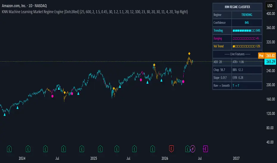
This script takes a different approach . It uses a K-Nearest Neighbors (KNN) machine learning algorithm to estimate the probability that the current market is in one of three regimes: Trending , Ranging , or Volatile Trend . Rather than comparing today's readings against a fixed number, it searches the past 700 bars for the moments that looked most like right now - and asks what the market did after each of those moments. The result is a live probability for each regime, not a hard categorical label.
The output is three things simultaneously:
a background color telling you the dominant regime
a dashboard showing live probability bars for all three states
change markers appearing only when the classifier is genuinely confident a shift has occurred.
█ THE FOUR REGIMES
🔵 TRENDING — price is moving directionally with efficiency. Momentum strategies belong here. Mean reversion strategies get punished here.
🟣 RANGING — price is oscillating between levels with no net directional movement. Mean reversion strategies and fade-the-extreme setups have edge here. Trend-following generates whipsaws.
🟡 VOLATILE TREND — price is trending and ATR has expanded sharply beyond its baseline. This captures earnings gaps, macro shocks, and post-breakout expansion. It is a distinct fourth state — not simply "a strong trend." Reduce size or trail very tightly.
⬛ UNCERTAIN — the dominant probability did not clear the minimum confidence threshold. The market's character is genuinely ambiguous. The best action is observation, not engagement.
█ HOW IT WORKS — THE FULL PIPELINE
Step 1 — Six features, measured every bar
Each bar is described by six measurements, each capturing a different dimension of market character:
• ADX — trend strength. Not direction — only how strongly price is committed to any direction.
• ATR ratio — current ATR divided by its own long-term average. Measures whether volatility is elevated or compressed relative to its own history.
• Choppiness Index — measures how much of the price movement was wasted going sideways. Near 100 = pure chop. Near 38 = perfectly directional.
• Bollinger Band width — how expanded or compressed the bands are relative to price. A compression often precedes volatile expansion.
• Normalized slope — linear regression slope over N bars, divided by ATR. A scale-free measure of directional momentum.
• Kaufman Efficiency Ratio — how directly did price move from A to B? If price traveled 100 points total but only net-moved 20, ER is 0.20. High ER = trending cleanly. Low ER = zigzagging.
Step 2 — Z-score normalization
ADX runs 0–100. ATR ratio runs 0.5–3.0. BB width might be 0.01–0.08 on forex. Using raw values in a distance calculation means the largest-scale feature dominates by sheer magnitude. All six features are standardized: z = (value − rolling mean) / rolling stdev . This puts every feature on equal footing — a reading of +2.0 means " two standard deviations above normal " on any feature. Critically, the mean and stdev are computed on prior bars only ( src offset), which eliminates look-ahead bias from the normalization step.
Step 3 — Labeling historical bars
For every historical bar, the script evaluates what happened over the following Forward Bars window:
• If the net price move exceeded Trend Threshold × average ATR over the window → labeled TRENDING (1)
• If the ATR ratio exceeded Volatility Threshold → labeled VOLATILE TREND (3)
• If trending AND volatile simultaneously → labeled VOLATILE TREND (3), because risk context takes priority
• Otherwise → labeled RANGING (2)
This label is only ever read at an offset of at least Forward Bars bars into the past, so the current bar carries no label — there is no look-ahead in the training data.
Step 4 — KNN search and Gaussian-weighted voting
On each bar, the algorithm scans the historical window (default 700 bars) and computes the Minkowski distance between today's six Z-scored features and every historical bar's six features. The K nearest matches are selected. Closer neighbors receive exponentially higher voting weight via a Gaussian kernel : w = exp(−d² / 2σ²) . This means a bar at distance 0.1 vastly outweighs one at distance 0.5. The votes produce three probabilities — P(trending), P(ranging), P(volatile trend) — that always sum to 1.
Step 5 — Three-stage noise filtering
A single KNN output can flicker bar to bar. Three filters eliminate this:
• Mode filter — selects the most common regime over the last smooth_len bars. Removes 1-3 bar flickers entirely.
• Confirmation filter — the smoothed regime must hold steady for confirm_bars consecutive bars before being accepted. Kills false starts.
• Signal gap — regime change markers only appear once per signal_gap bars minimum, and only when the dominant probability exceeds 65%. This eliminates cluttered charts entirely.
█ DESIGN DECISIONS — WHAT WAS INITIALLY, WHAT CHANGED AND WHY
From 3 regimes to 4
The first idea used three regimes with a simple override: if volatility was high, VOLATILE replaced TRENDING regardless of whether price was actually moving directionally. Testing on stocks showed this caused problems — an earnings-day spike during a clear uptrend was collapsing the trend signal entirely. We realized volatile trending markets are qualitatively different from volatile ranging markets. A fast trend during an OPEC announcement is not the same as a gap-down in a sideways consolidation. VOLATILE TREND became its own regime, and the distinction turned out to be the most practically useful change in the entire script.
From stride = fwd_bars to stride = 3
The early idea for the script we had sampled the training window with a stride equal to Forward Bars (30 by default). This gave roughly 23 training samples — barely enough for KNN to make a meaningful comparison. Reducing the stride to 3 gives approximately 230 samples. The regime classification became dramatically more stable and consistent, especially in quieter markets where the 23-sample version frequently returned UNCERTAIN. The trade-off is slightly more computation, which Pine handles comfortably within its limits.
From a single volatile threshold to a combined trend + volatile check
Originally we labeled VOLATILE based purely on ATR ratio exceeding a threshold. This correctly flagged high-volatility periods but was labeling slow low-ATR trends as RANGING instead of TRENDING during prolonged low-volatility bull markets. The label logic was reworked to check directionality and volatility independently and then combine them: a trending move is TRENDING unless ATR is also elevated, in which case it becomes VOLATILE TREND. This made the label logic honest about what the market was actually doing.
The Efficiency Ratio addition
The original five features (ADX, ATR ratio, Choppiness, BB width, Slope) left a gap: two markets can have identical ADX and slope but very different directional efficiency — one moves in a clean staircase, the other zigzags the same distance. Kaufman's Efficiency Ratio fills this gap. ER = 0.85 on a bar means 85% of all price movement went in the net direction. ER = 0.20 means price was thrashing around and barely net-moved. It proved particularly valuable for distinguishing true trending from noisy ranging in crypto and high-beta stocks.
The regime change marker clutter problem
Early testing produced charts covered in triangles, circles, and diamonds — a new marker on almost every regime flicker. Three parameters were added to solve this: the mode filter, the confirmation bars requirement, and the signal gap. Together they ensure a marker only appears when (a) the majority of recent bars agree on the new regime, (b) it has held for at least N bars, and (c) the KNN confidence is above 65%. The result is 2–6 meaningful markers per year on a daily chart rather than dozens of noisy ones.
█ WHAT YOU SEE ON THE CHART
Background color — the dominant confirmed regime, colored continuously. Cyan = Trending. Magenta = Ranging. Amber = Volatile Trend. No color = Uncertain.
Bar coloring — individual bars colored by the same regime. Toggle off if you prefer your own candle coloring scheme.
Regime change markers — small shapes at confirmed, high-confidence regime transitions only. ▲ below bar = shift to Trending. ● below bar = shift to Ranging. ◆ above bar = shift to Volatile Trend.
Dashboard (top right) — shows the confirmed regime label, confidence percentage, three probability meters (▰▰▰▱▱▱ format), and six live feature readings. The bottom row shows Raw → Smooth (e.g. "T → R") so you can see what the raw KNN output is before the filters process it — useful for understanding when the classifier is about to change state.
█ SETTINGS REFERENCE
🧠 KNN Engine
• K Neighbors — how many historical bars vote. Lower = faster reaction, higher = more stable. Default 25.
• Lookback Window — how many bars to search for neighbors. Larger = more training data. Default 700.
• Minkowski p — distance exponent. 1 = Manhattan (robust to outliers), 2 = Euclidean (standard). Default 2.
• Gaussian bandwidth — how steeply neighbor weight falls with distance. Lower = only the closest neighbors matter. Default 1.5.
• Minimum confidence — probability threshold below which the regime shows as UNCERTAIN. Default 0.45.
🏷️ Labeling
• Forward bars — how many bars ahead define a historical bar's regime label. Match your typical hold time. Default 30.
• Trend threshold — net move must exceed this × avg ATR to label TRENDING. Lower = more bars labeled trending. Default 1.2.
• Volatility threshold — ATR ratio must exceed this to label VOLATILE TREND. Higher = only extreme events qualify. Default 1.5.
📐 Features
• ADX Length — period for the directional movement index. Longer = smoother. Default 20.
• ATR Length — period for average true range. Default 14.
• ATR Baseline — SMA period for the ATR ratio denominator. Longer = more stable baseline. Default 100.
• Choppiness / BB / Slope lengths — feature calculation periods. All default to 20–30.
• Efficiency Ratio Length — Kaufman ER lookback. Default 30.
🧹 Filtering
• Regime Smoothing Lookback — mode filter window. Higher = fewer false regime changes. Default 11.
• Bars to confirm regime — consecutive bars required before a new regime is accepted. Default 4.
• Min bars between signals — minimum spacing between regime change markers. Default 20.
█ SETTINGS BY ASSET CLASS
📈 Large-cap stocks — daily (AMZN, AAPL, NVDA)
Stocks trend slowly over weeks to months, with sharp one-day volatility spikes on earnings. All feature lengths should be longer to resolve the slower regime pace.
• Forward bars: 20–30 | Trend threshold: 0.8–1.2 | Volatility threshold: 2.0–2.5
• ATR Baseline: 100 | ADX / Chop / Slope lengths: 20 | BB length: 30 | EffR: 30
• Smoothing: 11 | Confirm bars: 4–5 | Signal gap: 20
• Note: use 0.8 trend threshold for slow defensive stocks (JNJ, KO), 1.2 for high-beta tech (NVDA, TSLA)
₿ Crypto — daily (BTC, ETH, large caps)
Crypto regimes flip in days, not months. ATR is 3–7× higher than stocks. Shorter windows, lower thresholds, less smoothing.
• Forward bars: 10–14 | Trend threshold: 1.5–2.5 | Volatility threshold: 1.5–2.0
• ATR Baseline: 50–70 | All feature lengths: 14 | EffR: 14–20
• Smoothing: 5–7 | Confirm bars: 2–3 | Signal gap: 7–10
• Note: for altcoins use trend threshold 2.0–2.5; for BTC use 1.5–2.0
💱 Forex — daily (EUR/USD, GBP/USD, USD/JPY)
Forex trends are driven by central bank divergence and last months. Daily ATR is tiny (0.4–0.7% of price). Everything needs to be longer and slower.
• Forward bars: 30–45 | Trend threshold: 0.6–0.8 | Volatility threshold: 2.5–3.0
• ATR Baseline: 120–150 | ADX length: 20–25 | Slope / EffR: 40–50
• Smoothing: 15–21 | Confirm bars: 5–7 | Signal gap: 30–45
• Note: exotic pairs (USD/TRY, USD/ZAR) behave like crypto — use crypto settings instead
🛢️ Commodities — daily (Gold XAU, Oil WTI)
Gold is slow and stable like equities. Oil is fast and event-driven like crypto. Use different profiles.
• Gold: Forward bars 20, Trend 0.8, Vol 2.5, ATR Base 100, Smooth 11, Confirm 4, Gap 20
• Oil: Forward bars 15, Trend 1.2, Vol 2.0, ATR Base 70, Smooth 7, Confirm 2–3, Gap 10
• Note: OPEC events and geopolitical shocks will correctly fire VOLATILE TREND on oil — this is intended behavior
🌐 Indices — daily (SPX, NDX, DAX)
Indices are the most regime-stable asset class. They trend 65–75% of the time and have the cleanest feature signals of any asset.
• Forward bars: 20–30 | Trend threshold: 0.8–1.0 | Volatility threshold: 2.0–2.5
• ATR Baseline: 120 | ADX length: 20 | Smoothing: 11–15 | Confirm bars: 4–5 | Signal gap: 20–30
• Note: NDX is ~30% more volatile than SPX — use trend threshold 1.0 for NDX, 0.8 for SPX
EXAMPLE
█ HOW TO USE WITH OTHER INDICATORS
This script does not generate buy or sell signals. It tells you which type of strategy has edge right now . The intended workflow:
1 — Add your momentum or mean reversion indicator alongside this one.
2 — Only take momentum / trend-following entries when the background is cyan (TRENDING) .
3 — Only take mean reversion / fade entries when the background is magenta (RANGING) .
4 — Reduce position size or step aside entirely when the background is amber (VOLATILE TREND) .
5 — Do nothing when there is no background color — the regime is UNCERTAIN.
Used this way, the classifier acts as a strategy mode selector rather than a signal generator. It is the foundation of a multi-strategy system where the same chart hosts different logic depending on detected conditions.
█ LIMITATIONS
• KNN is a lazy learner — it reflects patterns in its training window. If the current market regime has no historical analog in the lookback window (e.g. a once-in-a-decade crash), the classifier will misclassify or return UNCERTAIN.
• The script requires a warm-up period equal to Lookback Window + Forward Bars bars before producing output. On instruments with limited history this may delay the first valid reading.
• Computation scales with window size and stride. Very large windows (2000+) may slow chart rendering on lower-end machines.
• The reversion probability reflects historical frequency, not a guarantee of future behavior. All market regimes can and do fail.
Human vs Machine 🧠vs 🤖
And most importantly, checking the chart with the HUMAN EYE is different from using the raw ML KNN method - something we agreed on checking the charts, as we, traders-developers, had different opinions of the market regime for an asset price. But the Script might yield results we can all agree upon.
█ DISCLAIMER
This indicator is a decision-support tool, not a trading system. It does not constitute financial advice. Past regime patterns do not guarantee future behavior. Always apply proper risk management.
Algorithm: K-Nearest Neighbors (KNN)
Distance metric: Minkowski Distance (p=2, Euclidean default)
Kernel: Gaussian (distance-weighted voting)
Normalization: Z-Score (look-ahead free)
Regimes: Trending | Ranging | Volatile Trend | Uncertain Indicator

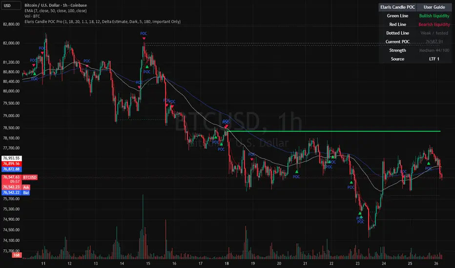
Order Block Mitigation Profiler [forexobroker]Order Block Mitigation Profiler locates institutional order blocks and tracks each one through a full lifecycle: OPEN (untouched), TOUCHED (price traded back in), and MITIGATED (price closed through). The unique angle is the dual-layer engine: instead of only firing the rare classic one-shot retest, a fresh block arms a persistent directional bias and entries are timed by an EMA reclaim inside that bias, keeping signal cadence usable on live charts.
🔶 ALGORITHM
1. Confirm swing structure with symmetric pivots (ta.pivothigh / ta.pivotlow), tracking the most recent confirmed swing high and low.
2. Detect a Break of Structure (BOS): close crosses the last confirmed swing pivot (close > lastPH while prior close was at or below it, mirrored for bearish).
3. Walk back up to OB Search Lookback bars from the BOS to find the last opposing-direction candle; that candle's high/low defines the order block.
4. Validate displacement: the impulse leg from the block must span at least Min Impulse x ATR, filtering out non-institutional moves.
5. Lifecycle state machine per block: state 1 (OPEN), 2 (TOUCHED on first retest), 3 (MITIGATED when the mitigation reference closes/wicks through).
6. Persistent bias: a freshly formed OB sets bias +1 / -1; the bias clears only when that block is mitigated.
7. Entry timing: within an active bias, an EMA reclaim (ta.crossover / ta.crossunder of close vs the Entry Reclaim EMA) fires the trade. Retest-Only Mode swaps this for the strict first-retest event.
🔶 SIGNAL LOGIC
- Buy: bullish bias active (fresh bull OB, not yet mitigated) and close crosses over the Entry Reclaim EMA (or, in Retest-Only Mode, the first bull OB retest), in session, with position not already long, after the cooldown window has elapsed, and only on barstate.isconfirmed; a position-lock state flips to LONG to prevent stacking.
- Sell: bearish bias active (fresh bear OB, not yet mitigated) and close crosses under the Entry Reclaim EMA (or the first bear OB retest), in session, position not already short, cooldown elapsed, on barstate.isconfirmed; position-lock flips to SHORT.
Only fires when a fresh, unmitigated order block has set directional bias.
🔶 INPUTS
- Structure: pivot length for swing confirmation (default 8), OB search lookback, and ATR length.
- Impulse filter: minimum impulse measured in ATR multiples to qualify a block (default 1.0x ATR).
- Mitigation rule: mitigate on close versus wick-through toggle (default close).
- Signal Logic: Entry Reclaim EMA length (default 9) and Retest-Only Mode toggle (default off = regime + EMA reclaim).
- Cooldown: minimum bars between signals (default 5).
- Filters: optional session restriction with a session window, and one-signal-per-block lock (default on).
- Visual: OB zone boxes, dashboard, 3-layer glow, buy/sell colors, and dashboard background.
🔶 ALERTS
OBM Buy, OBM Sell, OBM Any Signal, OBM Bull BOS, OBM Bear BOS, OBM Bull OB Formed, OBM Bear OB Formed, OBM Bull Mitigated, OBM Bear Mitigated, OBM Bull Retest, OBM Bear Retest, OBM Structure Break, OBM Webhook JSON.
🔶 LIMITATIONS
- Requires warm-up: pivots only confirm after Pivot Length bars on each side, so early chart history produces no structure.
- Defaults (ATR 14, impulse 1.0x) are tuned for liquid instruments; thin or low-volatility symbols may need a lower impulse multiple.
- Retest-Only Mode is intentionally rare and can go long stretches with no signal; the default regime + EMA reclaim mode trades more frequently.
- Non-repainting by design (pivots confirmed, signals on bar close), which means the swing that anchors a block appears Pivot Length bars after it actually formed.
- Order blocks are structural zones, not guaranteed reversals; the impulse and ATR filters reduce but do not eliminate false breaks.
Indicator

MTF Structure Vote [forexobroker]MTF Structure Vote polls three independent higher timeframes and lets each one cast a directional vote based on where price sits relative to its own structural trend EMA. When enough timeframes agree, a confluence regime is declared, and a precise local EMA reclaim then times the entry. The unique angle is treating multi-timeframe alignment as a discrete vote count rather than a single blended bias, which makes chop filtering explicit and tunable.
🔶 ALGORITHM
1. Three higher timeframes (default 60, 240, D) are read via request.security with barmerge.lookahead_off.
2. Each timeframe computes a trend EMA (default length 50) on its own closes. Close above the HTF EMA returns +1, below returns -1.
3. The three votes are summed into a net vote ranging from -3 to +3.
4. A local reclaim EMA (default 9) is computed on the chart timeframe to time entries.
5. Bull confluence is declared when net vote is greater than or equal to the threshold; bear confluence when it is less than or equal to the negative threshold.
6. ATR (default 14) is tracked for context in the dashboard.
7. Each signal flips a persistent position state and stamps the bar so the cooldown can enforce spacing.
🔶 SIGNAL LOGIC
- Buy: net vote reaches the bull confluence threshold AND local close crosses over the reclaim EMA AND session filter passes AND position is not already long AND cooldown bars elapsed since last signal AND barstate.isconfirmed.
- Sell: net vote reaches the bear confluence threshold AND local close crosses under the reclaim EMA AND session filter passes AND position is not already short AND cooldown bars elapsed since last signal AND barstate.isconfirmed.
Only fires when the multi-timeframe net vote has reached the configured confluence threshold.
🔶 INPUTS
- MTF group: three higher-timeframe selectors; HTF 1 default 60.
- HTF Trend EMA: length of the structural EMA computed on each higher timeframe; default 50.
- Local Reclaim EMA: chart-timeframe EMA used to time entries; default 9.
- Signal Logic group: minimum absolute net vote required; default 2 (at least 2 of 3 agree).
- ATR Length: volatility reference shown in the dashboard; default 14.
- Cooldown Bars: minimum bars between signals; default 5.
- Filters group: optional session restriction; session window default 0000-2400.
- Visual group: dashboard, 3-layer glow, local EMA plot, buy/sell colors, dashboard background; glow on by default.
🔶 ALERTS
MSV Buy, MSV Sell, MSV Any Signal, MSV Bull Conf, MSV Bear Conf, MSV Unanimous Bull, MSV Unanimous Bear, MSV Vote Change, MSV Local Up, MSV Local Down, MSV Any Conf, MSV Webhook JSON.
🔶 LIMITATIONS
- The higher-timeframe EMAs need warm-up history; on fresh symbols early bars carry no reliable vote.
- request.security on higher timeframes is read with lookahead_off on the confirmed bar, so values are non-repainting but update only when the HTF bar closes, introducing natural lag.
- Defaults are tuned for liquid instruments; thin symbols may need wider thresholds or different timeframes.
- Confluence gating intentionally suppresses signals during mixed regimes, so trending-only behavior is expected.
- The local reclaim is a fast EMA cross and can whipsaw inside a valid confluence regime during low volatility.
Indicator

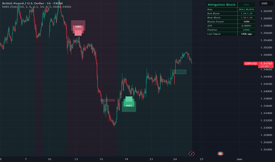
Mitigation Block Sentinel [forexobroker]Mitigation Block Sentinel locates mitigation blocks: a bullish block is the last down-close candle before an up-displacement that breaks recent structure, the zone where trapped longs were mitigated and from which price tends to launch again (mirror for bearish). The block arms a directional bias, and entries time off an EMA reclaim inside that bias or a strict block retest in Retest-Only mode. A live dashboard tracks both block zones and the current bias.
🔶 ALGORITHM
1. Compute ATR and the prior N-bar structural high and low (structure lookback).
2. A bullish impulse = up candle whose body >= k x ATR that closes above the prior structural high; bearish is the mirror below the prior structural low.
3. Mitigation-block origin scan: from the impulse, scan back up to the block-scan-back limit for the nearest opposite-close candle; its high/low becomes the block top/bottom.
4. The fresh block is armed; a retest occurs when price trades back into the block extended by a retest buffer of k x ATR.
5. A fresh block arms a persistent directional bias that holds until the opposite block forms.
6. Entry timing: an EMA reclaim (close crossing the entry-reclaim EMA in the block direction), or a strict block retest in Retest-Only Mode.
🔶 SIGNAL LOGIC
- Buy: bias == bullish AND close crosses over the reclaim EMA (or a bullish block retest in Retest-Only Mode), in session, with no active long, cooldown elapsed, and barstate.isconfirmed; position locks long.
- Sell: bias == bearish AND close crosses under the reclaim EMA (or a bearish block retest in Retest-Only Mode), in session, with no active short, cooldown elapsed, and barstate.isconfirmed; position locks short.
Only fires while the persistent block bias agrees with the entry direction.
🔶 INPUTS
- Block group: structure lookback for the high/low the impulse must break (default 10).
- Block group: impulse body multiple of ATR for the launch candle (default 1.0).
- Block group: block scan-back bars to find the origin candle (default 6).
- Block group: retest buffer multiple of ATR (default 0.10) and ATR length (default 14).
- Signal Logic group: entry reclaim EMA length (default 9).
- Signal Logic group: Retest-Only Mode toggle (default off) and cooldown bars (default 5).
- Filters group: restrict-to-session toggle and session window (default 0000-2400).
- Visual group: show block zones, dashboard, and 3-layer glow (all default on).
- Visual group: buy color, sell color, and dashboard background.
🔶 ALERTS
MBS Buy, MBS Sell, MBS Any Signal, MBS Bull Block, MBS Bear Block, MBS Bull Retest, MBS Bear Retest, MBS Any Block, MBS EMA Up, MBS EMA Down, MBS Bias Bull, MBS Bias Bear, MBS Webhook JSON.
🔶 LIMITATIONS
- Needs warm-up bars for ATR and the structural lookback before blocks can form.
- The origin scan only reaches back the block-scan-back limit; a block whose origin sits beyond that window is missed.
- ATR-adaptive defaults are tuned for liquid instruments; thin symbols may need the impulse body multiple retuned.
- The persistent bias holds until an opposite block forms, so it can remain stale through extended ranges.
- Signals confirm on bar close; block zones are redrawn on each new block and are not guaranteed support or resistance.
Indicator
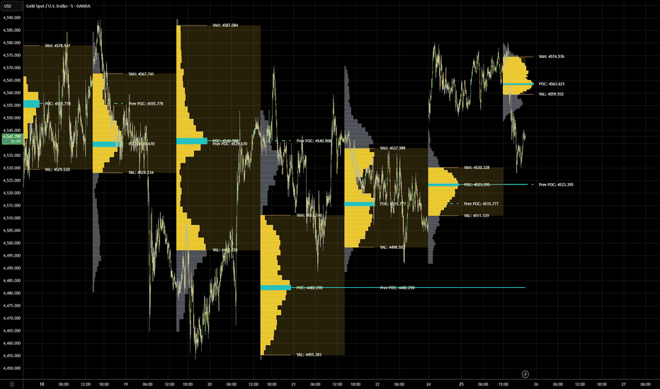
Volume Profile Enhanced PeriodicVolume Profile Enhanced Periodic
Volume Profile Enhanced Periodic is an advanced profile framework designed to analyze and visualize how volume is distributed across price levels over repeating time periods such as days, weeks, months, quarters, and years.
Unlike traditional fixed-range profiles that focus on a single visible section of the chart, this indicator automatically generates separate volume profiles for each selected historical period, allowing traders to study how price acceptance, value migration, and high participation areas evolve over time.
The objective is to identify where market participants historically concentrated activity and monitor how these areas shift as market structure develops.
By combining period-based volume profiles, Point of Control tracking, Value Area analysis, extending POC levels, and profile projection tools, the indicator is designed to provide additional context for support/resistance behavior, market acceptance, and evolving market structure.
Features
• Automatic Day / Week / Month / Quarter / Year profiles
• Historical profile generation across multiple periods
• Solid histogram profile display
• Profile direction toggle (Left or Right facing)
• Point of Control (POC) detection
• Previous POC tracking
• Value Area High (VAH) and Value Area Low (VAL) calculations
• Extend POC levels until price interaction
• Extend Value Area fields into future periods
• Adjustable Value Area extension brightness
• Custom profile width controls
• Historical profile management controls
• Lightweight performance optimization
• Naked labels without background flags
• Dynamic labels for:
• POC
• Previous POC
• VAH
• VAL
Alerts Included
• Price Crossed POC
• Price Crossed VAH
• Price Crossed VAL
• POC Shifted Higher
• POC Shifted Lower
• Price Entered Value Area
• Price Exited Value Area
Potential Use Cases
• Identify historical high participation zones
• Locate support and resistance areas
• Monitor value migration over time
• Track changing market acceptance
• Identify developing imbalance areas
• Observe POC movement between periods
• Use extended POC levels as potential reaction zones
• Add confluence to existing systems
• Study auction behavior and market structure
Interpretation
POC (Point of Control)
Represents the price level where the highest concentration of volume occurred during the selected period.
VAH (Value Area High)
Represents the upper boundary of the selected value area where the majority of trading activity occurred.
VAL (Value Area Low)
Represents the lower boundary of the selected value area.
Previous POC
Displays prior dominant participation levels for historical context.
Extended POC
Extends POC levels forward until price revisits or crosses through them, potentially highlighting important market interaction zones.
Extended Value Area Field
Projects the previous period's value area into future price action for additional context regarding acceptance and rejection zones.
About TrendGenY Indicators
TrendGenY indicators are built from market experience, creative concepts, and a constant pursuit of unique perspectives. Rather than following conventional ideas, the focus is on uncovering alternative insights and viewing market behavior through different angles to reveal information that traditional tools may overlook and help traders build a more meaningful edge in the market. Indicator
Indicator
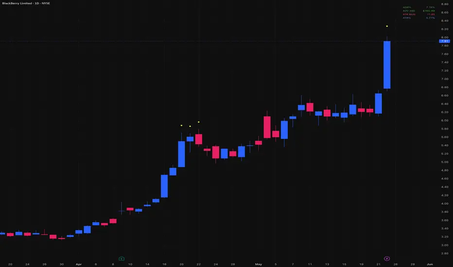
Entry Gate - ADR% / ADV / ATR MultipleThree critical pre-trade filters, always visible right on your chart.
Before entering any swing trade, three questions determine whether the setup is even worth considering: is this stock volatile enough to move my account, is it liquid enough to trade cleanly, and is it too extended to enter now? Entry Gate answers all three at a glance, in a single corner of your chart.
ADR% (Average Daily Range) measures how much a stock moves on an average day. Too low and it won't move your portfolio. Too high and daily noise will stop you out randomly.
ADV (Average Dollar Volume) measures how much money flows through the stock each day. Liquid stocks respect key levels, pull back cleanly to moving averages, and don't gap on low volume. Illiquid stocks do the opposite.
ATR Multiple measures how extended the price is above its 50-day moving average, expressed in ATR units. The further extended, the higher the probability of a pause or reversal. Based on jfsrev's published formula: % Gain from MA divided by ATR%.
ATR% rounds out the dashboard with the raw volatility number for context.
All values are color-coded against your thresholds:
🟢 Green — within your ideal range
🟠 Orange — borderline, proceed with caution
🔴 Red — outside your criteria
A yellow dot also plots above the bar when the ATR Multiple exceeds your trigger level, marking historically extended zones at a glance.
Fully customizable:
Independent thresholds for ADR%, ADV, and ATR Multiple
Warning zones for borderline values
Lookback periods for each calculation
Font size, table position, dot size and offset
Color customization for good / warning / bad / ATR / dot
All values are pulled from the daily timeframe via request.security, so the numbers stay consistent whether you're on a daily, weekly, or intraday chart.
Default thresholds are calibrated for swing traders running mid-sized accounts. Adjust to match your strategy.
Credits to ArmerSchlucker for the original ADR% table indicator, MikeC / TheScrutiniser and GlinckEastwoot for the ADR% formula, and jfsrev / Fred6724 for the ATR% Multiple from 50-MA approach. Indicator

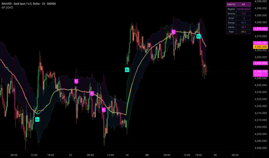
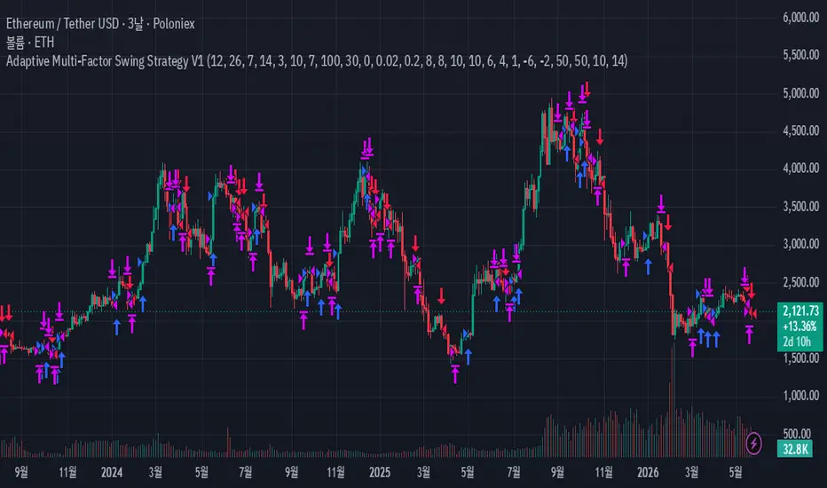
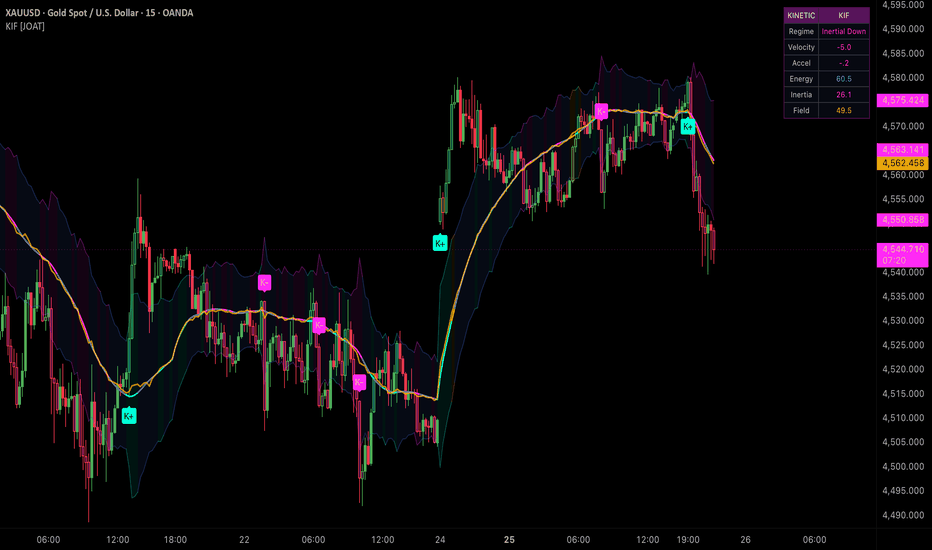
Kinetic Inertia Field [JOAT]Kinetic Inertia Field
Introduction
Kinetic Inertia Field models price like a noisy particle using velocity, acceleration, jerk, kinetic energy, potential displacement, and equilibrium deviation.
This open-source indicator is designed as a context tool, not a standalone trading system. It focuses on explaining the current market state with restrained visuals and confirmed-bar logic where signals are used.
Core Concepts
1. Velocity and Acceleration
Log returns are normalized by volatility to create velocity, then differentiated into acceleration and jerk.
2. Kinetic Energy
Inverse volatility acts as a mass proxy and squared velocity creates energy context.
3. Equilibrium Displacement
A regression/VWAP blend creates a fair path and ATR-normalized displacement.
4. Inertia Field
Energy, acceleration, and displacement combine into inertial up, inertial down, or elastic state.
kineticEnergy = 0.5 * mass * velocity * velocity
Features
Velocity, acceleration, and jerk model
Kinetic and potential energy scoring
Regression/VWAP equilibrium
Energy rails and impulse trace
K+ and K- labels plus snapback markers
Input Parameters
Velocity smoothing
Volatility memory
Equilibrium horizon
Energy and inertia gates
Cooldown and display toggles
How to Use This Script
Use K+ and K- as confirmed high-energy state changes. Gold markers show elastic snapback conditions.
Limitations
The script uses historical OHLCV data and cannot know future prices.
Signals and states can be late during fast reversals because confirmed-bar logic is used to reduce repainting.
Model outputs should be interpreted with market context, risk controls, and independent analysis.
No visual state should be treated as a certain trade outcome.
Originality Statement
KIF is original in applying kinetic energy, potential displacement, and inertia scoring to price-state analysis.
Disclaimer
This indicator is provided for educational and informational purposes only. It is not financial advice, investment advice, or a recommendation to buy or sell any financial instrument. All calculations are derived from historical market data and may produce inaccurate readings in some market conditions. No indicator can predict future market behavior. Use proper risk management and independent judgment.
-Made with passion by jackofalltrades
Indicator
Average Daily Range Percentage (ADR%) and Average Daily VolumeTwo critical pre-trade filters, always visible right on your chart.
Before entering any swing trade, you need to know two things: is this stock volatile enough to move your account, and is it liquid enough to trade cleanly? This indicator answers both questions at a glance.
**ADR% (Average Daily Range)** measures how much a stock moves on an average day. Too low and it won't move your portfolio. Too high and the daily noise will stop you out randomly. The color tells you where you stand instantly.
**ADV (Average Dollar Volume)** measures how much money flows through the stock each day. Liquid stocks respect key levels, pull back cleanly to moving averages, and don't gap randomly on low volume. Illiquid stocks do the opposite.
Both values are color-coded against your thresholds:
🟢 Green — within your ideal range
🟠 Orange — borderline, proceed with caution
🔴 Red — outside your criteria, skip it
Fully customizable:
ADR% and ADV thresholds
Warning zones for borderline values
Lookback periods for both calculations
Colors for good, warning, and bad values
Default thresholds are calibrated for swing traders. Adjust to match your account size and risk tolerance.
Built for swing traders who want clean, fast chart reviews without second-guessing liquidity or volatility on every name. Indicator

DTR & ATR & RVolDTR & ATR with Live Zones + Relative Volume
Combines two essential intraday tools in a single overlay indicator:
DTR vs ATR — compares today's Daily Trading Range (actual high–low) against the Average True Range (ATR). Displayed as a percentage so you instantly see where the day stands relative to its historical average range. The info box turns green (< 70%), yellow (70–90%), or red (≥ 90%) to signal how extended the move already is.
ATR Zone Lines & Boxes — draws horizontal lines and shaded zones at 100%, 150%, 200%, 250%, and 300% of the ATR, anchored to the session open. Lines update dynamically as price discovers the day's range, then lock in once the full ATR is covered. Fully customisable colours, thickness, and label styles per level.
Relative Volume (RVol) — measures today's volume activity versus the N-day historical average. Two modes:
[Cumulative (default): total volume accumulated so far today (including pre-market and after-hours) divided by the N-day average full-day total. Grows throughout the session; values above 100% mean today is running above average volume.
Pace: compares each individual bar's volume to the N-session EWMA for that same bar slot — a stable per-bar reading that is not distorted by the naturally high opening volume.
All inputs are fully configurable: ATR length and smoothing method (EMA/RMA/SMA/WMA), RVol lookback period and mode, session time and time zone, individual on/off toggles and colour pickers for every ATR level, and table position/size.
Based on the original "DTR & ATR with live zones" by Mereep01, extended with a time-consistent Relative Volume engine. Indicator

Black Merton Volatility Engine [JOAT]Black Merton Volatility Engine
Introduction
Black Merton Volatility Engine blends multiple realized-volatility estimators with expected-move rails, cone rank, jump pressure, and tail-state classification.
This open-source indicator is designed as a context tool, not a standalone trading system. It focuses on explaining the current market state with restrained visuals and confirmed-bar logic where signals are used.
Core Concepts
1. Composite Realized Volatility
Close-to-close, Parkinson, Garman-Klass, Rogers-Satchell, and Yang-Zhang-style estimates contribute to the volatility state.
2. Volatility Cone
Current volatility is ranked against a historical cone to identify squeeze and shock conditions.
3. Expected Move Rails
Annualized volatility is converted into a multi-day expected move around price.
4. Tail and Jump Pressure
Large returns, rail breaches, and volatility divergence contribute to tail and jump states.
expectedMove = close * realizedVol * math.sqrt(days / 252)
Features
Composite realized volatility
Expected-move rails
Squeeze and shock regimes
Gamma pin, tail shock, clean expansion, and jump labels
Movable quant HUD
Input Parameters
Fast, base, and slow vol windows
Vol cone window
Expected move days
Squeeze and shock percentiles
Cooldown and display toggles
How to Use This Script
Use the rails as volatility context. Squeeze, shock, tail, and jump states describe volatility conditions, not a certain direction.
Limitations
The script uses historical OHLCV data and cannot know future prices.
Signals and states can be late during fast reversals because confirmed-bar logic is used to reduce repainting.
Model outputs should be interpreted with market context, risk controls, and independent analysis.
No visual state should be treated as a certain trade outcome.
Originality Statement
BMV is original in blending several volatility estimators, cone ranking, jump pressure, and expected-move visualization.
Disclaimer
This indicator is provided for educational and informational purposes only. It is not financial advice, investment advice, or a recommendation to buy or sell any financial instrument. All calculations are derived from historical market data and may produce inaccurate readings in some market conditions. No indicator can predict future market behavior. Use proper risk management and independent judgment.
-Made with passion by jackofalltrades
Indicator

Discrete Stochastic Volatility Optimal Stopping## Technical Documentation: Discrete Approximation of Bivariate Optimal Stopping Boundaries
### Overview
This document outlines the mathematical methodology for discretizing a continuous-time stochastic volatility model to identify optimal execution boundaries. The algorithm maps an asset's price and variance processes into standardized state spaces to detect joint extrema, triggering execution when predefined statistical thresholds are breached.
---
### 1. Price Process Normalization
To evaluate structural price dislocation, the raw asset price $P_t$ is transformed into a standardized normal state space (Z-score).
**Mathematical Formulation:**
$$Z^{(S)}_t = \frac{P_t - \mu_S}{\sigma_S}$$
Where the sample mean ($\mu_S$) and sample standard deviation ($\sigma_S$) are calculated over an $N$-period lookback window:
* **Sample Mean:** $\mu_S = \frac{1}{N} \sum_{i=0}^{N-1} P_{t-i}$
* **Sample Standard Deviation:** $\sigma_S = \sqrt{\frac{1}{N} \sum_{i=0}^{N-1} (P_{t-i} - \mu_S)^2}$
**Purpose:** This isolates the magnitude of the price deviation relative to its recent equilibrium, providing the orthogonal $x$-axis for the state space.
---
### 2. Instantaneous Variance Estimation
Continuous-time models rely on instantaneous variance, which is unobservable in discrete time. The algorithm approximates this using the annualized rolling realized variance of geometric returns.
**Mathematical Formulation:**
$$v_t = \frac{252}{N} \sum_{i=0}^{N-1} r_{t-i}^2$$
Where the continuously compounded return $r_t$ is defined as:
$$r_t = \ln\left(\frac{P_t}{P_{t-1}}\right)$$
**Purpose:** Assuming the mean daily return is zero ($\mu \approx 0$), the squared log return $r_t^2$ serves as an unbiased estimator of daily variance. The factor $\frac{252}{N}$ standardizes the sum of these squared returns into an annualized volatility metric ($v_t$).
---
### 3. Variance Process Normalization
Because variance $v_t$ is heteroskedastic and mean-reverting, the empirical variance series must also be standardized to evaluate expansion or compression relative to its own baseline.
**Mathematical Formulation:**
$$Z^{(v)}_t = \frac{v_t - \mu_v}{\sigma_v}$$
Where $\mu_v$ and $\sigma_v$ are the $N$-period sample mean and standard deviation of the variance series $v_t$.
**Purpose:** This yields a unitless metric representing the statistical extremity of the current volatility regime, forming the orthogonal $y$-axis of the state space.
---
### 4. Boundary Evaluation Logic
The discrete optimal stopping conditions approximate the analytical Hamilton-Jacobi-Bellman (HJB) boundaries by evaluating the intersection of the two state variables ($Z^{(S)}_t$ and $Z^{(v)}_t$) against arbitrary static thresholds ($\alpha$ for maxima, $\beta$ for minima).
**Entry Condition (Buy):**
Execution is triggered exclusively at the joint minimum of price and variance, defined by the logical intersection:
$$\tau_B = \inf \{ t \ge 0 \mid (Z^{(S)}_t \le \beta_S) \land (Z^{(v)}_t \le \beta_v) \}$$
*Requires price to be heavily discounted while the market regime is highly compressed.*
**Exit Condition (Sell):**
Liquidation is triggered exclusively at the joint maximum, defined by the logical intersection:
$$\tau_S = \inf \{ t \ge \tau_B \mid (Z^{(S)}_t \ge \alpha_S) \land (Z^{(v)}_t \ge \alpha_v) \}$$
*Requires price to be statistically overextended during a regime of extreme variance expansion.* Indicator

Efficiency Trailing Stop LossEfficiency TSL is an adaptive trailing stop framework designed to dynamically follow market movement while continuously adjusting stop behavior based on changing price efficiency and directional conditions.
Unlike traditional trailing stop systems that rely on static ATR values or fixed structure levels, Flip TSL evaluates how effectively price is moving and uses that information to expand, tighten, or aggressively reduce risk as market behavior evolves.
The objective is not simply to trail price, but to adapt risk management according to changing market conditions beneath the surface.
By combining market efficiency analysis, directional state detection, adaptive stop expansion logic, and automatic long/short transition behavior into a unified framework, the indicator is designed to provide additional context for trade management and evolving market structure.
Features
• Single adaptive trailing stop line
• Automatic Long ↔ Short transition system
• Dynamic stop expansion and tightening engine
• Market efficiency analysis
• Improvement / deterioration detection
• Automatic direction logic modes:
• Stop Cross
• SMA Direction
• Candle Direction
• Structure Step stop logic
• Swing High / Low fallback logic
• Multi-timeframe calculations
• Adjustable timeframe selection
• Wait-until-close confirmation option
• Dynamic ATR stop sizing
• Real-time dashboard
• Fully customizable colors and display settings
Dashboard Includes
• Current direction mode
• Auto direction method
• Efficiency score
• Market state
• Stop mode
• Active ATR multiplier
• Current trailing stop value
Alerts Included
• Flipped Long
• Flipped Short
• Efficiency crossed below threshold
• Long Mode Activated
• Short Mode Activated
Potential Use Cases
• Dynamically manage open positions
• Adapt stop placement to changing conditions
• Reduce risk during deteriorating environments
• Hold stronger trends longer
• Filter lower-quality market conditions
• Add confluence to existing systems
• Study changing market behavior
Interpretation
Expanded
Market efficiency is elevated and conditions remain supportive of directional continuation.
The trailing stop expands and provides additional room for price movement.
Tightening
Market conditions begin slowing or losing efficiency.
The trailing stop contracts and moves closer to price action.
Cut / Take Profit
Market efficiency falls beneath the defined threshold.
The stop may aggressively tighten or move toward current price to reduce exposure and protect gains.
Direction Modes
Stop Cross
Direction flips when price crosses the active trailing stop.
SMA Direction
Direction follows price relative to moving average positioning.
Candle Direction
Direction adapts based on bullish and bearish candle behavior.
About TrendGenY Indicators
TrendGenY indicators are built from market experience, creative concepts, and a constant pursuit of unique perspectives. Rather than following conventional ideas, the focus is on uncovering alternative insights and viewing market behavior through different angles to reveal information that traditional tools may overlook and help traders build a more meaningful edge in the market. Indicator

Indicator

Strategy

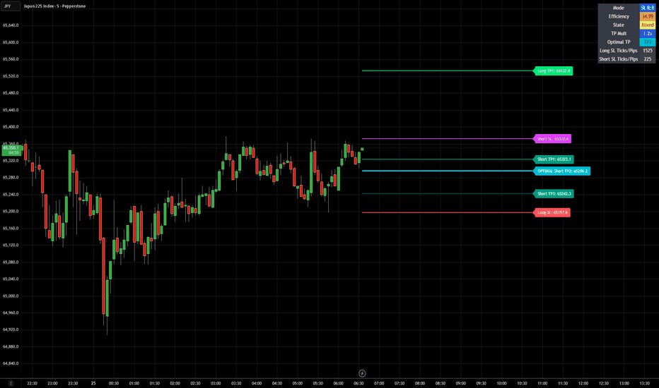
Dynamic Take Profit Stop LossDynamic Take Profit Stop Loss
Dynamic Take Profit Stop Loss is designed to move beyond static take profit levels by dynamically adapting profit projections to changing market conditions.
Instead of relying on fixed R:R targets or ATR values alone, this indicator uses an internal Efficiency Engine to measure how effectively price is moving and adjusts projected targets accordingly.
As market efficiency strengthens, targets can expand. As efficiency weakens or deteriorates, targets can tighten to help preserve gains and reduce exposure.
Key Features
• Adaptive TP projections based on market efficiency
• SL-based R:R projection mode
• ATR-based projection mode
• Dynamic TP expansion and contraction logic
• Automatic Optimal TP selection (TP1 / TP2 / TP3)
• Local High / Low stop-loss calculation with adjustable buffers
• Optional manual entry price input
• Multiple TP display combinations:
TP1 Only
TP2 Only
TP3 Only
Optimal Only
TP + Optimal combinations
Multi-TP combinations
Show All
• Long and Short trade projections
• Dynamic TP multiplier engine
• Efficiency state analysis:
Improving
Mixed
Worsening
• Live information table showing:
Efficiency Score
Market State
TP Multiplier
Optimal TP
Long SL Distance
Short SL Distance
• Adjustable colors, table placement, text sizing, labels, and projection length
How It Works
The internal Efficiency Engine analyzes recent price behavior by comparing:
• Net directional movement
• Total movement path traveled
• Historical improvement or deterioration in efficiency
A weighted score is generated and translated into a dynamic TP multiplier.
Typical behavior:
Strong efficiency + improving conditions
→ Expand targets
Neutral conditions
→ Hold targets
Weakening efficiency
→ Tighten targets
Weak and deteriorating conditions
→ Exit or reduce exposure
Example Use
A standard 2R target may become:
Strong conditions:
2R → 3R+
Weak conditions:
2R → 1.2R–1.5R
The goal is to align profit expectations with how price is actually behaving instead of assuming all trades deserve identical targets.
Best Used For
• Trend continuation trading
• Breakout strategies
• Intraday trading
• Swing trading
• Futures
• Forex
• Indices
• Crypto
• Stocks
About TrendGenY Indicators
TrendGenY indicators are built from market experience, creative concepts, and a constant pursuit of unique perspectives. Rather than following conventional ideas, the focus is on uncovering alternative insights and viewing market behavior through different angles to reveal information that traditional tools may overlook and help traders build a more meaningful edge in the market. Indicator
Symbol Volatility Mapper# Symbol Volatility Mapper
## Overview
Symbol Volatility Mapper automatically selects and plots the corresponding volatility index for the active chart symbol.
The script is designed to simplify cross-asset volatility analysis by linking major equity indices and selected commodity futures to their commonly referenced implied volatility benchmarks. This allows traders to monitor the relevant volatility regime directly from the underlying chart without manually switching between symbols.
## Supported Mappings
- **SPX / ES** -> `CBOE:VIX`
- **NDX / NQ** -> `CBOE:VXN`
- **RUT / RTY** -> `CBOE:RVX`
- **DAX / FDAX** -> `EUREX:VDAX-NEW`
- **Gold / GC** -> `CBOE:GVZ`
- **Crude Oil / CL** -> `CBOE:OVX`
## Features
- Automatic symbol recognition using `syminfo.ticker` and `syminfo.root`
- Dynamic mapping of the active chart to its corresponding volatility index
- Clean volatility plot in a separate pane
- On-chart label showing the currently active symbol mapping
- Graceful fallback when no supported mapping is available
## How It Works
The indicator checks the active chart symbol and determines whether it matches one of the supported index or futures roots. Once a valid match is found, the script requests the `close` data of the corresponding volatility index and plots it in real time.
This approach makes it easier to compare price action in the underlying market with its associated implied volatility measure, which can be useful for context, regime identification, and discretionary decision-making.
## Typical Use Cases
- Monitoring implied volatility alongside major equity indices
- Tracking sentiment shifts in SPX, NDX, and RUT through VIX, VXN, and RVX
- Observing volatility conditions in Gold and Crude Oil markets
- Keeping the relevant volatility benchmark visible without manually changing symbols
## Notes
This script is intended for use in a separate pane (`overlay=false`).
Mapped symbols must be available through your TradingView data feed. Depending on the exchange or subscription plan, some volatility indices may not be accessible for all users.
## Release Notes
### Version 1.0.0
Initial public release.
- Added automatic volatility index mapping based on the active chart symbol
- Added support for SPX / VIX
- Added support for NDX / VXN
- Added support for RUT / RVX
- Added support for DAX / VDAX-NEW
- Added support for Gold / GVZ
- Added support for Crude Oil / OVX
- Added an on-chart label displaying the active mapping
## Disclaimer
This indicator is provided for informational and educational purposes only. It does not constitute financial advice, investment guidance, or a recommendation to buy or sell any instrument.
Indicator

Wave Structure Projection MapWave Structure Projection Map
Wave Structure Projection Map is a pivot-based structure analysis tool designed to organize swing highs, swing lows, ABC corrective structure, Fibonacci retracement levels, and forward projection guides into one visual framework.
The script is built to help users study how price forms swing structure, how pullbacks behave inside a broader move, where a possible C-point may develop, and where retracement or extension reference levels may become important.
It does not provide buy or sell recommendations. The purpose of this script is to help users analyze wave-like price structure, corrective movement, retracement behavior, and potential continuation or invalidation zones.
────────────────────
Core Concept
────────────────────
This script is based on the idea that market structure often moves in swings rather than in a straight line.
Price tends to form:
• impulsive moves
• corrective pullbacks
• retracement zones
• continuation or invalidation points
This script focuses on a practical swing-structure workflow rather than strict automatic Elliott Wave counting.
The main concept is:
1. Detect meaningful pivot highs and pivot lows
2. Build a ZigZag-style structure map
3. Evaluate whether the recent sequence resembles an ABC corrective structure
4. Measure the pullback using Fibonacci retracement logic
5. Project possible continuation paths and extension guides from the C-point
This approach helps users review whether a pullback is shallow, normal, deep, or structurally weak.
────────────────────
What This Script Shows / What It Detects
────────────────────
The script can display:
• swing highs and swing lows
• ZigZag structure lines
• ABC structure labeling
• Fibonacci retracement levels
• projected extension guides
• projection fan lines
• trend zone context
• continuation breakout / breakdown tags
• structure invalidation status
• pullback-zone context
These elements are intended to help users understand where the current structure stands and how recent swings connect with retracement and continuation behavior.
────────────────────
How It Works
────────────────────
1. The script detects pivot highs and pivot lows using the selected swing length.
2. It stores recent pivots and organizes them into a ZigZag-style structure map.
3. The latest three-pivot sequence is evaluated as a possible A-B-C corrective structure.
4. The BC leg is measured relative to the AB leg.
5. The retracement is filtered using minimum and maximum retracement settings.
6. Additional range and trend filters can be used to reduce weaker structures.
7. If the structure is valid, the script draws Fibonacci retracement levels based on the active swing.
8. Projection fan lines are drawn forward from the C-point to visualize possible continuation paths.
9. AB=CD, 1.272, and 1.618 style extension guides are also plotted as reference objectives.
10. If price breaks beyond the B-point with the selected ATR buffer, the script can classify the move as a continuation breakout or continuation breakdown.
11. If price violates the base structure, the script can label the setup as invalidated.
This allows the indicator to function as a structured pullback and continuation map rather than a simple swing marker.
────────────────────
Inputs And Customization
────────────────────
Users can adjust:
• swing detection length
• pivot memory
• swing label count
• projection lookahead distance
• trend zone visibility
• ZigZag visibility
• pivot label visibility
• Fibonacci visibility
• projection fan visibility
• ABC label visibility
• structure tag visibility
• impulse extension guide visibility
• minimum and maximum retracement thresholds
• valid-bars-after-C limit
• range filter sensitivity
• ATR-based structure distance filter
• breakout ATR buffer
• optional trend-alignment requirement
• ATR and trend-factor settings
• zone width settings
• line, label, and projection colors
The default settings are intended to provide a balanced view of swing structure without forcing very small or overly noisy pivots into the map.
────────────────────
How To Use
────────────────────
This script is best used as a structure-analysis and projection-assistance tool.
General interpretation examples:
• A clear ABC structure can help users study whether the current move is a pullback inside a larger trend or the start of a deeper reversal.
• Fibonacci retracement levels can help users review whether the pullback is occurring in a commonly observed retracement zone.
• The C-point can be treated as a structural reference area, not as a guaranteed turning point.
• A continuation breakout tag can help users review whether price is moving beyond the corrective structure.
• A structure invalidation label can help users identify where the prior wave interpretation is no longer supported.
• Projection fan lines and extension guides can be used as forward reference paths, not as fixed price targets.
This script is best reviewed together with higher-timeframe structure, support and resistance, trend context, and price-action confirmation.
────────────────────
Confirmation And Repainting Notes
────────────────────
This script uses pivot highs and pivot lows.
Pivot-based structures require bars on both sides of the turning point before they become confirmed.
Because of that, swing labels and related structure lines are naturally confirmed after the pivot is formed.
The script does not use future price data to predict exact market direction, but the pivot-confirmation process means that structural labels appear only after the relevant swing is confirmed.
Users should understand that this is normal behavior for pivot-based structure tools.
────────────────────
Limitations
────────────────────
This script does not predict future price movement.
It does not provide buy or sell recommendations.
An ABC structure does not guarantee continuation or reversal.
A Fibonacci retracement level does not guarantee support or resistance.
Projection fan lines and extension levels are forward reference tools, not promises of future path or target completion.
In highly volatile or choppy conditions, price structure may become noisy and less reliable.
This script should not be used as a standalone trading system.
────────────────────
Disclaimer
────────────────────
This publication is for educational and informational chart analysis only.
It does not constitute financial advice, investment advice, or a recommendation to buy or sell any financial instrument.
All trading and investment decisions are the responsibility of the user.
━━━━━━━━━━━━━━━━━━━━
Wave Structure Projection Map
Wave Structure Projection Map는 pivot 기반 구조 분석 도구로, 스윙 고점과 저점, ABC 보정 구조, Fibonacci 되돌림 레벨, 그리고 전방 투영 가이드를 하나의 시각적 프레임워크 안에서 정리하도록 설계된 보조지표입니다.
이 스크립트는 가격이 어떤 스윙 구조를 만들고 있는지, 더 큰 움직임 안에서 눌림이 어떻게 진행되는지, 잠재적인 C포인트가 어디에서 형성되는지, 그리고 어떤 되돌림 또는 확장 레벨이 중요해질 수 있는지를 분석하는 데 도움을 주기 위해 만들어졌습니다.
이 지표는 매수 또는 매도 추천을 제공하지 않습니다. 목적은 파동형 가격 구조, 보정 움직임, 되돌림 행동, 그리고 잠재적인 지속 또는 무효화 구간을 분석하는 것입니다.
────────────────────
핵심 개념
────────────────────
이 스크립트는 시장 구조가 직선으로 움직이기보다 스윙 단위로 전개되는 경우가 많다는 개념을 바탕으로 합니다.
가격은 보통 다음과 같은 구조를 만듭니다.
• 추세성 진행 구간
• 보정성 눌림 구간
• 되돌림 구간
• 지속 또는 무효화 구간
이 스크립트는 정통 자동 Elliott Wave 카운팅보다는, 실전에서 활용하기 쉬운 스윙 구조 해석 흐름에 초점을 둡니다.
핵심 흐름은 다음과 같습니다.
1. 의미 있는 pivot high / low 감지
2. ZigZag 스타일 구조 형성
3. 최근 시퀀스가 ABC 보정 구조에 가까운지 평가
4. AB 대비 BC의 되돌림 비율 측정
5. C포인트 이후의 잠재적 진행 경로와 확장 가이드 투영
이 접근법은 현재 눌림이 얕은지, 정상적인지, 깊은지, 구조적으로 약한지를 검토하는 데 도움이 됩니다.
────────────────────
이 스크립트가 보여주는 것 / 감지하는 것
────────────────────
이 스크립트는 다음 요소를 표시할 수 있습니다.
• 스윙 고점과 스윙 저점
• ZigZag 구조 라인
• ABC 구조 라벨
• Fibonacci 되돌림 레벨
• 전방 확장 가이드
• Projection fan 라인
• Trend zone 컨텍스트
• continuation breakout / breakdown 태그
• structure invalidation 상태
• pullback-zone 컨텍스트
이 요소들은 현재 구조가 어떤 단계에 있는지, 최근 스윙이 되돌림과 지속 구조와 어떻게 연결되는지를 이해하는 데 도움을 주기 위한 시각적 참고 자료입니다.
────────────────────
작동 방식
────────────────────
1. 선택한 swing length를 기준으로 pivot high와 pivot low를 감지합니다.
2. 최근 pivot들을 저장하고 ZigZag 스타일 구조 맵으로 정리합니다.
3. 최신 3개 pivot 시퀀스를 잠재적 A-B-C 보정 구조로 평가합니다.
4. BC 구간을 AB 구간 대비 얼마나 되돌렸는지 측정합니다.
5. 최소 및 최대 retracement 기준으로 구조를 필터링합니다.
6. 추가적인 range 필터와 trend 필터로 약한 구조를 줄일 수 있습니다.
7. 구조가 유효하면, 활성 스윙 기준으로 Fibonacci 되돌림 레벨을 그립니다.
8. C포인트 이후에는 projection fan 라인을 앞으로 연장해 잠재적 진행 경로를 시각화합니다.
9. AB=CD, 1.272, 1.618 형태의 확장 가이드도 참고용으로 함께 표시합니다.
10. 가격이 선택된 ATR buffer를 포함해 B포인트를 돌파하면 continuation breakout 또는 continuation breakdown으로 분류할 수 있습니다.
11. 가격이 기본 구조를 무너뜨리면 setup invalidated 상태로 표시할 수 있습니다.
즉, 이 지표는 단순한 스윙 마커가 아니라 구조화된 눌림 및 지속 맵으로 작동하도록 설계되었습니다.
────────────────────
입력값 및 설정
────────────────────
사용자는 다음 항목을 조정할 수 있습니다.
• swing detection length
• pivot memory
• swing label count
• projection lookahead distance
• trend zone visibility
• ZigZag visibility
• pivot label visibility
• Fibonacci visibility
• projection fan visibility
• ABC label visibility
• structure tag visibility
• impulse extension guide visibility
• minimum and maximum retracement thresholds
• valid-bars-after-C limit
• range filter sensitivity
• ATR 기반 구조 거리 필터
• breakout ATR buffer
• optional trend-alignment requirement
• ATR 및 trend-factor settings
• zone width settings
• line, label, and projection colors
기본 설정은 너무 작은 pivot이나 과도한 노이즈를 억지로 구조에 포함시키지 않으면서, 균형 잡힌 스윙 구조를 보여주도록 설계되어 있습니다.
────────────────────
사용 방법
────────────────────
이 스크립트는 구조 분석 및 projection 보조 도구로 사용하는 것이 적절합니다.
일반적인 해석 예시는 다음과 같습니다.
• 명확한 ABC 구조는 현재 움직임이 큰 추세 안의 눌림인지, 아니면 더 깊은 반전의 시작인지 검토하는 데 도움이 될 수 있습니다.
• Fibonacci 되돌림 레벨은 현재 눌림이 자주 관찰되는 되돌림 구간에서 진행되고 있는지 확인하는 데 사용할 수 있습니다.
• C포인트는 확정적인 반전점이 아니라 구조적 기준점으로 해석하는 것이 적절합니다.
• continuation breakout 태그는 가격이 보정 구조를 넘어 다시 진행하는지 검토하는 데 사용할 수 있습니다.
• structure invalidation 라벨은 기존 구조 해석이 더 이상 유효하지 않은 위치를 확인하는 데 도움을 줄 수 있습니다.
• projection fan 라인과 extension 가이드는 미래 경로에 대한 참고선이지, 고정된 목표가가 아닙니다.
이 스크립트는 상위 시간대 구조, 지지와 저항, 추세 컨텍스트, 가격 행동 확인과 함께 보는 것이 좋습니다.
────────────────────
확인봉 및 리페인트 안내
────────────────────
이 스크립트는 pivot high와 pivot low를 사용합니다.
Pivot 기반 구조는 전환점 양쪽에 일정 수의 봉이 형성되어야 확정됩니다.
따라서 스윙 라벨과 관련 구조선은 해당 pivot이 확인된 뒤에 자연스럽게 표시됩니다.
이 스크립트는 미래 가격 데이터를 사용해 방향을 예측하지 않지만, pivot 확정 과정 자체 때문에 구조 라벨은 관련 스윙이 확인된 뒤에만 나타납니다.
이는 pivot 기반 구조 지표에서 정상적인 동작입니다.
────────────────────
한계
────────────────────
이 스크립트는 미래 가격 움직임을 예측하지 않습니다.
매수 또는 매도 추천을 제공하지 않습니다.
ABC 구조가 나타났다고 해서 반드시 추세 지속이나 반전을 보장하지는 않습니다.
Fibonacci 되돌림 레벨이 반드시 지지나 저항으로 작동하는 것은 아닙니다.
Projection fan 라인과 extension 레벨은 참고용 전방 가이드일 뿐, 실제 경로나 목표 달성을 보장하지 않습니다.
변동성이 매우 크거나 횡보가 심한 구간에서는 구조가 노이즈처럼 보일 수 있으며 신뢰도가 낮아질 수 있습니다.
이 스크립트를 단독 매매 시스템으로 사용해서는 안 됩니다.
────────────────────
중요 고지
────────────────────
본 게시물은 교육 및 정보 제공 목적의 차트 분석 자료입니다.
투자 자문, 매수·매도 추천, 특정 금융상품 거래 권유를 의미하지 않습니다.
모든 투자 판단과 그 결과에 대한 책임은 이용자 본인에게 있습니다. Indicator

Stochastic Cycle PulseStochastic Cycle Pulse
Stochastic Cycle Pulse is a momentum-cycle oscillator based on the classic Stochastic Oscillator. It is designed to show where price is positioned inside its recent high-low range, while also tracking overbought / oversold cycles, %K / %D crossover behavior, and trend-context conditions.
The script calculates a smoothed %K and %D line, highlights the 80 / 20 reference zones, and adds a simple cycle-state system that helps users review when stochastic momentum moves from oversold recovery toward overbought exhaustion.
It does not provide buy or sell recommendations. The purpose of this script is to help users study stochastic momentum cycles, overbought and oversold behavior, crossover timing, and trend-context alignment.
────────────────────
Core Concept
────────────────────
The Stochastic Oscillator is based on the idea that momentum can be evaluated by comparing the current close to the recent high-low range.
When the oscillator is near the upper part of the range, price is closing closer to recent highs.
When the oscillator is near the lower part of the range, price is closing closer to recent lows.
This script focuses on four stochastic-cycle concepts:
• Overbought and oversold zone recognition
• %K and %D crossover behavior
• Momentum-cycle recovery after oversold conditions
• Potential cycle exhaustion after the upper zone is reached
A bullish cycle event can appear when %K crosses above %D from the oversold zone.
A bearish cycle event can appear when %K crosses below %D after the oscillator has reached the upper zone.
The script also includes trend-context filtering so users can review whether stochastic events are occurring with or against the broader chart direction.
────────────────────
What This Script Shows
────────────────────
The script can display:
• Smoothed %K line
• Smoothed %D line
• Overbought reference zone
• Oversold reference zone
• Midline reference
• Bullish cycle markers
• Bullish cycle refresh markers
• Bearish cycle markers
• Optional raw %K / %D crossover markers
• Trend-context background
• Status table with stochastic, zone, cycle, context, and ADX information
These elements are intended to make stochastic cycle movement easier to review on the chart.
────────────────────
How It Works
────────────────────
1. The script calculates the Stochastic %K value from the selected high-low range.
2. %K is smoothed using the selected smoothing length.
3. %D is calculated as a moving average of the smoothed %K.
4. The oscillator is compared against the overbought, oversold, and midline levels.
5. The script detects %K / %D bullish and bearish crossovers.
6. A cycle-state system checks whether a bullish crossover occurs from the oversold zone.
7. After a bullish cycle begins, the script waits for the oscillator to reach the upper zone.
8. After the upper zone is reached, a bearish crossover can mark a cycle-down event.
9. Optional refresh logic can mark another bullish crossover if the oscillator remains near the oversold region.
10. EMA and ADX / DMI context can be used to identify whether the broader trend is strong upward, strong downward, or mixed.
11. Optional counter-trend blocking can reduce signals that occur against a strong directional trend.
12. A status table summarizes the current stochastic value, zone, cycle state, trend context, and ADX value.
────────────────────
Visual Elements
────────────────────
The script includes:
• %K line
• %D line
• Overbought zone
• Oversold zone
• Midline
• Bullish cycle dot
• Bullish refresh dot
• Bearish cycle dot
• Optional raw crossover dot
• K / D momentum fill
• Trend-context background
• Status table
The bullish cycle dot is used to highlight a stochastic recovery attempt from the oversold zone.
The bearish cycle dot is used to highlight a potential cycle-down event after the oscillator has already reached the upper zone.
The refresh dot is used when another bullish crossover appears while the oscillator is still near the lower cycle region.
The background context helps users distinguish whether the broader price environment is upward, downward, or mixed.
────────────────────
Inputs And Customization
────────────────────
Users can adjust:
• %K Length
• %K Smoothing
• %D Smoothing
• Overbought level
• Oversold level
• Midline
• Cycle state machine behavior
• GC refresh behavior
• DC confirmation rules
• Cycle timeout length
• EMA context lengths
• ADX and DMI settings
• Counter-trend blocking
• Minimum K / D gap after cross
• Slope-turn requirement
• Raw crossover visibility
• Main line visibility
• Momentum fill visibility
• Zone visibility
• Cycle signal visibility
• Context background visibility
• Status table visibility
• Line, zone, marker, and table colors
The default settings use the common 14 / 3 / 3 stochastic structure with 80 / 20 reference levels, while adding cycle-state logic to reduce random crossover interpretation.
────────────────────
Reference Markers
────────────────────
The script includes several reference markers.
Bullish Cycle Marker:
Shows when %K crosses above %D from the oversold zone and the cycle-state conditions are satisfied.
Bullish Refresh Marker:
Shows when another bullish crossover occurs while the oscillator remains near the lower cycle region.
Bearish Cycle Marker:
Shows when %K crosses below %D after the oscillator has already reached the upper zone.
Raw Crossover Marker:
Optional marker showing basic %K / %D crosses without the full cycle-state filter.
Overbought Zone:
Shows when the stochastic value is near the upper part of its recent range.
Oversold Zone:
Shows when the stochastic value is near the lower part of its recent range.
Status Table:
Displays the current stochastic value, zone, cycle state, context, and ADX reading.
These markers are not trading signals. They are visual reference points for studying stochastic momentum, cycle recovery, and possible exhaustion behavior.
────────────────────
How To Use
────────────────────
Use this script as a stochastic momentum-cycle viewer.
General interpretation examples:
• A bullish cycle marker can help users review where stochastic momentum begins to recover from the oversold zone.
• A bullish refresh marker can help users identify repeated recovery attempts near the lower cycle area.
• A bearish cycle marker can help users review where stochastic momentum weakens after reaching the upper zone.
• The overbought zone can help users identify when price is closing near the upper part of its recent range.
• The oversold zone can help users identify when price is closing near the lower part of its recent range.
• The trend-context background can help users review whether oscillator signals are aligned with the broader trend environment.
• The status table can be used to quickly check the current stochastic zone, cycle state, and ADX context.
This script is best reviewed together with price action, trend structure, support and resistance, volatility, and higher-timeframe context.
────────────────────
Confirmation And Repainting Notes
────────────────────
The script calculates stochastic values from the current high-low range and closing price.
Signals can change while the current candle is still forming because %K, %D, crossover conditions, and zone status can change before candle close.
For more conservative analysis, users should evaluate cycle markers after candle confirmation.
The script does not use future price data to predict upcoming price movement.
Because this script is based on oscillator behavior, signals may appear before, during, or after visible price turning points depending on market speed and volatility.
────────────────────
Limitations
────────────────────
This script does not predict future price movement.
It does not provide buy or sell recommendations.
Overbought does not always mean price must fall.
Oversold does not always mean price must rise.
In strong trends, the stochastic oscillator can remain overbought or oversold for extended periods.
Crossover markers can become noisy in sideways markets, low-volatility ranges, or unstable news-driven conditions.
This script should not be used as a standalone trading system.
────────────────────
Disclaimer
────────────────────
This publication is for educational and informational chart analysis only.
It does not constitute financial advice, investment advice, or a recommendation to buy or sell any financial instrument.
All trading and investment decisions are the responsibility of the user.
━━━━━━━━━━━━━━━━━━━━
Stochastic Cycle Pulse
Stochastic Cycle Pulse는 고전적인 Stochastic Oscillator를 기반으로 한 모멘텀 사이클 보조지표입니다. 가격이 최근 고가-저가 범위 안에서 어느 위치에 있는지 보여주면서, 과매수 / 과매도 사이클, %K / %D 교차 행동, 추세 컨텍스트를 함께 추적하도록 설계되었습니다.
이 스크립트는 smoothing 처리된 %K와 %D 라인을 계산하고, 80 / 20 기준 구간을 표시하며, 스토캐스틱 모멘텀이 과매도 회복 구간에서 과매수 소진 구간으로 이동하는 과정을 복기할 수 있도록 간단한 사이클 상태 시스템을 추가합니다.
이 지표는 매수 또는 매도 추천을 제공하지 않습니다. 목적은 스토캐스틱 모멘텀 사이클, 과매수와 과매도 행동, 교차 타이밍, 추세 컨텍스트 정렬을 관찰하는 것입니다.
────────────────────
핵심 개념
────────────────────
Stochastic Oscillator는 현재 종가가 최근 고가-저가 범위 안에서 어느 위치에 있는지를 비교해 모멘텀을 평가할 수 있다는 개념을 기반으로 합니다.
오실레이터가 상단 범위에 가까울수록 가격이 최근 고점에 가깝게 마감되고 있음을 의미합니다.
오실레이터가 하단 범위에 가까울수록 가격이 최근 저점에 가깝게 마감되고 있음을 의미합니다.
이 스크립트는 네 가지 스토캐스틱 사이클 개념에 초점을 둡니다.
• 과매수 및 과매도 구간 인식
• %K와 %D 교차 행동
• 과매도 이후 모멘텀 회복 사이클
• 상단 구간 도달 이후 잠재적인 사이클 소진
%K가 과매도 구간에서 %D를 상향 돌파하면 상승 사이클 이벤트가 나타날 수 있습니다.
오실레이터가 상단 구간에 도달한 뒤 %K가 %D를 하향 돌파하면 하락 사이클 이벤트가 나타날 수 있습니다.
또한 이 스크립트는 추세 컨텍스트 필터를 포함해, 스토캐스틱 이벤트가 더 넓은 차트 방향성과 일치하는지 또는 반대되는지 확인할 수 있도록 돕습니다.
────────────────────
표시 요소
────────────────────
이 스크립트는 다음 요소를 표시할 수 있습니다.
• Smoothed %K line
• Smoothed %D line
• 과매수 기준 구간
• 과매도 기준 구간
• 중앙선 기준
• 상승 사이클 마커
• 상승 사이클 refresh 마커
• 하락 사이클 마커
• 선택 가능한 기본 %K / %D 교차 마커
• 추세 컨텍스트 배경
• Stochastic, Zone, Cycle, Context, ADX 정보를 포함한 상태 테이블
이 요소들은 차트에서 스토캐스틱 사이클 움직임을 더 쉽게 복기하기 위한 시각적 참고 자료입니다.
────────────────────
작동 방식
────────────────────
1. 선택한 고가-저가 범위를 기준으로 Stochastic %K 값을 계산합니다.
2. 선택한 smoothing 길이로 %K를 부드럽게 처리합니다.
3. %D는 smoothing 처리된 %K의 이동평균으로 계산됩니다.
4. 오실레이터를 과매수, 과매도, 중앙선 레벨과 비교합니다.
5. %K / %D의 상승 및 하락 교차를 감지합니다.
6. 사이클 상태 시스템은 과매도 구간에서 상승 교차가 발생했는지 확인합니다.
7. 상승 사이클이 시작되면, 오실레이터가 상단 구간에 도달하는지 기다립니다.
8. 상단 구간 도달 이후 하락 교차가 발생하면 cycle-down 이벤트로 표시할 수 있습니다.
9. 선택 가능한 refresh 로직은 오실레이터가 여전히 하단 사이클 영역 근처에 있을 때 또 다른 상승 교차를 표시할 수 있습니다.
10. EMA와 ADX / DMI 컨텍스트를 사용해 더 넓은 추세가 강한 상승, 강한 하락, 혼합 상태인지 확인할 수 있습니다.
11. 선택 가능한 counter-trend blocking은 강한 방향성 추세에 반대되는 신호를 줄이는 데 사용할 수 있습니다.
12. 상태 테이블은 현재 stochastic 값, zone, cycle state, trend context, ADX 값을 요약합니다.
────────────────────
시각 요소
────────────────────
이 스크립트는 다음 시각 요소를 포함합니다.
• %K line
• %D line
• Overbought zone
• Oversold zone
• Midline
• Bullish cycle dot
• Bullish refresh dot
• Bearish cycle dot
• Optional raw crossover dot
• K / D momentum fill
• Trend-context background
• Status table
상승 사이클 도트는 과매도 구간에서 스토캐스틱 모멘텀이 회복을 시도하는 위치를 강조하는 데 사용됩니다.
하락 사이클 도트는 오실레이터가 이미 상단 구간에 도달한 이후 잠재적인 cycle-down 이벤트를 강조하는 데 사용됩니다.
Refresh 도트는 오실레이터가 여전히 하단 사이클 영역 근처에 있을 때 또 다른 상승 교차가 나타나는 경우를 표시합니다.
배경 컨텍스트는 더 넓은 가격 환경이 상승, 하락, 혼합 중 어디에 가까운지 구분하는 데 도움을 줍니다.
────────────────────
입력값 및 설정
────────────────────
사용자는 다음 항목을 조정할 수 있습니다.
• %K Length
• %K Smoothing
• %D Smoothing
• Overbought level
• Oversold level
• Midline
• Cycle state machine behavior
• GC refresh behavior
• DC confirmation rules
• Cycle timeout length
• EMA context lengths
• ADX and DMI settings
• Counter-trend blocking
• Minimum K / D gap after cross
• Slope-turn requirement
• Raw crossover visibility
• Main line visibility
• Momentum fill visibility
• Zone visibility
• Cycle signal visibility
• Context background visibility
• Status table visibility
• Line, zone, marker, and table colors
기본 설정은 일반적인 14 / 3 / 3 스토캐스틱 구조와 80 / 20 기준선을 사용하며, 무작위 교차 해석을 줄이기 위해 사이클 상태 로직을 추가한 형태입니다.
────────────────────
참고 마커
────────────────────
이 스크립트에는 여러 참고 마커가 포함되어 있습니다.
Bullish Cycle Marker:
%K가 과매도 구간에서 %D를 상향 돌파하고 사이클 상태 조건을 만족할 때 표시됩니다.
Bullish Refresh Marker:
오실레이터가 여전히 하단 사이클 영역 근처에 있을 때 또 다른 상승 교차가 발생하면 표시됩니다.
Bearish Cycle Marker:
오실레이터가 이미 상단 구간에 도달한 이후 %K가 %D를 하향 돌파하면 표시됩니다.
Raw Crossover Marker:
전체 사이클 상태 필터 없이 기본 %K / %D 교차를 보여주는 선택형 마커입니다.
Overbought Zone:
스토캐스틱 값이 최근 범위의 상단부에 가까운 구간을 표시합니다.
Oversold Zone:
스토캐스틱 값이 최근 범위의 하단부에 가까운 구간을 표시합니다.
Status Table:
현재 stochastic 값, zone, cycle state, context, ADX 값을 표시합니다.
이 마커들은 매매 신호가 아닙니다. 스토캐스틱 모멘텀, 사이클 회복, 잠재적인 소진 행동을 관찰하기 위한 시각적 참고 지점입니다.
────────────────────
사용 방법
────────────────────
이 스크립트는 스토캐스틱 모멘텀 사이클 확인용 보조지표로 사용할 수 있습니다.
일반적인 해석 예시는 다음과 같습니다.
• 상승 사이클 마커는 과매도 구간에서 스토캐스틱 모멘텀이 회복되기 시작한 위치를 복기하는 데 사용할 수 있습니다.
• 상승 refresh 마커는 하단 사이클 영역 근처에서 반복적인 회복 시도가 나타나는지 확인하는 데 도움을 줄 수 있습니다.
• 하락 사이클 마커는 상단 구간 도달 이후 스토캐스틱 모멘텀이 약화되는 위치를 복기하는 데 사용할 수 있습니다.
• 과매수 구간은 가격이 최근 범위의 상단부에 가깝게 마감되는 상태를 확인하는 데 사용할 수 있습니다.
• 과매도 구간은 가격이 최근 범위의 하단부에 가깝게 마감되는 상태를 확인하는 데 사용할 수 있습니다.
• 추세 컨텍스트 배경은 오실레이터 신호가 더 넓은 추세 환경과 일치하는지 확인하는 데 도움을 줄 수 있습니다.
• 상태 테이블은 현재 stochastic zone, cycle state, ADX context를 빠르게 확인하는 데 사용할 수 있습니다.
이 스크립트는 가격 행동, 추세 구조, 지지와 저항, 변동성, 상위 시간대 컨텍스트와 함께 검토하는 것이 좋습니다.
────────────────────
확인봉 및 리페인트 안내
────────────────────
이 스크립트는 현재 고가-저가 범위와 종가를 기준으로 stochastic 값을 계산합니다.
현재 캔들이 형성되는 동안에는 %K, %D, 교차 조건, zone 상태가 변할 수 있으므로 신호가 달라질 수 있습니다.
보다 보수적인 분석을 원하는 사용자는 봉 마감 이후 사이클 마커를 확인하는 것이 적절합니다.
이 스크립트는 향후 가격 움직임을 예측하기 위해 미래 가격 데이터를 사용하지 않습니다.
오실레이터 기반 스크립트이기 때문에 시장 속도와 변동성에 따라 신호가 눈에 보이는 가격 전환점보다 빠르거나, 전환 중간에 나오거나, 일부 늦게 표시될 수 있습니다.
────────────────────
한계
────────────────────
이 스크립트는 미래 가격 움직임을 예측하지 않습니다.
매수 또는 매도 추천을 제공하지 않습니다.
과매수는 가격이 반드시 하락한다는 뜻이 아닙니다.
과매도는 가격이 반드시 상승한다는 뜻이 아닙니다.
강한 추세에서는 Stochastic Oscillator가 장시간 과매수 또는 과매도 상태에 머무를 수 있습니다.
횡보장, 저변동성 구간, 뉴스성 급변 구간에서는 교차 마커가 노이즈처럼 많이 발생할 수 있습니다.
이 스크립트를 단독 매매 시스템으로 사용해서는 안 됩니다.
────────────────────
중요 고지
────────────────────
본 게시물은 교육 및 정보 제공 목적의 차트 분석 자료입니다.
투자 자문, 매수·매도 추천, 특정 금융상품 거래 권유를 의미하지 않습니다.
모든 투자 판단과 그 결과에 대한 책임은 이용자 본인에게 있습니다. Indicator

Liquidity Sweep Trap ZonesLiquidity Sweep Trap Zones
Liquidity Sweep Trap Zones is a liquidity-based market structure tool designed to detect swing high and swing low sweeps, possible stop-hunt behavior, trap confirmation zones, and mitigation behavior around swept liquidity levels.
The script evaluates whether price temporarily breaks above a previous swing high or below a previous swing low, then reclaims the level through wick or close behavior. It combines sweep penetration, wick quality, ADX / DMI strength, EMA regime, Ichimoku cloud context, volatility activity, premium / discount location, and zone health tracking to filter weaker sweep events.
It does not provide buy or sell recommendations. The purpose of this script is to help users study liquidity sweeps, false breakouts, trap zones, mitigation behavior, and possible reversal or continuation risk around important swing levels.
────────────────────
Core Concept
────────────────────
Liquidity sweep analysis is based on the idea that price often moves beyond visible swing highs or swing lows before reversing or continuing.
A swing high sweep occurs when price moves above a previous high, potentially triggering breakout entries or stop orders, then fails to hold above that level.
A swing low sweep occurs when price moves below a previous low, potentially triggering breakdown entries or stop orders, then fails to hold below that level.
This script focuses on four liquidity-related concepts:
• Swing high and swing low sweep detection
• Wick reclaim or close reclaim behavior
• Trap confirmation after a swept level
• Liquidity zone tracking and mitigation awareness
When price sweeps a previous swing high and reclaims below it, the script may identify a bearish liquidity trap zone.
When price sweeps a previous swing low and reclaims above it, the script may identify a bullish liquidity trap zone.
The script then uses confirmation and scoring logic to separate stronger trap structures from weaker sweep events.
────────────────────
What This Script Shows
────────────────────
The script can display:
• Bearish liquidity sweep markers
• Bullish liquidity sweep markers
• Bearish trap confirmation labels
• Bullish trap confirmation labels
• Sweep wick zones
• Liquidity sweep reference levels
• Mitigated or expired zone behavior
• Trap score percentages
• Zone health information
• Zone retest count information
These elements are intended to help users review where price interacted with prior liquidity, whether the sweep was reclaimed, and whether the zone remains structurally relevant.
────────────────────
How It Works
────────────────────
1. The script identifies confirmed swing highs and swing lows using pivot-based structure.
2. It monitors whether price breaks above a swing high or below a swing low.
3. ATR is used to normalize sweep penetration so the script can avoid extremely small or excessively large sweeps.
4. Wick ratio logic checks whether the candle shows meaningful rejection around the swept level.
5. ADX and DMI conditions evaluate whether the market has enough directional activity or is trapped in low-energy chop.
6. EMA regime and optional Ichimoku cloud context help evaluate the broader trend environment.
7. Premium / discount logic checks whether the sweep occurs in a more contextually meaningful part of the recent dealing range.
8. Volume and ATR activity filters help reduce weak or inactive market signals.
9. When a sweep is detected, the script creates a liquidity zone around the swept wick and reference level.
10. Trap confirmation can occur immediately or after follow-through, depending on the selected settings.
11. The script assigns a trap score based on reclaim quality, wick behavior, volume, ADX, DMI alignment, regime context, premium / discount location, and candle range.
12. Zone health and tested-count tracking help users review whether a liquidity zone has been repeatedly interacted with or weakened over time.
13. Mitigation logic can mark a level as no longer structurally fresh once price reclaims through it.
────────────────────
Visual Elements
────────────────────
The script includes:
• SWEEP marker
• TRAP↑ label
• TRAP↓ label
• TRAP↑+ label for stronger bullish trap structures
• TRAP↓+ label for stronger bearish trap structures
• Liquidity sweep level line
• Sweep wick zone top and bottom lines
• Semi-transparent sweep zone fill
• Optional weak trap marker
• Trap confidence percentage
• Zone health value
• Zone tested-count value
SWEEP marks a raw liquidity sweep event.
TRAP↑ marks a bullish trap confirmation after a downside sweep.
TRAP↓ marks a bearish trap confirmation after an upside sweep.
TRAP↑+ and TRAP↓+ mark stronger trap structures based on the internal score threshold.
The sweep zone shows the wick area and reference level used by the script while evaluating the liquidity event.
────────────────────
Inputs And Customization
────────────────────
Users can adjust:
• Swing length
• Sweep trigger mode
• Confirmation on candle close
• Minimum and maximum sweep penetration
• Minimum sweep wick ratio
• Local extreme lookback
• Sweep cooldown
• Same-level blocking distance
• ATR length
• Volume moving average length
• Follow-through confirmation behavior
• Trap confirmation window
• Strong and valid trap score thresholds
• ADX and DMI filters
• EMA regime filter
• Ichimoku cloud context
• ATR activity filter
• Volume activity filter
• Spike sweep blocking
• Premium / discount range
• Liquidity zone visibility
• Zone holding period
• Zone mitigation tracking
• Zone health capacity
• Strong, valid, weak, and sweep marker visibility
• Trap label display
• Marker and zone colors
The default settings are designed to focus on visible liquidity sweep structures while reducing low-quality signals from narrow chop, inactive volatility, repeated mitigated levels, or extreme one-candle spikes.
────────────────────
Reference Markers
────────────────────
The script includes several reference markers and zones.
SWEEP:
Shows when price sweeps a previous swing high or swing low and satisfies the selected reclaim and wick conditions.
TRAP↑:
Shows when a downside liquidity sweep develops into a bullish trap confirmation.
TRAP↓:
Shows when an upside liquidity sweep develops into a bearish trap confirmation.
TRAP↑+:
Shows when a bullish trap confirmation reaches the stronger score threshold.
TRAP↓+:
Shows when a bearish trap confirmation reaches the stronger score threshold.
Sweep Wick Zone:
Shows the wick area created by the sweep candle.
Liquidity Sweep Level:
Shows the prior swing level that was swept and reclaimed.
Zone Health:
Shows a simplified measure of how much interaction the zone has absorbed relative to the configured volume capacity.
Test Count:
Shows how many times the zone has been meaningfully retested after formation.
These markers are not trading signals. They are visual reference points for studying liquidity behavior, false breakouts, stop-hunt style movement, and trap confirmation around prior swing levels.
────────────────────
How To Use
────────────────────
Use this script as a liquidity sweep and trap-zone viewer.
General interpretation examples:
• A sweep above a prior swing high can show where upside liquidity may have been taken.
• A sweep below a prior swing low can show where downside liquidity may have been taken.
• A bearish trap label can help review failed upside breakout behavior.
• A bullish trap label can help review failed downside breakdown behavior.
• A stronger trap label can help identify sweeps with better context, rejection, and scoring conditions.
• A liquidity zone can help users monitor whether the swept area remains relevant.
• Zone health and test count can help users evaluate whether a level is fresh, repeatedly tested, or weakened.
• Mitigation behavior can help users avoid treating old levels as fresh liquidity areas.
This script is best reviewed together with price action, market structure, support and resistance, volume, volatility, and higher-timeframe trend context.
────────────────────
Confirmation And Repainting Notes
────────────────────
The script uses pivot-based swing highs and swing lows. Pivot structures require bars on both sides of the swing point before they are confirmed.
Because of this, swing reference levels appear only after the pivot condition is confirmed.
Sweep and trap conditions are calculated from available chart data. If confirmation on candle close is enabled, signals are intended to be evaluated after the candle closes.
If users disable close confirmation or use realtime bars, intrabar movement may change sweep, reclaim, or trap conditions before the candle closes.
The script does not use future price data to predict upcoming price movement. However, pivot-based swing references are naturally confirmed after a delay because the swing structure itself requires confirmation bars.
────────────────────
Limitations
────────────────────
This script does not predict future price movement.
It does not provide buy or sell recommendations.
A liquidity sweep does not guarantee reversal.
A trap label does not guarantee continuation in the opposite direction.
Strong trap scores only indicate that the event satisfied more of the selected structural, volatility, regime, and activity conditions.
In very strong trends, price can sweep liquidity and continue in the same direction.
In choppy, low-liquidity, news-driven, or extremely volatile conditions, sweep and trap signals may become less reliable.
This script should not be used as a standalone trading system.
────────────────────
Disclaimer
────────────────────
This publication is for educational and informational chart analysis only.
It does not constitute financial advice, investment advice, or a recommendation to buy or sell any financial instrument.
All trading and investment decisions are the responsibility of the user.
━━━━━━━━━━━━━━━━━━━━
Liquidity Sweep Trap Zones
Liquidity Sweep Trap Zones는 스윙 고점과 스윙 저점의 유동성 스윕, 잠재적인 스탑헌팅 움직임, 트랩 확인 구간, 스윕된 유동성 레벨 주변의 미티게이션 행동을 분석하기 위한 유동성 기반 시장 구조 보조지표입니다.
이 스크립트는 가격이 이전 스윙 고점 위 또는 이전 스윙 저점 아래를 일시적으로 돌파한 뒤, wick 또는 종가 기준으로 해당 레벨을 다시 회수하는지 평가합니다. 스윕 침투 깊이, wick 품질, ADX / DMI 강도, EMA 레짐, 일목구름 컨텍스트, 변동성 활동성, 프리미엄 / 디스카운트 위치, 존 헬스 추적을 함께 사용해 약한 스윕 이벤트를 필터링합니다.
이 지표는 매수 또는 매도 추천을 제공하지 않습니다. 목적은 유동성 스윕, 거짓 돌파, 트랩 구간, 미티게이션 행동, 주요 스윙 레벨 주변의 반전 또는 지속 위험을 관찰하는 것입니다.
────────────────────
핵심 개념
────────────────────
유동성 스윕 분석은 가격이 눈에 잘 보이는 스윙 고점 또는 스윙 저점을 넘어선 뒤 반전하거나 계속 진행되는 경우가 많다는 개념을 기반으로 합니다.
스윙 고점 스윕은 가격이 이전 고점 위로 올라가 돌파 매수 또는 손절 주문을 유발한 뒤, 그 레벨 위에서 유지되지 못할 때 발생합니다.
스윙 저점 스윕은 가격이 이전 저점 아래로 내려가 이탈 매도 또는 손절 주문을 유발한 뒤, 그 레벨 아래에서 유지되지 못할 때 발생합니다.
이 스크립트는 네 가지 유동성 관련 개념에 초점을 둡니다.
• 스윙 고점과 스윙 저점 스윕 감지
• Wick 회수 또는 종가 회수 행동
• 스윕된 레벨 이후 트랩 확인
• 유동성 존 추적 및 미티게이션 인식
가격이 이전 스윙 고점을 스윕한 뒤 다시 아래로 회수하면, 스크립트는 하락형 유동성 트랩 구간을 식별할 수 있습니다.
가격이 이전 스윙 저점을 스윕한 뒤 다시 위로 회수하면, 스크립트는 상승형 유동성 트랩 구간을 식별할 수 있습니다.
이후 확인 및 스코어링 로직을 사용해 강한 트랩 구조와 약한 스윕 이벤트를 구분합니다.
────────────────────
표시 요소
────────────────────
이 스크립트는 다음 요소를 표시할 수 있습니다.
• 하락형 유동성 스윕 마커
• 상승형 유동성 스윕 마커
• 하락형 트랩 확인 라벨
• 상승형 트랩 확인 라벨
• Sweep wick zone
• 유동성 스윕 기준 레벨
• 미티게이션 또는 만료된 존 행동
• 트랩 점수 퍼센트
• 존 헬스 정보
• 존 재테스트 횟수 정보
이 요소들은 가격이 이전 유동성과 어디에서 상호작용했는지, 스윕 이후 회수 행동이 있었는지, 해당 존이 여전히 구조적으로 의미가 있는지 복기할 수 있도록 돕습니다.
────────────────────
작동 방식
────────────────────
1. 피벗 기반 구조를 사용해 확정된 스윙 고점과 스윙 저점을 식별합니다.
2. 가격이 스윙 고점 위 또는 스윙 저점 아래로 돌파하는지 감시합니다.
3. ATR을 사용해 스윕 침투 깊이를 정규화하여 너무 작은 스윕이나 과도하게 큰 스윕을 줄입니다.
4. Wick 비율 로직을 통해 스윕된 레벨 주변에서 의미 있는 거부 반응이 있었는지 확인합니다.
5. ADX와 DMI 조건을 통해 시장에 충분한 방향성 활동성이 있는지 또는 저에너지 횡보인지 평가합니다.
6. EMA 레짐과 선택 가능한 일목구름 컨텍스트를 통해 더 넓은 추세 환경을 확인합니다.
7. 프리미엄 / 디스카운트 로직은 스윕이 최근 dealing range 안에서 더 의미 있는 위치에서 발생했는지 평가합니다.
8. 거래량과 ATR 활동성 필터는 약하거나 비활성화된 시장 신호를 줄이는 데 사용됩니다.
9. 스윕이 감지되면 스크립트는 스윕 wick과 기준 레벨 주변에 유동성 존을 생성합니다.
10. 선택한 설정에 따라 트랩 확인은 즉시 발생하거나 후속 움직임 이후 발생할 수 있습니다.
11. 스크립트는 회수 품질, wick 행동, 거래량, ADX, DMI 정렬, 레짐 컨텍스트, 프리미엄 / 디스카운트 위치, 캔들 범위를 기반으로 트랩 점수를 부여합니다.
12. 존 헬스와 테스트 횟수 추적은 유동성 존이 반복적으로 테스트되었는지 또는 시간이 지나며 약화되었는지 복기할 수 있도록 돕습니다.
13. 미티게이션 로직은 가격이 해당 레벨을 다시 회수하면 그 레벨이 더 이상 신선한 구조가 아닐 수 있음을 표시할 수 있습니다.
────────────────────
시각 요소
────────────────────
이 스크립트는 다음 시각 요소를 포함합니다.
• SWEEP 마커
• TRAP↑ 라벨
• TRAP↓ 라벨
• 더 강한 상승형 트랩 구조를 나타내는 TRAP↑+ 라벨
• 더 강한 하락형 트랩 구조를 나타내는 TRAP↓+ 라벨
• Liquidity sweep level line
• Sweep wick zone 상단 및 하단 라인
• 반투명 sweep zone fill
• 선택 가능한 약한 트랩 마커
• 트랩 신뢰도 퍼센트
• 존 헬스 값
• 존 테스트 횟수 값
SWEEP은 기본 유동성 스윕 이벤트를 표시합니다.
TRAP↑는 하방 스윕 이후 상승형 트랩 확인을 표시합니다.
TRAP↓는 상방 스윕 이후 하락형 트랩 확인을 표시합니다.
TRAP↑+와 TRAP↓+는 내부 점수 기준을 충족한 더 강한 트랩 구조를 표시합니다.
스윕 존은 스크립트가 유동성 이벤트를 평가할 때 사용한 wick 영역과 기준 레벨을 보여줍니다.
────────────────────
입력값 및 설정
────────────────────
사용자는 다음 항목을 조정할 수 있습니다.
• Swing Length
• Sweep Trigger Mode
• Confirm Only On Closed Bar
• 최소 및 최대 스윕 침투 깊이
• 최소 sweep wick ratio
• Local extreme lookback
• Sweep cooldown
• Same-level blocking distance
• ATR Length
• Volume MA Length
• Follow-through confirmation behavior
• Trap confirmation window
• Strong / valid trap score thresholds
• ADX and DMI filters
• EMA regime filter
• Ichimoku cloud context
• ATR activity filter
• Volume activity filter
• Spike sweep blocking
• Premium / discount range
• Liquidity zone visibility
• Zone holding period
• Zone mitigation tracking
• Zone health capacity
• Strong, valid, weak, sweep marker visibility
• Trap label display
• Marker and zone colors
기본 설정은 좁은 횡보, 비활성 변동성, 반복적으로 미티게이션된 레벨, 극단적인 단일 캔들 스파이크에서 발생하는 저품질 신호를 줄이면서, 눈에 보이는 유동성 스윕 구조에 집중하도록 구성되어 있습니다.
────────────────────
참고 마커
────────────────────
이 스크립트에는 여러 참고 마커와 존이 포함되어 있습니다.
SWEEP:
가격이 이전 스윙 고점 또는 스윙 저점을 스윕하고, 선택한 회수 및 wick 조건을 만족할 때 표시됩니다.
TRAP↑:
하방 유동성 스윕이 상승형 트랩 확인으로 발전할 때 표시됩니다.
TRAP↓:
상방 유동성 스윕이 하락형 트랩 확인으로 발전할 때 표시됩니다.
TRAP↑+:
상승형 트랩 확인이 더 강한 점수 기준을 충족할 때 표시됩니다.
TRAP↓+:
하락형 트랩 확인이 더 강한 점수 기준을 충족할 때 표시됩니다.
Sweep Wick Zone:
스윕 캔들이 만든 wick 영역을 표시합니다.
Liquidity Sweep Level:
스윕되고 회수된 이전 스윙 레벨을 표시합니다.
Zone Health:
설정된 거래량 capacity 대비 해당 존이 얼마나 많은 상호작용을 흡수했는지 단순화해 보여줍니다.
Test Count:
존 형성 이후 해당 구간이 의미 있게 재테스트된 횟수를 표시합니다.
이 마커들은 매매 신호가 아닙니다. 유동성 행동, 거짓 돌파, 스탑헌팅성 움직임, 이전 스윙 레벨 주변의 트랩 확인을 관찰하기 위한 시각적 참고 지점입니다.
────────────────────
사용 방법
────────────────────
이 스크립트는 유동성 스윕과 트랩 존 확인용 보조지표로 사용할 수 있습니다.
일반적인 해석 예시는 다음과 같습니다.
• 이전 스윙 고점 위의 스윕은 상방 유동성이 처리된 위치를 보여줄 수 있습니다.
• 이전 스윙 저점 아래의 스윕은 하방 유동성이 처리된 위치를 보여줄 수 있습니다.
• 하락형 트랩 라벨은 실패한 상방 돌파 행동을 복기하는 데 사용할 수 있습니다.
• 상승형 트랩 라벨은 실패한 하방 이탈 행동을 복기하는 데 사용할 수 있습니다.
• 더 강한 트랩 라벨은 컨텍스트, 거부 반응, 스코어 조건이 더 양호한 스윕을 식별하는 데 도움을 줄 수 있습니다.
• 유동성 존은 스윕된 구간이 여전히 의미 있는지 관찰하는 데 사용할 수 있습니다.
• 존 헬스와 테스트 횟수는 해당 레벨이 신선한지, 반복 테스트되었는지, 또는 약화되었는지 평가하는 데 도움을 줄 수 있습니다.
• 미티게이션 행동은 오래된 레벨을 신선한 유동성 영역으로 계속 해석하지 않도록 돕습니다.
이 스크립트는 가격 행동, 시장 구조, 지지와 저항, 거래량, 변동성, 상위 시간대 추세 컨텍스트와 함께 검토하는 것이 좋습니다.
────────────────────
확인봉 및 리페인트 안내
────────────────────
이 스크립트는 피벗 기반 스윙 고점과 스윙 저점을 사용합니다. 피벗 구조는 스윙 지점의 좌우에 필요한 수의 봉이 형성된 뒤에 확정됩니다.
따라서 스윙 기준 레벨은 피벗 조건이 확정된 후에만 나타납니다.
스윕과 트랩 조건은 차트에서 사용 가능한 데이터를 기준으로 계산됩니다. 봉 마감 확인 옵션이 켜져 있다면, 신호는 봉 마감 이후 평가하는 것을 전제로 합니다.
사용자가 종가 확인을 비활성화하거나 실시간 봉에서 사용할 경우, 봉이 마감되기 전의 움직임에 따라 스윕, 회수, 트랩 조건이 달라질 수 있습니다.
이 스크립트는 향후 가격 움직임을 예측하기 위해 미래 가격 데이터를 사용하지 않습니다. 다만 피벗 기반 스윙 기준은 구조상 확인봉이 필요하기 때문에 자연스럽게 지연되어 확정됩니다.
────────────────────
한계
────────────────────
이 스크립트는 미래 가격 움직임을 예측하지 않습니다.
매수 또는 매도 추천을 제공하지 않습니다.
유동성 스윕은 반전을 보장하지 않습니다.
트랩 라벨은 반대 방향의 지속을 보장하지 않습니다.
강한 트랩 점수는 해당 이벤트가 선택된 구조, 변동성, 레짐, 활동성 조건을 더 많이 만족했다는 의미일 뿐입니다.
강한 추세에서는 가격이 유동성을 스윕한 뒤 같은 방향으로 계속 진행될 수 있습니다.
횡보가 심한 시장, 저유동성 환경, 뉴스성 급등락, 극단적 변동성 구간에서는 스윕 및 트랩 신호의 신뢰도가 낮아질 수 있습니다.
이 스크립트를 단독 매매 시스템으로 사용해서는 안 됩니다.
────────────────────
중요 고지
────────────────────
본 게시물은 교육 및 정보 제공 목적의 차트 분석 자료입니다.
투자 자문, 매수·매도 추천, 특정 금융상품 거래 권유를 의미하지 않습니다.
모든 투자 판단과 그 결과에 대한 책임은 이용자 본인에게 있습니다. Indicator

Synapse Trail Pro [WillyAlgoTrader]◆ SYNAPSE TRAIL PRO — FREE & OPEN-SOURCE
Synapse Trail Pro is an overlay indicator that fuses a ratcheted ATR trail, a 3-factor market regime engine, a 5-factor signal quality score, and a complete risk-management layer (SL + TP1/TP2/TP3 + automatic break-even) into one decision-support system. Every signal arrives pre-graded (A / B / C), pre-leveled (SL and three targets drawn on the chart), and pre-contextualized (regime, HTF bias, volume, RSI, ATR percentile — all in one dashboard).
The core problem it solves: classic SuperTrend-style trails fire too many signals in choppy markets, and the trader is left guessing which ones to trust. Synapse Trail Pro keeps the clean visual of an ATR trail but scores each signal 0–100 using multi-factor confluence and tells you the market regime in plain language — so you know at a glance whether the chart wants a trend signal taken or skipped.
This is fully free, open-source Pine v6 — no paywall, no invite, no DM required. Use it, study it, adapt it.
🧩 WHY THESE COMPONENTS WORK TOGETHER
A trail line alone tells you direction. A quality score alone tells you confidence. A regime filter alone tells you environment. None of these are useful in isolation — a high-confidence signal in a choppy regime is still a coin flip, and a clean trail flip in a strong trend with no volume confirmation can still fail.
Synapse Trail Pro fuses them into a single pipeline:
ATR Trail (with optional ratchet) → Direction Flip Detection → Regime Score (ADX + Choppiness + R²) → Quality Score (HTF + Volume + RSI + Regime + Break Strength) → Grade A/B/C → Risk Levels (preset SL + TP1/TP2/TP3) → Break-Even after TP1 → Lifecycle Stats
The trail produces the raw signal. The regime engine tells you whether the market is even capable of trending right now. The quality score weighs five independent confluence factors against that regime. The grade compresses the score into a single letter you can act on. The risk layer then drops your SL, three TPs, and break-even logic onto the chart automatically — so the moment the signal fires, you already see the trade plan.
Without the regime engine, you'd take signals in chop. Without the quality score, you'd treat every flip equally. Without the risk levels, you'd still be calculating SL and TPs manually after the signal. Each component covers a blind spot of the others.
🔍 WHAT MAKES IT ORIGINAL
1️⃣ Ratcheted ATR Trail with Adaptive Volatility Multiplier.
The trail center is an EMA (default 21) of close, with bands at ±ATR × multiplier (default base 1.618 — the golden ratio). When the Ratchet option is on (recommended), the lower band only moves up in a long position and the upper band only moves down in a short — never loosens, only tightens. On a direction flip, the band resets to its raw value.
When the Adaptive Volatility Multiplier is on, the base multiplier auto-scales based on the 100-bar ATR percentile rank:
— Low vol (rank < 30) → multiplier × 0.8 (narrower band, catch the move earlier)
— Mid vol (30–70) → multiplier × 1.0 (default)
— High vol (rank > 70) → multiplier × 1.25 (wider band, avoid noise wicks)
Why this matters: a fixed multiplier overreacts in calm markets and gets whipsawed in volatile ones. Percentile-rank scaling keeps the trail behavior consistent across market conditions.
2️⃣ Composite Market Regime Score (0–100) — three-factor blend.
Each bar, three independent measurements vote on whether the market is trending or choppy:
— ADX (weight 40%) : standard Directional Movement ADX, length 14. Score = min(ADX / 50 × 100, 100). High ADX = strong directional pressure.
— Choppiness Index (weight 35%) : ChopIdx = 100 × log10(sum(TR, N) / (highest(high, N) − lowest(low, N))) / log10(N), then inverted to a trend score: chopScore = 100 − ChopIdx. Length 14. Low choppiness = clean directional movement.
— R² Linearity (weight 25%) : R² = correlation(close, bar_index, 50)². Measures how linearly price is moving. R² near 1 = clean trend, R² near 0 = pure noise.
Final regime score = ADX × 0.40 + chopScore × 0.35 + R² × 100 × 0.25.
Thresholds:
— Score ≥ 60 → Trending (green)
— Score < 35 → Choppy (red) — signals flagged with ⚠ or hard-skipped
— Between → Mixed (yellow)
Why three indicators instead of one: ADX measures strength but lags. Choppiness measures range expansion but can spike on news. R² measures linearity but is noisy on short windows. Combined and weighted, they cover each other's failure modes.
3️⃣ 5-Factor Quality Score (0–100) with letter grading.
When a trail-flip signal fires, it's scored on five confluence factors:
— HTF Bias (max 30 points) : higher-timeframe (4× current TF by default) EMA-50 bias. Match = 30, against = 0, HTF data missing or filter off = 15 (neutral credit).
— Volume Confirmation (max 20 points) : volume > 20-bar SMA × 1.3 (configurable). Auto-bypassed and given full credit on volume-less instruments (FX).
— RSI Momentum (max 20 points) : bullish signal needs RSI > 50, bearish needs RSI < 50.
— Regime Score (max 20 points) : regimeScore × 0.20.
— Break Strength (max 10 points) : how far past the band close pierced, capped at 3 × ATR. breakStrength = min(|breakDist| / ATR, 3) / 3 × 100, then × 0.10.
Grades:
— Score ≥ 75 → A (high-quality, all factors aligned)
— Score ≥ 55 → B (acceptable, most factors aligned)
— Score < 55 → C (weak — most factors against, consider skipping)
A "Min Quality Score" input lets you hide everything below a threshold (e.g., set to 55 to show only A and B grades).
4️⃣ Risk Presets with Per-Trade Snapshot Locking.
Four risk presets (plus Custom) auto-set SL × ATR and TP1/TP2/TP3 as R-multiples:
— Conservative : SL 2.5 × ATR, TP 1R / 2R / 4R
— Balanced (default): SL 1.5 × ATR, TP 1R / 2R / 3R
— Aggressive : SL 1.0 × ATR, TP 1.5R / 2.5R / 4R
— Scalping : SL 0.8 × ATR, TP 0.8R / 1.5R / 2R
— Custom : full manual control
Critical detail: SL and TP multipliers are snapshotted at entry . If you change the preset mid-trade, the open position keeps its original levels — and the Avg R statistic stays accurate (each closed trade contributes its own-time R values).
5️⃣ Break-Even Logic with Diagnostic BE-Save Counter.
When Break-Even After TP1 is on (recommended), reaching TP1 automatically moves the stop-loss to entry price. From the next bar onward, any wick at entry stops out at break-even instead of original SL — letting winners run risk-free to TP2/TP3.
A dedicated BE Saves counter on the dashboard tracks wins that closed because BE-stop fired (TP1 reached but TP3 didn't). A high BE-save ratio is a diagnostic signal that your TP3 may be too far — consider tightening.
6️⃣ Same-Bar Hit Guard + Realistic Closure Logic.
Two guards prevent unrealistic results:
— Entry-bar hold : SL/TP hits are ignored on the entry bar itself. A hairpin wick can't instantly stop out a fresh position.
— Same-bar SL+TP1 : if both SL and TP1 are hit on the same bar, the trade closes as a LOSS (conservative — mirrors realistic broker behavior on a single wick).
Closures are routed through a single classifier function so flip-closures, SL-closures, and TP3-closures are all tallied identically.
7️⃣ Flip Detection + Dedicated Flip Alert.
A "flip" is when an opposite signal fires while a position is still active. The old trade is classified and counted (its TP-reached state determines W/L and R-multiple), THEN the new position opens. A dedicated POSITION FLIP alert fires in addition to the new buy/sell alert, with from-direction, to-direction, prior entry, and new entry — useful for closing managed positions externally.
8️⃣ Unified Dashboard with Three Toggleable Sections.
One positioned table with three sections you can switch on/off individually:
— Trade section : Direction (with grade), SL (with BE marker), TP1/TP2/TP3 (with ✓ on hit), Risk % / R:R with unicode gauge, Bars in Trade.
— Market section : Regime (with 0–100 gauge), HTF bias, Volume status, RSI, ATR | Volatility-rank with adaptive multiplier.
— Statistics section : Total signals + grade breakdown (A:N B:N C:N), Buy/Sell split, Closed trades, W/L, Win rate, Avg R-multiple, BE Saves, Flips.
Dynamic section headers carry live context (e.g., "─── Trade · LONG · 23 bars ───") so the divider itself summarizes state.
9️⃣ Three Trail Visual Schemes for Different Aesthetics.
— Adaptive (Bull/Bear) : classic bright green/red — high visibility.
— Premium Indigo (recommended): muted indigo (long) and earth-brown (short) — financial-terminal aesthetic, never competes with green TP lines.
— Monochrome : neutral grey for ultra-minimal charts.
Optional Double Trail Line adds a dashed secondary line offset by a fraction of ATR (configurable 0.05–1.0 × ATR), creating a "channel" visual. The dashed segments are drawn via a ring-buffer of line.new(... line.style_dashed) instead of plot() — this produces TradingView's native dashed look that plot() can't render natively.
🔟 Theme Auto-Detection + Premium Color Palette.
The indicator detects whether your chart background is dark or light (using color.r(chart.bg_color) < 128) and adapts every palette element accordingly. Theme can also be force-set to Dark or Light. Light-theme variants use deeper, more saturated colors to maintain contrast (e.g., deep crimson SL on white, dark amber for BE).
All label text colors are calibrated for ≥4.5:1 contrast against their background (e.g., dark green text on bright green long labels = 7.8:1 ratio).
1️⃣1️⃣ Webhook-Ready JSON Alerts with Full Payload.
Every buy/sell/flip/SL-hit/TP-hit/BE-activation event can fire as plain text OR structured JSON. The JSON payload includes action, ticker, timeframe, price, SL, TP1/TP2/TP3, R:R, grade, quality score, regime, choppy flag, and flip flag — ready for any webhook automation.
🧠 HOW IT WORKS — STEP BY STEP
Step 1 — ATR + Trail Center: ATR(13) and EMA(21) of close are computed. Raw bands = EMA ± ATR × multiplier (base 1.618).
Step 2 — Adaptive Multiplier (optional): If on, the multiplier scales by 100-bar ATR percentile (×0.8 / ×1.0 / ×1.25).
Step 3 — Ratchet Logic (optional): In a long, the lower band can only move up. In a short, the upper band can only move down. On a direction flip, the band resets to raw.
Step 4 — Direction Flip Detection: Close > prev upper band → direction = 1 (long). Close < prev lower band → direction = −1 (short). A change in direction is the raw signal.
Step 5 — Regime Score: ADX × 0.40 + ChopScore × 0.35 + R² × 100 × 0.25. Trending ≥ 60, Choppy < 35.
Step 6 — Quality Score: HTF (0/15/30) + Volume (0 or 20) + RSI (0 or 20) + Regime × 0.20 + BreakStrength × 0.10. Grade A ≥ 75, B ≥ 55, C < 55.
Step 7 — Filtering: Min Quality threshold, choppy-skip toggle, barstate.isconfirmed gating.
Step 8 — Risk Levels: SL = entry ± ATR × slMult. TP1/TP2/TP3 = entry ± slDistance × tpMult. All snapshotted to the trade.
Step 9 — Lifecycle: On TP1 first-touch → BE activates (SL → entry). On SL or TP3 → trade closes, classified by tp1Reached (WIN if true, LOSS if false), R-multiple credited (1/3 per TP partition), state reset.
Step 10 — Visuals + Alerts: SL/TP lines drawn forward, labels updated on hit (✓ + cyan), alerts fired with full payload, dashboard updated.
📖 HOW TO USE — BEGINNER GUIDE
🎯 Quick start (5 steps):
1. Add Synapse Trail Pro to your chart on any timeframe.
2. Open Settings. Leave defaults for the first session — they are tuned for general use (Balanced preset, Premium Indigo trail, HTF filter on, BE on).
3. Wait for the first signal to fire (▲ Long or ▼ Short marker). The marker shows the grade (A/B/C) and a ⚠ flag if in choppy regime.
4. Read the dashboard (top-right by default). Note the Direction , Grade , Regime , and the SL/TP1/TP2/TP3 levels — these are your full trade plan.
5. Execute the trade in your broker using the SL and TPs from the dashboard. Optionally partition position 1/3 at each TP.
👁️ Reading the chart:
— 🟢 ▲ Long Grade-letter below a bar = Buy signal. Color matches grade quality.
— 🔴 ▼ Short Grade-letter above a bar = Sell signal.
— ⚠ next to the grade = signal fired in choppy regime (be cautious or skip).
— Trail line = current direction context. Indigo = long bias, terracotta = short bias (in Premium scheme).
— Dashed secondary line = soft/hard limit zone, offset by a fraction of ATR.
— ENTRY line (dotted blue) = your entry reference price.
— SL line (solid red) = your stop-loss.
— TP1 / TP2 / TP3 lines (dashed green) = your take-profit targets. Turn solid teal with ✓ on hit.
— Entry → SL (BE) label in amber = break-even is active (TP1 was reached, SL is now at entry).
📊 Dashboard fields (Trade section):
— Direction : LONG / SHORT / FLAT + Grade letter.
— SL : stop-loss price. Shows "BE @" prefix when break-even is active.
— TP1 / TP2 / TP3 : target prices. ✓ prefix once reached.
— Risk / R:R : distance % from entry to SL + current R:R + visual gauge.
— Bars in Trade : how many bars since entry.
📊 Dashboard fields (Market section):
— Regime : Trending / Mixed / Choppy + 0–100 gauge.
— HTF : higher-timeframe bias (Bullish / Bearish / Flat / off).
— Volume : Confirmed / Weak / no data / off.
— RSI : current 14-period RSI value, color-coded.
— ATR | Vol : ATR value, 100-bar volatility percentile, and current adaptive multiplier.
📊 Dashboard fields (Statistics section):
— Signals : total fired + breakdown (A:N B:N C:N).
— Buy / Sell : directional split.
— Closed : total wins + losses (flip, SL, and TP3 closures all counted).
— W / L : wins / losses.
— Win Rate : TP1-reached = WIN. Color-coded ≥ 55% green, ≥ 45% yellow, else red.
— Avg R : average realized R-multiple per closed trade.
— BE Saves : wins that closed because BE-stop fired (diagnostic).
— Flips : trades closed by opposite signal mid-position.
💡 Beginner trading workflow:
1. Start with the Balanced preset and HTF Bias Filter ON .
2. Only take A-grade or B-grade signals — set Min Quality Score to 55.
3. Skip every signal flagged with ⚠ (choppy regime) until you understand the regime engine — or enable Hard-skip Choppy .
4. Use the Premium Indigo trail scheme — the muted colors keep your focus on the SL/TP levels, not the trail itself.
5. Always partition position 1/3 at each TP — that's what the R-multiple math assumes.
6. After 30–50 trades, review the Statistics section: if Avg R is positive, the setup works. If BE Saves > 30% of wins, consider tightening TP3.
🔧 Tuning guide:
— Too many signals: increase Min Quality Score to 75 (A-grade only), enable Hard-skip Choppy.
— Too few signals: lower Min Quality to 0, turn off HTF filter, switch from Balanced to Aggressive preset.
— Stops too tight: switch to Conservative preset (SL 2.5 × ATR).
— Stops too wide: switch to Scalping preset (SL 0.8 × ATR).
— BE stopping you out too often: disable Break-Even After TP1.
— Trail too jumpy: increase Trail EMA Length from 21 to 34, enable Ratchet.
— Trail too sluggish: decrease Trail EMA Length to 13, decrease ATR Length to 8.
— Chart too busy: turn off Double Trail Line and Regime Background, set Trail History Bars to 50.
⚙️ KEY SETTINGS REFERENCE
⚙️ Main Settings:
— ATR Length (default 13): ATR period for volatility band.
— Base ATR Multiplier (default 1.618 — golden ratio): base band width.
— Trail EMA Length (default 21): EMA period for trail center.
— Adaptive Volatility Multiplier (default off): auto-scale multiplier by 100-bar ATR percentile.
— Ratchet Trail (default on): trail only tightens in position direction.
🔍 Signal Filters:
— Min Quality Score (default 0): hide signals below threshold (0 = all, 55 = B+, 75 = A only).
— Hard-skip Choppy Signals (default off): fully suppress signals in choppy regime.
— Use HTF Bias Filter (default on): Quality Score bonus for HTF-aligned signals.
— HTF for Bias (default empty = auto 4×): higher timeframe for bias check.
— Use Volume Confirmation (default off): bonus when volume > 20-SMA × threshold.
— Volume Threshold (default 1.3): volume × SMA20 to count as confirmation.
🌊 Market Regime:
— ADX Length (default 14)
— Choppiness Length (default 14)
— R² Regression Length (default 50)
🛡️ Risk Management:
— Risk Preset (default Balanced): Conservative / Balanced / Aggressive / Scalping / Custom.
— Custom SL × ATR (default 1.5)
— Custom TP1/TP2/TP3 × Risk (default 1.0 / 2.0 / 3.0)
— Break-Even After TP1 (default on): move SL to entry on TP1.
— Show SL/TP Lines / Labels / % Distance : all on by default.
— Entry / SL / TP Line Styles : Dotted / Solid / Dashed defaults.
🎨 Visual:
— Theme (default Auto)
— Trail Color Scheme (default Adaptive Bull/Bear) — try Premium Indigo for a financial-terminal look.
— Trail Line Width (default 2)
— Trail History Bars (default 0 = all)
— Double Trail Line (default on)
— Double Trail Offset × ATR (default 0.25)
— Show Buy/Sell Labels / Grade / Regime Background / Watermark
📊 Dashboard:
— Show Dashboard (default on) — master toggle
— Position (default Top Right) — 6 positions available
— Trade / Market / Statistics Section toggles
🔔 Alerts:
— Webhook JSON Format (default off): plain text or structured JSON.
— Alert on TP Hits (default off)
— Alert on SL Hit (default on)
— Alert on Position Flip (default on)
🔔 ALERTS
— 🟢 BUY — ticker, TF, price, SL, TP1/TP2/TP3, R:R, grade, quality score, regime, choppy flag, flip flag
— 🔴 SELL — same payload
— 🔄 POSITION FLIP — from-direction, to-direction, prior entry, new entry
— 🛑 SL HIT — entry, SL price, time
— 🛡️ BE STOP-OUT — fires instead of regular SL when break-even was active
— 🎯 TP1 / TP2 / TP3 HIT — first-touch only, no duplicate fires
— 🛡️ BREAK-EVEN — fires the bar TP1 is reached and SL moves to entry
All alerts support plain text and JSON webhook format. All fire bar-close confirmed (alert.freq_once_per_bar_close).
⚠️ IMPORTANT NOTES
— 🚫 No repainting. All signals require barstate.isconfirmed. Alerts fire once per bar close. The HTF security() call uses the canonical non-repaint pattern (close + ema with lookahead_on), reading the closed HTF bar without future leakage.
— 📐 The trail flip is the raw signal source; quality score and filters only suppress, never invent signals. Same-bar SL+TP1 always resolves as a LOSS (conservative bias toward stop).
— 📐 Statistics counters are session-scoped — they reset on script reload, input change, or by incrementing the "Reset Stats Counter" input. The Stats section is descriptive, not predictive: past behavior on a chart does not guarantee future behavior on the same chart.
— ⚖️ Win = TP1 reached (regardless of how the trade ultimately closed). Avg R assumes 1/3 position partitioned at each TP. These are conventions; your live execution may differ.
— 🛠️ This is an analysis tool, not an automated trading bot. It detects trail flips, scores quality, projects SL/TP zones, and tracks outcomes — trade decisions and execution remain yours.
— 🌐 Works on all markets and timeframes. Volume-based filters auto-bypass on instruments without volume data (FX). Adaptive multiplier and regime engine scale naturally across symbols.
— 📜 Fully open-source Pine v6. Read the code, fork it, adapt it. Feedback and forks welcome. Indicator

Trend Pullback Retest MapTrend Pullback Retest Map
Trend Pullback Retest Map is a chart study designed to identify trend-based pullback setups, retest confirmations, failed continuation structures, and possible extension zones within an active market trend.
The script evaluates trend direction, pullback depth, structure bias, volatility range, and retest behavior. It then displays SET, RT, FAIL, and EXT markers to help users review whether price is preparing for continuation, confirming a retest, failing the setup, or becoming extended after a strong directional move.
It does not provide buy or sell recommendations. The purpose of this script is to help users study trend continuation structure, pullback quality, retest behavior, invalidation areas, and late-move extension risk.
────────────────────
Core Concept
────────────────────
Trend continuation analysis is often used to study whether price is likely to resume its previous direction after a controlled pullback.
A healthy pullback generally appears when price retraces within an existing trend without fully breaking the underlying structure.
A retest confirmation generally appears when price attempts to recover after the pullback and re-engage the trend direction.
A failed setup appears when price loses the expected continuation structure before confirmation.
An extension zone appears when price has already moved strongly in one direction and may carry higher late-entry risk.
This script focuses on four trend-continuation concepts:
• Trend-based pullback setup detection
• Retest confirmation after a pullback
• Setup invalidation and failure recognition
• Extension and exhaustion awareness after strong movement
When price pulls back into a valid trend structure, the chart may show a SET marker.
When price recovers from that area and confirms continuation behavior, the chart may show an RT marker.
When the expected structure breaks down, the chart may show a FAIL marker.
When price becomes stretched after a strong move, the chart may show an EXT marker.
────────────────────
What This Script Shows
────────────────────
The script can display:
• SET markers for potential pullback setup areas
• RT markers for retest confirmation
• FAIL markers for invalidated continuation setups
• EXT markers for possible extension or exhaustion zones
• Retest trigger reference lines
• Invalidation reference lines
• Completed setup reference lines
• Optional weak pullback markers
These elements are intended to make trend pullback, retest, failure, and extension behavior easier to review on the chart.
────────────────────
How It Works
────────────────────
1. The script evaluates trend direction using fast, trend, and slow EMA structure.
2. ATR is used to normalize pullback depth, trend progress, candle range, and extension distance.
3. A slow regime filter helps reduce signals against the broader trend environment.
4. A structure bias filter checks whether price is positioned on the correct side of the trend structure.
5. Recent impulse logic helps avoid weak sideways conditions with insufficient directional movement.
6. The script checks whether price has pulled back into a controlled area near the trend structure.
7. A pullback setup can be marked as SET when trend, depth, structure, volume, and candle quality conditions are met.
8. After SET, the script monitors whether price breaks the retest trigger or confirms momentum recovery.
9. If retest confirmation appears, the script marks RT.
10. If price breaks the invalidation area or loses the required trend structure, the script marks FAIL.
11. If price moves too far from the trend structure or shows exhaustion behavior, the script marks EXT.
12. Optional realtime behavior can be controlled so users can review signals with confirmed-bar logic.
────────────────────
Visual Elements
────────────────────
The script includes:
• SET marker
• RT marker
• FAIL marker
• EXT marker
• Optional WK marker
• Retest Trigger Line
• Invalidation Line
• Completed setup line state
• Color-coded event markers
SET is used as a preparation marker.
RT is used as a stronger continuation confirmation marker.
FAIL is used as a structure failure marker.
EXT is used as an extension or late-move caution marker.
The retest trigger line and invalidation line help users review the reference range that the script used while evaluating the setup.
────────────────────
Inputs And Customization
────────────────────
Users can adjust:
• Trend EMA length
• Fast EMA length
• Slow regime EMA length
• ATR length
• Pullback lookback bars
• Minimum trend slope
• Minimum fast / trend EMA gap
• Minimum trend progress
• Minimum trend age
• Structure lookback
• Slow regime filter
• Directional impulse requirements
• Pullback depth range
• Trend hold buffer
• Fast EMA touch buffer
• SET quality score
• Volume quality filter
• Setup range filter
• Chop range filter
• Retest confirmation window
• Direct RT behavior
• EXT reset requirements
• Structure break requirements for RT
• Failure and invalidation settings
• Extension and exhaustion thresholds
• Signal visibility
• Line visibility
• Marker colors and text colors
The default settings are designed to reduce weak sideways signals and focus more on trend continuation structures where price pulls back, recovers, or fails around a defined reference area.
────────────────────
Reference Markers
────────────────────
The script includes several event markers.
SET:
Shows when price forms a potential pullback setup within a valid trend structure.
RT:
Shows when price confirms a retest or momentum recovery after a setup.
FAIL:
Shows when the setup loses its expected continuation structure or breaks the invalidation area.
EXT:
Shows when price appears extended after a strong directional movement and may require caution.
WK:
Optional weak pullback marker that can be enabled to observe deeper or weaker pullback behavior.
Retest Trigger Line:
Shows the reference area that price needs to recover or break through for continuation confirmation.
Invalidation Line:
Shows the reference area where the setup structure is considered weakened or failed.
These markers are not trading signals. They are visual reference points for studying pullback quality, retest confirmation, failed continuation, and extension risk.
────────────────────
How To Use
────────────────────
Use this script as a trend pullback and retest structure viewer.
General interpretation examples:
• SET can be used to review where a pullback setup begins to form.
• RT can be used to review where price confirms recovery after a pullback.
• FAIL can be used to review where the expected continuation structure breaks.
• EXT can be used to review where price may be stretched after a strong move.
• Retest trigger lines can help users understand the confirmation area.
• Invalidation lines can help users understand where the setup loses quality.
• The script should be reviewed together with price action, support and resistance, volume, volatility, and higher-timeframe trend context.
This script should be used with independent analysis, risk management, and a defined trading plan.
────────────────────
Confirmation And Repainting Notes
────────────────────
The script calculates conditions using the available chart data.
Trend context, pullback depth, retest confirmation, failure conditions, and extension conditions can change while the current candle is still forming.
If users want more conservative signal interpretation, events should be evaluated after candle close.
The script does not use future price data to predict upcoming price movement.
Some signals may appear after a structure is already partially formed because confirmation conditions require price behavior to develop first.
────────────────────
Limitations
────────────────────
This script does not predict future price movement.
It does not provide buy or sell recommendations.
SET and RT markers are not guaranteed continuation signals.
FAIL markers may appear after part of the move has already occurred because failure confirmation requires price to break or weaken the expected structure.
EXT markers do not guarantee reversal. They only indicate that price may be extended relative to the selected trend and volatility conditions.
In choppy, low-liquidity, news-driven, or highly volatile markets, the script may produce weaker or delayed signals.
The script should not be used as a standalone trading system.
────────────────────
Disclaimer
────────────────────
This publication is for educational and informational chart analysis only.
It does not constitute financial advice, investment advice, or a recommendation to buy or sell any financial instrument.
All trading and investment decisions are the responsibility of the user.
━━━━━━━━━━━━━━━━━━━━
Trend Pullback Retest Map
Trend Pullback Retest Map은 활성화된 시장 추세 안에서 추세 기반 눌림목 셋업, 리테스트 확인, 추세 지속 실패 구조, 과열 확장 구간을 식별하기 위한 차트 분석 보조지표입니다.
이 스크립트는 추세 방향, 눌림 깊이, 구조 편향, 변동성 범위, 리테스트 행동을 평가합니다. 이후 SET, RT, FAIL, EXT 마커를 표시해 가격이 추세 지속을 준비하는지, 리테스트를 확인하는지, 셋업이 실패하는지, 또는 강한 방향성 이동 이후 과도하게 확장되었는지 복기할 수 있도록 돕습니다.
이 지표는 매수 또는 매도 추천을 제공하지 않습니다.
목적은 추세 지속 구조, 눌림목 품질, 리테스트 행동, 무효화 영역, 늦은 진입 위험이 있는 확장 구간을 관찰하는 것입니다.
────────────────────
핵심 개념
────────────────────
추세 지속 분석은 가격이 일정한 눌림 이후 기존 방향으로 다시 이어질 수 있는지를 관찰하는 데 자주 사용됩니다.
건강한 눌림은 일반적으로 기존 추세 구조를 완전히 깨지 않으면서 가격이 일정 부분 되돌림을 보일 때 나타납니다.
리테스트 확인은 눌림 이후 가격이 다시 회복하면서 기존 추세 방향으로 재진입하려는 행동을 보일 때 나타납니다.
실패한 셋업은 확인이 나오기 전에 가격이 기대했던 추세 지속 구조를 잃을 때 나타납니다.
확장 구간은 가격이 이미 한 방향으로 강하게 움직인 뒤 늦은 진입 위험이 커질 수 있는 구간을 의미합니다.
이 스크립트는 네 가지 추세 지속 개념에 초점을 둡니다.
• 추세 기반 눌림목 셋업 감지
• 눌림 이후 리테스트 확인
• 셋업 무효화 및 실패 인식
• 강한 움직임 이후 확장 및 과열 인식
가격이 유효한 추세 구조 안으로 눌리면 차트에 SET 마커가 표시될 수 있습니다.
가격이 해당 구간에서 회복하고 추세 지속 행동을 확인하면 RT 마커가 표시될 수 있습니다.
기대했던 구조가 무너지면 FAIL 마커가 표시될 수 있습니다.
가격이 강한 움직임 이후 과도하게 확장되면 EXT 마커가 표시될 수 있습니다.
────────────────────
표시 요소
────────────────────
이 스크립트는 다음 요소를 표시할 수 있습니다.
• 잠재적 눌림목 셋업 구간을 나타내는 SET 마커
• 리테스트 확인을 나타내는 RT 마커
• 무효화된 추세 지속 셋업을 나타내는 FAIL 마커
• 과열 또는 확장 가능성을 나타내는 EXT 마커
• 리테스트 트리거 기준선
• 무효화 기준선
• 완료된 셋업 기준선
• 선택 가능한 약한 눌림 마커
이 요소들은 차트 위에서 추세 눌림, 리테스트, 실패, 확장 행동을 더 쉽게 복기하기 위한 시각적 참고 자료입니다.
────────────────────
작동 방식
────────────────────
1. 빠른 EMA, 추세 EMA, 장기 EMA 구조를 사용해 추세 방향을 평가합니다.
2. ATR을 사용해 눌림 깊이, 추세 진행도, 캔들 범위, 확장 거리를 정규화합니다.
3. 장기 레짐 필터를 통해 더 넓은 추세 환경과 반대되는 신호를 줄입니다.
4. 구조 편향 필터를 통해 가격이 추세 구조의 적절한 방향에 위치해 있는지 확인합니다.
5. 최근 임펄스 로직을 통해 방향성이 부족한 약한 횡보 구간을 줄입니다.
6. 가격이 추세 구조 근처의 통제된 영역으로 눌렸는지 확인합니다.
7. 추세, 눌림 깊이, 구조, 거래량, 캔들 품질 조건이 충족되면 SET으로 표시될 수 있습니다.
8. SET 이후 가격이 리테스트 트리거를 돌파하거나 모멘텀 회복을 확인하는지 관찰합니다.
9. 리테스트 확인이 나타나면 RT를 표시합니다.
10. 가격이 무효화 영역을 깨거나 필요한 추세 구조를 잃으면 FAIL을 표시합니다.
11. 가격이 추세 구조에서 지나치게 멀어지거나 과열 행동을 보이면 EXT를 표시합니다.
12. 선택 가능한 실시간 동작 설정을 통해 확정봉 기준으로 신호를 검토할 수 있습니다.
────────────────────
시각 요소
────────────────────
이 스크립트는 다음 시각 요소를 포함합니다.
• SET 마커
• RT 마커
• FAIL 마커
• EXT 마커
• 선택 가능한 WK 마커
• Retest Trigger Line
• Invalidation Line
• 완료된 셋업 라인 상태
• 색상으로 구분된 이벤트 마커
SET은 준비 구간 마커로 사용됩니다.
RT는 더 강한 추세 지속 확인 마커로 사용됩니다.
FAIL은 구조 실패 마커로 사용됩니다.
EXT는 확장 또는 늦은 진입 주의 마커로 사용됩니다.
리테스트 트리거 라인과 무효화 라인은 스크립트가 셋업을 평가할 때 사용한 기준 범위를 복기하는 데 도움을 줍니다.
────────────────────
입력값 및 설정
────────────────────
사용자는 다음 항목을 조정할 수 있습니다.
• Trend EMA Length
• Fast EMA Length
• Slow Regime EMA Length
• ATR Length
• Pullback Lookback Bars
• 최소 추세 기울기
• 최소 Fast / Trend EMA 간격
• 최소 추세 진행도
• 최소 추세 유지 시간
• 구조 기준 lookback
• 장기 레짐 필터
• 방향성 임펄스 조건
• 눌림 깊이 범위
• 추세 유지 버퍼
• Fast EMA 터치 버퍼
• SET 품질 점수
• 거래량 품질 필터
• 셋업 범위 필터
• 횡보 범위 필터
• 리테스트 확인 구간
• Direct RT 동작
• EXT 이후 reset 조건
• RT 구조 돌파 조건
• 실패 및 무효화 설정
• 확장 및 과열 기준
• 신호 표시 여부
• 라인 표시 여부
• 마커 색상 및 텍스트 색상
기본 설정은 약한 횡보 신호를 줄이고, 가격이 눌림 이후 회복하거나 실패하는 추세 지속 구조에 더 집중하도록 구성되어 있습니다.
────────────────────
참고 마커
────────────────────
이 스크립트에는 여러 이벤트 마커가 포함되어 있습니다.
SET:
가격이 유효한 추세 구조 안에서 잠재적 눌림목 셋업을 형성할 때 표시됩니다.
RT:
가격이 셋업 이후 리테스트 또는 모멘텀 회복을 확인할 때 표시됩니다.
FAIL:
셋업이 기대했던 추세 지속 구조를 잃거나 무효화 영역을 이탈할 때 표시됩니다.
EXT:
가격이 강한 방향성 이동 이후 확장되어 주의가 필요할 수 있을 때 표시됩니다.
WK:
더 깊거나 약한 눌림 행동을 관찰하기 위해 선택적으로 활성화할 수 있는 약한 눌림 마커입니다.
Retest Trigger Line:
가격이 추세 지속 확인을 위해 회복하거나 돌파해야 하는 기준 영역을 표시합니다.
Invalidation Line:
셋업 구조가 약화되거나 실패했다고 볼 수 있는 기준 영역을 표시합니다.
이 마커들은 매매 신호가 아닙니다.
눌림 품질, 리테스트 확인, 추세 지속 실패, 확장 위험을 관찰하기 위한 시각적 참고 지점입니다.
────────────────────
사용 방법
────────────────────
이 스크립트는 추세 눌림과 리테스트 구조 확인용 보조지표로 사용할 수 있습니다.
일반적인 해석 예시는 다음과 같습니다.
• SET은 눌림목 셋업이 형성되기 시작한 위치를 복기하는 데 사용할 수 있습니다.
• RT는 눌림 이후 가격이 회복을 확인한 위치를 복기하는 데 사용할 수 있습니다.
• FAIL은 기대했던 추세 지속 구조가 무너진 위치를 복기하는 데 사용할 수 있습니다.
• EXT는 강한 움직임 이후 가격이 과도하게 확장되었을 수 있는 구간을 복기하는 데 사용할 수 있습니다.
• 리테스트 트리거 라인은 확인 기준 영역을 이해하는 데 도움을 줄 수 있습니다.
• 무효화 라인은 셋업 품질이 사라지는 구간을 이해하는 데 도움을 줄 수 있습니다.
• 이 스크립트는 가격 행동, 지지와 저항, 거래량, 변동성, 상위 시간대 추세 컨텍스트와 함께 검토해야 합니다.
이 스크립트는 독립적인 분석, 리스크 관리, 본인의 매매 계획과 함께 참고해야 합니다.
────────────────────
확인봉 및 리페인트 안내
────────────────────
이 스크립트는 차트에서 사용 가능한 데이터를 기준으로 조건을 계산합니다.
현재 캔들이 형성되는 동안에는 추세 컨텍스트, 눌림 깊이, 리테스트 확인, 실패 조건, 확장 조건이 달라질 수 있습니다.
보다 보수적인 신호 해석을 원하는 사용자는 봉 마감 이후 이벤트를 확인해야 합니다.
이 스크립트는 향후 가격 움직임을 예측하기 위해 미래 가격 데이터를 사용하지 않습니다.
일부 신호는 확인 조건이 가격 행동의 진행을 필요로 하기 때문에 구조가 일부 형성된 뒤 표시될 수 있습니다.
────────────────────
한계
────────────────────
이 스크립트는 미래 가격 움직임을 예측하지 않습니다.
매수 또는 매도 추천을 제공하지 않습니다.
SET과 RT 마커는 추세 지속을 보장하지 않습니다.
FAIL 마커는 실패 확인을 위해 가격이 구조를 깨거나 약화되는 과정이 필요하므로 움직임이 일부 진행된 뒤 표시될 수 있습니다.
EXT 마커는 반전을 보장하지 않습니다. 선택한 추세 및 변동성 조건 대비 가격이 확장되었을 가능성을 나타낼 뿐입니다.
횡보가 심한 시장, 저유동성 시장, 뉴스성 급등락, 급변동 구간에서는 신호가 약해지거나 늦게 표시될 수 있습니다.
이 스크립트를 단독 매매 시스템으로 사용해서는 안 됩니다.
────────────────────
중요 고지
────────────────────
본 게시물은 교육 및 정보 제공 목적의 차트 분석 자료입니다.
투자 자문, 매수·매도 추천, 특정 금융상품 거래 권유를 의미하지 않습니다.
모든 투자 판단과 그 결과에 대한 책임은 이용자 본인에게 있습니다. Indicator

BB-RSI - Short IndicatorBB-RSI — Short Indicator
🔷 What it does:
This is a signal-only indicator that mirrors a fade-the-strength short DCA workflow. It tracks one virtual short position at a time, opened only when TWO independent overbought conditions align on a lower timeframe, then scales the position with up to nine safety orders as price ladders higher against entry. The indicator computes a running average entry, total deployed capital, and open PnL from the live fill ledger and renders all of it on the chart. Every event emits a webhook-ready JSON payload tailored for a DCA Bot.
- Dual confirmation entry: Bollinger Bands %B(20, 2.0) crossing up 1.00 AND RSI(7) crossing up 65, both on 30m.
- Wide deviation ladder: 0.72% to first safety order, 1.55× step multiplier — last AO at ~63% above base entry.
- Soft compounding: each safety order is sized 1.03× the previous one.
- Fixed exit: TP at 2.11% below the running average entry. No trailing, no Stop Loss.
- Eleven discrete events per cycle (entry + 9 AO fills + TP) — each one fires its own webhook payload.
🔷 Who is it for:
- Swing traders running a DCA Bot on crypto perpetuals that frequently overshoot resistance.
- Bot operators who want a chart-driven signal source that emits per-event JSON ready for a DCA Bot.
- Traders who want to monitor an evolving short position — base entry, owned AO levels, deployed capital, open PnL — directly on the chart without the strategy-tester overhead.
- Risk-conscious operators building a high-confidence, low-drawdown defensive short into a diversified portfolio.
🔷 How does it work:
Bollinger Bands %B Filter: A 30-minute Bollinger Bands(20, 2.0) is sampled via request.security and converted to %B = (close − lower) / (upper − lower). The BB gate fires when %B crosses up the configured level (default 1.00 — price exiting the upper band) at host-bar close.
RSI Filter: A 30-minute RSI(7) is sampled in parallel. The RSI gate fires when RSI crosses up the configured level (default 65 — entering overbought) at host-bar close.
Entry: When both gates align at the same host-bar close, the indicator marks a virtual short entry, captures the base entry price, seeds the cost-basis ledger, and fires the entry webhook payload.
Safety Order Ladder: After base entry, the indicator monitors close price upward against the position. When close reaches base entry × (1 + cumulative deviation), the k-th safety order is marked filled, cost-basis is updated, and the AO webhook payload is fired. Cumulative deviation grows by the step multiplier (default 1.55): 0.72%, 1.84%, 3.57%, 6.25%, 10.40%, 16.48%, 25.90%, 40.51%, 63.14%. AO USDT size grows by 1.03× per fill — soft compounding rather than aggressive martingale.
Honest Virtual Bookkeeping: Total cost and total qty are updated incrementally on every event, so the avg entry, deployed capital, and open PnL displayed in the status table reflect the actual broker-equivalent position state — no shortcut from base entry, no synthetic averaging.
Exit: A fixed Take Profit at 2.11% below the running average entry. When close reaches the TP target, the close webhook payload fires and the virtual position resets.
🔷 Why it's unique:
- Dual-Filter Confirmation: Two independent signals on the same lower timeframe must align. %B captures volatility expansion beyond statistical bounds; RSI captures momentum overheating. Together they filter out the either-or noise that triggers single-condition strategies.
- Soft Compounding Ladder: The 1.03× size multiplier is much gentler than typical martingale (1.5–2.0×). It scales position size with adverse drift but doesn't blow up capital deployment if all safety orders fill.
- Fill-by-Fill Avg Entry: The orange avg-entry line is derived from running totals updated on every event — what you see is what the broker-equivalent position would actually have.
- Per-Event Webhook Ledger: Eleven distinct events per cycle, each with its own JSON alert payload. The indicator drives a DCA Bot end-to-end through a single TradingView alert.
🔷 Considerations Before Using the Indicator:
Market & Timeframe: Designed for liquid crypto perpetuals on 30m–1h ranges. Default thresholds are calibrated for ATOMUSDT.P 30m. Strongly trending markets will fill the entire 9-AO ladder and hold the short while price grinds higher — the dual filter limits exposure to confirmed overbought conditions, but a regime shift to a strong trend requires manual oversight.
Cross Detection Granularity: Entries and AO fills are evaluated on bar close. A bar that spikes through a level and returns within the same bar may be missed by design — this matches realistic polling behavior and avoids over-signaling on intra-bar wicks.
Live vs Historical State: The virtual position state is rebuilt from chart history each time the indicator is recompiled. If the indicator is added mid-deployment or the live bot diverges from the signal stream (manual interventions, partial fills), the indicator state may not match the live bot. Toggle the indicator off and on to reset.
Funding Rates (Perpetuals): The indicator does not account for perpetual funding rates. Sustained positive funding (longs pay shorts) improves live performance; sustained negative funding degrades it. Review the historical funding pattern before live deployment.
No Stop Loss: There is no exit signal on adverse moves beyond the 9-AO ladder. Risk is structurally capped on the bot side by the bounded position-size ladder. If a hard exchange-side stop is required, configure it on the bot directly.
Backtesting Note: This is an indicator, not a strategy. There is no built-in P&L tester. For performance metrics over a 2.5-year sample (~267 closed trades, 79.78% win rate, 1.53% max drawdown, profit factor 6.23), use the companion strategy version on identical parameters.
🔷 How to Use It:
🔸 Add the indicator to a 30m chart on the perpetual pair you want to trade.
🔸 Review the BB filter (timeframe / period / deviation / level) and the RSI filter (timeframe / length / level). Defaults are calibrated for ATOMUSDT.P 30m — recalibrate per asset before deploying.
🔸 Set the AO ladder parameters (count, first AO size, step, multipliers) and the Take Profit percentage to match your bot's configuration.
🔸 In the DCA Bot Webhook group, paste the Bot ID, Email Token, and Pair (QUOTE_BASE format, e.g., USDT_ATOM).
🔸 Create an alert on the indicator with "Any alert() function call". Paste the DCA Bot's webhook URL into the alert's Webhook field. The indicator will emit JSON payloads for short entry, each safety order, and TP exit — formatted for direct DCA Bot consumption.
🔷 INDICATOR SETTINGS
Base Order Size (USDT): Virtual order size for the avg-entry computation. Real sizing happens on the bot.
First AO Size (USDT): Virtual size of the first safety order; subsequent AOs scale by the Size Multiplier.
Order Size Multiplier: Factor that grows each subsequent safety order's USDT size.
Averaging Orders per Trade: Maximum number of safety orders per deal (default 9).
Deviation to First AO (%): Distance from base entry at which AO1 becomes eligible.
Deviation Step Multiplier: Ladder factor that widens each subsequent deviation step.
BB Timeframe / Period / Deviation / Level: Lower-timeframe Bollinger Bands %B filter on the host symbol.
RSI Timeframe / Length / Level: Lower-timeframe RSI filter on the host symbol.
Take Profit (%): Fixed distance below the running average entry where the virtual short closes.
DCA Bot Webhook: Bot ID, Email Token, and Pair fields injected into every alert payload.
Visualization: Toggle DCA Ladder, Avg Entry / TP plot lines, fill labels, signal triangles, status table.
Brand Watermark: Configurable text, position, size, and transparency.
👨🏻💻💭 We hope this tool helps enhance your trading. Your feedback is invaluable, so feel free to share any suggestions for improvements or new features you'd like to see implemented.
__
The information and publications within the 3Commas TradingView account are not meant to be and do not constitute financial, investment, trading, or other types of advice or recommendations supplied or endorsed by 3Commas and any of the parties acting on behalf of 3Commas, including its employees, contractors, ambassadors, etc. Indicator