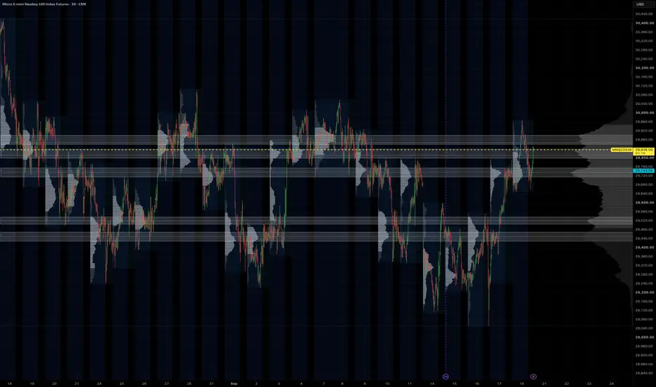
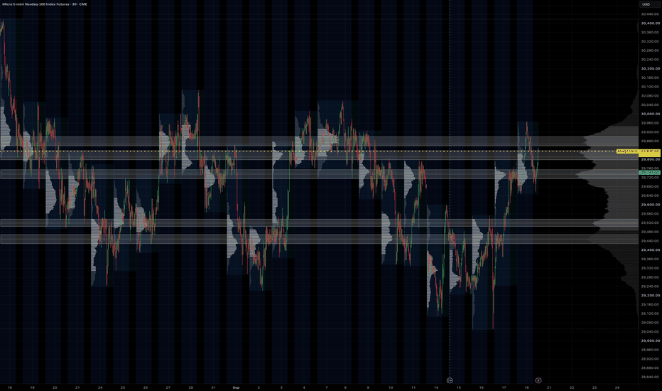
HVN ZonesHVN Zones boxes the high-volume nodes of a multi-session volume profile, the way many traders do by hand from a zoomed-out chart with a fine visible-range profile: each prominent node above and below price becomes a zone you can trade against. It draws the zones, a dotted line at each node's point of control, and a small label.
HOW IT WORKS
1. A volume profile is built over the last N Globex sessions (default 63, about three months) or over the visible range, from 1-minute intrabars where your plan allows it, otherwise from chart bars. Row size is fixed in points or automatic (range divided by 1000).
2. The histogram is smoothed with a short centred moving average.
3. A node is a row that is the tallest within a window of rows on either side and at least a set share of the tallest row in the profile.
4. Each node's zone is grown from the peak while volume stays above a floor. The default floor is prominence-based: prominence is the peak minus the higher of the troughs on either side, and the zone ends where volume has fallen 60% of the way from the peak toward that trough. This keeps a node on top of a broad dome local instead of turning the whole value area into one zone. Nodes with little prominence are dropped and zones are capped in height. The older "% of peak" rule is still available as an option.
5. Overlapping or near zones merge, a price band keeps only nodes within 2 x daily ATR(14) of the current price (or a fixed number of points, or off), and the strongest N zones by peak volume are drawn.
SETTINGS THAT MATTER
Window > Sessions: how far back the profile looks. 63 matches a three-month composite; 20 gives a tighter, more recent read.
Node detection > Zone width (%), Min prominence, Max zone height: how tall a zone gets and which nodes qualify. Lower the width for thinner boxes.
Price band: widen or narrow the multiplier to show more or fewer zones.
Node detection > Recompute every (minutes): the profile changes little intra-day, so the default is hourly. Bar Replay recomputes on every step.
Drawing > Label indent: a fixed pixel push to the right so labels sit in the chart margin at any zoom.
LIMITS
1-minute intrabars need a plan with intrabar access, and TradingView serves at most 100k of them per request, which is about 60 sessions. Longer lookbacks use chart bars for the older part. Switch "Profile source" to Chart bars on any plan.
Volume is spread evenly across the rows each bar overlaps, the same approximation TradingView's own visible-range profile makes at the bar level. It is not a tick profile.
Zones are rebuilt on each recompute from the current window, so they show the current profile, not a history of past zones.
The profile method follows the open-source volume-profile family by PtGambler (MPL-2.0). This script is an original implementation. Indicator
Indicator

VP/CD Active Relevance RadiusVolume Profile/Chip Ddistribution/Pressure Rails
The Volume Profile / Chip Distribution (VP/CD) indicator maps volume memory, price acceptance, overhead supply, downside memory, and low-volume transition areas across liquid large caps, volatile stocks, microcaps, gap-driven names, limited-history stocks, and multiple timeframes.
Current baseline: VP/CD v3.0 — M6A.3b. Its role is a market-memory and inventory-map evidence layer, answering key questions about accepted prices, volume memory, overhead supply, downside memory, low-acceptance zones, structural priority, and map reliability without providing automated buy/sell signals.
1. Pressure Rails
Calculates a Pressure Score for qualifying inventory levels and applies Pareto-style filtering to reduce clutter. Rail lengths reflect structural strength (longer rail = stronger surviving pressure structure).
2. Nearest UP and DN Pressure
Identifies nearest surviving pressure structures: UP (above price) and DN (below price). E.g., UP 174.19 | P26 indicates qualifying overhead pressure at 174.19 with a score of 26 (not an automatic resistance line).
3. Pressure Release — REL UP / REL DN
Marks REL UP or REL DN (e.g., REL UP 171.89 | P30) when price closes through a rail. This signifies inventory-pressure release in that direction rather than a guaranteed breakout or auto-entry.
4. Pareto Filtering
Evaluates candidate rails multi-dimensionally and eliminates dominated structures, reducing clutter while preserving key multi-factor historical levels.
5. Map Confidence
Classifies chart quality via environment states (High, Medium, Low, Event, Sparse) and numerical confidence scores. Accounts for structure variations between deep liquid assets versus IPOs, microcaps, gap events, or reverse splits.
6. Microstructure-Aware Calibration
Receives a profile from its companion adapter to categorize environments (Stable/Normal/Volatile Liquid, Limited Liquidity, Thin Stable, Thin Event-Driven, Gap Dominated, Limited History) to tune calculation conservativeness rather than direction.
7. Adaptive PM Evidence
Adjusts reaction counts based on market quality: stable liquid (3 reactions), thin stable (4 reactions), gap/event or limited history (5 reactions). Lower-quality structure requires stricter evidence.
8. Adaptive Event Sensitivity
Scales ATR sensitivity to shock candles based on market stability: stable (4.0 ATR), moderate instability (3.5 ATR), gap/event-driven (3.0 ATR) to avoid map contamination.
9. Adaptive Profile Resolution
Adapts Volume Profile rows to structure: highly liquid/gap-heavy uses finer rows (44 → 50), while thin stocks consolidate nearby inventory into coarser rows (44 → 34) for meaningful grouping.
10. Adaptive Profile Lookback
Modulates historical profile windows (e.g., stable stocks keep 252 days; gap/event-heavy use 189 days). Limited-history stocks retain full available history (252 days) but apply stricter confidence/resolution filters.
11. Adaptive Relevance Radius
Applies three historical relevance radii to prevent stale inventory from dominating: Normal (100%), Elevated Volatility (90%), Extreme/Erratic (80%).
12. Current Battle Map
Provides rapid visual identification of: Current Zone, Support Below, Resistance/Memory Above, AIR Path, Map Confidence, and Guard/Context warnings.
13. AIR / LVN Has a More Precise Meaning
AIR/LVN represents low-acceptance corridors (not direct support/resistance). Combines with Price Memory to form concepts like AIR+PM (thin volume with repeated price reactions).
14. Better Separation of Evidence
Separates distinct evidence categories: VP (traded volume), Chip Distribution (modeled cost basis), VP+Chip (confluence), PM (price memory), STRUCT (pivot memory), DEV (developing memory), and AIR (low-volume transitions).
15. Chip Distribution — Important Clarification
Chip Distribution estimates turnover migration over time. It is a model and does not track actual shareholder positions, tax lots, options exposure, or dark pool data.
16. Better Handling of Thin Stocks
Includes a Sparse Lower-Timeframe Current-Bar Fallback using current chart bar data if lower-timeframe data is missing, ensuring profile continuity without altering historical calculations.
17. Rail Endpoint Prices
Displays exact rail prices directly at the terminal end of each rail regardless of anchor orientation.
18. Cleaner REL Labels
Eliminates duplicate overlapping labels by prioritizing informative REL states over redundant nearest-level text.
19. Diagnostic Audit Improvements
Aligns Diagnostic audit ranking directly with production output: Candidate → Pressure Score filter → Pareto filtering → Surviving rails → Ranking → Displayed rails.
20. Multi-Timeframe Calibration
Scales baselines dynamically across timeframes (1D: 252d/44 rows; 2D: 504d/48 rows; 1W: 1825d/55 rows) to avoid stretched daily profiles.
What has NOT changed
VP/CD remains a structured evidence provider rather than an automatic buy/sell signal, entry trigger, or predictive guarantee.
How I use it
Recommended workflow: check Map Confidence → Current Zone → Support Below → Resistance Above → AIR Path → Pressure Rails → UP/DN → REL, then integrate with overall technical context.
Current Development Status
Baseline baseline VP/CD v3.0 — M6A.3b integrates Volume Profile, Chip Distribution, multi-layered memory, adaptive filters, and microstructure calibration into an analytical mapping framework.
Indicator

CME Institutional Order Flow & AMT Lens📜 Attribution & Open-Source Lineage
Mandatory Lineage Notice: This script is an open-source technical derivative and mathematical expansion building upon the continuous Gaussian volume-at-price decomposition architecture created by @ata_sabanci.
Original Script: Volume Footprint: Measuring Classical Indicators by Math & Geometry, Introduction by @ata_sabanci (Licensed under Mozilla Public License 2.0).
We gratefully attribute and cite the foundational works underpinning this suite:
• 🏛️ J. Peter Steidlmayer (CBOT, 1985) & James Dalton (Mind Over Markets, 1990; Markets in Profile, 2007): Pioneers of Market Profile and modern Auction Market Theory (AMT), establishing the classical profile distribution archetypes ( Balanced, Buying Drive, Liquidation Drive, and Double Distribution), the 80% Rule, and Value Area boundary analysis.
• 📐 @ata_sabanci (Ata Sabanci): Author of the open-source continuous Gaussian kernel density decomposition on TradingView under MPL 2.0. His dual-curve probability density function framework is integrated to project smooth buyer/seller volume distributions cleanly on the right chart margin.
• 🔬 Richard D. Wyckoff: The Law of Effort vs. Result, Volume Spread Analysis (VSA), stopping volume, and institutional limit order absorption of aggressive market sweeps at key structural boundaries.
• 🧮 Milton Abramowitz & Irene Stegun (Handbook of Mathematical Functions, National Bureau of Standards Applied Mathematics Series 55, 1964, Formula 7.1.26): High-precision rational Chebyshev polynomial approximation of the complementary error function erfc(x) (|ε(x)| ≤ 1.5 × 10⁻⁷), enabling O(1) constant-time calculation of the Normal Cumulative Distribution Function (CDF) without iterative series loops.
• 🌐 CME Group (Chicago Mercantile Exchange): Level 3 Market-By-Order (MBO) futures microstructure specifications, standardized tick sizes, and 24-hour session conventions across E-mini and Micro index futures (NQ, ES, YM, RTY, MBT, GC).
1. The Core Problem & Philosophy
Retail trading charts are overwhelmingly burdened by lagging moving averages, unpartitioned 24-hour volume histograms, and noisy retail footprint price ladders.
Squinting at hundreds of tiny numbers across individual candle bars creates cognitive fatigue and obscures what institutional algorithms are doing in real time. Furthermore, conventional volume indicators suffer from the "Candle Color Fallacy": if a bar closes green, 100% of its volume is labeled "buying", completely blinding the trader to passive institutional absorption (e.g. smart money absorbing aggressive market sellers on limit bids during a down bar).
The CME Institutional Order Flow & AMT Lens replaces this fragmentation with an integrated, high-performance visual cockpit:
• ⚡ Tick-Precision Footprint Tape Delta (request.footprint): Directly accesses exchange trade tape execution at tick granularity to separate actual ask-lifted buys from bid-hit sells.
• 🧱 True Stacked Imbalance Shelves with Native Footprint Parity: Automatically scans consecutive price tiers for 300%+ diagonal order flow imbalances, with strict zero-ignoring parity matching TradingView's native footprint engine.
• 📈 Right-Margin Continuous Gaussian Volume Profiles: Decomposes buyer and seller volume curves into smooth, continuous mathematical distributions projected cleanly on the right margin with zero price obstruction.
• 🏛️ Dalton Auction Market Theory Archetypes: Automatically classifies auctions into D-Shape, P-Shape, b-Shape, and B-Shape profiles with live Value Area High/Low (VAH/VAL) and Virgin Point of Control (VPOC) tracking.
• ⚖️ Structural Macro Pivots: Visualizes the Overnight Half-Back (50% midpoint equilibrium), Prior Day Cash Value Area, and Multi-Session Confluent Iron POC zones.
2. Order Flow & Auction Engine Pipeline
│ Pine Script v6 Native Footprint (request.footprint)
├── 🟢 True Ask-Lifted Buy Volume (Aggressive Market Buyers)
└── 🔴 True Bid-Hit Sell Volume (Aggressive Market Sellers)
│
▼
│ Ata Sabanci Dual-Curve Analytical Mathematics
├── 🧮 Rational Chebyshev Error Function Integration (Abramowitz & Stegun 7.1.26)
└── 📈 Right-Margin Continuous Volume Decomposition (Buyer Curve vs. Seller Curve)
│
▼
├── 🏛️ Dalton Profile Archetype Classification ( , , , )
├── 🧱 300% Stacked Imbalance Shelves with Native Footprint Parity ("Ignore Zeroes")
├── 🌌 Low Volume Node (LVN) Liquidity Vacuum Corridors & Forward Retests
├── ⚖️ Overnight Half-Back (50% Range) & Multi-Session Confluent Iron POCs
└── 🕯️ Wyckoff Effort vs. Reward Candlesticks (Buyer/Seller Absorption vs. Drives)
3. Visual Anatomy & Signal Guide
Quick reference for identifying real-time order flow and auction structures on your chart:
• 🟡 Buyer Absorption (Demand Exhaustion):
Color / Style: Gold Candle & Outer Glow
Order Flow Meaning: Aggressive market sellers absorbed by passive institutional limit bids at swing lows.
Tactical Interpretation: Trapped sellers; look for bullish reversal or long defense.
• 🟣 Seller Absorption (Supply Exhaustion):
Color / Style: Purple Candle & Outer Glow
Order Flow Meaning: Aggressive market buyers absorbed by passive institutional limit asks at swing highs.
Tactical Interpretation: Trapped buyers; look for bearish reversal or short defense.
• 🟢 Initiative Bull Drive:
Color / Style: Neon Green Bar
Order Flow Meaning: High-volume directional expansion (RVOL ≥ 1.50, Body ≥ 70%).
Tactical Interpretation: Active institutional buyers driving price; align with trend.
• 🔴 Initiative Bear Drive:
Color / Style: Vivid Red Bar
Order Flow Meaning: High-volume directional liquidation (RVOL ≥ 1.50, Body ≥ 70%).
Tactical Interpretation: Active institutional sellers pressing tape; align with trend.
• 🌫️ Dead Volume / Chop:
Color / Style: Dark Slate Candle
Order Flow Meaning: Low relative volume (RVOL < 0.70) or micro-range consolidation.
Tactical Interpretation: Low-liquidity chop; avoid initiating new breakout trades.
• 🧱 Bullish Imbalance Shelf:
Color / Style: Gold Horizontal Ribbon
Order Flow Meaning: 300%+ stacked aggressive buying across ≥ 2 consecutive tiers.
Tactical Interpretation: Institutional demand shelf; serves as high-probability support retest.
• 🧱 Bearish Imbalance Shelf:
Color / Style: Purple Horizontal Ribbon
Order Flow Meaning: 300%+ stacked aggressive selling across ≥ 2 consecutive tiers.
Tactical Interpretation: Institutional supply shelf; serves as high-probability resistance retest.
• ⚪ Prior Cash VPOC:
Color / Style: White Horizontal Ray
Order Flow Meaning: Highest volume price node of prior Regular Trading Hours (09:30–16:00 EST).
Tactical Interpretation: Primary mean-reversion gravity target (revisited in >70% of sessions).
• 🧊 Cash VAH / VAL (Value Area):
Color / Style: Ice Cyan Solid Lines
Order Flow Meaning: Value Area High and Low containing 70% of prior cash session volume.
Tactical Interpretation: Key institutional auction boundaries. Fade in range; follow on breakout.
• ⚖️ Overnight Half-Back (50% Range):
Color / Style: Cyan Dashed Ray
Order Flow Meaning: Exact 50% midpoint of the Overnight Globex range (18:00–09:30 EST).
Tactical Interpretation: Master equilibrium line; early directional bias barometer at cash open.
• ⚡ Confluent Iron POC Cluster:
Color / Style: Soft Orchid Line / Zone
Order Flow Meaning: Prior Day Cash VPOC and Overnight VPOC clustering within tight tolerance.
Tactical Interpretation: Powerful multi-session institutional price agreement and heavy defense wall.
• 🌌 LVN Vacuum Corridor (B-Shape):
Color / Style: Magenta Shaded Corridor
Order Flow Meaning: Low Volume Node valley separating twin distributions in B-Shape profiles.
Tactical Interpretation: Liquidity void; price accelerates rapidly through the corridor.
• 🎯 Unfinished Auction Magnets:
Color / Style: Dotted Horizontal Ray
Order Flow Meaning: Poor High or Poor Low where non-zero volume traded at the outer tick.
Tactical Interpretation: Incomplete auction magnet; high probability of future sweep and repair.
4. Mathematical & Algorithmic Foundations
A. Continuous Gaussian Kernel Density Estimation (Right-Margin Curves)
Rather than discretizing volume into arbitrary rectangular histogram bars that jump abruptly between price levels, volume at price is treated as a continuous probability density function:
text
f(p) = (1 / (σ * √(2π))) * exp(-(p - μ)² / (2σ²))
To calculate cumulative volume integrals in constant O(1) time without performance-draining numerical loops, the cumulative distribution function is solved via Abramowitz & Stegun Formula 7.1.26:
text
P(Z ≤ z) = 1 - (1 / √(2π)) * exp(-z² / 2) * (a1*t + a2*t² + a3*t³ + a4*t⁴ + a5*t⁵) + ε(z)
where t = 1 / (1 + p*z) and |ε(z)| ≤ 1.5 × 10⁻⁷. This enables the indicator to project smooth, mathematically rigorous buyer and seller curves on the chart's right margin with zero execution lag.
B. True Footprint Diagonal Imbalance Parity
Institutional order flow imbalances occur when aggressive market orders lifting the ask at price tier P overwhelm passive limit orders on the bid at price tier P by a specified dominance ratio (e.g. 3:1 or 300%):
text
Buy Imbalance: Ask_Volume(P_i+1) >= Ratio * Bid_Volume(P_i)
Sell Imbalance: Bid_Volume(P_i) >= Ratio * Ask_Volume(P_i+1)
• 🎯 Strict "Ignore Zeroes" Parity: In TradingView's native footprint engine, when "Ignore zeroes" is active, any diagonal pair where either side has 0 traded contracts is strictly disqualified from being an imbalance. The indicator enforces this parity rule by default, eliminating false edge-of-candle anomalies at highs and lows.
• 🎯 Calibrated Contract Floors: The volume floor is calibrated to 1.0 contract on CME futures to capture genuine institutional prints on smaller-lot contracts like RTY and YM, and 10.0 shares on US Equities to filter retail odd-lot dust.
• 🎯 Bounded Tier Span Geometry: Caps shelf thickness strictly to the stack depth span imbDepth * tick_group_pts, preventing shelves from expanding into giant monolithic slabs.
C. Dalton Profile Shape Archetypes & Empirical Resolutions
Audited across continuous CME index futures sessions, daily auctions resolve into four distinct structural shapes:
• 🏛️ Rotational Balance (25.1% frequency): Symmetrical bell curve indicating institutional consensus on fair value. High mean-reversion probability between Value Area High (VAH) and Value Area Low (VAL).
• 🚀 Initiative Buying Drive (14.1% frequency): Top-heavy volume distribution with a thin lower tail, signaling aggressive short-covering or institutional buying drives. Reversals into b-shape occur in less than 5% of sessions; edge lies in buying pullbacks to developing VPOC.
• 🩸 Initiative Liquidation Drive (8.5% frequency): Bottom-heavy volume distribution with a thin upper tail, signaling long liquidation or aggressive selling. Reversals into P-shape occur in less than 5% of sessions; edge lies in selling rallies to developing VPOC.
• 🗜️ Double Distribution (52.3% frequency): Two distinct high-volume distributions separated by a Low Volume Node (LVN) liquidity vacuum corridor. Price rapidly traverses the central LVN void (spending < 12% of session time inside it) moving from one balance area to the other.
5. Comprehensive Settings Dictionary (Explaining Every Parameter)
The settings dialog is cleanly divided into 10 structured groups matching the on-screen hierarchy:
⚙️ Group 0: Execution Performance & Replay Mode
• ⚡ Fast Replay / Lightweight Mode:
Purpose: Optimizes the indicator for TradingView Bar Replay and lower-memory systems.
How it works: Switches the calculation from tick-precision native footprint sampling to instantaneous Geometric Proxy delta (zero network/memory latency), reduces profile lookback to 300 bars, and streamlines profile bins to 30.
Default: false (keep unchecked for live charts with sub-bar tick precision).
🎨 Group 1: Candle Display & Visual Palette
• Candle Display Style:
Purpose: Selects the visual presentation of candlesticks on the chart.
Options:
Ghost Glow (Semi-Transparent Body + Solid Wicks): 75% body transparency allows underlying native TradingView footprint numbers and delta grids to remain 100% visible while keeping solid wicks for price action analysis.
Full Solid HD Candlestick: Opaque, vibrant institutional candles for standard charting.
Hollow (Wicks & Solid Borders Only): Outlined borders with 100% transparent centers.
Direct Native Barcolor: Applies colors directly to TradingView's default candle series.
Disabled: Hides custom candle rendering completely.
Default: Ghost Glow.
• Color Effort vs. Reward Candles:
Purpose: Toggles Wyckoff-based candle coloring (Demand, Supply, Initiative, Muted).
Default: true.
• Buyer Absorption (Demand) Color:
Purpose: Highlights bullish buyer absorption at lows (aggressive sellers absorbed on limit bids). Also styles bullish imbalance shelves and buyer volume profiles.
Default: Gold (#FFD700).
• Seller Absorption (Supply) Color:
Purpose: Highlights bearish seller absorption at highs (aggressive buyers absorbed on limit asks). Also styles bearish imbalance shelves and seller volume profiles.
Default: Purple (#AB47BC).
• Initiative Bull & Bear Colors:
Purpose: Highlights high-volume directional expansion drives (body ≥ 70%, RVOL ≥ 1.50).
Defaults: Neon Green (#00E676) and Vivid Red (#FF1744).
• Standard Bull & Bear Bar Colors:
Purpose: Colors standard non-absorption bars.
Defaults: Green (#00E676) and Red (#FF1744).
• Dead Volume / Chop Color:
Purpose: Colors candles that occur during micro-range consolidation or low relative volume (RVOL < 0.70). Gated strictly to confirmed bars to prevent premature shading on live candles.
Default: Slate (#373C4B).
• Show Unfinished Auction Magnets (Poor Highs / Lows):
Purpose: Projects horizontal dotted rays from candle extremes where volume executed at the outer tick with zero excess, representing unfinished inventory magnets.
Default: true.
• Auto-Suppress Intraday Overlays on Macro/HTF:
Purpose: Automatically cleans Daily and Weekly charts by hiding intraday rays, overnight boxes, and micro-shelves, preventing WebGL stutter.
Default: true.
🧱 Group 2: Stacked Imbalance Shelves
• Project Stacked Imbalance Shelves:
Purpose: Projects forward-extending support/demand shelves from stacked order flow imbalances until price retests or penetrates the zone.
Default: true.
• Ratio Multiplier:
Purpose: Diagonal volume dominance ratio required to trigger an imbalance.
Default: 3.0 (300% dominance, matching standard institutional footprint configurations).
• Stack Depth:
Purpose: Number of consecutive price tiers required to confirm an institutional shelf.
Default: 2 tiers.
• Ticks Per Row (Tier Size, 0 = Auto):
Purpose: Price tier bucket size in ticks. Set to 0 for Auto-Adaptive (automatically matches optimal row density across all assets and timeframes). Set to any positive integer (e.g. 8 for 2.00 pt on NQ, 4 for 4.00 pt on YM, 2 for 0.20 pt on RTY, 20 for 20 cents on NVDA) to force a fixed tier size.
Default: 0 (Auto).
• Ignore Zeroes (Native Footprint Parity):
Purpose: When enabled, price tiers with 0 volume on the opposite side are ignored, strictly matching TradingView native footprint behavior. Disable to allow trades against 0 to trigger imbalances.
Default: true.
• Shelf Line Width & Line Transp (%):
Purpose: Controls the thickness (1–4px) and opacity of the shelf baseline price ray.
Default: Width 1, Transp 100% (hides the harsh line for an ultra-clean ribbon).
• Shelf Box Transp (%):
Purpose: Controls background opacity of the shelf rectangle.
Default: 84% (soft background ribbon).
• Max Active Retest Shelves:
Purpose: Caps the maximum number of unmitigated imbalance shelves preserved across historical peaks, guaranteeing peak chart performance.
Default: 30.
🏛️ Group 3: Key Institutional Levels & Styling
• Show Prior Cash Levels (VAH / VAL / VPOC):
Purpose: Displays Prior Day RTH Cash (09:30–16:00 EST) Value Area High, Value Area Low, and Point of Control.
Default: true.
• VPOC Color, Width, Style, and Transp (%):
Purpose: Full visual customization of the Point of Control line.
Default: White (#FFFFFF), Width 2, Style Solid, Transp 0%.
• VAH & VAL Color, Width, Style, and Transp (%):
Purpose: Full visual customization of Value Area boundary lines.
Default: Ice Cyan (#00E5FF), Width 1, Style Solid, Transp 35%.
• Prior Level Origin Anchoring:
Purpose: Controls where historical levels start. Cash Open (New Day Only) starts cleanly at the 09:30 cash open; Session Origin (Full Span) anchors back to historical bars.
Default: Cash Open (New Day Only).
• Show Overnight Half-Back (50% Midpoint):
Purpose: Projects the exact 50% midpoint of the overnight range (18:00 to 09:30 EST), serving as a primary structural equilibrium balance line during the Cash Open.
Default: true, Cerulean Cyan (#00E5FF), Width 2, Dashed.
• Highlight Confluent Iron POC Cluster:
Purpose: Automatically detects when Prior Day Cash VPOC and Overnight VPOC cluster closely together, indicating powerful multi-session institutional price agreement.
Default: true, Soft Orchid (#CE93D8), Width 2, Solid.
• Show Overnight Shaded Box (18:00 - 07:00 EST):
Purpose: Renders a muted box preserving overnight inventory territory.
Default: false.
• Extend to 08:30 Pre-Market:
Purpose: Extends the overnight box cutoff from 07:00 EST to 08:30 EST to capture pre-market macroeconomic releases.
Default: false.
🔬 Group 4: Volume Delta Engine & Lower Timeframe
• Tick Grouping Mode:
Purpose: Enforces the Row-Density Invariance Law across all timeframes and assets, dynamically targeting 11–16 rows per candle.
Options: Auto-Adaptive (Row-Density Invariance) or Manual Ticks.
Default: Auto-Adaptive.
• Manual Ticks (if Selected):
Purpose: Fixed tick count when Manual Ticks mode is active.
Default: 4.
• Use Time-of-Day RVOL on 1-Hour Charts:
Purpose: Normalizes 1h volume against the historical average for that specific hour (0–23 EST), eliminating diurnal bias where morning bars appear artificially high and overnight bars appear low.
Default: true.
• Volume Engine (when Replay Mode is Off):
Purpose: Selects volume delta calculation when Fast Replay is unchecked:
Native Footprint (Tick Precision): Pine Script v6 native request.footprint() for true tick-level trade tape execution without lower-timeframe interpolation.
Geometric Proxy: Instant mathematical proxy for Bar Replay.
Intrabar (1m Low Memory): Fast 1-minute sub-bar sampling.
Intrabar (Sub-Minute): Sub-minute granularity for live intraday trading.
Default: Native Footprint (Tick Precision).
• Intrabar Lower Timeframe:
Purpose: Sub-bar resolution when Intrabar mode is active (Auto, 1S, 5S, 15S, 30S, 1, 5).
Default: Auto.
🌐 Group 5: Session Volume Profiles & AMT Scope
• Show Session Volume Profiles (Right Margin & Anchor):
Purpose: Enables the developing volume profile on the right margin and completed historical profile succession.
Default: true.
• Profile Scope Horizon:
Purpose: Controls the institutional auction cycle:
Auto-Adaptive: Sub-Session (<= 15m), Daily Full Cycle (30m–4h), Weekly (Daily charts), Monthly (Weekly charts).
Or force fixed Sub-Session, Daily Full Cycle, Weekly, or Monthly.
Default: Auto-Adaptive.
• Completed Sessions to Display:
Purpose: Number of completed historical session profiles to render across the chart (e.g. 10 sessions = 5 Full Trading Days of Cash + Overnight).
Default: 15.
• Show Session VAH / VAL Lines:
Purpose: Toggles session Value Area High and Value Area Low boundary lines.
Default: true.
• Show Dalton Profile Shape Badges ( , , , ):
Purpose: Identifies and stamps Dalton profile shape badges at session extremes.
Default: true.
• Extend Completed Virgin POC to Live Bar:
Purpose: Extends unvisited Virgin POCs forward as horizontal attractor lines until retested.
Default: true.
• Wait for 1 Bar Close on Session Open:
Purpose: Waits for the opening candle of a new session to fully close before initiating the developing profile on the right margin. Prevents opening-tick jitter, zero-range artifacts, and profile flashing.
Default: true.
📐 Group 6: Profile Curve Geometry & Shading
• Profile Width Scaling:
Purpose: Controls how far volume profiles expand horizontally into the session.
Options: Expressive (50% Span), Balanced (35% Span), Wide (65% Span), Compact (20% Span), or Fixed Bars.
Default: Expressive (50% Span).
• Fixed Width (Bars) & Offset off Candle:
Purpose: Fine-tunes profile width in fixed-bar mode and right-margin clearance off the live candle.
Defaults: 36 bars and 3 bars offset.
• Profile Shading Style:
Purpose: Selects visual color treatment for volume profile curves (Bid/Ask Dual-Tone, Monochrome Slate, Monochrome Gold, Monochrome Cyan).
Default: Bid/Ask Dual-Tone.
• Buy Vol Curve & Sell Vol Curve Colors:
Purpose: Independent palette selectors for buyer and seller curves.
Defaults: Gold (#FFD700) and Purple (#AB47BC).
• Fill Transp (%) & Outline Transp (%):
Purpose: Controls background fill opacity (default 92% provides a soft watermark) and contour outline opacity (default 5% gives a crisp border).
Defaults: Fill 92%, Outline 5%.
• Profile Label Size:
Purpose: Scales font size of session shape badges and POC price labels (Tiny, Small, Normal, Large).
Default: Small.
🏷️ Group 7: Level Labels & Dark Knockout Shield
• Level Labels Style:
Purpose: Visual presentation of VAH, VAL, and POC text:
Subtle Acronym (On Line): Clean, transparent floating text (POC 29484.75, VAH 29550.00) sitting directly on the line without bulky background badges.
Session Acronym (C-POC / ON-POC): Prepends session identifier.
Compact Acronym Only: Shows only the letters (POC, VAH, VAL) without price.
Bulky Badges: Legacy high-contrast opaque pill badges.
Hidden: Suppresses text for pure minimalist lines.
Default: Subtle Acronym (On Line).
• Level Labels Position:
Purpose: Horizontal placement along the level line (Right Edge Inside Box, Right Edge Outside Box, Center of Session, Left Edge Inside Box).
Default: Right Edge (Inside Box).
• Dark Knockout Shield Pill:
Purpose: Wraps acronym labels in a dark cutout container (#0C0F18) to shield text from candle wicks passing through the level.
Default: true.
• Shield Opacity (%):
Purpose: Background shield opacity (0% = solid dark container, 15% = subtle dark glass).
Default: 15%.
🔲 Group 8: Session Framing Outlines & LVN Corridors
• Show Session Framing Outlines:
Purpose: Frames each completed and developing Cash RTH and Overnight auction in a clean, high-contrast outline that connects seamlessly to the next session.
Default: true.
• Frame Border Style & Width:
Purpose: Border style (Solid/Dashed/Dotted) and width (1–3px).
Default: Dotted, Width 1.
• Cash Frame & ON Frame Colors:
Purpose: Distinct frame border colors for Cash RTH (Gold) vs. Overnight Globex (Purple).
• Outline Transp (%) & Fill Transp (%):
Purpose: Opacity of outer frame border (30%) and internal session shading (98% = transparent wireframe with zero candle tinting).
Defaults: Outline 30%, Fill 98%.
• Show LVN Vacuum Corridor (B-Shape):
Purpose: Displays the Low Volume Node (LVN) liquidity vacuum corridor for B-Shape (Double Distribution) profiles.
Default: true.
• LVN Presentation:
Purpose: Visual style (Both Corridor Box + Centerline, Shaded Corridor Box, or Inflection Line Only).
Default: Inflection Line Only.
• LVN Forward Extension:
Purpose: Extend Until Mitigated projects the corridor forward until retested or penetrated; Session Span Only confines it within session boundaries.
Default: Extend Until Mitigated.
• LVN Color, Style, and Box Fill Transp (%):
Purpose: Visual customization of the LVN corridor.
Defaults: Magenta (#E040FB), Dotted, 92% box fill transparency.
📊 Group 9: Institutional Heads-Up Display & Educational Table
• HUD Display Mode:
Purpose: Selects dashboard presentation (Full Educational Dashboard, Compact Status Pill, or Disabled).
Default: Full Educational Dashboard.
• Dashboard Position:
Purpose: Screen corner placement (Bottom Right, Bottom Left, Top Right, Top Left).
Default: Bottom Right.
• Detect Imbalances at Key Levels:
Purpose: Real-time audio/visual alert scanning active order flow imbalance shelves and alerting when stacked absorption coincides with key levels (VAH, VAL, VPOC, or Overnight Half-Back).
Default: true.
6. Tactical Execution Playbook
1. Pre-Market Balance Orientation (08:30 – 09:30 EST)
• ⚖️ Identify the position of price relative to the Overnight Half-Back (50%).
• ⚡ Scan for Confluent Iron POC alignments between yesterday's Cash VPOC and the Overnight VPOC.
• 🏛️ Check the prior session's Dalton archetype badge: Is the market balanced ( ) or trending ( or )?
2. Opening Drive & Judas Swing Mitigation (09:30 – 10:00 EST)
• 🛑 Stand aside during the opening 15 minutes to protect capital from opening whipsaws and liquidity gaps.
• 🪤 Watch for a false opening drive (Judas Swing) sweeping overnight extremes into an unmitigated Stacked Imbalance Shelf.
• 🟡🟣 Confirm absorption via Effort vs. Reward Candle Colors (Gold for Buyer Absorption, Purple for Seller Absorption).
3. High-Confluence Setups by Dalton Archetype
• 🔄 Rotational Days: Fade Value Area boundaries (VAH and VAL) targeting the VPOC mean.
• 🌌 Double Distribution Days: Trade the breakout through the LVN Vacuum Corridor, capturing rapid price displacement toward the secondary distribution's POC.
• 🚀 Initiative Days: Never fade the morning drive. Align with trend pullbacks into the developing right-margin VPOC and stacked imbalance shelves.
7. Educational & Compliance Disclaimer
This indicator is published under the Mozilla Public License 2.0 (MPL 2.0) strictly for educational, research, and analytical purposes. It does not provide trade recommendations, signals, or financial advice. Trading futures, equities, and options carries substantial risk of capital loss. Past performance and quantitative models do not guarantee future market outcomes. Always exercise rigorous risk management. Indicator

Previous Day Value Area - CriptoMatiko## Description
The **Previous Day Value Area** replicates, bar-for-bar, the exact volume-area calculation used in our own Python volume profile backtester. Every VAH/POC/VAL value this indicator plots can be checked line-by-line against the backtester's output — that's the reason this exists: TradingView's native Volume Profile does its own internal binning, which you can't inspect or reproduce outside the platform. This one gives you a value area you can actually verify.
---
**How it works**
1. Pulls 1-minute bars for each session (`request.security_lower_tf`).
2. Splits each 1-minute bar's volume evenly across every price bucket its high-low range touches ("bar-distributed" volume) — same method as the Python backtester, not TradingView's built-in binning.
3. POC = the price bucket that accumulated the most volume.
4. Expands outward from the POC toward the heavier side until 70% (configurable) of the day's total volume is captured. The two edges of that range are VAL and VAH.
5. Bucket resolution is fixed once at session open and held constant until the session closes, so keys never shift mid-calculation.
---
**Visuals**
- Lines — the previous day's VAH / POC / VAL, projected across the current session (what a systematic detector would read)
- Optional histogram — the volume profile silhouette for each session, drawn as a mirrored buy/sell split
- Comparison mode — draws the value area over the same day that produced it, for side-by-side visual checks against other volume-profile tools
- Table (top-right) — previous day's date, VAH, POC, VAL, plus the current (in-progress) session's values
---
**Parameters**
- Value area %: percentage of volume captured between VAL and VAH (default 70%)
- Profile resolution: automatic (% of price), fixed bucket size, or rows based on D-1's range
- Project D-1 value area: shows the previous day's finished levels across the current session
- Comparison mode: draws the levels on the day that generated them instead of projecting forward
- Histogram rows / width: controls the resolution and size of the drawn volume profile
- Split buy/sell volume: separates the histogram into up-close and down-close volume
---
**Originality**
This is not a variant of the built-in Volume Profile — it's a from-scratch bar-distributed volume calculation written to match a specific Python backtesting pipeline, so that value-area levels computed in code and value-area levels seen on the chart are provably the same numbers.
---
**Credits**
Author: Vernon CriptoMatiko Indicator

Swing Fibonacci Arcs & Volume Profile [BigBeluga]🔵 OVERVIEW
The Swing Fibonacci Arcs & Volume Profile is an advanced technical analysis indicator designed by BigBeluga to combine geometric Fibonacci arc projections with automated swing-anchored volume profile histograms directly on the chart. Traditional Fibonacci tools rely strictly on linear retracements or horizontal grids, often failing to account for circular expansion paths and volume distribution across structural market swings. To solve this limitation, this script automatically detects significant market swings, projects customizable elliptical Fibonacci arcs with band fills, and computes a detailed volume profile histogram complete with a Point of Control (POC) line.
The indicator visualizes confirmed swing lines, curved arc bands, volume profile distribution boxes, and custom percentage labels. The core calculations track rolling highs and lows, compute elliptical scaling parameters using adjustable horizontal and vertical multipliers, and aggregate volume bins across the active swing structure. Customizable color palettes, arc resolutions, and level toggles allow traders to fine-tune the system across various timeframes and asset classes.
🔵 HOW IT WORKS
The system operates through an integrated architecture where each component dynamically influences chart behavior:
1 — Swing Structure Engine
Swing Detection & Tracking: Scans rolling highest and lowest points using the Swing Structure input. To adapt this feature, set the length shorter (e.g., 30 to 50 ) to capture fast, short-term structural swings for day trading, or longer (e.g., 70 to 150+ ) for swing trading to focus on major macro market turning points.
Visual Line Mapping: Plots confirmed bullish and bearish swing lines using custom user-defined colors alongside real-time unconfirmed dashed projections.
2 — Fibonacci Arcs & Geometric Engine
Arc Expansion & Scaling: Projects elliptical arc bands from swing origins based on standard ratios (0.0%, 23.6%, 38.2%, 50.0%, 61.8%, 78.6%, 100.0%). Horizontal and vertical scaling factors ( Horizontal Scale (X) and Vertical Scale (Y) ) can be adjusted between 0.1 and 10.0 to modify the curvature and width of the arcs.
Resolution & Styling Controls: Adjusts arc smoothness via the Arc Resolution (Segments) input (set between 10 and 100 ) and controls border thicknesses, transparency levels, and individual band fill options.
3 — Volume Profile & POC Engine
Profile Generation: Constructs an automated volume profile histogram anchored to the active swing start point, scaled via the Profile Max Width (Bars) input.
Point of Control (POC): Identifies the highest volume bin within the swing range, rendering a distinct POC line and price label with customizable gradient coloring.
🔵 HOW TO USE
Apart from serving as a comprehensive geometric and order flow mapping tool, the indicator can be applied in several ways:
Identify Curved Support & Resistance Arcs: Monitor the intersection of price action with elliptical Fibonacci arcs (such as the 50.0% and 61.8% levels) to anticipate dynamic reversal zones during market pullbacks.
Analyze Volume Distribution Nodes: Inspect the volume profile histogram extending from the swing origin to spot heavy volume accumulation clusters.
Trade POC Rejections: Use the highlighted Point of Control (POC) line and volume tag as a primary reference level for potential breakouts or retests.
🔵 NOTES
Why this implementation is unique:
It merges advanced elliptical Fibonacci arc geometry with swing-anchored volume profile distributions.
Features dynamic polyline rendering, customizable gradient color fills, and robust array management optimized for Pine Script version 6.
Provides extensive modular toggles for individual arc ratios, line widths, and profile displays.
Indicator

Composite HVN/LVN NodesComposite HVN/LVN Nodes
Most volume profile tools show one session at a time. This one accumulates high and low volume nodes across many sessions into a single map, so the prices that keep reappearing stand out from the ones that showed up once.
Each session is profiled separately. Its nodes are extracted and folded into a running composite where repeat sightings reinforce each other, unreinforced levels decay away, and levels price has torn through get demoted. Zones are shaded by relative strength — the darkest bands are the strongest currently on the map.
HOW IT WORKS
Detection finds a run of contiguous rows clearing the threshold, then anchors the zone on that run's actual volume peak. Anchoring on the first qualifying row instead biases every zone toward the lower peak of a multi-peak shelf.
Merging takes the union of two overlapping bands rather than the average of their centres. Averaging places the result in the valley between two shelves, covering neither.
Decay runs at every session close. A node that stops being reinforced fades and is eventually dropped.
Invalidation cuts a zone's weight hard when a single bar rips clean through it.
Conflict resolution removes one of any overlapping HVN/LVN pair. A price cannot be both a shelf and a gap.
Profiles are built from 1-minute intrabars rather than chart bars, so the map is the same on 1m as on 1h. Without this, coarse bars smear volume across rows they only passed through.
DEFAULTS ARE TUNED FOR NQ
Most thresholds are percentages of session range or session volume, so they travel between instruments reasonably well. The session times and the LVN threshold do not.
Sessions: Globex (1800-0930) and New York (0930-1700). For equities, use a single 0930-1600 and disable the other. Sessions must not overlap.
Resolution: 1 minute. The most important setting for consistency. The "Intrabars/bar" readout in the status line shows whether it is active; 0 means it has fallen back to chart bars, which happens past roughly 100k intrabars of history.
Detection: 200 rows, sensitivity 6, HVN 70%, LVN 10%. Roughly one row per point on a typical NQ session range. The thresholds are asymmetric on purpose: 70% is permissive enough to catch shoulders as well as the POC, while 10% is strict because on a liquid instrument nearly everything trades a little and a loose setting produces gaps that aren't really gaps. On thinner instruments 10% may find nothing.
Node width: max 12% of range. Mainly restrains LVNs. At a 10% threshold a genuinely dead pocket can run a long way, and without a ceiling one gap swallows half the range.
Volume weighting — each session's contribution is scaled by how active it was against a rolling 20-session average, capped at 3x either way so one event day cannot dominate. Sessions below 35% of average volume are skipped entirely, which filters holidays and half days on NQ. Set to 0 to disable.
Composite: half-life 50 sessions. Note that is sessions, not days: with both enabled that is two per weekday, so about five trading weeks. Halve it for a faster-moving map.
Conflicts: stronger wins. The lighter of an overlapping pair is removed, ties going to the HVN, since volume that demonstrably traded is harder evidence than volume that didn't. Zones that merely touch are left alone — an HVN against an LVN is a real structure, the edge of a shelf against a gap.
Archive: off. When on, invalidated nodes freeze in place with a dashed border instead of disappearing, so you can see where a level sat and how long it lasted. Useful for review, cluttered live.
ADAPTING IT
Start with the session times; everything depends on those being right. Then check LVN detection, which assumes NQ-like liquidity. If the map is too sparse or too crowded, adjust "Drop below weight" and "Max nodes kept".
NOTES
Nodes are computed at session close and are not recalculated afterwards, but their appearance changes as weights decay and merge — shading is relative to the strongest node currently on the map, not an absolute scale.
TradingView caps drawing objects at 500 boxes. Active and archived nodes share that budget.
This is an analysis tool, not a signal generator. It marks prices where volume repeatedly concentrated or repeatedly didn't. What that means for any given trade is up to you.
Indicator

Volume Profile Breakout Continuation
What this is - and is not. This is one state machine, not separate tools stacked on a chart. A range-compression detector, a volume profile, a higher-timeframe filter, a pullback tracker and a trade-management layer are chained so that each stage only exists because the previous one fired. It is not a volume profile indicator with signals bolted on, and it is not a breakout indicator with a profile drawn next to it.
Why the parts are inseparable. The profile is built only over the bars of a detected accumulation range - remove the range detector and there is nothing to profile. The breakout is defined as a close outside that same range - remove the profile and the pullback has no POC to return to. The trigger is a close back through the POC in the breakout direction - remove the breakout and the trigger has no direction. Take any stage away and the remaining logic has nothing to act on.
Mechanism
1. Accumulation. When the range of the last N bars is at or under k × ATR, an accumulation box opens on that bar and grows while price stays inside. It is drawn as it forms, not in hindsight. A box that expands past the abandon threshold, or runs too long, is dropped and faded.
2. Profile. A small volume-at-price histogram is built inside the box from the accumulation bars only and refreshed each bar. Each bar's volume is spread evenly across the rows its high-low spans. POC is the heaviest row; the value area is expanded outward from the POC to the chosen percentage.
3. Breakout. A confirmed close outside the box. With the higher-timeframe filter on, long breakouts require the prior completed HTF close above its EMA and shorts below. At this moment POC, VAL and VAH are frozen and a second box opens to frame the pullback.
4. Pullback. Price comes back into the POC zone (a tolerance expressed as a percentage of the range height). The setup is invalidated by a close through the far edge of the value area or by a wait timeout.
5. Trigger. A confirmed close back through the POC in the breakout direction marks the entry.
What you see
- Purple accumulation boxes with the profile tucked inside (heatmap or single-hue mode, POC row in gold).
- A teal pullback box from the breakout bar to the trigger bar, with the POC line running through it and a label on the bar that touches the zone.
- Entry labels with entry, TP and SL; TP and SL boxes that extend while the trade is open and truncate at the exit; exit labels showing the percentage actually taken. Past trades stay on the chart.
- A developing session profile floated off the last bar, plus finished day profiles painted in place at each rollover and never redrawn.
- A monospace dashboard: stage, HTF bias, accumulation range, setup and day POC, day value area, pullback status, position, TP/SL, running record, readiness.
Settings
- Accumulation: range lookback, compression multiple, minimum and maximum bars, abandon multiple, ATR length.
- Setup profile: rows, value-area percentage, histogram width, past-setup fade and count.
- Session profile: rows, width, offset, side, color mode, past profiles to keep and their width and transparency.
- HTF bias: on/off, timeframe (auto steps up one tier from the chart), EMA length.
- Pullback: POC zone half-width, maximum wait.
- Trade management: fixed-percent or ATR-multiple TP/SL, max bars in trade, entry cooldown, optional post-exit cooldowns by exit type, past-box fade.
- Session: end-of-day flatten hour and minute (New York).
- Webhook: optional JSON payload on entry and exit with a strategy id and quantity.
How to use. Start with the default settings on the timeframe you normally trade and watch how often boxes form and how often breakouts fail before the pullback. Tighten the compression multiple for fewer, cleaner ranges; widen the POC zone if pullbacks are missing the level by a hair. The trade-management layer is a study aid: the labels and boxes show what the mechanical rules would have done, so you can judge the logic against your own read of the chart.
The defaults are a starting point for one instrument, not an optimized or recommended configuration, not intended to suggest any particular outcome.
Non-repainting. Every state transition, entry and time-based exit is evaluated on confirmed bars only. The higher-timeframe values are requested with lookahead off and reference the previous completed HTF bar, so history and live behave the same. Finished day profiles are painted once at the rollover and never redrawn. TP and SL are checked against the bar's high and low. The profile uses chart-timeframe bar volume, not tick data, so it is an approximation, as every profile built in Pine is; instruments without volume fall back to a time-at-price count. Indicator

Volume Delta Footprint Zones HeatmapVolume Delta Footprint Zones Heatmap (ΔFP)
Order-flow context from CVD. It marks the price levels where aggressive buying or selling showed up without moving price, and keeps those levels on the chart as horizontal lines that fade as they age.
The idea
Delta at a price level tells you how much aggression traded there — but most delta is just the cost of moving price. A bar that rallies 20 points obviously prints positive delta, and that part says nothing you couldn't read off the candle. What's worth marking is delta that did not produce a move: aggression that got absorbed by passive size sitting at a level.
So rather than accumulating raw delta, this script accumulates the residual:
It keeps a rolling average of delta per point of price movement over the last N bars.
For the current bar it computes the delta you would expect from that bar's price change.
Actual minus expected is the unexplained delta.
That residual is spread across the bar's footprint rows in proportion to each row's share of the bar's net delta, and added to a running total for that price.
A level therefore builds up value when trade happens there that the price move doesn't account for. Positive = unexplained buying, drawn green above price. Negative = unexplained selling, drawn red below price.
On a bar with essentially no price change the expected delta is ~zero, so the whole of the bar's delta counts as unexplained — which is the intended behaviour, not a special case.
Decay, not accumulation
Every stored level fades by a fixed percentage each bar, so the map is an exponentially weighted average rather than a session-long total, and recent flow dominates. A contribution keeps (1 − rate)^N of its weight after N bars — at the 5% default that is roughly 60% after 10 bars, 36% after 20, 8% after 50. Levels that fade below the minimum threshold are dropped.
Levels are also removed the moment price trades through them, and are barred from re-forming until price moves a configurable distance away. The display therefore stays on levels that have not been tested yet.
Reading it
Green line above price — unexplained buying that was absorbed there. Supply sat on it.
Red line below price — unexplained selling that was absorbed there.
The label on each line is the level's current residual delta. Red labels show sell-side magnitude as a positive number.
Lines get shorter-lived and thinner on the ground when flow is being explained by the move itself; they persist and stack when price is grinding against size.
Thicker clusters are simply several adjacent rows that each cleared the threshold. Up to 30 levels are kept per side; when both sides are full the furthest level is dropped first.
Limitations — please read before drawing conclusions
Footprint delta is approximated, not tape-derived. Treat magnitudes as relative to each other, not as absolute traded size.
Requires footprint data for your plan and symbol.
Decay only advances on bars where the footprint request actually returns data. On the 1S default, where sub-minute history is shallow, older levels freeze rather than fading — scroll back far enough and the map stops ageing.
The expected-delta baseline is a single rolling mean. It is a crude model of the delta/price relationship and it is symmetric — it does not distinguish up-moves from down-moves.
A level that replaces another in the same drawing slot on the same bar starts one bar late, and a level that lives only a couple of bars in a reused slot may not draw a line at all, though its label still appears.
No signals, no alerts, no directional calls. This is context only, and it is published for people who want to experiment with the idea rather than as a finished system.
Notes
Delta is accumulated per price grid, decays exponentially, and is never reinforced — a level only ever fades once the flow that built it stops. Zones are drawn with plot.style_linebr and the plot layer forces a break whenever a drawing slot changes level, so every segment is horizontal. Indicator

Smooths Session Volume ProfileOverview
Smooths Session Volume Profile (SSVP) is built around a single volume-splitting engine that feeds three different views of the same underlying data: a per-bar footprint table, a compact mobile dashboard, and a session-scaled Volume Profile with Point of Control, Value Area, and Imbalance detection. Every number shown anywhere in the script traces back to one buy/sell volume calculation performed once per bar.
Why these are one script, not a mashup
The footprint table and the Volume Profile are not two indicators placed side by side — they are two resolutions of the identical volume model. The table shows that model at full per-bar detail over a short recent window; the profile aggregates the exact same bar-level buy/sell split over whichever session(s) the user selects. The session tools (highlight boxes, session-based profile scaling, Naked POC) extend that one model with time-of-day awareness rather than adding a separate feature. Removing the table would not simplify the script's purpose, it would just remove one lens on the same data the profile already uses.
Concepts used
Selectable volume engine: Geometric splits each bar's volume by where it closed inside its own high-low range. Intrabar reads real up/down volume from a lower timeframe via TradingView's own ta library. Footprint reads TradingView's native per-tick request.footprint() data (Premium/Ultimate plans only). Every other calculation in the script consumes whichever engine is active, unchanged.
Per-bar truncated-normal volume split: rather than splitting a bar's volume evenly across the ticks it traded, the script models the buy side and the sell side as separate truncated normal distributions inside the bar's own high-low range, centered toward where the bar actually closed. This produces a continuous, weighted density instead of a flat histogram bar.
Volume Profile as a summed density: the same per-bar truncated-normal components are summed across every included bar into one continuous curve, which is then sampled to locate the Point of Control (the price of maximum combined density), the Value Area (the narrowest band containing a chosen percentage of the modeled volume), and diagonal volume imbalances between adjacent price levels.
Session-aware scaling: Asia, London, and New York are each tracked independently — the script knows whether a session is currently forming or was last completed, and the profile can be built from the live union of whichever sessions are toggled on, instead of a fixed bar count.
Naked POC: the instant a session's occurrence closes, that session's own standalone Point of Control is computed independently of the combined profile and kept on the chart as an untested level until price actually trades back through it.
Self-checking math: the Overlap reading (OVL) measures what share of buy and sell volume occurred at the same prices, from 0 (fully separated, directional) to 1 (fully overlapping, balanced/rotational). The Residual reading (RES) independently re-integrates the density model and compares it back to the real volume it's supposed to represent, in parts-per-million, so the script can flag its own modeling error rather than silently drawing a profile that doesn't add up.
How to use it
Add it to any chart and timeframe. Use the Volume Profile's POC as a magnet level and its Value Area edges as boundaries between accepted and rejected price. Diagonal imbalances mark price levels where one side of the market overwhelmed the other. Toggle individual sessions in and out of "Include in Profile" to isolate one session's structure or build a composite of several. Switch to the footprint table or the mobile dashboard for the identical volume data at per-bar resolution instead of session-aggregated.
Originality
The per-bar truncated-normal volume model — shared by the footprint table and the Volume Profile alike — is the mechanism this script is built around, not an assembly of standard metrics. Session-aware profile scaling, Naked POC seeded independently per session, and the self-checking Residual metric are not reused from another publication; the detection, modeling, and rendering logic here were written for this script.
Inputs
Volume Profile — Profile Period/Session Scaling mode, Style (Line/Columns/Histogram), Width/Resolution, Gap From Chart, bell colors and fill
Session Profile Scaling — per-session time windows, time zone, Include in Profile and Show Highlight toggles, highlight colors
Metrics — Point of Control, Value Area, Imbalance thresholds, Naked POC, Balance Tilt, Residual Tolerance
Data Engine — volume engine selection and its parameters
Table Display — footprint table and mobile dashboard appearance
This indicator has no buy/sell signals, alerts framed as trade calls, or strategy logic — it is a volume-analysis tool. It does include TradingView alertcondition() entries for session starts and Overlap-state changes, which fire on data conditions, not trade recommendations. Indicator

The Magnet ModelThe Magnet Model — Opening Range Volume Profile
The Magnet Model ORVP is designed to turn the opening auction into a simple, repeatable map of where volume established value and where those levels may continue to matter throughout the trading session. It will automatically map the key volume-based levels established during New York opening range.
Instead of manually drawing a Fixed Range Volume Profile each morning, the indicator automatically builds the opening profile and identifies the Point of Control (POC), Value Area High (VAH), and Value Area Low (VAL). Once the opening range is complete, these levels extend to the right, allowing traders to monitor how price interacts with them throughout the session.
Key Features
Automatic 9:30–9:46 AM New York Opening Range Volume Profile
Automatically calculates VAH, POC, and VAL
70% Value Area by default
VAH, POC, and VAL automatically extend to the right
Shaded Value Area between VAH and VAL for quick visual reference
Current ORVP is highlighted pink
Previous ORVP zones can use different colors to distinguish sessions
Adjustable number of historical ORVPs displayed
Clean date labels such as 8/31 ORVP
Adjustable profile rows and profile width
Customizable colors, line widths, and line styles
Optional Overlap Detection Deletion to automatically remove older ORVP zones that overlap the newest value area
Designed to maintain a clean chart while preserving important historical opening-range levels
How It Can Be Used
The ORVP provides a structured framework for evaluating the market after the opening range has formed.
VAH, VAL, and POC can serve as important areas to monitor for:
Acceptance and rejection
Support and resistance
Breakouts and failed breakouts
Retests
Potential price magnets
Continuation or reversal opportunities
Historical ORVP levels can also remain on the chart, allowing traders to identify when price returns to areas of value established during previous sessions.
Best Used With Confluence
While The Magnet Model ORVP is powerful on its own, it can become even more effective when combined with other high-quality market references and confirmation tools.
Consider looking for confluence with VWAP, Simple Moving Averages (SMAs), Initial Balance (IB), key session levels, and order flow.
Some of the strongest areas of interest can develop when multiple independent levels or signals align with an ORVP VAH, VAL, or POC, providing additional context for potential support, resistance, acceptance, rejection, and directional movement.
The goal is not to trade an ORVP level blindly, but to use it as part of a broader framework of confluence.
Overlap Detection
When Overlap Detection Deletion is enabled, the indicator compares each newly completed value area with older ORVP zones.
If an older VAH-to-VAL value area overlaps the newest value area, the older profile is automatically removed.
This optional feature helps reduce chart clutter and keeps the focus on distinct opening-range value areas.
Default Configuration
Opening Range: 9:30–9:46 AM New York
Value Area: 70%
Profile Rows: 100
VAH / VAL / POC: Black, 2-width lines
Current Value Area: Pink, 20% opacity
Historical Value Areas: Differentiated by color
Send me a message with any questions or requests.
For educational and informational purposes only. This indicator does not provide financial advice or guarantee future market behavior. Indicator

Unicode Heatmap CandlesUnicode Heatmap Candles
■Overview: Analytical Paradigm & Value Proposition
This indicator introduces a fundamentally new approach to micro-structural market analysis within TradingView. Transcending the visual limitations of standard OHLC (Open, High, Low, Close) candles, it leverages Pine Script v6's dynamic array processing to completely reconstruct price bars into high-resolution liquidity heatmaps. Engineered specifically for active traders and quantitative analysts, it visualizes the true order flow and volume concentrations (Point of Control) hidden beneath superficial price action in real-time.
1. Concept & Analytical Edge
Standard candlestick charts display static geometrical shapes, which inherit a critical flaw: they completely obscure internal transaction dynamics. A long wick or a large body tells you where the price moved, but not where the actual capital was deployed. In institutional quantitative analysis, a candlestick is not a solid bar, but a vertical aggregation of micro-transactions.
By utilizing Unicode block characters with sub-tick precision, this indicator maps the exact distribution of executed lower-timeframe (LTF) volume across price tiers within each individual candle—without relying on external footprint tables. It separates "empty price movements" from "solid liquidity zones.
2. Core Mechanics & Mathematical Logic
A. Dynamic Volatility Slicing (ATR Adaptive)
To maintain consistent visual resolution across varying market conditions (from low-volatility Asian sessions to high-impact news events), the price tier step is dynamically derived from the Average True Range (ATR).
Calculate dynamic price step based on 14-period ATR
float current_atr = global_atr
if na(current_atr) or current_atr == 0
current_atr := close * 0.005
int active_ticks = math.max(1, math.round((current_atr / 30) / syminfo.mintick))
float step = syminfo.mintick * active_ticks
int total_r = math.ceil((bar_h - bar_l) / step) + 1
Why this calculation? Fixing the tier size by a static tick value causes resolution breakdown during volatility spikes. By dividing the 14-period ATR by 30 and rounding to the nearest minimum tick, this mathematical normalization guarantees that each candle is systematically divided into approximately 20 to 30 micro-tiers, outputting a consistent heatmap resolution regardless of the timeframe or asset class.
B. Geometry Detection: Real Body vs. Wick
The script evaluates the exact numerical center of each vertical price tier to identify whether it structurally belongs to the candle body or the wick, rendering distinct Unicode glyphs to preserve the traditional candlestick silhouette.
Determine Body vs Wick geometry
float top_p = price_p + (step / 2)
float bot_p = price_p - (step / 2)
bool is_body = (top_p > body_bot) and (bot_p < body_top)
string current_char = is_body ? body_char : wick_char
Candle Body: Stacks wide block glyphs (███) to represent the high-density range between Open and Close.
Candle Wick: Stacks slender vertical glyphs (┃) to trace extreme price rejections up to the High/Low limits.
3. Scope of Capability & Technical Boundaries
To maintain institutional-grade transparency, the operational boundaries and strict design choices of this tool are detailed below. This is a specialized hyper-local lens, not a historical charting tool.
Intra-Candle Heatmap : Maps LTF volume directly inside the candle shape.
Real-Time POC Tracking : Visualizes highest volume nodes via color saturation.
Multi-Asset Support : Works flawlessly across Equities, Crypto, Forex, and Futures.
Full Historical Backtesting : Restricted by the Pine Script 500-label buffer limit.
High-ATR Max Display : Optimized strictly for real-time, active execution setups.
System Constraint & Design Architecture: Pine Script v6 enforces a hard maximum of 500 label objects (max_labels_count=500). Because each high-resolution candle consumes 20 to 40 individual labels to render the micro-tiers, the simultaneous display limit is mathematically capped around the most recent 5 to 8 bars in high-ATR environments. Older bars are systematically garbage-collected. This is an intentional architectural choice: 100% of the maximum allowed computing and drawing resources are allocated to maximizing the resolution of the current market structure.
Important Note on Higher Timeframes (Daily/Weekly/Monthly): TradingView Data Limits
You may notice that when applied to high timeframes like the Monthly chart, older candles render as gray (Zero Volume). This is not a bug. TradingView imposes a strict limit of 100,000 historical bars for lower-timeframe (request.security_lower_tf) data requests. If your LTF is set to 1-minute, 100,000 bars cover only about 70 days. Therefore, older macro candles cannot retrieve micro-volume data.
Remember: This indicator is a "Microscope" built for active intraday/swing execution. It is fundamentally designed for micro-structure analysis, not macro-historical profiling.
Anti-Crash Fail-Safe (For Non-Premium Users)
TradingView strictly limits access to seconds-based timeframes (e.g., 1S, 15S) to Premium plan subscribers. To prevent runtime crashes for Essential/Plus users, this script features a built-in safety toggle: "Premium Plan (Allow Seconds TF)".
If this box is unchecked (default), any attempt to input a seconds-based LTF will be automatically intercepted and safely downgraded to a 1-minute (1m) resolution, ensuring uninterrupted operation for all user tiers.
4. How to Use
Add the indicator to your chart.
Open Chart Settings (Gear Icon) -> Symbol -> Uncheck Body, Wick, and Borders (hide standard candles).
Observe the internal liquidity distribution:
Red / Orange Nodes: Point of Control (POC) and high-liquidity concentration zones.
Blue / Muted Nodes: Low volume nodes (slippage zones, price vacuums, or liquidity voids).
Disclaimer
This script and its description are published solely for the purpose of learning, researching, and providing technical analysis methodologies. The developer assumes no responsibility for any direct, indirect, incidental, or consequential losses or damages (including trading losses or loss of profits) arising from the use of this tool. Trading in financial markets involves substantial risk. Please conduct thorough verification and implement appropriate risk management at your own risk before using this in a live trading environment. Indicator

MTF VWAP + POC Fan### What it does
Seven fixed-lookback windows on one anchor timeframe. Each window draws a VWAP curve — where the average participant's cost sits over that span — and can optionally draw a POC, the single price bin inside that same window that traded the most volume.
Same window, two different questions:
- **VWAP** — what the average participant paid
- **POC** — where participation actually concentrated
A dashboard reads the seven VWAP endpoints and scores the structure they form.
Default ladder is a daily one: **21 / 63 / 126 / 189 / 252 / 378 / 756** bars — roughly one month through three years. The anchor timeframe is configurable, so the same ladder on Weekly becomes five months through fourteen years.
### Why fixed lookbacks instead of swing anchors
Anchoring a VWAP at a swing high or low answers a real question — "what has been paid since that event" — but those anchors collapse into each other as windows grow. If price has not exceeded its three-month high, then the six-month, twelve-month and three-year highs are all the same bar, and several rungs draw one curve.
Fixed-lookback anchors cannot collide. The bar 252 back and the bar 378 back are always different bars, so seven rungs always mean seven distinct windows. That property is what makes a seven-horizon fan worth drawing at all.
### Reading the curve correctly
This is the part most multi-window VWAP scripts leave ambiguous, so it is worth being explicit.
At its **right edge**, VW252 equals the VWAP of the last 252 anchor-TF bars. That endpoint is the number.
The **tail behind it is not a rolling 252-bar series.** Every point on the drawn curve is the accumulation from the origin that is 252 bars back *today*, so the midpoint of the line is roughly a 126-bar average. The curve does not show what VW252 read on those past dates — on any past date it was anchored 252 bars before *that* date, at a different origin entirely.
The tail is one accumulation path from today's origin. Read historical crossings with that in mind.
### How the VWAP is calculated
Standard volume-weighted mean of the source (default HLC3) from the window's origin bar to its end bar, accumulated over **chart** bars. Origins are located on the anchor timeframe, then resolved to the exact chart bar by binary search.
When volume is missing or zero the engine substitutes 1.0, and tracks the substitution rate **per window**. Two different failures hide under one symptom:
- Missing on nearly every bar (synthetic symbols, some indices) — every bar weighs the same, so the curve is an *unweighted* mean of the source. Usable if you know that is what you are reading.
- Missing on a handful of bars in a real feed — a bar weighing 1.0 against neighbours weighing millions is not averaged in, it is effectively *dropped*. Still a proper volume-weighted mean, over a slightly smaller sample.
Curves whose own window exceeds the warning rate are suffixed with `*` and counted on the dashboard.
### How the POC is calculated
The window's high-low range is divided into bins, and each bar's volume is allocated **in proportion to how much of that bar's range overlaps each bin.**
The obvious shortcut — splitting a bar's volume equally across every bin it touches — is wrong at the edges: a bar with 2% of its range in one bin and 98% in the next would contribute 50/50. Since the POC is an argmax rather than an average, that error does not wash out. It can hand the win to the wrong bin.
Fully covered interior bins are accumulated with a difference array (one increment at the low edge, one decrement at the high edge, resolved in a single prefix sum) rather than a per-bin loop, which keeps the cost at O(bars + bins).
Three deliberate constraints:
**Resolution is capped at one bin per tick.** The bin-count input is a *maximum* resolution, not permission to invent sub-tick precision. If a window's whole range spans forty ticks, a hundred bins would put several bins inside one tick and the argmax would be choosing between prices that cannot trade. The reported level is also snapped to the instrument's tick grid, because an unrounded one-tick bin from 10.00 to 10.01 reports 10.005.
**Bin width is per window.** Each window divides its *own* range, so a P756 bin can be several times wider than a P126 bin. Two POCs landing on the same price are not confirming each other to the same tolerance. Each label's tooltip prints its bin width — read the level as the centre of that band, not as a price.
**POC is suppressed, not flagged, when volume is substituted.** A VWAP with missing volume degrades into an unweighted mean, which is still a usable number. A profile with missing volume becomes a bar-*count* histogram, whose peak answers where price spent the most bars regardless of size traded. That is a different statistic wearing the POC's name, so above a threshold nothing is drawn and the dashboard names the reason.
### Why POC is drawn forward, not backward
By default a POC starts at the last calculated bar and extends right. It is not drawn back across the window it was computed from.
A VWAP tail is a continuous accumulation with a value at every bar. A POC is a single number recomputed every bar with no value anywhere but now. Drawing both back to the same origin would make one line a genuine path and the other a snapshot impersonating one — the same visual gesture carrying two different truth-values, which teaches the wrong reading and creates hindsight support that was never there.
`Window + Forward` is available when you want to see the span, with the understanding that the backward segment is decoration.
Related: a POC **jumps**. It is an argmax, so when a different bin overtakes the leader the level teleports. A POC that sat at 70k yesterday and prints 62k today is not a data error — it is a window with two shelves close in volume. The single line cannot tell you that, which is the honest limitation of showing a POC without its profile.
### The visual grammar
- **Colour = horizon identity**, fixed per rung, never reassigned when other rungs are toggled. 252 is gold whether seven rungs are on or two.
- **Solid, width 2 = VWAP**
- **Dashed, width 1 = POC**, same colour as its VWAP
There is deliberately no horizon-based transparency and no colour-by-price-position. Fading short horizons fought the pairing and restyled everything on every toggle. Colour-by-price-position was redundant with the chart itself — whether a VWAP is above or below price is visible by looking at it — and spending the colour channel on it meant colour was unavailable for identity.
The palette is a cool progression (aqua → light blue → blue → lavender → **gold at 252** → violet → deep purple) so the fan reads as one instrument rather than seven unrelated indicators. Gold breaks the ramp deliberately, because 252 is the horizon most often referenced. Green and red stay out of the palette on purpose: they belong to the candles, and to the dashboard.
The script declares `scale=scale.none` so a distant 756-bar VWAP cannot drag the price axis and compress the candles you are actually trading.
### Seven VWAPs, three POCs
All seven VWAPs ship on. Seven ordered curves read fine, and where they bunch is itself information.
POCs are opt-in per rung, defaulting to **126 / 252 / 756** only — medium-term, annual, multi-year. Seven horizontal levels crowd a chart in a way seven curves do not. P189 and P378 are one click away. Global `Show VWAPs` and `Show POCs` switches let you inspect either family alone.
### The structure dashboard
A 0–100 read on where price sits relative to the fan and whether the fan is ordered.
```
STRUCT 88
P>VW 7/7
STACK +5/6
BIAS STRONG BULL
P>POC 3/3
```
**Price position — 50 points.** How many VWAP endpoints price is above, as a fraction of the drawn rungs, times 50.
**Stack — 50 points.** The adjacent-pair ordering, short over long. Each of the six adjacent pairs scores +1 when the shorter window sits above the longer, −1 when inverted, 0 when they are inside an equality tolerance. Raw range −6 to +6, rescaled to 0–50.
The dashboard shows the **signed raw total** (`+5/6`, `0/6`, `−4/6`) rather than a count of bullish pairs, because that signed number is literally what enters the score. Five bullish plus one tied and five bullish plus one inverted are different fans that a bullish-pair count would render identically.
The tolerance is normalised by the **anchor timeframe's** ATR, not the chart's — otherwise the same daily fan would classify two near-identical VWAPs as tied on a 130m chart and ordered on a 39m one, purely because the chart-TF ATR is smaller.
| Score | Bias |
|---:|---|
| 85–100 | Strong Bull |
| 70–84 | Bull |
| 55–69 | Bull Lean |
| 45–54 | Neutral |
| 31–44 | Bear Lean |
| 16–30 | Bear |
| 0–15 | Strong Bear |
`P>POC` is context only and does **not** enter the score. A volume concentration is a location, not a direction.
### What the score is not
Worth stating plainly, because a 0–100 number invites more confidence than this one has earned.
**The two components are not independent.** Price above every VWAP and a perfectly stacked fan are largely the same market condition seen twice — in a sustained one-way move both max out together, in chop both sit near their middles. Treat 0–100 as one structural reading measured two ways, not as a composite of separate evidence. The extremes are easier to reach than a two-component construction suggests.
**Stack ordering is partly mechanical.** These windows are nested — VW21's bars are a subset of VW63's, which are a subset of VW126's — so in any monotonic trend the ordering *follows* from the trend rather than confirming it independently. Where it earns its keep is at turns, when the short end inverts while price position is still high. That divergence between the two rows is more informative than the combined number.
**It is a step function.** With seven rungs, price position moves in jumps of 7.14 and stack in jumps of 4.17. The reading can cross the entire neutral band between two bars without ever printing a value inside it. Small changes are not drift.
**The score is withheld when horizons are missing.** Unless every enabled rung produced a VWAP and no two rungs share a lookback, STRUCT and BIAS print `—` and a `check` row names the reason. Normalising over whatever horizons happened to exist would let a two-horizon symbol print `STRUCT 100 / STRONG BULL`, indistinguishable at a glance from a seven-horizon reading.
Practical consequence: on a symbol without 756 anchor bars of history, the score stays blank until you turn VW756 off. That is deliberate. Disabling the rungs a symbol cannot support makes the reading an explicit statement about which horizons you are using.
### Confirmed Bars Only
With this off (default), windows extend through the current chart bar and update live.
With it on, **both ends** move to completed bars: lookbacks shift back one anchor bar, and all accumulation — VWAP, POC, the dashboard's reference price, and the stack tolerance's ATR — stops at the last chart bar of the last completed anchor candle. The fan then stops moving intraday entirely, which is what the switch should mean. Labels still sit at the chart's right edge while the values belong to the last completed candle; that gap is the point of the switch.
### Settings worth knowing
- **Anchor Timeframe** — the timeframe every lookback is counted in. Must be at or above the chart timeframe. Every anchor timeframe wants its own ladder; the defaults are a daily one.
- **Profile Bins** — maximum POC resolution, capped at one bin per tick.
- **Stored Chart Bars** — an origin must fall inside stored history or its rung is dropped, not approximated. Default 10,000 because 756 daily bars on a 39m chart is roughly 7,500 chart bars.
- **Dim rungs far from price** — optional, off by default. Fades a rung whose VWAP is beyond a set ATR distance. The whole rung dims together so a pair never splits into one bright line and one faint one. Try `scale.none` alone first.
- **Update Mode** — Live redraws every tick, which is necessary rather than wasteful: Pine destroys drawing objects created on an uncommitted tick, so on the forming bar a redraw every tick is the only way curves stay on screen. On Bar Close draws only on committed executions. Use it, or turn POCs off, if the profile passes trip the calculation time limit.
- **Show Diagnostics Panel** — full accounting of rungs, drawn objects and failure reasons. Off by default; anything genuinely wrong still surfaces on the dashboard's `check` row.
### Known properties
**Chart-timeframe sensitivity.** Origins come from the anchor timeframe, but accumulation uses chart bars, so the same daily setup gives slightly different values on a 39m chart than a 130m one. For the VWAPs this is second order — averaging washes out coarse bucketing. For the POC it is not: an argmax does not average, and a coarse bar spreads its volume uniformly across a range it never traded uniformly through. Expect the POC to shift by a bin or two between chart timeframes, more on symbols with frequent wide-range bars.
**Duplicate lookbacks are counted, never merged.** Two rungs set to the same number draw two identical curves in two colours, which looks like two horizons agreeing and is really one horizon entered twice. The dashboard flags it and withholds the score.
### Why VWAP and POC live in one script
They are computed from the same window definition. Splitting them would mean two indicators independently re-deriving identical origins, and would make it impossible to guarantee that P252 and VW252 cover exactly the same bars — which is the entire point of reading them as a pair. The dashboard reads only the VWAPs; the POC family is excluded from it precisely because it answers a non-directional question.
---
*This is a structural reference tool, not a signal generator. Nothing here produces entries, exits or alerts, and no part of it is a claim about future prices. Published open source so the calculations can be checked rather than taken on trust.*
Indicator

StormCore Engine: OTE, Alligator & Volume ProfileThe StormCore Engine is a modular, all-in-one technical analysis tool designed to consolidate three powerful trading methodologies into a single, highly optimized script. By combining Optimal Trade Entry (OTE) zones, a modernized Williams Alligator, and a dynamic Volume Profile with node detection, this engine helps traders identify liquidity zones, trend alignments, and key volume clusters without exhausting indicator limits on the chart.
This script is built with a modular architecture, meaning every core component can be toggled on or off via a "Master Toggle" in the settings, keeping your workspace clean and reducing CPU load when specific tools are not in use.
### Core Modules
1. Optimal Trade Entry (OTE)
This module automatically plots Fibonacci retracement levels (including the 62% and 79% "sweet spot" boxes) anchored either to the visible chart area, custom date ranges, or higher timeframe swings.
- Features fractal detection to identify potential market structure shifts.
- Customizable Fibonacci extensions for dynamic profit-taking targets.
2. Super Alligator
A modernized take on the classic Bill Williams Alligator indicator. It utilizes SMMA-based Jaw, Teeth, and Lips to gauge trend direction and momentum.
- Signal Generation: Prints explicit Buy/Sell markers only when the "mouth" is fully open and the gap between the close price and the Lips exceeds a user-defined percentage.
- Trend Filters: Includes optional SMA 200 and VWAP filters to ensure signals only fire in the direction of the macro trend or intraday fair value.
3. Volume Profile & Node Detection
Calculates the trading volume at specific price levels over a user-defined lookback period.
- Displays the Point of Control (POC) and Value Area High/Low (VAH/VAL).
- Node Detection Algorithm: Highlights high-volume Peaks and low-volume Troughs within the profile, which often act as significant support and resistance barriers.
### Practical Application (How to Use)
A high-probability setup occurs when multiple modules align:
- Wait for the price to retrace into the OTE 70% box.
- Check if this zone coincides with a Volume Profile Peak (indicating strong historical liquidity).
- Await a confirming signal from the Super Alligator (e.g., a Buy triangle firing above the VWAP filter) to execute the trade.
All modules are calculated independently but rendered cleanly to avoid chart clutter. Adjust the settings for your specific asset and timeframe.
Developed by Andy Storm | AI-StormCore. Indicator

Market Profile TPO [vault]TPO is a market profile tool that shows where the market actually spent its time, not just where price printed a candle. It builds a time price opportunity profile for every day, week or month and marks the levels that keep mattering after the period closes.
How it works
The script splits each period's range into a configurable number of rows and counts how many bars traded inside every row. That count is the TPO score. The widest row is the Point of Control, the fairest price of the period and the level price keeps rotating back to. Around it the script expands the Value Area using the standard two row algorithm until it holds a chosen percentage of total TPO count, giving you the accepted range and its two edges.
Everything is calculated in a single pass over the period's bars instead of scanning every row separately, so the developing profile updates in real time without dragging the chart down, even on 100 rows and low timeframes.
Green area below, red above, no. This is not a signal tool. Value area high and low are the edges of accepted price, and trades that open outside value and reject back inside tend to rotate to the opposite edge. The POC is a magnet. Untouched POCs from previous periods are stronger magnets.
What it draws
- Full TPO profile per period, D, W or M, with adjustable row size and profile width
- Point of Control line, ties resolved toward the middle of the range so the POC never sticks to an extreme
- Value Area high and low with optional shaded background
- Initial Balance, the range of the first balance window of the session, with optional extension across the whole period
- Single prints, the thin one row areas left by one sided moves, top and bottom tails excluded by design
- Naked POC, previous POCs price never traded back into, extended right until they get hit and then removed automatically
Reading it
Value area edges are where acceptance starts and ends. Initial Balance tells you the shape of the day early: price holding inside IB all session is a rotation day, a break of IB high or low with follow through is the classic trend day tell. Single prints mark unfinished auction, the market moved too fast to trade there and usually comes back. A naked POC sitting above or below current price is an obvious target for the next rotation.
Additional settings
- Profile period: D for day trading, W or M for swing context
- Row size: higher for precision, lower for speed on long periods
- Value Area %: 70 is standard, some traders use 68 or 80
- IB session and timezone: defaults to 0930 to 1030 New York, the RTH open hour for US index futures. Set it to your own instrument's open
- Profiles kept on chart: old profiles are deleted as a whole group, so the script never hits TradingView drawing limits and never leaves half a profile behind
- Min rows per single print: filters out one row noise, 2 or 3 keeps only meaningful gaps
- Show developing profile: toggle the live, still forming profile
- Level labels with prices for POC, VAH and VAL
- Full color, width and line style control for every element
- Built-in alerts for prior POC, VAH and VAL crosses and for IB high and low breaks
- Works on any instrument, requires a chart timeframe lower than the profile period
Indicator

Prev Day/Week/Month/ON VP LevelsBased on Prev Day/Week VP Levels MADE BY ADAM by adam4530. Credit to the original author for the core session-reset and volume-profile calculation approach this script builds on. This script is only tested on Tradingview Premium subscription.
This indicator automatically plots the previous day's, week's, month's, and overnight session's volume profile levels — Point of Control (POC), Value Area High (VAH), and Value Area Low (VAL) — as clean horizontal levels, replicating the look of manually drawn key levels.
What's new vs. the original
Previous Month profile, calculated on its own configurable timeframe (default 5m), kept separate from the Day/Week/ON timeframe so a full month of bars doesn't hit intrabar data limits.
Previous Overnight (ON) profile — a configurable time-of-day session (default 18:00–09:30 New York) rather than a calendar-day session. It rolls over automatically the moment the session ends, replacing the prior ON levels.
Independent styling per period — Day, Week, Month, and ON each get their own line color, width, and style, instead of one shared style for everything.
Extend-to-latest-bar option — lines can stop at the current bar instead of running off the chart indefinitely, for a cleaner look (this is now the default).
How it works
Sessions are defined by a custom reset hour in a chosen timezone rather than midnight exchange time (default 18:00 New York). Weeks run from the Sunday-evening session open through the Friday close; months follow the same reset-hour boundary. The Overnight session instead uses a fixed time-of-day window (default 18:00–09:30) that wraps across midnight, finalizing into "previous ON" levels the moment RTH begins.
All profiles are calculated on a separate, configurable calculation timeframe — 1-minute by default for Day/Week/ON, 5-minute by default for Month — through request.security, independent of the chart timeframe. This means the levels are identical on every chart resolution and remain visible even on a 1-minute chart. Each period's profile distributes bar volume across price rows (default 1000), locates the POC as the highest-volume row, and expands the value area around it until it contains the configured share of total volume (default 70%).
Once a period completes, its levels are drawn and stay fixed until the next rollover — the exact levels a trader would mark by hand at the start of each session.
Features
Previous Day, Week, Month, and Overnight POC/VAH/VAL, each independently toggleable
Custom session reset hour and timezone (DST-safe)
Configurable ON session start/end time
Separate calculation timeframe for Day/Week/ON vs. Month, row count, and value area %
Independent line color, width, and style per period
Choice of extending levels infinitely right or only to the latest bar
Plain text labels with adjustable offset and size
No repainting — only completed periods are plotted
Intended use
Built for intraday traders who anchor execution around prior-session value: value area rotations, POC retests, acceptance/rejection outside prior value, and confluence with order flow, overnight range, or options-derived levels. Indicator

VWAP Suite [vault]VWAP Suite
Most traders treat VWAP like a single line. This tool treats it the way Auction Market Theory treats it: as a developing value area with a center, an upper edge and a lower edge, tracked across every timeframe that matters, with the previous period frozen next to the current one so you always know where price sits relative to value.
Everything is inside one indicator. Session VWAPs from daily to yearly, standard deviation bands that form the value area, previous period levels, right side labels for every higher timeframe level, and rolling VWAPs over 7, 30, 90 and 365 days.
WHAT IT PLOTS
1. Session VWAPs (Daily, Weekly, Monthly, Quarterly, Yearly)
Each period has its own anchored VWAP that resets at the start of the period. The reset follows the exchange session of the symbol, not midnight UTC, so on CME futures a new daily VWAP starts at 18:00 New York, on OANDA gold at 17:00 New York, and so on. Weekly, monthly, quarterly and yearly resets follow the same logic.
You can enable any combination of these, each with its own color. By default the VWAP lines are drawn dotted so they do not compete visually with the bands and rolling lines. A "Dotted VWAP Lines" toggle switches them back to solid.
The lines break at the period change instead of drawing a vertical jump to the new starting level, so every session or week or month shows as its own clean block.
2. Standard Deviation Bands (Value Area)
Pick one period under "Anchored to Period" and the indicator draws its standard deviation bands around that VWAP:
- VWAP plus 1 SD = VAH (value area high)
- VWAP minus 1 SD = VAL (value area low)
- optional plus and minus 2 SD outer bands
The area between VAH and VAL is filled. Fill transparency is adjustable and defaults to a very subtle 95 so the band reads as a shadow behind price rather than a colored block.
The deviation is calculated with volume weighting from the same cumulative data as the VWAP itself, so VAH and VAL are the true volume weighted 1 SD edges of the developing value area. Bands also break at the period change.
3. Previous Period Levels
At the start of every new period the indicator freezes the VWAP and standard deviation of the period that just closed. Those frozen values are carried forward as flat lines through the current period:
- previous VWAP
- previous VAH and VAL (plus and minus 1 SD)
- optional previous plus and minus 2 SD
These are the levels that matter most from an Auction Market Theory point of view. Price opening inside the previous value area, above it, or below it tells you what kind of day or week you are likely dealing with. The previous value area can be filled as well, with a separate "Fill Prev Bands" toggle.
Each of the five periods keeps its own frozen values, so the previous weekly VAH is genuinely the VAH of last week, not of the last day.
4. HTF Labels (Weekly, Monthly, Quarterly, Yearly)
This is the part that keeps the chart clean. Instead of plotting eight or ten extra lines you get labels on the right side of the chart for the higher timeframe levels:
- current VWAP, VAH, VAL for each of W, M, Q, Y
- previous VWAP, VAH, VAL for each of W, M, Q, Y
Every single label has its own checkbox, so you can show exactly the ones you use and nothing else. Each period has its own color, and previous period labels are automatically dimmed so you can tell them apart at a glance. Two group switches, "Show Current Labels" and "Show Previous Labels", turn whole sets on and off.
Each label comes with a short horizontal tick line drawn at the price level, so you can see where the level sits even when the line itself is not plotted.
5. Rolling VWAPs (7, 30, 90, 365 day)
Rolling VWAPs do not reset. They always look back a fixed number of days and give you the volume weighted average of that whole window. They are calculated by time, not by bar count, so a 30 day rolling VWAP is the same 30 days whether you are on a 5 minute chart or a 4 hour chart. Each one has its own toggle, color and label.
Note on history: the 365 day line needs roughly a year of bars on your chart. On low timeframes with limited history it will be calculated from the first available bar. It is off by default for that reason.
LABEL CONTROLS
- Label Offset: how many bars to the right of the current bar the labels sit
- Label Size: tiny, small, normal or large
- Label Tick Length: length of the short line drawn in front of each label
- Show Right-Side Labels: one master switch that hides every label on the right in one click. Lines and fills stay. Useful when you want to screenshot a clean chart or when the labels start stacking up during a tight range.
HOW WE USE IT
The core idea is that VWAP is fair value for the period and the 1 SD bands are the edges of value. Price accepted inside the bands is balance. Price outside the bands is either an imbalance that will be faded back to value or the start of a trend that leaves the old value area behind.
A few things to watch for:
- Price opening the day or week outside the previous value area and holding there. That is acceptance away from old value and usually the start of a directional move.
- Price opening outside the previous value area and coming straight back inside. Failed breakout, look for a rotation to the other side of the value area.
- Daily VAH or VAL lining up with a weekly or monthly VWAP or value area edge. Stacked value edges from multiple timeframes are where the strongest reactions happen.
- Rolling 7D and 30D crossing or converging. That is medium term value shifting and it often precedes a larger move on the session timeframes.
The labels on the right are there so you never have to guess which level a line represents or scroll around to find the monthly VWAP.
CALCULATION NOTES
- Source is hlc3 by default and can be changed.
- VWAP is the volume weighted average of the source since the period start. Standard deviation is the volume weighted deviation of the source around that VWAP.
- Session boundaries come from the symbol's own exchange calendar.
- On symbols without volume (some CFDs and spot pairs), the indicator falls back to equal weighting so it still plots a time weighted average and bands rather than nothing.
- No repainting. Every value is computed from closed data and a period's frozen levels never change once the period has ended.
- Written in Pine Script v6.
INPUTS OVERVIEW
General: source, label offset, label size, label tick length, right side labels master switch
Session VWAPs: Daily / Weekly / Monthly / Quarterly / Yearly with colors, line width, dotted or solid
Standard Deviation Bands: on/off, anchored period, fill on/off, 2 SD bands on/off, colors, fill transparency
Previous Period Levels: prev 1 SD levels, prev 2 SD levels, prev labels, fill prev bands, color
HTF Labels: current / previous group switches, then per period color and six individual checkboxes (VWAP, VAH, VAL, pVWAP, pVAH, pVAL)
Rolling VWAPs: 7 / 30 / 90 / 365 day with colors
Works on any market and any timeframe. Built for futures and gold on intraday charts but the logic is the same on crypto, forex and stocks. Indicator

Delta by Price [SVP Style]🔹 Introduction
This indicator, "Delta by Price", builds a session volume profile where each row shows net signed volume — estimated buying pressure minus estimated selling pressure — instead of total volume traded.
The idea is straightforward. A standard volume profile tells you where the market spent its activity. It cannot tell you who won at those prices. Two rows with identical volume can mean completely opposite things: one where aggressive buyers lifted offers and price left immediately, and one where aggressive buyers hit a wall of resting supply and went nowhere. Total volume is blind to the difference. Net delta is not.
Here is the honest part, stated up front: true delta requires knowing whether each trade executed at the bid or the ask, and TradingView does not expose that data to Pine. Every delta figure this script produces is an estimate derived from intrabar price direction. That estimate is defensible — it is essentially the tick rule, one of the oldest and best-studied trade classification methods in market microstructure — but it is an estimate, and I will be specific throughout about where it degrades.
🔹 The Premise
🔸 Every trade has two sides, but only one initiator
A trade happens when someone crosses the spread. A resting limit order sits passively; a market order comes and takes it. Both parties transact the same volume, but only one of them demanded immediacy. That asymmetry is the entire foundation of order flow analysis.
Delta is the running count of who demanded immediacy. If 10,000 contracts trade at a price and 7,000 of them were buyers lifting offers, delta at that price is +4,000. The other 3,000 buyers were filled passively by sellers who came to them.
Why does this matter? Because aggression that produces movement and aggression that produces nothing are two very different market states.
🔸 A worked example
Assume ES is trading at 5,000.00 and rotating into yesterday's value area low at 4,992.00.
Price arrives at 4,992.00. Over the next fifteen minutes, 40,000 contracts trade in a two-point band around that level. Delta over that window is −22,000 — heavily seller-initiated. Aggressive sellers are hitting the bid relentlessly.
Now ask the only question that matters: where is price?
Case one: price is at 4,986.00. Sellers pressed, and price gave way. The imbalance produced displacement. The level failed. Delta and price agree.
Case two: price is at 4,992.50. Sellers pressed 22,000 contracts of net aggression into that level and price is half a point higher than where they started. Every one of those market sell orders was filled by a passive buyer who was willing to stand there and take the other side. Nobody absorbs 22,000 contracts by accident.
The second case is the interesting one, and total volume cannot see it at all. Both cases print 40,000 contracts at 4,992.00. The volume profile draws an identical row. Only the sign and size of the delta, held against price's failure to move, separates a level that broke from a level that held.
This is the phenomenon usually called absorption, and it is the reason a delta profile exists.
🔸 Why the row matters more than the bar
Most delta tooling on TradingView plots delta per bar — one number per five-minute candle, or a cumulative line. That is useful, but it throws away the location information.
Consider a five-minute bar with a total delta of +200. Unremarkable. Now decompose it: +3,000 of net buying concentrated in the bottom three ticks of the bar's range, and −2,800 spread across the top. That is not a neutral bar. That is buyers being aggressive at the low and sellers being aggressive at the high — a violently two-sided bar that nets to nearly nothing.
Aggregating delta to the bar destroys exactly the information that makes delta actionable, because the level is the whole point. Order flow that is not anchored to a price you care about is noise. Order flow at a mapped level — a value area edge, a prior day's POC, an untested gap — is context.
Delta by Price exists to put the imbalance back where it happened.
🔸 What the research actually says about inferring direction from price
Since the classification is inferred rather than observed, it is worth knowing how good the inference is. This is well-studied.
Lee and Ready (1991) introduced the standard framework for classifying trades as buyer- or seller-initiated when the initiator is not recorded in the data. Ellis, Michaely, and O'Hara (2000) then tested those methods against a proprietary Nasdaq dataset that did record the true initiator, and found the quote rule, the tick rule, and the Lee-Ready rule correctly classified 76.4%, 77.66%, and 81.05% of trades respectively. Finucane (2000), testing the same question independently, found the tick test performed roughly as well as the more elaborate Lee-Ready algorithm — and that both performed worse than researchers had assumed.
So the tick rule lands somewhere in the mid-to-high seventies for accuracy on equities. Not exact. Not noise either.
There is a more pointed finding for futures traders. Andersen and Bondarenko (2015) constructed an accurate trade classification benchmark specifically for E-mini S&P 500 futures, using quote and trade data, and compared it against the bulk-volume classification scheme of Easley, López de Prado, and O'Hara (2012). Two results are relevant here. First, the simple tick rule outperformed bulk-volume classification. Second — and this is the part worth internalizing — rising volatility systematically induces classification errors.
Read that again, because it is the single most important limitation of this tool. The delta estimate is least reliable precisely during the fast, volatile, high-participation moments you most want to read. No amount of code fixes this. It is a property of inferring intent from price when price is moving quickly.
And separately, order imbalance is not a curiosity — it is a documented driver of returns. Chordia, Roll, and Subrahmanyam (2002) found market-wide returns are strongly affected by contemporaneous and lagged order imbalance, and that returns reverse after large negative-imbalance days. Chordia and Subrahmanyam (2004) extended the result to individual names. Chan and Fong (2000) tied order imbalance directly to the volatility-volume relation.
The concept is sound and the measurement is approximate. Both of those things are true at once, and the second one is why this indicator is built as a context tool rather than a signal generator.
🔹 How It Works
🔸 Estimating delta
Show Image
The script requests lower-timeframe OHLCV data for every chart bar — automatically selecting 1-second intrabars on a seconds chart, 1-minute on intraday, and so on, or a timeframe you specify.
Each intrabar is classified by the tick rule: close above open, its volume counts as buy-initiated; close below open, sell-initiated; unchanged, discarded. That signed volume is then dropped into the price row containing the intrabar's close.
There are limitations and assumptions here. The classification is per intrabar, not per trade — a one-minute intrabar containing 4,000 contracts is treated as one directional unit, when in reality it contained thousands of individually classifiable transactions. And the entire intrabar's volume is assigned to a single row, even though the intrabar had a range. On a violent one-minute bar spanning fifteen ticks, that is a real distortion.
Choosing a finer lower timeframe reduces both problems — 1-second intrabars classify and locate far more precisely than 1-minute. The tradeoff is history: finer intrabars exhaust TradingView's intrabar data budget faster, so the profile reaches back over fewer sessions. That is the trade you are making with that setting, and it is worth making deliberately.
🔸 Tick-based rows
Most profile scripts ask for a row count and divide the range by it. That means the row height changes every session — a 40-point day and a 90-point day produce rows of different sizes, and a row never covers the same prices twice.
This one asks for a row size in ticks, and rows sit on a fixed grid anchored to the instrument's tick size. A 4-tick row on ES always spans the same four ticks, session after session. Profiles become directly comparable across days, and rows line up with the price levels you actually mark.
The constraint is Pine's 500-drawing-object ceiling, shared across every profile on screen. The script computes a per-session row budget, and if a session's range needs more rows than its budget allows, rows are merged automatically and the effective size is displayed in the stats table. Nothing is silently dropped — you are told when the resolution you asked for was not available. Fewer sessions displayed means a larger budget each and finer rows.
🔸 Multi-session profiles
Show Image
Each completed session is drawn once at its own anchor and frozen; the developing session redraws live on every tick. Closed sessions are faded so the current one reads clearly against its history, and profile width scales to each session's own bar span.
One structural limitation: historical profiles are constructed bar-by-bar as the script executes, which means they exist only for sessions inside the chart's loaded history. Scroll back far enough and they stop. TradingView's own Session Volume Profile behaves identically — it is a property of the platform, not a defect in the implementation.
🔸 POC and Value Area
The point of control marks the row with the highest concentration, and the value area expands outward from it until the chosen percentage of the session's activity is enclosed — the conventional 70% by default, which comes from treating the distribution as roughly normal and taking one standard deviation.
The POC / VA Source toggle is the interesting setting, and it changes what question the profile answers.
Set to Volume, POC and value area are computed on total volume. This reproduces a conventional volume profile's levels — the prices with the most transaction activity, the ones most traders are watching, the ones that function as reference points precisely because they are widely observed.
Set to Absolute Delta, POC and value area are computed on the magnitude of net imbalance instead. Now the POC marks the price with the largest one-sided commitment, which is not necessarily the price with the most volume. A row can carry enormous volume and near-zero delta — that is two-sided churn, and a volume POC will flag it while a delta POC will not.
When those two levels sit far apart, the session had heavy activity somewhere the participants were evenly matched, and heavy commitment somewhere else. That gap is often more informative than either level alone.
🔸 Reading it
Row length is the magnitude of net imbalance at that price; color is the sign. Long teal rows are net buying, long red rows are net selling, short rows are balance.
A few configurations worth recognising:
Large delta with no displacement. A long row at an extreme of the session, where price then reversed. The aggression was absorbed by passive size. This is the absorption signature from the worked example above.
Large delta with displacement. A long row that price left immediately and did not revisit. The aggression was rewarded — closer to initiative than absorption.
Delta sign flipping at a value area edge. Price retests the edge and the rows there change color from the prior test. Something about who is defending that level changed.
A stack of same-color rows away from the POC. Sustained one-sided commitment away from the balance area — usually where a trend leg was built.
None of these are signals. They are descriptions of what happened at a price, and they are only worth anything when the price already mattered to you before you looked at the profile. A large delta row in the middle of a featureless range is a statistic. The same row at yesterday's value area low, on a retest, in a session where you already had a directional thesis, is context.
🔹 Closing Remarks
Volume tells you where the market was busy. Delta attempts to tell you who was demanding immediacy while it was busy there — and the disagreement between heavy aggression and absent movement is one of the more reliable tells that passive size is defending a price.
That said, everything here rests on an inference. The classification is the tick rule applied to intrabar candles, not observed bid/ask execution data, and the research is clear that this approach is right somewhere in the high seventies percent of the time on individual trades and gets worse as volatility rises. Volume is assigned to rows at intrabar closes rather than at the price of each transaction. Row resolution is bounded by a hard platform limit.
Treat every level this draws as a probabilistic reading of what likely happened, not a record of what did. Large delta clusters do not guarantee that a level will hold, and a POC is not a magnet. Used as a layer of context over levels you mapped independently — and ignored when the profile disagrees with the rest of your read — it earns its place on the chart. Used as a standalone entry trigger, it will disappoint you, and the research above explains exactly why.
If you find configurations that read well on your instrument, or edge cases where the estimate breaks down in an interesting way, I would like to hear about them.
🔹 References
Trade classification and its accuracy
Lee, C. M. C., & Ready, M. J. (1991). Inferring Trade Direction from Intraday Data. The Journal of Finance, 46(2), 733–746.
Ellis, K., Michaely, R., & O'Hara, M. (2000). The Accuracy of Trade Classification Rules: Evidence from Nasdaq. Journal of Financial and Quantitative Analysis, 35(4), 529–551.
Finucane, T. J. (2000). A Direct Test of Methods for Inferring Trade Direction from Intra-Day Data. Journal of Financial and Quantitative Analysis, 35(4), 553–576.
Order flow classification in futures markets
Easley, D., López de Prado, M. M., & O'Hara, M. (2012). Flow Toxicity and Liquidity in a High-Frequency World. The Review of Financial Studies, 25(5), 1457–1493.
Andersen, T. G., & Bondarenko, O. (2015). Assessing Measures of Order Flow Toxicity and Early Warning Signals for Market Turbulence. Review of Finance, 19(1), 1–54.
Order imbalance and returns
Chordia, T., Roll, R., & Subrahmanyam, A. (2002). Order imbalance, liquidity, and market returns. Journal of Financial Economics, 65(1), 111–130.
Chordia, T., & Subrahmanyam, A. (2004). Order imbalance and individual stock returns: Theory and evidence. Journal of Financial Economics, 72(3), 485–518.
Chan, K., & Fong, W.-M. (2000). Trade size, order imbalance, and the volatility-volume relation. Journal of Financial Economics, 57(2), 247–273. Indicator

Fabio Delta Volume Profile🔹 Introduction
This indicator, "Fabio Delta Volume Profile", builds a session volume profile where each row shows net signed volume — estimated buying pressure minus estimated selling pressure — instead of total volume traded.
The idea is straightforward. A standard volume profile tells you where the market spent its activity. It cannot tell you who won at those prices. Two rows with identical volume can mean completely opposite things: one where aggressive buyers lifted offers and price left immediately, and one where aggressive buyers hit a wall of resting supply and went nowhere. Total volume is blind to the difference. Net delta is not.
Here is the honest part, stated up front: true delta requires knowing whether each trade executed at the bid or the ask, and TradingView does not expose that data to Pine. Every delta figure this script produces is an estimate derived from intrabar price direction. That estimate is defensible — it is essentially the tick rule, one of the oldest and best-studied trade classification methods in market microstructure — but it is an estimate, and I will be specific throughout about where it degrades.
🔹 The Premise
🔸 Every trade has two sides, but only one initiator
A trade happens when someone crosses the spread. A resting limit order sits passively; a market order comes and takes it. Both parties transact the same volume, but only one of them demanded immediacy. That asymmetry is the entire foundation of order flow analysis.
Delta is the running count of who demanded immediacy. If 10,000 contracts trade at a price and 7,000 of them were buyers lifting offers, delta at that price is +4,000. The other 3,000 buyers were filled passively by sellers who came to them.
Why does this matter? Because aggression that produces movement and aggression that produces nothing are two very different market states.
🔸 A worked example
Assume ES is trading at 5,000.00 and rotating into yesterday's value area low at 4,992.00.
Price arrives at 4,992.00. Over the next fifteen minutes, 40,000 contracts trade in a two-point band around that level. Delta over that window is −22,000 — heavily seller-initiated. Aggressive sellers are hitting the bid relentlessly.
Now ask the only question that matters: where is price?
Case one: price is at 4,986.00. Sellers pressed, and price gave way. The imbalance produced displacement. The level failed. Delta and price agree.
Case two: price is at 4,992.50. Sellers pressed 22,000 contracts of net aggression into that level and price is half a point higher than where they started. Every one of those market sell orders was filled by a passive buyer who was willing to stand there and take the other side. Nobody absorbs 22,000 contracts by accident.
The second case is the interesting one, and total volume cannot see it at all. Both cases print 40,000 contracts at 4,992.00. The volume profile draws an identical row. Only the sign and size of the delta, held against price's failure to move, separates a level that broke from a level that held.
This is the phenomenon usually called absorption, and it is the reason a delta profile exists.
🔸 Why the row matters more than the bar
Most delta tooling on TradingView plots delta per bar — one number per five-minute candle, or a cumulative line. That is useful, but it throws away the location information.
Consider a five-minute bar with a total delta of +200. Unremarkable. Now decompose it: +3,000 of net buying concentrated in the bottom three ticks of the bar's range, and −2,800 spread across the top. That is not a neutral bar. That is buyers being aggressive at the low and sellers being aggressive at the high — a violently two-sided bar that nets to nearly nothing.
Aggregating delta to the bar destroys exactly the information that makes delta actionable, because the level is the whole point. Order flow that is not anchored to a price you care about is noise. Order flow at a mapped level — a value area edge, a prior day's POC, an untested gap — is context.
Delta by Price exists to put the imbalance back where it happened.
🔸 What the research actually says about inferring direction from price
Since the classification is inferred rather than observed, it is worth knowing how good the inference is. This is well-studied.
Lee and Ready (1991) introduced the standard framework for classifying trades as buyer- or seller-initiated when the initiator is not recorded in the data. Ellis, Michaely, and O'Hara (2000) then tested those methods against a proprietary Nasdaq dataset that did record the true initiator, and found the quote rule, the tick rule, and the Lee-Ready rule correctly classified 76.4%, 77.66%, and 81.05% of trades respectively. Finucane (2000), testing the same question independently, found the tick test performed roughly as well as the more elaborate Lee-Ready algorithm — and that both performed worse than researchers had assumed.
So the tick rule lands somewhere in the mid-to-high seventies for accuracy on equities. Not exact. Not noise either.
There is a more pointed finding for futures traders. Andersen and Bondarenko (2015) constructed an accurate trade classification benchmark specifically for E-mini S&P 500 futures, using quote and trade data, and compared it against the bulk-volume classification scheme of Easley, López de Prado, and O'Hara (2012). Two results are relevant here. First, the simple tick rule outperformed bulk-volume classification. Second — and this is the part worth internalizing — rising volatility systematically induces classification errors.
Read that again, because it is the single most important limitation of this tool. The delta estimate is least reliable precisely during the fast, volatile, high-participation moments you most want to read. No amount of code fixes this. It is a property of inferring intent from price when price is moving quickly.
And separately, order imbalance is not a curiosity — it is a documented driver of returns. Chordia, Roll, and Subrahmanyam (2002) found market-wide returns are strongly affected by contemporaneous and lagged order imbalance, and that returns reverse after large negative-imbalance days. Chordia and Subrahmanyam (2004) extended the result to individual names. Chan and Fong (2000) tied order imbalance directly to the volatility-volume relation.
The concept is sound and the measurement is approximate. Both of those things are true at once, and the second one is why this indicator is built as a context tool rather than a signal generator.
🔹 How It Works
🔸 Estimating delta
Show Image
The script requests lower-timeframe OHLCV data for every chart bar — automatically selecting 1-second intrabars on a seconds chart, 1-minute on intraday, and so on, or a timeframe you specify.
Each intrabar is classified by the tick rule: close above open, its volume counts as buy-initiated; close below open, sell-initiated; unchanged, discarded. That signed volume is then dropped into the price row containing the intrabar's close.
There are limitations and assumptions here. The classification is per intrabar, not per trade — a one-minute intrabar containing 4,000 contracts is treated as one directional unit, when in reality it contained thousands of individually classifiable transactions. And the entire intrabar's volume is assigned to a single row, even though the intrabar had a range. On a violent one-minute bar spanning fifteen ticks, that is a real distortion.
Choosing a finer lower timeframe reduces both problems — 1-second intrabars classify and locate far more precisely than 1-minute. The tradeoff is history: finer intrabars exhaust TradingView's intrabar data budget faster, so the profile reaches back over fewer sessions. That is the trade you are making with that setting, and it is worth making deliberately.
🔸 Tick-based rows
Most profile scripts ask for a row count and divide the range by it. That means the row height changes every session — a 40-point day and a 90-point day produce rows of different sizes, and a row never covers the same prices twice.
This one asks for a row size in ticks, and rows sit on a fixed grid anchored to the instrument's tick size. A 4-tick row on ES always spans the same four ticks, session after session. Profiles become directly comparable across days, and rows line up with the price levels you actually mark.
The constraint is Pine's 500-drawing-object ceiling, shared across every profile on screen. The script computes a per-session row budget, and if a session's range needs more rows than its budget allows, rows are merged automatically and the effective size is displayed in the stats table. Nothing is silently dropped — you are told when the resolution you asked for was not available. Fewer sessions displayed means a larger budget each and finer rows.
🔸 Multi-session profiles
Show Image
Each completed session is drawn once at its own anchor and frozen; the developing session redraws live on every tick. Closed sessions are faded so the current one reads clearly against its history, and profile width scales to each session's own bar span.
One structural limitation: historical profiles are constructed bar-by-bar as the script executes, which means they exist only for sessions inside the chart's loaded history. Scroll back far enough and they stop. TradingView's own Session Volume Profile behaves identically — it is a property of the platform, not a defect in the implementation.
🔸 POC and Value Area
The point of control marks the row with the highest concentration, and the value area expands outward from it until the chosen percentage of the session's activity is enclosed — the conventional 70% by default, which comes from treating the distribution as roughly normal and taking one standard deviation.
The POC / VA Source toggle is the interesting setting, and it changes what question the profile answers.
Set to Volume, POC and value area are computed on total volume. This reproduces a conventional volume profile's levels — the prices with the most transaction activity, the ones most traders are watching, the ones that function as reference points precisely because they are widely observed.
Set to Absolute Delta, POC and value area are computed on the magnitude of net imbalance instead. Now the POC marks the price with the largest one-sided commitment, which is not necessarily the price with the most volume. A row can carry enormous volume and near-zero delta — that is two-sided churn, and a volume POC will flag it while a delta POC will not.
When those two levels sit far apart, the session had heavy activity somewhere the participants were evenly matched, and heavy commitment somewhere else. That gap is often more informative than either level alone.
🔸 Reading it
Row length is the magnitude of net imbalance at that price; color is the sign. Long teal rows are net buying, long red rows are net selling, short rows are balance.
A few configurations worth recognising:
Large delta with no displacement. A long row at an extreme of the session, where price then reversed. The aggression was absorbed by passive size. This is the absorption signature from the worked example above.
Large delta with displacement. A long row that price left immediately and did not revisit. The aggression was rewarded — closer to initiative than absorption.
Delta sign flipping at a value area edge. Price retests the edge and the rows there change color from the prior test. Something about who is defending that level changed.
A stack of same-color rows away from the POC. Sustained one-sided commitment away from the balance area — usually where a trend leg was built.
None of these are signals. They are descriptions of what happened at a price, and they are only worth anything when the price already mattered to you before you looked at the profile. A large delta row in the middle of a featureless range is a statistic. The same row at yesterday's value area low, on a retest, in a session where you already had a directional thesis, is context.
🔹 Closing Remarks
Volume tells you where the market was busy. Delta attempts to tell you who was demanding immediacy while it was busy there — and the disagreement between heavy aggression and absent movement is one of the more reliable tells that passive size is defending a price.
That said, everything here rests on an inference. The classification is the tick rule applied to intrabar candles, not observed bid/ask execution data, and the research is clear that this approach is right somewhere in the high seventies percent of the time on individual trades and gets worse as volatility rises. Volume is assigned to rows at intrabar closes rather than at the price of each transaction. Row resolution is bounded by a hard platform limit.
Treat every level this draws as a probabilistic reading of what likely happened, not a record of what did. Large delta clusters do not guarantee that a level will hold, and a POC is not a magnet. Used as a layer of context over levels you mapped independently — and ignored when the profile disagrees with the rest of your read — it earns its place on the chart. Used as a standalone entry trigger, it will disappoint you, and the research above explains exactly why.
If you find configurations that read well on your instrument, or edge cases where the estimate breaks down in an interesting way, I would like to hear about them.
🔹 References
Trade classification and its accuracy
Lee, C. M. C., & Ready, M. J. (1991). Inferring Trade Direction from Intraday Data. The Journal of Finance, 46(2), 733–746.
Ellis, K., Michaely, R., & O'Hara, M. (2000). The Accuracy of Trade Classification Rules: Evidence from Nasdaq. Journal of Financial and Quantitative Analysis, 35(4), 529–551.
Finucane, T. J. (2000). A Direct Test of Methods for Inferring Trade Direction from Intra-Day Data. Journal of Financial and Quantitative Analysis, 35(4), 553–576.
Order flow classification in futures markets
Easley, D., López de Prado, M. M., & O'Hara, M. (2012). Flow Toxicity and Liquidity in a High-Frequency World. The Review of Financial Studies, 25(5), 1457–1493.
Andersen, T. G., & Bondarenko, O. (2015). Assessing Measures of Order Flow Toxicity and Early Warning Signals for Market Turbulence. Review of Finance, 19(1), 1–54.
Order imbalance and returns
Chordia, T., Roll, R., & Subrahmanyam, A. (2002). Order imbalance, liquidity, and market returns. Journal of Financial Economics, 65(1), 111–130.
Chordia, T., & Subrahmanyam, A. (2004). Order imbalance and individual stock returns: Theory and evidence. Journal of Financial Economics, 72(3), 485–518.
Chan, K., & Fong, W.-M. (2000). Trade size, order imbalance, and the volatility-volume relation. Journal of Financial Economics, 57(2), 247–273. Indicator

CandelaCharts - Value Area Reversals📝 Overview
The CandelaCharts - Value Area Reversals indicator is a powerful tool designed to identify high-probability institutional reversals around key volume nodes. By generating a rolling session Volume Profile and tracking the Value Area High (VAH) and Value Area Low (VAL), this script highlights moments where price aggressively rejects the boundaries of fair value with anomalous volume.
This tool introduces Dynamic CISD (Change In State of Delivery) tracking, automatically anchoring to the true swing point of a reversal and projecting institutional support/resistance levels until formally confirmed by price action.
📦 Features
Session Volume Profiles : Highly customizable rolling profiles. Choose between classic stepped Histograms or a beautifully smoothed Curved aesthetic that accurately maps volume distribution.
Value Area Reversals : Automatically detects when price dips outside of the established Value Area (VA) and aggressively reclaims it. Signals are filtered by volume—only firing when the reversal candle exceeds the volume of the last N similar-type candles.
Dynamic CISD Tracking : When a reversal signal fires, the script actively tracks price to find the absolute lowest/highest swing point of the manipulation leg. It then maps the body of that swing as a Change in State of Delivery (CISD) level, drawing a projection line until price formally breaks and confirms the shift in delivery.
Volume Spike Candles : Optionally colors individual candles on the chart that exhibit significant volume spikes relative to their recent peers, providing immediate visual context for momentum shifts.
⚙️ Settings
Volume Profile : Configure the timeframe used to define a session (e.g., Daily), the number of horizontal bins, the Value Area percentage (default 70%), and the aesthetic style (Curved vs Histogram).
Change In State Of Delivery : Toggle the CISD tracking system, customize the line style and colors for bullish and bearish CISD projections.
Signals : Enable or disable the VA Reclaim signals, and adjust the lookback window used to qualify a volume spike.
Style : Full color control over up/down volume nodes, VAH/VAL/POC levels, and signal markers.
⚡️ Showcase
Volume Profile - Curved Style
Volume Profile - Histogram Style
CISD
🚨 Alerts
The indicator includes native, ready-to-use alert conditions for:
Bullish / Bearish VA Reclaims : Fires the moment a volume-backed reversal back into the Value Area is detected.
Bullish / Bearish CISD Confirmation : Fires the exact moment price action structurally confirms the swing by breaking the dynamic CISD level.
⚠️ Disclaimer
Trading involves significant risk, and many participants may incur losses. The content on this site is not intended as financial advice and should not be interpreted as such. Decisions to buy, sell, hold, or trade securities, commodities, or other financial instruments carry inherent risks and are best made with guidance from qualified financial professionals. Past performance is not indicative of future results.
Indicator

Precision Volume Profile [AxeAlgo]OVERVIEW
Precision Volume Profile is a native Pine Script volume
profile tool: it rebuilds a full price-by-volume histogram for whatever
range you anchor it to — the visible chart, a fixed bar count, the
current day, week, month, or a custom trading session — and derives the
Point of Control (POC), Value Area High/Low (VAH/VAL), a Prior Period
Value Area with open-type and POC-migration classification, and a
session VWAP with standard-deviation bands, all from the same underlying
bar history.
This is the classic Market Profile / Volume Profile toolkit used to
judge where the market has actually traded the most volume — not just
where price is right now — and how today's activity compares to the
period before it. Everything here runs natively on your own chart data;
there are no external requests, no repainting of confirmed history, and
no hidden calculations.
This script is free and open-source, published so the full methodology
described below is verifiable directly in the source code.
============================================================
HOW IT WORKS
============================================================
Volume Profile Histogram
----------------------------
For the selected range, price is divided into rows (automatically sized
to the range, or set manually) and every historical bar's volume is
distributed across the rows its high-low span touches. Each bar's
volume is split into an estimated buy side and sell side based on where
that bar's close sits between its low and high — a bar that closed near
its high is treated as more buy-weighted, one that closed near its low
as more sell-weighted. The row with the most total volume becomes the
POC; rows are colored on a gradient between two configurable colors
based on that estimated buy/sell split, with opacity scaled to each
row's relative strength versus the POC.
Value Area
----------------------------
The Value Area is expanded outward from the POC two rows at a time —
comparing the volume of the next pair of rows above versus the next
pair below and adding whichever pair holds more volume — until the
accumulated volume reaches the configured Value Area percentage (70% by
default, the standard Market Profile convention). This is the same
textbook two-row-pair expansion method used for both the live profile
and the Prior Period snapshot below, so the two stay directly
comparable.
Anchor Modes
----------------------------
Six ways to define what range the profile is built from: Visible Range
(whatever's currently on screen), Fixed Bars (a set lookback), Day,
Week, Month, or a fully custom Session (configurable start/end time and
timezone, e.g. 0930-1600 for US regular trading hours). A dotted
vertical line marks exactly where the current profile's lookback
begins whenever that boundary isn't simply the edge of your screen.
Prior Period Value Area, Open Type & POC Migration
----------------------------------------------------
At each period boundary (Day or Week, configurable), the script
snapshots the period that just closed: its Value Area is drawn as a
dashed box extending forward, today's open is classified as Above,
Below, or Inside that prior value, and the new POC is compared against
the previous one to report whether it's migrating up, down, or holding
flat. This is the standard "open-type" read used to gauge whether a
session is likely to be rotational or trending.
Session VWAP & Standard Deviation Bands
------------------------------------------
A running volume-weighted average price with up to two configurable
standard-deviation bands on each side, calculated with the same
volume-weighted variance formula as TradingView's own VWAP tool. It can
reset either at calendar midnight or at your custom session's open
time — the same session window used by the Session anchor mode above,
so the two can be kept in sync.
Stats Panel
----------------------------
An optional on-chart table summarizing the active anchor mode, bar/row
count, POC, VAH/VAL, Value Area width, estimated buy/sell split and
delta, total volume, open type, POC migration, and current VWAP —
everything the script computes, in one place, without needing to
hover over individual lines.
Alerts
----------------------------
Two alert conditions: price crossing the POC, and price entering or
exiting the Value Area.
============================================================
ACCURACY NOTE — HOW BUY/SELL VOLUME IS ESTIMATED
============================================================
Pine Script does not have access to real trade-by-trade tape or
bid/ask data on standard bars, so no volume profile indicator can
measure "true" buy versus sell volume directly. This script — like
essentially every volume profile tool on TradingView — estimates it
from each bar's own OHLC: where the close sits between the low and the
high. This is a widely used, reasonable proxy, but it is an estimate,
not measured order flow. Treat the buy/sell split and Delta reading as
directional context, not a precise execution metric.
============================================================
HOW TO USE IT
============================================================
Add the indicator, pick an Anchor mode that matches how you trade
(Visible Range for manual exploration, Day/Week/Session for a
consistent recurring reference), and set the Value Area percentage if
you want something other than the 70% default. Every input has an
in-editor tooltip explaining exactly what it changes. The Prior Period
panel rows (Open Type, POC Migration) are most useful checked once at
the start of a session; the POC/VAH/VAL lines and histogram are
intended as a persistent reference for the rest of the period.
============================================================
REPAINTING & REAL-TIME BEHAVIOR
============================================================
The profile, its lines, and the stats panel are only (re)computed on
the most recent bar (barstate.islast) — not on every historical bar —
for performance, and are cleared and redrawn from scratch each time
they update. In Visible Range or Fixed Bars mode this means the profile
legitimately changes as you scroll, zoom, or as new bars form — that's
the tool responding to a different input range, not repainting of a
fixed historical value. In Day/Week/Month/Session mode, once a period
has closed its POC, VAH, and VAL are fixed and do not change on
subsequent reloads; only the currently forming period's profile updates
live as new bars print. The Prior Period Value Area snapshot is
computed once, at the moment its period closes, and is never
recalculated afterward.
============================================================
LIMITATIONS — PLEASE READ
============================================================
- Buy/sell volume is an OHLC-based estimate, not real tape data (see
the Accuracy Note above).
- The Value Area expansion is a discrete two-row-pair algorithm; on
very coarse row counts it can land a percentage point or two away
from the exact target rather than hitting it precisely.
- "Max Bars Stored" caps how much history is kept in memory for
performance; extremely long Fixed Bars or Visible Range lookbacks on
very low timeframes can exceed it and get truncated.
- The custom Session anchor and VWAP session-open reset depend on the
Session Time and Timezone inputs actually matching your instrument's
real trading session — mismatched inputs will produce a
technically-correct but practically meaningless boundary.
- This is a discretionary analysis tool intended to support your own
read of the market, not a mechanical, guaranteed-signal system.
============================================================
RISK DISCLAIMER
============================================================
This script is provided for educational and informational purposes
only. It is not financial advice, and it is not a recommendation to buy
or sell any security or instrument. Trading and investing involve
substantial risk of loss and are not suitable for every investor. Past
performance is not indicative of future results. Always do your own
research and consider consulting a licensed financial advisor before
making trading decisions. Use this indicator, and any alerts it
generates, entirely at your own risk.
============================================================
ORIGINALITY
============================================================
This is original work: the row-building and Value Area expansion
algorithms, the Prior Period snapshot and open-type/migration logic,
the session-anchor handling, and the visual design are all written
from scratch for this script. It is published free and open-source so
the full methodology described above is verifiable directly in the
source code.
Indicator

Trade Wzrd - Auction [Rampage Series]✨ Trade Wzrd - Auction a higher-timeframe volume auction rebuilt live on your chart: the forming HTF candle wears its order flow on its body, with buy volume winging right and sell volume winging left per price row, a gold point-of-control frame, a dashed volume-weighted control line, and the live auction delta on top. Multi-timeframe order flow and volume profile logic, readable in half a second.
Every higher-timeframe candle is an auction playing out in slow motion. Most tools show you the candle after it closes. Auction shows you the bidding INSIDE it while it forms - and tells you who is winning.
THE AUCTION
Every chart bar's volume is split by who won its close, then filed at the price where it traded across the forming candle's range. The result rides on the candle itself:
Buy mass wings out to the RIGHT of the body, sell mass to the LEFT - each row's width and intensity scaled by what actually traded there.
The gold frame = POINT OF CONTROL: the row the auction has accepted most.
The dashed line = CONTROL PRICE: the volume-weighted mean of everything bid so far, drawn back to where the bidding started.
The delta tag = who is carrying the auction right now. The split tag = the exact buy/sell balance.
When the candle closes, its POC settles into a dotted gold FOSSIL - the settled auctions stay on chart until price crosses them again. The archaeology of where fair value used to sit.
THE SIGNALS - THE AUCTION RESOLVES TWO WAYS
POC RECLAIM - price crosses back through the LAST settled auction's point of control after real time on the other side (Acceptance Bars). The fairest price of the last auction changed hands. Ridden toward the settled extreme, stopped back through the POC. Side-colored chip.
DELTA DRIVE - the forming auction flips who is carrying it (delta crosses the trigger) with price on the matching side of the control price. Fresh control, ride the momentum, stopped back through control. Gold chip.
Every signal carries a CONVICTION score : this chart's own live win-rate database, bucketed by delta strength, fused with auction alignment, kinetic fuel and absorption into one number. Hover any chip for the full deep-dive: the settled POC, the control price, the auction's delta and sample count, the win probability, the verdict.
THE DASHBOARD
The auction timeframe and sample count. Live delta and the buy/sell split. The forming POC and control price. The settled POC and which side price stands on. The win-rate database, the best session, the record, kinetic fuel, automation status.
TRADEWZRD AUTOMATION
Built in, zero config. Enable Automation, create ONE alert choosing "Any alert() function call", paste your webhook URL. Entries, opposite-signal closes and TP/SL-hit closes all emit plain-text order strings - the same grammar drives automation across 7+ platforms (MT4, MT5, cTrader and major crypto exchanges). Full trade box on chart: entry, stop, auction-magnet target, R:R, and win/loss stamps where the trade actually closed.
HOW TO READ IT
The candle beside price = the forming HTF auction. Its color = winning or losing its open.
Right wing heavier than left = buyers own this auction. Watch the balance shift row by row.
Gold frame = the price most accepted. Dashed line = the mean of all bidding.
Delta tag = net delta of the forming candle. Flip past the trigger = DELTA DRIVE.
Dotted gold fossils = settled auctions' control prices. Price crossing one erases it.
THE RAMPAGE SERIES
Rift maps WHERE the volume traded. Tide knows WHO OWNS every price - and watches them defend it. Null Range knows WHERE THE VOLUME NETS TO NOTHING. Anchor knows WHERE PRICE BELONGS. Auction knows WHO IS WINNING THE CURRENT AUCTION - and shows you the bidding.
Educational shell. Not a signal service, not financial advice. Works on any symbol; pick an auction timeframe above your chart timeframe. Without volume data the wings, delta and conviction stand down.
Indicator

HTF Auction Candle (Zeiierman)█ Overview
HTF Auction Candle (Zeiierman) is a multi-timeframe auction profiling indicator that reconstructs the currently forming Higher Timeframe candle and analyzes the lower-timeframe activity developing inside it.
Rather than viewing the Higher Timeframe candle only as a single OHLC structure, the indicator breaks its full high-to-low range into individual price cells. It estimates how buying and selling activity is distributed across those levels.
Battle Bubbles provide an additional view of the auction by showing which side is winning across broader price segments and the relative strength of each battle.
█ HTF Auction Structure
The center of the indicator displays the reconstructed Higher Timeframe candle.
⚪ Buy and sell activity is displayed on opposite sides of the candle:
• Sell activity extends to the left.
• Buy activity extends to the right.
The width of each profile section represents the estimated amount of activity concentrated at that price level. Wider areas therefore highlight prices where greater participation occurred during the developing Higher Timeframe auction.
⚪ When Delta Dominance is enabled, each price cell also compares estimated buying and selling activity.
• Positive Delta extends to the right.
• Negative Delta extends to the left.
• Larger Delta cells represent stronger directional imbalance.
⚪ Battle Bubbles summarize buyer-versus-seller control across 20 equal sections of the Higher Timeframe range.
• Green bubbles indicate a buyer win.
• Red bubbles indicate a seller win.
• Larger bubbles represent stronger battles with greater participation.
Together, the Volume Wings, Delta Dominance, and Battle Bubbles provide different views of participation, imbalance, and directional control inside the developing Higher Timeframe candle.
█ How It Works
⚪ Higher Timeframe Reconstruction
The indicator reconstructs the selected Higher Timeframe candle using its live open, high, low, and current close. The high and low are also linked back to the chart bars where those extremes first formed.
⚪ Lower Timeframe Sampling
The internal auction is built from Lower Timeframe candles, using their open, high, low, close, and volume. The selected Lower Timeframe must remain below the Higher Timeframe and cannot exceed the chart timeframe.
⚪ Buy and Sell Volume Estimation
Each Lower Timeframe candle’s volume is divided into estimated buy and sell activity using its close position, candle direction, and wick structure.
buyVolume = volume × buyShare
sellVolume = volume - buyVolume
A stronger bullish structure receives a larger estimated buy share, while a stronger bearish structure receives a larger sell share. This is an estimation model and does not use true bid and ask transaction data.
⚪ Price Cell Distribution
The Higher Timeframe range is divided into Price Cells, with each Lower Timeframe candle contributing activity only to the cells touched by its range.
Buy and sell volume is weighted toward separate directional areas, while Cell Concentration controls how tightly that activity is distributed.
⚪ Volume Wings
Estimated sell activity forms the left profile and buy activity forms the right profile. Wider sections indicate greater participation at that price level.
⚪ Delta Dominance
Delta measures the difference between estimated buy and sell activity inside each Price Cell.
delta = buyVolume - sellVolume
• Positive Delta indicates stronger estimated buying.
• Negative Delta indicates stronger estimated selling.
• Wider Delta areas represent stronger imbalance.
⚪ Battle Bubbles
The Higher Timeframe range is divided into 20 equal Battle segments.
Each segment combines estimated volume Delta with directional Lower Timeframe win consistency to determine buyer or seller control.
• Green bubbles indicate buyer control.
• Red bubbles indicate seller control.
• Larger bubbles represent stronger battles with greater participation.
Bubble size is normalized against the strongest Battle segment in the current Higher Timeframe candle.
⚪ Higher Timeframe Delta
The indicator also calculates estimated Delta across the entire Higher Timeframe candle.
Delta % = 100 × (Buy Volume - Sell Volume) / Total Volume
Positive values indicate overall buying dominance, while negative values indicate selling dominance.
█ How to Use
⚪ Analyze the Developing Higher Timeframe Candle
Use the reconstructed candle to monitor a Higher Timeframe auction without leaving the current chart timeframe.
Instead of waiting for the Higher Timeframe candle to close, traders can observe how its structure and internal participation are developing in realtime.
This can be useful when monitoring larger timeframe candles from lower execution timeframes.
⚪ Identify High-Participation Areas
Wide sections of the Volume Wings show price levels where more estimated activity has accumulated.
These areas can highlight important zones of acceptance, consolidation, support, resistance, or repeated participation within the current Higher Timeframe candle. Narrow profile areas show prices where relatively less activity occurred.
⚪ Use the Control Price
The Control Price identifies the price cell with the highest combined estimated activity.
Traders can use it as a reference for where the current Higher Timeframe auction has concentrated the greatest participation.
Price holding around the Control Price can suggest continued acceptance, while movement away from it can help highlight changes in the developing auction.
⚪ Read Delta Across the Range
Delta Dominance shows which side is stronger at individual price levels.
• Positive Delta highlights areas of stronger estimated buying activity.
• Negative Delta highlights areas of stronger estimated selling activity.
• Large Delta cells highlight stronger directional imbalance.
This can help reveal whether buying or selling pressure is concentrated near specific parts of the Higher Timeframe candle.
For example, strong positive Delta near the upper portion of the range can show aggressive bullish participation, while strong negative Delta near the highs can indicate selling pressure developing into higher prices.
⚪ Read the Battle Bubbles
Battle Bubbles provide a simplified view of which side is winning across different parts of the Higher Timeframe range.
Clusters of larger buyer or seller bubbles can highlight areas where directional control is especially strong, while smaller bubbles indicate weaker or less significant battles.
They can be used alongside the Volume Wings and Delta Dominance to distinguish broad directional control from the more detailed activity occurring inside individual price cells.
█ Settings
Higher Timeframe: Selects the Higher Timeframe candle used for the live auction. It must be greater than the chart timeframe.
Auto LTF: Automatically selects a suitable Lower Timeframe used to build the internal auction.
Manual LTF: Selects the Lower Timeframe manually when Auto LTF is disabled. It must remain below the Higher Timeframe and no higher than the chart timeframe.
Price Cells: Controls how many price levels divide the Higher Timeframe range. More cells provide finer profile and Delta resolution.
Cell Concentration: Controls how tightly estimated buy and sell activity is distributed around each Lower Timeframe candle's directional activity centers.
LTF Sample Capacity: Sets the maximum number of Lower Timeframe samples retained before older samples are compressed to maintain performance.
-----------------
Disclaimer
The content provided in my scripts, indicators, ideas, algorithms, and systems is for educational and informational purposes only. It does not constitute financial advice, investment recommendations, or a solicitation to buy or sell any financial instruments. I will not accept liability for any loss or damage, including without limitation any loss of profit, which may arise directly or indirectly from the use of or reliance on such information.
All investments involve risk, and the past performance of a security, industry, sector, market, financial product, trading strategy, backtest, or individual's trading does not guarantee future results or returns. Investors are fully responsible for any investment decisions they make. Such decisions should be based solely on an evaluation of their financial circumstances, investment objectives, risk tolerance, and liquidity needs.
Indicator