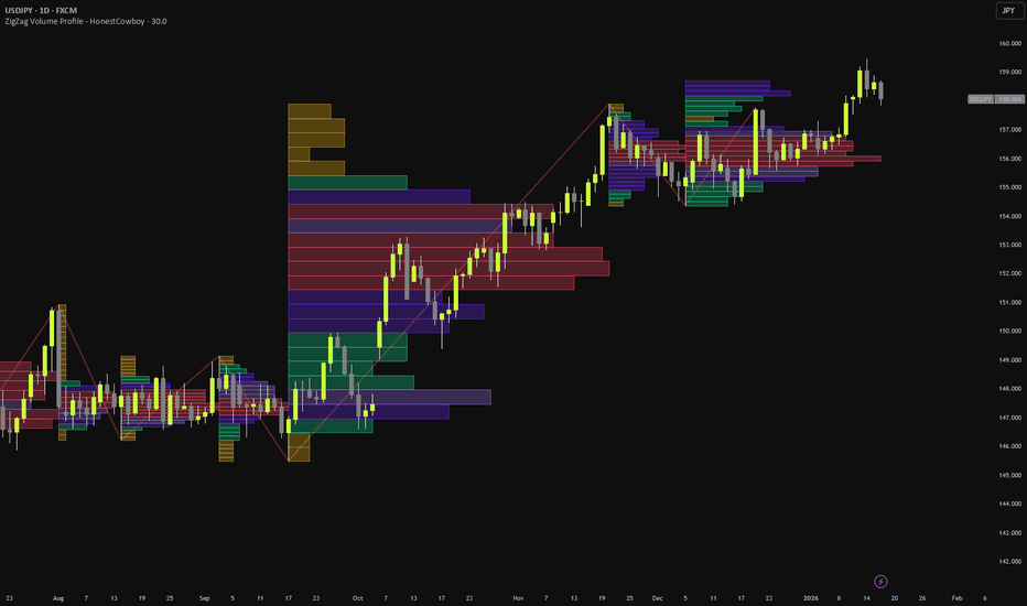
Anchored Clusters Volume Profile [LuxAlgo]The Anchored Clusters Volume Profile indicator utilizes K-Means clustering to categorize historical price action into distinct groups within a user-defined range and generates individual volume profiles for each detected cluster. This tool provides a unique perspective on volume distribution by isolating price behaviors based on proximity rather than strictly chronological order.
🔶 USAGE
The indicator identifies "clusters" of price activity within a selected range defined by a starting and ending date. Each cluster is assigned a unique color and its own horizontal volume profile, allowing traders to see where liquidity is most concentrated within specific price regimes.
🔹 Identifying Institutional Zones
Traders can use the Point of Control (POC) of high-volume clusters to identify significant institutional interest. Because the K-Means algorithm groups price action by density rather than time, a cluster's POC often represents a "fair value" level where significant exchange occurred. These dashed POC lines frequently act as robust support or resistance levels when price returns to them in the future.
🔹 Market Regime Detection
By observing the vertical distribution and overlap of clusters, traders can identify market phases. Overlapping clusters with high volume often indicate accumulation or distribution phases (sideways markets), whereas distinct, vertically separated clusters with lower volume gaps between them suggest a trending environment. A shift from multiple overlapping clusters to a new, isolated cluster can signal a breakout or the start of a new trend.
🔹 Precision Entry & Exits
Cluster boundaries and POC lines provide concrete levels for trade management. An entry can be sought when price retests a high-volume cluster POC, while stops can be placed outside the total price range of that specific cluster (the area covered by its volume profile). Conversely, targets can be set at the POC of the next major cluster above or below current price action.
🔹 Volume Conviction
The tool provides specific volume metrics that allow traders to gauge conviction. By comparing the "Total" volume label of one cluster against another, a trader can determine which price regime had more participation. A breakout into a price zone with a high-volume cluster suggests stronger conviction and a higher probability of the level holding compared to a zone with low total volume.
🔶 DETAILS
Unlike traditional anchored volume profiles that provide a single histogram, this script employs a K-Means clustering algorithm to segment the range. This process involves:
Identifying the specific range of bars between the user-selected Start Time and End Time .
Initializing "centroids" across the price range of that period.
Iteratively assigning each price bar to the nearest centroid based on the HLC2 (median) price.
Recalculating centroids based on the volume-weighted average price of the assigned bars.
Finalizing assignments after the specified number of iterations to ensure stable clusters.
By separating price action into these clusters, the tool helps identify high-interest zones that might be obscured by a single, traditional Volume Profile.
🔶 SETTINGS
🔹 Anchor Settings
Start Time / End Time : Sets the beginning and end of the analysis range. These use the "Confirm" feature, allowing you to select the range directly on the chart after adding the indicator or changing settings.
Range Highlight : Adjusts the color and transparency of the background shading that identifies the analyzed range.
🔹 Clustering Settings
Number of Clusters : Sets how many distinct price groups the algorithm should attempt to find (2 to 10).
K-Means Iterations : Controls the number of times the algorithm refines the cluster centers. Higher values can lead to more stable results.
🔹 Volume Profile Settings
Rows per Cluster VP : Defines the vertical resolution (number of bins) for each individual cluster's profile.
Max VP Width (Bars) : Sets the maximum horizontal length of the volume profile histograms.
VP Offset : Adjusts the horizontal spacing between the current bar and the start of the volume profiles.
Highlight Price Dots : Toggles the visibility of the colored dots on the price action to identify cluster assignments.
Dot Size : Adjusts the size of the cluster assignment dots on the chart, ranging from tiny to huge.
Indicator

Volume Anchored Price Map [LuxAlgo]The Volume Anchored Price Map indicator is a sophisticated institutional-grade tool designed to visualize where the highest concentration of trading activity is occurring relative to current price action.
By combining statistical volume analysis through dynamic "Bubbles" with a retrospective Volume Profile, it allows traders to identify high-interest liquidity zones and potential institutional support/resistance levels.
🔶 USAGE
The indicator provides a multi-layered view of market activity, helping traders distinguish between standard price movement and high-conviction institutional participation.
🔹 Identifying Institutional S/R
The projected dashed lines with TIER labels act as a roadmap for liquidity. Institutions often defend positions at these high-volume price points. When price returns to a TIER I level, traders should expect a significant reaction, either in the form of a strong reversal or a high-momentum breakout.
🔹 Spotting Absorption and Exhaustion
Large bubbles often signal the end of a move or the beginning of a major shift:
Exhaustion : Large red bubbles at the end of a downtrend suggest sellers are throwing in the towel (climax).
Absorption : Large green bubbles at the top of an uptrend can indicate institutional absorption of supply or a "blow-off" top.
🔹 Market Speed and the Value Area
The Price Map profile reveals the "thickness" of the market at specific prices:
High Volume Nodes (Wide/Bright Bars) : Expect price to slow down and consolidate. These are "sticky" areas where the market is comfortable.
Low Volume Areas (Thin Bars) : Price often moves through these zones rapidly due to a lack of historical interest, facilitating fast breakouts.
🔶 HOW TO USE
Traders can utilize the Volume Anchored Price Map to identify high-probability entries based on where "smart money" has previously transacted.
Filter Price Action : Look for TIER I or TIER II levels that align with the widest bars (High Volume Nodes) of the Price Map Profile. These confluences mark the strongest historical "Fair Value" zones.
Wait for Mean Reversion : If price deviates far from the High Volume Nodes into a "Low Volume Area" and a large Volume Bubble appears, it often indicates an exhaustion point where price is likely to snap back toward the high-volume center.
Breakout Confirmation : Use the levels as a breakout filter. A candle closing decisively above or below a projected TIER level—accompanied by a new Volume Bubble—suggests institutional participation in the new direction.
🔶 DETAILS
🔹 Price Map (The Gradient Histogram)
The tool looks back at a user-defined lookback window and calculates the total volume traded at every price bin. It displays this as a heatmap anchored to the right. Brighter, wider bars represent High Volume Nodes (HVN) where the market has found significant value or spent considerable time.
🔹 Volume Bubbles (Z-Score Analysis)
Instead of using raw volume, the script utilizes a Z-Score (a statistical measure of standard deviations from the mean). When volume spikes significantly above the average, a bubble is placed on the price action. The bubble size scales dynamically based on its statistical intensity (Z-Score), ranging from "Tiny" to "Huge."
🔹 Projected Anchor Levels
When a significant volume bubble is detected, the script "anchors" that price level and projects it forward. These levels are categorized by importance:
TIER I (Extreme) : Massive liquidity events (> 6 standard deviations). Major structural significance.
TIER II (High) : Strong institutional interest (4 to 6 standard deviations).
TIER III (Significant) : Noteworthy volume spikes (2 to 4 standard deviations).
🔶 SETTINGS
🔹 Price Map Profile
Lookback Length : Determines the historical window used to calculate the volume profile and identify bubbles.
Price Bins : The vertical resolution of the profile. Higher values create a more detailed histogram.
Show Price Map Profile : Toggles the visibility of the volume heatmap.
Profile Color : Sets the base color for the volume profile gradient.
🔹 Volume Bubbles
Show Volume Bubbles : Toggles the visibility of the Z-Score based circles.
Bubble Sensitivity (Z-Score) : The threshold at which a volume spike is considered significant enough to display.
Project Levels from Bubbles : Enables the projection of horizontal dashed lines from significant bubbles.
Max Projected Levels : Limits the number of active anchor levels displayed on the chart.
Label Horizontal Offset : Adjusts the position of the TIER labels to prevent overlap with the profile.
🔹 Dashboard
Enable Dashboard : Toggles the data table showing lookback, POC (Max Vol Level), and current Z-Score.
Position/Size : Controls the visual placement and scale of the dashboard on the chart. Indicator

Gaussian Volume Profile [LuxAlgo]The Gaussian Volume Profile indicator is a sophisticated volume analysis tool that uses the Levenberg-Marquardt optimization algorithm to fit a Sum of Gaussians model to historical volume distribution.
This approach transcends traditional discrete volume profiles by providing a continuous, noise-reduced representation of liquidity clusters, allowing for the precise identification of high-volume nodes and their respective price boundaries.
🔶 USAGE
The indicator projects a lateral volume density map to the right of the current price action. Users can utilize this tool to identify "fair value" zones where the Gaussian peaks are most concentrated. Unlike standard profiles that show jagged horizontal bars, this tool provides a smooth "fit" line that highlights the true center of gravity for volume at specific price levels.
🔹 Identifying High-Volume Nodes
The script automatically detects local maxima (peaks) within the fitted Gaussian model. These peaks represent the most significant price levels where the highest density of trading occurred. Horizontal dashed lines are drawn at these apexes, color-coded to match the specific Gaussian component that is most dominant at that price.
🔹 Zone Width and Volatility
By observing the width (standard deviation) of the individual Gaussian components (the dotted curves), traders can gauge the "breadth" of a value area. A narrow, sharp peak suggests a very specific price level of agreement, while a wide, shallow curve indicates a broad range where volume was distributed less precisely.
🔶 DETAILS
This tool represents a scientific advancement over regular Volume Profiles by applying a Gaussian Density model to market data:
Noise Reduction: Discrete profiles are often "noisy," with small volume gaps between price ticks. The Sum of Gaussians model acts as a sophisticated filter, smoothing out insignificant variances to reveal the underlying structural liquidity.
Levenberg-Marquardt Optimization: The script utilizes the LM algorithm, a standard in non-linear least squares problems, to iteratively refine the fit of multiple Gaussian pulses. This ensures the model converges on the most mathematically accurate representation of the volume data.
Precise Liquidity Centers: While a standard profile bin might be several ticks wide, the Gaussian apex provides a mathematically derived "center" ($\mu$) for liquidity, often offering more precise support and resistance levels.
Continuous Distribution: Because it models volume as a continuous function, it can estimate volume density between discrete price bins, providing a more fluid view of market interest.
The visual output combines a lateral histogram with a bold Gaussian density curve, color-coded components, and auto-detected peak levels for a comprehensive view of institutional interest.
🔶 SETTINGS
🔹 Profile Settings
Lookback Window: The number of historical bars used to calculate the volume profile distribution.
Number of Bins: Determines the vertical resolution of the profile. More bins provide more detail but require more computation.
🔹 Gaussian Settings
Max Potential Peaks: The maximum number of Gaussian components (nodes) the algorithm will attempt to fit to the data.
Max Iterations: Controls how many times the LM optimizer refines the fit. Higher values improve accuracy but may impact performance.
Initial Lambda: The damping factor for the optimization algorithm, affecting the early steps of the fitting process.
🔹 Visuals
Histogram Resolution: The maximum horizontal length of the projected histogram and fit line, measured in bar widths.
Highlight Window Range: Toggles a visual background box covering the historical lookback area for context.
Highlight Detected Peaks: Detects local maxima in the final fit and draws horizontal dashed levels at those price points.
Fit Color: Sets the static color for the main density curve.
Auto: When enabled, the fit color automatically adapts to your chart's foreground color (e.g., white on dark backgrounds).
Indicator

Volume Grid Heatmap [LuxAlgo]The Volume Grid Heatmap indicator provides a two-dimensional visualization of volume distribution across both price and time, allowing traders to identify areas of high liquidity and intense trading activity within a specific lookback period.
By partitioning the historical price action into a customizable grid, this tool maps volume data onto specific price-time coordinates, using heatmap color gradients to highlight "hot zones" where the most significant market participation has occurred.
🔶 USAGE
The indicator is primarily used to identify institutional activity, support/resistance zones, and liquidity clusters that might not be visible on a standard volume histogram.
🔹 Identifying High Activity Zones
Brightly colored cells in the heatmap represent areas where a high volume of shares or contracts changed hands at a specific price during a specific time interval. These zones often act as significant magnets for future price action or areas where price may find temporary friction.
🔹 Volume Distribution
Unlike a standard Volume Profile which only shows volume by price, the Grid Heatmap shows how that volume was distributed over time. Users can see if a high-volume price level was formed by a single massive spike (a single bright cell) or by consistent trading over a longer duration (a horizontal row of highlighted cells).
🔶 DETAILS
The script operates by dividing the recent price range (Highest High to Lowest Low over the lookback period) into a user-defined number of rows and columns.
For every bar within the lookback:
The script calculates the volume for that bar.
It distributes that volume across the grid rows based on the price overlap of the bar's high and low relative to the grid cell boundaries.
The volume is then aggregated into the corresponding time column.
Finally, the grid is normalized against the maximum volume found in any single cell, and colors are applied using professional perceptually uniform colormaps.
🔶 SETTINGS
🔹 Grid Settings
Lookback Bars: Determines the historical window of bars used to calculate the price range and volume data.
Rows (Price): Defines the vertical resolution of the grid. More rows provide more precise price-level analysis.
Columns (Time): Defines the horizontal resolution of the grid. More columns provide more precise timing of volume spikes.
🔹 Visuals
Heatmap Theme: Selects the color palette used for the gradient (Viridis, Inferno, Magma, Plasma, Cividis, or Turbo).
Transparency: Adjusts the visibility of the grid cells to ensure the underlying price action remains clear.
Indicator

Key Price Levels Daily Ver [structJCWL]As an independent developer and active trader, I built this tool to address a personal frustration: the lack of precision in standard session-level indicators. For those who trade based on market micro-structure, a level that is "approximately" correct is a logic error.
Key Price Levels Daily Ver is an engineering implementation focused on reconstructing session data with surgical accuracy. It is designed for traders who require reliable, noise-filtered benchmarks to anchor their daily execution.
THE ENGINEERING LOGIC:
1-Second (1S) Intrabar Reconstruction : Standard scripts often rely on daily-bar data, which can be imprecise. This tool re-aggregates the session using 1-Second (1S) granularity . By processing every sub-candle, it ensures that POC, Value Area, and Extremes are anchored to the true weight of capital commitment.
The 15-Minute Threshold (Technical Rationale) : To maintain the high fidelity of 1S data aggregation, this indicator is optimized for timeframes ≤ 15 minutes . Calculating micro-structure on higher timeframes leads to data thinning and reduced precision—limitations I refuse to accept in my personal trading setup.
Adaptive Visual Hierarchy (Fade & Limits) : To prevent visual clutter, I’ve integrated Fade Strength and Timeframe Limits . Lines automatically adjust their transparency or visibility based on your current timeframe, ensuring that the most relevant levels remain clear while secondary noise recedes.
Reliability by Design : In 24/7 markets, script stability is paramount. I have implemented defensive programming (including a 98,000-unit memory circuit breaker ) to prevent overflows during extreme volatility. I strive for absolute dependability; if you encounter any issues, your feedback is highly welcome as we refine and improve this tool together.
作为一名独立开发者与实战交易者,我构建此工具是为了解决一个长期的困扰:标准时段指标精度的缺失。对于基于市场微观结构进行交易的人来说,“大约准确”的水位本身就是一种逻辑错误。
Key Price Levels Daily Ver 是我对日内关键水位线的个人工程化实现,专注于以“外科手术式”的精度重构时段数据。它专为那些需要可靠、过滤噪音的基准位来锚定日内执行的交易者而设计。
核心设计逻辑:
1秒级微观重构 (1S Precision) :我不满足于直接调用现成的日线数据。脚本通过扫描 1秒 (1S) 微观颗粒度数据 来重构整个交易时段,确保 POC 和价值区的计算基准来自于最真实的成交细节。
15分钟周期硬限制 :为了保证 1S 数据聚合的极致精度,本脚本仅限在 15分钟及以下周期 运行。在更长周期调用微观数据会导致精度大幅下降。作为开发者,我不允许“大约准确”的逻辑存在于我的系统里。
自适应视觉层级 (Fade & Limits) :通过内置的 淡化强度 (Fade) 与 周期限制 (Limits) ,水位线会根据你当前的图表周期自动调节透明度或可见性。
可靠性设计 :在 24/7 不间断的交易中,脚本的稳定性至关重要。我在代码底层加入了防御性设计(包括 98,000 数组容量熔断机制 ),旨在防止极端行情下的计算溢出或图表崩溃。我追求的是一个能让人放心的工具,若你在使用中发现任何问题,欢迎随时反馈,我们共同完善。
Feedback & Interaction:
As a personal project, this script is continuously refined. I welcome any bug reports or suggestions for improvement to make this tool even more robust for the community.
Compliance & Credits:
Author: structJCWL (Independent Developer & Trader)
License: Mozilla Public License 2.0 (MPL 2.0)
Attribution: Core data aggregation and state-machine logic are 100% original implementations Indicator

Indicator
Indicator

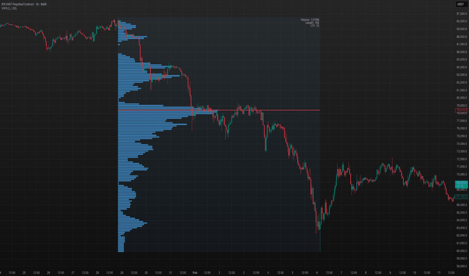
Volume Profile S/R Zones (Peaks)Volume Profile S/R Zones (Peaks) is a volume-profile based support/resistance tool that converts significant volume nodes into tradable zones, then ranks them by how consistently price respected them over the selected lookback.
The script builds a rolling Volume Profile over a user-defined window (default 81 days) using a fixed number of price bins (default 33 rows). For each price bin it accumulates:
Total volume traded inside that price region
Bullish volume (lower-timeframe bars that close above open)
Bearish volume (implied as total − bullish)
The profile is plotted on the left side of the chart. All profile elements and zones are intentionally forced to a single clean style: white at 20% opacity (labels keep the chart’s default text color styling).
What it detects
1) High Volume Nodes (Peaks)
The script scans the profile rows and detects local maxima (HVNs). To prevent noisy “micro peaks,” a peak must pass two quality filters:
Relative-to-Max filter: peak volume must be at least a % of the largest node’s volume
Prominence filter: peak volume must exceed the average of nearby nodes by a minimum ratio
These filters remove weak nodes and keep only meaningful price areas where the market traded heavily.
2) Optional Low Volume Nodes (Troughs / LVNs)
When enabled, the script also detects local minima (LVNs). LVNs can behave like “barrier” areas where price rejects or moves quickly through.
Zones instead of lines
Each detected node becomes a zone, not a single price line.
Zone center = middle of the profile row
Zone thickness is adaptive:
Zone Half-Width = max(price bin size, ATR × fraction)
This makes zones robust to volatility and reduces “false breaks” caused by small wicks.
Zone merging (reduces clutter)
Nodes close to each other are merged into a single zone if their centers are within:
Merge Distance = ATR × fraction
The merged zone center becomes volume-weighted, so stronger nodes dominate.
Reliability scoring (the core feature)
Every zone is scored by replaying price interaction over the lookback window:
Events
Touch: candle range intersects the zone
Valid rejection: touch + close exits the zone in the expected direction
Confirmed break: close outside the zone, confirmed by:
distance beyond the zone (ATR-based), or
a minimum number of consecutive closes outside
Scoring
Touch adds points
Rejection adds more points
Confirmed break subtracts points
A decay factor is applied each bar so older interactions matter less than recent ones
This produces a practical ranking: zones that get repeatedly respected score high; zones that fail score low.
What you see on the chart
Left-side Volume Profile (white 20% opacity)
Top N strongest zones (ranked by score), drawn as horizontal bands across the chart
Right-side price labels showing each zone’s center price
Label tooltip includes:
zone center price
reliability score
current “role” (support-side vs resistance-side)
polarity bias (bull/bear/neutral based on volume delta)
Inputs and how to tune
Volume Profile
Profile Lookback (Days): defines market memory (short = tactical, long = structural)
Rows: resolution of price bins (higher = more detailed, lower = smoother)
Profile Width: visual width of the profile histogram
POC mode: optional regular or developing POC line
Zones
Top N Zones: limits clutter by plotting only the strongest zones
ATR Length / Zone Half-Width: controls how wide zones are
Prominence / Relative-to-Max: controls strictness of peak detection
Merge Distance: merges nearby zones into one
Scoring
Touch / Rejection / Break points
Decay factor (higher = longer memory)
Break confirmation settings (ATR distance + consecutive closes)
How to use (practical framework)
This indicator is designed to treat volume nodes as acceptance/rejection areas, not perfect lines:
Focus on high-score zones (they have the most recent evidence of being respected)
Use zones as:
potential accumulation/defense areas (support-side)
potential supply/ceiling areas (resistance-side)
Break confirmation is ATR-based to reduce false breakdowns/breakouts
For investing, many users run two instances:
long lookback (e.g., 252 days) for macro zones
shorter lookback (e.g., 81 days) for tactical entries
Notes / Limitations
The script is a historical structure tool, not a predictor.
Zones can shift gradually as the rolling lookback window updates.
Different assets (high volatility vs low volatility) may require different row counts and filter strictness.
License / Credits
Based on LuxAlgo’s Volume Profile foundation and heavily modified to add zone construction, merging, and reliability scoring.
Licensed under CC BY-NC-SA 4.0 (Attribution–NonCommercial–ShareAlike). Indicator

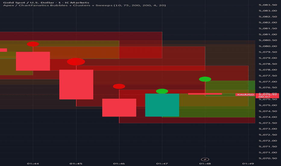
Apex / ChartFanatics Bubbles + Clusters + SweepsApex / ChartFanatics Bubbles + Clusters + Sweeps
This open-source indicator combines four visual elements — Volume Bubbles, Volume Clusters, Liquidity Sweep Markers, and Dynamic Supply/Demand Zones — into a single overlay tool. The goal is to provide traders with a unified view of volume intensity, aggressive price action, and key institutional reference levels on any timeframe or instrument.
Why this combination?
Many volume and structure tools exist separately, but combining them creates synergy:
- Volume Bubbles highlight relative volume strength instantly (quick glance at participation level).
- Volume Clusters emphasize high-volume bars as potential support/resistance areas.
- Liquidity Sweep markers flag classic "fakeout" or stop-hunt behavior (aggressive wicks that fail to sustain).
- Supply/Demand zones provide context for where price is likely to react after sweeps or clusters form.
Together, these elements help traders spot:
- Areas of high institutional interest (clusters + zones)
- Potential reversals after liquidity grabs (sweeps + zones)
- Confirmation of momentum via volume size and candle direction (bubbles + clusters)
This mashup is not random — it follows a logical Smart-Money / Order-Flow inspired workflow: detect volume → identify aggressive liquidity raids → map reaction zones → visualize everything for fast decision-making.
Core Features & How They Work
1. Volume Bubbles (Quantile-Based)
- Volume is ranked against a rolling lookback (default 200 bars).
- Dynamic quantiles divide the volume range into buckets (default 10 levels).
- Bubble size scales with quantile rank (tiny → huge).
- Color: bright green (bullish close) or bright red (bearish close), with adjustable opacity.
- Only shown when volume exceeds 1.2× the lookback minimum (avoids noise).
- Tooltip shows exact volume, delta (close-open), and quantile position.
2. Volume Clusters
- Draws semi-transparent boxes around bars exceeding a user-defined minimum volume.
- Width adjustable (default 4 bars forward) to highlight clusters visually.
- Same bullish/bearish coloring as bubbles for consistency.
3. Liquidity Sweeps
- Detects classic sweep patterns on the previous bar:
→ Bullish sweep: high > previous high, but close < previous high AND bearish candle
→ Bearish sweep: low < previous low, but close > previous low AND bullish candle
- Marked with a bright yellow star (★) label + tooltip.
- Useful for identifying potential stop hunts or failed breakouts.
4. Supply & Demand Zones
- Uses pivot high/low (default lookback 20 left/right) to detect swing points.
- Supply zone: from pivot high downward by 2× ATR(14).
- Demand zone: from pivot low upward by 2× ATR(14).
- Zones extend rightward dynamically (up to +30 bars) and remain visible until new pivots form.
- Brownish for supply (resistance), greenish for demand (support).
Inputs & Customization
- Bubble Quantiles (3–15): more levels = finer volume grading
- Bubble Opacity: controls transparency
- Volume Lookback: historical window for quantile calculation
- Cluster settings: toggle, min volume, width
- Sweeps & Zones: individual toggles
- Zone Pivot Lookback: sensitivity of swing detection
How to Use
- Best on lower timeframes (1m–15m) for scalping/day trading or higher (1h–4h) for swing setups.
- Look for confluence:
→ Large green bubble + cluster + demand zone + bullish sweep = strong support area
→ Large red bubble + cluster + supply zone + bearish sweep = strong resistance area
- Use sweeps as early warning of potential reversal when price approaches a zone.
- Combine with your own price action or structure analysis — this is a visual aid, not a signal generator.
- Keep chart clean: toggle off unused features if cluttered.
Publishing Notes
- Publish with a clean chart (only this indicator active, no other overlays/drawings).
- Recommended symbols: volatile instruments (forex majors, indices, crypto, gold).
- Max labels/boxes set high (500) to handle long histories — reduce if performance issues occur.
This script is fully open-source for transparency and learning. It is provided for educational purposes — no guarantees of profitability. Trading involves risk.
Feedback welcome — happy charting! Indicator
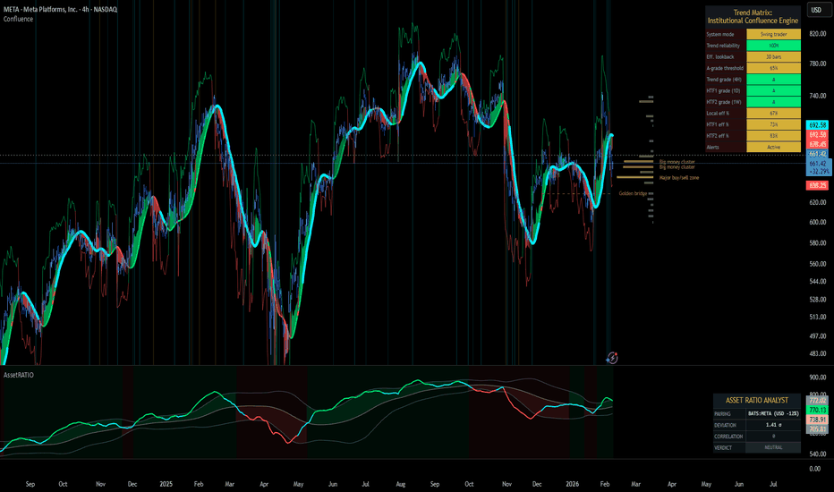
Trend Matrix: Institutional Confluence EngineTrend Matrix: Institutional Confluence Engine
The Institutional Confluence Engine is a professional-grade diagnostic tool designed to solve the two biggest problems in technical analysis: market noise and false breakouts.
Unlike standard lagging indicators, the Institutional Confluence Engine uses a sentient resolution engine to adapt its logic based on whether you are scalping or swing trading. It provides a real-time "Efficiency Grade" for the market, allowing you to ignore "C-Grade" chop and focus exclusively on "A-Grade" institutional trends.
Institutional Confluence and Alerts: Notifies you only when the Local, HTF1, and HTF2 timeframes all align at an "A-Grade" efficiency—the hallmark of a major structural move.
How to Trade It
Identify Confluence: Look for the Status Hub in the top right. When all three grades turn Green (A), institutional alignment is at its peak. This is also visible on the chart.
Monitor Trend Core: The ribbon acts as dynamic support/resistance. "Trend Flares" (brightening of the ribbon) indicate significant volume spikes entering the trend.
Profit Targets: Use the dynamic Green/Red expansion lines. These are volatility-adjusted targets that stretch or contract based on market energy (ATR).
Volume Intelligence
1. The Big Money Heatmap (Volume Intelligence)
Institutional players leave footprints in the form of volume. This engine visualizes these footprints using a dynamic Volume Profile integrated directly into your price action.
Big Money Clusters: These are price levels where massive institutional orders are being "filled." They represent high-conviction zones that act as magnets for price.
Major Buy/Sell Zones (POC): This marks the Point of Control—the exact price where the highest volume has transacted. It represents "Fair Value." Breakouts away from this zone often lead to the most explosive moves.
Gap Prediction: The engine analyzes the sentiment within volume nodes to predict if the market is preparing for an institutional "Gap Up" or "Gap Down."
2. The Golden Bridge (Structural Confluence)
The system calculates the Golden Bridge—a dynamic threshold based on the 0.618 Fibonacci ratio between major structural pivots.
The Logic: In institutional finance, the 0.618 level is the "Line in the Sand." If a rally holds above the Golden Bridge, the trend is structurally sound.
Golden Cluster Stronghold: When the Golden Bridge aligns perfectly with a Big Money Cluster, the system identifies a "Stronghold." This is the highest-probability support or resistance level generated by the engine.
3. MTF Efficiency Grading (A/B/C)
The Trend Matrix doesn't just show direction; it calculates Efficiency.
Grade A (High Efficiency): Price is tracking the trend core with minimal deviation. This is where institutional momentum is strongest.
Grade B (Moderate Efficiency): Healthy trending with standard pullbacks.
Grade C (Low Efficiency/Chop): Price is oscillating. The system will automatically "dim" the interface during these periods to prevent you from over-trading.
4. Status Hub & Intelligent Alerts
The Status Hub provides a real-time cockpit of your trading environment, displaying the "Trend Reliability Score" (0-100%) and Multi-Timeframe grades.
Confluence Alerts: Get notified when the Local, HTF1, and HTF2 timeframes all reach "A-Grade" status simultaneously.
Exhaustion Pillars: Vertical pillars on your chart highlight "Volume Spikes," warning you of potential trend exhaustion before the reversal happens.
How to Use
Check the Hub: Ensure the Trend Reliability is above 75%.
Verify Grade: Look for "A-Grade" efficiency on your local timeframe.
Find the Stronghold: Enter trades where the Golden Bridge and Big Money Clusters overlap for the highest-probability entries.
Target Expansion: Follow the dynamic Green/Red target lines for volatility-adjusted take-profits.
Disclaimer: Trading involves significant risk. This tool is designed for educational and diagnostic purposes and should be used as part of a comprehensive trading plan. Indicator
Orderflow GapThis is the **Orderflow Gap (OG)** analyzer.
It goes beyond standard price gap detection by integrating
**Market Structure (Dow/SMC)** and **Intra-Bar Orderflow**
to classify the quality and intent behind price discontinuities.
Key Features:
1. **Advanced Gap Detection & Lifecycle:**
- **Flexible Definition:** Users can define gaps based on
market psychology:
- **Body (Open-Close):** Focuses on the "True Gap" between
sessions or candles, ignoring wicks.
- **Full (High-Low):** Focuses on total price dislocation
where no trading occurred at all.
- **Lifecycle Tracking:** The indicator persistently tracks
open gaps and visually marks them as **Filled** once price
mitigates the area by a user-defined percentage.
2. **Intra-Bar Orderflow Profiling (Pre & Post Analysis):**
- **Context:** Standard tools treat a gap merely as empty price space.
This indicator analyzes the **Micro-Auction** immediately surrounding
the event to understand the mechanics of the move.
- **Reconstruction:** Using high-resolution lower timeframe data, it
builds detailed Volume Profiles for the **Pre-Gap Candle** (The Origin)
and the **Post-Gap Candle** (The Reaction).
- **Flow Validation:** This allows the user to verify **Orderflow Continuity**:
Does the aggressive buying/selling that caused the gap continue
immediately after, or is the move fading into absorption?
3. **Statistical Volume Profile Engine:** For each bar in the anchored
period, the indicator builds a complete volume profile on a lower
'Intra-Bar Timeframe'. Instead of simple tick counting, it uses
**statistical models ('PDF' allocation)** to distribute volume
across price levels and **advanced classifiers ('Dynamic' split)**
to determine the buy/sell pressure within that profile.
4. **Structural & Volumetric Context:**
- **Vacuum (Density):** Calculates the "Volume Density" per
tick. A low density indicates a **Liquidity Vacuum** (price
slipped due to lack of orders), while high density indicates
aggressive fighting.
- **Commitment:** Compares the volume surrounding the gap
to the historical average to determine if big players
are backing the move.
- **Trend Alignment:** Filters signals based on the underlying
trend using either **Dow Theory** or **Smart Money Concepts**.
5. **Gap Classification Engine:**
The indicator automatically classifies gaps into four
structural types based on the metrics above:
- **Breakaway:** A high-conviction move that breaks structure,
showing **Initiative** (breaking previous Value Area) and
**Commitment** (High Volume).
- **Runaway:** A continuation gap within an established trend,
aligned with the Orderflow Delta.
- **Exhaustion:** A gap that occurs late in a trend, often
characterized by a **Liquidity Vacuum** (low density) despite
high volume, signaling potential reversal.
- **Common:** Standard volatility gaps lacking significant structural
or volumetric backing.
**Volume Fallback:** If no volume data is provided by the
exchange (e.g., certain CFDs or Indices), the classification
logic automatically defaults to **Common** to ensure strict
signal integrity without Orderflow verification.
6. **Visual Orderflow Insight:**
- **Profile Visualization:** Plots the reconstructed volume
profile as a polyline directly adjacent to the gap, allowing
you to see the "Injection" of volume that caused the move.
- **Color Coding:** Gaps are color-coded based on their
classification (Breakaway/Runaway/Exhaustion) and direction
(Bullish/Bearish).
7. **Multi-Metric Profiling (Volume, Time, Velocity):** Unlike standard
tools, this indicator allows you to switch between three critical
dimensions of market activity:
- **VOLUME (The "Where"):** Shows standard acceptance levels.
- **TIME (The "How Long"):** Measures duration at price (similar to TPO),
indicating fair value (High Time) or rejection (Low Time).
- **VELOCITY (The "How Fast"):** Measures the speed of trading (Contracts
per Second) to reveal intent. **High Velocity** suggests aggression
(initiative buying/selling), while **Low Velocity** despite volume
indicates absorption (passive limit orders).
8. **Integrated Alerts:** Includes granular alerts for:
- Detection of specific gap types (e.g., "Bullish Breakaway Gap").
- General gap formation.
**Caution: Real-Time Data Behavior (Intra-Bar Repainting)**
This indicator uses high-resolution intra-bar data. As a result, the
values on the **current, unclosed bar** (the real-time bar) will
update dynamically as new intra-bar data arrives. This includes
the values used for real-time alerts in 'Structure' and
'Delta' modes.
---
**DISCLAIMER**
1. **For Informational/Educational Use Only:** This indicator is
provided for informational and educational purposes only. It does
not constitute financial, investment, or trading advice, nor is
it a recommendation to buy or sell any asset.
2. **Use at Your Own Risk:** All trading decisions you make based on
the information or signals generated by this indicator are made
solely at your own risk.
3. **No Guarantee of Performance:** Past performance is not an
indicator of future results. The author makes no guarantee
regarding the accuracy of the signals or future profitability.
4. **No Liability:** The author shall not be held liable for any
financial losses or damages incurred directly or indirectly from
the use of this indicator.
5. **Signals Are Not Recommendations:** The alerts and visual signals
(e.g., crossovers) generated by this tool are not direct
recommendations to buy or sell. They are technical observations
for your own analysis and consideration. Indicator

Clusters Volume Profile [LuxAlgo]The Clusters Volume Profile indicator utilizes K-Means clustering to categorize historical price action into distinct groups and generates individual volume profiles for each detected cluster. This tool provides a unique perspective on volume distribution by isolating price behaviors based on proximity rather than strictly chronological order.
🔶 USAGE
The indicator identifies "clusters" of price activity within a user-defined lookback period. Each cluster is assigned a unique color and its own horizontal volume profile, allowing traders to see where liquidity is most concentrated within specific price regimes.
🔹 Identifying Institutional Zones
Traders can use the Point of Control (POC) of high-volume clusters to identify significant institutional interest. Because the K-Means algorithm groups price action by density rather than time, a cluster's POC often represents a "fair value" level where significant exchange occurred. These dashed POC lines frequently act as robust support or resistance levels when price returns to them in the future.
🔹 Market Regime Detection
By observing the vertical distribution and overlap of clusters, traders can identify market phases. Overlapping clusters with high volume often indicate accumulation or distribution phases (sideways markets), whereas distinct, vertically separated clusters with lower volume gaps between them suggest a trending environment. A shift from multiple overlapping clusters to a new, isolated cluster can signal a breakout or the start of a new trend.
🔹 Precision Entry & Exits
Cluster boundaries and POC lines provide concrete levels for trade management. An entry can be sought when price retests a high-volume cluster POC, while stops can be placed outside the total price range of that specific cluster (the area covered by its volume profile). Conversely, targets can be set at the POC of the next major cluster above or below current price action.
🔹 Volume Conviction
The tool provides specific volume metrics that allow traders to gauge conviction. By comparing the "Total" volume label of one cluster against another, a trader can determine which price regime had more participation. A breakout into a price zone with a high-volume cluster suggests stronger conviction and a higher probability of the level holding compared to a zone with low total volume.
🔶 DETAILS
The script employs a K-Means clustering algorithm. This process involves:
Initializing "centroids" across the price range of the lookback period.
Iteratively assigning each price bar to the nearest centroid based on the HLC2 (median) price.
Recalculating centroids based on the volume-weighted average price of the assigned bars.
Finalizing assignments after the specified number of iterations to ensure stable clusters.
By separating price action into these clusters, the tool helps identify high-interest zones that might be obscured by a single, traditional Volume Profile.
🔶 SETTINGS
🔹 Clustering Settings
Lookback Period: Determines the number of recent bars used for the clustering analysis.
Number of Clusters: Sets how many distinct price groups the algorithm should attempt to find (2 to 10).
K-Means Iterations: Controls the number of times the algorithm refines the cluster centers. Higher values can lead to more stable results.
🔹 Volume Profile Settings
Rows per Cluster VP: Defines the vertical resolution (number of bins) for each individual cluster's profile.
Max VP Width (Bars): Sets the maximum horizontal length of the volume profile histograms.
VP Offset: Adjusts the horizontal spacing between the current bar and the start of the volume profiles.
Highlight Price Dots: Toggles the visibility of the colored dots on the price action to identify cluster assignments.
Dot Size: Adjusts the size of the cluster assignment dots on the chart, ranging from tiny to huge.
Indicator

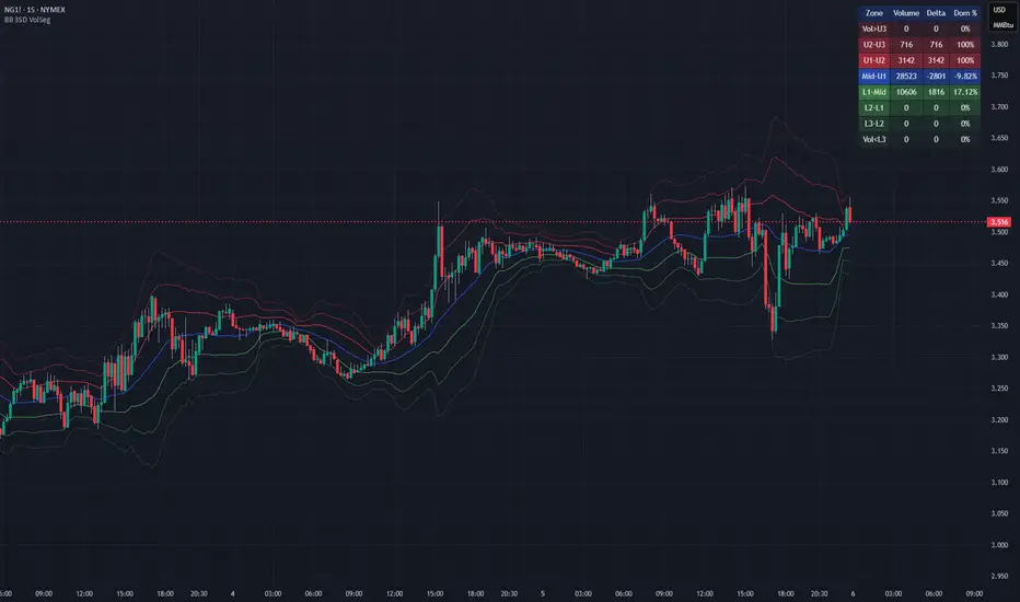
Bollinger Bands with 3SD Volume SegmentationPurpose
This script provides a structured way to analyze how real traded volume distributes across the different volatility zones defined by Bollinger Bands with three standard deviations, it reveals where activity concentrates, how pressure shifts between buyers and sellers, and how market participation behaves as price moves through expanding or contracting volatility regimes. The tool turns the bands into a mechanical segmentation system that exposes the microstructure hidden inside each volatility layer.
How it works
The script calculates Bollinger Bands at one, two, and three standard deviations, then assigns every bar’s volume to the correct volatility zone based on where price closed, it reconstructs buy and sell volume from candle behavior, computes delta as the difference between them, and aggregates these values over the chosen lookback window. Each zone displays total volume, delta, and a dominance percentage that expresses how strongly buyers or sellers controlled that region, all updated dynamically on the most recent bar. For example, if the Mid–U1 zone shows 28,450 contracts with a –2,728 delta and –9.59% dominance, that indicates mild seller control in a normally balanced rotation area, while the L1–Mid zone showing 10,606 contracts, +1,816 delta, and 17.12% dominance signals buyers absorbing pressure and defending the pullback.
Rationale
Volatility zones behave like natural boundaries where liquidity concentrates, where traders commit, hesitate, or get trapped, and where expansions or reversals often originate, so segmenting volume and delta by these zones provides a clearer picture of intent and pressure than raw volume alone. By quantifying how much buying or selling occurred in each volatility layer, the script helps identify continuation, absorption, exhaustion, and imbalance, giving traders a mechanical, objective map of market behavior rather than relying on subjective interpretation.
Indicator

Precision Market Entropy Heatmap [LuxAlgo]The Precision Market Entropy Heatmap indicator provides a high-resolution visualization of volume distribution and market activity within specific anchor intervals using intrabar data.
By utilizing lower timeframe (LTF) precision, it maps out where the most significant trading activity occurred, allowing traders to identify institutional interest zones and "fair value" areas through a dynamic heat-mapped profile.
🔶 USAGE
The indicator segments the chart into blocks based on the selected Anchor Interval. Within each block, a vertical distribution of volume is calculated using the Intrabar Precision setting to ensure the heatmap accurately reflects market participation at specific price levels.
Heatmap Blocks : Brighter colors represent higher volume concentrations (high entropy). These areas often act as significant support or resistance zones where the market has previously found "fair value" or high liquidity.
Identifying Institutional Interest : High-volume "bright" nodes represent price levels where heavy institutional participation occurred. These nodes act as powerful magnets or barriers for future price action.
Navigating Liquidity Voids : Darker areas indicate low volume nodes (low entropy). Price often "slips" through these gaps quickly. Traders can use these zones to anticipate fast-moving price action or set targets beyond the void.
Trend Direction via POC : Observe the slope and shifts of the Developing POC polyline. An ascending POC confirms bullish value migration, while a descending one suggests bearish value migration.
Mean Reversion : Significant price deviations from the largest high-volume node, when the POC remains static, can signal that the market is overextended and likely to return to "fair value."
Breakout Validation : Use the blocks to identify compression zones. A breakout is more reliable when the POC shifts into the new range, confirming that the move is backed by volume and accepted by the market.
POC Extensions : Dashed lines extend the session's final POC. These are dynamically colored based on their relationship to the current price: Green if the POC is below the current price (potential support) and Red if above (potential resistance).
🔶 DETAILS
Unlike standard Volume Profiles that look at fixed ranges, this script focuses on "Entropy" by visualizing the density of distribution across a user-defined grid.
By requesting security data from lower timeframes, it provides a much more granular view of price action than what is visible on the current chart timeframe alone.
The indicator uses a gradient-based coloring system to distinguish between low-activity areas and high-volume nodes, making it easier to spot "Liquidity Voids" (darker areas) and "High Volume Nodes" (brighter areas).
🔶 SETTINGS
🔹 Heatmap Settings
Anchor Interval : Sets the timeframe that defines each heatmap block (e.g., "D" for Daily blocks).
Intrabar Precision : Determines the lower timeframe used to calculate the volume distribution. Lower values (like "1m") provide higher precision but are limited by available historical data.
Number of Rows : Controls the vertical price resolution of the heatmap grid. Higher values create a more detailed but computationally heavier profile.
🔹 Style Settings
Heatmap Intensity : A three-color gradient selector that defines the color transition from low to high volume areas.
Heatmap Transparency : Adjusts the visibility of the heatmap blocks on the chart.
POC Extension (Bull/Bear) : Sets the colors for the dashed POC lines based on whether they are currently below (Bull) or above (Bear) the market price.
Show Developing POC : Toggles the visibility of the real-time POC polyline.
Auto : When enabled, the developing POC color automatically syncs with your chart theme's foreground color.
🔹 Display Settings
Max Sessions to Show : Limits the number of historical heatmap blocks rendered on the chart to maintain performance.
Extend POCs to Current Bar : When enabled, historical POC lines will extend to the far right of the chart until they are replaced by newer sessions.
Indicator

Volume Profile with HVN / LVN Detection (Low-TF Safe)Session-based volume profile with VPOC, HVN, and LVN detection, optimized for fast charts and runtime-safe lower-timeframe execution.
Volume Profile with HVN / LVN Detection (Low-TF Safe)
This indicator plots a session-based Volume Profile , highlights the Volume Point of Control (VPOC) , and automatically detects High Volume Nodes (HVNs) and Low Volume Nodes (LVNs) from the completed profile.
It is a performance-focused refactor of the original Volume Profile With HVN/LVN Detector , redesigned to work reliably on fast timeframes (including 5-second charts) without runtime errors.
Features
Session-based volume profile with adjustable row resolution
VPOC with optional extension and date labeling
Automatic HVN and LVN detection from the prior session
HVNs and LVNs displayed as levels or areas
Configurable strength, colors, and line/area styles
Runtime-safe lower-timeframe handling using request.security_lower_tf
Optimized to reduce execution overhead on high-frequency charts
Designed for traders who use volume structure to identify acceptance, rejection, and potential support/resistance zones across all chart timeframes.
---
What’s new in this version
Refactored lower-timeframe logic to prevent runtime errors on fast charts
Automatic, runtime-safe fallback when selected lower TF exceeds chart TF
Stable execution on very low timeframes (e.g. 5s, 10s)
Preserved original profile, VPOC, HVN, and LVN behavior
No repainting of completed session profiles
This update prioritizes stability, correctness, and cross-timeframe compatibility .
---
Credits & Attribution
This script is based on the original
“Volume Profile With HVN/LVN Detector”
by tradeforopp (revised by Madpuppy88 ).
The current version refactors the original implementation to improve:
Runtime safety on low timeframes
Performance on high-frequency charts
Robust multi-timeframe handling
Original concept and core logic credit remain with the original authors.
---
How to Use
VPOC highlights the price level of highest traded volume for the session and often acts as a magnet or balance point.
HVNs represent areas of acceptance where price previously traded heavily and may act as support/resistance or consolidation zones.
LVNs mark areas of rejection where price moved quickly and may act as inflection or breakout levels.
Use HVNs and LVNs from the prior session to frame intraday bias, targets, and risk zones.
On very fast charts, the script automatically falls back to chart-timeframe data to maintain stability.
Indicator

Volume Profile Skew [BackQuant]Volume Profile Skew
Overview
Volume Profile Skew is a market-structure indicator that answers a specific question most volume profiles do not:
“Is volume concentrating toward lower prices (accumulation) or higher prices (distribution) inside the current profile range?”
A standard volume profile shows where volume traded, but it does not quantify the shape of that distribution in a single number. This script builds a volume profile over a rolling lookback window, extracts the key profile levels (POC, VAH, VAL, and a volume-weighted mean), then computes the skewness of the volume distribution across price bins. That skewness becomes an oscillator, smoothed into a regime signal and paired with visual profile plotting, key level lines, and historical POC tracking.
This gives you two layers at once:
A full profile and its important levels (where volume is).
A skew metric (how volume is leaning within that range).
What this indicator is based on
The foundation comes from classical “volume at price” concepts used in Market Profile and Volume Profile analysis:
POC (Point of Control): the price level with the highest traded volume.
Value Area (VAH/VAL): the zone containing the bulk of activity, commonly 70% of total volume.
Volume-weighted mean (VWMP in this script): the average price weighted by volume, a “center of mass” for traded activity.
Where this indicator extends the idea is by treating the volume profile as a statistical distribution across price. Once you treat “volume by price bin” as a probability distribution (weights sum to 1), you can compute distribution moments:
Mean: where the mass is centered.
Standard deviation: how spread-out it is.
Skewness: whether the distribution has a heavier tail toward higher or lower prices.
This is not a gimmick. Skewness is a standard statistic in probability theory. Here it is applied to “volume concentration across price”, not to returns.
Core concept: what “skew” means in a volume profile
Imagine a profile range from Low to High, split into bins. Each bin has some volume. You can get these shapes:
Balanced profile: volume is fairly symmetric around the mean, skew near 0.
Bottom-heavy profile: more volume at lower prices, with a tail toward higher prices, skew tends to be positive.
Top-heavy profile: more volume at higher prices, with a tail toward lower prices, skew tends to be negative.
In this script:
Positive skew is labeled as ACCUMULATION.
Negative skew is labeled as DISTRIBUTION.
Near-zero skew is NEUTRAL.
Important: accumulation here does not mean “buying will immediately pump price.” It means the profile shape suggests more participation at lower prices inside the current lookback range. Distribution means participation is heavier at higher prices.
How the volume profile is built
1) Define the analysis window
The profile is computed on a rolling window:
Lookback Period: number of bars included (capped by available history).
Profile Resolution (bins): number of price bins used to discretize the high-low range.
The script finds the highest high and lowest low in the lookback window to define the price range:
rangeHigh = highest high in window
rangeLow = lowest low in window
binSize = (rangeHigh - rangeLow) / bins
2) Create bin midpoints
Each bin gets a midpoint “price” used for calculations:
price = rangeLow + binSize * (b + 0.5)
These midpoints are what the mean, variance, and skewness are computed on.
3) Distribute each candle’s volume into bins
This is a key implementation detail. Real volume profiles require tick-level data, but Pine does not provide that. So the script approximates volume-at-price using candle ranges:
For each bar in the lookback:
Determine which bins its low-to-high range touches.
Split that candle’s total volume evenly across the touched bins.
So if a candle spans 6 bins, each bin gets volume/6 from that bar. This is a practical, consistent approximation for “where trading could have occurred” inside the bar.
This approach has tradeoffs:
It does not know where within the candle the volume truly traded.
It assumes uniform distribution across the candle range.
It becomes more meaningful with larger samples (bigger lookback) and/or higher timeframes.
But it is still useful because the purpose here is the shape of the distribution across the whole window, not exact microstructure.
Key profile levels: POC, VAH, VAL, VWMP
POC (Point of Control)
POC is found by scanning bins and selecting the bin with maximum volume. The script stores:
pocIndex: which bin has max volume
poc price: midpoint price of that bin
Value Area (VAH/VAL) using 70% volume
The script builds the value area around the POC outward until it captures 70% of total volume:
Start with the POC bin.
Expand one bin at a time to the side with more volume.
Stop when accumulated volume >= 70% of total profile volume.
Then:
VAL = rangeLow + binSize * lowerIdx
VAH = rangeLow + binSize * (upperIdx + 1)
This produces a classic “where most business happened” zone.
VWMP (Volume-Weighted Mean Price)
This is essentially the center of mass of the profile:
VWMP = sum(price * volume ) / totalVolume
It is similar in spirit to VWAP, but it is computed over the profile bins, not from bar-by-bar typical price.
Skewness calculation: turning the profile into an oscillator
This is the main feature.
1) Treat volumes as weights
For each bin:
weight = volume / totalVolume
Now weights sum to 1.
2) Compute weighted mean
Mean price:
mean = sum(weight * price )
3) Compute weighted variance and std deviation
Variance:
variance = sum(weight * (price - mean)^2)
stdDev = sqrt(variance)
4) Compute weighted third central moment
Third moment:
m3 = sum(weight * (price - mean)^3)
5) Standardize to skewness
Skewness:
rawSkew = m3 / (stdDev^3)
This standardization matters. Without it, the value would explode or shrink based on profile scale. Standardized skewness is dimensionless and comparable.
Smoothing and regime rules
Raw skewness can be jumpy because:
profile bins change as rangeHigh/rangeLow shift,
one high-volume candle can reshape the distribution,
volume regimes change quickly in crypto.
So the indicator applies EMA smoothing:
smoothedSkew = EMA(rawSkew, smooth)
Then it classifies regime using fixed thresholds:
Bullish (ACCUMULATION): smoothedSkew > +0.25
Bearish (DISTRIBUTION): smoothedSkew < -0.25
Neutral: between those values
Signals are generated on threshold cross events:
Bull signal when smoothedSkew crosses above +0.25
Bear signal when smoothedSkew crosses below -0.25
This makes the skew act like a regime oscillator rather than a constantly flipping color.
Volume Profile plotting modes
The script draws the profile on the last bar, using boxes for each bin, anchored to the right with a configurable offset. The width of each profile bar is normalized by max bin volume:
volRatio = binVol / maxVol
barWidth = volRatio * width
Three style modes exist:
1) Gradient
Uses a “jet-like” gradient based on volRatio (blue → red). Higher-volume bins stand out naturally. Transparency increases as volume decreases, so low-volume bins fade.
2) Solid
Uses the current regime color (bull/bear/neutral) for all bins, with transparency. This makes the profile read as “structure + regime.”
3) Skew Highlight
Highlights bins that match the skew bias:
If skew bullish, emphasize lower portion of profile.
If skew bearish, emphasize higher portion of profile.
Else, keep most bins neutral.
This is a visual “where the skew is coming from” mode.
Historical POC tracking and Naked POCs
This script also treats POCs as meaningful levels over time, similar to how traders track old VA levels.
What is a “naked POC”?
A “naked POC” is a previously formed POC that has not been revisited (retested) by price since it was recorded. Many traders watch these as potential reaction zones because they represent prior “maximum traded interest” that the market has not re-engaged with.
How this script records POCs
It stores a new historical POC when:
At least updatebars have passed since the last stored POC, and
The POC has changed by at least pochangethres (%) from the last stored value.
New stored POCs are flagged as naked by default.
How naked becomes tested
On each update, the script checks whether price has entered a small zone around a naked POC:
zoneSize = POC * 0.002 (about 0.2%)
If bar range overlaps that zone, mark it as tested (not naked).
Display controls:
Highlight Naked POCs: draws and labels untested POCs.
Show Tested POCs: optionally draw tested ones in a muted color.
To avoid clutter, the script limits stored POCs to the most recent 20 and avoids drawing ones too close to the current POC.
On-chart key levels and what they mean
When enabled, the script draws the current lookback profile levels on the price chart:
POC (solid): the “most traded” price.
VAH/VAL (dashed): boundaries of the 70% value area.
VWMP (dotted): volume-weighted mean of the profile distribution.
Interpretation framework (practical, not mystical):
POC often behaves like a magnet in balanced conditions.
VAH/VAL define the “accepted” area, breaks can signal auction continuation.
VWMP is a fair-value reference, useful as a mean anchor when skew is neutralizing.
Oscillator panel and histogram
The skew oscillator is plotted in a separate pane:
Line: smoothedSkew, colored by regime.
Histogram: smoothedSkew as bars, colored by sign.
Fill: subtle shading above/below 0 to reinforce bias.
This makes it easy to read:
Direction of bias (positive vs negative).
Strength (distance from 0 and from thresholds).
Transitions (crosses of ±0.25).
Info table: what it summarizes
On the last bar, a table prints key diagnostics:
Current skew value (smoothed).
Regime label (ACCUMULATION / DISTRIBUTION / NEUTRAL).
Current POC, VAH, VAL, VWMP.
Count of naked POCs still active.
A simple “volume location” hint (lower/higher/balanced).
This is designed for quick scanning without reading the entire profile.
Alerts
The indicator includes alerts for:
Skew regime shifts (cross above +0.25, cross below -0.25).
Price crossing above/below current POC.
Approaching a naked POC (within 1% of any active naked POC).
The “approaching naked POC” alert is useful as a heads-up that price is entering a historically important volume magnet/reaction zone.
How to use it properly
1) Regime filter
Use skew regime to decide what type of trades you should prioritize:
ACCUMULATION (positive skew): market activity is heavier at lower prices, pullbacks into value or below VWMP often matter more.
DISTRIBUTION (negative skew): activity is heavier at higher prices, rallies into value or above VWMP often matter more.
NEUTRAL: mean-reversion and POC magnet behavior tends to dominate.
This is not “buy when green.” It is context for what the auction is doing.
2) Level-based execution
Combine skew with VA/POC levels:
In neutral regimes, expect rotations around POC and inside VA.
In strong skew regimes, watch for acceptance away from POC and reactions at VA edges.
3) Naked POCs as targets and reaction zones
Naked POCs can act like unfinished business. Common workflows:
As targets in rotations.
As areas to reduce risk when price is approaching.
As “if it breaks cleanly, trend continuation” markers when price returns with force.
Parameter tuning guidance
Lookback
Controls how “local” the profile is.
Shorter: reacts faster, more sensitive to recent moves.
Longer: more stable, better for swing context.
Bins
Controls resolution of the profile.
Higher bins: more detail, more computation, more sensitive profile shape.
Lower bins: smoother, less detail, more stable skew.
Smoothing
Controls how noisy the skew oscillator is.
Higher smoothing: fewer regime flips, slower response.
Lower smoothing: more responsive, more false transitions.
POC tracking settings
Update interval and threshold decide how many historical POCs you store and how different they must be. If you set them too loose, you will spam levels. If too strict, you will miss meaningful shifts.
Limitations and what not to assume
This indicator uses candle-range volume distribution because Pine cannot see tick-level volume-at-price. That means:
The profile is an approximation of where volume could have traded, not exact tape data.
Skew is best treated as a structural bias, not a precise signal generator.
Extreme single-bar events can distort the distribution briefly, smoothing helps but cannot remove reality.
Summary
Volume Profile Skew takes standard volume profile structure (POC, Value Area, volume-weighted mean) and adds a statistically grounded measure of profile shape using skewness. The result is a regime oscillator that quantifies whether volume concentration is leaning toward lower prices (accumulation) or higher prices (distribution), while also plotting the full profile, key levels, and historical naked POCs for actionable context.
Indicator

Replay FootprintReplay Footprint (RF) is a footprint (cluster) volume analysis indicator with a key feature: full support for Replay mode.
You can rewind to any point in history, and the indicator will re-request real tick data (or the lower timeframe specified in the inputs) and rebuild the footprint as if the market were forming in real time. This allows accurate historical analysis without distorted or pre-aggregated data.
The indicator displays:
buy and sell volume at each price level,
imbalance levels,
delta and volume imbalances,
Point of Control (POC),
Value Area High / Low (VAH / VAL).
Replay note
If you want to play Replay in real time, make sure to run Replay using a lower resolution (ticks or lower timeframe) rather than the chart resolution.
In this mode, the indicator works correctly and updates footprint data in real time.
Requesting detailed data is a resource-intensive operation.
If you encounter memory limit errors, reduce the number of price rows or the amount of detailed bars requested.
If you need more detail, you can increase these values, keeping TradingView limits in mind. Indicator

Indicator

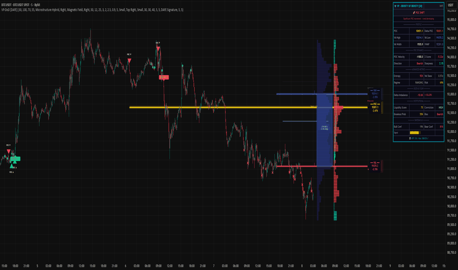
Volume Profile - Density of Density [DAFE]Volume Profile - Density of Density
The Art & Science of Market Architecture: An AI-Enhanced Volume Profile & Order Flow Engine with a Revolutionary Visualization Core.
█ PHILOSOPHY: BEYOND THE PROFILE, INTO THE DENSITY
Standard Volume Profile shows you a one-dimensional story: where volume was traded. It shows you the first layer of density. But this is like looking at a galaxy and only seeing the stars, completely missing the gravitational forces, the dark matter, and the nebulae that give it structure.
Volume Profile - Density of Density (VP-DoD) is a revolutionary leap forward. It was engineered to analyze the second order of market data: the properties of the density itself . We don't just ask "Where did volume trade?" We ask " Why did it trade there? What was the character of that volume? What is the statistical significance of its shape? What is the probability of what happens next?"
This is a complete, institutional-grade analytical framework built on the DAFE principle: Data Analysis For Execution . It fuses a higher-timeframe structural engine, a proprietary microstructure delta engine, and a Bayesian AI into a single, cohesive intelligence system. It is designed to transform your chart from a flat, lagging record of the past into a living, three-dimensional map of market structure and intention.
█ WHAT MAKES VP-DoD ULTIMATE UNLIKE ANY OTHER PROFILE TOOL?
This is not just another volume profile script. It stands apart due to a suite of proprietary features previously unseen on this platform.
Higher Timeframe (HTF) Core: While other profiles are trapped by the noise of your current chart, VP-DoD builds its foundation on a higher timeframe of your choice (e.g., Daily data on a 15m chart). This is its greatest strength. It filters out intraday noise to reveal the true, macro architectural levels where institutions have built their positions.
Microstructure Hybrid Delta Engine: Standard delta is primitive. Our engine provides a far more accurate picture of order flow by simulating tick data and analyzing the battle between candle bodies (aggression) and wicks (absorption). It sees the hidden story inside the volume.
Bayesian AI Confidence Model: This is not a simple weighted score. VP-DoD incorporates a genuine Bayesian inference model. It starts with a neutral "belief" about the market and continuously updates its Bullish/Bearish Confidence percentage based on new evidence from delta, POC velocity, and price action. It thinks like a professional quant, providing you with a real-time statistical edge.
Advanced Statistical Analysis: It calculates metrics found nowhere else, such as Profile Entropy (a measure of market disorder) and Volatility Skew (a measure of fear vs. greed from the derivatives market), and normalizes them with Z-Scores for universal applicability.
Revolutionary Visualization Engine: Data should be intuitive and beautiful. VP-DoD features 14 distinct, animated, and theme-aware rendering modes . From "Nebula Plasma" and "Liquid Metal" to "DNA Helix" and "Constellation Map," you can transform raw data into interactive data art, allowing you to perceive market structure in a way that resonates with your unique analytical style.
█ THE ART OF ANALYSIS: A REVOLUTIONARY VISUALIZATION CORE
Data is useless if it isn't intuitive. VP-DoD shatters the mold of boring, static indicators with a state-of-the-art visualization engine. This is where data analysis becomes data art.
The Profile Itself: 14 Modes of Perception
Choose how you want to see the market's architecture:
Nebula Plasma & Quantum Matrix: Futuristic, cyberpunk aesthetics with vibrant glow effects that make HVNs and POCs pulse with energy.
Thermal Vision & Heat Shimmer: Renders the profile as a heatmap, instantly drawing your eye to the "hottest" zones of institutional liquidity.
Liquid Metal & Crystalline: Creates a tangible, almost physical representation of volume with metallic sheens, animated light flows, and faceted structures.
3D Depth Map & Prismatic Refraction: Uses layering and color channel separation to create a stunning illusion of depth, separating the profile into its core components.
Particle Field & Constellation Map: Abstract, beautiful data art modes that represent volume as animated particles or glowing stars, connecting major nodes like celestial bodies.
DNA Helix & Magnetic Field: Dynamic, animated modes that visualize the forces of attraction and repulsion around the POC and Value Area, representing the market's underlying code.
The POC & Value Area: A Living, Breathing Structure
The POC and VA are no longer static lines. They are a dynamic, interactive system designed for immediate contextual awareness:
Multi-Layered Glow Effects: The POC and VA lines are rendered with multiple layers of glowing, pulsating light, giving them a vibrant, three-dimensional presence on your chart.
Dynamic Labels & Badges: Each key level (POC, VAH, VAL) features an advanced label block showing not just the price, but the real-time distance from the current price, and a status badge (e.g., "▲ ABOVE", "◆ INSIDE") that changes color and text based on price interaction.
Intelligent Color Adaptation: The color of the VAH and VAL lines dynamically changes. A VAH line will glow bright green when price is breaking above it, but will appear dim and neutral when price is far below it, providing instant visual cues about market context.
█ ACTIONABLE INTELLIGENCE: THE SIGNAL & ALERT SYSTEM
VP-DoD is not just an analytical tool; it's a complete trading framework with a built-in, context-aware signal system.
Absorption/Distribution Signals (🏦): The "Whale Signal." Triggers when price and delta are in stark divergence, indicating large passive orders are absorbing the market—a classic institutional maneuver.
Coiling Signals (⚡): A high-probability setup that alerts you when the market is compressing (VA contracting, low entropy), storing energy for a significant breakout.
POC Shift & VA Breakout Signals: Trend-initiation signals that fire when value is migrating and the market breaks out of its established balance area with conviction.
Delta Extreme Signals: Contrarian reversal signals that detect capitulation at the extremes of buying or selling pressure, often marking key turning points.
█ THE DASHBOARD: YOUR INSTITUTIONAL COMMAND CENTER
The professional-grade dashboard provides a real-time, comprehensive overview of the market's hidden state.
Market Regime: Instantly know if the market is BALANCED, COILING, TRENDING , or VOLATILE .
Advanced Metrics: Monitor Entropy (disorder), Volatility Skew (fear/greed), and a composite Risk Score .
Institutional Score: See the calculated Liquidity Score and Conviction Level , grading the quality of the current market structure.
Bayesian AI: The crown jewel. See the real-time, AI-calculated Bull vs. Bear Confidence percentages, giving you a statistical edge on the probable direction of the next move.
Breakout Gauge: A forward-looking metric that calculates the Breakout Probability and its likely Bias (Bullish/Bearish).
█ DEVELOPMENT PHILOSOPHY
VP-DoD Ultimate was created out of a passion for revealing the hidden architecture of the market. We believe that the most profound truths are found at the intersection of rigorous science and intuitive art. This tool is the culmination of thousands of hours of research into market microstructure, statistical analysis, and data visualization. It is for the trader who is no longer satisfied with lagging indicators and seeks a deeper, more contextual understanding of the market auction. It is for the trader who believes that analysis should be not only effective but also beautiful.
VP-DoD Ultimate is designed to help you ride the trend with confidence, but more importantly, to give you the data-driven intelligence to anticipate that final, critical bend.
█ DISCLAIMER AND BEST PRACTICES
CONTEXT IS KING: This is an advanced contextual tool, not a simple "buy/sell" signal indicator. Use its intelligence to frame your trades within your own strategy.
RISK MANAGEMENT IS PARAMOUNT: All trading involves substantial risk. The signals and levels provided are based on historical data and statistical probability, not guarantees.
HTF IS YOUR GUIDE: For the highest probability setups, use the HTF feature (e.g., 240m or Daily) to identify macro structure. Then, execute trades on a lower timeframe based on interactions with these key macro levels.
ALIGN WITH THE REGIME: Pay close attention to the "Regime" and "Entropy" readouts on the dashboard. Trading a breakout strategy during a high-entropy "RANGING" regime is a low-probability endeavor. Align your strategy with the market's current state.
"The trend is your friend, except at the end where it bends."
— Ed Seykota, Market Wizard
Taking you to school. - Dskyz, Trade with Volume. Trade with Density. Trade with DAFE
Indicator
Volume ProfileVolume Profile — Daily & Weekly Levels
This indicator plots session-based Volume Profile levels directly on the chart, focusing on Daily and Weekly structures.
It is designed to help visualize areas where trading activity was most concentrated during the current and previous periods.
The script calculates and displays the following levels:
POC (Point of Control) — price level with the highest traded volume
VAH (Value Area High) — upper boundary of the value area
VAL (Value Area Low) — lower boundary of the value area
Features
Today’s Volume Profile
POC, VAH, and VAL updated in real time during the current trading day
Yesterday’s Volume Profile
Previous day’s POC, VAH, and VAL extended forward as reference levels
Current Weekly Volume Profile
Live weekly POC, VAH, and VAL
Previous Weekly Volume Profile
Last week’s completed POC, VAH, and VAL
Configurable Inputs
Adjustable number of volume bins (rows)
Custom value area percentage
Toggle visibility for daily, yesterday, weekly, and previous weekly levels
Optional labels with configurable horizontal offset
How it works
The indicator builds a custom volume distribution by aggregating volume across price bins within each session (daily or weekly).
From this distribution, it identifies:
The price level with maximum volume (POC)
The value area surrounding the POC based on the selected percentage
All calculations are performed locally using historical bar data, without external data sources.
Alerts
An alert condition is included that triggers when price crosses any visible Volume Profile level (POC, VAH, or VAL).
Notes
This indicator is designed for market structure and volume analysis. Indicator

Delta Microstructure AnalysisDelta Microstructure Analysis
Market microstructure analysis using footprint data for divergence, exhaustion, absorption, and trapped trader detection
Overview
Delta Microstructure Analysis is an order flow indicator that uses TradingView's footprint data to identify market conditions including divergences, exhaustion patterns, absorption zones, and trapped trader scenarios. The indicator calculates delta at each bar and tracks cumulative delta to identify potential reversals and continuations.
Key Features
Footprint Data Integration: Uses TradingView's built-in footprint data for accurate buy/sell volume delta calculation. Falls back to synthetic delta calculation when footprint data is unavailable.
Adaptive Tick Calculation: Automatically adjusts footprint tick size based on asset type and timeframe. Baseline values: crypto (200), forex (10), stocks (5), indices/futures (1), with timeframe scaling.
Cumulative Volume Delta (CVD): Tracks cumulative delta with reset options (None, Daily, Fixed Bars) to identify overall buying/selling pressure trends.
Divergence Detection: Identifies bullish and bearish divergences between price action and cumulative delta using configurable pivot strength (3-20 bars).
Exhaustion Pattern Recognition: Detects buying and selling exhaustion when delta exceeds configurable multiplier (2.0-10.0x) of average delta over lookback period (10-100 bars).
Absorption Zone Analysis: Identifies areas where aggressive orders are absorbed by resting liquidity, indicating potential support/resistance zones.
Trapped Trader Detection: Recognizes scenarios with strong initial momentum followed by sharp reversals, suggesting trapped positions.
Visual Labeling System: Displays signals as monospace labels (DIV↑/DIV↓, EXH↑/EXH↓, ABS↑/ABS↓, TRAP↑/TRAP↓) above/below candles.
Info Table Display: Shows current CVD, delta, average delta, data source, and active signals in a monospace-formatted table.
Alert System: Individual alerts for each signal type (divergences, exhaustion, absorption, trapped traders).
How It Works
Footprint Data Request: The indicator requests footprint data using adaptive tick sizing. If unavailable, uses synthetic delta calculation based on candle characteristics.
Delta Calculation: For footprint data, uses fp.delta() function. For synthetic delta, considers body size, wick analysis, and volume characteristics.
Cumulative Delta Tracking: Maintains running cumulative delta that resets based on selected mode (daily session changes or fixed bar intervals).
Pivot Detection: Uses configurable pivot strength to identify significant highs and lows in both price and cumulative delta.
Divergence Analysis: Compares price pivots with cumulative delta pivots. Bullish divergence: lower price lows with higher delta lows. Bearish divergence: higher price highs with lower delta highs.
Exhaustion Detection: Calculates average absolute delta over lookback period and identifies when current delta exceeds multiplier threshold.
Absorption Identification: Analyzes footprint patterns to detect when aggressive orders are met with sufficient resting liquidity.
Trapped Trader Recognition: Identifies strong momentum followed by sharp reversals using proprietary pattern recognition.
Signal Display: Shows signals as labels on chart and summarizes in info table with current market conditions.
Use Cases
Divergence Trading: Use divergence signals to identify potential trend reversals before they appear in price action.
Exhaustion Monitoring: Identify when buying or selling pressure may be exhausted, suggesting potential reversals.
Support/Resistance Levels: Use absorption zones to identify key price levels where institutional activity occurs.
Risk Management: Use trapped trader signals to anticipate sharp reversals and adjust position sizing.
Market Structure Analysis: Understand underlying order flow dynamics driving price movements.
Confirmation Tool: Combine with other technical indicators to confirm signals and improve trade probability.
Settings
Footprint Settings:
Use Footprint Data: Toggle between footprint and synthetic delta
Tick Size Mode: Auto (adaptive) or Manual tick sizing
Tick Density Multiplier: Adjusts price bucket size in footprint data
Manual Footprint Ticks: Custom tick size for Manual mode
CVD Settings:
CVD Reset Mode: None, Daily, or Fixed Bars
Reset Every N Bars: Number of bars between resets (10-1000)
Divergence Settings:
Pivot Strength: Bars required for pivot detection (3-20)
Show Divergence Lines: Toggle line display
Bullish/Bearish Divergence Color: Custom colors
Divergence Line Width: Line thickness (1-5)
Exhaustion Settings:
Delta Multiplier: Threshold multiplier (2.0-10.0)
Lookback for Avg Delta: Period for average calculation (10-100)
Show Exhaustion Markers: Toggle signal display
Display Options:
Show Info Table: Toggle table display
Table Position: Choose table location on chart
Table Styling:
Background, text, and border colors
Header styling options
Label Styling:
Label text color
Alert Settings:
Individual toggles for each signal type
Technical Notes
The indicator uses TradingView's footprint functions (request.footprint(), fp.delta()) for order flow analysis.
Adaptive tick calculation converts all timeframes to minutes for consistent scaling across chart intervals.
Synthetic delta calculation uses body size (70% weight), wick analysis, and body-to-range ratio for fallback when footprint data unavailable.
The indicator uses barstate.isconfirmed for calculations to prevent repainting.
All text displays use monospace font for consistent readability.
Table displays current CVD, delta, average delta, data source, and active signals in real-time.
Best Practices
Use on symbols where footprint data is available for most accurate analysis.
Combine divergence signals with price action for higher probability setups.
Monitor exhaustion signals in context of overall trend direction.
Pay attention to absorption zones at key technical levels.
Use trapped trader signals as early warning for potential reversals.
Adjust pivot strength based on trading timeframe (lower for shorter timeframes).
Consider data source indicator - synthetic delta may be less reliable than footprint data.
Set up alerts for preferred signal types when monitoring multiple symbols.
This indicator analyzes market microstructure using footprint data to identify divergences, exhaustion, absorption, and trapped trader patterns. Indicator

Smart Range ProfilerSmart Market Structure Viewer: Gaps, Swings & Dealing Ranges
Overview
This script is a comprehensive technical analysis viewer designed to provide a clear and objective visualization of market structure. By mapping liquidity gaps, multi-tier swing points, and dynamic dealing ranges, it helps traders identify key institutional levels and price action context without the clutter of predictive signals.
Key Features
1. Gap Analysis (FVG & Breakaway)
The tool identifies and tracks price imbalances to help visualize market inefficiency:
Fair Value Gaps (FVG): Highlights standard price imbalances.
Breakaway Gaps: Specifically marks gaps where the candle close remains outside the previous range, indicating strong directional commitment.
Sophisticated Mitigation: Users can choose how gaps are cleared from the chart (e.g., when price touches, leaves, or completely covers the gap), ensuring only relevant imbalances are displayed.
2. Hierarchical Swing Points
To help distinguish between minor fluctuations and major trend shifts, the viewer categorizes market structure into three hierarchical levels:
Short-Term (ST): Localized swing points identified in relation to gap formations.
Intermediate-Term (IT): Structural points derived from the relationship between short-term swings.
Long-Term (LT): High-level structural points that define the broader market framework.
3. Dynamic Dealing Range & Profiling
The script calculates and projects the current "Dealing Range" based on the selected structural hierarchy (ST, IT, or LT).
Range Geometry: Displays the Range Top, Range Bottom, and the Equilibrium (50%) level.
MTP (Most Traded Price): A volume-based profile indicating the price level with the highest trading activity within the current range.
MTS (Most Time Spent): A time-based profile highlighting the price level where the market spent the most duration.
How to use this Viewer
Structural Context: Use the multi-tier swings to identify the current market phase (Bullish/Bearish) and seniority of the trend.
Imbalance Tracking: Monitor how price interacts with Fair Value and Breakaway gaps to gauge the strength of a move.
Premium vs. Discount: Utilize the Dealing Range Equilibrium in conjunction with MTP/MTS levels to identify where price sits relative to its value distribution.
Indicator

ZigZag Volume Profile [Honestcowboy]The ZigZag Volume Profile Indicator is a combination of 2 very popular trading indicators, the volume profile and zigzag indicator. Instead of using predetermined sessions like traditional volume profile analysis. This indicator expands on zigzag indicators "legs" and draws a volume profile inside each zigzag leg.
What is a Volume Profile?
"Technical analysis tool showing trading volume at specific price levels, creating a horizontal histogram on the side of a chart to reveal areas of high buying/selling interest, unlike traditional volume bars showing volume over time. Key elements include the Point of Control (POC) for most traded price, the Value Area (VAH/VAL), identifying crucial support/resistance, and analyzing profile shapes (like D, B, P) to understand market balance and potential price targets, used by professionals to spot liquidity and market structure."
Key Differences
Does not have a value area but distinguishes each column in relation to the biggest column in percentage terms.
Does not take sessions into account instead using zigzag legs
🟦 CALCULATION
The zigzag volume profile first builds a standard zigzag indicator to find structure in the market. Using pivot points and a minimum % price move threshhold.
Then once it knows the zigzags it will use each leg as a time window to calculate a volume profile inside.
🔹Coloring each column:
The script will find the biggest column in the Profile and use that as a reference for all other columns. It will then decide for each column individually how big it is in % compared to the biggest column. It will use that percentage to decide which color to give it, top 20% will be red, top 40% purple, top 60% blue, top 80% green and all the rest yellow. The user is able to adjust these numbers for further customisation.
🟦 USAGE
The idea behind this indicator is, if you look at markets as different legs (moves) going in a zigzag pattern you might want to look deeper inside your previous moves and see where the actual liquidity/volume was during that move. The hypothesis here is you build trade ideas based on zigzags but then use the volume profiles.
Since volume and market structure are very well known concepts to discretionary traders I'm hoping this indicator might give some different perspective on this relation and help people create a trading approach based on it. Here's some quick cherry picked examples, just as a proof of concept:
🟦 SETTINGS
🔹ZIGZAG SETTINGS
Price Deviotion % : This is the minimum price move in % term from last pivot price needs to move to form a new pivot for the zigzag.
Pivot Legs (Left/Right): The amount of bars a high or a low needs to be higher/lower than to the left and right of the bar. 10 By default to create medium term zigzag
🔹Volume Profile
Profile Rows: The amount of rows in Y axis the zigzag is going to be sliced into to create the volume profile. Higher number is more detailed volume profile but also uses more box objects which is maxed at 500. 25 by default
Profiles to Display: The amount of volume profiles the indicator will draw back in time. Higher number means more history but also longer loading time. 20 by default
🔹Visual Settings
This part is pretty self explanatory and you have can manually select the colors used to create the volume profile. Refer back the the explanation about the "🔹coloring each column" section.
Indicator