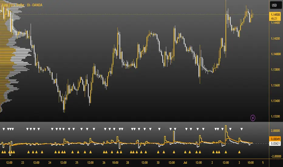
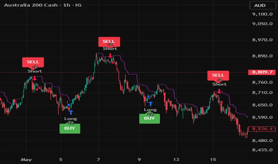
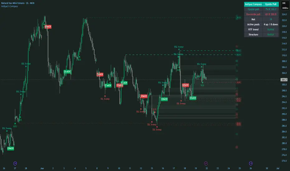
Smart MTF Vertical Timezones & Future Forecast [212]Author: 212 (KOREA)
This indicator is designed for scalpers and day traders who monitor micro-timeframes (e.g., 15-second or 1-minute charts) but need to keep track of higher timeframe (HTF) market rhythms without cluttering their screens.
1. Smart Overlap Filter (Hierarchy System)
When multiple timeframes close at the exact same time (e.g., at 12:00, the 15m, 30m, 1H, 4H, and 12H intervals all overlap), the script automatically hides the lower timeframe lines and only displays the most significant HTF line. This prevents color bleeding and keeps your chart incredibly clean.
2. Multi-Timeframe Tracking
Visualizes 5 essential intervals (15m, 30m, 1H, 4H, and 12H) with distinct colors, line widths, and labels for immediate visual recognition.
3. Future Time Projection
Dynamically plots the next two upcoming 15-minute intervals (Future +15m, Future +30m) into the right-side empty space (future axis) of the chart. This helps you anticipate upcoming volatility and crucial candle closes.
4. Extreme Optimization (Anti-Lag)
Limits the historical lines to a maximum of 100 to prevent browser lag and memory overload when used on ultra-fast timeframes like the 15s chart.
Apply this script to any lower timeframe chart (15s, 30s, 1m, 3m, 5m). Use the vertical lines as major structural transition points where volatility or trend reversals are likely to occur. Indicator

Ha Smooth Scalperha smooth scalper
ha smooth scalper is a trend-following and scalping tool built around smoothed heikin-ashi logic, real structure trend locking, multi-timeframe confirmation, higher-timeframe filtering, protected structure levels, clean candle coloring, and a compact professional dashboard.
the goal of this indicator is to help traders stay with the real trend instead of reacting to every small candle color change.
in a strong bullish slope, the tool can keep the chart bullish until a real protected swing low is broken.
in a strong bearish slope, the tool can keep the chart bearish until a real protected swing high is broken.
this makes the trend view cleaner and helps reduce false flips during strong directional moves.
main concept
most candle-based systems change color too quickly.
a single weak red candle inside a strong bullish trend should not always mean the trend is bearish.
a single weak green candle inside a strong bearish trend should not always mean the trend is bullish.
ha smooth scalper solves this by combining:
smoothed heikin-ashi calculation
real structure lock
protected swing highs and swing lows
multi-timeframe agreement
extra higher-timeframe confirmation
trend cloud
optional smooth candle mode
professional dashboard
how the trend works
the indicator first builds smoothed heikin-ashi candles from the chart data.
then it uses a structure lock system to decide if the market is really bullish or bearish.
bullish trend
the market stays bullish while price respects the protected swing low.
small bearish candles inside the bullish slope do not automatically flip the trend.
the trend changes to bearish only when the protected support structure is broken.
bearish trend
the market stays bearish while price respects the protected swing high.
small bullish candles inside the bearish slope do not automatically flip the trend.
the trend changes to bullish only when the protected resistance structure is broken.
protected structure level
the protected structure line shows the key level that must break before the trend can truly change.
in a bullish trend, this level is usually below price.
in a bearish trend, this level is usually above price.
for beginners, this is one of the most important parts of the tool.
if the market is bullish and price stays above the protected structure, the bullish trend remains valid.
if the market is bearish and price stays below the protected structure, the bearish trend remains valid.
smooth lock candle mode
smooth lock candle mode is designed to keep chart colors aligned with the real structure trend.
when enabled:
bullish structure keeps candles bullish
bearish structure keeps candles bearish
minor counter-trend candles are ignored
color changes only happen after real structure breaks
this mode is useful for traders who want a cleaner trend view and fewer emotional exits.
multi-timeframe confirmation
the indicator includes six selectable timeframes.
each timeframe can be enabled or disabled.
the panel shows whether each selected timeframe is bullish or bearish.
the minimum timeframe agreement setting controls how many selected timeframes must agree before a signal is accepted.
example:
if six timeframes are enabled and the minimum agreement is set to three, at least three selected timeframes must agree with the signal direction.
higher values create fewer but cleaner signals.
lower values create more signals but with more risk of noise.
extra htf confirmator
the extra higher-timeframe confirmator is an additional filter designed to reduce weak buy and sell signals.
it can confirm direction using:
ema slope plus price
or heikin-ashi direction
when enabled, long signals require bullish higher-timeframe confirmation.
short signals require bearish higher-timeframe confirmation.
this is useful because many losing trades happen when lower-timeframe signals go against the larger trend.
signal logic
long signal
a long signal can appear when:
the structure flips bullish
enough selected timeframes agree
the extra htf confirmator agrees
the trend mode allows long entries
the impulse filter confirms body expansion
short signal
a short signal can appear when:
the structure flips bearish
enough selected timeframes agree
the extra htf confirmator agrees
the trend mode allows short entries
the impulse filter confirms body expansion
full confluence star
a star appears when all selected timeframes agree with the signal direction.
this is a stronger confluence condition, but it should still be used with proper risk management.
dashboard
the dashboard is designed to give a fast view of the market.
it shows:
chart trend
six timeframe directions
multi-timeframe agreement
extra htf confirmation
structure lock status
protected structure price
smooth lock candle state
last signal
the panel uses a clean grey professional style and can be moved around the chart.
how to use the indicator
step 1: check the chart trend
start with the first dashboard row.
if the chart trend is bullish, focus mainly on long setups.
if the chart trend is bearish, focus mainly on short setups.
beginners should avoid trading directly against the displayed structure trend.
step 2: check the protected level
look at the protected structure level.
in a bullish trend, this is the important level below price.
if price stays above it, the bullish structure remains valid.
in a bearish trend, this is the important level above price.
if price stays below it, the bearish structure remains valid.
step 3: check timeframe agreement
look at the six timeframe rows.
cleaner long conditions usually appear when most selected timeframes are bullish.
cleaner short conditions usually appear when most selected timeframes are bearish.
step 4: check the htf confirmator
if the extra htf confirmator is enabled, wait for it to agree with the trade direction.
bullish htf confirmation supports long setups.
bearish htf confirmation supports short setups.
step 5: wait for a signal
a long signal marks a bullish structure transition with confirmation.
a short signal marks a bearish structure transition with confirmation.
do not trade every signal blindly.
always check trend context, support and resistance, volatility, session timing, and risk placement.
beginner long example
1. chart trend is bullish
2. smooth lock candle mode shows bullish structure
3. most selected timeframes are bullish
4. extra htf confirmator is bullish
5. price holds above the protected structure level
6. a long signal appears
7. stop loss can be planned below the protected level or below a recent swing low
8. target can be based on resistance, previous high, or a fixed risk/reward plan
beginner short example
1. chart trend is bearish
2. smooth lock candle mode shows bearish structure
3. most selected timeframes are bearish
4. extra htf confirmator is bearish
5. price holds below the protected structure level
6. a short signal appears
7. stop loss can be planned above the protected level or above a recent swing high
8. target can be based on support, previous low, or a fixed risk/reward plan
important settings
pre-smooth length
controls the first smoothing applied to price before the heikin-ashi calculation.
lower values react faster.
higher values are smoother.
post-smooth length
controls smoothing after the heikin-ashi calculation.
higher values reduce noise and false movement.
lower values make the tool more reactive.
slow baseline length
controls the slow baseline used for trend context and pullback logic.
structure pivot strength
controls how strong a swing high or swing low must be before it can become a protected structure level.
lower values react faster.
higher values create stronger but slower structure levels.
structure break confirmation
close mode requires candle close beyond the protected level.
wick mode reacts faster but can be noisier.
structure break buffer
adds an atr buffer beyond the protected level before the structure is considered broken.
higher buffer creates fewer trend flips.
lower buffer creates faster flips.
minimum timeframes agreeing
controls how many enabled timeframes must agree before a signal is allowed.
higher values are stricter.
lower values are more aggressive.
extra htf confirmator
adds a higher-timeframe direction filter to help avoid weak lower-timeframe signals.
smooth lock candle mode
keeps the visible candle color aligned with the structure trend until a real structure break happens.
best beginner settings
for cleaner trend reading:
enable real structure trend lock: on
structure source: raw price
structure break confirmation: close
smooth lock candle mode: on
extra htf confirmator: on
use confirmed mtf candles: on
minimum timeframes agreeing: 3 or higher
glow baseline: off
confluence background tint: off
for faster scalping:
structure pivot strength: 6 to 8
minimum timeframes agreeing: 2 to 3
extra htf confirmator: on
smooth lock candle mode: on
for safer trend following:
structure pivot strength: 10 to 14
minimum timeframes agreeing: 4 to 6
extra htf confirmator: on
structure break buffer: higher value
alerts
the indicator includes alerts for:
long scalp
short scalp
full bull
full bear
structure bull break
structure bear break
for cleaner alerts, use once per bar close.
risk management
this tool helps identify trend direction and filtered signals, but risk management is still required.
before entering a trade, define:
entry
stop loss
target
position size
invalidated condition
a good signal without risk management can still become a bad trade.
final note
ha smooth scalper is designed to make trend direction cleaner, reduce false color flips, and help traders focus on higher-quality conditions using structure, smoothing, multi-timeframe alignment, and higher-timeframe confirmation.
Indicator

Indicator

TREND RIBBONtrend filter ribbon
trend filter ribbon is a market structure and trend filtering tool designed to help traders read the active direction of price with a clean ema ribbon, external structure logic, internal entry markers, htf bias filtering, and a compact live dashboard.
the tool is built to answer one simple question:
is the market bullish, bearish, or neutral?
it does not try to predict every candle. it filters the chart so the trader can avoid low-quality counter-trend decisions and focus on cleaner directional setups.
what the indicator does
the indicator combines several elements:
ema ribbon:
a multi-layer ema ribbon shows the current trend body. when the ribbon expands, the trend is stronger. when it compresses, the market is weaker or flatter.
external structure:
major swing highs and swing lows define the main market structure. when price breaks a major level, the script detects bos or choch depending on the current structure state.
internal structure:
smaller swing breaks are used as early entry markers, but only when they agree with the active master trend.
htf veto:
a higher timeframe ema filter can block counter-trend conditions. when the lower timeframe disagrees with the selected htf direction, the master trend can be held as neutral.
live structure levels:
the most important active high and low levels are drawn on the chart so the trader can see where the next structural decision may happen.
dashboard:
a compact institutional-style panel displays external trend, htf bias, master state, ribbon spread, active levels, and early long or short validity.
how to read the ribbon
bullish ribbon:
when the ribbon is bullish, the tool is showing that the active structure and trend conditions favor long setups.
bearish ribbon:
when the ribbon is bearish, the tool is showing that the active structure and trend conditions favor short setups.
neutral ribbon:
when the ribbon is neutral, the market is not clean enough or the htf filter is blocking the active direction. beginners should usually avoid trading during neutral conditions.
ribbon spread:
the ribbon spread measures the distance between the fastest and slowest ribbon ema, normalized by atr.
flat:
the ribbon is compressed. the market may be ranging or weak.
building:
the ribbon is expanding. trend strength is improving.
strong:
the ribbon is clearly expanded. the current direction has stronger momentum.
bos and choch
bos means break of structure.
a bullish bos appears when price continues higher by breaking a valid structural high during a bullish structure.
a bearish bos appears when price continues lower by breaking a valid structural low during a bearish structure.
choch means change of character.
a bullish choch appears when price breaks structure upward after a bearish phase.
a bearish choch appears when price breaks structure downward after a bullish phase.
for beginners:
bos usually means continuation.
choch usually means possible reversal.
how to use the indicator
step 1: check the master trend
start with the dashboard.
if master is bullish, focus only on long ideas.
if master is bearish, focus only on short ideas.
if master is neutral, wait.
step 2: check the htf bias
the htf line shows whether the selected higher timeframe is bullish or bearish.
when the htf agrees with the master trend, the condition is cleaner.
when the htf disagrees, the tool can hold the master trend in neutral mode.
step 3: check the ribbon spread
flat ribbon:
avoid aggressive entries.
building ribbon:
look for confirmation.
strong ribbon:
trend conditions are more active.
step 4: wait for structure
a bos can confirm continuation.
a choch can show that the previous direction may be changing.
beginners should not enter only because a label appears. the label should be combined with context, trend direction, support and resistance, and risk management.
step 5: use internal entry markers
internal entry markers are early signals that appear only in the direction of the active filtered trend.
a long marker is only valid when the master trend is bullish.
a short marker is only valid when the master trend is bearish.
beginner example
example long setup:
1. master trend is bullish
2. htf bias is bullish
3. ribbon spread is building or strong
4. price breaks structure upward
5. a long entry marker appears
6. trader looks for a logical stop below the recent swing low
7. trader targets the next resistance, previous high, or a fixed risk/reward level
example short setup:
1. master trend is bearish
2. htf bias is bearish
3. ribbon spread is building or strong
4. price breaks structure downward
5. a short entry marker appears
6. trader looks for a logical stop above the recent swing high
7. trader targets the next support, previous low, or a fixed risk/reward level
main inputs
external swing strength:
controls the strength of the major swing structure. higher values create fewer but stronger structure signals. lower values create more responsive signals.
internal swing strength:
controls the smaller internal structure used for early entry markers. lower values are faster. higher values are cleaner but slower.
break confirmation:
choose whether structure breaks are confirmed by close or wick.
close:
more conservative.
wick:
more reactive.
bos pivot strength:
controls the pivot sensitivity used for bos continuation levels.
choch pivot strength:
controls the pivot sensitivity used for choch reversal levels.
htf timeframe:
selects the higher timeframe used for directional filtering.
htf ema length:
controls the ema used for the higher timeframe bias.
base ema length:
sets the first ema in the ribbon.
ema step:
controls the spacing between each ema in the ribbon.
ribbon lines:
turns the ribbon lines on or off.
ribbon fill:
turns the fill between ribbon layers on or off.
core glow:
adds a stronger visual emphasis to the main ribbon line.
external structure labels:
shows or hides bos and choch labels.
internal entry markers:
shows or hides early long and short markers.
live structure levels:
shows or hides the active major structure levels.
background tint:
adds a light background color based on the current master trend.
dashboard:
shows or hides the live panel.
dashboard position:
lets the trader place the panel in any chart position.
alerts
the script includes alerts for:
bullish choch
bearish choch
bullish bos
bearish bos
long entry
short entry
for best results, create alerts after the indicator is added to the chart and select the alert condition that matches your trading plan.
beginner tips
do not trade every signal.
use the indicator as a filter, not as a complete trading system.
avoid trading when the dashboard shows neutral.
avoid trading when the ribbon spread is flat.
look for agreement between master trend and htf bias.
always define stop loss, target, and invalidation before entering.
combine the tool with support and resistance, liquidity levels, volume, session context, or higher timeframe analysis.
important notes
this indicator is designed for market analysis and trend filtering.
it does not guarantee profitable trades.
signals can fail during news, low liquidity, sideways markets, or high volatility conditions.
risk management remains the responsibility of the trader.
the best use of this tool is to filter direction, read structure, and avoid trading against the dominant trend.
Indicator

Indicator

PDH/PDL + FVG + Order Blocks (Clean ICT)**PDH/PDL + Session Highs/Lows + FVG + Order Blocks (Clean ICT)**
An all-in-one ICT/Smart Money toolkit that layers the core concepts traders use for daily bias and liquidity mapping onto a single, clean chart — no clutter, no repainting boxes, fully configurable.
**What it plots:**
📍 **Previous Day High / Low (PDH/PDL)**
Day boundary locked to a chosen timezone (defaults to New York midnight, the ICT standard), so the daily range always lines up with how ICT concepts are taught, regardless of your exchange's native session times.
🌏 **Asia / London / New York Session Highs & Lows**
Each session range builds live as price moves through it, then locks and stays on the chart once the session closes — giving you the classic liquidity pools traders watch for sweeps and reversals. All three sessions are fully customizable (time window, color) to match your own session definitions.
⚡ **Liquidity Sweep Tags (SFP)**
Automatically tags candles that wick through the prior day's high or low and close back inside it — a classic stop-hunt / failure-to-continue signal.
📊 **Fair Value Gaps (FVG)**
Detects 3-candle imbalances above a minimum size threshold (scaled to ATR, so it adapts across instruments and timeframes). Gaps auto-remove once fully filled, keeping the chart from filling up with stale zones.
🟦 **Order Blocks (OB)**
Marks the last opposing candle before a strong displacement move, with an ATR-based displacement filter and an optional "must leave an FVG" filter to cut down on noise. Blocks auto-remove once price closes through and mitigates them.
📈 **EMA**
A simple configurable EMA for trend context.
**Why it's different:**
- Everything is timezone-anchored, not just chart-timezone dependent — so PDH/PDL and session ranges stay accurate no matter what timezone your chart is displaying.
- Labels track live with price instead of sitting frozen back at the bar where a level formed, so the chart stays readable as new bars print.
- Old FVGs and Order Blocks clean themselves up once invalidated, instead of piling up indefinitely.
- Every color, threshold, and session window is adjustable from the settings panel — no code editing required.
**How to use it:**
1. Add the indicator and open Settings to toggle on/off any of the five modules (PDH/PDL, Sessions, FVG, Order Blocks, EMA).
2. Adjust the session time inputs to match the sessions you trade (defaults: Asia 20:00–00:00, London 02:00–05:00, New York 07:00–16:00, all in the day-boundary timezone).
3. Use the ATR-based thresholds to tune how many FVGs/Order Blocks show up — raise them for fewer, larger, higher-conviction zones; lower them to see more.
4. Watch for confluence: a liquidity sweep of PDH/PDL near a session high/low, followed by a fresh FVG or Order Block, is a common ICT-style setup.
**Notes:**
This script is for educational and analytical purposes and does not constitute financial advice. As with any tool, backtest and forward-test any strategy built around these concepts before trading live. Indicator

Indicator

Indicator

Wave Structure PRO v2 [Viprasol]Wave Structure PRO v2 is an automated Elliott Wave structure engine. It builds a ZigZag from confirmed pivots, searches for a valid 1-2-3-4-5 impulse and the following A-B-C correction, validates every candidate against Elliott's three hard rules, and scores how closely each wave matches its ideal Fibonacci proportion. On top of the count it draws the Elliott base channel, Wave 3 / Wave 5 Fibonacci targets, the next-wave retrace zone, and the exact price level where the count becomes invalid.
This is a structure assistant, not a prediction oracle. Elliott counting is inherently ambiguous, and this engine recounts as new pivots confirm. Everything it shows is derived from confirmed swing points, and it tells you honestly when no valid count exists.
HOW IT WORKS
ZigZag Pivot Engine:
Swing highs and lows are detected with a symmetric pivot window (default 8 bars left and right). A pivot only enters the structure after it is confirmed, and consecutive same-direction extremes are merged so the ZigZag always alternates high-low-high-low. The engine keeps the most recent 32 pivots as its working structure.
Sliding-Window Count Search:
The engine scans across the entire pivot structure for the most recent valid count — it does not require the pattern to end exactly at the newest pivot. A completed impulse whose correction is still developing stays on the chart and is marked "prior" in the panel, so a single awkward swing at the right edge does not wipe the analysis. At each candidate position a full 9-pivot impulse + A-B-C structure is preferred over a 6-pivot impulse alone.
Hard-Rule Validation:
Every candidate impulse must pass Elliott's three non-negotiable rules before it is accepted:
1. Wave 2 never retraces more than 100% of Wave 1
2. Wave 3 is never the shortest among Waves 1, 3, and 5
3. Wave 4 never enters the price territory of Wave 1
The A-B-C correction is additionally validated for direction and structure (B stays below the impulse extreme, C extends beyond A).
Fibonacci Quality Score:
Each wave is measured against its textbook ideal — Wave 2 near 0.5-0.618 of Wave 1, Wave 3 extending 1.618+ of Wave 1, Wave 4 near 0.382 of Wave 3, Wave 5 near equality with Wave 1. The four fits combine into a 0-100 "textbook fit" score. Extended fifth waves are scored against the alternative ideal of 0.618 x (Wave 1 + Wave 3), so a legitimately extended fifth is recognized instead of being punished, and the panel flags it as "extended 5th".
Invalidation Level:
For every accepted count the engine draws the price at which the structure stops being valid — a correction that retraces 100% of the impulse start invalidates the count. The exact level is shown on the chart, in the panel, and in the data window, giving you an objective line in the sand instead of a subjective opinion.
Alternation Check:
Waves 2 and 4 are compared as retracements of Wave 1 — when their depths differ meaningfully the panel confirms the alternation guideline is present, and shows an explicit "absent" flag when it is not.
KEY FEATURES
- Automatic 1-5 impulse and A-B-C correction detection with wave labels on the chart
- Sliding-window search — finds the most recent valid count anywhere in the structure, marked "prior" when its final pivot is not the newest swing
- Elliott's 3 hard rules enforced on every count — invalid structures are never labeled
- 0-100 Fibonacci quality score with per-wave ratio annotations at each pivot
- Extended fifth wave recognition with alternative 0.618 x (W1+W3) scoring path
- On-chart invalidation level with price label
- Elliott base channel (2-4 trendline with parallel through Wave 3)
- Wave 3 and Wave 5 Fibonacci extension targets with configurable multiples
- Next-wave retrace target zone (0.382-0.618 of the full impulse)
- Analysis panel: count state, quality, all four wave ratios, alternation, rule status, invalidation price
- Data-window outputs (quality, direction, stage, invalidation) usable by strategies and screeners via input.source
- Transition-based alerts that fire on state changes, not on every pivot refresh
HOW TO USE
Setup:
1. Add to any chart — works on all markets and timeframes
2. Use a standard candlestick chart (not Heikin Ashi)
3. Tune "Swing Sensitivity" to the wave degree you trade: higher values = larger-degree waves, lower values = smaller subdivisions
4. Defaults (sensitivity 8) suit 1H-4H charts on liquid instruments
Reading the Chart:
- Numbered labels 1-5 mark the impulse pivots; A-B-C labels mark the correction (orange)
- Small ratio numbers at pivots 2, 3, 4, 5 show each wave's Fibonacci proportion
- Dotted / dashed blue lines = Wave 3 and Wave 5 extension targets
- Cyan channel = Elliott base channel projected forward
- Purple box = expected retrace zone for the next corrective wave
- Red line = invalidation level; if price crosses it, the count is wrong
- Panel header: up/down arrow shows count direction; "prior" means the count completed before the newest swing
Reading the Panel:
- Quality 70+ = clean textbook structure; below 50 = forced fit, treat with caution
- "NO COUNT" genuinely means no valid structure exists right now — the engine never shows leftover metrics from a dead count
- The Invalidation row gives the exact price that voids the current count
SETTINGS
ZigZag: Swing sensitivity (pivot bars left/right), ZigZag visibility and color.
Waves: Wave label toggles for 1-5 and A-B-C, bullish/bearish/corrective colors, label size.
Fibonacci & Quality: Ratio annotations toggle, target visibility, Wave 3 and Wave 5 extension multiples, target color.
Channel & Target Zone: Base channel toggle and color, retrace zone toggle and color.
Invalidation: Level visibility and color.
Analysis Panel: Show/hide, position.
Alerts: Quality threshold for the high-quality alert, dynamic alert() messages toggle.
ALERTS
1. Count found — a new valid wave count appeared (fires once per count, not on every pivot extension)
2. Count invalidated — the active count stopped being valid
3. 1-5 + A-B-C complete — the correction finished, full cycle in place
4. High-quality count — a new count scored above your quality threshold
With "Dynamic alert() Messages" enabled, alert() notifications include the symbol, timeframe, direction, quality score, and invalidation price. Create the alert with condition "Any alert() function call".
LIMITATIONS & DISCLAIMER
- Elliott Wave counting is subjective by nature; this engine applies one rigorous, rule-based interpretation and recounts as new pivots confirm
- Pivots confirm with a delay equal to the swing sensitivity — labels appear after the swing completes, never in real time at the extreme
- The count can change when a developing swing extends; the transition alerts are designed around this, firing on genuine state changes only
- Wave degree is determined by your sensitivity setting; the engine does not track multiple degrees simultaneously
- Quality scoring measures Fibonacci proportion fit, not probability of continuation
- This indicator is for educational and analytical purposes only — it is not financial advice. Always use proper risk management.
ORIGINALITY
All code is original Viprasol work. Elliott Wave theory itself is public knowledge (R.N. Elliott); no third-party script was reused. v2 supersedes Wave Structure PRO with a stale-state fix, sliding-window count search, invalidation levels, extended-fifth scoring, data-window outputs, and transition-based alerts. Indicator

Price Acceleration Flow (PAF)Price Acceleration Flow (PAF)
Price Acceleration Flow (PAF) is an original momentum indicator designed to measure the rate at which price movement accelerates or decelerates. Instead of relying on traditional oscillators, PAF analyzes changes in price velocity, candle efficiency, and relative trading activity to identify developing market momentum.
By focusing on acceleration rather than absolute price movement, PAF helps traders recognize trend continuation, weakening momentum, and potential reversal zones before they become obvious on the chart.
Key Features
Original price acceleration algorithm
Measures momentum through changes in price velocity
Volume-adjusted flow calculation for stronger signal quality
Dynamic signal line for trend confirmation
Early identification of bullish and bearish momentum shifts
Built-in Buy and Sell alerts
Lightweight, non-repainting Pine Script v6 design
Compatible with Forex, Crypto, Stocks, Indices, and Commodities
How to Use
Bullish Signal: PAF crosses above the signal line, indicating increasing buying momentum.
Bearish Signal: PAF crosses below the signal line, suggesting strengthening selling pressure.
Strong Trends: Large positive or negative values indicate accelerating market participation.
Sideways Markets: Flat or low-amplitude readings suggest weak momentum and possible consolidation.
Price Acceleration Flow (PAF) is designed as a confirmation tool and performs best when combined with price action, market structure, and disciplined risk management. It helps traders focus on high-momentum opportunities while filtering out low-conviction market conditions. Indicator

SUPERTREND RIBBONsupertrend ribbon
supertrend ribbon is a confirmed trend ribbon built from multiple supertrend bands. it is designed to show a clean, stable, and readable market direction directly on the chart.
instead of allowing each band to change color separately, the ribbon uses one master trend state. this keeps the full ribbon in one confirmed color and helps avoid visual fragmentation, false flips, and noisy mid-trend breaks.
the goal is simple: show whether the market is in a confirmed bullish or bearish trend, while keeping the chart clean and easy to read.
---
main concept
the indicator uses 8 supertrend bands with different factors.
each band can be bullish or bearish.
the script counts how many bands are aligned in the same direction.
when enough bands confirm a new direction, the full ribbon changes trend.
this creates a more stable trend filter than a single supertrend line, because the ribbon does not flip on every small price movement.
---
what the indicator shows
trend ribbon
the ribbon shows the dominant trend state.
green means confirmed bullish trend.
red means confirmed bearish trend.
band lines
the internal band lines can be displayed to see the full structure of the ribbon.
ribbon fill
the fill between the bands makes the trend easier to read visually.
core line
the core line gives a fast reference for the main trend path.
confirmed flip markers
markers appear only when a trend flip is confirmed.
trend background tint
a soft background color can be enabled to show the current trend regime.
dashboard
the dashboard shows the current trend, the number of aligned bands, flip requirements, fast core direction, and early long / short validity.
---
inputs guide
atr period
sets the atr period used by the supertrend bands.
a lower value makes the ribbon more reactive.
a higher value makes the ribbon smoother and more stable.
base factor
sets the starting supertrend factor.
a lower value keeps the ribbon closer to price.
a higher value makes the ribbon wider and more filtering.
factor step
sets the spacing between the 8 supertrend bands.
a lower value makes the bands tighter.
a higher value makes the ribbon wider.
bands to confirm a flip
sets how many bands must confirm a new direction before the ribbon changes color.
a higher value reduces false flips.
a lower value makes the ribbon faster.
confirm for n bars
sets how many bars the confirmation condition must remain valid before the trend flips.
1 is faster.
2 or 3 is stricter and can reduce whipsaws.
show band lines
shows or hides the internal ribbon lines.
show ribbon fill
shows or hides the fill between the bands.
core glow
enables a glow effect around the core line.
show core line
shows or hides the main core line.
show confirmed flip markers
shows or hides confirmed trend flip markers.
trend background tint
enables or disables the soft trend background.
show dashboard
shows or hides the dashboard.
dashboard position
sets the dashboard position on the chart.
bull
sets the bullish trend color.
bear
sets the bearish trend color.
accent / transition
sets the accent color used for dashboard and transition information.
neutral
sets the neutral text and information color.
---
how to use the indicator
the ribbon is best used as a trend filter.
when the ribbon is green, the market is in a confirmed bullish trend.
in this condition, long setups have priority.
when the ribbon is red, the market is in a confirmed bearish trend.
in this condition, short setups have priority.
the ribbon should not be used as a standalone entry signal.
its main purpose is to help avoid trading against the dominant trend.
---
beginner tutorial
1. add the indicator to the chart.
2. start with the default settings.
3. look at the ribbon color.
4. if the ribbon is green, focus mainly on long opportunities.
5. if the ribbon is red, focus mainly on short opportunities.
6. avoid buying when the ribbon is red.
7. avoid selling when the ribbon is green.
8. use confirmed flip markers to identify confirmed trend changes.
9. use the dashboard to check how many bands are aligned.
10. combine the ribbon with market structure, volume, support and resistance, order blocks, liquidity zones, and proper risk management.
---
simple usage example
if price is above the ribbon and the ribbon is green, the market is in a bullish trend.
a trader can wait for price to pull back toward the ribbon, then look for a bullish reaction before considering a long setup.
if price is below the ribbon and the ribbon is red, the market is in a bearish trend.
a trader can wait for price to pull back toward the ribbon, then look for a bearish rejection before considering a short setup.
---
order block filter example
a bullish order block is stronger when the ribbon is green.
a bearish order block is stronger when the ribbon is red.
if a long setup appears while the ribbon is red, the setup is more risky.
if a short setup appears while the ribbon is green, the setup is more risky.
the ribbon can therefore be used as a confirmation filter before taking early entries.
---
beginner settings
atr period: 10
base factor: 1.0
factor step: 0.4
bands to confirm a flip: 6
confirm for n bars: 1
show band lines: on
show ribbon fill: on
show core line: on
show confirmed flip markers: on
trend background tint: personal preference
show dashboard: on
this setup gives a balanced mix of reactivity and stability.
---
stricter settings
bands to confirm a flip: 7
confirm for n bars: 2 or 3
this setup reduces false flips, but trend changes appear later.
---
faster settings
bands to confirm a flip: 5
confirm for n bars: 1
this setup reacts faster, but it can create more false flips in choppy markets.
---
important notes
the ribbon shows a trend regime, not a guaranteed entry signal.
the best use is to trade in the direction of the ribbon.
confirmed flips are more reliable than fast color changes.
a green ribbon means long setups have better context.
a red ribbon means short setups have better context.
risk management is required on every trade.
supertrend ribbon is designed to make trend direction clear, reduce visual noise, and help traders stay aligned with the dominant market structure.
Indicator

Standing Wave Phase Coherence [JOAT]STANDING WAVE PHASE COHERENCE
A phase-coherence engine that asks a question almost no public indicator can answer: are the LTF and HTF oscillators in phase or out of phase ? Two oscillators that move together (peaks and troughs aligned) form a standing wave — a state of constructive interference where the trend is amplified. Two oscillators that move opposite (peaks aligned with troughs) form an anti-standing wave — a state of destructive interference where a reversal is forming. Standing Wave Phase Coherence measures phase, computes the coherence between the two timeframes, and surfaces a single number bounded in that tells you which regime you are in.
Phase, not just direction
A moving average tells you "where price is sitting". A momentum oscillator tells you "which way it is moving". Phase is the location inside the cycle — are we approaching a peak, leaving a peak, approaching a trough, leaving a trough? Two oscillators on different timeframes can be:
In phase — both rising or both falling at the same rate of cycle progression. Constructive interference. Trend amplifies.
Anti-phase — one rising, the other falling at the same cycle rate. Destructive interference. Reversal forms.
Decoherent — phases are uncorrelated. The wave structure is breaking down. No directional edge from coherence.
The script estimates phase from each timeframe's RSI series (both legs at the same RSI length for fair comparison), differences the phase smoothly, then takes the cosine of the phase difference — which is exactly the quantum-mechanical coherence metric on a scale.
Non-repainting HTF construction
The HTF leg uses request.security with lookahead_on AND a offset on the expression — the only non-repainting form per Pine v6 docs. This is exposed as a toggle but ON by default; the warning in the input tooltip explains the trade-off (turn off only for research, never live).
Three thresholds, three states
Coherence > +0.70 (configurable) — IN PHASE . Standing wave constructive. Trend amplifies. Bull-palette background tint.
Coherence < −0.70 — ANTI PHASE . Standing wave destructive. Reversal forms. Bear-palette background tint.
|Coherence| < 0.30 (decoherent band) — DECOHERENT . No standing wave. Mid-palette neutral.
In between — transitional.
Phase-status arrows print inside the pane at every regime entry, so the chart history shows when each standing wave formed and collapsed.
Visual system
Coherence line with configurable width.
Glow halo — a wider semi-transparent copy of the coherence line below the main line, creating a soft glow effect.
Background tint by phase status — bull when IN PHASE, bear when ANTI PHASE, none when decoherent. Transparency configurable.
Threshold lines at ±0.70 (toggleable).
Zero line .
Fill between threshold and ±1 — soft bull / bear fill highlights the active phase zone so it is immediately obvious which side is engaged.
Phase status arrows inside the pane on state transitions.
The pane uses the JOAT default palette (cyan-teal bull / magenta bear).
Amplification factor
A separate EMA-smoothed trend amplification factor is computed from the coherence and surfaced in the dashboard. When coherence is sustained high (in-phase), the amplification factor rises — quantifying how much the LTF/HTF agreement is reinforcing the move. Useful as a position-sizing input: bigger amplification = stronger conviction = larger size.
Dashboard
Monospaced table, positionable to any of nine corners. Surfaces:
Current coherence value and bar age.
Phase status (IN PHASE / ANTI PHASE / DECOHERENT) with glyph.
LTF and HTF RSI values.
Phase difference in radians and degrees.
Trend amplification factor (smoothed).
HTF timeframe in use with non-repaint flag.
Alerts
Multiple alert conditions:
Coherence crosses above +0.70 (IN PHASE entry)
Coherence crosses below −0.70 (ANTI PHASE entry)
Coherence returns to decoherent band
Sustained IN PHASE (held above threshold for N bars)
Sustained ANTI PHASE
How to read it
Three reads, in order of conviction:
Sustained IN PHASE — the highest-conviction trend read. LTF and HTF oscillators are decisively moving together. This is the regime in which momentum tools have their largest edge.
Entry into ANTI PHASE — the reversal warning. The two timeframes have rotated opposite each other; whichever direction LTF is moving, HTF is opposing. Often precedes meaningful reversals.
Decoherent zone — stand-aside signal. The wave structure has broken down. Coherence-based reads are not actionable; switch to a regime-classification tool (FDI, Hurst, Entropy).
The cleanest workflow: only take trend trades when IN PHASE; only take reversal trades when ANTI PHASE; do nothing when DECOHERENT.
Suggested settings
Defaults (RSI 14, HTF 4H, phase smoothing 3, coherence smoothing 8, ±0.70 thresholds, ±0.30 decoherent band) are tuned for 15m–1H charts. The HTF should always be greater than or equal to the chart timeframe; mismatching produces meaningless phase reads. For HTF (4H+ chart timeframes) raise HTF to Daily and consider the LTF/HTF coherence as a daily-vs-weekly read.
Originality
The implementation — the dual-timeframe RSI phase estimator, the smoothed phase-difference cosine coherence (quantum-style metric), the non-repainting HTF request with -offset + lookahead_on pattern, the three-threshold phase classifier with decoherent band, the trend amplification factor formulation, the glow-halo line render, and the pane-overlay phase-status arrows — is JOAT-original. No third-party code reused. The notion of phase coherence between timeframes as a market regime metric is the original quantitative contribution, borrowed conceptually from optical and quantum physics.
Limitations
Phase estimation from discrete bar data is inherently noisy on short windows; the smoothing inputs (phase EMA and coherence EMA) exist to address that — over-smoothing destroys phase information, so the defaults are intentionally light. The HTF request is non-repainting in the useStrictHtf = ON configuration; do not turn it off in live trading. The decoherent band is a heuristic to avoid acting on noise reads; widen it on instruments with naturally choppy oscillator structure.
—
-made with passion by jackofalltrades
Indicator

Elliott Wave Scanner [MarkitTick]💡 An automated structural analysis tool engineered to detect, classify, and visualize complex market cycles based on classic wave progression principles. By scanning localized price extrema and passing them through a rigorous matrix of geometric and proportion-based filters, this indicator distills highly subjective chart analysis into objective, rule-based pattern recognition. Designed for traders who rely on structured market phases, the scanner not only maps five-wave impulses and three-wave corrections but also integrates dynamic risk-to-reward calculations, volume confirmation, and higher-timeframe alignment to evaluate the probabilistic quality of every structural sequence it identifies.
✨ Originality and Utility
Wave theory is traditionally plagued by subjectivity and observer bias, where two analysts might map entirely different structures on the same chart. The utility of this script lies in its strict, algorithmic standardization. It removes emotional interpretation by requiring market swings to conform to precise mathematical tolerances before a sequence is validated.
This tool distinguishes itself by moving beyond mere drawing utilities. It is a complete analytical environment that actively assesses the viability of a market structure. It calculates a predefined Risk-to-Reward (R:R) ratio, establishes a clear target, and sets a protective invalidation level for every valid formation. Furthermore, it incorporates confluence filters—such as market structure midlines and higher-timeframe directional bias—ensuring that localized patterns are only presented when they align with the broader macroeconomic flow. This multifaceted approach provides a systematic, highly actionable framework rather than a simple visual overlay.
🔬 Methodology and Concepts
The core engine of this scanner is built upon the identification of sequential market pivots and the subsequent validation of their relationships through Fibonacci retracement and extension parameters.
• Algorithmic Pivot Detection
The script continuously monitors price action to identify localized peaks and troughs, referred to as Pivot Highs and Pivot Lows. A pivot is mathematically confirmed only when a central price point is surrounded by a user-defined number of lower highs (or higher lows) on both its left and right sides. This ensures that only significant market turning points are evaluated, filtering out intraday noise.
• Impulse Validation (1-2-3-4-5)
To confirm a five-wave impulse, the script isolates an alternating sequence of six confirmed pivots and applies strict proportional rules:
Wave 2 must retrace between 38.2% and 78.6% of Wave 1.
Wave 3 must extend beyond the terminus of Wave 1 and mathematically cannot be the shortest wave in the 1-3-5 sequence.
Wave 4 must retrace between 23.6% and 50.0% of Wave 3.
The script enforces an optional but standard rule where the extreme of Wave 4 must not overlap the extreme of Wave 1.
• Correction Validation (A-B-C)
For three-wave corrective structures, the engine isolates a sequence of four alternating pivots:
Wave B is required to retrace between 38.2% and 78.6% of the initial Wave A sequence.
Wave C must form a proportional extension of Wave A, operating strictly between the 61.8% and 161.8% boundaries.
• Structural Confirmation and PRZ
Once geometric rules are satisfied, the script calculates a Potential Reversal Zone (PRZ). For an impulse, the PRZ represents the logical termination area for Wave 5, derived by projecting 100% to 161.8% of Wave 1's magnitude outward from the origin of Wave 5. The entire sequence is then subjected to a Risk:Reward calculation, validating the pattern only if the theoretical trade setup meets the required profitability threshold.
🎨 Visual Guide
The indicator is designed to provide maximum data density without cluttering the charting environment.
• Structural Pathing
Valid Impulse waves are rendered using robust, continuous lines connecting the validated pivots, clearly demarcating the 1-2-3-4-5 progression. Corrective A-B-C structures are rendered in a distinctly contrasting color, providing immediate visual differentiation between trending and counter-trend market phases.
• Fibonacci Anchor Lines
Dotted horizontal projection lines extend outward from the Wave 4 terminus, visually indicating the 1.0x, 1.618x, and 2.618x Fibonacci extensions of Wave 1. These serve as dynamic targets for Wave 5 completion.
• Potential Reversal Zone (PRZ)
A shaded, transparent box is drawn at the culmination of the pattern. This box highlights the specific price region where harmonic and Fibonacci projections converge, signifying the highest probability area for the pattern's completion and subsequent market reversal.
• Trade Parameters
Upon pattern completion, three distinct dashed lines are projected forward on the chart:
An Entry line, anchored at the final wave's closing extreme.
A Stop line, calculated dynamically using an Average True Range (ATR) buffer applied to the penultimate structural pivot.
A Target line, mathematically derived from a 61.8% proportional measurement of the dominant impulsive wave.
• The Analytical Dashboard
A comprehensive data table anchors to the top right of the screen. This dashboard tracks real-time system metrics, including the prevailing market bias, the active pattern type, exact price levels for the generated trade parameters, and a dynamic Risk:Reward quality score visualized via an integrated block-bar system. It also tracks historical pattern frequency and individual wave magnitudes.
📖 How to Use
This script is engineered to act as an objective entry generation tool based on wave completion.
• Trading the Impulse W5
When the scanner identifies a validated 1-2-3-4 progression and projects the final Wave 5 into the PRZ box, traders should monitor price action within this shaded region. A rejection or stabilization within the PRZ, accompanied by the printing of the Entry, Stop, and Target dashed lines, signals a valid execution window. The structural stop-loss ensures that if the wave count is invalidated by overlapping previous structure, risk is immediately contained.
• Trading the A-B-C Correction
Corrective sequences are utilized to position into the resumption of the primary trend. When an A-B-C sequence completes, indicating that the counter-trend exhaustion has been reached, the system will output actionable levels targeting the previous macro swing high or low. Traders can utilize the volume confirmation toggle to ensure that the reversal away from the Wave C terminus is supported by institutional participation.
• Managing Pivot Delay
Because the indicator relies on confirmed pivots (requiring a set number of bars to close on the right side of the extreme), signals are generated only after the structural turning point is mathematically locked. Traders should view the generated Entry line as the execution threshold, waiting for price to retest or confidently cross this parameter rather than attempting to guess the absolute bottom or top of the raw price action.
⚙️ Inputs and Settings
The indicator offers deep modularity, allowing adaptation across different asset classes and timeframes.
• Pivot Configurations
Adjusting the Pivot Left and Pivot Right parameters alters the sensitivity of the extrema detection. Lower values yield aggressive, micro-wave tracking suitable for scalping, while higher values isolate macro-economic market cycles.
• Elliott Rules and Tolerances
The Fib Tolerance (%) input allows the user to expand or contract the leniency of the retracement measurements. The system also includes logical toggles to enforce strict structural laws, such as ensuring Wave 4 never overlaps Wave 1, or that Wave 3 must explicitly extend beyond Wave 1.
• Filter Systems
Traders can enforce a Higher Timeframe (HTF) Bias , ensuring the script only plots bullish waves when the macro trend is positive. A Volume Confirmation toggle is also available, suppressing signals if the momentum behind Wave 3 fails to breach the baseline volume moving average.
• Visual and Dashboard Toggles
Every graphical element, from the PRZ shading to the individual wave labels, can be toggled on or off to maintain chart hygiene. The dashboard can also be customized with specific text and background colors to fit any chart template.
🔍 Deconstruction of the Underlying Scientific and Academic Framework
The foundational framework of this indicator is deeply rooted in fractal geometry and the statistical behavior of financial time series. Markets, much like natural phenomena, exhibit self-similarity across different scales—a concept heavily explored in the mathematics of fractional Brownian motion. This indicator applies this academic premise by assuming that macroeconomic trending phases (impulses) and mean-reverting phases (corrections) manifest in predictable, repeating geometric sequences, regardless of the timeframe observed.
At the core of the algorithm is the algorithmic isolation of local extrema. By utilizing a rolling array of historical price highs and lows, the engine establishes a localized topology of the market. This topology is then subjected to proportional analysis governed by the Fibonacci sequence, a mathematical series intimately connected to the golden ratio (1.618). In financial econometrics, these specific ratios function as a psychological boundary mechanism; because market participants aggregate their risk and take-profit parameters around these proportional extensions, they generate measurable zones of supply and demand clustering.
The script synthesizes these disciplines by requiring that the distance between consecutive topological extrema strictly conforms to these irrational proportions. By enforcing a rule set where localized wave measurements must divide into one another to produce specific golden ratio derivatives, the indicator successfully models the non-linear, oscillatory nature of crowd psychology and market liquidity into a rigid, computable output.
⚠️ Disclaimer
All provided scripts and indicators are strictly for educational exploration and must not be interpreted as financial advice or a recommendation to execute trades. We expressly disclaim all liability for any financial losses or damages that may result, directly or indirectly, from the reliance on or application of these tools. Market participation carries inherent risk where past performance never guarantees future returns, leaving all investment decisions and due diligence solely at your own discretion. Indicator

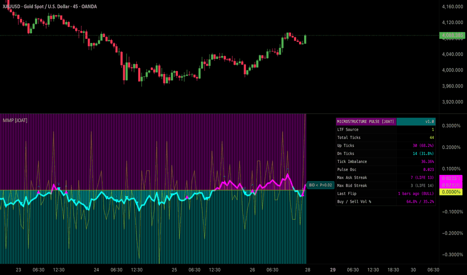
Market Microstructure Pulse [JOAT]MARKET MICROSTRUCTURE PULSE
A composite microstructure oscillator that fuses three lower-timeframe-reconstructed flow primitives into a single bounded pulse line — the tick imbalance, the aggressive ask/bid streak, and the single-bar massive imbalance event. The pulse tells you in one number whether buyers or sellers are currently dominant at the tape level, and whether that dominance is at warning or extreme intensity.
Lower-timeframe reconstruction
Real microstructure lives below the chart timeframe. The pulse engine pulls intrabar prints from a configurable LTF (default 1 minute; auto-mode picks ~1/20 of the chart TF) and classifies each tick via the standard tick rule. The classified ticks are then EMA-smoothed by a configurable pulse length (default 14) and optionally volume-weighted (default ON) so a heavy print contributes proportionally more to the read than a light one.
The output is a smoothed signed value bounded approximately in where:
+1 — all recent ticks were buy-classified.
−1 — all recent ticks were sell-classified.
0 — perfectly balanced flow.
Aggressive streak histograms
Two separate counters track consecutive same-side ticks — one for aggressive asks, one for aggressive bids. When a streak exceeds the Aggressive Streak Min threshold (default 5), it qualifies as institutional persistence. The two histograms are rendered as a colour-coded background to the pulse line so you can see at a glance which side has been running consecutively. EMA-smoothed for visual stability.
Massive imbalance event
A single-bar event: when one side's share of total bar volume exceeds imbalancePct (default 80%), a Massive Imbalance event fires. This is the script's strongest single-bar read — institutional decisiveness landing on the tape.
Two-tier threshold system
Pulse Warning — |pulse| above the warning threshold (default 0.50). Inner band, visual reference.
Pulse Extreme — |pulse| above the extreme threshold (default 0.70). Triggers the Pulse Extreme alert and tints the chart background.
A toggleable Aggression Flip Marker prints a glyph at the bar where the pulse sign actually flips — useful for catching the moment dominance rotates sides.
Visual system
Pulse line in the iridescent palette (magenta buy / cyan sell) with configurable width.
Aggressive streak histograms — two-sided coloured columns behind the pulse (transparency configurable).
Threshold levels at ±warning and ±extreme (toggleable).
Gradient fill from pulse line to zero, coloured by current sign (transparency configurable).
Background tint on extreme — magenta or cyan tint when |pulse| is above extreme threshold (transparency configurable).
Aggression flip markers at sign-change bars (toggleable).
A locked Iridescent palette (magenta buy aggression / cyan sell aggression / yellow extreme accent on pure black) gives the pane a distinctive cyberpunk-tape identity.
Dashboard
Monospaced 11-row table positionable to any of nine corners. Surfaces:
Current pulse value with sign.
Buy streak count and sell streak count.
Aggressive side dominance with bar age.
Last extreme event direction with bars-ago.
Last flip direction with bars-ago.
Last massive imbalance event with bars-ago.
LTF in use, volume-weighting flag, pulse EMA length.
Threshold values for warning and extreme.
Alerts
Three alert conditions, each independently controllable:
Pulse Extreme — fires when |pulse| crosses above extreme threshold.
Aggression Flip — fires when pulse sign flips (positive ↔ negative).
Massive Imbalance — fires when a single bar's directional share exceeds the imbalance threshold.
How to read it
Three reads, in order of conviction:
Massive Imbalance alert at a structural level — the highest-conviction single read. Institutional decisiveness landed on the tape at a known S/R; the next directional move is more conviction-aligned with the imbalance side.
Pulse Extreme + matching aggressive streak — sustained dominance. The pulse is decisively past its extreme threshold AND the streak histograms show consecutive same-side runs above the streak minimum. This is the regime where momentum tools have their largest edge.
Aggression Flip after extreme — exhaustion read. The pulse hit extreme then flipped sign; the institutional commitment that drove the extreme has just rotated. Often produces clean reversals.
Suggested settings
Defaults (1m LTF, pulse EMA 14, streak EMA 7, volume-weighted ON, ±0.50 / ±0.70 thresholds, 80% imbalance, 5-tick streak min) are tuned for 5m–15m charts on liquid futures and crypto. For lower-timeframe scalping, drop LTF to 15s or 30s (Premium plan required) and pulse EMA to 8. For HTF, set LTF auto-mode and raise streak min to 10. The volume-weighting is the recommended default — without it, equal-tick instruments dominate the read regardless of size.
Originality
The implementation — the LTF tick-rule reconstruction with optional volume weighting, the bounded pulse formulation, the dual aggressive-streak histograms with EMA smoothing, the two-tier (warning / extreme) threshold system, the single-bar massive-imbalance detector, the aggression-flip marker logic, the chart-overlay extreme tinting, and the iridescent dual-hue palette — is JOAT-original. No third-party code reused. The pulse is the original composite formulation.
Limitations
Reconstructed tick direction is an inference — the tick rule is the accepted public-market proxy but it is not a direct read of bid/ask volume. Sub-minute LTFs require a TradingView Premium or Ultimate plan. The pulse is bounded approximately in but extreme volume-weighted reads can briefly exceed those bounds; this is intentional and not a bug. EMA smoothing introduces a small lag; turn pulse length to 1 to see the raw imbalance.
—
-made with passion by jackofalltrades
Indicator
Indicator

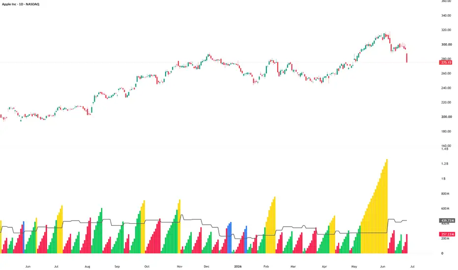
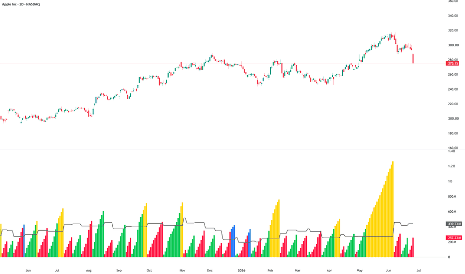
Weis Wave OscillatorWeis Wave Oscillator
1. Overview
Weis Wave Oscillator is a volume-based wave analysis indicator.
Instead of reading volume bar by bar, the indicator groups volume into directional price waves. It accumulates volume during confirmed upward and downward waves, then displays the accumulated wave volume as columns in a separate pane.
The purpose of the indicator is to help users compare effort versus result by studying how much volume was involved in each directional wave.
This is an indicator, not a strategy. It does not place trades, does not execute orders, and does not produce TradingView Strategy Tester results.
2. Core Idea
Traditional volume bars show volume for each individual candle.
Weis Wave Oscillator groups volume across an entire price wave.
This allows users to ask a different question:
How much volume was required to create this wave?
This can help users study whether a move had strong participation, weak participation, or inefficient effort.
3. Wave Direction
Wave direction is based on confirmed pivot highs and pivot lows.
When a pivot low is confirmed, the indicator starts or continues an upward wave.
When a pivot high is confirmed, the indicator starts or continues a downward wave.
Because pivots require future bars to confirm, wave changes can appear with a delay. This is expected behavior for pivot-based wave analysis.
4. Wave Volume
During each wave, the indicator accumulates the volume of each bar.
For an upward wave, the accumulated volume is displayed using the up wave color.
For a downward wave, the accumulated volume is displayed using the down wave color.
The displayed columns represent the total volume accumulated inside the current directional wave, not only the volume of a single candle.
5. Average Wave Volume
The indicator includes an optional average completed wave volume line.
This line is calculated from recently completed waves.
It helps users compare the current wave volume against the recent average wave effort.
If the current wave grows above the average, it may suggest stronger participation compared with recent waves.
6. High Effort Waves
The indicator can highlight high effort waves.
A wave is considered high effort when its accumulated volume becomes greater than the average completed wave volume multiplied by the selected high-effort factor.
The default high-effort factor is 1.50.
This means the wave must reach at least 150% of the average completed wave volume to be highlighted.
High effort does not automatically mean bullish or bearish continuation. It simply means that the wave used a larger amount of volume compared with recent completed waves.
7. Effort Versus Result
The main purpose of the indicator is to support effort-versus-result analysis.
Examples:
* A strong upward wave with high volume and clear price progress may suggest committed buying participation.
* A strong downward wave with high volume and clear downside progress may suggest committed selling pressure.
* A very large wave volume with limited price progress may suggest inefficient effort, absorption, resistance, or support.
* Comparing the volume of opposing waves can help users study whether buyers or sellers are showing stronger participation.
These observations should always be reviewed with price structure and market context.
8. Optional Effort / Result Line
The indicator includes an optional effort/result line.
This line compares completed wave volume with the absolute price result of the wave.
It is OFF by default to keep the chart clean.
When enabled, it can help users study cases where a wave uses large volume but produces limited price movement.
9. Display
The default display is designed to be clean:
* Wave volume columns are ON.
* Average completed wave volume line is ON.
* Wave volume line is OFF.
* Effort/result line is OFF.
The colors are designed to make wave states easier to separate visually:
* Normal up wave: green
* Normal down wave: red
* High effort up wave: yellow
* High effort down wave: blue
Users can change all colors from the settings.
10. How to Use
A practical workflow:
1. Add the indicator to the chart.
2. Watch how volume accumulates during each upward and downward wave.
3. Compare the current wave volume with the average completed wave volume line.
4. Look for high effort waves when the columns change to the high-effort colors.
5. Compare wave volume with price progress.
6. Review whether large effort produced strong movement or weak movement.
7. Combine the reading with support, resistance, trend direction, market structure, and volume context.
8. Avoid using wave color alone as a trade signal.
9. Suggested Use Cases
Weis Wave Oscillator can be useful for:
* Volume wave analysis
* Effort-versus-result review
* Wyckoff-style volume interpretation
* Comparing buying and selling pressure
* Studying absorption or inefficient effort
* Reviewing support and resistance reactions
* Confirming or questioning directional moves
* Identifying waves with unusually high participation
12. Important Usage Note
This indicator does not tell users when to buy or sell.
It does not predict future price movement.
It does not guarantee continuation.
It does not guarantee reversal.
It does not identify support or resistance by itself.
It only groups volume into directional waves and highlights wave effort.
Users should treat the output as an analytical layer, not as a standalone trading system.
13. Limitations
Wave direction is based on confirmed pivots, so wave changes may appear after the actual turning point.
The indicator can behave differently across timeframes.
Volume data quality can vary by market and symbol.
On markets with unreliable or synthetic volume, the interpretation may be less useful.
A high effort wave can appear before continuation, reversal, or consolidation.
Users should always review the broader chart context before making any trading decision.
14. Alerts
The script includes alert conditions for:
* New up wave
* New down wave
* High effort wave
Alerts are notifications only. They do not place orders and do not confirm broker execution.
15. Educational Disclaimer
This script is for educational and chart-analysis purposes only. It is not financial advice, investment advice, or a recommendation to buy or sell any financial instrument. Users are responsible for their own analysis, risk management, and trading decisions.
Indicator
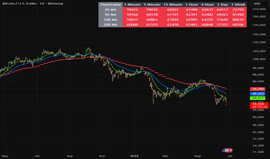
Multi-Timeframe MA CrossMulti-Timeframe MA Cross (MTFMAC) is a professional-grade trend analysis tool designed for traders who wish to view market structure across multiple timeframes at a glance. It consolidates key exponential moving averages (EMAs) into a single dashboard, helping traders make quick, informed decisions based on price alignment with moving averages.
This indicator provides a clear visual overview of trend direction and alignment from intraday (1-minute) to weekly charts. By highlighting whether price is above or below key EMAs and signalling EMA crossovers, traders can quickly identify bullish or bearish trends, trend strength, and high-probability trade setups.
Key Features
Multi-timeframe EMA dashboard (1 min → 1 week)
Real-time trend alignment for 20, 50, 100, and 200 EMAs
Visual "Above/Below" signals for each EMA
Weekly EMA overlays for higher timeframe context
Alerts for bullish/bearish alignment and EMA crosses
Fully customisable EMA lengths and visual settings
Professional table and chart display, overlaying price
How It Works
Compares the current price to 20, 50, 100, and 200 EMAs across multiple timeframes.
Colours indicate whether price is above (green) or below (red) the EMA.
Weekly EMA lines are plotted as dashed or circle-style overlays for macro trend context.
Alerts notify the trader when:
All EMAs align bullishly or bearishly
20 EMA crosses above or below 50 EMA
Best Use Cases
Trend-following strategies
Multi-timeframe confirmation
Swing and intraday trading
Spotting market bias and trend reversals
High-probability trade filtering
Alerts
Bullish Trend Alignment: All EMAs in ascending order, price above EMAs
Bearish Trend Alignment: All EMAs in descending order, price below EMAs
Bullish EMA Cross: 20 EMA crosses above 50 EMA
Bearish EMA Cross: 20 EMA crosses below 50 EMA
Notes and Disclaimers
This indicator does not repaint; all signals are based on confirmed bar data.
Use as a decision-support tool, not as sole trade advice. Combine with risk management.
Optimised for clear visualisation and multi-timeframe analysis. Indicator

Wave Sniper# Wave Sniper — Elliott Wave Flat & Confluence Detector
**by SRUS**
Wave Sniper is an advanced Elliott Wave overlay that automatically detects **flat corrections**, **3-wave pullbacks**, and **multi-timeframe wave structure** — then scores each setup for quality and confluence before marking it on your chart.
Built for traders who want clean wave-based entries without manually counting every pivot across timeframes.
---
## What It Detects
### Flat Corrections (A–B–C)
- **Regular Flat** — B retraces ~90–100% of A, C completes near A
- **Expanded Flat** — B exceeds A (up to 138.2%), C extends 123.6–161.8% of A
- **Running Flat** — B exceeds A, C fails to reach A (truncated C)
Each flat is validated with Fibonacci ratios, optional B-wave close validation, RSI momentum divergence, and volume confirmation at the C pivot.
### 3-Wave Pullbacks
- **Continuation** — three-wave pullback in the direction of the prevailing trend
- **Reversal** — three-wave structure signaling a potential turn
### 5-Wave Retest
After a flat completes, Wave Sniper tracks whether price forms a valid 5-wave extension and flags **retest opportunities** at the prior correction zone.
### Multi-Timeframe Wave Engine (15m · 1H · 4H · Daily)
Independent pivot engines run on four higher timeframes, each maintaining its own wave count state:
`WAVE_1` through `WAVE_5`, `WAVE_A/B/C`, impulse complete, correction complete.
---
## Signal System
### Triangle Markers
Confirmed setups print a **small triangle** at the C pivot:
- ▲ Green/Purple = Long bias
- ▼ Red = Short bias
Triangle color and line weight reflect the **confluence tier** — not just pattern type.
### Confluence Tiers (HTF Bonus)
| Tier | HTF Bonus | Visual |
|------|-----------|--------|
| CASCADE | 100+ | Boldest lines + chart flash |
| TRIPLE | 70–99 | Strong color, width 3 |
| WAVE | 40–69 | Medium color, width 2 |
| Single | Below 40 | Gray tint, width 1 |
**Base pattern score (0–100)** rates Fib accuracy, momentum, volume, and B-wave validation.
**HTF bonus (0–130)** adds points when chart and higher timeframes align on wave direction, impulse structure, RSI divergence, and volume behavior.
Full scoring breakdown is shown in the **info panel** (top right).
---
## Key Features
**Wave 4 Watch System**
- Detects when price enters the 23.6–38.2% Fib retrace zone of HTF Wave 3
- Confirms with RSI behavior, volume contraction, and a completing 3-wave structure
- Draws W4 MIN / W4 MAX levels and `W4 WATCH` / `W4 ✅ LOAD W5` labels
**HTF Fib Zones**
- Auto-draws Wave 4 expected retrace boxes per active timeframe
- Projects W5 targets: MIN, STANDARD, 161.8%, 261.8%
**⚡ Prime Zone**
When an HTF Wave 4 Fib zone overlaps a confirmed flat correction zone on your chart timeframe, a bright **PRIME ZONE** box highlights the overlap — highest-probability confluence area.
**Auto-Invalidation**
Patterns that break structure fade to gray and are removed from active tracking.
**Adaptive Pivots**
Pivot strength auto-adjusts to ATR and timeframe so detection stays consistent across instruments and chart periods.
**Focus Mode**
Toggle to show flats only and reduce chart clutter.
**Lookback Filter**
Auto / 1 Day / 1 Week / 1 Month / All — control how far back patterns are drawn.
---
## Info Panel
Live readout includes:
- Daily · 4H · 1H · 15m wave states
- HTF Bias (Long/Short)
- Prime Zone status
- Current chart wave state
---
## Alerts
Built-in alert conditions:
- ⚡ Wave 4 Approaching
- ✅ Wave 4 Confirmed — W5 Loading
- 🔥 Cascade Signal — All TFs Aligned
- ⚡ Prime Zone Active
- 🔁 Wave Count Invalidated (per TF)
- 🎯 Wave 5 Target Hit (MIN / 161.8%)
- Flat detected (Regular / Expanded / Running)
- 3-Wave Continuation / Reversal
- 5-Wave retest confirmed
- B-wave confirmed — watching for C
---
## Recommended Settings
| Use Case | Suggestion |
|----------|------------|
| Scalping (1m–5m) | Enable 15m + 1H layers, Min Score 65, Min HTF Bonus 40 |
| Swing (15m–1H) | All HTF layers on, Min Score 60, Min HTF Bonus 30 |
| Position (4H–D) | Daily + 4H layers, Wave Degree = Intermediate |
| Clean chart | Focus Mode ON, Max Visible = 3 |
---
## How to Read a Setup
1. **Triangle appears** at C pivot → flat or pullback confirmed
2. Check **info panel** for HTF alignment and tier
3. Watch for **W4 zone** or **Prime Zone** for entry refinement
4. Use **W5 projection lines** for targets
5. Set alerts for CASCADE or Prime Zone for hands-free monitoring
---
## Disclaimer
Wave Sniper is a **technical analysis tool**, not financial advice. Elliott Wave counting is interpretive — always confirm with your own analysis, risk management, and market context. Past pattern performance does not guarantee Indicator

Indicator
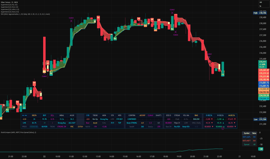
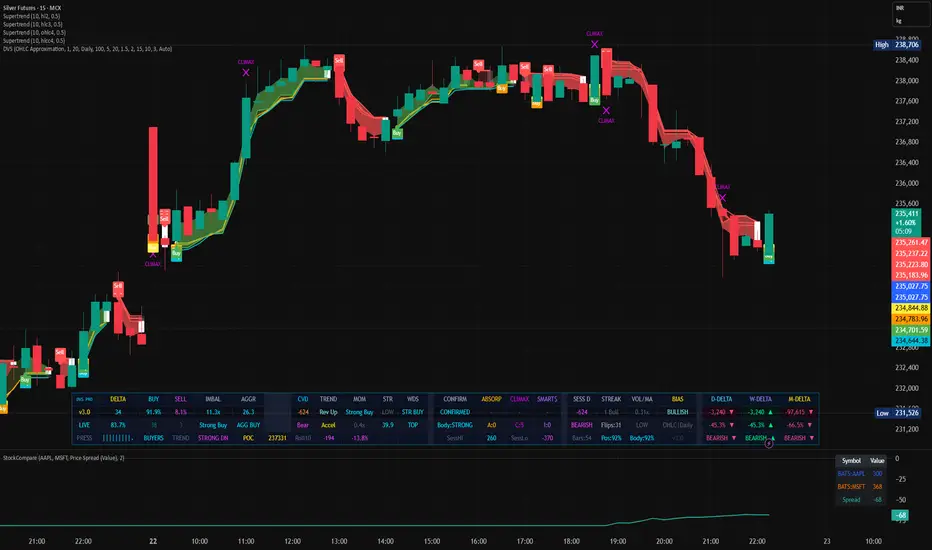
EWO,RSI advanced Signals Strategy - Exhaustion Filter## EWO, RSI, MFI - Advanced Exhaustion Filter
## Overview
Strategy - Advanced Exhaustion Filter is a comprehensive momentum and mean-reversion trading strategy designed for Pine Script v6. It combines multi-indicator momentum tracking with structural price filters to protect traders from "falling knives" during market capitulation and distribution phases.
By blending the Elliott Wave Oscillator (EWO), Relative Strength Index (RSI), Money Flow Index (MFI), and volume-weighted confirmations, this strategy ensures you only enter a trade when genuine momentum returns to the market.
------------------------------
## How It Works##
1. Core Momentum Engine
The strategy relies on three distinct layers of confirmation before generating a trade:
* Elliott Wave Oscillator (EWO): Measures the displacement of price to determine the dominant market wave. Entries require the EWO to be ticking upward from below zero.
* Relative Strength Index (RSI): Filters structural momentum. A long entry triggers when RSI crosses above the critical 40 line, proving a shift out of bearish territory.
* Money Flow Index (MFI): Adds volume-weighted momentum to ensure asset accumulation is actually taking place rather than a low-liquidity squeeze.
2. The Exhaustion & Structural Filter (Anti-Falling Knife)
Standard momentum strategies often fail during deep market sell-offs because indicators flash "buy" on minor relief bounces while price continues to plummet. This script solves that problem using two proprietary rules:
* The Breakout/Breakdown Barrier: The script dynamically tracks the highest high and lowest low of the last N bars (lookback_len). Even if indicators say buy, the strategy will wait until price physically breaks above this local structural barrier.
* Capitulation Memory Flag: If the market enters a state of extreme panic (RSI drops below rsi_oversold), the strategy flags an "Exhaustion Zone". In this zone, the strategy prepares for an explosive trend reset, overriding standard barriers once momentum reverses.
3. Volumetric Confirmation
Signals are filtered through a volume moving average (Volume MA). Entries and exits are only permitted if market volume is at least 80% of its recent average, keeping you out of choppy, illiquid trading sessions.
------------------------------
## Strategy Parameters
* EWO Fast / Slow (Default: 5, 34): The short and long-term moving averages used to calculate the Elliott Wave Oscillator waves.
* RSI Length (Default: 14): The lookback window for trend and exhaustion momentum.
* MFI Length (Default: 14): The lookback window for volume-weighted money flow tracking.
* Breakout Lookback Bars (Default: 10): The number of historical bars used to calculate local structural highs and lows to prevent premature entries.
* Exhaustion RSI Level (Default: 30): The extreme oversold threshold that triggers capitulation logic.
------------------------------
## Best Practices & Asset Classes
* Timeframes: Optimised for 15-minute, 1-hour, and 4-hour charts where structural highs and lows carry significant weight.
* Markets: Highly effective on trending assets with periodic high-volatility liquidations, such as Crypto (BTC, ETH), major Forex pairs, and Tech Stocks.
------------------------------
## ⚠️ Disclaimer
Financial Risk Warning: Financial trading involves substantial risk of loss and is not suitable for every investor. The information, strategies, and script provided here are strictly for educational, informational, and research purposes.
No Advice: This script is not financial advice, an investment recommendation, or a solicitation to buy or sell any financial instrument. Past performance as demonstrated by historical backtesting is never a guarantee of future results.
User Responsibility: Markets change rapidly, and default settings may not fit all assets or market conditions. You are fully responsible for your own trading decisions. Always thoroughly backtest, forward-test on a demo account, and apply your own strict risk management protocols before risking real capital.
Strategy

Imtiyaz Signature Liquidity Compass SMCImtiyaz Signature Liquidity Compass SMC
Imtiyaz Signature Liquidity Compass SMC is an original Smart Money Concepts decision-support indicator that maps nearby buy-side and sell-side liquidity, tracks sweeps, highlights structure breaks, displays fair value gaps, and ranks the strongest active liquidity target on each side of price.
The purpose of the tool is not to predict the future or issue guaranteed buy/sell calls. It is designed to help traders see where meaningful liquidity may be resting, whether one side of the market has stronger current pull, and how that context lines up with structure and higher-timeframe trend.
What It Shows
Buy-side liquidity pools above price, based on confirmed swing highs.
Sell-side liquidity pools below price, based on confirmed swing lows.
Buy-side and sell-side liquidity sweeps.
Bullish and bearish BOS events.
Bullish and bearish CHOCH events when structure changes direction.
Bullish and bearish Fair Value Gaps.
A compact dashboard showing upside pull, downside pull, net pull, active pool counts, HTF trend, and current structure.
Scoring Model
Every active liquidity pool receives a 0-100 score. The score is a weighted context reading, not a probability.
The score combines:
Distance from current price, normalized by ATR.
Volume at the swing that created the pool.
Freshness of the pool.
Number of touches or reactions.
Whether the pool is still on the correct side of price.
Higher-timeframe EMA trend alignment.
The dashboard compares the strongest upside pool against the strongest downside pool. If the difference is small, the field is marked Balanced. If one side is stronger by the selected threshold, the dashboard marks Upside Pull or Downside Pull.
Main Settings
Swing Confirmation Length controls how important a swing must be before it becomes a liquidity pool. A higher value creates fewer but more significant levels.
Maximum Pools Per Side limits how many active buy-side and sell-side pools are kept on the chart.
Pool Freshness Window controls how quickly old pools lose score.
Touch Buffer ATR controls how close price must get before a pool is considered touched.
Sweep Confirmation lets you choose between wick-only sweep detection and stricter close-back-inside sweep detection.
Minimum Visible Pool Score hides weaker pools so the chart remains clean.
Dominance Threshold controls how much stronger one side must be before the dashboard changes from Balanced to a directional pull.
HTF Trend Timeframe and HTF EMA Length define the higher-timeframe trend component used in the scoring engine.
Alerts
The indicator includes alerts for:
Buy-side liquidity sweep.
Sell-side liquidity sweep.
Bullish BOS or CHOCH.
Bearish BOS or CHOCH.
Upside liquidity pull becoming dominant.
Downside liquidity pull becoming dominant.
Bullish FVG formation.
Bearish FVG formation.
How To Use
Start with the dashboard. If the field is Balanced, liquidity pressure is mixed and traders may prefer to wait for a sweep, structure break, or FVG reaction. If Upside Pull or Downside Pull is dominant, look at the strongest marked pool and judge whether price action supports a move toward or away from that area.
Liquidity sweeps can be used as context for potential reversals or displacement. BOS and CHOCH markers help separate continuation from possible directional change. FVGs highlight imbalance areas that may later be revisited or mitigated.
This indicator is best used alongside a complete trading plan, risk management, and independent confirmation. It does not guarantee future price movement, win rate, profitability, or signal accuracy.
Originality
Imtiyaz Signature Liquidity Compass SMC uses an original scoring model that combines liquidity-pool distance, swing volume, freshness, reaction count, side validity, and higher-timeframe trend alignment. The goal is to reduce chart clutter by showing the pools that currently matter most, while keeping the logic transparent and avoiding unsupported probability claims.
Disclaimer
This script is for educational and informational purposes only. Trading involves risk. Always do your own analysis before taking any trade.
Indicator

Nasrul Fib SR M5Nasrul Fib SR M5 — Strategy Pine Script v6 for M5 charts. 50%/61.8% Fibonacci levels and Support/Resistance levels are taken from M30; entry occurs when the price touches the zone level and candlestick patterns (pin bar, engulfing bar, inside bar breakout, false breakout). Supports reversal and breakout setups, confluence filters, choppy blocks, minimum R:R ratio of 2:1, and automatic SL/TP. Displays zone boxes, level lines, signal labels, and a status table.
Full description
Summary & workflow (M30 → M5)
Chart view (4 zones, lines, labels, table)
Reversal & breakout setups
4 candlestick patterns + filters
Entry / SL / TP / confluence
List of inputs per group
Alerts, how to use, default parameters for XAUUSD
Links to research, specs, and M30 indicators Strategy

PVRPLE ORACLE - 250%# PVRPLE ORACLE
PVRPLE ORACLE is a Smart Zone and Order Block strategy designed to identify potential momentum continuation setups after a price retest of an active trading zone.
The strategy detects bullish and bearish Order Block candles, validates them through an ATR-based momentum filter, and creates dynamic trading zones.
Once price revisits a zone, PVRPLE ORACLE waits for confirmation before opening a trade:
* **Blue Zone:** price returns into the bullish zone and breaks above the upper confirmation trigger → LONG entry.
* **Red Zone:** price returns into the bearish zone and breaks below the lower confirmation trigger → SHORT entry.
## Core Features
* Automatic bullish and bearish Order Block detection
* ATR-based momentum filter
* Dynamic Smart Zone visualization
* Configurable entry confirmation distance
* Configurable Take Profit and Stop Loss
* One trade per zone
* Long and Short signal visualization
* Supports fixed cash sizing or percentage-of-equity sizing
* Designed for backtesting and strategy optimization
## Tested Configuration
* Timeframe: **1 Hour**
* Initial Capital: **50,000 USDT**
* Position Size Tested: **50% of equity**
* Entry Confirmation: **100 points**
* Take Profit: **300 points**
* Stop Loss: **50 points**
* Maximum Trades per Zone: **1**
## Important Disclaimer
PVRPLE ORACLE is designed for backtesting, research, and educational purposes.
Historical performance does not guarantee future results. Before using the strategy in live conditions, test it with realistic trading costs, commissions, slippage, and Bar Magnifier settings.
For a 50,000 USDT prop account, a more conservative starting allocation such as **5%–10% of equity per trade** is recommended until the strategy has been validated across multiple market conditions, symbols, and timeframes.
Strategy