
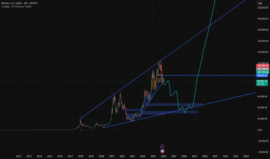
1. Rising Long-Term Trend (Blue Wedge Channel)
BTC is shown inside a large, long-term rising wedge/channel.
The lower trendline starts far left at very low price levels and gradually rises toward the right.
The upper trendline connects previous major peaks.
This suggests the chart is showing macro price structure, not short-term moves.
2. Current Price Area
The current BTC price shown is around 103,000 USD.
It has pulled back sharply from the recent high near the top of the rising channel.
3. Key Levels Marked
Horizontal Levels
98,242 USD – highlighted as an important support/resistance level.
103,750 USD – another notable level around current price.
Support Boxes (Red/Blue Zones)
You have multiple demand zones marked in the 40,000–50,000 USD range:
Upper support zone around 50k–55k
Larger and deeper support zone around 40k–45k
These look like areas where price previously consolidated.
4. The Blue Projected Path (Your Forecast Line)
There’s a blue zig-zag line showing a hypothetical future price movement:
Move Downward First
The projection suggests BTC may drop from the current area
Slowly stair-stepping down into the 40k–50k support zones
Possibly touching the lower long-term trendline
Then a Strong Uptrend
After hitting bottom:
A sharp rally shoots upward
Eventually breaking past the mid-line and returning to the top of the channel
Continues aggressively upward toward 120k+
This is clearly a speculative future scenario, not actual data.
BTC is shown inside a large, long-term rising wedge/channel.
The lower trendline starts far left at very low price levels and gradually rises toward the right.
The upper trendline connects previous major peaks.
This suggests the chart is showing macro price structure, not short-term moves.
2. Current Price Area
The current BTC price shown is around 103,000 USD.
It has pulled back sharply from the recent high near the top of the rising channel.
3. Key Levels Marked
Horizontal Levels
98,242 USD – highlighted as an important support/resistance level.
103,750 USD – another notable level around current price.
Support Boxes (Red/Blue Zones)
You have multiple demand zones marked in the 40,000–50,000 USD range:
Upper support zone around 50k–55k
Larger and deeper support zone around 40k–45k
These look like areas where price previously consolidated.
4. The Blue Projected Path (Your Forecast Line)
There’s a blue zig-zag line showing a hypothetical future price movement:
Move Downward First
The projection suggests BTC may drop from the current area
Slowly stair-stepping down into the 40k–50k support zones
Possibly touching the lower long-term trendline
Then a Strong Uptrend
After hitting bottom:
A sharp rally shoots upward
Eventually breaking past the mid-line and returning to the top of the channel
Continues aggressively upward toward 120k+
This is clearly a speculative future scenario, not actual data.

Declinazione di responsabilità
Le informazioni e le pubblicazioni non sono intese come, e non costituiscono, consulenza o raccomandazioni finanziarie, di investimento, di trading o di altro tipo fornite o approvate da TradingView. Per ulteriori informazioni, consultare i Termini di utilizzo.
Declinazione di responsabilità
Le informazioni e le pubblicazioni non sono intese come, e non costituiscono, consulenza o raccomandazioni finanziarie, di investimento, di trading o di altro tipo fornite o approvate da TradingView. Per ulteriori informazioni, consultare i Termini di utilizzo.