Indicatore
Indicatori di ampiezza

Indicatore

Target Fusion Overlay TheGutixxTheGutixx Fusion Overlay es un indicador avanzado de análisis técnico diseñado para combinar en una sola herramienta la fuerza del RSI Trend, la estructura de tendencia mediante EMA 9/21 y un sistema visual de objetivos de precio.
Este indicador ayuda a identificar posibles oportunidades de mercado mediante la combinación de momentum, dirección de tendencia y estructura del precio, mostrando señales visuales directamente sobre el gráfico.
Características principales:
✅ RSI Trend Integration
Detecta cambios de momentum y posibles giros de tendencia mediante el comportamiento del RSI y Hull Trend.
✅ EMA 9/21 Trend System
Utiliza cruces de medias exponenciales para visualizar cambios de dirección del mercado y zonas de posible continuación.
✅ CALL & PUT Signals
Señales visuales integradas sobre el gráfico para facilitar la lectura de oportunidades alcistas y bajistas.
✅ Bull & Bear Targets
Proyección automática de objetivos de precio después de los cruces EMA, ayudando a visualizar posibles zonas de movimiento.
✅ Multi-Market Compatible
Diseñado para utilizarse en diferentes mercados:
📈 Acciones (Stocks)
💱 Forex
₿ Criptomonedas
📊 Índices
✅ Multi-Timeframe
Puede utilizarse en diferentes temporalidades, desde scalping en marcos pequeños hasta análisis de mayor duración.
✅ Alertas TradingView
Compatible con alertas personalizadas para señales y cruces importantes.
TheGutixx Fusion Overlay fue creado para traders que buscan una lectura más limpia del mercado combinando tendencia, momentum y objetivos en un solo indicador.
Indicatore

Bystry Counter Strike Style + PVSRABystry Counter Strike Style + PVSRA
This indicator is a breakout and trade-management tool designed to help traders visualize potential long and short strike zones, dynamic profit targets, stop levels, and volume-based candle context directly on the chart.
The script combines four main components:
1. Dynamic Strike Channel
The indicator builds a dynamic price channel using recent market structure. The upper boundary represents a potential long breakout area, while the lower boundary represents a potential short breakout area.
The channel is calculated from recent highs and lows over a configurable lookback window. This makes the tool adapt to changing market conditions instead of using fixed horizontal levels.
2. Breakout Signals
Long signals are generated when price breaks above the upper strike level, while short signals are generated when price breaks below the lower strike level.
The user can choose between:
* Confirmed Close mode: signals are based on candle close confirmation.
* Intrabar Wick Touch mode: signals can appear when price touches the level during the candle.
Confirmed Close mode is designed to reduce intrabar signal changes and is the default approach for cleaner confirmation.
3. Dynamic TP and SL Logic
The indicator automatically calculates potential TP1 and stop-loss levels using ATR and the width of the strike channel.
This allows the risk and target zones to expand or contract depending on current volatility.
The script includes:
* Future Long TP1
* Future Long SL
* Future Short TP1
* Future Short SL
* Active trade lines
* Optional fixed or trailing stop behavior
The stop mode can be set to:
* Auto
* Fixed
* Trailing
In Auto mode, the script can switch to trailing behavior depending on market volatility conditions.
4. PVSRA Candle Coloring
This version includes PVSRA-style candle coloring to highlight unusual volume behavior.
The candle coloring uses:
* Average volume
* Candle spread
* Volume multiplied by spread
* Climax volume conditions
* Rising volume conditions
The purpose of this layer is to help traders see when a breakout or rejection happens with increased volume activity.
Default PVSRA candle logic:
* Bullish climax candles are highlighted when bullish candles appear with strong volume or strong volume-spread behavior.
* Bearish climax candles are highlighted when bearish candles appear with strong volume or strong volume-spread behavior.
* Rising volume candles are marked separately to show increased participation before or during a move.
Main Features
* Dynamic long breakout level
* Dynamic short breakout level
* Adaptive strike channel
* ATR-based TP and SL levels
* Optional EMA trend filter
* Optional volatility filter
* Fixed or trailing stop logic
* PVSRA candle coloring
* Entry labels
* TP1 labels
* Stop and trailing exit labels
* Performance table
* Alert conditions for entries, TP1, stop events, trailing conversion, and channel changes
* Dynamic alert messages using alert()
How To Use
This tool is intended to be used as a visual decision-support indicator, not as a standalone automated trading system.
A basic workflow may look like this:
1. Use the EMA filter to define directional bias.
* Price above EMA may favor long setups.
* Price below EMA may favor short setups.
2. Watch the dynamic strike channel.
* A break above the upper level may suggest bullish continuation.
* A break below the lower level may suggest bearish continuation.
3. Use PVSRA candle colors as additional context.
* Strong volume on a breakout can indicate participation.
* Strong opposite volume near a level may suggest rejection or absorption.
4. Use TP1 and SL levels as reference zones.
* These levels are calculated dynamically from ATR and channel width.
* They are not guaranteed execution prices.
5. Combine the indicator with your own market structure analysis.
* Higher timeframe trend
* Support and resistance
* Liquidity zones
* Session timing
* Risk management
Inputs
Counter Strike Engine:
* AI Direction: choose Long & Short, Trade Longs, or Trade Shorts.
* Signal Mode: choose Full System or Entries Only.
* Learning / Strike Window: controls the lookback period for the strike channel.
* ATR Length: controls volatility calculation.
* Minimum ATR Profit Target: sets the minimum target distance.
* Minimum ATR Stop Loss: sets the minimum stop distance.
* Auto ATR Adjustment On Very Low Timeframes: increases ATR distance on very low timeframes.
* Entry Buffer ATR: adds a small ATR-based buffer to breakout levels.
* Stop Loss Mode: Auto, Trailing, or Fixed.
* Same Candle TP/SL Assumption: controls how the script handles candles where both TP and SL are touched.
* Entry Trigger: Confirmed Close or Intrabar Wick Touch.
Filters:
* EMA Filter: optional trend filter.
* EMA Filter Length: default trend filter length.
* Volatility Filter: optional filter for market volatility conditions.
Visuals:
* Show Strike Channel
* Show EMA
* Show Future TP/SL
* Show Trade Buttons
* Show Performance Table
* Label Size
* Brighter Labels
* Table Location
PVSRA Candle Coloring:
* Enable PVSRA Candle Coloring
* PVSRA Volume MA Length
* Climax Volume Multiplier
* Rising Volume Multiplier
* Custom candle colors for bullish and bearish volume conditions
Alerts
The script includes alert conditions for:
* Long Entry
* Short Entry
* TP1 Hit
* Trailing Stop Conversion
* Stop or Trail Exit
* Long Entry Price Changed
* Short Entry Price Changed
* Any Important Event
It also includes optional dynamic alert() messages with symbol, timeframe, entry price, TP1, and SL information.
Important Notes
This indicator does not use future data or lookahead logic.
The performance table is a simplified internal visual reference and should not be treated as an official strategy backtest. For full backtesting, commission modeling, slippage modeling, and order execution simulation, a dedicated strategy version should be used.
Signals may behave differently depending on the selected trigger mode. Confirmed Close mode is generally cleaner for historical review, while Intrabar Wick Touch mode can react earlier but may change during the live candle.
This tool is not financial advice. It does not predict the future and does not guarantee profitable results. It should be used together with proper risk management and independent market analysis.
Recommended Markets and Timeframes
The indicator can be tested on forex, crypto, indices, commodities, and futures markets.
For cleaner signals, higher intraday timeframes such as 15m, 30m, and 1h are generally more stable than very low timeframes. Very low timeframes may produce more noise and should be used with additional confirmation.
Originality
This script is an original breakout and trade-management tool that combines a dynamic strike channel, ATR-based target and stop logic, optional trend and volatility filters, alert support, and PVSRA-style candle coloring in one chart-based workflow.
It is not intended to reproduce or copy any closed-source script. The calculations, trade-management logic, and visual structure are implemented independently.
Indicatore

Bystry Prime-Style Oscillator ProBystry Prime-Style Oscillator Pro is a multi-layer momentum, money-flow and volume oscillator designed to help traders read market pressure, exhaustion zones and potential momentum shifts in a clean oscillator panel.
This indicator is an original Pine Script v6 tool. It is not affiliated with, endorsed by, or intended to reproduce any proprietary or closed-source indicator. The goal of this script is to provide a transparent, self-contained oscillator framework that combines momentum, volume pressure, money flow and trend confirmation into one visual dashboard.
What the indicator does:
The script builds a normalized oscillator using several market components:
1. Price momentum
The indicator measures price impulse and deviation from a smoothed trend baseline. This helps identify whether price is expanding away from its average behavior or returning toward balance.
2. Momentum confirmation
RSI, CCI and MFI-style components are normalized and blended into the main oscillator. This allows the tool to react not only to price movement, but also to changes in internal momentum.
3. Money Flow Tracker
The money-flow module estimates buying and selling pressure by combining candle body pressure, close location inside the candle range and volume. This helps identify whether volume is supporting bullish or bearish movement.
4. Volume Matrix
The volume matrix compares bullish and bearish volume participation. It is designed to show whether the current move has meaningful volume support or whether price is moving with weak participation.
5. True 7 Rank System
The True 7 model scores market conditions using seven bullish and seven bearish checks, including oscillator direction, signal-line relationship, money flow, volume pressure and trend alignment. The result is displayed as a simple strength framework that helps traders avoid relying on one signal alone.
6. Dynamic Bands
The oscillator includes adaptive upper and lower bands based on recent oscillator behavior. These bands help identify overbought, oversold and extreme conditions without relying only on fixed levels.
7. Peak Seekers and Divergences
Confirmed oscillator pivots can mark potential exhaustion areas. The script can also highlight bullish and bearish divergence when price makes a new extreme while the oscillator fails to confirm that move.
How to read the indicator:
Bullish conditions are generally stronger when:
* the oscillator is above its signal line,
* the oscillator is above the zero line,
* money flow is positive,
* the volume matrix supports buyers,
* the True 7 bullish score is high.
Bearish conditions are generally stronger when:
* the oscillator is below its signal line,
* the oscillator is below the zero line,
* money flow is negative,
* the volume matrix supports sellers,
* the True 7 bearish score is high.
The overbought and oversold zones should not be used as automatic buy or sell signals. Strong trends can remain overbought or oversold for long periods. These zones are most useful when combined with momentum shifts, money-flow changes, divergence or market-structure confirmation.
Signals and alerts:
The indicator includes alert conditions for:
* bullish reversal signal,
* bearish reversal signal,
* bullish momentum shift,
* bearish momentum shift,
* bullish peak seeker,
* bearish peak seeker,
* bullish divergence,
* bearish divergence.
For cleaner alerts, it is recommended to use “Once Per Bar Close” when creating TradingView alerts.
Important behavior:
Peak seeker and divergence markers are confirmed only after the required right-side pivot bars have closed. For visual clarity, these markers are plotted on the original pivot candle, but they are not known in real time until confirmation. This avoids misleading users about when the signal becomes available.
The indicator does not guarantee future performance and should not be used as a standalone trading system. It is designed as a decision-support tool and should be combined with market structure, risk management, session context and higher-timeframe analysis.
Suggested use:
This oscillator can be useful for:
* identifying momentum expansion and exhaustion,
* confirming trend continuation,
* filtering weak signals with volume and money flow,
* spotting divergence near important zones,
* building confluence with support/resistance, liquidity zones or session-based strategies.
Risk disclaimer:
This script is for educational and analytical purposes only. It does not provide financial advice. No indicator can predict market movement with certainty. Past signals or historical behavior do not guarantee future results. Always use proper risk management and test the indicator on your own markets and timeframes before using it in live trading.
Indicatore

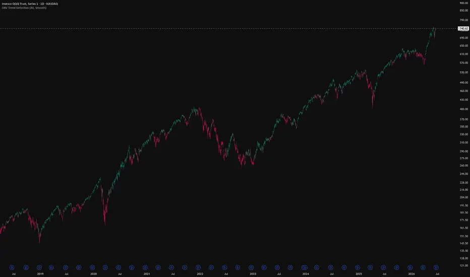
OBV Trend CandlesOBV Trend Candles
This indicator colors your candles based on the relationship between On-Balance Volume (OBV) and a moving average of OBV. It's a simple way to keep volume-based trend context visible directly on the price chart, without having to watch a separate OBV pane.
How it works
OBV accumulates volume on up-closes and subtracts it on down-closes, so a rising OBV means volume is flowing into the asset and a falling OBV means it's flowing out. This script takes that OBV line and compares it to a simple moving average of itself:
When OBV is above its SMA, volume momentum is building → candles are painted green.
When OBV is below its SMA, volume momentum is fading → candles are painted red.
The idea is that volume often shifts before or alongside price, so the color flips can give you a read on whether the current move is backed by participation.
The Sensitivity input
The single setting that matters is Sensitivity, which is the length of the SMA applied to OBV. Lower values make the indicator react faster to changes in volume flow (more color flips, more noise), while higher values smooth things out and only flip on more established shifts. Tune it to your timeframe and trading style — there's no universally "correct" value.
Notes
It works on any timeframe and any asset, as long as that asset reports volume data. On symbols without volume (some forex pairs and certain indices), OBV can't be calculated and the script will let you know. Colors are fully customizable in the settings.
This is a context/confirmation tool, not a standalone signal — it tells you about volume flow, not where to enter or exit. Use it alongside your own analysis.
Indicatore
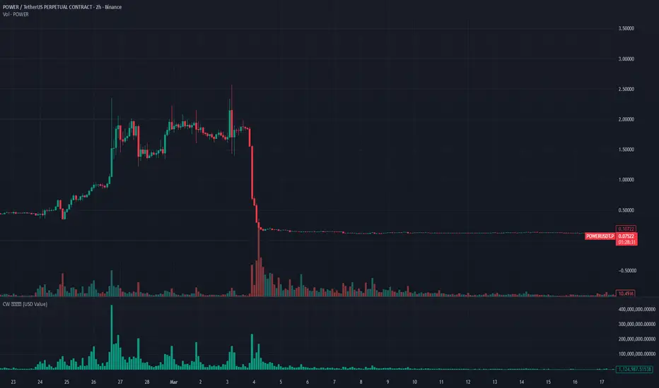
Closewinter Volume ValueThe Illusion of Token Count vs. Actual Capital Volume
To put it simply, the critical limitation of traditional volume indicators is that they fail to account for price changes and only display the absolute number of tokens traded.
For instance, buying $100 worth of an asset at $1 generates 100 tokens. However, buying $100 worth at $10 generates only 10 tokens. Even though the exact same amount of capital was deployed, the number of filled tokens varies depending on the price.
The inherent flaw is that standard charts do not reflect this disconnect—the fact that actual capital volume and token count are not strictly proportional. This is precisely why you must look at Traded Value (or Fiat Volume / Notional Volume) rather than just raw trading volume.
Indicatore
Sessions Suite [claysul] + FVGSessions Suite + FVG + Market Structure — Warsaw Time
Sessions Suite + FVG + Market Structure is a visual market context indicator designed to help traders organize intraday price action around trading sessions, important highs/lows, opening prices, opening gaps, Fair Value Gaps and basic BOS/CHOCH structure.
The script is built as an overlay indicator and is intended for chart analysis, market preparation and visual context. It does not execute trades, does not provide guaranteed buy/sell signals and should not be treated as a standalone trading system. All market decisions should be confirmed with the trader’s own analysis, risk management and testing.
Main purpose
This indicator helps traders see where price is trading in relation to:
* major intraday sessions,
* session highs and lows,
* session equilibrium levels,
* previous hour, day, week and month levels,
* daily, weekly, monthly and custom opening prices,
* New Day Opening Gaps and New Week Opening Gaps,
* 90-minute market cycles,
* Fair Value Gaps,
* BOS and CHOCH structure breaks.
The default time zone is Europe/Warsaw, which makes the script especially useful for traders who analyze London and New York sessions from a Central European time perspective.
1. Session ranges
The indicator can display several customizable intraday sessions directly on the chart:
* Asia,
* London,
* NY AM,
* NY PM,
* optional NY Lunch or any custom session.
Each session can be enabled or disabled individually. The user can also change the session name, time window and color.
For every enabled session, the indicator can draw a session box that expands during the session and automatically tracks the current session high and low. This makes it easier to see the full range built during a specific part of the trading day.
Session boxes can include:
* transparent background,
* optional border,
* custom session colors,
* limited historical lookback to keep the chart clean,
* optional session equilibrium line.
The lookback setting is useful because TradingView has drawing object limits. Limiting boxes to recent days helps improve chart readability and keeps the indicator lighter.
2. Session highs, lows and equilibrium
The script can mark the high and low of each enabled session.
Session lines help identify liquidity areas where price may later react, sweep or reject. These levels can be used as contextual reference points, not as automatic entry signals.
Available session line settings include:
* show/hide session lines,
* line width,
* solid, dashed or dotted style,
* default session color or one custom color for all lines,
* lookback limit for historical lines and labels.
The indicator can also display Session EQ, which is the midpoint between the session high and low. This can help traders quickly see whether price is trading in the upper or lower half of a session range.
3. Session labels
The indicator includes flexible label settings for session highs and lows.
The user can choose:
* whether to show labels,
* label size,
* label alignment,
* label placement,
* whether to show high only, low only or both,
* whether labels should include “High” and “Low” text,
* whether all session labels should use one custom color.
There is also an option to relabel session highs and lows as Day High, Day Low, Week High, Week Low, Month High or Month Low when those session levels match higher-timeframe extremes. Month labels have priority over week labels, and week labels have priority over day labels.
This helps identify when an intraday session level is also a more important daily, weekly or monthly liquidity level.
4. Mitigation of session levels
The mitigation module controls how session high and low lines behave after price interacts with them.
The indicator can:
* extend unmitigated session lines to the current bar,
* stop a line once price reaches that level,
* optionally remove mitigated lines and labels from the chart.
A session high is considered mitigated when price trades up to that level. A session low is considered mitigated when price trades down to that level.
This is designed to reduce chart clutter and help the trader focus on levels that have not yet been revisited by price.
5. Previous Hour High and Low
The Previous Hour module displays:
* PHH — Previous Hour High,
* PHL — Previous Hour Low.
These levels are useful for very short-term intraday analysis, especially when observing liquidity sweeps, breakouts, retests or session transitions.
The user can customize:
* visibility of PHH and PHL,
* color,
* line style,
* whether mitigated previous-hour levels should be removed.
The labels are placed near the current chart area so the levels are easy to identify in real time.
6. Previous Day, Week and Month levels
The indicator can draw important higher-timeframe reference levels:
Previous Day:
* PDH — Previous Day High,
* PDL — Previous Day Low,
* PD EQ — midpoint between previous day high and low,
* PDC — Previous Day Close.
Previous Week:
* PWH — Previous Week High,
* PWL — Previous Week Low,
* PW EQ — midpoint between previous week high and low.
Previous Month:
* PMH — Previous Month High,
* PML — Previous Month Low.
These levels are often used by intraday traders as major liquidity, reaction or bias reference points. The indicator displays them directly on the chart with customizable colors and line styles.
The script also includes overlap suppression logic. When levels overlap, higher-priority levels can visually replace lower-priority labels to avoid unnecessary duplicates. Month levels have the highest priority, then week levels, then day levels.
There is also an option to remove mitigated previous day, week and month levels once price has traded through them.
7. Opening prices
The Opening Prices module displays important opening price levels:
* Daily Open,
* Weekly Open,
* Monthly Open,
* up to seven custom opening times.
By default, the script includes commonly used custom opens such as 15:30 and 06:00, with additional optional custom opens such as 22:00, 16:00, 15:00, 14:30 and 20:00.
Each custom open can be renamed and assigned its own session window and color.
This can be useful for traders who follow specific market opens, futures opens, cash session opens, regional session opens or personal timing models.
The script also supports previous custom opening prices for multiple previous days. The user can choose how those previous custom open lines should end:
* at the end of the day,
* at the next opening,
* at the current bar.
This gives flexibility depending on whether the trader wants a clean daily view or a more extended historical reference.
8. New Day Opening Gap and New Week Opening Gap
The script includes optional NDOG and NWOG visualization.
NDOG — New Day Opening Gap
Shows the gap between the previous close and the new trading day open.
NWOG — New Week Opening Gap
Shows the gap between the previous close and the new trading week open.
Both gap types can include:
* background box,
* optional equilibrium line,
* custom color,
* maximum number of visible gaps,
* optional removal after full mitigation.
A gap is treated as fully mitigated only after price has reached both sides of the gap. This helps traders distinguish between partially revisited gaps and fully filled gaps.
9. Day of Week labels and separators
The Day of Week module can display daily separators and day labels directly on the chart.
Available options include:
* show/hide day of week labels,
* top or bottom label placement,
* custom label color,
* daily separator color,
* number of recent days to display.
This is useful for traders who analyze weekly rhythm, day-of-week tendencies, Monday range behavior, midweek expansion or Friday positioning.
10. 90-minute cycles
The indicator includes a 90-minute cycle module.
The day is divided into customizable 90-minute segments across the main sessions:
* Asia Q1, Q2, Q3, Q4,
* London Q1, Q2, Q3, Q4,
* NY AM Q1, Q2, Q3, Q4,
* NY PM Q1, Q2, Q3, Q4.
Each cycle can be displayed as a box that tracks the high and low formed during that specific 90-minute window.
The user can control:
* whether 90-minute cycles are shown,
* whether borders are shown,
* whether labels are shown,
* custom cycle names,
* cycle colors,
* one shared label color or individual cycle colors,
* label size,
* lookback limit.
This feature is designed for traders who use time-based market models and want to see how price behaves inside recurring 90-minute windows.
11. Fair Value Gaps
The Fair Value Gap module detects and draws basic bullish and bearish FVG zones.
A bullish FVG is detected when the current candle’s low is above the high from two candles earlier, with the middle candle closing bullish.
A bearish FVG is detected when the current candle’s high is below the low from two candles earlier, with the middle candle closing bearish.
The indicator draws each FVG as a static box directly in the location where the imbalance appears.
Available FVG settings include:
* show/hide FVG,
* bullish FVG color,
* bearish FVG color.
FVG zones are visual areas of imbalance. They are not automatic entry signals. Traders may use them as areas to observe possible reactions, retracements or continuation setups, depending on their own trading model.
12. BOS and CHOCH market structure
The indicator includes a basic BOS and CHOCH module.
The script detects pivot highs and pivot lows using a configurable pivot length. When price closes above the latest pivot high, the script marks a bullish structure break. When price closes below the latest pivot low, the script marks a bearish structure break.
The label shown depends on the previous detected structure direction:
* BOS means the break continues the current structure direction,
* CHOCH means the break changes the previous structure direction.
The user can control:
* whether BOS/CHOCH is displayed,
* pivot length used for structure detection.
To keep the chart readable, this module only draws recent BOS/CHOCH markings within the script’s recent-time window.
This module is intended to provide simple structure context and should not be treated as a complete Smart Money Concepts strategy by itself.
13. Best use cases
This indicator can be useful for traders who want to:
* organize intraday sessions,
* mark session liquidity,
* compare price with previous day/week/month levels,
* observe market opens,
* track unmitigated levels,
* visualize opening gaps,
* study 90-minute cycles,
* identify basic FVG areas,
* observe simple BOS/CHOCH structure shifts.
It may be especially useful on intraday timeframes where session-based analysis is important.
14. Important limitations
This indicator is a visual analysis tool. It does not guarantee future price movement and does not replace risk management.
The presence of a level, FVG, gap, BOS or CHOCH does not mean price must react from that area. Markets can move through levels without reaction, and historical structure does not guarantee future behavior.
The script uses drawing objects such as boxes, labels and lines. Because TradingView has limits on the number of objects that can be displayed, several modules include lookback settings to control how much historical information remains visible on the chart.
Session-based tools work best on intraday charts. Some features may be less relevant or unavailable on higher timeframes.
15. Credits
This script is based on and extends the Sessions Suite concept by claysul, with additional modules such as Fair Value Gaps and BOS/CHOCH market structure visualization.
The script is provided for educational and analytical use only.
Indicatore

Alligator - Cross Signals-False signalsThis very simple indicator generates buy and sell signals at each crossover of the alligator's lips, offering good visual readability. If a signal is contradicted by an opposite signal within the following two candles, an alert signal is triggered. When combined with a 200-period EMA and an MACD, it can help improve entry and exit points, although the trader's own analysis remains essential.
Indicatore
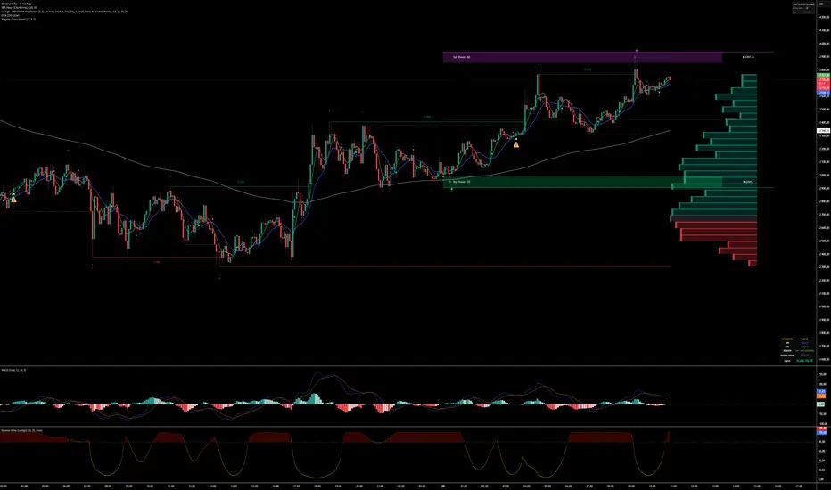
Trucker Stock Trader Confluence ProTrucker Stock Trader Confluence Pro
Built for beginners and experienced day traders alike
This indicator combines several popular trading tools into one easy-to-read dashboard so you don’t have to jump between 5 different indicators.
How It Works (Simple Version):
Think of it like a traffic light system for buying or selling stocks:
The Colored Shapes on the Chart:
Green Circle = MACD just turned bullish (momentum shifting up)
Green Triangle = RSI crossing above 50 (getting stronger)
Green Square = EMA 9 crossing above other EMAs (short-term trend turning up)
Green Diamond = Price breaking above the Keltner Channel (strong upward move)
White Circle = Price crossed above or below the VWAP line
The more green shapes that appear together on the same candle = the stronger the buy signal.
Red shapes mean the opposite (bearish/sell signals).
Live Status Box (Top Left Corner):
This box tells you at a glance what each tool is saying:
MACD, RSI, EMA, VWAP, Keltner — each marked Bullish or Bearish with matching symbols
ATR Stop — Shows a suggested stop-loss distance (how much room to give the trade)
Strength Bar — Fills up with green blocks the more signals are agreeing. More green = higher probability setup.
Plotted Lines You See:
Yellow line = Fast EMA (9)
Green line = Medium EMA (20)
Red line = Long-term EMA (200)
White line = VWAP (average price for the day)
Thin green/red lines = Keltner Channels (like dynamic support/resistance)
Best Way for Beginners to Use It:
Look for candles where multiple green shapes stack together.
Check the Strength Bar — the fuller it is, the better.
Use the ATR number in the box to help set your stop-loss.
Always combine this with your own chart reading and risk management.
This indicator helps you see confluence — when several tools agree at the same time — which usually gives higher-probability trades than using just one tool alone.
Perfect for SPY, QQQ, IWM, NVDA, PLTR, and other popular stocks.
Indicatore

Fibonacci Volume Profilefibonacci volume profile — institutional edition v2
fibonacci volume profile is a chart-based volume profile tool designed to combine volume structure, fibonacci levels, poc, vah, val, bull/bear volume split, merged poc clusters, confluence detection, global heatmap zones and live volume profile gauges in one visual workspace.
the goal of this tool is to help traders understand where volume is concentrated, where price is reacting, and where important structural levels may exist on the chart.
this indicator is not a buy or sell system. it is a market structure and volume analysis tool. it helps the user read the chart with more context before making a trading decision.
main concept
volume profile shows where volume has traded inside a selected price range.
instead of only looking at candles, this tool studies how volume is distributed across price levels. areas with high volume can act as important reaction zones because many market participants traded there. areas with lower volume can sometimes show thinner zones where price may move faster.
the script builds volume profiles using different trigger modes:
fixed bars
session
manual period
each profile displays volume rows, poc, value area, fibonacci levels and optional advanced modules.
how the volume profile works
each volume profile divides the selected range into several price rows.
for every row, the script estimates how much volume traded there.
the row with the highest volume becomes the poc.
the value area contains the main part of traded volume, based on the selected value area percentage.
vah is the upper limit of the value area.
val is the lower limit of the value area.
poc, vah and val are often used by traders as reference levels for reaction, acceptance, rejection, balance and imbalance.
important levels
poc
poc means point of control. it is the price level with the highest volume inside the profile.
a poc can act as a magnet when price returns to it. it can also become a reaction level if price rejects it.
vah
vah means value area high. it marks the upper boundary of the value area.
price above vah can show strength or expansion away from value.
price rejecting vah can show that buyers failed to accept higher prices.
val
val means value area low. it marks the lower boundary of the value area.
price below val can show weakness or expansion away from value.
price rejecting val can show that sellers failed to accept lower prices.
fibonacci module
the script can draw fibonacci levels from the selected volume profile structure.
the anchor can be based on:
vp range
vah to val
poc to range
the fibonacci direction can be automatic or manually selected.
automatic direction uses the dominant bull or bear volume logic to decide whether the fibonacci should be drawn from low to high or from high to low.
this makes the fibonacci module connected to the volume profile context instead of being only a manual drawing tool.
bull and bear volume split
the profile can separate estimated bullish and bearish volume.
this helps identify whether volume inside the profile is more aggressive on the buy side or the sell side.
the delta method can be selected from several modes:
bar direction
range position
body weighted
wick absorption
hybrid pro
this does not represent real bid and ask order flow. it is an estimation based on candle behavior and volume distribution.
merged poc module
when several poc levels are close together, the script can merge them into a cleaner cluster.
this helps reduce chart noise and makes repeated high-volume zones easier to read.
a merged poc cluster can show that several profiles agree around the same price area.
when multiple poc levels cluster near the same zone, that level can become more important for future analysis.
confluence detector
the true confluence detector looks for clusters between different level types.
it can combine:
poc
vah
val
fibonacci levels
multiple profiles
the idea is to identify zones where several independent references are close to each other.
a confluence zone is not a guaranteed reversal point. it is a zone where the chart deserves more attention.
global heatmap
the global heatmap aggregates visible volume profiles into one heatmap zone on the right side of the chart.
this gives a broader view of where volume is concentrated across all visible profiles.
the global heatmap can help identify larger high-volume areas and thinner zones.
live vp gauges panel
the live vp gauges panel shows live information about the current developing volume profile.
it includes readings such as:
buy pressure
sell pressure
net delta estimate
value area position
distance to poc
distance to vah
distance to val
current row pressure
last bar pressure
close location inside the vp range
this panel is not an order book. it does not use bid and ask data. it is based on the current volume profile structure.
dashboard
the dashboard gives a quick summary of the current mode and important status information.
it can show:
current vp mode
number of stored profiles
nearest poc
distance to nearest poc
fibonacci status
poc merge status
value area extension status
confluence status
global heatmap status
poc touch alert
the script includes a poc touch alert.
this alert can help notify when price reaches a stored poc level.
a poc touch does not mean immediate entry. it only means price has reached an important volume reference level.
how to use the tool
step 1: choose the vp mode
fixed bars creates a new profile every selected number of bars.
session creates profiles based on the selected session.
manual period builds a live profile from a fixed manual number of bars.
beginners can start with fixed bars because it is simple and stable.
step 2: choose the number of rows
rows per vp controls how detailed the volume profile is.
more rows give more precision but can make the chart heavier.
fewer rows give a cleaner view but less detail.
a balanced setting is usually better for beginners.
step 3: read poc, vah and val
start by locating the poc.
then look at vah and val.
ask three simple questions:
is price above value?
is price below value?
is price inside value?
this gives a basic market context.
step 4: check reaction zones
watch how price behaves when it reaches poc, vah, val, fibonacci levels or merged poc clusters.
a strong reaction can show rejection.
a slow move through the level can show acceptance.
a clean breakout can show expansion away from value.
step 5: confirm with price action
do not trade only because price touches a level.
wait for confirmation such as:
market structure shift
rejection candle
break and retest
support or resistance reaction
volume confirmation
trend confirmation
example 1: price returns to poc
price moves away from a profile and later returns to the poc.
this can be a magnet zone because the poc is the highest volume level of that profile.
a beginner can watch if price accepts the poc or rejects it.
if price holds above poc after a retest, it may show support behavior.
if price rejects below poc, it may show resistance behavior.
example 2: rejection at vah
price moves up into vah and fails to stay above it.
this can show that higher prices are not accepted.
a trader can then look for bearish confirmation on the normal price chart.
the level itself is only a reference. confirmation is still required.
example 3: reaction at val
price drops into val and quickly rejects lower prices.
this can show that sellers failed to push price below value.
a trader can then look for bullish confirmation before considering a long setup.
example 4: merged poc cluster
several poc levels appear close to each other and the script merges them.
this creates a cleaner high-volume cluster.
if price returns to that cluster, it can become an important decision zone.
a beginner should watch whether price bounces, consolidates, or breaks through the cluster.
example 5: confluence zone
a poc, a fibonacci level and a value area boundary appear near the same price.
the confluence detector can highlight this type of zone.
this does not predict the future, but it helps the trader focus on areas where several references agree.
example 6: global heatmap
the global heatmap shows a strong high-volume area on the right side of the chart.
if price trades near this zone, it may slow down, react or consolidate.
if price moves through a low-volume zone, it may move faster.
beginner trading workflow
first, identify the current trend on the main chart.
then, check where price is compared to the nearest poc.
next, look at vah and val.
then, check if there is a merged poc cluster or confluence zone nearby.
after that, wait for price action confirmation.
finally, define risk before entering any trade.
a simple beginner rule is:
do not enter just because a level appears.
wait for price to react.
wait for confirmation.
protect the trade with a clear invalidation level.
best use cases
volume profile analysis
poc reaction zones
value area reading
fibonacci confluence
session profile analysis
fixed range profile analysis
support and resistance context
market balance and imbalance reading
high-volume and low-volume zone detection
beginner-friendly structure analysis
settings overview
vp trigger
selects how the profile is created.
fixed bars builds profiles after a fixed number of bars.
session builds profiles around selected market sessions.
manual period builds a profile from a manual number of bars.
bars per vp
controls how many bars are used before a new fixed profile is created.
manual period bars
controls the number of bars used for the manual live profile.
max vp visible
controls how many profiles remain visible on the chart.
rows per vp
controls the number of price rows inside each profile.
value area percentage
controls how much of the profile volume is included inside the value area.
vp width percentage
controls the visual width of each profile.
show fibonacci
enables or disables fibonacci levels.
anchor type
selects what structure is used to anchor fibonacci levels.
fib direction
selects automatic or manual fibonacci direction.
show poc
shows or hides the point of control.
show vah and val
shows or hides value area high and value area low.
extend poc right
extends poc levels to the right side of the chart.
merge close poc lines
merges close poc levels into cleaner clusters.
bull and bear split
shows estimated bullish and bearish volume separately.
delta method
selects how bullish and bearish volume is estimated.
global heatmap
shows an aggregated heatmap from visible profiles.
true confluence detector
detects zones where several important levels cluster together.
live vp gauges panel
shows live pressure and distance readings from the developing profile.
dashboard
shows a compact status panel with useful script information.
risk note
this indicator is designed for technical analysis and education. it does not give financial advice and does not guarantee results. levels, profiles, gauges, heatmaps and alerts are references only. always use risk management and confirm every setup with your own analysis.
Indicatore

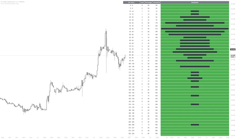
Bar HL Distribution [XWiseTrade]Analyze the distribution of High-Low ranges over the last N bars.
This indicator groups candle ranges (in ticks) into bins and displays:
• Count per bin
• Percentage and cumulative %
• Visual histogram bars
Perfect for understanding typical volatility, setting realistic targets/stops, and spotting unusual bar sizes.
Features:
• Adjustable lookback and bin size
• Clean table with truncation warning
• Lightweight and always up-to-date
Indicatore
Indicatore

SwiftFlow SPX Early Entry PROتحليل يومي لمؤشر S&P 500 باستخدام مؤشر SwiftFlow SPX Early Entry PRO . يعتمد المؤشر على تحليل الزخم والاتجاه لتحديد فرص CALL و PUT بدقة عالية. هذا التحليل لأغراض تعليمية فقط وليس توصية مالية.
Indicatore

SwiftFlow SPX Early Entry PROتحليل يومي لمؤشر S&P 500 باستخدام مؤشر SwiftFlow SPX Early Entry PRO . يعتمد المؤشر على تحليل الزخم والاتجاه لتحديد فرص CALL و PUT بدقة عالية. هذا التحليل لأغراض تعليمية فقط وليس توصية مالية.
Indicatore

Market Breadth: NH/NLMarket Breadth: NH/NL Indicator
This indicator tracks the daily number of stocks making New Highs (NH) and New Lows (NL) across the NYSE and NASDAQ exchanges to evaluate underlying market breadth.
Key Features:
Data Source: Utilizes native TradingView breadth tickers (USI:NYH, USI:NYL, USI:NDH, USI:NDL).
Visual Layout: New Highs are plotted above the zero line. New Lows are inverted and plotted below the zero line for immediate visual assessment of market bias.
Formatting: NYSE breadth is displayed as a histogram. NASDAQ breadth is overlaid as continuous lines.
Application: Used to gauge internal market participation, measure trend strength, and identify structural divergences between price action and breadth.
Indicatore

Equivest Supply and Demand Zoneupply & Demand Zone Indicator is a technical analysis tool that automatically identifies key buying (Demand) and selling (Supply) areas on a price chart.
🟢 Demand Zone: Area where buyers previously entered aggressively, potentially causing the price to rise.
🔴 Supply Zone: Area where sellers previously dominated, potentially causing the price to fall.
🎯 Helps traders identify entry, exit, stop-loss, and target levels.
📈 Useful for intraday, swing trading, and positional trading.
⚡ Works best when combined with price action, volume, and trend analysis.
🚨 Zones are not guaranteed support/resistance levels; always use proper risk management.
Simple Formula for Traders:
👉 Buy near Demand Zone
👉 Sell or Short near Supply Zone
👉 Confirm with price action before taking a trad
Indicatore

Elite Ultimate SMC PRO - Probability EngineDescription:
Overview:
This indicator is a comprehensive Smart Money Concepts (SMC) engine designed to filter noise and identify high-probability trade setups. By combining market structure analysis with momentum and trend filters, the engine generates a dynamic "Probability Score" (0-100).
How it works:
The script evaluates four core market conditions before triggering an entry signal:
1-Market Structure: Identifies swing highs and lows using custom lookback periods.
2-Momentum (Stochastic): Monitors overbought/oversold conditions to avoid entering late.
3-Money Flow (MFI): Confirms if the market volume supports the price move.
4-Trend Filter: Uses SMAs to ensure the trade is aligned with the broader trend.
Features:
1-Probability Score: Only shows signals that meet your customized threshold.
2-Automated Risk Management: Automatically calculates and plots SL (Stop Loss) and TP (Take Profit) levels based on ATR (Average True Range).
3-FVG Detection: Visualizes Fair Value Gaps on the chart to identify areas of price inefficiency.
Settings:
1-Score Threshold: Adjust the sensitivity of the signals (Default 70).
2-Swing Lookback: Change to suit your preferred timeframe (Intraday vs. Swing).
3-ATR Multipliers: Customize your Risk/Reward ratio for TP1 and TP2.
Usage Tips:
1-Works best on 1H/4H timeframes.
2-Use the "Score" on the label to gauge the strength of the setup.
3-Always combine with your own market analysis.
Disclaimer: This indicator is for educational purposes only and does not constitute financial advice. Always perform your own due diligence.
BY ANDREHAN
Indicatore

SCALE Strat Trade Plan (+ Wedge Trendlines)A discretionary decision-support overlay that combines "The Strat" reversal logic with a 5-point S.C.A.L.E confluence score, draws a clean, ready-to-read trade plan — entry, stop, and a 3-step target ladder — and overlays auto-drawn wedge trendlines and the structure that matters.**
It does not predict the market or promise results. It *organizes* what's already on your chart — reversals, levels, momentum, trendlines, and a scored setup — so you can make faster, more consistent discretionary decisions.
What it shows
🎯 The trade plan**
When a qualifying reversal forms, the indicator draws a complete plan:
- **Entry** — above the bullish reversal bar (Call) or below the bearish one (Put)
- **Stop** — at the structure low/high, but **capped at 0.75 × ATR** so risk stays defined
- **Targets** — a **TP1 / TP2 / TP3 ladder** at 2× / 3× / 4× ATR, each labeled with its % move
- **Shaded reward / risk zones** from entry to TP3 and entry to stop
The plan **locks** once set, so it stays steady through a continuation instead of jumping to every little pullback, and **hides itself** once price closes past its stop or runs far beyond target — no stale plans cluttering the chart.
📊 The S.C.A.L.E score (0–5)**
Every setup is scored on five factors:
- **S** — at a Support/Resistance level
- **C** — a reversal Candle (engulfing / hammer / shooter / doji)
- **A** — Alignment (daily/weekly/monthly) or a Strat reversal
- **L** — Liquidity event (swept swing / break of structure / fair-value gap)
- **E** — daily 5/9 EMA confirmation
A live score reads out in the corner box, and you can require a minimum score before a full plan is drawn.
📐 Auto wedge trendlines**
Two self-updating trendlines connect recent pivot highs (upper) and pivot lows (lower) and extend to the right — so converging wedges, rising/falling channels, and breakout/breakdown lines are drawn for you. Fully adjustable pivot length and which pivots to connect, and they can be toggled off entirely.
🧱 Structure, drawn for you**
- Pivot levels (R2 / R1 / Pivot / S1 / S2) from a configurable anchor timeframe
- Swing highs/lows (auto-tagged Higher High, Lower Low, etc.)
- Previous-week high/low, most-recent liquidity sweep
- Major Fibonacci pullbacks (50% and 61.8% golden)
- Nearest Support / Resistance labels
- "The Strat" bar typing — **1** (inside) / **3** (outside) numbers and **Rev** flags on 2-2 / 2-1-2 / 3-1-2 reversals
🧭 The read-out box (bottom-right)**
`ATR | SC (live score) | Now (live trend) | Mom %`
- **SC** — the current SCALE score, color-graded
- **Now** — the live trend bias on your chart timeframe
- **Mom %** — share of 15m / 1H / 4H / D / W / M timeframes pointing up (green = full continuity, yellow = mixed, red = full down)
🎯 Sniper panel (Dir | 3m | 5m | 15m)**
A compact multi-timeframe panel showing intraday direction, so a lower-timeframe entry can be checked against the higher ones at a glance.
---
How to use it
1. **Add it to any chart and timeframe.** It's built for intraday (3m / 5m / 15m) but works on any resolution — the plan, pivots, and trendlines auto-scale.
2. **Read the box.** `SC` climbing toward your threshold, `Now` for trend direction, `Mom %` for higher-timeframe agreement.
3. **Use the wedge lines for context.** Watch how price behaves at the upper/lower trendline — a reversal off a line, or a clean break of one, is often where the best setups appear.
4. **Wait for a plan to print.** When a reversal qualifies, the Call/Put entry, stop, and TP ladder appear. The label shows the SCALE score and the location (at support / resistance / breakout).
5. **Confirm with the Sniper panel.** For an intraday entry, glance at whether 5m and 15m agree with the direction.
6. **Manage with the ladder.** A common approach: trim at TP1, move stop to entry, let a runner go to TP2 / TP3 — your call.
7. **Tune the filters to your style** (below) — wide open to learn the patterns, or tight for only high-confluence setups.
Key inputs
- **SCALE threshold** — minimum score to draw a full plan (0 = every reversal, higher = selective). Sub-threshold setups can show as lighter **"watch"** flags.
- **Min reversal bar size (× ATR)** — ignores tiny pullback wiggles so the entry isn't re-drawn on every micro-move.
- **Lock entry until it resolves** — keeps one plan steady through a continuation.
- **Noise / fakeout filter** — require a clean directional bar + above-average volume.
- **Level-align entries** — only long at support / short at resistance.
- **Require 3m + 5m + 15m alignment** — top-down confirmation.
- **Block new entries after 3pm ET** — avoids late-day setups with no room before the close.
- **Trendlines (Wedge Maker)** — show/hide, pivot length, which pivots to connect, source, colors, width.
- **Pivot anchor timeframe, ATR length, TP multipliers, stop cap** — fully adjustable.
Each filter is independent — start loose to learn the patterns, then tighten the ones that fit how you trade.
---
Alerts
- **Call / Put entry** — a qualifying setup formed
- **Watch setup** — a lower-score setup is forming
- **TP1 hit / TP3 hit / Stop hit** — manage the open plan
---
Credits
The wedge-trendline module is adapted from **"Wedge Maker Pro – Day Trade Edition" by veryfid**, integrated here with permission/attribution under TradingView's house rules. All credit for that component goes to the original author.
Notes
- This is a **discretionary tool**, not an automated strategy or signal service. It highlights and scores setups; **you** decide whether to act.
- No indicator guarantees profit. Use proper risk management and your own analysis.
- Best used on liquid instruments where structure is clean.
- Not financial advice. For educational and decision-support purposes only.
Indicatore

Indicatore

Tableau Technique Multi-TFThe 4-hour timeframe is now fully integrated into the table, using the same signal logic (RSI + EMA crossover) as the other timeframes. The table will display signals like:
"Achat Fort" / "Vente Forte" (strong buy/sell)
"Achat" / "Vente" (buy/sell)
"Neutre" (neutral).
Great job! The script is now complete with support for 1m, 5m, 15m, 30m, 1h, and 4h timeframes.
Indicatore

G10 Excess Liquidity Leading Indicator (Proxy)█ OVERVIEW
This indicator plots a GDP-weighted composite of real money growth across ten G10 economies, measured as the deviation of each economy's annual real money growth from its own trailing trend, in a separate pane. The thesis it expresses is the excess-liquidity idea: when real money across the major economies is growing faster than its recent trend, the liquidity backdrop for risk assets is supportive, and when it is growing below trend the backdrop is restrictive. An optional SPX YoY reference line is provided on a shared scale so the user can inspect the visual relationship between the two series.
═════════════════════════════════════════════════════════════
█ HISTORY / BACKGROUND
The term excess liquidity comes from monetarist macro analysis, where the quantity of money in circulation is compared against the economy's transactional needs. The level analogue is the Marshallian K, the ratio of broad money to nominal output. The flow version used here treats the growth of real money relative to its own recent trend as a measure of surplus or deficit liquidity, on the reasoning that money created beyond what current activity absorbs tends to find its way into financial assets, while a deficit withdraws that support.
Aggregated, multi-country versions of this measure are produced by several research firms and data vendors as proprietary series, and are commonly charted against equity returns with a forward displacement to illustrate a hypothesized lead. Those vendor series are closed: their exact money aggregates, weighting, smoothing, and detrending are not published. This script is a transparent reconstruction of the concept from public data. It is not a copy of any vendor series, and its construction choices are the author's own, stated in full below.
═════════════════════════════════════════════════════════════
█ HOW IT WORKS
The script computes everything from external data requests and does not use the chart symbol's price, so its output is the same regardless of which symbol the chart shows. The pane location follows the chart; the values do not.
For each of ten economic units (United States, Euro area, Japan, United Kingdom, Canada, Switzerland, Australia, New Zealand, Sweden, Norway) the algorithm proceeds as follows.
1. It requests a money-supply series and a consumer price index from the ECONOMICS provider at monthly resolution. Requests use no lookahead and forward-fill gaps, and invalid symbols are tolerated rather than throwing.
2. It forms real money as the money-supply level divided by the CPI index.
3. It computes annual real money growth as the twelve-month percentage change of that real money series.
4. It detrends that growth by subtracting its own simple moving average over the Trend window length. The result is each economy's excess-liquidity reading in percentage points relative to its own trend.
The ten readings are then combined.
5. The composite is the GDP-weighted mean of the per-economy readings, using fixed nominal-GDP weights held as constants. Any economy whose data does not resolve returns na, is excluded from both the weighted sum and the weight total, and the remaining weights are renormalized automatically over the live subset.
6. The composite is optionally standardized by subtracting its moving average and dividing by its standard deviation over the Z-score window . If the standard deviation is zero the standardized value is na.
7. The same twelve-month-change and optional standardization are applied to SP:SPX to produce the reference line.
The plotted objects are: the composite, drawn with a forward bar offset and colored red when below zero and blue when at or above zero; the SPX reference line in black, shown only when its toggle is on; a dashed zero line; a status table in the top right listing each economic leg as OK or missing with a live-leg count; and a warning label that appears on the last bar only when the chart is not on a monthly resolution.
═════════════════════════════════════════════════════════════
█ HOW TO USE
Apply the script on a monthly chart. The twelve-month change is computed as a twelve-bar change and the forward displacement is expressed in bars, so both only carry their intended meaning of twelve months and the configured number of months when one bar equals one month. On any other resolution the windows no longer correspond to those spans, and the script draws a label warning of this on the last bar.
Read the composite against the zero line. A blue reading means aggregate G10 real money growth is running above its own trailing trend; a red reading means it is running below trend. When standardization is enabled the vertical units are standard deviations from the windowed mean rather than raw percentage points.
The composite is displaced forward by the Forward push setting to align it visually with the period the excess-liquidity hypothesis associates it with. This displacement is a charting offset for inspection, not a forecast, and the displaced portion extending past the last bar carries no data claim.
The black SPX reference line is supplied only for visual comparison of timing on a common scale. The script does not combine the two series into a single signal.
Before interpreting the composite, check the status table. A reduced live-leg count changes which economies are present in the GDP weighting and therefore changes the composite. Because the standardization and trend windows require history, the composite is blank until enough monthly history has accumulated for the latest-starting live leg, so early chart history may show no line.
═════════════════════════════════════════════════════════════
█ SETTINGS
• Trend window (months) : length of the moving average subtracted from each economy's annual real money growth to form its excess reading. Default 36, minimum 12.
• Z-score window (months) : lookback used for the mean and standard deviation when standardizing both the composite and the SPX reference. Default 120, minimum 24.
• Z-score series for comparability : when enabled, the composite and the SPX line are standardized to a common unitless scale. When disabled, the composite is shown in percentage-point deviation units and the SPX line as a raw annual percentage change. Default enabled.
• Overlay SPX YoY : toggles the black SPX reference line. Default enabled.
• Forward push (months / bars) : number of bars by which the composite plot is shifted forward. Default 6, minimum 0, maximum 24.
═════════════════════════════════════════════════════════════
█ WHAT MAKES IT ORIGINAL
The script is a self-contained, fully on-chart reconstruction of the excess-liquidity concept rather than a wrapper around a published series. Its specific construction is: per-economy real money defined as a national money aggregate deflated by that country's CPI; annual growth of that real money detrended against its own moving average so each economy is measured relative to its own history; a GDP-weighted aggregation across ten G10 economies; and automatic renormalization of the weights over whatever data legs resolve at runtime, with a coverage table that makes the live universe and each economy's contribution status visible on the chart. A configurable forward displacement and an optional shared-scale SPX reference are included so the timing relationship can be inspected directly.
The money aggregates are each economy's most-available headline measure from the data provider and are therefore a mixed family across countries by design; each leg is internally consistent through time, which is what the annual-change and detrending steps require. The aggregate definition, the choice of detrending against a trailing trend, the weighting, and the windows are modeling choices made by the author and are exposed as inputs or as clearly marked constants, not hidden internals.
═════════════════════════════════════════════════════════════
█ NOTES / LIMITATIONS
• Monthly resolution only. The twelve-month change and the forward offset are bar-based. On non-monthly charts they no longer correspond to twelve months and the configured number of months. The script flags this with a label on the last bar.
• Forward displacement. The composite is shifted forward by the offset using the plot offset. The displaced segment extends beyond the last historical bar and moves as new bars arrive. It is a visual offset and not a prediction.
• Data dependence and coverage. The composite is built entirely from external money-supply and CPI series for ten economies plus the SPX series. Legs that fail to resolve return na, drop out of the aggregate, and shrink the effective universe. The status table reports the live count so the user can judge whether the composite is representative.
• History requirement. Each leg needs enough valid monthly history to fill the trend window and, when standardization is on, the z-score window before it contributes. The composite is na until those windows are satisfied for the live legs, so it begins only after sufficient history has accumulated.
• Revision behavior. Requests use no lookahead, so the script does not read future data. Economic series are published with a lag and are forward-filled between releases, and published values can be revised after the fact. The most recent readings can therefore change as data is updated, independently of any bar-level repainting.
• Symbol independence. The output does not depend on the chart symbol; it computes the same composite on any chart. Only the pane in which it is drawn follows the chart.
No claim is made regarding profitability, accuracy, or future returns. The indicator is a descriptive macro monitor.
Indicatore

Alpha Flow AI Pro V17Alpha Flow AI Pro is an all-in-one trading assistant that combines multi-timeframe trend analysis, smart money concepts and automated risk management.
It gives clear buy and sell signals with a confidence score, dynamic support and resistance zones, trading session tracking, and automatic take profit and stop loss levels with lot size calculation for any account size.
Main features:
- 8 factor AI confidence engine with multi-timeframe confirmation
- Automatic TP1, TP2, TP3 and Stop Loss with live profit tracking
- Smart lot size calculation for forex, indices and gold
- Dynamic support and resistance with session overlays
- Clean all-in-one dashboard
Works on all markets and timeframes. For educational purposes only, not financial advice.
Indicatore
