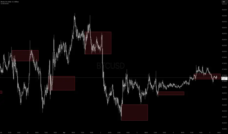
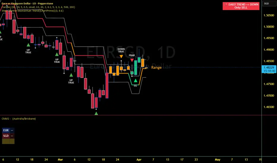
Candle Bracket - Mark Any HTF Candle's Range at a Specific TimeWhat It Does
Candle Bracket draws a visual range box using the High and Low of any higher timeframe candle at a user-defined time of day. Set it to the 9:30 AM 15-minute candle and you get the Opening Range. Set it to the London open, the New York open, or any key session candle — the indicator marks it automatically, every day.
Use Cases
- Opening Range Breakout (ORB) - Mark the 9:30 or 9:45 AM candle as your initial range
- Session Opens - London (3:00 AM ET), New York (9:30 AM ET), Asia (8:00 PM ET)
- News Candles - Mark a recurring economic release time (e.g. 8:30 AM CPI/NFP candle)
- Custom Reference Ranges - Any time-based candle you want as a daily anchor
Settings
- Fixed Timeframe - The HTF candle to pull from (e.g. 15, 30, 60, D)
- Target Hour / Minute - The exact time of the candle you want to mark
- Timezone - Defaults to America/New_York. Adjustable for any global session
- Rectangle Width (Bars) - How far the box extends to the right
- Box Color + Opacity Full visual customization
How to Use It
1. Set the timeframe to match your candle of interest (e.g. '15' for a 15-minute candle)
2. Set the target time to the candle's open time (e.g. '9:30' for the NY open candle)
3. The box draws automatically on every matching candle going back in history
4. Use the High and Low of the box as your key levels breakout, rejection, or retest
Notes
- Works on any asset and any chart timeframe
- Keeps the last 20 boxes by default to manage memory efficiently
- Best used on intraday charts (1m, 5m, 15m) when targeting session-level candles Indicatore

Indicatore

Indicatore

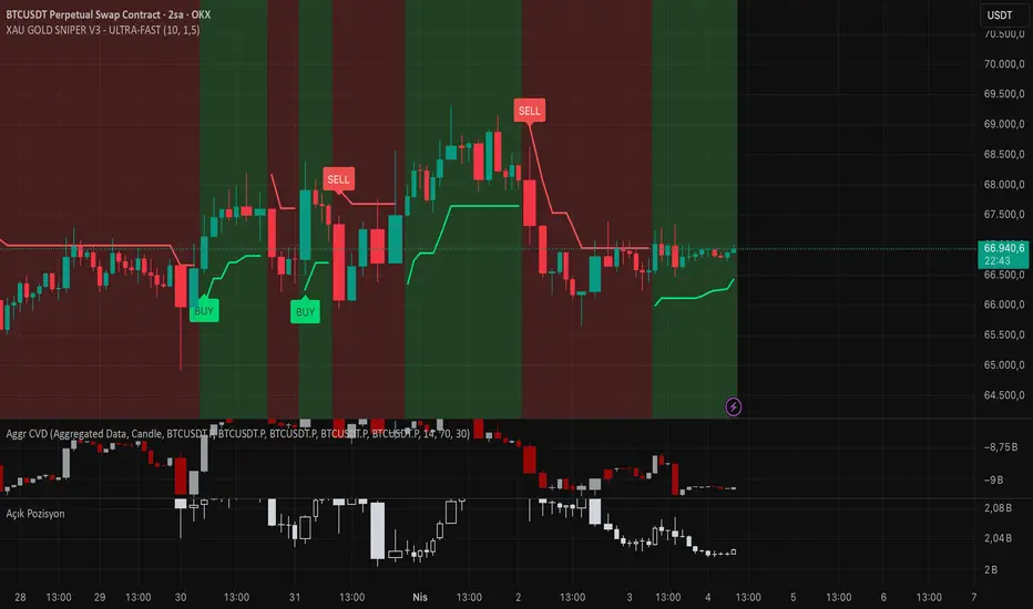
BTC XAU GOLD SNIPER V3 - ULTRA-FASTXAU GOLD SNIPER V3 - ULTRA-FAST
📋 Description
XAU GOLD SNIPER V3 is an advanced technical analysis tool specifically optimized for capturing high-velocity price movements and short-term trend reversals in XAU/USD (Gold). This version integrates Dynamic Momentum tracking with an Adaptive Trend Filtering algorithm to filter out market noise and identify high-probability entry points.
Designed specifically for the unique volatility of Gold, it performs exceptionally well on lower timeframes such as 1m, 5m, and 15m.
🛠 Key Features
Ultra-Fast Response: Unlike lagging indicators, this script uses a specialized smoothing algorithm to minimize signal delay.
Smart Trend Guard: Automatically filters out risky counter-trend signals by analyzing the institutional trend direction.
Volatility Adaptation: Fine-tuned to handle Gold's characteristic "fake-outs," ensuring cleaner signals during high-impact news.
Minimalist UI: Clean and intuitive "BUY/SELL" labels to keep your charts clutter-free and focus on price action.
💡 How to Trade (Strategy Guide)
Best Timeframe: Optimized for 15-Minute (15m) charts, but highly effective for 5m scalping.
Entry: Follow the BUY or SELL labels as they appear at the close of the candle.
Confirmation: Accuracy is significantly higher when the signal aligns with the background trend (e.g., price above/below the 200 EMA).
Risk Management: Gold is highly volatile. We recommend placing a Stop-Loss slightly below the previous swing low for Longs, or above the swing high for Shorts.
⚠️ Disclaimer
This indicator is for educational and informational purposes only. Trading financial markets involves significant risk. Always backtest the strategy against your own trading style before using it on a live account.
💻 Updated Pine Script (English Version)
TradingView'de yayınlarken kodun içindeki isimlendirmelerin de İngilizce olması profesyonelliği tamamlar:
Pine Script
//@version=5
indicator("XAU GOLD SNIPER V3 - ULTRA-FAST", shorttitle="GOLD_SNIPER_V3", overlay=true, precision=2)
// --- Inputs ---
fastLen = input.int(7, "Fast Period")
slowLen = input.int(21, "Slow Period")
src = close
// --- Ultra-Fast Momentum Calculation ---
fastEMA = ta.ema(src, fastLen)
slowEMA = ta.ema(src, slowLen)
// --- Trend Filter (EMA 200) ---
trendFilter = ta.ema(src, 200)
isUpTrend = src > trendFilter
isDownTrend = src < trendFilter
// --- Signal Logic ---
buyCond = ta.crossunder(slowEMA, fastEMA) and isUpTrend
sellCond = ta.crossover(slowEMA, fastEMA) and isDownTrend
// --- Visuals ---
plotshape(buyCond, title="BUY SIGNAL", style=shape.labelup, location=location.belowbar, color=color.new(#00ff00, 0), textcolor=color.black, size=size.small, text="BUY")
plotshape(sellCond, title="SELL SIGNAL", style=shape.labeldown, location=location.abovebar, color=color.new(#ff0000, 0), textcolor=color.white, size=size.small, text="SELL")
// Trend Line
plot(trendFilter, color=color.new(color.gray, 50), title="Institutional Trend Line") Indicatore

Indicatore

NQ Session edge proNQ Session Edge Pro is an intraday indicator for NQ and MNQ that organizes price action around the London session range, New York session behavior, OTE zones, and a session-state classification model.
The purpose of the script is to help traders interpret whether New York is continuing the London move, reversing it, consolidating inside the established range, or taking liquidity on both sides before directional expansion. Rather than treating these concepts separately, the script combines them into a single intraday framework so the user can evaluate context before looking for an entry.
The script begins by plotting the London session high, low, and midpoint. These levels define the primary reference range going into the New York session. It then maps OTE zones to highlight areas where price may be trading at discount or premium relative to the session structure. These zones are not intended to act as standalone entry signals. They are location tools used together with session context.
A key part of the script is its New York session classification. The background color is used to show which environment the script has identified:
Green: continuation conditions
Orange: reversal conditions
Blue: consolidation conditions
Red: seek and destroy or two-sided liquidity conditions
This classification is intended to help traders distinguish between directional conditions and lower-quality environments. Signals are only shown when the script detects aligned session context and entry location.
What the indicator displays
London session levels
Green line: London high
Red line: London low
White line: London midpoint
These levels define the main session range and act as the structural reference for the New York open.
OTE zones
Blue zone: bullish OTE or discount area
Orange zone: bearish OTE or premium area
These areas are designed to help the trader judge whether price is pulling back into a favorable location within the broader session structure.
Session-state background
Green background: continuation environment
Orange background: reversal environment
Blue background: consolidation environment
Red background: seek and destroy environment
Trade signals
Up marker: long setup
Down marker: short setup
Signals are intended to appear only when the session model and price location are aligned.
How the components work together
The script is built on the idea that session levels, entry location, and market condition should be evaluated together rather than independently.
For example, the London range provides the structural map. The OTE zones identify areas where price is trading at relative discount or premium inside that structure. The New York classification then determines whether the market is behaving like a continuation, reversal, consolidation, or liquidity-driven environment. A signal is only relevant when those layers agree.
This means the script is not designed to mark every possible move. Its purpose is to reduce low-quality entries by requiring confluence between session structure, price location, and market state.
General use
A typical workflow is:
Let the London session establish its range.
Observe whether price approaches one of the plotted OTE zones.
Wait for New York to open and for the session-state model to classify conditions.
Use signals only when the session context and price location agree.
Timeframes and market
This script is designed for intraday use, with primary focus on the 1-minute chart. It can also be used on 3-minute and 5-minute charts. It is optimized for NQ and MNQ.
Notes
This indicator is intended as a decision-support tool for intraday session trading. It is not a guarantee of outcome and should be used with the trader’s own execution rules, risk management, and confirmation process. Indicatore

Brandt Classical Charting SystemThe Core Workflow
1. Let the Indicator Scan for You
The script is constantly looking for classical patterns forming. When you load it on a chart, check the dashboard in the top-right corner — it tells you the current "Pattern Status." If it says "Scanning..." there's no valid pattern yet. Be patient. Brandt himself often waits weeks or months for setups.
2. Focus on Rectangles First
Brandt considers rectangles with horizontal boundaries his highest-conviction patterns. When the indicator draws a colored box on your chart, that's a rectangle consolidation. The box shows you:
Top boundary = Resistance (breakout level for longs)
Bottom boundary = Support (breakdown level for shorts)
The color tells you the prior trend bias — green means price came from below (bullish bias), red means price came from above (bearish bias).
3. Wait for the Breakout Signal
Don't anticipate. When price closes above the rectangle top, you'll see a "RECT▲" label appear. That's your entry signal for a long. The opposite for shorts with "RECT▼".
How to Size Your Position (Factor Trading)
This is where Brandt's real edge lives — not in pattern recognition, but in risk control.
When a breakout occurs, the dashboard shows:
FieldWhat It MeansStop LevelWhere to place your stop loss (based on ATR or pattern boundary)TargetMinimum profit target (2:1 reward-to-risk or pattern height)Position SizeExactly how many shares to buy so you only risk 1% of your accountRisk ($)The dollar amount you'll lose if stopped out
Example: If your account is $100,000 and the indicator shows Position Size = 150 shares with Risk = $1,000, that means if the trade goes against you and hits your stop, you lose exactly 1% of capital. No more.
Practical Steps
Set your account size in the indicator settings (default is $100k)
Use weekly or daily charts — Brandt ignores intraday noise
Adjust "Minimum Pattern Duration" — The default 50 bars on a daily chart is roughly 2.5 months. Increase to 100 for the full "5-month rule"
When a breakout fires:
Enter at market or on a slight pullback
Set stop at the "Stop Level" shown
Set target at the "Target" shown
Use the exact "Position Size" shown
What Makes This Different From Typical TA
Most traders focus on prediction. Brandt focuses on defined risk. The pattern isn't telling you "price will go up" — it's giving you a structure where you know exactly:
Where you're wrong (stop level)
What you're risking (1% max)
What you'll make if right (2:1 minimum)
Even if you're only right 40% of the time, this math works in your favor over many trades.
Alerts You Can Set
Right-click the indicator and set alerts for:
Rectangle breakouts (up or down)
Head & Shoulders patterns
Triangle formations
This way you don't have to watch charts all day — TradingView notifies you when a setup triggers. Indicatore
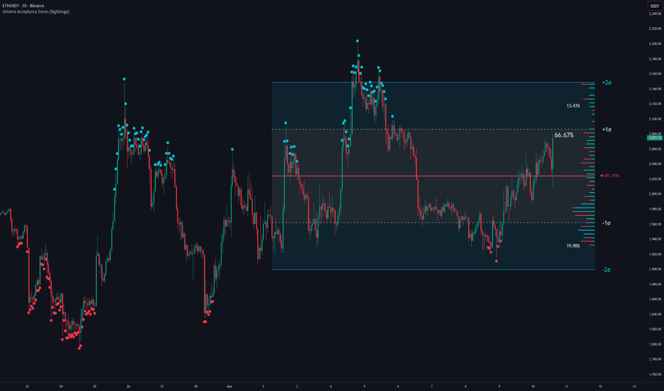
Volume Acceptance Zones [BigBeluga]Volume Acceptance Zones is a market structure tool designed to identify areas of price acceptance and statistically stretched extremes. By modeling market activity as a continuous distribution, the indicator highlights where price is actively accepted versus where it behaves as a statistical outlier.
The goal is not prediction, but context — separating balanced price behavior from structurally stretched conditions.
🔵 CONCEPTS
The indicator calculates a Volume-Weighted Balance Price , representing the center of gravity for participation over a selected range.
Price dispersion around this balance point is measured using volume-weighted standard deviation .
The area within ±1 standard deviation forms the Acceptance Zone , where the majority of activity is concentrated.
Prices beyond this zone are treated as outliers , where participation thins and market reactions become more likely.
These zones do NOT represent guaranteed probabilities — they describe participation density and behavioral extremes.
🔵 STANDARD DEVIATION, BELL CURVE & OUTLIERS
At the core of this indicator lies the concept of standard deviation , which describes how price activity clusters around a central value.
When activity is observed over time, it tends to form a distribution where:
Most activity concentrates near a central balance level.
Fewer observations occur as price moves further away from that balance.
This behavior can be visualized conceptually as a bell-shaped distribution — a practical way to describe market participation density.
Prices that move beyond the Acceptance Zone deviate meaningfully from the balance of participation.
These areas are treated as outliers , where price is statistically stretched relative to recent market behavior.
Outliers do not imply immediate reversals — they signal that price is operating in a low-acceptance environment.
Market responses in these zones often include rejection, consolidation, or strong continuation if acceptance builds.
🔵 NEW: INTEGRATED FREQUENCY PROFILE
While the zones are calculated using volume-weighted math, the visual profile has been updated to a Frequency-Based Distribution . This transition allows you to see "Time at Price" rather than just raw volume.
Frequency Distribution: The profile counts the number of bars (occurrences) spent at each price bin. This highlights levels of high interest where the market finds it easy to trade, effectively acting as a Time-Price Opportunity (TPO) proxy.
Time-Based Sentiment: Each bin is split into Bull/Bear frequency. This shows which side was in control during the time spent at that specific level, identifying where buyers or sellers were more persistent.
Filtering Noise: By using frequency instead of raw volume, the profile avoids being skewed by single high-volume spikes, focusing instead on where the market established a sustained presence.
🔵 FEATURES
Acceptance Zone (±1σ)
Highlights the primary balance area where price is most actively accepted and rotational behavior is common.
Extreme Zones (±2σ)
Marks statistically stretched prices where acceptance weakens and reactions or trend continuation may occur.
Volume-Weighted Balance Line
Acts as a structural fair-value reference similar to an anchored VWAP.
Outlier Detection
Price closing beyond the acceptance zone is flagged as an outlier, helping identify exhaustion or breakout conditions.
Distribution Labels
Displays how price activity is distributed between acceptance and extreme zones, reinforcing the concept visually.
Flexible Anchoring
Calculations can be based on a fixed lookback or the visible chart range.
🔵 HOW TO USE
Treat the Acceptance Zone as a balance area where price is fairly valued and mean-reversion is common.
Observe how price behaves in Extreme Zones — rejection may signal reversion, while sustained acceptance may indicate trend continuation.
Frequency Nodes: Use the Frequency Profile to identify where the market is "stalling." High frequency nodes often act as magnets for price, while low frequency gaps (low time spent) often lead to fast price movement.
Use outlier signals in combination with trend bias, liquidity levels, or momentum tools.
🔵 CONCLUSION
Volume Acceptance Zones reframes market analysis around participation density. By distinguishing accepted price behavior from statistical outliers and providing a frequency-based view of time-at-price, the indicator helps traders understand when the market is balanced—and when it is structurally stretched. Indicatore
Indicatore

Probability Live Table (Juan)The Probability Table Live is an advanced indicator for TradingView designed to display real-time probabilities of price movement for any currency pair and timeframe. This tool organizes the information into a clear and visual table, using intuitive colors to quickly interpret trend strength and the likelihood of continuation or retracement.
🔹 What the chart includes:
Mode → Indicates the current trend: UPTREND or DOWNTREND
Continuation Rate (Cont. Rate) → Probability that the trend will continue strong (30–95%)
Probability Retest → Probability that the price will safely retrace to the key zone (EMA50), adjusted for momentum and distance
Valid Lows / Valid Highs → Count of reliable recent swings (max. 100)
Breakout → Number of confirmed recent breakouts, filtered by strength and relevance
Streak → Streak of candles in the direction of the trend, shown as a %
BOS / CHOCH → Signals for Break of Structure and Change of Character, with dynamic probability
🌈 Dynamic colors: Green → strong and favorable conditions Yellow → medium conditions Red → weak or cautionary conditions Light Blue → recent swings and breakouts 💡 Advantages: Live bar-by-bar predictions. Real and dynamic probabilities for quick decision-making. Compatible with any pair and timeframe. Ideal for fund traders, swing traders, and day traders. With this chart, you can see at a glance the strength of the trend, the probability of continuation or retracement, and market structure signals, all in a single, easy-to-read visual panel. Indicatore

Ultimate Trend Suite: SMAs | MAs | Cloud | VWAP | BB [R2D2]Ultimate Trend Suite: Dynamic MAs, Cloud, VWAP & Bollinger Bands
Overview
Chart clutter is a trader’s worst enemy. Constantly toggling between different moving averages, volatility bands, and volume indicators can lead to analysis paralysis.
The Ultimate Trend Suite is designed to be your “one-stop shop” for trend analysis. It combines the most powerful traditional moving averages (SMAs and EMAs) with a visual Trend Cloud, Session VWAP, and Bollinger Bands into a single, fully customizable overlay. Every single feature can be toggled on or off, allowing you to keep your charts incredibly clean while maintaining access to deep, institutional-grade insights.
Core Features
Fully Customizable EMAs & SMAs: Comes pre-loaded with the most widely respected lengths (EMA: 20, 50, 200 | SMA: 50, 100, 200, 730).
Dynamic Trend Cloud: A visual ribbon that fills the space between your fast and slow EMAs (default 20 & 50). Green signifies a bullish momentum phase, while red visually warns of a bearish phase.
Session VWAP: The gold standard for institutional day traders. Displays the true intraday price action weighted by volume.
Bollinger Bands: Integrated volatility tracking to help you spot overbought/oversold conditions and impending breakouts (the "squeeze").
Built-in Alerts: Server-side alert conditions programmed for the classic 50/200 SMA Golden Cross and Death Cross.
Decluttered UI Mode: A built-in toggle to hide the indicator's raw data numbers from your chart's status line, keeping your screen visually pristine.
Educational Guide: SMA vs. EMA
To get the most out of this suite, it is crucial to understand which moving average to use and when.
EMA (Exponential Moving Average)
How it works: Places a higher mathematical weight on the most recent price data.
Best for: Momentum traders and catching early trend reversals. Because it reacts to price changes faster, it hugs the current price action much closer.
The Catch: Its speed makes it more susceptible to "whipsaws" or fake-outs during choppy, ranging markets.
SMA (Simple Moving Average)
How it works: Calculates the average price over a set number of periods equally. Day 1 carries the same weight as Day 50.
Best for: Identifying the macro, overarching trend and finding strong, reliable support/resistance zones.
The Catch: It lags behind current price action. It won't get you in at the absolute bottom, but it provides a much higher-probability confirmation of a trend change.
Optimizing for Different Timeframes
Different timeframes require different lenses. Here is how to configure the Ultimate Trend Suite based on your trading style:
1. The 4-Hour Chart (Swing Traders & Intraday Macro)
The 4H chart is the battleground where intraday noise meets macro trends.
The Setup: Turn on the 20 EMA, 50 EMA, and the Trend Cloud. Keep the 200 SMA on as your ultimate baseline.
The Strategy: Use the Trend Cloud (20/50 EMA) to ride multi-day swings. When price pulls back into the cloud during an uptrend, treat it as a dynamic buy zone. If price drops below the 200 SMA, the asset is in a macro 4H downtrend—look for short setups when price bounces into the red cloud.
2. The Daily Chart (Position Traders & Investors)
The Daily (1D) chart is driven by institutional accumulation and distribution. Fast EMAs create too much noise here.
The Setup: Turn off all EMAs. Turn on the 50 SMA, 100 SMA, 200 SMA, and 730 SMA.
The Strategy: * Watch the interaction between the 50 SMA and 200 SMA. A Golden Cross (50 crossing above 200) often signals the start of a multi-month bull market.
The 100 SMA acts as excellent mid-cycle support during strong bull runs.
The 730 SMA (roughly 2 years of daily price action) is the ultimate generational bottom indicator. For high-volatility assets like Crypto, buying near the 730 SMA has historically offered massive asymmetric returns.
3. The Lower Timeframes (Day Traders - 5m/15m)
The Setup: Turn off the macro SMAs. Turn on the Session VWAP, 20 EMA, and Bollinger Bands.
The Strategy: Price has a magnetic attraction to the VWAP. If price extends far outside the upper or lower Bollinger Bands while far away from the VWAP, expect a mean-reversion snapback toward the VWAP line.
How to Use This Script
Apply it to your chart.
Click the Gear Icon (⚙️) next to the indicator name.
Check or uncheck the boxes in the settings panel to build your perfect custom setup for the specific asset and timeframe you are analyzing.
Trade smart, manage your risk, and let the trend be your compass. Indicatore

Catalyst Response AtlasCatalyst Response Atlas maps what price is actually doing after a corporate catalyst.
Instead of treating an earnings beat, dividend, or split as a signal by itself, this indicator measures whether the market is accepting that reaction, fading it, or simply balancing after the event.
The script tracks the latest selected catalyst and then builds a simple post-event framework around it:
- a catalyst-anchored VWAP
- volume-weighted sigma bands around that AVWAP
- the high/low range of the catalyst bar
- the pre-event close as a possible gap-fill magnet
- a compact acceptance score based on price behavior after the event
The goal is to answer a very practical question:
Is this catalyst move being accepted, rejected, or stretched?
How it works
1) Catalyst detection
The script can reset on Earnings, Dividends, Splits, or Earnings only.
For earnings, it also labels the event as Beat, Miss, or Inline using the EPS surprise threshold input.
That label is informational only. The actual trading state always comes from price response, not from the headline.
2) Catalyst AVWAP
When a new selected catalyst appears, the script anchors VWAP to that event bar.
This gives traders a live reference for post-event value.
3) Acceptance model
The indicator scores the reaction using:
- price vs catalyst AVWAP
- price vs the midpoint of the catalyst bar
- whether price is holding above/below the catalyst range
- the slope of the catalyst AVWAP
- how much of the event gap has been filled
If the score is strong enough, the move is classified as accepted.
If the score turns strongly negative, the move is classified as failed.
Anything in between is treated as balancing.
4) Stretch logic
If the reaction is accepted and price is also extended beyond the AVWAP sigma band threshold, the state is upgraded to an Extended condition.
This helps traders separate healthy continuation from moves that may be too stretched to chase.
States:
1. Accepted Up
The bullish post-catalyst reaction is holding.
Pullbacks toward AVWAP may matter more than random momentum entries.
2. Accepted Down
The bearish post-catalyst reaction is holding.
Rallies back toward AVWAP may matter more than emotional bottom-fishing.
3. Accepted Up, Extended
The bullish reaction is still strong, but it is stretched away from AVWAP.
4. Accepted Down, Extended
The bearish reaction is still strong, but it is stretched away from AVWAP.
5. Bullish Move Failed
The original bullish catalyst reaction has broken down.
6. Bearish Move Failed
The original bearish catalyst reaction has broken down.
7. Balancing
The market is digesting the event and has not yet committed to clean acceptance or failure.
What makes this script different
This is not just another earnings marker and it is not just a plain event-anchored VWAP.
The original part of this script is the combination of:
- catalyst-anchored VWAP
- weighted sigma stretch context
- event-range acceptance/failure logic
- gap-fill tracking
- a simple state engine and playbook panel
The result is meant to be easy to read on-chart while still giving useful post-event context.
How to use it
A common continuation workflow is:
- identify a fresh catalyst
- watch whether price holds the catalyst AVWAP
- watch whether price stays outside or re-enters the catalyst range
- use the state and playbook to decide whether the move is being accepted, balancing, or failing
This indicator is generally most useful on liquid stocks where corporate events create meaningful repricing.
A good starting point is Earnings only on 1H, 4H, or Daily charts.
Default interpretation guide
Accepted Up:
Trend intact. Watch for pullbacks above AVWAP.
Accepted Down:
Trend intact. Watch for rallies below AVWAP.
Balancing:
Wait for a cleaner hold, rejection, or range break.
Failed states:
The initial post-catalyst direction is losing control. AVWAP can start acting as the opposite side’s decision area.
Inputs
Catalyst source:
Choose which event type can reset the atlas.
EPS beat/miss threshold:
Only affects the earnings label text.
ATR length:
Normalizes gap significance across symbols.
AVWAP slope lookback:
Controls how quickly slope confirmation reacts.
Gap thresholds:
Define what counts as meaningful hold or failure of the event gap.
Sigma settings:
Control band width and stretch sensitivity.
Visual toggles:
Show or hide AVWAP, sigma bands, event range, markers, label, candle tint, and panel.
Limitations
This script is stock-focused and depends on TradingView’s event data for the selected symbol.
Corporate event behavior can vary across instruments, liquidity conditions, and timeframes.
The indicator does not predict future price. It classifies the quality of the market’s response after a catalyst has occurred.
Low-volume symbols and noisy lower timeframes can produce less reliable context than liquid names on higher timeframes. Indicatore

AG Pro Volume Profile Acceptance Ladder [AGPro Series]AG Pro Volume Profile Acceptance Ladder
Overview / What it does
AG Pro Volume Profile Acceptance Ladder is a volume-structure indicator designed to monitor whether price is building acceptance, holding acceptance, or losing acceptance inside a rolling volume-defined band. Instead of treating volume profile as a static reference snapshot, this script tracks acceptance as a progressive process. The goal is not to predict where price must go next, but to help the user read whether the market is spending enough time and participation inside a value zone to justify calling that area accepted.
The script builds a rolling profile window, estimates the active acceptance band, and then classifies current behavior into states such as Probe, Build, Accept, Shift Watch, Shift Confirmed, and Fail. This creates a ladder-style framework for reading when the market is stabilizing within one value region and when that acceptance may be migrating toward another region. In practice, that makes it useful for users who want a structured way to distinguish temporary interaction from more durable volume-based acceptance.
A key design goal of this script is to separate acceptance progression from simple attraction-to-level logic. Some tools are built around whether price is pulled back toward a reference such as a POC or another central level. This script focuses on a different question: is the market actually building and holding acceptance inside a rolling value zone, and is that acceptance stable enough to be treated as an active auction area rather than a temporary touch.
Because of that framing, the indicator is best read as a market-structure context tool. It maps an evolving acceptance zone, estimates a directional ladder bias, and provides state transitions that can be used to organize chart reading, scenario planning, or alert workflows. It is not an execution engine, not a broker-grade order book product, and not a substitute for independent trade management.
Unique Edge
The distinguishing feature of this script is that it treats acceptance as a staged process rather than a single level event. The output is not limited to a profile center or a value-area drawing. Instead, the script evaluates how price behaves relative to a rolling volume-defined band and converts that behavior into a progression model.
That matters because a market can interact with a value area in very different ways. It can briefly probe it, begin building around it, hold it in a more stable manner, shift acceptance upward or downward, or fail to maintain acceptance altogether. By organizing those conditions into a ladder of states, the script attempts to make the auction process easier to read in real time.
This also makes the indicator materially different from a standard POC-centered interpretation. The emphasis here is not on magnetic pull toward one volume reference. The emphasis is on whether acceptance is forming, strengthening, or migrating. In that sense, the script is better understood as an acceptance progression map than as a simple volume anchor display.
Methodology
The script uses a rolling lookback window and distributes bar-based volume across a defined number of bins in order to approximate a local volume profile. From that rolling profile it derives the active central reference, the current acceptance band, and the relative participation of that band within the profile window.
Using those profile components, the script calculates several internal measures. These include how often price remains inside the band over a recent hold window, how often price re-enters the band after leaving it, how stable the band center is relative to recent values, and whether the active center appears to be migrating in a meaningful way. These measures are then blended into an aggregate acceptance score and a ladder bias.
The state engine uses those components to classify behavior into the following progression states:
- Reject
- Probe
- Build
- Accept
- Shift Watch
- Shift Confirmed
- Fail
These states should not be read as guarantees of continuation or reversal. They are condition labels describing how the script currently interprets interaction with the active acceptance band.
Signals & Alerts
The script includes deterministic state-based alerts so users can build workflows around changes in acceptance conditions.
Available alert events:
- Acceptance Building
- Acceptance Confirmed
- Upward Ladder Migration Confirmed
- Downward Ladder Migration Confirmed
- Acceptance Failed
- Acceptance Lost
These alerts are designed to reflect state transitions inside the indicator logic. They do not imply expected profitability, win rate, or directional certainty.
Key Inputs
- Profile Window: Defines the rolling lookback used for the local profile estimate.
- Bin Count: Controls the profile resolution.
- Value Area %: Defines how much of the rolling profile volume is used to construct the active acceptance band.
- Migration Sensitivity: Controls how easily the script classifies center shifts as migration activity.
- Probe Band Multiplier: Expands the outer interaction zone around the active acceptance band.
- Hold Lookback: Defines the window used for hold and re-entry style calculations.
- Theme / Panel Location / Panel Font Size / Label Font Size: Presentation controls for chart readability.
- Show Previous Acceptance Band / Show State Markers / Forward Extension Bars: Visual controls for context and labeling.
Limitations & Transparency
This script does not use exchange-native tick-by-tick volume profile data. It uses a bar-based approximation built from the information available to Pine Script on the chart. As a result, the acceptance band and profile structure shown by the indicator should be interpreted as a model of local volume distribution, not as a perfect reconstruction of exchange-level auction detail.
The ladder states are also model outputs, not objective market facts. Small changes in lookback, resolution, or volatility regime can influence how the script classifies the same area. Users should therefore treat the states as structured analytical context rather than as standalone instructions.
The indicator is also not intended to replace broader market analysis. Trend structure, liquidity conditions, volatility regime, higher-timeframe context, and instrument-specific behavior can all affect how useful an acceptance reading is in practice.
Risk Disclosure
This script is for chart analysis and educational use only. It does not provide financial advice, investment advice, or trade recommendations. All markets involve risk, and no indicator can guarantee outcome, timing, or future performance. Users should apply independent judgment, test settings carefully, and use risk management appropriate to their own methodology.
What this script is not
- It is not a promise of continuation or reversal.
- It is not a broker-grade volume profile engine.
- It is not a substitute for execution planning or risk control.
- It is not a claim that acceptance automatically leads to trend persistence. Indicatore

AlphaX News Filter with Webhook AlertsAlphaX News Filter — Pre-Scheduled Economic Event Blocker with Webhook Alerts
Block trading during high-impact news events automatically. Get real-time alerts to any webhook, Telegram bot, or automation service the moment a news window opens or clears.
━━━━━━━━━━━━━━━━━━━━━━━━━━━━━━━━━━━━━━━━
🔍 What This Indicator Does
Pre-schedule up to 4 economic news events (NFP, CPI, FOMC, PCE or any custom label) directly on your chart. Around each event, a configurable block window fires structured JSON alerts and shades your chart red so you never accidentally enter a trade into a volatile news spike.
━━━━━━━━━━━━━━━━━━━━━━━━━━━━━━━━━━━━━━━━
⚡ Key Features
🗓️ Pre-Scheduled Events
Enter the exact date and time of any economic release. Each event has its own enable/disable toggle, custom label, and timestamp. Times display in your chart's local timezone with no UTC confusion.
⏱️ Configurable Block Window
Set a symmetric buffer (5–120 minutes, default 18 min) applied both before and after each event. Covers the pre-release positioning freeze and the post-release volatility tail in one setting.
🔔 Structured JSON Alerts — Webhook Ready
Two alert types fire automatically on state transitions:
Block entered: {"action":"NEWS_BLOCK","mins":18,"event":"NFP"}
Block cleared: {"action":"NEWS_CLEAR"}
These JSON payloads plug directly into 3Commas, Alertatron, WunderTrading, Telegram bots, n8n, Make, Zapier, or any custom webhook endpoint to pause and resume your bots automatically.
📊 Visual Chart Overlays
🔴 Red background shading covers the entire block window on the chart
📍 A dashed vertical line marks the exact moment of each scheduled event
🏷️ A label tag drops from the candle high so you spot events instantly on historical review
🖥️ Live Status Table — Dark Theme, Bottom Right
A persistent HUD shows all 4 events at a glance with label, date/time in chart timezone, and live status:
✅ CLEAR — no news window active
🔴 BLOCKED — inside a news block window
🟡 WAITING — event scheduled, not yet triggered
⚫ OFF — event disabled
━━━━━━━━━━━━━━━━━━━━━━━━━━━━━━━━━━━━━━━━
👥 Who This Is For
🤖 Algo and bot traders — send NEWS_BLOCK to pause strategies, resume on NEWS_CLEAR
📈 Semi-manual traders — visual and alert reminder so you never trade blindly into NFP or CPI
📢 Telegram signal groups — auto-broadcast news warnings to your subscribers
🛡️ Risk managers — enforce a rule-based news blackout across a session
━━━━━━━━━━━━━━━━━━━━━━━━━━━━━━━━━━━━━━━━
🚀 How to Use
Add the indicator to any chart and timeframe
Set your block window (minutes before and after each event)
Enter each upcoming news event's date, time, and label in the inputs
Enable or disable individual events with the toggle
Create a TradingView alert on this indicator and set your webhook URL
The alert message is pre-filled as JSON — point it at your endpoint
━━━━━━━━━━━━━━━━━━━━━━━━━━━━━━━━━━━━━━━━
📝 Notes
Supports up to 4 simultaneous events
Alert fires once per bar on state transition — no alert spam
All times render in chart timezone — no manual UTC conversion needed
Compatible with all asset classes: Forex, Futures, Crypto, Indices
━━━━━━━━━━━━━━━━━━━━━━━━━━━━━━━━━━━━━━━━
Built for traders who take news risk seriously. Indicatore

AG Pro Correlation Stress Meter [AGPro Series]AG Pro Correlation Stress Meter
Overview / What it does
AG Pro Correlation Stress Meter is an overlay indicator designed to estimate when an instrument is becoming increasingly synchronized with a selected benchmark and whether that relationship is developing into a higher-stress market condition.
Instead of treating correlation as a standalone number, this script converts multiple correlation-related components into a structured stress framework. The goal is not to predict direction. The goal is to help the user judge whether market behavior is becoming more tightly linked, more fragile, and potentially less independent than usual.
The script combines smoothed rolling correlation, short-term correlation acceleration, persistence of elevated correlation, and a simple fragility layer based on price behavior versus an internal backbone EMA. The result is a normalized stress score and a state model that classifies conditions as Stable, Building, Pressured, Stressed, or Critical.
Because the script is plotted directly on price, it is intended to function as a context layer. It can be used to evaluate whether a chart is trading in a relatively independent manner or whether it is increasingly behaving like a benchmark-driven instrument.
Unique Edge
The main difference in this script is that it does not treat correlation as a single readout. It treats correlation as a pressure structure.
Many correlation tools stop at the raw coefficient. This script goes further by asking four separate questions:
1. How strong is the current relationship?
2. Is that relationship tightening or loosening?
3. Has elevated correlation persisted for long enough to matter?
4. Is price behavior becoming fragile at the same time?
That combination is what makes this script different from many standard overlays, matrix-style correlation displays, or simple coefficient dashboards.
It is also different from several other AG Pro scripts in the catalog. Some AG Pro tools focus on trend quality, pullback quality, squeeze behavior, reclaim structure, momentum pressure, or reaction mapping around known reference levels. This script does not focus on any of those themes. Its job is narrower and more diagnostic: it measures how much benchmark-linked stress is building inside the chart. In other words, it is less about trend or structure classification, and more about whether the instrument is becoming increasingly dependent on external benchmark behavior.
Methodology
The script starts with log returns for both the chart symbol and the selected benchmark symbol. A rolling correlation is then calculated over the chosen correlation window and smoothed to reduce noise.
From there, the model evaluates four components:
1. Correlation strength
This is the normalized level of the smoothed rolling correlation. Higher positive correlation generally contributes more to the final stress score.
2. Correlation velocity
This measures how much the smoothed correlation has changed over a short lookback. A rising relationship can matter even when the absolute coefficient is not yet extreme.
3. Correlation persistence
This evaluates how consistently correlation has remained above a user-defined threshold over a recent window. Short spikes and sustained linkage should not be treated as the same condition, so persistence is included as a separate layer.
4. Fragility layer
This component looks at whether price is trading below the internal backbone EMA, whether short-term rate of change is weak, how stretched price is relative to the EMA, and whether ATR percentage is elevated. The purpose of this layer is not to predict reversals. Its purpose is to distinguish a calm, orderly correlation regime from a more fragile one.
These components are weighted into a composite stress score, then mapped into five states:
- Stable
- Building
- Pressured
- Stressed
- Critical
The script also provides a backdrop layer, optional event labels, a backbone EMA for context, and a compact information panel.
Signals & Alerts
This script is primarily a state-classification and context tool. It is not a direct entry system and should not be interpreted as a standalone buy or sell engine.
Available alert logic includes:
- Stress Building
- Stress Pressured
- Stress Stressed
- Stress Critical
- Stress Cooling
These alerts are designed to notify the user when the internal state model changes. They can be used to monitor regime transitions, benchmark sensitivity changes, or shifts in how tightly a symbol is tracking the selected benchmark.
Practical interpretation examples:
- Building may suggest that correlation-linked influence is starting to develop.
- Pressured may suggest that the relationship is no longer background noise and is becoming relevant to decision-making.
- Stressed may suggest that the symbol is trading with notable benchmark dependency.
- Critical may suggest that benchmark-linked pressure is unusually elevated relative to the script’s internal framework.
- Cooling may suggest that the prior stress state is easing.
These are contextual interpretations, not trade instructions.
Key Inputs
Benchmark Symbol
Selects the reference instrument used for the correlation calculation.
Benchmark Timeframe
Allows the benchmark series to follow the chart timeframe or use a different one.
Correlation Length
Defines the rolling window used for correlation.
Correlation Smoothing
Smooths the raw correlation series.
Velocity Lookback
Controls how quickly changes in correlation are measured.
Persistence Window
Defines how far back the script checks for sustained elevated correlation.
Persistence Threshold
Defines what the script considers “elevated” for persistence purposes.
Fragility EMA Length
Controls the internal backbone EMA used in the fragility layer and optional overlay line.
Fragility ROC Length
Defines the short-term price change measurement inside the fragility model.
ATR Length
Controls the volatility input used in the fragility model.
Label Trigger State
Sets the minimum state required before labels can appear.
Minimum Bars Between Labels
Reduces label clustering.
Background From State
Sets the minimum state required before the stress backdrop is shown.
Label ATR Offset
Controls how far event labels are plotted from price.
Panel / Visual Inputs
Allow control over panel visibility, panel position, panel theme, panel font size, label size, backdrop visibility, backbone visibility, and backbone label visibility.
Limitations & Transparency
This script is a contextual model, not a statement of causality. A high reading does not prove that the benchmark is causing the move. It only indicates that the symbol is trading in a way that is more tightly aligned with the selected benchmark according to the model inputs.
Correlation is also regime-dependent. A symbol may appear highly linked during one period and much less linked during another. Different benchmarks, timeframes, and windows can produce different readings.
The fragility layer is intentionally simple. It is included to refine the stress framework, not to replace full market structure analysis. Users who rely on this script should still examine trend structure, volatility context, liquidity conditions, and the behavior of the benchmark itself.
This script also does not claim to identify tops, bottoms, crashes, breakouts, or future returns. It measures an internal definition of correlation-linked stress and presents that information visually.
Risk Disclosure
This indicator is for analytical and educational use. It does not provide financial advice, investment advice, or guaranteed outcomes.
No indicator can remove market risk. Correlation regimes can change quickly, benchmark relationships can decouple without warning, and any model based on historical data can fail in live conditions.
This tool should be used as one part of a broader chart review process, not as a substitute for independent judgment, risk management, or position sizing discipline. Indicatore

Indicatore

Trade Strategy Calculator [WillyAlgoTrader]📊 Trade Strategy Calculator is the first comprehensive mathematical strategy calculator built entirely inside TradingView — a 4-panel dashboard that computes position sizing, risk analysis, deposit growth projection, and Kelly Criterion optimization in real time, directly on your chart. No spreadsheets, no external tools, no switching tabs. Every number you need before entering a trade — position size, stop loss level, take-profit targets, commission impact, expected value, probability of ruin, compound growth forecast, and optimal bet sizing — calculated from your strategy parameters and displayed in a single organized view.
This tool is useful for every trader regardless of market, instrument, or timeframe — stocks, forex, crypto, futures, indices, commodities. Whether you trade scalping on 1-minute charts or swing on daily, whether you use 1x spot or 125x futures leverage — the mathematics of position sizing, risk management, and bankroll growth are universal. This calculator puts those mathematics at your fingertips.
🧩 WHY ALL FOUR PANELS WORK TOGETHER
Most traders calculate position size in isolation — they know how much to risk but don't connect it to their long-term growth trajectory. They know their win rate but don't know if it's mathematically profitable after commissions. They have a "feel" for their risk level but haven't computed what happens after 7 consecutive losses.
This calculator connects four mathematical dimensions into one coherent picture:
🎯 TRADE panel answers: "How large should this specific trade be, and what are the exact entry/SL/TP prices?"
⚠️ RISK panel answers: "What happens when things go wrong — how many losses until I hit my daily limit, my max drawdown, and what's my expected value per trade?"
📈 GROWTH panel answers: "If I trade consistently with these parameters, where will my deposit be in 30/90/365 days — and how long to reach my target?"
📐 KELLY panel answers: "Am I betting the mathematically optimal amount — or am I over-betting (risking ruin) or under-betting (leaving growth on the table)?"
A trader who only uses the TRADE panel knows their position size but not whether their strategy has positive expected value. A trader who only uses KELLY knows the optimal bet size but not the specific position for their current trade. A trader who only uses GROWTH knows the projection but not whether the underlying math is sound. All four together give you the complete picture: "Is my strategy profitable? Am I sizing correctly? What's the worst case? And where does this lead?"
🔍 WHAT MAKES IT ORIGINAL
There is no other indicator on TradingView that combines all four of these mathematical models — position sizing, risk stress testing, compound growth simulation, and Kelly Criterion — into a single, real-time, interactive dashboard. Each panel alone would be a useful tool. Together, they create something that doesn't exist elsewhere on the platform.
🎯 PANEL 1 — TRADE (Position Sizing + Targets)
This panel calculates the exact position size for your trade based on your deposit, risk percentage, stop loss distance, leverage, and commissions.
Core formula:
positionSize = riskAmount / (slDistance% + commissionBothSides)
Where:
— riskAmount = deposit × riskPerTrade%
— slDistance% = slPercent × (1 + slippage%) — slippage is added to the stop distance for realistic sizing
— commissionBothSides = commission% × 2 (open + close)
This formula ensures that if your stop loss is hit, you lose exactly riskAmount — not more, not less — after accounting for both slippage and round-trip commission.
What you see:
— Direction (Long / Short)
— Entry Price (manual or auto from chart)
— Stop Loss price (calculated from entry ± SL%)
— 💰 Position Size in USD — the headline number
— Margin Required (if leverage > 1)
— Quantity (units/coins/shares)
— 🔴 Risk (loss) in USD and % of deposit
— 🟢 Profit at TP — in USD, % of deposit, and net R:R after commission
— TP Price level
— Commission cost in USD
— Liquidation price (for leveraged positions)
— ⚠️ Insufficient margin warning (if position exceeds deposit)
Multi Take-Profit mode:
When enabled, the position is split across 2 or 3 TP levels with configurable volume allocation:
— TP1 at R:R 1.0 with 50% of position → locks partial profit early
— TP2 at R:R 2.0 with 30% → captures the main move
— TP3 at R:R 3.0 with 20% (if 3 TPs) → runner for extended moves
Each TP shows: profit in USD, target price. The panel also computes:
— Total blended profit across all TPs
— Net R:R (blended, after commissions)
— Breakeven price after TP1 — the price where your remaining position becomes zero-loss after banking TP1 profit. This is critical: after TP1, you move your stop to this price — the trade can no longer lose money.
Example:
Deposit: $10,000. Risk: 1% ($100). SL: 2%. Commission: 0.04%.
Position = $100 / (0.02 + 0.0008) = $4,808.
If BTC at $100,000 → SL at $98,000, TP1 at $102,000.
If stopped out → you lose exactly $100 (1% of deposit).
If TP1 hit → you gain ~$96 (after commission).
⚠️ PANEL 2 — RISK (Stress Testing + Expected Value)
This panel answers: "What happens when I have a losing streak, and is my strategy mathematically profitable?"
Daily risk limit:
maxLosingDaily = floor(dailyRiskLimit% / riskPerTrade%)
Example: 3% daily limit, 1% per trade → you stop after 3 losses in a day.
Max drawdown limit:
maxLosingTotal = floor(maxDrawdown% / riskPerTrade%)
Example: 20% max DD, 1% per trade → 20 consecutive losses to hit max DD.
Stress test — losing streaks:
The panel computes what happens after 5, 7, and 10 consecutive losses:
— depositAfterN = deposit × (1 − riskPerTrade%)^N
— drawdownAfterN = (1 − (1 − riskPerTrade%)^N) × 100%
— probabilityOfN = (1 − winrate%)^N × 100%
Example: $10,000 deposit, 1% risk, 55% winrate:
— 5 losses: −4.9% DD ($9,510), probability 1.85%
— 7 losses: −6.8% DD ($9,321), probability 0.37%
— 10 losses: −9.6% DD ($9,044), probability 0.03%
This tells you: a 5-loss streak WILL happen (1.85% probability over hundreds of trades). A 10-loss streak is extremely rare (0.03%). Your risk% must be sized so that even the realistic worst case doesn't blow your account.
Expected Value (EV):
EV per trade = winrate × riskAmount × avgR:R − (1 − winrate) × riskAmount − commission
This is the single most important number in trading. If EV > 0, your strategy makes money over time. If EV < 0, no amount of position sizing saves you.
The panel shows:
— 📈 EV per trade in USD (highlighted — this is the headline metric)
— EV per 100 trades
— Break-even winrate WITH commission — the minimum winrate needed to be profitable at your R:R, accounting for commission drag
— Your actual WR and R:R for comparison
Break-even winrate formula (with commission):
beWinrate = (1 + commissionCost / riskAmount) / (avgR:R + 1)
This is more accurate than the standard 1/(R:R+1) because it accounts for commission reducing your net edge.
📈 PANEL 3 — GROWTH (Deposit Projection + Scenarios)
This is the unique deposit growth simulator — it projects where your deposit will be after N days of consistent trading, using either compound (reinvest profits) or simple (fixed risk from initial deposit) growth.
Compound growth formula:
EV per trade as % = winrate × (risk% × R:R) − (1 − winrate) × risk%
totalTrades = tradesPerDay × projectionDays
finalDeposit = deposit × (1 + evPerTrade%)^totalTrades
Simple growth formula:
finalDeposit = deposit + deposit × evPerTrade% × totalTrades
The difference is massive. Compound growth reinvests profits — each winning trade increases the base for the next trade. Simple growth always risks a fixed amount from the initial deposit.
Example — compound vs simple:
$1,000 deposit, 55% WR, 1:2 R:R, 1% risk, 3 trades/day, 30 days:
— Simple: $1,000 + $1,000 × 0.65% × 90 = $1,585
— Compound: $1,000 × (1.0065)^90 = $1,795
Over 90 days: $1,585 vs $1,795. Over 365 days the gap becomes enormous. This is why compound growth (reinvesting profits) is the key to deposit acceleration.
Three scenarios:
— 🟢 Optimistic: your winrate + 10% (what happens if you're having a great month)
— 🟡 Realistic: your actual parameters
— 🔴 Pessimistic: your winrate − 10% (what happens during a drawdown period)
This gives you a range, not a single number. If even the pessimistic scenario is positive, your strategy is robust.
Goal milestones:
— Days to 2× deposit (double your money)
— Days to 3× deposit
— Days to custom target ($5,000, $10,000, etc.)
Formula: daysToTarget = log(target / deposit) / (log(1 + evPerTrade%) × tradesPerDay)
Risk metrics:
— Max estimated drawdown: based on expected worst losing streak × risk%
— Ruin probability: the probability of losing your entire bankroll at your current risk level
Ruin probability formula:
edge = winrate × R:R − (1 − winrate)
bankrollUnits = floor(100 / risk%)
ruinProb = ((1 − winrate) / (winrate × R:R))^bankrollUnits
If edge ≤ 0, ruin probability is effectively 100%. If edge > 0, ruin probability decreases exponentially with more bankroll units (lower risk%).
Presets for quick scenarios:
— Beginner: 45% WR, 1:2 R:R, 1% risk — conservative starting point
— Moderate: 55% WR, 1:2 R:R, 2% risk — typical intermediate trader
— Aggressive: 50% WR, 1:3 R:R, 3% risk — higher risk, needs discipline
— Custom: uses your exact My Strategy values
📐 PANEL 4 — KELLY CRITERION (Optimal Bet Sizing)
The Kelly Criterion is the mathematically optimal percentage of your bankroll to risk on each bet, given your edge. It maximizes the long-term growth rate of your account.
Kelly formula:
edge = winrate × avgR:R − (1 − winrate)
kellyPercent = edge / avgR:R
If edge ≤ 0 → Kelly = 0% (no edge, don't trade). If edge > 0 → Kelly tells you the maximum you should risk.
What the panel shows:
— Your winrate and avg R:R
— Break-even winrate (with commission)
— 📐 Edge per $1 risked — your mathematical advantage. If +$0.15, every $1 risked returns $1.15 on average.
— Full Kelly % — the theoretical maximum. Most traders should NOT use this — it's too aggressive.
— Half Kelly ✦ — the recommended practical value. Reduces variance by ~75% while giving up only ~25% of growth.
— Quarter Kelly — ultra-conservative, minimal variance.
— Your current risk % — so you can compare
— Status: 🟢 Optimal (between half and full Kelly), 🟡 Conservative (below half), 🔴 Over-bet (above full Kelly), 🚨 >2× Kelly (danger zone)
Growth rate comparison:
— Growth rate at Kelly %: the compound growth rate per trade at the optimal bet size
— Growth rate at your %: your actual compound growth rate per trade
Formula: growthRate = winrate × log(1 + risk% × R:R) + (1 − winrate) × log(1 − risk%)
If your rate is close to the Kelly rate, you're near-optimal. If it's much lower, you're leaving growth on the table. If it's negative (possible when over-betting!), you're actually losing money despite having a positive edge — the over-betting destroys the compounding.
Why this matters:
A trader with a 55% WR and 1:2 R:R has an edge. Kelly says risk ~4.6%. But if that trader risks 10% per trade (2× Kelly), their actual growth rate can become negative — they go broke despite having a winning strategy. This is the most counterintuitive result in trading mathematics: over-betting a winning system turns it into a losing system . The Kelly panel prevents this.
📖 HOW TO USE — STEP BY STEP
Step 1 — Enter your strategy parameters (My Strategy section):
— Deposit: your actual account balance in USD
— Risk per Trade: how much you risk per trade (start with 1% if unsure)
— Winrate: your historical win rate (be honest — check your journal)
— Average R:R: your average reward-to-risk on winning trades
— Trades per Day: how many trades you typically take
— Leverage: 1 for spot, or your futures leverage
— Commission: your exchange fee per side (Binance Futures taker: 0.04%)
Step 2 — Set up your current trade (Trade Setup section):
— Direction: Long or Short
— Stop Loss %: how far your SL is from entry
— Risk:Reward: your target R:R for this trade
— Entry Price: manual or auto from chart
Step 3 — Read the TRADE panel:
— The 💰 Position Size number is your order size in USD
— If using leverage, check Margin Required doesn't exceed your deposit
— Note the SL and TP prices — set these in your exchange
Step 4 — Check the RISK panel:
— Is your EV per trade positive? If not, your strategy loses money long-term
— Is your winrate above the break-even? If not, improve your R:R
— Check the stress test: can your deposit survive 7 losses in a row?
— If the risk badge shows 🚨 DANGER, reduce your risk% or leverage
Step 5 — Review the GROWTH panel:
— The projected deposit shows where you'll be in 30 days
— Check the pessimistic scenario — is it still above your starting deposit?
— Note the days to 2× — this is your compound growth timeline
— If ruin probability > 5%, your risk is too high
Step 6 — Optimize with KELLY panel:
— Compare your risk% to Half Kelly — this is the recommended level
— If Status shows 🔴 Over-bet, reduce your risk%
— If Status shows 🟡 Conservative, you could increase (but don't have to)
— Check Growth Rate at Your % — is it positive? Is it close to Kelly's rate?
🎯 PRACTICAL EXAMPLES
Example 1 — Conservative Spot Trader:
Deposit $5,000, Risk 1%, WR 55%, R:R 1:2, 2 trades/day, No leverage, Commission 0.1%
— Position: ~$2,500 per trade. Risk: $50.
— EV: +$5.60 per trade. Positive — strategy is profitable.
— 30-day projection (compound): $5,000 → $5,705 (+14.1%)
— Days to double: ~98 days
— Kelly: 4.6%. Your 1% = conservative. Status: 🟡
Example 2 — Crypto Futures Scalper:
Deposit $1,000, Risk 2%, WR 50%, R:R 1:3, 5 trades/day, Leverage 10x, Commission 0.04%
— Position: ~$10,000 per trade. Margin: $1,000. Risk: $20.
— EV: +$10.40 per trade. Strong positive edge.
— 30-day projection (compound): $1,000 → $4,680 (+368%)
— Days to double: ~14 days
— Kelly: 8.3%. Your 2% = well below Kelly. Room to grow.
— ⚠️ But 7-loss streak probability: 0.78%. DD: −13.2%. Manageable.
Example 3 — Why Over-Betting Kills:
Same as Example 2, but Risk 15% (almost 2× Kelly):
— EV per trade still positive (+$78)
— BUT growth rate per trade: NEGATIVE (−0.3%)
— 30-day projection: $1,000 → $620 (−38%)
— Kelly Status: 🚨 >2× Kelly
— Despite winning 50% with 1:3 R:R, you LOSE money because over-betting destroys compounding.
⚙️ KEY SETTINGS REFERENCE
⚙️ My Strategy:
— Deposit : account balance in USD
— Risk per Trade (default 1%): % of deposit risked per trade
— Winrate (default 55%): historical win rate
— Average R:R (default 2.0): average reward-to-risk on wins
— Trades per Day (default 3): daily trade count
— Leverage (default 1): 1 = spot, >1 = futures
— Commission (default 0.04%): exchange fee per side
🎯 Trade Setup:
— Direction : Long / Short
— Stop Loss % (default 1%): SL distance from entry
— Risk:Reward (default 2.0): target R:R
— Slippage (default 0.05%): expected execution slippage
— Entry Price : Manual or Auto (chart price)
🎯 Multi Take-Profit:
— Enable Multi TP (default Off): split into 2–3 targets
— R:R for TP1/TP2/TP3 (default 1.0/2.0/3.0)
— Volume allocation (default 50%/30%/20%)
📈 Growth Projection:
— Preset : Beginner / Moderate / Aggressive / Custom
— Projection Period (default 30 days)
— Compound (default On): reinvest profits
— Target Deposit (default 0 = off): goal amount
— Max Daily Risk (default 3%): daily loss limit
— Max Drawdown (default 20%): total DD limit
🎨 Visual:
— Font Size: Tiny / Small / Normal / Large
— Auto / Dark / Light theme
⚠️ IMPORTANT NOTES
— 📊 This is a calculator, not a signal generator. It does not produce buy/sell signals. It computes the mathematical framework for your trading decisions — position sizing, risk limits, growth projections, and optimal bet sizing. The math is universal and applies to any strategy.
— 📐 All calculations are deterministic — they depend only on your input parameters, not on price data. The dashboard updates in real-time when you change any input.
— ⚖️ The growth projection assumes consistent strategy parameters over the projection period. Real trading involves varying win rates, R:R ratios, and market conditions. The three scenarios (optimistic/realistic/pessimistic) partially address this by showing a range.
— 📏 The Kelly Criterion assumes known, fixed probabilities . In practice, your winrate and R:R fluctuate. This is why Half Kelly (not Full Kelly) is recommended — it accounts for parameter uncertainty.
— 💰 Commission is calculated as round-trip (both sides) and deducted from both profit calculations and expected value. This provides realistic net returns.
— 📊 The break-even winrate calculation includes commission drag — it's higher than the simplified 1/(R:R+1) formula because commission erodes your edge.
— 🔄 The compound growth formula uses logarithmic overflow protection — if the projected growth exceeds exp(23) ≈ 10 billion ×, it displays "∞" instead of crashing.
— 🛠️ Works on any chart, any instrument, any timeframe . The calculator is price-independent — it uses your manual inputs. "Auto" entry price mode uses the current chart close for convenience.
— 🌐 Useful for all markets : stocks (set leverage = 1, commission = 0.1%), forex (adjust for pip-based SL), crypto spot (leverage = 1), crypto futures (set your leverage), indices, commodities. Indicatore

Indicatore

Indicatore

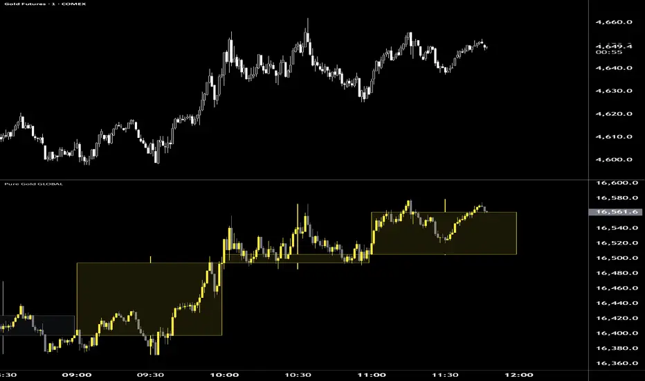
Pure Dollar GLOBALPure Dollar GLOBALPure Dollar GLOBAL is a modernized US Dollar index that measures AMEX:USD $ strength against the top global trade and financial partners: CNH, MXN, JPY, CAD, CHF, EUR, GBP, and AUD.Weighting: Equal-weighted (12.5%), providing a more balanced view of dollar strength than the Euro-heavy TVC:DXY $.Inversion Math: Automatically flips "Inverse" pairs (like OANDA:EURUSD $) so that the index always moves UP when the Dollar is strengthening.Anchor Date: Also fixed to January 1, 2025, providing a consistent mathematical mirror to the Pure Gold GLOBAL index for direct correlation analysis. Indicatore

Pure Gold GLOBALPure Gold GLOBAL is a synthetic index that tracks the price of gold against an equally weighted basket of eight major non-USD currencies: EUR, JPY, GBP, AUD, CHF, CAD, CNH, and INR.Weighting: Each currency represents exactly 12.5% of the index to prevent any single economy from distorting the trend.Purpose: It removes US Dollar ( TVC:DXY $) volatility from the chart, allowing traders to see if gold is gaining or losing value on a truly global scale.Anchor Date: Fixed to January 1, 2025. This ensures that price levels remain identical across all timeframes, keeping Fibonacci and trendline annotations perfectly in place.Technical Features: Includes live Multi-Timeframe (MTF) overlays (boxes and stepped bars) and an institutional-grade validation engine that prevents "internal wicks" during high-volatility sessions. Indicatore

Indicatore

Indicatore