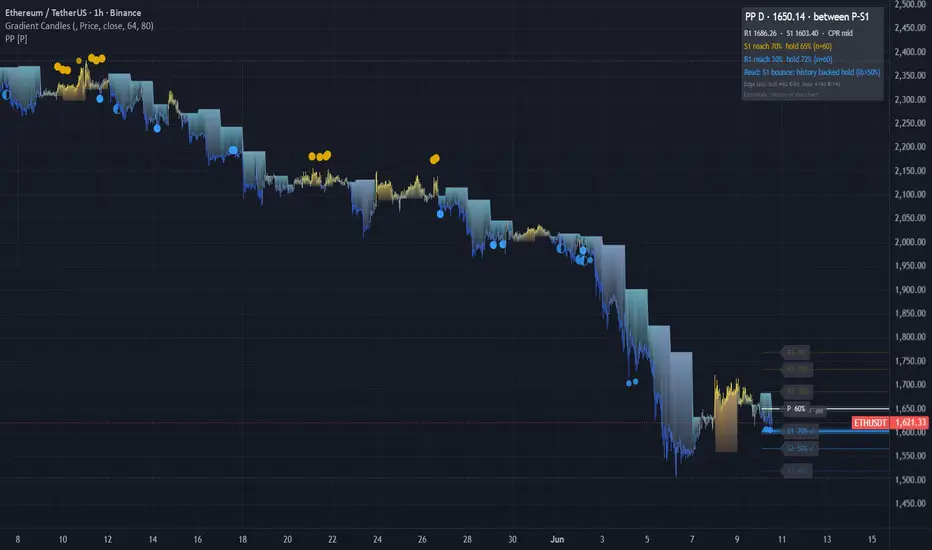
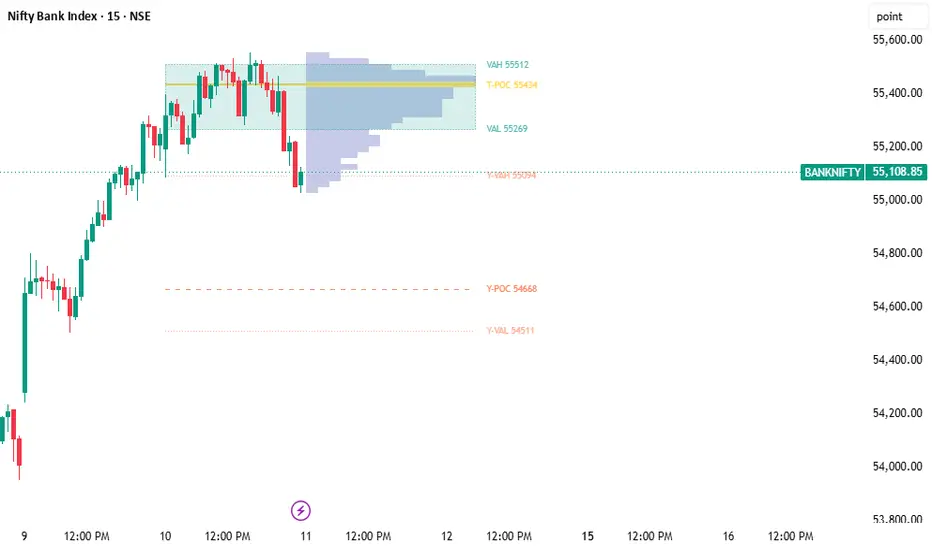
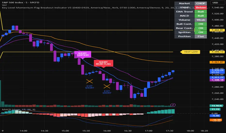
Indicatore

Golden Cross Chob ZoneGolden Cross Chob Zone
Golden Cross Chob Zone is a visual trend-following indicator designed to help traders study bullish trend regimes using EMA 50, EMA 200, Chop Zone trend strength, pullback behavior, and structured visual risk references.
The script combines:
* EMA 50 and EMA 200 regime analysis
* Golden Cross and Death Cross detection
* Chop Zone trend-strength coloring
* Sideways / no-trade filtering
* Multiple bullish entry-event types
* Visual Entry / Stop / Target reference lines
* EMA 200 exit logic
* Compact labels with detailed tooltips
* Dashboard status and event counters
* Alert conditions for key events
This script is an indicator, not a strategy. It does not place orders, does not execute trades, and does not produce TradingView Strategy Tester backtest results. The visual BUY, TP, SL, and EMA200 EXIT labels are chart-analysis events only. They are intended to help users study how the selected rules behave on the chart, not to guarantee performance or provide financial advice.
Important note about signals and performance
Golden Cross Chob Zone does not guarantee profitable trades.
The BUY labels are not automatic trading recommendations. They mark technical conditions where the script detected one of its bullish entry-event rules.
The TP HIT, SL HIT, EMA200 EXIT, and DC EXIT labels are visual tracking references only. They are not broker fills, not strategy orders, and not official backtest results.
The dashboard statistics are simple event counters based on the script’s visual tracking logic. They should not be interpreted as verified strategy performance, win rate, or realistic trading results.
Users should combine this tool with their own analysis, risk management, position sizing, and market context.
Core idea
The main idea of this indicator is to detect bullish market conditions where EMA 50 is above EMA 200, then look for structured bullish continuation events such as:
* Golden Cross breakout
* EMA 50 pullback confirmation
* EMA 50 bounce
* EMA 50 reclaim
The script also uses Chop Zone coloring to estimate whether the trend environment is strong, weak, choppy, or bearish. A sideways / no-trade filter can block normal BUY events when the market is too flat, too compressed, or price is not clearly above EMA 200.
Main components
1. EMA 50 and EMA 200 trend regime
The script uses two exponential moving averages:
Fast EMA
Default: EMA 50
Slow EMA
Default: EMA 200
The Fast EMA is used for pullbacks, bounces, reclaims, and Golden Cross entries.
The Slow EMA is used as the main regime filter and as an optional dynamic exit reference.
Bullish regime
A bullish regime exists when EMA 50 is above EMA 200.
This is the script’s most important directional filter. The script is designed mainly for long-side trend analysis.
Golden Cross
A Golden Cross occurs when the Fast EMA crosses above the Slow EMA.
The script can mark this event with a GC label.
Death Cross
A Death Cross occurs when the Fast EMA crosses below the Slow EMA.
The script can mark this event with a DC label.
Important: GC and DC labels are moving-average structure events. They are not guaranteed buy or sell signals.
2. EMA regime fill
The script can shade the area between EMA 50 and EMA 200.
Green fill
Fast EMA is above Slow EMA.
Red fill
Fast EMA is below Slow EMA.
This helps users quickly identify whether the chart is in a bullish or bearish EMA regime.
3. Chop Zone filter
The Chop Zone section estimates the slope strength of a selected EMA by measuring its angle relative to the recent price range.
The script calculates:
* a recent high-low range,
* an EMA slope,
* a normalized slope angle,
* a color grade based on the slope direction and strength.
The Chop Zone grade is then translated into color categories.
Positive Chop Zone grades
Turquoise
Strong upward trend condition.
Dark green
Clear upward trend condition.
Pale green
Mild upward trend condition.
Teal
Weak upward condition.
Neutral / yellow
Yellow
Choppy or neutral slope condition.
Negative Chop Zone grades
Light orange
Weak downward condition.
Orange
Mild downward condition.
Pink
Clear downward condition.
Dark red
Strong downward condition.
The Chop Zone is used as a trend-quality filter for normal BUY signals. Users can choose the minimum Chop Zone grade required to allow buys.
Minimum Grade To Allow Buys
Any green
Allows any positive green / teal condition.
Pale green or better
Requires a stronger positive Chop Zone reading.
Dark green or better
Requires a clear upward trend condition.
Turquoise only
Requires the strongest upward Chop Zone condition.
4. Chop Zone strip
The script can plot a small colored strip at the bottom of the price pane.
Each square represents the Chop Zone color for that bar.
This gives a compact visual reading of trend strength and choppiness without needing a separate pane.
5. Candle coloring by Chop Zone
The script can color price candles using the Chop Zone colors.
This helps the user visually connect candle movement with the current trend-strength classification.
Candle coloring is visual context only. It is not a standalone entry or exit signal.
Entry logic
The script supports several bullish entry-event types.
A BUY label can appear only when the script’s selected rules are met. By default, the logic is long-side focused and requires EMA 50 to be above EMA 200, except that Golden Cross breakout has its own optional filter settings.
1. Golden Cross Breakout Entry
The Golden Cross breakout entry is designed to identify a bullish breakout condition on the bar where EMA 50 crosses above EMA 200.
A GC breakout BUY can occur when:
* Golden Cross happens,
* EMA 50 is above EMA 200,
* close is above EMA 50,
* close is above EMA 200,
* candle is bullish,
* optional Chop Zone condition passes,
* optional sideways filter condition passes.
This entry type is displayed as:
GC BREAKOUT
Important: This is not a guaranteed breakout signal. It only marks that the selected Golden Cross breakout conditions were met.
2. Classic Pullback Entry
The classic pullback logic waits for price to touch or come close to EMA 50, then requires a bullish confirmation candle within a selected number of bars.
A classic pullback BUY can occur when:
* EMA 50 is above EMA 200,
* Chop Zone filter allows buys,
* price touches or nearly touches EMA 50,
* confirmation candle appears within the selected confirmation window,
* candle closes above EMA 50,
* optional prior-high confirmation passes.
This entry type is displayed as:
PULLBACK
3. EMA 50 Bounce Entry
The EMA 50 bounce entry is a more direct bounce condition.
A bounce BUY can occur when:
* EMA 50 is above EMA 200,
* Chop Zone filter allows buys,
* candle is bullish,
* close is above EMA 50,
* low touches or nearly touches EMA 50.
This entry type is displayed as:
EMA50 BOUNCE
4. EMA 50 Reclaim Entry
The EMA 50 reclaim entry looks for price recovering back above EMA 50.
A reclaim BUY can occur when:
* EMA 50 is above EMA 200,
* Chop Zone filter allows buys,
* candle is bullish,
* close is above EMA 50,
* previous close was at or below EMA 50.
This entry type is displayed as:
EMA50 RECLAIM
5. One open signal at a time
The script includes an option called:
Only One Open Signal At A Time
When enabled, the script does not print a new BUY signal while a previous signal is still being visually tracked by the Entry / SL / TP logic.
This helps reduce repeated labels in the same open setup.
Sideways / no-trade filter
The script includes a market filter designed to reduce normal BUY events in sideways or unclear conditions.
The sideways filter can check:
* EMA 50 / EMA 200 spread,
* EMA 50 slope,
* EMA 200 slope,
* price position relative to EMA 200,
* cooldown after previous exit.
The filter is designed to block normal BUY signals when market conditions are too flat, compressed, or unclear.
Important: The Golden Cross breakout entry can be allowed separately from the normal sideways filter, depending on the user settings. This is useful when the user wants to observe the first strong breakout immediately after a Golden Cross.
Filter elements
Minimum EMA50-EMA200 Spread %
Measures the distance between EMA 50 and EMA 200 as a percentage of price.
Higher values reduce signals in sideways markets.
EMA Slope Lookback
Defines how many bars are used to check if EMA 50 or EMA 200 is rising.
Require EMA 50 Slope Up
When enabled, normal BUY events require EMA 50 to be rising.
Require EMA 200 Slope Up
When enabled, normal BUY events require EMA 200 to be rising.
Require Price Above EMA 200
When enabled, normal BUY events require close to be above EMA 200.
Cooldown After Exit
Blocks new normal BUY events for a selected number of bars after TP, SL, or EMA200 exit.
This is intended to reduce repeated entries after an exit, especially in sideways markets.
Stop / exit and target logic
The script includes visual reference levels for Entry, Stop / Exit, and Target.
These levels are not strategy orders. They are chart references only.
Stop / Exit Mode
The script supports three stop / exit modes:
1. EMA 200 Break Exit
This mode uses the current EMA 200 as a dynamic exit reference.
The exit can trigger when:
* low touches EMA 200, or
* close falls below EMA 200,
depending on the selected EMA 200 break trigger.
This mode is dynamic because the EMA 200 changes as new bars form.
2. Fixed EMA 200 at Entry
This mode freezes the stop reference at the EMA 200 value on the BUY signal bar.
Unlike the dynamic EMA 200 exit, this reference does not move after entry.
3. Fixed Pullback Low
This mode places the stop reference below the recent pullback low.
The pullback low is calculated using the selected lookback period.
SL Buffer
The script allows an optional ATR-based buffer under the chosen stop anchor.
A buffer of 0.00 uses the stop anchor directly.
Increasing the value places the fixed stop reference farther away from the stop anchor.
Take-profit logic
The take-profit level is based on prior swing-high structure.
The script first looks for the highest high over the selected swing-high lookback period before the signal bar.
If that swing-high target is not available, is below entry, or gives too little reward-to-risk, the script uses a fallback R-multiple target.
Target: Swing-High Lookback
Defines how far back the script looks for a prior swing-high target.
Fallback R Multiple
Defines the fallback target based on risk distance.
Minimum Acceptable Target RR
If the prior swing-high target gives less than this minimum RR, the script uses the fallback R target instead.
Visual lines
When enabled, the script can draw:
Entry line
A dashed reference at the BUY close price.
SL / exit reference line
A red reference line based on the selected stop / exit mode.
TP line
A green reference line based on the selected target logic.
If EMA 200 Break Exit is used, the SL reference line can follow the EMA 200 dynamically.
Labels
BUY label
The BUY label appears when one of the selected entry-event rules is triggered.
If compact labels are enabled, the label stays small and the full details are placed in the tooltip.
The BUY tooltip can include:
* entry type,
* entry price,
* reference SL,
* target,
* RR,
* target mode,
* exit mode,
* EMA 50 / EMA 200 regime,
* EMA spread,
* filter status,
* cooldown status,
* Golden Cross breakout status,
* Chop Zone grade.
TP HIT label
The TP HIT label appears when price reaches the visual take-profit reference.
This label is a visual tracking event only. It is not a broker fill or a verified backtest result.
SL HIT label
The SL HIT label appears when the fixed stop reference is touched.
This applies when the selected mode uses a fixed stop reference.
EMA200 EXIT label
The EMA200 EXIT label appears when the dynamic EMA 200 exit condition is triggered.
Depending on settings, this can happen when:
* low touches EMA 200, or
* close falls below EMA 200.
DC EXIT label
The DC EXIT label can appear when a Death Cross occurs while a tracked signal is open and the selected exit logic allows that condition.
This is a moving-average structure exit event, not a strategy order.
Label spacing
The script places labels using ATR-based spacing so they are not directly attached to candles.
Label Distance From Candles controls how far labels are placed vertically away from price bars.
Dashboard
The dashboard summarizes the current condition of the indicator.
Dashboard fields
Regime
Shows whether the EMA structure is bullish or bearish.
BULL
EMA 50 is above EMA 200.
BEAR
EMA 50 is below EMA 200.
The dashboard can also show how many bars have passed since the last Golden Cross or Death Cross.
Chop Zone
Shows the current Chop Zone condition, such as:
* STRONG UP
* TREND UP
* MILD UP
* WEAK UP
* CHOP
* WEAK DOWN
* MILD DOWN
* TREND DOWN
* STRONG DOWN
Filter
Shows whether the normal market filter is allowing signals or blocking them.
OK
Normal market filter conditions are acceptable.
NO TRADE
Normal market filter is blocking normal BUY events.
The dashboard also shows EMA spread percentage.
Setup
Shows the current setup state, such as:
SIGNAL OPEN
A visual signal is currently being tracked.
COOLDOWN
New normal signals are blocked temporarily after an exit.
GC BREAKOUT READY
Golden Cross breakout conditions are present.
NO TRADE
Market filter is blocking normal entries.
PULLBACK ARMED
Price has touched the EMA 50 pullback zone and is waiting for confirmation.
WAITING PULLBACK
Bullish regime exists, but no valid entry event has triggered.
STAND ASIDE
The EMA regime is not bullish.
Open
Shows current open visual tracking references:
* Entry
* SL / exit reference
* TP
Stats
Shows simple event counters:
* total signals,
* wins counted by TP events,
* losses counted by SL / exit events,
* TP-rate based on the script’s internal visual events.
Important: These are not official Strategy Tester results and should not be presented as backtesting performance. They are simple chart-event counters for study and comparison only.
Alerts
The script includes alert conditions for:
Golden Cross
Triggered when EMA 50 crosses above EMA 200.
GC Breakout BUY
Triggered when the Golden Cross breakout entry conditions are met.
Death Cross
Triggered when EMA 50 crosses below EMA 200.
Pullback Touch
Triggered when price touches or approaches the EMA 50 pullback zone.
BUY Signal
Triggered when a selected BUY event occurs.
Chop Zone -> Green
Triggered when Chop Zone shifts into a positive / green condition.
Chop Zone -> Red
Triggered when Chop Zone shifts into a negative / red condition.
TP Hit
Triggered when the visual take-profit reference is reached.
Stop / EMA200 Exit
Triggered when the stop reference or EMA 200 exit condition is reached.
Alerts are notifications only. They do not instruct the user to buy or sell.
Settings explained
Trend EMAs
Fast EMA Length
Sets the fast EMA. Default is EMA 50.
Slow EMA Length
Sets the slow EMA. Default is EMA 200.
Fill Between EMAs
Shows or hides the colored area between the two EMAs.
Chop Zone Filter
Range Lookback
Defines the range used to normalize the EMA slope.
Slope EMA Length
Defines the EMA used for the Chop Zone slope calculation.
Minimum Grade To Allow Buys
Defines how strong the Chop Zone must be before normal BUY events are allowed.
Show Chop Zone Strip
Shows or hides the colored strip at the bottom of the price pane.
Color Price Bars By Chop Zone
Colors candles using the Chop Zone condition.
Entry Logic
Allow Golden Cross Breakout Entry
Allows a BUY event on the Golden Cross bar if the breakout conditions are met.
GC Breakout Requires Green Chop Zone
Requires Chop Zone to be green for Golden Cross breakout entries.
Fast-EMA Touch Tolerance (%)
Allows a candle low to come close to EMA 50 instead of requiring an exact touch.
Confirm Within (bars)
Defines how many bars are allowed between an EMA 50 touch and a confirmation candle.
Confirm Candle Must Close Above Prior High
Requires the confirmation candle to close above the previous bar’s high.
Allow Classic Pullback Entry
Enables the classic pullback entry-event logic.
Allow EMA 50 Bounce Entry
Enables the EMA 50 bounce entry-event logic.
Allow EMA 50 Reclaim Entry
Enables the EMA 50 reclaim entry-event logic.
Only One Open Signal At A Time
Blocks new BUY events while a previous visual signal is still open.
Sideways / No-Trade Filter
Enable Sideways / No-Trade Filter
Enables or disables the normal market filter.
Apply Sideways Filter To GC Breakout
Applies the sideways filter to Golden Cross breakout entries when enabled.
Minimum EMA50-EMA200 Spread (%)
Requires a minimum distance between EMA 50 and EMA 200.
EMA Slope Lookback (bars)
Defines the slope lookback for EMA slope checks.
Require EMA 50 Slope Up
Requires EMA 50 to be rising.
Require EMA 200 Slope Up
Requires EMA 200 to be rising.
Require Price Above EMA 200
Requires close to be above EMA 200.
Cooldown After Exit (bars)
Blocks normal BUY events after an exit for the selected number of bars.
Stop Loss / Target
Stop / Exit Mode
Chooses between dynamic EMA 200 exit, fixed EMA 200 at entry, or fixed pullback low.
EMA 200 Break Trigger
Chooses whether the dynamic EMA 200 exit uses a low touch or a close below EMA 200.
ATR Length
Controls the ATR used for stop buffer and label spacing.
SL Buffer (ATR multiples)
Adds an optional ATR buffer to the stop reference.
Pullback Low Lookback (bars)
Defines the lookback for the fixed pullback low stop mode.
Target: Swing-High Lookback (bars)
Defines the lookback for the prior swing-high target.
Fallback R Multiple
Defines the fallback target if the swing-high target is not usable.
Minimum Acceptable Target RR
Defines the minimum reward-to-risk required before using the swing-high target.
Visuals / Dashboard
Show Dashboard
Shows or hides the dashboard.
Dashboard Position
Moves the dashboard to a selected chart corner.
Mark Golden / Death Crosses
Shows or hides GC and DC labels.
Draw Entry / SL / TP Lines
Shows or hides the visual reference lines.
Show BUY Triangle
Shows or hides the BUY triangle marker.
Use Compact Labels
Uses smaller labels with full details stored in tooltips.
Show BUY Label
Shows or hides the BUY label.
Label Distance From Candles (ATR)
Controls vertical spacing between labels and candles.
How to use this indicator
A practical workflow:
1. Check whether EMA 50 is above EMA 200.
2. Check the Chop Zone condition.
3. Check whether the dashboard says OK or NO TRADE.
4. Watch for one of the selected BUY event types.
5. Review the visual Entry, SL / exit reference, and TP reference.
6. Use the tooltip on the label for full signal details.
7. Treat all labels as chart-analysis events, not as automatic trade instructions.
8. Combine the signal event with market structure, volume, higher timeframe analysis, and risk management.
Example interpretation
If a GC BREAKOUT label appears, it means EMA 50 crossed above EMA 200 and the selected breakout conditions were met. It does not guarantee that price will continue higher.
If a PULLBACK label appears, it means price touched the EMA 50 pullback zone and then produced a bullish confirmation candle within the selected confirmation window.
If an EMA50 BOUNCE label appears, it means price touched or nearly touched EMA 50 and closed back above it with a bullish candle.
If an EMA50 RECLAIM label appears, it means price closed back above EMA 50 after previously being at or below it.
If EMA200 EXIT appears, it means the dynamic EMA 200 exit condition was triggered.
If TP HIT appears, it means price reached the visual target reference.
Important limitations
This indicator does not predict future price movement.
It does not guarantee profitable trades.
It does not place orders.
It does not produce Strategy Tester results.
BUY labels are not financial advice.
TP / SL / exit labels are not broker fills.
Dashboard stats are internal visual event counters, not verified backtest statistics.
EMA-based systems can perform poorly in choppy, sideways, or low-volume markets.
Chop Zone classification is based on slope and range normalization, not on future price prediction.
The script is designed mainly for long-side trend-following analysis.
Different symbols, markets, sessions, and timeframes may require different settings.
Users are responsible for their own trade decisions, risk management, and position sizing.
Recommended use
Golden Cross Chob Zone is best used as a decision-support and chart-analysis tool for traders who study:
* Golden Cross / Death Cross structure,
* EMA 50 and EMA 200 trend regimes,
* EMA pullbacks,
* EMA 50 bounces,
* EMA 50 reclaim events,
* trend strength and choppiness,
* visual risk references,
* long-side trend continuation conditions.
It should be used as one part of a broader trading process, not as a standalone trading system.
Originality and purpose
Golden Cross Chob Zone combines several visual and analytical components into one workflow:
* EMA 50 / EMA 200 regime detection,
* Golden Cross breakout logic,
* Chop Zone trend-strength filter,
* pullback / bounce / reclaim entry-event logic,
* sideways market filtering,
* visual Entry / SL / TP references,
* dynamic EMA 200 exit option,
* compact labels with detailed tooltips,
* dashboard state monitoring,
* alert conditions for key events.
The purpose is to help users study bullish trend-continuation conditions with clearer visual context and fewer signals during weak or sideways conditions.
Indicatore

ADR percentage Completion Table Real-Time Daily Range Tracker ET📊 ADR % Completion Table
Track how much of the Average Daily Range (ADR) has been consumed in real time — works correctly on every timeframe from 1 minute to weekly.
─────────────────────────────────
🔍 WHAT IT DOES
─────────────────────────────────
This indicator calculates the 14-day Average Daily Range and compares it to the current day's high-to-low range, showing you exactly what percentage of the ADR has been reached so far today.
The daily session resets at 00:00 UTC-4 (New York midnight), making it ideal for forex, indices, and US equity traders.
─────────────────────────────────
📋 TABLE DISPLAY
─────────────────────────────────
- ADR (14d) — the average daily range over the last 14 completed days
- Day High / Day Low — intraday extremes since session open (00:00 UTC-4)
- Today Range — current high-to-low range in price points
- ADR % — percentage of ADR consumed (color-coded)
- Remaining — how many points are left to complete the ADR
─────────────────────────────────
🎨 COLOR CODING
─────────────────────────────────
🔘 Grey → 0–49% (early in the day)
🔵 Blue → 50–74% (halfway through)
🟠 Orange → 75–99% (nearing completion)
🟢 Green → 100%+ (ADR fully reached)
─────────────────────────────────
⚙️ SETTINGS
─────────────────────────────────
- ADR Lookback — customize the number of days (default: 14)
- Table Position — 8 placement options
- Text Size — Tiny to Huge
- Show/hide Day High & Low lines on the chart
─────────────────────────────────
✅ KEY FEATURES
─────────────────────────────────
✔ Timeframe-independent — ADR value is identical on 1m, 15m, 1h, 4h, and daily charts
✔ Session-accurate — day range always starts at 00:00 UTC-4 regardless of chart timezone
✔ Clean overlay table — no clutter, just the numbers that matter
✔ Works on all instruments — forex pairs, indices, stocks, futures, crypto
─────────────────────────────────
💡 HOW TO USE IT
─────────────────────────────────
When ADR % is low (grey/blue) early in the session, the market still has room to move. When it reaches orange or green, price has covered most or all of its expected daily range — useful for managing targets, avoiding late entries, and timing exits.
Best used alongside your existing strategy as a context filter, not a standalone signal.
Indicatore

Momentum Saturation Zones [JOAT]Momentum Saturation Zones
Introduction
Momentum Saturation Zones is an open-source indicator that detects when momentum has reached an extreme and then begins pulling back, marks the price level where that extreme occurred as a zone, and tracks the zone's structural validity until price either respects or invalidates it. The premise is that momentum peaks and troughs at significant price levels leave structural imprints — areas where the market demonstrated conviction — that subsequently act as reference points for support or resistance.
The key differentiator from a simple overbought/oversold indicator is the composite strength scoring: a zone is only created when a configurable minimum score is reached, incorporating the momentum extreme level, the magnitude of the pullback, volume at the peak bar, and whether a divergence is present.
Core Concepts
1. Multi-Source Momentum
The momentum signal is selectable from five sources: RSI, Rate of Change (normalized), MFI, Stochastic RSI, or a composite average of all four. The composite mode averages RSI, normalized ROC, MFI, and StochRSI into a single signal, reducing single-indicator noise while retaining each component's contribution:
float momSeries = (rsiRaw + rocNorm + mfiRaw + stochD) / 4.0
2. Adaptive Pullback Detection
The saturation trigger fires when momentum has pulled back from a rolling peak by more than a configurable percentage threshold. The threshold is adaptive — scaled by the current ATR relative to its 50-bar average. In high-volatility regimes the required pullback is larger; in low-volatility regimes it is smaller. This prevents premature triggers in noisy markets and late triggers in calm ones.
3. Composite Strength Scoring (0-100)
Each potential zone is scored before creation. The score combines four components: how extreme the momentum peak was (0-40 points), how far beyond the threshold the pullback reached (0-20 points), the volume ratio at the peak bar relative to average (0-20 points), and whether momentum divergence is present (0-20 points). Only zones meeting the minimum score gate are created:
float extrem = math.max(0.0, math.min(40.0, (peakAbsMom - 50.0) * 40.0 / 50.0))
float pbScore = math.max(0.0, math.min(20.0, (actualPb - adaptPct) * 2.0 + 10.0))
float volScore = math.max(0.0, math.min(20.0, (volRatio - 1.0) * 20.0))
float divScore = bearDiv and i_useDiv ? 20.0 : 0.0
4. Zone Anchor Logic
Bear resistance zones are anchored at the candle high of the peak bar with the zone extending upward by one ATR multiple — the bottom edge sits exactly at the candle high so price must reach up to touch the zone. Bull support zones are anchored at the candle low of the trough bar with the zone extending downward — the top edge sits at the candle low so price must come back down to touch it.
5. Zone Lifecycle and Touch Counting
Each zone tracks how many times price has returned to it (touch counter displayed in the label). When price closes beyond the invalidation offset, the zone is deleted entirely — no ghost boxes remain. A proximity check before creation prevents duplicate zones from stacking at the same price level.
Features
Five momentum sources: RSI, ROC, MFI, StochRSI, or Composite average
Adaptive pullback threshold: ATR-normalized trigger scaled to current volatility regime
Composite strength scoring (0-100): Extremity, pullback depth, volume, and divergence components
ATR-anchored zones: Three-layer gradient zones (outer, mid, core) with center line
Proper candle anchoring: Resistance bottoms at candle high; support tops at candle low
Touch counting: Zone labels update each time price retests the zone
Proximity deduplication: No duplicate zones within 1.5 ATR of same-side existing zones
Clean invalidation: Zones deleted entirely on invalidation — no ghost boxes
Divergence detection: Momentum divergence contributes bonus points to strength score
Candle coloring: Candles tinted when price is inside or within 0.5 ATR of a valid zone
Dashboard: Momentum value, pullback threshold, volatility regime, active zone count, and directional strength scores
Input Parameters
Momentum Configuration:
Momentum Source: RSI, ROC, MFI, StochRSI, or Composite (default: Composite)
Momentum Length: Period for all momentum calculations (default: 14)
Peak Lookback Bars: Rolling window for peak/trough detection (default: 50)
Saturation Trigger:
Adaptive ATR Threshold toggle (default: on)
Pullback % from Peak: Required pullback to trigger (default: 10%)
RSI Overbought/Oversold: Absolute extreme levels for gate (default: 70/30)
Cooldown Bars: Minimum bars between zone creation events (default: 10)
Zone Settings:
Max Active Zones: Simultaneous zone cap (default: 4)
ATR Length: ATR period for zone sizing (default: 14)
Zone Width (x ATR): Zone height as ATR multiple (default: 1.0)
Invalidation Offset %: Margin beyond zone for invalidation trigger (default: 0.3%)
How to Use This Indicator
Step 1: Read the Zone Strength
Zones display their strength score (0-100) in the label. Higher-scoring zones represent confluences of multiple factors and are historically more likely to produce price reactions.
Step 2: Use Touch Count for Context
A zone touched twice and holding is more significant than a freshly-created zone. A zone touched three or more times that eventually breaks is exhausted — expect the break to accelerate.
Step 3: Watch for Candle Color Changes Near Zones
The candle coloring activates when price enters the zone or comes within 0.5 ATR of it. This provides a passive alert that price is approaching a structural reference.
Indicator Limitations
Momentum peaks do not always coincide with price extremes — the zone is placed at the price of the peak momentum bar, which may differ from the highest/lowest price in the lookback
In strongly trending markets, zones on the trend side may be repeatedly invalidated as trend continues
The strength score is a composite heuristic, not a backtested predictor of zone success rate
Originality Statement
The composite strength scoring system — combining momentum extremity, pullback depth, volume, and divergence into a single 0-100 gate — applied to zone creation is the original analytical contribution. The proper candle-edge anchoring (resistance bottom at candle high, support top at candle low), proximity deduplication, and clean deletion on invalidation are implementation details not present in most published support/resistance zone indicators.
Disclaimer
This indicator is provided for educational and informational purposes only. It is not financial advice. Momentum saturation zones are historical reference levels and do not predict future price reactions. Trading involves substantial risk of loss.
-Made with passion by jackofalltrades
Indicatore

Auto Trendline BreaksAuto Trendline Breaks
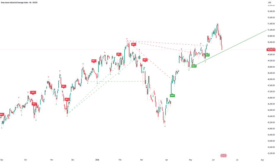
Auto Trendline Breaks is a visual trendline analysis indicator that automatically detects confirmed swing highs and swing lows, builds validated support and resistance trendlines from those pivot points, and marks close-through trendline break events on the chart.
The purpose of this script is to reduce manual trendline drawing and help traders monitor diagonal support, diagonal resistance, confirmed pivot structure, and trendline break events in a more systematic way.
This script is an indicator, not a trading strategy. It does not place orders, does not calculate backtest results, and does not guarantee that any trendline break will lead to continuation or profit. It is designed for visual chart analysis, structure monitoring, and alert-based observation only.
Important note about signals
Auto Trendline Breaks does not generate direct buy or sell signals.
The labels and markers shown by the script are technical structure markers only. They are designed to show confirmed pivots, validated trendlines, and close-through break events.
Confirmed Peak markers are not sell signals.
Confirmed Trough markers are not buy signals.
BRK R labels are not buy signals.
BRK S labels are not sell signals.
The script does not provide trade entries, trade exits, stop-loss levels, take-profit levels, or strategy performance results. Any trading decision must come from the user’s own analysis, confirmation method, and risk-management process.
Important note about repainting and pivot delay
The Confirmed Peak and Confirmed Trough markers are based on confirmed pivot logic.
A pivot high or pivot low is only confirmed after the selected number of Pivot Right Bars has passed. For that reason, the marker appears with a natural confirmation delay.
After a pivot marker is confirmed and printed, it is not intended to move from that pivot bar. However, the marker is plotted back on the original pivot candle using an offset, so it should not be interpreted as a real-time signal that was known on that historical candle.
For example, if Pivot Right Bars is set to 10, the script needs 10 bars after a possible peak or trough before confirming it. Once confirmed, the marker is plotted on the original pivot candle for visual clarity.
This behavior is normal for pivot-based indicators. It helps identify confirmed swing structure, but it also means these markers are delayed structure markers, not real-time entry signals.
Main visual elements
The script focuses on four main visual elements:
1. Confirmed Peak markers
2. Confirmed Trough markers
3. Resistance and support trendlines
4. BRK R / BRK S trendline break labels
5. Confirmed Peak markers
A Confirmed Peak marker appears above a candle when the script confirms a swing high using pivot logic.
A swing high is confirmed only after the required number of bars has formed to the right of the potential pivot. This creates a natural delay, which is expected behavior for pivot-based indicators.
Confirmed Peak markers are used by the script as potential resistance anchor points.
They may appear in the Style tab as:
* Confirmed Peak Tiny
* Confirmed Peak Small
* Confirmed Peak Normal
These three Style entries exist because TradingView displays each plotshape used for different marker sizes. The user controls the active marker size from the indicator settings using the Pivot Marker Size input. Only the selected marker size is intended to be visible on the chart.
Confirmed Peak markers are not sell signals. They only identify confirmed swing highs used by the trendline engine.
2. Confirmed Trough markers
A Confirmed Trough marker appears below a candle when the script confirms a swing low using pivot logic.
A swing low is confirmed only after the required number of bars has formed to the right of the potential pivot. This creates a natural delay, which is expected behavior for pivot-based indicators.
Confirmed Trough markers are used by the script as potential support anchor points.
They may appear in the Style tab as:
* Confirmed Trough Tiny
* Confirmed Trough Small
* Confirmed Trough Normal
These three Style entries exist because TradingView displays each plotshape used for different marker sizes. The user controls the active marker size from the indicator settings using the Pivot Marker Size input. Only the selected marker size is intended to be visible on the chart.
Confirmed Trough markers are not buy signals. They only identify confirmed swing lows used by the trendline engine.
3. Resistance trendlines
Resistance trendlines are built from confirmed swing highs, also called confirmed peaks.
The script scans recent confirmed peaks and attempts to build a validated resistance line from them. A resistance line is accepted only if it passes the script’s validation rules.
A valid resistance trendline must:
* connect confirmed swing-high pivots,
* respect the selected line direction mode,
* stay within the ATR-based tolerance,
* receive the required number of touches,
* avoid being too old based on the Max Anchor Age setting.
Resistance trendlines are visual resistance references only. They are not automatic short entries and are not guaranteed rejection areas.
4. Support trendlines
Support trendlines are built from confirmed swing lows, also called confirmed troughs.
The script scans recent confirmed troughs and attempts to build a validated support line from them. A support line is accepted only if it passes the script’s validation rules.
A valid support trendline must:
* connect confirmed swing-low pivots,
* respect the selected line direction mode,
* stay within the ATR-based tolerance,
* receive the required number of touches,
* avoid being too old based on the Max Anchor Age setting.
Support trendlines are visual support references only. They are not automatic long entries and are not guaranteed bounce areas.
5. BRK R label
BRK R means Resistance Trendline Broken.
This label appears when price closes above an active resistance trendline after being at or below the same trendline on the previous bar.
BRK R is shown in green by default because it represents price closing above a resistance trendline. It is a resistance-break event only.
BRK R does not mean “Buy.”
BRK R is not a buy signal.
BRK R does not guarantee continuation.
BRK R only identifies that price closed through a detected resistance trendline.
Users may choose to study that event with their own trend, volume, market structure, and risk-management methods.
6. BRK S label
BRK S means Support Trendline Broken.
This label appears when price closes below an active support trendline after being at or above the same trendline on the previous bar.
BRK S is shown in red by default because it represents price closing below a support trendline. It is a support-break event only.
BRK S does not mean “Sell.”
BRK S is not a sell signal.
BRK S does not guarantee continuation.
BRK S only identifies that price closed through a detected support trendline.
Users may choose to study that event with their own trend, volume, market structure, and risk-management methods.
How the indicator works
1. Swing detection
The indicator uses pivot logic to identify confirmed swing highs and confirmed swing lows.
A swing high is confirmed when the selected source forms a high with enough bars on both sides.
A swing low is confirmed when the selected source forms a low with enough bars on both sides.
The user controls this with:
Pivot Left Bars
Pivot Right Bars
Because the script waits for right-side bars before confirming a pivot, the peak and trough markers appear after confirmation. This is normal for pivot-based logic and helps avoid using unstable unconfirmed swing points.
2. Anchor source
The user can choose how trendline anchors are calculated:
Wicks (High/Low)
Uses candle highs for resistance and candle lows for support.
Closes
Uses closing prices instead of wick extremes.
Wick-based trendlines are more reactive because they use the full candle range.
Close-based trendlines are usually cleaner and more conservative because they ignore wick extremes.
3. Trendline construction
When a new confirmed peak or trough appears, the script scans recent pivots from the same side.
For resistance, the script scans confirmed peaks.
For support, the script scans confirmed troughs.
The script then tests possible anchor pairs to decide whether a valid line can be drawn.
A valid trendline must pass several checks:
* the line must connect two confirmed pivots,
* the line direction must be allowed by the selected mode,
* price must not pierce the line beyond the ATR-based tolerance,
* the line must have at least the required number of touches,
* the anchor must not be older than the selected maximum age.
4. Line validation
The script validates a candidate trendline from the first anchor point to the current bar.
For a resistance line, the script checks whether highs remain below or near the line.
For a support line, the script checks whether lows remain above or near the line.
If price pierces the candidate line by more than the selected ATR tolerance, the candidate is rejected.
This means the script does not simply connect any two pivots. It attempts to draw only lines that price has respected within the selected tolerance.
5. Touch count
The script counts how many times price touches or comes close to the candidate trendline.
Minimum Touches controls how many touches are required before a line is drawn.
A higher value creates fewer but more selective trendlines.
A lower value creates more trendlines but may increase noise.
6. ATR-based tolerance
The tolerance setting uses ATR to adjust for volatility.
Tolerance (ATR multiple) defines how much price can touch or slightly pierce a line without invalidating it.
This makes the trendline logic more adaptive across different symbols and timeframes.
7. Line direction mode
The script includes two direction modes:
Classic only
Resistance lines must slope downward or remain flat. Support lines must slope upward or remain flat. This is the default textbook interpretation of falling resistance and rising support.
Any slope
Allows all valid slopes if the line passes the validation rules. This can be useful for channel edges, but it may produce more lines on choppy charts.
8. Active trendlines
Active trendlines remain visible while they are not broken or retired.
The user can choose how active lines are projected:
Extend Right
Active lines continue extending to the right.
Limited Projection
Lines are only projected a selected number of bars into the future.
9. Break detection
A break is detected only when price closes through an active trendline.
Resistance break
A resistance break occurs when price closes above an active resistance trendline after being at or below it on the previous bar.
Support break
A support break occurs when price closes below an active support trendline after being at or above it on the previous bar.
The indicator can display labels:
BRK R or BREAK R
Price closed above a resistance trendline.
BRK S or BREAK S
Price closed below a support trendline.
These labels are technical break labels only. They are not automatic buy or sell signals.
10. Broken lines
When a trendline is broken, the user can choose whether the line remains visible.
If Keep Broken Lines is enabled, the line remains on the chart as a broken or faded line and stops extending at the break candle.
If Keep Broken Lines is disabled, the broken line is hidden after the break.
11. Expired / retired lines
The script can retire lines that become too far from current price.
This is controlled by:
Retire Line Beyond (ATR multiple)
If an active line is farther than the selected ATR multiple from price, it is retired visually.
A retired line is not the same as a breakout. It only means the line is no longer close enough to current price to remain useful as an active reference.
Support lines that project at or below zero can also be retired to avoid unrealistic projections on low-priced instruments.
12. Smart BREAK label placement
The latest version includes Smart BREAK Label Placement to improve readability.
Earlier versions could place break labels too close to candles or away from the exact line that was broken. This version uses a combined placement method:
* The label is linked to the broken trendline price.
* The label is printed on the actual break candle by default.
* The label is prevented from touching or entering the candle body or wick.
* If the broken trendline is too close to the candle, the label is automatically moved away using an ATR-based minimum gap.
This helps users see both the break event and the price structure without covering the candle.
The relevant settings are:
Place BREAK Label At Broken Line
Places the label near the broken trendline price.
BREAK Label Offset From Broken Line
Controls how far the label is placed from the broken trendline.
Minimum BREAK Label Gap From Candle
Defines the minimum distance between the label and the candle. This prevents labels from overlapping candles.
Fallback BREAK Label Distance from Candle
Used when label placement at the broken line is disabled.
BREAK Label Horizontal Offset Bars
Moves the label to the right if desired. The default is 0 so the label stays on the actual break candle.
Minimum Bars Between BRK R Labels
Optional filter to reduce repeated resistance-break labels.
Minimum Bars Between BRK S Labels
Optional filter to reduce repeated support-break labels.
Only Label Visible Active Lines
When enabled, labels are printed only for lines that were active and visible before the break.
These settings affect label placement and visual clarity. They do not change the underlying break logic.
Settings explained
Swing Detection
Pivot Left Bars
Controls how many bars to the left are required to confirm a swing point. Higher values create fewer but more significant pivots.
Pivot Right Bars
Controls how many bars to the right are required before a pivot is confirmed. Higher values create stronger confirmation but increase delay.
Anchor Source
Selects whether trendlines use wick extremes or closing prices.
Wicks (High/Low) uses the candle high for resistance and candle low for support.
Closes uses closing prices for cleaner close-based trendlines.
Line Construction
Pivots Scanned Per Side
Controls how many recent peaks or troughs are scanned when building a new line.
Tolerance (ATR multiple)
Controls how much price can touch or slightly pierce a candidate line without invalidating it.
ATR Length
Controls the ATR calculation used for tolerance, label spacing, and retirement distance.
Allowed Line Direction
Controls whether the indicator draws only classic falling resistance and rising support, or allows any valid slope.
Minimum Touches
Controls how many touches are required before a trendline is drawn.
Max Anchor Age (bars)
Prevents very old pivots from being used as anchors.
Retire Line Beyond (ATR multiple)
Retires active lines that become too far from current price.
Display
Max Lines Per Side
Controls how many resistance and support lines remain on the chart.
Line Projection Mode
Selects whether active lines extend right or use limited future projection.
Limited Projection Bars
Controls the projection length when Limited Projection is selected.
Show Active Lines
Shows or hides active trendlines.
Keep Broken Lines
Keeps broken trendlines visible after price closes through them.
Show Expired Lines
Shows or hides retired trendlines.
Active Line Width
Controls the thickness of active lines.
Broken / Expired Line Width
Controls the thickness of broken and expired lines.
Broken Line Style
Controls the style of broken lines: solid, dashed, or dotted.
Expired Line Style
Controls the style of retired lines: solid, dashed, or dotted.
Resistance Trendline Color
Controls the color of resistance trendlines.
Support Trendline Color
Controls the color of support trendlines.
Active Line Transparency
Controls the visibility of active trendlines.
Broken Line Transparency
Controls the visibility of broken trendlines.
Expired Line Transparency
Controls the visibility of retired trendlines.
Mark Swing Points
Shows or hides confirmed peak and trough markers.
Pivot Marker Size
Controls which confirmed pivot marker size is shown on the chart: Tiny, Small, or Normal.
Peak Marker Color
Controls the color of confirmed peak markers.
Trough Marker Color
Controls the color of confirmed trough markers.
Important note about the Style tab
TradingView may show separate Style entries for Confirmed Peak Tiny, Confirmed Trough Tiny, Confirmed Peak Small, Confirmed Trough Small, Confirmed Peak Normal, and Confirmed Trough Normal. These are not separate signals. They are the internal visual outputs used to support the selectable Pivot Marker Size setting.
Breakout Labels
Show BREAK Labels
Shows or hides labels when price closes through a trendline.
BREAK Label Text
Compact mode displays BRK R and BRK S.
Full mode displays BREAK R and BREAK S.
Break Label Size
Controls the size of the break labels.
Break Label Style
Controls whether labels appear as directional arrow labels or simple labels.
Place BREAK Label At Broken Line
Places the label near the broken trendline price.
BREAK Label Offset From Broken Line
Controls the ATR-based distance between the label and the broken trendline price.
Minimum BREAK Label Gap From Candle
Prevents the break label from touching or entering the candle.
Fallback BREAK Label Distance from Candle
Controls label distance from the candle when line-based placement is disabled.
BREAK Label Horizontal Offset Bars
Moves break labels to the right if desired. Default is 0 so the label remains on the break candle.
Only Label Visible Active Lines
When enabled, labels are printed only when the broken line was active and visible before the break.
Minimum Bars Between BRK R Labels
Limits how frequently resistance-break labels can appear.
Minimum Bars Between BRK S Labels
Limits how frequently support-break labels can appear.
BRK R Color - Resistance Broken Up
Controls the label color for resistance breaks. Green is the default because price closed above resistance.
BRK S Color - Support Broken Down
Controls the label color for support breaks. Red is the default because price closed below support.
BREAK Label Transparency
Controls the label background transparency.
BREAK Label Text Color
Controls the text color of break labels.
Alerts
Enable Alerts
Allows the script alert conditions to be used. Alerts must still be created manually from TradingView’s alert menu.
Alerts included
Resistance Trendline Broken
Triggered when price closes above an active resistance trendline.
Support Trendline Broken
Triggered when price closes below an active support trendline.
New Resistance Trendline
Triggered when a new validated resistance trendline is confirmed and drawn.
New Support Trendline
Triggered when a new validated support trendline is confirmed and drawn.
These alerts are notifications only. They do not instruct the user to buy or sell.
How to use this indicator
A practical workflow:
1. Choose pivot sensitivity using Pivot Left Bars and Pivot Right Bars.
2. Use Wicks for more reactive trendlines or Closes for cleaner close-based trendlines.
3. Set Minimum Touches to 3 or higher for more selective lines.
4. Use Classic only for traditional falling resistance and rising support.
5. Use Confirmed Peak and Confirmed Trough markers to understand which pivots the engine uses.
6. Watch active support and resistance trendlines as structure references.
7. Treat BRK R and BRK S labels as trendline break events, not as standalone trade signals.
8. Use Smart BREAK label placement settings if labels are too close to candles or if you want labels placed near the broken line.
9. Combine any break with market structure, volume, trend context, and risk management.
Example interpretation
If price closes above an active resistance trendline, the script may display BRK R. This means price closed through a detected resistance trendline. A trader may then study whether the market structure supports continuation, but the label itself is not a buy signal.
If price closes below an active support trendline, the script may display BRK S. This means price closed through a detected support trendline. A trader may then study whether the break changes market structure, but the label itself is not a sell signal.
If a Confirmed Peak marker appears, it means a swing high was confirmed by the pivot logic. It does not mean the user should sell.
If a Confirmed Trough marker appears, it means a swing low was confirmed by the pivot logic. It does not mean the user should buy.
If a line becomes expired or retired, it means the line is no longer close enough to current price or no longer useful as an active reference. This is not a breakout signal.
Important limitations
This indicator does not predict future price movement.
It does not generate guaranteed buy or sell signals.
It does not place orders.
It does not provide backtesting results.
Pivot points are confirmed only after the selected number of right bars has passed.
Confirmed Peak and Confirmed Trough markers appear after pivot confirmation and therefore have a natural delay.
Confirmed Peak and Confirmed Trough markers are plotted back on the original pivot candle for visual clarity, so they should not be interpreted as real-time signals on that candle.
After confirmation, pivot markers are not intended to move, but the user must understand that they were only known after the required confirmation bars.
Trendlines are algorithmic approximations and may differ from manually drawn trendlines.
Different pivot settings can produce different lines.
A close-through break does not guarantee continuation.
Smart BREAK label placement changes only the visual location of labels. It does not change the break calculation.
ATR-based tolerance and ATR-based label distance may need adjustment for different symbols, timeframes, and volatility conditions.
Very volatile or low-liquidity instruments may produce more frequent line changes.
Recommended use
Auto Trendline Breaks is best used as a visual support and resistance tool for traders who study:
* swing highs and swing lows,
* confirmed peaks and troughs,
* diagonal support and resistance,
* trendline breaks,
* structure shifts,
* breakout monitoring,
* manual chart-reading support.
It is intended for visual analysis, educational use, and workflow organization. It should not be used as a standalone trading system or as financial advice.
Originality and purpose
Auto Trendline Breaks provides a systematic and configurable method for drawing trendlines from confirmed swing points.
Instead of only connecting the latest two highs or lows, the script:
* stores confirmed peaks and troughs,
* scans recent pivot anchors,
* validates possible trendlines against historical price action,
* requires a minimum number of touches,
* applies ATR-based tolerance,
* manages active, broken, and expired line states,
* provides optional confirmed pivot markers,
* provides optional break labels,
* provides Smart BREAK label placement,
* provides alert conditions for line creation and trendline breaks.
The purpose is to help users monitor support and resistance structure without manually redrawing every trendline.
Indicatore
Anchored VWAP Confluence Volume-Weighted Bands & MTF LevelsANCHORED VWAP CONFLUENCE — Decayed Line, Volume-Weighted Bands & MTF Levels
OVERVIEW
This is an anchored-VWAP framework that turns a single VWAP line into a complete fair-value workspace. It plots an anchored VWAP, a faster "decayed" VWAP, a rolling VWAP, proper volume-weighted standard-deviation bands, higher-timeframe VWAP levels that act as support and resistance, and a regime read — and it calibrates its own signals against the symbol's own past so you can see how often they actually followed through. Everything is derived from one idea (volume-weighted price) so the components reinforce each other rather than competing for screen space.
WHY THESE COMPONENTS ARE COMBINED (and how they work together)
A plain VWAP tells you fair value but nothing about momentum, dispersion, higher-timeframe structure, or reliability. Each component here answers a different one of those questions, and they are meant to be read together as one picture:
- ANCHORED VWAP is the reference: fair value accumulated since a chosen event (the session, a swing pivot, or a manual click). Every other element is measured relative to this line, which is why it sits at the centre of the engine rather than being one more overlay.
- DECAYED FAST VWAP is the same VWAP with an exponential half-life applied to its volume weights, so it responds faster to recent flow. On its own a fast line is just noise; paired with the anchored line it becomes a momentum signal — when the fast line crosses the slow line, near-term flow has shifted relative to fair value. This is a fast/slow pair built from a single construct, not two unrelated indicators.
- VOLUME-WEIGHTED SIGMA BANDS measure dispersion around fair value. They are computed from the running second moment (sigma = square root of E - (E )^2), volume-weighted and reset-aware, not a price-only standard deviation slapped onto the VWAP. Because the bands scale with volume-weighted dispersion, "stretched" means the same thing on any instrument and in any regime — which is what lets the cross and stretch signals be compared and calibrated across assets.
- ROLLING VWAP provides a second, independent cross of the anchored line, so a shift confirmed by both the decayed and the rolling line carries more weight than either alone.
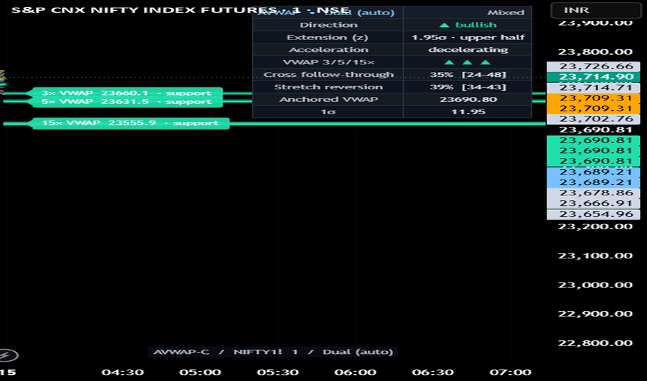
- MULTI-TIMEFRAME VWAP LEVELS are the rolling VWAP computed at 3x, 5x and 15x the chart timeframe and drawn as horizontal levels. Higher-timeframe fair value is where larger participants transact, so these levels frequently act as support and resistance. They are coloured by role — green when a level sits below price (support), red when above (resistance) — and weighted by horizon, so the longer-timeframe level is visually the heaviest.
- REGIME + CALIBRATION are the quality layer. An efficiency-ratio and ADX read classifies the market as trending, mixed or choppy, and (optionally) filters the cross signals so they are not taken in chop. Separately, the script tracks, past-only, how often a cross was followed by a move and how often a stretch reverted toward fair value, reporting each as a percentage with a confidence interval. This is what separates a measured framework from a drawing tool: the signals are scored against the instrument's own history.
Read together: the anchored VWAP gives you fair value, the bands tell you how stretched price is, the decayed/rolling crosses tell you when flow shifts, the higher-timeframe levels tell you the structure price is moving inside, the regime tells you whether to trust a signal, and the calibration tells you how those signals have behaved here before.
HOW TO USE IT
1. Pick an anchor mode in settings — Session, Pivot High, Pivot Low, or Manual (click a bar). The anchored VWAP and its bands rebuild from that point.
2. Use the trend-coloured anchored VWAP as fair value. Price above it is in the upper half of value, below it the lower half.
3. Watch the decayed line crossing the anchored line (triangles) as a momentum-shift cue, and treat crosses that occur in a non-choppy regime as higher quality (the regime filter does this for you when enabled).
4. Treat the +/- sigma stretches (circles) as extension — price is far from fair value and historically prone to revert; the table shows how often that has happened on this symbol.
5. Use the 3x/5x/15x VWAP levels as support/resistance targets and invalidation references; alignment of price above or below all three is shown compactly in the table.
6. Read the table for direction, extension (as a z-score), regime, higher-timeframe alignment, and the past-only follow-through rates.
WHAT MAKES IT ORIGINAL
It is not a single-line VWAP or a generic band script. The combination is the point: a decayed fast/slow VWAP pair, a correct volume-weighted sigma from the running second moment, multi-timeframe VWAP support/resistance, regime-gated signals, and a per-symbol calibration of both the cross and the stretch. The calibration in particular — measuring the script's own signals against the symbol's own past rather than assuming they work — is not something a standard VWAP provides.
WORKS ON ANY ASSET (universal)
The price SOURCE is selectable in the settings, so the engine runs on any market — futures, indices, FX, crypto, or stocks. VWAP requires volume; on symbols that report none, you can borrow volume from a reference symbol so the script still functions. All thresholds are sigma- and ATR-relative, so nothing is tied to one instrument's price scale.
SETTINGS SUMMARY
- Data Source: price source (default HLC3) and an optional volume-borrow symbol for no-volume instruments.
- Anchor & Lines: anchor mode, pivot length, manual anchor time, decay half-life, rolling window, slope smoothing.
- Signals & Regime: stretch threshold (in sigma), and an option to show crosses only in a non-choppy regime.
- Higher-Timeframe VWAP: show the 3x/5x/15x bias, and draw them as support/resistance levels.
- Calibration: enable tracking, evaluation horizon, and minimum follow-through in ATR.
- Visuals: Auto/Dark/Light theme, bull/bear colours, gradient fill, line glow, table, and table position.
The script also prints its name, the symbol and the timeframe on the chart so it is always clear what is being viewed.
LIMITATIONS (please read)
- Pivot anchors confirm only after the pivot length in bars, so a new pivot anchor appears with that delay (it is always drawn at its true historical bar).
- The higher-timeframe levels are live VWAPs and firm up as their higher-timeframe bar closes.
- Calibration is descriptive of past behaviour only and is not a forecast.
- Everything here is probabilistic context, not a prediction or a guarantee.
DISCLAIMER
This is a study / indicator for chart analysis and education only. It is NOT a strategy, NOT a recommendation, and NOT financial advice. It places no orders and guarantees no outcome. Trading involves risk. Do your own research and manage your own risk.
Indicatore
Open Grid MatrixHave you ever paid close attention to the open price?
It is more than just the first traded price of a session or timeframe.
It often becomes the boundary between bullish and bearish intent, a line where conflicting expectations, positioning, and reactions collide.
This indicator was built to visualize those open prices across multiple timeframes in a clean and practical way.
Open Grid Matrix displays the open levels of several key timeframes on a single chart, allowing you to track how price behaves around them in real time. These levels often act as subtle but important reference points for continuation, rejection, hesitation, and momentum shifts.
In addition to the horizontal open lines, the indicator also plots vertical marker lines. These are aligned with repeating interval structures, especially the common 30-minute rhythm where scheduled data releases, market transitions, liquidity shifts, and session-based reactions often cluster.
What this indicator does
* Plots multiple timeframe open prices on one chart
* Extends each open line forward until the next open of the same timeframe
* Displays vertical interval markers to help frame timing structure
* Lets higher timeframe opens stand out more clearly with thicker line settings
* Uses distinct colors for each timeframe so you can quickly separate lower and higher timeframe references
Why open prices matter
Open prices are often overlooked compared to highs, lows, or closing levels, but they can be highly useful because they represent a reset point in market participation.
They can help you identify:
* bullish or bearish acceptance around a level
* hesitation and indecision zones
* intraday reaction points
* higher timeframe directional references
* areas where multiple opens begin to cluster together
How to read it
Lower timeframe opens can help with short-term structure and execution.
Higher timeframe opens can serve as broader directional anchors.
For example:
* lower timeframe open lines can highlight intraday balance shifts
* daily and weekly opens can act as strong reference zones
* monthly opens can provide a wider structural boundary
* vertical interval lines can help you anticipate moments where timing itself becomes important
Who it is for
This tool is designed for traders who like to read the chart through structure, timing, and reaction rather than relying only on conventional indicators.
It is especially useful for traders who want to keep important session and timeframe opens visible at all times without manually drawing them.
Open Grid Matrix is a visual framework for traders who believe that where price opens often matters just as much as where price moves. Indicatore

Pivot Points Mapped [Probalist Essentials]Pivot Points Mapped turns the standard pivot grid into a measured one. Pick your formula (Classic, Fibonacci, Camarilla, Woodie) and the grid timeframe follows your chart (intraday→Daily, daily→Weekly, weekly→Monthly). Every level is labelled with its empirical reach rate on this chart — R1 at 68% is a real target, R3 at 9% is a long shot — and weighted by reach, proximity and higher-TF confluence, so the chart shows a few meaningful zones instead of seven equal lines.
🟡 WHY THIS VERSION
Most pivot tools draw the same lines on every chart without telling you which ones price ever reaches. This one counts it: reach rate per level, hold rate per touch with a Wilson lower bound, first-touch decay, and ✦ when the higher timeframe's grid agrees — all measured on the loaded chart. The CPR band adds the classic narrow-means-trend tell as a percentile of this chart's own history. Alerts have history-backed variants that only fire when the evidence clears the bar. It counts instead of guessing.
🟡 HOW IT WORKS
Levels come from the prior period's confirmed HLC (no lookahead) in the formula you pick; the same formula builds the higher-TF set, so confluence compares like with like. Each live period, per-level booleans track whether price tagged each level; at period close they roll into the reach history. Touch-reactions are judged on the bar after a zone entry — hold or break — and feed per-level hold arrays with Wilson lower bounds. First-touch decay splits the hold rate by 1st/2nd/3rd test of the period. Visual weight (width, brightness, glow) blends reach × proximity × confluence. The CPR band (BC to TC) is washed behind the levels; its width is ranked against this chart's recent periods — narrow percentiles classically precede trending periods. A corner table shows the state, the bull/bear reach-hold stats, a plain-language Read, and an edge clock stamping the last history-backed bounce/rejection.
🟡 KEY FEATURES
Reach Map: every level labelled with its empirical reach rate — e.g. 'R1 68% ✓'
Four pivot methods (Classic / Fibonacci / Camarilla / Woodie), one selector — the stats work for all
Auto grid timeframe: intraday→D, daily→W, weekly→M, with manual override; stats count per period
CPR band with width-percentile read (narrow/mid/wide vs this chart's own history)
Hold rate per level with Wilson lower bound + first-touch decay (1st/2nd/3rd test) in tooltips
✦ confluence: levels aligned with the grid one rung up, same formula, weighted brighter
Self-decluttering: far/low-reach levels fade, high-evidence levels glow
Corner stats table + edge clock (last history-backed bounce/rejection)
Touch-reaction dots with density control (All / Medium+ / Backed)
Evidence-gated alert variants; everything non-repainting (confirmed prior-period data)
🟡 HOW TO USE
Read the reach % first: 70%+ is a credible target, <15% a stretch. Set targets by evidence, not formula.
✦ levels are where two timeframes agree — treat them as the higher-conviction zones.
✓ = already tagged this period; focus shifts to the next untagged level in the direction of travel.
Hover a level for hold rate, Wilson lower bound and first-touch decay — a level that holds its 1st test but folds on the 3rd is for first-touch fades only.
CPR narrow (low percentile) classically precedes trending periods — favour breakout targets; wide favours fades. The percentile is measured, the interpretation is theory.
Use the history-backed alerts for signals worth acting on; standard alerts for awareness.
Costs honesty: median touch-reactions on low timeframes are small — check hold rate and n against your round-trip costs. This tool filters levels, not entries.
🟡 PAIRS WELL WITH
Pair with a trend or momentum read (MA slope, MACD) to know which side of P has the directional edge — pivots are neutral by formula. Volume profile confirms whether a pivot sits at a real high-volume node. For intraday, an opening-range tool tells you the likely direction into the day's levels. Pivots are reference structure, not entries.
Not seven equal lines but a measured terrain: the most-reached levels stand out, confluence is computed instead of eyeballed, and every reaction has a counted history. Evidence from this chart only — description, not prediction.
Open source under MPL-2.0. The probability layer describes past signals on your chart — it is a measurement, not a prediction, and nothing here is financial advice. Indicatore

Time Acceptance Profile TPO LevelsTIME ACCEPTANCE PROFILE — TPO-STYLE LEVELS THAT WORK WITHOUT VOLUME
Volume profile tools fail on index spot charts — NIFTY, BANKNIFTY and SENSEX spot have no volume data at all. This indicator solves that by profiling TIME instead of volume: it counts how many bars touched each price bin during the session. Where price spent the most time is where the market found acceptance — and those levels act as the day's strongest reference points.
WHAT IT PLOTS
- Time POC — the price row with the highest time count today (gold line)
- Value Area (VAH / VAL) — the price band containing ~70% of today's time, expanded outward from the POC (teal box)
- Time Histogram — the full time-at-price distribution drawn to the right of price, POC row highlighted
- Prior-Day POC / VAH / VAL — yesterday's completed levels, frozen at the day close and extended across today (dashed)
HOW IT WORKS
1. The day's range is divided into N price bins (default 24)
2. Every bar adds one time-unit to each bin its high-low range touched
3. The bin with the maximum count = Time POC
4. The Value Area expands outward from the POC, adding the larger neighbouring bin until 70% of total time is covered
5. At the session change, the completed profile is frozen into prior-day levels — these never repaint
HOW TRADERS USE IT
- Prior-day POC acts as a magnet/pivot — rejections and reclaims there are high-information events
- Open outside yesterday's Value Area = imbalance day; watch for continuation away from value or a rotation back to Y-POC
- Open inside the Value Area = balance day; VAH/VAL rotation setups become relevant
- Thin rows in the histogram (low time) mark prices the market rejected — price tends to move quickly through them
NOTES
- Designed for intraday timeframes; shows a warning otherwise
- Today's POC and Value Area update as the session develops (by design); prior-day levels are fixed and never repaint
- Alerts are available on prior-day POC / VAH / VAL crosses — static levels only, alert-safe
- Price labels round to integers by default (toggle off for low-priced symbols)
- No volume data is used anywhere — works identically on spot indices, futures, stocks and crypto
This is an original implementation in Pine Script v6. The time-binning, POC selection and value-area expansion logic are fully described above.
Educational tool for market context — not financial advice. Indicatore

S/R & Liquidity ProOverview
DT S/R & Liquidity Pro is a clean, multi-layer Support and Resistance toolkit that maps three distinct sources of structural memory onto a single chart: pivot-based liquidity zones, daily session anchors, and psychological round numbers. Each layer is independently toggleable, all lines extend right of the last bar, and nothing repaints.
How It Works
Layer 1 — Pivot Liquidity S/R
The indicator scans historical bars for confirmed swing highs and swing lows using a configurable lookback window. Each confirmed pivot is treated as a liquidity zone — a price where a meaningful number of participants were previously stopped out, filled, or reversed. These levels tend to act as magnets on subsequent approaches because trapped positions and pending orders cluster there.
Only the most recent N levels are kept on chart (adjustable input labeled Max Historical Levels), which prevents the chart from becoming a graveyard of every pivot ever made. Lines are color-coded: resistance in red, support in green by default.
What makes a pivot significant: the lookback (Pivot Strength) sets how many bars must form on each side of the high or low before it is confirmed. Higher values = fewer, higher-quality levels. Lower values = more granular intraday structure.
Layer 2 — Session Anchor Levels
Three automatic levels anchor each trading day:
Daily Open — Algos and institutional order flow are benchmarked against this level throughout the day. Reclaims and rejections at the daily open are among the most repeatable intraday setups.
Previous Day High (PDH) — A magnet for liquidity sweeps and breakout/breakdown setups, particularly in the first 90 minutes of the session.
Previous Day Low (PDL) — One of the most watched levels by professional desk traders and algorithms.
These levels update automatically at each new session. No manual input required.
Layer 3 — Psychological Round Numbers
Optional grid of horizontal levels spaced at a user-defined interval (default: every $10). Round numbers attract options strike clustering, retail stop placement, and institutional limit orders. Useful as a secondary confirmation layer, not a primary setup trigger.
Painted as faint dotted lines to minimize visual weight while remaining visible when warranted.
Recommended Inputs by Trading Style:
Scalping / Active Day Trading (1m – 15m chart)
Pivot Strength (Lookback): 5 – 7 — Captures granular intraday swing points; lower bars confirm faster
Max Historical Levels: 4 – 5 — More nearby levels needed for tight intraday decision-making
Show Session Levels: On — Daily Open is a primary intraday reference — essential
Show Previous Day H/L: On — PDH/PDL sweeps are bread-and-butter scalp setups
Show Round Numbers: Optional — Enable on high-priced instruments (e.g., SPX, TSLA) where $5–$10 intervals cluster options strikes
Round Number Step: 5.0 – 10.0 — Match to the instrument's typical daily range
Swing Trading (1H – Daily chart)
Pivot Strength (Lookback): 15 – 25 — Filters intraday noise; only confirms swing-level structural highs/lows
Max Historical Levels: 2 – 3 — On higher timeframes, only the most recent major levels matter
Show Session Levels: Optional — Daily Open is less relevant on a weekly hold; PDH/PDL retain value as weekly structure markers
Show Previous Day H/L: On — Still useful; overnight gaps into PDH/PDL are structural events on swing timeframes
Show Round Numbers: On — Psychological levels matter more over multi-day holds as price cycles through them repeatedly
Round Number Step: 10.0 – 25.0 — Larger intervals appropriate for instruments moving $10–$50 per week Indicatore
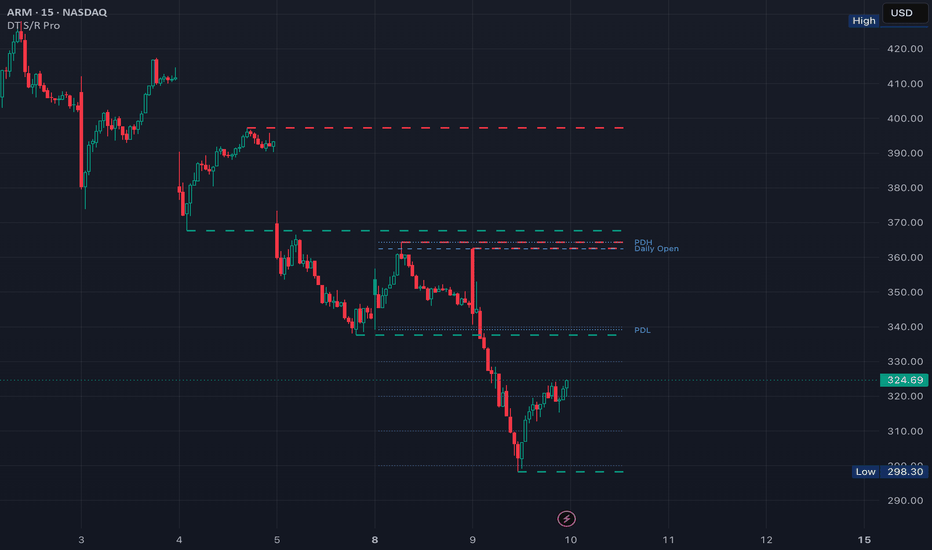
Indicatore

Impulse Waves & Reversal Zones [MQLSoftware]Impulse Waves & Reversal Zones is a structural overlay that reads price as a chain of impulse and correction legs, then projects the zone where the dominant trend is expected to resume. Instead of auto-drawing a Fibonacci grid on the latest swing, it first decides whether a leg is a genuine impulse, frames the counter-trend pullback against it, and builds a managed reversal zone with targets, a stop, and a live status that retires the setup once it plays out. A compact right-side panel adds higher-timeframe bias, trend-conviction strength, an alignment score, and a plain-language plan.
This is a visual analytical tool intended for chart reading and structure mapping. It does not execute trades and does not provide financial advice.
Key Features
Impulse legs qualified by a self-calibrating quality score and drawn as bold trend channels; weaker legs stay as a faint wave skeleton
Active correction framed as an amber box labelled with its retracement depth versus the impulse it is correcting (an overrun beyond 100% is flagged as a deep retrace / structure break, not a clean correction)
Reversal zone built on the 0.382-0.618 retracement of the qualified impulse, with TP1 (x1.272) and TP2 (x1.618) extension targets and a stop with its R:R
Live setup status that moves through wait, in-zone, target hit, and stopped, and greys the zone out once it is resolved so a played-out setup never lingers as a live opportunity
Multi-timeframe panel: bias plus trend-conviction (ADX) strength for the chart and the next higher timeframes, an alignment score, and a plain-language plan
Higher timeframes selected automatically from the standard timeframe ladder based on the chart, with fewer rows near the top of the ladder (Daily, Weekly)
A plan that softens to "low conviction" when the bias is backed only by ranging higher timeframes, with the active setup flagged the same way so the panel never states two opposite things at once
Core Concept
Most reversal-zone and Fibonacci tools on TradingView take one of two approaches. They either auto-draw a retracement grid on the most recent swing pair (no quality filter, and the grid jumps every time the latest swing redraws), or they label market structure (swings, breaks of structure) without projecting a managed, self-invalidating trade zone. Both leave the reader to decide by hand whether the leg even mattered and where the level should sit.
This indicator builds on a different base: classify structure first, then project a zone only from legs that qualify, and track that zone until it resolves. It adds three specific algorithmic elements on top of that base.
1. Protected-Swing Structure Classification. Trend direction is tracked by a change-of-character state machine with protected swings: the trend only flips when price breaks the swing low or high that launched the prior impulse. Shallow pullbacks therefore stay classified as corrections instead of constantly flipping the trend, which is the common failure mode of naive zigzag and two-pivot tools.
2. Self-Calibrating Impulse Quality Score. Every leg is scored 0-100 as one half Efficiency Ratio (net move divided by the path travelled, i.e. how straight the leg is) and one half Displacement Percentile (the leg's size in ATR units, ranked against the recent distribution of legs). A leg is drawn as an impulse only if it is with-trend and clears the score threshold. Because the size component is ranked against recent legs rather than compared to a fixed pip or point value, the filter self-calibrates across instruments and timeframes with no magic numbers.
3. Conviction-Aware Bias and Reversal Zone. The reversal zone is anchored to the dominant-direction qualified impulse and managed with targets, a stop, and a live state. Higher-timeframe context uses ADX strength rather than a path-efficiency ratio, so a strong trend still reads as strong mid-pullback. When the bias is supported only by ranging higher timeframes, the panel reports the bias but softens the plan to "low conviction" and marks any active setup the same way, so the structural read and the suggested action stay consistent.
Anatomy of the Display
Trend channels are bold green or coral channels drawn only for legs that qualify as impulses. The wave skeleton is a faint thin backbone drawn under every leg, so the raw swing structure stays visible; where a leg qualifies as an impulse, the bold channel sits on top of it.
The correction box is an amber dashed outline on the active counter-trend pullback, labelled with the retracement depth as a percentage of the impulse it is correcting. A retracement beyond 100% is relabelled as a deep retrace because the structure that the zone relied on is now at risk.
The reversal (entry) zone is the filled box spanning the 0.382-0.618 retracement of the qualified impulse, with a dotted mid-line and a label carrying the R:R of the resulting setup. TP1 and TP2 are the 1.272 and 1.618 extensions; the stop sits beyond the impulse origin.
The status chip reads the live state of the setup: waiting for the zone, in the zone, target hit, or stopped. Once the zone is hit or the setup is stopped, the zone and its levels grey out and the chip says so, so a resolved setup is visually retired rather than left looking active.
The right-side panel lists, per row, the timeframe, its bias (Bull / Bear / Flat), and a trend-conviction strength bar. The chart's own row is marked "pullback" when its direction opposes the trading bias, so a green chart row inside a bearish plan reads as the rally you are selling, not as a long signal. Below the rows: an ALIGN score (filled dots for how many higher timeframes vote each way, with the side that has no votes greyed), a verdict (ALIGNED, BULLISH/BEARISH BIAS, or MIXED), and the plan line.
Multi-Timeframe Panel
The higher-timeframe rows are selected automatically from the standard timeframe ladder based on the chart timeframe. For example, a 5m chart reads 15m / 30m / 1H; a 1H chart reads 4H / 1D / 1W; a 4H chart reads 1D / 1W / 1M. Near the top of the ladder fewer than three higher timeframes exist, so the panel simply shows fewer rows (a Daily chart shows Weekly and Monthly; a Weekly chart shows Monthly only). A manual mode lets you pin three timeframes of your choice instead. Higher-timeframe values are read with `lookahead=barmerge.lookahead_off` and a one-bar offset, which is the standard non-repainting pattern for higher-timeframe context.
Notes on Repainting
Historical impulses and corrections do not repaint. They are built from confirmed pivots (`ta.pivothigh` and `ta.pivotlow` with a right-bars parameter), so once a leg is committed it stays anchored in place.
The active forming leg is explicitly labelled "forming" and updates as new bars print; the reversal zone itself is anchored to the confirmed pivots of the qualified impulse.
The setup state is latched. Once price tags the stop or a target, that resolution is recorded against the setup's anchor and does not revert if price later trades back into the zone. A stopped or completed setup cannot revive itself.
Pivot detection has an inherent delay equal to the right-bars parameter (default 3 bars). A pivot becomes visible only after that many bars close past it. This is a property of all pivot-based indicators, not specific to this script.
Multi-timeframe panel data uses `lookahead=barmerge.lookahead_off` with a one-bar offset, the canonical non-repainting pattern for higher-timeframe context.
Alerts are gated by `barstate.isconfirmed` and fire once per closed bar, never intra-bar.
Typical Analysis Workflow
A common analytical workflow may include:
Reading the panel verdict and plan line to anchor an overall directional view, and noting the conviction (a "low conviction" plan means the bias is real but the higher timeframes are only ranging)
Checking the ALIGN row and the per-timeframe rows to see whether higher timeframes agree or conflict
Waiting for the status chip to read in-zone in the direction of the plan (sell rallies into the zone in a down-bias, buy pullbacks in an up-bias)
Reading the zone label R:R and the TP1 / TP2 / stop levels to frame the trade, then managing it with other forms of analysis and risk management
Treating the deep-retrace flag and the greyed-out (stopped / target-hit) state as structural context that a setup has changed or ended
Configuration
ATR Length - lookback for the ATR used in the swing filter, channel width, and stop placement.
Swing Filter (ATR) - the main noise lever. Higher values keep fewer, larger swings; lower values keep more, smaller swings.
Pivot Left Bars / Pivot Right Bars - the pivot lookback. Right Bars also sets the confirmation delay (a pivot is confirmed this many bars after it forms).
Impulse Strength Min - the minimum quality score (0-100) a with-trend leg must reach to be drawn as an impulse rather than skeleton.
Channel Width (ATR) - the half-width of the impulse channels, in ATR.
Visuals - colors for impulse up/down, correction, entry zone, targets, and stop; toggles for the wave skeleton, entry zone, targets, stop / R:R, and labels.
Multi-Timeframe HUD - show / hide the panel; Auto (next higher timeframes) versus Manual (three chosen timeframes); the three manual timeframes; and panel position (any corner).
Markets and Timeframes
The indicator can be applied across multiple markets and timeframes:
Forex
Stocks and Indices
Commodities
Cryptocurrencies
Because the swing filter, channel width, and impulse-size ranking are all ATR-based, the visual behavior stays consistent across instruments and timeframes. The Swing Filter and pivot settings can be tuned per chart for the cleanest read on a given symbol and timeframe.
Alerts
Price entered entry zone - fires when price first closes inside the reversal zone
New Swing High - fires when a high pivot is confirmed
New Swing Low - fires when a low pivot is confirmed
All higher TFs bullish - fires when every higher-timeframe row is bullish
All higher TFs bearish - fires when every higher-timeframe row is bearish
All alerts evaluate on confirmed bars to avoid intra-bar oscillation. Indicatore

Kalman Auction Ribbon [JOAT]Kalman Auction Ribbon is an open-source Pine Script v6 overlay that builds a six-layer adaptive ribbon from a zero-lag source and Kalman-style velocity smoothing. The goal is to show trend alignment, slope strength, deviation zones, and confirmed retest behavior in one restrained chart layer.
The script focuses on auction behavior around a dynamic ribbon. When the ribbon layers align and slope together, the state becomes directional. When price stretches beyond the deviation envelope and then returns, the script can mark supply or demand zones for later retests.
Core Concepts
1. Zero-Lag Source
The source is adjusted by comparing current price with a half-length historical value. This produces a more responsive input for the ribbon calculations.
zeroLagOffset = math.max(1, int(math.round(baseLength * 0.50)))
zeroLagSource = src + (src - nz(src , src))
2. Kalman-Style Velocity Estimate
Each ribbon layer uses a compact velocity smoother that maintains an estimate and speed component. The speed term helps the estimate respond to directional movement without relying on future bars.
prior = na(estimate ) ? value : estimate + nz(speed ) * gain
error = value - prior
speed := nz(speed ) * (1.0 - alpha * 0.50) + error * alpha * gain
estimate := prior + error * alpha
3. Six-Layer Ribbon Alignment
The script calculates six different ribbon lengths. Alignment and slope scores are combined into a trend score from -100 to +100. This score controls the ribbon color and dashboard power reading.
4. Deviation Zones
Upper and lower deviation levels are built around the ribbon midpoint using ATR. If price pushes beyond a deviation level and closes back inside, the script creates a compact supply or demand zone.
5. Retest Logic
Retest signals occur when price interacts with a live zone or the ribbon itself while the ribbon state remains directional. These signals are confirmed on closed bars.
Features
Six-layer adaptive ribbon: Multiple Kalman-style layers reveal alignment and spread
Velocity weighting: Gain input changes how aggressively the smoother responds
Deviation envelope: ATR-based upper and lower zones around the ribbon midpoint
Soft supply and demand boxes: Created only on confirmed deviation rejection behavior, with overlap suppression so the chart does not stack redundant boxes
Labeled deviation boxes: Supply and Demand Deviation boxes include midpoint guide lines and fade after invalidation
Confirmed buy/sell markers: Compact BUY and SELL dots appear only after confirmed ribbon or zone retest behavior
Trend-state candles: Optional bar coloring by ribbon state
Dashboard: Shows state, power, distance, and retest status
Alerts: Confirmed buy, confirmed sell, lower deviation zone, and upper deviation zone
Input Parameters
Core:
Source: Price source used by the ribbon
Base Length: Main length from which all ribbon layers are derived
Velocity Weight: Strength of the speed component
Deviation ATR Length: ATR length for deviation zones
Deviation Width: ATR multiplier for the envelope
Zones:
Show Deviation Zones: Toggles supply and demand boxes
Zone Extension Bars: How far active boxes extend to the right
Maximum Zones Per Side: Caps active supply and demand boxes
Signals:
Show Confirmed Buy/Sell: Toggles compact confirmed signal dots
Signal Spacing Bars: Minimum spacing between signal markers
Zone Extension Bars: Forward box extension length
Maximum Zones Per Side: Object cap for zone storage
Visual:
Palette: Selects the color pair
Show Ribbon: Toggles ribbon plots and fill
Trend-State Candles: Enables candle coloring
Dashboard: Shows the top-right panel
How to Use This Indicator
Step 1: Read Ribbon Alignment
A strongly stacked ribbon with a high dashboard power value indicates directional alignment. A mixed ribbon shows a less decisive state.
Step 2: Watch Deviation Zones
Zones are created when price rejects beyond an ATR deviation envelope. These boxes represent areas where price stretched away from the ribbon and returned.
Step 3: Use Retests With Context
Retest dots identify confirmed interactions with the ribbon or zones. They should be evaluated with trend state, market structure, and risk placement.
Indicator Limitations
Kalman-style smoothing is reactive and does not know future price direction
Strong news bars can move through deviation zones without meaningful retests
Object limits require older zones to be removed when the maximum is exceeded
The ribbon can compress during range conditions and produce mixed readings
Originality Statement
Kalman Auction Ribbon is original in its combination of zero-lag preprocessing, six independent Kalman-style layers, ATR deviation boxes, and confirmed retest tracking. It uses public Pine primitives in a custom structure and does not paste or disguise another author's source.
Disclaimer
This script is provided for educational and informational use only. It is not financial advice or a recommendation to buy or sell any financial instrument. Trading involves substantial risk of loss. Ribbon states and zones can fail during unusual volatility or thin liquidity. Always use independent analysis and proper risk management.
-Made with passion by jackofalltrades
Indicatore

Indicatore

MACD Pressure Zones | Alpha S+Range Compression Map | Alpha S+
Range Compression Map is a chart-based range and sideways-structure detection tool designed to help users study price compression directly on the chart.
Instead of displaying a separate oscillator or status panel, this script draws volatility-adjusted range boxes around areas where price remains contained inside a controlled structure. The box then changes its border and background state when price breaks above, breaks below, or returns back into the range after a failed break.
The script does not provide entry or exit recommendations. Its purpose is to help users study range compression, sideways structure, breakout context, failed breaks, and the relationship between price action and volatility-adjusted boundaries.
────────────────────
Core Concept
────────────────────
Markets often alternate between expansion and compression.
During compression, price tends to remain inside a relatively narrow structure before a directional move develops.
This script uses a volatility-adjusted range model to identify when recent closing prices remain inside an ATR-based boundary around a central price line.
The main concept is:
• calculate a central range reference
• build upper and lower boundaries using ATR-based volatility
• check whether recent closing prices remain inside those boundaries
• draw a range box when price is contained
• keep the visual focus on the box instead of adding many chart labels
• change the box state when price breaks upward or downward
• optionally detect failed breaks when price returns back into the range
• use border and background color changes instead of heavy signal markers
This makes the indicator useful as a chart-based range structure viewer rather than a standalone buy or sell signal tool.
────────────────────
What This Script Shows
────────────────────
The script can display:
• range compression boxes
• active sideways structure zones
• volatility-adjusted upper and lower range boundaries
• dotted range midpoint line
• unbroken range state
• upward break state
• downward break state
• optional fakeout state
• optional break labels
• optional fakeout labels
• optional adaptive center mode
• optional top and bottom range lines
These elements are designed to help users identify whether price is still compressed inside a range or has moved outside of the structure.
────────────────────
How It Works
────────────────────
1. The script calculates a central price reference using the selected center mode.
2. In SMA mode, the center is based on a moving average of the selected source.
3. In Adaptive mode, the center updates only when price moves far enough from the previous center using an ATR-based step.
4. The script builds an upper and lower range boundary around the center.
5. It checks whether recent closing prices remain inside the volatility-adjusted range.
6. When the selected number of recent bars stays inside the range, the script draws a range compression box.
7. If a new detected range overlaps with an existing box, the structure can be merged instead of creating unnecessary duplicate boxes.
8. While the range remains unbroken, the box stays in its neutral range color.
9. If price closes above the active range boundary, the box changes into an upward break state.
10. If price closes below the active range boundary, the box changes into a downward break state.
11. If fakeout detection is enabled, the script can change the box into a fakeout state when price returns back inside after a break.
12. The midpoint line helps users visually track the center of the detected range structure.
13. Optional labels can be enabled, but the default design keeps the chart clean by using box color states.
This structure helps users study compression, range behavior, breakout context, and failed-break behavior without relying on crowded markers.
────────────────────
Inputs And Customization
────────────────────
Users can adjust:
• minimum range length
• range width multiplier
• ATR length
• source price
• center mode: SMA or Adaptive
• adaptive ATR length
• adaptive factor
• overlap merging behavior
• cooldown after break
• maximum active range duration
• trend pause classification using ADX
• break buffer
• body confirmation for break conditions
• fakeout detection
• fakeout window
• midpoint line visibility
• top and bottom range line visibility
• optional break labels
• optional fakeout labels
• range box colors
• break box colors
• fakeout box colors
• border transparency
• background transparency
• border width
• signal border width
The default settings are designed to keep the chart clean while making range structures visible directly on the price chart.
────────────────────
Visual Elements
────────────────────
The script includes:
• range box
• midpoint line
• optional range top and bottom lines
• border color state
• background color state
• optional break labels
• optional fakeout labels
The range box is the main visual element.
The midpoint line shows the central level of the detected structure.
The border and background color provide the main state information without requiring large labels.
Optional labels can be enabled for users who prefer explicit text confirmation, but the primary design is based on clean chart boxes.
────────────────────
Reference States
────────────────────
Unbroken Range:
Price remains inside the detected volatility-adjusted range. The box stays in its neutral range color.
Upward Break:
Price closes above the active range boundary. The box changes to the upward break color.
Downward Break:
Price closes below the active range boundary. The box changes to the downward break color.
Fakeout:
If fakeout detection is enabled, price breaks out of the range and then returns back inside the structure within the selected fakeout window. The box changes to the fakeout color.
Trend Pause:
When ADX-based classification is enabled, some range structures can be treated as trend-pause zones rather than pure sideways ranges. This can help distinguish quiet consolidation from temporary pauses inside a stronger directional environment.
Adaptive Range:
When Adaptive mode is selected, the center line updates less frequently and only shifts when price moves far enough away from the previous center. This can create a more stable range reference in some market conditions.
These states are informational and should not be interpreted as trading instructions.
────────────────────
How To Use
────────────────────
Use this script as a chart-based range structure viewer.
General interpretation examples:
• A neutral range box can help users identify where price is moving inside a controlled sideways or compression structure.
• A green upward-break box can help users review where price moved above the detected range.
• A red downward-break box can help users review where price moved below the detected range.
• A yellow fakeout box, when enabled, can help users study failed range breaks.
• The midpoint line can be used as a visual reference for the center of the range.
• The adaptive center mode can be tested when users want a slower-moving center reference.
• The SMA center mode can be used when users want a more standard range-detection approach.
• Optional labels can be turned on for explicit break text, but the box color state is designed to be the primary visual guide.
This script is best reviewed together with price action, volume, volatility, support and resistance, trend structure, and higher-timeframe context.
────────────────────
Confirmation And Repainting Notes
────────────────────
The script uses recent closing prices and ATR-based boundaries to detect range structures.
Range boxes can update as new candles appear.
On realtime candles, values can change before the candle closes because price, ATR, and range conditions can update intrabar.
Break states are based on price moving beyond the active range boundary.
For more conservative analysis, users should evaluate range breaks after candle confirmation.
The script does not use future price data to predict market direction.
────────────────────
Limitations
────────────────────
This script does not predict future price movement.
It does not provide entry or exit recommendations.
A range break does not guarantee trend continuation.
A fakeout state does not guarantee reversal.
ATR length, range length, and width multiplier can materially change how often ranges appear.
Very low-liquidity markets, large gaps, news-driven moves, and extreme volatility can reduce the usefulness of range-based analysis.
In strong trending markets, some detected ranges may represent temporary pauses rather than true sideways structures.
This script should not be used as a standalone trading system.
────────────────────
Disclaimer
────────────────────
This publication is for educational and informational chart analysis only.
It does not constitute financial advice, investment advice, or a recommendation to trade any financial instrument.
All trading and investment decisions are the responsibility of the user.
━━━━━━━━━━━━━━━━━━━━
Range Compression Map | Alpha S+
Range Compression Map은 가격이 일정한 변동성 기준 범위 안에서 압축되거나 횡보하는 구조를 차트 위에 직접 표시하는 Range 구조 분석 도구입니다.
별도의 오실레이터나 큰 상태 패널을 중심으로 보여주는 방식이 아니라, 가격이 통제된 범위 안에 머무르는 구간을 박스로 표시하고, 이후 상단 돌파·하단 이탈·Fakeout 상태를 박스의 테두리와 배경색 변화로 구분합니다.
이 스크립트는 진입 또는 청산 추천을 제공하지 않습니다. 목적은 횡보 압축, 박스권 구조, 돌파 컨텍스트, 실패 돌파, 그리고 가격 행동과 변동성 기반 경계 사이의 관계를 분석하는 것입니다.
────────────────────
핵심 개념
────────────────────
시장은 확장과 압축을 반복하는 경우가 많습니다.
압축 구간에서는 가격이 비교적 제한된 구조 안에 머물다가 이후 방향성 움직임이 나타날 수 있습니다.
이 스크립트는 중심 가격선을 기준으로 ATR 기반 상단·하단 경계를 만들고, 최근 종가들이 해당 범위 안에 머무르는지를 확인해 Range 구조를 감지합니다.
핵심 개념은 다음과 같습니다.
• 중심 Range 기준선 계산
• ATR 기반 상단·하단 경계 생성
• 최근 종가들이 해당 경계 안에 머무르는지 확인
• 가격이 통제된 범위 안에 있으면 Range 박스 표시
• 많은 라벨보다 박스 자체를 중심으로 시각화
• 상단 돌파 또는 하단 이탈 시 박스 상태 변경
• 선택적으로 돌파 실패 후 Range 안으로 복귀하는 Fakeout 감지
• 무거운 마커 대신 테두리와 배경색 변화 중심으로 표현
이 구조는 단독 매수·매도 신호가 아니라, 차트 위에서 Range 구조를 분석하는 데 적합합니다.
────────────────────
이 스크립트가 보여주는 것
────────────────────
이 스크립트는 다음 요소를 표시할 수 있습니다.
• 횡보 압축 박스
• 활성 sideways structure zone
• 변동성 기반 상단·하단 Range 경계
• 점선 중앙선
• 아직 돌파되지 않은 Range 상태
• 상단 돌파 상태
• 하단 이탈 상태
• 선택 가능한 Fakeout 상태
• 선택 가능한 돌파 라벨
• 선택 가능한 Fakeout 라벨
• 선택 가능한 Adaptive Center 모드
• 선택 가능한 상단·하단 Range 라인
이 요소들은 가격이 아직 Range 안에서 압축 중인지, 또는 해당 구조를 벗어났는지를 확인하는 데 도움을 줍니다.
────────────────────
작동 방식
────────────────────
1. 스크립트는 선택한 center mode를 기준으로 중심 가격선을 계산합니다.
2. SMA 모드에서는 선택한 기준 가격의 이동평균을 중심선으로 사용합니다.
3. Adaptive 모드에서는 가격이 이전 중심선에서 ATR 기반 기준 이상으로 멀어졌을 때만 중심선이 단계적으로 갱신됩니다.
4. 중심선을 기준으로 상단·하단 Range 경계를 만듭니다.
5. 최근 종가들이 변동성 기반 Range 안에 머무르는지 확인합니다.
6. 설정된 기간 동안 가격이 Range 안에 머무르면 차트 위에 Range Compression 박스를 표시합니다.
7. 새로 감지된 Range가 기존 박스와 겹치면 불필요한 중복 박스를 만들지 않고 병합할 수 있습니다.
8. Range가 돌파되지 않은 동안 박스는 기본 Range 색상으로 유지됩니다.
9. 가격이 활성 Range 상단을 종가 기준으로 돌파하면 박스가 상방 돌파 상태로 변경됩니다.
10. 가격이 활성 Range 하단을 종가 기준으로 이탈하면 박스가 하방 이탈 상태로 변경됩니다.
11. Fakeout 감지를 켜면 돌파 후 다시 Range 안으로 복귀하는 경우 박스가 Fakeout 상태로 변경될 수 있습니다.
12. 중앙선은 감지된 Range 구조의 중심 위치를 시각적으로 확인하는 데 도움을 줍니다.
13. 선택형 라벨을 켤 수 있지만, 기본 설계는 박스 색상 상태를 중심으로 차트를 깔끔하게 유지하는 방식입니다.
이 구조는 복잡한 마커 없이 압축, Range 행동, 돌파 컨텍스트, 실패 돌파를 분석하는 데 도움을 줍니다.
────────────────────
입력값 및 설정
────────────────────
사용자는 다음 항목을 조정할 수 있습니다.
• 최소 Range 길이
• Range 폭 배수
• ATR 길이
• 기준 가격
• 중심선 모드: SMA 또는 Adaptive
• Adaptive ATR 길이
• Adaptive factor
• 겹치는 Range 병합 여부
• 돌파 후 cooldown
• 최대 활성 Range 유지 기간
• ADX 기반 Trend Pause 분류
• 돌파 버퍼
• 돌파 조건의 몸통 확인 여부
• Fakeout 감지
• Fakeout 확인 기간
• 중앙선 표시 여부
• 상단·하단 Range 라인 표시 여부
• 선택형 돌파 라벨
• 선택형 Fakeout 라벨
• Range 박스 색상
• 돌파 박스 색상
• Fakeout 박스 색상
• 테두리 투명도
• 배경 투명도
• 테두리 두께
• 신호 상태 테두리 두께
기본 설정은 차트를 깔끔하게 유지하면서 Range 구조를 가격 차트 위에서 직접 읽을 수 있도록 설계되어 있습니다.
────────────────────
시각 요소
────────────────────
이 스크립트는 다음 시각 요소를 포함합니다.
• Range box
• Midpoint line
• 선택 가능한 Range top / bottom lines
• Border color state
• Background color state
• 선택 가능한 break labels
• 선택 가능한 fakeout labels
Range box는 이 지표의 핵심 시각 요소입니다.
Midpoint line은 감지된 구조의 중심 레벨을 보여줍니다.
테두리와 배경색은 큰 라벨 없이도 현재 Range 상태를 구분할 수 있게 합니다.
선택형 라벨은 명시적인 텍스트 확인을 원하는 사용자를 위해 제공되지만, 기본 설계는 박스 색상 상태를 중심으로 합니다.
────────────────────
참고 상태
────────────────────
Unbroken Range:
가격이 감지된 변동성 기반 Range 안에 머무르는 상태입니다. 박스는 기본 Range 색상으로 유지됩니다.
Upward Break:
가격이 활성 Range 상단을 종가 기준으로 돌파한 상태입니다. 박스는 상방 돌파 색상으로 변경됩니다.
Downward Break:
가격이 활성 Range 하단을 종가 기준으로 이탈한 상태입니다. 박스는 하방 이탈 색상으로 변경됩니다.
Fakeout:
Fakeout 감지가 켜져 있을 때, 가격이 Range를 돌파한 뒤 설정된 기간 안에 다시 Range 안으로 복귀한 상태입니다. 박스는 Fakeout 색상으로 변경됩니다.
Trend Pause:
ADX 기반 분류가 켜져 있을 때, 일부 Range 구조는 순수 횡보가 아니라 강한 방향성 흐름 중의 일시적 휴식 구간으로 분류될 수 있습니다.
Adaptive Range:
Adaptive mode를 선택하면 중심선이 매 봉마다 계속 흔들리지 않고, 가격이 이전 중심선에서 충분히 멀어졌을 때만 갱신됩니다. 일부 시장 조건에서는 더 안정적인 Range 기준을 제공할 수 있습니다.
이 상태들은 정보 제공용이며, 매매 지시로 해석해서는 안 됩니다.
────────────────────
사용 방법
────────────────────
이 스크립트는 차트 기반 Range 구조 분석 도구로 사용하는 것이 적절합니다.
일반적인 해석 예시는 다음과 같습니다.
• 기본 Range 박스는 가격이 통제된 횡보 또는 압축 구조 안에서 움직이는 구간을 확인하는 데 사용할 수 있습니다.
• 초록색 상방 돌파 박스는 가격이 감지된 Range 상단을 벗어난 구간을 복기하는 데 사용할 수 있습니다.
• 빨간색 하방 이탈 박스는 가격이 감지된 Range 하단을 벗어난 구간을 복기하는 데 사용할 수 있습니다.
• 노란색 Fakeout 박스는 Fakeout 감지를 켰을 때 실패한 Range 돌파를 검토하는 데 사용할 수 있습니다.
• 중앙선은 Range 중심 위치를 확인하는 시각 기준으로 사용할 수 있습니다.
• Adaptive Center 모드는 더 느리게 움직이는 중심 기준을 테스트하고 싶을 때 사용할 수 있습니다.
• SMA Center 모드는 더 표준적인 Range 감지 방식을 원할 때 사용할 수 있습니다.
• 선택형 라벨은 명시적 돌파 텍스트를 원할 때 켤 수 있지만, 박스 색상 상태가 기본 시각 가이드로 설계되어 있습니다.
이 스크립트는 가격 행동, 거래량, 변동성, 지지와 저항, 추세 구조, 상위 시간대 컨텍스트와 함께 검토하는 것이 좋습니다.
────────────────────
확인봉 및 리페인트 안내
────────────────────
이 스크립트는 최근 종가와 ATR 기반 경계를 사용해 Range 구조를 감지합니다.
Range 박스는 새로운 캔들이 나타남에 따라 갱신될 수 있습니다.
실시간 캔들에서는 가격, ATR, Range 조건이 봉 마감 전까지 변할 수 있으므로 값이 변경될 수 있습니다.
돌파 상태는 가격이 활성 Range 경계를 벗어나는지를 기준으로 판단합니다.
보다 보수적인 분석을 원한다면 Range 돌파는 봉 마감 이후 확인하는 것이 적절합니다.
이 스크립트는 미래 가격 데이터를 사용해 시장 방향을 예측하지 않습니다.
────────────────────
한계
────────────────────
이 스크립트는 미래 가격 움직임을 예측하지 않습니다.
진입 또는 청산 추천을 제공하지 않습니다.
Range 돌파가 추세 지속을 보장하지 않습니다.
Fakeout 상태가 추세 반전을 보장하지 않습니다.
ATR 길이, Range 길이, 폭 배수는 Range가 표시되는 빈도에 큰 영향을 줄 수 있습니다.
저유동성 시장, 큰 갭, 뉴스 기반 급변동, 극단적 변동성 구간에서는 Range 기반 분석의 효율이 낮아질 수 있습니다.
강한 추세장에서는 일부 Range가 순수 횡보가 아니라 일시적 휴식 구간일 수 있습니다.
이 스크립트를 단독 매매 시스템으로 사용해서는 안 됩니다.
────────────────────
중요 고지
────────────────────
본 게시물은 교육 및 정보 제공 목적의 차트 분석 자료입니다.
투자 자문, 특정 금융상품 거래 권유, 또는 수익 보장을 의미하지 않습니다.
모든 투자 판단과 그 결과에 대한 책임은 이용자 본인에게 있습니다. Indicatore

Smart Range ProjectionSmart Range Projection — Daily High/Low Forecast from Opening Volatility
OVERVIEW
This indicator projects the likely shape of the trading day early in the session, anchoring everything to the day's opening price. It plots the expected daily range envelope, an expansion range for potential trend day extension, and reversal zones near the projected extremes where
price often exhausts or turns.
The projection is built from a blend of four independent volatility inputs: daily ATR, opening volatility, CPR width, and an optional VIX multiplier. Once the opening window completes, the levels lock in for the rest of the session and do not shift.
HOW IT WORKS
1. Daily ATR Baseline
The previous day's confirmed ATR sets the expected full-day travel.
A user-defined multiplier (default 1.0x) converts this into the projected day range.
2. Opening Volatility Factor
The indicator measures the high-low range of the first N bars after the session opens (default 3 bars) and compares it to a rolling 20-day average of opening ranges. An unusually wide opening stretches the projection. An unusually narrow opening tightens it. The influence is
user-controlled (default 0.5).
3. CPR Width Lean
Central Pivot Range width is calculated from the previous day's high, low, and close. The current day's CPR width is compared to its 20-day average. A narrow CPR (relative to history) widens the projection because narrow CPRs statistically precede trending or expansion days.
A wide CPR tightens the projection.
4. VIX Multiplier (Optional)
An optional volatility-index input scales the entire projection based on the regime. Above the user-defined neutral level, the range widens.
Below it, the range tightens. Disabled by default. Enable only if your local volatility index is available on TradingView.
5. Reversal and Expansion Zones
- Projected High and Projected Low: the expected daily range envelope
- Expansion High and Low: dashed lines beyond the normal range, marking trend day extension targets
- Reversal Zones: shaded bands just inside the projected extremes where price often exhausts on normal days
- Expansion Zones: shaded bands between the normal envelope and expansion lines, highlighting trend day extension territory
NON-REPAINTING DESIGN
- Prior-day values use historical offset with lookahead_off
- Day open is tracked locally via session change detection
- Projection levels lock once the opening window completes and remain fixed for the rest of the session
- No future data access, no lookahead leak
INPUTS
- Daily ATR length and base range multiplier
- Expansion multiplier and reversal zone percentage
- Opening window bars and volatility influence
- Optional VIX symbol, neutral level, and toggle
- CPR lean toggle, dashboard toggle, level rounding toggle
- Color customization for all elements
DASHBOARD
A status panel shows projected high and low, expansion high and low, day lean classification (Trend or Range bias from CPR width), measured opening volatility, and the active VIX multiplier.
ALERTS
Four alert conditions are available:
- Price reached projected day high
- Price reached projected day low
- Price hit expansion high (trend day extension)
- Price hit expansion low (trend day extension)
HOW TO USE
The projected high and low serve as the day's expected range boundaries.
Price reaching these zones early often coincides with exhaustion on range days. The expansion lines act as continuation targets when strong directional moves break the normal range envelope.
The day lean classification in the dashboard helps set expectations.
A Trend lean (narrow CPR) suggests price is more likely to reach the expansion lines. A Range lean (wide CPR) suggests price is more likely to oscillate within the normal envelope and reverse at the extremes.
This indicator works on intraday timeframes where multiple bars fit within a session. It is most effective on actively traded instruments with reliable opening sessions.
NOTES
This is a technical analysis tool intended for educational and informational purposes. Volatility projections are statistical estimates based on historical patterns and do not guarantee price will reach the projected levels. Always apply proper risk management and combine with
your own trading methodology.
CREDITS
Original implementation. Uses TradingView built-in ATR, security, and array functions combined with original opening volatility and CPR width lean methodology. Indicatore

Fibonacci Touch HeatmapFibonacci Touch Heatmap
Fibonacci Touch Heatmap is an advanced Fibonacci channel indicator that dynamically builds a full upper and lower Fibonacci structure over a user-defined lookback window, then scores each level by how many times price has genuinely touched or respected it. The result is a ranked, color-coded map of the most statistically significant support and resistance zones on your chart — updated automatically on every bar.
What Problem This Solves
Standard Fibonacci tools require manual swing selection and draw static levels with no feedback on whether price actually reacted to them. This indicator eliminates both limitations: it auto-detects the range, draws all 14 Fibonacci levels (7 upper + 7 lower), and continuously counts how many times each level has been touched — giving traders an objective, data-driven view of which levels the market genuinely respects.
How It Works — Technical Details
Range Detection:
The indicator uses ta.highest(high, lookback) and ta.lowest(low, lookback) to identify the high and low of the most recent N bars (default: 300). The midpoint is calculated as the arithmetic average of these two values.
Fibonacci Level Construction:
Seven standard Fibonacci ratios (0.0, 0.236, 0.382, 0.500, 0.618, 0.786, 1.0) are applied symmetrically from the midpoint — upward toward the range high (upper channel) and downward toward the range low (lower channel) — producing 14 distinct price levels in total.
Touch Counting Algorithm:
On the final bar (barstate.islast), the script iterates backward through every bar in the lookback window. For each bar, it checks whether the high or low came within a user-defined sensitivity threshold of any Fibonacci level. The threshold is calculated as a percentage of the level price (default: 0.2%), making it adaptive across different asset classes and price scales. Each qualifying bar increments that level's touch counter.
Gradient Coloring:
A custom gradColor() function interpolates RGB values across three anchor colors — bottom (green), mid (yellow), top (red) — based on the level's vertical position within the channel. This creates a smooth visual gradient that immediately communicates zone type: green = support territory, red = resistance territory.
Touch Heatmap:
Line opacity and the color in the top-right table are determined by each level's touch count relative to the maximum touch count across all 14 levels, using the touchColor() function. Levels with more touches render with warmer, more opaque colors.
Background Zones:
The channel is divided into 9 equal vertical slices, each rendered as a semi-transparent colored box, creating a heat gradient background that visually reinforces price zone significance.
Multi-Timeframe Panel
Two additional timeframes (default: 1H and 4H, fully customizable) are analyzed via request.security(). For each external timeframe, the script independently fetches the 500-bar high/low range, builds the complete Fibonacci channel, runs the touch-counting algorithm, and identifies the top 2 most-touched levels. These are displayed in the bottom-right table, color-coded by timeframe (blue = TF1, purple = TF2), allowing traders to instantly identify cross-timeframe Fibonacci confluences.
Top-Right Table — Most Touched Fib Levels
Displays the top 4 most-touched Fibonacci levels from the current chart timeframe, ranked using a bubble sort across all 14 levels. Each row shows:
Fib ratio with direction arrow (↑ upper channel / ↓ lower channel)
Exact price of the level
Touch count (colored from blue → red based on relative touch frequency)
Zone — Upper (resistance side) or Lower (support side)
How To Use
Set Lookback Bars to define the range of history to analyze. Higher values (500+) reveal macro structure; lower values (50–150) focus on recent structure.
Identify high-touch levels from the top-right table — these are the levels price has tested most frequently and are the strongest candidate zones for future reactions.
Use the multi-TF table to find confluences: when the same Fibonacci level appears as most-touched on both TF1 and TF2 simultaneously, it indicates a high-probability reaction zone.
Adjust Touch Sensitivity (%) based on asset volatility:
Crypto: 0.2–0.5% recommended
Forex: 0.05–0.15% recommended
Equities: 0.1–0.3% recommended
Color gradient gives immediate visual context — price trading near red zones suggests resistance pressure; near green zones suggests support.
Inputs Summary
InputDefaultDescriptionLookback Bars300Number of bars used for range and touch detectionTouch Sensitivity (%)0.002Tolerance for a bar high/low to qualify as a touchFib Line Width1Visual thickness of dashed level linesTop / Mid / Bottom ColorRed / Yellow / GreenGradient anchor colorsTimeframe 160 (1H)First external TF for multi-TF panelTimeframe 2240 (4H)Second external TF for multi-TF panel
Originality
This script is an original work combining automatic range-based Fibonacci channel construction with a bar-by-bar touch counting algorithm and multi-timeframe confluence detection. While Fibonacci retracement is a widely used concept, the specific implementation — symmetric dual-channel construction from a dynamic midpoint, percentage-adaptive touch sensitivity, RGB gradient heatmap coloring, bubble-sort level ranking, and simultaneous multi-timeframe touch analysis via request.security() — represents the author's own methodology for transforming static Fibonacci levels into a dynamic, data-scored support/resistance framework.
Disclaimer
This indicator is intended for educational and analytical purposes only. No indicator can predict future price movements with certainty. Always combine multiple forms of analysis and apply proper risk management before making any trading decisions.
Short Description:
Automatically builds a dual Fibonacci channel from the N-bar range high/low, counts how many times price has touched each of the 14 levels, and ranks them by touch frequency. Includes a multi-timeframe panel showing the most-respected Fibonacci levels across two additional timeframes for confluence analysis. Indicatore

VV Control Levels AnalyzerVV Control Levels Analyzer
VV Control Levels Analyzer is a control-level analysis indicator designed to help traders evaluate where price is positioned relative to major volume and VWAP reference levels.
The indicator studies four main control references:
1. Daily POC
2. Weekly POC
3. Monthly POC
4. Anchored VWAP Gate Line
It then summarizes the relationship between price and those levels in a clean technical dashboard.
This script is an indicator, not a strategy. It does not place trades, does not calculate backtest results, and does not provide guaranteed buy or sell signals. Its purpose is to organize important control-level information on the chart so users can make their own analysis.
Overview
The main idea behind VV Control Levels Analyzer is that price location relative to high-volume control levels can provide useful market context.
When price is above most control levels, the chart may be showing stronger acceptance above value.
When price is below most control levels, the chart may be showing weaker acceptance below value.
When price is close to one or more control levels, the market may be testing an important decision area.
The indicator does not predict future price movement. It shows where price is trading relative to selected control references.
Main components
1. Daily, Weekly, and Monthly POC
The script calculates an approximate Point of Control for the previous completed Daily, Weekly, and Monthly periods.
POC means Point of Control. It represents the price area with the highest estimated volume within the selected period.
The indicator calculates POC internally by:
* storing period price and volume data,
* dividing the price range into volume rows,
* distributing volume into those rows,
* selecting the row with the highest accumulated volume.
The POC calculation is an approximation based on available chart data. It is not intended to exactly duplicate exchange-native or broker-native volume profile tools.
The Daily, Weekly, and Monthly POC values are shown in the dashboard. The active POC line can also be plotted on the chart if the user enables it from settings.
By default, the POC line is hidden to keep the chart clean. However, the POC logic remains active even when the line is hidden.
2. Active POC Line
The user can choose which POC period is displayed on the chart:
* Daily
* Weekly
* Monthly
The displayed POC line is optional. It can be enabled or disabled from the settings.
Bar coloring can still use the active POC even when the POC line itself is hidden.
The active POC is used to color candles as:
* above POC,
* below POC,
* crossing POC.
This is visual context only and should not be treated as a standalone entry or exit signal.
3. VWAP Gate Line
The indicator calculates a VWAP Gate from a selected anchor period:
* Daily
* Weekly
* Monthly
The main VWAP Gate Line is shown by default. It represents the central VWAP reference from the selected period.
The script also calculates optional upper and lower VWAP gates using standard deviation around the VWAP.
The optional gates are:
* Upper Gate 1
* Upper Gate 2
* Lower Gate 1
* Lower Gate 2
By default, only the main VWAP line is shown to reduce chart clutter. Users can disable “Show Only Main VWAP Line” to display the additional upper and lower gate levels.
4. VWAP Standard Deviation Gates
The upper and lower VWAP gates are calculated using the selected standard deviation multipliers.
First Gate Multiplier controls the first deviation band.
Second Gate Multiplier controls the second deviation band.
These levels can help users identify areas where price is stretched above or below the selected VWAP period.
These gates are reference levels only. They are not automatic reversal or breakout signals.
5. Smart Control Logic
The indicator evaluates price against four control references:
* Daily POC
* Weekly POC
* Monthly POC
* VWAP Gate Line
It counts how many of these levels price is currently above.
The result is displayed as Control Strength:
0/4 = price is below all four control references
1/4 = price is above one control reference
2/4 = price is above two control references
3/4 = price is above three control references
4/4 = price is above all four control references
This control count is used to create the dashboard status.
Dashboard status explained
Very Bullish
Price is above all four control references and is not too close to a control level.
Bullish
Price is above most control references and is not too close to a control level.
Neutral
Price is around the middle of the control structure or near a control level.
Recovery Watch
Price is near a control level after weakness. This may indicate that price is testing an area where recovery could be studied, but it is not a buy signal.
Breakout Watch
Price is near a control level and trading above or near the VWAP Gate. This may indicate that price is testing control resistance, but it is not a breakout confirmation by itself.
Breakdown Risk
Price is near a control area but below the VWAP Gate or important control references. This may indicate weakness around control levels, but it is not a short signal by itself.
Bearish
Price is below most control references.
Very Bearish
Price is below all four control references and is not too close to a control level.
Trend reading
The script also provides a simple trend reading:
Up
Price is above both Weekly POC and Monthly POC.
Down
Price is below both Weekly POC and Monthly POC.
Sideways
Price is mixed between Weekly and Monthly POC references.
This trend field is a broad context reading only. It should not be treated as a complete trend-following system.
Nearest Control
The dashboard identifies the nearest control level to current price among:
* Daily POC
* Weekly POC
* Monthly POC
* VWAP Gate
It also shows the distance from current price to that nearest control level as a percentage.
If price is within the selected Neutral Distance %, the dashboard treats price as being near a control area.
Volume Ratio
The script calculates a volume ratio by comparing current volume with a 20-period average volume.
Volume Ratio = Current Volume / 20-period Average Volume
The dashboard highlights volume strength based on the selected Strong Volume Ratio setting.
Strong volume means current volume is above the selected threshold.
Weak or normal volume means current volume has not reached that threshold.
Volume is used as context only. It does not validate a trade by itself.
Technical Analysis Dashboard
The dashboard displays:
Symbol
Shows the current ticker.
Current Price
Shows the latest close price.
Status
Shows the smart control state, such as Very Bullish, Neutral, Breakout Watch, or Breakdown Risk.
Trend
Shows Up, Down, or Sideways based on Weekly and Monthly POC position.
Current Volume
Shows the current chart volume.
Volume Ratio
Compares current volume with its recent 20-period average.
Daily POC
Shows the calculated Daily POC.
Weekly POC
Shows the calculated Weekly POC.
Monthly POC
Shows the calculated Monthly POC.
Upper Zone
Shows the first upper VWAP deviation gate.
VWAP Gate Line
Shows the main VWAP gate value.
Lower Zone
Shows the first lower VWAP deviation gate.
Control Strength
Shows how many of the four control references price is currently above.
Nearest Control
Shows the closest control reference to current price.
Distance
Shows percentage distance from price to the nearest control level.
Settings explained
Volume Profile / POC Settings
Show POC Line
Shows or hides the active POC line. The POC remains active in the dashboard and logic even when hidden.
POC Base Color
Controls the color of the active POC line.
POC Transparency
Controls how visible or soft the POC line appears.
POC Line Width
Controls the thickness of the active POC line.
Above POC Bar
Color used when price closes above the active POC.
Below POC Bar
Color used when price closes below the active POC.
POC Cross Bar
Color used when price crosses the active POC.
Displayed POC Period
Selects which POC period is displayed as the active POC line: Daily, Weekly, or Monthly.
Color Bars by POC
Colors candles according to price position relative to the active POC.
Volume Resolution Rows
Controls how many rows are used in the internal POC approximation. Higher values may provide more detail but can require more processing.
VWAP Gate Settings
Show VWAP Gate
Enables or disables VWAP gate plotting.
Show Only Main VWAP Line
When enabled, only the central VWAP Gate Line is shown. When disabled, upper and lower deviation gates are also shown.
Main VWAP Line
Controls the color of the main VWAP line.
Main VWAP Line Width
Controls the thickness of the main VWAP line.
Optional Gate Lines
Controls the color of the optional upper and lower VWAP gates.
Fill Optional Gate Zones
Fills the space between optional VWAP deviation gates. This is disabled by default for a cleaner chart.
VWAP Gate Period
Selects the anchor period used for the VWAP calculation: Daily, Weekly, or Monthly.
First Gate Multiplier
Controls the first standard deviation level around VWAP.
Second Gate Multiplier
Controls the second standard deviation level around VWAP.
Smart Control Logic
Neutral Distance %
Defines how close price must be to a control level to be treated as a neutral or control-test area.
Strong Volume Ratio
Defines the volume ratio threshold used to classify current volume as strong.
Use Volume in Optional Status Label
Adds volume context to the optional chart label.
Technical Analysis Table
Show Table
Shows or hides the technical dashboard.
Table Position
Controls where the dashboard appears on the chart.
Table Size
Controls the dashboard text size.
Show Optional Status Label
Shows a compact chart label with the current VV Analyzer status.
Optional Label Size
Controls the size of the optional status label.
Optional Label Distance
Controls how far the optional label is placed from the latest candle using ATR.
How to use this indicator
A practical workflow:
1. Check the dashboard Status.
2. Review Control Strength to see how many major control levels price is above.
3. Check the Trend field for broad context.
4. Identify the Nearest Control level and distance.
5. Watch price behavior around the VWAP Gate Line and the nearest POC.
6. Use Volume Ratio as supporting context.
7. Combine this information with your own market structure, risk management, and trading plan.
Example interpretation
If price is above Daily POC, Weekly POC, Monthly POC, and VWAP Gate, the dashboard may show Very Bullish. This means price is accepted above all selected control references. It does not mean price must continue upward.
If price is below most control references, the dashboard may show Bearish or Very Bearish. This means price is trading below important control levels. It does not mean price must continue downward.
If price is close to a POC or VWAP Gate, the dashboard may show Breakout Watch, Recovery Watch, Breakdown Risk, or Neutral. This means price is testing a control area and needs further confirmation from the user’s own analysis.
Alerts
The script includes alerts for:
VV Very Bullish
Price is above all control levels.
VV Bullish
Price is above most control levels.
VV Recovery Watch
Price is near a control level after weakness.
VV Breakout Watch
Price is testing control resistance.
VV Breakdown Risk
Price is below VWAP or a key control area.
VV Very Bearish
Price is below all control levels.
These alerts are classification alerts only. They do not instruct the user to buy or sell.
Important limitations
This indicator does not predict future price movement.
It does not provide buy or sell signals.
It does not place strategy orders.
It does not provide backtesting results.
POC values are internally approximated from available chart price and volume data.
VWAP gates are calculated from the selected period and may differ from other VWAP tools depending on method and data source.
Daily, Weekly, and Monthly values are based on completed periods and update when a new period begins.
Volume quality can differ between markets, symbols, and data providers.
The dashboard status is a contextual classification, not a trade recommendation.
Recommended use
VV Control Levels Analyzer is best used as a decision-support tool for traders who study:
* Point of Control
* VWAP
* volume-based control levels
* price acceptance above or below value
* distance from key control levels
* volume confirmation
* multi-timeframe control context
It is designed for visual market context, not automated trading, not guaranteed signal generation, and not financial advice.
Originality and purpose
VV Control Levels Analyzer combines multi-timeframe POC, anchored VWAP gates, volume ratio, nearest control distance, bar coloring, and a smart technical dashboard into one clean control-level framework.
The purpose of combining these components is to help traders quickly understand whether price is above, below, or testing important volume and VWAP reference levels.
The script is intended to reduce chart clutter by showing the main VWAP gate by default, hiding the POC line by default, and placing the detailed control information inside the dashboard.
Indicatore

Continuous Market Grid botThe Continuous Market Grid Bot is a high-frequency, range-bound algorithmic market-making strategy. It bypasses conventional directional forecasting by dividing a master price bracket into symmetrical, mathematically spaced price corridors. Utilizing dynamic status arrays to maintain structural awareness, the engine systematically scaling-in long inventory via micro-dips and liquidating positions for explicit, compounding cash-flow gains upon immediate cyclical rotations.
Core Algorithmic Architecture
1. Finite Array State Machine
Unlike standard grid scripts that continuously spam overlapping or duplicate orders, this version integrates a persistent boolean status matrix (grid_holding). The array serves as the bot's independent memory core. It dynamically locks a specific grid corridor the microsecond an accumulation trigger is met, ensuring that a tier cannot be duplicated until its active inventory is completely cleared via an offsetting profit execution.
2. Self-Replenishing Micro-Corridors
The matrix loop is designed for continuous rotation across the operational band:
The Dip Layer: The engine monitors price interactions with each localized grid line. If price cuts downward across a tier, the bot locks inventory for that specific corridor.
The Targeted Rotation: Once inventory is secured, the strategy targets a discrete liquidation zone exactly one step higher. Upon an upward crossover, the engine flushes the tier, clears the array reference, and instantly rearms the level to repeat the accumulation process on the next corrective wave.
3. Dynamic Boundary Activation
To prevent adverse fills during chaotic macro trends, the system includes an automated initialization sequence. The execution engine remains completely dormant until price action enters the designated trading bracket. Once active, the intermediate nodes are cleanly rendered as non-repainting dashed structural levels across the right side of the user workspace.
Strategy Parameters & Backtesting Metrics
To replicate realistic institutional execution, the strategy properties are pre-embedded with specific live-market friction metrics. When running historical simulations or connecting to automated API order routers, ensure the configuration mirrors these structural settings:
Explicit Commission Values: The script is hardcoded with a 0.035% execution fee (strategy.commission.percent) applied to every single transaction. This precisely mirrors real-world round-trip costs on premium derivative exchanges and discount brokerages.
Slippage Buffer Requirements: It is highly recommended to configure 10 to 15 Slippage Ticks within your TradingView strategy properties tab. This ensures the historical performance metrics account for order book latency, depth variations, and execution delay during high-speed matching environments.
Independent Close Rule: The strategy utilizes the close_entries_rule="ANY" instruction. This is a critical configuration that enables the engine to close position tiers out of chronological order, focusing strictly on closing the exact matching layer that reached its specific target matrix.
High-Risk Capital & Margin Warning
Symmetrical grid trading algorithms present exceptionally stable performance metrics during consolidation zones, but they introduce structural liabilities that users must thoroughly evaluate before allocating active capital:
High Capital Intensity: Grid systems demand heavy capital allocation. Because the bot continuously accumulates units as price descends, your ledger requires deep, un-leveraged cash reserves to sustain multiple simultaneous open drawdowns without triggering forced liquidation or margin calls.
The Trend Extinction Risk: The primary hazard to a grid framework is a one-directional macro trend. If an asset enters a persistent, structural capitulation phase that breaks cleanly below your Lower Price Limit, the bot will remain at maximum asset capacity, holding a full basket of losing inventory with mounting unrealized losses.
Emergency Risk Isolation: The script features an embedded Stop Loss Control Module. If enabled, a breach of the user-defined floor price immediately initiates a comprehensive purge sequence—wiping all pending orders, flushing outstanding inventory at market values, and clearing the status arrays to completely halt ongoing downside exposure.
Disclaimer: Trading financial derivative instruments carries a high level of capital risk. Grid bots are highly susceptible to severe trend extensions and liquidity blackouts. This technical model is presented strictly for educational research and historical backtesting analysis. It does not constitute personalized financial advice or automated asset management.
Strategia
Indicatore

Anchor S&R Suite - ParallelAnchor S&R Suite — Parallel
A data-driven, zero-repaint parallel support/resistance grid built from the market's own swing pivots.
Instead of eyeballing a range and dragging parallel lines by hand, this indicator finds the swing pivots automatically, groups the ones that cluster at similar prices into support/resistance levels, picks the single strongest Resistance/Support pair, and repeats that channel's height up and down as an evenly-spaced grid — recomputed on a higher-time-frame (HTF) rhythm and held flat in between.
WHAT MAKES IT DIFFERENT
• Data-driven, not arbitrary. The channel is built from REAL swing pivots that actually printed. A level's weight comes from how many pivots cluster on it and how long they span — not from a hand-placed box.
• Anchored to a time frame. You set the cadence (e.g. Weekly); the channel recomputes once per closed HTF candle and stays perfectly flat until the next close — clean horizontal steps, not sloping lines.
• Zero repaint. Pivots are confirmed and only closed HTF periods are used. A level you saw earlier sits in the exact same place now. Warm-up is not repaint: if a period has too few qualifying levels, the previous channel simply CARRIES FORWARD — no past value is ever rewritten.
HOW IT WORKS
1. Pivots — confirmed swing highs/lows on your CHART bars (strength = Pivot Period).
2. Window — at each cadence close, keep the pivots from the last `Lookback` closed HTF periods.
3. Clustering — sort pivots by price and merge those within Cluster Tolerance (% of price) into one level, carrying its touch COUNT and time SPAN.
4. Best channel — among levels with at least Min Touches, pick the Resistance/Support pair with the highest score (see below), subject to the width filters.
5. Grid — repeat that channel's height up and down: price = resistance − height × j. The base channel (Resistance & Support) is highlighted; the lines above/below are projected S/R.
THE ALGORITHM
For every Resistance cluster R and Support cluster S with R.price > S.price and height H = R − S > 0:
width% = H / basis × 100 (basis = Support or Resistance — see Width Basis)
reject if width% < Min% or width% > Max% (0 disables that bound)
score = (R.count + S.count) × (R.span + S.span + 1)
→ keep the highest-scoring pair; if none qualifies, carry the previous channel forward.
Why that score: (count) rewards levels touched many times; (span) rewards levels respected over a long stretch. Multiplying them favours a channel whose BOTH edges are repeatedly AND durably defended.
SETTINGS
• Cadence TF — when the channel recomputes and how macro it is. Higher = fewer, wider, slower channels; lower = tighter, more reactive. Must be greater than the chart TF.
• Lookback (1–20) — how many closed HTF periods of pivots feed the search. More = steadier, better-tested channel; less = tracks the latest swing but can be noisier or carry forward.
• Pivot Period — swing strength: a pivot needs this many bars on each side. Higher = bigger, fewer, more significant swings; lower = finer, busier levels. (A pivot is confirmed `period` bars after it forms — a delay, not repaint.)
• Price Source — High/Low (wicks, true extremes) or Open/Close (bodies only, cleaner on wick-heavy assets).
• Cluster Tolerance % — how close two pivots must be to count as the same level. Larger = fewer, fatter, better-touched levels; smaller = more, thinner levels (which may fall below Min Touches).
• Min Touches — minimum pivots in a cluster to qualify as a level. Higher = only well-tested levels (more robust, fewer candidates); lower = looser.
• Min / Max Channel Width % (+ Width Basis) — a FILTER on which R/S pairs are allowed, by channel height as a percentage. It does not resize a channel; it decides how tall the chosen one may be (and therefore the grid spacing).
width% = height / basis × 100, with basis = Support (“Bottom to Top”) or Resistance (“Top to Bottom”).
Example: R = 70 000, S = 63 000 → height 7 000 → 11.1% (Bottom to Top) or 10.0% (Top to Bottom).
Raise Min → forces a taller channel / wider grid; lower Max → forces a shorter channel / tighter grid; 0 = bound off. If the band is too strict, no pair passes and the channel carries forward.
Lookback = 1 (reactive) vs Lookback = 3 (broader, steadier).
• Parallel Lines (per side) — how many grid repeats are drawn above/below the base channel (total = 2 × N + 1). Coverage only.
• Display — colour & width for the Grid and the Base channel, and optional channel-height % labels.
The base channel (bold Resistance / Support) with the % labels on, and the lighter grid repeating around it.
HOW TO TRADE THE GRID
• Trade reactions, not the line itself — watch for a rejection, reclaim or stall at a line rather than assuming it stops there.
• The base channel is the anchor: inside it = range conditions (fade the edges); a clean break-and-hold often runs to the next grid line (one channel height away).
• Grid spacing = a measured-move unit — the next line up/down is a natural first target after a breakout.
• Confluence first — a line matters most where it lines up with prior structure, a round number, or (with the rest of the suite) a Volume/OI zone or a Fib level.
EXAMPLE SETUPS
• Swing (default): 1h–4h chart, Cadence = Weekly, Lookback = 3, Pivot Period = 5.
• Intraday: 5–15m chart, Cadence = Daily, Lookback = 2–3, Pivot Period = 3–5.
• Macro: Daily chart, Cadence = Monthly, Pivot Period = 8–15.
Nothing showing? Raise Cluster Tolerance, then lower Min Touches, then widen the Min/Max width band, then increase Lookback.
Works on any market and any timeframe.
This indicator is a charting / analysis tool. It is not financial advice and does not generate buy or sell signals.
Indicatore
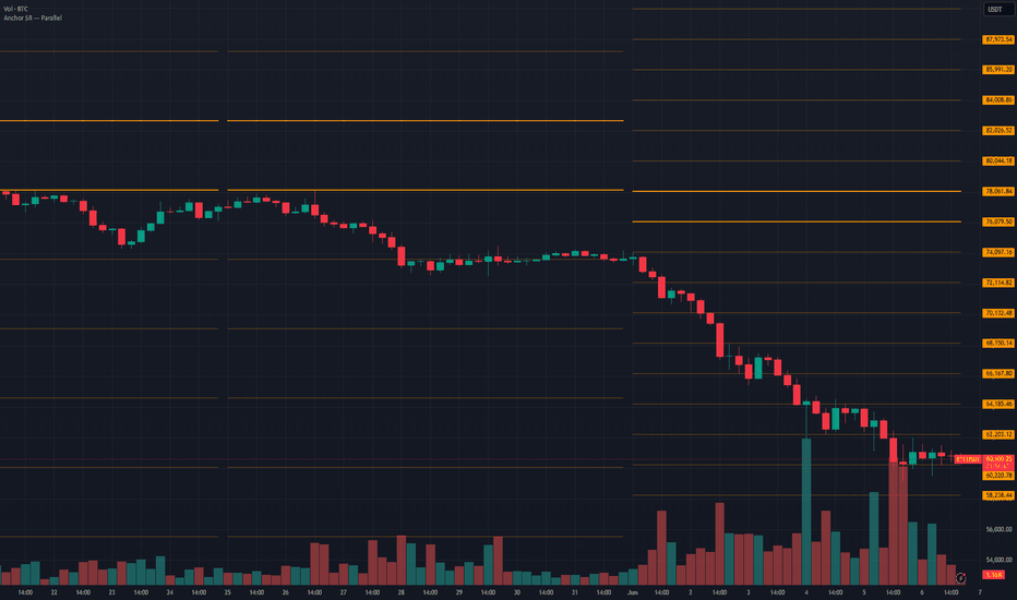
Anchor S&R Suite - Fib LevelsAnchor S&R Suite — Fib Levels
Anchored Fibonacci retracements & projections that recompute on a higher-time-frame rhythm and never repaint.
Instead of dragging a fib tool by hand between a swing high and a swing low, this indicator measures a reference range automatically — the High/Low (or Open/Close) of one or several CLOSED higher-time-frame (HTF) candles — and plots the full Fibonacci ladder from it, across your entire chart history. The result is a clean, repeatable level grid that updates on a predictable rhythm and never moves under your feet.
WHAT MAKES IT DIFFERENT
• Anchored to a time frame, not a manual swing. You choose the cadence (e.g. Weekly); the levels are recomputed once per closed HTF candle and held perfectly flat until the next one closes — clean horizontal steps, not sloping diagonals.
• Zero repaint. The indicator only ever reads candles that have already CLOSED. During the current, still-forming HTF period the levels are based on the previous period and do not move — not on every tick, not on every chart bar. A level you saw an hour ago sits in the exact same place now, so what you backtest by eye is what you would have traded.
• Warm-up, not repaint. The only caveat: the first levels can appear only once enough closed HTF candles exist (exactly like a moving average needs its length in bars). No historical value is ever rewritten — loading more history simply reveals earlier levels.
HOW IT WORKS
On the close of every cadence candle, the indicator takes the range of the last closed candle(s) and rebuilds the ladder from it. That ladder stays fixed until the next cadence close, when it jumps to the new values.
• Retracement levels sit INSIDE the range — the pullback / continuation zones you watch while price works within an established range.
• Projection levels sit OUTSIDE the range — measured-move / breakout targets for when price leaves the range.
The deliberate one-bar gap you see at each boundary is intentional: it marks the bar where a new HTF candle closed and the ladder was recomputed. It is the visual signature of a correctly anchored, non-repainting level — not a glitch.
THE CALCULATION
Let mergeHi and mergeLo be the high and low of the anchored window, and H = mergeHi − mergeLo its height. For a ratio f, the four directions are:
• Retracement from the high : mergeHi − f × H (descends into the range)
• Retracement from the low : mergeLo + f × H (rises into the range)
• Projection above the high : mergeHi + f × H (extends upward)
• Projection below the low : mergeLo − f × H (extends downward)
At f = 0 a level sits on its anchor; at f = 1 it reaches the opposite end of the range. So 0 and 1 are the range bounds (the decision zone lives between them, 0.382–0.786). Ratios are not limited to 0–1: a value above 1 (e.g. 1.272, 1.618) projects beyond the range as an extension target.
SETTINGS
• Cadence TF — the heartbeat. It controls both which range the fibs are measured from and how often they refresh. Higher cadence = fewer, wider, slower levels (a macro map); lower cadence = tighter, more reactive levels. Must be greater than the chart TF.
• Lookback (1–20) — how many closed HTF candles merge into ONE range. 1 = the last period only (maximum reactivity); 4 (default) = the highest high / lowest low of the last four (broader, calmer, anchored to more structure).
• Source — High/Low (full candle range, wicks included; captures the true extremes) or Open/Close (bodies only, ignores wicks; tighter, “accepted-value” levels).
• Fib Mode — Retracement / Projection / Both. It also greys out the inputs of the family it excludes.
• 7 levels — each row gives INDEPENDENT control over its Retracement and its Projection: a toggle plus a fully editable ratio for each family, side by side. So any level can be a retracement, a projection, both, or neither, each with its own value. The classic 0.382 / 0.5 / 0.618 / 0.786 are shown by default; 0 / 0.236 / 1 are available. Edit any value to match your method (an OTE-style 0.705, a 0.65, or a 1.618 extension).
• Display — independent show/hide and colour for the Upper family, the Lower family and the Range lines; level & range line widths; optional per-level ratio labels.
Lookback = 1 — the last closed period only (tight, reactive).
Lookback = 4 (default) — a broader, calmer range over four periods.
Retracement / Projection / Both.
HOW TO TRADE THE LEVELS
The indicator draws the map; you decide. A level is a decision point, not a guarantee.
• Confluence first. A level matters most when several things agree at the same price: a retracement and a projection landing together, a level sitting on a prior swing high/low or a round number. The more overlap, the stronger the reaction tends to be.
• React, don’t predict. Watch HOW price behaves at a level — a rejection wick, a reclaim, a tight consolidation — rather than assuming it must stop there.
• Entries. In a pullback, continuation entries tend to cluster around 0.5 / 0.618 / 0.786; wait for a reaction rather than a blind limit on the line.
• Stops & targets. A stop just beyond the next level (where the idea is invalidated); targets at the opposite retracements, the range bounds, or the projection extensions (0.618 / 1.0 / 1.618).
• Bias from the range. Holding above the 0.5 of the range reads as relative strength; losing the deep 0.786 suggests the pullback is failing.
EXAMPLE SETUPS
• Swing (default): chart 1h–4h, Cadence = Weekly, Lookback = 4, Source = High/Low, Mode = Retracement. The multi-week range frames the swing; the internal retracements mark where to add or fade.
• Intraday off the prior day: chart 5–15m, Cadence = Daily, Lookback = 1, Mode = Both. Prior-day range as anchors, internal retracements as pullback zones, projections as breakout targets.
• Macro context: chart Daily, Cadence = Monthly, Lookback = 1. A slow, stable map of monthly value for bias.
Works on any market and any timeframe.
This indicator is a charting / analysis tool. It is not financial advice and does not generate buy or sell signals.
Indicatore

Delivery Shift CISD [Viprasol]Overview
This indicator is based on an open-source "Change in State of Delivery (CISD)" community script, which detects the ICT concept of a delivery shift — the moment price reverses and closes back through the opening level of the opposing momentum leg that produced it. The original tracks swing-point liquidity, detects bullish and bearish CISD events using a displacement-ratio test, marks the origin level, and flags "strong" CISDs that occur right after opposing liquidity is swept. This version keeps that detection engine intact and adds a Viprasol confluence and execution layer: a 0-4 confluence score with A/B/C grading, optional volume-surge and higher-timeframe bias filters, a signal cooldown, a minimum-score gate, and an ATR-anchored Entry/SL/TP risk overlay drawn on qualified signals.
It is built for ICT/SMC traders who use CISD as a confirmation of intraday delivery direction and want each event graded by confluence, with optional filters and an automatic risk projection.
How It Works
Swing Liquidity (from original):
Pivot highs and lows over the swing period create horizontal liquidity lines that extend forward each bar. A line is mitigated when price trades through it (high >= level for a high, low <= level for a low) on a confirmed bar, and removed; lines older than the expiry threshold stop updating. The most recently mitigated high and low, and how many bars ago they were taken, are retained for the sweep test below.
CISD Detection (from original):
When a candle flips color (a down candle followed by an up candle, or vice versa), its open is stored as a potential CISD origin along with its bar index. On each later bar the script checks whether price has closed back beyond that stored open. If it has, it measures the displacement of the leg as a ratio: for a bearish CISD, (highest close in the leg − origin open) / (top of the bearish run − origin open). If that ratio exceeds the Noise Filter, the event qualifies as a CISD, the origin level is drawn, and the trend state flips. Weaker candidates are discarded and the scan continues to older candidates.
Liquidity-Sweep Confluence (from original):
A CISD is flagged "strong" when it fires within the liquidity-lookback window after the opposing liquidity was swept — a bearish CISD where a swing high was just taken and price closed back below it, or a bullish CISD where a swing low was taken and price closed back above. These print the labeled sweep arrows.
Confluence Score & Grade (new):
Every CISD event is scored 0-4 by summing four independent confluence checks:
score = strongDisplacement? + liquiditySweep? + htfAligned? + volumeSurge?
- strongDisplacement = the measured ratio is at least halfway between the Noise Filter and 1.0 (a decisively strong leg, not a marginal one).
- liquiditySweep = the original sweep confluence is present.
- htfAligned = the CISD direction agrees with the higher-timeframe EMA.
- volumeSurge = volume on the CISD bar exceeds its rolling average × the multiplier.
The score maps to a grade — A (>= 3), B (= 2), C (<= 1) — labeled at the origin level.
Filters & Qualified Signals (new):
Four optional gates can be applied without altering the original CISD drawing: a volume-surge requirement, a higher-timeframe EMA bias (bull only above, bear only below), a per-signal cooldown (minimum bars between qualified signals), and a minimum-confluence-score requirement. A CISD that passes all active gates becomes a "qualified" signal, which is what the risk overlay and the two new qualified alerts use. With every gate at its default (cooldown 0, filters off, min score 0), every CISD qualifies and the original behaviour is unchanged.
Risk Overlay (new):
On a qualified CISD, the script projects three lines: Entry at the CISD origin level, Stop-Loss beyond the CISD swing extreme (the highest/lowest close captured during detection) plus an ATR buffer, and Take-Profit at Entry ± risk × the Risk:Reward ratio, where risk is the Entry-to-SL distance. Colored ENTRY/SL/TP price labels mark the line ends. Only the most recent qualified signal's projection is kept, to avoid clutter.
What Is Original (Viprasol Additions)
1. Confluence score (0-4) and A/B/C grade per CISD, from displacement strength, liquidity sweep, HTF alignment, and volume surge.
2. Minimum-confluence-score gate and the "qualified signal" concept layered on top of raw CISD detection.
3. Optional volume-surge filter (volume above its rolling average × multiplier on the CISD bar).
4. Optional higher-timeframe EMA bias filter (and an always-computed HTF read used for grading).
5. Per-signal cooldown to prevent qualified-signal clustering.
6. ATR-anchored Entry/SL/TP risk overlay with colored price labels, with the stop anchored to the CISD swing extreme.
Key Features
From the Original:
- Swing-point liquidity lines with forward extension, mitigation, and expiry
- Displacement-ratio CISD detection for both directions with a Noise Filter
- Origin-level lines drawn on each CISD
- Trend/delivery-state tracking
- Liquidity-sweep confluence with labeled strong-CISD arrows
- Swing-high / swing-low dots
- Trend-gradient candle coloring
Added in This Version (Viprasol):
- 0-4 confluence score with A/B/C grade label
- Minimum-score gate and qualified-signal logic
- Volume-surge filter, HTF EMA bias filter, and signal cooldown
- ATR-anchored Entry/SL/TP risk overlay with price labels
- Info dashboard (delivery state, last grade, sweep, HTF bias, volume, live liquidity counts)
- Two new alerts for qualified bull/bear signals; all alert messages made dynamic
How to Use
Getting Started:
1. Add to a standard candlestick chart (not Heikin Ashi).
2. With defaults, every CISD is drawn and graded — read the A/B/C label to judge each event's confluence.
3. To trade only stronger setups, raise the Minimum Confluence Score or enable the volume / HTF filters.
Reading the Chart:
- Candles tint green/red with the current delivery state.
- A thick green/red horizontal line marks a CISD origin level; the A/B/C label shows its grade.
- ▲/▼ arrows mark strong CISDs that followed an opposing liquidity sweep.
- On a qualified CISD (with SL/TP enabled), Entry/SL/TP lines and price labels project to the right.
Recommended Starting Points:
- Intraday (1m-15m): Swing Period 10-12, Noise Filter 0.6-0.7, Min Score 0-1
- Swing (1H-4H): Swing Period 15-20, Noise Filter 0.7-0.8, Min Score 2, enable HTF bias
- Higher conviction: Min Score 3 (grade A), or require volume surge + HTF bias
These are starting points only — every market and timeframe behaves differently. Backtest and adjust before trading live.
Settings
Calculations: Noise Filter (displacement ratio threshold), Swing Period, Expiry Bars, Liquidity Lookback.
Signal Filters (Viprasol): signal cooldown, volume-surge requirement (length + multiplier), and HTF EMA bias (resolution + length).
Confluence & Quality (Viprasol): show grade on CISD, minimum confluence score.
Risk Overlay (Viprasol): show SL/TP on qualified CISD, show price labels, ATR period, SL ATR buffer, Risk:Reward.
Appearance: bullish/bearish colors, candle body and wick transparency, hide expired levels, hide mitigated levels.
Dashboard / Display: dashboard toggle and position.
Alerts
1. Swing High Mitigation — a swing-high liquidity line was taken
2. Swing Low Mitigation — a swing-low liquidity line was taken
3. Bearish CISD — a bearish change in state of delivery fired
4. Bullish CISD — a bullish change in state of delivery fired
5. Strong Bearish (Sweep) — bearish CISD following an opposing liquidity sweep
6. Strong Bullish (Sweep) — bullish CISD following an opposing liquidity sweep
7. Qualified Bull — a bullish CISD that passed all active filters and the score gate
8. Qualified Bear — a bearish CISD that passed all active filters and the score gate
All alerts include {{ticker}}, {{close}}, and {{interval}} for dynamic notification messages.
Limitations & Disclaimer
- CISD detection scans backward through stored candidate origins and uses closing relationships; signals are evaluated as bars confirm and the displacement ratio is measured after the move.
- The HTF EMA bias uses request.security with lookahead disabled; HTF values update only as the higher-timeframe bar develops.
- Swing liquidity lines are capped (oldest pruned) and can expire; in fast markets some mitigations may occur off-screen relative to the visible levels.
- The risk overlay's stop is anchored to the captured swing extreme plus an ATR buffer — it is a mechanical projection, not an optimized stop, and the lines are visual references only; they do not place or manage trades.
- Filters and the minimum-score gate reduce the number of qualified signals; in choppy conditions valid CISDs may not qualify, while with all gates off qualified signals equal raw CISDs.
- Past performance does not guarantee future results. This indicator is for educational and analytical purposes only and is not financial advice. Always use proper risk management and test on historical data before trading live.
Credits & Attribution
Based on an open-source "Change in State of Delivery (CISD)" community indicator, which provided the swing-point liquidity lines with extension/mitigation/expiry, the displacement-ratio CISD detection for both directions, the origin-level drawing, the trend/delivery-state tracking, the liquidity-sweep confluence with labeled strong-CISD arrows, the swing dots, and the trend-gradient candle coloring. CISD is an Inner Circle Trader (ICT) concept. Added by Viprasol: the 0-4 confluence score and A/B/C grading, the minimum-score gate and qualified-signal logic, the volume-surge and HTF EMA bias filters, the signal cooldown, the ATR-anchored Entry/SL/TP risk overlay with colored price labels, the info dashboard, and the two additional qualified-signal alerts with dynamic messages.
Published open-source per TradingView House Rules.
Indicatore