Professional Volume Delta & CVD SuiteEnglish Version
Professional Volume Delta & CVD Suite
Professional Volume Delta & CVD Suite is an all-in-one order flow and volume analysis indicator engineered to deliver institutional-grade market context across any timeframe. By combining Intrabar Volume Delta estimation, Cumulative Volume Delta (CVD), Order Flow Divergences, Volume Climax detection, and a dynamic Real-Time Data Table, this script condenses multiple advanced trading tools into a single, clean workspace.
Key Features & Internal Mechanics
Dual Volume Delta Calculation Engine:
Wick-Based Estimation (Recommended): Evaluates intrabar price action by analyzing high, low, and close prices (volume * (close - low) / (high - low)) to accurately distribute buying and selling volume within each candle.
Color-Based Alternative: Calculates net volume based strictly on candle close vs. open.
Automated Multi-Timeframe Adaptation (Auto-Adjust):
Intraday Mode (1m - 1H): Calculates a Session CVD that resets to 0 at the start of each trading day (00:00 UTC), ideal for tracking day-trading order flow absorption. Divergence lookback is set to 5 bars, Volume MA to 20 periods, and Climax Multiplier to 2.0x.
Daily & Weekly Mode (1D, 1W, 1M): Automatically switches to a Continuous Accumulated CVD (no daily reset) to track multi-week accumulation/distribution cycles. Sets the volume Moving Average to 21 periods (1 trading month) and divergence lookback to 10 bars for high-conviction swing signals.
In-Bar Buyer/Seller Percentage Labels:
Plots exact percentages of buying (%C) and selling (%V) pressure on each individual volume bar.
Fully customizable display: show both percentages, only the winning side, adjust font sizes, toggle % symbols, and control vertical offset distance.
Algorithmic Price vs. Delta Divergence Detection:
Bullish Divergence (Green Arrow): Triggers below the volume histogram when price marks a lower low but Volume Delta forms a higher low (indicates institutional supply absorption).
Bearish Divergence (Red Arrow): Triggers above the volume histogram when price marks a higher high but Volume Delta forms a lower high (indicates demand exhaustion/distribution).
Volume Climax & Trend Filters:
Volume Moving Average (MA): Smoothed volume baseline (default 21 periods for daily charts).
Volume Climax Highlights: Highlights exceptional volume spikes in bright gold when total volume exceeds the moving average by the configured multiplier (e.g., 1.8x or 2.0x), signaling heavy institutional positioning or potential exhaustion.
Dynamic Real-Time Information Table:
Candle Status: Live indicator (Bullish 🟢 / Bearish 🔴).
% Buyer / % Seller: Exact percentage breakdown for the current open candle.
Candle Delta: Net delta percentage of the active bar.
Session CVD / Accumulated CVD: Shows continuous capital flow adapted to the current timeframe.
Volume Activity: Displays current volume activity relative to the MA percentage or alerts CLIMAX ⚡.
Inputs & Customization Settings
Timeframe Configuration: Toggle auto-adaptation or manually enforce Intraday / Daily modes.
Calculations & Display: Choose calculation methods, toggle label modes, change text sizes, and adjust label offsets.
Divergences & MA Filters: Customize MA period, divergence lookback window (bars), and climax thresholds.
Table & Aesthetics: Full control over UI table placement (9 anchor points), table size, row visibility, and custom color palettes for buyers, sellers, climax bars, and divergence shapes.
Versión en Español
Professional Volume Delta & CVD Suite
Professional Volume Delta & CVD Suite es un indicador de análisis de flujo de órdenes (order flow) y volumen todo-en-uno, diseñado para proporcionar contexto de nivel institucional en cualquier marco temporal. Al combinar la estimación de Delta por vela, el Delta Acumulado (CVD), Divergencias de Order Flow, detección de Clímax de Volumen y una Tabla de Datos en Tiempo Real, este script sintetiza múltiples herramientas avanzadas en un único panel limpio y eficiente.
Características Principales y Mecánica Interna
Motor Doble de Cálculo de Volumen Delta:
Estimación por Mechas (Recomendado): Evalúa la acción del precio dentro de la vela analizando máximos, mínimos y cierres (volumen * (cierre - mínimo) / (máximo - mínimo)) para distribuir de manera precisa el volumen comprador y vendedor.
Alternativa por Color de Vela: Calcula el volumen neto basándose estrictamente en el cierre vs. la apertura.
Adaptación Automática según Temporalidad (Auto-Adjust):
Modo Intradía (1m - 1H): Calcula un CVD de Sesión que se reinicia a 0 al inicio de cada jornada (00:00 UTC), ideal para medir la absorción en el day trading. Configura la evaluación de divergencias en 5 velas, la Media Móvil en 20 períodos y el Clímax en 2.0x.
Modo Diario y Semanal (1D, 1W, 1M): Cambia automáticamente a un CVD Acumulado Continuo (sin reseteo diario) para medir ciclos de acumulación y distribución de mediano/largo plazo. Ajusta la Media Móvil de volumen a 21 ruedas (1 mes bursátil) y la evaluación de divergencias a 10 velas para señales swing de alta probabilidad.
Etiquetas de Porcentaje Comprador/Vendedor en Barras:
Muestra en tiempo real los porcentajes exactos de presión compradora (%C) y vendedora (%V) sobre cada barra de volumen.
Personalización visual total: muestra ambos porcentajes, solo el lado ganador, ajusta el tamaño de texto, activa/desactiva el símbolo % y modifica la distancia vertical.
Detección Algorítmica de Divergencias (Precio vs. Delta):
Divergencia Alcista (Flecha Verde): Salta debajo del histograma cuando el precio hace un mínimo más bajo pero el Delta de Volumen hace un mínimo más alto (señal de absorción de oferta institucional).
Divergencia Bajista (Flecha Roja): Salta arriba del histograma cuando el precio marca un máximo más alto pero el Delta de Volumen marca un máximo más bajo (señal de agotamiento de demanda o distribución).
Clímax de Volumen y Filtros de Tendencia:
Media Móvil de Volumen (MA): Línea base del volumen promedio (fijada en 21 ruedas para gráficos diarios).
Resaltado de Clímax: Pinta las barras en color dorado brillante cuando el volumen total supera drásticamente la media móvil según el multiplicador configurado (1.8x o 2.0x), alertando sobre volumen institucional masivo o posible agotamiento.
Tabla Informativa Dinámica en Tiempo Real:
Estado Vela: Indicador en vivo del sesgo actual (ALCISTA 🟢 / BAJISTA 🔴).
% Comprador / % Vendedor: Desglose porcentual exacto de la vela en formación.
Delta Vela: Porcentaje de delta neto de la barra activa.
CVD Sesión / CVD Acumulado: Flujo continuo de dinero adaptado dinámicamente según la temporalidad del gráfico.
Actividad Vol.: Muestra la actividad de volumen respecto a la Media Móvil o la alerta de CLÍMAX ⚡.
Parámetros y Opciones de Configuración
Configuración de Temporalidad: Activa/desactiva la autoconfiguración o fuerza manualmente los modos Intradía o Diario/Semanal.
Cálculos y Visualización: Elección del método de cálculo, formatos de etiqueta, tamaños de texto y distancias en el gráfico.
Divergencias y Filtros de MA: Ajuste de períodos de Media Móvil, rango de velas para divergencias (lookback) y umbrales de clímax.
Estética de la Tabla: Control total sobre la posición de la tabla (9 anclajes), tamaño de celda, visibilidad de filas y paletas de colores totalmente personalizables (compradores, vendedores, clímax y flechas de divergencia).
Indicatore

VWAP Regime AI [AxeAlgo]OVERVIEW
VWAP Regime AI is an anchored VWAP (Volume-Weighted Average Price) with
standard-deviation bands, enhanced by a native, from-scratch k-means
clustering engine that classifies recent market volatility into three
regimes — Low, Medium, and High — and adapts the indicator's behavior
based on which regime is currently active.
At its foundation this is the same tool institutional desks use every
day: a running volume-weighted average price with bands around it, used
to judge where "fair value" sits and how far price has stretched away
from it. What this script adds on top is a genuine unsupervised machine
learning step that reads the market's own volatility and lets that
reading drive three things: how wide the bands are, which signal logic
is active, and how much the indicator should trust its own regime call
before acting on it.
This script is free and open-source. All calculations happen natively in
Pine Script on your own chart data.
============================================================
FULL TRANSPARENCY ABOUT THE "AI" IN THIS SCRIPT
============================================================
Pine Script cannot call an LLM, a remote model, or any external AI
service — TradingView does not allow outbound network requests from
indicators, and this script makes none. There is no hidden API call,
no "black box," and nothing running outside of what you can read in the
source code.
What "AI" means here specifically: this script implements k-means
clustering — a well-established unsupervised machine learning algorithm
— entirely in native Pine Script math and arrays. It groups a rolling
window of recent ATR (volatility) readings into three clusters by
repeatedly assigning each reading to its nearest cluster center and then
recomputing each center as the mean of everything assigned to it. This
publication states plainly what is and is not happening so nobody
mistakes this for predictive AI, sentiment analysis, or anything that
consults external data or forecasts the future. It classifies what has
already happened; it does not predict what will happen next.
============================================================
HOW IT WORKS
============================================================
VWAP & Standard Deviation Bands
--------------------------------
The core VWAP resets at the start of each new anchor period (Session,
Week, Month, Quarter, or Year — configurable) and accumulates a running
volume-weighted average from there. Standard deviation is calculated
using the same volume-weighted variance formula TradingView's own
built-in VWAP-with-bands tool. Up to three bands can be shown,
each set at a configurable standard-deviation distance from VWAP.
AI Volatility Clustering (K-Means)
------------------------------------
A rolling window of recent ATR readings (length and window size are both
configurable) is periodically re-clustered into three groups — Low,
Medium, High — using k-means. Reclustering happens every N bars rather
than every single bar, purely for performance; the live classification
of the current bar still updates continuously between reclusters.
Alongside the classification, the script computes a Confidence score
(0-100%): how much closer the current reading sits to its nearest
cluster than to its second-nearest one. A reading sitting right on a
cluster's center scores near 100%; a reading sitting on the boundary
between two regimes — an effectively ambiguous call — scores near 0%.
A "Minimum Regime Confidence" input lets you require a minimum score
before the regime is allowed to influence anything else in the script,
so an unconfident, boundary-line classification doesn't silently drive
behavior.
Adaptive Band Width
----------------------
When enabled, the standard-deviation band multipliers are scaled by a
per-regime factor: tighter in Low volatility, wider in High volatility,
instead of one fixed multiplier that's too tight in some conditions and
too loose in others. This only engages once the AI is both ready
(its lookback window has filled and it has run at least once) and
confident, per the Minimum Regime Confidence setting above.
Signal Logic — Mean Reversion, Breakout, or Auto
----------------------------------------------------
Two independent signal styles are built in, both measured off Band 2:
Mean Reversion looks for price crossing back inside the band from
outside (betting an extreme move snaps back toward VWAP); Breakout looks
for price crossing outside the band (betting the move has momentum to
keep running). "Auto" mode lets the detected volatility regime decide
which logic applies bar by bar — Low/Medium volatility defaults to Mean
Reversion, High volatility defaults to Breakout — falling back to Mean
Reversion whenever the AI isn't ready or confident enough to trust.
Three independent, stackable filters reduce noise on top of the raw
band cross:
- Bar-Close Confirmation: a cross only counts once the bar has fully
closed, filtering out intrabar wicks that reverse before the close.
- Signal Cooldown: blocks a new signal, in either direction, for a
configurable number of bars after the last one — aimed directly at
whipsaw (price crossing back and forth across a band repeatedly).
- Band Cross Buffer (hysteresis): requires price to clear a band by a
small extra distance, in standard deviations, rather than an exact
touch, so noise sitting right on the line doesn't keep re-triggering
crosses back and forth.
AI Volume Confirmation Filter
---------------------------------
The same k-means engine used for volatility is optionally reused on raw
volume, classifying each bar's volume as Low, Normal, or High. When
enabled, signals are only allowed on Normal-or-above volume, filtering
out low-conviction moves.
Secondary VWAP
-----------------
An optional second VWAP anchored to a different (typically higher)
period can be plotted alongside the primary one — for example a Weekly
VWAP behind a Session VWAP — for confluence, since multiple VWAP anchors
are commonly watched together rather than trusting a single one in
isolation. It is a reference line only; no bands are drawn for it.
Signal Track Record
-----------------------
An on-chart scorecard tracks, in a simple and fully model-free way, how
the signals have actually performed: each signal opens a virtual
position at that bar's close, and the next opposite-direction signal
closes it out, scored as a win or a loss purely on which way price
moved in between. No target or stop-loss assumption is built into this
score — see the Limitations section below for exactly what this number
does and does not tell you.
Status Table
---------------
An optional on-chart table shows the current regime and its confidence,
the active band scale, the current VWAP value, a "Stretch Score" (see
below), and the Signal Track Record numbers, all in one place.
Stretch Score
----------------
A signed z-score of how many standard deviations price currently sits
from VWAP. Because it's measured in the same standard deviations the
bands are drawn in, it stays consistent with whatever the adaptive band
width currently has in effect — a reading of +2.00 always means "sitting
on Band 2," whether that band is currently tight or wide.
============================================================
HOW TO USE THIS INDICATOR
============================================================
1. Start with the default settings and watch the status table for a
while before changing anything. Let the AI Volatility Clustering
lookback window fill (the table will show "Calibrating..." until it
has enough data) so the regime classification is meaningful.
2. Decide whether you want Mean Reversion, Breakout, or Auto signal
logic. Auto is a reasonable starting point since it adapts to
detected conditions automatically.
3. Watch the Confidence score alongside the regime label. If confidence
is frequently low on your instrument/timeframe, consider raising the
Minimum Regime Confidence input so the indicator falls back to
neutral behavior more readily instead of acting on ambiguous calls.
4. Use the Stretch Score to judge how extended price currently is
relative to VWAP in a way that stays consistent even as band width
adapts.
5. Treat the Signal Track Record as a rough, ongoing sanity check on
signal quality — not a backtest and not a promise (see Limitations).
6. This is a visual/analytical tool, not an auto-trading system. It
does not place trades. Any alerts it can generate are notifications
only.
============================================================
INPUT GROUPS (SUMMARY)
============================================================
VWAP Settings
- Anchor Period (Session / Week / Month / Quarter / Year)
- Source price used for the VWAP calculation
Secondary VWAP (Confluence)
- Show/hide toggle, its own anchor period, and its own color
Standard Deviation Bands
- Independent show/hide and distance (in standard deviations) for
three bands, plus a toggle for the gradient fill shading around them
AI Volatility Clustering (K-Means)
- Enable/disable the clustering engine
- ATR length used as the raw volatility reading that gets clustered
- Clustering lookback window (bars) and reclustering frequency
- Number of k-means refinement iterations per reclustering
- Adaptive band width toggle and the three per-regime scale factors
- Minimum Regime Confidence threshold
Signals
- Show/hide signal markers
- Signal Mode (Mean Reversion / Breakout / Auto)
- Volume confirmation filter toggle
- Bar-close confirmation toggle
- Signal cooldown (bars)
- Band cross buffer (hysteresis, in standard deviations)
Visuals
- Regime background highlight toggle
- Status table toggle and Signal Track Record toggle
- Colors for VWAP, each band, each regime, and each signal direction
============================================================
REPAINTING & REAL-TIME BEHAVIOR
============================================================
This script does not use any higher-timeframe security() calls and does
not look ahead — every value at every historical bar is a function of
data available up to and including that bar. Once a historical bar is
confirmed, its VWAP, bands, regime classification, and signals do not
change on subsequent chart loads or reloads.
Like any real-time indicator, values on the currently forming (unclosed)
bar update as new price/volume ticks arrive, and will settle once that
bar closes — this is standard behavior for any live indicator, not
repainting of historical data. If you want signal markers to appear only
after a bar has fully closed rather than updating intrabar, keep the
"Require Bar Close Confirmation" input enabled (it is on by default).
============================================================
LIMITATIONS — PLEASE READ
============================================================
- The Signal Track Record is a simplified, model-free heuristic, not a
backtest. It ignores commissions, spread, slippage, position sizing,
and any stop-loss/take-profit logic, and it scores a "trade" purely by
whether price was above or below the entry price when the next
opposite signal fired. It exists to give a rough, ongoing sense of
signal direction quality — it is not a performance guarantee and
should not be relied on as one.
- K-means clustering, like any clustering method, can produce a
misleadingly high confidence score if recent volatility (or volume)
readings happen to be nearly constant for an extended window — a rare
condition, more likely on thinly-traded instruments, but worth being
aware of.
- Regime classification and adaptive behavior depend on the Clustering
Lookback window filling with data first; expect "Calibrating..." on a
freshly loaded chart or a short history until then.
- This is a discretionary analysis tool intended to support your own
judgment, not a mechanical, guaranteed-signal system. No combination
of settings eliminates false signals entirely, which is why several
independent, adjustable filters (bar-close confirmation, cooldown,
hysteresis buffer, volume confirmation, regime confidence threshold)
are provided rather than relied on individually.
============================================================
RISK DISCLAIMER
============================================================
This script is provided for educational and informational purposes
only. It is not financial advice, and it is not a recommendation to buy
or sell any security or instrument. Trading and investing involve
substantial risk of loss and are not suitable for every investor. Past
performance — whether real, simulated, or shown via the on-chart Signal
Track Record — is not indicative of future results. Always do your own
research and consider consulting a licensed financial advisor before
making trading decisions. Use this indicator, and any alerts it
generates, entirely at your own risk. Indicatore

EMA Reversal Squeeze K8EEMA Reversal Squeeze K8E
The EMA Reversal Squeeze K8E is designed to identify potential momentum reversals by detecting a specific sequence of EMA compression and directional flipping.
Works on lower time frames only
The indicator monitors the 9 EMA, 20 EMA, and 50 EMA internally and looks for situations where the three averages come tightly together before reversing their order.
How LONG signals work
A LONG setup begins when:
EMA 9 < EMA 20 < EMA 50
All three EMAs are within 1 point of each other
The EMAs compress further to within 0.5 points
The EMA structure then flips to EMA 9 > EMA 20 > EMA 50
The final flip occurs while the EMAs remain within 1 point
The indicator then prints a LONG signal on the first qualifying candle.
How SHORT signals work
A SHORT setup is the exact opposite:
EMA 9 > EMA 20 > EMA 50
All three EMAs are within 1 point
The EMAs compress to within 0.5 points
The EMA structure flips to EMA 9 < EMA 20 < EMA 50
The final flip occurs while the EMAs remain within 1 point
The indicator then prints a SHORT signal on the first qualifying candle.
Why the squeeze matters
The idea behind the setup is that when the 9, 20, and 50 EMAs become extremely compressed, the market is showing a period of reduced separation between short-, medium-, and longer-term momentum.
When that compression is followed by a complete EMA order reversal, it can indicate that momentum is transitioning to the opposite direction.
The EMA lines are intentionally hidden from the chart so the indicator provides clean LONG and SHORT signals without clutter.
Note: This indicator is a technical analysis tool and should not be considered financial advice. Signals should be evaluated alongside price action, market structure, volatility, session levels, and your own risk-management rules. Indicatore

BearScope Pattern RadarBearScope - Bearish Pattern Scanner
OVERVIEW
BearScope is a bearish chart-pattern research indicator that identifies five commonly followed bearish formations on the current symbol and timeframe.
The indicator displays pattern-shaped outlines directly over the price chart and provides a separate lower panel showing when each formation was identified throughout the available chart history.
PATTERNS IDENTIFIED
• Classic Bear Flag
• Descending Triangle
• Rising Wedge
• Double Top
• Inverse Cup and Handle
HOW IT WORKS
Classic Bear Flag
BearScope searches for a strong downward flagpole followed by a controlled, upward-sloping consolidation channel. The upper and lower channel slopes must be reasonably parallel, and the consolidation must remain within the selected maximum retracement.
Descending Triangle
The indicator looks for approximately horizontal support combined with descending resistance and repeated tests near the support area. The pattern is identified when price confirms a downside breakdown beneath the fitted support line.
Rising Wedge
BearScope searches for rising upper and lower boundaries that converge as the pattern develops. The lower boundary must rise faster than the upper boundary, creating a narrowing structure. Identification requires a confirmed downside breakdown.
Double Top
Two confirmed pivot highs must occur within the selected price tolerance and bar-separation limits. A meaningful decline must appear between the two tops.
Because pivot highs require subsequent candles for confirmation, a Double Top is recognized only after the selected pivot-strength period has elapsed.
Inverse Cup and Handle
The indicator searches for two similar lower rim areas separated by a rounded price advance, followed by a smaller upward handle. Identification requires price to break below the rim area.
CHART DISPLAY
Pattern-shaped outlines are drawn directly on the main price chart:
• Red — Classic Bear Flag
• Yellow — Descending Triangle
• Orange — Rising Wedge
• Purple — Double Top
• Aqua — Inverse Cup and Handle
LOWER PATTERN PANEL
The lower panel contains five permanently labeled rows corresponding to the five pattern types.
• Faint dotted lines identify each pattern row.
• Thick colored segments show the complete historical duration of identified patterns.
• Colored confirmation markers identify the candle on which the script confirmed the pattern.
• Pattern names remain positioned at the left edge of the visible chart and automatically adjust when the chart is scrolled or zoomed.
ALERTS
Individual alert conditions are available for:
• Bear Flag
• Descending Triangle breakdown
• Rising Wedge breakdown
• Double Top
• Inverse Cup and Handle breakdown
IMPORTANT INFORMATION
BearScope evaluates only the symbol and timeframe currently displayed on the chart. It does not scan the entire stock market or a TradingView watchlist.
Pattern detection is based on mathematical approximations of price structure. Real-world formations are subjective, and no automated method will identify every valid pattern or exclude every questionable one.
Historical markings show when the script’s programmed conditions were satisfied. They are not evidence that a trade would have been profitable.
Double Top detection uses confirmed pivots and therefore occurs after the actual pivot candle. Pattern drawings may extend back to the formation’s earlier bars, but the information was not available until confirmation occurred.
DISCLAIMER
BearScope is provided solely for educational, informational and historical research purposes. It is not financial or investment advice and does not constitute a recommendation to buy, sell or short any security.
A detected pattern does not guarantee a downside move. Bearish formations can fail, reverse or break upward. Users should independently evaluate trend, volume, liquidity, market conditions, news, risk tolerance and position sizing before making any trading decision.
Past performance and historical chart patterns are not reliable indicators of future results. Indicatore

Red Light / Green LightRed Light / Green Light (ATR Distribution & FTD Signals)
Pressing the gas when momentum favors you is easy, but the hard part is knowing when to hit the brakes before getting caught in a sharp distribution drop.
Red Light / Green Light is an overlay indicator designed to keep you on the right side of heavy market moves. It combines ATR-based volatility expansion on down days with Follow-Through Day (FTD) breakout logic to give clear visual entry and exit cues right on your chart.
How It Works
Red Light (Bearish Exit Signal): Triggers on down-bars where the body size expands beyond a customizable ATR threshold (default: 1.5x 10-period ATR). This flags heavy institutional selling or distribution before a deeper pullback unfolds.
Green Light (Bullish Entry Signal): Triggers on a custom Follow-Through Day setup requiring a minimum +1.5% single-day gain, higher volume than the prior bar, and structural price support off a 10-day lookback low.
Key Features & Customization
Custom Emojis or Text: Choose from preset emojis (e.g., 🍆 / ☠️, 🚀 / 💥) or type in your own custom text labels (e.g., "BUY", "SELL", "GTFO", "DONT BE A HERO").
Smart Wick Clearance: Uses ATR-based dynamic positioning so labels remain readable across all timeframes without crowding candle wicks.
Directional Arrows: Optional toggleable pointer arrows (↑ / ↓) pointing directly at signal candles.
Alert Ready: Includes native alertcondition triggers for both Red Light and Green Light signals so you can route them to webhooks, pop-ups, or SMS.
How to Use
1. Add to Chart: Works across standard timeframes (Daily recommended for standard swing trading logic).
2. Adjust Inputs: Fine-tune ATR length, percentage gain thresholds, or lookback periods in the settings menu to fit your asset class (Equities, Crypto, Futures).
3. Set Alerts: Create a TradingView alert selecting "Red Light Alert" or "Green Light Alert" for real-time notification.
Disclaimer: For educational and informational purposes only. Always manage risk and conduct your own analysis before entering any trade. Indicatore

OLS Slope For Loop [MiesOnCharts]Ordinary Least Squares Slope For Loop
An ensemble of least squares regression lines, one for every window length in a range. Each fits a straight line to recent price and votes on whether that line points up or down. The plotted score is the margin of the vote, running from -1 when every window is falling to +1 when every window is rising.
Built and tuned for the daily timeframe. The inputs adjust for others.
Why an ensemble
Any single regression length is an arbitrary pick, and the best one is only obvious afterwards. Short windows turn fast and catch noise. Long windows are steady and late. This runs the whole range at once and treats direction as a vote, so no single length decides the answer.
Why a slope instead of a crossing
Price above a moving average, or price above where it sat some bars ago, both compare one number against one other number. A single violent bar can push either across the line.
A regression slope is fitted to every bar in its window. One outlier is one point among many, so the fit barely moves. A wick, a gap or a liquidation candle does not get a vote of its own.
That resistance is the whole trade, and it cuts both ways. The reading holds steady when price is chopping inside a range, which is where crossing based tools whipsaw. It is also slower to commit during a clean fast run, where a simple moving average vote will usually be ahead of it. This is meant to sit beside those tools rather than replace them.
How it works
A loop steps from the min window to the max window. Each step fits a least squares line over that many bars and votes +1 if the line rises, -1 if it falls. The votes are averaged into the score.
Every member keeps two running totals that update once per bar, so its slope comes out at a fixed cost no matter how long its window is. Re-summing every window on every bar would not survive a long chart.
A second line shows the average move the fitted lines imply, as a percent of price. It is rescaled to share the vote's axis and clipped at the edges, so if it sits pinned at the top it has run off the scale rather than maxed out. The exact figure is in the data window as Consensus Slope %.
Signals
Score at or above the threshold turns the state to uptrend and everything green. Score at or below the mirror of it turns the state to downtrend and everything red. In between, the previous state holds.
Holding between the thresholds is deliberate. A brief loss of agreement does not end a regime, and the state only turns when the other side wins outright. Triangles mark each flip, and both flips have alerts.
Inputs
Source: the price series the lines are fitted to.
Min Window and Max Window: the shortest and longest lookbacks in the ensemble. A wider span mixes more timescales and gives a smoother, slower score.
Window Step: the spacing between members. Smaller packs in more lines, finer but heavier. Larger uses fewer, coarser ones.
Trend Threshold: how much agreement is needed before the state flips. Higher is more selective and later. Lower reacts sooner and flips more often.
Show Consensus Slope and Fill To Zero: display toggles.
How to use it
Read the colour as a regime filter. A score near an extreme means every horizon agrees. A score near the middle means they are split and directional trades have less behind them.
Watch it beside a faster tool. When that one has flipped and this has not, the move so far rests on the newest bars rather than on the shape of the whole window.
Check the slope as well as the score. A full vote on a shallow drift and a full vote on a steep run look identical in the score.
Limits
It is reactive. It describes the trend price is already in and will lag turns. It does not forecast.
Nearby window lengths give similar answers, so a narrow range delivers less of the averaging benefit than a wide one.
The score moves in steps set by how many members there are. A small ensemble gives a coarse, stair stepped reading, and one member changing its mind moves the score a long way. Wider spans and smaller steps smooth this out.
Runtime grows with the number of members.
No setting is right everywhere. Test on your own market and timeframe.
Disclaimer
This indicator is provided for educational and informational purposes only and does not constitute financial, investment, or trading advice, nor a recommendation to buy or sell any asset. Indicatore

Indicatore

Confirmed Structure Transition Map [Pineify]Confirmed Structure Transition Map
Overview
This Pine Script v6 indicator separates confirmed swings, break-of-structure events, and direction candidates. A finite state appears as a stepped price corridor.
Problem Definition
A common baseline finds fractal highs and lows, then labels any crossing BOS or CHoCH. It hides the pivot bar, the later confirmation bar, and the still later break. One level may emit repeated labels, while one counter-break may be called a reversal. Label density replaces a distinction between swing formation, continuation, and transition. This script separates those events and never triggers an earlier break with future information.
Design Rationale
Confirmed pivots provide stable levels; a moving extreme has no fixed identity. Each high and low becomes a one-use rail. A break with the bias is BOS; the first qualified counter-break is only a potential CHoCH. Bias changes after a fresh rail breaks again in that direction. Crossing the frozen opposite rail or age limit cancels the candidate. This rejects immediate reversal on one counter-break. The tradeoff is lag for explicit evidence. ATR scaling filters tiny overruns but does not estimate probability.
Key Features
Optional confirmed HH, LH, HL, and LL labels.
One-use rails that suppress duplicate breaks.
BOS, potential CHoCH, shift, invalidation, and expiry states.
ATR displacement, state corridor, alerts, and dashboard.
How It Works
The script reads chart OHLC and a symmetric pivot window. A pivot is accepted after its right-side bars close. Its price and index are stored, compared with the prior same-type pivot, and armed as a rail. If price already exceeded the required displacement when it became knowable, that rail is consumed without a hindsight event.
Each confirmed bar compares the Close or Wick probe with both rails. Distance beyond a rail is divided by ATR and must meet Minimum Break Displacement. On a two-sided outside bar, the larger normalized wick defines one event. The first event sets bias; a same-direction event is BOS. A counter-event freezes break rail, invalidation rail, displacement, and start bar. Confirmation needs a fresh rail and second break in the candidate direction. Invalidation or expiry ends the candidate. The corridor shows bullish, bearish, pending, or neutral state; early bars stay neutral.
How Multiple Indicators Work Together
This is one dependent state model, not a mashup. Pivot confirmation supplies stable rails; otherwise levels move while tested. ATR displacement separates a tiny overrun from a range-scaled break. The ordered state machine consumes those qualified breaks; otherwise crossings remain a label stream. The corridor encodes the resulting state instead of adding an unrelated signal.
Trading Ideas and Insights
Read BOS as evidence that price cleared a rail with the established bias, not as an entry command. Violet marks a candidate; amber shows why it ended. A wide corridor requires a larger absolute move. Apply separate risk, liquidity, and execution rules: the map does not select stops, size positions, or forecast events.
Unique Aspects
The contribution is an ordered lifecycle. Rails arm only when knowable, each fires once, a counter-break stays provisional, and a second newly armed break is required before bias changes. Invalidation level and age limit freeze at candidate start, so later pivots cannot rewrite the test. One corridor carries bias and transition while labels, wash, bar colors, and table remain optional. This is more than a renamed fractal plot.
How to Use
Begin with Close and default pivots, then check swing density for the market and timeframe. Read rails first: BOS continues state, P-CH opens a candidate, and SHIFT completes the two-break transition. HH/HL locations are revealed after the right-bar delay, not known on their historical bars. Use BOS and shift alerts only within an existing process.
Customization
Pivot Left/Right Bars control granularity and delay: smaller values add noise; larger values add lag. Close requires settlement beyond a rail. Wick uses extremes and resolves outside bars by larger excursion. Minimum Break Displacement sets ATR clearance; Candidate Expiry limits age. Corridor, labels, wash, bar colors, and dashboard are independently configurable.
Assumptions and Limitations
Pivots need future bars for confirmation, so markers appear on pivot bars only after the right-side delay; breaks and shifts remain on confirmation bars. Probes move live, but state and alerts require bar close. ATR and pivot settings are market-sensitive. Gaps can jump rails, Wick mode reduces an outside bar to one event, and chop can repeat candidates. The model reads chart prices, not order flow, news, higher timeframes, or execution quality. A shift is an ordered event, not a guaranteed reversal or profitable trade.
Conclusion
The map turns delayed pivots and breaks into an auditable sequence: location, one-use break, provisional counter-break, then confirmation or invalidation. It provides structural context; interpretation and risk remain with the user.
Indicatore

Dynamic Oscillator (RSI, MACD, Stoch, Stoch RSI)Description:
This indicator combines four of the most widely used momentum and trend oscillators—RSI, MACD, Stochastic RSI, and Stochastic—into a single, unified pane.
Originality and Usefulness:
The primary issue with combining multiple bounded (0-100) and unbounded (MACD) oscillators into a single pane is overlapping, which creates an unreadable chart. This script solves that problem by introducing a Dynamic Auto-Scaling and Stacking Algorithm.
Instead of rendering all indicators on the same axis, the script dynamically assigns a visual 100-point tier (base level) to each activated indicator. If an indicator is toggled off in the settings, the script automatically recalculates the bases and shifts the remaining active indicators down to fill the void (auto-scale). This ensures a clean, non-overlapping visualization that saves valuable chart space, especially for users who rely on multiple momentum confirmations.
To achieve this, the script utilizes invisible base plots and custom helper functions drawing extended dashed lines (line.new with extend.both) to act as smart visual separators that adapt dynamically based on how many indicators are currently active.
Underlying Concepts & How It Does It:
1. MACD Normalization (Unbounded to Bounded):
Since the MACD does not have a fixed upper or lower bound, directly overlaying it with bounded oscillators is impossible without distortion. This script uses a mathematical workaround: it calculates the highest absolute value among the MACD line, Signal line, and Histogram over a 100-bar lookback window using ta.highest(). It then generates a proportional scaling factor to compress the MACD data precisely into a 100-point visual zone. The visual crosses, trend direction, and histogram shapes remain mathematically accurate to a traditional MACD, but scaled to fit the stacking environment.
2. Relative Strength Index (RSI) & Divergence:
The script includes a standard RSI (default 14-period). It is equipped with an automated Regular Divergence detection system. The logic uses ta.pivotlow and ta.pivothigh with customizable lookback windows (left and right) to identify price extremes compared to RSI extremes. Furthermore, users can enable a moving average smoothing line directly applied to the RSI calculation (SMA, EMA, WMA, VWMA, or Bollinger Bands).
3. Stochastic & Stochastic RSI:
The script calculates the traditional Stochastic Oscillator (%K and %D) using the standard ta.stoch() function based on Close, High, and Low. Additionally, it provides the Stochastic RSI, applying the Stochastic formula directly to the RSI values rather than price data, increasing sensitivity for identifying short-term overbought/oversold conditions.
How to Use It:
● Toggle System: Open the indicator settings and use the checkboxes to turn specific oscillators ON or OFF. The layout will adapt automatically.
● Confluence Trading: Use this stacked view to spot confluences. For example, spotting a Regular Bullish Divergence on the RSI occurring simultaneously with a MACD zero-line cross and a Stochastic %K/%D crossover in the oversold zone.
● Clean Visualization: The indicator uses custom transparent boundaries and dashed separator lines to keep your workspace structured.
(Note: This script is published for educational purposes to demonstrate dynamic vertical scaling of mixed-bound arrays).
Disclaimer:
This script is strictly an analytical tool for educational and informational purposes only. It does not constitute financial advice, nor is it an invitation, solicitation, or recommendation to buy or sell any financial instrument. The developer of this indicator assumes no responsibility or liability for any trading decisions, financial losses, or actions you take based on this tool. Trading in financial markets involves a high degree of risk, and all trading decisions are entirely in your own hands. Past performance of any trading system is not indicative of future results. Always Do Your Own Research (DYOR) and test strategies on a paper trading account before risking real capital. Indicatore

TRADLEWARE-DCA+Trend ETF
DCA + Trend: Monthly Contributions with a Bear-Market Exit and Dip-Ladder Re-entry
This strategy treats "putting money in every month" and "managing the pile of money already invested" as two separate jobs. A fixed monthly contribution never stops, even in a bear market — but the accumulated stack gets pulled out entirely when the long-term trend breaks, and put back to work gradually as the market recovers rather than all at once.
The target here is beating plain monthly dollar-cost averaging, not simple buy-and-hold. On broad-market ETFs, which tend to trend upward over long horizons, DCA already captures much of the benefit of buying dips just by staying systematic — a real bar to clear, not a strawman. It's also the one this strategy has consistently cleared across every asset tested so far (see Known limitations for where it falls short of buy-and-hold's raw return instead).
How it works
Every calendar month, a fixed dollar amount is invested, regardless of what the trend is doing — this means fixed dollars buy more shares exactly when the market is cheap, which is the whole point of dollar-cost averaging. Separately, a 200-day SMA acts as a trend filter for the accumulated position: when price closes below it, the entire stack built up so far is sold. When the trend recovers, that money doesn't necessarily go back in all at once — instead it can be split into tranches that buy in stages as price falls further below its prior peak during the bear market, so more of the recovery budget lands at genuinely lower prices instead of guessing the exact bottom.
Entry
Three separate mechanisms add to the position:
Monthly DCA: on the first bar of every calendar month, a fixed dollar amount is invested — by default, this keeps happening even during a bear market (can be turned off to pause contributions below the trend line instead)
Dip-ladder tranches: after a bear-market exit, the re-entry budget is split equally across up to three pieces, regardless of how deep each one triggers — each buys when price falls a further fixed percentage below the running all-time high (15%, 20%, and 30% below, by default) — this uses the all-time high as the reference level specifically because, unlike the moving average, it does not sink during the bear market
Lump sum recovery: any part of the re-entry budget that wasn't already spent by the dip-ladder tranches is deployed in one shot on the first bar the trend recovers
Exit
The entire accumulated position (not the monthly contributions still to come) is sold in full the moment price closes below the 200-day SMA — a trend-broken event, not something that unwinds gradually. An optional "death cross" confirmation (50-day SMA also below the 200-day SMA) can be required before treating a dip as a genuine bear market, which reduces false exits during brief pullbacks.
Parameters
SMA period: 200 days (the trend filter for the exit)
SMA hysteresis band: a dead zone around the SMA, on by default. The regime only flips bullish above SMA×(1+band) or bearish below SMA×(1-band); price sitting between those two lines just holds whatever state it was already in. This filters out marginal SMA crossings that would otherwise trigger an exit and re-entry over a move that never became a real trend break — most such round trips re-buy at close to the same price they sold at, paying costs without capturing anything. Set to 0 to require only a plain SMA cross.
Monthly DCA amount: fixed dollar amount invested on the first bar of each month
Lump re-entry percentage: how much of the value that was sold at the exit gets redeployed on recovery (0 = skip lump entirely and resume monthly DCA only; higher = more of the recovery captured, at the cost of more drawdown if the recovery turns out to be a false one)
Death cross confirmation: off by default; when enabled, requires the 50-day SMA below the 200-day SMA before treating the market as unsafe
DCA during bear regime: on by default; contributions keep buying through the bear market instead of pausing
Dip-ladder toggle and three rung levels (percentage below the running high): default 15%, 20%, 30% below; any rung can be set to 0 to disable it
Whole-share DCA: off by default. A fractional monthly quantity (contribution amount smaller than one share) rounds down to zero on most equity brokers and never fills or fires an alert. Turning this on banks any unspent contribution and carries it to the next month, firing a whole-share order once enough has accumulated
Label offset: how far the buy/sell trade labels sit from the bar, in multiples of ATR(14)
Chart labels
Every fill is marked directly on the chart: a green label below the bar for each buy (tagging which mechanism fired — DCA, LUMP, or RUNG 1/2/3, combined if more than one lands on the same bar) and a red label above the bar for each exit (CRASH EXIT or PERIOD END), showing the blended profit/loss across everything that closed on that bar. Since one crash exit can unwind dozens of separate monthly contributions and dip-ladder buys at once, the P&L shown is the combined result of all of them, not just one trade. Both label types also show the cash left in the account after that fill — useful for keeping an eye on how close the pool is to running dry, since TradingView blocks an order it can't cover and DCA/lump/rung buys stall until the next sale refills it.
Costs modelled
0% commission (typical for US equity brokers), 1 tick slippage, fills at next bar's open.
Intended assets and timeframe
Daily bars, US equity ETFs. Built and tested on MGK specifically, using the settings published as its defaults (death-cross confirmation off, rungs at 15/20/30% below the running high) — that combination is the only one checked end-to-end against a live TradingView run. Seven other broad-market, growth, value, equal-weight, and momentum funds — QQQ, VOO, IVW, IVE, RSP, SPYM, and SPMO — were also tested, each with its own settings rather than MGK's defaults left unchanged, and are very likely to beat plain monthly DCA too: that pattern held without exception on every asset checked so far. Their validated combination is different from what's published here — death-cross confirmation on and wider rungs at 20/30/40% — which is the better starting point if you switch tickers, with QQQ as the one exception even to that (see Known limitations): it pairs better with death-cross confirmation off and the hysteresis band set to 2% instead. Parameter choices matter more than they might look — death-cross on/off, the lump percentage, and the rung spacing have each swung the outcome by a wide margin in testing — so tuning for whichever asset and regime you're actually using, rather than leaving the MGK-tuned defaults unchanged, is worth the effort.
Known limitations
The exit reacts at the next bar's open after the trend breaks, so it lags fast crashes rather than anticipating them. In a slow, grinding bear market, the dip ladder's fixed rungs can all fire and the market can keep falling anyway, leaving a larger paper loss than the version without a ladder — the extra return the ladder aims to capture on recovery is paid for with real, and sometimes severe, worst-case pain during a prolonged decline. Size the lump and rung percentages to a drawdown you could actually hold through, not just a comfortable one. Bear-market DCA contributions can sit on paper losses for a long time before a recovery arrives. Switching to one of the other seven validated funds calls for different settings than the published MGK defaults — see Intended assets and timeframe above. QQQ specifically pairs better with the death-cross confirmation off and the hysteresis band at 2% rather than either of the other two combinations. For VOO, turning death-cross confirmation on is a genuine trade-off rather than a clear-cut fix: it gives a smaller drawdown and better Calmar ratio at the cost of slightly lower return and Sharpe. TradingView's own chart price does not include dividends, so a live TradingView backtest will differ somewhat from a dividend-adjusted one, though trade dates should still match. Over the published defaults' validated window, trade count sits below the sample size usually wanted for stable statistics — treat this as a directional result to build on, not a confirmed edge, until it's been checked over a longer window or across more of the validated assets.
If you already hold a lump-sum position and plan to add ongoing contributions on top of it, don't feed the lump into this strategy's own trading — a crash exit sells everything it holds at once, lump included, and testing found that dragged results down noticeably compared to keeping an existing lump in a separate buy-and-hold position and only running new contributions through this strategy. Even limited to just the ongoing contributions, though, this strategy's trading is not guaranteed to beat simply holding those same contributions — in the scenarios tested so far, plain buy-and-hold of the contributions matched or outperformed running them through the strategy's exit/re-entry logic. Treat this as a tool for managing how an existing trend-following thesis gets traded, not as a proven improvement over doing nothing.
Strategia

Artillery EliteArtillery Elite is a session momentum-pullback signal indicator for intraday index futures. It marks BUY/SELL candidates only when several independent conditions line up at once - trend structure, VWAP bias, a completed pullback, momentum strength and the time of day - and then draws the full trade context (entry, stop, target zones) so you can judge each signal against your own plan. This canonical publication consolidates the earlier Artillery Elite variants (two strategy versions and an older indicator build) into one script.
WHAT IT DOES
A signal prints only when ALL of these agree:
1) Trend structure - the 9 EMA above the 21 EMA for longs (below for shorts), with a 50 EMA plotted for wider context.
2) VWAP bias - price on the trend side of the session VWAP: longs only above it, shorts only below it.
3) Pullback and resume - one of the last two bars dipped through the 9 EMA (the pullback), and the signal bar closes back beyond the 9 EMA in the trend direction with a real body.
4) Momentum floor - ADX (computed from the classic DMI recursion) above a configurable minimum, so signals are skipped in driftless tape.
5) Session windows - signals fire only inside the configurable AM (9:45-11:30 ET) and PM (14:00-15:30 ET) windows, with a separate highlighted mid-morning focus window. A cooldown gate spaces consecutive signals.
WHY THESE FILTERS TOGETHER
Each filter fails in a different way on its own: EMA crosses whipsaw in chop, VWAP bias alone is late, pullbacks against momentum keep pulling. Requiring structure + bias + a finished pullback + a momentum floor + the right session is what turns five ordinary conditions into one selective checklist. All code is original and uses only Pine built-ins.
WHAT YOU SEE ON THE CHART
- BUY / SELL labels on qualifying bars, with gold-highlighted signal bars
- Optional projection lines and shaded zones for the reference entry, stop and target (point-based inputs, drawn for study - not advice)
- Session VWAP (gold), the 9/21 EMA pair with a trend-tinted fill, and the 50 EMA
- Background shading for the AM window, PM window and the mid-morning focus window
- A dashboard with trend state, VWAP bias, live ADX, current signal, active session and the configured reference R:R
- Eight visual themes
INPUTS
Reference TP/SL in points (defaults scaled for MNQ - rescale for other symbols), signal cooldown, ADX minimum, short-signal toggle, the three session windows, per-layer visual toggles and the theme picker.
ALERTS
Two alert conditions: BUY signal and SELL signal.
BEHAVIOUR NOTES
Conditions are evaluated on the live bar and confirm at bar close, so a forming signal can appear and disappear until its bar closes. The script uses no higher-timeframe requests and no lookahead. This is a signal-study tool: it does not measure or display any historical win rate, and drawn targets are geometric references, not predictions.
This is an educational and analytical tool. It is not financial advice. Indicatore

Pattern Echo - Market Outcome ForecasterOVERVIEW
EchoEdge is a historical-analog research indicator that compares the current confirmed market environment with similar conditions previously observed on the same symbol and timeframe.
Rather than producing a conventional buy or sell signal, the indicator asks:
“What happened after this symbol previously displayed comparable technical conditions?”
It identifies independent historical matches, studies their subsequent price behavior, and summarizes those outcomes in an on-chart dashboard and forward projection.
METHODOLOGY
Each historical comparison uses a normalized collection of technical characteristics:
• 20-bar price momentum
• RSI
• ATR-based volatility
• Relative volume
• Distance from the 20-period EMA
• Position within the 52-week price range
• ADX trend strength
• Relative strength versus the selected benchmark
• EMA 20/50/200 trend alignment
• 20-period EMA slope
The script calculates a similarity score between the current confirmed market state and eligible historical observations.
Potential matches are ranked by similarity. A user-adjustable minimum separation prevents neighboring candles from the same historical event from being counted as multiple independent matches.
Historical observations without a completed forward evaluation period are excluded.
DASHBOARD
The dashboard displays:
• Analyzed candle — the confirmed candle being evaluated
• Best similarity — similarity of the closest historical match
• Average similarity — average across all accepted matches
• Independent matches — accepted matches meeting the similarity and spacing requirements
• Target reached first — percentage that reached the selected target before the stop
• Stop reached first — percentage that reached the selected stop before the target
• Neither reached — percentage that reached neither level during the evaluation period
• Median forward return — median closing return after the selected number of bars
• Median maximum upside — median highest favorable excursion
• Median maximum drawdown — median largest adverse excursion
• Entry, target and stop — reference levels derived from user-selected percentages
• Reward/risk — mathematical ratio between the selected target and stop distances
• Historical verdict — descriptive summary of the accepted historical outcomes
• Closest historical dates — dates of the three closest accepted matches
The verdict can be Favorable, Mixed, Unfavorable or Insufficient Matches. It summarizes the selected historical sample and is not a trading recommendation.
CHART COLORS
• Solid blue projection — median path followed by the accepted historical matches
• Dashed green projection — upper-quartile historical path
• Dashed red projection — lower-quartile historical path
• Green dotted horizontal line — user-defined target reference
• Red dotted horizontal line — user-defined stop reference
• Blue “DNA” labels — locations of the five closest historical analogs
• Green dashboard cells — comparatively favorable historical values
• Amber dashboard cells — mixed, intermediate or cautionary values
• Red dashboard cells — comparatively unfavorable historical values
• Gray dashboard cells — neutral, informational or unavailable values
The projected paths are distributions of historical outcomes. They are not forecasts of exact future prices and should not be interpreted as support, resistance or guaranteed destinations.
IMPORTANT LIMITATIONS
Historical similarity does not establish causation and does not ensure that future price behavior will resemble prior outcomes.
Results can vary substantially by symbol, timeframe, available history, benchmark, similarity threshold, forward period, target, stop and minimum match-separation settings.
Small samples may be statistically unreliable. A high similarity score means that the selected technical measurements were alike; it does not mean that the subsequent outcomes will also be alike.
Target-first and stop-first statistics use historical bar highs and lows. When both levels occur within the same candle, their actual intrabar order cannot be determined. The script therefore applies the conservative assumption that the stop occurred first.
The indicator uses standard OHLCV candles for its calculations, even when displayed on a synthetic chart type. When “Use last confirmed candle” is enabled, the current unconfirmed candle is excluded from the analysis.
This indicator does not account for commissions, slippage, bid/ask spreads, liquidity, taxes, news, earnings events or changes in market structure.
DISCLAIMER
EchoEdge is provided solely for educational, informational and historical research purposes. It is not financial, investment, legal or tax advice and does not constitute a recommendation or solicitation to buy or sell any security or financial instrument.
No result, projection, target, stop, similarity score, alert or historical verdict guarantees future performance. Users are responsible for conducting their own research, evaluating risk and determining whether any trade is appropriate for their circumstances.
Past performance and historical analogs are not reliable indicators of future results. Indicatore

Indicatore

Momentum Bands | BreakoutThis strategy hunts for N-bar breakouts confirmed by volume expansion — but instead of trading every breakout blindly (like a standard Opening Range or Donchian breakout), it runs price through a trend filter and an RSI momentum check first. Breakouts that align with the EMA trend and show accelerating RSI get traded as genuine continuation moves. Breakouts that fire against the prevailing trend, with RSI already rolling over, get treated as exhaustion — and faded instead of chased. Built-in ATR-based position sizing and a trailing stop round it out into a complete, risk-managed system rather than just a signal generator.
Key Features
Trend-gated entries — EMA fast/slow cross defines regime; longs only trade with the trend, fades only trade against it
Volume-confirmed breakouts — requires expansion above the rolling volume average, not just a price poke
RSI momentum-exhaustion filter — distinguishes accelerating momentum (real breakout) from divergence (fakeout)
ATR-based risk sizing — position size auto-scales to a fixed % of equity risked, using ATR-derived stop distance
ATR trailing stop — lets winners run instead of capping them at a fixed target
Glowing ATR bands — layered, fading visual bands around trend basis for at-a-glance regime read
Breakout candle highlighting — candles color-shift on signal and while a position is open
Live + archived trailing-stop path — see the stop while a trade is open, and its full trail once closed
How It Works
Price breaks above the highest high of the last N bars with volume above its rolling average — that's the breakout trigger.
EMA fast vs. slow defines trend direction.
RSI and its rate of change are checked at the breakout bar: still climbing and near its own recent peak = momentum confirms. Already fading or below its recent peak = momentum diverges.
Confirmed + with-trend → long. Diverging + against-trend → short (fade).
Every entry is sized off account risk %, not a fixed share count, and exits on an ATR stop plus ATR trailing stop.
Tips
Backtest across multiple symbols and volatility regimes before trusting the defaults — breakout/fade systems behave very differently in trending vs. choppy markets
Widen nLen (breakout lookback) on lower timeframes to reduce noise-driven false breakouts
If fades are underperforming, try disabling allowShorts and running long-only to isolate performance
Tighten rsiConfirmLvl for higher-conviction (fewer, cleaner) long signals
Use the glowing bands as a quick visual regime check even when not actively watching signals
Strategia

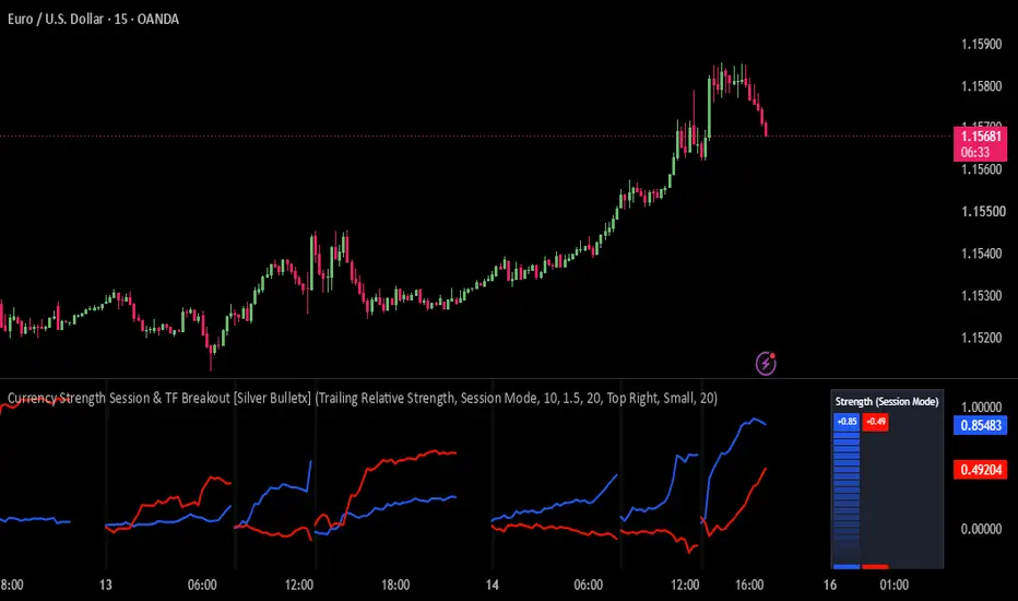
Currency Strength Session & TF Breakout [Silver Bulletx]Currency Strength Session & TF Breakout
Currency Strength Session & TF Breakout is a specialized EURUSD and USDJPY currency strength indicator designed to compare the relative strength of the currencies behind the pair.
The indicator analyzes EUR, USD, and JPY strength using price movement, EMA-based Bull Power / Bear Power, ATR normalization, and directional weighting.
It provides two analysis modes:
Trailing Relative Strength
Relative Strength Scatter Graph
IMPORTANT — Supported Pairs
This indicator ONLY works on:
EURUSD
USDJPY
It will not run on other chart symbols.
Although EURJPY is used internally as part of the currency-strength calculation, the indicator itself is designed specifically for EURUSD and USDJPY charts.
How It Works
The indicator breaks the selected pair into its individual currencies and calculates their relative strength.
For the calculations, it uses:
EURUSD
USDJPY
EURJPY
These three currency pairs allow the indicator to derive relative strength for EUR, USD, and JPY.
Asymmetric Bull & Bear Power
Instead of treating bullish and bearish movement identically, the indicator measures how far the candle's high and low extend from an EMA.
Bull Power measures upside reach above the EMA.
Bear Power measures downside reach below the EMA.
Both are normalized using ATR, allowing the strength calculation to adapt to current market volatility.
The resulting movement is then given additional weighting when bullish or bearish pressure becomes stronger.
This creates an asymmetric currency-strength model designed to emphasize stronger directional expansion.
Timeframe Engine
Choose from:
5 Minutes
15 Minutes
30 Minutes
1 Hour
4 Hours
Daily
Session Mode
The selected timeframe determines how the strength calculation is accumulated and reset.
Session Mode
The Session Mode is designed to track currency strength separately around major intraday market sessions.
It recognizes:
Asian Session
London Session
New York Session
Session Mode resets the strength calculation when a new tracked session begins.
This can be useful when analyzing session momentum, London breakout, New York momentum, Asian range behavior, and changes in currency strength between sessions.
Strength Meter
The built-in Currency Strength Meter displays the relative strength of the two currencies on the current chart.
For example:
EURUSD → EUR vs USD
USDJPY → USD vs JPY
The meter dynamically scales the displayed strength values so the relationship between the two currencies can be viewed quickly.
Relative Strength Scatter Graph
The optional Relative Strength Scatter Graph provides another way to visualize currency strength.
It categorizes the current relationship into areas representing:
Strong
Improving
Weakening
Weak
It also compares current strength with previous strength to show whether currency momentum is improving or deteriorating.
What It Can Help Analyze
This indicator is designed for traders analyzing:
EURUSD currency strength
USDJPY currency strength
EUR vs USD strength
USD vs JPY strength
Forex market bias
Currency momentum
Relative strength
Session strength
London session
New York session
Asian session
Forex breakouts
Trend continuation
Momentum shifts
Bullish and bearish pressure
ATR-normalized strength
Intraday Forex trading
Best Use
The indicator is specifically built for EURUSD and USDJPY Forex analysis.
It can be particularly useful when trying to determine which currency is currently showing greater directional strength rather than looking at the pair alone.
For example, on EURUSD:
Strong EUR + Weak USD → bullish EURUSD conditions
Weak EUR + Strong USD → bearish EURUSD conditions
On USDJPY:
Strong USD + Weak JPY → bullish USDJPY conditions
Weak USD + Strong JPY → bearish USDJPY conditions
These relationships should be treated as market context, not guaranteed trading signals.
Key Features
EURUSD-only / USDJPY-only design
Currency strength analysis
EUR, USD and JPY strength engine
ATR-normalized Bull Power / Bear Power
Asymmetric bullish/bearish weighting
Session-based strength tracking
5m, 15m, 30m, 1H, 4H and Daily engines
Asian, London and New York session mode
Currency strength meter
Relative strength scatter graph
Momentum and strength-change visualization Indicatore

Weinstein Human-Like Stage Layout [v6]This indicator automates the classic Stan Weinstein 4-Stage Market Cycle Analysis (from his legendary book “Secrets for Profiting in Bull and Bear Markets” ) using a custom context-aware layout engine.
Most automated stage analysis scripts create immense visual clutter, resetting indicators and stacking labels on every minor bar cross. This script uses a human-like design philosophy, relying on multi-week absolute price structures to print exactly one clean, dynamic tracking label per macro phase.
Human-Centric Visual Design
The indicator adapts its graphics engine based on the style of phase the market is currently experiencing:
Stage 1 (Accumulation) : Draws a clean, horizontal Dashed Blue Box around the absolute support/resistance boundary floor, with a floating blue label centered over the base.
Stage 2 (Markup) : Strips away consolidation frames and softly tints the entire chart vertical background Green to signify a clean, institutional buying regime.
Stage 3 (Distribution) : Places a precise, horizontal Dashed Orange Box around the macro topping range to track turning points.
Stage 4 (Markdown) : Softly tints the chart vertical background Red to warn traders away from catching a falling knife.
How the Boundary Engine Works
Instead of calculating mathematical slope percentages (which shift falsely on volatile weeks), the engine operates via a shifted Donchian Price Channel Model:
Breakout Tracking : It evaluates the asset's closing price against the Highest High / Lowest Low of the prior 20 weeks (using a lookback offset to remove current bar skew).
Expansion Filtering : A true Stage 2 or Stage 4 regime shift will only trigger when price completely bursts out of the historical multi-month ceiling or floor line while confirming its position relative to the 30-Week Simple Moving Average.
Automatic Clean-Up : The script natively tracks historical nodes. The moment a new cycle phase is mathematically confirmed, it deletes overlapping data to keep your screen spotless.
Best Practices for Setup
Timeframe : To stay true to Weinstein's original methodology, always run this indicator on a Weekly (1W) chart.
Customization : Open the settings gear panel to adjust the Consolidation Range Lookback (Weeks) up or down depending on whether you want to focus on intermediate market movements or structural multi-year cycles.
⚠️ Disclaimer & Risk Disclosure
Educational Purpose Only : This script is an automated open-source visual aid designed solely for educational, historical analysis, and charting convenience. It does not constitute investment advice, financial advice, or a recommendation to buy, sell, or hold any financial asset or security.
No Guarantees of Accuracy : Market conditions are subject to rapid change. Past performance, channel breakouts, or historical bounding boxes generated by this script are not indicative of future market results.
Backtesting & Verification : Systems using algorithmic filters can generate false breakouts or delayed lag-signals during highly volatile or macroeconomic events. Users should always cross-reference these automated stages with their own fundamental analysis, independent price action charting, and volume verification.
Risk of Loss : Trading financial markets involves a high degree of financial risk. The author of this script assumes absolutely no liability or responsibility for any direct or indirect financial losses, trading errors, or damages resulting from the use or interpretation of this indicator.
Indicatore

Auto Fibonacci Retracement, Golden Zone & OTE Levels [LunqFX]Every fibonacci retracement tool draws the same six lines, and every one of them assumes you already picked the right swing. Drag the fib from a different high and the golden pocket lands somewhere else entirely — so the fibonacci level you are about to buy is not a level the market chose, it is a level your cursor chose.
This auto fibonacci indicator takes the swing out of your hands. The leg is anchored to confirmed pivots and re-anchors itself the moment structure makes a new extreme, so the fib retracement on the chart is always drawn from the leg the market is actually trading, and the golden pocket and OTE zone sit where that leg puts them.
And it adds the number no fibonacci retracement indicator has ever given you: how deep this symbol actually retraces.
Included: automatic fibonacci retracement from confirmed swing pivots, an adjustable golden pocket and OTE zone filled on the chart, fibonacci extension targets beyond the leg, gold candles on the bars that traded inside the zone, a measured typical retracement depth for the current symbol, a dashboard reading the live fib retracement, and alerts on the zone.
❶ HOW THE FIBONACCI IS ANCHORED
Swing points come from confirmed pivots, so a leg only exists once the bars on both sides of its pivot have closed. Nothing appears and then vanishes.
The active leg runs from the anchor pivot to the extreme pivot. A new pivot beyond the extreme, in the same direction, extends the leg — the fibonacci retracement stretches with it. A pivot the other way flips the leg and the fib re-anchors to the new one. There is no setting for "which high to use", because the structure decides.
❷ THE GOLDEN POCKET AND THE OTE ZONE
The band between 0.618 and 0.786 is filled, with a soft halo behind it so it reads at a glance on a crowded chart. Smart money traders call this band the OTE — the Optimal Trade Entry — and it is where continuation entries are taken after a pullback, because it is deep enough that the move is discounted and shallow enough that the leg is still intact.
The golden pocket, the narrow 0.618–0.65 strip, sits along the top edge of that band. Both edges are adjustable, so set them to 0.618 and 0.65 if the pocket alone is what you trade, or to 0.5–0.618 if that is your definition of the golden zone. The whole tool follows whatever you set — the depth statistics, the dashboard and the alerts all read from the same two numbers.
❸ EXTENSIONS
Three projections beyond the leg, negative fib values by default at −0.272, −0.618 and −1.0. They are drawn from the same anchors as the retracement, so a target is measured against the same swing the entry came from rather than against a fib you dragged separately.
They ship switched off. A target at −1.0 sits far enough from price that the chart's autoscale stretches to include it and squashes the candles into a band — useful once you are in a trade, in the way while you are reading the chart. Switch them on in the Extensions section when you need them.
❹ A SPENT LEG STOPS SHOUTING
When price trades all the way through the anchor, the leg has done everything it was going to do. The fib cannot re-anchor until the next pivot confirms, so in the meantime the whole drawing fades: the levels dim, the golden zone loses its glow and its label reads spent.
It is a small thing that most tools get wrong. A fib left burning at full brightness over a setup that is already finished is not neutral — it is the chart arguing for a trade that is no longer there.
❺ TYPICAL RETRACEMENT DEPTH — what a fibonacci tool never shows
0.618 is a number from a sequence. It is not a fact about gold, or about the euro, or about this timeframe.
So the indicator measures it. Every time a leg pulls back and then makes a new extreme in the same direction, the depth of that pullback is recorded. The average of those depths is printed on the chart as its own line, and in the panel with the sample size behind it:
Typical depth 0.547 (23 legs)
Read it against the golden zone. When the measured depth sits at 0.55 and the golden zone starts at 0.618, this symbol has been turning BEFORE the golden zone — waiting for 0.618 means the move leaves without you. When it sits at 0.72, shallow entries at 0.5 have been getting run over.
Only pullbacks that were followed by continuation are counted. A leg that reversed outright is not a retracement, and folding those in is how a depth average gets quietly inflated past anything useful. Samples under eight legs are marked with a tilde, because an average of three is not an average.
❻ THE CHART ITSELF
Every candle stands in a soft lit column — an aura drawn behind it, its body stretched across the full range and left almost transparent with its outline switched off. The effect is a neon tube rather than a coloured rectangle.
The glow is not constant. Its brightness is driven by the bar's range against ATR, so a conviction candle burns and a doji barely registers. Strength becomes something you feel across a screen of price action instead of something you measure bar by bar, and the decoration is carrying information rather than existing for its own sake.
The candle on top has a translucent body against a solid outline. That one detail is what makes it read as part of the chart instead of a sticker placed over it: the background shows faintly through while the edge stays crisp.
Five palettes, because one set of colours cannot suit every background. Neon Bloom is turquoise against magenta, a matched pair that leaves gold free for the zone. Midnight Cyan is the common signature dark scheme, Vibrant Neon the high-contrast crypto pairing, Classic Soft the muted everyday version. Cool Blue drops red entirely — a number of full-time traders run blue against grey, since red carries a stress response that gets in the way of reading a chart objectively for eight hours at a stretch.
Bars of the current leg that closed inside the golden zone are drawn in gold, so the OTE is visible in the price action and not only in the band behind it. Only the current leg is marked — a highlight left over from a leg that ended months ago sits nowhere near the zone on screen and reads as a fault.
The levels follow the same restraint, in three tiers rather than nine identical lines: the two ends of the leg carry its direction, the levels between them sit back in muted grey, and the accent is spent once, on the golden zone. Candle colouring can be switched off entirely if you would rather keep your own.
❼ THE DASHBOARD
Leg direction and size, the live retracement as a single large number, whether price is inside the golden zone or has not reached it yet, the measured typical depth with its sample count, and the 0.618 and 0.786 prices ready to be turned into orders.
HOW TO USE IT
1 — Wait for the leg, not the level. The fib only exists after a confirmed pivot. That delay is the point: it is what stops you fibbing a swing that is still forming.
2 — Compare the golden zone with the typical depth line. If they overlap, the zone is doing its job on this symbol. If the typical depth sits well above or below it, trade the measured level and treat 0.618 as decoration.
3 — Use the extensions as the other half of the trade. An entry in the golden zone with a target at −0.272 is a defined structure; an entry with no target is a hope.
4 — Change the swing length to change the timeframe of the analysis. A short length gives the fib of the current intraday leg; a long one gives the fib of the swing the whole session is trading inside. Both are valid, and they answer different questions.
HOW IT WORKS
Pivot highs and lows of your chosen length define the leg. Span is the distance between anchor and extreme; a retracement level is the extreme moved back toward the anchor by its fraction of the span, and an extension is the same arithmetic past the extreme. The live retracement is the current close expressed in that same fraction. Depth statistics keep a rolling window of completed pullbacks and report their mean.
Works on any symbol and any timeframe. On higher timeframes raise the swing length so the fib tracks the swing rather than the noise inside it.
SETTINGS
▸ Swing — pivot length and how far levels extend to the right. ▸ Retracement Levels — each level individually switchable. ▸ Golden Zone / OTE — fill on or off, and both edges of the band. ▸ Extensions — three targets, any fib values you like. ▸ Depth Statistics — on or off, and how many legs are remembered. ▸ Visuals — labels, line width, five candle palettes plus off, aura glow and its strength, gold OTE bars, dashboard position.
ALERTS — price entered the golden zone, 0.618 reached, leg fully retraced, and fib re-anchored. All fire on closed bars.
NON-REPAINTING — the fib is anchored to confirmed pivots, which means a leg is only drawn after the bars either side of its pivot have closed. The depth record is built from completed pullbacks and never changes retroactively.
WHY THESE PARTS ARE ONE SCRIPT
The auto-anchoring, the golden zone and the depth measurement describe one object. Auto-anchoring alone gives you a fib that is correctly placed but still generic. The golden zone alone is a band drawn on an assumption. The measurement exists only to tell you whether that assumption holds on the symbol in front of you — and it needs the anchoring to have legs to measure. Remove any one and the other two lose their point.
This indicator is an educational market-analysis tool, not financial advice. The depth statistic describes pullbacks that have already happened on the loaded chart; it does not predict the next one. Always confirm with your own analysis and manage your risk.
Indicatore

Turtle Trading System - Full (S1+S2)Turtle Trading System - Full (System 1 + System 2)
A complete implementation of the original Turtle Trading rules (Richard Dennis, 1983),
built for Daily timeframe use. Pine Script v6.
FEATURES:
- System 1: 20-day breakout entry / 10-day breakout exit
- System 2: 55-day breakout entry / 20-day breakout exit (failsafe, never filtered)
- Last-Trade Filter: skips a System 1 signal if the prior System 1 trade was a winner,
reducing false breakouts in ranging markets. Falls through to System 2 when filtered.
- ATR-based (N) position sizing reference and 2N initial stop
- Pyramiding: adds units every 0.5N in the favorable direction, up to 4 units max
- Trailing stop that only tightens in the trade's favor, never loosens
- No-repaint option: signals confirm only on closed bars (barstate.isconfirmed)
- Live status table: current position, units held, active system, current N, filter state
NOTES:
- Calibrated for Daily charts, consistent with the original system's historical backtesting.
Using it on lower timeframes changes what the lookback lengths represent and has not been
validated here.
- The Last-Trade Filter only tracks trades entered via System 1. Trades triggered by the
System 2 failsafe do not update the filter, per the original rule set.
- This is a signal/reference tool, not an auto-trading strategy. Verify signals in replay
mode before trading live. Be claude IA Indicatore

Volume FootprintVolume Footprint
First and foremost, a special thanks to @bassnavy for the direct request and inspiration to build this tool. I truly appreciate your comment!
Disclaimer: This is essentially a simplified script inspired by premium footprint tools (lol). I pay my utmost respect to TradingView and its amazing community!
This indicator is an "Advanced Precision Footprint Visualizer" built strictly on Pine Script v6. Standard footprint charts often struggle with TradingView's rendering limits (max 500 boxes). To overcome this, I engineered a dynamic tick-grouping algorithm that visualizes exact Bid/Ask deltas, volume densities, and Point of Control (POC) with extreme precision, without breaking the platform's constraints.
This tool is designed for highly disciplined traders who rely on verified entry setups. It filters out market noise and visually isolates true liquidity nodes.
Core Mechanics & Calculation Logic:
Tick Grouping (Step Calculation): step = syminfo.mintick * active_ticks
Why: Processing every single minimum tick would instantly exceed the 500-box drawing limit. By grouping ticks based on ATR (Auto Tiers) or a manual input, we compress the data while maintaining visual fidelity.
Output Example: If syminfo.mintick is 0.01 and active_ticks is set to 1, the step size becomes 0.01. If the bar's high is 16.59 and low is 16.26, the engine calculates exactly 34 rows for rendering.
Row Delta Determination: row_delta = Ask Volume - Bid Volume
Why: To accurately gauge whether buyers or sellers absorbed the liquidity at a specific price tier.
Output Example: If Ask volume is 2.5K and Bid volume is 1.0K at a specific row, the row_delta is +1.5K. The text dynamically changes to the "Plus Delta" color (Green).
3-Step Volume Gradient: half_max = max_r_v * 0.5
Why: To create a seamless 3-step color gradient (Low -> Mid -> High). By calculating the 50% threshold of the maximum volume (POC) inside the bar, it intuitively separates high-interest zones from market noise.
Premium Plan TF Downgrade Logic: actual_ltf = (not is_premium and is_sec_tf) ? "1" : ltf_res_input
Why: TradingView restricts seconds-based timeframes (like 1S or 15S) to Premium users and above. Requesting this data on lower plans causes script crashes. This logic automatically downgrades the timeframe to 1 (1-minute) if the Premium toggle is disabled, ensuring stability for all users.
Output Example: If the user inputs 15S and the Premium toggle is false, is_sec_tf evaluates to true. The condition not is_premium is met, so actual_ltf outputs "1" (1-minute). If the toggle is true, it outputs "15S".
Warning: This script operates at the absolute edge of TradingView's rendering capabilities. If you encounter rendering errors, please reduce the "Lookback Bars" or increase the "Lower Timeframe (LTF)" resolution.
Indicatore

Uptrick: Adaptive Trend TrailIntroduction
Uptrick: Adaptive Trend Trail is a trend-following overlay indicator that holds one of three states, bullish, bearish or neutral, where neutral applies only before the first confirmed flip on the chart. That state is visualized through a layered ATR trail or volatility bands, colored candles, and reversal labels. Rather than deriving direction from a single crossover, the indicator builds a composite regime score from nine weighted measurements, requires agreement from three internally calculated adaptive Supertrends, and then applies confirmation, cooldown and hysteresis rules whose strictness changes with measured market conditions. It also includes a valuation meter and a set of internal simulation statistics displayed in the Data Window.
The design intent is to require more evidence before accepting a state change when measured directional efficiency is low, rather than to detect every turn as early as possible.
Originality
A trend state can be derived from a single measurement: a moving average cross, one Supertrend, or one oscillator threshold. Each responds to a different aspect of price and each has conditions where it carries less information. A long moving average responds slowly. A single volatility-stop line can change direction repeatedly when price oscillates within its band width. An oscillator carries no information about price structure or volatility state. This script combines measurements that are informative under different conditions, so that no single one can force a state change on its own, and it makes the strictness of the decision depend on measured market conditions rather than holding it fixed.
Why these specific components were chosen :
Directional efficiency (net movement over total path traveled over 10 bars) is used because it distinguishes directional movement from back-and-forth movement covering the same ground. Its inverse, chop, is the central control variable of the script. Chop is not only an input to the score; it directly changes how many Supertrends must agree, how many bars a signal must persist, how wide the hysteresis gate is, and how long the cooldown lasts. This is the mechanism that lets one configuration behave differently in high-efficiency and low-efficiency conditions without the user changing settings.
Three Supertrends at different ATR lengths (fast 9, medium 14, slow 21) are used instead of one because a single Supertrend returns a binary direction with no measure of agreement. Three produce a vote count, which serves both as a gate (how many must agree) and as a continuous input to the composite score (vote difference divided by three). Their ATR multipliers are not fixed: chop and volatility expansion are added on top of the user's base factor, so all three widen as efficiency falls or volatility expands.
Distance from the EMA baseline and momentum are both normalized by ATR rather than used raw. This expresses them relative to recent volatility and reduces their dependence on the instrument's absolute price scale, so the same threshold values remain meaningful on instruments with very different nominal prices.
Baseline slope and a slower HL2 baseline slope are included because distance alone does not distinguish a market moving away from its mean from one moving back toward it. Two slopes at different speeds mean a short-term push against a flat longer-term structure contributes less to the score than an aligned move.
RSI is included with a small weight (0.08) as a momentum cross-check rather than as a signal generator. At that weight it cannot on its own carry the score past the gate.
Candle pressure (body direction and close location within the bar) and structure breaks (close beyond the prior N-bar high or low) are included with small weights (0.05 each) because they respond on the current bar, adding a small amount of immediacy to a score otherwise built from lagging averages.
How they work together : the nine fields are blended into one regime value smoothed by a 3-period EMA. That value must exceed a dynamic gate whose size grows with selectivity, chop and volatility deviation. Price must also be displaced from the baseline. Momentum must have the correct sign. The Supertrend vote must be confirmed and persistent. Only then does a candidate exist, and the candidate must persist for one to three consecutive bars depending on chop, with a cooldown of six to ten bars since the last flip. A separate strong-move path can bypass the candidate persistence requirement and the cooldown when all three Supertrends agree unanimously, the score exceeds the gate by an additional margin, momentum is strong and efficiency is above 0.42. It does not bypass the underlying Supertrend persistence requirement. Finally, a takeover rule requires the fast Supertrend plus at least one slower one to agree with the new direction, so a flip cannot occur against the shorter-term Supertrend structure.
The valuation meter and the internal simulation exist to provide context on the same chart rather than requiring separate indicators: one shows where smoothed RSI currently sits on a segmented scale, the other reports how the script's own state changes would have resolved under a simple trailing-stop assumption.
Features
Single trend state driving all visuals, bullish or bearish once the first flip occurs, neutral before that point
Composite regime score built from nine weighted fields, blended and smoothed with a 3-period EMA
Weighting: baseline distance 0.22, Supertrend consensus 0.20, momentum 0.19, baseline slope 0.14, slow baseline slope 0.10, directional efficiency 0.09, RSI 0.08, candle pressure 0.05, structure break 0.05
Directional efficiency engine measuring net movement against total path over 10 bars, producing a chop value used throughout the script
Volatility regime measurement comparing current ATR to its 50-period EMA, producing expansion and deviation values
Three internally calculated Supertrends (fast, medium, slow) used for logic only and not plotted on the chart
Adaptive Supertrend factors, where chop and volatility expansion are added on top of each user-set base multiplier, with the slow Supertrend receiving the largest adjustment
Vote-based Supertrend consensus requiring two of three in normal conditions and three of three when chop exceeds 0.70
Supertrend persistence requirement of one confirmed bar normally and two when chop exceeds 0.72
Dynamic hysteresis gate that widens with the selectivity input, with chop, and with volatility deviation
Price displacement filter requiring close to be above or below the baseline by an ATR-scaled amount
Momentum sign filter requiring directional momentum beyond a small deadband
Adaptive confirmation requiring one, two or three consecutive candidate bars depending on measured chop
Strong-move path that can bypass the candidate confirmation requirement and the cooldown when all three Supertrends agree, the score clears the gate by an additional 0.26, momentum exceeds 0.16 and efficiency exceeds 0.42, while still requiring Supertrend persistence
Takeover rule requiring the fast Supertrend plus one slower Supertrend to align with the new direction before any flip
Adaptive cooldown of six to ten bars between state changes, scaled by chop
All state changes evaluated on confirmed bars only, so the state does not flip on an unclosed bar
Trail overlay mode with three layers constructed at 0.55, 1.15 and 1.60 ATR multiples from the smoothed baseline, placed below it in bullish states and above it in bearish states, scaled by the width input
Bands overlay mode with three levels on each side of the baseline at 1.30, 2.00 and 2.90 ATR multiples, scaled by the width input, using an additional smoothing stage applied to the already-smoothed baseline and ATR
Overlay None mode that hides the Trail and Bands while leaving the other independently controlled outputs available
Smoothness control applied to the baseline and ATR used for the overlay geometry
Trend candles that recolor the price bars to the active state
Reversal labels printed on the bar where the state changes, placed relative to the outer trail layer
Valuation meter drawn as a table with a segmented scale and a pointer showing where 3-period smoothed RSI(14) currently sits
Four meter sizes: Off, Compact (11 segments), Normal (17 segments) and Large (25 segments)
Six meter positions covering top and bottom, left, center and right
Internal historical trade simulation driven by the script's own state changes, reported in the Data Window
Simulation outputs: return percent, win rate percent, profit factor, maximum drawdown percent and closed trade count
Simulation uses a fixed 10000 starting equity and full-equity sizing, with a fee equal to 0.1 percent of entry equity deducted at entry and a further amount equal to 0.1 percent of that same entry equity applied at exit
Simulation stop is set from the outer trail on the entry bar, constrained to at least one minimum tick beyond the entry close, and thereafter can only move in the position's favorable direction using the previous bar's outer trail value
Simulation return figure includes unrealized profit or loss on any position still open, so it is not a closed-trade-only figure
Two alert conditions, one for the bullish flip and one for the bearish flip, each carrying the ticker in the message
Inputs
Group 01, Trend Engine
Trend Length, default 34, range 10 to 200. Sets the primary EMA baseline used for the overlay, the distance field and the baseline slope field. It also determines two internally derived lengths: the slower HL2 baseline is calculated at approximately 70 percent of this value with a floor of 10, and the structure-break lookback is approximately 12 percent of this value with a floor of 3.
Momentum Length, default 12, range 3 to 100. Lookback used to measure directional momentum before ATR normalization.
Signal Selectivity, default 0.35, range 0.10 to 1.25. Raises both the hysteresis gate and the required price displacement. Higher values produce fewer state changes.
Group 02, Supertrend Confirmation
Fast Length, default 9, range 2 to 100. ATR length of the fast internal Supertrend.
Fast Factor, default 1.45, range 0.25 to 10.0. Base ATR multiplier of the fast internal Supertrend before adaptive widening.
Medium Length, default 14, range 2 to 150. ATR length of the medium internal Supertrend.
Medium Factor, default 1.95, range 0.25 to 10.0. Base ATR multiplier of the medium internal Supertrend.
Slow Length, default 21, range 2 to 200. ATR length of the slow internal Supertrend, acting as the broader continuation confirmation.
Slow Factor, default 2.55, range 0.25 to 10.0. Base ATR multiplier of the slow internal Supertrend.
Group 03, Overlay
Overlay, default Trail, options Trail, Bands, None. Selects which overlay geometry is drawn, or hides both.
Width, default 1.00, range 0.40 to 2.50. Scales the distance of all trail layers and all band levels from the baseline. Because the internal simulation uses the outer trail layer as its stop, this input also changes the Data Window statistics. It does not affect the trend engine.
Smoothness, default 5, range 1 to 20. Smooths the baseline and ATR used to build the overlay geometry, and is applied a second time to those already-smoothed values when Bands mode is selected. Because the outer trail layer is built from these smoothed values, this input also changes the Data Window statistics. It does not affect the trend engine.
Group 04, Valuation
Meter Size, default Normal, options Off, Compact, Normal, Large. Controls whether the meter is shown and how many segments it uses.
Position, default Top Center, options Top Left, Top Center, Top Right, Bottom Left, Bottom Center, Bottom Right.
How It Works
The baseline is an EMA of close over the Trend Length. ATR(14) is the volatility unit and is floored at one tick to avoid division problems on illiquid data.
Directional efficiency is the absolute 10-bar net price change divided by the sum of the absolute bar-to-bar changes over the same window, clamped between 0 and 1. Chop is one minus that value. Efficiency is signed by the 10-bar direction to form the efficiency field.
Volatility regime compares current ATR to its 50-period EMA. Expansion is the amount above one, clamped to 1.25. Deviation is the absolute distance from one, clamped to 1.50.
The three Supertrend factors are the user's base values plus a chop term and a volatility expansion term. Their directions become bullish or bearish votes. The vote requirement is two of three normally and three of three when chop exceeds 0.70, and the confirmed vote must persist for one confirmed bar, or two when chop exceeds 0.72.
Nine fields are then blended. Distance from baseline and momentum are divided by ATR and clamped. Baseline slope and slow baseline slope are three-bar changes divided by ATR and clamped. RSI(14) is centered on 50 and clamped. The Supertrend field is the vote difference divided by three. Candle pressure combines body direction and close location within the bar. Structure is plus one when close breaks the prior N-bar high and minus one when it breaks the prior N-bar low. The weighted sum is smoothed with a 3-period EMA to produce the regime value.
The gate is 0.22 plus selectivity times 0.12, plus chop times 0.085, plus a volatility deviation term capped at 0.06. A bullish candidate exists when the regime exceeds the gate, close is above the baseline by the required ATR displacement, momentum is positive beyond its deadband, and the bullish Supertrend consensus is persistent. The bearish candidate is the mirror.
A candidate must persist for one bar in high-efficiency conditions, two when chop exceeds 0.40, and three when chop exceeds 0.72. The strong-move path can bypass that candidate persistence requirement and the cooldown, but only when all three Supertrends agree, the regime clears the gate by an additional 0.26, momentum exceeds 0.16 in absolute terms and efficiency is above 0.42. Because the strong-move path is itself built on the candidate condition, it does not bypass the Supertrend persistence requirement. It is intended to provide a faster response when directional evidence is unusually strong under the script's own measurements.
Before any flip is accepted, the takeover rule requires the fast Supertrend and at least one of the medium or slow Supertrends to be aligned with the new direction. A cooldown of six bars plus up to four additional bars scaled by chop must also have elapsed since the last flip, unless the strong-move path is active. All of this is evaluated on confirmed bars only.
When the state flips, the counters reset, the label prints, the candles recolor and the overlay switches sides. Before the first flip on a chart the state is neutral, candles are yellow, and the trail layers sit flat on the baseline.
The valuation meter takes RSI(14), smooths it with a 3-period EMA, and maps it onto the selected number of segments with a pointer. It is a positioning display for smoothed RSI and nothing more; it does not measure fair value and is not part of the trend decision.
The Data Window values come from a simplified internal historical trade simulation implemented inside the indicator. The script is an indicator, not a TradingView strategy, so these are not Strategy Tester results and no Strategy Tester properties apply. The simulation opens a position at the close of each flip bar and closes it on either an opposite flip or a stop. The stop is set on the entry bar from the outer trail, constrained to at least one minimum tick beyond the entry close, and thereafter can only move in the position's favorable direction using the previous bar's outer trail value. Starting equity is 10000, the full equity is used on every position, a fee equal to 0.1 percent of entry equity is deducted at entry, and a further amount equal to 0.1 percent of that same entry equity is applied at exit. Win rate and profit factor are classified on the fee-inclusive result of each position. The return figure is calculated from equity including unrealized profit or loss on any position still open, so it is not a closed-trade-only figure.
These assumptions are deliberately simplified. The purpose is to compare the effect of different settings against one another on the same symbol, not to model a tradable account. Full-equity sizing is used so the figures are not dependent on an arbitrary position size choice, and no sizing shown here is being recommended. No slippage, spread, funding cost or gap-through-stop execution is modelled, so the simulation does not reproduce actual execution conditions and may differ materially from live trading. There is no take profit and positions are never partially closed. These values describe the script's own historical state changes under those assumptions and are not evidence about future behavior.
How to Use
Add the indicator to a clean chart and read the current state from the candle color and the overlay side. In Trail mode the layers are constructed below the smoothed baseline while the state is bullish and above it while the state is bearish. In Bands mode the three levels on each side show how far price has extended from the baseline in ATR terms.
Increase Signal Selectivity if you are getting more state changes than you want, or increase Trend Length for a slower baseline. Increase the Supertrend factors to require larger moves before the internal confirmation layer will agree. Reduce the factors and lengths for faster and noisier behavior on lower timeframes.
Width and Smoothness do not affect the trend engine, so flips and alerts are identical regardless of their values. Both do change the Data Window statistics, because the stop used by the internal simulation is drawn from the outer trail layer.
The two alerts fire on confirmed bars when the state changes. Treat the Data Window values as a rough comparison tool between settings on the loaded symbol and history, subject to the assumptions listed above.
Limitations to be aware of: because confirmation, persistence, takeover and cooldown conditions must all be satisfied before a state change is accepted, a flip can occur after price has already moved some distance from where the previous state ended. During lower-efficiency conditions the script requires additional Supertrend agreement and additional confirmation bars, which increases that distance further. These mechanisms intentionally prioritize confirmation over earliest possible detection, and that trade-off cannot be removed by settings, only shifted. Values on the current unclosed bar can change until that bar closes, since state changes are only committed on confirmed bars. The chart begins in a neutral state until the first flip is accepted. Behavior varies substantially between symbols and timeframes, and the defaults are a starting point rather than an optimized configuration.
Conclusion
Uptrick: Adaptive Trend Trail derives a trend state from nine weighted measurements rather than a single crossing, and makes the strictness of that decision a function of measured directional efficiency and volatility through the chop and volatility terms. The overlay, the trend candles, the valuation meter and the internal simulation are there to make that state and its context readable on one chart. It is a decision-support tool for discretionary trend reading and is intended to be used alongside your own analysis and risk management rather than as a standalone system.
Disclaimer
This indicator is provided for educational and informational purposes only. It is not financial advice and does not constitute a recommendation to buy or sell any instrument. All trading involves risk and can result in substantial losses. Leveraged products can involve additional risks that depend on the instrument, broker and account structure. Past behavior of this indicator, including any statistics it displays, does not predict or guarantee future results. Signals, statistics and visuals vary across symbols, timeframes and market conditions. You are solely responsible for your own trading decisions and should test any tool thoroughly and apply your own risk management before using it with real capital. Indicatore

VWAP Rope Band by ByblloVWAP Rope Band plots a smoothed trend line (the "rope") that only moves once price has traveled beyond a VWAP-deviation threshold from its last position - small back-and-forth noise around VWAP is absorbed, and the line only steps when a move is statistically meaningful.
The threshold is the standard deviation of (close - VWAP) over a lookback period, scaled by a multiplier, so the surrounding band automatically widens or narrows with how far price is currently dispersing from VWAP - no manual adjustment needed as volatility changes.
A genuine trend reversal is only registered once the rope actually reverses direction (not on every VWAP wiggle). That short transition window gets its own color, an optional gradient cloud, and an optional Buy/Sell badge at the exact bar the reversal is confirmed.
INTENDED USE
Works well for short-term futures scalping - Nasdaq futures, KOSPI200 futures, and similar instruments. Built and tested primarily on the 1-minute chart, but the underlying VWAP/rope/band logic is timeframe-agnostic and holds up well on 2, 3, and 5-minute charts and other intraday timeframes too. The StdDev Length and Band Multiplier adapt to volatility automatically, but it's worth rechecking them when you switch timeframe or instrument.
FEATURES
- Threshold-based "rope" trend line that ignores VWAP noise, only stepping on statistically meaningful deviations
- Volatility-adaptive band (self-widening/narrowing standard-deviation envelope around the rope)
- True-gradient cloud fill between rope and band, with adjustable steepness
- Confirmed-reversal transition detection with its own color/cloud, auto-expiring after 5 bars if unresolved
- Optional Buy/Sell badge plotted at the exact bar a reversal is confirmed
- Two alert families: simple rope crossover/crossunder, and confirmed Buy/Sell signal alerts
- Works on any chart type (candlestick, Heikin Ashi, Renko, etc.) since prices are pulled via request.security() from the underlying ticker
This is a visual/alerting tool only - it does not place real orders. For educational and informational purposes only, not financial advice. Always verify how the rope and bands behave on your specific symbol and timeframe before relying on them for live trading. Indicatore

Adaptive Trend Direction Indicator [ATR Trail + Regime]Adaptive Trend Direction
WHAT IT DOES
Adaptive Trend Direction is a trend-following state indicator. It answers three questions on every bar: which way is the trend pointing, is the market currently orderly enough for a trend signal to be worth taking, and where is the level that would invalidate that view.
The core is an ATR trailing stop that flips between a bullish and a bearish state. On its own a trailing stop flips constantly in choppy conditions, which is the well-known failure mode of every trend follower. This script's purpose is to gate those flips behind a two-factor regime test, so that the flips which occur inside directionless price action are marked as such instead of being presented as trend signals.
HOW IT WORKS
ATR trailing stop. A stop is placed one ATR-multiple away from the close (default ATR 23, multiplier 3.0). While the state is bullish the stop only ratchets upward; while bearish it only ratchets downward. A close beyond the stop flips the state and the stop jumps to the opposite side of price. The state flip is the raw directional signal.
Regime detection — ADX plus Efficiency Ratio. Two independent measures must agree before the market counts as trending. ADX (default period 10) must exceed its threshold (default 21), measuring directional strength. Kaufman's Efficiency Ratio must exceed its threshold (default 0.15), calculated as the absolute net move over N bars divided by the sum of the absolute bar-to-bar moves over the same window — a value near 1 means price travelled in a straight line, a value near 0 means it covered the same ground repeatedly. ADX can rise on volatile chop; the Efficiency Ratio cannot. Requiring both is what filters out that case.
Hysteresis. The regime does not flip the moment the two tests agree. It requires N consecutive confirming bars (default 3) before switching, in either direction. This stops the regime label from oscillating bar to bar around the thresholds, which would otherwise reintroduce the exact noise the filter is meant to remove.
RSI momentum filter. A directional flip is only accepted if RSI confirms it — above the long threshold for longs, below the short threshold for shorts. The defaults (48 long, 43 short) sit close to the midline, so this rejects flips that occur against prevailing momentum rather than demanding an extreme reading.
Signal end conditions. An open directional signal is marked as finished on whichever comes first: an opposing trailing-stop flip, an EMA slope reversal against the signal (optional, off by default), or a maximum bar count (default 140) that retires a signal which has gone nowhere.
Optional mean-reversion mode. When the regime is ranging, the default behaviour is to stand aside — no signals are generated. Setting "Ranging Mode" to 1 instead generates counter-trend signals from RSI extremes (default below 30 / above 70) with ATR-based take-profit and stop levels drawn on the chart. This is opt-in because it is a different premise from the rest of the script and should be evaluated separately.
WHAT YOU SEE ON THE CHART
Trailing stop line, green in the bullish state and red in the bearish state.
Background tint: green while the regime is trending, amber while ranging.
Triangles mark trend signals, circles mark mean-reversion signals, crosses mark where a signal ends.
Bars are tinted while a signal is active, so the held periods are visible at a glance.
A label at the end of each signal shows the percentage move over that leg, with a tooltip giving entry, exit, end reason and bars held. This is a measurement of the price move between two chart events. It is not a return, and it accounts for no costs.
A dashboard reports ATR, stop level, direction, RSI, EMA slope, regime with live ADX/ER values, current signal state, and which components are switched on.
SIZING READ-OUT
The dashboard also reports a volatility-normalised exposure figure: leverage that scales inversely with recent ATR so that a fixed percentage of a reference account is at risk regardless of how volatile the market currently is, clamped between a floor and a ceiling. Setting the vol target to 0 switches to a stop-distance-based calculation instead. This is informational only. It gates no signal, and the reference account size affects only the displayed units — the leverage figure itself is independent of it.
WHY THIS IS AN INDICATOR AND NOT A STRATEGY
The script tracks an internal long/short/flat state so the chart can colour bars and measure each leg, but it submits no orders and produces no Strategy Tester report. That is intentional. Fill assumptions, funding and leverage modelling on a leveraged instrument dominate any backtest of a system like this, and a tester report would imply a precision the model does not have. What is shown here is the signal logic and the price move between signals, which is what can be verified directly on the chart.
SETTINGS AND USAGE NOTES
The defaults were fitted by a parameter search on a single market and timeframe (BTC on a 6-hour chart). They are a starting point for that context, not universal values, and there is no reason to expect them to transfer unchanged to other symbols or timeframes — the ATR multiplier and the regime thresholds in particular are the ones to revisit first. The volatility estimate used by the sizing read-out assumes roughly a 6-hour bar; on other timeframes it should be recalibrated.
Every component has an independent toggle, so the contribution of each can be isolated: turn the regime filter off to see the raw trailing-stop flips, then turn it back on to see which ones it removed. Signals are evaluated on bar close.
Alerts are available for signal start and signal end, in plain text or as a JSON body for programmatic consumers.
LIMITATIONS
This is a trend-following model. It will give back open gains at every reversal, because the exit is a trailing stop rather than a target. It will produce clustered false flips at regime boundaries, since the confirmation delay lags a genuine turn by design. The mean-reversion mode takes positions against the prevailing move and behaves very differently from the trend mode. Signal-leg percentages shown on the chart exclude commission, slippage and funding.
Published open-source. Not financial advice, not a recommendation to trade any instrument, and nothing here is a forecast. Test it yourself before relying on it. Indicatore

Kinetic MTF Trend & Structure RibbonsKinetic Trend & Structure Ribbons is a multi-layer trend framework designed to make market structure visible across multiple time horizons on a single chart.
Instead of treating moving averages as isolated crossover signals, Kinetic organizes them into a visual hierarchy: Execution → Trend → Structure → Long-Term Regime
The goal is simple: quickly identify whether price is trending, pulling back, compressing, transitioning, or undergoing a deeper structural change.
The framework is primarily designed around stocks and swing trading , while retaining enough short-term information to assist with lower-timeframe execution.
Core Concept
Markets operate across multiple time horizons simultaneously.
A short-term selloff can occur inside a strong intermediate uptrend. An intermediate downtrend can occur while long-term structure remains bullish. Likewise, a short-term breakout means much more when the larger structural layers are aligned behind it.
Kinetic separates these horizons visually rather than compressing everything into a single bullish/bearish signal.
The framework is designed to answer four questions:
1. What is price doing right now?
2. What direction is the active trend?
3. Where is deeper market structure?
4. What is the long-term regime?
The relationship between these layers is often more important than any individual moving average.
Visual Hierarchy
1. Execution Ribbon
The fastest group of averages follows price closely and represents short-term market behavior.
Use it to observe:
*Short-term momentum
* Expansion and contraction
* Trend rotation
* Pullbacks
* Reclaims
* Early changes in direction
When the ribbon is tightly compressed, the market may be entering equilibrium.
When it expands cleanly in one direction, short-term trend strength is increasing.
2. Gaussian Trend Line
The Gaussian filter acts as a smooth trend spine between short-term price action and the broader structural ribbons.
Its purpose is to reduce short-term noise while remaining responsive enough to identify meaningful changes in direction.
Watch for:
* Price reclaiming or losing the Gaussian
* Changes in Gaussian slope
* Interaction between the Gaussian and execution ribbon
* Compression between the Gaussian and larger trend structure
The Gaussian should be interpreted in context rather than as a standalone buy or sell signal.
3. Blue Trend Ribbon
The blue ribbon represents the primary trend layer.
This is the area where normal pullbacks within an established trend can often be distinguished from more meaningful structural deterioration.
Key characteristics include:
* Rising + expanding: strengthening bullish trend
* Falling + expanding: strengthening bearish trend
* Flattening: trend momentum is weakening
* Compressing: equilibrium or transition
* Price repeatedly respecting the ribbon: established trend behavior
The location of the execution layer and Gaussian relative to the blue ribbon provides additional context.
4. Gold Structure Ribbon
The gold ribbon represents slower, deeper market structure.
Because this layer reacts more slowly than the blue trend ribbon, interaction with gold generally represents a more significant event than an ordinary short-term pullback.
The gold ribbon can help distinguish between:
* Routine trend retracement
* Intermediate correction
* Structural reset
* Major trend transition
A market can lose its short-term trend while its deeper structure remains intact.
This distinction is one of the central ideas behind Kinetic.
5. Red Long-Term Regime
The red layer represents the slowest structural reference within the framework.
It is intended to provide long-term regime context rather than short-term entries.
Think of the hierarchy as:
Fast price behavior
↓
Execution
↓
Gaussian
↓
Blue Trend
↓
Gold Structure
↓
Red Long-Term Regime
As price penetrates progressively deeper layers, the significance of the move generally increases.
Reading the Framework
Bullish Alignment
The cleanest bullish environments occur when the layers become progressively ordered beneath price.
Typical characteristics:
* Price above the execution ribbon
* Execution ribbon expanding upward
* Gaussian rising
* Blue trend ribbon rising
* Gold structure ribbon rising
* Faster layers positioned above slower layers
This creates a visual hierarchy in which shorter-term momentum is supported by progressively deeper structure.
Bearish Alignment
The opposite configuration represents bearish alignment.
Typical characteristics:
* Price below the execution ribbon
* Execution ribbon expanding downward
* Gaussian falling
* Blue trend ribbon declining
* Gold structure deteriorating
* Faster layers positioned beneath slower layers
The more completely the hierarchy becomes inverted, the more significant the bearish regime.
Compression → Expansion
One of the most important concepts in Kinetic is compression and expansion.
During compression, multiple layers begin moving closer together. Trend separation decreases and the market approaches equilibrium.
Compression itself does not predict direction.
Instead, it identifies an environment where the existing trend structure has weakened and a new directional move may eventually develop.
The subsequent expansion provides the directional information.
Compression
Look for:
* Narrowing ribbons
* Flattening slopes
* Gaussian convergence
* Price repeatedly crossing the same structural area
* Reduced separation between fast and slow layers
Expansion
Look for:
* Ribbon separation increasing
* Consistent slope developing
* Price holding one side of the framework
* Faster layers leading slower layers
* Structural ordering becoming increasingly clean
Compression represents potential energy. Expansion reveals direction.
Pullbacks vs. Structural Breaks
Not every decline is bearish.
This framework was specifically designed to preserve the distinction between short-term weakness and long-term structural weakness.
For example, price may:
1. Lose the execution ribbon while remaining above blue.
2. Enter the blue trend ribbon while gold remains intact.
3. Lose blue and test deeper gold structure.
4. Lose both trend and structure and begin approaching the long-term regime layer.
These events should not be treated as equivalent.
The deeper price moves through the hierarchy, the more meaningful the structural deterioration becomes.
The same concept applies in reverse during recovery from a bearish regime.
Trend Transitions
Markets rarely move instantly from fully bullish to fully bearish structure.
Transitions frequently occur progressively:
Expansion → Deceleration → Compression → Rotation → Reordering → Expansion
Kinetic is designed to make this process visible.
Rather than attempting to predict every turning point, the framework allows the trader to observe the market reorganizing itself across multiple time horizons.
Practical Use
Kinetic is best used as a context and structure framework, not as a mechanical buy/sell system.
Potential applications include:
* Trend identification
* Swing-trade filtering
* Pullback evaluation
* Structural support/resistance
* Compression identification
* Breakout context
* Trend continuation
* Regime identification
* Multi-timeframe alignment
* Risk management context
A trader may combine the framework with independent tools such as price action, volume, relative strength, volume profile, or anchored VWAP depending on their methodology.
These external tools are not required for the framework itself.
Signals
Where enabled, Kinetic includes visual signals designed to highlight changes within the faster components of the framework.
Signals should not be interpreted as automatic entries or exits.
Their significance depends heavily on surrounding structure.
For example, a bullish short-term signal occurring above rising blue and gold ribbons represents a very different environment from the same signal occurring beneath declining structural layers.
Context comes first. Signal comes second.
Timeframe Philosophy
Kinetic uses multiple structural horizons so that a lower-timeframe chart can retain awareness of the larger trend.
This makes it particularly useful for traders who execute on shorter charts while making decisions based on higher-timeframe structure.
The objective is not to make every timeframe look identical.
It is to maintain a consistent structural framework while allowing price behavior to be examined at different levels of detail.
What Kinetic Is — and Isn’t
Kinetic is designed to visualize trend architecture.
It is not intended to:
* Predict exact tops or bottoms
* Generate guaranteed trade entries
* Replace risk management
* Eliminate false breakouts
* Function as a standalone trading strategy
The framework organizes information that already exists in price into a more intuitive structural hierarchy.
Its value comes from interpreting the relationships, slopes, ordering, compression, and expansion of those layers.
Quick Reference
Execution Ribbon → Short-term behavior and rotation
Gaussian → Smoothed trend spine
Blue Ribbon → Primary trend
Gold Ribbon → Deeper market structure
Red Layer → Long-term regime
The basic visual rule:
Ordered + expanding = trend
Compressed + intertwined = equilibrium / transition
Reordered + expanding = new trend structure
Final Notes
Kinetic was built around a simple premise: Price should not be viewed against one moving average or one timeframe in isolation.
Trend exists as a hierarchy.
Short-term momentum moves first. Intermediate trend follows. Deeper structure moves more slowly. Long-term regime changes slowest of all.
Kinetic brings those layers together so that their relationship can be read visually on a single chart.
Execution → Trend → Structure → Regime
The goal is not to predict what the market must do next.
The goal is to make it easier to see what the market is doing now.
Indicatore