
Hi everybody,
here is my BTC TA for the coming week.
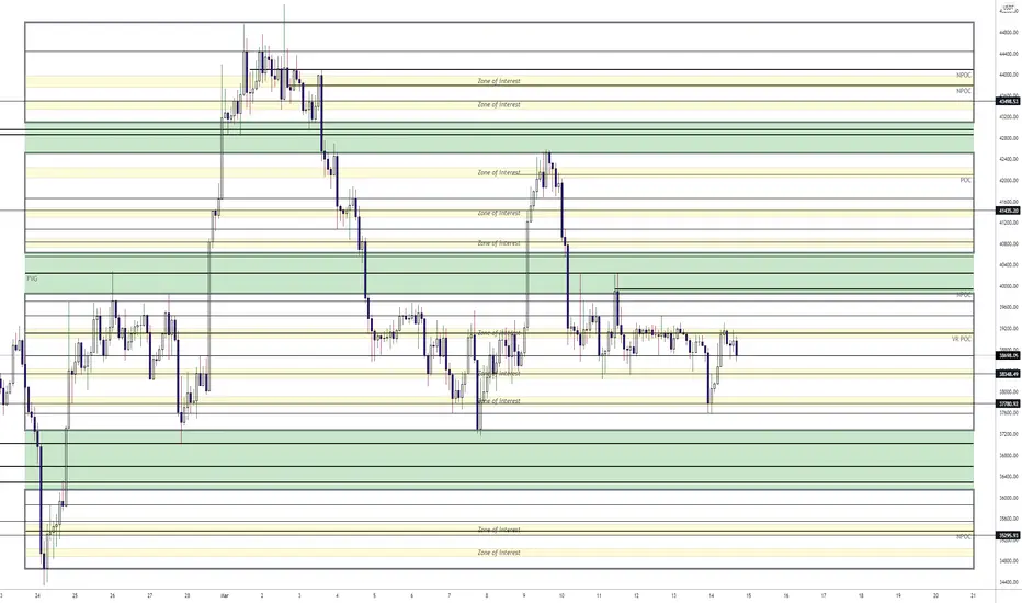
It indicates all levels of relevance.
The areas surrounded by thick grey lines indicate large high volume areas.
The "zones of interest" within those areas indicate high volume zones which attract price.
The POC and NPOC levels of course also serve as a good reference point for where price may be headed.
The green zones in between the larger areas indicate low volume zones where price tends to return to or shoot straight through.
Then in between are some basic S/R lines that may be of relevance.
If you like the chart, give me a thumbs up.
Enjoy your week, everyone!
here is my BTC TA for the coming week.
It indicates all levels of relevance.
The areas surrounded by thick grey lines indicate large high volume areas.
The "zones of interest" within those areas indicate high volume zones which attract price.
The POC and NPOC levels of course also serve as a good reference point for where price may be headed.
The green zones in between the larger areas indicate low volume zones where price tends to return to or shoot straight through.
Then in between are some basic S/R lines that may be of relevance.
If you like the chart, give me a thumbs up.
Enjoy your week, everyone!

免責事項
これらの情報および投稿は、TradingViewが提供または承認する金融、投資、取引、またはその他の種類の助言もしくは推奨であることを意図したものではなく、またこれらに該当するものでもありません。詳細は利用規約をご覧ください。
免責事項
これらの情報および投稿は、TradingViewが提供または承認する金融、投資、取引、またはその他の種類の助言もしくは推奨であることを意図したものではなく、またこれらに該当するものでもありません。詳細は利用規約をご覧ください。