
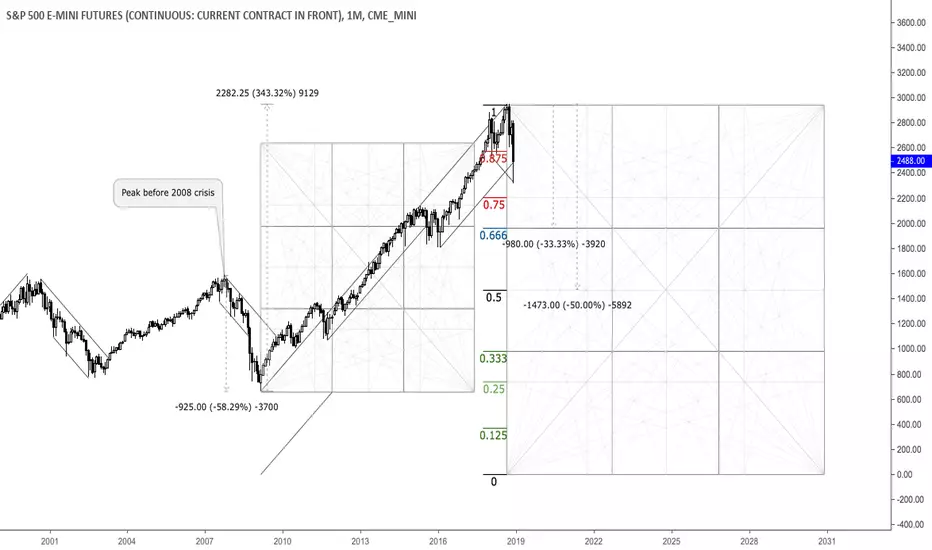
This is a monthly chart that shows important relationships in terms of price and time. As we can see, through the 2008 crisis the market plunged almost 60% and saw around 350% increase thereafter, painting an all-time high in September 2018. Currently, the 10-year-cycle is seemingly done and another big selloff in the equity market appears to be zooming. The 25%, 33.33% and 50% areas from the all-time high are potential targets and reversal zones. Selling into strength seems reasonable here.

免責事項
これらの情報および投稿は、TradingViewが提供または承認する金融、投資、取引、またはその他の種類の助言もしくは推奨であることを意図したものではなく、またこれらに該当するものでもありません。詳細は利用規約をご覧ください。
免責事項
これらの情報および投稿は、TradingViewが提供または承認する金融、投資、取引、またはその他の種類の助言もしくは推奨であることを意図したものではなく、またこれらに該当するものでもありません。詳細は利用規約をご覧ください。