

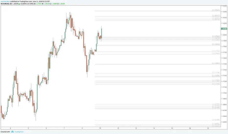
These zones are calculated using Fibonacci Ratios of past price moves.
Where prices overlap, drag the Right (price) Axis up to magnify and reduce overlap vertically.
There are zones above and below the current window, Drag the Chart up/down to see other zones.
Drag bottom axis to the left to magnify the candle size to view close up.
I will update as new zones are defined by upcoming Fibs.
Where prices overlap, drag the Right (price) Axis up to magnify and reduce overlap vertically.
There are zones above and below the current window, Drag the Chart up/down to see other zones.
Drag bottom axis to the left to magnify the candle size to view close up.
I will update as new zones are defined by upcoming Fibs.
ノート
EU trying hard to stay within this zone or bounce.I am kinda doubting a bounce.
ノート
EU entering Do or Die zones3.amazonaws.com/tradingview/snapshots/c/cR3mWgmx.png
ノート
NOT 'do' I guess!Big of a bounce off the next zone below,
but already broke below a strong zone, my shorts are fine!
ノート
EU is about to test a pretty large and relatively strong support zone.If it breaks below during Asian session, it could lead strong downward momentum.
ノート
Cutting right through.There are a couple more strong zones below.
After than, not much
ノート
Updated Support Resistance zones.Made some changes based on Fib waves today.
Pink are modified or new zones, light-light grey zones to be removed.
ノート
Looking at today's late US session action:1 minute chart shows the perfect compliance to fib numbers.
There are probably other things like Pivots, Previous Lows, Moving Averages, etc that line with some of those fibs. BUT, the fibs were drawn before hand, and projected outward or inward based on each move before. The Golden Ratio once again proves to have accounted for EVERYTHING and focused things down to the PIP.
ノート
Close up of the tail end of massive drop after ECB news, and adherence to the zonesThe darker bands are where fibs overlap, resulting in very strong resonance points.

the Golden Ratio is my Religion
the Trading View is my Nation
the Moderator Tag is my Flag
the Trading View is my Nation
the Moderator Tag is my Flag
関連の投稿
免責事項
これらの情報および投稿は、TradingViewが提供または承認する金融、投資、取引、またはその他の種類の助言もしくは推奨であることを意図したものではなく、またこれらに該当するものでもありません。詳細は利用規約をご覧ください。
the Golden Ratio is my Religion
the Trading View is my Nation
the Moderator Tag is my Flag
the Trading View is my Nation
the Moderator Tag is my Flag
関連の投稿
免責事項
これらの情報および投稿は、TradingViewが提供または承認する金融、投資、取引、またはその他の種類の助言もしくは推奨であることを意図したものではなく、またこれらに該当するものでもありません。詳細は利用規約をご覧ください。