
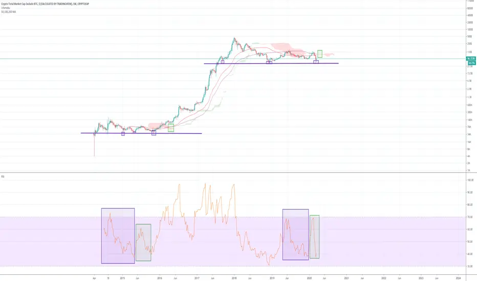
Impending golden cross on the weekly chart for the alt coin market cap! Also included a few points (purple squares) that show similarities to the previous bull run, and a RSI fractal i'm not sure if that's a thing? I know its meant to be used just for divergences but i noticed some similarities and thought i'd share. Ichimoku resistance can also be seen to be thinning which is a good sign for the golden cross. Happy trading in this crazy market!

免責事項
これらの情報および投稿は、TradingViewが提供または承認する金融、投資、取引、またはその他の種類の助言もしくは推奨であることを意図したものではなく、またこれらに該当するものでもありません。詳細は利用規約をご覧ください。
免責事項
これらの情報および投稿は、TradingViewが提供または承認する金融、投資、取引、またはその他の種類の助言もしくは推奨であることを意図したものではなく、またこれらに該当するものでもありません。詳細は利用規約をご覧ください。