OPEN-SOURCE SCRIPT
Average Price History Candle
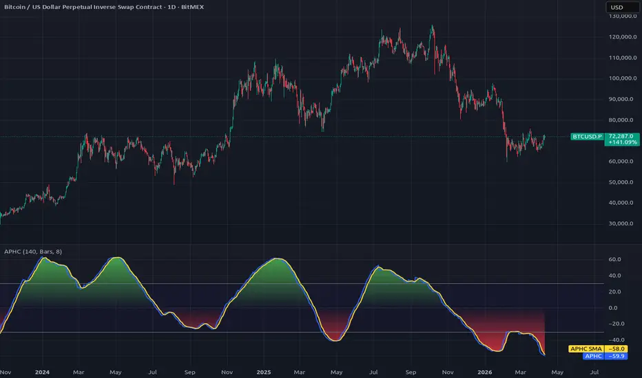
The Average Price History Candle indicator (APHC) is my own invention and is entirely new.
It's calculated from a time period, specified by a number of bars, hours or days.
It's basically one candle calculated from the average price history, with the high and low being that of the specified time period.
The open is the average (SMA) of the first half of the time period.
The close is the average (SMA) of the second half of the time period.
The plot is the size of the candle body expressed as a percentage of the whole price range, with positive being bullish and negative bearish.
It generally resembles a sine wave more or less, as the momentume shifts from bullish to bearish and back again.
Because it's fairly consistant and predictable, it gives a good indication where the market momentum is going next.
It also seems to work quite well with divergences.
Using a time period of a very few bars, say 6 or 8, it behaves more like an RSI or Stochastic.
But to be honest, I've not had much chance to explore all the different ways in which this indicator could be used to provide useful trading information.
Please leave ideas in the comments if you find ways in which you find it useful. Thanks.
It's calculated from a time period, specified by a number of bars, hours or days.
It's basically one candle calculated from the average price history, with the high and low being that of the specified time period.
The open is the average (SMA) of the first half of the time period.
The close is the average (SMA) of the second half of the time period.
The plot is the size of the candle body expressed as a percentage of the whole price range, with positive being bullish and negative bearish.
It generally resembles a sine wave more or less, as the momentume shifts from bullish to bearish and back again.
Because it's fairly consistant and predictable, it gives a good indication where the market momentum is going next.
It also seems to work quite well with divergences.
Using a time period of a very few bars, say 6 or 8, it behaves more like an RSI or Stochastic.
But to be honest, I've not had much chance to explore all the different ways in which this indicator could be used to provide useful trading information.
Please leave ideas in the comments if you find ways in which you find it useful. Thanks.
オープンソーススクリプト
TradingViewの精神に則り、このスクリプトの作者はコードをオープンソースとして公開してくれました。トレーダーが内容を確認・検証できるようにという配慮です。作者に拍手を送りましょう!無料で利用できますが、コードの再公開はハウスルールに従う必要があります。

免責事項
これらの情報および投稿は、TradingViewが提供または承認する金融、投資、取引、またはその他の種類の助言もしくは推奨であることを意図したものではなく、またこれらに該当するものでもありません。詳細は利用規約をご覧ください。
オープンソーススクリプト
TradingViewの精神に則り、このスクリプトの作者はコードをオープンソースとして公開してくれました。トレーダーが内容を確認・検証できるようにという配慮です。作者に拍手を送りましょう!無料で利用できますが、コードの再公開はハウスルールに従う必要があります。
免責事項
これらの情報および投稿は、TradingViewが提供または承認する金融、投資、取引、またはその他の種類の助言もしくは推奨であることを意図したものではなく、またこれらに該当するものでもありません。詳細は利用規約をご覧ください。