OPEN-SOURCE SCRIPT
Combined Market Breadth Table
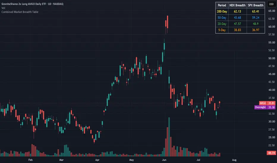
Overview
Combined Market Breadth Table is an overlay indicator that brings key market breadth data directly onto your chart in a clean, compact visual display. It tracks the percentage of stocks trading above major moving averages across two of the most heavily watched benchmarks: the Nasdaq 100 (NDX) and the S&P 500 (SPX).
Instead of clogging your screen with multiple lower-pane indicators, this script compiles short-term, medium-term, and long-term breadth metrics into a single table anchored to the top-right corner of your chart.
Key Features
Multi-Timeframe Moving Average Tracking: Displays the percentage of stocks trading above their 200-day, 50-day, 20-day, and 5-day moving averages simultaneously.
Dual-Index Comparison: Tracks both the Nasdaq 100 (NDX) and S&P 500 (SPX) side-by-side to easily spot divergence between tech heavyweights and the broader market.
Color-Coded Rows: Each moving average timeframe uses a distinct, color-coded text palette for quick scanning:
🟡 200-Day (Yellow): Macro / long-term structural trend.
🔵 50-Day (Blue): Intermediate trend.
🟢 20-Day (Green): Short-term trend.
🟠 5-Day (Orange): Ultra-short-term / momentum pulse.
Non-Intrusive Design: Renders only on the latest bar inside a dark, framed table box in the top-right corner, leaving your price action uncluttered.
Combined Market Breadth Table is an overlay indicator that brings key market breadth data directly onto your chart in a clean, compact visual display. It tracks the percentage of stocks trading above major moving averages across two of the most heavily watched benchmarks: the Nasdaq 100 (NDX) and the S&P 500 (SPX).
Instead of clogging your screen with multiple lower-pane indicators, this script compiles short-term, medium-term, and long-term breadth metrics into a single table anchored to the top-right corner of your chart.
Key Features
Multi-Timeframe Moving Average Tracking: Displays the percentage of stocks trading above their 200-day, 50-day, 20-day, and 5-day moving averages simultaneously.
Dual-Index Comparison: Tracks both the Nasdaq 100 (NDX) and S&P 500 (SPX) side-by-side to easily spot divergence between tech heavyweights and the broader market.
Color-Coded Rows: Each moving average timeframe uses a distinct, color-coded text palette for quick scanning:
🟡 200-Day (Yellow): Macro / long-term structural trend.
🔵 50-Day (Blue): Intermediate trend.
🟢 20-Day (Green): Short-term trend.
🟠 5-Day (Orange): Ultra-short-term / momentum pulse.
Non-Intrusive Design: Renders only on the latest bar inside a dark, framed table box in the top-right corner, leaving your price action uncluttered.
オープンソーススクリプト
TradingViewの精神に則り、このスクリプトの作者はコードをオープンソースとして公開してくれました。トレーダーが内容を確認・検証できるようにという配慮です。作者に拍手を送りましょう!無料で利用できますが、コードの再公開はハウスルールに従う必要があります。

免責事項
これらの情報および投稿は、TradingViewが提供または承認する金融、投資、取引、またはその他の種類の助言もしくは推奨であることを意図したものではなく、またこれらに該当するものでもありません。詳細は利用規約をご覧ください。
オープンソーススクリプト
TradingViewの精神に則り、このスクリプトの作者はコードをオープンソースとして公開してくれました。トレーダーが内容を確認・検証できるようにという配慮です。作者に拍手を送りましょう!無料で利用できますが、コードの再公開はハウスルールに従う必要があります。
免責事項
これらの情報および投稿は、TradingViewが提供または承認する金融、投資、取引、またはその他の種類の助言もしくは推奨であることを意図したものではなく、またこれらに該当するものでもありません。詳細は利用規約をご覧ください。