OPEN-SOURCE SCRIPT
Market Euphoria Index - MEI - Predict Market Tops & Bottoms
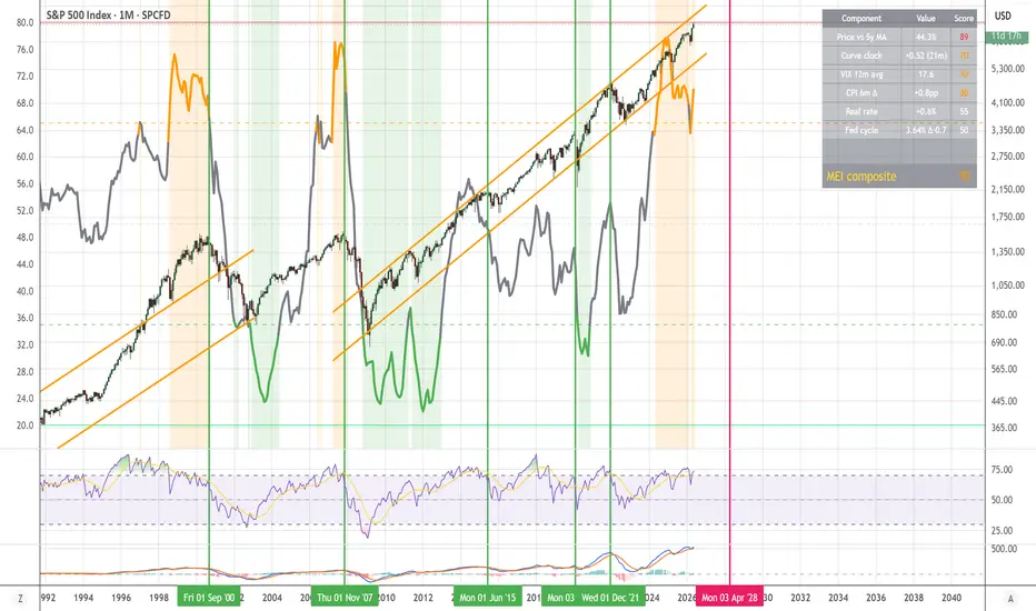
A composite macro indicator designed to peak BEFORE major equity market tops — not during the crash.
Most "fear & greed" gauges are coincident: they spike with the panic, not before it. The MEI flips that. It measures how much euphoria and late-cycle stress have built up over months of bull market, so it tends to peak in the run-up to a top rather than at the bottom.
What it captured historically (visual backtest on monthly SPX):
— Climbed into the red zone ahead of the August 1987 top
— Peaked ahead of the March 2000 dot-com top
— Peaked ahead of the October 2007 GFC top
— Peaked ahead of the January 2022 top
— Dropped to the extreme-fear zone near every major bear-market bottom that followed
The six components (default weights):
— Price extension vs 5-year SMA (30%) — the primary leading signal. SPX has been 25-55% above its 5-year average at every major top since 1980.
— Yield curve un-inversion clock (25%) — tracks months since the 10Y-2Y spread last went negative. Peak warning is 0-12 months after the curve un-inverts (this is the actual recession trigger, historically).
— VIX 12-month average (15%) — captures sustained complacency, not single panic spikes. Low for a year = top buildup.
— Inflation re-acceleration (10%) — 6-month change in CPI YoY. Late-cycle inflation shocks (2000, 2007, 2022) are the classic top catalyst.
— Real rate stress (10%) — 10Y nominal yield minus CPI YoY. High and rising = tightening financial conditions.
— Fed cycle position (10%) — high and plateauing = peak late cycle; aggressive cuts = bottom signal.
How to read the line:
— Above 80 (red) = EXTREME EUPHORIA, historical top zone, reduce risk
— 65 to 80 (orange) = Euphoria warning, late cycle, tighten stops
— 35 to 65 (gray) = Neutral
— 20 to 35 (green) = Fear, opportunity zone
— Below 20 (lime) = EXTREME FEAR, historical bottom zone
Best timeframe: monthly (M) or weekly (W) on SPX, NDX, QQQ, or SPY. All economic data is fetched at monthly resolution regardless of your chart's timeframe, so the indicator reads the same whether you're on D, W, or M.
Customizable: every component weight and threshold is exposed in the settings. Bump up "Price extension" if you want more sensitivity to bubbles, or "Yield curve" if you trust macro recession signals more than price action.
Built-in alerts: Euphoria warning, Extreme euphoria, Fear, Extreme fear — all four crossovers are configurable from the alert menu.
To overlay on SPX: right-click the indicator name, then "Move pane to" then "Above", then "Pin to scale" to give it its own axis on the price chart.
Data sources (all free, built into TradingView):
SP:SPX, FRED:T10Y2Y, CBOE:VIX, ECONOMICS:USIRYY, FRED:FEDFUNDS, TVC:US10Y
Honest limitations:
— This is a macro/cyclical tool, useless for intraday or short-term timing.
— Designed to call major bull/bear turning points, not 10-20% corrections.
— The 2020 COVID crash was an exogenous shock no macro model could predict; the MEI would not have warned you.
— Past patterns are not guarantees. Current dynamics (AI capex, geopolitics, structural inflation) may break historical relationships.
— Not financial advice. Use alongside your own analysis.
Most "fear & greed" gauges are coincident: they spike with the panic, not before it. The MEI flips that. It measures how much euphoria and late-cycle stress have built up over months of bull market, so it tends to peak in the run-up to a top rather than at the bottom.
What it captured historically (visual backtest on monthly SPX):
— Climbed into the red zone ahead of the August 1987 top
— Peaked ahead of the March 2000 dot-com top
— Peaked ahead of the October 2007 GFC top
— Peaked ahead of the January 2022 top
— Dropped to the extreme-fear zone near every major bear-market bottom that followed
The six components (default weights):
— Price extension vs 5-year SMA (30%) — the primary leading signal. SPX has been 25-55% above its 5-year average at every major top since 1980.
— Yield curve un-inversion clock (25%) — tracks months since the 10Y-2Y spread last went negative. Peak warning is 0-12 months after the curve un-inverts (this is the actual recession trigger, historically).
— VIX 12-month average (15%) — captures sustained complacency, not single panic spikes. Low for a year = top buildup.
— Inflation re-acceleration (10%) — 6-month change in CPI YoY. Late-cycle inflation shocks (2000, 2007, 2022) are the classic top catalyst.
— Real rate stress (10%) — 10Y nominal yield minus CPI YoY. High and rising = tightening financial conditions.
— Fed cycle position (10%) — high and plateauing = peak late cycle; aggressive cuts = bottom signal.
How to read the line:
— Above 80 (red) = EXTREME EUPHORIA, historical top zone, reduce risk
— 65 to 80 (orange) = Euphoria warning, late cycle, tighten stops
— 35 to 65 (gray) = Neutral
— 20 to 35 (green) = Fear, opportunity zone
— Below 20 (lime) = EXTREME FEAR, historical bottom zone
Best timeframe: monthly (M) or weekly (W) on SPX, NDX, QQQ, or SPY. All economic data is fetched at monthly resolution regardless of your chart's timeframe, so the indicator reads the same whether you're on D, W, or M.
Customizable: every component weight and threshold is exposed in the settings. Bump up "Price extension" if you want more sensitivity to bubbles, or "Yield curve" if you trust macro recession signals more than price action.
Built-in alerts: Euphoria warning, Extreme euphoria, Fear, Extreme fear — all four crossovers are configurable from the alert menu.
To overlay on SPX: right-click the indicator name, then "Move pane to" then "Above", then "Pin to scale" to give it its own axis on the price chart.
Data sources (all free, built into TradingView):
SP:SPX, FRED:T10Y2Y, CBOE:VIX, ECONOMICS:USIRYY, FRED:FEDFUNDS, TVC:US10Y
Honest limitations:
— This is a macro/cyclical tool, useless for intraday or short-term timing.
— Designed to call major bull/bear turning points, not 10-20% corrections.
— The 2020 COVID crash was an exogenous shock no macro model could predict; the MEI would not have warned you.
— Past patterns are not guarantees. Current dynamics (AI capex, geopolitics, structural inflation) may break historical relationships.
— Not financial advice. Use alongside your own analysis.
オープンソーススクリプト
TradingViewの精神に則り、このスクリプトの作者はコードをオープンソースとして公開してくれました。トレーダーが内容を確認・検証できるようにという配慮です。作者に拍手を送りましょう!無料で利用できますが、コードの再公開はハウスルールに従う必要があります。

免責事項
これらの情報および投稿は、TradingViewが提供または承認する金融、投資、取引、またはその他の種類の助言もしくは推奨であることを意図したものではなく、またこれらに該当するものでもありません。詳細は利用規約をご覧ください。
オープンソーススクリプト
TradingViewの精神に則り、このスクリプトの作者はコードをオープンソースとして公開してくれました。トレーダーが内容を確認・検証できるようにという配慮です。作者に拍手を送りましょう!無料で利用できますが、コードの再公開はハウスルールに従う必要があります。
免責事項
これらの情報および投稿は、TradingViewが提供または承認する金融、投資、取引、またはその他の種類の助言もしくは推奨であることを意図したものではなく、またこれらに該当するものでもありません。詳細は利用規約をご覧ください。