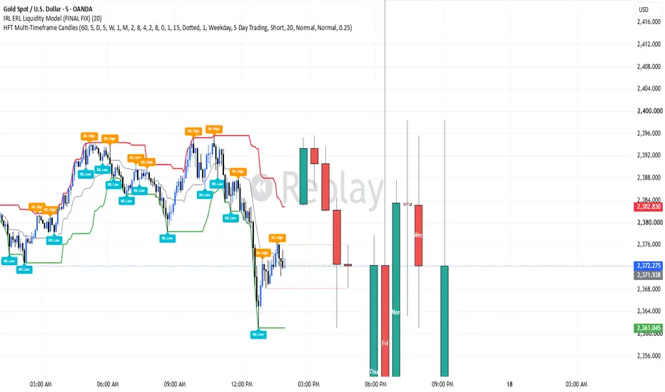
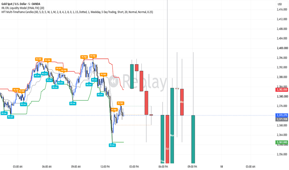
IRL ERL Liquidity Model (FINAL FIX) okesherl irl model base indicator creat by okesh matreLibrary "CurrentlyPositionIndicator" Currently position indicator run(_index, _price, _stoploss, _high, _low, _side, _is_entered, _colors, _position_left, _box_width) Currently positions indicator Parameters: _index (int) : entry index _price (float) : entry price _stoploss (float) : stoploss price _high (float) : range high _low (float) : range low _side (int) _is_entered (bool) : is entered _colors (color ) : color array _position_left (int) : Left position _box_width (int) : box's width Returns: TODO: add what function returns
by boitoki
Updated Oct 15, 2023
インジケーター
SMT w AlertsThis script is a Smart Money Tool (SMT) Divergence Indicator written in TradingView's Pine Script v6. It automatically detects and visualizes instances where highly correlated assets (like NQ, ES, and YM) fall out of sync at major price swings.
Here is a breakdown of how the script works and its key features:
1. Core Logic (Pivot Tracking)
The script uses ta.pivothigh and ta.pivotlow to identify swing highs and swing lows on your main chart based on a window of bars (default 3 bars left and right). It remembers the most recent pivot and the one right before it so it can compare the two.
2. Dual-Symbol Comparison
When a pivot is confirmed on your main chart, the script immediately looks at the price action of two comparison symbols (e.g., MNQ and MES) at that exact same time.
Tolerance Window: Because assets like NQ and ES don't always peak on the exact same 1-minute or 5-minute candle, the script includes a "Comparison Tolerance" input. It looks a few bars before and after the pivot on the comparison symbols to find their true peak/valley.
3. Divergence Detection
The script compares the slope of the pivots on your chart against the comparison symbols:
Bearish SMT (Highs): If your chart makes a Higher High, but the comparison symbol makes a Lower High (or vice versa). This indicates underlying weakness in the buying pressure.
Bullish SMT (Lows): If your chart makes a Lower Low, but the comparison symbol makes a Higher Low (or vice versa). This indicates underlying strength in the selling absorption.
It checks both comparison symbols simultaneously — if an SMT forms against either of them, it triggers the signal.
4. Visuals & Aesthetics
The SMT Bracket: When an SMT is detected, it draws a clean bracket (or "bridge") connecting the two diverging pivots. It draws horizontal tick marks at the pivots, vertical lines extending outward, and a horizontal bridge connecting them with a small "SMT" label. The bracket dynamically sizes itself using ATR (Average True Range).
Unused Pivots: Pivots that do not result in an SMT divergence are optionally connected with subtle grey dashed lines so you can see the market structure.
Bar Coloring: The candle where the SMT is officially confirmed is highlighted with a subtle background color.
5. Dashboard & Alerts
Dashboard: A clean table in the top right corner tracks how many Bearish and Bullish SMTs have occurred on the chart, and how many bars ago the most recent one fired.
Alerts: The script exposes alert conditions (alertcondition) that you can hook into TradingView's alert system to receive notifications when a Bullish or Bearish SMT forms. インジケーター

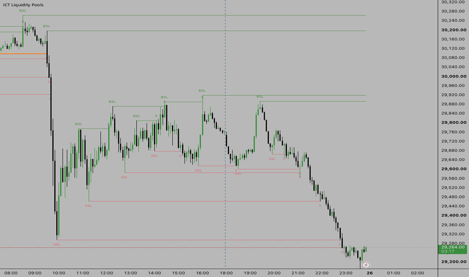
Liquidity PoolsThis script is an automated liquidity mapping tool based on ICT concepts. It actively hunts your chart for zones where retail stop losses and pending breakout orders are clustered.
Here is a breakdown of how the script functions and visualizes liquidity on your chart:
1. Automatic Pivot Detection (Old Highs & Old Lows)
The script continuously monitors price action to find major structural turning points (swing highs and swing lows).
When a confirmed swing high forms, it registers it as Buy-Side Liquidity (BSL) and draws a blue line projecting to the right. This marks a zone where retail traders have placed their buy-stop loss orders above the high.
When a confirmed swing low forms, it registers it as Sell-Side Liquidity (SSL) and draws a red line projecting to the right. This marks a zone where sell-stop loss orders are resting.
2. Equal Highs (EQH) and Equal Lows (EQL) Detection
In ICT methodology, the most powerful magnets for price are "Relative Equal Highs" or "Relative Equal Lows".
The script actively measures the distance between a newly formed pivot and an old active pivot.
If a new pivot forms within a few ticks of an old one (customizable in settings), the script recognizes it as highly engineered liquidity!
It automatically thickens the line, changes its color to bright orange, and updates the text label to EQH or EQL, signaling an extremely high-probability draw on liquidity.
3. Smart Text Labeling
To ensure you never have to guess what a line means, the script pins a text label (BSL, SSL, EQH, or EQL) directly at the starting point of every liquidity pool.
4. Sweep Detection & "Stop-Hunting" Tracking
Liquidity pools are only valid until they are traded through.
The script tracks every live tick. The exact moment price sweeps through a liquidity line, it stops extending the line.
It drops a small "X" right where the line was broken. This gives you a permanent historical footprint on your chart of exactly where and when "Smart Money" swept stops.
5. Memory Management
Because liquidity lines could theoretically build up infinitely and crash your chart, the script has built-in garbage collection. It only keeps track of the 15 most recent unswept pools (you can change this number in the settings) so your chart always stays clean and fast. インジケーター
インジケーター

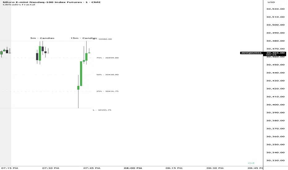
Ease Fractal Reclaim [ZOM]Ease Fractal Reclaim is an open-source structure and reclaim tool built around Ease of Movement flow, recent fractal range context, CCI impulse, and ATR/body thrust confirmation.
The script is designed to show when price is attempting to reclaim or reject a recent structure zone while movement becomes easier and momentum begins to confirm. The visual style uses sparse fractal rails and price-anchored markers instead of a heavy cloud, with a compact mini dashboard for quick context.
Core components:
- Ease of Movement flow / resistance read
- Recent fractal range rails and reclaim/reject context
- CCI zero-line impulse filter
- ATR/body thrust confirmation
- Cooldown-aware watch and confirmed signals
- Compact mini dashboard with mode, EOM flow, fractal map, CCI impulse, bias, and quality score
- Alerts for bullish and bearish watch/confirmed conditions
The Quality Score is a compact confluence read, not a prediction. It summarizes whether flow, structure, impulse, thrust, and cooldown conditions are aligned enough to support the current signal context.
This is not financial advice or a standalone trading system. Use it with broader market structure, risk controls, and your own confirmation process. インジケーター

インジケーター

インジケーター
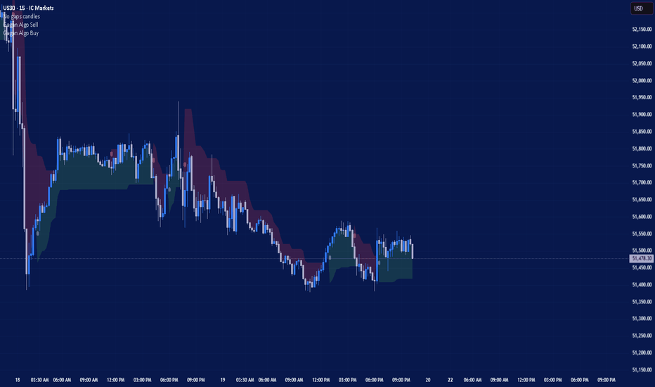
インジケーター

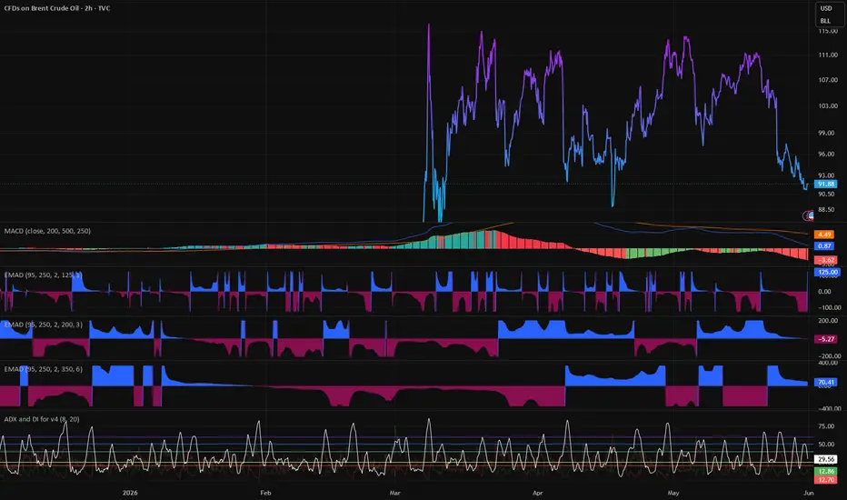
Fractal Regime Engine (FRPE)🚀 Fractal Regime Engine (FRPE)
The FRPE (Fractal Regime Engine) is an advanced, quantitative market regime oscillator designed to identify structural transitions between trend expansion, mean reversion compression, and neutral market equilibrium in real time. Built on a multi-scale fractal scaling framework, volatility-normalized logarithmic relationships, and adaptive statistical compression, this indicator reconstructs market behavior through regime dynamics rather than price direction alone.
Unlike conventional momentum oscillators that rely on lagging price derivatives, FRPE models the *structural complexity of market behavior* by comparing fractal scaling differences across multiple time horizons. This allows the detection of regime shifts that occur before they become visually apparent on price charts.
The result is a bounded, adaptive regime signal that clearly distinguishes when the market is expanding directionally, compressing into equilibrium, or transitioning between structural phases of uncertainty.
💡 Key Features
🧠 Multi-Scale Fractal Engine:
FRPE evaluates market structure across short, mid, and long-term windows simultaneously. By measuring fractal scaling divergence between these timeframes, the system isolates structural drift in market behavior rather than simple price movement.
📊 Fractal Drift Model:
The core signal is derived from the differential relationship between short-term and long-term fractal scaling behavior. This creates a robust measure of regime imbalance that reflects the underlying geometry of market activity.
🔬 Volatility-Normalized Log Scaling:
Price range behavior is normalized against ATR-based volatility scaling using logarithmic transformation. This ensures that the signal remains consistent across different asset classes and volatility regimes.
⚡ Adaptive Oscillator Compression:
All raw outputs are transformed into a bounded oscillator (-100 to +100) using dynamic scaling logic. This enables consistent interpretation across all market conditions without recalibration.
🛡️ Percentile-Based Dynamic Thresholds:
Instead of fixed levels, FRPE uses rolling percentile bands to define regime boundaries. This ensures that signal sensitivity adapts automatically to changing market environments.
📉 Three-State Regime Classification:
FRPE categorizes market behavior into three structural phases:
* Expansion Regime (Trend Continuation / Directional Imbalance)
* Compression Regime (Mean Reversion / Liquidity Equilibrium)
* Transition Regime (Structural Uncertainty / Regime Shift Zone)
🔬 Mathematical Logic and Structure
FRPE is built on a multi-layer fractal decomposition model that transforms raw market data into a structured regime oscillator.
The process begins by calculating a fractal scaling proxy based on the logarithmic relationship between price range expansion and volatility-adjusted ATR scaling. This creates a normalized measure of how efficiently price is expanding relative to its underlying volatility structure.
To capture structural differences across time horizons, the system computes fractal scaling values across short, mid, and long windows. The divergence between short-term and long-term behavior forms the core “fractal drift” signal, which represents directional structural imbalance in market dynamics.
This drift signal is then amplified and normalized into a bounded oscillator space (-100 to +100), allowing direct interpretation of regime intensity. Positive values indicate structural expansion and trending behavior, while negative values indicate compression and mean-reverting pressure.
To eliminate noise and microstructure distortion, the signal is smoothed using exponential moving averaging, ensuring that only statistically relevant regime transitions are preserved.
Finally, adaptive percentile-based thresholds dynamically define regime boundaries based on recent historical distribution. This removes dependency on static parameters and ensures robustness across different volatility environments.
In essence, FRPE does not track price direction. It reconstructs the *structural evolution of market complexity across time scales* and translates it into a unified regime map of expansion, compression, and transition.
🛠️ How to Use
1. Expansion Regime (Positive Extremes):
Indicates strong directional structure and increasing trend persistence. Breakout continuation strategies are statistically favored.
2. Compression Regime (Negative Extremes):
Represents equilibrium or absorption phases where mean reversion behavior dominates. Range-bound strategies tend to perform better.
3. Transition Regime (Neutral Zone):
Signals structural uncertainty and regime instability. Market conditions are non-directional and require caution.
🎛️ Settings
* Short Window (10): High-frequency structural sensitivity
* Mid Window (30): Core regime stability filter
* Long Window (100): Macro structural reference baseline
* Smoothing Length (5): Signal stabilization layer
📌 Credits and Origins
FRPE is engineered by gunebak4n as a structural market regime framework built on multi-timeframe fractal scaling dynamics, volatility-normalized logarithmic relationships, and adaptive statistical compression. The model is designed to move beyond traditional momentum-based oscillators and instead reconstruct underlying market behavior through regime transitions driven by fractal divergence across time horizons.
The model is optimized for discretionary traders, quantitative analysts, and systematic trading workflows that prioritize regime awareness over directional prediction.
⚠️ Disclaimer
All outputs generated by FRPE are probabilistic and non-deterministic. This indicator does not predict market direction or guarantee outcomes. It is a structural analysis tool intended to support decision-making under uncertainty. Proper risk management remains essential at all times.
インジケーター

インジケーター

ストラテジー

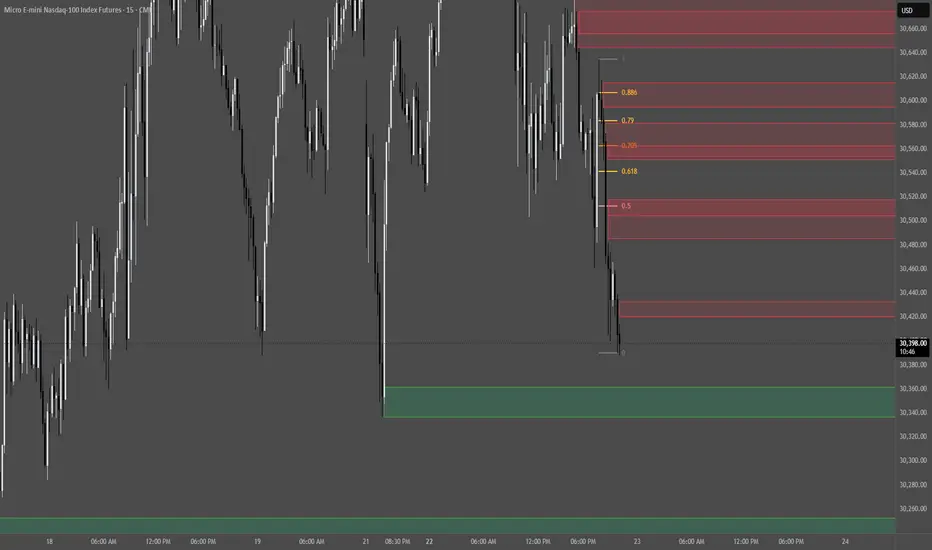
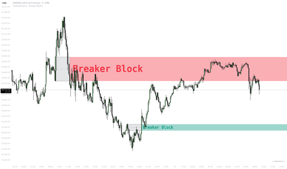
CandelaCharts - Breaker Blocks📝 Overview
Breaker Blocks are a powerful concept popularized by ICT (Inner Circle Trader) and widely used in Smart Money Concepts (SMC) trading. A Breaker Block is essentially a "failed" order block. It forms when the market sweeps a prior high or low to grab liquidity, but then sharply reverses and breaks the pivot that initiated the sweep. The original order block that caused the liquidity sweep then becomes a high-probability mitigation zone—known as a Breaker Block.
Our CandelaCharts - Breaker Blocks indicator automatically identifies these complex market structures, drawing the original order block and extending the active Breaker Block zone to help you anticipate high-probability reversals and continuation setups.
📦 Features
Automated Detection : Instantly identifies both Bullish and Bearish Breaker Blocks by analyzing pivot sweeps and structural breaks.
Visual Clarity : Highlights the original Order Block (gray by default) and extends the mitigated Breaker Block zone (colored) for easy visual reference.
Mean Line : Automatically draws a dotted mean (50%) line inside the breaker block, a key sensitivity level for price reactions.
Overlap Management : Optionally removes overlapping breaker blocks to keep your chart clean and focused on the most relevant zones.
Dynamic Clean-up : Automatically removes mitigated blocks once price breaks and closes completely through them.
Dynamic Ranking & Shading : Calculates a robust 0-100 score based on Volume, Block Size, Sweep Depth, and Displacement. Ranks range from Prime (highest) to Weak (lowest), and the zone's visual opacity dynamically scales to highlight stronger setups.
⚙️ Settings
Bias : Filters the detection to show "Neutral" (both directions), "Bullish" only, or "Bearish" only.
Max Blocks : Limits the maximum number of active breaker blocks displayed simultaneously on the chart.
Pivot Lookback : Adjusts the lookback period for detecting Pivot Highs and Lows. Increase this value to detect major, higher-timeframe structural breakers, or decrease it for minor, short-term breakers.
Bullish / Bearish Colors : Fully customize the colors for both the historical Order Block zone and the active Breaker Block zone.
Remove Overlaps : When enabled, the script will automatically filter out and remove overlapping breaker zones, leaving only the most distinct blocks.
Show Rank : Toggles the display of the rank text appended directly to the block name (e.g., "Breaker Block (Premium)").
⚡️ Showcase
Bullish Breakers
Bearish Breakers
Ranked Breakers
🚨 Alerts
This indicator includes built-in dynamic alerts using TradingView's `alert()` function. You can easily set up an alert on this indicator by selecting "Any alert() function call" in the Create Alert menu.
Bullish Breaker Alert : Fires when a new Bullish Breaker Block is confirmed on bar close. The alert message includes the rank of the block, allowing external filtering for high-probability setups.
Bearish Breaker Alert : Fires when a new Bearish Breaker Block is confirmed on bar close. The alert message includes the rank of the block.
⚠️ Disclaimer
Trading involves significant risk, and many participants may incur losses. The content on this site is not intended as financial advice and should not be interpreted as such. Decisions to buy, sell, hold, or trade securities, commodities, or other financial instruments carry inherent risks and are best made with guidance from qualified financial professionals. Past performance is not indicative of future results.
インジケーター
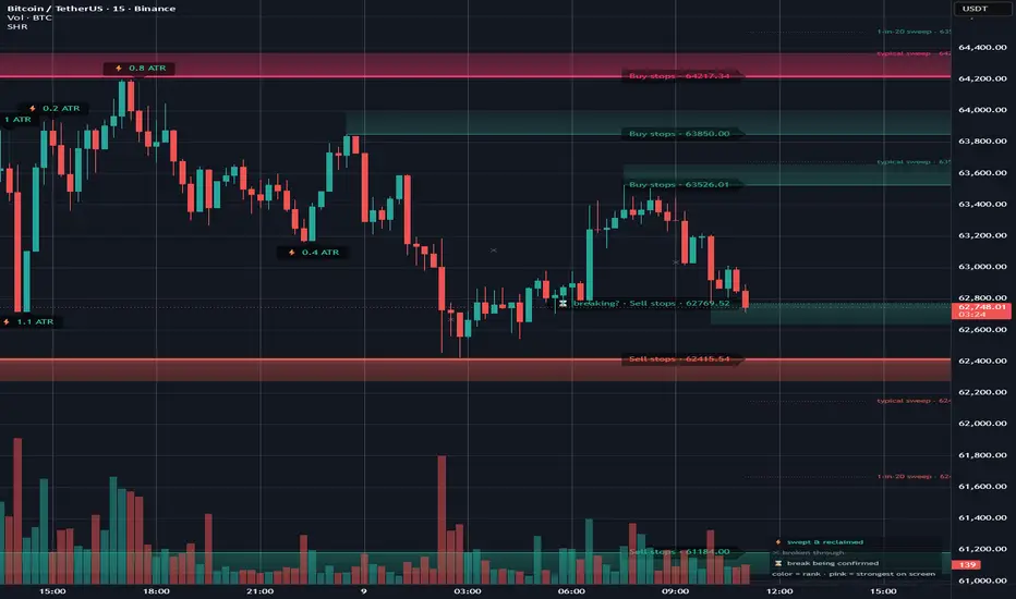
Stop Hunt Radar [GBB]STOP HUNT RADAR
Have you ever placed a stop loss under a swing low, watched price come down, take out your stop to the tick, and then run exactly where you said it would? That's not bad luck and it's not a conspiracy. Below every obvious low sits a cluster of sell orders — your stop, my stop, the breakout traders' sell-stops — and for anyone who needs to buy size, that cluster is the only spot on the chart with guaranteed forced selling waiting at a known price. Your stop wasn't hunted out of malice. Your stop was the liquidity.
This indicator maps those clusters in real time, classifies what happens when they get hit, and keeps honest records. That last part matters more than you think.
How is works
The shaded bands are stop pools. "Sell stops · 60,621" means stop losses from longs are probably resting under that level; the shading shows the pocket where they sit. Color is a ranking, not a direction: gray is a minor fresh swing, pink is the most loaded level currently on your screen. Hover any level and it tells you in plain words why it's ranked — "3 equal lows · yesterday's low · 4.2× volume". No codes to memorize. (If you prefer compact BSL/SSL labels, switch Label Style to Pro.)
When price hits a pool, the radar decides what happened by fixed rules, on closed bars, with no repainting:
⚡ swept — price wicked through and closed back. The marker stays on the chart with the measured raid depth ("⚡ 2.4 ATR").
✕ broken — price closed through and stayed.
⌛ undecided — price closed through but might come back. The radar waits a few bars before calling it instead of guessing. Capitulation V-reversals get correctly labeled as sweeps because of this.
The dotted lines near ranked pools are the part I'm most proud of: depth guides. They're measured from this chart's own history — "typical sweep · 63,955" marks how far the median raid ran past that level, "1-in-20 sweep" marks the bad case. Now look where the textbook stop placement is. Usually inside the typical zone. That's the whole point of this tool in one picture.
IMPORTANT
Every channel that shows you stop hunts follows up with the same pitch: buy the sweep, ride the reversal. Before publishing this, I tested that. Properly — the engine was rebuilt in Python, verified bar-for-bar identical against this script, and run through a pre-registered study on 24 months of BTC, ETH and SOL. The final test ran exactly once, on 21,813 sweeps of held-out data the tuning never touched.
Result: after a sweep, the average forward move is statistically indistinguishable from entering at a random moment. The strongest-ranked pools did not reverse harder — if anything slightly worse. The dramatic panic-volume wicks leaned toward continuation, not reversal.
So no, the lightning bolts are not buy signals, and I won't pretend otherwise. The live tally on your own chart will show you the same thing — reclaim rates around 55–60%, a coin flip with commission. This is why the radar prints the losses too. If someone shows you this pattern with only winning examples, you now know what got cropped.
WHAT IT'S ACTUALLY FOR
Stop placement, mostly. The depth guides answer "is my stop sitting in the feeding zone?" before you find out the expensive way. Either place it past the typical-sweep line or size down knowing the risk. Second: when a level gets hit you get a rule-based verdict — swept or broken — instead of arguing with yourself, and alerts fire on those events so it watches the levels while you don't. Third: the receipt trail audits your beliefs. You think "they always sweep the lows here"? Scroll back. The chart kept score.
ANY MARKET, ANY TIMEFRAME
The geometry is ATR-scaled and the tolerances are percentage-based, so it self-adapts. The stats are measured per chart — a Gold chart shows Gold's raid depths, not Bitcoin's. Auto-Adapt handles the asset-specific details: forex gets proper big-figure/half-figure round numbers (159.50 on USDJPY, 1.0850 on EURUSD), and symbols without volume data get the volume factor switched off. When an adaptation is active, the legend says so. One honest caveat: the validation study was crypto on 5m. Other markets run the same mechanics but ship with their own live base rates instead of borrowed claims. Stocks gap — gap-throughs get adjudicated by the same waiting rule, but read markers around opens with some skepticism.
GOOD TO KNOW
Colors are relative: a pool's color can shift as stronger or weaker pools appear on screen. That's ranking, not repainting — the absolute score lives in the tooltip and never changes retroactively. Depth guides appear once the chart has logged at least 10 classified sweeps per side, because statistics from three events aren't statistics. If another indicator ever squashes your chart, right-click the price scale and enable "Scale price chart only" — worth doing in general. The optional dashboard (off by default) adds the nearest pools and the rolling base rates in a corner panel.
THE SETTINGS
You don't need to touch any of this — the defaults are the validated configuration and what I run myself. But it's all there if you want it. The settings are grouped the same way the panel is.
Display — the stuff you'll actually use. Min Score To Display hides weak pools (0 shows everything). Display Radius (default 3%) hides pools too far from price; they're still tracked, they just reappear when price comes back. Show Pool Labels, Show Radar Dashboard (off by default — the corner panel with nearest pools and base rates), Show Legend, Show Sweep Base Rates. Label Style is the big one: Beginner spells everything out, Pro uses compact BSL/SSL codes. UI Text Size and Label Size — bump these up for screenshots and video. Sweep Depth Guides plus "Hide Guides For Gray Pools" (rank 0–10, default 3): raise it to only annotate the strongest levels, lower it to 0 to guide every pool. Auto-Adapt To Asset Class — leave this on unless you have a reason.
Swing Detection — how a level is found. Pivot Left / Pivot Right define how many bars each side make a swing (8/3 default — bigger = fewer, more significant levels). Max Armed Life retires a level that's gone untested for too long.
Pool Geometry — ATR Length drives all the scaling. Pocket Depth sets how thick the shaded stop pocket is. EQ Merge Tolerance controls how close two swings must be to count as the "same" level and cluster together — by % of price (default) or ATR.
Sweep / Outcome — the classification rules. Min Sweep Penetration is how far past a level a wick must go to count as a touch. Multi-Bar Sweep Grace (default 10 bars) is the window where a close-through can still turn back into a sweep — this is what catches capitulation reversals instead of mislabeling them as breaks; set it to 0 for strict single-bar sweeps only. Reclaim Confirmation and Outcome Watch Window define what counts as a confirmed reclaim and how long the radar watches before giving up.
Scoring & Heat Weights — what makes a level rank high. Four weights: EQ Cluster Size, Untested Age, Confluence, Formation Volume. The "Norm" values are how much of each earns a full score (e.g. 3 equal pivots = full cluster score). Session Confluence toggles the prior day/week levels; Round Number Confluence and its step (0 = auto, and auto is asset-aware) toggle round-number weighting. Fair warning: the study found the heat score doesn't predict sweep outcomes, so retuning these changes what looks prominent, not what works. I left mine at default and I'd suggest you do too.
Heat Palette & Receipts — looks. Heat Color Scale is Relative by default (the ramp stretches across the pools currently on screen); switch to Absolute if you want a fixed 0–10 meaning. The four color stops (Cold / Warm / Hot / Prime) are the ramp. Outcome Receipts: show Wins + Losses (default — the point), Wins Only, or None.
Alerts — High-Rank Pool Score is the threshold for the "approaching a strong pool" alerts (it's on the absolute score, where pools typically sit around 1–4). Proximity is how close counts as "approaching". The sweep and break alerts themselves fire on the events directly — add them from the alerts dialog. インジケーター

インジケーター

インジケーター

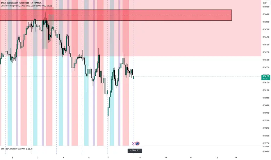
OHLC-OLHC [ARKN] ARKN combines three time-based analysis tools into a single overlay so that session context, higher-timeframe structure, and cross-asset divergence can be read together on one chart, without stacking three separate indicators.
What it does
Killzones — Draws up to four configurable session boxes (defaults: Asia, London, NY AM, NY PM) with optional session high/low pivot lines, midpoints, day-of-week labels, opening-price lines, and an "opening candle" marker. Pivots can extend until mitigated or past mitigation, with optional alerts when a session high or low is broken.
HTF Candles — Renders up to four higher-timeframe candle sets to the right of the live price, each with its own timeframe and display count. Optional Fair Value Gap and Volume Imbalance boxes, a remaining-time countdown, and interval labels are drawn directly on the projected candles.
Sequential SMT (SSMT) — Detects SMT-style divergence between correlated instruments across nested cycles (Micro, 90-minute, Daily, Weekly, Monthly). Triads can be set automatically for common groups (metals, indices, FX, crypto, futures) or defined manually, with an inverse option for negatively-correlated pairs. Both standard (wick-based) and hidden (body/close-based) divergences are supported.
Why these three together
The three modules answer three sequential questions a session-based trader asks in order: when (Killzones frame the active session), what structure (HTF Candles show the higher-timeframe bias forming in real time), and confirmation (SSMT flags when a correlated instrument fails to confirm the move). Combining them removes the need to switch layouts or sync timeframes manually, since all three share the same timezone and session logic.
How to use
Set your timezone under Settings; all sessions and cycles reference it.
Each module has a master ON/OFF toggle at the top of its settings group.
For SSMT, either leave Triad Selection on Auto (it picks correlated assets for the current symbol) or set Manual to define your own triad. Lower timeframes show Micro/90m cycles; higher timeframes show Daily/Weekly/Monthly.
HTF Candle timeframes must be higher than the chart timeframe to display.
Settings overview
Global: drawing limit, timeframe limit, timezone, label size, text color, cutoff time. Per module: session times and colors (Killzones), timeframe and candle count (HTF Candles), cycle visibility, line styles, and correlation triads (SSMT).
Note on originality
This script combines well-established, publicly-discussed ICT community concepts — session Killzones, projected higher-timeframe candles, and SMT/Sequential SMT divergence. These concepts are not original to this script; the contribution here is integrating all three into one configurable overlay with shared session and timezone handling. The script is published open-source so the implementation can be reviewed and reused. インジケーター

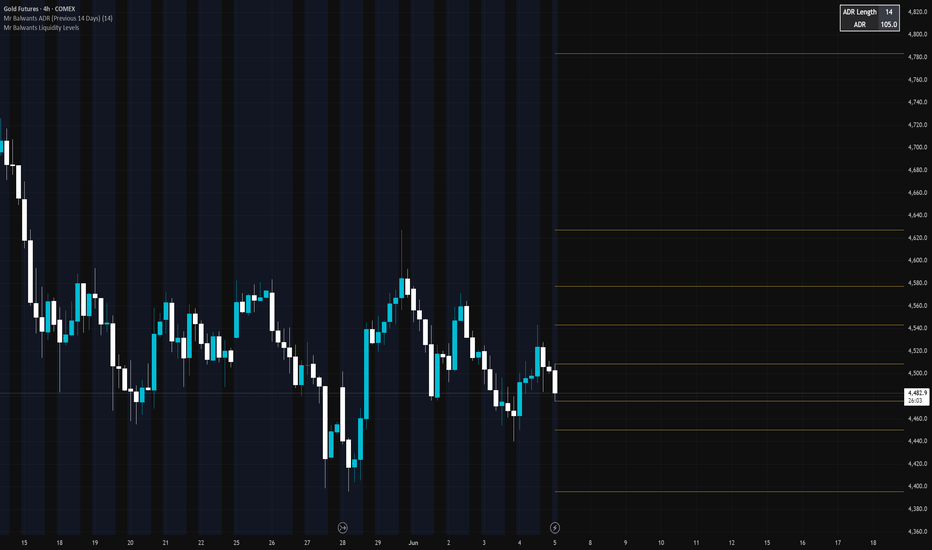
Mr Balwants Liquidity LevelsMinimalist Liquidity Levels
A clean and lightweight liquidity indicator designed to display important Daily, Weekly, and Monthly high/low levels directly on the chart.
The indicator automatically plots:
• Previous Day High (PDH)
• Previous Day Low (PDL)
• Current Day High (CDH)
• Current Day Low (CDL)
• Previous Week High (PWH)
• Previous Week Low (PWL)
• Current Week High (CWH)
• Current Week Low (CWL)
• Previous Month High (PMH)
• Previous Month Low (PML)
• Current Month High (CMH)
• Current Month Low (CML)
Features:
• Minimalist design
• Clean horizontal ray levels
• No labels or chart clutter
• Daily, Weekly, and Monthly liquidity references
• Works across all markets and timeframes
• Lightweight and fast
This indicator helps traders identify potential liquidity pools, support and resistance zones, and important market structure reference levels while maintaining a clean chart environment.
Ideal for:
• Price Action Traders
• ICT Traders
• Smart Money Concept (SMC) Traders
• Swing Traders
• Intraday Traders
Tags:
Liquidity, PDH, PDL, PWH, PWL, PMH, PML, Market Structure, Support Resistance, ICT, SMC, Price Action インジケーター
インジケーター

SESSION TIME LEVELS (BRT) Xau24k📍 SESSION TIME LEVELS (BRT)
Automatically marks the High and Low of up to 3 custom candles per day — defined by hour and minute in Brasília time (BRT). Each level is drawn as a horizontal line that extends forward throughout the session, with an optional fill zone between High and Low.
━━━━━━━━━━━━━━━━━━━━━━━━━━
🔍 WHAT THIS INDICATOR DOES
━━━━━━━━━━━━━━━━━━━━━━━━━━
Many trading strategies rely on the High and Low of specific candles — session opens, liquidity sweeps, institutional reference times. This tool automates that marking process for up to 3 configurable times per day, in Brasília time (UTC−3), with full historical replay.
At each defined time, the indicator:
• Captures the High and Low of that exact candle
• Draws a Max line (upper level) and a Min line (lower level)
• Fills the range between them with a transparent color zone
• Labels each level with the time and exact price
• Extends lines forward through the session (frozen at day close)
• Preserves up to 20 days of history on the chart
━━━━━━━━━━━━━━━━━━━━━━━━━━
📐 HOW IT WORKS
━━━━━━━━━━━━━━━━━━━━━━━━━━
1. At the exact bar matching the configured hour and minute (in BRT), the indicator captures that candle's High and Low.
2. Two horizontal lines are drawn — one for the High (Max), one for the Low (Min) — extended to the right until the session ends.
3. A fill box is drawn between them as a visual reference zone.
4. At the turn of each new day (BRT), all lines and boxes from the previous session are frozen at their last bar — keeping history clean and readable.
5. Lines and boxes older than the configured history window are automatically excluded.
━━━━━━━━━━━━━━━━━━━━━━━━━━
📊 VISUAL ELEMENTS
━━━━━━━━━━━━━━━━━━━━━━━━━━
For each active time slot:
• Max line — upper level of the reference candle (fully customizable color)
• Min line — lower level of the reference candle (fully customizable color)
• Fill zone — transparent box between Max and Min (customizable fill color)
• Labels — show time (HH:MM BRT) and price at High and Low
Lines extend to the right during the current session and freeze at day-end. Historical days are preserved for visual reference.
━━━━━━━━━━━━━━━━━━━━━━━━━━
⚙️ CONFIGURABLE SETTINGS
━━━━━━━━━━━━━━━━━━━━━━━━━━
TIME SLOTS (up to 3, independently toggleable):
• Enable/disable each slot individually
• Hour and minute in BRT (Brasília time)
• Max line color, Min line color, Fill zone color — all fully customizable per slot
VISUAL OPTIONS:
• Line style: Solid / Dashed / Dotted
• Line thickness: 1 to 4
• History depth: 0 (today only) up to 20 days
• Show/hide labels
• BRT UTC offset (default −3; adjust to −2 during daylight saving time)
━━━━━━━━━━━━━━━━━━━━━━━━━━
📌 USAGE NOTES
━━━━━━━━━━━━━━━━━━━━━━━━━━
• Works on any asset and any intraday timeframe
• Designed around Brasília time (BRT / UTC−3) — adjust the offset if your broker uses a different timezone
• If your region observes daylight saving time, change the offset to −2 during summer
• Setting history to 0 shows only today's levels — useful for clean intraday charts
• The fill zone helps visually identify premium/discount areas between the High and Low
━━━━━━━━━━━━━━━━━━━━━━━━━━
⚠️ DISCLAIMER
━━━━━━━━━━━━━━━━━━━━━━━━━━
This indicator is for educational and informational purposes only. It does not constitute financial advice. Always manage your risk appropriately. インジケーター

インジケーター

インジケーター
インジケーター

インジケーター